Transcripts
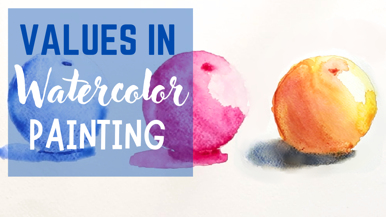
1. Introduction to Values in Watercolor: Hello. My name is Matthew Dewey, and welcome to my watercolor
course on Values. Now values are one of the most important elements in painting, not only because they help us show where it is light
and where it is dark, but it lends depth and form
to our paintings as well. This course is aimed at beginner watercolor
artists looking to grate this depth
in their painting. So I'll be going over how you can use values to do just that. First, I'll be going
over the value scale, how you can make your
paints darker and lighter. And then I'll be showing you
how to use these values to establish shape and form in
some monochrome paintings. And finally, we'll
be putting it all together in the
final demonstration, where I'll be showing
you how to use values and colors together. Before starting this course, I highly recommend checking out my beginner course on
watercolor painting. As I'll not only show you the brushes that
I use, the paper, and the paints, but I'll
also be showing you the fundamental techniques that I use throughout this course. And when you're
ready to learn about values and watercolor painting, I'll see you in the
very first lesson.
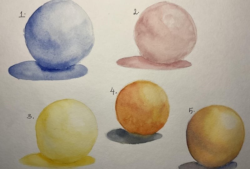
2. Practicing with Values in Watercolor: Hello, and welcome to your
watercolor course on values. Now, I'd like to take this
first lesson to explain the importance of values
in watercolor painting. One of the best ways that
I can show this off is to display the gray
scale of values. Values add depth to an image. On this gray scale,
we have it from its lightest to its darkest, and we can establish the values in almost every color
that we choose. Take, for example, this image. It displays a lot of
shadows and highlights, and yes, there are a lot
of colors to look at. But if I was to make this
image black and white, you'll see that the depth and detail is not lost
without color. A monochrome image
still has depth. It still displays form,
even without color. However, as I lower the
contrast for this image, you'll notice that it starts to gradually lose its depth and form until eventually we just
have a plain gray square. That is because contrast is the difference
between our values. The greatest contrast
we can have is between our lightest
and our darkest value. And this is important in
painting for many reasons. But it's especially important in watercolor because it has a different approach when it comes to establishing
shape and form. Like with many
mediums out there, you have the room to cover your mistakes with a
fresh layer of paint. When it comes to
watercolor, however, you can only work from light to dark and never back again. Meaning what we add
to our paintings as watercolor artists establishes
exactly what we want. If we make a mistake, it's very difficult
to take it away. When it comes to
watercolor paintings, it's very important to get your values right as
there is no going back, there's only starting over. As you can see, I have mixed nothing into
the paint at all. It's just blue
added darkest form without any water added to it. Of course, to start diluting it, I would start
adding water to it. Of course, with Tom, a pigment is also lost as we start to spread it out
thinly on the page. As you can see that creates a nice set of values
on the scale. I'm going to provide this
scale in digital format so you can print it out and
use it as practice as well. Use that gray scale to help you practice
with your values. I recommend starting with
a single dark pigment, such as your ultramarine blue. But if you want to
mix a darker pigment, as I said earlier, you can mix ultramarine blue
with burn CNA or you can mix a sarin crimson and
cadmium yellow and ultramarine blue until you
get a nice gray consistency. Once you feel that you have
a better understanding of how to work with your
values in watercolor, we're going to practice
with our image here, which is an orange on a table. As you can see,
there are some darks and lights that
we can work with. So with that, thank you
for watching this lesson, and I'll see you in
the next one for now.
3. Using Values to Show Form: Hello, and welcome back to your order color
course on values. Now, in this lesson,
we're going to practice our values with a
subject matter. We're going to be
painting and orange. The reason we're doing this
is because a great way to practice one's values is
to work with basic shapes before jumping into
something as complex as a landscape or portrait or any other detailed
subject matter. Now, we could start very
simple and work with a cube, but I think that
will only give us flat planes to
represent our values. I think that's something
we've practiced already in the previous lesson. When we practiced our values
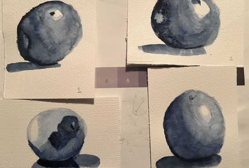
moving up the value scale. As you can see here, I
have drawn three circles. I'm going to be doing
it three times. First of all, with
blue because I feel that best
represents the shadows, so I'll use less blue to no blue in areas where
there's light and highlights. And of course, blue when
there is shadows and there's deep shadows where there won't be any dilution
of the pigment. The next one I'll do in red, and the third one,
I'll do in yellow. This will also
demonstrate to you why we often use cooler colors, I E blue or purple when
it comes to shadows, and we use yellow or any other light warm color to represent
our lighter values. I will be providing this
image of an orange in the project section so you
can practice with it as well. I also recommend giving yourself enough
room to work with. You don't need to use a
whole page to do this. But certainly don't try
and paint a tiny orange, give yourself room to establish those shadows and
those highlights. One of the first things
that I'm going to do is establish which area
is the darkest of all, and that would be just
underneath the orange itself. I'm using my round
brush to ground, my shape first of all. Next, I'm going to establish all the shadowy areas with a very thin wash of
ultramarine blue. And I I find some of
the pigment is getting collected too much in areas where I feel
that it wouldn't be. What I'm going to do is
while it's still wet is use my brush to help push the pigment back
to the darker areas. And it's started to lend
shape to the image. I'm not going to be
excessive with it. As I said earlier,
we can only add, take away to a certain degree. Now, while it's still wet, I'm going to show
in the image here. You'll notice that it is
darker around this area, the lower area of our orange, and there's a heavy
shadow over here, but there is a lighter
tone just between the two, just a bit of reflective light. So while it's still wet, I can also try and push some pigment side to those
areas which are much darker. I want it to be as
light as possible compared to my values. So I think I'm opting for a nine or eight leaving ten here for the main
highlighted area. And with that done, I can
now start darkening areas, which I feel need
to be darkened. Ba Ba. And let's soften the
edge of that shadow. There's just a few
touches of the brush. Now, I believe that is
that for blue orange. If you want to when practicing, you can just stick with one. Right now, I'm just using
this as a demonstration for this lesson using red. But if you want to aim
for accuracy sake, I think using blue, and tran blue or dark blue of your choice, you
are the artist. Is the best thing for it. If you want to work, as I
said in the previous lesson, you could mix a purple for
realistic shadow or you can mix tone by combining
ultramarine, some yellow and red, but
for quicker solution, combining ultramarine with
something like Burn Siena. You notice as I'm
doing these areas, I'm not picking up a lot of
pigment and moving it around, and then washing it and
picking up some more. Instead, what I'm doing is, I'm just adding more water and letting the water dilute it, but also the fact that I am spreading the pigment
on the page itself. Instead, what I'm trying
to do is establish the major shapes in the
shadows and in the highlights. And as I'm doing that,
The values do the rest. The values, as I said earlier, will help establish the shape and the form of your
subject matter. It doesn't require
from you to be too detailed with your work because the shapes
aren't detailed. There aren't that many
complex shapes in nature. And now that we've done that, let's move on to probably one
of the most difficult ones, which is a yellow orange. Suppose that'll be a lemon, but I'm going to be doing
the shadows in yellow too. So Let's establish
our darkest value. It's just that light here, so I can see it just
a little bit better, and we'll put yellow line
just like that underneath. That's as dark as it's
going to get there. Once more, as
lightly as possible, just dilute your color to
get a very light value. Establish all the major
areas in your image, starting with the
darker ones first. M. And there we have it. My orange is painted and
anything but orange. But that's something we'll be doing in the next demonstration. For now, I want you to
practice with a sphere. Use your values. You can
use the image that I used, but you can also use your own. W is something a
bit more different. You can paint an apple, which will have a slightly
different shape. But mainly focus on establishing your darker areas with a
light wash of order color. And then start adding to it. If you like to work wet and wet and the
effect it creates, as I've demonstrated here, you can then use the brush
to pick up pigment and place it in there and
let the water connect itself and everything
start to smooth out. Use your brush to carefully
move the pigment around, but mainly let the
water do its thing, and focus on blending your darker tones into your lighter tones to
really give that shape. You don't need to depending
on your art style, but to get as close as
possible to that shape, it's something I do recommend. Thank you for
watching this lesson. And I'll see you
in the next one, we'll be painting
that same orange, but now we're going to be
using a full color spectrum. I'll see you then and Baffin.
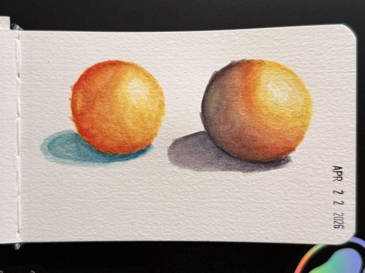
4. Final Value Demonstration - How Specific Colors Have Different Values: Hello, and welcome back to
Watercolor course on values. Now, in this lesson, we're
going to be finishing off the course with a
demonstration with our orange, but this time painting
it in orange. Now, initially, I
was going to do one method in painting
in this orange, but I feel that there are two methods here
worth discussing. In the first orange, I'm going to paint it in orange just like we did in
the previous lessons, focusing on the values. But in the second one, I'm going to approach
it while noticing the key colors that are
represented in nature. And this is something
I feel that one should apply to most of
what they paint is understanding that
not everything is going to be a solid
color even an orange. But we'll get to that. First of all, let's paint our first orange by getting
in some of our yellow. I use cadmium yellow, and a bit of a lizard and crimson to help get
the right color. Oh. Now, I feel that I can make
this range a bit darker, so I'll pick up even more
red. Mix that in there. It's looking a bit
brighter on the cameras. I'm just going to adjust that. There we go. Just use a
less, a bit more pigment. Let's try and establish
that shadow a bit better. I'm trying to pay
special care to where my colors and pigments settle. You'll notice that it's pulling here a lot around the bottom. One of the tips that
I recommended in my beginner course was
to have your page. Or your work table,
slightly angled. To let the water do its thing. Gravity will help you
out in some areas. Some of the color has
already bled into it now. But that's perfectly fine
because a little bit of orange reflected on the
surface is common enough. Let's just save it from getting
a bit out of hand here. Picking it up. I'm going
to darken the value. Once more now that
the paint is somewhat dry around this area and just do a final dark shadow. Slightly around this edge, and then connected around here. And there we have our orange. For example, when you
look at this orange, you'll notice that there is a
light side and a dark side, but in the lighter side, the colors get and. To the point where the orange starts to look a
little bit yellow. Whereas the darker side, the coolness of the
shadow starts to set in a bit and it becomes
a bit closer to blue, or in this case,
perhaps a purple. What I'm going to do
next is I'm going to brighten up this
orange a lot more. And I'm not going to use as much as I did with
the first orange. This time, I'm just going to focus on the lighter side first. Oh. When it comes to the shadow, I'm going to mix a bit of blue, and a tiny bit of red
to create a purple. If we want to talk
about warmth and cool, we'd say that oranges
are very warm color, so we'll use a shadow, and that would be purple. Mo And then we have our two ranges. Now, from these two examples, I tried to display a values to help give that to the shapes. When it came to this orange, I try to focus on the
color ban orange. So I'd have to make
the orange darker, by adding more red, lighter, many more yellow, just to make the orange
capture those values. When it came to this orange, I approached it with the
idea that I would use the colors themselves to
help establish the values. So I recommend trying out these two techniques to help
you paint your oranges. First, trying it in the
value scale, of course, with just a single color, but then branching out
to use other colors to help you establish
its shape and form. Use cooler deeper colors such as blue to help establish
the darker areas, and in the lighter
areas, use more yellow. This is, of course, our final demonstration
for this course, but that doesn't mean
the course ends here. If you want to show off some of your work and submit
your projects, please do so in the
project section. This way, I can review your
work and provide my input. You can also share any
of the other projects we you experimenting
with values. If you're painting
something more complex or working with
a different shape, you can share that in the
project section as well. Of course, if you have
any questions for me, leaving me the question in the discussion section
is perfectly all right. As an active instructor, that means the moment I see it, I'll be ready to answer you. And if you haven't ready, I'd recommend checking
out my beginner course on watercolors as I'll go through not only the paints
that are typically used, but also the brushes, the kind of paper I use, and go over some
fundamental techniques that can help you improve your
watercolor painting. I aim that course
at beginners who've never touched a paint brush
or worked with watercolor, and are interested
in taking it up. So if you have no experience, this is a course I do recommend. That, thank you for watching
and happy painting.
 Matthew Dewey