Transcripts
1. Introduction: Impetus. In watercolors,
impetuous refers to spontaneous, unpredictable approach
where the artist surrenders much of their control over the flagrant result. It's a free flowing
process driven mostly by water and pigment,
interacting naturally. The artist simply goes ahead, guides the process,
partners with the medium, and embraces all the
uncertainty that comes with it, only leading to direction
of the water and pigments. Hi, guys. I am Ruth
kanath an artist, instructor, mother,
Skillshare teacher, and founder of vibrant parcels where we create
handmade sketchbook, artistry, pinks and more. If you are joining me for
the first time, welcome. I go by the name watercolor dot Illustration dot
LETE on Instagram, as well as on YouTube, where I share my passion
for watercolors, creativity, and
everything about art. Get ready for the fun, relaxed ten day journey
into World of water colors. This class is
designed to be easy, enjoyable, and stress free, perfect for bigners
or anyone looking to reconnect with the
pure joy of painting. We will focus on flow of colors, not strict subjects or
complicated compositions. Most of the exercises
are simple and can be completed in under 20
minutes, real time. We will start with the
basics, exploring materials, and gradually move into foundational techniques
like blending, creating diffuse edges, mixing
colors directly on paper, this class is all about free expression and
plea food exploration. If you have ever felt
intimidated by watercolors, this is your chance to
let go of those fears. By the end, you
will walk away with beautiful expressive pieces and a deeper confidence in
your watercolor journey. Let's dive in and
enjoy the flow.
2. Materials Required: I will guide you through the list of all the
materials that I am going to use in the
process of creating this ten day watercolor
scenes. Hello, guys. These are all the materials
which I'm going to use. First, let me tell you
the size of the paper. The size of the paper is around 14.5 centimeter into
20 1 centimeter. I would be using both the phase, that is the portrait style as well as the landscape style. I have kept these small
papers for testing my colors. I usually test these
colors in a way so that there are no muddy
mixes which I get on it. Though it's easier to not get any muddy mixes
on a wet paper, but still always trying out your colors in advance is easy. This is 100% cotton, fabriano artistico,
300 GSM paper. For sticking this paper, we will need an acrylic
board like this. I have this acrylic board. You can have any other board
that is available with you. Now this is my palette. The ceramic palette comes in very handy and
you can also see the colors when it is white,
the base color is white. Two jars of water, one for fresh supply and another for washing
your brushes. This is a drawing gum, which basically means
a masking fluid. You can have this or else you can also keep a
masking tape handy. We will be masking out
areas very small like this. You can just cut
out a small piece from this masking tape
and this stick to it. Once that is done, then you
can start with the painting. Brushes. My brushes are Devins, size six brush, Devens,
size four brush. This is all Kolinski, and then I have my
Casino Davins brush. This is Raphael size
four liner brush, and this is basically
my wash brush. You can have a
bigger wash brush, you can have a
smaller wash brush. I just kept it around
1 " or a bit lesser, it's good to go ahead with it. Is PH martin, bleed proof
white that I keep for myself. This is majorly white gouache. It acts like a white gouache. If you don't have it, you
can also use white gouache. Now, the colors are
from many brands as you see me using colors from various brands that is white
knives and midge yellow. This is RM brand, something
is your sennelier. Variety of brands that I would be using and I would be naming them each one of them before
we start with our class. This is all. Now let's move
on to our property section.
3. 8 Properties of Impetuous Watercolor: Today, I'm going to discuss
eight important properties of watercolors before we go ahead with our first painting. Soft edges, when paint
is applied to wet paper, it spreads out and merges with the surrounding
moisture on the paper, resulting in gentle
diffused edges and a smooth blurred appearance. Color blending blending
colors directly on paper is a key part of
watercolor painting. We begin by picking
up colors with the brush and applying
them to the paper. As they mix on the surface, they often create
beautiful natural blends and harmonious color
combinations independently. Avoiding muddy, mixing color on a dry surface can create
dull, muddy results. To keep colors vibrant, it's better to work
on wet surface where the paint can flow
and blend naturally. Since watercolor is a
transparent medium, this helps maintain brightness
and clarity in the mixes. Spontaneous and
unpredictable nature. Wet on wet painting allows
watercolor to flow free. Creating unexpected
and beautiful effects. With less control and
more spontaneity, the paints often form soft accidental blooms and patterns that are
visually pleasing, dreamy and magical
atmospheric outcome, the interplay of
diffused edges and seamless color gradation
inherent in the wet on wet technique imparts an ethereal atmospheric
quality that defines the expressive
and evocative nature of watercolor painting. Lifting technique,
this technique is especially useful during
the wet on wet process. A clean damp brush is
gently used to lift or remove the paint from the areas where color
is not desired. Allowing for highlights,
correction and added textures. Diffused edges, if you want to maintain soft edges
in your second ar, the wet on wet
technique is ideal. When the paper is slightly damp, you can paint elements like
mountains or distant shapes. Like over here, we are
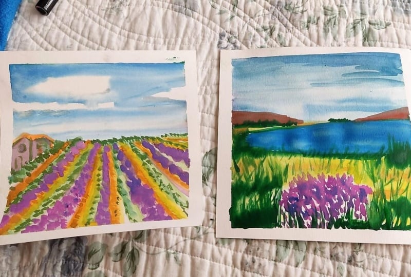
painting the floral fields, allowing the edges
to blur naturally and create a softer,
more atmospheric effect. Back runs, also known
as cauliflower effect, B runs occur when excess
water flows from the edges, such as from an
inclined acrylic boat into a partially dried
area of the paper. The sudden influx of moisture
pushes the pigment outward, creating irregular
blooms like patterns. Therefore, always clean your
edges to avoid back runs.
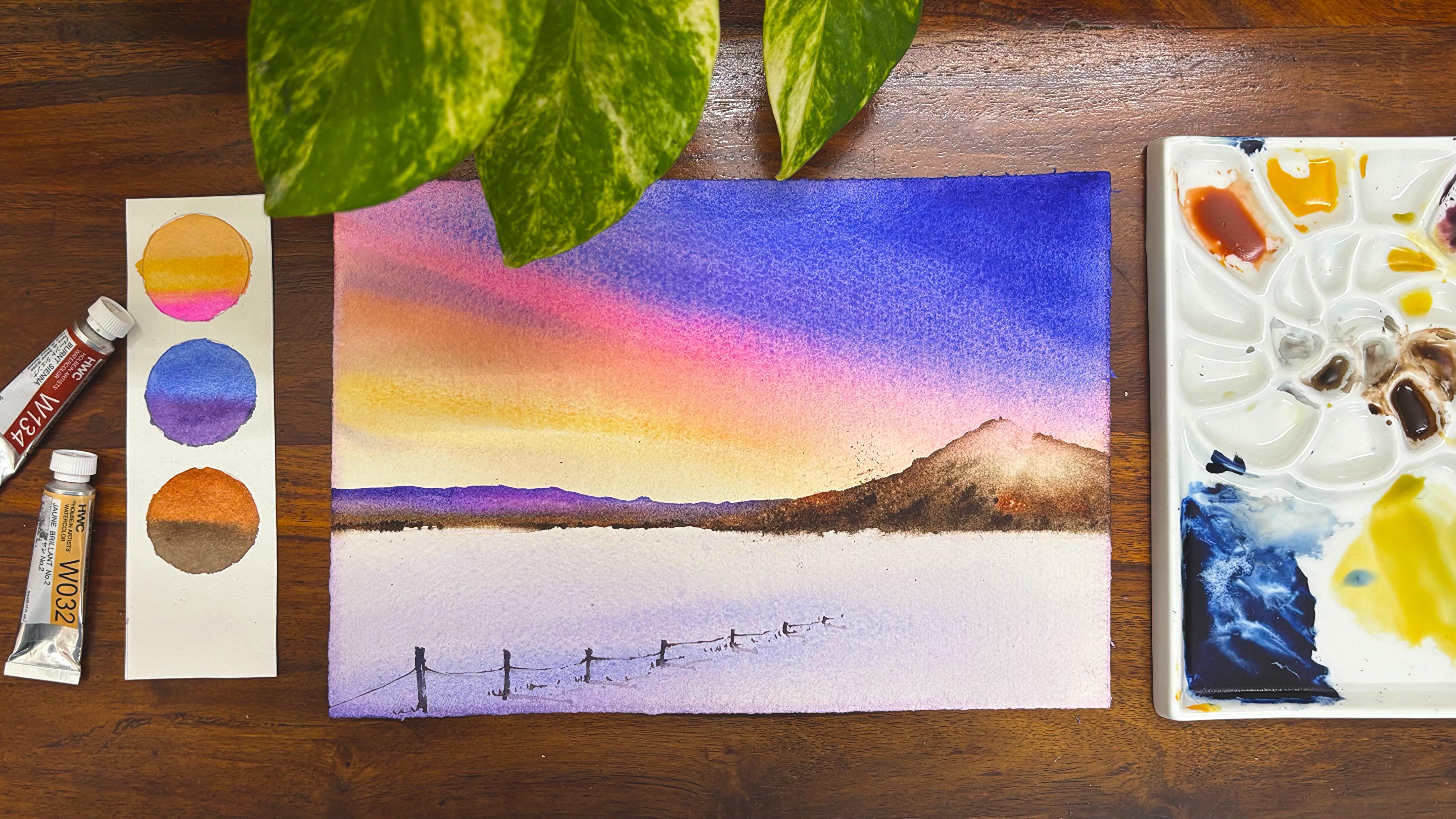
4. Project 1 - Snowy Day: Let's have a look
at all the colors. We are starting out
with naples yellow, then Indian yellow, opera, Kobal blue deep, purple, burn Siena, and burn timber. This is how I'm going to use all these colors
for my painting. I love the spontaneity that
comes with watercolors, and the whole idea of this particular class is all
about being spontaneous, not thinking much
about the composition, just going with the flow, enjoying the process of creating something
that you enjoy, and watercolor is a
medium that most of us have it very handy
available in our houses. Just for this
particular purpose, I wanted to keep it really
simple and starting with a very simple line that is about a bit above one
third of the paper, and then drawing a hill area
or else you can also see a mountain that is there in the background compared
to the foregrounds, where we are going to keep it
as snow and simply just add the colors which are in the sky that gets
reflected on the snow. Another background
mountain which we are also going to add. The colors are very simple. I have already told you in
the beginning of the class all the colors and
we have experimented with small circular blocks because of which it is
very easy for us to understand how the
colors blend with each other without
creating any dirty mixes. Most of these colors are from the palette where they
are next to each other, and hence it is very harmonious. You don't need to worry much. I would apply water
on both sides of the paper since it
is a wet on wet and spontaneity in watercolors
is something that I really I think it is just not to think much when you are
working with watercolors. The more you think, the
more it would be difficult for you as you want to
control the watercolors, which is really
not a possibility when you're working
with this medium. Watercolors is all about keeping it as just
letting it flow, enjoying the water,
enjoying the colors, and that's how we go about it. Started by adding one wash on
the back side of the paper. It is a clear wash of water and the second wash on the
top part of the paper. I have taken an acrylic board. You can go ahead with any boards that's available with you. Even a flat plastic sheet is
also good to go ahead with. If you can really stick it to some board or if you don't have any board available, I
think a plastic sheet, if you can stick
it to any board, I think that can
also help you to manage a kind of outcome
which you see over here. I'm going ahead with a mix of your beautiful naples
yellow and some amount of any yellow that's available on
your palette for me, it's indian yellow,
but naples yellow is good to go ahead with. And then we will go around with the colors that are
harmonious with each other, which means orange, or you
can also go ahead with opera. Then some amount
of purple or blue, they gel very well
with each other. You can also apply some orange
as I'm doing it right now. You can mix some orange
with the naples yellow, get a color that
looks similar to the one, which I'm applying. This opera is available
on my palette. If you don't have opera, you can go ahead
with carmine or any of the other pink colors that's available
on your palette. But opera is one
of the sheds that has been on my palette
for many years now. I have been painting with
the shade for, long now. Okay, going ahead with my blue, this is basically a big blob of blue that did
appear on my paper. It's absolutely fine. These kind of
accidents do happen. That's one of the
reasons this is a complete scenario where you cannot judge how the painting
is going to turn out. If something like
this also happens, go with a lot of water and
just pick up the colors. This is basically
a beautiful blue from the kobarblue
deep. Point of view. I have been using this
blue for many days now, and it was really not there
initially in my palette, but now I have added it, and all I can say
is that it's really fantastic when you look at
it and have a final outcome, which makes it really,
really interesting. You can still see
that blue plop, but that will go
away. Do not worry. There is lots of water
that can cover up for all these smaller mistakes that you create in watercolors. You know why I selected
the papers rather than going ahead with a
sketchbook kind of exercise. Because for paper, if you
don't like something, you can again go ahead with another paper and start painting on it, whereas
in sketchbooks, sometimes if you
are owning a very expensive one and you start painting on it and
something goes wrong, you might f but, okay, I lost a sheet of
paper where then there are positives of
even using a sketchbook, the backside of the paper of the sketchbook can again be
used to paint another one. So always go ahead with 100%
cotton paper sketchbooks. You can see that the opera and the blue will mix and give me a way of opulish
kind of a shade. And this particular
blue is granulating, and hence you will see some granulating
colors. Do not worry. If you don't like
granulating colors, go ahead with the colors that's available
on your palette. If it granulates, accept
it wholeheartedly because the granuating colors also look fantastic on the paper, finally. I will go ahead with the
tissue and clean up the area, which is basically
in the yellow. That is your mountain area, and that mountain
area you can clean up with the tissue
and then again start painting on it when you want to go ahead
with the mountain piece. Some orange, you can see that I continuously change or I even continuous to remove
the colors from the space where I
don't want it at all. Blend it with some clear water
and then again pick it up. While I blend the colors, I make sure that there
is even wash. Now, even wash means that
the blending is even. There are no lines
that you usually see. You can also move this acrylic
board in and around to get a final outcome which
looks absolutely blended. Gravity does a lot of work. You will see in one
of our paintings, we will be doing that, too. There are a lot
of learnings that we have in each of
these paintings, so do not worry. Go ahead with the
flow, enjoy the work. And just enjoy painting simple landscape or
maybe just a flower. There are different compositions which we would be trying, ralins some good skyscape. So there is nothing in particular that has
gone into my mind while I was literally
trying to make this class. It was all enjoying the flow
of watercolors and just, um, enjoying this medium
more together, just loving the medium, just wanting me to work more
and more with this medium. In between, I took
some break for my own as I was pretty
unwell and hence, even getting back to the painting was
really tough for me. So going through these simple
landscapes helped me a lot. It's a 15 to 20 minute exercise. Believe me or not, the
sky takes some more time. Wherever you think you
are happy with the sky, just leave it at this stage. You do not need to always go ahead and keep coloring
or adding colors. I will go to the bottom part. Go ahead with a
very light sheet of the purplish sheet which we
did have on the top area, some pink into it or
opera that you did apply. As you see, these are very, very diluted or you can say there's hardly
any color in it, there's hardly any pigment
in it. Mostly it's water. And then I would go ahead with the purple that you
have on the palette on the right side and
just start adding it on the paper from the
left to the right. Now, this is basically to
show that the color of the sky is getting
reflected into my snow. Snow has no color of its own. They reflect the colors. So always, always
keep that in mind. If you are observing snow
on a bright sunny day, you will just find it white. If you are observing
under the light, you might find some amount of light getting
reflected on the snow. And if you're absorbing somewhere like this
on a colorful sky, there will be at least the deeper values getting reflected on the bottom side or the
bottom part of the snow. I'm just adding some
more of my purple. As you see over here, most of this piece only lies
in this particular part because our colors that we had
to spread are almost done. We might have to just take off any extra water from the sides or else it would be a back run. Now, what do I usually
mean by a back run is the water from the sides
will move into the painting, and there will be a
cauliflower effect, which we really don't
want in this painting. Hence, always keeping
in mind that yes, there is no cauliflower
effect which we get. Let your paper dry off to a great extent before
you go ahead with the next set of your
background mountains. Now, this is very important. As I always say, you can
use the same colors. You can blend some
amount of opera also into it or some amount of
darker blues also into it. It's good to always
change your colors or add the color on
top of the paper. There you can really get good number of shades
coming up that way. You know, and when you mix
the colour on the paper, the variety of shades that you get on the paper is really not equivalent to the
shades that you can make on the palette. And hence, that's
how I go about it. Even adding simple water, you know, you can
alter the values, and altering the
values also adds a lot more depth
into your painting. I'm adding some more opera
now, as you can see. I did tell you initially, I love to blend my colors. I love to add different sheets into the background
mountains, too. Once this is done, we will work on the
foreground mountains. I would go ahead with some
of my burn Siena and then blend it with my burnt umber or any darker value that's
available with you. So go ahead with that shade
or make some amount of your paints gray
into the brown or burn Siena that's available
and get a darker value. You can also mix the purple that you have created
that could also get a darker value with the browns
that you add over here. I will clean up the space
with my tissue and then just add darker values on lighter values wherever
I feel it's necessary. Keep a tissue handy. It's always good to have it, then you can pick up
your colors very easily. All the steps explained over here is very big no friendly. If you are someone who is
looking for good blending, good composition, simple and easy paintings
to just hang on your wall. I think this is perfect
place for each one of you. Go ahead with this painting, and I think you will be
in a position to nail it completely and just tap your back once you
are done with it. I'm just blending my colors, some darker and lighter values. You know, all of us
create mistakes, and in fact, sometimes
I go overboard. I add some more
darker colors because of which I have to pick them up maybe a bit later on with the help of my brush or
with the help of my tissue. I continue to work through these simple aspects
of watercolor, and I think it's important
for each one of us not to consider ourselves
that we just know everything. Watercolor is a
medium that teaches you every day something
or other new. If you keep experimenting
with this medium, if you keep experimenting
with various compositions, I can tell you that you
are going to nail each of your watercolor compositions as you keep painting and
go along with it. I'm adding some more
darker values for the foreground of
these fountains. I kept them really dark. You can see that the colors
are moving into each other as the paper that is
basically the mountain area. Above the darker value
of brown is still wet, so I'm picking up with the
help of my damp brush. I have been doing this
process for many years now, and I know how to pick up the colors with the
help of the damp brush. If you are someone who is new, just take your brush, add it, add some water on it, take the
extra water on the tissue, and then just remove the
extra paints from your paper. Again, do the same process, and you would be in
a position to get some clean or some darker lines in the foreground and
some lighter colors or whatever colors you've
added for the background. Adding some more darker
value of brown and then blending it with the help
of my blending brush, I have kept basically
a size four, size six, then this round or you
can say the squll brush. Those are the
brushes which I have been using for a few years now. But the new Dawnci
that I've opened up, you can see that it is
very, very beautiful. I'm experiencing
amazing outcome with these Devins brushes,
and finally, I can say that this is
one of the brushes that I feel everyone should own
after Escoda optimal brush, which I have really told that I've been using
it for at least five, six years now, and it's been an amazing experience
with that brush. So many years I've been using
it still it's the same. I still use it pretty rough, but the tip, et
cetera, remains as is. So if you are investing in a
higher value branded brush, I think that it can
sustain you for longer years and hence you can have a great outcome with it. Always try to invest slowly. Do not go very fast with your investments on
brushes, paints, et cetera. But as and when you do it, you would be very happy to see how interesting
it is to have outcomes that you
might find very difficult to achieve with
maybe some cheaper materials. See, expensive materials are always good but
difficult to acquire. Hence, over time, if you acquire and continue creating with your watercolor as a hobby or as a side hustle or whatever
you have considered, I think it would be
great outcome for you, and it would be a great
addition for anyone. Uh, the paper is becoming a bit dry and
adding a few lines now would make it look really nice. It's not flowing a lot. But yes, wherever
I have to blend, I think that has to
continue in a similar way. The blending of the bottom
area is also important. I will use my flat brush
to do that blending. This is something
that I have done previously also in
many of my paintings, and you will observe
very strongly as we go ahead with our
other paintings, too. I'm still picking up some of the colors from where I
think it is necessary and just using some clean
water to pick up those colors. This is very important exercise that I've been doing always, and I mentioned even
earlier about it. I guess this is it. Maybe some dots
here and there to just make the ridges and all or the rocky terrain that
you usually absorb in any kind of mountain area
that you come across. Don't try to overwork
at any point in time. If you try to overwork, what happens is that
the final outcome might not be to your liking. You may continue to overwork
in all the areas, but, yeah, the final
outcome might not be exactly how you
would have loved it. Okay, great. I guess we can just take
a break, stop, look back. Do we need to add
anything further, and then just start out
with the bottom piece? Bottom piece, you can only do once your paper is completely dry or else the lines
will not be sharp enough. This is the only thing which we are doing wet on
dry, to be frank. Mostly everything that we have done till now is wet on wet. You will find more paintings
coming up as we progress only in wet on wet there will be nothing that we would be
adding in wet on dry. The whole idea is spontaneity, and that's what I'm looking forward to in this
whole of the series. It's a very small series. Ten days, 15 to 20 minutes, that is all you need for this entire series
on a regular basis. It is spread across two weeks, five days and five days. It's easier for you to follow, continue, and do let me know how you are
enjoying the class. This is basically the wooden fence, and I'm just adding
some strings to it, or you can say some
kind of lines just to add the add perspective into
this whole of the painting. It's very important whenever you are working
through watercolors. Adding a bit of perspective helps in the
watercolor painting. Just dropping a few dots here
and there, and that is it. These are basically the
dry grasses, et cetera, which is usually there in
any kind of snowscape. I'm adding the shadow of the wooden fence
and this string. Once it is done, I will allow this paper to dry off and
then have a fun look at it. Nothing more needs to be done. Hope you have enjoyed it.
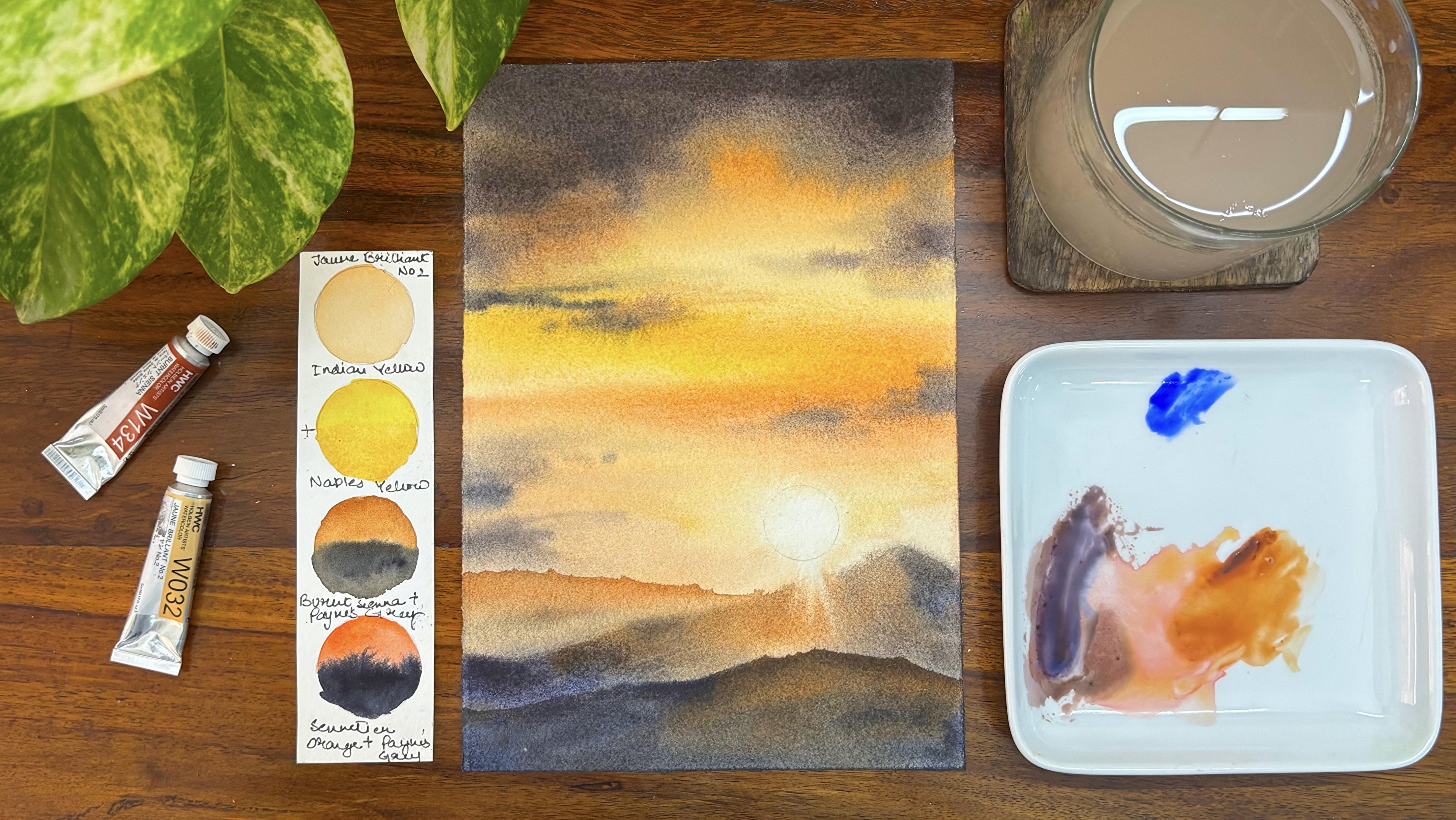
5. Project 2 - Evening Light into the Mountains: Let's have a look at
all the colors which we are going to use
for this painting. The first is John
Brilliant number two, Indian yellow with
naples yellow, then is burned Sienna and Pains gray along with it
aniliaOange and Pains grey. These are the combinations which I have already
tried on my paper. Hence, I know that I don't get any muddy mixes when I use
these kind of combinations. Go ahead with any coin size of your choice and start
by adding a circle. This is a bit below the
half portion of your paper. I have aligned the paper
in a portrait way, not in a landscape manner. Hence we all need to
work in the similar way. So there are landscape
and portrait way, both we would be using
for all these paintings. I have not thought much through all the
compositions that we have done. It's kind of random. Sometimes you are actually
painting mountains, sometimes you are
painting skies, sometimes you are
painting sunsets. So go with the flow,
enjoy the spontaneity, enjoy the process of creating that's what
was there in my mind when I went ahead and actually started
working on this class. I have added three
different parts of my mountain if
you see over here. One is a background and
two are foregrounds. You will see how the sun rays actually cut through
the mountains. It would be a very easy process. So do not worry. Let's go ahead and first
work on our sketching. Once you are done
with the sketching, add water on the back side of the paper as well as on the
front side of the paper. Adding water on the
backside of the paper really keeps your paper wet
for a longer period of time. This is Fabriano Artistico, 300 GSM, 100% cotton
paper, which we are using. You can go ahead with any
other paper of your choice, but I would request you
to use 300 GSM only. If you're using 300 GSM, 100% cotton, then only you will
have an outcome which would look
similar to the one. That I am getting over here, and it would provide you with a lot of time to
work around with your skies or mountains or any of the parts that we are
going to paint over here. Therefore, having a good paper
is very, very important. As I always say, basics is something that I
always always go back to, whether it be paintings, whether it be having
a good paper, whether it be having some
good artistray paints and artist gray brushes. So all of these make a lot of difference
to your painting. Though I don't say you have
to get all of this at one go, you may get it as and when
you have the money because all the supplies are
pretty expensive and hence you cannot get
everything as you want. Okay, now I'm picking up
some of the water from wherever I think that I
have large puddles and all. So you have to see
it from the sides. If you have any large butles, pick it up and just add
it on another tissue or you can also take it out from the sides by
tilting your board. So that I would
leave it up to you. I'm taking out some burnt sienna and some amount of John
Brilliant number two. Both of these paints are
from the brand holding. So Holbein is another brand
that I have been using for many years now along
with Michello, Koa, Snelia and many more other like Winsor and
Newton professional grade, Daniel Smith, and whatnot. I think I have used every
brand that's available, including Fram Brand and all. Nowadays, although paints
are available even in India, though they are imported, and it might be available
at a bit higher cost. But you know, the outcome of
these paints are amazing. So we are starting out with
some of our yellow and brown, and then we would add some
John Brilliant number two as we go towards the top. This is a beautiful skin color, kind of color like shade. You can also have
this kind of naples, yellow and him and ke. I'm really not sure
exactly the shade name, but, yes, something
similar is available. You can blend it with
the brown and then get, outcome that looks similar to the one which you see over here. I'm going ahead with
my broader brush. Now, Broader brush is
important at this moment, as I'm working through
a larger piece of the sky compared
to the smaller parts, which I would be using or
working on next, you can say, Let's go ahead and just pick up some more of
our John Brilliant and go around the sun and
add colors over here, the paper is really wet and
hence the color will flow. You do not need to worry. You might have to go
ahead and pick up the colors from the spaces
where it is necessary. That is, if the colors
go into the sun area, we might have to go ahead
and remove that part. Those are the important aspects. I'm mixing some amount
of red into the brown, yellow mixture that we had and apply towards the bottom
area on the left side. I would be doing
the same process even on the right
side of the painting. Blending is a very
important process. In wet on wet watercolors, I will mix some amount of orange into the brown red
mixture that we had, and now I will start applying the color
towards the middle part. Though I will not cover the entire yellow
that I initially had. If I see that I'm
covering up the yellow, I might have to go
ahead and again drop in some amount of indian yellow
to keep that yellow intact. I don't want to cover up the
entire space of the yellow. I'm very clear about that, nor I will occupy the entire
white space of the sun. Take some amount of endonthrine
blue or pains gray, whatever is available
on your palette and then mix some amount
of orange into it. This is the sennelia
orange which I'm using. You will get a color
that looks really deep exactly the way which I'm using
in my painting right now. As I go towards the bottom, the colors will become
lighter and lighter, and I will get more
of the yellow and the brown tonal values along with the
orange tonal values, which I have added
already into my painting. I'm mixing some of
my paints gray and orange mix into the
brown and orange mix, which is there on the top. Believe me, these mixes
just happen on its own. I just keep them *** and
continue to work with my colors, whatever appear on my palette. I don't go with any mindset. That's one of the
reasons I always say that landscape, skyscape, et cetera, whatever
you are going to do in this particular series is
everything spontaneous. Whatever comes into my mind, I start painting it that way. There is no set rule
which I have followed, only a simple rule that usually every watercolor artist
follows is going from a lighter value
to the darker value. Why it is important to go from lighter value to darker
value in watercolors, as it is a transparent medium. You cannot get back to
lighter values once you have applied the darker values or a lot of lifting
processes involved, which might leave some
stains on your paper. And that is really not needed
in our painting one of the reasons that I
always move from lighter to the darker values. I continue to use the same mix in some
of the other spaces, and I'm not going to dip
my brush into the palette. I'm going to use the
same mix which I have in my brush and apply it in some of the areas as we go
towards the bottom. I think the top area needs
to be a bit more darker. I can see some white spaces, so it's important to go ahead with somewhat
darker values. It's the same paints gray
and your annelar orange mix. You can also have this
antrine and your orange mix. I would leave that
decision up to you. You should get a color
that looks similar to the one which I am
using over here. And then again, start applying
in few of the spaces. I'm going ahead with my
size four round brush, you can also go ahead with
your size two round brrush. I think size two round
brush will help you to actually control your
colors in a better way. Picking up the colors from the sun area is very important. As you see over here, we need to add some amount
of brown on the left, as well as just blend
it with the background. The paper is still wet, and hence you can work on it. If your paper is
not wet anymore, you really can't work
on these aspects. So just judge your paper before you come back to
this part, at least, so make sure that
you are not having a dry paper or else
the final outcome will not as you would like to have it because
there will be no soft edges. What we are looking
forward to at least in this painting
is soft edges, and soft edges is only
possible only when you blend the colors easily
and they move into each other as the paper is wet. I'm using my flat
brush to pick up the colors as my sun
rays are passing. Through this part of the hill, that's very important
to show it. You can also say
it's a mountain, so I would leave that
decision up to you. Whatever you want to call, the paper is still wet, and
again, I'm painting on it. I'm really not sure why I'm
retouching all the spaces, but just I think this is it. I'm not going to
retouch anymore and start with my mountain area. The paper, of course, for the mountain
area is also wet. I'm going ahead and
using some more brown near the area of the sun. As this part will be
lighter in value, the sun rays passes through it, and hence it needs
to be lighter, whereas as you go further away, it will become
darker and darker. We will use the same
paints gray and orange mix that we have used
do for this spot. I will keep blending my colors. The paper is also wet. Hence, they will move
into each other. Just clear out the spaces
wherever I think it is necessary with the help of a flat brush that
you see over here. If you try using your tissue, what will happen
is that it might leave some marks which we
don't want at this stage. I will blend my brown color
with a pains gray mix. Of course, you know this mix. We have been using
it from the palette, and then again, mixing
with some brown. This is very important
at this stage to let your paper
dry off after this, and then only you can add
your background mountain. Everything is really soft. You can see we are working
mostly wet on wet. Hardly there is wet or dry, which we are working through. You have to let your paper
dry off before you go ahead with your
background mountain and your foreground mountain. So both of them,
it's very important to work around only once
your paper is dried up. I will keep picking
up my colors at various stages wherever
I think it is necessary. This is, again, an
important process. As you see, I need some sharp
edges for my mountains, and that's really not possible
if everything is wet. They will move into
each other and it would become more
abstract in nature. That's not the idea wholly. We want to have a good outcome, which doesn't look absolutely
an abstract thing. It should look
more like natural, and hence that's the reason
I want to keep it this way. Now adding some endanthrine
blue towards the bottom. I have mixed some of
the endanthne blue into the mixture of the paints gray and orange and whatever
we had on the palette. I'm going to continue to use everything that I have on
my palette to my advantage. Though there is some amount of blending that is needed
with brown that we have added and you can see that the darker values
are coming up from the left. They are blending it well with the browns that we
have added on now. I will pick up my colors from wherever it is necessary
and then allow this part to dry
off before I move on to the next part
of the painting. You have to allow
some drying time, even when you are doing wet
on wet completely wet on wet, yes, means more
quicker approach. You need to work more
quickly compared to wet on dry because we are
not working in layers, we're usually working in one or two layers and pretty quickly that we are going
through it completely. I have added some amount of
my darker value of the blue, even on the right
side, but that is to really less extent with the
help of my size board brush. As you can see, now my
paper has dried off and the colors have become way
more lighter than what it was. I'm going ahead with my
lighter value of the brown. And starting out with
my background mountain, it's a very simple process. Go with the size six brush, load your brush and start
adding your colors. As you go towards the bottom, just blend your colors with some clear water,
and that is it. You do not need to
do anything more. The blending will
work on its own. You have to just sit back, relax and enjoy the
process of creating. We have to again let
this paper dry off completely and then start
out with the bottom area. Now, bottom area is going
to be really simple. But before that, I
would just add a bit of my darker value towards
the lower side of the background mountain
just to blend it as if it looks very
naturally coming to it. Right now, it was just
like it became white, which is not the sky too. And hence we had
to blend it well. And to start out with our
bottom part of the sky, we will go with the
darkest value in this. It would be a mix of our brown and the paint's
gray that we have. And then blend blended, blended. We get the best of the color
towards the bottom part. Once you have the
blue blending with the uh this particular
dark brown on the sides, as you go, we will be
adding more and more of the darker value of
blue or pains gray. If you have blue in
your pains gray, that's the best kind of the paints which you can have
if you have a bluish stone. Though in my particular paint, I don't have a lot of blue
in it. So part of blue. So maybe when I'm
purchasing the next one, I will see that, yes, I have a bit more blue. I would go ahead and
remove the sketch as the paper is dry and make
it a bit more organic, as you see over here. Let the paper dry
off completely, remove any that is any
colors if you have on the sides or any
extra water that you have on the side so that
there are no backgrounds, blend it well, and then
have a fine look at it. I'm pretty sure that you would be surely proud of yourself. With how the whole
painting has turned out. I see on the right side, there were some white spaces which were visible, and hence, I had to go ahead again
with my bluish shade of brown to make it look
It is not white. Of course, it cannot
be white, and hence, we have to even paint on the edges near the
part of the sun. It would be more brown. As you go below, it would be
more in the darker values. That's all you need
to keep in mind, and I hope you have
enjoyed this paint the next painting is going to be about Relins and the down. I have tried to keep every
composition different, and it is easy to fall in love with each and
every painting separately. You can pick up from any
point and draw anything.
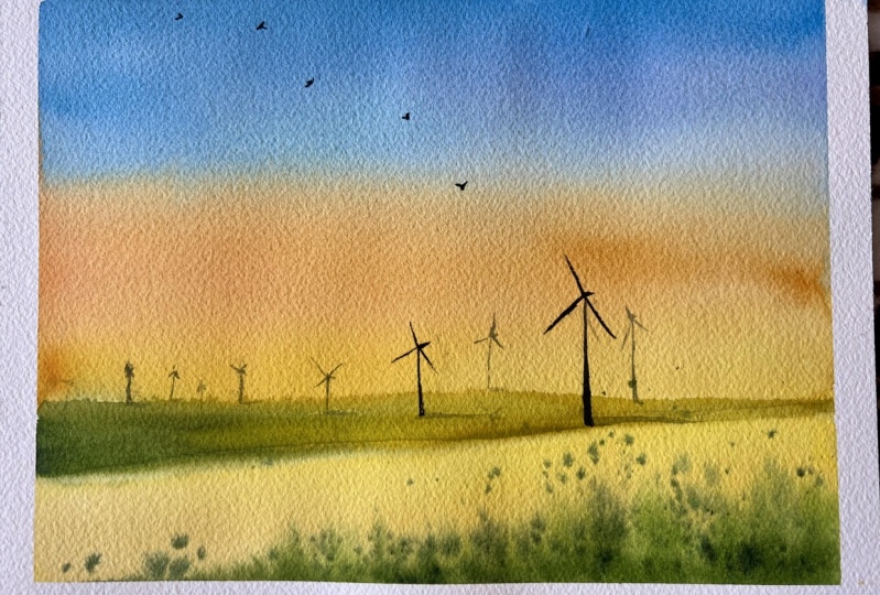
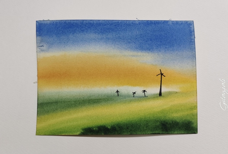
6. Project 3 - Dawn by the Grassland: Let's have a look
at all the colors. This is my centers blue. This is my bar blue deep. Then I have naples yellow. This is my orange. You can mix it with a bit of your opera to get a shade that looks similar
to the one over here. The next is your s
green or yellow green, whatever is available with you, you can also keep some
ink in yellow with you to get the shade
that appears over here. Along with it, you
can have forestry. These are all the
colors which we would be using for this
particular painting. Let's sketch the grassland. I am going to mark a bit above the one third of
the paper. As you see. This is portrait rather
than it being landscape as we need to allocate a
lot of space to the sky. Hence, um, I think just changing the way we place
our paper is most important. When we have more of a sky area, then we will allocate a
lot of space to the sky. Okay, let's just make three
to four slanting lines. And this is basically to show
that there is perspective. These are major
League grasslands, and I would go ahead. After making those lines, just mark a bit of pushes. One done, go ahead and take
the backside of the paper, apply a lot of water, and then stick it to
the acrylic board or any other board that
you have with yourself. I will add water on both
sides of the paper. That is on the top side, as well as on the bottom side. Swatch both ways. That is your straight, as well as your cross. Once you are done with the
straight and cross swatches, you already know that
all of the paper is being covered and there is no place that you
have left empty. 90 to 95% of the painting that we are doing is
mostly wet on wet, except maybe one or
two smaller details, which is wet on dry. I would just pick up
my size four brush and then start adding
my naples yellow. This is naples yellow deep
from the brand Sennelier. You can go ahead with any of the other naples yellow
that's available with you. I'm in love with this color
for quite a few years now, and I have been using it
in many of my paintings. If you are someone who has
not come across this color, it's a very interesting shade. It doesn't react with
blue to give you greens, but always do try your colors on a
separate sheet of paper. As I say, it's good to try
your colors rather than coming back and getting some muddy mixes which you do not expect in your painting. I will make some opera with my orange and some
yellow to get a shade that looks more orangish and start applying it in
few of the areas. Just mark the way I am going ahead and
applying my colors. You will see some
of them are mostly horizontal strokes and some of them are even side strokes. You will see that the
clouds are directional. Now, directional cloud is
something that I must tell you because directional
clouds really, really help you to
understand how to go about your cloud areas or particularly clouds
are placed in a way that it looks
like a direction, so it comes from the right
and moves slowly downwards. While you come more
towards the bottom area, you will have smaller
or you can say very, very small kind of clouds, whereas as you are going
away towards the top area, going away from the
horizontal line, you will have broader clouds. That's how the perspective
of cloud works. If you are someone who is like who really wants to
learn only about clouds. I have many classes that
I've already given. On the Skillshare platform, you can make use of
them, and for sure, it would help you
and benefit you even in your future journey
of watercolors. Go ahead and just establish
your yellows a bit more as I see that we have actually covered it
with a lot of orange. Hence I did go ahead and apply
some more yellow, again, mixing some of my
opera with orange and yellow to get a mix of a bit of a darker value compared
to what we had earlier. When you work with
a smaller brush, you can have smaller strokes. As we have used a
lot of our time. You can see about three to 4
minutes painting the clouds. I need to go ahead
and check that my paper is still wet
towards the top area, though this is
100% cotton paper, and it stays wet for a
longer period of time. But if you are using some 25% cotton or 50% cotton
or even cellulose paper, you might have to
go back and check the paper very well before
you apply any of the colors. I am going ahead with my cobalt yellow deep
and serneus blue. Now, these are two colors. You can go ahead
with any other shade that's available with you. One can be a light blue, one can be a dark blue. You can also go ahead
with ultramarine. I don't have any problems with any colors
that you are using, that this is more of
a contrasting shade. If you see this is a co shade. So the blue and the yellow are opposite on the color viel, as we always see, hence, giving a contrast in your
sky really adds a lot of depth and understanding of how your clouds
are being placed. I will not mix up the colors to a great extent because I know that I might get
some muddy mixes, so a bit of mixing is
okay, but not much. Make sure that your
colors don't flow a lot. It will not, in fact, because I know that
we have already spent about four to
5 minutes audio. And hence the flow of water
is not that much anymore. Ultramarine is one of
my favorite colors, and even if I'm using
cobalt blue, deep, I would love to add some ultramarine into it and
start off with the top part. We will have some
smaller strokes as we reach the bottom area. You can see that I'm using
size four brush only. It helps me to really control my colors to
a greater extent. You can also switch
to size six brush. It all depends the size of the
paper which you are using. This almost the size of
an A five size paper, you can say, or a bit
smaller than that, but you can also go ahead
with an A five size paper if you are comfortable
using A five size. Mmm. Um I always use a clean damp flat
brush to lift off the colors from the spaces
where I think it is necessary. Now it's time to add some smaller lines as
you see over here, one or two small
lines here and there, and this is the same blue and the Kobal blue
combination that is ultramarine and Kobal blue
combination that I'm adding. Though I will make sure that it doesn't turn green and I really don't want the colors
to turn green or muddy. That's something which I keep in my mind when I'm painting. I add very, very small lines because I don't want to change
anything at this stage. I would go ahead and
start adding my green. This is either an
olive green you can take or a yellow
green or a sap green, whatever green is
available with you. Then mix it with some
amount of forest green and start adding the lines
as you absorb over here. Now, these lines are basically the ones which help
you to define perspective. The grasses which are closer to us will appear bigger
in size and shape, whereas the ones which are far away from us will
appear just as lines. That is what I always
always say to everyone. I have also kept an
area on the left side, which is more yellowish. This is the area where I will be adding more of my grasses. You will observe, like how we continue to work
around with it. Already, this
painting looks pretty much organic and it
looks almost done. But the sky was not the only aspect which
I was looking into. Go ahead with my
darker value of green. I mixed it with the blue
that I've used for my sky. This is what I always say use the colors that are
available on the palette. You can make darker value of green using the blue
that's available. So go ahead, do that, make use of whatever
colors is available. In your painting, so that
none of the colors is wasted. Most of the colors are
very expensive, and hence, you have to make
sure that it should be used very efficiently
throughout your painting. Okay, now it's time to use our rigor brush or liner brush, whatever is available with you, pick up some darker value of green and then start
adding these lines. These are majorly
vertical lines. Liner brush will surely help
you to add these lines. This is yellow inch shade, and hence whenever
you are adding some green or yellow,
it will show off. This is a pretty repetitive
and iterative process, as you see over here, but I will also add a few dots is all I'm thinking
because otherwise, this looks very dull
at this moment, so we might have to go ahead and make some dots in clusters. Hence, it would look
more like grasslands. Otherwise, it looks more
like floral fields. And this is not exactly floral fields which
we want to paint. There will be floral
fields that is also coming up in
one of our projects, but not this one that
we are going to add in. Let's continue to make some
more darker values and try to add lines as you see
me doing it over here. I'm using still the liner brush. It takes a while. It is
an iterative process, not that it just comes
very easy or handy, but continue with it, and
I'm pretty sure about it, you are going to
nail your paintings. I'm going to pick up some
of my orlein and this is the inan yellow colour and
start dropping a few drops. As you see the paper
is still wet and I can continue to work on this is at least 12 to 13
minutes that I have kept my paper wet and I continue to work on
it with my brushes. That's the beauty of
using a mold made paper. This is a fabriano artistico, 300 GSM, 100% cotton. And if you have one for TRV, I'm pretty sure about it
15 minutes to 17 minutes, you can easily work
on this paper, and you can easily nail
all your paintings. I used a clean damp brush to go over my horizon area so that I can again add some more lines starting from the right into the left part. As you observe over here, I am mixing some more. This is more of dry paints, as you see, my paper is wet. Hence, using my dry paints
really helps me actually give a direction to my field or show the perspective
in a better way. I can't continue to have or keep adding water into
my color palette. Then overall, when I
have a final outcome, you will see that the colors
have moved into each other and there is hardly anything that we can do at that stage. We are trying to put a
direction to our medium. We are not trying to
control the medium. Having said that, I understand that many of you might have
struggled even in the past, keeping your paper wet for a longer period of time or
your colors getting mixed. The only thing that I can say
is it will take some time for you to understand the moisture that is
left on the paper. The paper needs to be moist. It doesn't need to have
puddles of water on top of it. That's something I always always say in most of
my audio classes too, that moisture on
the paper is more important rather than you having puddles of
water floating around, then the movement
and the colors will be so much moving
into it that it would be difficult for
you to control at all. Some small orange wildflowers that we add into our painting, small, small ones, as
you see over here, one, two, three,
four, like that. Continue to add it
on your painting, and you will see, that's it. We're not going to touch
most of the areas, and now I have to move on to
the top part where I have to add a few trees so that the horizon line can be
shown in a better way. I will continue to do
that, but before that, I see that the colors have moved into each other and
we might have to go ahead and clean up the space a bit more with
the help of a round brush. Again, I will go to
my horizon line, use my damp clean
brush to remove all the extra greens that have moved till the
top of the sky. This is an important process, and we might have to
work around with it three to four times or five
times till you are satisfied. We start adding
some darker dots of green as you see
towards the top area that is near the horizon
line and then extend it towards the right
with one or two dots. There is cluster of trees
that are put in one space. Other spaces, it would be one
or two dots here and there. Simple easy process. We just have ten to 12 dots
that we are going to add. That's it to showcase the
horizon in a better way. I do not like to
overcrowd any place. Keeping it simple
is the whole idea. We are not only working
with landscapes. We would be working
with skyscape. Winterscape, the
next painting has a beautiful sky which
has snow along with it, and then some misty pines. After that, we are going
to paint a flower. Variety of paintings
are coming up, so you do not need to worry. We are not thinking
about compositions only. Just going ahead with
one kind of a subject. There are multiple subjects
that we would be painting, including some water, et cetera, and everything would
be wet on wet. If you're someone who
has been struggling with watercolors and
wet on wet has been an area where you have
been concerned or you are curious to
know how to nail it, I think this particular
class has it all. Once you take the
whole of the class, you will get to realize
that it has so much to offer after you complete
all the ten paintings, I think you will be in a
position to nail any kind of landscapes or any
kind of flowers, et cetera that you think
you want to paint. I will add some
more small grasses, as you see over here with the
help of my size four brush. This is my darker value
of green that I'm using and then adding some
curved lines on the paper. I'm really happy with
how it has turned out. I would let the
paper dry off and then have a final
look at the painting.
7. Project 4 - The Pastel Sky: Have a look at all the colors. I'm starting with brilliant
pink Opera, compose Opera. The blue is your ultramary. Next is my sap green and Bnciena burnt umber or any of
the darker value of brown. I would be using a mix of my blue and the greens
to create various shades for the faraway misty pines
that you see over here. This is going to be
a very beautiful, colorful painting, so just
hang along and let's paint it. I'm going ahead and just
marking a horizon line. Once I have marked
this horizon line, I would be drawing one more line where the
fence will be coming up. But before that, let's just add a small outline
where we would be adding our trees or the far away misty pins that
you see over here. It's a very simple
and easy process. None of the paintings is
more than 20 minutes. This is real time, and you are going to nil it within
the next 20 minutes. Add a few fences, and that's it. As we go from the
top left hand corner towards the right hand corner, it would become smaller in size. I have kept the
perspective that way. This is more closer to my eyes, and as I go a bit
towards the right, it's a bit further
away from my eyes. I always erase if I'm not happy with my drawing
and then again, go ahead with another
part of this drawing. If you are someone who is not so well versed
with watercolors, this is a class where
you have very less drawing and just go with
the flow is the idea. You don't need to do much, see whatever you observe, let water do its job, go with the flow,
enjoy the painting. Do not think about
the final outcome. You may get it exactly the same the way I have got or maybe it be a bit different from the one that I
have got over here. Let it be. We are not here
to make a perfect painting. We are just here to
enjoy the process. The whole idea of this class
is to enjoy the process. Let creative side
of your take over, and we are here just
to enjoy that part. Go ahead and applying some water on the
backside of the paper. Once we are done applying water, I would stick it to
the board that I have. This is my acrylic boat. I am going to stick to it and then go ahead with
the other side of it, where I will again
apply a lot of water. Before I apply the water, I would go ahead and just
add a moon or a sun. Both of them is good to go as per my understanding
because here, nothing much needs to be done. You have to just see that the final outcome is having
a small white.in it. You can also use your white
gosh to add this dot. I have used my masking
fluid over here and let your masking fluid dry off before you add any
water to your paper. That's how we
always go about it. Why masking told
should get dried off or else the brushes
might get affected, which we don't want in the
whole of the journey of watercolors that we are picking up in this
particular class. I always do crosswatch. Crosswatch helps me to have an even layer of water on top of the paper rather than having very skewed kind of water or puddles of water
here or there. I'm mixing my brilliant
pink with some of the opera and start applying
on the top part of the sky. Brilliant pink Opera, compose, opera, blue, in terms
of ultrame, et cetera. These are the colors which
I'm going to use for my sky, and there will be some places where I would be
leaving it in white. I love to keep a few
white spaces for my sky. You will observe it in
most of my paintings, even in the painting
that we did last, which was all about grasslands. We did the same process. Okay, going ahead and just
marking my darker values, adding it, I'm using
my size four brush. You can also use
a size six brush if you are using a
five size paper. It's a very important process to start with the
lightest value and then go ahead with the
darker value like your blue, but also in the
lighter tonal values, that is basically having more of water and less of pigments. Now, this way,
what you can do in watercolors is you can
keep it transparent. Watercolor has its own way
of showing up or it has its own way of
having that vibrancy if you keep it light
with the tonal values. And as you go, of course, into the painting more and more, we will apply the darker values. I sometimes do pick
up the colors from wherever it is necessary with
the help of my damp brush. This is an important process
for a wet on wet painting. I have none other way to pick it up or else you can
also use your tissue. Tissue sometimes
leaves some marks because of which I
like to do it with my paint brush that
is damp in nature. Going ahead and
adding some more of my darker values
towards the top area. I see that the water is becoming lesser and
lesser of the paper because of which we
might have to move fast after this while
we add our blues. Let's go ahead
with the top part. Now, I'm starting out with
some of my purplish color, that is the blue and the
color of compose opera, I am mixing it and then
applying in the top part. You can also go ahead with
Kobarblue or ultramarine. Both are good for this painting. I have not considered much about what exact blue
you need and all. Believe me, that's not the idea. As I always say, this
particular class is only about flow enjoyment, and having an outcome that
you are super proud of and not thinking about all the difficulties
in the process. Watercolors is all
about enjoyment. The more you enjoy,
the better would um, I would say the
theming that you have while you complete a
painting is something that's more important rather
than only thinking about the final outcome or how
this is going to turn up. I apply a lot of water if
you see, I let it flow. I don't think much about, Okay, it's going down
or it's going up. I have always a damp
clean brush to take off the extra colors
wherever it is necessary. Go ahead with some of my
brilliant pink again. Mixing it with some opera and then applying
it if even need be. I don't like it the way I
don't like it right now, I don't think that I really
like how it has turned out. I would go ahead and blend
a bit or some parts of it. That's absolutely okay to do when you are not
happy with something, maybe the top area, so it's all experimenting. It's not about having the exact outcome that even
if you are copying from a photo or you are going ahead and painting from a particular scene that's
in front of you. Never try to copy. It's always from the eyes of the artist, so how you intercept it, how you like to portray it, or how you like to bring
it to life in front of your in front of various people who are observing it, that's most important. And hence, whatever you paint
really doesn't matter till the time you are
satisfied and you know this is what I wanted to
bring out in this painting. And hence that becomes the most important
aspect in watercolors. I've gone ahead and added some darker values
of my compose opera, and now adding some more
blue towards the top area, you can see that now the
blue has become really dark. I'm going ahead with some more of this darker
sheet of blue. This is the darkest
value of blue that we are adding
and then blending it with the pink that is there
towards the bottom pot. Right now, this is my size
six brush rather than it being the size four
brush. Blending is great. Wet on wet is a lot
about blending. Believe me, blending is the key. You want to tilt the paper, you can go ahead
and tilt the paper. I would leave the
decision up to you. I did not tilt this
particular painting for sure. I just left it as
on my, um, table. Now it's again time to pick
up some of the colors from a few of the areas where I think it should
be left in white. I am using my damp brush
to do it and again, wipe it off on this clean tissue that I have on the left side. I always keep a
tissue very handy now adding some of my pinks and
some of my bluish purple. On the bottom area, as you see over here. Once this is done, we will go ahead
with our misty pines kind of the outcome
that we want. Believe me, that's one of the best things that we have
added in this painting. It is a highlight of the
whole of the painting. I never thought initially, that you can mix so many
colors and paint this one. I also pick up my paints
with p of my fingers. I do everything
possible, paints, water, et cetera,
then use your tissue, use your hands, whatever is available with you
don't think much, but your hands needs to be clean if you are doing
anything like this. I'm going ahead and mixing some of my greens with the blue that's already available
on the palette and adding a few small spar dot. And then these look
more like lines. I will just keep adding and mixing some of
the other colors. You can also mix some olive green or brown into it and get a darker value like the
that you absorb over here, and then again, start
from the right side. Mixing your colors is very
important on the paper, and this is, believe me, one of the best
things that you can do in wet on wet technique, mixing the colors on the paper rather than
mixing it on the palette. I love this idea when
we are doing wet on wet rather than doing wet on dry because mostly
in wet on dry, you have to mix your colors on the palette and then pick it
up and use it on the paper. So this particular part
really remains a highlight. Mix your colors,
use some more blue, use some more greens, create your own colors, mix a bit of brown, mix a bit of olive
green, if you want. So that's all mixing
the colors and then just adding a few
lines like structures, small lines, which will look like misty pines in
the faraway land. Once I've added
these smaller lines, I will go from the
bottom part and just move from the left
towards the right, and then just add
the colors in a way, pick it up with my flat brush, as you see over here, and then again, pick
up on the right side, make a few long lines, as you see, and I just
extend it a bit to make it look like they are
pines in the background. I am not giving it any shape. It is getting blended with the background because the
background is still wet, not exactly having
puddles of water, but it is damp in nature. Damp and moist is all we need
at this stage of painting. I just even out the
bottom part or the edge of these pines with the
help of my flat brush. So browns, again, in few of the areas where
there are greens, they will automatically
blend with each other. You don't need to do much. This is just to add the depth and some different
blend of colors, as you see me doing in
most of my paintings. I'm to work on a
foreground a bit more. The colors have
turned really light, so I would like to add some more colors
into my background, going ahead with some more of my bicker brush
and then blending it with the background area, picking up some blue and adding it on the bottom
left hand corner. And then, again, blending
it with our pink shade, blending it, blending it, and blending it.
That's how it is. I will be using my brown
for my um fence area. This is basically
some burn Siena, and then I would be mixing
some yellow also into it. You can also go ahead with
only some burn siena. I would leave that
decision up to you. Once this burn siena is done, we have to again go over it
with a darker value of brown, either at bond umber or any of the other CPR kind of color that you have
available with you. Every brand actually
manufactures different kind of colors, and every color is not Um, I would say that every pigment is not in line with each other, so you might have
to see the color that looks exactly similar to the one that I am using over here and then
go ahead with it. Adding some more burnt sienna
from the top to the bottom, as you see over here, making the lines shorter as
you go towards the right, adding some dots here and there, the paper is still
wet, they will move. I mean, the lines will
not remain as lines. They will become
a bit more blur. That's absolutely okay. Add some more of the
dots here and there. Once you have added the dot, we might have to go ahead
with one more darker color. But before that, I think some more lines is
very important for the misty pines
because these pines look lot like they
have become really, really blur, which I don't want. Some of them should be defined, one or two of them
or three for maxim. That's all we are looking
forward to in this painting. Add some more line
like structure. That's all. This
is with my You can use a rigor brush or else you
can also use a liner brush. Whatever is available with you, do not think much about what brush I should use,
how it should work. You can also go ahead with a zero size brush if you don't have the brush
available with you. I'm picking up the
colors and then just taking it a bit
towards the top. That's what I'm doing. I am not having much of
colors on my brush anymore. It's just picking
up the colors from the bottom and just pulling
it towards the top. This approach is very common. I have removed the masking fluid now and it looks so nice. The paper has almost dried
off going ahead with some of my darkest value of brown
and adding it over here. I hope you have
enjoyed this painting because this is one of
my favorite paintings. Again, the colors of the sky
has my heart completely. So yes, keeping the other
parts very minimal. The next composition is
going to be of flower. I am not thinking much about composition, skis or anything. We're just going with the flow. The class is all about
enjoying the flow, enjoying the spontaneity of
watercolors, enjoying the um, I would say the happiness that
watercolor brings to you, the joy of painting is something that I'm
looking forward to always. Do leave me a comment in
the discussion section. If you have any
questions for me, I would be more than happy to
go ahead and respond to it. If you are someone who is
also leaving a feedback, I would be so grateful to you and I would love to
read through it entirely. Just adding a few more
lines here and there to show the dry I would say plants, which usually happen in areas where there's
a lot of snow. That's all, and then
have a final look at it. Let the paper dry
off completely. We are going to start out the
next painting after this. Blending the bottom area
a bit with the help of my size four brush
because it looks more like lines and we
want everything to be soft and simple in the
whole of this painting, Blending it with the help
of the size six brush now.
8. Project 5 - Soft Poppy Flower: Let's have a look
at all the colors. It's Indian yellow,
John Brilliant number two, orange, quinacridone coral, then as compost opera, may green, sap green, forest green, and tromini. These are all the shades that we need for completing
the painting. Any colors that is
closer to the one which I'm using is also
good to go ahead with. I will start out
with a small circle, and once that circle is done, we will just carve
out two petals. This is majorly any Poppy, which is seen from the side. You can also take it as
an abstract rose or an abstract poppy or
any of the florals, which is more on the red side, I can, of course, serve as
more of an abstract part. Why I say abstract Because we are doing
everything wet on wet. And when it is wet on wet, the colors do move into
each other because of which all the features of the poppy is not seen very well. But overall, you can understand, yes, this is a beautiful poppy, and it pops out beautifully with its color of red or
quinacridone coral, orange, and compose opera. I'm overall excited to actually show this whole
of the painting to you as I feel that this is a composition which we
haven't touched at all. This particular class is not bound by any kind
of composition. We are just going
ahead with the flow. Whatever we like, we
would be painting. Sometimes it can be clouds. It can be just some
floor or fields. It can be some water body, anything and everything
under the sun, we can go ahead and paint. Though it is just ten
days because of which I could not touch upon
a lot more subjects, which I would have loved to do, but that's absolutely fine. We can do it later on in one
of the other classes, too. I'm going ahead and making
some line like structure. You will see that these
are basically wildflowers which usually happen
to be there in um, wild grasslands or any kind of places where there is
more of wilderness and less of only thinking about the nature or it is not
completely man made. It just happens on its own. I always say that something
which is controlled by man is very different or
human beings is very different than the one which
just appears naturally. Let's continue to add
some more shape and sizes for these wildflowers. I know Poppy is
important and we are going ahead and marking
out more of these lines. You can also add these lines
later on on the stage. You can add it now. I would
leave the decision up to you. You can see on the right
hand side, top corner, I have a may green which I
did the takeout for my use. This is a very, very important green for this
painting altogether. It has got the lighter
yellowish kind of tone, which we usually don't see, and it's pretty
vibrant and brilliant, which adds on to the
beauty of the painting. Let's now start
wetting out our area. I'm going ahead and wetting out the backside of the paper. Once I'm done with
wetting the backside, I would just leave
out the area of my floral and then
wet the entire paper. There are so many ways
in which you can paint. Sometimes it can be pouring, sometimes it can be just
by wetting the paper. Sometimes it can be play
of light and shadows. Here it would be a
lot more about light. That we will add
into the painting, but not much of shadows
that we are going to do. It's all about the light and the darker values are
basically towards the bottom, which is a shadow
and the depth play. Everything will be more in an abstract and loose way
the way an artist sees it, rather than it being the way I would say anybody
would like to paint. It's not a realistic
painting altogether, but it's something
that is close to the way an artist
would have a look and feel of any floral
that he observes and want to add it or
want to actually paint. It's my way of showing it. You can, of course, use all
these techniques in any of your future paintings where
you are painting a floral, and I'm pretty sure about it. The people who are watching it will obviously fall
in love with it. Uh I'm starting out
with my Indian yellow. You can see that this
is the Indian yellow, which I'm adding on the top, as well as on the left side. Once I've added it,
I will go here with my John Brilliant number two and just mix it in and around. It would be absolutely in a loose way that I'm
adding all these colors. I'm not thinking much
while I'm adding it, this looks more like
any skin color that you might have in your palette. If not, then yes, you can also make this kind
of a shade with adding a very little bit
amount of orange into your I would
say naples yellow. And you will get a sheet that's similar to the one which
I'm adding right now. May green is very
vibrant and brilliant, which we are adding
to our painting. And I would say that you
have to go ahead with a very with an approach where you are in and
around the flower, you are adding mostly
these yellows. And after that, when you
go to the right side, you are going ahead and
adding some sav green. Even towards the bottom, I would go ahead and
add some forest green, so all of it, of course, stays. But first, let's go with
our lighter values. We can always add the
darker values at the end. Let's move on and let's add
some of our sap green now. This is a bit more
darker value compared to the ones that we have added
till now to our painting, going to the right, and again, adding it on the right side. You see that I go very slow
with my painting process. I just have a lot of water
still there on my paper. This is because we did wet
both the sides of the paper. When you wet both the
sides of the paper, yes, you are going to have this
kind of a situation where you can really play with your colors for way
more longer period. I will now add some burn
sienna, and in some spaces, I will start mixing
my forest green. This is the darkest value of green, which I'm going to add. I'm using my size six brush to add all
these colors because these are more like big blobs of colors which I want
to go ahead and add, and they should mix up with your other shades that you have already
applied on the paper. You can also go ahead,
tilt your paper a bit here and there so that
gravity automatically doesn't work and just gets you some more of the
mixing of colors easily. I will use my line of brush now and start adding some
of the darkest of the values and smallest of the spaces along with some
may green that you see. Yes, mixing the colors, blending it well is
very, very important. And hence we are working on that piece pretty strongly
wherever it is important. I am now going ahead and adding some lines as you see over here. This is the forest green
as you see, some lines, these are more this will become
very blurred these lines. And maybe after this, you have to go with another
layer where you will have more or less
blurry lines coming in. Some of the spaces, of course, you see that the
blending is not even, and we might have
to go ahead and use our bigger brush to blend
it a bit more evenly. Let's go ahead with our liner
brush to add some lines as you observe and these lines are becoming more
and more blurred, they will become really blurred. That's absolutely okay. Just adding lines
is more important. At this stage. You can always think about having the
perfect lines at the end. These colors that you absorb
will become really light as at least one or two shade lighter once you
have it dried off. So make sure whenever you are adding the colors,
they are not really, really light that you might
have to go ahead with another layer for the background before you start with
the whole grounds. Now adding some lines
with Bern sienna. You can mix some
green into this burn Siena to get a darker value. It's absolutely okay. Mix and match whatever
colors you have been using. No need to always pick up some new colors
from your palette. This is something that
I have realized very much that just change
or mix your colors, and you will get a outcome that looks pretty nice,
vibrant and beautiful. Let's go with
somewhat darker lines of brown as you see
me adding over here and then extending it a bit more above the floral that
we have already added. I think this looks
pretty beautiful now. I would like to now focus on my foregrounds rather
than only the background. This is the darkest value. You can mix your green and your ultramarine to
get a color like this, or you can use any color
that's available with you. I'm really not a
person who would like to actually get a lot
into the color part. Whatever is available is great. Use it to your advantage. No need to buy new colors, something that is
closer to the one, which I have is good to go. Now it's time to focus
on the foregrounds. We are starting out with
our reddish kind of shade. Now, what is this reddish shade? Of course, it would be our
beautiful quinacrodon coral. You mix a bit of yellow in it, and you see how
beautifully the colors or the shades move
into each other. Great. Let's continue to
work with the colors. That is, again, some amount
of quinacridone gold. And we would be adding
the darkest value as compose opera extended. This is size four brush, which I'm using to
add the colors. They might bleed at some spaces. Do not worry. Bleeds are good. Bs are good, at least for
this particular painting, it's wet on wet. Let's go with the flow. It's spontaneous and spontaneity is something that's very, very important for our painting. Let's continue with the floral. I'm just extending
the darkest value a bit more towards the top. I go very slow in this process because
foregrounds are something that's very important to us and we have to focus
a lot over there. You can go ahead with
your darkest value. That can be your
purple or it can be also any kind
of neutral tint, et cetera that's
available with you. Extend it towards
the bottom area. If you are not happy, just
the way I am not very happy, after seeing my stem, you can go ahead and just remove it with the help of
your flat brush. I will do it for sure because I'm really not happy with
how it has turned out. It's become too, too dark, which is not what I
would really expect it. Yes, damp brush is
always good to pick up any kind of colors that you
want to pick in the process. Mixing some amount of
light green along with it. I still you are
not happy, again, you can pick up the colors
as you want and then go ahead with another shade, which is up to your liking
and add it to the painting. You can see I have
removed the color from the entire space, and now again, I'm going ahead with
my darkest value only, but slowly I'm adding it. And this is a bit more
on the green side. I mix some more amount of green. That is my porous
green. Okay, great. I guess, this looks good. Let's just add some
more of these lines. Now, these are mostly
wet on dry lines. Most of the places are dry as I see or maybe way less wet. It would be damp or moist, compared to the wetness that we had initially for
the backgrounds. Background wetness is always
more or the background, I would say the
wildflowers that you want to add have to be or wild bushes whatever you want to
add will be way more um, hazy or you can say blur compared to the one
that you add over here. Going ahead with a lighter
value of orange and leaving some white space between
the petals of the flower. I will extend the
color even towards the bottom area as you can see if there is
some blurry effect, let it be, we can clean
it up with our brush. That is your wet damp
brush, and then again, go over it with some darker value of green
to create the background. The background is still wet. Hence it's good to work over it and you have good amount of chances that the outcome
would be pretty blurred. Which makes it look
like wet on wet. Okay, let's go ahead
and again start adding some of the
colors, darkest value, as you see, and
then adding some of Mquinacrodone coral
in few of the areas. You can also make
some amount of opera, that is your compose opera, if you don't have
quinacrodon coral. Even red is good to go ahead
for this kind of a flora. Cleaning up the edges with the
help of my damp wet brush, as you see over here. Now it's time for the beautiful green that
we will go ahead and add. But before this, let's just add some more
of our darker values. You can use a neutral tint. You can mix the
green with some blue to get a darkest
value of colour. You can also mix
some amount of green with any compose
opera that you had. You need to just experiment
with your colors and see whatever best dark
color that you get and work around
for this painting. And Adding colours and picking up the colors is pretty normal in wet on wet process. You should not
worry on that part. Just go ahead and keep
picking up your colors. Once you have picked
up your colors, you want to add the greens, you can always
switch your brush to a smaller brush and
then go ahead with your darker value of green that we are going to
add for the backgrounds. As you see over here, I've
already added the green. The paper was wet, and hence
it is moving and flowing. I'm picking up
some lighter value of green and then
blending it with the darkest value of green that we have udy added over here. Let's add some more
of a darker value to the foreground petal. As you see over here, this is more like a very, very dark value and blending it with my colors that I
have already applied. It's easy. It's mostly a very simple and sorted kind of poppy that you want to paint. Now, let your paper dry off, and once it's dried, we will start adding some white flowers. This is with the help
of my whitewash. I will just add some
dots in clusters and make it look like white
flowers for the background. Adding the white flowers is like a pretty iterative process, so you have to go around
with it many times. And since I hope you
have enjoyed this video, it is very different from the one compositions that
we have done previously. I, all the four compositions
we have done previously, it's very different from that. We are going to go ahead with some further beautiful
cloudscapes, some water, et cetera. So hold on, and more updates will be coming up
very, very, very soon. I'm excited about this class, as it has a lot to offer and hope you are
also enjoying it. Do write back to me in
the discussion section. If you have any doubts, I would be more than
happy to solve them. Once this is done, have
a fine look at it, and do let it dry before you pick up your paper from
this acrylic board.
9. Project 6 - The Evocative Sky: The colors for this painting is any yellow or John
Brilliant number two. You can keep Indian yellow, orange, some quinacrodon coral. Then you can go ahead
with paints gray, sermsblue, koba blue deep, burn Sienna, some yellow green, then some sacren and forestry. These are the
colors that I would be using for completing
my painting. Whatever colors are
closer to the ones that you see over here are
good to go ahead with. We start by adding water on
both sides of the paper. First is the back
side of the paper, and then we will add
on the front side. You will add water throughout
the back side and then place it on top of
the acrylic board, and it will stick to it. Once it is done, we will start
out with the actual site. Now, on the actual side, I would be painting
my sky first, and then I would be
moving to my bottom part. This is the first
painting where we are not going ahead and painting
the entire part. So we will move
from top to bottom. That's the idea how
we go about it. Leaving out the space which
is majorly for our mountains. Once you have added good amount of water on
the top part of the sky, just have a look at the
sheen that you get, and you can always tilt your people exactly the
way I'm doing over here, look at it, how the water flows. All the extra water, you need to take it out or
pick it up with the help of your tissue from the
ends and make it even. Once that is even, we
will start out with our lightest of the value
that is a mix of orange, yellow, and some amount
of our inacrodon coral. These are the colors that I would use for the
lighter values, but this is a mix that
I would be doing. It's not that some
of the places might appear more lighter
because of the yellow being a bit more than the Quinacadon coral or the
opera that I had into it. And some of the
places might to a bit more lighter and value. So these all things are basically change of
values which you are going to absorb very much in the whole of
the sky painting. This is particularly
a sky painting. If you are someone
who is in love with skies and really
want to paint skies, I have many of my classes
where we are just painting incredible skies within ten to 15 minutes of your time. So looking forward to you guys to join
those classes, too. Overall, I have 54 classes
available on Skillshare, which makes it even more easier for each one
of you to go ahead, pick up any subject
that you want. I have literally
covered everything under the sun that
is possible for all of you to just make good use of all the resources
that's available with you. You can see that
I'm adding more of yellow and making
it lighter in value compared to the other shades that were oldier more darker. I continue to add more
and more colors as we progress towards the bottom
part of our sky area. I'm not going to fill out
entire part of my sky. You can see there is a lot of white spaces which I have left. This would be more with the cobalt blue that I would be going ahead
and adding it. So this is the bar blue deep, which I would be adding
for my sky area. You can also go ahead
with ultramarine if you are someone who is in love with ultramarine just the way I am, though I haven't
used ultramarine in this particular case. I'm mixing some amount of my do weariable pink on the palette and this pink is nothing but the brilliant pink which we have used in one of our
audio paintings. I'm adding my size four brush to add all the colors to my sky, as you see over here. Some of the portions are
already getting done as you see that some of the portions are really not shining anymore, and there is less of
water that's available. On the paper, we have
to work really fast at this stage and continue to just look at the finishing part, which is majorly the blues and some amount of neutral tint
that I would go ahead and add I am using my cobalt blue deep as I did
even tell you earlier. I am mixing again some more of this shade and just adding
it towards the right side. Now, there will be
more spaces where I would be adding
the darker values. As we go towards the bottom, you have to make it lighter, so either you add more amount of water or some amount of
iranium blue into it. Whatever blue basically
is available, either it can be royal
blue, erleium blue, any of these blue,
that is lighter and shade that can be added pretty
easily into our painting. Some more lighter
value of blue towards the bottom part that
you see over here, I'm going ahead and
continuously adding now mixing my neutral
tint with orange, yellow, whatever was available. I'm good with it. I don't mind mixing my
colors as it comes, but I may go ahead and just add some more
amount of neutral tint. You can also use Pains gray if you don't have neutral tint. It is also great
to start out with your shades that we
are looking forward to mix it with a bit of orange
as you see over here so that they can be
controlled to an extent. Now, the colors the paper is
already becoming really dry, so the colors will not
move much as you see, and hence you have to work around with it
very, very quickly. I did tell you even this
particular part earlier, if your paper has
already dried up, leave it, do not try
to work over it. If you work at this
point in time, it would give you
dry patches which we don't want in a soft
painting like this one. I'm adding somewhat
darker value compared to what we did add audio, and now I'm just dropping in one or two dots
here and there. As you see the dots and drops
coming in to our painting, they do not move a lot. I did, like, oddly tell you that my paper is not
dry much anymore. Hence whatever I'm adding or whatever I'm doing
will not move a lot. We have to see we are
not adding any kind of patches in the dryer section. So make that point. And I think rest, we are good to go ahead with. If you are someone who still wants to add some more colors, I would say, I can
very well see now. It is absolutely patchy. It's no more soft. You can use a very dry brush. I will tell you how exactly you can do the movement.
It's very easy. I will show you how you
can help to actually displace your colors from one particular
portion to another. First, let's go ahead
and add some blue towards the bottom part
from where we have removed some amount of darker value of the brown
that we did add earlier. Cool. I guess I'm good with how this
painting has turned out. Believe me, I do not
want to touch it more, and I will not be touching
it to a greater extent. Only a few parts here and there where there should be some
more of darker values. That's all, and then we
will leave it as is. Now, the darker that we did add odio has become a
bit more lighter, hence some drops
of darker values. Now, as this was the last portion which
I did paint, hence, there was still some amount
of moisture that was left on the paper compared to the other parts which
we did add odio. You can of course, see that, yes, the colors are
not moving much, and I'm just trying
to blend it with the colors that are available
in the background shades, just adding some amount
of opera into it. This is like a bright color
that I'm trying to get as a transition that is darker to lighter value is
basically my transition, which I want to show
from the top for my orangish kind of
shade that you see, and the other shade, of course, has to be lighter in value
that is on the left, which is majorly my dark
clouds that we usually see. Okay, great. Now, I will show
you something like this. This is a round
brush which I have. I use it. It's absolutely dry. I use it for displacing some
of my you can say pints whenever I feel that
it is necessary or I'm getting some dry
patches that I don't want. I displace it like this. So of course, this is a
trick that I can tell you, but there is no
guaranteed results. Believe me, sometimes it works. Sometimes it doesn't work. So there is no best way that I can tell you that this is
going to work for sure. And so it's just an experimental
way to go about it. You may get lighter values also. Which may look great
as an accident, which may not also look great. I always say this
in advance that whenever you are working
with watercolors, there are so many
accidents that can happen. You may like it, you
may not like it. It might not be up to your
liking at all altogether. Okay, going ahead and
adding some brown, as you see over here, and then making the
brown move a bit, adding some more of
the darker values. Once the darker
values are added, we will clear out the space with the help of our flat brush. Adding some bonsienaO course, the bonsiena is very
pretty, which I have. And hence, it also moves a lot. If you want to make
your colors move less, I would say one of
the important brands that you can look forward
to is Megalo Mission Gold. All the colors don't move a lot, and hence you can
control it very well. If you are starting
out with watercolors. This is a great brand
to move ahead with Windsor and Newton professional red colours also move a lot, and Senior is in between
Windsor and Newton. And Migallo vision goal. So somewhere or the
other, if you want a lot more movement in
your colors in the water, then you can go with Senlio
or Winsor and Newton, that is professional d. I haven't used much of the
student rate Winsor and Newton. That is the Cotman colors. Hence, I will not be in the best case position
to tell you about it. But for the others, of course, that's whatever you want to choose the way you
want to control. But for me when I'm a big noo, I always love to go ahead
with Migelo Mission gold. I'm using my yellow green
colour to cover out the green patches that
you see over here. Once the green
patches are covered, we will just blend the colour with the brown that
we have Audi added. I would be also adding some
amount of darker green color. It can be our sap green
that you see over here and blend it with the yellow
green that's Audi there. Once we have added on the right
side, that's a sub green, I would go ahead and even introduce the color
on the left side. I will blend it with a yellow green that's
already been added. You can also add some
amount of forestry into it and blend it with the
bottom part on the right side. I would leave that
decision up to you. Sometimes this sabgreen
I don't like to greater extent because
it is a bit Um, I would say non transparent. I feel very strongly compared to my other sheds which
are more transparent. Watercolors is all
about transparency. And if I don't get
that transparency, I sometimes get a bit bumped. But overall, it worked
great in this painting, and that's what matters the
most at the end of the day. The painting should
speak to you. The painting should
speak your mind. The painting should be
creative as you want it, and the final outcome should be as what you have imagined. Now, this is from the
eyes of an artist. This is from the eyes of
how I see my painting. You may have a very, very different view of your
painting altogether. Every artist has their own way of representing
their own paintings. I'm now adding some more of my darker values of greens
as we go towards the bottom, I'm using the same palette and picking it up, just adding it. On the left, also, I have added some of my greens as
well as on the right. Adding the greens as you
see over here and then blending it with the
browns that is ody there. I will just blend my
green into the brown and then add it a bit towards the inside as you see over here, trying to blend it in a soft, natural way rather than
not keeping it natural. Something that I have
learned over time is that keeping it
natural actually makes the outcome look we
more attractive and nice. So adding some more of our darker value of green
towards the top side, the browns are, of course, great, as I see. So yes, I feel some more of my brown is needed just to blend that green
into the brown, and I am again trying
to blend it totally. I will add some of
my darkest value of green and just add it
towards the right side. This is an iterative process. Believe me, the best case
scenario where you have the best blend and the best outcome may not
be possible altogether. At some point in time, you
have to really stop and just think that this is what I
expected out of this painting, and this is what I have got. So that's one stage where
you should go ahead and reach to feel satisfied
altogether. Okay, great. I think once this part
is completely done, we will go ahead and
just add our mountain. This would be in the blue shade. You can go ahead with the same blue that you
have added for the top part of the sky or even go ahead with a darker
value of koba blue, mix it with some amount
of your neutral tint and get a shade that looks more
organic or greenish in shade. And that is on the
darker side, of course, it is a faraway land, and hence I wanted to
make it more darker. You can also make it lighter. But for this
particular painting, we are making it as a contrast. Our sky is light. Hence, I will try to keep my faraway lands a
bit more darker. I am picking up my size
four brush to add it, mixing it with some
amount of our green. Now, this green is basically my sap green that I'm picking up along with
some forest green, mixing the colour as we want and then extending
it on the left side. So that's what I will do. I will paint the entire part of the mountain and then
we will remove or just blend some areas which are appearing as not as
feels altogether. They look more like they
have blended together, and I don't want the
blended together look. Hence just use your
flat brush to pick up the colors from any of the spaces where you
think it is necessary. I'm to pick up the color, as I did tell you even earlier. This is a damp, clean
brush that I use very often for picking up my colors from wherever it is
necessary. Okay, great. I guess this is how the whole
painting has turned up. I hope you are happy with
J six. It's a quick one. Like 15 to 18 months is all you need for
doing this painting. There is not much
of your drawing, et cetera that we are
also doing over here. It's just a very
simple painting. Going ahead and
adding the clouds and then our land and some bushes
for our faraway background. These are basically far
away trees or bushes, whatever you want to say, one or two drops here and there. Since the paper is wet, they will blend into each other and look more
like far away trees. Great. Have a fun look at it. Do not allow your
water to get into the painting and hence
avoid any backgrounds.
10. Day 7 - A Simple Landscape: Let's have a look
at all the colors. The first is my royal blue. Next would be ultramarine. You can also keep some
amount of purple, naples yellow,
orange, yellow green, olive green, forest green, and you can keep neutral
tint for your windmills. So that's it from the
colors perspective, which we need to
complete this painting. Today we are going to do
a very simple sunset sky. Along with it, you will
understand that I'm going to draw only a few lines
to mark the bottom area. There are two sets of
highlands or grasslands, which we are going
to show over here. And once that is done, we are going to just add a few you can say
windmills. That's it. Once the windmills are done, we will go ahead and
start adding the colors. The major work is off blending. Now, why I see blending plays an important role in this
particular painting, there is a lot of blending that we are going
to do for the sky, as well as for the bottom
area of the grassland. I hope you will
find this painting really simple and
easy and it is very, very big nerve friendly for anyone who is struggling
with watercolors, this is the first painting
that they can go ahead with, though you might think that
I have level down again, but it is just to
give a quick break from wherever we
have been till now. Let's just make three
blades of the windmills. This is the modern day
windmill that I'm adding. I will add two or three
more of these windmills. You can draw them at
this point or also just draw a similar or simple
lines and weave it. As we progress, we will just
go ahead and add more of the lines or you can say more of the depiction of this
windmill in a detailed way. I will go ahead and wet
the backside of the paper. Once I've added on the
backside of the paper, I would go ahead and even add water on the front
side of the paper. Now, this is to keep the paper wet for a
longer period of time, and you will get more time
to work on the painting. Oh We are now on the front side. I have used my washbush to add the paints on top of the paper. You can see that slowly
I'm going ahead and adding some bits
of my water on top of my paper and just doing a cross swath so that there
are no spaces that are empty. Et's start out by selecting the colors that
you're going to do. I would go ahead with
my naples yellow. This is basically for the
bottom part of my sky area. As we go towards the top, it will become
orange and then it would be the blue
and some purple. It's going to be a very,
very simple painting. You don't need to worry, go ahead and start
blending your colors. If you are someone who
is facing even a bit of a challenge with watercolors
regarding your skies, what you can do is you can
have a small eraser or any of the other item under
the top part of this acrylic board and
see that it is silted. What would happen
if your board is dirted your water will
move into each other, and that would
help your pigments to really mix well
with each other. You rather than doing more
of this blending work, you can focus on just
handing the colors, and the blending will
happen on its own with the help of the
gravitational pull. I'm going ahead with the
lightest value of blue, that is royal blue. I love this blue. You can also use illium blue. If this blue is not available, it will go darker and
darker. As we progress. But for my first layer, I have gone ahead
and added this blue. It will never mix
with your yellow or this orange to give any kind of muddy mixes.
That's the best part. Now I'm adding some amount of my ultramarine,
as you can see. Ultramarine is a
granulated color, which usually helps a lot. When you add these
colors to the paper, they just granulate well on the paper and show
a beautiful outcome. There was some
mark that came up, so I had to remove
that and maybe have to again go ahead and blend
the colors a bit more. Skies are something upon which I have already given
a lot of classes. If you are someone who
really wants to paint skies, I would request you
guys to go ahead and watch out my other
classes on skies, there are skies, where we have gone ahead and
painted for 14 days, then there is some seven
days, three days, four days, five days, There's multiple sky classes
that I've already given. And most of them are
bringer friendly. So please go ahead
and look out for these classes where you can
really, really learn a lot. Mixing some amount
of purple and then blending into the blue that
we have already added. I'm going ahead and again, adding this royal blue to
keep the blend similar. And with this process, you can see that the colors
will move into each other rather than staying at a single place and
not displacing much. Another thing that
is important for any color if you are
struggling as a big nurse, you can see the color
choices that you make. If you love to work
on bigger paper, you can go ahead with colors
like Windsora Newton or any of the other shades
of QOR or maybe canalia. So these move a lot on paper
compared to your colors like Migalo Mission Gold or maybe some other few brands
which I have used there. Movement is a bit lower. So there are two parts of it. For me, it becomes
really easy to work around with them as
they don't move a lot. Hence, I don't need to worry if I'm working on a smaller
paper or a bigger paper. But if you are someone who is struggling to get the blending, then I can always suggest go
for colors that move a lot, you can easily get the blends. Go ahead and add some
yellow or yellow green on the paper once done
at the sub green. And then blend it with the yellow that you
have Audi added. You can also add some blue
like I am adding right now, and this is basically the
same ultramarine blue that I'm going ahead and adding
into the background. Now, the left side is majorly the glassln area
that is far away, and I'm going to make
it darker in value. Let's have a closer
look at this painting, and you can see that on
the right side as I move, it would be lighter blending that I'm going ahead with,
and on the left side, it is a bit more darker, or it has more of the blue content with the
darker value of saprem. I would also go ahead and add some more darker values to the bottom part of
this grassland. It would not be a single color. You can go ahead and blend
it with the blending brush. If you're someone who is not great with the
blending brush, just dip your brush in water, then take out all
the extra water on the tissue as I
do on the left side. And blend it with
the background. The background still look I would say this is the
background is done. The foreground still
looks very, very light, which is for the grassland, and I have to go ahead and add some more of
my darker values. Right now, I'm working
on a dry paper. To be frank, my paper has already dried out
and I might have to go ahead and add some
water to blend my colors, which is absolutely okay. After some time, your
paper will start drying. It will only stay wet for
ten to 12 minutes, Maxim, and you have to work
pretty quickly in watercolors because of
this simple treason. There will be accidents. As I always say,
accidents are good. So go ahead and don't take it personally
or don't take it. Like, why did I create
this? Why did it happen? It is okay to get through
all these happy accidents. With these happy accidents, we get to learn in watercolors. I'm adding the darkest
value of green, which is basically my
forest green towards the bottom part and then
blending it with my sap green, or you can also go
ahead with olive green. See, every company has got
different I would say, name of their colors with
maybe the same pigment that another company is
selling as sap green. And this particular company is selling as your
maybe olive green. As per my advice, always check
the pigments that you are purchasing rather than going
on the name of the pigments. That is something which
I have done in the past, and over the years, I have learned that
it's important to know what pigment goes
into a particular, I would say, in this
particular paying tube, rather than knowing exactly
the name of the pigment. You can see a very soft
approach of the foreground. I'm just adding a few dots
towards the bottom area. This is just to show
the grasslands. I am not even creating lines. I really don't want to
add a lot of lines. It's just the grasses
that are growing up, and it will
automatically show up. I'm using my size for brush
from the brand that we see. This is a very good brush of mine that I've come
across very recently. Once my sister got it from US, if you are someone doesn't have any access to
this kind of brushes, you can go ahead with Escoda or maybe other brands that
are available with you. It's absolutely fine. You can keep investing
slowly on good art supplies. You can just add
some Oleine as tots or you can go ahead
and add some yellow. Whatever yellow is available, do not worry, go ahead
and add these tots. Let us take some
darkest value of blue, which can be paints
gray or it can be also some of the other blue
that's available with you, maybe Prussian blue or it can
be neutral tint whatever is available and start out with the areas that has to
be done more intricate, which means you have
to switch your brush to either size one or two, whatever is available,
and then use the tip of your brush to make the
lines for our windmill. It is simple, easy, may have to go slow and make sure that either your
bottom area is already dry before you paint this or go from the side if your
bottom area is still wet. Let's have a closer look at it, how we go ahead and paint
the other smaller portions. Right now, I would use any
of my thinnest brush too, or else you can also go
ahead with the same brush. I would leave that
decision up to you. If you're confident
in going ahead with your bigger
brush, it's good. The paper is still wet. I'm just applying some water and spraying it at the bottom
part of my grassland. And then again, going
ahead with some few dots as you observe me
adding it over here. H You can see I'm using the tip of my
size four brush only to create these lines
for our windmills. That's absolutely okay. Whichever brush you're
more comfortable with, go ahead and do it with that. Just bringing some
yellow, as you see, I'm using my fingers to do that into the greens that
we have already added. This is my orlein yellow, and these are the smaller
dots which can be seen. The paper is still wet because of which I can
continue this process, and now I'm removing some spaces which has
gone a bit on the top, and that is basically
the colors of the darker value of green has moved a bit towards
the top area. This happens, you know,
in the blending process. So absolutely fine. As I say, take it
with a pinch of salt, and then just leave this painting to dry off
and have a fun look at it. I'm pretty sure about it that you would be
really proud of yourself once you have a
final look and know that, yes, it is simple, easy, yet interesting to know
how quickly it can be blended and how easily we
can create a final painting.
11. Day 8 - Floral Fields in France: Look at all the colors
for this painting. It is serines blue,
cobalt blue deep, and then there is coral
that I've Kuncrodon coral is basically a color that I'm really in love with
Indian yellow. Then it is Opera. Yellow, forest green is the color that you get over here that is yellow
green or forest green, whichever both the colors will make this part of the painting. Then we are left
with ultramarine. Ultramarine is an optional
color, which you can keep. This is basically for some darker values over
here for the green because I love to mix some blue into the green and then
apply it on the paper. Today in day eight, we are going to paint
a floral field. I'm very excited to
teach you this one. First, I will just allow to
just take a measurement that is around eight to
9 centimeters you can take on your paper
and mark the area. This is basically to
show the horizon line. If you are someone who
is struggling with watercolors and cannot
draw very well, you can use your scale. Though I would always
say that if you can mark with your free hand line
drawing, that is better. But if you cannot, it's
okay to start out this way. Now it's time to draw hut. Of course, it's going to
be a two dimension one, at least two to three dimension is all I'm expecting
on this paper, and you will go ahead and start out with one single
line in the middle, just to see how much distance
we want for our art. I would say that I did not like where I
placed my top line. So I'm going ahead and
placing the line a bit in the lower part and then extending it on the left,
as well as on the right. This would be more
like a square box, kind of a structure,
which you would, of course, observe
as we progress. And on the right,
we will go ahead and just met out the
vanishing point. Now what is a vanishing point? This is something
that I've explained aldo in many of
my other classes. All the lines that you place on the plane of paper will
meet one single point either on your horizon line or above your horizon line
or below your horizon line, but that is how a
vanishing point appears. Just follow this
simple approach for your drawing and just extend
your lines on the right. You will also extend
the top line, but it has to be more slanting. You will see how slanting I make my lines and then create
the roof of this hut. It's easy, but needs a
bit of understanding. I have been doing
it for years now. That's one of the reasons if I don't find something
up to the proportion, I go ahead and then again,
correct my proportions. If you're someone
who is new to this, it will take a bit more time. But that's absolutely okay. If it even takes
time, it's fine. Just try to create
more and more houses, and you will get a hang of it. I did not like how
it has turned out, so I have erased it again and
started out with my lines. I want to make it a bit
far away, kind of a view. That's one of the reasons
I'm making it more thinner than what I initially thought so that it
gives the faraway look. Let us continue to draw
some doors and windows, if possible, and then we
will look for a background. Now, the background
would be a bit of hills and very simple sky. I will go ahead
with floral fields, but mostly these will
just be lines as of now. We are going to make it loose. As you have seen even earlier, we are not going
to make it as if that there is a lot of uh, you can say, like,
a lot of florals, et cetera, is there. It would be very loose
just a way to show that, yes, there are floral fields
existing in the Farwayans. And then the light
comes from the left, I think, and there is some
shadow that I want to make. But it all depends, right, how you want to address it. It's absolutely okay. You do not need to
worry much about the shadows and the
light at this stage. It would be more
of the clear skies that we are going to add, and there will be two
layer of mountains and greens that I'm going
to add in this painting. Now it's time to start
adding those lines, which will meet
to a single point called as the vanishing point. Let's continue to
add some more lines that converge to one single
point vanishing point. Now, this vanishing point cannot be seen on
the horizon line. That's absolutely okay. We can just imagine that, yes, it's somewhere on the paper plane or
outside the paper plane. It's absolutely okay to
imagine it this way. See, an artist's perspective, you have to understand whatever you want to
show to the world or whatever you want to showcase
through your painting is all that a spectator will infer or a spectator
will understand that gives you a lot of freedom
to play with your colors, to play with your perspective, to play with the fields, et cetera, keeping a few points of course in place like
your vanishing point, then your other things like you have two
vanishing points or one vanishing point, or your heart, et cetera. So all of these
things are important, the principal scale, et cetera. But rest, you can do or
play with your colors, your perspective to
quite an extent. I'm adding water on the
back side of the paper, as well as on the front
side of the paper. Both sides, I would
be adding water. And then sticking it to
my acrylic sheet so that it stays wet for a
longer period of time. I will start off
with sereneous blue. This is one of the
most beautiful shades that I have ever
worked out with. So going ahead and
applying it on the top part of the sky
as the sky is still wet, going ahead with my size
four or size six brush, whichever you feel you're more comfortable with
six I feel will be more comfort and
go as if you want, there's absolute randomness
in applying the colors. I would also go ahead
with some amount of my Copal blue deep or you can also go
ahead with ultramarine. Those are two colors which I feel are good to go ahead with. I'm using my, you can
say, the broader brush, and this is basically
the brush that I use for most of the places where I want to add more of
water, et cetera. You can always use the
wash brush to alter the variability of your water into the clouds area
or into the sky area. That I leave it up to you. Once this is done,
let's go ahead with some cobalt blue deep. You can go ahead even ultramarine or any
other shade of blue if you don't have cobalt or
blue deep available with you. Et's go ahead and start wetting the area where we will be
adding our floral fields. I will go ahead with my wash
brush to add the water. Once we have added the water, we will start adding the
colors like your yellow, then some amount of your orange or maybe other colors like pink, then green, et cetera. Let's see what best suits us. It is more to do with the
flow of the watercolors. I really don't decide all
the colors initially. As we progress, I
decide the colors. Though in the beginning
of the video, I do tell you about all the
colors that I'm going to use, but it takes me
some time to decide on every set of colors that is important for this
particular painting because sometimes they don't work out exactly the way
I want them to. I'm starting out with the
yellowish orange color that is there and
marking the fields. You can see I'm going along the lines which we
have already created, and this is my size six
brush, which I'm using. These are broader lines that
gets created at this moment. Slowly, we would be
introducing more colors. This is the lightest value
which I'm going to add. And then as we progress, it would be darker and darker. I like to go from your
lighter values to darker values because that gives me a lot more chance to play
with my values, colors, as well as it gives me a lot more opportunity
to understand that I do not need to remove
any darker values from my paper on nor it will
give me any muddy mixes. I will just get some
clear transparent shades which I want for this painting. I'm going ahead and
adding some of my pink, which is the opera and the
yellow that I have already added to create an orange kind of shade for this
part of the painting. Now, this orange looks quite a mix of your
nice opera colour, and you can also pick up the colours like
inacrodon coral, et cetera, for this
part of the painting. I will go ahead with
some dark green and just add it in the spaces
that are in white. I want to avoid any kind of muddy mixes for this
painting, as you know, hence, I've kept the colours
pretty light in a way that they are not mixing
with any of them. Like, yes, there
are no dirty mixes that I'm getting as of now. I would like to avoid
it, believe me or not. This is something
that I have always, always wanted in any
painting of mine. Let's pick up some more
dark green colour and apply it with the help
of the size fous. You see me doing it
now in and around the heart or the house that
we have made over here. Now, you can add
some light mixes of purple as you see over here in and around the green
shade that has been added. We will add it on the left,
as well as on the right. I'm not going to add
it in all the parts. It's just a mix that I want. Hence, you can mix it with some quinacrodon coral and get a shade that looks really nice, pretty, beautiful, rather than just going
ahead with lavender fields. These are more about any colored floral feeds that you want. They can be yellow. They can be your
brighter shades. I love to keep it warmer. Hence, I have chosen the colours like yellow
quinacrodon coral, or you can go ahead with
Opera and some orange. Do try to avoid the
stage. At this moment. This is going ahead with a
very thin brush and trying to add a few lines here
and there, some dots. This I will not use in my
whole of the painting. So it's just some parts that
I'm touching right now, and I will again blend it. So avoid this part, but I
still wanted to show you because there are
some mistakes which we do in a painting,
and it's okay. Sometimes we cannot avoid those. We continue it continues to grow basically
goes in our head. If it would have been
in this particular way, the final outcome would have
been something different. And hence always trying
it out, it's important. Once you are done
with the blending of these colors with each other, we will just focus on
the background hills and then also move
on to the hut. That is a very, very
important part, and some of the areas will be a bit more darker as the colors are blending with each
other and they are becoming way more softer
than what we have applied. You should know that the
shades currently are one shade darker than what
it would finally turn out. Adding some olive green
for the background, you can see that this
is the olive green, or you can also go ahead with yellow green or any other green that's available with you. It can be even sap green. No particular color,
you have to go ahead with whatever
available on your palette. If you don't have a
color that is similar, go ahead and mix up
some of the yellow with your greens that you have and something
similar will appear. You can also mix a bit of
brown into it to get a shade that looks like in something closer to the
one that I'm using. So it is all mix and match. You can just mix the color, see the early tones
are coming or not if the early tones are
appearing and this is warm, then go ahead and use
it in your painting. Adding a bit of darker
value of green to just finish it off and then blending it with the help of my yellow. I'm just filling up the space
that is in between with help of a warm shade
that is my inion yellow. You can go ahead with any yellow that's
available with you. Let's add a bit of
quin acrodon coral in a few of the
places where we need, as you can see over here, I'm extending from the left
and going towards the right. I'm slowly extending it and adding it from the
left to the right, making the lines so that it
looks like floral field. Of course, this gives a way that you can see
your fields, et cetera, that is the more it is organized or the more
it gives a line, it feels like, yes, this is more man made. Of course, nature is
absolutely generic. You will not find
fields like this. If it is man made, then only you will get
any feels like this and extending it with the help of mine darker value
of green color. This is using my line of brush. You can go ahead
with any thin brush that's available with you for
carrying out this activity. It will help you define the vanishing line
in a better way, which gives an impression that all the colors are not actually blending with each
other because in the first intiao when we
were adding the colors, yes, the paper was wet and
they do blend with each other, which we don't want as we progress and as the paper
becomes drier and drier. Now, the background
mountains are painting, so we have to go ahead and paint those background
mountains, too. But before we go ahead with
the background mountains, let's pick up some of our naples yellow and start
applying on the house area. Do pardon my voice because I
have a pretty broken voice. As my child was under
the viral fever and we have also got infected
because of that, though, this is not required, but still, I would like to tell you
that do pardon my voice as my voice is not as
it should have been. I'm covering the entire area
of the house and then adding some burn sienna
towards the bottom and the other areas wherever
I think it is necessary, the colors will move as
we have already added. The naples yellow,
and the paper is dry. I want to show some contrast
in the country house, and hence I am adding the
darker value on the right side, the lighter value will
remain on the left side. I continue to add some shades of yellow ochre kind of colour. You can mix it with the
brown and then again, add it, allow it to dry off. And then for the
background mountain, I'm going ahead with
my darkest colour. That is the green which I had, adding some blue into
it, blending it, the darker green or you can say the light of darker green that
we have added or that is basically your olive
green has already dried off because of which we can work for the
background mountains now. When you want to
change the value, just add some water into
this darker value of green, and you will see that the
colors are changing on it so. You can work on the
hot floral fields, et cetera till it is wet, so I'm still going ahead
and working on it, though it is not needed anymore. I feel very strongly that
we have the shades, colors, et cetera in place for our
floral fields going ahead with my darkest value of brown for the hot area and
then covering it. As you see over here, the colors will blend
into each other. You do not need to worry. I'm just creating some
shadows, et cetera, leave it as it can be
also the grounds and also some more greens in
and around the hot area. Paper is wet as you see, so I need to even
pick up the colours in few of the areas where
I think it is necessary. Let's paint the windows. Now, I will go ahead with
the darkest value of brown. You can make some amount
of blue into your bunsena to get a shade that
looks like this one, or else even half paints gray, dark brown, whatever
is available with you. CPA is also good
to go ahead with. I have picked up some
Bnciena in my brush, and I'm starting to
add it in a few of the spaces where I
think it is necessary. This is with the help of my
lineup brush that I'm adding. You can go ahead
with any the brush that's available with you, which has a very thin line or which has got a
very, very thin tip. That's what I want to say that it should
create thin lines. I'm just picking up
some of the colors. If it is extending, this is how we go about it. Again, I'm using my wash brush to clean out some of the pieces. This is basically a flat brush, which I always keep to make it a bit more easier for myself. You can have even
more thinner, uh, whatever you say flat brushes, et cetera with you if
you want to pick up the colors from any of
the spaces that's needed. I'm going ahead with
the darkest value of this brown and adding the
window as well as the door, it's kept very, very soft. Believe me, the idea is to just paint really soft and easy way. We are not here to
define everything. I'm not going to go ahead
and just paint in a way that you will get each and every stroke defined or
it would be hard edges. Mostly it is soft edges throughout the entire
part of this paint. Maybe ten, 15% would be
hard just just to show the various kinds of you can say component that's
there in this painting. All the paintings have got
a different composition, and with every composition, there is a lot of change that also holds into the painting. For the bottom part of the hut, I will add some few drops of
the green value as you see, one or two drops here and there. And even if it is moving a lot, you can pick up the colours
as you see over here. Again, this is for defining our structure of the
house in a better way. So there is some amount
of definition, of course, that's needed for any kind
of a house that we paint. You are almost in the
final stages where we are just adding few drops lines, blending some colors, et cetera. Most of the things are done. We don't have to
do anything more. All the background, all the foregrounds,
everything is set. Step up, relax, see if you
really want to add anything, or you want to let it be as is. You can see I am
also waiting for a while and checking
for everything. I would like to add a few words as the painting
looks very empty, you can see it's
a very easy way. Small perds on the left side of the painting that I'm
going ahead and adding. You can also do this exercise or else. You may also leave it. I would leave that
decision up to you. These are small components
that if you like, you can add. If you don't like, you
may just avoid it. The blending of colors have become too much because
of which I have to pick up and make the horizon
look like Horizon line more, but these are more
smaller nuances. Mostly the painting is done. Have a fine look at it, see how it has turned out. Are you happy and excited
to finish off the painting? We are done with the eighth day. There are last two
paintings which are left, which are going to be
super simple, easy. I am not going to take more than 15 to 20 minutes
to complete those paintings. You are going to see it yourself and then have a final
look at this one, give it to any of the friends. You want to or just hang
it on your um table. You can use it anyway you want. But do not remove
this till the paper is completely dry
off. Okay, great. I'm super happy with how your
paintings are turning off. I'm not getting much
time to give feedback, but we'll back on each of
the projects very soon till then you can
drop your feedback about how this
class is going on. I would be more than happy
to have a look at it.
12. Project 9 - Loose Landscape: Let's have a look
at all the colors. It's serenes blue,
co baar, blue, deep, yellow green,
then sap green, forest and some
amount of indigo, as well any of the naples yellow or maybe some amount of brown that you can keep for
yourself, painting them. Peeled, along with some water. Mostly wet on wet
that we have done, and I love to explore
it with you guys. I hope you have been enjoying
though there has been a bit of delays on the uploads because of some personal reason, which I will explain later. You will get more updates
on the emails very soon. So do follow me further updates. And we have also completed
more than 100 students. Given out soon. Let's go ahead
and mark the horizon line. Above the horizon line, there will be a small hill
that we are going to add. Once we have added the hill. Below that, exactly, I would
be adding the water area. Small, small flowers,
it's basically to show that here exactly I
want to place my flowers. Nothing else I have in mind while I'm making
these flowers. It's absolutely loose.
Go with the flow. Don't think much, enjoy
the enjoy the pinks, water, and your brushes. Let the brush dance and let the whole of the painting
come together on its own. It's a quick, small one. About 20 minutes is all you need for completing
this painting. There's nothing much that we are going to do,
as I did tell you. It's a very easy, simple
landscape painting, and anyone who is even a big no can at least attempt
this kind of a painting. See, all the paintings
might not turn out exactly the way you might be seeing your
instructor doing it. It's absolutely okay. Go ahead, attempt it once or twice, and you will get a result that is similar to the
one that you observe. For us, also, it takes a
lot of time to practice and then get back to you
with any of these classes. So most of these paintings are practiced two
to three times, or we have a lot of practice that we have done earlier that helps us to go ahead and
work this out altogether. Hence, I think that just enjoying the flow is most important aspect
of watercolors. Go ahead, apply the water
on both sides of the paper. I'm going ahead with
my either you can go with p over here. Along with it, I have
taken even Sereneusblue. You can go ahead with any of the other blues that's
available with you. If you have some peacock
blue or something like that, that also looks pretty
similar to the sereneus blue. That's what I'm using over here. I'm now adding some serenes blue into it as
well as you can add some brown into the mix if
you want to make it darker. But according to me, right now, let's just go ahead with
the lightest value. And slowly steadily, we
will make it more and more darker as we progress
with the painting. I In the lower side of the painting, I will not be adding
a lot of clouds. I will keep it more
on the white side compared to the one that we
have added on the top part. I have taken the
seneus blue in between until the top almost when we were painting from
the middle to the top, and then I have gone ahead
with my darker value that is basically this kobalt blue deep. For the other areas, now
you can make some amount of indigo in it or
else neutral tint, whatever is available with you for completing this
part of the painting. As you see, the whole of
the painting is slow. You can take your own time as both the sides of the
paper are already wet, you do not need to think
much when you are adding the clouds or just
adding any lines, your paper will support you
to the flest and hence, it's easier to continue and work on paintings where you have your paper
supporting you, but make sure that
you have 100% cotton, mole made paper, illose paper. Kind of paper like
your handmade paper might not support this
kind of a painting. I usually ask for arches, ana, fabriano artistico or any kind of other paper that you have, which is 100% cotton
altogether for painting to go bad or you are not
getting the supportzi elllos paper cannot keep the water on top of the paper or even on the
back side of the paper, you cannot keep it for a
longer period of time. And I usually see there is a lot of sinness that also
happens on a celllos paper. Lifting is difficult compared to the other papers that
we use in our painting. I'm using my DiVinc brush
for adding all this. You can go ahead with
any size ford brush that is available with you. No need to have these exact
brushes, as I always say. Whatever is available,
please go ahead with that. Okay, time to add some water. You can see that the
water is also moving to a great extent and the
colors may move a bit more. It's absolutely
okay. If the greens, blues, et cetera, mixes
up, don't think much. You can always go
ahead and lift out your colors from any
place that you want, because these colors
are artist red paints. If you are going ahead, even
with student red paints, then also lifting is easier. Only point is that
in student red, you might have to go ahead with two to three washers
compared to the artists red where you might
have to go ahead with only one wash
is all I can say. A For the water area, also, I'm going ahead and mixing the same colors of my sky as you know that the water
always reflects the sky. If it has algae or any
other kind of corals in it, then the color may change. But otherwise, mostly it is the sky color as water doesn't
have any color of its own, so it reflects the colors which is there or which
is falling on it. I'm going ahead with my
naples yellow and starting to apply it just below
the area of the water. Let us start out with the
yellow green and mix it with the colors
that we have added. That is your naples yellow, and then we will go ahead with a beautiful blend of
both of these shades. As you see, I'm using
my flat brush now, which is basically my wash brush more compared to
what I did earlier, as it is a bigger paper and I don't have water available
on the paper any longer. I would really need these colors to go ahead and work on it. So yes, let's just pack it as and continue to
work with these shades. I am also adding some amount
of olive green into it. You can go ahead with
sap green olive green. A green which has a bit
of earthy pigment in it, or else mix your light
green with some amount of brown to get a shade that's closer to the one
which I am using. Let's continue to add some
more darker greens as you see, with the help of our size
sits or sized brush, whatever is available near
the blue of the water, which is already there, and then mix it
with naples yellow, as you see over here. Now, the naples yellow,
what happens is, if you mix it with
naples yellow, the color also changes
to quite an extent. And that's absolutely
okay because it's fine. You do not need the same
colours everywhere. You can always go ahead
with different set of shades and mixing
on the paper. The best part is
that you will see different shades rather
than if you mix it on the palette where only a
single shade will come up. Adding some Bnciena and the
darkest value of green, the darkest value of green
is your forest green. You can mix it with some
of your olive green or sap green to get a
shade that looks similar. Now I'm using my liner
brush to add a few grasses. I'm really not sure
how much effect it will give at this stage because
the paper is still wet. We might have to go over it again and again in
the later stages. That's absolutely okay. Just wait and see how
it works for you. We will repeat the
process of making the grasses as we progress and add some more smaller
and thinner lines over here, as you see near the water area. Again, going ahead and
adding some grasses. So far away grasses will
be more like lines, as you see, I'm adding with
the help of my liner brush. Anything that is far away from our eyes will be more thinner, whereas anything
that is closer to our eyes will be
more I would say, larger in size and shape. So that particular thing, you have to keep in mind. Then go ahead with the purple, as you see over here. I will also make some amount of Opera or any other
pink to give it a better look because I am always inclined
towards purple flowers. You can go ahead pink or red or any of the
other flowers, also, though we have already
attempted a floral field odio, where we have added the quinacrodon coral and the reddish and pinkish
kind of shades. So it's good to always try out different shades for
painting because there are various landscapes that we
have done and different kind of different kind of wet on wet techniques have
been applied everywhere. Somewhere we have tried to lift, somewhere we have tried to add some places we
are just adding dots. Everything that you are
doing is not going to, like, is not perfect in a way
that if it's far away, we are just adding dots
for the floral fields. If it is closer, we might go
ahead and add some lines to show the line of
these grasslands. But yes, whatever's
said and done Always, always make sure that you
have a perspective in mind. Far away things will be
more blur, more smaller, closer things will be
more bigger in size, and that's all you
need to keep in mind. I now I'm using some clear brush to apply
the water on this grassland. You will see that water
also has an effect. It will give you
white kind of grasses that you might not have
imagined can also come up. I use it in many
of my paintings, and I'm using it for
this easy painting tool. You will love to add
these kind of techniques, even to your future
paintings from here, whatever you learn can easily be applied in any composition that you want to go ahead with, as there has been
no restriction with the composition that
we have attempted or any kind of landscapes and the different subjects
that we have touched upon. Now you can add the
mountains or you can say the green hills in
the background and just go ahead with
some darker green in the bottom or some
darker green in the top. I would leave that
decision up to you. I'm not thinking much
when we are adding this. It's just to create
an illusion of your horizon line
and make the horizon line in a better way
is all I understand. Let's go ahead with some darker
value of green and apply it in the bottom part
of the painting, as you see over here and
some dots in the hill area. This is very small, small dots, which is applied to show the part of the greenery and
the mixes in a better way. Now we are left out with very few areas because most
of the things are audit done. It's just the refinement and some added things
that we want to add. Over added things means, of course, very simple, simple, small dots, lines, et cetera, is all
we are going to do. I continue to add some
more grasses and lines. Now the grasses
can be seen well. And as I did say, even earlier, it's
some few dots, lines, et cetera, which is basically to show the
refinement of the painting. It is, again, not wet on dry. It's mostly wet on wet
that we have done. Maybe some of the areas if you really want
to do wet on dry, you can go ahead with it, or if your paper has already
dried up, it's okay. But my paper is still wet
and has some moisture on it. Of course, it's not wet, wet. You can say, but it's moist, and that's what I'm going
to use for my advantage. Ast few things that you should
keep in mind while doing any kind of a wet
on wet painting is your paper needs
to hold water, and you need to try that paper earlier
rather than going ahead, wet 25% cotton, 50% cotton, 75% cotton, always go ahead
with 100% cotton paper. I have emphasized on it Audio, and I really want
to emphasize it in at least the second last
painting because you have already attempted
so many of my paintings, and I would like you
to nail all of them, and it can be done only
if your paper is good. Your paper can be
good and great. I would say you can have a similar result or same
result maybe better than what I have also
attempted if you continue to work with I mean, the greatest of the
paper is something that I always always say overtime, have your good brushes. If it's a side hussle,
accumulate slowly. If it's a hobby, then
also accumulate slowly. You do not need all the
brushes at 1.10 time. You can have all the brushes. I have been painting for
last six to seven years. And it has been a
continuous process. I have been accumulating a
lot of brushes over time. It's not that I buy
everything together. I buy a few brushes, wait for that particular
year to get over, and again, buy
something next year. I have been using Escoda
brush, as you all know. It's Escoda optimum. I've been using it for past
maybe four to five years. If you invest on a good brush, it can support you for maybe, I don't know, yours
and yours and yours. And hence, buying good brushes
overtime can really help. Now let's have a fun look at the whole of the
painting and let it dry completely before you
go ahead with the next one. The last one will be
uploaded again by tomorrow as I'm going to wrap up this
last as soon as possible. Y
 Dhritikana Nath, Watercolor Artist and Instructor