Transcripts
1. Introduction: Are you someone who
is looking forward to consistency in watercolor
without pressure? If yes, then this
class is for you. A brand new tend, Watercolor challenge
for all busy creatives. Hi, guys, I am
Rikon at an artist, instructor, mother,
sketch teacher, and brand owner of
vibrant parcels where we manufacture
handmade sketchbook, artist way paints and much more. Recently, we have
been blessed with a baby girl and she's
around two months old. I really get very
less time during the day and it's usually
around ten to 15 minutes. When you have this
less amount of time in your hand you stop over
thinking just go with the flow. A very underrated benefit of participating in a
challenge like this is you feel really motivated with each
small win every day. This watercolor challenge begins by cutting smaller sheets from a larger paper to make the most of the
available materials. Next, we take some time to understand the tools and
supplies we will be using. From there, we move into the ten day watercolor
journey with each painting designed to be completed in just
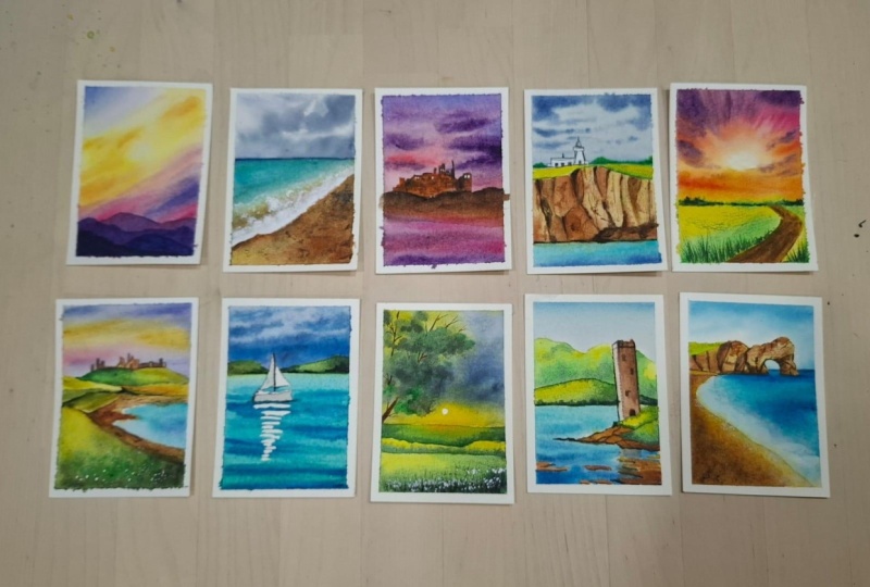
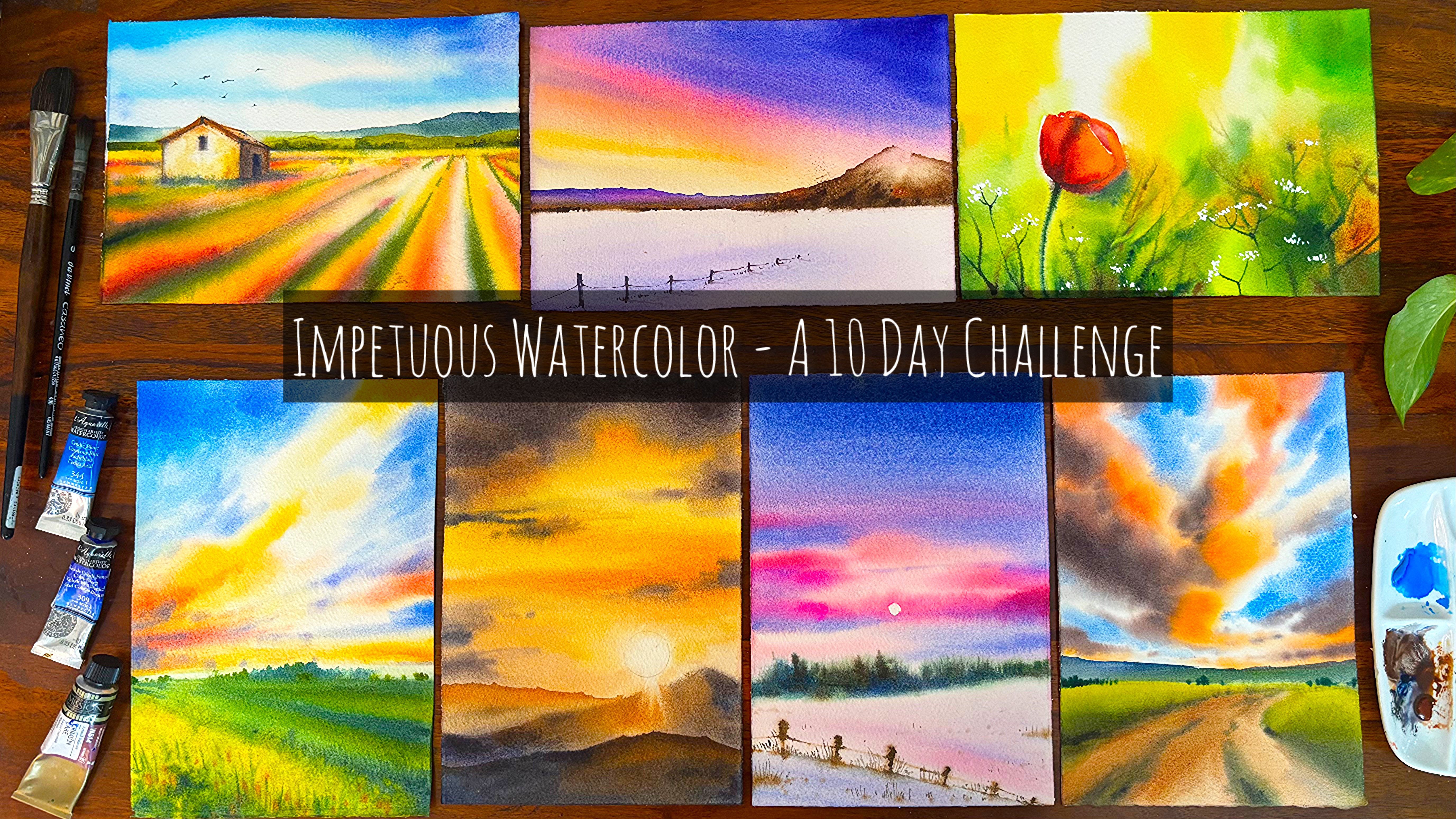
ten to 15 minutes. The class is inspired by seasonal themes featuring a
collection of N artworks, five inspired by spring
and five by summer. Each painting is
thoughtfully designed with its own unique
composition and elements, allowing you to
explore a variety of techniques and creative approach throughout
the challenge. Spring paintings stand out with a wide range of vibrant sky
color palettes capturing different moods and
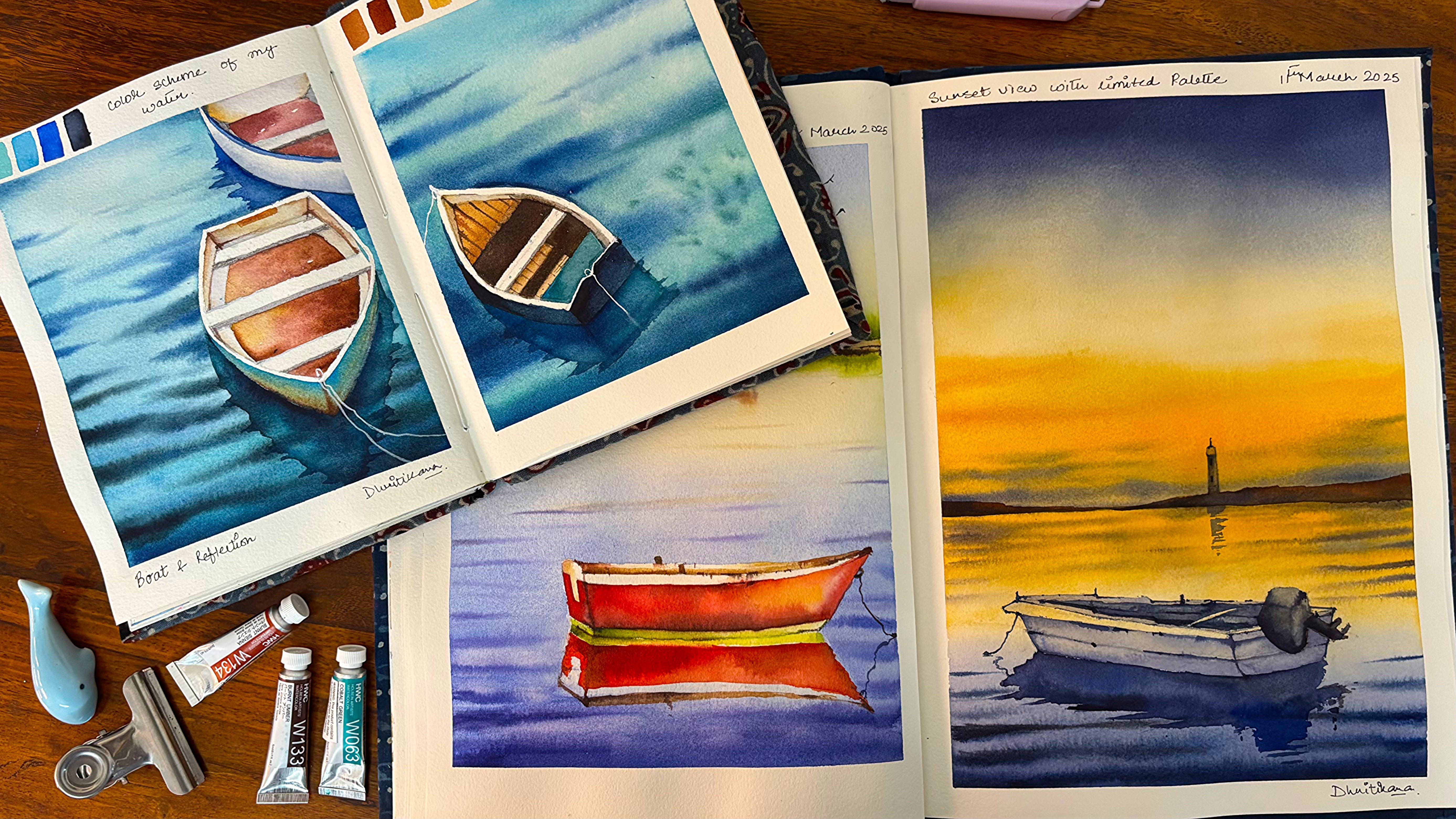
light while the summer artworks embrace a soothing cool blue approach
inspired by this. Most of these paintings are designed to be completed within ten to 15 minutes with only a
few taking slightly longer. Before each project,
essential techniques such as color mixing,
blending, perspective, and brush control are
briefly introduced, ensuring that even Wigners can confidently follow along
and enjoy the process. Finally, if you are in love with the beauty and expressive
nature of watercolors, this class is the
perfect place for you. Whether you are a beginner or someone looking too
deep in your skills, I will be right
here to guide you step by step through
each painting. I can't wait to have you join me and create something
beautiful together.
2. All you need: Look at all the materials
which we are going to use for completing
all these paintings. You can see that these are small size paintings
and you can easily do them in ten to 15 minutes or sometimes even 20 minutes. It all depends upon
the composition and the number of elements that we have in that particular
composition. I would be using 100% cotton, 300 GSM arches paper. You can see that this is
15 into 30 centimeter. Now, I would be using
15 into 18 centimeter. You can have a pad
like this or else go ahead and use a big sheet, cut out pieces out of that, and then start
with the painting. I will use a white
ceramic palette for mixing my colors as I can see through all the colors which I want to use
in my painting. There is a custom
palette like this, which I use for
all my paintings. It has a lot of colors. In case I use any of
the other shades, you will see them on my palette as we progress through
all the paintings. Here, there are various
watercolor tubes from companies like
Windsor and Newton, Daniel Smith, Michelo
Mission Gold, White Knights, et cetera. Always keep two jars of water, one for cleaning your brush
and another for fresh supply. Let's have a look
at all the brushes. I am going to use a wash brush. This is 0.75 inch. Then I have size four, size six, a liner
brush, a mop brush, that is three by zero, and a pencil tape and
eraser for drawing, then taping down my paper. And picking up the extra
graphite marks respectively. I always keep tissue handy. Now, tissue is very, very important for picking
up any extra colors or taking out the extra
paints from my brushes. I do have an acrylic
board on top of which I would be sticking my paper
with the help of the tape. The size of the paper is usually smaller than
the acrylic board. Now let's move on
to the next lesson.
3. Day 1 - Color Mixing & Thumbnail Sketch: This particular part,
we are going to test our colors and the
direction of the clouds. Yes, testing color mixing before a final watercolor painting is essential and here's
why it really matters. Colors changes as they dry. Watercolor usually dry lighter
than they appear when wet. By testing mixes first, you can predict the final
look and avoid surprises. Prevent muddy colors. So pigment don't mix well
and can turn dull or muddy. Esting helps you find clean, vibrant combinations instead
of ruining your painting. Helps control color harmony. Remixing lets you build
a consistent palette. This keeps your painting
visually balanced rather than having random
or clashing colors. Saves time and effort. Fixing colour mistakes in
watercolor is difficult. A quick test avoids
reworking or starting over. Builds confidence
while painting. When you already know how
your colors will behave, you can paint more
freely and focus on expression instead of
worrying about results. Improves layering. Watercolor often involves
layering, transparent washes. Testing shows how colors
interact when layered, helping you avoid
unwanted tones. Encourages
experimentation safely. You can try bold or unusual
mixes without risking your final artwork and sometimes
discover unique effects. These colors are also mentioned before we start our
final painting, but I've gone ahead with
naples yellow, Indian yellow, inatrodon coral, bright
opera, compose Opera, or you can leave
the compose opera, go ahead with your royal
blue and ultramarine. Ultramarine can also be
replaced with bal blue. Let's go ahead and just apply a clear layer of water on the
smaller box on the right. What I'm going to
do over here is a simple exercise exactly the way we are going to do
our wet on wet cloud. This is nothing but to help you understand how you can paint
your directional clouds. This is a very, very
small piece of paper and mainly used for
our practice session. I'm using the similar
arches paper, though this one is
185 GSM compared to 300 GSM arches paper that we are going to use in
our final paintings. You can very well see I have started out with
my lightest value, and then I am moving on to the darker value as we are
progressing with the painting. In the middle, I have
added the yellow, and then I'm going to add
the quin actodon coral, opera, royal blue, then
ultramarine or cobarblue. This acts more like
a thumbnail sketch. Doing a thumbnail
practice sketch before a watercolor painting
is extremely helpful because it lets you plan smartly before committing to
an unforgiving medium. Watercolor doesn't
allow much correction, so a small sketch can save
a lot of trouble later. Helps plant composition. Thumbnail sketches
let you quickly arrange elements where
your subject sits, how the background flows, and how the eye moves
across the painting. You can test multiple
layouts in minutes. Establish values light and dark. Watercolor relies heavily on preserving whites
and building layers. A small sketch helps
you decide whether your lightest light and darkest dark will go
before you start. This helps you avoid
major mistakes early, fixes composition or
proposition issues in a tiny sketch than
in a full painting, saves time and materials,
builds confidence. Once you've already seen your
painting in a thumbnail, the final process feels
clear and less stressful.
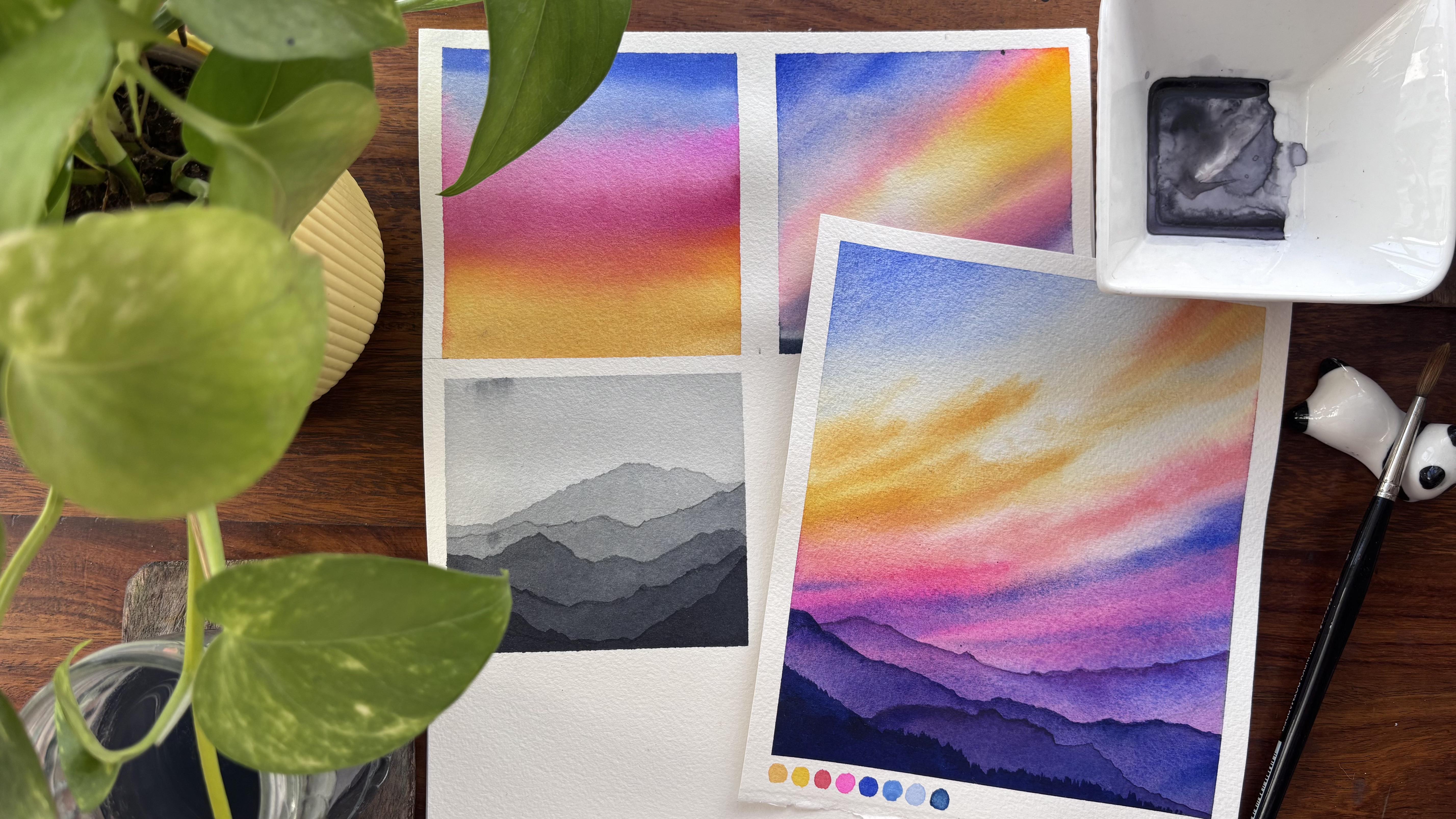
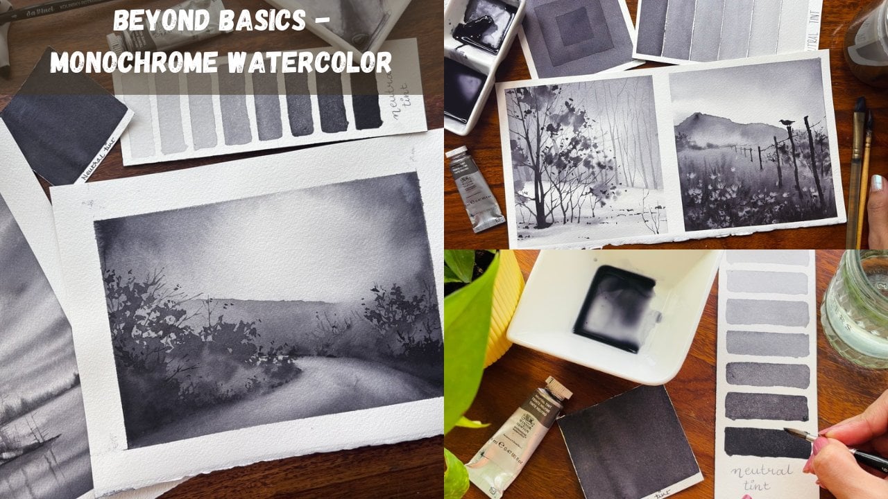
4. Day 1 - Layered Mountains - Perspective: Let us understand a bit about perspective by creating
layered mountains. The monochrome layered
mountains in the painting is an image that serves as a powerful foundation
for understanding depth, atmosphere, and composition
in watercolor landscape. Created only by using
a neutral tint, it strips the scene down to
its most essential element, value contrast, and layering. Each mountain ridge is
defined not by color, but by how light or dark it appears in relationship
to the other. The soft transitions
between layers may make the natural feeling
effect of distance we mountains farther
away appear lighter and less detailed due to
atmospheric perspective. This simplicity makes
the monochrome study an ideal starting
point for everyone, as it trains the eye
to see structure before being
influenced by color. In watercolor mastering, this sense of depth
is crucial and the monochrome approach teaches control over water,
pigment, and timing. The general gradients seen in the gray mountains or
nutritt mountains are achieved through careful wet on wet technique where pigment diffuses softly
across the paper. Each successive layer may be
applied with concentration, darker values are typically
reserved for the foreground, while lighter ones are
for the background. By practicing in monochrome, you learn how to build
dimension gradually, ensuring that each layer remains distinct,
yet harmonious. This understanding can
then be translated into multicolor layered
mountain paintings like the one we are going to do
next in our Project one, that is evening sunset. The key is logic learned
from the monochrome study, progression of light to dark, soft edges for distance, and sharper contrast in the
foreground remains unchanged. Additionally, the monochrome
concept helps prevent one of the most common challenges in watercolor overworking
with color. When you understand that value does most of the work
in creating depth, then you can use color more
intentionally and sparingly. This result is cleaner, more luminous
paintings, where colors blend naturally rather
than becoming muddy. The multiclored
mountain painting looks really successful because it is built upon this
underlying structure that we are using right now. Ultimately, this monochrome
layered mountain study is more than just a neutral
tint or gray scale painting. It is a blueprint. It teaches discipline,
observation, and control, all of which are essential
when transitioning to expressive multicolor
watercolor landscapes. By first mastering
from without color, you gain the confidence
and skill to use color, not as a crunch, but as an enhancement, bringing the layered
mountain scene to life with both
clarity and vibrancy. Once you are done,
let the paper dry off and then remove
the tape at an angle. Use all the learnings
from color mixing, thumbnail sketch, and
layered mountains in your next painting. That is evening sunset. If you are convinced, then come and join me in the next lesson.
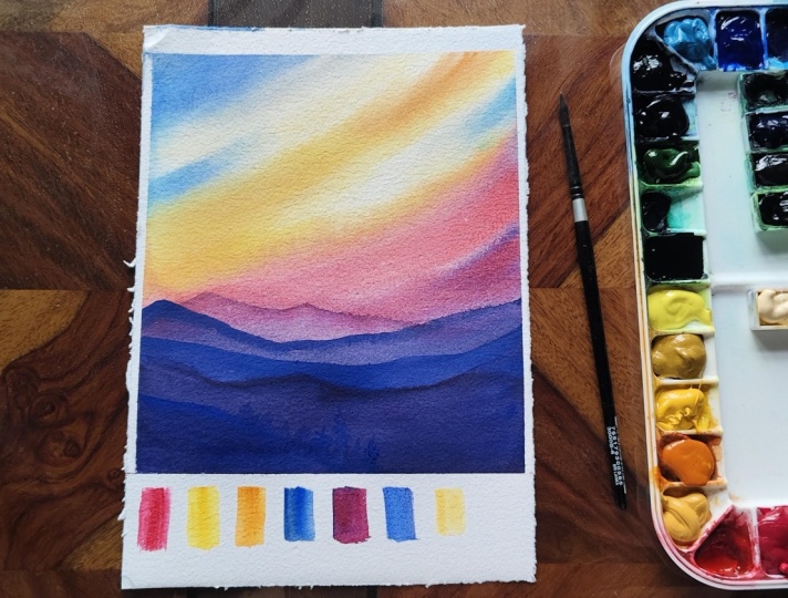
5. Day 1 - Evening Sunset: Let's have a look
at all the colors. It is Indian yellow, naples yellow, nacrodon coral, opera, ultramarine,
erleium blue, royal blue, and indigo. You can also use bar blue if
you don't have ultramarine. I would apply an
even coat of wash on the entire paper and then
start out with the shade, which is Indian yellow
and naples yellow. These are warm colors
for the sunset, and hence, applying this
first is most important. You cannot come back in
watercolors and make it light. Yes, we can always pick up the colors in
few of the spaces, but the transparency
of the paper and watercolors might
get lost in the process. Hence, if you have an
opportunity to go ahead and use your watercolors in
the lighter shade earlier, that's always better. Now I am adding some
quinacrodon coral, or you can also use
your bright opera, mix it with Indian yellow
and naples yellow, and start applying it on the
lower part of the paper. If you see I am currently using a very light
shade of this, as we progress, I will
make it more darker. Now it's time you can make some more darker shades and
go ahead by applying it. But before that, there is a beautiful shade of royal blue, which you can apply on
the left top corner. I intentionally leave
some white spaces when applying watercolors as it helps enhance the transparency of the paint on
100% cotton paper. An easy way to make
your watercolors darker is to load more
pigments onto your brush and use less water to dilute it exactly the way we
have done over here. We have picked up more of quinactodone coral and
mixed it with less water. I am also going ahead
and washing my brush, then taking off all the
extra water on this issue, leaving out only
some light colors on the brush which I
directly apply on the paper. This is a beautiful bright opera from the brand
Magello Mission Gold. I have been using this
brand for many years now, and this is one of
the sheets which has been my favorite
from the beginning. The bottom part of the
paper is still wet. I am mixing some amount of my cobal blue into this pigment. You can see that there is a beautiful granulation
that this Copal blue has. This is again from
the brand Sennelier. There are various brands
which I have been using for many of my
paintings till date. And these are all
artist grade pigments. You can go ahead with any
brand of your choice, Michello Mission Gold,
Winsor and Newton. And Singer has been few of the brands that I have been
using from the beginning. If you know me, you
know that these are the shades that I have used
even in my other classes. You can very well see that the colors are completely
dried out on the paper, and this is happening because of the
weather in Bangalore. I'm using my flat
brush in the spaces wherever possible to make
it more even and soft. Wherever you notice
the paint dry, like in my case, use a flat brush to apply a
fresh layer of water. This helps keep the
paper workable for a longer time when
using watercolors. Having said that, watercolor is an easier medium to work with when the paper
stays wet for longer, and you can extend
that working time by applying water to the
backside of the paper. This particular trick I have applied for many years till now. If you are a big nu, you may follow what we
are doing over here, but if you are more of an intermediate or
experienced artist, please go ahead and
use the water on the back side of the paper
to have a better outcome. You can use some
amount of Indian yellow and apply it in an
angular direction which moves from bottom
towards the top and from the top towards
the bottom left and side. I love to mix my colors
directly on paper, as it creates more
natural vibrant blends because the pigment interacts
organically on the surface. It also adds a sense of
spontaneity and softness, producing smooth transitions
and unique textures that are harder to achieve when mixing colors on
a palette first. I use a clean washbush to just go ahead and
blend the colors that are already there on the
paper and then apply some more darker tonal
values as you see over here. I will tell you, white spaces
play a crucial role in watercolor sky
paintings because they represent the lightest
values like clouds, highlights and the
glow of sunlight. Since watercolor is a
transparent medium, you can't easily paint pure white over darker areas later. So preserving the white of the paper from the
beginning is essential. These untouched areas
also create contrast, making the sky look
more luminous and airy. Without them, the paper
can appear flat or dull, lacking the brightness
and depth that gives skies their
realistic glowing effect. Some more opera and kobal blue towards the bottom for creating
the darkest of the value, which majorly is the
contrasting part in this sky painting. I would again go
ahead and apply some of my clear water
onto the paper, and this is just towards the
bottom part of the paper. As we haven't worked
on this part at all. I would go ahead with the
same colors like my opera, quintodon coral and
blue for creating the contrasting colors and the darkest value which
appears in this painting. On the palette make
some compose opera and blue to create a shade
that looks like purple. Now, this purple is not exactly the purple
that we would apply. It's somewhere in between the purple and the
compose opera. It is also called as red Vallet as the appearance is more on the red side and a few more brush strokes that
form soft line like marks, which naturally blur
on the wet paper. This helps create the
illusion of clouds in motion. Painting directional clouds in watercolor takes
longer because you need more control over both the brushwork and the
moisture on the paper. Unlike loose clouds
directional clouds require deliberate strokes that
follow a specific flow. So you have to carefully
manage timing, waiting for the paper to be at the right level of wetness. You are also building
layers gradually to maintain softness while
still guiding the movement, which slows the process. Balancing control with
the natural fluidity of the watercolor
takes extra time, especially to keep the cloud forms
cohesive and realistic. I'm pretty happy with how
the clouds have turned out. I would let the
paper dry off and then move on to the
layered mountain view. Using pencil marks for
layered mountains is important because they act
as a guide for placement, depth, and proportions
before you start painting. They have you clearly
separate each layer so you don't lose the structure once the watercolor
starts to flow. These light outlines also make it easier to control
perspective, keeping distant mountains
softer and lighter, white looser ones appear
darker and more defined. Since watercolor is hard
to correct, once applied, having pencil guidelines ensure cleaner layers and more
balanced composition. I do always use the colors
that are there on the palette. Using colors mixed on
the palette for coloring watercolor mountains is a
great starting point because it gives you better control over the exact sheet and value before applying
it to the paper. This helps you establish
the base layers cleanly without unexpected
blooms or harsh transitions. It also allows you to plan depth more effectively,
mixing lighter, cooler tones for
distant mountains and richer darker
tones for closer ones. Once the base is set, you can always build textures and variations
on the paper. But starting with palette, mixed colors keeps
the foundation consistent and easier to manage. Mixing compose opera with blue creates a violet
shade that closely matches the tones already present in the lower
layer of the clouds. I prefer to keep
the same shade to maintain consistency rather
than introducing new ones. I would allow my paper
to dry off after this and then introduce a
new layer of mountains. You can always fast
forward the process of drying by using a hair dryer I do not like to use any kind of artificial
method for drawing my paper. Hence, I go ahead with
either a fan or leave it naturally open so that the
colors dry off automatically. You can go ahead and
add some more of cobar blue towards the bottom
part of the mountains. This really helps
you to add some more darker sheade
for the second ar. Right now, the sheade might look way more darker
at this moment, but as the paper will dry off, you will see that the color
has become way more lighter. Watercolor paints often appear one or two shade lighter after drying because the pigment spread thinner and
the water evaporates, leaving less concentrated
color on the paper. While wet, the paint
looks richer and more saturated due to the
reflective wet surface. But as it dries,
the paper absorbs the pigment and the surface
loses the wet sheen, making the color appear lighter. This is why it's
possible to anticipate the shift when layering
or mixing colors. So your final painting
matches your intended values. Oh Once my at has dried off, I will use again
the same shade of compose opera and some
more richer amount of blue to get or
create a shed that looks darker than the one which we have already
applied on the paper. This is a very easy
way of creating, contrasting or
layered mountains. Just start with a single sheet or two sheds with
diluted colors, and we get more and
more darker with richer pigments as you progress with the
layered mountains. The left side has more of purple and the right
side has more of blue. I would just pick
up this acrylic bot and let the colors
move into each other. The paper is still wet, hence the blend will
happen on its own. There is still a
stark difference between the left and the right. We will go ahead and add some more amount of
blue on the left. Try to mix it with the background wash of the purple and then
leave it to dry. Once it dries off, we will introduce the last
layer of mountains after this. The last layer has to be the darkest layer which we
have introduced till now. You can use some amount
of indigo along with the compose opera and then
just use a brush movement, which is a bit variant. It moves up and down
so that you can see that there is nearby trees
which appears on the mountain. Perspective is the key
in layered mountain, watercolor painting because it creates a sense of
depth and distance, making the scene look
more realistic rather than flat by adjusting
size, value, and color, lighter and cooler tones
for distant mountains, darker and warmer tones
for the closer ones, you guide the viewer's eye
naturally through the layers. Without proper
perspective, the mountains can appear jumbled
or unrealistic, losing the illusion of space
that gives the painting its atmospheric and three
dimensional effect. If you have enjoyed
seeing this painting, come together as
painting alongside a demonstration helps you understand the
techniques in real time, how to handle wet
paper, layer colors, and create depth,
while also giving you the freedom to add
your own personal touch. It's a fun way to
practice, experiment, and build confidence,
as you will learn a lot more by doing it
yourself than just watching. Have a look at the
final painting and then remove the
tape at an angle.
6. Day 2 - Painting Clouds - Practice: A two is all about
painting clouds and C. The C is going
to be really simple. Let's start with the clouds. You will see that I will
paint some clusters together and some sparing
places with very, very light brush strokes while we come towards
the bottom part. This is the part of perspective as you come towards the bottom, the number of clouds or even you can say
the way the clouds appear is way more
lesser compared to the top area where it
is way more higher. I have just masked out my
entire area of the ocean part. I'm starting out with a
clear shade of royal blue. I have picked up my color on the flat brush so that I can
cover this larger space, and then I am adding it
in higher intensity or in higher value on left side and with lower intensity
on the bottom part. Have a darker pigment
for the clouds, and this is basically a mix of your indigo, then
your ultramarne, some amount of your royal blue, as well as you can also
keep some prucianbue, et cetera, for creating
a shade like this. You can make some more amount of your pains gray if you
want a darker value, which I would also be doing though this is peak summer
season in Bangalore, and it becomes very tough on my part to keep the paper
wet for a longer period. Keeping a wash brush handy in this case comes to
your rescue very well. You will see how I'm
going to use it. My paper is really
dry when I come towards the bottom
area, towards the top, I can still work as the
top area is still damp, you can always wash
your brush and apply some clear water wherever
you think it is necessary, I'm applying it towards
the bottom area. Overall, my clouds may
not appear the same way. I might go ahead and just
change it a bit more, but that's absolutely okay. If you do not have the required amount of
water on top of your paper, you can allow this
painting to first dry off or just go ahead and apply some clear brush chokes
with the help of your flat brush exactly the
way I am doing over here. Clouds may appear different than what it was
in the first row, but overall, the painting
will appear good. So don't think much
when you are painting, go with the floor, let your
creative juices flowing. I will again go with a
darker mixture and apply some more colors in the areas where I
think it is necessary. Again, some of the areas
have become ready dry. That's one of the reasons
you might have to go ahead and use your flat
brush to apply clear water. These things I have done even in the beginning
and we all have faced challenges when we
work with watercolors. Even if there are
any hard edges, just go with the float. Do not think much. I always say overthinking and overworking will
always kill your painting. If you're someone
who wants to ace through watercolors,
this is your chance. Go ahead with your
beautiful shade of Horizon blue, bar green, or any of the other shades
that's available with you and then apply some of your Telo turquoise
towards the bottom area. Top part on the right
appears way more darker. Hence, you have to go
ahead and apply some of your darker value of blue
even towards the bottom. The shadow of the clouds
have to appear in the bottom area because that
is how it appears in nature. The whole of the
video is 1.5 xp. You can always go ahead
and adjust the speed of the video wherever you
think this is necessary. It would help you to
not only have a edge when you go ahead and start with your second
painting or day two, this will also help you to
gain a lot more confidence, as we understand
the fluffy nature of the clouds in a great way. As I always say,
practice is the key. If you have a quick
practice session before a final painting, you are going to nail it. I would remove the
tape pattern angle and let everything dry.
7. Day 2 - Cloudy Beach: Let us have a look
at all the colors. First is Horizon blue,
turquoise green. Then I have royal
blue, Cirelmblue, French ultramarine, invigo and
John Brilliant Number two. These are all the shades which
we need for this painting. Let us start with
a Horizon line. Once we have marked
a horizon line, we will be marking
two more lines. That is it, which we will be doing from the
drawing perspective. Once we mark those lines, this painting is all set for going through the
watercolor process. Before we start with
the painting part, I should actually tell
you how powerful it is to participate in these ten to 15 minutes
watercolor challenges. It is not only a
consistent habit, I also improves your speed
and decision making. It boosts your creativity, reduces the fear of mistake, and finally improves a lot
on the water control side. Why our water control is such an important
aspect in watercolors, it is the water to pigment ratio that is very, very important, just the way right
now we are applying our royal blue color
on the sheet of paper. I have added a real light
shade towards the top part, and again, I'm starting from the bottom and taking
it to the top. This royal blue is
a beautiful shade from the brand white knights. You can also get this
color in senior. Both of them actually are
something close to serium blue. If you don't have serium blue, you can also go ahead
with your royal blue. I have mixed some amount of serraium blue into my
royal blue right now, and I am again applying
it on the paper. This is some amount of
ultramarine and indigo to create a darker shade so that
we can create our clouds. You will see that
I continuously mix my color to make
it look darker in appearance because
this right side is the area where I'm going to apply my colors for the clouds. This first shade, of course, would be lighter, and as we go, there would be one
more shade dark that I'm going to apply
in few of the places. I'm not covering the
entire part of the sky. You will see whenever
I am painting clouds to make it
airy and fluffy, I'll leave out some
of the spaces in white of the paper or
maybe very light shade of blue so that it appears absolutely airy, fluffy,
and atmospheric. Right now, my pigment to water ratio where
the pigment ratio is very high compared to the
water on my brush, hence, you will see very less
of movement in terms of the colors that appear or appear to be
moving on the paper. I would leave this
particular painting here itself and then
think about that, do I need to add
more clouds or do they we as is and start
with the bottom part, which is majorly my water area. Water is going to
be very interesting when you are using Horizon blue. If you don't have horizon blue, you can mix some amount
of green into yellow, and then get a shade that looks similar to the one
which I would be using. If you don't have Horizon two, you can also use
Copal tren Copart. These are the ordinate
shades which I love to use during all my
painting sessions, that is for the summer season. Summers is one of my favorites, and that's one of the reasons
I wanted to introduce summer and spring paintings in this particular
ten day challenge. Still retouching some of
the spaces of the sky, but they need to be wet if
you are retouching any space. Let it dry off and then start
with your horizon blue. I have given you alternate
colors for horizon blue. Again, this particular color
is from Migeno Mission Gold, and the Steelo turquoise
is from Daniel Smith. I would leave this
decision up to you, which colors, which
brand you want to use, but always an artist's
great paints is an add on whenever you are looking forward to painting
with watercolors. The colors do not dry up two, two, three shades lighter. Which usually happens in case you are using a
student rate pig. Here, your water and sand
will meet each other. I'm going to use John
Brilliant number two. This is from the
brand whole paint. If you are someone who
doesn't have this color, something closer
to peach or brown mixed with a bit of naples yellow can also
serve the purpose. I am blending both the colors. I would be using white goh
for painting the waves, but there is another painting which we are going to do at the last where there is only
white of the paper, which we would be using
for painting our waves. So hold on if you are someone who is in love with
white of the paper and wants to create waves
with that I will introduce how by simply using
water, you can do the same. Okay, let's continue to add some more of
the darker values. This would be one or two
shade lighter as we progress. Hence adding some
more darker values is very important at this stage. I would go ahead and introduce some more browns
and darker browns. Either you can create
darker brown by mixing some of your
light brown with blue. It is a great way to create your different shades
of brown or else. You can also use
your dark brown. I would leave that
decision up to you. I always love to mix my
colors on the paper. Mixing watercolor directly on paper instead of p
mixing on palette is one of the techniques that gives watercolor its
unique, lively character. More natural and
vibrant color blends. When pigments mixes
on the paper, they blend organically
with the water, and this creates
subtle variations, transitions that are hard
to achieve on the palette. Saves times and keeps
the momentum going. That's one of the most
important reasons which I'm going to tell you, I'm using this
particular technique for this ten day challenge
because we have to be quick. We need to have the
creative flow moving. Having said that,
it also encourages a lot of spontaneity
and happy accidents. So very unexpected textures that you make granulation effect and unique color blooms that
you usually don't see if you are mixing the colors on the palette rather
than on the paper. You see a hint of
blue somewhere. You see a hint of
dark brown somewhere. Some places would be in brown. Then your John
brilliant number two, everything put together,
it looks unique, brilliant, and
absolutely refreshing. So I've introduced some
water onto the paper. With my brush, I would let my acrylic board help me
move the colors a bit more, and then we might apply
some more of the brown as the brown is not seen much
on the paper at this stage. Hence going ahead and just adding a bit more
is always a good idea. Continue to add
some more shades. As you see over here, the darker value of brown, then the blue, I would be using the same blue that
I've used for my sky. Use the mixes that is
available on the palette for even introducing
onto your sand area. This helps to bring in a
lot of color harmony and interaction between the
colors itself onto the ping. Now it's time to go ahead and lift out the color in
some of the spaces. It helps to restore
light and dark areas. Watercolor is transparent. So once you go dark, it's hard to get
lighter by adding paint Pullback highlights
create flow within shadows, recover areas that
became too heavy, creates contrast and depth. Dark areas look more interesting when they are in flat.
You all know this. You break solid dark masses, add variation within shadows, make the painting feel
more dimensional. Add atmosphere and light effect. This basically helps you to glow some of the spaces
even of the sand, where you think it
is necessary to have the lighter values
compared to the darker values. In and around it, you may
also add some dark, but yeah, most of the space where
you want the white still remains or maybe not
exactly the white, I would say the lighter value, which is majorly our John
Willian number two over here. After even picking
up the colors, I think some of the spaces needs a bit more of the
blue and the brown, you will see me introducing
it on the waves part. Let the paper dry off
after this and then add the white on top
of the waves area. Now, this particular white is the quash that I
would be introducing, and it would help you to show
the effect of the waves. Bit of ultramarine blue that
you're going to use towards the horizon line just to separate the sky
from the water area. Though it is very
well separated, but still introducing a bit
of it is not a bad idea. And the paper was wet so
I could do this exercise. I have picked up some of
my whiteqh on my brush, and I've started
introducing my waves, as you can see over here. Using white gouache in a
watercolor waves painting is a smart practical choice. It helps you capture the
energy and sparkle of water in ways pure
watercolor, sometimes can't. Brings back bright
highlights instantly. Watercolor is transparent. So once you lose the white
of the paper, it's gone. White gouache lets you
add foam highlights, creating crashing wave edges, paint sea spray and
splashes very easily. Creates strong contrast
and dark waves. Now pops against the dark areas, makes foam ucrous and energetic exactly the
way we want over here, enhances depth and drama. Allows layering
over finished work. This is something that
I appreciate a lot. You know water color
is less forgiving, and if you have applied
the color already, you cannot go over it with
any of the white spaces. So you can introduce white uh to get that effect
which you want. And it also speeds up the
process, paint more freely, focus on shapes and values it
highlights later with Goh. Finally, fix his
mistakes gracefully. That's the best part of
using watercolor gouache. If a wave area becomes
too dark or muddy, gouache can recover highlights. You can reshape the foam
patterns and it helps rescue the painting without starting
it over again. Okay, great. I think I will keep
introducing some more gouache in some of the places
where it is necessary, the white is beautiful, and this is from the
brand Windsor and Newton. I have been using this brand very often for most
of my paintings, whether it be watercolor, whether it be guh. You can see it that this is a designer wash
kept on the left. I have picked up a bigger size of it compared to my others, which I usually used
to pick up earlier. Once again, the
quash has dried off, it might look a
bit more lighter, but that's absolutely okay. The pigment to water ratio
might have been a bit lesser, hence it has dried
off a bit lighter. Now, if you have a situation like this or
in a situation like this, you can go ahead and introduce somewhat darker values in
skew spaces that would help you enhance
the crispiness of the watercolor waves
very quickly and easily. I have been using
this technique very often in many of my
audio paintings, too, and this has been
rewarded in a great way when I wanted to actually
have the highlights intact. I would add some more darker
value of brown on the left, and then just blend it
with my blending brush. You can use any size four brush
to introduce this kind of a darker shade and then just apply some of the
water to blend it. I love this painting altogether. It has such less requirements in terms of keeping the space as is using any of your masking fluid or
any of the masking tape. Hence, it becomes very easy for anyone as a big not
to also attempt. Salt is a classic and
very effective way to create texture in watercolor, and it works beautiful on a simple but
fascinating principle. It absorbs water and pigments. Salt crystals are hydroscopic. They attract moisture. They pull water
towards themselves. Pigments move along
with that water. This leaves lighter starburst
patterns around each grain. Creates organic,
unpredictable patterns because the process
isn't fully control. Salt introduces natural
looking textures, irregular shapes, unique
results every time. Before you touch upon any
of the areas of the salt, just let the paper dry off
and then start introducing these smaller brown
patterns which are basically like rocks on the
beach that you usually find. Hope you have enjoyed the
Dato painting along with me. I am waiting for your results
in the project section. Do upload it, and let me know if you are facing any difficulty
in the discussion part. I would be more than happy to
have you wherever possible. Met you again with the third painting,
and that is spring.
8. Day 3 - The Castle - Practice: Today, first, we are
going to learn how we can actually blend
colors in a castle. Now, these shades
will be lighter than what we will be using
in our final painting. If you know how to
use lighter shades, it's very easy to go
ahead and use any kind of dark shade that you are willing to apply
in your painting. Let's go ahead and start
with the royal blue, as well as some ultrak
for the sky area. Our main focus is not the sky or even the greens that we are
going to add in the bottom. But just to complete this painting and make
it look more organic, I just thought to apply some colors for my
sky and the green for the feels that I
want to add towards the bottom area below
the horizon line. Of course, our horizon
line is marked by the sky and the green pastures that you are going
to paint next. I wanted to keep it absolutely rough and a practice exercise. Therefore, I did not
even tape down my paper. Only for your understanding, I have added this blue. I'm going ahead and using any color that's
available on my palette, so don't think much when you go ahead and paint
this castle part. We are majorly concentrating
on the castle, and it is a bit far away
as our final painting fourth the third
day is also having a castle that is also far away. I'm using my three colours
that is yellow green, olive green, and some
amount of forest green. I'm very happy with how the
greens have turned out. I will also add a bit of salt to get some textures into this pot. The paper was wet and hence the colors did blend
into each other. Having a bit of texture
is always more beautiful. I always start out with a very simple and easy
shade like naples yellow. You may also go ahead
with any kind of peachish skin shade if you don't have naples
yellow with you. Then we are going
to actually mix some amount of our
brown and red together. You can also take compose, opera or any kind of
quinacrodon coral, et cetera, if you do not
have red in your palette. Now, since my brown
that I'm going to use is not as per what I would
like to add to the painting, hence, I love to add some
amount of red into it. Red actually is a
brick kind of a shade, and that brick kind of
a shade appears usually in any kind of castle
around the world. I wanted to keep it absolutely natural with a red stone part. Hence, adding a bit of
red or compose opera will be an additional
add on to your painting. Some of the areas would be lighter and some of the
areas would be darker. It is a natural wear
a tear which usually happens in any castle that
is standing for years. Mostly, I would be
working wet on wet and avoiding any
kind of hard edges. That's how I love to keep my
paintings atmospheric flowy, as well as simply creative. When you are working on
a small paper like ASIC, which I'm using right now, always use a very small brush. This is a size two brush
which I am using along with a size four that you
have seen me using earlier. For smaller papers,
you don't need bigger sizes of brushes. For bigger paper, of course, the size of the
brushes also changes. Let's go ahead and
mix our colors. The mixing of the colors of
cases happening on the paper. I have iteratively told you why mixing on the paper is better
than mixing on the palette. You will get more shades and
it will not appear muddy, as well as there will
be some happy accidents which you will not find
happening on a palette. My paper has become
moist at this moment, and it might appear that you
have a better water control. But what's really happening is a shift in how
the water behaves. The paper is already saturated. This gives you more time to
move and adjust the paint. Slower absorption is equal
to more working time. On dry paper, water plus
pigment gets absorbed quickly, which can lock shapes
in place fast, create hard edges,
you didn't intend. On moist paper, absorption
is slower and more even. You can guide washes, blend colors, and soften
the edge more easily. Because the surface
is uniformly damp, paint flows in
smoother gradients. You avoid sudden blooms
caused by uneven dryness. Less competition
between water sources. On moist paper, the whole
surface already has water, so adding paints integrates itself of pushing
outward harshly. Softer edges happens
by default this way. I'm adding the darkest of
the value at this moment, and usually I'm adding it
towards the bottom area. And then there are some windows which I would be highlighting with the ducks. This whole of the castle is not done in a very dark
shade of brown, as it is the morning time, or you can say this
is the daytime. Hence, it's important
to just keep it in lighter shades rather than adding any kind
of darker shades. Light shades usually
appears during the day, during the night, of course, or in the evening, these shades will appear
way more darker that you will observe me using
in our next painting. You can continue to add the darkest of the
value at this moment. I did not go ahead and
start with the sketch part because all I wanted to concentrate on was the
blending of colors. When you are going to
paint the next project, you will get, of
course, the sketching. I do not spend a lot
of time on sketching because the whole idea is
to keep everything simple, easy, and free flowing. This whole video
is at 1.5 X speed. You can always go ahead, reduce the speed
of the video and then paint along with
me or just watch it as is to understand the
blending of the paints in the castle area on
100% cotton paper. You can let the
paper dry off and then remove the tape
and have a finer look. Let's move on to
the next painting where we are going
to paint sky, water, and a beautiful castle. H
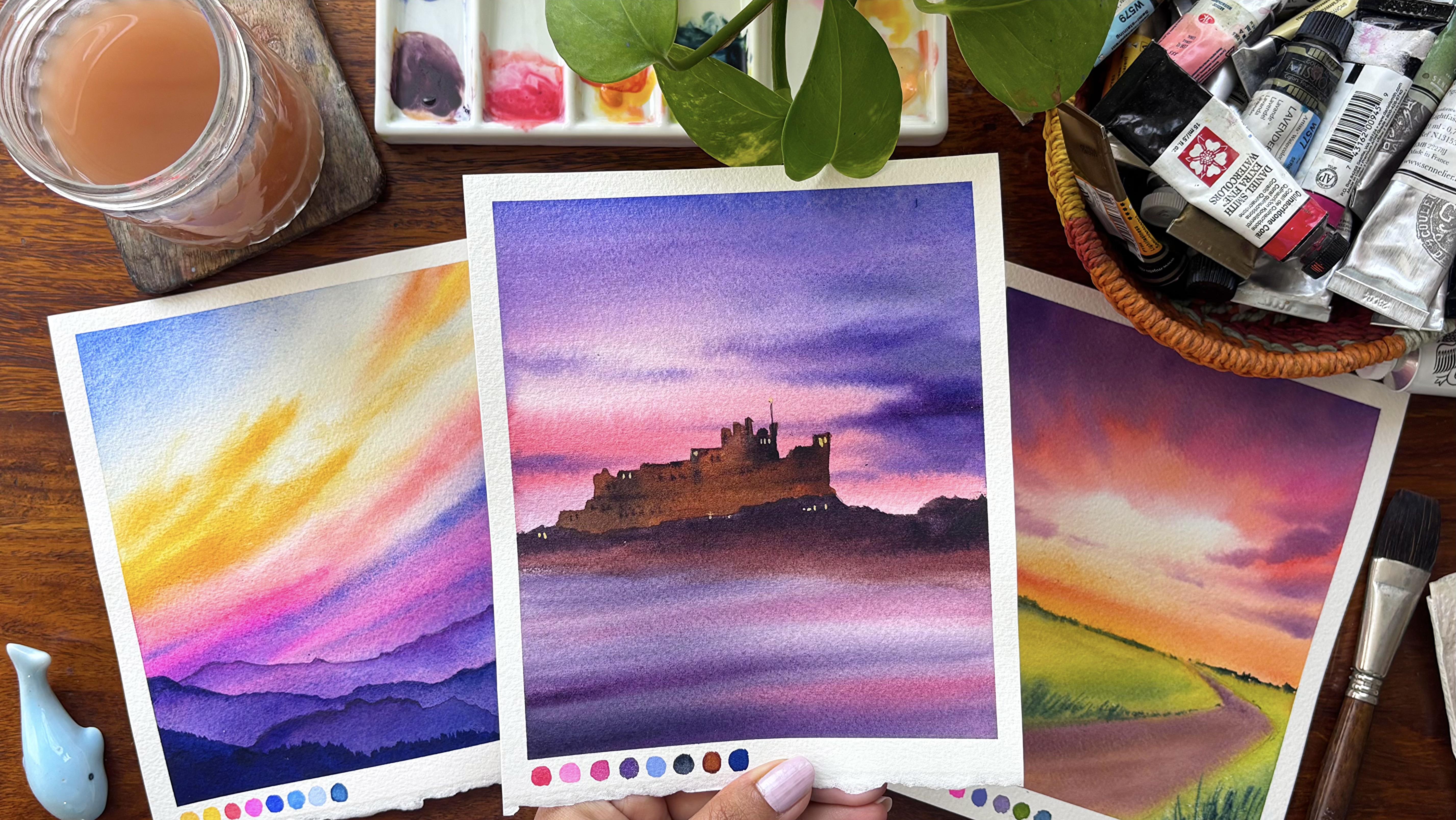
9. Day 3 - The Castle: Let us have a look
at all the colors quin actodon coral,
bright topera, compost sopera,
purple, royal blue, indigo, brown, and ultramarine. We're not going to spend a
lot of time on the drawing. First, I will mark
the horizon line. Once I have marked
the horizon line, I would go over it
or on top of it, you can see, and start adding
the details for my castle. Now, this castle details
is going to be very rough. That is how I always
look forward into it. I do not want a very detailed
outcome at this stage. Because it is a multiclored sky and the castle is just there. The reflection of the
multicolored sky is into the water and because the water has got good amount
of movements into it, hence, you will not
observe any kind of a reflection of this
castle in the water area. That is how I look into it. I try to keep things very simple even when we are
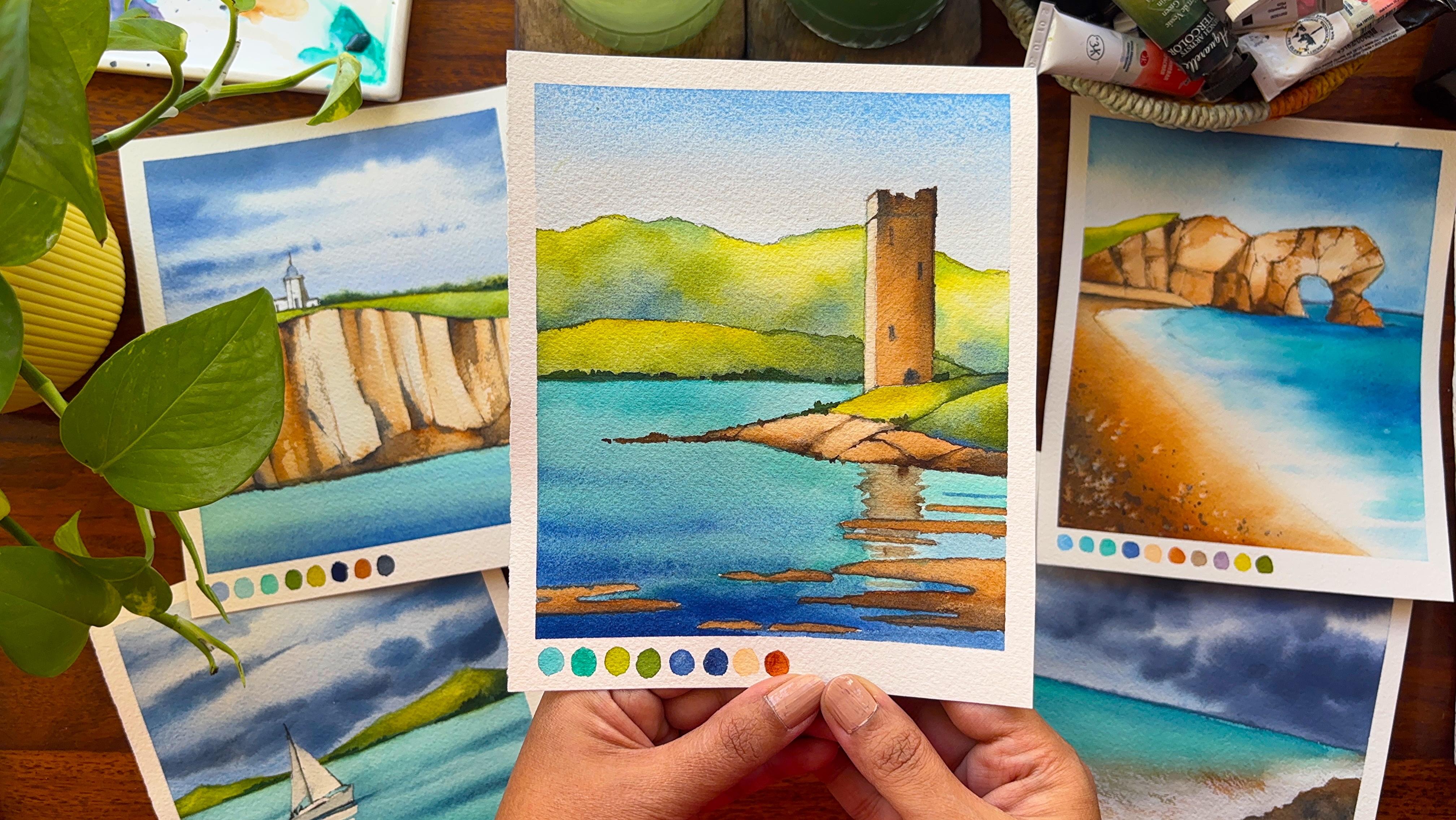
doing castle paintings. There are two castle paintings. One is from the spring part, and one is from the summer part. The summer part again, has a reflection into the water area
because that water is standstill compared to the one that we are doing right now. I am very excited at this stage to show you how we do this. It's a very, very rough sketch. You can go about it. It will not take you more
than five to 7 minutes. If you can't do this somewhere the way
I'm doing over here, I will also upload this
in the project section. You can go ahead
and have a look at the drawing from there
after downloading it. That way, it can become
really easy to follow. Once I have finalized the
sketch of the castle, I would go over the entire
paper and apply water. Now, this water is going to keep my paper wet for a
longer period of time, and I will not, of course, paint over the castle area. I would leave that ***. I would go over
it with my brown. We are right now starting
out with my quin atrodon coral and then adding
some amount of purple. As you see, I go from the middle and sometimes towards the
top and from the top, sometimes towards the middle. I'm not following
any particular way of applying my colors. This is going just
with the flow. Believe me, the idea of even do watercolor paintings
at this stage when I have a small
child at home, I cannot think I just
go as I want to. There is no particular way or no particular motion
that I follow. Not much of watercolor
rules or not so much of watercolor ways in
which it should be done. Sometimes I'm applying the blue, sometimes I'm
applying the purple, and then you might
see me even applying some amount of coral
or opera as you see, this is a beautiful coral shade which I have been using
from the Band Daniel Smith. If you are someone who
is in love with coral, I think this is a must
have for your floral, as well as for your
sky paintings. I have been using this over
a few years now, and still, I feel it gives a very
beautiful and fresh look in every painting wherever
I go ahead and apply it. Now is the darkest
value of purple which I'm trying to apply
for my clouds area. Having said that,
you will always see that some portions
of the cloud, I still keep it a white, which I have been following
for many of my paintings. White is important to
show the fluffiness and the atmosphere of the sky compared to if you do not
keep it white at all. Sky also looks overworked if
there are no empty spaces, or you can say there
are no white spaces. I love to show the same
kind of reflection of the sky and use the same colors even
for my water area. Once this color dries off, it would be one
shade or two shade lighter than what
you see over here. There are various colors
that I have been using. Hence, I cannot say that
it would be only one shade or the pigment to water ratio
is as it is wet on wet. It might get two shade lighter. If you are doing wet on dry, usually it is one shade lighter than what
you have applied. This is what is as
per my experience, but you may be using
a student rate paints that maybe two or
three or four shades lighter than what it appears. It all depends upon
the filler that is there in a student
grade paint compared to there are no fillers
that usually is there in any kind of
artist grade paint. There is only gum arabic and
some amount of pigments. I mean, usually it's the pigment and the gum arabic,
which is there, whereas gum arabic pigments
and there are some amount of fillers that available
in a student red paint. As for my experience, that's what I have seen. I do apply some amount of
quinarodone coral in towards the bottom area or in and around the horizon line that
you see over here. But because it is mixed
with a bit of blue, the color has become
a bit darker. That's absolutely okay. Do not worry much. While you are doing
this painting, just remember go with the flow. If you have to pick up some of the colors in a few places, do pick it up wherever
it is necessary. Blending is always the key, and I am right now blending a
bit of color here and there towards the top area of the sky as this
part is still wet. Always know you can only work on a wet surface if you are
doing a wet on wet painting. It's very difficult to
work on any kind of a dry or semi wet surface
if it is wet on wet. I'm starting out with a very, very light wash of purple and then applying it
on the bottom part. I would go ahead and still apply some more colors of the
sky into the water area. This is just a very,
very preliminary part of adding a first layer. I would say, and then the
same colors that I have on the palette would be applied
even on the bottom part. I'm mixing my purple
and some amount of quin agradone coral
along with blue, and this blue is basically
your royal blue. Then I've started applying as
lines on top of the paper. The paper is moist. It's not completely wet, so I will get a few
line like structures. This is mostly purple. I am not going to apply a
lot of colors at this stage. It's only the shades
that I've applied above would be reflected
into the water area. Simple exercise, but
all I can say is that you may feel
that this looks less, but less is always
more in watercolors. Know the fact that if you
are applying less colors, if you are doing
less in watercolors, that particular painting
is going to shine through. Watercolors is transparent
and the transparency, if can be maintained,
I would say, we'll give you the best of the results in your
future paintings, too. I have realized this
over the years, and believe me with
my experience, you will understand
that the whites or some of the spaces of
the painting might look better if they are absolutely in water with the clear shine of
the paper coming in. Great. I guess I am now going ahead and applying
some amount of pink. You can go ahead and apply
some compose opera or opera. It can be also quinacodon oral. These are the shades
that have been used do and we are going to use
the same shades over here. The paper is wet and
it's time to go in and around our horizon line
and start adding the brown. The brown can be your
B sienna bon sienna, one, two, three, whatever
colour is available with you. I'm not thinking much when
I'm applying the colour. I'm going with my
size pour brush. You can also go with a
smaller brush like this. Or go ahead with any other brush that's
available with you. The brown is now mixed
with some amount of purple to get a darker shade. I try to use the similar
kind of colors which have been used lier in
the painting to make my shades
darker or lighter. I think this is the best
way that I have learned and want to impart the same
learnings of mine to you too. Mixing some indigo to
get the darkest value. You can also add some purple. I would leave the
decision up to you, whatever works best
for you, add that, to get the darkest of
the values and start adding it above the brown that
you have already applied. Once I'm done with the bottom
part in a darker shade, I would allow the paper to
dry off as I will be adding lighter and darker values to create the depth effect
into the castle area. Always create contrast and
depth in your main subject, and over here, castle
is the main subject. It would help you to
differentiate the subject better, as well as present
it in a manner which looks more pleasing
to the eyes of any Person who is watching it. I'm again starting out with the lightest value of
brown at this stage, and slowly I would be
introducing the darker shades. I am using my size four brush. I have loaded prime brush with
the pigments and applying it on top of the darkest
value of the brown, which is there in and
around the horizon line. Here we are again
going to actually mix the colors on the palette as well as differentiate in terms of the values
of the colors. Some places the brown is of a darker value compared to other places where the
brown is of lighter value. I will also add some
amount of indigo into the brown to create the
toques of the value, but all the mixing is
done on the paper. Hence, there will be more
colors or there will be more number of idea
sheets which would be formed that usually do
not appear if you are mixing the colors on the palette rather than over here
directly on the paper. Though, I have
talked enough about mixing watercolor
directly on the paper, but let me tell you two or three more hidden benefits
of doing this. More natural color variation when pigments blend on paper, they interact with the water, paper texture, and each
other in unpredictable ways. This creates richer,
more organic color transitions than
pre mixed colors. The next would be it is the
better use of water control. Mixing on paper forces you to
understand moisture levels, how wet your brush and paper is, which is a core
watercolor skill. Lastly, it is cleaner colors. Over mixing on a palette can
dull the colors on paper. Pigments often retain
their identity, especially if you let them
blend lightly instead of fully combining just the
way we are doing over here. It's just last three
to 4 minutes which we need at this moment to
complete the painting fully. I need to even allow my paper to dry off before we
add some highlights, which is basically the
lights in the asser. This is again an evening sky. I'm in love with these evenings, and the purple variation of the sky is one
of my favorite. It has been my favorite for quite a few years and
still the variation with the purple is where
I like to invest a lot of time and understand
the skies in a better. Though if you are
looking for sky classes, I have other dedicated classes where I am teaching
for ten days, 15 days, or 20 days. Even smaller classes
are also there. Please go ahead and
check out those. I think you can dedicatedly give very
less amount of time, still achieve great results. And have an understanding
on sky paintings. Let's go ahead and apply some of the darkest of the
values to create small small window
light structure in this particular cassle. Once this is done, I
would let the paper to dry off and then
apply some highlights. The highlights will
be with the white. Now, this white is basically the wash that I'm going to use. You can mix it with
some amount of yellow or use the h directly, that is the white, which represents basically
the lights in the assu. I would be using my
liner brush to apply these colors because
it is very thin, small dots here and there. Some of the spaces
might also bleed. If it is bleeding, I
might go ahead with my finger and just
rub it a bit more. And apply some two, three dots here and there. I do not keep it
even at all places. Some of the places it's two, some of the places it's three, some of the places it's longer, some of the places it's shorter. That's how I like to keep it. Variations is always good. Variation helps you to understand
that all the windows or all the places is not equally glowing because of the
lights in the castle. If you enjoyed the painting
and followed along, please upload your work
in the project section. I'm looking forward to
seeing all your creations. I will take a look at
each one of them and share my feedback
wherever it is needed. Let the paper dry
off completely and then have a look at
the entire painting. I am truly telling you that you will be super proud of how
this painting has turned out. I really did not feel that
this painting would turn up exactly the way it did
when I started out with it. Over the whole span
of 15 to 20 minutes, it became one of my
favorite paintings from the entire
ten day challenge. Some of the paintings did
look very basic initially, but I realized that
basic is also good. Stop thinking that this is
not good or that is not good. Just appreciate yourself
and go with the flow. Remove the tape, and meet you
again in the next lesson. Till then happy painting.
10. Day 4 - Painting Rocks - Practice: I'm going to teach
you how I started painting my rocks when
I was a beginner and then how I improved upon it as I did progress to an
advanced level artist. Let's first start out by just adding a flat wash
to our sky area. We will be doing a similar
kind of a flat wash, even as an advanced
level artist. I have not changed much in this. As a beginner, of course, you are more scared
and you might go ahead with lighter values
compared to when you are working as an advanced
level artist where you know exactly how much pigment to water ratio should be
added on the paper. Next, I will move on to my grasses section why I'm
attempting the grasses. As a bign I did not know that you have to move
from top to bottom. And I did go with the
subject at the last level. I never thought that you
have to move from the sky, then attempt the rocks, and then the ground level where you will be
painting the shadows, as there are many things which usually change when
we paint our subject. And it's important to
always go with the flow, not start from in between
and work it out accordingly. I would say this
is something that I have learned
over time that you have to move from top to bottom that gives you more
control in watercolor. Though there are
a few exceptions, which I have also exercised
in my other paintings. There can be negative
painting or there can be some floral painting
where you have to go as per the
particular photograph or on the site where
you are painting. Let's go ahead and then add the shadow of the rocks
onto the bottom part. Though the shadows is
just on the right side, you can see the light
is on the left, and everything that's on the darker side is on
the right hand part. As I'm adding the water on a semi weight kind of a surface, this is, of course, pigment, but it has got good
amount of water in it. You will some cauliflower
like effect which I never work around with when
I am advanced level artist. If even I need a cauliflower
effect personally, then only I will
go ahead with it. I will not allow this kind
of a cauliflower effect to occur in a simple easy
painting like this one. I'm going with a flatwh
for, again, the rocks, and I'm just filling
up the space, which is right now
in white that I did keep empty for
my rocky area. Let me do a quick comparison of my bigness compared to my
advanced at this stage, we will only focus on bigness. The rocks look oversimplified. Shapes look round and generic, almost like soft blobs, poorly defined edges, edges
are too smooth and uniform. Unconvincing stacking, the rocks don't feel like they
are actually balancing. They lack weight and gravity. Weak value contrast. The Bigner painting has
very limited contrast. The shadows are
too light and not clearly separated
from the lit areas. Everything sits in a
similar midton range. Color use is just too basic. Use mostly one local
color, light brown. If you observe
here very clearly, we have the dominance
of one color. Shadows are just
slightly darker version of the same color, no temperature variation,
which means there is no interplay of warm
and cool colors. The next is about texture. Surfaces are too smooth. No suggestion of rock, grains, cracks or roughness looks more
like soft clay than stone. I will tell you that the dry
brush technique, lifting, broken washes, nothing is there a big null level
painting of rocks. Light and shadow confusion. Light source is unclear
or inconsistent. Shadows don't wrap around
the forms properly. Cast shadows on the ground
is weak and undefined. As a beginner, when
I started out, I really did not know
about value control, understanding of light,
observation of rho shapes, texture technique,
color variation. These are something which
I did learn over time. Let us really slow down and unpack why the advanced
level painting works so much better because the difference isn't
about more detail. It's the collection of
deliberate decision that makes the rock feel
believable, solid and alive. First we are going ahead with a solid wash. Once we are
done with a solid wash, we will add the values,
the darks, et cetera. But let's start from the
thinking perspective. Convincing sense of form, that is three D thinking. The most importantly
from Bigner to advanced is thinking in three D
instead of two D shapes. Each rock is built from planes. You can clearly see how surfaces turn away
from the light. I understand that
rocks are not plops. They are faced forms
with structure. This is why light
hits the top planes. Midtones appear on
angled surfaces. Deep shadows sits in
the underneath areas. Mastery of value. If you had to pick one thing that elevates
the advanced painting, it is the value contrast. There's a full range of value. Light highlights, mid tones,
strong confident darks. The dark areas are used
strategically, not everywhere. Key improvements, deep shadows between rocks create separation. Undersides are clearly
darker, reinforcing gravity. Cast shadows on the ground
adds weight and realism, which you will see
as we progress. Clear and consistent
light source, light is coming from
a specific direction. All highlights and shadows
agree with the direction. Shadows are not random. They follow the form. The
result is cohesive lighting, believable volume,
stronger realism. Shadows are not just darker, they are cooler and
richer in color. Light areas are warmer creating contrast
beyond just value. You will observe that slowly I'm adding colors at this stage. Initially, I added
a very light wash, and now I'm going
ahead with my browns. Once I'm done with my brown, I would add some amount of ultramarine into few of the areas to create
the darker values. I will mix it on
the palette also, as well as you can
always add it even on the paper directly
wherever it is wet. This brings me to the point
color sophistication. Beyond brown rocks,
the advanced painting avoids the trap of using
a single flat color. Warm tones, which is
basically your warm browns, cooler tones, which
is basically blue, and some amount of muted
Bnciena in the shadows, subtle shifts within
the same rock. Why this matters,
real world objects are rarely one color. Color variation adds
life and realism, warm and cool contrast
enhances depth. Texture that suggests and
it doesn't overwhelm. The advanced painting
introduces texture, and it is done in a
very intelligent way, if you see broken edges,
slight irregularities, granulation from
watercolor pigment, suggestion of cracks
and roughness. Everywhere I'm not
adding the darker values or everywhere I'm not adding
my dry brush technique. Dry brush, only for
the rough surfaces. Lifting to create highlights. If you are lifting it
from any of the spaces, I will use the
lifting technique for my ground area towards
the right hand corner, which is thumbing
up as we progress. Edge control. I would say
the advanced painting. So edges are sharp,
others are soft. Edges help guide your eye. Overlapping rocks are
clearly separated. Soft transition and realism. Grounding and
environmental integration. The advanced level portion of the rocks feels like they
belong in the landscape. That's the most important part, and this is our subject that actually differentiates
the whole of the painting. Strong cast shadow anchors
them to the ground. The grass has value variation, not just flat green. Their interaction between
light, rocks and ground. This creates a sense of place, physical weight, stability,
overlap and spatial clarity. Rocks clearly
overlap each other. Foreground versus
background is easy to read. Depth is created
through value contrast, overlapping shapes
and edge variation. Last, I would say is
confidence and intentionality. Confident brush strokes,
deliberate placement of dogs, no hesitation in defining form. Knew what we are trying or
what we are aiming for. Me decision on purpose. If you look at a bigger picture, observation is the
most important aspect, seeing real shapes and light. Value control is very, very important for
creating contrast. Color understanding to introduce the warm and cool at
the correct place. Techniques that
is not only doing wet on wet or not only
doing wet on dry. Adding the edges,
textures, layering. These are most
important techniques that actually build
up your painting. Finally, I would say layering. Laying is something that you do intentionally for
your rocky areas. Now, this laying will only
help you to understand that everything will not move wet on wet or everything will
not move wet on dry. Some of the pieces are kept soft with the help of
my blending brush, and some of the spaces
are kept very hard with the help of
the liner brush. I think I have
explained you enough. Of course, the whole
of the video is at two speed and you may
not follow it exactly. You can always go
ahead and reduce the speed wherever you
think it is necessary. This is basically
to show you how you can add structure or depth or value or even how you can add life to any
kind of painting, even if it be rocks, how dimension can be added, how it can change to
a three dimension or painting rather than it
being a two dimension. Now I would say it's
time to just follow along and have a look
at the final painting, how we are actually
painting our grasses, the shadows into the grass area, and some of the textures that I will also
add in the grass, the variation of the
colors in the grass area, as well as the shadow area, which also will have
some kind of variations. Continue to watch it and
just paint along with me. You will nail your
Dafot completely, waiting to paint along
with you the cliff. Uh, Uh
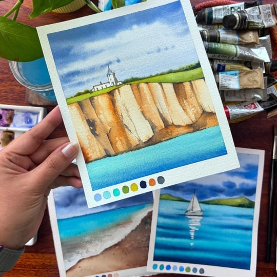
11. Day 4 - The Cliff: Let us have a look
at all the colors. The first is my royal blue. The second horizon blue. Third would be Telo turquoise. Fourth would be my beautiful
sabrene or olive green, yellow green, ultramarine,
bun sienna, and neutral tint. Let us start out with
the horizon line. The horizon line is going to separate your land and the sea, as well as once we
draw the cliff, the top area would be your sky. I am starting out with
a very simple drawing, and there will be
some green pastures, even on top of the cliff
and a small lighthouse. This is all we are going
to add to the elements, and this particular
painting is more compared to all the
other paintings we have attempted till now. But this became one of my favorite painting from
the entire series as it had so many different
beautiful elements added on with the light
and shadow effect, as well as the depth that
you can create in rocks. I will guide you through
the entire process, so do not worry, just go with the flow
and enjoy the process. Make a few lines that
you are going to add on top of this cliff area. It will help you to
separate the depth, as well as the lights and the darks that usually
occur in the cliff. Just keep adding a few more
lines even on the right, though, this is just a guideline which we are going to follow. When we actually paint, sometimes the sketches do change to a greater
extent and you will also see how that
particular thing happens. Some of the areas where I
want the darker values, you can always go ahead and add some shading
with your pencil. Again, I would say this is a guideline which
will help you to add the darker values in these areas and leave out the lighter
values on the other area. I'm going with simple flat
lines, straight lines, I would say for my
small lighthouse that I have on top of the cliff. This cliff is very beautiful. Believe me, the final
outcome I never thought would come out
exactly the way it happened. Overall, it takes
time to understand. So if you are in a hurry, I would say you can attempt
this painting in two parts. One is the drawing part, and another is the
painting part. The drawing part is going to take you around
four to 5 minutes, and the painting again take
you around 20 minutes time. Though the whole of
the painting process is not difficult at all, as I always say, there is proper guidance which I'm going to
give step by step. Even if you are a regner who is starting out
with watercolors, you can, for sure attempt it. Only keep in mind
that you should be using 100% cotton paper. If you're not using
100% cotton paper, the outcome would not be exactly the way
you see over here. I always keep the focal
point a bit on the left. You will see that none of my subjects are placed just in the middle of the painting. I would keep either on the top left corner or
on the bottom corner, bottom left corner, on
the top right corner. These are the spaces
where you will usually find all my
subjects to lie. Some green bushes
for the background, and I will get back to
some more of the shading on the rock area
wherever I think again, it is necessary because those darker areas are
important for my eyes as some of the
areas need to be in darker shade so that the
contrast can be seen very well, and it gives the
effect of rocks. Going ahead and masking
the small lighthouse which you see over here
with the masking fluid. You may also leave it. I would leave that
decision up to you. This particular masking is only because I do not want
to touch this at all, and I do not want
to get back with my white coach exactly
the way we went in day two where we
wanted to actually paint the foam of the
water on the beach. Over here, I want to keep it as is the white of the paper. Hence, this particular thing. Okay, let's go ahead and
start out with the top area, which is majorly my sky. I would be using my royal blue and just going with
the bottom area, then blend it towards the top. For drawing my clouds, I would be taking away more darker mix of pigments and that I would
guide you through the process. Till now I am just tilting my board so that the
colors move on their own. I do not need to do
anything as gravity has its own work to do and let gravity play its role in
this particular case. Let's make some more of our ultramarine and royal
blue. Along with it. I'm also mixing indigo
or neutral tint, whatever is available with you. You can also use
Pains gray if you don't have neutral
tint or indigo. I'm starting out
with my top area, and then you see how my brush
strokes are laying flat. I am again going
ahead and making some more of my brush
strokes on the top part, mixing it with a bit of
indigo or neutral tint. And then while I go
towards the bottom, my clouds would become thinner and smaller
in size and shape. This is also as per perspective. The clouds that are on
the top area always look way more bigger
in size and shape, whereas the clouds which
are towards the bottom or near the horizon line are
always smaller in size. I have changed my brush, and now I have moved on to a very thin line of brush
for adding these clouds. I would continue to work on the cloud area a bit more as you see over here and then
just blend the colors, some more with the
background sheade which is basically
my royal blue. Do not overwork. At this stage. We need the beautiful
white of the paper. Of course, it's not
absolutely white. A very light shade of royal blue has been
added on top of it. The paper is still wet. Let's go ahead and add
the green pastures. You can use your olive green or any other dark value of green
that's available with you. Even a forest green is
good to go ahead with. I would like to add some
more graphite marks to my glyph in the areas where I feel that I would be adding
more of the darker values. I'm just marking those. You can always improvise your
sketches at any point in watercolor till you have not added any of the
paints on top of it. Even after adding the paints. If it is in very light value, you can go ahead and add some of the graphite
marks on top of it. We do it very often when I'm doing any kind of layered
mountains, et cetera. And even in sketches, as we go forward, you might want to
add a few things which you have missed out
during the sketching time. Those things can always be
included I still your paper has space or you have
not added any colors, even if you have added colors, light values, you want
to add some dark values. For a guideline, it's important to always add
those graphite marks. I always believe in it. Okay, let's go ahead and add some green grassland area
on top of the cliff. This is a very
beautiful yellow green and with the yellow green, I would add some amount of my olive green towards
the bottom part. The yellow green is
one of my favorites. I have been using it
for very long time. This is from the brand
Michello Mission Gold. If you are looking
for a yellow green, go ahead and try this out. They do have the
greenish yellow, as well as the yellow green. I go ahead with yellow green more than the greenish yellow, though, I have both
the colors with me. I'm a fan of this
particular brand Michelo Mission Gold or SenaliaO Windsor and Newton
Artist Great paints. These are my go to brand always, and I have been using them
for most of my paintings. I always blend my greens
even in smaller spaces. As you see over here, it gives you some beautiful
shades which you do not get very often if you are
blending it on the palette, as I am a fan of blending on paper compared
to the palette. You already know it from all the paintings that
we have done till now. Lifting out some of
the greens from a few of the spaces as
you see over here. I will pick up
some of my horizon blue on my brush and
start out with the water. The water is going
to be very simple. We are going from
more simple stuff to more difficult things. The most difficult in this
stage is a rocky area, and I would be attempting
that the last, as you always see me gaining some confidence
in the process of watercolor and then only
attempting the difficult ones. Okay, once you have
added this color, we will go ahead and use some of our til turquoise
or turquoise green. Whatever is available with you, I have two of these shades, one from Daniel Smith and
another from Shimenke. So both of them I have with me. I have been using
it alternatively in many of my paintings, and believe me, the final
outcome has been tremendous. I am again adding some
amount of my blue. This blue, of course, is ultramarine, as you
see a lot of granulation. I'm a fan of granulation when it comes to ultramarine
Bern Siena. If I have those shades which can give me
some granulation, I always go ahead and
use it in my painting. Blending is the key. I'm not
going to go ahead and add a lot of movement into
the water at this stage. It's going to be simple, easy and let the paper dry off before you start out with
your areas of the cliff. That is majorly
the rocky areas to apply the lights or to show
the lights of the cliff. I am going ahead and using
John Brilliant number two. This paint is from been. I have a full set
of hopin which I have been using for
many years now. I purchased this when I was in US and then I have been using it very this particular shade is something that I have
fallen in love with. It is a skin color tone, but not exactly
naples yellow, also. So it is somewhere in between, which gives me a lot more
subjects to play with. And so you see, again, we using this for
the rocky terrain. When I go ahead with
my first layer, it's more of watery solution
and less of pigments. And then I go ahead
with few of the areas where I want to add more of
pigments and less of water. I'm also blending some of my
burnsiena into the shed now. Slowly, steadily, we are
going to build up the cliff, varying the colors, shades, pigment to water
ratio, and more. Let us add some more
pigmented values now. We are going more darker in the value compared to what
we have added earlier. I have mixed some amount of
blue or else you can also go ahead with CPA or any of the dark brown colors
like Vendike brown, et cetera, that's
available with you. I will shift to my thinnest
of the brush now as I want to add some
line structure. The paper is still wet or else the colors will move
a lot, which I don't want. Though the soft ditches
is something that I have always eyed for hence I will use my flat brush to go ahead and just blend the
colors with the bottom part. Keep adding more and
more of these shades in various places where
you think it's wet. This is a pretty iterative
and repetitive process. You might feel that it's a bit boring or we are doing the
same thing again and again. But believe me, when you
are layering your colors, it's good to go slow
at this moment. We do not want to
spoil anything. It's only the rocky and the
ridges area which is lift. Rest, all the parts are done. You can see that we
are done with the sky, we are done with the
water, the green pastures, it's only a bit of the lighthouse which
you need to attempt, rest, everything is in place. Continue to work
through these layers, and once you are done with
more and more of these layers, I will tell you how
the depth is created. Let us quickly understand
the process of layering. Laying is what gives those glyphs their convincing
depth and structure. It's less about
one perfect color and more about building values
and textures gradually. We are going ahead
with our browns and then the neutral tint, which is basically
the darker value. Start with a light base wash. This base wash is an early tone, and it is either you can have a very light skin color exactly the way I
have added over here, or else you can also use
your brown along with some amount of your
naples yellow. It will give a color
that's similar to the one which we
have used over here. Keep it light and uneven. This becomes your stone base. Let some paper show through for highlights while
still damp drop in slightly stronger
brown and random areas to create natural variation. Establish forms with mid tools. Use a slightly stronger mix
of brown and a touch of neutral tint if you do not
have dark brown in place, paint vertical strokes to
suggest cracks and erosion, form the natural
direction of the Now, how do we form this natural
direction of the cliff? Exactly by giving the
vertical strokes? Deepen shadows with
the neutral tint, mix the neutral tint with
the brown for cooler, deeper shadows,
use less water for sharper edges in shadow
zones, and darker accents. Use dark brown, deep cracks, base of the cliff and
overlapping rock edges. Use layering technique
intentionally. Glazing builds richness
without losing luminosity. Dry brushes a rock
like structure. We will also do that
as we progress. Soft itches, distinct
or round forms, hard ditches, sharp rock
bricks and shadows. Preserve highlight.
Don't paint everything, leave light areas
untouched or lift paints. These highlights suggest
sunlit rock faces, and they balance the
darker layers and enhances you can see
right now I'm adding the darkest of the
layer and even keeping a blending brush in few of the spaces where I think
blending is necessary. This is how I exactly go
about painting my rocks. Painting rocks
initially was very difficult for me when I
started out with watercolor. But over the time, I
have realized that painting rocks is one of the
easiest form of watercolor, only if you know how exactly
you should apply the colors. It is not important to apply colors or darker
values everywhere. Only in few places, if you apply the colors, it's good enough to give you the cracks or the
rocky structure for the darker shadows and the lighter versions
are basically for the littered areas, which usually fall
on a sunny day or on any of the days where
you are observing it on the site or working
through even a photograph. Thing that I would like to tell you is layering in watercolor demands patience because
the medium is transparent, fluid and hard to control
once it's on paper. Each layer affects the neck, so rushing usually
works against you. You have to wait for
each layer to dry. If you paint over a damp layer, colors bleed uncontrollably. Edges become bloody
instead of crisp. You lose the structure. Water builds depth gradually. You need opaque paints, you can't jump
straight to ducks. You start slowly
deepening the values. Each layer subtly shipped
colour tatons rushing through dark values can make
things look flat or muddy. It's easy to overwork the paper. The paper surface
can break down, colors get dull and chalky, you lose the freshness,
luminous look. Patience helps you stop
at the right moment. You are constantly
judging values. Between layers, you need
to pause and assess. Do I need more contrast? Where should shadows go? Is this area already
strong enough? Those decisions are
harder when you rush. Mistakes are harder to fix. Watercolor is not
very forgiving. Dark layers are difficult
to lift completely. Muddy mixes can't
always be undone. So taking your time reduces the chance of
needing correction. Simple way to think about it is layering watercolors is like building depth with glass sheet. Each layer is thin
and transparent. Stack them carefully. You get richness, rush or smudge them. Everything turns cloudy. Therefore, patience
is the key always, and if you have the patience, you are going to nail your painting in the
best of your ability. Now it's time to layer
with the darkest value, and this is the final step
that gives your watercolor, real depth and drama. The layer creates
strong contrast, makes everything
else look brighter. Depth pushes shadows back. Focus guides the viewer's eye. When to add the darkest value
is very, very important. All lighter and mid tones
are completely dry. You are confident about your
shapes and light direction. Think of it as a
finishing touch, not something you
build very oolly. How to mix your darkest value, you can go ahead and make some amount of your brown
with either the blue, that is ultramarine
or the neutral tint. Less water is equal to
deeper or sharper ducks. Me water, softer
shadow transition. Avoid using straight blacks. I would say, you should always mix the color and
keep it or the, as well as believable. Where to place your
darkest value. Basically, in the deep
cracks or ridges, the base of the
cliff where lightest block and overlapping
rock edges. These are the places
where I usually place my darkest of the value.
Control is everything. So either you go with a smaller brush or if you are going with a brush like my size, you have to use the
tip of your brush. Sharp rock details, that is basically with the
hard edges which you will get and slightly softened edge depth
without harshness. That's what it is all about. I have been iterating
this again and again because we sometimes
lip it from our mind, and it's important
to understand that both soft and hard edges
to make up a painting, it's not only one part which
is important and one part, which is not important. Common mistakes. Now, I will
tell you over using darks, everything looks heavy and flat. Adding to OD, these darks, which is you lose the
transparency and too much water. Dark spread and lose the
impact if you're using too much water
with the softness, et cetera during
the initial stages. There's a very
small mental model that I usually go ahead with. Light is equal to paper, which is majority, very, very diluted colors that I apply on the complete
form of the rock. Midtones is equal to forms. Now the rocky forms, et cetera, have
started working out. Darkest values is
equal to structure and depth off the cliff. Once this part is
completely dry, we will go ahead
with our lighthouse. There is very less
amount of colors that I would be using for
painting the lighthouse. I would go ahead with
whatever is available on my palette and add some windows, as well as a few
lines to highlight the docks in my lighthouse area. You will see that these
are the final details or the last moment
things which I am done. My painting is finished, hence I'm going ahead
with my thinnest brush, which is basically
my rhino brush. If you are looking for
a lino brush like this, you can go ahead with
this Raphael brush. It's great to work around with I have been using
for a few years now, and I'm pretty happy
with how it helps me to turn out all my paintings in
exactly the way I wanted to. Let us now remove the tape at an angle and have a final
look at this painting. But do let your paper dry
off before you do the same. If there are any final edits which you want to do
on this painting, this is the time.
Think about it. Once you have removed the tape, though I do not encourage
a lot of changes, but still, if you want, yes, do it, and then
just finalize it. Don't go ahead and overwork
anymore on this painting. The painting ready
looks amazing. There is nothing much to
be done at this stage. It's only some small
lines here and there. Met you again day after tomorrow with the
spring painting.
12. Day 5 - The Pathway: Let's have a look
at all the colors. It is John Brilliant number
two, then naples yellow, Indian yellow,
quinacridon coral, bright Opera, royal blue, purple, yellow green, and forest wing let's start with
a basic horizon line, which will actually divide
my sky and the bottom part. That is basically my fields. Horizon line is a
basic outcome which we usually try to get in
any kind of a sketching. I will now make a small pathway. If you can see it is moving from the top and going
till the bottom. The pathway becomes broader
when it is closer to the yes and it becomes thinner when it is far away from the eyes. Take away any extra
graphite marks, and then we will start
with the sky pot. Apply clear water on the
entire part of the paper, I will pick up my wash
brush and dip my brush in the clear water and then start with the
horizontal swatch. Once I've added the
horizontal swatch, I will also do a
vertical swatch so that there is no place
which is left empty. Let us now start with
our Indian yellow. I am going to apply this
color along with it. You can also go ahead with
any kind of Naples orange, or you can also go ahead with a very light
tint of orange in it. I would leave that
decision up to you or even go ahead with
orange like this. Yes. The point is
that you should get a color that looks similar to the one which you
observe on the paper. You do not need to
be concerned about the sheets which you have something similar
will always work. Once we have applied the color, we will add some amount of
John Williant number two. This is a beautiful
shade and it's a skin color shade
that looks amazing, even for the sky
or for the rocks. Most of the pieces I
have been using this, and throughout the painting, I have seen so much of beauty. Whether you use in a rock, whether you use in for a wood log or you
use for the skies. Everything looks beautiful
with this painting. I'm mixing some amount of orange with my quinacadon coral, and then I'm starting
out with my sky pod. You can see that some of even John Willian number
two, I love to mix. This mixing I have been doing for many years now,
and believe me, these mixing give me
some beautiful shades which usually I do not get if I'm going
with only one single shade. Okay, continue to
build in your sky. You will see that your
paper is becoming dry. So it's important to add
some amount of your opera. You can go ahead with bright
opera or compose opera, whichever is available with you. If you don't have these colors, please go ahead with carmine or any of the other things that's
available on your palette. I'm trying to apply and pick
up some of the colors in few of the spaces so that it
becomes gentle and pretty. Towards the top area, I will go ahead with my
beautiful purple shade. This painting was very spontaneous and I was really
not sure that I would include it in this whole
process of ten day challenge. But overall, when
I completed it, I just felt it's easy, quick, and anyone can paint it because it has beautiful
shades along with it. It doesn't take much
of time for anyone during the day or
even on busy days, you can't find this much amount of time to complete your skies. Okay, I guess I'm happy
with how it is turning out. Some of the spaces
towards the bottom area, I'm applying some more orange as the color got
completely mixed, and I do not see
any hint of orange specifically being shown there, mixing some amount of my
purple with my royal blue, as you can see on the palette
in the left side and then extending from the top
towards the bottom part. Now, bottom is not
exactly the bottom, of course, few strokes,
as you can see. And then even some more
strokes near the horizon line. Near the horizon line, the clouds will become
smaller as per perspective. It's a multicolored sky, and I'm very happy and
excited to actually teach this one hope that you are
also following along with me. It is not going to take you
more than ten to 15 minutes. Usually, I complete it
within ten to 12 minutes. If you are someone who is
starting out or is a big note, then you will do it very quickly
because skies have to be painted faster or else you will lose the wetness or the
moisture of the paper. I'm using the same
yellow color which got extended from the sky
area towards the bottom, and then using my purple color, along with the yellow shade, you get a color that
looks more like brown. It's not practically
the brown shade which I have used
for painting this. It's just the yellow and
the purple mix together, which gives me a
shade like this. But you can also go and check if you mix the
naples yellow and purple. Do you get something
similar to this one or you will get for sure. But every pigment or every company that produces
a particular type of pigment has different ratios of
particular pigment of two, three pigments that
they usually mix. Like, if it's a naples yellow, they might have gone for
two or three different kind of pigments to produce
that naples Yerow. And if it's a signal pigment, then I'm not sure
how it would behave, but you can always go ahead and try out these shades together, mix it and see how
it works for you. Mixing is always great. Mix it on the paper. Mixing on the paper is a
very, very good exercise. You get various
shades and colors, which you usually don't see when you are doing
it on the palette. Oh I will pick up
some of the colors from the pathway size because
it is done on a wet paper. And when it is done
on a wet paper, you will see that the sheets which you are
getting will move a bit around as the paper will itself let the colors
move here and there. Okay, going with the yellow, it is a yellow green
that you can also go ahead with any of the
other light trenes that's available with you. It looks really bright and
I might have to change it a bit more to make
it look a bit goldy. Otherwise, the whole painting is glowing altogether
at this moment. Mixing some amount of my forestren with the
light reen that's available over here and then just blending it
near the horizon line. I will do the same on the left side too.
It is, again, wet. You can go ahead
with also blue to mix the shade and
get a colour that looks more like the forest or green or any of the other
darker values or green. You can go ahead with dark green also that's available with you. I would not suggest
you new new colors. I will always tell you whatever is available
on the palette. Go ahead with that to
create your own sheets. That looks similar
to the one which you observe over here,
which I am using. Again, you will see
that whenever you are mixing some good
amount of blue or purple, you will get very dark color
that looks like your green, and then that color can be used for painting
these brushes. The paper is still
wet because of which whenever I'm adding
these line like structure, it would look like soft grasses. I really want to do this. Even on the right
side of the paper, you can see over here
I'm adding some line like structures that
would look like grasses. You can go ahead again with some amount or some
more amount of your greens or blues and then add one or
two more structure. A bit of salt can also be
added to get the texture these are some quick tips and tricks that I love to
use for my paintings. I have been using salt a lot for getting the texture in
this entire series. You will see more of
it as we progress. So far away green
pastures to show the horizon line in a
better way is important. I have added that on the left
as well as on the right. Some of the spaces, of course, would be broader and bigger and some of the spaces
would be smaller. Uh huh. Blending is the key, and I'm blending with my
clear brush over here, as you can observe, some of the dots and
the final touches. I'm not going to do much in
this particular painting. Less is more for this painting, and that's what I want
to also tell you. It was more of a relaxed, easy going painting
compared to the other all the paintings
which we have done till now. If you're someone who
loves painting skies and a very simple pathway for
your creative energy, I think this is the one
that you should try. Okay, let your paper dry off at this moment or just add a bit
of salt on the left side. I'm not going to
add it everywhere. This is something
that I've realized, do not touch all the spaces. Only a few spaces
here and there is good to go ahead
with. Let it dry. You will get a bit of textures, and that's absolutely
cool to go ahead with. Great. I guess the whole
painting turned out very well. Let's remove the tape at an angle and have a
final look at it.
13. Day 6 - Wave Structure - Practice: I'm going to do a quick
comparison of waves painting along with the
shoreline as a beginner, how I used to work around and how as an advanced
artist, I do it. These kind of comparisons
really help you to understand the
mindset shift which has happened over the years and how even you can work through these smaller exercises and create a lot of impact
in your painting. If you're just starting
out with watercolors, you will understand that usually the washes that
we do are mostly flat. Even if we try to
blend the colors look more flatter and they
don't have any shadows, contrast, or any kind of laying, which we usually apply as we
move to the advanced stage. I'm just blending
a few colors like darker value of brown,
the maples yellow, and some amount of
burn sienna for the land area or
the shoreline part. The sky area is really small. I started out with royal
blue and applied it on the complete top part of the sky area and did not try to apply any kind
of other colors, though you will see some kind
of blending as we move to the advanced stage where we actually apply
some structure. I'm not going to use Koch
in this bigner case, as we don't have much of resources available with
us when we are starting out, but quash is an
amazing opaque medium which can be used in
a great way if you are working with
watercolors and have lost a particular area which
needed to be kept in white. Those kind of things can be
done very well with quash. So as we move forward, I will even tell you about
using only water and paper for preserving
the whites of the paper and creating
the waves accordingly. Those are also there
for our painting parts. But at this moment, let's start off with wash and think about from an
advanced perspective, how do we go about it? I'm starting out
with my royal blue and then mixing some amount
of erradium blue into though the two colors will
blend into each other and will not show a different
color altogether, it would be one single shade that you will observe
on the paper. The leap from a beginner
to advanced level is quite intentional
control transforms a simple wash into
convincing landscapes. Let's do a detailed understanding
values and contrast. The most striking improvement, if you see, is the
value, the horizon, by using a deep blue saturated
color at the horizon line, you create an immediate
sense of distance. In landscape painting,
the darkest part of the deep waters is often
where it meets the sky. The shoreline, the shadow
under the white foam, where the water meets the
sand adds a three D effect. It makes the water look like a physical volume resting
on top of the beach, rather than just a
flat color next to it. Edge control, wet
on wet versus dry. The advanced version where
you see soft gradients. The transition from deep
blue to turquoise is smooth. Mimicking how light
penetrates shallower water. Hard edges, a sharp line at the horizon and the crisp edge of the foam provides structure, which grounds the
painting and prevents it from looking
blurry or accidental. Texture and the foam, the white spaces used for the crashing waves is
the soul of the spray. Notice that the dry
brush effect on the splattering of the
edge of the white foam, this mimics the chaotic
energy of the sea spray. Negative spaces, leaving
the paper white or creating a high contrast focal point than the bigno version blacks. So in the bigner version, you will see that we
have kept white spaces, whereas in the advanced version, we have used quash, because of which you will get
crashing wave l structure, and that crashing wave actually creates an energy in the water, which usually you do not
see in the bigno version. Sophisticated color
theory. The sand, instead of flat tan, the advanced sand uses
variegated washes. You can see darker browns, burn siennas near
the water edges, such as wet sand, which is naturally darker
and more effective. The water introduced some
amount of turquoise, and then you can also add
ultramarine, et cetera. So there are various colors, and hence there are darker
shades, there are mid tones, and there are lighter tones, which accurately depicts
the way sunlight hits the shallows before
the water breaks. There are a few key positive
takeaways like laying. The sand shows texture that is more dots suggesting
grains and pebbles. You can see that we have added some amount
of salt into it, which pushes the
pigments outside, and there are some white
spots which appears. Then we have also added some splattering
into the sand area. Because of this splattering, the colors of darker and
lighter shades both appear. The second is perspective, the darker horizon and the lighter foreground
creates a clear z axis, which is basically
your depth anatomy. The wave has a clear face, the blue part and the
crest, the white part. The white basically
shows a lot of energy, the form of the sea, the crashing waves, whereas the calmer parts are
majorly the face part. Color gravity, the pigment is settled more heavily in
the troughs of the sand, which feels very, very natural. If you are just starting
out with watercolor, I want to give you a few tips. Moving from the cows of a bignawh to structure
of an advanced piece is mostly about managing
moisture and planning in layers. Master the shadow
under the waves. The biggest difference in any kind of painting
is layering. How to practice it, wait for your sand layer to
be 100% bone dry. Then take a darker
brown and paint a thin wiggly line right
at the edge of the wave, soften the bottom edge of
the line with a damp brush. This creates the
illusion of wet sand and use negative
spaces for the foam. That is preventing the whites. Either you preserve the
whites or you just go ahead with any opaque medium like wash to create
those whites, the gravity of the color. Which is majorly
denoting the values, graduated washes,
how to practice, start at the horizon with a very thick buttery
consistency of blue as you move your
brush down the page, dip it in more cleaner water, and then it really takes the pigments very lighter
compared to the darker, which we have added
on the horizon line. You can also go ahead with
lightest wash and then add the darker values
towards the horizon, just the way I have
done over here. Controlled texture or splatters. That is your active
texturing is something that I have also done very
well in this painting. While the sand wash
is still damp, tap your brush
against your finger, and then this would
create some tiny dots. You can do it on
a dry paper also, or you can just do it
when your paper is wet. The salt can be added, which actually
breaks your pigments and move the paints from there, creates white, small,
small dots here and there. This breaks up the
flat colors and mimics the look of
pebbles and shells. Hopefully, you have got
a clear understanding of the wave structure
from this painting. We will be using this kind of learning even in our last
painting where there is rocks, then there is
shoreline, et cetera. So be ready, go with
the practice and see you in the next lesson where we are going
to paint thesis.
14. Day 6 - Dawn at the Castle: Let's have a look at
all the colors for our Project six, naples
yellow, naples, orange yellow,
quinacrodon coral, ultramarine, horizon blue,
sap green, and burn Sienna. Starting out with
the horizon line. Once we are done with
the horizon line, we will start working
for the castle area. The castle is at a
faraway distance, and hence, it has
to be really small, that the drawing might
be a bit complicated at this moment because it's really far away when something
is really far away, small, small details
are important. But having said that, it is going to take
you really less time, and it's going to be
very simple and easy the way you are going to actually draw and
paint the castle. It is far away distance. Hence, very less details will be added in this
particular painting. Sketching before
watercolor painting isn't just a bigner habit. It's a foundational step that even experienced
artists rely on. Watercolor is a less
forgiving medium, so having a plan makes
a big difference. Now, this particular composition has good number of elements compared to the
other composition that we have attempted till now. So having some knowledge
about the sketching part or this sketching can provide a great guidance before you go ahead with
the final painting. This sketching might take a
bit of time at this moment, but if you continue
to get along, I think that you can nail it. It helps you plan composition. A sketch lets you decide
where exactly goes subject, background, focal points
before committing with paint. Since watercolor is
hard to correct, this upfront planning
prevents awkward layouts. You avoid major mistakes. With watercolor, you
can't easily cover or erase errors like
acrylic or oil. A light pencil sketch helps
you catch proportions, issues, perspective problems,
or placement errors early. It guides your brush work. The sketch acts like a roadmap. Instead of guessing
where to paint, you can focus on
techniques like washes, gradients, and layering because the structure is
already in place. It improves proposition
and accuracy, especially for architecture
or detailed subjects. Sketching ensures everything is aligned and balanced
before adding color. It saves time and paint. Fixing mistakes in watercolor
often means starting over. A quick sketch reduces
wasted effort and material. It builds confidence. When you know your
drawing is solid, you can paint more freely and expressively without
worrying about structure. It helps with value planning. You can lightly indicate shadows and highlights
in your sketch, which is crucial in watercolor, since light areas are
preserved from the paper. Having said that, some artists keep sketching for a looser, more spontaneous style,
but that usually comes with experience and
strong drawing skills. I prefer always adding my sketching before we go
ahead with the final painting. Though in all the
audio compositions, I have tried to keep
the sketch to minimum. But as we progress
with the compositions, I would be introducing some
more of the sketching part. This particular composition
has a lot of elements starting out with
your sky, your land. Then we have this castle. Along with it, you will also
have water and grasslands. Now, since there are
so many elements that I have added in this
particular composition, I would ask you guys to go slow as I am also teaching
in that particular way. I do not want you all to get confused or get
overwhelmed in the process. Keeping it simple is the idea. Go ahead and first
add these lines. It is very, very important when you are working
through watercolors. That's the reason
I have asked you to step into
sketching in more of a stronger way rather than keeping it just a
few lines, et cetera. Few of the areas, I just add some of my darker graphite marks
as I want to see that those areas are done
in darker values compared to the other areas which are kept in
the lighter values. I have added some water
on top of my sky area, and then going ahead
with my naples yellow, naples orange, quin
acrodon coral, just to make it look like dawn, you will see that
the dawn colors are very light, pretty, beautiful. I want to also always
keep it that way. The blue color is bar blue or ultra pennin whichever
you want to choose, M cobarblue is equally granulating just the
way my ultramarine is. Hence, both these colors have become my favorite overtime. Each and every brand
produces different kind of colors because the pigments are different in each
of these colors. You can choose your brand, see which pigment you want, and then only buy them. I would like to tell you a few fundamentals when we are going ahead with a
wet on wet approach. Let's break down why
we start light and build darker values and what's
happening on the paper. Watercolor is transparent. Unlike opaque mediums,
watercolor relies on dark reflecting off the
white paper beneath. If you go dark too early, you lose the glow permanently. Light washes is equal to
preserving luminosity. Dark washes always
blocks the light. Wet on wet spreads and
softens everything. When the paper is wet, pigments flow freely, edges
become soft and blurry. While I have just
picked up some of my masking fluid and trying to add a few dots
here and there, let's continue with our
wet on wet journey. While we gradually
add darker values, watercolor follows a
light dark progression and more pigment later, lift or fix two dark areas. Wet on wet is for atmosphere
and not for precision. This is majorly for
sky backgrounds, soft shadows, base colors. What's happening physically? Water spreads pigment
across paper fibers, more water is equal
to light value, more pigment is
equal to dark value. Now let's go ahead and mix our colors like
our sap green and yellow to get a faraway land
area which is in green. I am taking this particular
castle at the last. Why I am picking up the
castle at the last, I want to first explore these grounds and then only
work on my castle part. In the meantime,
you can see that my bottom area is already dried off where it sprinkles are
amount of my masking fluid. Time to add the darkest of the values. You can just pick up some blue on your brush and
then introduce it. On top of the sabrne, you will get the darkest
of the value this way, very simple and easy. I love to add warm yellow, school blues and sabgrens onto the background
area for the land. It practically introduces such a beautiful
atmospheric way of greens into the
environment that it brings out a lot of realism rather
than making it look flat. I'm now going ahead
with my horizon blue. You can see that my horizon blue is from the brand
Migello Mission Gold, I have already introduced
you to this color. I'm blending it with some water. You can also introduce a bit of your bar blue or
ultramarine on the sides. Every space in this particular
painting is very small because of which it is taking some good amount of time
to work through it. For the beach, I have started using my John
Brilliant number two, which I am slowly introducing
on the beach area, and then I would be blending
it with some of the water. Also introducing some
darker values of brown. I always try to
add some contrast, whether it be the beach area or whether it be the land area. This contrasting news brings a lot of dimensional effect into any painting rather
than making it look flat and more bignurs like. The structure also gets
defined in this way. You all know that I have been talking a lot about contrast. Contrast is one of the
most important elements in watercolor painting because
it creates visual interest, clarity, and emotional impact. Without enough contrast, a painting can look flat,
dull and confusing. Creates depth and dimension. Watercolor is
naturally transparent, so contrast help define form. Strong contrast make objects appear three dimensional
instead of flat. Just the way you see over here, we are introducing
the blues into the Browns and that's the
way it is becoming darker in few of the spaces
and lighter in the others. Eye contrast areas
naturally attract attention by placing
contrast strategically, you control where the viewers look first and how their eye
move across the painting. Enhances focal points. Your me subject stands
out when it has strong contrast compared to surrounding areas.
Without contrast. Everything competes
equally for attention. Adds drama and mood. Soft low contrast
can feel calm and subtle while bold contrast
creates drama and energy. You can control
the emotional tone of your painting
through contrast. Contrast makes shapes
and edge clearer. This is especially
important in watercolor, where colors can easily
blend and loose definition. Balances composition, a
good range of values, light, midtones and dark, exactly the way we introduce. Even for our crowns, we have started with our
beautiful yellow green, and then sap green. You can slowly introduce the blue to create the
darkest of the value. This helps to balance any kind of composition
in a great way. When we spontaneously paint the land and the grassland area, you will see that they
move into each other. The pigments also blend, creating some soft
edges which look amazing and very atmospheric
for painting like this one. I have started enclosing
some of the darker values of my browns or else
this painting is looking more flat when
the blend of the green and the browns make it look like a single piece rather than
adding dimension into it. I've introduced the darkest
of the value towards the bottom area because
this is closest to my eyes, and hence it has to appear
more dark as per perspective. You will also introduce some
amount of salt into it. The salt will create
lots of texture that would look like
the spring flowers, and I really like the fact when summer spring is coming together to create a
beautiful outcome, which looks very impactful and creates a interest
in the viewer's eye. I'm picking up my thinnest
brush to add some details. I have added this
darkest of the brown. How I did that, I
have picked up some blue and added onto
this brown area, and you can see that it looks
very dark at this moment. Use your liner brush
to work this around. Once this is done, I will slowly introduce
my lightest of the green just
underneath the area where the smallest
of the part of the greens was introduced on top of which this
castle is standing. We are going to
slowly build up on the faraway land
areas to each of these land area is
different from each other. Hence, I have worked
on smaller aspects slowly compared to the
ones that we did Audio, where we were continuously working one after another
from top to bottom. Though the whole of
watercolor painting should always go
from top to bottom, but there are some exceptions which do happen in watercolors. I do keep those kind of
things also in mind. I slowly develop these kind of paintings where I'm
going each step by step, the areas which are not interlinked or have to be
actually shown differently. Those areas need to be
painted separately. Introduce some amount of
the darkest of the green, so that is basically
your sabgreen and blue to actually make this particular area stand out compared to the ones which we have already
painted over here. Watercolor is often
spontaneous and sometimes it does
change the whole flow. You might have a
different pencil sketch, but when you paint, it becomes very different. A pencil sketch gives
structure but watercolor tends to soften or even
overwrite the hard lines. The fluidity can break the
precision of the drawing leading to a looser and
more expressive result. This is what I have learned
over the complete time, I have worked with watercolors. Watercolors isn't
about strict control. It's about collaboration
with the medium. You guide it, but you also
respond to what it does. That's why artists say watercolor is less
about following rules and more about understanding behavior and letting go
at the right moments. Whenever the colors are
moving into each other, I do like to pick it
up as I did over here. I'm also adding some water
onto the bottom part. It has become really dried, and I might like to introduce
some colors at this moment. Whenever you are introducing
some colors like your blues, et cetera, you want to create some texture
with the help of salt. I think it's important to have the paper wet to do all of this. If your paper is not wet, you will not get the textures that you really want
in this painting. I will also allow my colors to move as
per gravity by placing a small tape underneath
and then add the salt on the bottom part
of this grassland area. So more lines with
the help of blue to make it look more
precise and even, as well as it gives a lot more, I would say, detailing
into this drawing. Continue to add some more
of the darkest value of blue underneath the
area of this monument. Once you have added this particular blue
on the monument area, we will go ahead and let the paper dry off
before we start adding the color on the particular
area of the castle. While we continue to finish this particular part
of the painting, I would like to tell
you why painting a castle in watercolor
is very interesting. Subject naturally combines
structure and imagination perfect for a
medium that thrives on both control and spontaneity. Contrast between rigid
architecture and fluid paint. Castles are full
of straight lines, towers, and defined shapes. Watercolour, on the other hand, flows and softens the edges. That tension creates
a beautiful balance between precision and looseness. Castles often have strong forms, walls, arches, which are
perfect for exploring contrast. Watercolor lets you build soft shadows and
glowing highlights, making the structure feel
atmospheric and alive. Texture exploration, stone
walls, weathered surfaces, moss and age marks can be suggested with
watercolor washes, dry brush and granulation. You don't need to
paint every brick. The medium helps imply
detail naturally. Watercolor excels
at creating mood, mist, fog, sunset,
and stormy skies. A castle surrounded by a soft, diffuse background
can feel mysterious, romantic, or even magical. Freedom to style. You don't have to be
perfectly realistic. You can exaggerate
shape, simplify details, and even make the castle look whimsical or storybook like. Foreground, mid grounds and background elements like tree, sky can be built up a
transparent watercolors, giving depth without heaviness exactly the way we
are doing right now. The paper is still wet, and I'm introducing some small, small darker values of the
blue into it to making it look like the darkest
of the green and create some textures
into the foregrounds. Lastly, I would say it's
all about story telling. Castles naturally evoke
history, fantasy, and emotion where it
is ruined fortress, a fairy tale palace, or a dramatic
cliffside stronghold. Watercolor enhances
that storytelling with its expressive quality. I am now introducing my
browns in the castle area. Slowly, we will add some
amount of blue to make it look more darker and create the contrast and depth
which is needed. Some of the areas would
be lighter in value with some of the areas
being darker in value. I have less to guide. At this moment. You can continue to keep
building your castle. As you see, this is a very, very small area, a space
which you need to work on. Just having one darker and
one lighter value is going to be sufficient for the
darks and for the lights, for the depths, for the
contrast and everything. I will pick up my
thinnest liner brush to introduce the darkest of the value and keep
working through it. A I'm happy with how the castle has turned out. Way less detail and very
less work has gone into it, which actually makes it look very fresh yet
keeping it simple. I would now go ahead and remove the masking fluid in
the foreground area. This foreground area has small, small flower like structure. I would also add a small
dark line just below it. Finally all done,
I'm just trying to add a line with
water and then just use my tissue to remove the extra pigments
from that particular area. Let us remove the
tape at an angle, as I always see and have a
final look at the painting. Be proud of yourself, and let's move on
to the next day.
15. Day 7 - The Boat: Let us have a look
at all the colors. First is horizon blue. The second is to blue. The third would be
bi ultramarine. The fourth is royal blue. Fifth would be myserleum blue, and then we will go
ahead with the green, that is sap green, then is some dark value of
green, any green utrtint. This is what we have from
the color perspective, and let's start out
by drawing a line. Once you draw a line, this would be
basically the horizon which will separate
your sky and the water. I will also draw
two small hill like structure for defining my
horizon in a better way. Watercolor is a very
transparent medium. If you go ahead with very
dark marks of graphite, taking it off in a later
date would be difficult. And since it is transparent, you will be also in a
position to see through. Whenever you are
working with graphite, for watercolor is either keep it limited or if you are
not keeping it limited, just make sure that you apply lighter tones or lighter
values of graphite marks. Working with a two edge or an edge B pencil like this is always helpful
in the process. Let us now go ahead
and make a small boat. Now, this boat is starting
from the left side. You will see that I will never place my subjects
in the middle. It's a very easy and
simple painting. We are going to cover this
boat with a masking fluid. If you don't have
the masking fluid, you can also go ahead
with masking tape. Take a 1 " masking tape, place it on top of
this small boat, and then draw on top of it. Once your drawing is done, go ahead and cut out the piece, and then just stick it
on top of the boat area. I have used the masking tape
method quite a few times ardo and then I did go ahead
with the masking tape way. Exactly just by
sticking it on top of the paper and then
applying all my colors, removing it, and
keeping the white ases. That's a great way
to work around in your white spaces or keeping
your white spaces intact. Masking fluid is the best way. If you do not have
masking fluid, then another way
is masking thief. You can make
beautiful birch trees even with the masking
tape approach. I have another
class where you can paint 21 polroid series. I have used this masking
tape method over there. So go ahead and refer
back to the class if you are someone who is
looking for a few hats, which can replace
your masking fluid. Let us continue to add the graphite masks
for making the boat. You will see that the
whole composition is being kept as
very simple, easy. We have done more complex
compositions over here. Hopefully you will like and enjoy this composition
a lot more, as I love the greens, the blues, et cetera, merging and
together in one painting. My composition
usually has a choice that I choose whenever I'm
going to a beach side. Every beach side I go to, I like to have some hills,
see, land together. That really makes
that particular trip really memorable for me. Let us add some small
tiny human beings on the left side of the boat, and then we will just mask it out with the help
of the masking fluid. I've already told you
if you cannot use the masking fluid or don't
have the masking fluid, then go ahead and
use masking tape. I will not have a lot of
reflection into the water, but since this boat is white, so there will be some amount of reflection that I need to
add to the water body, I will go ahead
and just mark out that area with the
help of my pencil. And once that is done, we will just apply some masking fluid
in few of the areas. I use the masking fluid
from the brand Pebo and this is 100%
cotton paper, 300 GSM, which enables me to apply
the masking fluid without any tear whenever I try to
remove my masking fluid. I would always like to tell you if you are using
any masking fluid, go ahead and check the kind of paper which you need
for that masking fluid. Usually 100% cotton, 300
GSM paper is good to have. In case you are using a
lllose paper to check that this masking fluid should be compatible with that
particular kind of paper. I would let my masking
fluid dry off completely before applying a clear
water for the sky area. I will go ahead with my own beautiful colors
like loyal blue, erleum blue, and then
some more darker shade to create the clouds. Whatever we are learning
here is clearly an extension of whatever
we have learned earlier. Now, since this particular
painting has more of all the learnings from the di paintings except
the water part, I would just recommend you to go ahead and start with
the painting directly. You can watch this video
at Nox speed first, see how I go about
the entire painting, and then you can start with the painting and
paint along with me. All the paintings are at, which makes it easier for you to follow along
and paint with me. I'm mixing some amount
of ireum blue with the royal blue to
get a darker shade of blue towards the bottom area. I usually try to keep my
watercolors transparent. Watercolor is a very
transparent medium, and if you have some whites
of the paper visible, I can tell you the clouds or the sky looks
way more prettier. Mixing some tramarin
and indigo in the existing mix of royal
blue and erleium blue. If you don't have these shades, you can also go ahead with
cobar blue or donthrineblue. These two are equally good
shades to work around with. I have added the darkest value at this moment towards
the bottom area. I plan to add clouds only
in few of the spaces. I will not add it on the
entire part of the paper. They are concentrated more towards the bottom and
few lines here and there, or few shorter clouds
towards the top area. Not every time we will observe clouds everywhere
and that's one of the reasons I like to
keep it concentrated in some of the areas
of the composition compared to the entire
part of the sky. I have also picked
up some more of my darker values
into the cloud area, mix some more indigo
or neutral tint, whatever is available
with you and start adding the colors
in some of the spaces. Do not apply it
everywhere as we don't want the clouds to be
concentrated in all the spaces. This is one of the
mistakes which I have done initially
as big nurse to go ahead and apply the clouds or the concentrated
mix of the colors everywhere into the cloud area. That really leads to the fact that we are not sure about where to exactly guide the eyes of the spectator
into our painting, and it makes all the
spaces equally important, which doesn't allow our
painting to actually glow. So it becomes
really important to keep some of the
spaces boring and some of the spaces
pretty interesting in any painting that
you are attempting. As we have already applied the blue on top of
the green areas, hence, it has become
an underpainting. Now, let me tell you a bit
more about this technique. Watercolor underpainting
is essentially the blueprint phase
of a painting. It involves applying an
initial layer of light, transparent pigment
to establish values, map out lighter sources or unify the color temperature
of the piece before adding local
color and details. Type of underpainting,
one monochromatic, usually done in a neutrton
like paints gray, CPR or light blue. This focuses entirely on value, allowing you to ignore color
and focus on the three form. Warm versus cool base. If you want a glowing sunset, you might underpaint
the entire paper with pale yellow aca. For a snowy landscape, a pale koba blue wash
sets a cool mood that peeks through
subsequent layers, complimentary underpainting. This is a more advanced
technique when you paint the opposite
color underneath. For example, a light wash
of pink or red under a green forest can
make the greens appear more vibrant
through optical mixing. Core mechanics to master
the underpainting, you must control
the relationship between water and
pigment early on. There is wet on wet wet on dry, staining
versus granulating. Wet on wet is applying
pigment to a damp surface. This is what we have
done over here. Wet on dry is applying a
wash to the dry paper. Staining versus
granulating is using non granulating color
like Taleo blue. Best practice for
layering is go light. It is nearly impossible to lighten an underpainting
once it is done. Start with a much lighter
value than you think you need. Check non lifting colors. If you use a pigment
that lifts easily, it will mix with your
second layer and create. Staining colors for
underpainting so they stay locked to the paper. By ensure the underpainting is 100% dry before
moving to next stage. Now, it all depends if
you are doing wet on dry, then it should be bone dry. If you are doing wet on wet, then it should be normalized, or I mean, the paper should be damp enough so that you
can apply the colors. I'm picking up some of the
darker colors at this moment while we continue to work through the
underpainting points. When painting complex
subjects like water or ves, the underpainting
serves as a light. I would say, I have used this
particular thing in many of my paintings earlier and it
has turned out really well. Let's go ahead and just
focus on our background, ill before we go ahead
with the water area. O. Let us start with the Horizon blue for
applying our first layer of watercolors into the
bottom area for the water. I really love this T and
horizon blue combination, Telo turquoise, I would say, and Horizon blue combination. I have been using this for
quite a few years now. And if you are
someone who doesn't have turquoise or Tao turquoise, you can always go ahead,
mix some blue with your lemon yellow and
try this combination. I think you will
get a color that's closer to the one which
I'm using over here. I will go ahead and apply some
more of my Telo turquoise towards the bottom area and
more towards the top area. Let us try to have an even
wash with a gradient in it because we will really need the colors to change a bit as
we go towards the top area. I'm not saying that we have to stick to any particular pattern, but this is how I like it. And I think you would also
enjoy painting this way. Okay, the darker values
would be closer to our eyes because we can
see it in a close manner, whereas everything that is far away will appear
way more lighter. I'm mixing some
amount of indigo into the Ao turquoise shape and then trying to
apply some lines. The lines will be more broader
towards the bottom area, and it would become
more thinner and thinner as we go
towards the top area. The golden rule of
watercolor is going light, which is light to dark, allows you to bid depth through glazing without losing
the clarity of colors. The first wash, this is where you map out
your lighter values. For things like the crest of a wave or sunlight
hitting a surface, you might leave the
paper completely white or use a very
diluted watery wash. The mid tones. Once the
first layer is dry, you add more pigment
and less water. You can also go wet and wet
as we are doing over here. The darkest dark reserved
for the very end. This is where you use high pigment concentration
to pull out deep shadows, crevice or sharp contrast, exactly the way we
are doing over here. I have added more of indigo
to create the darkest of the value towards the bottom area as
we have progressed. Why disorder matters,
transparency and vibrancy. If you layer a light
color over a dark tone, it will just look
chalky or muddy. By layering dark over light, the light shines
through the layers, creating a rich stained glass
effect. Mistake management. It is much easier to darken an area than it is
to lighten that up. Edge control. Start
light allows you to establish soft atmospheric
edges early on. You can then use the darker
thicker paint layer to create hard edges that draw
the eye to the focal point. Let us have a quick comparison. EO coffee is very high in water, establishes the light and move. Milk and cream is balanced, building structure
and mid drown values. Butter, very low water, deepest shadows
and fine details. This is how your
pigments should appear. I continue to create
some more lines, as you see over here. We are almost armed with the
bottom part of the painting, and we will allow
this part to dry off before we go ahead
with the boat area. The complete area is
dry now and I'm adding some more darkest
value of greens towards the bottom
area of my hill part. Once this is done,
I could just use my flat brush to blend it easily and quickly
with the water area. Or else you can also leave it as there will be no changes
or no problem in it. I'm using my flat brush to blend the darkest value of colors
with the water area. It gives a nice
smooth transition from the land to the water side. We will be repeating
the same process again till I'm a bit
satisfied with the outcome. Now it's time to work
with the darkest value, and that is our neutral thin. As you can see, I have actually
used my thinnest brush at this moment and
started applying it in few of the areas where I
think it is necessary. This is basically a lineup
brush from the brand file. You can have a lineup
brush like this or whatever thin brush that's available with you,
you can use that. Let the darker values
dry off before you go ahead and remove
the masking fluid. Once you remove
the masking fluid, we will go with a very, very light wash of the
nutritent that we have applied. The boat is white, but we cannot keep the entire
paper absolutely white. Hence, a very clear kind of a wash of this nutritent will be helpful in creating
the structure of boat and its reflection
into the water area. I'm exceptionally happy with
how it has turned out and supplying some more of my lighter value of this
neutral tint on the right side. We might have to
go ahead and again work with a bit of darker
tint here and there just to make it look
more organic and not just blend the colors
automatically into each other. That is something you
must always keep in mind. If you are adding
something in wet on wet, you have to go over it
once more to finish it. There is very less to
explain at this stage. I hope that you are
enjoying the lesson. I have completely loved
the easy composition, though there is lots of components that we
have added over here, whether it be the sky, the land, the water,
and the boat. But still, you can complete
it pretty quickly and easily. You have seen how much
time I have taken. You may go ahead and
just multiply it by 1.2 or 1.3 x for
your completion. Yes, sometimes we have to pause, we have to see, and
then again give back. So all of that, keep in mind. I have just estimated the time. Let the paper dry off after this and then remove the
tape pattern angle, have a final look
at the painting. I'm pretty sure about it that
you are going to love it. Do upload the project
in the project session, and I will meet you soon in the next lesson with
a spring painting.
16. Day 8 - The Meadow: Colors are green, yellow green, sap green, ultramarine, aleine, immian yellow, maples
orange, serlem blue, royal blue, Russian blue, or indigo, and neutritin. We are going to do
very simple sketch. First is basically a small area that I'm going to define and under that would be
an horizon line. You continue to just add these lines as I
work through it. I want to really tell you
a bit about horizon line. The horizon line is the
absolute backbone of realistic drawing and
spatial composition. Whether sketching a vast
landscape or a complex interior, it acts as the foundational
reference point for every single
element in the frame. It dictates the
viewer's eye level. In drawing the horizon line and eye level are
functionally identical. Whether the artist or the
viewer's eye are positioned, that is where the
horizon line sits. Shifting the line completely alters the narrative and
the mood of the piece. High horizon line
implies the viewer is looking down from
a high vantage point, Ward's eye view, emphasizing the ground plane and making
the viewers feel dominant. Low horizon line implies
the viewer is low to the ground making objects
and figures look imposing, grand and heroic, just the way
as we are doing over here. Without a horizon line, linear perspective
breaks down completely. In one point and two
point perspective, all receding parallel
lines converge at specific vanishing point which must live exactly on
the horizon line. It controls object orientation. The position of an object
related to the horizon line tells the viewer
exactly which sides of the object can be seen. This creates an instant
intuitive sense of three D or two resurface. Above the horizon line, you will look up at the objects. Below the horizon line, you are looking down
at the objects and on the horizon line the object intersect your direct
line of sight. It establishes consistent
scale and proportion. Once we have
established our line, that is basically
the horizon line, we will go ahead and mark the area where we want
to draw these branches. For my son, I have
masked out that area, as you have already seen. With my masking fluid. You can also go with
a masking tape to mask out this small
circular area. In case none of
these are available, you can also go ahead
with wash. Now, white Kush is great
to work around with. It's opaque in nature, and you can always add this small wash area on
top of the watercolor. Which would shine bright
and because of its opacity, it is always good to work around in case even working with
a medium like watercolors. I will go ahead and apply a layer of water on
top of the paper. As you see, I'm going from
the bottom towards the top. You can also go from the
top towards the bottom. It's great to do a
cross watch and always see that you have not
left out any spaces. Once this is done, we are going to go ahead
with the yellow. I am adding some amount of my naples yellow
at this moment. You can also use lein
or Indian yellow. These are the options
that can be used in case you don't have Naples
yellow available with you. Indian yellow has always
been one of my go to colors because of its
extreme transparency. Modern Indian yellow
is highly transparent because it lacks any
chalky or opaque filters, it acts like a stained
glass window on your paper. It's great to warm up underlying
layers without making the painting look muddy or muddying the paper's
natural white cloth. As I continue to apply
my yellow color, you will see that some of
the spaces I would leave in white as I go towards the
top in and around the sun, it would be more of yellows, and towards the top, it would be more of blues on
neutral tint as you observe. I'm starting out with the
lightest of the blue, which is basically
my royal blue. You will see that this shade, along with the
cerium blue can do wonders in any of
your paintings. Let us elaborate a bit more. Using a warm yellow
alongside Indigo for a watercolor sky is one of the most brilliant palette
choices you can make. It yields incredibly dramatic
atmospheric results that mimic the natural physics
of light in our atmosphere. While mixing a standard
yellow and standard blue often creates a bright, grassy green, the
unique property of indigo changes
the game entirely. You avoid the muddy green trap. The biggest fear
watercolor artists have when painting
skies is accidentally creating a brilliant
unnatural green when the sun meets the blue sky. The magic of indigo, indigo is a deeply,
highly desaturated, reddish or gray leaning blue because it contains a hint
of red violet undertone, and a lot of black
and gray value. It acts as a neutralizer. The result, when a warm
golden yellow blends into indigo on damp paper, they don't create
vibrant landscape green. Instead, the transition
through a beautiful, soft, muted olive gray or an
odd stormy gray green. This perfectly mimics
the natural dusty haze seen near the horizon
during sunset or a sunrise. Watercolor relies entirely
on white of the paper to create light to make a
light look flindly bright. You need deep darks next to it. Yellow sits at the very
top of the value scale. Indigo sets at the very
bottom, the result. Putting them in same sky creates an immense
dramatic value contrast. The yellow sun or
the horizon will appear to vently glow
and radiate light because it is scraped by
the deep moody darkness of the indigo storm clouds
or night sky above. I love the aqua
brown shade that I see over here near
the horizon line, once I make some
amount of orange into the blue that I
have already added. I will add some
lighter values of this dirty blue mix
towards the top area. Once that is done, we will move to the ground part that is majorly
using my may green, apply the first undertone value. And then going ahead
with the darker value of greens to create
the contrast. I will use may green
as an undertone, or you can also say it is my base layer
for all the greens. May green is a bright, luminous, yellow, leaning green, while it might look shockingly vibrant right out of the tube, almost like a neon spring leaf, it is a secret weapon for landscape painters when
used as an undertone. Using knee green as a
foundational underpainting for round planes, fields and foliage works beautifully for several
distinct reasons. It mimics natural
subsurface scattering. In nature, grass, moss and leaves aren't solid
opaque surfaces. They are translucent. When sunlight hits a field, the light actually penetrates the top layer of the blade of grass bounces around inside it and illuminates
it from within. It counteracts the dreading
effect of earthy tones. If you paint a ground plane, using only traditional earthy
tones like raw sienna, ocher and Saprine,
the landscape can quickly start to look
heavy, flat, or muddy. May green has
incredibly high chroma and strong yellow pies. Using it as an underlayer
ensures that even when you cover 80% of it with muddy
or dark brown colors, the remaining 20% will provide
an intense visual pop. You can see I have started
arting on the right side, some amount of blue
along with sap green. But still, the ground looks
really vibrant and classy. It creates instant
atmospheric depth because me green is so heavily
biased towards yellow, it acts as a warm color
in the foreground. As the ground plane recedes
towards the horizon line, you can let that matrene
undertone mix with cooler blues or atmospheric
grays as you see over here. The transition from a warm, glowing may grene underlayer
in the foreground to a cool, hazy blue green in the
background instantly establishes a believable sense of distance and perspective
on flat ground. You can also use it in opposite way exactly how
we have done over here. I have also added some amount of salt on the wet surface to shift the colors from that
particular area and make it look more
like a spring season. As you know, this
whole of the series is a spring as well as
a summer series, and I love the fact that we are creating beautiful greens today. I would be going ahead
with the yellow under the sun area and then
mixing it with the green. As we continue to work
through the greens, let me tell you
another important fact when you apply a wet on wet undertone of
may green and drop other colors directly into
it while it's still them, the granular properties of round earth pigments
react beautifully. Granulation contrast
may green is typically very smooth
and non granulating. If you drop a highly
granulating pigment, like a bar blue or genuine
granulating earths over a damp may green wash, the heavy sediment of the paint settles into the valleys
of the paper texture, while the smooth may green
stays on the ridges. Let's go ahead and just mix these greens in a
good way so that the yellow and the
green look very smooth when the blend
appears on top of it. I would allow this to dry off and then go ahead
with some amount of my darker value of green along with the dry
brush technique, as you see over here, to create the grass like
structure for my fgrounds. The phenomenon of the foreground being darker and more
intense in value compared to the
background is one of the most fundamental laws of landscape painting
and drawing. It is caused by a natural
optical occurrence known as atmospheric
perspective. Even when the air looks
completely clear, the atmosphere between you and a distant object is filled with billions of
microscopic particles, moisture, dust, pollution
and gas molecules. In the foreground, there
is very little air between your eyes and nearby object
like a tree ten feet away. You are looking through almost zero atmospheric
interference. So you see the object through deep,
unaltered dark values. In the background,
when you look at the mountains 10 miles away, you are looking through
a massive dense wall of air and floating particles. These particles scatter
the incoming sunlight, and this scattered light
acts like a luminous veil or fog filling in the dark shadows of the distant
mountains with light, making them appear much
lighter, softer and blur. I've added some amount
of my white gouache and the blue color of the royal blue that I
already had on my palette, along with the white
gouache to create these small dots that appear
like your spring fields. I'm adding a second layer
now to my background hils. This is basically the
yellow and the blues, along with the greens
that you see over here. You have to always use
it in a way that it shows the contrast that
we need in the paint. I will add yellow towards the top and then blend
it with the green when I go towards the bottom area that is around the horizon line. Once I have added the green, I would make sure
that I blend it with the help of my
flat brush so that the movement of the
colors look absolutely seamless from the horizon
line to the background hills. There is less to
explain at this moment. Hence, I would let the
colors blend and move as is. Once it is done, we will
just go ahead and move on to the next part that is
basically drawing our tree. It would be simple and easy. So some of the part is basically your branches and
then would be the leaves. We will do it in a
very soft natural way so that it blends
with the background. Um, now we are starting with a very
atmospheric and blended kind of approach for our greens. I'm going ahead and applying
a clear layer of water. This you can only do once
your sky is completely dry. Since we have painted
the sky first, hence the sky should
be dry by now, go ahead and apply a
clear layer of water. Once you have applied
this clear layer, you can always start
out with the greens. Now, once you start out with
the greens before that, you can also add some amount
of yellow if you feel anywhere you have added less
of yellow for the sky area. This is the second
layer on major, you can say this is basically your glazing part for the sky. As we have already applied
all the sky colors, and this is just to
add as a top up, or you can say just
to make it look a bit more enhancing
and enchanting. I'm done retouching my sky area. Now I am mixing
some amount of my may green along with
the yellow green. Once I have added that, we are starting out
to apply some of the areas of the green onto
the top area of the sky. The bottom area would be more in the darker values compared to the lighter leaves which
actually appear in the top area. The phenomenon of
the bottom area of the tree appearing more
vividly green compared to the leaves at the top comes down to a beautiful
mix of plant piology, lighting conditions, and the translucent
nature of the leaves. Now I am starting out with
my darker value of green, which I apply only underneath the lighter value of greens that I have applied
towards the top area. Direct sun washout, you can say. The leaves at the very
top of the tree are completely exposed to
direct intense sunlight. When bright light hits these
glossy or waxy leaf surface, it creates a high amount
of spectacular reflection. Subsurface scattering. Leaves are not
completely opaque. They act like tiny filters of light when sunlight
hits the top canopy, some of the light penetrates
through the upper leaves. As the light travels downwards, through the layers of the tree, it gets filtered by millions of chloroplast
containing chlorophyll. The light eliminates
the lower leaves from behind and above, creating a phenomenon called
subsurface scattering. It makes the bottom
area of the tree look like it is
glowing with a deep, vibrant green inner light. Shadow contrast in the
visual perception, color is entirely relative
to what it is next to it. The bottom canopy of
the tree is full of deep pockets of shadow created
by the branches above. When a rich green leaf is nested right next to
a deep dark shadow, the value contrast
makes the green appear incredibly
punchy and intense. At the top of the tree, the leaves are framed against
a bright luminous sky, which visually
compresses their color and makes them look less
saturated by comparison. That's why we have
lighter values towards the top and darker values
towards the bottom, as I have or the told you in the pinning before we were starting out with the
colors of the tree. I have now added
some smaller dots here and there of the darker
values for the trees. This is basically to
show that there are some scattered leaves here and there rather than making
it look like a pattern, which looks more human made
versus it appearing natural. Now I'm mixing some shade of light value of brown
and darker value of brown to create the
shade of the branches. And these branches,
some of it is dark, some of it is light,
some of it is thin, some of it is more heavy. Towards the bottom area, you will see that the branches are more heavier and they do not appear like smaller
or thinner ones, compared to the top where they just break into
more thinner ones. Let's summarize
quickly in 1 minute, whatever we have learned in the last 20 minutes,
the glowing sky. Look at how the brilliant, warm yellow horizon perfectly collides with the heavy
dramatic indigo clouds. By using a desaturated, reddish blue indigo, the transition creates
a completely natural, stormy atmospheric gray
green right where they meet, avoiding any flat,
muddy green drops. The radiating sun,
the tiny unpainted, white circle of the
sun looks blindly bright because it is immediately hugged
by the rich yellow, which is then framed by the deep dark indigo above
the may green ground. The foreground meadow uses the vibrant luminous
yellow green undertone to capture the look of
the sun drenched turf. Notice how it provides an intense lifelike
inner light while the dark grains are laid over it to create rolling
shadow and depth. The anatomy of the tree, the tree perfectly showcases the leaf biology
under harsh lighting. The top canopy catches the
direct blue of the sky. Turning light and translucent, while the bottom area gets progressively darker
and richer in green as it escapes the dic lure and sits next to deep
shadow pockets. Let's remove the
tape at an angle and have a look at
this final painting. If you have also
painted along with me, do upload the project
in the project gallery. See you soon in
the next painting.
17. Day 9 - The Tower: Hello, guys. Let's have a
look at all the colors. It is horizon blue, to green, yellow green, sap green, ultramarine, indigo, John Brilliant number
two, and Burn Siena. Let us now start out with
some basics of drawing. First is my horizon line. Once I have added
the horizon line, I would go ahead and
just mark out an area where basically I would
add a small monument, a watchtower or even
you can say it's a small castle kind of tower
that I'm going to add. Overall, I have tried to keep the composition
pretty simple, but still it is
complex compared to last all the compositions
which we have attempted, as there is a good number of things that we have included. We have included some
amount of our land. Then some amount of greens for
the backgrounds as well as this small tower castle whose reflection will
fall in the water. You should be ready
for something very exciting, creative,
and enjoyable. Okay, I guess I am happy with how this is turning
up at this moment. I'm not trying to actually
have a very complex painting. As I always say,
complexity should be kept out When you are
working with watercolors. You should always try to simplify whatever
is given to you. I've made a small
door for my castle. Once it is done, I would
add my background hills. Now these are two layer of
hills which I'm going to add, and keeping it more simple, the skies would be
easy to go with. We are not going to
complicate the sky at all. So long windows for the castle. Of course, they are not done in an absolute straight manner. I have done it dintively. Um, just add a bit of darker pencil marks
wherever it is necessary. And once that is done, we have to start out
with some of the soil or the land patches
towards the bottom area. Bottom, right hand conno left hand conno and rest
would be the water. We are going to add some beautiful colors
even in our water. That's one of the reasons I have chosen horizon blue palo green. These are one of my favorite
shades to go for water area. Now, let me elaborate
a bit about why do I always go ahead with pencil
marks before final painting. Skipping straight
to the final paper with a loaded
paintbrush is tempting, but a preliminary
pencil sketch is the secret weapon of watercolor
artists and painters. Don't think that it
is an extra work. You would see it as
a blueprint that ensures your final
masterpiece doesn't collapse. Here is why laying down
those pencil marks is so crucial before you ever
touch paints to the paper. When you start a painting, your brain is trying to process a dozen of things at once, color harmony, water control, values, anatomy
structure, et cetera. A rough sketch allows you to solve the spatio puzzle first. Proportions and placement. It ensures your subject actually fits on
the page and that a horizon line or
a critical element isn't accidentally cut off. Focal points, you can map
out exactly where you want the viewer's eye to go
using composition rules. The roadmap for water and light in mediums
like watercolor, timing and moisture
control are everything. Once the paper is wet, you don't have time
to second guess where a shadow falls or where a
light should be preserved. Saving the whites,
a light pencil mark reminds you exactly
where to leave the bare paper for brilliant highlights or where
to apply the masking fluid. Value mapping. You are lightly hatch on note whether
the darkest darks and the midtones will go
giving you a clear idea for building up washes
from dark to light. Ful is painting.
There is nothing more intimidating
than a pristine, expensive sheet of black paper. Lowering the stakes, a
sketch breaks the curse of the blank page because
it's just a sketch. You give yourself permission
to make mistakes. Erase and adjust. Okay. Now, let's start out
with our Olean yellow. You can also go
ahead with Indian yellow and then mix some
amount of yellow green into it to get a shade that looks exactly similar to
what I have over here. I'm also mixing some amount of my Telo green because I
usually like to go ahead with whatever is available on the
palette rather than always always trying to go with some
new shades or new colors. We are now going to go ahead with some of our sabrene
and ultramarine. Sabrene and ultramarine
will give you the midtones and the darker
values wherever necessary. I would be changing
the values as and when needed in and
around the bottom part, I would be going with
the darker values and around the top part, I would like to keep it lighter. The paper already has some
moisture on it because of my application of Alene or
the green that you can say. You can also go ahead with this to green if you don't have the ultramarine or
you want to use this to green to your advantage, I would leave that
decision up to you. There is nothing in particular
that I always say about the colors which you
need to go ahead with. You can always try
your own shade, see what works for you, what doesn't work for you. Palo green. Of course, we'll have some
amount of staininess. So be ready for that. If you are someone who
is new to watercolors and is not sure about the stainess and the
properties of watercolor, I would ask you to go
ahead with ultramarine. That is a better
shade and you can pick up those colors
whenever it is necessary. You will see that I'm
continuously just going ahead, picking up some of my sap green, applying it on the paper, and then again, mixing it with some of my darker
values of blue, whether it be ultramarine, to green, these are the
shades that I'm using. Some of the areas are
lighter in values and some of the areas
are darker in values. That's how I like to usually go ahead with
any of my paintings. Mixing some of the yellow green
now towards the top area. The top area would
be more lighter. Towards the bottom area, it would be more darker. My faraway here would be
more lighter in value compared to the
ones that we would be doing closer to our eyes. We have Audi learned that
in our last painting, that is your day eight. This is day nine, and since we have Audi
learned it there, I do not want to again
iterate it over here. We would be having
a darker value for the hill area that is just
above our horizon line. Why we use the same concept
of watercolors over here, I would like to just add a bit about the change
in value and contrast. In watercolor, constantly
shifting the value and contrast within small areas is what keeps a painting alive. Because watercolor is
a transparent medium that relies on the
paper shining through, flat uniform color can quickly look dull,
lightless or muddy. Here is why a micro
adjustment to value and contrast matters so much even the tiniest section
of the painting. It mimics how light
actually works. In nature, light
is never static, even on a seemingly
flat surface, light mounts, diffuses
and creates tiny shifts. Reflected light. A
small shadow area is rarely pure black
or a solid dark tone. It receives ambient light
reflected from nearby objects. By varying the value
in a small shadow, you hint at this reflected light making the object look
three dimensional. At this moment, I am going ahead with my yellow
green, yellow, and darker value of green, which is basically a
mix of my sub green, and it can also have some
amount of your ultramarne to create the darker
shade of the hill pot, as I have already told you odio. While we continue to explore
the changes of the value, let's also paint along. Our eyes are naturally drawn to areas of
the high contrast. By manipulating value
shifts in small zones, you control exactly
where the viewers look. Creating depth. If you paint a shape with a uniform value all
the way to its edge, it looks like a flat cutoff
by letting the value fade out in one small
spot and sharpening it. In another, you create
a lost and found edge. It prevents the flat mud. Watercolor behaves
differently than opaque mediums like
oil or acrylic, which can be layered
thickly to create texture. Watercolors beauty
lies in the luminosity when you vary the value
within a small wash, perhaps by letting
water due one side or dropping in a slightly
darker pigment while it's wet, you allow the paper to
breathe through the paint. This variation creates
a sense of texture and atmosphere that a flood block of color completely destroys. Okay, I guess I'm very happy with how this
has turned out. Now in and around
my horizon line, I'm trying to add some
more of my darker values. I just see the colors
which I'm adding for my greens really breathe and they are
getting reflected. I am pretty happy with
how this is turning out, so let's go ahead and add some more colors
to this painting. I will now start out
with my water area, and the first color that is in my mind is
the horizon blue. W 579 is a stunning
luminous shade and it is incredibly well
suited for painting water, especially if you are capturing the vibrant light filled essence of moving waves, tropical sea, or shallow shorelines because
Mission Gold formulation is known for its
intense pigment load and rich honeybees consistency, Horizon blow brings a unique set of properties to
a water painting. Here is why it works
so beautifully along with a couple
of technical quirks. The power of pigment mix, it is PB 1523 that is to blue, green shade, PY, hansa yellow
light, and titanium white. The underlying mix of a clean, greenish blue with a touch
of bright yellow gives it that perfect vibrant
aqua turquoise gleam. The touch of white, the
inclusion of a tiny bit of white gives the color a semi
transparent, milky opacity. While some watercolor
purists shy away from white pigments
in watercolor painting, it is a massive sec. It gives the paint
physical body, making it phenomenal for
painting mist sea foam, shallow water ripples or the hazy atmosphere where
water meets the sky. I will make some
amount of blue now. This is the ultramarine blue, and then just go ahead
into the areas which are basically in and
around the shoreline, or you can say this is
basically in and around the muddy areas which
we have left in whites. I would always like to keep the muddy areas in whites
rather than going over it at this moment and then
just spoiling the whites because if you add on top
of it the burn sienna, it gives a better
greenish, dirty, I would say, brown, kind of a mix, rather than
it being pure bunsena. Okay, let's go ahead and just take off some of the
areas of the blue. Now, here I would be adding the reflection of my tower
into the water area. That's the reason I want
to keep it in white. Though I have already gone
ahead and add the colors. Hence, it cannot be changed
to a greater extent, but to some extent, I can always pick up my colors. You all know that picking up colors in watercolor
is not a new thing. We have been doing it in
many of my oldio paintings, and it's always good to use it, even in our future paintings
where we want to keep it white or go ahead in
another layer for glazing. I always love to mix
my ultramarine into the green or the blues
that I am choosing over here because it gives
me a bit of granulation that looks great in any kind
of watercolor painting. This is basically the mid tones, and when we come towards the yes or towards
the bottom part, it has to be more mid
tone or darker in value. The darkest value of blue, or you can say purest of the ultramarine I'm only adding towards the bottom
part of the painting, I have loaded my brush
size six or size four and start adding it
towards the bottom area. For adding movements
into the water, I simply go ahead with my brush and just add a
few lines here and there. That's all I am not going
to do much at this stage. It's just a bit of
lines, and that's all. We are going to see a
perfect, beautiful, blended water sky
greens everything together with various shades
to create the contrast, values, et cetera,
in a painting. Uh I was really not happy with how
the water turned out. Hence, I have added
some more colours, water, et cetera, to make
it look more organic. But this is up to you if
you do not want to do this. I was even happy with how
it turned out initially. I did not change much. But still, I wanted to
make it more softer. Hence, I have gone ahead
and added more water, colours, et cetera, towards the top part of the water area. Once we are done with the water, we have to go ahead and let
it dry up before we start painting the parts of our rocks, as well as the tower that we have added in our right
side of the composition. Starting out with
non number two, this is the color that I'm adding towards the bottom area, and once I have
added this color, I will go a bit towards the top to add some of my burn CNA. These are the two shades
that I'm going to use for creating the darker and lighter values in
my watercolor study of this particular
monument or tower, whatever you want to say, as well as the land parcels
that we have over here. I will add some amount of my burn sienna, take
it from the top, and then just mix some amount of blue to create the
darkest of their value. This has always been the
case that I've been doing. You will get the darkest
of the browns this way, and the blend of
colors that appears on the paper is super
cool, super amazing. I have used it previously, and I think if you also start doing the
mixing on the paper, you will get various
shades which actually give the
painting another level of mixes that usually don't
appear if you are mixing your colors on the palette rather than mixing
it on the paper. The darker values of the
tower is on the right side, and the lighter values where the light falls is
on the left side. Hence, I'm making that area more lighter compared to the right
side, which is more darker. I would be using
a similar concept even for my rocky terrain. While you see the bottom
of the rocky area, you will observe that
we need some more of the darker values as the water hits these
rocks and hence, there is a lot of algae, et cetera that settles down. Once these algae, et
cetera settles down, the rocks become more
darker in values. Of course, keeping the
dio point constant, that is the right
side would be darker, the left side where
the light faults would be lighter in value. I will now go ahead and start
painting the shoreline. Now these are small parcels of land that you see
on the shoreline. Now you will observe
me doing glazing. Watercolor glazing, the
art of layered light. Glazing is the technique
of applying a thin, transparent wash of watercolor over a completely dry layer, unlike mixing pigments
directly on the palette, glazing relies on
optical color mixing. Because watercolor
is transparent, light passes through
the top layer, bounces off the underlying paint and paper and reflects
back to the viewer's eye. This technique is invaluable
for building rich value, depth, luminosity, without
losing structural clarity. In complex subjects
like water and a glaze can instantly shift
to colorless temperature, such as warming up a shadow
with a thin yellow overlay or deepen contrast in
a specific zone without mudding the
detailed beneath. Bone dry. The base
layer must be 100% dry or the brush will re wet and disturb the
paint underneath. Non staining top layers, use non staining or transparent pigment for the
glaze and apply it with a soft brush and a
single confidence stroke to keep the layers crisp. I'm going ahead and just mixing some amount of my darker
values from the top as any of the things
that you see in nature is not even because
of the wear and tear, rain, light, shadows, et cetera, as well as the
atmospheric particles. Some of the areas
appear more darker, some of the areas
appear more lighter. I Time and again, I'm actually picking up some of the concepts and explaining
it to you as we paint. I hope you are liking it, and if you have any questions to post in the
discussion section, I would be more than happy
to get back to you in case you are not getting
any reply on that. You can also directly
ping me on Instagram, that is Watercolort
Illustration dot ETA. If you are new to my classes, you can go ahead and see all my earlier classes
to understand water, clouds skies, et cetera,
in much more detail. Let's continue over here and just go ahead with
our painting skills. I am very happy with how
this is turning up now. You can see that even in
smaller parcels of land, I try to actually create
some value contrast. I add the darker and lighter
tonal values of Bern Siena. By mixing some amount of
blue into Bern Siena, you will get the darker
value if you are not very well versed with
these mixing of colors. Then go ahead and add some
amount of Vendi k brown or darker Vagus of brown that's available with you
on your palette. I'm pretty happy with how this is turning up
some amounts of green for the base
of the tower area, and then I think we are done. This is really less in terms
of what you have to do. We have taken it really slow and hope that you have also
enjoyed along with me. I am just finishing off
a few here and there points that is necessary
for this painting. And then once the
whole part is done, we will let the paper dry off, have a final look at it, how it has turned out,
remove the tape at an angle. The base of this tower will
be having some yellow green. You can also go
ahead with any of the other yellowish
kind of shades. You can make some
amount of oleine into your sub green and get a green that looks
similar to this one. I will also add bit of darker values in some of the
areas where it is necessary, and it is important to actually separate out
the other patch of land, which is going to
come up after that. Okay, great. I guess this is good in terms of the
darker values of brown. Just that I have to add some of the lines or tell
you that these are the areas which look
more dark in the browns and these are the areas
which look more lighter. This is majorly to
differentiate the rocky areas. I always love to add a bit of your dry brush stroke
for our rocky planes. It helps me add the
shadows more brilliantly. Okay. So more of the darker
values as you see over here and then blending it with some more water to
create the softer edges. This more of a repetitive
and iterative process. There's less to
explain over here. I would just add some
music so that you can just meditate and
paint along with me. Time to add the reflection
into the water area. Water is not constant
and hence there has to be a few lines
which move here and there. Some of the areas will
have these moving lines, and some of the areas will
have a simple blend of colors. I would like to add simple lines here and there to make it look
more even and interesting. Playing with the values even in the water area for a
reflection is a good idea. Go ahead and do it. Then let it just dry off
once it dries off, remove the tape at an angle, have a final look at it, and see what you have achieved. I hope that you have
liked this lesson. We will go on to the
next lesson very soon. You have a look at it and let me know in case there
are any doubts. Once you have completed
this particular project, to upload it in the
project section, I'm eagerly waiting
for each one of them. Hopefully I can add some
of my valuable inputs, which can help you to improve
in your future paintings.
18. Day 10 - The Cliff: Colors are bar blue, horizon blue, C bar
green, ultramarine, John Brilliant, number two, burn Sienna, bun tumble, purple, yellow green, sam green. Let us now start
with our painting. Again, a very simple sketch, and this is last painting
from the entire series. Of course, I hope that you
would have liked the series, and there is a lot that we have learned through
the entire series. There was a mix of spring and the summer season
where we have gone ahead and painted a lot of different kinds of
water waves, et cetera. Starting out with
the horizon line and then a small mountain or a hill, as you can see over here, followed by a beach, and the beach has a
part on the right side, which is basically the sea. On the left side, it
would be the shoreline. So this is what we would
go about in this painting. It's going to be simple,
easy, interesting. We have quite a
number of elements. This is one of my
favorite paintings when your hill actually
touches your sea. That's where I think the whole painting
is brought together. As this is a last thing, I would love to actually emphasize why sketching
is so important. Watercolor is a
beautiful medium, but it is notoriously
unforgiving. Once a wash is down, you cannot paint over it
with a lighter color to fix a mistake because water moves
quickly and unpredictably, your brain is forced
to multitask, managing water to pigment ratio, timing wet on wet merges, and preserving the
whites of the paper. If you're trying to figure out proportions perspective and where your shadows go while
the paper is actively drying, things can quickly turn
into a muddy mess. This is why sketching is the ultimate stepping stone
for watercolor painting. It offloads the
mental heavy lifting before a single drop of
water touches the sheet. It solves a value puzzle first. In watercolor, you build
from light to dark. If you lose your
highlights early on, you cannot get them back. A quick monochrome sketch or how you study acts
as a visual map. It helps you identify where to leave the paper
completely untouched, where the soft
midtones will sit, where the deepest
hard edge shadows need to lock the
composition together. A secure underdrawing frees your brush work exactly the
way we are doing over here, creating the darker and lighter values wherever
it is necessary. When you have a confident, accurate refine
or waterproof ink sketch on your watercolor
paper, your mind relaxes. You do not have to
worry if the left side of your part matches
the right side or if a weak structure
is anatomically correct because the
skeleton is already secure. You can focus 100% of
your energy on fluid, expressive brush strokes, and
beautiful pigment plumes. It prevents overworking
and muddy watercolor. Usually happens when an artist
tries to fix a shape that went wrong while the paper is in a tricky semi wet damp stage. A solid sketch ensures you hit your shapes correctly
on the first pass, allowing the pigments to
settle naturally into the grain without being agitated
by constant corrections. It teaches edges and boundaries. Sketching forces you
to seal line and form in watercolor
managing your edge, knowing where to a
color bleed out in a soft edge versus keeping a crisp hard boundary
is everything. Like in this one, we are going
to learn how without using even a guash or any masking fluid which will
keep the paper as white. So this is going to be a new trick that we
are going to learn. We will leave the white
space and paint in and around it. It's interesting. Nice, as well as it's
a new experience. Okay, let's carry on and
finalize our sketching first, and then we will go ahead
with the painting part. You will start off
with the sky and try to move from top to bottom. Now starting out with the sky means that I'm
picking up some of my bar blue and then adding a very light layer of
it for the sky area. Then slowly going ahead
and applying some of the darker values from the right hand side and
moving it towards the left. This is, again, easy
going painting. I hope you do understand that it's simple,
easy, interesting, as well as you have very less in terms of
complexity in this part. There is more of
beautiful shades, colors of water that
we are going to experience and
paint with and less of thoughts into how
the whole painting is turning out because
colors are simple. There are less number of elements that we have
in the painting. Hence it is easier
to work around. I am now using my board to just let the colors
move from left to right. This is how I always
love to work it around moving the colors left to right on
from top to bottom, whichever way you
want to go about. I will just go about
mixing the darker value of the palbo into the
lighter values on the left souls on the right, the smallest of
the part where you have the area of
the sky in between the two rocky areas needs to be also fixed with the help
of your blue colour. So go ahead, fix that part, make it look more organic, and you will have
a painting that is going to reward
you in many ways. In case you have some Prussian
blue on your palette, now, these colors are very
different in various palettes, so you have to check what
color is available with you. You can go ahead with that
Prussian blue and apply it. In case you don't
have a Prussian blue, just go about mixing some amount of ultramarine and
then applying it. I'm a fan of ultramarine
and I have been using ultramarine in most
of my watercolor paintings. You have seen how beautifully
it has turned out. I can quickly tell
you how we are going to work through the
shoreline and the water. It is going to be a
wet on wet technique. I'm starting out with my John Billian number
two on the left side, mixing it with some
of my burnt sienna, and then the water will
be in various colors like your ultramarine horizon,
blue, cobalt green. Creating the seamless
water gradient, the smooth transition from
the deep go baar blue on the right side to the
bright aquamarine on the center was achieved by laying down a
continuous wet on wet wash by applying wet paint on a
complete damp paper surface, the pigment were able to bleed
and merge into one another naturally without creating any
harsh, unwanted dry lines. This mimics the gradual change
in ocean depth perfectly. You will observe it
as we move forward. I will now make some
amount of my burn Siena into this and then
use a flat brush to apply some clear water
so that water can move into the colors and the colors can move
into the water, making the space more white, as well as it would mimic
the wave like structure. Though my initial plan was I will start out from the right, apply all the colors and
then move into the left. But then I thought
that that would not be the great
way to work around. We should always apply the
water on the left side. That is the area of the place where we
are going to leave it all the wave area altogether
and then go with the blue, starting from the right side and putting it on the lift so that they merge
into each other. This also creates the
soft shoreline belt. Look closely at the area where
the turquoise water meets the warm golden brown sand
instead of hard crisp patch. There is a soft,
hazy dissipation. The overall way, what
we have achieved this is that bleeding
a diluted blue wash directly into a
still wet wash of the sandy undertone because both sections of the
paper were wet at the same time and
the color did flow into each other perfectly
capturing the soft look of the receding wave or a
shallow translucent shoreline. Reserving the light
for the foam effect. Yes, this is my favorite part. The brilliant white of the
paper right at the edge of the water provides
a beautiful break between the sea and the shore. By leaving a strip of paper
in a semi wet condition, what I understand is you will
get some crisp boundaries. Along with it, you will
create the soft wet on wet pres happening
just inches away. You can see how the colors
are moving into each other. You can pick up some of the colors in a
few of the places, make it bit more white. And also apply some of
the darker values for creating the foam or the
ocean waves in a better way. Blend it with the help of your flat brush anywhere
you want as of here. Granulation and texture
of the wet sand. This is something that
I really want to touch, but let's park it
for a bit later on. Till now, I would go ahead
and just apply some of my tramarne as you see over
here into the water element. This is to create the
various values in the water compared to only
one single value which we have mostly
applied over here. Some of the turquoise colour or co baar green colour
can also be applied. You can see that
everywhere I do not keep the same shade
or same value. I like to alter it, and creating some lines, small, small lines actually help us to show the foam
in a better way. Now applying my darkest
of the values, of course, this has to be in and
around the area where my rocky terrain
touches the water and then also going ahead
and applying it towards the right side to create that
sense of depth and value. Using my broad
round brush just to fix the colors in a few
of the places wherever it is necessary as the dampness on the paper is not same and now my paper has become
way less damp. Either I have to stop working
at this stage or apply a fresh layer of u my
water and then again, keep working through
the entire water area. Because I want to retouch
some of the water areas, it's important to go about with it with the help
of a flat brush. Now, this flat broad
wash brush actually covers a larger area and it also helps to
blend the colors. It's a semi wet condition,
and believe me, it's not the best condition
to work around with. You can also let your
paper dry off and then pick up your colors from
wherever it is necessary. If you are a go in watercolors. Now, this is something
that I have done pretty often in all my older paintings, and I have been working
this way or retouching my paintings in various areas wherever I think
it is necessary, even through the early
paintings, et cetera. You may not see it much
whenever I'm taking classes, but yes, when I'm working
on my own, it does happen. This more of an
advanced technique, I would say I keep just adding a few clear water here and there and then just mix my colors so that
they look very even. This, yes, you can also do if you are very
comfortable with or else, let the paper dry off, then apply a clear layer of
water wherever necessary, and then you can again go
ahead with your darker or lighter values to retouch any areas that you think
it is necessary to do. I would be using the same colors that is John Brilliant number two and Bern Siena to apply in various areas
of the shoreline. You will observe that they
would blend into each other, but let's talk a bit about granulation and texture
on the wet sun. As we move forward, there will be dark brown
foreground of the beach. You can see some beautiful
textured spot and speckles, which is created with
the help of salt. This effect happens when
paint is dropped into an existing wet wash or your salt is dropped
into your darker areas. It will create some
texture effect. Mimicking the
gritty, uneven look of damp wet sand
filled with pebbles. So this is something that I have used often in many of
my earlier paintings. I can also use some bendy
ke brown, some burnt umber, or mix some amount of neutrth ultramarine into the
shade of your burn Sena, where you can get
any darker value exactly the way you
absorb over here. Cleaning up the burn
tamber or B sienna with the help of my flat brush
wherever it is necessary. The value shipped from John
Brilliant to burn tumble, John Brilliant number two and Burn sienna in the mid crowd, where the water gently
laps onto the shore, the mix of John
Brilliant number two and Burnsiena creates
the warm, luminous, peachy gold undertone because John Brilliant often
has a touch of opacity. It gives the shallow water area a milky translucent quality, perfectly mimicking how wet sand glows when a thin sheet of
water reflects the sky. Moving down into the
immediate foreground, transitioning into burn tamber drops the value significantly. This deep rich earth tone
anchors the entire painting, instantly giving the viewer the sensation of
looking at heavy, saturated water logged sand. The magic of salt on undertones, using salt in that deep
burn tamber burn Sienna mix is a brilliant choice
for a peach texture. Salt is incredibly thirsty when dropped onto a
damp watercolor wash. It acts like a tiny sponge. The fox pebble effect because burn tumber burn sienna are
often granulating pigments, the salt creates these beautiful organic
crystalline flares. Perfect microdtl. Looking at the foreground, those tiny pale
speckles surrounded by slightly darker rings
look exactly like a miniature pebble
crushed sea shells or the bubbling foam
that traps air as a wave recedes over coarse sin. It is perfect example of letting the chemistry of water
do the hard work for us, giving us intricate
chaotic realism that would be almost impossible to paint
by hand with a brush. Now moving on to the hilly
area or the rocky terrain, where we have this on
Brain number two, again, working with my Vern Siena
in few of the areas, the darker values will be there towards the bottom
because the water, of course, has a wear and tear on any rocky terrain,
hills, et cetera, whatsoever is going to actually go about and meet
the water in these areas. So you will see this happening
whenever you are going to a shoreline or even if you have visited beaches
of Thailand, Murius, et cetera, you would have seen this phenomenon or any of the other beaches
for that matter, you can see this kind
of phenomena happening. I can only already
see these blues, the beaches, the foams, et cetera, makeup, the whole
painting come together. But this rockytering
is going to add that star to the painting which we have always, always thought. Okay, adding the darkest of
the value towards the bottom, some of the areas will again be mixed with the darkest
of the dark value. This can be born tumber. Mix some amount of blue into your burn Siena,
you will get it. I'm using my hands or fingers
to also mix my colors. I do it very often for
my watercolor paintings, you can paint with your fingers. You can paint with your hand, you can paint with your brush whatsoever you like
to go about it. I've switched to a
liner brush now, and this liner brush is loaded with the
darkest of the value, which is basically your
ultramarine mixed with burn CNA or you can also have
burned tumberFndak brown. Whichever is available
on your palette, I am not much inclined to what darkest of the value
which you are using. It's just that it should be one of the shades of
the brown that should be darker as it would then be in line with the value effect
that we always try to create, whether it be water,
whether it be land, whether it be your rocky
terrain, hills, et cetera. I'm loading another
brush with some of my bon sienna and then adding
few blinds here and there. I am then also mixing my
darkest value in few of the areas and creating the rocky ridges for
this part of the hill. Now, these are the
two shades that I would be using alternatively, and you will see
that the whole of this part for the rock
area will come together. When we work with two brushes, that is one which has this
kind of lighter value with it. And this is more like
a mob thin brush. The other one is your lino
brush that is applied in few of the areas where we
have dy added our brown. Now, this brown, of course, is darker than what we
have already applied as an undertone for the hill
or the rocky terrain. While you actually
paint along with me, let me just go
ahead and break up this whole of the rocky terrain, along with the green
parts a bit more for you. Structural form and
geometric underdrawing. The cliff and the
arch are defined by highly confident angular faces instead of drawing
smooth rounded blobs, utilizing sharp geometric
planes to suggest a rugged crystald rock
face that has been carved out by centuries of crashing waves
and coastal winds. The underdrawing
successfully mapped out the distinct planes, allowing us to
treat each surface as an individual block
of light and shadow. Sophisticated play of light and shadow, the highlighted faces, the surface facing upwards
and to the left up in a warm, glowing occur tone suggesting a bright direct light source, the cast shadows strong, deep down shadows line
that undercuts off the cliff and the right
hand side of the surfaces. Now, this high contrast
instantly gives the rock mass weight depth and making it pop forward
from the distant sky. We have already learned more about painting rocks in one
of our practice sessions. I would ask you to
go back to that in case you haven't gone
ahead and taken it. That's a very, very
effective tool if you are someone who
wants to paint rocks. Linear textures, to emphasize the weathered fractured nature of the terrain, fine, dark architectural lines
run through the formation. These mimicking cracks and falls look like
they're applied with a very fine detail brush like the one we are
using right now. You should go ahead and use a liner brush wherever possible. This technique breaks up the
solid blocks of color and introduces the chaotic
imperfect texture found in the natural stone. The popping greenery,
which is my favorite. The porch on the top left slope of the rock
is a vibrant strip of grass like mixed
using the sap ring and the green yellow visible
on the palette swatch. This sudden burst of saturated warm green provides
a brilliant visual break. It separates the warm earthy
tones of the cliff from the cool blue of the sky and adds a layer of organic life. Otherwise harsh barren
stone structure. This is something that I've always loved to create
in my paintings, and that one of the
reasons even a touch of green can really add life to your painting of your browns or your rocky terrains and
even your shoreline, which has more of
sand, et cetera. Okay, I'm adding some
amount of my darkest value of this brown and then blending with the help
of my blending brush. This is something that
we have done always. This is basically to create
the undertone value of the darkest shade or heating the car shadow
wherever it is needed. Let the paper dry off now and then remove the
tape at an angle, have a fun look at the painting, and I'm very sure about it, you will fall in love with it, as I'm already in love with it and I want to create
more like this. If you are also someone who loves the summer
water season, I would say join
my other classes where I have taught a lot
about how to paint water. I would be coming up with
a new class very soon. It's a subject that I've always fallen in love with
and hope you also enjoy it. Please drop a
constructive feedback as I would be waiting for it, and it is really helpful
for my future class.
 Dhritikana Nath, Watercolor Artist and Instructor