Transcripts
1. Introduction to Simple Watercolor Painting: Hello. My name is Matthew Dewey, and I am the instructor for this beginner Watercolor course. Now, watercolor
is a great medium to get into if you want
to take up painting. But it does present its own
challenges and difficulties. For this course, I've
broken it down to the most basic fundamentals
to help you understand how watercolor works
and how you can use these techniques to create some amazing
watercolor artworks. And that is one of the
beauties of water color is that it encourages
simplicity in your art. It requires from
you a delicacy and a willingness to let there be an absence in your painting, an absence that emphasizes
what you do add. In this course, I'm going
to be first showing you the equipment that you need
when watercolor painting, as well as some
additional equipment, if you want to make the
process a little easier. After that, I get into some basic brush strokes and
techniques for painting. I show you how to
do a basic wash and also a simple demonstration
of this scene here. The goal of this course
is just to teach you the fundamentals to get you ready to take up
order color painting. Like with any skill, you need to put in time and practice, but you need to start somewhere. And this course will
provide you with effective lessons
to get you started. As an active instructor, if you have any questions, be sure to leave it in
the discussions below, and I'll be able to answer
them as soon as I see them. Not to mention, if you want
me to review your work, you can also post that
in the project section. So with all of that said, let's get straight into
the very first lesson.
2. Equipment and Materials: Hello, and welcome to the first lesson in your
watercolor painting course. Now, since we'll be going over the fundamentals
throughout this course, it makes sense to go over
the equipment first. The first brush I use is a larger brush which I
use mainly for my washes. Of course, when blocking in
major parts in a painting, this is incredibly useful. I should say that the
brand I use is in art. This is a first grower cat's
tongue, three quarter inch, and it's incredibly useful, as I said, for blocking in
major parts in your painting. But for me, it's
mainly the washes. As for my workhorse of a brush, I use a round brush. This is a number eight, but
you can use a number five. Anything as small
as that is fine. I'm going to use a number eight because I use an A four page, which I think is large enough that a number eight
round will do perfectly. I try to use it for
all my smaller details as well, but occasionally, if I want to put
in a small detail that the round brush
is just too large for. I use this basic rig, number two rigger FL, focus in. Yeah. But again, this is mainly
for the smaller details. Maybe a bird in the
sky in a landscape, or if I'm doing a macro painting or something like a flower, I'd use this to help get
those tiny details in. But these three brushes should cover all that you need when
it comes to water color. Larger brush for your
washes, your main brush, which you'll be using to put in the basic elements
in your painting. Make sure you're painting
them with details as well. Because a round brush does have a nice sharp edge to
it and a tip to it, but it gets even sharper when you add water
and your paint to it. The same goes for the rigger. You can get quite a few details done with just this number two. Now let's talk about the paper. This is 300 GSM. Typically artists, such
as watercolorists, will like thicker paper, especially if they enjoy
doing wet and wet, because having a thicker page means less chance of warping, which is common
if you plan to do some watercolor
painting on thin paper. But thicker paper makes
that incredibly difficult, so this is highly recommended. No specific brand, it's just the thickness that
you need to take note of. It also helps if you have a painting area to tape down
the edges of your painting. This is basic builder's tape. You can use basic
masking tape to keep the page still
on your surface. Next, we have the paints. I'm using Vezia
watercolor paints. And maybe a Chinese white, which I do use maybe
smaller details that I want to make sure stand
out in a painting. But the browns that I have
here, the raw sienna, and the Burn Sienna are great
for washers for paintings. Typically, a colder wash
would simply be a blue if you have perhaps a night scene or just leave the page as is. But if you want to
bring out some warmth in the painting, well, that tends to for me, be these two over here. If I want it really warm, I'll mix perhaps an orange between the red and the yellow. But we'll go over that in the
basic wash lesson later on. But soon as you're
just getting started, I recommend a ultramarine
of some kind, a yellow and a red as well. It's much easier to work
with your primaries and get a better feel for them
and mixing colors. Speaking of mixing, you will of course need a palette
of some kind. I have here an as
plastic travel palette. You can use other materials
such as a glass palette. I just have an old
messy plastic one, which I try to clean as much
as possible for this course. But seeing as it's only going
to get paint in it again, I'll leave it as is. So this works quite well. Any type of container to
hold water I'm using. Again, a rather messy
container set of containers. It's nice to have
multiple places to clean your brushes in case
the water gets too dirty, so you can contain a lot
of water first of all. It's just dried paint here, so that should mess with
any of the painting itself. But of course, any
container will do, you can use a glass jar. Of course, if you like to
do sketches beforehand, having a pencil and erasor to
do your sketches is great. If you want the sketch to show
up underneath, of course, you want to make
sure that that stays there and stands out a bit more, perhaps a darker pencil if
you want that to happen. If you'd like to use ink on
your watercolor, for example, illustrations, then you can use any high quality ink pen to do that after your
painting is dry. But if you want to do the
illustration beforehand, then I recommend
waterproof ink so that way doesn't run when
you're painting over it. As an extra tip,
it also helps to have your page at an angle. What I'm going to do is simply take pages off in
the demonstrations, tape around it, and angle the surface up
just a little bit. Because even slightly is
better than leaving it flat. But obviously, you don't want
to do it too steep because then your colors will run down and that'll be out of control. Another tool that
watercolor artists like to recommend
is a hair dryer. As a hair dryer can obviously help dry your
paint a lot faster. Set it of course to a very
light minimal setting. You don't want to
blow your paints all over unless that's
something you're going for. But that'll help dry
it a lot faster. Typically, I like to not use
such heavier miles of water. Otherwise, I feel it collects
too much in certain areas. It may be tempting to do that and sometimes it
can't be helped, but it's best to
keep as much control over your water in your
watercolor painting as possible. That is all the basic equipment that you'll be needing
for this course, and in fact, perhaps your
entire watercolor career. Watercolor is a wonderful and simple art form to get into. Not only does it teach
you a measure of control, but it also creates some of those visually stunning
pieces in art. It's an art form that encourages clarity over messy
painting because it's not something that
you can salvage if you do too much with
your painting itself. With all these nuances in mind, simplicity is often the
name of the game here. Keep your paint selection, as I'll recommended, simple, with your primaries and
perhaps brown and white, or browns for warmer
washes, for example. Keep your a number of
brushes simple as well. Your palette for mixing colors, a container for water obviously. And of course, thicker paper to allow you some leeway if you
do use a bit too much water. But with 300 GSM, that will be
incredibly difficult, even if you are painting
weight on weight. We're going to be talking
about that in the next lesson, talking about weight on
dry and weight on weight, how it affects the
paints themselves, as well as some
mixing techniques, and of course, some brush strokes to help get
you started as well. With that, I hope you
enjoy this lesson and I'll see you in the
next one for now.
3. Basic Painting Techniques: Hello, and welcome back to
your basic watercolor course. In this lesson, I'm
going to be going over some simple brush
strokes that you can use when you're
painting a watercolor, and I'll be comparing
it to painting on just a flat white page and a wash which I did
earlier and let dry. I can show you what
wet on dry looks like. In the next lesson, I will be showing you how to
do a basic wash so you can see what
it's like when colors mix when it
comes to wet on wet. But for now, I'll be showing
you just wet on dry. When it comes to
painting in watercolor, It's all about how much pigment you have as well
as how much water. When your brush is dry, it's much easier for
you to pick up a lot of pigment and use it with very deep
pronounced color. Now, you can hold a
brush as I dish done here like a pencil for
your smaller details. For more of a free
form painting, you would hold it like so. Place it top of your
fingers such as this, place your thumb, and
you're just using your wrist for the most part
to dictate where it goes. You can use your pinky here to bring it in and out as well. Now, as you can see, the
more I paint with it, the less pigment there is until it becomes
drier and drier. This creates texture
in your painting. Now, this is a dry
brush with pigment. As I've been using it,
I has been drying out, but the pigment has remained dark in the areas
that it was used. However, when it
comes to water color, you can dilute your paint with water to make it
a little bit lighter. And as you can see, it
becomes less spotty. Because as the water dilutes it, it also brings the
color together. As you can see, the rigger
brush is fantastic for doing these thinner
lines for more details. You can apply more pressure, but it still won't be as
thick with your round. The more pressure you
have, the more water you'll release and
it will dilute it. This is the round
brush when it's, I'm going to pick
up a decent amount of pigment in my watercolor t. I'm going to start
with a thin stroke. You can get quite a
lot of details done as well when it comes
to your round brush. Fantastic. Pick up a bit more
paint, and apply pressure. As you can see, it's
already starting to dry. Isn't that fantastic? The colors itself
are lifting up, but it all holds
together quite nicely. There we go, we have
three more strokes here. As you can see, the
more pressure app, the more pigment is being
pushed down as well, so it's faster to lose it all. But also, it spreads out, more pressure, less pigment, until it's thinned out. But now, while it's st, I'm going to pick up some
more water with my brush, and I'm going to
spread it out a bit. Keeping it was
straight movements. I keep using straight movements here because I wanted
to be uniform. If I didn't, it would have lines in it and how it settles. But for now, let's
just keep it flat. Straight. I've spread the
pigment using the water while st and I should dry
to the same tone as this. Bear in mind, this also applies to any paint that hasn't
dried quite well yet. This will dry a lot faster than the paint
pigment which I have painted over here because the
paint is spread out thinly. It's water is well
so I'll help it dry. Whereas this is still
pigment that needs a lot more time to dry as there isn't water
to help dilute it. If I was to take my
brush to it now, you can see, I can pick up that pigment and move it around. I use, the diluted it becomes, the further I can
spread it, and so on. I recommend experimenting with a wet and dry brush because it can help you figure out exactly how you want to create the
texture that you want. Sometimes we have
to be very careful where we put our
paint because we need white of the page to help bring out
those lighter areas. Didn't mention in
the previous lesson that you can use white, but that is only recommended, as I would recommend anyway, for extreme highlights, such as the rim light on something
catching some light, or if you've made
a crucial mistake that needs to be corrected. But that's only for
small spotted areas. If you've painted over
something that needs to be at its lightest as in
as white as the page, and it's a large area. I honestly recommend
starting over if possible. Now that you've seen
what it's like with working on a dry
side of the page, you can now also have a look
and see how colors stand out on a page that has
already got a wash. It's also important
now to realize that even on this page
with the trial background, you can still pick up
colors with enough water. And if you have on hand, a little bit of paper. Paper tiles are quite
handy in picking up paint. Even if it has been
dry for quite a while. Let me just watch up this area. Dab it in some areas. It won't be perfect, I to be, especially if you want to
create very basic effect. Se as I'm trying
to make a cloud, it seems, Let's dale
that a bit more. Let's make the underside of the cloud a little bit darker. To just give it a bit more
shape and then use the towel to dab at that top edge to
create a sense of fluffiness. So that's just me getting
carried away with this silly little idea.
I tend to do that. But it's not just the blue on blue that I'm
going to show off. Obviously with other
colors as well. This is a nice red
stands out clearly, and on a blue background, you may notice that a little bit of the color shows through. If we didn't want
that to happen, we'd use a bit more
pigment to overpower that and then overcome
off a lot thicker. But if we dilute it with
the water, bit more. And go over certain areas. You'll notice that it has
a purple. Tone to it. Because we are
creating a layer of red over the blue and while the colors
aren't quite mixing, it still gives the
illusion of purple. But I should leave it
here because that gives you quite a good idea
of how this works now. Experiment with how
much water you use. And the different brush
strokes that you can create with your three
recommended brushes. If you like using
these other tools, such as a bit of paper
towel to dab up the water. I recommend also
working with a lot of water and early stages so you can understand how the
pigment still hasn't settled into the page yet.
It's quick to pick up. But also in later stages, like I did here, where this was 20 minutes after
it was already dry. So I could still pick up
the pigment if I used enough water and with the paper tile, just
scoop it right up. It's not going to be perfect, and it'll be more difficult later on until you
can't do it anymore, but there's still time to catch these things
if you want to. I recommend experimenting
first obviously on a flat white page before
trying it with a wash. When you're ready to
try it with a wash, be sure to check out
the next lesson. We'll be showing you how to
do a basic wash on the page. So we'll talk about
that in the next video. With that, thank you
for watching and b.
4. Basic Washes and Painting Prep: Lesson, I'm going to be
showing you how to do a basic wash for your
watercolor paintings. And now I was thinking I could show you how to do a simple wash over a blank page and not really use it for
anything other than that, but it's also probably
better to use a subject matter to
practice our washes with. Now, I've separated
two papers here where I'm going to be doing
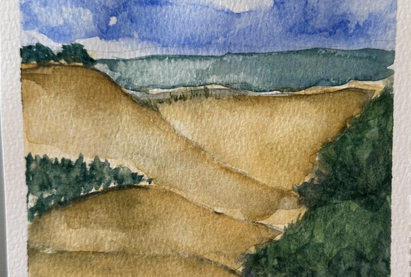
one picture and another picture which I'll be finishing in the next video. But for these two paintings, I want to set up basic washes. The most basic wash I'm
going to be doing here. I decided to get
some photographs of my dogs on the beach in
some opportune locations. The first one is
in a simple one. I'm going to be doing
a gradient from a dark blue to a
lighter shade here. And then, again,
following through with some more blue here in the bottom because
it's a cooler area. To take things a
little bit further, I'm going to be doing
multiple colors for this wash over here. I'm going to be
doing a blue wash here for the sky and
a bit of the ocean. And then a slightly warmer wash here for the lower
section of the painting. Now, considering that this photo is taken on a cooler day, it might be better
to leave it as a cool wash for all or to
leave this area black. But I'd like to warm
up the painting a bit, especially in this area to
really bring out the sun. And I find that the sky
in this picture will be a great area for us to practice working with
weight on weight, as well as controlling the pigment in a
wet area over here to make the sky a sort of dappled blue
as it is in the image. So I'm going to be
taking my large brush. I have here my blue, and ultramarine. I
have more water. And all I'm going to do is
pick up some of the pigment. Spread it out here because I might later use it for mixing. But I feel that there's
too much pigment in there, so let's keep it nice and light. You can't take away so
easily with watercolor. So what I'm going to do is
I'm going to simply move my brush slowly down the page. Back and forth. I'm
doing this quite a lot in this mag because
what I want to do is create a gradient with my wash. The gradient is simply letting the pigment run
thin near the end. Now, we can also include a new color to that
gradient if we wish. But let's keep it nice and simple for our first basic wash. So one color. And you might
be using blue quite a lot. Let's add a bit more water
just to really work this. You must always keep
your washes weight. Now, I should say that
while this does look okay now for the image
that I'm working with, I'm probably going to add a
bit more pigment into it. I think the gradient is
too thin near the area. So I take a little bit, mix it here, add
a bit more water. Start at the top because I
want most of the pigment to be there and add it as I go here. Use a lot of water, and if it's too much
there at the bottom, drag it upwards with clean
water to create that effect. Okay, for now, that
works quite nicely. But now we need to take care
of this area down here. Now, as you can
see in the image, this area is der
than the sky itself. So what I'm going to do is while I'm mixing
here with my blue, I'm going to add a
touch of my red. This will make your
blue a purple. It just deepens
the color itself. But it's still quite bright now, so that's enough red, let's add a bit more
blue to darken it again. To deepen it a bit more, I'm going to add a bit more red, and perhaps a bit
of yellow ocher. I always like to
use yellow ocher in addition to my three
primary colors of yellow blue and red because
I find it very useful, quite a bit too much there. That's probably catching too
much color in the brush. Let's add quite a lot of blue to bring that
back down again. There we go, now we're
getting much closer to the color that I want. It's not that I don't
like the purple, but I feel to get it
closer to the image. I need to make it a bit darker. The predominant
color is still blue to tell you how cool this
area of the sand is. Now while we're
here, I'm going to take my little rigger brush. I think I'll just
use a bit of blue. To work a tiny little figure on top of the Dun knee.
And there we have it. Basic wash, a nice
simple figure, and now we're going to move onto something a
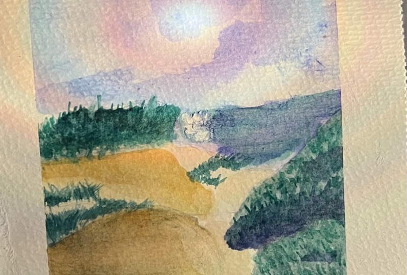
bit more complex. When it comes to the sky
itself in this next one, you'll notice that
it's a little dappled, and it's not a straight blue
sky like this one here. Still, the process remains
fundamentally the same. Pick up some blue.
Take a lot of water. I'm actually going
to extend it into the ocean because the ocean
is already blue itself. We just need to make
it deeper than that. Now, while it is still wet, I'm going to use one of
our other techniques, which is taking paper towel. And dabbing it in areas that I want to
lighten the painting. Now, while it is still wet, let's do a little wet on wet, which is simply taking
color and using an already wet part of the
page to help spread it out. So I'm going to darken some areas of
the clouds over here. It with little touches, to use a bit more water. Let's get it as watery as we can to really give it
that natural sense. This is why it helps to
always have your painting at an angle when working
with water cover is because it gets the water moving for effects such as this. Not only do you
have to work fast, but it does lend a more
expressive tone to a painting. You don't have to worry too much about accuracy and
creating insane details. It's all about injecting colors into where you want
there to be colors. I don't want the
foliage too warm. So I'm going to in areas
where there's bushes, just do very lightly probably
a bit too much there. But I can pick that up. But
mainly here in the bushes, I'm going to add a cool wash. Very large amounts of yellow
ocher for this warmer area. And I'm going to be very
sparing in what I do with it because I want some areas just to really be
lighter than now. Perhaps in the
darker areas here, the shadow of the Dune. Now, in the next lesson, I'm going to finish with
this painting over here. If you really enjoy working with wet and wet and the
effect it creates, and you don't want to work too
fast when you're painting, you want to sit back and
relax as you work it. To give yourself
a bit more time, I recommend another tool, which is a spray bottle. Creating a nice mist of water, which you can spray
over your page without adding it via brush is a great way to keep everything
wet on wet and allowing you to move colors around
and work with that pigment. And if that's something
you enjoy doing, then I do recommend
getting a spray bottle, but specifically a
bottle that will create a mist rather than a spray bottle that
sends out a stream. You don't want to hit your
painting and blast the colors everywhere unless you're working with something more abstract. You want to create
a mist of water, and you want the water to
fall and settle on the page. Don't spray directly or too
close to it because again, the force of that will spread the pigment in
unpredictable ways. That being said, if you are also following along with
these paintings, we'll continue
with this painting over here in the next lesson. So I'll see you then and alfa.
5. Final Demonstration and Conclusion: Hello, and welcome back to your Watercolor
Fundamentals course. This is the conclusion
video to the course, where I'm going to finish
off this painting. Just mainly, I'm going
to add the bushes, darken some areas
and do the ocean. But that should be enough
to contrast as well the softness and the fluidity
of clouds in the sky. I have attached these photos
to the course itself. You'll probably find it
in the project section. So if you want to work on
these paintings as well, as I feel that these are ice basic ones to get started with, as long as you don't try to
get too detailed with it, but mainly they provide
you an opportunity to experiment with washes and
use your tools effectively. Now, the ocean itself, I feel is a little green
compared to that of the sky, but I don't want to get
carried away with that. I also want to be very
careful in what I do do with this ocean as I feel
if I use too much, I can create a muddy mess, which is commonplace in
a lot of water color. Feel that's better, but I
want to now take paper towel, and just gladly dab this
area to lighten it. Now for the bushes,
we're going to also still need a green. I think that same sort
of green is good, but I like to bring a bit life into my bushes as
much as possible. So there's nothing
wrong with just adding a bit more warmth to the yellow and then
balance it out here. It works nicely.
I'm going to start with just a very watery color
to fill in these areas. I'm now going to take a bit
of blue because I want to darken these bushes over here. Because these bushes
here on the edge of the dune are being hit with the light directly
in front of it. We can't see it in the image. But for us, it's even darker. So adding blue makes it
a much darker green. And for these bushes here, it's more actually
a few grass sprigs sticking out of the dune itself. So I'm going to keep it light, but I don't mind getting
carried away with some areas. I'm not using a lot of water in these parts because I'm trying to be a bit more
detailed with it. But while it is wet and wet, I'm going to be adding
some dark green that are used for those amongst
these bushes over here. Just touching it up in areas to break up the
shape a bit more. I'm going to take a bit
more of that yellow ocher. Let's keep it light. So I'm going to do the shadows of
the areas the darker areas, just with another layer of wash. Once you got that, we
could finally move on to our darkest docks,
which is our shadows. And I'm mainly going to
take blue at this point. And just dab a little bit. Very lightly in key areas to add that final
level of depth. And there we have it. The
completed demonstration. You can see how effective it is to simply use your brown brush. It is the brush that
I use the most often, and I believe most
watercolor artists will understand why. Maybe I've muddled that
a bit too much there. Maybe I should have gone
straight into the purple instead of the yellow ocher darkening
those shadows there. But I still think that works quite nicely because it brings out that warmth that I wanted. And that brings us to the
end of this course as well. I do hope you enjoyed and found these
demonstrations helpful. For getting into watercolor, I think that understanding the fundamentals and
practicing with them, employing them in small
demonstrations such as these, will help give you
a better sense of how to work with
your materials and the techniques you can use
when crafting your paintings. The more you do this,
the more familiar, you'll be comme
with the process, so you can look at a picture and understand what you need to
do in order to recreate it. If you've enjoyed this
course and found it useful, be sure to follow me as well. As I'll be doing future
demonstration videos, tackling some more
difficult subjects. I've done plenty of
landscapes myself, and I've also worked
with Ink and in watercolor whenever I wanted
to define things a bit more. And as you're painting,
please feel free to share your process or your finished works with me
in the discussions. It's also a great way
to join this community, as I am an active instructor, so I'll be able to reply to any questions or review
any work that you submit. Thank you for joining
me for this beginner fundamental course on
watercolor painting, and I wish you a lot of luck and happy painting
in the future.
 Matthew Dewey