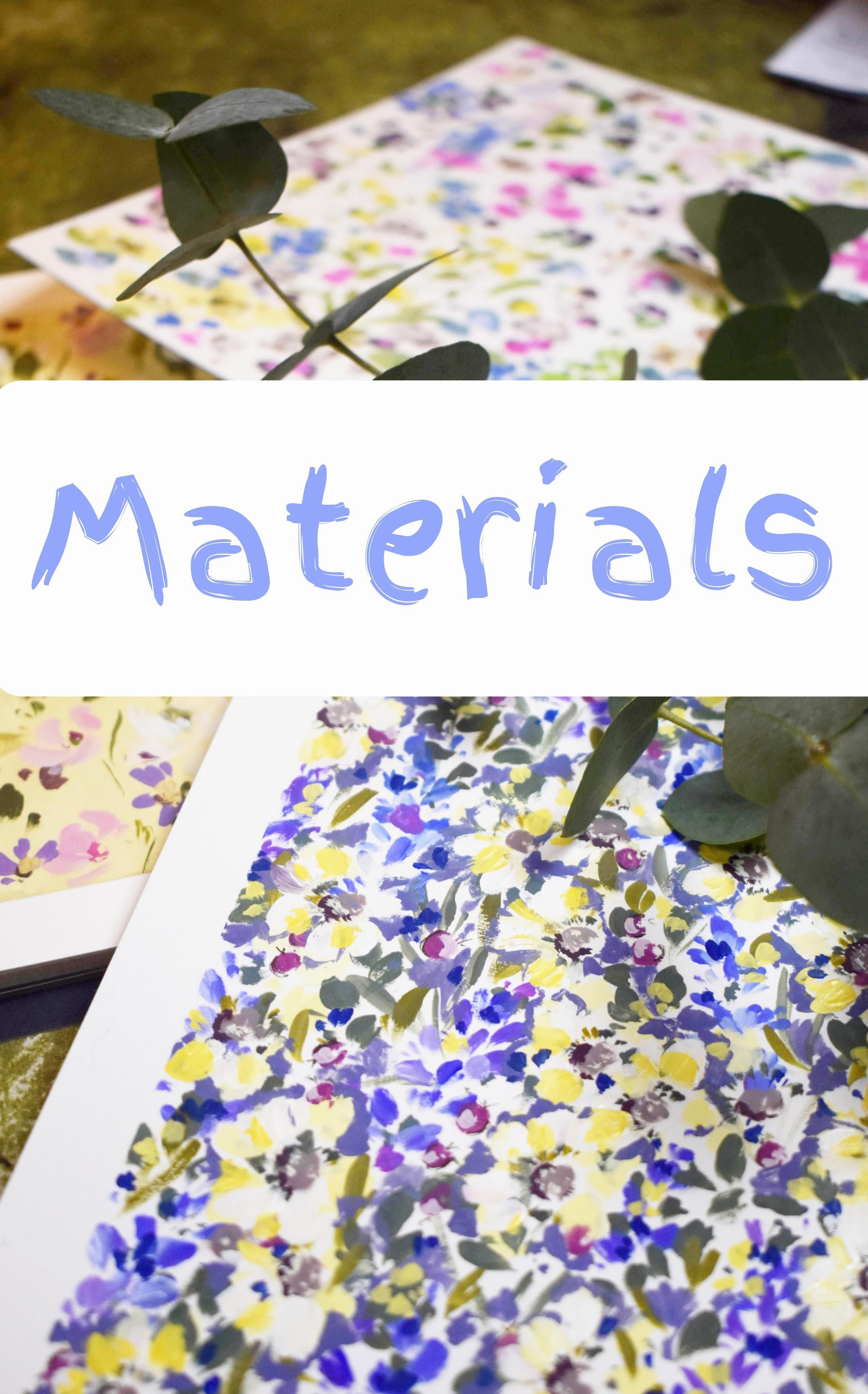
Transcripts
1. Welcome!: Welcome to Hestia.
In this class, we're going to be creating a busy summer garden
crammed full of flowers. But before we start, for
those who don't know me, I'm Holly Thomas, and I started
teaching four years ago. I feel I really found
my vibe on skill share. It's definitely my happy place. And I just wanted to say
thank you to all of you who support me and to my new
followers, a huge welcome. A little about where
I get my inspiration. I live with my partner and daughter with my
eldest just down the road in an
18th century house on the coast of East Lothian. It is, I feel, one of the
prettiest areas in Scotland. And we're lucky enough to
live near the Lamame Hills. We have beautiful beaches. This is Belhaven Bay. And castles. And most of all, we have
great areas of conservation. The coast includes Bass Rock, which is famous for
its Gannet population, and also the Isle of May, which I can see from my window, which has one of the largest
puffin colonies in the UK. I love puffins. So here's what we're going
to be doing in Hestia. We're going to start by
taping off our page. Then we'll create a lovely
foundation of pretty leaves, beginning with
beautiful larkspur with its long stem
and clusard florets, and then painting sunny
potentilla flower heads, dusky pink berries. And as we did in
Scottish wildflowers, we're going to be adding
pen details to our berries. Last but not least, we'll be creating
tiny dotty blossoms in hands yellow deep
and French ultramarine. So who is this class for? It's for confident beginners
to intermediate level. Those seeking a restful, unhurried, and gentle
teaching style. For those wanting to gain confidence in the
layering of flowers and foliage and painting intuitively with more heart led
brush movements. So the basic techniques we'll be covering are mixing a
complimentary palette, and we'll be doing that
throughout the class. Spacing out motifs to create
a slightly random feel whilst aiming for a cohesive finished painting, and finally, learning how to
keep a balance in our paintings with the
use of paint value, layering, brush
stroke, and detailing. I know for a lot of us, painting offers a balance in life and really adds to
our emotional well being. So whatever flavor of
chaos you're dealing with, got you covered, at least for
the duration of this class. There's no pressure to share your work, but if you'd like to, you could find out
how to do that in our projects and resources area underneath the class and on the right,
submit project. So, shall we move on to
the class? Let's go.
2. Taping off Our Paper & Base flowers: And I'm going to
start out by using this empty washi tape
in my favorite color. So I'm going to start
off with my size five round brush and putting some titanium
white gouache down and some undersea green. A And I've put that in two places
because I want to make a gray green
with the white mix, and I also want
another well with some of that green into to
mix with other colors. So let's start with that
green and white mix. And this mix is neutral green. And it's a lovely way
to start out painting. So first of all, let's
just create some leaves. I'm sometimes bringing
the leaf into the center and sometimes using the brush
away from the stem. Also varying the size
and the direction. Because this is going to
get quite busy later on, we don't need to worry
about it being perfect. It's more about the
feel of it, really. Some kind of starting off at the top and
working my way down. Maybe the leaves get a little bigger as we move down the stem. And I'm just varying
them a little bit by elongating the leaves here. So I'm putting the
tip of the brush down and then just carrying
it through for longer. They're very sketchy, and
there isn't a lot of water on my brush and a lot of paint. So it's about getting the
right consistency for you. But it's a dryer
approach, for sure. So you can see how much
paint is in the well. And I would say that it's
probably 80% pigment, 20 water, if not more pigment. I'm just mixing it so
that it moves, really. I This is a fairly new brush to me, but I'm liking it so far. I also have an squada in this
size, which is lovely, too. So moving down the page and just scattering
these leaves around, let's fill the space here. And I'm going to run
this one off the page. So you see we can get some
very different shapes just from one brush
and one color. I from the page there, just to give it a
feeling of continuity, so it has a life
beyond the edge.
3. Gestural Blue-Green Leaves: So I'm putting some French
ultramarine down now. And that gives us this
lovely rich bluey green. Let's see what that looks like. Ooh, so rich. I love it. I might just add a
little white to it, see where we get with that. Just spending time mixing
these colors together. French ultramarine
undersea green and white. Until I get this kind
of neutral greeny blue, This time, I'm almost just dotting and
sketching with the brush. Certainly not thinking
of them as leaves, per se, but just marks. Try not to worry too much about
them looking like leaves. We're getting a very
free, sketchy feel. Just the tip of the brush
dancing over the page. Little scribble, little dot. And remembering the
edges of the page.
4. Larkspur: So those are our base
leaves. Now what to do. And I started off with a very messy palette
for which I apologize. I was messing around
with different colors. So I'm just clearing out a well so that I can have
a nice clean colour. Sometimes I don't mind if
they mix on the palette, but other times it
needs to be clean. So some French ultramarine. And I did actually
think this was gouache, but I'm pretty sure
that's watercolor. And I'm trying to get the
last of my white gouache out. So I'm cleaning my
brush really well. Got some fresh water. I often have two pots of water, saves interruptions,
and you can just carry on mixing knowing that your colours will
be nice and bright. So a lovely bright blue here with French
ultramarine and white. Isn't that gorgeous. And we've got two very
different blues there. And I am putting some
of this gorgeous, bright opera pink down. And that's squash. And I'm mixing that with some
of the French ultramarine. I'm trying to mix a
nice violet colour. It's one of my favorite mixes. So I thought it might be nice to do some of these
more leggy flowers. They can be anything you
imagine them to be and these are pretty much
the same movements as we've just done
with the leaves. But we're following a
line down in the middle. So imagining that the
stem is running down, and we're just adding these either side
and in the center. And the reason why I don't do the stem first with
flowers like this, it's just a personal thing. I am a bit freer with my brush strokes when
there's no stem there, so it doesn't interrupt anything and I can put
petals wherever I like. So I do actually usually
go in afterwards. We did flowers similar
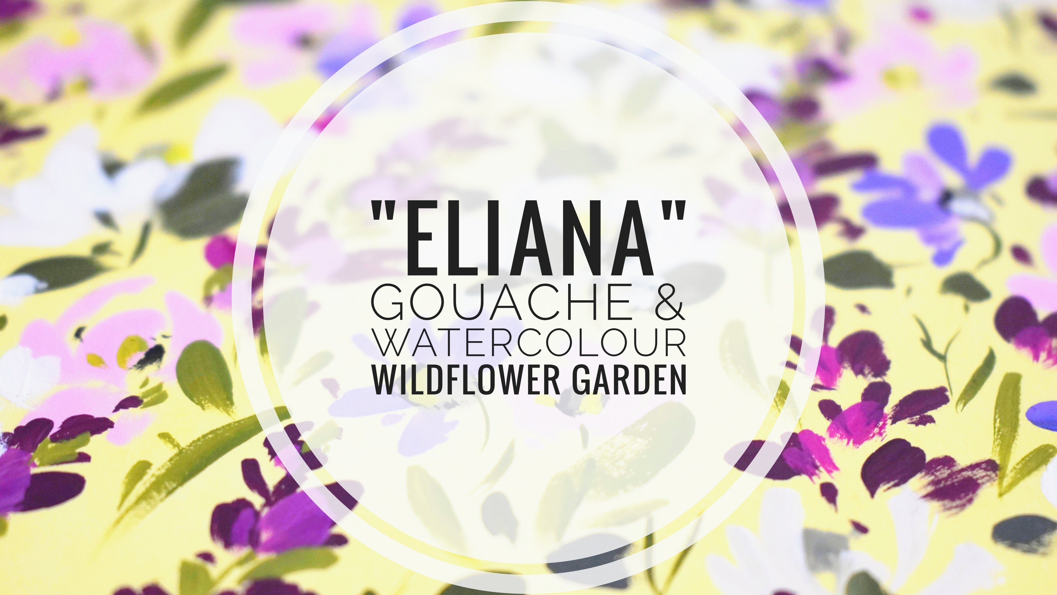
to this in Ileana. And I'm working between
a few blues there. We've got the violet, of
the pink and blue together. We've got a kind of a sky
blue over to the left. We've got that very cool
white blue at the bottom. So I'm just dipping
my brush in between all of these different hues
of the pink, blue and white. This is an easy way to
bring your flowers to life to vary the
color just slightly. And you can always go back in and add different
colored petals. So my paint gots a
little bit tacky, just adding a bit more water. And this here is still
my size two Filbert. And slowly working my way down. A little bit more
white, I think. So we're working from that
almost neat French ultramarine to almost white. We're also embracing the
fact that we're going over our first layer
of leaves now. And that's what we
want because that's what this whole
painting is about. Very thick layers with this one, hardly any white space. So I'm still flitting
between the blue, the pink, and the blue and
pink together in the violet. Trying to keep them quite
fluid and not think too much. You can tell there that I've got a bit conscious of
what I was doing, and that feels a bit less free. So just gonna see what
I can do with it. And while I've got
color on my brush, I do often go around and just dot that on the
other plants as well. Looks a little bit better having a bit of pink and violet in it. So you can see all the lush
colors that we get between the blue and pink and how
many variations we can get. Mixing with opera pink keeps
these flowers looking fresh. Just topping up the
French ultramarine. So we're working on the
edge of tacky here, and by that I mean, hardly
any water, almost neat paint. It gives us a lot of
control this style, and it also means that we can correct little
mistakes quite easily. So if you have too
much of one color, you could always go in and place another color
on that petal. So there's a bit more freedom
with this squash style. I actually love
it just as it is, but I really want to
experiment today with a very crowded page with
quite close knit layers. But I might come back
to doing one like this. I think it's so lovely, just the violet and
the green, very fresh. I don't want to bring
this one down into the page too much because we've got that
one just below it. And remembering the
sides, as well. It's quite nice
actually going over these leaves because we can see them poking through
some of the flower heads. So I think just one down here. I just want to scatter
them fairly evenly. We don't have to get too prescriptive with
that because we're going to be doing so many
different layers on top. But it's nice just to have a nice bed of
flowers to work on. So adding more opera pink I just realized this one
was a little bit blue, so I just want to add a
little bit of violet. And just that
little flower head. Maybe a couple of
throwaway petals here just to make it feel like it
goes beyond the boundaries. I do want that feeling. It might be nice for us to
explore that, you know, as if it's kind of exploding
off the page with beauty. Okay, so washing my brush and taking time to consider
what we can do next.
5. Potentilla Centres: So I'm just cleaning
a well so that I can keep my colours nice
and crisp and clean and putting down
some perlein violet and renewing my white
there in the top well. So let's mix a nice cream color, and I'm using white and just a touch of the
handsome yellow deep. And then let's mix some of the Perlein violet with
a bit of the yellow. It's got a tiny touch
of white in it as well. And then that's add blue. So what I'm trying to get
here is a kind of a brown. I don't mind if it's
on the red side. And that's kind of
like a marooni brown. I like that. And I think I'd
like a lighter version, too. So I'm just taking
some of that up above there and mixing
it with the white. So we're going to continue
with that dryer style. Not much water on
the brush at all, and the paint very thick. So what we're going to do is start with the centers
for our flowers, and we can keep the placement
a little bit random. And it doesn't
matter, obviously, if we're going over
motifs underneath because that's the whole
kind of plan with this. Is this kind of crowded
wildflower garden feel. So there can be full spheres or just a sea curve or a
little bit of white space. They don't all need
to be the same. And remembering to take up some of the
flowers to the edges. So this is a mix of undersea green with a
little bit of white in it, and we're just going to tap in these little stamens
around the center. Little dots, really. You can also use a small round brush
or a liner brush for this. And we can start
to relax because all of these flowers have that
same kind of feel to them. So we're getting
into almost like a repetitive style
of painting here, which is very meditative. I don't want to miss any, so just keeping an eye on that. You can see I'm doing
these really quickly, and I found that I get
a style that I really like doing that because I'm not thinking
about it too much. I'm not trying to be perfect. I'm just trying to
create a very kind of rustic, expressionful style. One tactic that I
really like for flower centers is to get
a few colors in there. So I'm just rinsing
off my brush, and let's mix a kind
of a mustardy color. And that's very simple given
the colors that we have. So all we need to do is to
add that aubergine kind of Perlin violet mix and add that to our
handsy yellow deep. I'm gonna get this very quick
and easy mustard color. So we can then just take
our time to dab in some of this color in between the green that we've
already placed down. Very pleasurable and
a lovely pastime. Make sure you have a nice cup of tea or your favorite
drink next to you. Take little breaks
when you need them.
6. Potentilla Petals: So I'm replenishing the white. And this could be
gouache or watercolor. If you're using watercolor, I have noticed if you go
heavy on the watercolor, that it can look a little shiny, which is why I suggest
that if you want to make the transition over
from watercolor to gouache, that you buy a tube of white gouache because you can then add that to any
of your watercolors, and it will kind of lend
a guache quality to it. So starting with our
gorgeous petals now, just bringing them
to the center. So I just want to show you here because it's not
showing up too well, but we will be able to see
these more as we continue. I've added the
smallest amount of hands yellow deep to the white. I'm using gouache, so it's very, very bright, as you'll
know from other classes. So I just want it erring
on the side of a kind of a buttercup yellow,
very gentle yellow. And just bringing
up little strokes from this filbert brush, keeping it nice and loose. And again, embracing
the fact that we're now going over the
motifs underneath, and that's exactly what we want. Or you could also choose to allow some of the
motifs to peep through. And because this painting is
all about the whole effect, we don't need to get too
hung up about perfection or, you know, the placement
of the petals. It's much more about feel and all the flowers and
leaves working together. Let me just do a
quick close up here. I work quite quickly, you can obviously
go at your speed. And I love doing classes like this because it does
allow you to rest. Because we're using
a dryer technique, it means that we're not as
reliant on drying times. So what we can do now is add some white petals on top
of the buttery ones. So I'm using the white
very, very thickly. We just want our brush to be damp and for there to
be no excess water, just enough for it to move. And we'll start to
bring out and see these flowers in our
following lessons. But for now, we're
just building up a little bit of texture
with this white. And it looks so crisp. I love that against the blue
and the flower centers. Again, very meditative
because we're going over petals we've
already laid down, either over them or in between. And you can see I'm
continuing to move between a one stroke petal
and little two stroke petals. If you feel the paint is getting tacky and isn't
moving very well, I tend to leave the
paint on my brush and just dip the tip of
the brush in the water. So that way, you're
not losing all of the lovely lush color you
have on your brush. I
7. Grey-Green leaves: And maybe it's time to
add some leaves now. So I'm just rinsing
out my brush and adding some white to
the undersea green. I do like this color. It's kind of a gray green, depending on how
much white you add. And I've purposely mixed
it into a neutral green because the colors that we've laid down are quite neutral, so I don't want these leaves
to suddenly leap out. We want them to mix in beautifully with what
we've already done. And you can see now that the
flowers are coming forward. We're just giving them a
little bit of structure. And with these, I'm going
from the tip to the center of the brush and using a very similar action
to the lark's fur. Keeping it nice and
loose and quick. And isn't it beautiful? I love how paintings kind of start to create
themselves, almost. They start to come out
of the page towards you. Just adding this tiny touch of green has done
that. I love that. And I'm placing some of the
leaves to kind of curve around the petals and some in
the white space in between. So we're getting a
general coverage of this lovely gray green. And not forgetting the edges. I do like to bring things
right up to the edge and over just so we get that lovely line when
we take the tape off. Paying attention now to where little leaves
need to be added. Trust your eye on
this because you will notice where there are little white spaces
that you want to fill. And just adding those leaves
has taken us on leaps and bounds because it's just framing all of the flowers that
we've already placed down.
8. Berries: So let's move down to a size zero in a filbert
or a round brush, and let's add some berries. So I'm just going to
wake up the opera pink. Just a gorgeous color. And it's really nice
for color mixing, too. So I'm going to add white to it, and then maybe a little
of the periviolettll we get a very neutral kind of violet towards the
red, like a red violet. Don't lose that quality. And then just as we did with
the center of the flowers, we're just going to create
these little berries. And again, can be
full berries or little sea curves or circles with a little
bit of white space? And just place them where you feel you would like them to be. You could stay with that
kind of partial random feel. Put two berries together there, just to break things up and keep it lively and as if it's
dancing on the page. And you'll know from my
other classes that the way I do berries is with
a very dry brush, and I like it because you
have ultimate control, really, of the paint. So very dry and a
very thick paint. And I love how this pink
tends to tie up colors. Again, I've said that before that Perlin violet
is so good for that. It's starting to
look really cohesive now and to get that
kind of random, slightly chaotic look
of a wildflower garden. So every now and then, I'm just placing a couple together. I've always been interested
in placing a color down and watching how it transforms
the colours around it, and we're starting
to see that now with this pinky perylene
violet and how it reacts with the blue lilac
violet and creamy yellow.
9. Detail On Berries & Flower Centres: Let's add some highlights
to our berries. And as we've done in
previous classes, it's very, very simple. Just going to mix a nice white, which has a tiny touch
of the pink in it. And then we're going to just do these little sea curves or little splodges even on
one side of the berry. And you can relax with
this, I promise you, because I used to spend ages
trying to get this perfect. But actually, a little
splodge means a lot, and it's amazing how much it adds to the round
effect of the berries. So don't give yourself
a hard time over these tiny little throwaway
dots and sea curves. So I'm just going to turn my page around so
I don't miss any. But also, so I don't
smudge my work. So whilst we wait for
the berries to dry, let's do a similar thing to
the center of the flowers. So let's go back to
our perylene violet. Mix it in with a
little bit of white. I'm just taking the
excess paint off there, just so I have some control. And then I'm adding some
little dots around the center. And what we're doing is
creating a little bit of shadow around the center. And it will just allow
it to pop a little bit. So just following
around the centers. You could either
use a sea curve or little dots or a
little scribble. It's really effective, and it starts to bring
the flowers forward again because as we add detail through
all of these layers, we need to take care of every motif and bring
it along with us. And again, this is a
restful part of the class because we already
have the motifs down, and now we're just bringing them to life a little bit more. And I'm just slowly
working my way around. I do try to catch them all, but sometimes I do
miss the odd one. I noticed in previous
classes when I've done that. And I imagine you're screaming
at me through the screen. But maybe that's a good thing. We don't want things to be
too polished or too perfect. And can you see how that brings them forward
just a little bit?
10. Berry Pen & Flower Centre Details: So we can return to
the berries now. And we could use
a technique that we've used in
Scottish wildflowers, cleaver, pimpernel and
forget me not class, and also the winter
doodle class. And we're going to
use our pigma micron. And on one side of the berry, we can add these little Vs. It just seems to transform
them into berries. And we can also add
just a little bit of shading on one
side of the berry. And again, this serves to bring the berries
forward, as well. So we're going back
and we're kind of tending to our garden so that all the motifs are working together with a similar
amount of detail. You can use a fineer pen, but I tend to ruin mine because I go in when the
paint's still a little wet. So I just have reverted
back to a 01 size now. So just continuing on, adding little touches and
little vis for stalks. Forgot a little center there. Just going back in
with a peri violet. So stopping and having some thinking time is
a really good idea. I don't often map out
everything that I'm going to do and paint
very intuitively. So I make decisions
as I go along. So I might add a little
white to the centers, and I'll switch down
to my liner brush. But you can stick with your
zero size brush for this. Or you could even dot some
in by using the base of a brush or the clay modeling
tools that I've used before. And because that's such a
neutral color in the middle, the white just adds
a little bit of highlight to it and
brings it forward, which is what we're
looking for all the time to bring all of these
little elements together. And you can also use a
white gel pen for this. With the white gel pen just from my own
bitter experience, I know that if I use
it on wet paint, it carves into it rather than
leaving the white on top. So I usually have to wait until the paint is
really, really dry. I also realize that I need to recognize when
they're running out. I've made so many mistakes
with that in the past. So I keep nice fresh
white gel pens, wait till the paint is dried, and I don't push down very hard. That's another thing
that I've realized that starts to then carve
in, and we don't want that. In this case, we've used it
that way in other classes, but for this, we want
it to lie on top. A good technique to remember
as well with paintings like this is you can place a very light color
next to a dark one, and it's a lovely
vehicle, if you like, for creating a
little bit of drama, a little bit of
interest for the eye. It's like a little
light dancing movement, and it creates these
imperfect shapes, which I feel always adds
something beautiful. I
11. Warm Green Leaves: So let's go back to
creating some leaves. And this time, I thought
it would be nice if we mixed a lovely warm green. So using the colors
that we already have in our palette and picking up some of the
handsy yellow deep and mixing it with
the undersea green, which I've just added there. And this moves the green very much into the
olive green camp, and we're going to
make a neutral out of that by adding
white squash to it. And we want this
to be quite thick. So let's see what this
looks like on the page. And I'm doing them just
slightly more elongated, just to bring a bitter variety in the color and the shape. So this is very tacky. So I think I'm just going to
add a tiny touch of water. And as with the other motifs, and placing them in white spaces or over
our previous layer. Just allowing my
intuition to take over. Going around some of
the flower petals to define them a little bit more and in other
places going over them. Bit more water. It's kind of difficult to get it
just right with gouache. I do like using
quite thick gouache, but of course, it
has to move as well, so it's about getting
just the right amount of water too to keep
that value of paint, but allow it to flow.
12. White Potentilla petals: So what next? I think it would be really nice to add some
white to these flowers. And it can go really textural, I think, using very thick paint. There's hardly any water
on my brush at all. And let's stick to our size zero Filbert brush or whichever brush you've chosen for this class. And this is very, very thick, very textural. And it's quite nice to have
a slightly raised surface. So don't be afraid to get
a lot of the white on your brush and then go in either over the petals we've already
painted or between them. And you'll start to see at
this point in time that we are actually going over some of the motifs that we've done
earlier, and that's okay. I quite like that where
a painting evolves, and sometimes you miss or obscure some of the motifs
that you painted originally. And I like it because those motifs helped
you get where you are. So don't worry about going over other leaves or petals or flowers because that's
all part of the process. We set out to make this very busy kind of beautifully squash together wildflower
garden where there's hardly any room to breathe and they're all
jostling together. I'm taking time to go over some of the darker
motifs with the white. So some of the leaves, which I really like
because it also adds to the sense of
depth and layering. And we can start to see how the potentilla is becoming
more defined now.
13. Violet Background: Let's have a look at
the blue flowers again. So I've put down some
more French ultramarine. I'm mixing that with white. And then I'm bringing some of the Perlein violet down
and mixing that, too. And again, we've done this before where we've
chosen our palette. And then we're
borrowing from all of the colors to create
these beautiful neutrals. That is a gorgeous color. So I have this idea
now that I've got this beautiful color to
define the flowers even more. And I love this little
scribbly technique, which we can go
around the petals, and we're also negative
painting almost here. So what we're doing is painting around with these little
scribbly movements. And because we're using
complimentary colors opposite on color wheel, it just looks
absolutely gorgeous. I love purples violets with
yellow and buttery whites. So I'm not worried here about, you know, are these
flowers? What are they? We're just adding this
lovely little shading to really allow them to shine. It's a nice introduction into
negative painting as well, because I always find that
can be quite overwhelming. But doing it in a
very small way like this is it's a nice
comfortable place to practice. So you can define
the petal you can go in and create a space
between two petals. And you see here, I'm just shaping and bringing
those in a little bit. So this is your chance to reshape them into a
formation that you like. I will have to remember this
color again because Oh, it's just I just love it. And can you see how that
dances with the yellow? So this very, very soft blue violet and very
soft white yellow. So turning my page upside down, you might find this
helpful as well, because it just gives you
a different perspective, and you start to pick up on things that you may have missed. So with this, we're really relinquishing control
over our background now. We're accepting that some of the motifs that we've
painted will be painted over, and the painting is
choosing its own direction. I started out with just wanting to define very
gently the flowers. But now I really like this
as a kind of a background, so I'm not too worried
now because we have a lot of blue and violet in the background already
with previous layers, it's all merging
in really nicely. I find one of the easiest little details
is to do a little V like that where
you're shaping the petal and it's going
almost up to the middle. I'm just adding
tiny little touches of water to keep it fluid. But this is very thick paint. And I'm just drawing
some of these out even further 'cause I realize
I really love it. I'm doing another
little V inlet there. Just going up and over the tape. And another little V there. So now I can see that
the lark spur is moching with this beautiful,
muted blue violet. Just bringing a few
little lines up there to complete the petals. And you can move down to
a liner brush for this. So just looking where there's little bits of white
space that I don't want. I think it's nice to
have a little touch, but as this is designed
to be very busy, I just want to make
sure that there's, like, an even coverage. And going round
the berries there. I don't want to go over them. So again, losing some
of the motifs here, breaking well into some of
the petals, and that's okay. And as I go around, I realized I wanted to
extend some of the violet. So I'm kind of pulling it
out a little bit more in areas to create that lovely, busy but complimentary
background. Let's get a bit watery now, but it's not far to go. I have neglected this
bottom right hand corner, so just picking out
the berry there and the other berry and just
bringing it to the outer edges. I just thought I'd create a tiny little flower
in the corner there. And up into the
top right corner. And also picking up
some of the leaves now. Just going round that. So what started out as just
little maybe a bed of flowers behind the white yellow flowers has turned into a kind
of a lovely background. And it does take a while. When you get into doing
something like this, which is quite intuitive
and you're darting around, going from one
flower to another, it actually holds your interest because it's also got that
expressive quality to it.
14. Yellow Potentilla Details: Right, so I put my brush
down a little bit more hands yellow deep still
with my size zero Filbert, mixing a little of the white. This is the easiest kind
of warm yellow mix. And now I want to just add
back in some of the yellow. Just some little highlights. This is our way of taking
care of the flowers that we've painted and making sure
that they all get to sing. And you could decide to go
quite bright with these. I think all I would caution is that we're using
these neutral colors, and they all have equal
value figuratively, but also paint value and tint. So, you know, we just need to keep a balance because if we put in a really acidy yellow
or a very bright yellow, we'd lose that balance between the violet and the
buttery white and yellow. So for this, what we're
doing is borrowing from a gouache white to just make all of these
beautiful neutrals. And I'm really liking this. I'm glad that I've
done this because it feels now that they're
moving even more forward. So going back to flaring
the brush a little bit, flower and wiggle. And suddenly, it looks
like the sun's come out and these little
flowers are blooming. And whilst I'm here, I'm just going to add some tiny little blobs of yellow around. Not even trying to make them
anything in particular. Just little blobs
and the old dot. Because this whole process, as we've done before, is about tending to
each of our motifs. So the more detail
we add to one motif, the more it comes
out towards us. And so we need to then go into the other motifs and
bring them up, as well. It does take practice. And I think doing
layered paintings like this gives us time
to check in with ourselves and just
create some restful, peaceful time,
which we all need. So, yeah, I'm really
enjoying this. I think that's a good move. It now feels very cohesive.
15. Finishing Touches & Reveal: Just casting my eye
over the whole now, asking myself, is it working? And I want to add
just some tiny, little highlights now in blue. So this just defines that
background, a tiny touch. So we've got those little yellow almost flowing
in the breeze, petals separate
from the flowers. And now I just want
to add a little bit of definition in the background. And using a neat color
like this when we've used all neutrals is really effective because we're
using it very sparingly, but because it's so bright, it kind of really
makes everything pop. I think the charging thing with multi layered paintings like this is knowing when to stop. So I am going to be careful that I don't
do too many of these because what happens
then is I'll have to compensate by
adding more details to the flowers and
so on and so on. So it's very good just to pause and keep looking
at the overall picture. But I continue my love
for French ultramarine, which I think I hadn't
fully appreciated before, so it's nice to work with it. It's almost like the sun is catching those lovely
yellow petals that we added and also these little dots of bright color
in the background. And adding some of these on
the yellow flowers as well. I don't want them to just
be in the background, just like little
hints of this color. So looking over, I'm
really loving that. I don't want to add any more, so I think it's time
for the reveal. And the great thing about these thicker paintings
is we don't need to wait. We can take that
off straight away. Oh, little garden. I think one of the
main reasons I like taping is because it does leave a little
mystery towards the end, how's it gonna look,
but also frames what we've done and gives
it free reign almost. It's like it looks less busy actually when
we take the tape off. But yeah, I'm so
chuffed with that.
16. Thank You!: I thought it might be a
little different if I shared some of the photographic
work that I've done. I don't get out often, but when I do, I take
loads and loads of photos. And although I may not use
them directly as resources, it all kind of sinks in and
inspires me in my work. I always aim for
my classes to be informative, relaxing, and fun. And because this class
has so many layers, I hope it's been accessible to those of you who suffer from chronic health conditions in that you've been able
to rest between layers. And I also really
wanted to focus this class on emotional health. I do feel it's really
important that we take some time away from the difficulties
of everyday life and just a place where you
can completely switch off. So I hope I've managed to do that and that you
really enjoyed it, and are taking a few of the
techniques away with you, namely mixing a
complimentary palette and painting intuitively
also came in quite strong with this
class and moving quite quickly so that our heads
don't interfere too much. And just as we focused on
the balance of the painting, I hope that this class has offered a little
balance in your life. So thanks again,
and I will see you over in discussions
or on Instagram. Take care. Bye bye for now.
 Holly Tomas Art, Watercolour | Gouache | Mixed Media