Transcripts
1. About the Class: No matter your experience level, you can pat holiday cards that feel like
little works of art. Every year, I look
forward to creating a holiday watercolor
class that's easy, fun, and achievable
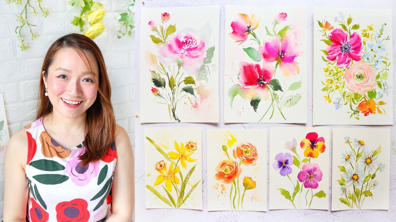
for everyone. Hi, I'm Jolly. I'm a
watercolor artist, content creator, and a
skillshare top teacher. For nearly a decade, I've focused on painting loose, expressive watercolor florals, and my goal is to make
watercolor techniques simple and approachable so that anyone
can create beautiful art. In this class, we'll
create a variety of holiday theme cards
from delicate wreaths, whimsical trees,
a floral porter, and even a classic
holiday dessert. Aside from using watercolor, you'll also explore using white gouache and
white pen to add some snowy effect and also gold paint to add some
sparkle to our holiday art. Each project takes
less than 20 minutes, so you can easily fit
them into your day. Whether you're a beginner or more experienced
with watercolors, don't worry, as I
will be guiding you step by step
through each project. Alright, ready to make some
holiday watercolor magic. Now let's get started.
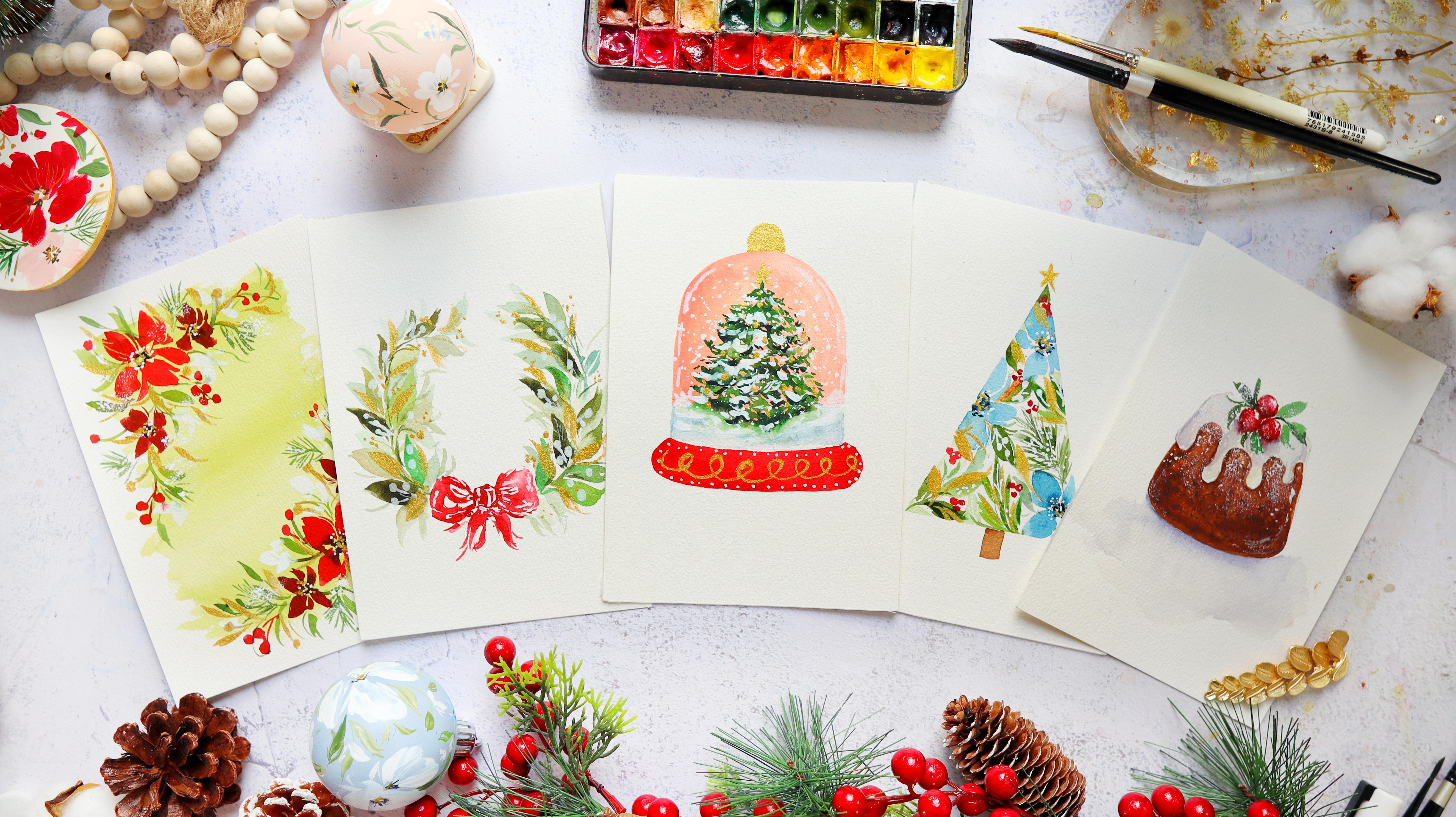
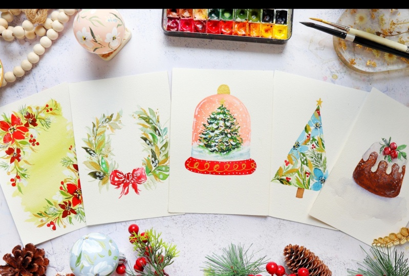
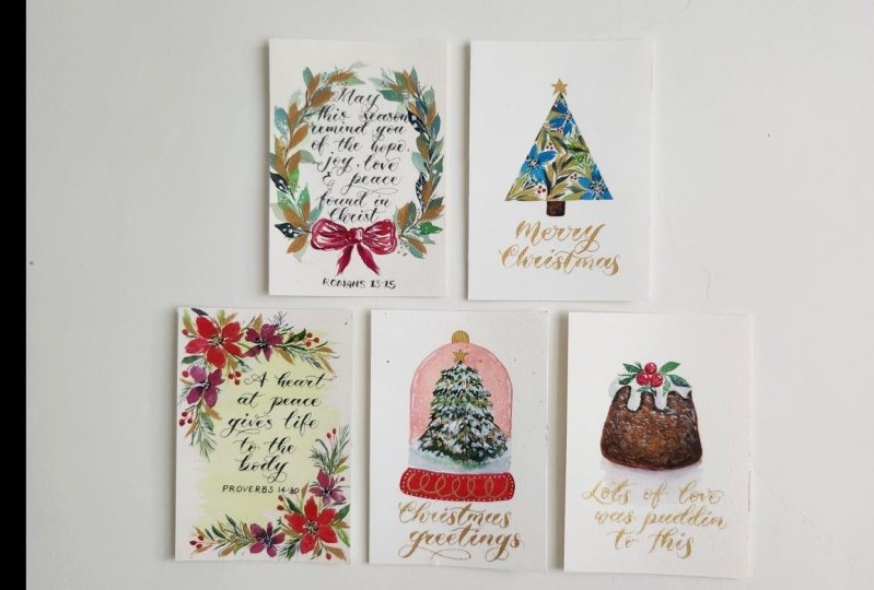
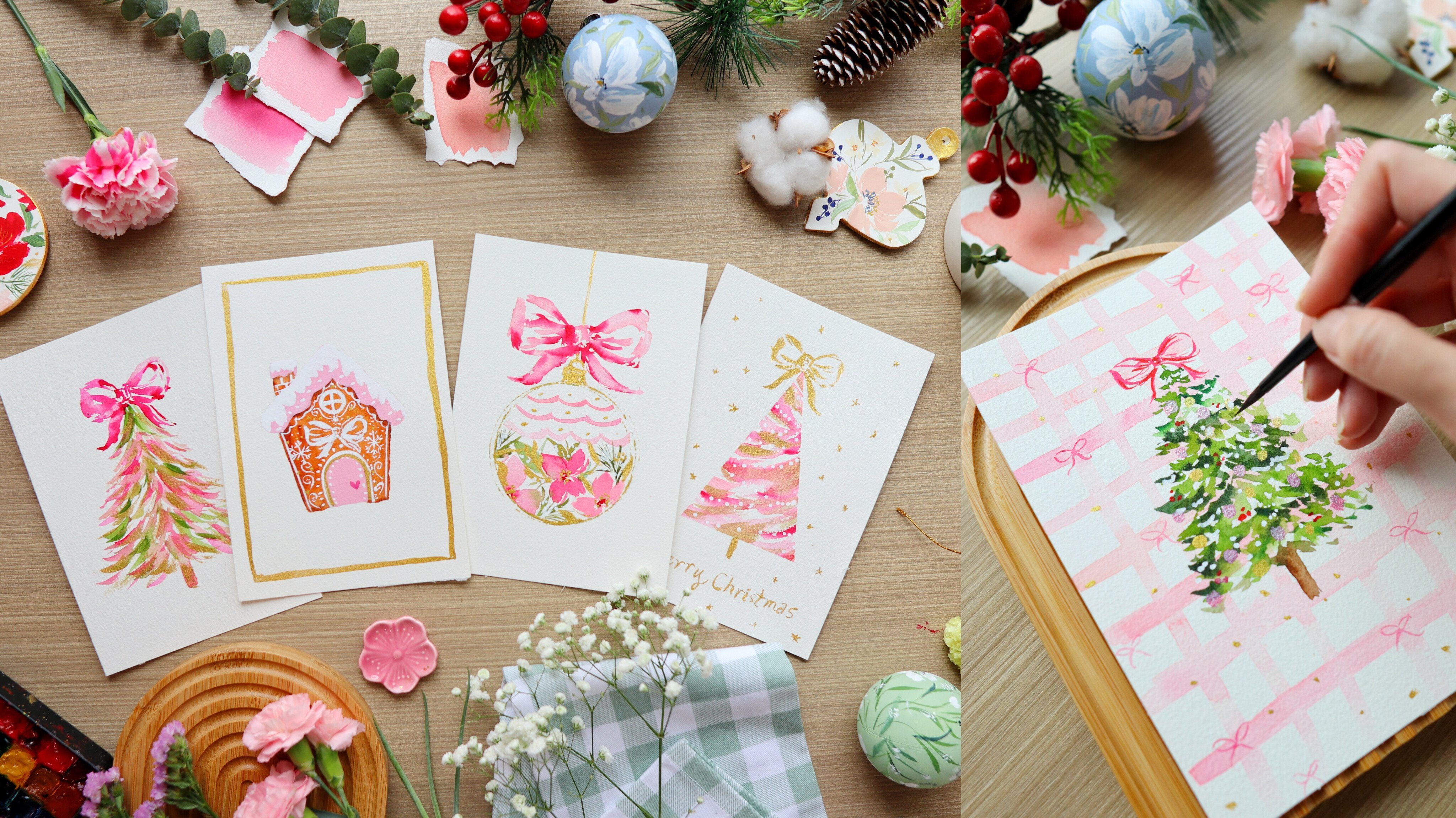
2. Class Overview: Welcome to the class overview. So in this class, we are
going to paint five projects, starting from a simple one to a more elaborate
holiday element. But don't worry as
everything will be filmed in real time so that you
can follow along. We'll start with a simple
yet elegant wreath that is filled with different
shades of green and gold. Then we'll wrap it up
with a cut ribbon in the middle and you can even
put a greeting in the middle. Next, we'll paint this beautiful whimsical tree with florals, and I just love
the clean edge of this tree that we can
achieve by using a tape. You can also change
the colors of the flowers to suit your style. For the third project, we'll
paint a floral mortar, and I chose a red one to
just make it more festive. You can also write a
greeting in the middle. Now, I am in love with
the fourth holiday card because it's a little
bit different. The background of
this snow globe is a pastel peach color. You may choose to change it to blue so that it has
more of a winter feel. I just chose peach because I feel like it has a
vintage soft vibe. So we'll be painting
this tree also with some snowy effect
using white wash. For the last project,
we will paint a yummy looking bunt cake. So bunt cakes usually have
ridges or curves on the sides, but I just made this project simpler and just
more approachable. So we just got rid
of the curves. Now, you'll learn
how to also add some powdered sugar
effect using a sponge. Alright, so that's it. Now,
let's get to the next video.
3. Materials : All right, so let's talk about the materials
that you need. First, we are going to use
this watercolor paper. It's from the brand Bao hung, and it's 300 GSM in thickness. I'm using this watercolor block, which means that all the sides are glued except for this part where you can slide it off using a palette knife once
you're done painting. We're going to use
cold press paper, and it has this
beautiful texture. It's perfect for loose
watercolor florals. The size that we will be
using is five by 7 ", but you can also go a
little bit smaller. Next, we're going to
use our Shinhan PWC. These are Korean
artist grade paints, and they come in tubes, but I just pour it into
small half pans like this. And what I love about this paint is that it's very vibrant, and it also stays
moist on the pants. Next, we also need
a mixing palette. You can also use just
regular ceramic plate. And then for the snowy effect, I'm going to use
holebin white gouache and permanent white. So you can see the
beautiful texture here. I used gouache to add
the beautiful details. We also need sponge, just a regular sponge, and we're going to use
that to add some texture, just like the powdered
sugar on the bun cake. And because we are painting
smaller paintings, we need smaller brushes. I am using these silver
black velvet brushes in sizes two, four, and six. These brushes are very soft and they maintain the
nice pointy tip, even when it's filled
with a lot of water. But of course, feel free to use whatever
brush that you have. Next, I also need a flat brush for painting one of
the backgrounds. So this is the project where I will be using a flat brush. But if you don't
have a flat brush, you can use just a
regular round brush. Just choose a bigger size. Next, I will be using silver
ultramni designer round. This is a synthetic brush, and I specifically
use this brush to add some tiny details and
also for the gold paint. So whenever you're
using a gold paint, I highly suggest that you
use synthetic brushes. And because this is a
holiday card glass, you need to add some white
details for the snow effect. And I'll be using
this white pen. This is the Posca acrylic pen. If you don't have this pen, you can simply use
white gouache as well. I just decided to use this because sometimes
there are details that are easier to
add using a pen. So you can see the
beautiful dots here that look like snow. For the gold paint, I will be using the kurretakeGld mica, and I really love this. It's like liquid gold, and it's just so convenient to use because you
just have to shake it. And once you open, you
can use it right away. You don't need to add water. But of course, feel free to use any gold metallic
paint that you have. And so we have a project
where I'll be using a tape to get the nice
clean edge like this. And I'll be using a
Japanese washi tape. You can use regular washi tape. For this one I actually
got this in Japan, but any regular
washi tape will do. It usually works better
on 100% cotton paper. In the past, I actually use regular masking tape, as well. Of course, we need
a jar of water and also some tissue paper just to blot out the excess
paint in our brushes. Alright, so that's it. Now let's move on to the first project.
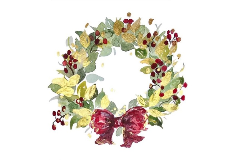
4. Project 1: Holiday Wreath: Before we start, here are
the colors that you need. Welcome to the first project. So usually the first
project is the easiest, and we are going to paint this beautiful wreath with
a cute bow in the middle. Let's do a quick overview
before we start painting. So we'll start with the
ribbon in the middle. I'm going to do a fading
technique where I will be painting some few bold
strokes just like this. And then we're going to use water to soften
some of the edges. And when we're done with that, we're going to add some leaves on the left side and
also on the right side. This will be just
one layer first. Once the first layer is dry, we can add the second layer of leaves to make it more lush. And here's the fun part. We're going to add some
sparkle using gold paint, and then we're going to add some white berries
using a white pen. Alright, so that's it.
We're just going to add a few more finishing
touches and we're done. So let's start
painting this project. Let's use a pencil to
sketch this ribbon. I'm going to put a
small dot right there just to mark the
center of the wreath. And we are going to loosely draw a very simple ribbon
shape, just the outline. Next, we're going to
put some curve lines on the left and also on
the right side of the bow. And this is going
to be a guide later on so that we know where
to put the leaves. So I'm just trying
to eyeball this, but you can also use a round
object to do the outline of this wreath so that you can make sure that it's
really a round shape. I'm using a size
four round brush, let's grab some permanent
red for the ribbon. So you want a very
thick mixture. You want this to be
really bold in color. I'm going to use a tip of
the brush and just paint a few strokes in the
middle of this ribbon. Using the tip of the brush, we're going to paint a few
strokes in the center, and we are not going
to fill in this space. Add a few strokes and
leave some white spaces. Next, on the flap of the ribbon, we're going to just draw or paint a few
strokes like this. And then I'm going
to rinse my brush, and we are going to fade
away these strokes. So this is the fading technique. And using just water, I'm going to spread around this color and create
the shape of the flap. So this is how we achieve
a loosely painted ribbon. And you'll notice that
I am leaving a lot of white spaces that's going to make it look very
pretty later on. Now, on the left side, I'm going to do the
outline of that area, and I am not going to fade
away the strokes that much. So I'm going to use a very thick mixture and make sure to leave
some white spaces. So I do love doing
this style for ribbons because it creates
a painterly style. Alright, so now we're going to add the legs of the ribbon, and I'm just going to
grab some more paint and just add some really
short strokes. You can do a little
flick towards the end of the stroke so that you
get some nice pointy tips. Alright, so it's looking good. Now let's mix a darker color. This is permanent red, which is a tiny bit
of hookers green. I'm going to add it near
the folds of the ribbon. Now, this is going to give it more depth because we're
adding some shadows. Okay, so let's
prepare our greens, and we have here hooker's
green and also sap green. So I like to mix this with
a little bit of brown. Let's use burnt umber. So it's nice to
prepare these paints beforehand when you're
going to paint a wreath, so that's just faster and
easier to paint the leaves, just grab any green
in your palette. Now I'm also going to add
a little bit of blue. I'm going to use brush and blue, but you can use any
blue in your palette. Alright, so we have the
colors that we need. We can just add more later on. Now, let's start some
really simple leaves. Slowly press your brush
and live towards the end. Going to put a few
stems as well, then rinse my brush. And now you have a
lighter green color. Okay, so just grab different shades of
green in your palette. You can play around
with the colors. Just continue to add some stems, just short stems, and then
attach some leaves to it. So it's always nice
to vary the colors. So you can alternate
it one that's dark, another one that's light. Towards the top, you can make the leaves a little bit smaller. And for the placement
of the leaves, make sure that it is
diagonally across each other and not
beside each other, just to make it
look more organic. Alright, so we're going to leave a little bit of
space at the top. So we're not really going
to close off this wreath, but of course, you
can close off if you want it to be that way. But for this project, just to make it look a
little bit different, I decided to heap the top open and just
leave a small gap. Alright, so you
just continue to do the same process
on the right side, and we're just going
to keep adding some leaves now you can also
vary the type of leaves. You can add some pine needles
or maybe other shapes. So it's completely up to you. I decided to keep
this quite simple, since this is the first project, and it's going to be like a
warm up exercise for you. Alright, so I need to add
a few more darker leaves, so I'm going to mix more
burnt umber to my mixture and just put it on top of some of the leaves just to
add some contrast. So I'm going to let
this dry first, and I'm using a small fan, but you can use a heat gun, or you can just wait it out until this first layer is dry. Once it's dry, you can grab a
few greens in your palette, make sure that it
is quite light. You can see my mixture
is very watery, and you can paint it on top of some of the leaves or
in between the leaves. And you'll notice that
it's quite translucent so you can still see the
leaves underneath. So you can mix in
a little bit of that prussian blue
to your green, and you can see that
it's going to give it a cooler effect on the wreath. So you can continue to add some second layer to fill in the gaps and make this
wreath look more lush. Alright, so it's looking
really good now, and we can add
some more contrast by adding darker leaves. So just add a little
bit more of that burnt umper to
create this color. You can also add short
strokes that look like stems. So here comes the fun part, we are going to
add some sparkle. I'm using the Kura
take gold mica, and this is what I call liquid gold because once
you open the bottle, you can use this
paint straight up. No more mixing, no
more adding of water. I'm using a different brush. So this one has
synthetic bristles, and I just prefer it that
way because I feel like the natural hair
brushes will get ruined with the metallic colors. So height here, I'm adding
some gold leaves underneath. So this is another
layer of leaves. We're going to put
just a few leaves here because we don't want
it to look too overwhelming. This is just supposed
to complement the wreath and not make
it look too overcrowded. We're going to add a few
small dots as fillers. So this is great to
add some fillers for those small white caps and also add some texture
to your wreath. A to add some winter vibes, I'm going to use a white pen. This is posca acrylic pen, and we're going to add some
white berries on the wreath. So I notice that whenever I add some white
berries to a wreath, it just makes it look prettier. And again, it adds this
winter vibe to it. If you don't have
this white pen, you can simply use
the white guash. I just find it easier to use a white pen because
it has more control. So try to add these white
berries on the darker leaves because that will make
the white berries pop up. And there is no rule as to how many berries you
add in your reef. It's completely up to you. So I am just making sure
that I have covered most parts of the wreath just to make it
look more balanced. So you can also add some veins on the leaves
using this white pen. And if you want to add some
highlights to the ribbon, this is also a good
time to add that. Let's make sure that the
ribbon is already dry. Alright, so we are done. I think this is
just a beautiful, simple wreath that you can recreate in different
colors as well. And the gold paint really
made it stand out. I'm excited to see what you can create from this tutorial. Alright, so now let's move on to the next video as we
pat the new project. Oh
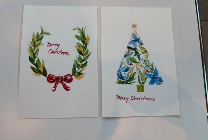
5. Project 2: Whimsical Winter Tree: So before we start, here are
the colors that you need. For our second project, we're going to do a
whimsical winter tree, and I love the cool tone blues that we added in this project, but you can also paint
this in different colors. So it's a very
versatile project. Let me give you a brief
overview of this project. So first, we need some tape. This is just washy tape, and going to create a triangle. Next, we are going to
paint our flowers. So I decided to make it blue. I just feel like it has
this winter vibe to it. So I guess it depends on the
vibe that you're going for. You can do pinks and
oranges and yellows. Next, we're going to fill in the spaces with some foliage. So I'm going to add
some simple leaves and also some pine needles, and you can use different
shades of green for this one. And then we're going to
add some red berries. This is going to help
make the composition more alive and also
give it a holiday vibe. Of course, because
we're doing cards, we are going to use some gold paint to
make this stand out. I'm just going to paint
some simple leaves and just some fillers. And we're also going to
use a white pen to add some whitebrries and
some snowy effect by putting some small dots. Once this is dry, we're just
going to peel off the tape, and it will reveal a
beautiful clean edge. Using gold paint, we're
just going to paint the star and also the trunk of the tree, and
then we're done. Alright, so let's get started. So you can actually draw the triangle shape first
before you add the tape. But right here, I'm
just going to eyeball this doesn't have to be perfect. So we're going to
use a washi tape, and this is a washi tape that I use or I bought from Japan. You can use regular
printed washi tape. So I'm just going to try and
form an elongated triangle, just a tall triangle so
that it looks like a tree. Just make sure that you press the tape really hard on the
paper so that it will stick, and then you'll get a nice
clean edge afterwards. A Okay, so now we have our triangle. I'm going to just
prepare some colors on my palette so that it's
faster to paint later on. I have here hookers
green and sap green. So I want to also mix this
with a little bit of brown. I'm going to add
some bunt umber. So it's going to give me
an earthy brown color. And at the same time, I'm going to grab some more
hooker screen and sap green and put it on a
separate area on my palette. Next, let's grab some indigo
and also some Prussian blue. So you can also use different
colors for this project. If you don't like blue, you can definitely change it according to your preference. So I'm using a size
four round brush, and I'm going to
grab Prussian blue. Let's start here at
the bottom right, and we're going to just paint
a simple five petal flower, lightly press your brush
to create a petal shape. Alright, so next,
we're going to grab some indigo and add it in the center just to
give it some contrast. And if you noticed, I painted the petals on top of the
tape, and that's okay. That's gonna help us achieve
a clean edge later on. So they're going
to need a cross. I'm going to do another flower. This is just three petals. So we don't really need
to paint all the petals. Okay, so it's nice to change
the shape of the flower. Some are side facing, some are front facing. And now I'm just adding
a darker center. Let's put one more at the top. So just try to experiment with the
placement of the flowers. You can also vary it. So can be smaller,
some are bigger. Alright, so I'm
just going to add a few more indigo in the center. Alright, it's time to fill
it in with some foliage. I'm using just sap green
with some burnt umber. So we're just going to paint
a simple leaves right here. And again, I'm trying
to paint on top of the tape so that we'll have
a clean edge later on. I just rinse my brush so that I can achieve a
lighter green color. So try to experiment with
different shades of green. I'm using a size two
round brush now. I'm going to paint
some pine needles. So I just painted
one stem and then added some arms on the sides. You can see I'm doing some
really thin, short strokes. Alright, so we're just doing a simple version
of a pine needle, since this is just a
very small painting. You don't need a lot of details, and we can just grab a
little bit of indigo and add it in the center just
to give it more depth. Alright, so we can go
back into a size for round brush to paint some
slightly bigger petals. I'm just trying to
add the leaves in between the flowers.
I'm also at the top. I'm putting in a little bit of that green paint
just to fill it in, and then we'll get
that nice pointy tip at the top of the tree. Right here, I'm just doing
some elongated strokes, so you can vary the
shape of the leaves. Now, let's just
grab a little bit of that brushian
blue and add it to our green so that will
have a different color. This is just a very fun
and easy card to make, and you can create lots and lots of cards with this design. So I feel like it's a bit flat, and I'm just adding some
darker green color. You can add some
indigo to your green, or if you have
black, that's okay. And for that holiday
vibe, we, of course, need to add a little
bit of that red, some grabbing permanent red. So you'll notice that we
have some white spaces, and we can put
those small berries in the small white gaps. I'm just going to do a
cluster of three berries. Alright, so I think
it looks very nice. I'm just going to
go back in with some darker green for
some of the leaves. I'm just going to
paint it on top of the existing leaves that we
have to add some contrast. I Alright, so just wait for the painting to dry before you add
this gold paint. So I'm using the
Kuretake gold mica. And again, you've seen this
in the previous project, so just open the
bottle and you can dip your brush and
just grab the paint. No need to mix. You can just shake the bottle
before you use it. So I'm just going to
layer the leaves with some gold so you can
paint some gold leaves and just make sure that you add just a few leaves in this painting so that
it's not overwhelming. So I've also decided to add some small gold dots in
the middle of the flowers. So I can imagine this
painting also in a combination of red
flowers and green leaves. I think it's also going
to be a nice combination. I next, I have my
posca acrylic pen. So you can use different sizes. This is, I think three M, and we want to add
some white berries. And then we can also add some small dots on the pine needles that
will look like snow. If you have a sponge, you can also play around
with dipping your sponge in a white gouache and adding
some texture on the leaves. But for this project, we're just going to use the white pen. I'm also going to add some
dots in the center of the flowers just to give
it some more detail. Alright, this step
is very important. Make sure that the painting is already dry before
you peel the tape. Okay, so now I'm going
to peel this tape, and it will reveal a
very nice clean edge. So to get that beautiful edge, make sure that you really
paint on all the sides. Try not to leave
some white spaces near the tape so that
you get a nice line. Okay, so at the top, I'm just going to
paint the simple star. And for the trunk, I'm
going to use burnt umber. You can also use gold
paint if you wish. So there's a space at the
bottom of this project, and you can put the
greeting there. You can put Merry Christmas. Alright, you can look at
your painting from afar and check if you want to
add some more details. So right here, I'm just adding some indigo in the center
just to give it more depth. Alright, so that's it. It's very easy to do. I hope you had fun painting
this whimsical tree, and I hope to see it in different color
combinations as well. So don't forget to upload your project in the
project gallery section. Now let's move on
to the next film.
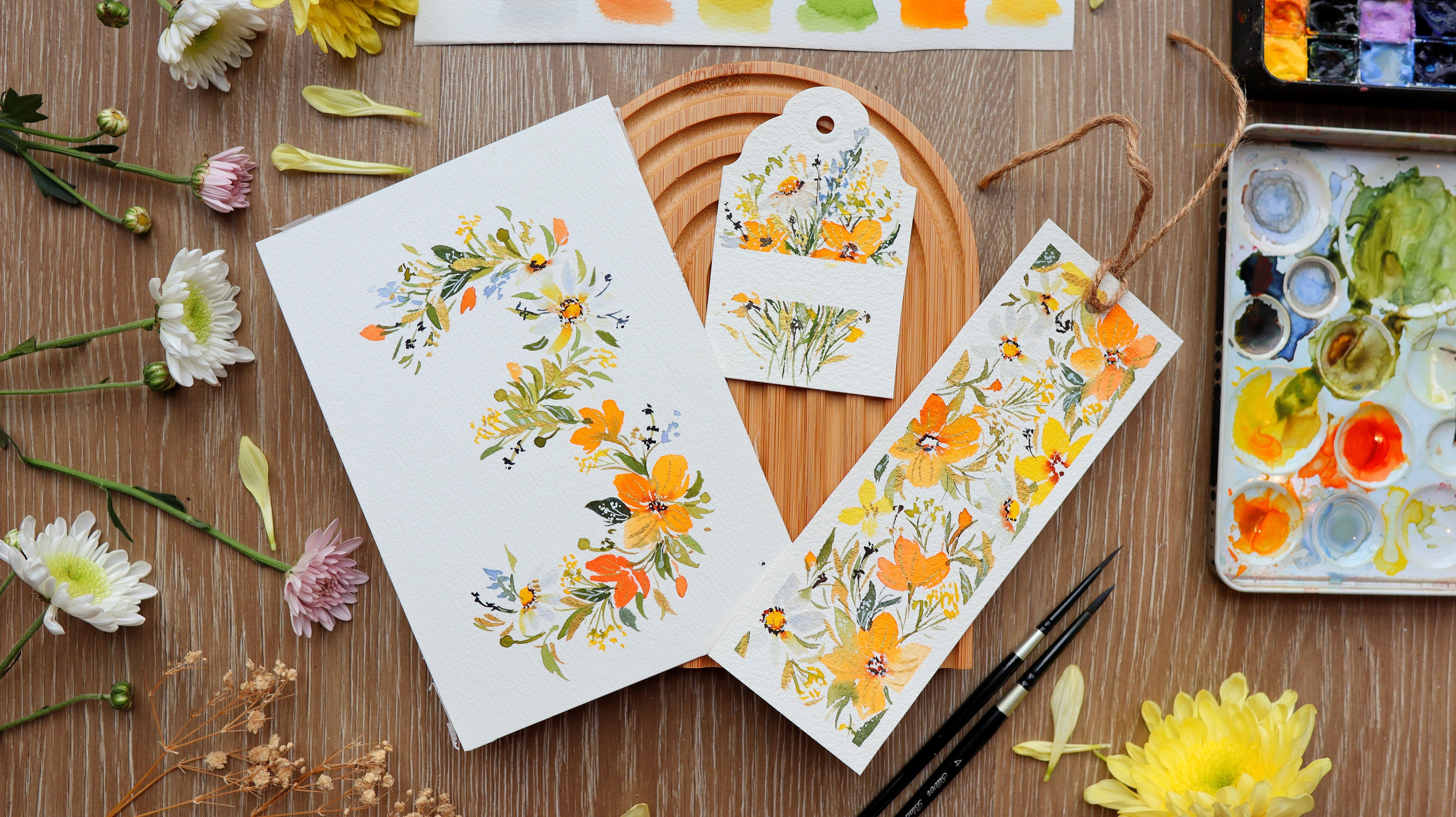
6. Project 3: Holiday Floral Border: Before we start here the
colors that you need. So I decided to make
a holiday card idea where you can put
more greetings, more words in the center. So this is really perfect, and you can adjust the size of the flowers and make it smaller
so you have more space. So let's do a brief
overview of the class. So we're going to do
the background first. I'm using watercolor
with a little bit of gouache to get that
nice opaque background. And I worked on a
green background because it complements
the red flowers, and the red flowers just gives
off a more holiday vibe. We're going to keep
it very simple. We're just going to paint some
simple five petal flowers, and I just did it in two colors. So one that's a bright red and just two small flowers that's
a little bit more maroon. So I'm going to do the
lower right side first, and then we're going
to add some details. I'm adding some white
flowers using white gouache. We're also going to
add some berries and some more leaves
and pine needles. And then we're going to head
on to the upper left side. So this is a floral
border where we just put it on the corners
of this holiday card. So we're going to do
just the same procedure, add some white flowers, some foliage, some pine
needles and leaves. And we're going to use
a white pen to add some small dots in the
center of the flowers, but you can also use gouache and just add some snowy effect. I'm using a sponge and dipping
it in the white gouache, and we're going to dab
it on our painting. So I like dabbing it on the leaves so that it looks
like it has some snow. Next, of course,
we're going to add a little bit of this gold paint. We're going to add some leaves and just layer
this floral piece. You can also add some dots in
the center of the flowers. And then of course,
we're going to add some finishing touches, extend some of the
leaves to make it looser, and that's it. So let's start painting. So this is a five by
seven inch paper, and we're going to start
with a background. I'm going to put some white
gouache on the palette. This is permanent white. Next, we are going
to grab some color. I'm going to get sap green. So we're going to
mix watercolor and gouache to create the
opaque background. I just like a creamy background. I think this is a
really good mix, but we need a little
bit of yellow, so I'm going to add some
greenish yellow to my mixture. This is another versatile
project where you can change the colors
to suit your style. You can definitely do
different color combinations for this card. Okay, so I'm just going to
mix in more white gouache and make sure I have enough mixture to
cover the background. And if you need more color, just add some more watercolor. So this looks like a
nice bright green color. I'm going to use a flat brush
to paint the background. So I'm going to
start at the top, and we're just going to do
some horizontal strokes. And if the brush feels
a little bit dry, you can just dip it in water. So right here, I
added a little bit of water just to extend the
mixture in my brush, and you can grab
some more paint. So we're not really
going to be super strict about this background. I actually want it
to look more rugged, so that's why I
painted on dry paper. I really love the rustic
vibe of this holiday cart, and I love the edges,
the uneven edges. If you want a cleaner look, you can just tape off the sides of the paper
so that you have a nice clean edge or a clean border after
painting the background. All right, so this looks good. I'm going to use my small
fan to dry this painting. You can use a heat gun
or you can just wait for this painting to dry
on its own. All right. Now we can grab a pencil, and I'm just going
to put some dots as a guide on where to
put the flowers. I'm going to do three
flowers each on both corners that are
diagonally across each other. So it's roughly the
same pattern just to make it simpler and
easier for you to recreate. So for the flowers, I'm going to use red. I'm using the color permanent
red, but, of course, you can use whatever red
color in your palette. And then we want this
to be quite thick. So this is going to be
a really bold color. Then just lightly press your brush and then
live towards the end. Sometimes I use a tip of the brush to create
some thin strokes. So that's just do five petals
and make sure that you leave white spaces in between your petals just
to separate them. So I usually add some short
strokes and thin strokes near the main petals because it just makes
it look looser. Alright, so let's add some hookers green to
our permanent red. You'll notice how the
color instantly changed. It became a little
bit more maroon, and we're just going to paint some tiny flowers on each
side of this corner. So I'm really more of
just pressing my brush and moving it to create
the small petals. Alright, now let's
add some indigo in the center just to
add some contrast. Let's try to prepare
some of the greens. I'm using sap green with a
little bit of burnt umber. So this is going to be a
nice earthy green color. And then I'm also going to grab some white and just mix it up. Next reds grab Hooker is green. So at this point, you can
experiment with the greens. You can add some guash, add a little bit of red, play around with the colors. I'm going to start by
adding a small stem there and just painting
some tiny leaves. It's best to use the
tip of the brush to create these nice thin strokes. So I'm doing some curve
strokes for the stems, and it's always nice to add the leaves in
between the petals. Alright, so I'm just
going to extend some areas of this corner. Just add some nice
wispy strokes. Now let's grab some white guash and just add some tiny flowers. I'm just going to lightly
stamp my brush onto the paper, and create these fillers. Okay, so we have the
base leaves here. Now, let's add some variety. Let's mix hookers green
with some burnt umber, and we're going to
paint some pie needles. So using the tip of the brush, just paint some
nice thin strokes. So it looks like a
cluster of thin strokes. So I think adding pie needles in floral composition
instantly makes it look like a holiday card. A Alright, let's add some more shapes
to our composition. I'm going to add some red
berries using permanent red. Just try to distribute the berries all
throughout this corner. Knowing where to put the
fillers really takes a lot of practice and a lot
of mistakes, too. And you'll learn
from your mistakes, and next time around, it will be just more natural for you to put
these small fillers, and it won't be as
difficult anymore. Alright, so we are done with
the lower right corner. We're going to do the one
that is diagonally across it. So I'm doing the same pattern. This is permanent red, and we're going to paint
the five petal flower. So I'm just going
to do this loosely and moving my brush up and down, and you can use the side of the brush to create
a broader stroke. Now, let's grab some
more red and then mix it up with a little bit
of hookers green to create a more maroon color. So we're going to add the
smaller flowers on each side. Now, here's a more
close up video. So it just feels like
stamping your brush. It doesn't really
have to be perfect. Okay, this looks great, and we're going to add the
center to add more depth. This is just indigo. Make sure that you have a nice
thick mixture and just tap it in the center
while the flowers are all still a little bit damp. Next, just grab your greens and put some leaves in
between the flowers. I usually like adding these
curve lines because it makes the painting look more
dainty and also more loose. Adding the curve stems
will also help you extend some areas if you need
to adjust the height or the width of a
floral composition. Right, so we are just
painting on the top left and top right part
of this background. So we are not going to let the two corner designs
meet each other. You can see a gap between them. Now let's add some
white flowers. Using gouache. Okay, so let's grab our hookers
green with burnt umber, and we're going to be
adding our pine needles. Again, just use the tip of the brush and create
some really quick, thin strokes and combine it into a cluster like this so that you can create
some pine needles. I do have some basic tutorials on the holiday elements
in my previous classes. So you might want to check
that out if you want a more basic holiday
element tutorial. Alright, so it's
looking really good. So let's just add some berries. So you can also do the
berries in different colors. Maybe you can do some
in blue or purple. So it just depends on the color combination
that you have chosen. All right, so let's add some
white dots on the flowers. I like the effect of
adding small white dots. It just has a winter vibe to it. But you can also use white
gouache and just use a regular paint brush
to add these dots. I just find it easier to use a pen because you can easily
create the small dots. Now let's add some
more snowy effect, and I've decided
to use a sponge. So this needs to be a dry
sponge and just dab it in gouache and I'm going to dab
my sponge onto the foliage. So try to add this
to the leaves. It's going to give
you the effect that there's snow on the leaves, which is really, really cool. Again, you want the sponge to be dry and also the
gouache mixture. Don't add too much water because you'll end
up with blobs. But if everything is quite dry, then you'll be able to create these small specks
of white dots. So to add some sparkle, I'm going to add
some gold paint. This is the Kura take gold mica, and then we can just use
this synthetic brush. We're going to add some leaves. So the floral composition looks a little bit full already. So let's be careful about adding the gold details so that it
doesn't look overcrowded. So you can vary the
shape of the leaves. You can make it
smaller or bigger. So can be thinner,
and then you can also add some dots in the
center of the flowers. So try to play around
and have fun adding these small details
that will make a huge difference to the
overall holiday card. You can also add some
gold berries here, and I think it looks nice. So again, just have fun and add details that
feels right to you. I'm going to just tilt
the card and you can see the beautiful sparkle
from the gold pane. Alright, so we're
actually almost done. I'm just going to add some
more finishing touches using a very small brush. This is a size two round brush. So I'm just going to add
some loose leaves hanging around just to make this composition look
even more loose. Alright, so this looks good. I hope you had fun
creating this. And again, you can do it in
different color combinations. It's so easy to recreate, and you can make so many
cards using this design. Alright, so now let's move
on to the next video.
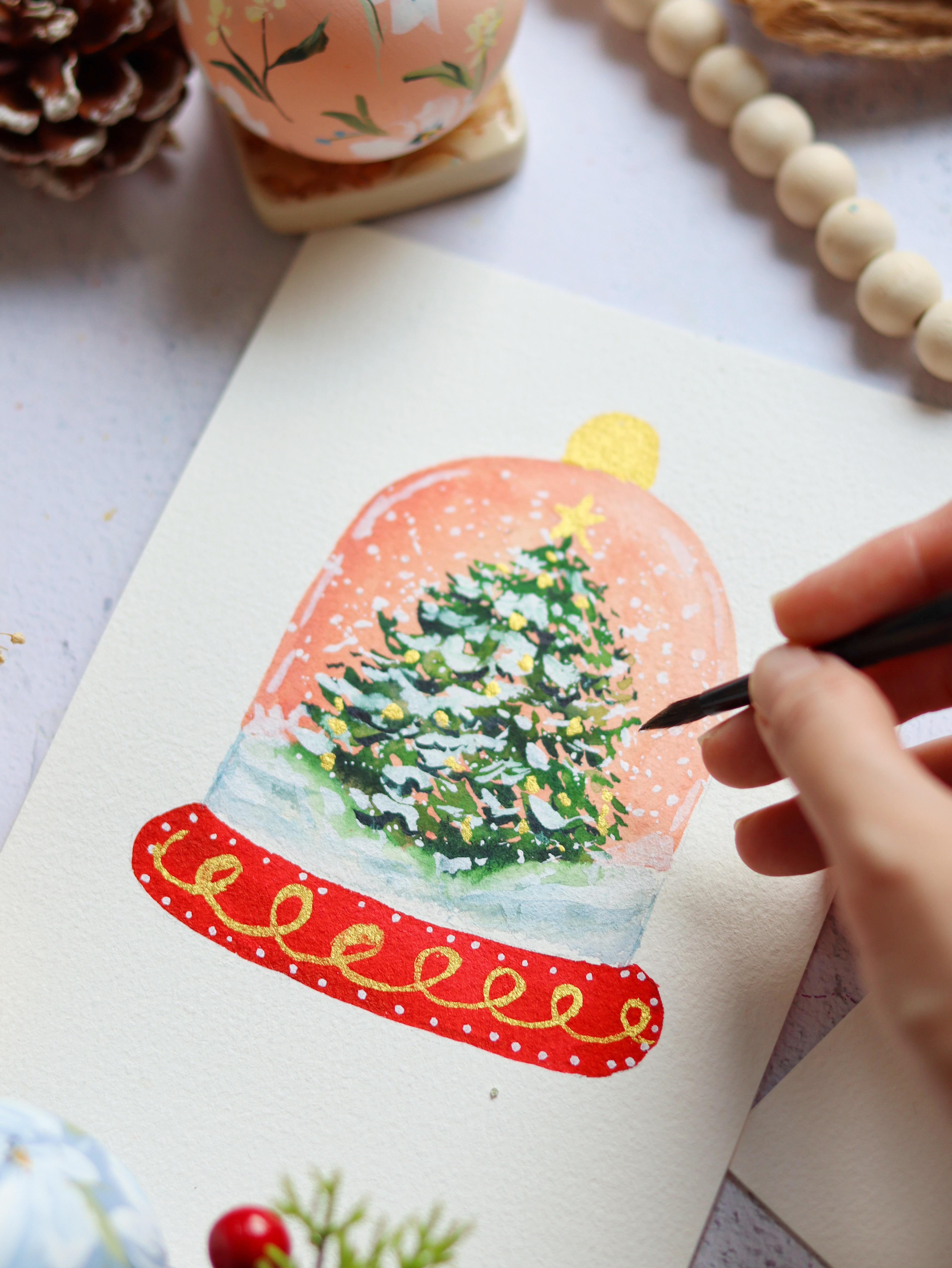
7. Project 4: Peach Snow Globe: Two. Before we start, here are the colors
that you need. This might be my favorite
project from the class. It's a beautiful snow globe with this pastel vintage
vibe background, and then you have
this beautiful tree. I just love the contrast
of the red base. And so let's do a
quick overview first. We're going to do the
background first. So this is the
peachy brown color with a little bit of
yellow in the middle. So while waiting
for this to dry, let's move on to
painting the base. Next, you see that
white cap over there. That's going to be the
snowy base of the tree. And when this is already dry, we can move on to
painting the tree. So I'm just going to blur out this edge so that it will
blend in with the snow. And then we're going to
use a white gouache to add some snow on this tree. Let's do a splatter technique to get some more snow
in the background. So I just had some
fun with the base and just added some
small dots as a design, and we're going to paint these wonky swirls at the bottom. And I just love how
imperfect it looks. And then we're going
to use our gold to embellish this tree, add some stars and
Christmas balls, and then we're just going to
add some finishing touches. Alright. So now let's move
on to painting this project. Alright, so I'm using a
five by seven inch paper and using a pencil, we're going to draw
the snow globe. Going to start right there and
then paint the curve dome. So this is going to
be a little bit tall. Next, I'm going to do the base. I wanted the size to be a little bit curve so that
it looks more dainty. So I'm doing a free
hand style of drawing. So you might notice
some areas might not be as even as the other
side, and that's okay. Next, I'm going to just draw the snowy part at the
bottom of the tree. You'll notice that it's
like a little slope. And then next, we're going to draw a straight
line in the middle. That's going to be our guide for the tree so that we know
where the center is. Okay, let's start painting
the base or the background. I'm using white gouache and also brilliant pink
and yellow ochre. So these are Brilliant pink
is a pastel pink color. And if you don't
have this, you can simply use permanent rose. So I wanted this color
to be a little bit peachy with just a
vintage vibe to it. And I also want it to
be a little bit opaque. So I added some white gouache. So just keep mixing the ratio
of the pink and the yellow until you get the peach
color that you prefer. Again, this also works with permanent rose and yellow ochre. Just add some more white gouache to get more pastel color. So what's great about
this project is that the background
can be changed. So if you want to
do a light blue for the background,
that's also nice, or if you want, like,
a midnight blue, I think that would be
great for a winter feel. So we are going to
paint on dry paper. So I'm going to fill
in the top part with this peach color. Right, so I'm just going to rinse my brush and
add a little bit of water so that I can
easily spread the color. So this doesn't
have to be perfect. It doesn't have to be even
all throughout this space. So if you have
some patchy areas, that's okay because later on, we're going to put a tree in the middle and also
some snowy effect. So it's going to cover
up some of the mistakes. So let's just slowly
fill in this space, just grab some more paint. So I'm just going to
grab a little bit of yellow ochre and add it towards the middle so that
when we add the tree, it kind of radiates a yellow background like
it's lit up from the back. Alright, so this looks good, and now we can continue
on with the base. For the base, I will be
using permanent red to make sure you mix
a thick mixture. It has to be a bold
red, almost opaque. I just love the contrast between this muted pastel color and
also this bold red base. Right, so this looks good now, and you can just go back
in to fill in some spaces. And then we're going to get
our fan and let it dry. Again, you can use a heat gun or just wait for this to dry on its own and come
back later on. Alright. For the white gap in between
the peach and the red, we're going to put some water. This is going to be the snow
at the bottom of the tree. So that's just water, and we're going to put
some blue later on. Alright, now let's grab
a little bit of indigo. So this is just a very, very light mixture of
indigo and just do some sweeping strokes really quick and try not to
overwork this area. We still want to
preserve some of the white from the paper. Okay, so this looks good. Let's just leave it as it
is and come back later on. So the background
is already dry. We can start painting the tree. I'm going to just
prepare some colors. We have hookers green, sap green, and burnt umber. So we can just try
to mix these colors. I'm also going to mix
a burnt umber with some hookers green for
a darker green color. If you have the color Perline
green or shadow green, you can also use that for the
darker greens in the tree. So start with hookers green. You can use a smaller
brush for this part, since you are going to
paint some smaller strokes, I'm going to start at the top of the tree and just lightly tap my brush to
create some leaves. I'm going to do the
leaves layer by layer, and you can see that I'm leaving a space in between each layer. I usually do this so that I
will not overwork the tree. I'm going to leave some big
spaces or gaps intentionally, and then later on,
you can come back to it to fill in those spaces. All right. So I'm
just going to rinse my brush and add some
lighter green color. You can vary the green colors in this tree to make it
look more interesting. Just continue to do
the tapping motion, and you can change the pressure in your brush so that
you'll be able to create some smaller leaves
and some broader leaves. Okay, so towards the
base of this tree, I'm just going to stop
there and rinse my brush, and then we are
going to blot out the excess moisture in
our brush like this, I'm going to lightly touch
the edge of that green area and just let it bleed
into the wet brush. So I am trying to
fade away that area, make it look softer. So you can always
blot out your brush in the tissue paper
if it's too wet. I think it looks
a lot better now. I love how the tree
blended in with the snow. So I'm going to go back in
with some more green leaves. I'm just going to tap my brush and just slowly
fill in the gaps. I'm also adding some indigo to my green to create
a darker green color. And you can just add that
towards the bottom of each layer just to add some shadow and
some depth to the tree. Now, another tip is to add
some tiny bits of strokes, just like what I'm doing here. So you add it on the sides. It's a little bit
detached from the tree, and that's going to
make it look looser. So let's wait for this to dry. I'm going to use my fan and
you can use a heat gun. So we want this to be fully dry before we add another layer. So just squeeze some
white gouache on your palette and add a
little bit of water, but you still want
it to be quite thick so that it looks
nice on the tree, and we're just going
to dab our brush. So I usually try to add the snow effect on top of the leaves because
if you think about it, when the snow falls on the tree, it goes to the top
part of the leaves. So try to vary the pressure in each stroke so that it
looks more interesting. So I find it very relaxing
to add the snow on the tree. It's just quite amazing from
being this flat looking tree into this three D effect
because of the gouache. So let's just tap in our
brush a little bit more. You can use the tip of the brush and create some
small dots as well. All right, so now
I'm going to add some snow on the background, and I'm going to do that by
doing a splatter technique. So just tap your brush. Your brush needs to be
a little bit more wet than usual to get
the splatter effect. You can also go back in and put the small dots
using your brush. So just tap the tip of
the brush onto the paper. I also decided to just drag my brush across this
snowy landscape, just to add some dimension
to it using the white kah. Next, we're going to do
a design on the base. So this is up to you. You can definitely
change the design. I'm just going to use Posca
acrylic pen and just put some tiny dots all around
the border of this red base. Okay, so it's
looking really good. Now let's add some sparkle. You saying gold paint. So this is the Corta gold Mica. Going to use my brush
and dip it in the paint. I wanted to add some wonky
swirls at the bottom. Again, you can
change the design, so you can do some stripes or maybe different
kind of swirls. So I try to introduce projects in the class
that are customizable, which means that you can really inject your own style
to the project, and you don't really
have to follow all the details in the tutorial. So at the end of the day, I want you to feel that
this is your own painting. All right, so we can
also do a star at the top of the tree
using the gold paint. And just to make this
even look prettier, we're going to add some small Christmas falls
using gold paint. So you can also add
different metallic colors. If you have red or blue
or other metallic paints, you can definitely add it. And just to emphasize that
this is a snow globe. I'm going to put a small
handle at the top, and I'm going to
use a gold paint. So another option is to
do a ribbon at the top. I think that's going
to look great as well. So we are now off to adding
some finishing touches. I'm using this dark green
color and just adding it below the white snow just
to add some contrast, some shadow, and I think it's best to use a small
round brush for this. So this is a size two
round brush so that you can really create
those small wispy strokes. Next, we can try to emphasize the snowy effect at the
bottom of the tree. This is just diluted indigo. Just going to drag my brush and just create
these long strokes. And then next we can use our posacrtic pen just to
add some more snowy effect. Then we can also
add some lines on the sides of the snow globe that will look like reflection. Alright, so we are done. I hope you enjoyed painting
this beautiful project. Now let's move on to the next video as
we create a Bncake.
8. Project 5: Bundt Cake: Before we start, here are
the colors that you need. Okay, welcome to
the last project, and we're going to
paint something yummy. This is a bun cake. I really enjoyed
painting this cake. I'm sure you're going to learn
a lot from the techniques here that you can apply to painting other sweets, as well. Let's do a brief overview first. I'm going to just draw the
outline of the cake first. Then we're going to start
with the frosting on top with a very
pale yellow color. Next, we're going to paint
the body of the cake. I'm starting with this
light brown color, and then we're
going to go back in and add a darker brown color. Well, it's still wet.
We are going to drop in some dots of dark brown color
just to add some texture. Next, we're going to
paint the berries. So I just put three
berries on top. Then we're just
going to add some tiny leaves all around it. To add some more texture, I'm going to do a
dry brush technique on the body of the cake. Add that powder sugar effect, we're going to use a
gouache and also a sponge. So I'm just going to tap
my sponge onto the cake. And just to make this
cake pop up even more, we're going to add some
shadow at the bottom. Okay, let's learn how to
paint this beautiful cake. So you can try to look for reference photos of bun
cake for Christmas, and you'll see that most of the bun cakes have some
curves on the sides. But we're going to make this
simple for our project, and we're not going to include the folds on the outside
of the cake anymore. I usually start
with the oval top, and then we're going
to add the sides. So I actually imagine this
as the base of a cupcake, but it's upside down. So I hope that will make it
easier for you to draw it. Now I'm going to do the
dripping sauce on top. So try to vary the length of these drippings and try to add some curves so that
it looks more natural. Next, I'm going to draw
the three berries on top. Et's start with the frosting. So I'm using buff titanium. It's a nice muted yellow color. I'm going to fill in this space, but I'm not going to paint
on top of the berries. If you don't have buff titanium, you can simply mix just white gouache with a
little bit of yellow ochre, and you can adjust the shade. And if you don't want to
add this yellow colour, you can also leave this
part as just white, just the color of the paper. O. Okay, so now let's dry this area. I'm going to use a fan, or you can use a heat gun or
just let it dry on its own. It's very important
to let this part dry because we're going to start
adding the body of the cake, and you don't want that color to mix in with the frosting. You want it to be very distinct and just separate
from the frosting. Let's prepare the
colors that we need, so we're going to use raw umber. I am also going to grab a little bit of
this burnt sienna. Next, let's grab
some burnt umber, just a darker brown. Alright, let's start painting
the base of the cake. I'm using raw umber, and then we're going to paint
on dry paper. All right. So I'm just going to
follow the line here and just follow the
shape of the frosting. Just slowly doing this. It's easier if you can find a smaller brush so that you have more control
over your strokes. All right, so it's looking good. I'm going to fill in this space. Normally, for this
type of painting, I will try to do the outline first that are more
difficult to paint on. So look at the areas in
between the frosting. It's quite a small gap. So I have to make sure that
I fill it in very carefully. So because the paper
is 100% cotton paper, it can keep the paints moist for a longer period
of time on the paper, which means that I have
more time to work on it. If you're using
student grade paper, it will most likely
dry up faster. So you have to work faster as well so that you
don't get hard edges. Alright, so this is
still a little bit damp. I'm going to grab
some burnt sienna. This is going to give
it a nice pop of color. Now let's grab a little
bit of burnt umber. Go to add it near the frosting, the drippings because that's
where the shadows are. Now, let's just rinse or brush
and tap the excess water. I'm just going to slowly fade
away these dark strokes. So this looks a
little bit light. We can go ahead and grab some burnt umber and mix
it with the burnt sienna. So when you are painting
sweets or any type of food, always think of the color. So the color needs
to look yummy. So when you're
painting, for example, this pun cake, you want a nice, rich brown color and
not a pale one because a pale colored dessert doesn't look yummy when
you look at it, right? So you want colors
that really pop. And again, colors that look
yummy when you look at it. So when you're
painting a cookie, it should have a
nice brown color. Alright, so now I'm going
to grab some burnt umber, go to add some texture. So we're going to add
this towards the base and maybe just a few dots on
the body of the cake. So I'm doing this while the cake is still
a little bit damp. Okay, so this looks good. I'm now going to proceed
to painting the berries. So while we're waiting
for the body of the cake to dry, we
can paint this part. I'm going to use permanent red. Let's fill in this circle
with some red color, but I'm going to
leave a little bit of white space on one
side as a highlight. All right, so it looks good. Now let's do another one. Again, I'm going to leave
a little bit of highlight, leave a small space that
you will not paint on. So this makes it the
cherries or the berries look a little bit more realistic just by adding that
small highlight. Okay, so let's do the third one. I'm not going to really let it touch the other two berries. So you can see I'm leaving
some white space so that we can separate
all three berries. Now, to add some shadow, let's just grab a little bit
of hookers green and mix it to a red to create
this nice maroon color. This mixture is a
little bit thick, and we're going
to put it towards the bottom part of the berries, and the berries are still
damp at this point. Let's now prepare hooker screen, Let's add some leaves hanging
on top of the frosting. So I'm going to attach
it to the berries. You can add it in
between the berries, and you can also try to vary the shape and the
size of the leaves. But I'm just going
to make it simple. Okay, so to make the top
part more interesting, I'm going to dilute permanent violet and
also ultramarine blue. We're going to add this
to the white frosting. So usually with white, we want to add a little
bit of color as well, so it's not purely white. So I'm going to add a little bit of this permanent violet. Make sure you dilute it
in a lot of water as we don't want this frosting to
turn into a violet color. You're gonna add it
under the berries, just to add some shadow. Now, let's add some more
definition to the frosting. So I want it to look like it's
really on top of the cake. So in order to do that, we need to add some
shadow underneath. I'm going to use a
size two round brush and some burnt umber. So this is a nice
dark brown color. Paint the outline of the
dripping sauce on top. So I'm using a really
thin small brush to create this detail. And then before
this one dries up, I'm going to rinse my brush and try to fade away the stroke. So we're going to just
fade away one side. Going to fade away
the bottom part. Okay, so you will immediately
notice the difference. Just adding this small detail makes the frosting pop
up a little bit more. So I'm just going to try and
finish off the other side. So again, you start with
a dark brown color, and then you rinse
your brush and fade away one side
of your stroke, just to make it look softer. If you're already happy with the color and texture
of this pun cake, you can leave it as is. Or you can add
some more texture. I'm doing dry brush technique. I'm going to grab some paint, dab my brush in
the tissue paper, and just try to paint my
brush onto the paper. So it looks like I'm
rubbing the brush onto the paper to
create some texture. Can grab a little
bit more paint, so this one has more
water in my brush, and it looks a little
bit messy now, but it's going to
look great later on. So you can continue
to fill in some of the areas where you want it
to be a little bit darker. Okay, so it's looking good. Now, let's grab
some white guash, and I'm going to add some powdered effect
on this pun cake. So make sure that it's already dry before you
do this technique. I'm using a dry sponge, and I'm dapping it on
the white gouache. Lightly press your
sponge onto the leaves, and you'll see the
beautiful white specks that will look like
powdered sugar. Alright, so I'm just
going to add a few more on the berries, as well. So think of how a bun cake would look like if you put
powdered sugar on top. So it's going to start from
the top part of the cake, and it's going to trickle
down to the body of the cake. This is such a good
technique that you can also apply to painting other
sweets, other desserts. Just try not to
overdo this or else the entire cake will look like it's filled
with powdered sugar. So now I'm going to grab a little bit of this
white gouache and add or put back in the
highlights on the berries. G to put a little bit of white dots on the
body of this cake. So I'm just making it look a little bit more
pronounced on the cake. That's why I'm using a brush. And add a little bit more
color to the frosting. I'm using this diluted permanent violet with
some blue in it. So I'm adding it
towards the bottom part of the frosting and
also underneath the berries and just let the red berries bleed
into the shadow. It's going to look
great later on. Okay, so for the shadows at
the bottom part of this cake, we're going to mix permanent
violet with some indigo. Let's just paint a
very thin line at the bottom part
of this bun cake. Next, rinse your brush
and tap the excess water, I'm going to fade
away this area. I'm going to soften it using just water and just
let the color bleed into the watery areas where we can move our
brush left and right. And we can also grab a little bit more color
from our palette. So we are almost done. I'm just using this
dark brown color and tapping it on to the cakes, just to add some texture. Okay, so that's it
for this project. Congratulations
for finishing it. I hope you enjoyed learning how to paint this
beautiful dessert. Now let's move on to the next video as I share
my final thoughts with you.
9. Final Thoughts: Alright, congratulations. You've just finished a
holiday cards glass. I hope you had as
much fun creating these cards as much as I
did sharing them to you. We have covered a
lot in this class, so we started from
festive wreaths and winter trees to floral border and even a sweet
holiday dessert. You've learned techniques
for layering and blending and adding those
finishing touches that make each card stand out. Remember that you can also
personalize these designs with your own details and colors
to make it even more special. I would love to see your
work, so please share your cards in the project
gallery section of the class. Under the Projects
and Resources tab, you can upload your project, hit the submit button
or create project. It would also mean a lot if you can leave a review
after watching this class to let other
students know how this class help you in
your watercolor journey. Alright, so that's it,
Happy holidays to you all. See you again in my
next class. Bye.