Transcripts
1. About the Class: Are you ready to fill
your sketchbook with beautiful floral
paintings in 15 days? Whether you're feeling stuck in a creative block or
just looking for a fun, fresh way to boost your
watercolor skills, then this daily
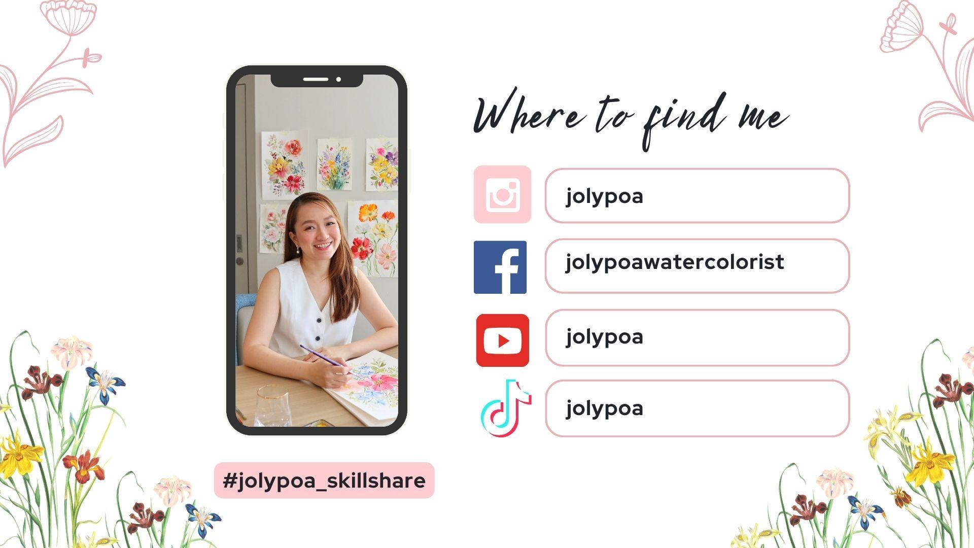
challenge is for you. Hi, my name is hole, and I'm a watercolor artist, content creator, and a
skillshare top teacher. I have been painting
for about a decade now, and my arch revolves
around painting watercolor flowers in a
loose expressive style. My goal is to break down
challenging techniques into an easy and simple step by step process so that anyone
can create beautiful art. In this class, we'll start by going over the
materials that you need and some helpful
watercolor tips to get you ready
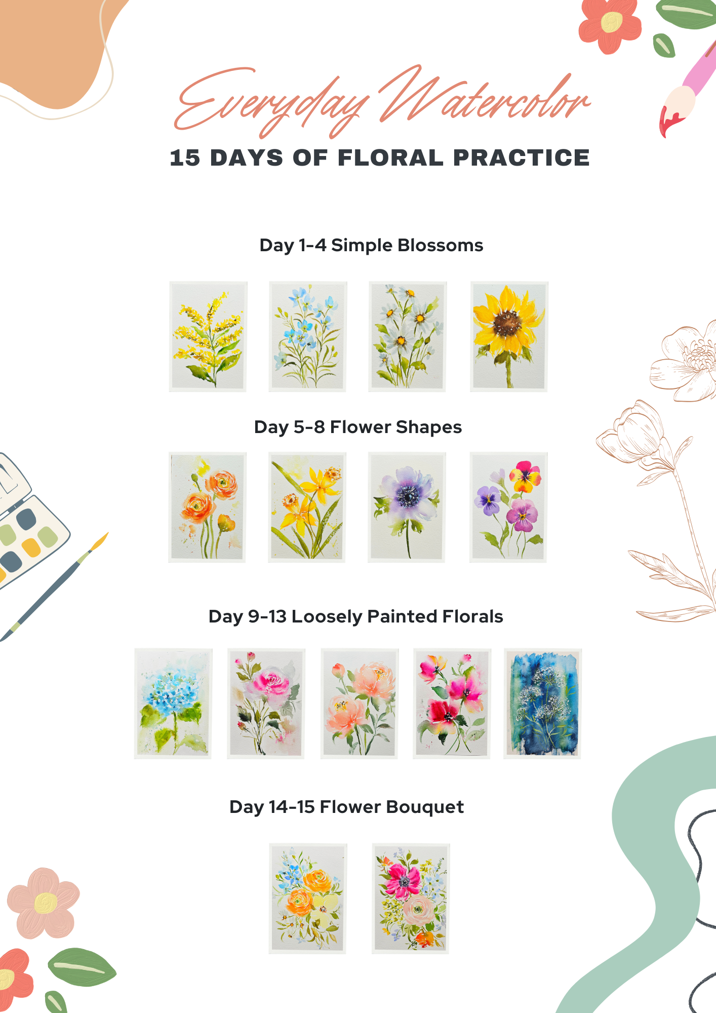
for the projects. Over the next 15 days, we'll explore a
variety of flowers, starting with simple blossoms, a variety of flower shapes, and working our way up to
loosely painted florals. Towards the end
of the challenge, we'll be combining the
flowers into a bouquet. Each day you learn
new techniques such as creating soft petals, adding dimension, and wet on wet techniques for a
dramatic watercolor effect. This class is designed to fit easily into
your daily schedule with each project just ranging
around 15 to 20 minutes. Whether you're just
starting out or looking to add more practice to
your watercolor routine, this class will
guide you through painting beautiful
floras step by step. By the end of the class, you'll have 15 paintings
that you'll be proud of. So grab your brushes
and let's get started.
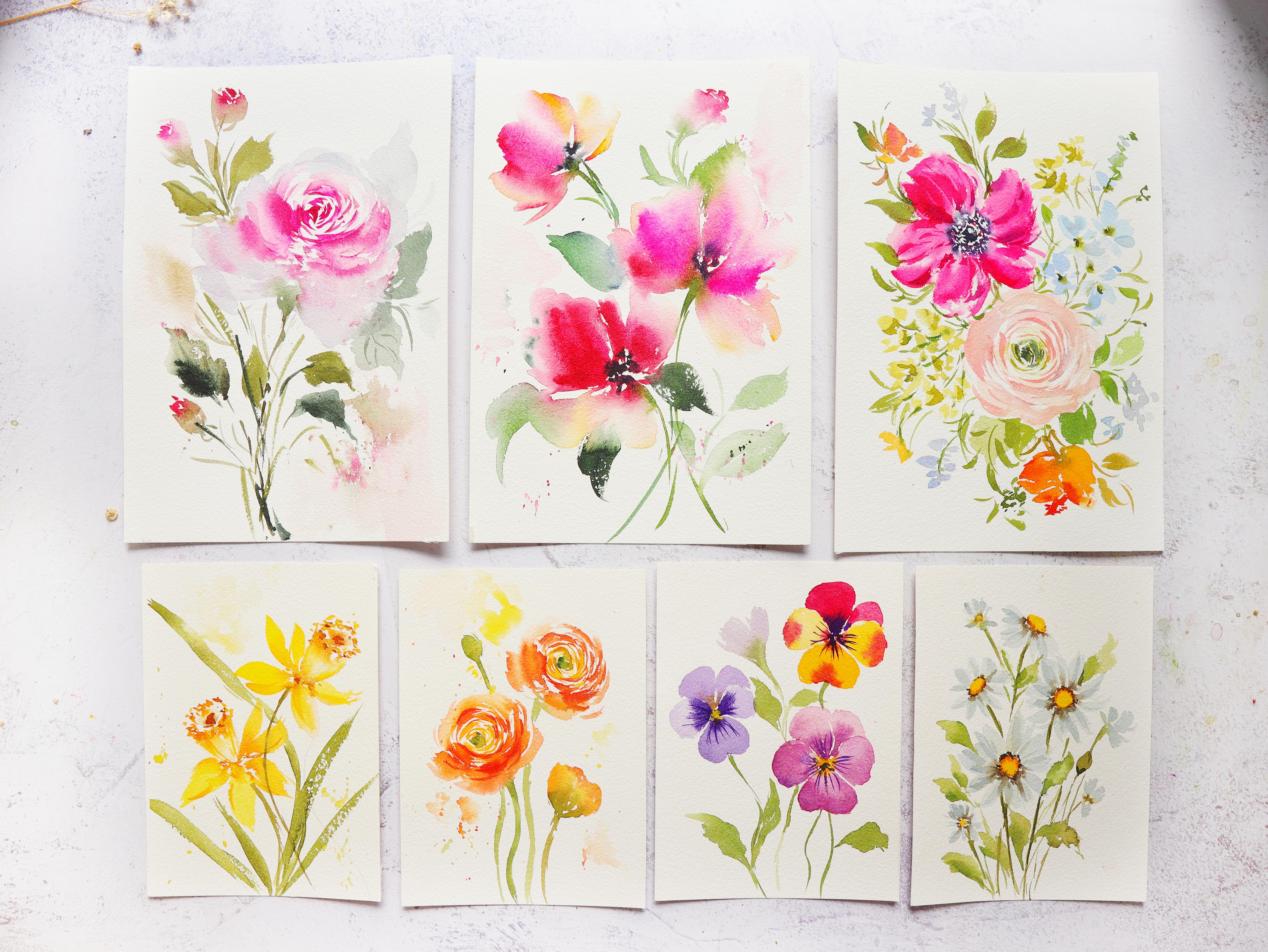
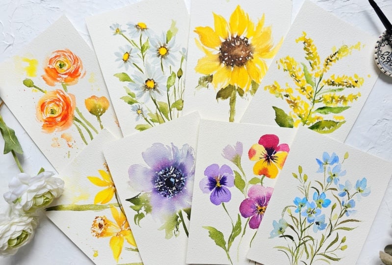
2. Class Overview: Welcome to the class overview. This is a daily challenge class, which means that
one project will be uploaded each day for 15 days. To avoid confusion,
if you joined early, then you might not
be able to see all the projects just yet while
the challenge is ongoing. But after 15 days, then all the projects
will now be available. For the first few days of the challenge we'll be
using a smaller paper, which is five by 7 " just to keep things manageable
and not overwhelming. The goal is to celebrate small wins each day as
you build your skills. I will also be including a timeless video
of the paintings each day before we start the project to give you
an idea of the process. Alright, let's quickly go over
the projects in the class. For day one to four, we will be painting simple
blossoms with minimal details. This is to help you
build your confidence and also serve as a
warm up exercise. Day five to eight,
we will explore a variety of shapes
such as round, crumpet, bowl, and fan shape. Aside from the flowers
in the projects, you can also use this prompt to search for
flowers in this category. For days six to 13, we will explore loosely
painted and freestyle florals. This is one of my favorite
categories because we will be experimenting
with different techniques. Lastly, for day 14 and 15, we will be combining some of
the flowers into a bouquet, and this will also give you the freedom to paint
your own bouquet. Okay, so I hope you're
excited for the challenge. Let's now move on
to the next video as we talk about the
materials that you need.
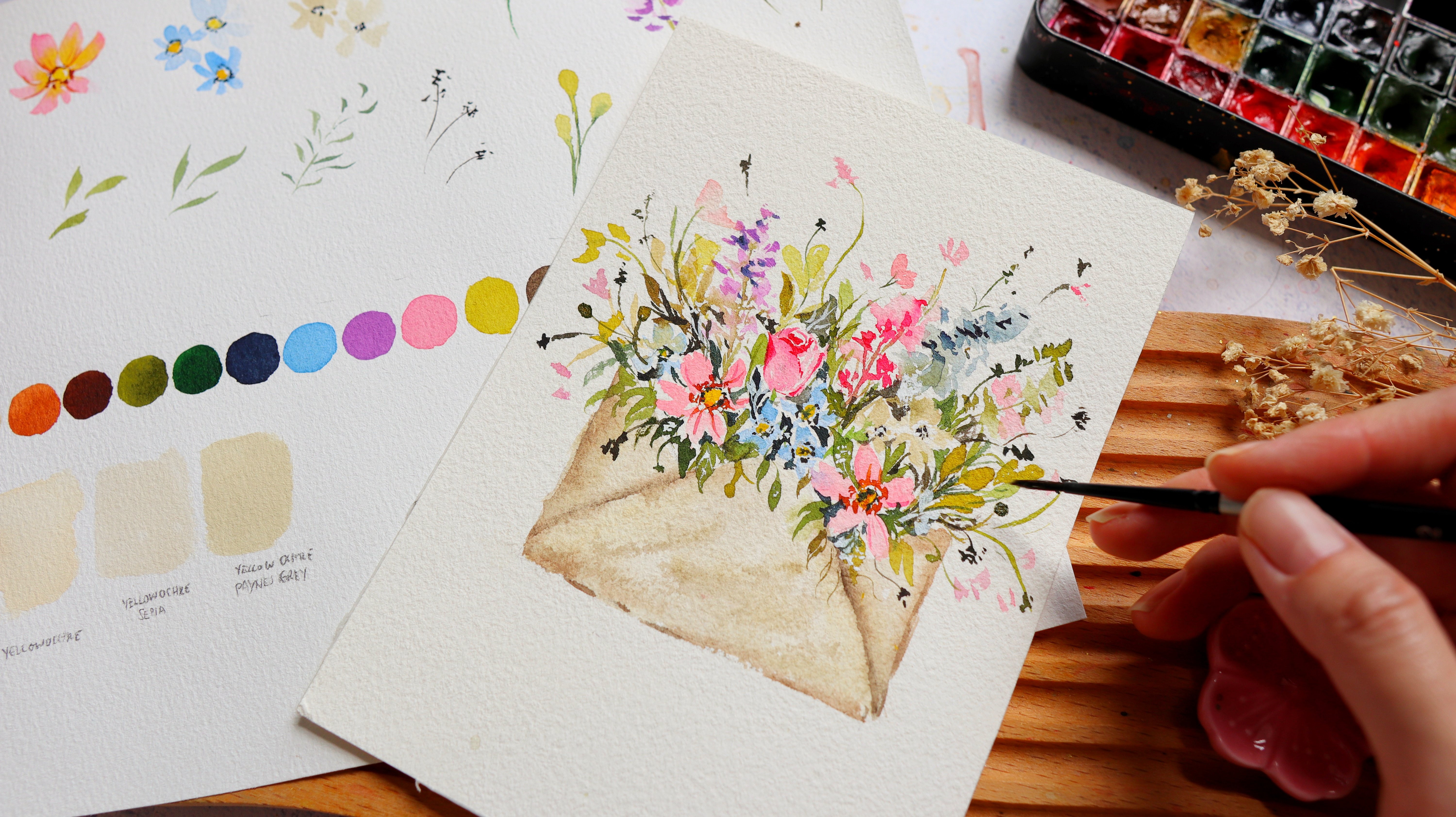
3. Materials : In this video, let's talk about the materials
that you need. First, we need paper. I'm using the brand
called Bao Hong. This is artist grade
watercolor paper. It's 100% cotton and
it's also cold pressed. You can see this
beautiful texture. It's really good for
loose watercolor style. And then this is also in
a watercolor block form. So all the sides are glued except for this part right here and you can use a
palette knife to slide off one sheet
once you're done. This class, we're going
to use two sizes. So I'm going to show
you the two sizes here. So I have here the smaller one. This is five by 7 " or half of that watercolor block
that you see on the screen. So for the first few days, we're going to use
the smaller sheets. Then for the remaining days, towards the latter
part of the challenge, we're going to use the
bigger size paper, which is the seven
by ten inch paper. Then for the paints, I'm going to use
the Shinhan PWC. It's a Korean artist grade paint that comes in tubes like this, and I just pour them into half pans so that it's just
more convenient to use. Of course, you also need a
palette to mix our paints in. This is just the
lid of my tin can. It's from the brand core. It's also a different
watercolor brand, but I just changed the
paints inside this tin can. I love this palette
because you can see those small wells where I
can mix different colors. The brush, I'll be using
silver black velvet brushes. So these are round brushes
in sizes two, six and eight. So what we're looking
for in a brush is that it can hold a lot of water, but still keep its point. It's also supposed to be soft so that you can really
move your brush around. But of course, if you prefer
something more dense, then that's completely fine. What's important is that you are comfortable using your brush. In one of the projects, I will be using this filbert brush, but you can definitely use your regular round brush
to paint the strokes. All right, so we also need a white gouache to add
some highlights. This is the whole B white
gouache in permanent white. Lastly, we need tissue
paper to blot out the excess paint in our brushes
and also a jar of water. For the colors needed
in this class, I will be sharing them
each day for each project. Alright, so now let's move
on to the next video.
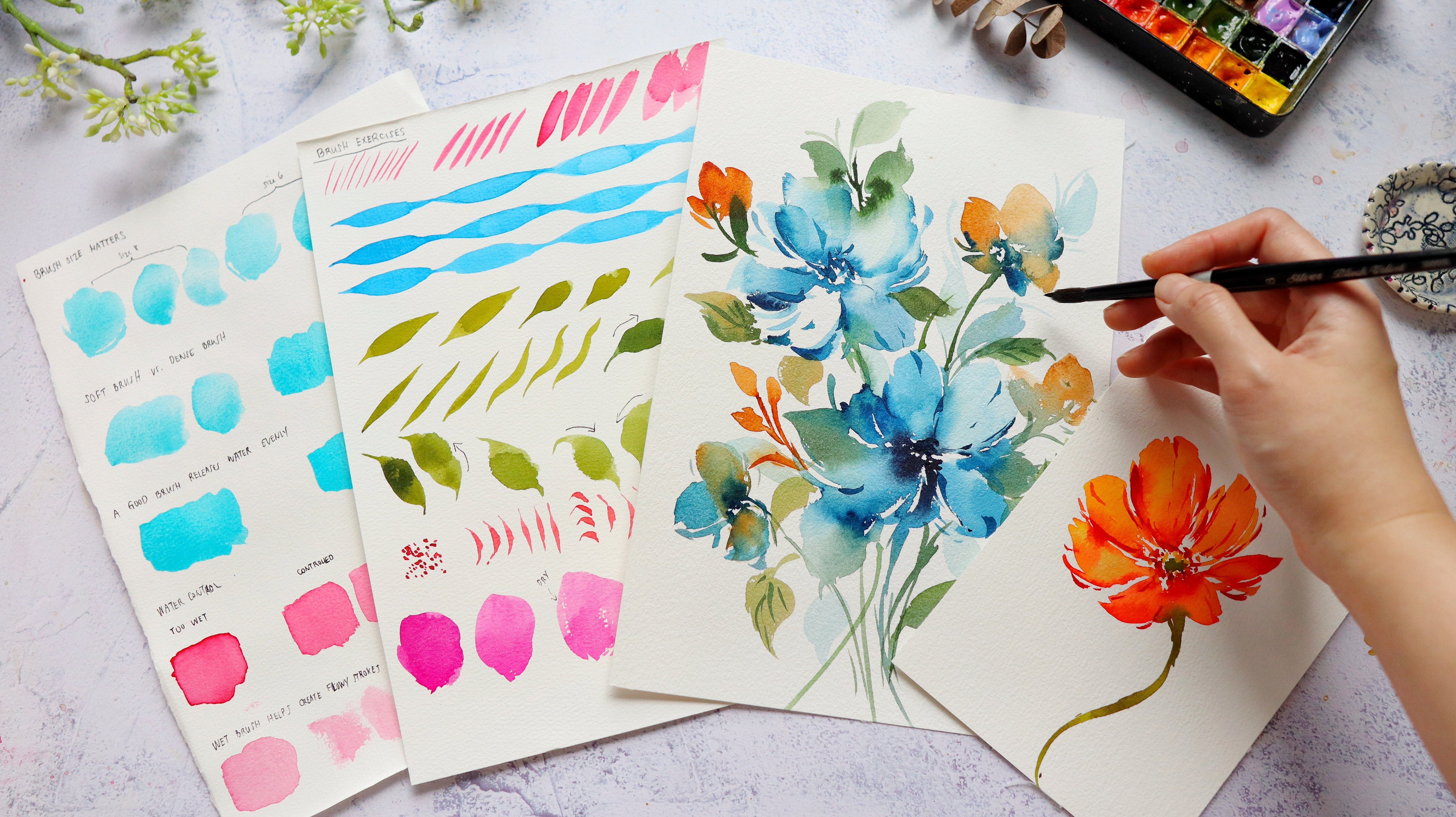
4. Tips Before You Start: I'm pretty sure excited
to start the challenge. So let me just share a few
tips with you before we start. So tip number one is
to prep your paints. And we do this by spraying the paints with some water to
that it become more moist. So you can see right here,
my paints are still dry. It's still quite hard. And what you want is
to add some water. Because I don't have
a spray bottle, I usually just use my
brush and just drop some water onto the paints or sprinkle it with some water. Let your paint rest for about a minute or two so
that it will become moist. And once it is moist, it will be easy to
pick up the pigment. It will be easier to grab
a more vibrant color. While we are waiting for
our paints to become moist. Let me talk about
tip number two, which is how to hold
your brush properly. So let's talk about the grip
of your hand onto the brush. So we want to hold the
brush comfortably in a relaxed manner because if you hold your
brush too tight, it will also produce tight
strokes or stiff strokes. So you want to hold it
in a relaxed manner. Now, let's talk
about the position of your hand when you're
holding the brush. So I would normally
recommend holding the brush in the middle
if you're a beginner, just as a starting point. And if you want to paint
some really tiny details, you want to be in
control of the brush, you hold it near the
bristles just like this. Next, if you want it to be really loose and free
flowing strokes, you hold it towards the end and just let the brush
move onto the paper. Now, these are just
guides for you. Eventually, you will find a more comfortable
position when it comes to holding your
brush so that you'll be able to create loose
and expressive strokes. Let's talk about
tip number three, and that is how to grab some
paint from the palette. So I'm just going
to wet my brush, and you can choose any
color in your palette. I'm going to choose
permanent rose. You'll notice that the
paint is already moist, and I'm able to grab
some paint easily. You can see my brush is loaded with a lot
of permanent rose. We're just going to
mix this paint on the palette and sort of just
melting all the pigments. And now let's try
to just swatch. So you'll see that we have a nice bold color,
almost opaque. And if you want it to
be lighter in color, then you just introduce
more water to your mixture. And pretty sure a lot
of you are already familiar with this if you have
been painting for a while. But just in case
you're a beginner, this is how you do it. So you just continue
to add water until you get the desired color. So over the course
of the challenge, we are going to explore
different brush strokes. So sometimes we're going
to just dab our brush or stamp our brush onto the paper to create some
markings just like this. Or sometimes we're going to explore painting
expressive strokes or paint some leaves or even paint some simple
petals just like this. So let's start. I'm going to grab my size six round brush, and let's try to use just
the tip of the brush. And if you try to
stipple it on the paper, you'll be able to
create some small dots. And depending on the
pressure that you put, you can create bigger dots, smaller dots that can look
like fillers or small flowers. And then you can also
draw some thin lines, and you can put some more pressure to
create thicker strokes. So my tip is really
to get to know your brush and
just try to create these markings that can help you understand how your
brush moves on the paper. So try to understand
the different parts of the brush and how you can
use them to your advantage. So right here, I'm
using the side of the brush to create
a broad stroke. So sometimes I use the side of the brush to create a broad petal and just move
my brush up and down to create the
shape of a petal. And you'll see more
of that later on. So now let's try to
practice some leaves. Grab any green paint. So practicing leaves is also a good way for you to develop the muscle
memory in your hand, and it's also very easy to do. So you just start
with a light pressure and then just press your brush, and then drag and slowly live. So let's do this a
couple more times. So if you want to
warm up exercise, you can try to paint
leaves like this. It doesn't have to
be complicated. What we want is just to be comfortable when it comes
to painting these strokes. A so try to play around, create some wiggly lines just like this or create
some zig zag pattern. It's just a fun way
to understand how your brush works and how your brush moves on
a cold press paper. So let me just grab
a different color. You can also try to practice some petal strokes so you
can stamp your brush, and you'll see the shape of the round brush once you
stamp it on the paper, and then you can also create
a loop to create a petal. So these are simple
strokes that we will also be using
in our challenge. So for the start
of the challenge, you'll be painting smaller
flowers that are simpler, and we will be painting
simple petals as well. So now I'm just
pressing my brush and then lifting it
towards the end, and I'm trying to do this
in different directions. And you'll see that
once we do that, we are able to create this
beautiful loose flower. So I'm just moving my brush up and down to create that petal. Okay, I'm going to move on
to a size eight round brush. So a bigger brush
can also help you to paint more loose strokes. So let's just try to
paint some simple petals. And this is a juicy brush. I'm going to move my brush
up and down, up and down. And then using the
tip of the brush, we can create some
nice thin strokes attached to this main petal. So this is how I usually paint the petals
for the flowers, and I think it looks very
nice and expressive. So you'll notice that the
bristles are fanning out, and that's because
I'm pressing my brush onto the paper to create
this broad stroke. So don't be afraid to really
press your brush onto the paper to create some
nice broad strokes. And usually for loose flowers, we want a center
that is quite dark, just to give it some contrast. So let me just grab
some permanent rose. So this is a
concentrated mixture, but I want to dab my brush onto a tissue paper to draw
out that excess moisture. And by doing this, you can see that the paint
is more concentrated in the center and it's not really spreading too much
towards the petals. Now let me show you what will happen if your brush
is quite moist. So I dipped it in the
water on purpose, and you'll notice that
the paints are going to spread some more
within the petal. And sometimes we do
want that effect, but sometimes we want the paint to be concentrated
just in the center. So I guess it depends on
the style that you prefer. Because at the end of the day, I still want you to
paint in your own style. So I'm just sharing
some guides and some tips that you can apply
to your own paintings. So painting loose
flowers is also being in control of your
brush, and to do that, you really need to
practice, you know, paint some petal strokes, check marks, paint some see strokes like this in
different directions. That's going to help
you become more comfortable painting the petals. So painting loose fors can be frustrating
at times because you can't seem to
translate what's in your head onto
what you're painting. And I think one of
the key things is really to understand
how your brush works, which is why I keep saying
that it's important to practice and just learn more about how your brush
moves on the paper. Alright, so I hope that you
learned from this lesson. Now, I think you are
ready to move on to the next video where we
will start our day one.
5. Day 1 Goldenrod: Before we start, here are
the colors that you need. Welcome to the first
day of this challenge, and today we are going
to paint golden rod. So it has this small
dense cluster of flowers, and it has this
feathery appearance to it that looks very dainty. Before we start, I'm
going to show you a quick overview
of this project. So we're going to paint
these small flowers by dabbing our brush
or stamping our brush onto the paper to create these short strokes that
look like small flowers, and we're going to vary
the size of these strokes. Then I'm going to add two colors for the yellow, one
that's lighter. One is a bit darker just
to give it more contrast. Next, we're going to prepare
our greens and add the stem, and also going to
add little bits of green in between
the yellow flowers. Next, we're going to
add the leaves and also add a few more of
those yellow flowers. And at this point, I feel
like we need more contrast. So I added some dark brown color to the flowers just to
give it some more depth. Alright, and then here I'm just adding a few more
finishing touches, so it's always good to look
at your painting from afar, just to observe if you need
to add some more details. Alright, that's it. So now let's move on to painting our project. I'll be using this
as a reference. It's from the book called
flower Color Guide, and I really love this
book because it has a variety of flowers that
you can use as a reference. I'm just going to grab my pencil and just paint some guides. So these are going to be just stems where we will be
putting the yellow flowers. So I'm just choosing the
details in the reference photo. You don't need to
paint all the cluster of yellow flowers. So it just needs a few arms
or stems sticking out. So to start, I'm going to
grab permanent yellow light. You can grab any yellow
color in your palette. Okay, so we want a
slightly thick mixture. You want this to be
a bright yellow, just to make the flowers pop up. So now I'm just sort of
stamping or stippling my brush onto the paper to create
a variety of strokes, and you can see that
these are short strokes, and that's going to represent the small cluster of flowers. Sometimes I find
it easier to work from the tip of the
stem going inwards. And you also notice I'm leaving spaces in between my strokes. Leaving the white
spaces can help us achieve a more
feathery appearance. It just makes it less chunky. So I would suggest leaving
more white spaces. And then if you feel like
it's too much white space, you can always go back in and add some more stroke
or more paint. Okay, so here I
attempted to start from the main stem going up, but it just did not feel right. So I started again from the tip of this stem going inward. And you'll notice I'm
trying to just sway my brush around to create
these more expressive strokes. So yellow is really a
beautiful color for florals, but sometimes it can
look a little bit flat. So we want to add some depth, and I'm using
permanent yellow deep, adding it towards
the bottom part of the stems or these
stalks that we painted. So they look like a shadow. That's why I'm adding
it to one side only. And also, we're adding these shadows while the
base flower is still wet. And that's because we
want these two colors to blend with each other. We don't want sharp edges. Okay, so you can always go back into the other stalks that you painted if you feel
like you need to add some more flowers. You also notice that I made
the stems a little bit curve, so they're not really straight. And that's because the reference photo also
looks like that. And I feel like if you make the stalks a
little bit curve, it looks more natural
and looks more organic. Okay, so now we can
add some stems, and I'm just going
to use sap green. So we're just going to
connect all of these stalks. You can also add little bits of green in between
those yellow flowers. So I'm looking at my
reference photo again, and I can see a bit more green towards the bottom
part of each stock. So I'm just going to put some
more green to my painting. And again, you just choose the stocks that
you want to paint, whichever stands out
more in your eyes, and you can always look for another reference
photo, as well. Alright, so looking at the
shape of this golden rod, I feel like I need to
grab some more yellow and just dab my brush
towards the tips of each stalk to make it look more wispy and just add some
direction to the stalks. So just lightly dab your brush to create
these small markings. Alright, so now I'm
just going to put some leaves towards
the bottom part. I'm just going to
wiggle my brush. So just try to have fun and create your own interpretation
of this flower. So for the leaves, I just wanted to add some
more flair to it. You can see I did a
dry brush technique. I'm also trying to put a darker color onto the leaves
while they're still wet. So this space looks like
a little bit blank. So I'm going to just
put some leaf there and also leaves in between
some of the stalks. Alright? So the leaves
came out a little bit thicker than the reference
photo, but that's fine. We can always
adjust what we see. Alright, so it's looking
good, but at this point, I still feel like we need to add a more
feathery appearance. I'm going to do that
by just dabbing my brush a little bit more
towards the tips of the stalk. And you can see that it makes a huge difference by doing that and just leaving some white
spaces in between my strokes. Alright, so I'm going
to grab burnt umber, just to add a darker contrast. I'm going to put it near the
yellow cluster of flowers. Some of these flowers
are still a little bit damp and some of
them are dry already. So it's okay. That's going
to be part of the fun, and it's going to be great to experiment
with your painting. You can grab a little bit more
of the green if you wish, can dab a little bit more in between the cluster of flowers. So I decided to paint on a smaller sheet of paper for the first few days so that it's not as intimidating and you
can easily fill in the space. Sometimes there are areas that
doesn't look nice for you. So what you can do is just grab a damp brush and
lift the color of the page and dab your brush on a tissue paper
to clean your brush again. Then you can always go back in and just add some more yellow. Alright, so congratulations for finishing your first project. And definitely the techniques
that you learned here, you can also apply it to other flowers that look
similar to golden Rod. Alright, so stay tuned for
day two for our next project.
6. Day 2 Larkspur: Here are the colors that you
will need in this project. Welcome to day two
of our challenge. So this is still part of the simple blossoms
or simple blooms. So we will be
painting lark spur. This is a slender plant with some small
cluster of flowers. And again, it's going to
be very easy to paint. And so I decided to also
choose blue for this flower. You can find it in lavender in purple and pink
and even white. So I'm just going to start with some four or three petal flowers and add some green
in the center. And you can see I'm
adding some buds as well. We'll be looking at a
reference photo later on. And after painting
the buds and flowers, we're going to paint
these slender leaves using a size two round brush. So we're going to paint
those wispy leaves. Okay, so after that, I wanted to add some more depth. So I added some indigo in
the center of the flowers, and it really made
a huge difference. I think it made the
flower pop up even more. Alright, so we're just going to add some finishing touches, some small buds and leaves. Okay, so let's start painting. Now, let me quickly show you
guys the reference photo. So this is the lark per flower that we are going
to use as a reference. You can see the small cluster of four or five petal flowers and also some light green buds. And you can also find this in
a different shade of blue. That's also a beautiful blue. You can try to do that as well. So first, we're going
to use our pencil, and I'm just going to lightly draw on my paper as a guide. You can just try to draw the stems and a little
bit of the flowers. Just make sure that you
draw lightly because once you paint on
top of the sketch, you can no longer erase
the pencil markings. Okay, so here I'm just trying to decide which flowers
I will add and also adjust the height of the flowers and the
gap between the flowers. So I want them all in
different heights. So they are also diagonally
across each other, just to add some movement
to the painting. Okay. So we are going to
use the color verdiublue. This is one of my
favorite blue colors. I like that it has a little
bit of that pastel color. And now I'm also going to
mix in a little bit of cerulean blue on my palette and just a little bit
of this ultramarine. So I'm just sort of preparing
the colors that I need. Alright, I'm using a
size six round brush, and we're going to start
with the color verdial blue, and we're going to
start with four petals. So you can see I'm just painting a loop to paint the petals. So right here I just rinse my brush to create
a lighter color, and I'm adding a little bit
of that ultramarine blue. So we're going to leave
the center blank for now. Next, I'm going to
grab my cerulean blue. Just try to dilute it in
water so that the color isn't that bold because Cerullian
blue is a bright color. So I just painted three petals
beside the first flower. Now, let's add a
few more petals. So you can just paint
maybe two or three petals, and it will suggest that this flower is behind
the first flower. So we don't really need to paint all the petals
all the time. Alright, so now that we
have a few flowers here, we can grab greenish
yellow and add it in the center of the flowers
while they are all still wet. You can also dab your brush in a tissue paper to make
sure that it's not too wet because you don't want the greenish yellow to mix too
much with the blue petals. Okay, so let me just add
a few more petals here. Alright, so we are
going to add our stems, and I'm going to
mix sap green with part umber to create
an earthy green color. So I'm just going
to attach all of these flowers into a stem. Next diagonally across
this cluster of flowers, we're going to start
another cluster. So we don't want this to
be in the same height. So we want it to be
a little bit higher. So right here, I'm just
painting three petals, and then I can just rinse my
brush to change the value. So you can see that some
petals are lighter, some are more opaque. It's also best to use a small brush to be able
to create these petals. So you can just really
drag your brush and create a loop to paint these
petals and make sure that you also leave
an ample space between the petals just to make it look more interesting so that it won't
look like a blob of paint. Next, we're going
to add the center, adding some greenish
yellow again. Let me just quickly show you the flowers in a
reference photo. So you'll notice that we tried to also simplify the flowers. And that's what I
love about painting loose flowers because you don't really need to paint
all the details. You just want the
main characteristic of the flower when you're
painting loose flowers. And then now I'm just going
to add some more stems. You can see I'm adding
some broken lines and the stems are a little bit curve just to add some movement. And now I'm just adding a
few more stems ticking out, and we can put some buds or
some flowers there later on. Okay, let's add another
cluster of flowers. So you'll notice that
this one is a bit higher. So I'm just going to put some spaces in
between my petals. And then now let's grab some
more of this vertical blue. You can also mix some of
the blues in your palette. So these are really
just simple blooms, but once you turn
them into a cluster, it becomes very beautiful. Okay. So I'm just repeating
the process for the flowers, and now we're going
to add the stems. All right, so we can also
add a few more stems over here just to fill in
this white space. And then next, we can
grab some greenish yellow and have
dilute it in water, and we're going
to use this color to paint some small buds. So adding buds is a
great way to also add some texture to your paintings because it's a different
shape from the flowers. So you'll notice that the
buds are a little bit light, and I'm just going to grab some burnt umber and
mix it to my sap green. And we're going
to add that color towards the base of the buds. And you'll see that it will
create a beautiful effect. Alright, using a size
two round brush, we're going to paint
these wispy leaves. You can see those nice
thin elongated leaves, and we can achieve that
by using a smaller brush. So you can notice that
I'm trying to also drag my brush and letting it move
in different directions. Alright, so the
bottom part needs a little bit more leaves
and also some blue flower. So I feel like we need
some blue towards the bottom part just to
make it feel more balanced. So I'm just gonna grab my paint, and you can see
it has been mixed with a little bit of
green, and that's fine. All right, so we can go back
in with some more green and add it towards the
center of the flowers. Adding a second layer to loose flowers can help
us add some more depth. So I'm just mixing verdire
blue and ultramarine blue. You'll notice this
color is maybe two shades darker than
the base flowers that we already painted here. I'm just going to paint
some thin strokes in between the petals, and that's going to help
separate the petals, making it more pronounced. This is a technique
that I love to add to flowers because it makes the
flowers pop up even more. You can also think
of it as shadow. So these can be shadow
in between the petals, the curves of the petals. Okay, it's looking good, so we can add some more depth. I'm using indigo. You can use black or even
sepia or any brown color, and just tapping my brush to just absorb the
extra moisture in my brush because I don't want the paint to spread
all over the petals. Okay, so just use the
tip of the brush and lightly tap it on the paper
to create some small dots. So at this point, you can look
at a reference photo again and observe if there are details that you can
add to your painting. So right here, I'm just adding
some light colored buds. I don't want it to be
too dark because I don't want it to grab attention,
but at the same time, I want there to be a little
bit of color just to fill in some of the white gaps in between the flowers
and the leaves. Okay? So we're just adding this to complement the main flowers. Alright, so we're done. Congratulations for finishing
your second project. I hope that you enjoyed
painting this lark spur, and I hope that you can try
it in different colors, too. So now let's move on to day three as we
paint a new flower.
7. Day 3 Daisy: So before we start, here are the colors that you
need in this project. So for day three, we are
going to paint daisies, and I just love
painting daisies. It's also a great way to add as a filler for your florals. I chose this as part of the challenge because the
techniques that you will learn here can also be applied to flowers that
look like a daisy. You just need to
change the color. Okay, so let me show you a photo that I took
during one of my trips. So you can see that if
the Daisy is facing us, facing front, you can
see that the center is circle and the petals
are fanning out. And if the Daisy is
fazing at an angle, you will notice that
the center is oval, and then of course,
the length of the petals are going to vary. Let's do a brief overview of the project before
we start painting. So first, we're going to paint
the center of the flowers. So we're going to pinpoint
where we're going to put them. And you'll notice that some of the centers here are
circle, some are oval. Then next, while
this is still wet, we're going to add some shadow. So this is raw umber, and I'm going to put
it towards the edges. So you'll see that it's going to give it a little
bit more depth. Alright, so for the
petals of the daisies, we're going to use paints gray. So this is one of
the quickest ways to paint white flowers
or white petals. Using a small brush, we're going to just paint
a more elongated petal. And again, we're
just going to vary the length and add some
spaces in between the petals. Okay, and then we're
going to add sepia. This is going to
be added towards the ring or the
edges of the center. It's going to help make the
daisies pop up even more. And of course, we're
also going to add the stems and also the leaves. I'm going to add it in
between the flowers. Alright, so when the
flowers are already dry, we can also try to
add another layer. So I'm using paints gray, and just adding a few more
of those petals on top. And right here,
we're just adding some more finishing touches. If you want more depth, you can go back in
with a darker color for the edge of
that round center. Alright, so now let's
start painting, and I'm going to grab first
permanent yellow light. And then permanent yellow deep. So I just mix those two colors because the permanent
yellow light is too bright, too lemony, so we want it
to be a little bit warm. Okay, so I'm just
grabbing my pencil and we can just try to
draw some circles, which will be our guide for
the center of the daisies. So you can look at the
reference photo and check out which flower
stands out to you. It's also nice to
vary the angles of the daisies in a composition so that it looks
more interesting. So you'll notice some of the shapes here are
circles, some are oval. Alright, so we are
ready to paint. Let's just grab
this yellow paint. So I'm just going to
fill in that circle. I'm using a small brush, so this is a size
four round brush. But you can definitely
use a size six as well. Alright, so let's just rinse or brush and grab a new color. This is raw umber, and I am also going to add it to the edges of this center. If you don't have raw umber, you can also add a little bit of brown to your yellow or
maybe add some Benziena. So we just want to add some depth to the
center of the daisies. So you can grab a
tissue paper and dab your brush to absorb the
excess moisture in your brush. So I'm doing this because I want to control that brown color. I don't want it to spread
all over the place. I just want it to stay
put around the edges. So if your brush is too wet, it's definitely going to move around on the surface
of the paper. Okay, so let's prepare
the color for the petals. I'm going to use paints gray, and you can see that I'm
adding a lot of water. We really want this to
be very transparent. So I'm going to
swatch it for you. So you'll see there that
it's actually quite light. You almost can't see it. So we're going to try and
paint some petals here. So I'm just going to drag my brush from the
center going out, and I'm doing this quite fast to create some
nice wispy strokes. Also try to vary the
pressure in each petal so that you will end up with different brush markings. I'm also trying to leave a little bit of space in
between some of the petals. And if you'll notice
the reference photo, some of the petals have
more irregular shape. So we can also try
to follow that. Okay, so now I'm going to grab a little bit of
ultramarine blue, so I want to really
dilute this color. Something I love to
do when painting white flowers is that I add
different colors to it. Sometimes I add purple, sometimes I add some blue in it, and it's going to make
it look very pretty. So you'll notice that the
blue is very, very subtle. Okay, so now let's move
on to another flower. So this is on its side, so we want to also vary
the length of the petals. H So when you're doing
composition like this, it's best to vary the
size of the flowers. So you'll notice here that
the flower at the bottom, it's the biggest flower. And then the flowers in the
middle, they're medium size. And at the top, it's
going to be the smallest. And that's going
to help distribute the weight in the
floral composition. So I'm sharing these tips
because you can also apply this to painting a floral composition
using different flowers. Alright, so I think we can
start adding some more depth. I'm going to use Sepia. It's a dark brown color, and we are going to add that
to the edges of the circle. So you can see that I dab
my brush and tissue paper. That is to absorb
the excess moisture. So the center is
still a bit damp, and then the petals
are a little bit wet. You can see that the brown color is spreading to the petals, and I think it looks great. So I love how the two
colors are blending. If there are areas
that you don't like, you can troubleshoot it
by using a clean brush. Just blot it in a tissue paper and absorb the excess paint, just like what I'm doing here, and then dab your brush again in the tissue paper to
clean your brush. Alright, so this is
one of the ways to slightly erase some
of the mistakes. Alright, so it's time to add the stems going to mix sap
green and burnt umber. So we just want an earthy
green color again. Any green and any brown
color can work well. So just make use of the colors that you
have in your palette. I'm just going to add
these long stems. And we can also add some small buds and also
some smaller flowers. I feel like we need to add more variety in
this composition. So I'm using a very light color. This is still paints gray. So just dab your brush onto the paper to create
some small markings. And I think we can add a little bit right
here at the bottom, just to fill in that space. We can add one more
on the right side. You can see my hand is, like, moving and checking where I should add another small flower. So it really just takes practice to know where to
put the flowers. You really need to paint a lot to understand the
floor composition. So now I'm going to add
some yellows in the center. You can see I did
a reverse process, so I painted the petals first, and then I added the center. So you can actually
still do that as well. Alright, so for the leaves, we're going to use sap green
and burnt umber again, and I'm just going to wiggle my brush to create some
jagged edge for the leaves. And when you're adding leaves, it's always nice to add
it near the white flowers because it's going to help
shape the edges of the petals. It's going to make the
flowers pop up as well. A Alright, so while the leaves
are still wet, I'm just going to
quickly drop in a darker color just
for some contrast, and that's going to create
a beautiful effect. Let's just grab a
little bit of sepia or dark brown color
and add it in the center of the
smaller flowers just to give it more contrast. Now, for white flowers, I usually love adding
a second layer. So this is just a shade or two darker than
the previous color. If you don't want to add a
second layer, that's fine. If you're happy with this look, it's also okay to
leave it as is. So now I'm adding
a second layer, and I'm just painting
these quick strokes, these elongated strokes on top of the first layer of petals. And it's going to help sort of separate some of the petals. All right. It's grab
some more paint. I'm just going to
continue adding a second layer on
the other flowers. So I try to do curved strokes. You can see that the strokes
are a little bit bent. It's not a straight
stroke all the time. That's because I want to add
some movement to the petals. Okay, it's looking great, but I think we can add some
more on the smaller flowers. So you can see that we're
just painting a few strokes, and it instantly makes
the flowers pop up. So we can go back into
the bigger flowers here, going to add near the center where more shadow will occur. Alright, now let's
grab a little bit of sepia and you can add it again in the
center of the flour. So this is optional. If you feel like the
colors are light, you can go back in and
just add some more color. I also love how the brown color moves into the wet petals. It's giving it a
more dramatic look. And again, if there are
areas that you don't like, you simply grab a clean
damp brush and just try to absorb the excess
paint on the paper. Okay, so we're down to
the finishing touches. I'm just going to add a few
more smaller flowers here. So just try to look
at your painting from afar to see what else
you need to add. Okay, so we're done
with day three. I hope that you enjoy
this project for today. And now let's move on to
day four of our challenge.
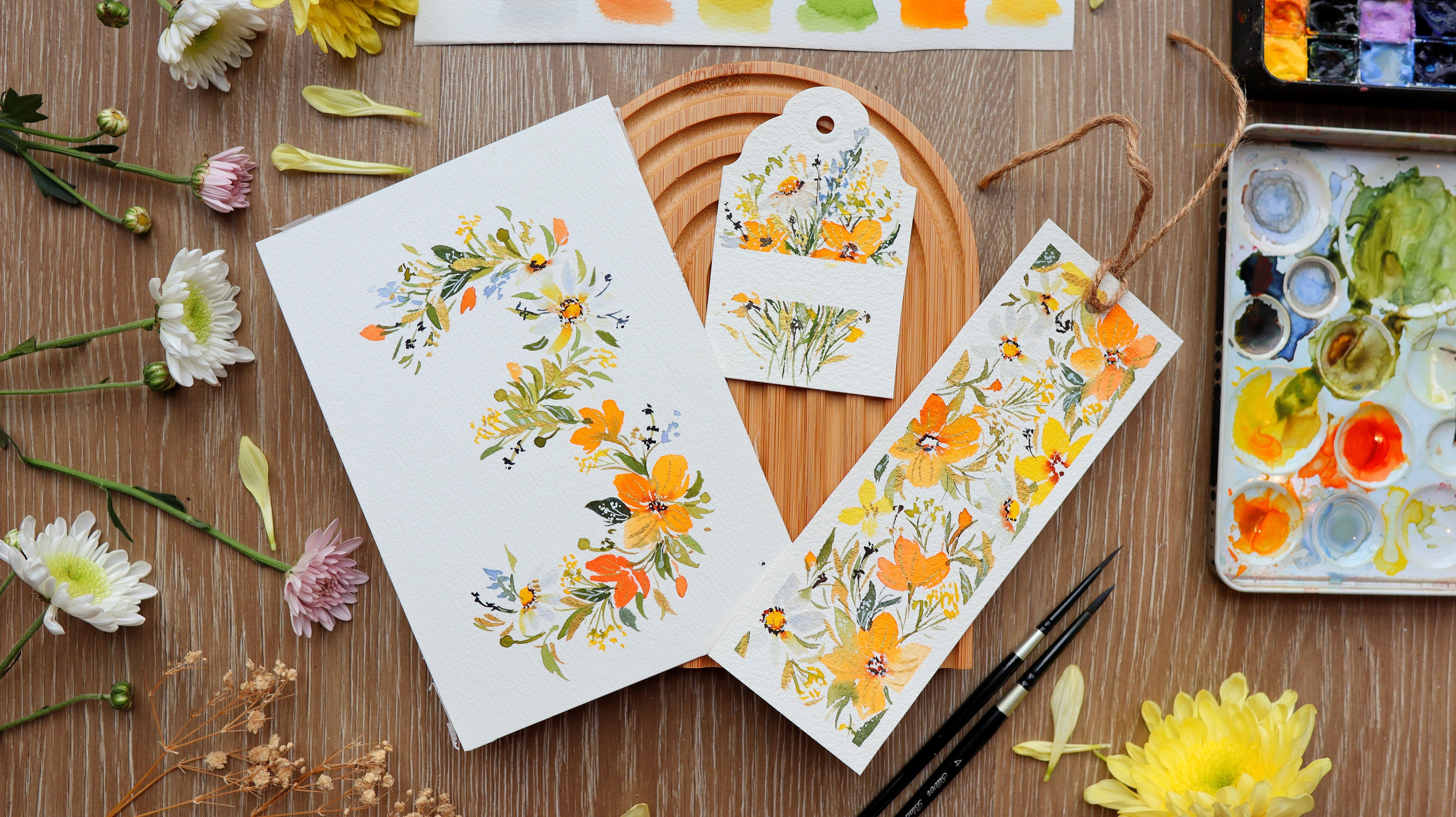
8. Day 4 Sunflower: Before we start here are
the colors that you need. Okay, so we are on day four, and this is the last
project in this category, and we'll be painting
a sunflower. In this project, we're
going to let our brush move a little bit more compared
to the first three days. So we're going to paint
these huge petals. Let's do a quick
overview of the process. First, we'll get a brown color, and we're just going
to dab our brush onto the paper to create
a circle shape. And while that is still wet, we're going to grab a
darker brown color. You can use CPR even black and just add it in the center
to give it more depth. Using a bigger brush, this is a size eight brush. We're going to start
adding our petals, and you can see that I'm trying
to really move my brush, creating some strokes
to add some petals. I'm also making sure
that I'm leaving some white spaces in
between the petals. Next we're going
to mix our green. I'm mixing sap green
and print umber, and I'm just going
to put a few leaves peeking behind the petals, and then we're going
to add a stem. This is such a good project
because the process is easy. So this is like a warm
up exercise for you. I love how we can
build small wins every day by painting
one project per day. Alright, so once
the petals are dry, we can start adding
a second layer. This is just about
a shade or two darker than the base
color of the petals. Next, we can go back
and add some more brown in the center just
to create more contrast. Alright, so now let's start
painting our project. So I have here my
reference photo, so we can try to observe first
the shape of the flower. So we have this round center, and you can use your pencil to just lightly draw
a circle as a guide. Okay, so we are not going
to draw the petals anymore. So just the center as a guide. So you'll see different
layers of petals there, and we're just going
to simplify it and add just a few petals
on this flower. Now let's grab Burnt umber. This is the brown color that
I will use for the center, but you can use other colors
as well in your palette. And I want this to be
a little bit thick. I'm using a size four brush, you can also use a size six. So what I'm doing
now is I'm trying to stamp my brush to
create this texture. And we are going to
fill in this circle for the center of
this a sunflower. Then I can also try to rinse my brush to get a
lighter brown color. So I'm introducing more
water to my mixture. You'll notice that
there are areas that are darker and
some are lighter. Try to also add some spaces
in between your strokes. So I'm doing this
stamping technique because we can get
a nice texture. So instead of filling in the entire space with
just brown color, I am trying to just
stamp my brush instead onto the paper
to create some texture. And the reason is that when
you look at the sunflower, you'll notice that the center
also has some texture, so we're trying to mimic that. All right, let's leave
the center as it is. Now let's move on to our petals. I'm going to grab
permanent yellow light and permanent yellow deep. So if you have a
different version of these colors, that's
completely fine. Or if you want to use just
yellow, that's also okay. All right, let me switch to
a size eight round brush. So a bigger brush can produce
more expressive strokes. Let's just grab some water. I'm going to grab
permanent yellow light and just move my brush
from the center going out, creating that nice pointy tip. I can also tip my brush to
the permanent yellow deep. Sometimes I'm mixing
these two yellows. Let's dip it in our
water jar and move our brush to create that
nice expressive petal. You can see that the
brown center is still a little bit damp and it's
moving towards the petals, and that's actually
a beautiful effect. As we're painting the petals, we're also trying
to wiggle or brush, creating an S stroke movement. So we're creating a
more curved stroke. You'll notice that the
petals has some movement, and don't forget to leave some spaces in
between your petals. Alright, now let's add some
dark spots in the center. I'm using sepia. So this is a nice
dark color and just tab it towards the edges
of this sunflower. You can see that I'm grabbing the paint
straight from the pan and putting it on
the paper because I want it to be a thick mixture. So we're adding it towards the edges because that's
where the shallows are. Now we can add a little bit
of highlight in the center. Grab a clean brush and just slowly lift that
color in the center. Let's grab yellow orange and add it to our yellow mixture. And we're going to add this onto the petals while
they're still wet. So you'll notice that
it's going to give it a little bit more depth so
that it doesn't look too flat. Yellow flowers
tend to look flat, so we need to really add
some shadows by adding, like, a darker shade. So right here, you can
see I'm even grabbing some color from the center and moving it towards the petal. Alright, so look at the
painting from afar, and you can add a few more strokes to fix
the shape of the sunflower. I think it's looking great. Now let's move on to
mixing our greens. This is sap green
and brent umber. I'm just going to add
a few leaf strokes in between the petals, so it looks like they
are behind this flower. And making sure that
they have a pointy tip. Now I'm going to add this stem. I'm going to rinse my brush, and we're going to fade away some parts of this stem
to make it look softer. And while it's still wet, I'm going to drop in
a darker green color. So I'm just adding a few spots there to make it
look more dramatic. So that's a technique
that you can do even in other flowers. And you'll notice that my brush
is also a little bit dry, so you can see that as I'm adding summer strokes
to that leaf, I'm creating a dry
brush technique. Let's check the petals by touching it if it's already dry. So if it's already dry, we can start adding
a second layer. I'm going to add some yellow
orange to my yellow mixture on my palette and maybe add
a little bit of this brown. Then you can start adding some expressive strokes using
just the tip of the brush, creating some S strokes. Let me show it to you up close
so you can see it better. You can see that the
color is not too dark because we don't want
it to be overwhelming. We still want to see the
base color of this flower. Let's just grab some more paint. I just using the tip and
moving it up and down. So these are really
just very thin strokes. This is going to give us
the illusion that it has some ridges or some
folds in the petals. Alright, so that's grab Sepia, and I'm adding it in the center because the center looks
a little bit light. And when you look
at sunflower photo, you'll notice that the center
brown color is quite dark. So we want to bring
back that color. Alright, so we're done with
our sunflower painting. You can even add some white
gouache in the center. Add some dots to give
it some highlights, or you can leave this as it is. Now let's move on
to day five as we learn from a different
category for this challenge.
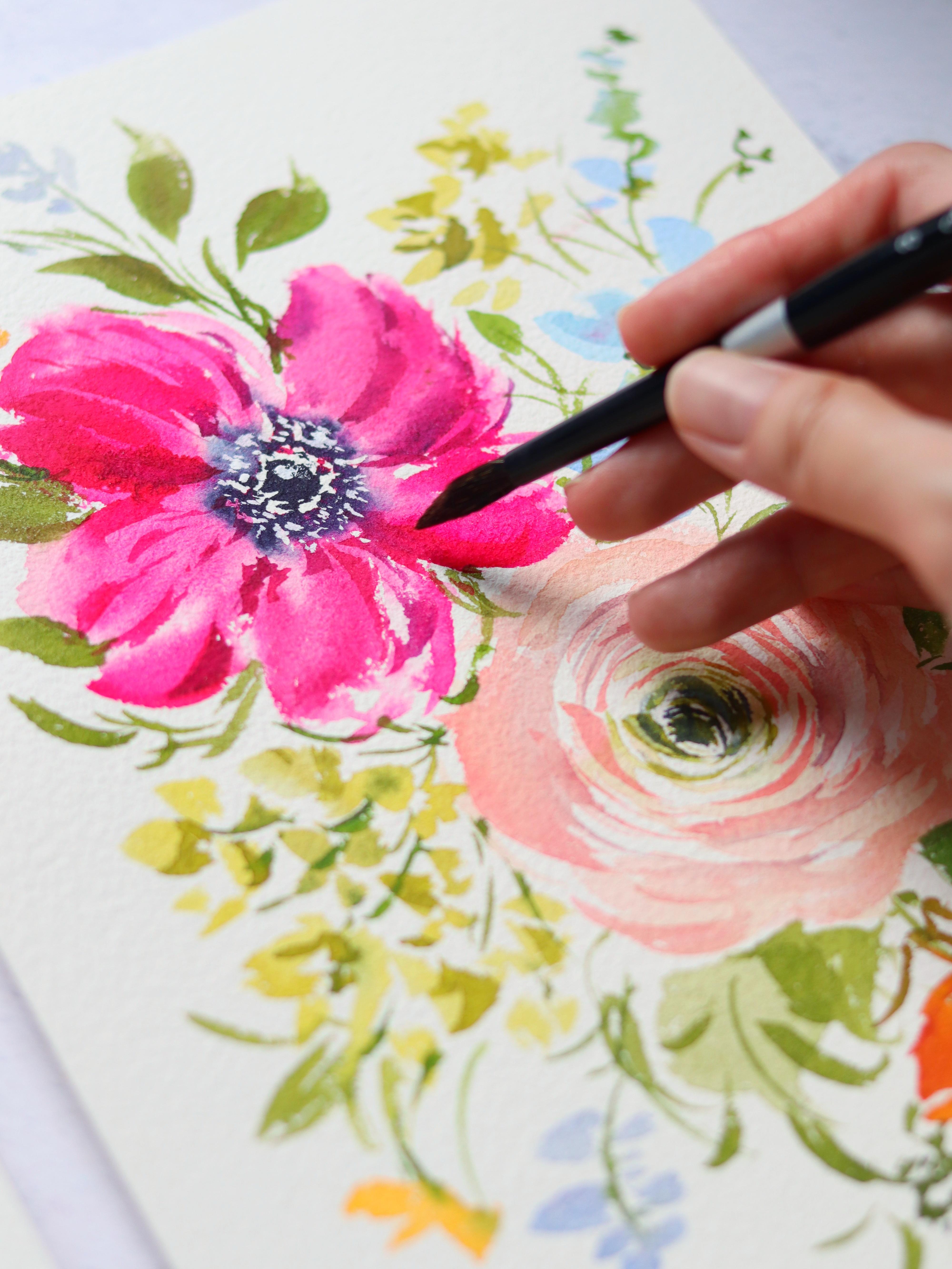
9. Day 5 Ranunculus: So here are the colors that
you need in this project. All right, so we're done
with Day one to four, and now we're going to move forward to a different category. We're going to explore
different shapes of flowers. So for day five, we're
going to paint ranunculus, which is a round shaped flower. The characteristic of ranunculus is that it has
really tight petals. So we're going to start
with the center first, and I'm going to paint
tight petals by using just a tip of the brush and
painting some curve petals. And then as we go further out, we're going to paint
bigger petals. You can definitely
use different colors. Mnuclus comes in
different colors. I've seen some dainty
pink, some whites, so you can definitely change
the color for this project. To keep it simple, we're just going to
paint two main flowers, and then we're going to add some smaller flowers
and buds later on. Lastly, we're going to
add some splatters. It's going to make your
painting look even prettier. I just love the
character that it gives. Okay, so I think we
can start painting. Let me show you this
reference photo, so you'll notice all
the tight petals. So they actually look like
just curve lines from afar, but they are the tight petals. They have several layers, but we don't need to
paint all the details. Again, we just choose the
details that stand out. So right here, I'm just
going to use my pencil to just draw these
small dots as a guide. And to keep it simple, we're going to paint
two main flowers that are diagonally
across each other. And then we're just
going to add some buds and some smaller flowers. Okay, so this looks good. And you can, of course, look at our reference
photo again. This is a beautiful
yellow orange flower. Let's now prepare the colors. I'm going to use
greenish yellow, but if you don't have this, just mix your green and yellow. And then next I'm using
permanent yellow light. So just use a small
brush for this center. Then going to paint this
crescent moon shape center. And then using the tip, I'm just painting some
smaller s strokes. Right. Next, let's grab our
permanent yellow light. And again, I'm just painting these very thin curve lines and then making sure that there are spaces in between my strokes. Okay, now let's prepare
vermilion and yellow orange. So we're going to use this for the remaining parts
of the anuncids and So now we're still going
to paint some thin lines using just the tip of the brush and going all around the center. So it looks like I'm
hugging the center of this flower and then make sure you have some spaces in
between your strokes. So these are going to look like the layers of petals
in the renunculs. So we're just creating
that illusion. Now you can also
grab a little bit of that vermilion just to change
the color a little bit. Now, let's rinse our brush, tap the excess water, and then we're going to blur out the edges of these petals, and I'm also making the
petals a little bit bigger. So in the reference photo, you'll notice that the center of the ranunculus has
tighter petals. As you go further out, the petals are bigger. So to make this look soft, we need to add some water
in our brush and just fade away the stroke so that it
looks very soft and feathery. And while this is still wet, you can grab a little
bit more pigment. You can grab more yellow
orange or more vermilion and just paint it on top of
the strokes that we did. This is also going to help us build that contrast and depth. Alright, it's looking good. Now let's grab sap green
and paint this stem. Now as I paint the stem, I'm going to paint it in
a curved manner so you can see that the nculus
looks like it's dancing. All right, so we can also try
to lift some of the color. It's going to give us a little bit more highlight
in some areas of the stem. Diagonally across
the first flower, we're going to
start another one. So it's the same process. We need a green center, and then we're going to paint some really thin
strokes all around it. So if you're doing a different
color for the ranunculus, it's going to be
the same process. Alright, now let's grab a little bit of
that yellow orange. And I just really love
the gradient effect. So I'm also trying to touch the yellow part and mix it
with the yellow orange. Alright, let's grab
some more vermilion. So if you try to paint
more thin throkes, then it will look like it's more intricate and it has
more layers of petals. Alright, let's rinse our brush, tap the excess water, and then slowly fade
away the outer petals. And again, we're going to
paint it a little bit bigger. So we're going to sort of
extend some of the petals. And don't be afraid
to dip your brush in the water so that you can
fade away the strokes. Then we can look at
the reference photo again and you'll see this really huge petals towards the outer
part of the flower. So while the vase
flour is still wet, you can grab a darker color, a more intense orange, like vermilion, and then just paint the
same thin strokes. So I'm usually
adding this towards the middle part because
that's where the shadows are. Now let's grab our green
again and add a stem. So we want this dancing stem, so I'm going to make
it a little bit curve. Okay, so we still have some
white spaces to fill in. And instead of
painting big flowers, we're just going to paint
a small bud right here. So I'm just going to
use my green paint, and then we're going to add the stem behind
the main flowers. So here I'm just grabbing a
darker green and just putting it towards the base of this
bud and also on the stems, just put some small dots
of those dark spots. I'm going to put
a smaller flower on the lower right side, so this is the reference. And you'll notice that it
doesn't have a lot of details. So we're just going to paint some plain petals here
using yellow orange. So it looks like a heart shape. And then just grab vermilion and add it towards the edges. So you can see it looks
like it's two toned. Then you just added a stem. So once the flowers
are already dry, we can start adding
a second layer. So here I just got a little
bit of yellow orange, and I'm just going to
paint near the center, just a few thin strokes, and then grab some of
that for 1 million. And you can even add a
little bit of red or brown to your mixture so
that it's slightly darker. And you'll notice
here I'm adding a few strokes that's going to make this
flour pop up even more. And it's going to help
separate all the petals. At the center of the flower, we can grab a little
bit more green. You can use sap green
or greenish yellow. So when you're painting
loose florals, it's always important to add that dark center to
give it more contrast. And now we're going
to the fun part, which is the splatter technique. I'm grabbing yellow
and some orange, and we're just going to splatter it all over the white space. So for the splatters, I usually use the colors that
I use in the main flowers. Now, to make it
look more dramatic, we can grab a clean brush
and try to spread some of the splatters so that we have more color
instead of just dots. The center needs a little
bit more corncrst, so I'm going to add some
more green to the center. You can also use indigo. Alright, so now we are done. You can definitely add some
more splatters if you wish, but this is just a beautiful and cheery flower to look at. I hope that you enjoy the
flower that we painted today. Now let's move on to day six.
10. Day 6 Daffodil: Here are the colors that you
will need in this project. All right, so for day six, we are going to paint daffodils. So these are flowers with
a trumpet shape center, and then you have some
petals surrounding that. It's also characterized
by long slender stems and also these
elongated leaves. Before we start our project, let's do a quick overview
of our painting. After drawing the
shape using a pencil, we're going to start by painting the surrounding petals around
the trumpet shape center. Next, we're going to paint small round dots in the
center of that trumpet, and then we're going
to fill in its shape with some water and a little
bit of that yellow paint. And at the same time,
we're going to add some contrast by adding a
deeper color of yellow. So inside that
circle that you see, we're going to just
tap our brush and add a little bit of
yellow and just add a darker dot just to give it an illusion that
it has more depth, and then we're going
to put the stem after which we're
going to proceed to this second daffodil. So I did the same procedure. It's the petal surrounding
the trumpet shape, and then we're going to start
with the trumpet itself. And right here, I'm just adding some contrast or some shadows. And then we're just going
to fit in that circle again and put a
small.in the center. Next, we're going to add
those nice elongated leaves. I just love using the
dry brush technique so you can see a bit
of texture there. Daffodils may seem intimidating to paint because it
looks like complicated. But for me, this is the
easiest way to do it, and I'm really excited
for you to try it out. So here, I'm just adding
splatters of yellow. It just looks great with some character in the background
by adding the splatters. Then we can just go back and add some more finishing touches to make certain areas look
deeper or with more contrast. Alright, so let's
start painting. I'm going to show you
this reference photo from the book called the
flower Color Guide. You'll notice that
daffodils have six petals. But because what we're painting is a daffodil that
is on its side, you can't really
see all the petals. So you don't need to
paint all the six petals. Some can be behind the trumpet. So we're just going to paint two daffodils,
two main flowers. So I'm going to start
with the trumpet. So I am just drawing
this kind of like a bell shape you can start with this oval shape and then just connect some lines to
create this bell shape. And that is going to be
our guide for painting. Let's prepare the colors first. I'm going to use
permanent yellow light and permanent yellow deep, so you can try to find two
yellows in your palette. I'm going to also use a
size eight round brush to get a more expressive stroke. Let's start with
the outer petals. Just slightly press
your brush and then go towards that bottom
part of the trumpet. So I'm painting smaller
petals towards the back of the trumpet because it's further away
from my perspective. Now we're going to
paint bigger petals that are in front
of this trumpet. Alright, so just press and
then lift towards the end, and you'll have a
nice pointy tip. So all the petals
are going to point towards that bottom part
of the trumpet shape. Next, I'm going to grab this
permanent yellow deep and put some small dots all
around that oval shape. So right here, I'm
using a smaller brush, but you can still use your
size eight round brush. So we want to just rinse
our brush right now. And using the color
from the dots, I'm going to pull that away. I'm going to pull it down to create the shape of the trumpet. So you can grab a
deeper yellow color. So I'm just going to
put a little bit of that burnt umber and
mix it with my yellow. So just put it there
towards the base of the trumpet because that's
where the shadow will be. That's why we want it to
be a little bit darker. So at this point, you can also slowly fix the shape
of some of the petals. You can add some
more color as well. Alright, let's grab
a little bit of Bent sienna and mix it with
the yellow on our palette. And I'm going to use that to add to the
base of the trumpet. Again, this is to
add some shadow. Also going to add a little bit towards that ring of
dots that we did. Now let's grab a little bit of water and blur out that center. And while that is still wet, I'm going to grab
a little bit of burnsiana and just
put a small dot. So the center or the
trumpet is actually hollow. That's why we added
that small dot. It's going to look
like a shadow, so it will have more depth. We'll go back to that later on. So now I'm just mixing
the color for the stem, it's sap green with burnt umber. So we want this to be a
nice, long slender stem. So if you'll notice
the daffodil, it still needs a little
bit more contrast. So I'm grabbing burnt sienna straight from the
pan and just dabbing it in the ring of dots and also towards the
base of the trumpet. As I'm doing this, the flower is also still a little bit damp. All right, so now let's move
on to the second daffodil. And I'm using a size
eight round brush, and this is permanent
yellow light. So I'm painting these
petals and making sure it's pointing towards the bottom
of the trumpet shape. And if you'll notice,
we're painting these petals that are facing
in different directions. You can see I'm
painting the petal from the right going inwards. And it's just nice to
create those pointy tips. It makes the flour
look more expressive. Let's grab permanent
yellow deep, and I'm going to switch
the smaller brush and add some small dots in
this oval shape. Next, clean your brush
and tap the excess water, and we're going to
drag the color from the dots to create the
shape of the trumpet. Now let's grab a little
bit of burnt sienna. I'm just going to mix
it on my palette. And it's not a
really dark mixture. So I'm going to add it on the dots just to
add some contrast. Then also towards the
base of the trumpet. So you can also mix it
with a deeper yellow. So rinse your brush, and then we're going to blur out the center and move a
little bit of that color. You can see a little
bit of yellow. And in the middle, I'm
going to put a dark center. This is burnt umber. So again, this is to
create an illusion that this is a hollow trumpet. Next, let's grab our green. This is sap green
with burnt umber, and we're going to paint
this long slender stem. So looking at the
reference photo, you'll notice all of these
nice elongated leaves, and we're going to do
single strokes for this. I'm using a size
eight round brush. So let's just mix our green
with a little bit of brown. We're going to paint from
the bottom going up, and it's going to face in different directions. All right. So if you want to achieve
that dry brush technique, you can also dab your
brush and tissue paper before you start
painting on the paper. Okay, let me just rinse my
brush and just wet this area. And then let's just
paint some more leaves. So I think I want to add a
little bit of movements. I'm going to start
from the bottom and create this curved stroke. Next, we can grab
a little bit of color and just add
it on the leaves. You can see that it
looks quite imperfect. Some areas are darker,
some are lighter, and it just gives this
flower more character. So this is optional, but I'm going to add
some splatters of yellow and maybe a little
bit of green as well. And then we can also
grab our clean brush and just smudge that area. So this is going to make the
area look more pronounced, more obvious that
there's a background. Now we can go back into our daffodil and add
some more detail. I'm using Benziena. So the flour is already dry, and we're just adding
a few more thoughts there to give it more depth. You can also add in
a few strokes on the petals just to
create some texture. Alright, so we are
done with day six. I hope that you enjoyed painting this daffodil and you can also do this in
different colors. So now let's move
on to Day seven.
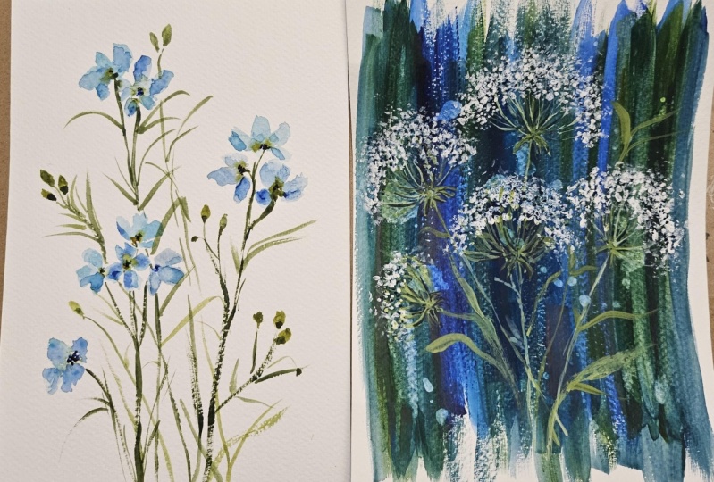
11. Day 7 Anemone: Here are the colors that
we need for this project. Let's continue with
our floral shapes. Today we are going to explore this bowl shaped
flower. It's an demone. We are going to simplify the process for painting
this anemone so that it's not too daunting for you
and yet we're able to achieve this beautiful
and soft petals. Let me give you a brief overview before we start painting. I started with a ring of dots, and then I use purple and
a little bit of pink. Next, I just grab a big brush, and it's just water in my brush. I'm just trying to
move the colors from the dots into the
petals that I'm painting. Next with a darker color, we are just going to dap our
brush into the center to create that detail similar
to the Anemone flower. And while the petals
are all still wet, we're going to add the
stem and also the leaves. So what I love about this
technique is that we're able to achieve the nice soft petals. So I love the gradient effect in the center and going into
the light colored petals. So this is definitely a technique
that you can also apply to painting other flowers that look similar to the anemone. So now I'm just trying to let it dry and I'm
using a small fan. And this is going to really
level up your flowers. So you can add some white
dots using white gouache. And you'll notice
later on that it will give this flower
a three D effect. Okay, so I'm just going
to go back in with my indigo just to bring
in more contrast. Then next, we can
go back in with some more white gouache to
just add some more highlights. Okay, so that's it. Now
let's start painting. Okay, so this is the reference
photo, and to start, we are going to use our pencil, and let's just draw a small circle in the
middle of the paper. Okay, let's grab
permanent violet and also permanent rose. We want a nice thick mixture. All right. Let me just grab
some more permanent violet. And you can use a
smaller brush for this. We are going to use the
tip of the brush and paint some small dots all around that circle that
we drew earlier. So you can vary the
size of the dots, some are bigger,
some are smaller, and leave some
spaces in between. I'm also going to
put in a little bit of those permanent rose dots. So if you have a
different reference photo for the anemone, you can definitely use a
different color combination. So we want the dots to be really wet and also very pigmented. And don't worry, you
can always go back in and put in some more paint. And that's because
we are going to grab color from those
dots into the petal. So right here, I just
have a clean brush, and I am painting the petals, going from the center, from the dots going out. You can see I'm just trying
to move my brush up and down until I form
a curved petal. Alright, let me switch
to a bigger brush because it's just easier
to do it this way. So you can see that
I'm just really pressing my brush onto the
paper, letting it fan out. And also, my brush is
filled with a lot of water. So I just want those pigments to really move into the petals. Let me do it for you slowly
so you can really observe. And then you can paint
some thin strokes. Sometimes I try to push the pigments a little
bit more using my brush so that it will move
into the petal somewhere. All right, so we can do
one more petal over here. Alright, so you can see I'm just painting water onto the paper, but I'm grabbing a little
bit of pigment from the center just to add
some color to the petals. And you can see right away
the petals look very, very soft using this technique. I'm grabbing a
little bit more of that permanent violet
and adding it in the center and maybe a little
bit of this permanent rose, and I just love the combination
of these two colors. Okay, so I think we need a
little bit more contrast, so we can grab indigo or any dark color in your palette and just
add it in the center. Let it bleed into the petals. Now let's use our brush. I have here indigo, and just go to tab it in
the center just to add some detail that's similar
to the reference photo. So you'll notice that
it has some fuzzy edge. So that's what I'm doing here, tabbing my brush to
create a texture. At the same time, you'll notice
I'm leaving some spaces. So there's like a ring of
white space around the center. Alright, now with a clean brush, you can also try
to move the paint. So just like what
I'm doing here. I'm using just the tip of my brush is creating
these elongated strokes, just very quick
strokes that's going to add some character
to the petals. Alright, now let's
move on to our stem. I'm using sap cream
and burnt tumber. You can just paint a
straight stem here. Then you can add a few more
leaves sticking out and I'm going to put it near the petals while the
petals are still wet. I just love how it just blends a little bit
into the petal. It just makes it look softer. Let me blend out this area. I'm using a clean brush. Just pressing my brush
to soften that area. It's now time to let
the painting dry. You can wait for it
or you can use a fan like what I'm doing
here or use a heat gun. I don't have a heat gun, so
I'm just using a simple fan. Next, we need to squeeze
out some white quash. I'm using the whole in
in permanent white. So permanent white
is a good color for adding those opaque
white highlights. I'm using a small brush and just adding a
little bit of water. Now I'm going to
put some small dots just all around the center. And then maybe put
a little bit of see stroke right there just
to add some highlight. Next, I'm going to
grab indigo or grab any dark color in your
palette I'm going to stipple the tip of the brush right
there in the center of the flour and going all around
the highlight that I did. Next, let's put some
small dots again. So I'm adding a second layer for this detail because
it looks very light. So when the watercolor dries, sometimes it dries too light. So we want to put
back in the color. That's why I'm adding
another layer of indigo. All right, let's go back in again with some white gouache. So make sure that you have
a really thick mixture because you want
this to be opaque. I'm going to continue
adding those white dots, but the dark dots that we added are still
a little bit wet, and you'll notice that the white gouache is going to
mix in with the watercolor. It's also going to create a
beautiful three D effect. So I'm just going to go back in with that highlight again. Just continue adding
the dots until you're satisfied
with how it looks. Let's look at this from afar, and you'll notice that we
have more depth in the center just because we added those
white gouache details. Okay, so, I think we're done. Congratulations for
finishing your project. We are now one week
into the challenge. I hope that you are enjoying your time painting
new flowers each day. Okay, let's now move on to day eight as we
paint some pansies.
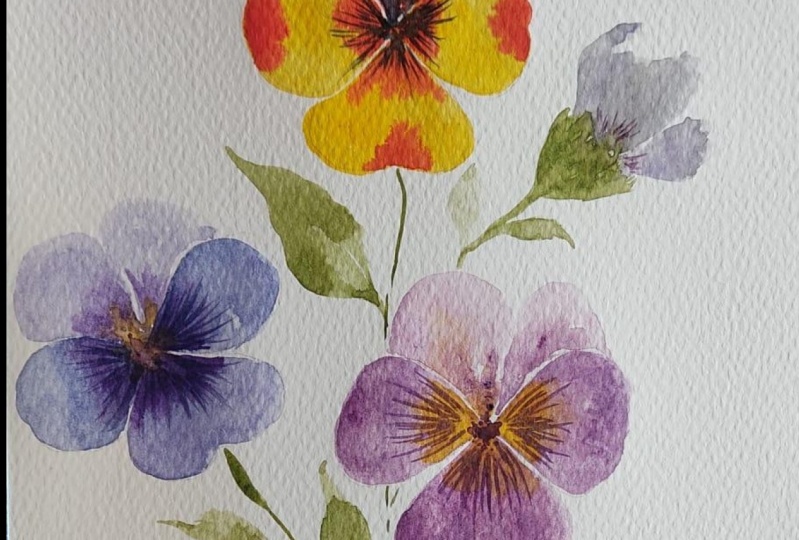
12. Day 8 Pansies: Here are the colors that
we need for this project. Okay, so welcome to Day eight, and today we're going
to paint pansies. So these flowers
have a fan shape. It also has overlapping petals, and the key feature is
the face of this flower. You'll notice a dark center
and also those dark lines. Now, pansies are fun
to paint because they come in different
color combinations, so it's really great
to experiment with. So this flower has always been
quite intimidating for me, but I decided to study it. And I noticed that the bottom
petal has this heart shape. So it's like an upside
down heart shape, and it has petals or I
would say wings beside it. So those are the
three lower petals. And then the pansies
have two upper petals. So I just drew the guide first, and then we're just going to
fill it in with some color. I'm going to start with
the lower petals first. And so right here, this is yellow with a little bit of red. So you can do different
color combinations. And then we are just
going to let this dry first before we move on
to the upper petals. And we have two upper petals. We're going to paint
a bigger one and a smaller one that looks like
behind the other petals. While the petals are still wet, you can add another color. So next, I'm going to add those veins coming
from the center, and we have to make
sure that the flour is already dry before
we add this detail. Okay, so we're going to
make this really simple. I'm just going to add some stems and maybe some leaves and also a small bud or small flower that's about to
bloom, and that's it. Okay so let's get started. Okay, let me show you a photo from one of
my trips to Japan. I saw a lot of pansies
just along the streets. And you'll notice
at the bottom petal has this heart shape, and then it has
some wings or arms. And then on the upper part, you have two petals. So we are going to start drawing
so that we have a guide. So normally, I wouldn't really try to draw the
shape of the flower. I usually paint straight
away on the paper. But I realize with pansies, it's best to draw the outline
just to have a guide. So here we are going to
paint three flowers, and I'm just painting the heart shape for
the bottom petal. So it looks like an
upside down heart. And then on its side, you paint two petals, one on the left,
one on the right. You can always adjust
the shape later on. Like, for me, this is the
easiest way to paint pansies. And then next, we can
paint one petal on top and another one on
the right that's smaller. So the top two petals
have different size. Okay, let's grab some color. I'm using mineral violet, and I'm going to add a little
bit of permanent rose. You can definitely mix your own violet or mix a
different color for the pansies. So I'm mixing these
two colors because I'm basing it on the
reference photo. So we want this to be
a little bit light. We're going to paint
the three petals below. So this is the
upside down heart. You'll notice that it's
not really a dark color. Okay, now let's paint the petals on the left
and on the right. And as I'm painting
these petals, you'll notice that I
am leaving white space in between these three petals. So they are not really
touching each other. So in the reference photo, I saw a yellow center. So we're going to
grab some yellow and put it in the center while
this flower is still wet, so you want that color to
blend in with each other. Alright, so at this point, we can mix a deeper color. This is still permit
rose and mineral violet. I'm just going to
tab this color along the edges and also in
between the petals. Alright, so I really love how these colors blend
on wet surface. So you'll notice some areas have a darker color, somew lighter. And I'm going to
leave this as is. For now, let's move
on to another flower. Okay, now let's use
permanent violet. So this one has a little
bit more blue in it, and I'm going to do
the same process. So we're going to paint the
upside down heart first. So I'm using a small
brush to do this so that it's easier to move
in a smaller space. And then we're going
to paint the arms, one on the left, again,
one on the right. And you'll notice the mixture
is also a little bit light, so we can just go back in and add some more
color later on. All right. So now let's grab a thicker mixture
of permanent violet. This is a bolder color. I'm going to add
it in the center to give this flower
more contrast. So for this flower, I'm
going to keep it simple. I'm going to add
permanent violet. Next, let's move on
to another flower. So I am going to grab
permanent yellow deep, so you can get any warm
yellow color in your palette. So we're going to repeat
the same process, paint the upside down heart
and the arms beside it. And you can
definitely go back in to fix the shape of the petals. You can make some petals
a little bit bigger. So I guess it depends also on the reference
photo that you have, but I will be providing you with a reference
photo that I took. Alright, now let's
grab a darker color. I'm going to use crimson lake, and I just love the mixture
of these two colors. It's a nice combination. So let's just mix
it on our palette. And I want this to be quite thick and drop it in the petals. I'm going to add it
towards the outer part of the flower and
also in the middle. Let me show you the
reference photo up close. So you'll notice different
spots of reddish brown color. So we're just going
to copy that. So once the lower
petals are dry, we can start adding
the upper petals. I'm going to paint
the first one here. So just follow the curve
that's why it's important to wait for the lower
petals to dry or else these two petals will
just blend with each other. Okay, right here, again, I'm just following the
curves of the petals, and this is going to
be a smaller one. So I want to create the
illusion that this is a petal that is behind
the other petals. So don't forget to leave just some tiny white spaces to separate it from
the other petals. Now, the scrap violet. I'm going to put it
here in the center. Let the color bleed. Okay, so let's move on
to the second flower. I'm using permanent violet. And again, we're going to follow the curve of the lower petals. You can see I'm
pushing my brush, and then we're going to
paint one big petal. For the second one, it's
going to be smaller. Okay, so while
this is still wet, let's grab a darker violet. This is just more pigmented. I'm put it in the center. So I notice in the
reference photo, there's a little bit of yellow. So I'm just going to
add that in the center. And if the colors look messy, you can always
grab a clean brush and just lift the color, let the brush absorb
the extra paint. So they're all coming to life. I really love it. Now let's
move on to the third pansy. I'm using crimson lake. So for the upper petals, it's going to be a
different color. So I'm just going to follow
the curve of the lower petal and then just slowly
work my way around it. So while the petals
are still wet, let's grab a darker color. I'm going to use
permanent violet, make sure it's a thick mixture
and add it right there. Just let it bleed
on the wet surface. You can also use indigo
or any dark color. Alright, so you'll
notice that adding this dark color really
creates a striking contrast. And now we are going to grab our brush and use a
size two round brush, grab some violet and paint
these nice thin lines. I'm going to start from
the center going out so that I have some
nice wispy strokes. Okay, let's move on
to the other flowers, touch the petals,
make sure it's dry. And then we can add
those nice thin lines. So this is one of the
key features of a pansy. So it has this beautiful detail. Alright, so as I'm
painting this, I feel like we need to
add some pop of color. So I'm going to grab
permanent yellow light. A light yellow color you have in your palette,
you can use that. And then I'm just going to grab a thick paint and put it in the center so that it will make this flower
stand out even more. Another option is to use
gouache and a yellow color. So I'm going to do that as
well on the other flower. Alright, now let's add some
veins on the third flower. Okay, so as I'm
adding the veins, I noticed that this flower right here looks like it needs
a bit more contrast. So I'm grabbing
some crimson lake and just going to lightly
paint the sides of the petals. But the downside
is that I'm going to blur out some of the
lines that I painted, but that's okay because we can always go back in and add it. So I'm just going to paint
the edges and then clean my brush and just
slowly blur the edges. So I'm just adding color
towards the edges of the petal. While this is still wet, we can grab a little bit
more of that crimson lake or you can grab some
violet and add some color. Let the colors bleed
with each other. And then if you don't like it, you can always go back in
and kind of blot the color. Now, we can grab a few dots of dark color in the center
just to give it more depth. And now let's mix the
colors for our stems. I'm going to mix sap
green and burnt umber. So just mix any green and
brown color in your palette. Now we can add some curve stems that look like
they're dancing, going to make this look
like it's more whimsical. And then we can also
add some leaves. So we have a space on the upper left part of this painting that looks
a little bit blank. So I think we can add some small flower
that's about to bloom. I'm using a very
light violet color. I'm just trying to observe this small flower in
the reference photo, you'll see that nice small
bud and I'm gonna put a green in the base of this flower so that it will
be connected to the stem. Okay, congratulations
for finishing Day eight, and this is the last
of the category. Now we'll move on to a different
category for day nine. I hope that you got
inspired to paint more panties in different
color combinations. Okay, let's move on
to the next video.
13. Day 9 Hydrangea: Before we start, here are
the colors that you need. Okay, so we are now on day nine, and today we're going
to paint hydranga. It can be overwhelming to
paint this flower because of all the small cluster
of flowers and details. So we're going to
paint it loosely. So for this project, we're going to do a
wet on wet technique. And first, we're going
to wet the entire paper. So here I'm showing you
the sheen on the paper. Next, we're going to
grab a blue paint, and we're going to just create some markings on the wet paper. And you can see that I'm
trying to also dab my brush in a tissue paper so that
my brush isn't too wet. And what we want is to still see the markings on the paper, even if it's a
little bit blurred. Then we're going to
add the stem and also the leaves while the paper is still
a little bit damp. And you can also start adding some shadows, some
darker greens. To make it more dramatic, I'm grabbing a little bit of water and just
trying to blur out the edges of the leaves and let the green color just
flow into the background. Okay. So next, we want to
add another layer of color. So this is going to be
a little bit darker, and you can see in
the reference photo, there are shadows in some areas, and so I'm going to
put a darker blue. Some parts of the
flower are still wet, and we want that so that
the colors will blend in with each other and we
won't have a harsh line. And of course, we're going to
add some splatters all over our painting just to give
it some dramatic effect. We can also try to blur
out some of the splatters. So here I'm just adding some more dark areas
to give it more depth. I start painting, and this
is our reference photo. So what I'm doing here
is I'm just drawing lightly the entire
shape of the hydranga. So I'm not going to draw
all the small petals. We just want the overall shape of the flower and the stem, and you can also
add some leaves. And this is just going
to be our guide. Next, we are going
to wet our paper. So I have here just a big brush. It's a Filbert brush, but you can use your round
brush or any big brush, and I'm just going to paint the paper with just clean water. So I'm going to do
it up and down. But to be honest, even if I do this in different
directions, it's fine. So I'm so sorry if you
can hear my voice. It sounds nasal
because I'm still recovering from a flu
as I'm recording this. Alright, so I'm going
to tilt my paper so you can see the sheen on the paper. You can see that it's damp, but it's not dripping wet, and that's what we
want for this project. So you just want the
sheen on the paper. You don't have any puddles. Hydrans come in
different colors, but I just decided on a blue one because I think it looks very cool in the eyes. So here I'm just grabbing some colors that
I will be using, and we'll need cerulean blue, prussian blue, and
also vertical blue. You can definitely switch
up the colors depending on the availability of the
blue colors in your palette. I'm going to start
with Cerulian blue. I'm using a size
six round brush. The paper is still damp, and I'm just going to dab my brush to
create some markings, and you can see that
it's spreading too much. So I'm going to dab
it in a tissue paper, and now you can see that my strokes are a
little bit better, and you can see the
markings better. Okay, so let's try it again. This is vertal blue. Alright, so you can see that almost like crescent moon shape. Oh, that's what we want. And I'm leaving spaces
in between my strokes. And you can still see the
first few strokes that I did, it looks like a blob of paint, and that's because
my brush is too wet. So when you're
doing this project, make sure that your
brush is a little bit dry by damping it
in a tissue paper. Alright, so we're not going
to be strick with this. We can mix the blues
in their palette, use different blues
in different areas. So just dab your brush, and you'll be able to create soft strokes because
this is a damp paper. You can also try
adding a darker color. This is Prussian blue. I'm adding it towards
the bottom part of the hydrangea just because there's more shadow
in that area. So what I love about working
on wet paper is that it really produces a
very soft painting. Okay, so for the edges
of the hydrangea, I want it to be really soft. So I'm just grabbing some water, and I'm just going to
quickly blur out the edges. You can see I'm trying to press my brush onto the paper and add some water just to
disperse the color. Because I want it
to be very soft. So because we've been
working on this for a while, the bottom part is already dry, and I'm going to grab
some water again and just lightly wet my paper, so you can see,
it's not a puddle, just really light
layer of water. Now, let's prepare our greens. I'm going to mix sap
green and burnt umber. And we're going to add the stem. This is a thick mixture and
I'm also dabbing my brush in the tissue paper so that it's not going to
spread all over the place. Then we're going
to add the leaves. So you can see that hydrone
have really wide leaves. I'm going to add it
towards the other side. And I'm going to try and
attach this to the flour. So you'll see the beautiful
blend of blue and green. And because we're
working on a damp paper, you can see the
edges of the leaves. It's kind of feathering. It looks a little bit blurred. Okay, so now you can grab
a darker mixture and add it towards certain areas near the flower where
the shadow will be. And then we're going to
add a dramatic effect, so I just grab some
water and I'm going to just lightly drag the color. So you can see right here, just grabbing water and adding it towards the
bottom part of the. Again, just want to
drag the color down, kind of let the colors flow, and it's just going to create
a beautiful background. Okay, it's time to add the
second layer of the hydrangea. It's going to give
it more depth. So this flour is
still slightly damp. Some areas are
actually dry already. I'm just going to dab my brush to create some
petal like strokes. You can see I'm moving
it up and down. So I'm using cerulean blue
and also verdial blue. You can see that some areas, I'm going to paint some
four petal flowers. Maybe some will be just three, but I'm also making
sure that I have spaces in between these
flowers and that you can still see some white from
the base layer that we did. So we are not going to cover
the entire first layer. So we still want to see that. And it can be quite
tricky at first, but don't worry this is
something that you can practice. So now you can see that this hydrna is slowly
coming together. There are more details, and I think it has
more depth now. But of course, we're going to
add some more darker color. So this is Prussian blue. So I'm mixing a
slightly darker color, and I'm adding these strokes, these check mark strokes
towards the bottom part. So you can always go back to your reference photo to check where the shadows
are going to be. You can also improvise. You can change the
placement a little bit. Okay, so I'm just adding some really dark mixture
onto the flower. Sometimes I just dab my brush like this and
put some small dots. Then you can rinse your brush
and add some vertial blue. I guess sometimes it's all about knowing when to stop when you're doing this technique because
if you add too many petals, it's going to look very crowded and it won't look soft anymore. Right. Let me just
add some greens here and there because
at the reference photo, I can see a little
bit of the stems. All right, so now
we're going to add some water towards the upper
part of this hydrangea, and I wanted to add some
more drama to that area. So we're going to add some blue, sort of extend some petals. So you can see that
it looks very, very soft because we're
painting on wet paper. If it's too much, you can always dab it with tissue
paper like what I did and then just go back
in to add some strokes. So just use a tip
of your brush and kind of wiggle your brush
to create these markings. So right here on the side, I'm just going to blur out
this part just to make it look softer. All right. And just to give it even more
depth, I'm grabbing indigo. I'm going to put small dots
all over this hydrangea. So it's going to look like
the center of the flower. But again, we have to
be careful and not add too much so that it
doesn't look too crowded. Just going to add
some darker areas towards the stem and
also the leaves. So the leaves here
are already dry, and what we can do is we
can add some texture. So you can see I'm
using just the side and the tip of the brush
to create the strokes. I'm trying to wiggle my brush so that it
will look more organic. This is another option instead of painting the usual veins, you can do this technique. Alright, let's add
another leaf right here. I'm just using water, and then we're going to
add a little bit of that green and then grab
a darker color. I'm just going to tab
that dark color in different areas and just leave it as is and not
going to blend it. Then next, we can
add some splatters. So when you're
doing splatters and you don't know
what color to use, my tip is to use the color of
the flower that you did in your painting or maybe add a little bit of green
from the leaves. I love adding splatters
because it just feels like the painting looks
more loosely painted. Now you can always go back in, blur out some edges to
make it look softer. For some finishing touches, I'm just going to put some
small dots again of indigo in different areas just to let your brain think that there are more flowers in that area. Alright, so that's it. I hope
that you enjoyed painting this freestyle hydranga and I hope to see your
painting very soon. Let's move on to
another project, which is a crowd favorite, so this is the expressive rose.
14. Day 10 Rose: Before we start here, the colors that we need. Okay, so for day ten, we're going to paint a rose, and I really love this
expressive style, and roses are my favorite
flowers to paint. You can see a lot of
expressive strokes here, which we will be doing later on. Okay, so just an overview
before we start the project. We're going to start with
the center of the rose. I'm working on dry paper. So right here, I'm
just trying to create the bigger petals
by trying to blur out some of the strokes and also leaving some white
spaces in between my strokes. And I'm adding a little
bit of that violet, and also I think that's indigo, and we're going to add it
towards the outer petals. It's going to give it a
very beautiful shadow. It looks like this
rose is floating. And it's one of the secret
techniques that I do when I want to paint romantic
watercolor roses. So after we have this base rose, we're going to paint
this wonky stem. You can see it has
these broken lines, and then we're going
to add some leaves. And then we're going to
paint these tiny pods. I'm going to do a very
simple technique, and you learn that later on. Some areas look a
little bit plank, so I decided to add some
more stems and also leaves. So when the rose is already dry, we're going to add
some dimension. I'm going to add a second layer. So this is like a
darker pink color, and I'm going to just slowly
fade away some strokes. And because we're doing
freestyle florals, I'm going to just add some flatters to make
it look more fun, but you can definitely
skip this part. Okay, so let's start painting. I'm going to use a pencil and just put a small
dot right here. That's going to be the center of our flower and
usually do this as a guide before I start since I don't sketch my
floals beforehand. So first, we're going
to grab our pink. You can use any pink color. I'm using bright rose
just to change things up, but it looks a bit cool, so I'm going to add
just a tiny bit of permanent rose just
to give it some warmth. So what I love about
bright rose is that as the name states it, it's really bright, and I love
how intense the color is. So here I'm just
watching the colors. I'm grabbing more paint because I want this to be
a thick mixture. We want a really dark center. You start with this
crescent moon shape. And then all around it, I'm using the tip of the brush and just painting
some curve strokes, just some nice thin strokes.
I'm going to vary it. So strokes will be a
little bit thicker. So it feels like I'm
hugging the center. So you can also notice that
I'm trying to flick my brush so that all my strokes will
have nice pointy tips. So you can see here, it's like I'm creating
this cup shape. Alright, so let's just clean our brush and just
tap the excess water. I'm going to slowly fade
away these outer strokes. So I'm sort of
connecting some of the strokes using just water just to keep it light and soft. All right. So as we go towards the outer part of the rose, it's going to be a bigger size. So the petals are
going to be bigger, and then going to put just
some small strokes right here, which I will be blurring out. So let's rinse our brush. Then press your brush, and then you can move it sideways to create
these bigger petals. As I'm doing this, I'm
making sure that I still have some white spaces in between my strokes just to suggest that these
are layers of petals. So right here, I'm going to
blur out this area as well. Just moving my brush. So this is going to be a
rose that is on its side. So in order to create
that illusion, we should put more petals towards the bottom
part of this rose. All right. I have the indigo
and I mix it a little bit with the bright rose to
create this purple shade, and then I'm going to
grab some more indigo and just paint it
on the palette. And we want to add
a lot of water. I'm going to attach this
to the outer petals. So it will create
this shadow effect, and just make sure that you add a lot of water just
to keep it soft. This is, again, one of the
secret techniques that I do whenever I want to
create a romantic rose. So you can also use paints gray. If you don't have indigo, just make sure
that you're adding a lot of water like
what I'm doing here. So just add this
slightly towards the outer parts of this rose. So when you're painting
loose flowers, you want the center to be darker than the outer
part is lighter. So now I'm going to
grab a little bit more of that bright
rose mixture. This rose is still damp. You can see that as I'm
painting these strokes, it looks blurry or
feathery, and that's okay. Okay, let's leave that flour alone for now and
mix our greens. I'm using sap green
and Burnt umber, this is my usual combo. And then I'm going to
grab shadow green. So shadow green is also
perlin green in other brands. So I wanted to add some
movement to the stem. Gonna use just the
tip of the brush and just create these broken lines, and you can see that it's
not a straight line. Alright, so you can mix the
two greens in your palette. And then I'm going to add just some more
stems sticking out. That's going to be
our guide later on. We can put some more
leaves or some more buds, so you can change the composition
in your own painting. Alright, let's start
adding some leaves. I'm going to grab some
more shallow green, and I'm just going to
wiggle my brush to create these expressive leaves. I'm using the size six brush, so the effect might be
a little bit different. If you're using a
size eight brush, it's going to be a bigger leaf. While the leaves are still wet, you can grab some
darker green or even indigo and just
drop it in the leaves. It's going to create a
beautiful dramatic effect. I'm going to vary
the green colors. This is going to be a little
bit lighter at the top. So I'm just going to wiggle my brush and just add some
more stems sticking out. Alright. Now let's add some buds towards the top part
of this composition. Go to grab bright rose. So we just want to put a few small dots at the tip
and then rinse your brush. And then we're going to
pull that color going down and just fix the shape
until you create that bud. Next, I'm going to grab some
green and add it towards the base of this pd so that
I can attach it to the stem. Let's do it one more time, and this time, it's up close. So you can see, I'm
putting some small dots. These are very
concentrated dots. Then rinse your brush, dab the excess water, and just pull that color down. Okay, so just let it
bleed into the wet area. Alright, so we can now
add some more leaves, I'm using shadow green, and we're going to add this
towards the right side of this rose just to frame
the shape of the rose. So usually do this near the
light areas of the petals. So this is going to help
make the flowers pop up. So you'll notice here how adding a dark leaf in the background just makes the
flowers pop up even more. You can even add some
more darker areas. Alright, so my next tip is also to add some shadow leaves. So these are very, very
pale colored leaves. I'm using just paints
gray with a lot of water. When I add it right here, it feels that this
area is blank, but I don't want to
add some more flowers. So we're just going to
add this shadow leaf. So it feels like it's
just in the background. It's just floating. Okay, so I think we're good with that. Now let's grab our
sap green and burnt umber and you can just add
some brighter green leaves. You'll notice that shadow
green or perylene green is a really dark green color. It just creates a more moody
effect on the florals. So sometimes I like
to change things up and add some brighter greens. Okay, now we're going to add
some more buds right here. Just go to rinse my
brush and try to just drag that pink dots and
add some greens as well. It's now time to add a
second layer for the rose. So this is just a bright
rose that's more pigmented. So just change the ratio
of the paint and water. So you want more
paint and then maybe add just a little bit
of that paints gray. And then we're just
going to paint the same crescent moon
shape in the center. I'm going to just put some
small thin strokes all around. This is going to help
bring out the layers of petals of the rose. All right. Let's rinse our brush and
just dab the excess water. I'm going to slowly
fade away some of the outer strokes so that
it will look very soft. So I'm just going
to go back in with this indigo color and add it towards the outer
part of the petals. Can also play around, add a little bit of pink. So I'm doing this while
the petals are still wet. Then now we can also dab some darker mixture
in the center. We can use this very
diluted purple colour to extend some areas
of the petals as well. So when you are
adding splatters, you can also try to wet
some areas before you add those splatters so that you have a different texture in different
areas of your painting. So I'm mixing green and
some pink splatters here. So you can look at
your painting from afar to see what's missing. You can add some more leaves. We can also add some veins on the leaves just
to give it some more depth. And this is actually what
I love about painting some freestyle florals
because you can just add all these
details as you go along. Alright, so we're done. Congratulations for finishing this beautiful rose painting. I hope you enjoyed it. Now let's move on to the next day as we
paint some peonies.
15. Day 11 Peony: All right, so here
are the colors that you need for this project. For the 11, let's paint peonse. This is a really popular flower that a lot of people
want to paint, so I decided to include
it in this challenge. So we're going to paint these
loose and fluffy peonse. Before we start, let me give you a brief overview of the process. So these are going to be
the cup shaped peonies. I'm going to start with
two petals in front, and then we're going
to close off the top, and we're going to leave that
white space in the middle. And then we're going to
add some more petals on the right and also
towards the bottom part. So it looks like
it has some petals hanging just like this
in the reference photo. I really, really love the
color used in this project. It's a nice brownish,
pink, peachy color. So we're going to learn
how to mix that later on. So right here, I'm just
adding some darker color towards where the petals meet. Next, we're going
to add the stamen. And then we are going
to actually paint just two main flowers for this
project to keep it simple. So next we're going to add
the stems and the leaves. So I'm going to put the
leaves near the petals. So here we're going to
do this second peony. It's going to be
the same process. We're going to start
with a cup shape. And then we're going to
add these loose petals hanging below. Okay. And once we're done, we're going to add the stem and add some more expressive leaves. And in those blank spaces, instead of painting
another flower, we're just going to
paint the small buds. And lastly, we can put some finishing touches,
create some depth. I'm going to add
a second layer to some of the petals and just add some darker contrast just to make these
flowers pop up. Alright, so I think
we're ready to paint. Let me just grab my pencil. I'm going to look at
this reference photo. So I'm going to copy the
shape of this Pione. It looks like a cup.
And we're going to do two main flowers that are
diagoni across each other. So I'm just going to paint this cup shape, rather draw it. Again, just draw lightly because once you paint on top
of this pencil sketch, it's not gonna go away. So try to draw as
light as possible. So for the colors, I'm going to mix permanent
rose and also yellow ochre. So for this mixture, I'm going to add
more permanent rows. So this is going to be pinkish. And then we're going to
also add a lot of water. Next, I'm going to do the
same mixture, but this time, I'm going to add
more yellow ochre, so you can see it's
more of a peach color. So we can alternate these colors within the petals that
we will be painting. Right. So let's start
the petals in front. I'm going to use this brush. It's a size eight round brush, and we're going to
follow that curve line. So just press your brush, going to the center. It's going to create
a letter V shape. So we have one
petal on the left, another one on the right, and just make sure that you
have some white spaces. So you can see that the
mixture has a lot of water. The color is very translucent. To make it look even looser, you can just try to paint
some nice thin strokes, and then let's just
grab some more paint. I'm going to close off the top, paint some nice curve
lines at the top. So I'm doing some
really quick strokes to that all my strokes will
have nice pointy tips. So now I'm just
trying to connect some areas so that it
doesn't look detached. Alright, so it's
looking really good. And now I'm going to add just some darker colors here
where all the petals meet. It's the same permanent rose
and yellow ochre mixture. Next, we're going to just
paint some petals right here. You can see that
there's one facing us. So I'm just going to mimic that, press your brush and go
towards that center. Then again, press your brush and just drag it to
create that loop. And you'll notice
that this petal doesn't fully attach
to the main flower. It's just one small
area in the petal that attaches to
the main flower. And that's because
we don't want this to look like a blob of paint. So you really want to keep the distance and make sure
you have some white space. So here I'm just grabbing
a darker paint and just adding it towards that base of the flower just to
give it more depth. Right, so for the
stamen, I'm going to use permanent yellow deep, add some thin lines
in the center. So that white part we left
it as is a while ago, and that's because
we're going to paint the stamen in the center. You can put some small dots. You can use any yellow
paint in your palette. Alright, now let's
mix our greens, I'm going to use sap green
with some burnt umber. Just wanted a nice
earthy green color. And we're going to add the stem. So I'm just going to
do a straight line so while this stem is still wet, you can grab a darker green. So I'm going to
use shadow green. You can also add indigo
or paints grayer greens. But shadow green is just
an easy color to use, and I'm just going to add
some leaves using this color. So as I'm adding the leaves, you'll notice that the
petals are also still wet and the leaves are blending in with the
petals a little bit, and that's going to create
a nice loose floral vibe. Okay, let's move on
to the second flower. You can see this
curve pencil outline. So we're just going
to follow that. Going to paint one petal and then another one on
the right so that it creates this letter V shape. You can vary the pressure
in your strokes so that some can be thick strokes, some can be thin ones. So here I'm just going to add one more petal and just a few more thin
strokes all around it. You can also try to adjust
the shape of the petals. Now I'm going to
close off the top, use the tip of my
brush and just create some flicks and you'll notice that I'm painting kind
of like broken lines. Some strokes are just dots. So you can hold your
brush towards the end of the handle to create
these nice loose strokes. You'll also notice I'm leaving
a lot of white spaces. Alright, let's add the petals
below this main flower. So we just want to really press our brush and just go
towards the center. And you can also start from the center going out
to create a loop. So you can see I'm moving
my brush just up and down. Let's add some depth by adding a darker color here where
all the petals meet. So that's going to
be very important. You can also add some darker
areas in between the petals. So, to be honest,
it takes a while to get used to painting
the shape of a peony. Sometimes it looks odd, but it really just boils down to practicing and doing
it again and again. To here, I'm just checking out the reference photo
again just to check where the shadows are so I can add
the darker areas. And now I'm adding this stamen. Just paint some
really thin strokes. You can use a smaller brush, and then we can just
add some small dots. Right, so it looks great. Next, let's just paint the stem. Going to do a straight line. And then we are going to add
some nice expressive leaves. I'm going back in
with my size eight, and you can see I'm
just swinging my brush to create these nice
expressive leaves. So the petals are
also still wet, so it's going to really blend
in nicely with the leaves. Alright, so this area
is looking really nice. And you can go back in and
just press your brush where the petal and the leaves meet so that they will
blend in with each other. Alright, so there's a
space here where we can paint a small bud
that's about to bloom, going to use the same color. And using a size
eight round brush, and we're going to
do an oval shape. So this can be comprised
of two petals. We can do one main petal
there and one on the right. And towards the tip, you can put a darker color at the top. And it actually looks like
a small fruit right now. And what I'm going to
do is I'm going to grab permanent rose again
with yellow ochre. Then we're going to
add it right here. You can see it's a darker
or a more intense mixture. So when you're doing
loose florals, it's important to
change the value. So some areas are darker,
some are lighter. Using shadow green,
we're going to add some more leaves,
some more stems. And you can try to paint these leaves very quickly so that it will look
more expressive. To add more depth to the center, I'm going to use burnt sienna. So you can use any brown color
as well in your palette. I'm going to do
the same strokes. It's going to be very thin
strokes and some small dots. So usually for the
center of the flowers, when I'm doing loose flowers, I prefer using two colors, one that is lighter and
another one that's darker, and it will give it more depth. So the petals are still
wet at this point, and I'm just going to grab this same mixture of permanent
rose and yellow ochre. We're going to add it
towards the base of this flower where
all the petals met. You can also use this color
to add a second layer. So just like what
I'm doing here, I'm painting the same petals. But I love the effect
because it gives the illusion that there are
more layers in this flower. Alright, so as I'm looking
at this from afar, I think we need an
even darker color. So I'm mixing permanent
rose with bun sienna. So sometimes as you paint along, something just
feels a little bit off and you have to fix it. So here I'm just adding just a darker color towards
the base of the flower. And it looks a little
bit weird now, but it will look great
once it dries up. Let's look at this
flower from afar, and I think I needed
just a tiny bit of contrast in the center. I'm gonna use sepia. You can use black
or any dark color. Just put some small dots there. And I think the contrast really makes the flowers
pop up even more. Okay, so we are done. Congratulations for
finishing day 11. I hope to see you
again tomorrow for day 12 as we paint some
expressive florals.
16. Day 12 Expressive Florals: B. So here are the colors that we will
use in this project. Welcome to day 12. And today, it's going to be
so much fun because we're going to paint loose
and abstract florals. So the goal is to create a
dreamy and free flowing look. Now, let me give you
a brief overview before we start the project, so we have an idea
before we paint, right? So I'm going to first paint some petals using a large brush. So I'm using a
Filbert brush here and you can use any big
brush that you have. And then after we have
laid down our foundation, we're going to grab our paint, and I'm going to let it flow
into the wet areas only. This is going to give us a really beautiful
soft edge flower. This is also a good
way for you to understand how your paints
move on wet surface, and you can also try to
combine different colors. And in this project,
I just painted some simple four or
five petal flowers and just make sure that I have ample white space
or gap in between my strokes so that the
petals will be more defined. Right, so after painting
the two flowers there, we're going to paint the
stems and also the leaves. Now, this is a simple
floral composition. So we just have three flowers that are diagonally
across each other. If you have a huge brush, that would be an advantage
because you can paint really loose strokes
using just water. So you can get a big round
brush or a big flat brush. And once we're done
with the flowers, we can just add a darker center. We can also add some splatters to give this more character. Alright, so let's
start painting. I have here my three
fourths inch Filbert brush, which I'm going to
use in the project. If you don't have this brush, you can simply use
your round brush. Next, we need a jar
of clean water, and we're just going to grab some water and make sure
you have a juicy brush. So we're going to
paint three flowers that are diagonally
across each other, and I'm going to start
at the bottommost flour. Alright, so this paper is
dry and our brush is wet. So I'm going to paint the
petal and lay down my brush. And as I'm ending the stroke, I'm trying to lift my brush
so that I have a pointy tip. I'm also trying to change the ankle of my brush to
create some thin strokes. So you can see that as
I'm painting the petals, I'm going towards
one point only, which is the center
of the flour. Alright, so we can now add some more strokes
on the right side, and you'll notice that
there are dry areas. So that's going to be the
gap between my strokes. It means that there won't be
any pigment in that area. Now, this is very
important because if you don't leave spaces
in between your strokes, you're going to have
blobs of paint instead. So for the color, I am going to use carmine, and I'm just going to mix
this color on my palette and just lay it on the wet
surface that we just painted. So I am just working
within those petals, and you'll notice that we have feathery edges or
very soft edges, and that's because
the surface is wet. I think we can add a
little bit of yellow. And it's going to look
great with the carmine. I'm just going to tilt my paper a little bit so you can see
the sheen on the paper. You'll notice that the petals
are still very, very wet. And you can also try to
tilt your paper so that the pigment will move
and mix with each other. So I'm not going to fill
in the entire petal. You'll notice some areas are still filled with just water. I know it can be very
tempting to paint the entire petal and put
some color in all the areas, but trust me, just leave some of them blank or without any color, and it will look
very, very soft. All right. So, I'm just
doing the second flower. It's the same process. What's great about
the Filbert brush is that every time I lay
it flat on the paper, I get a very rounded edge, which automatically
looks like a petal, so it's very easy to use. If you're using a round brush, you can just move your
brush up and down to create a loop so that you have
a nice rounded edge. So I'm using bright rose
for the second flower. Going to put color
on the wet surface. So you'll notice that
I don't really move around the pigment
so much anymore. That's because I wanted
some very soft edges. And if you try to
overwork on the petals, it's not going to
look that great. I'm going to get some yellow. This is permanent
yellow deep and maybe mix it a little bit
with the bright rose. So we're just going to
do very quick strokes. So here I'm just adding
some more water towards the edge just to make
it look even softer. And you can grab a
more pigmented color. This is just carmine
and I'm going to add it in the center to give
this flower more depth. But you can also use
other larker colors. So for me, the trick when it comes to painting these types of loose florals is to limit the number of
strokes that you make. I think it shows whenever we put in a lot
of brush strokes, it becomes very heavy. Okay, so while the
flowers are still damp, we are going to add the stems so that they will
connect seamlessly. I'm going to do curved lines, and I want it to
be broken lines. So this is also a good time
to add some leaves and the mixing sap green and indigo for a darker
green mixture. Going to add it near the
petals because I know that the petals are still wet and we want the colors to really
bleed into each other. Alright, to make it
look more balanced, we can add one more
smaller flower at the top. So I'm just adding
the stem first. Alright, so when it
comes to leaves, try to vary the values, so you can see some are
lighter and some are darker. Alright, so I'm going to
grab a little bit of darker green and just tap it
onto the wet leaves. Okay, let's move on
to the third flower, and you can see here the sheen. I'm going to tilt my paper so you can see what I'm painting. So this is just a
simple flower shape. So it looks like a fan shape. But you'll notice
that I intentionally left a gaps between
some of my strokes. All right. So I'm going
to grab bright rose and just paint it
on the wet petals. Can also grab a little
bit of carmine. So I'm trying to
vary the colors. And again, you'll
notice that I do very quick short strokes. I don't try to move my brush
so much on the petals. So you really need to
know just when to stop. And you can also try
to tilt your paper, like what I'm doing here so that the colors are going to
mix with each other. So you can add a little
bit of green towards the base and maybe just
a few more leaves. I usually add leaves near
the flowers and also in the white gaps of
the floral painting. Alright, let's grab our brush and dab it in the tissue paper. Let's grab indigo and
add it in the center of the flowers because we
want just more contrast. So when you're doing
abstract florals, it's important to
establish that contrast, just to make the colors pop. I really, really love how the leaves just blends
in with the wet petals. I love the seamless look of it. And you can only achieve
that when you add the leaves onto the wet petals. So we can also add
some small buds. You see I'm putting here
just concentrated dots, and we're just going to grab
a clean brush and drag it down so we can create the
shape of a small bud. So again, just lightly tap
your brush onto the paper. Then you can grab some
green and add a stem. So this is a fun project, and I really encourage you to just try out different
color combinations. So the colors that are beside each other on the color wheel, they will look great in
a composition like this. Next, let's add some splatters. I'm using pinks and a
little bit of green. It's going to make this painting look even more expressive. Now, feel free to
go back in and add some more darker centers if you need more contrast
in your plurals. All right, so that
was very quick. I hope that you had fun, and I look forward to seeing your projects in the project gallery section of the class. Now let's move on
to the next video.
17. Day 13 Queen Annes Lace: Before we start, here are
the colors that we need. Welcome to Day 13, and this is actually one of my favorite paintings
in this challenge. I love adding the
background and also adding the texture for
the Queen Anne's lace. I'm pretty sure you will
enjoy this project. So let me give you
a brief overview. So first, we are going to
do a wet on dry technique, so we're going to do the
background like this. And I decided to do a wet on dry because I wanted
those jagged edges. Wanted it to look more rustic. Blue color also makes it look more dramatic,
in my opinion, and I love the contrast between the blue background and the
white Queen Anne's lace. And to add some texture, I'm going to just splatter
some clean water, and you can see the pigment
move as I add the water. So it's really beautiful
to create these effects, and you'll see the imperfections
in the background. I think it adds more character. Next, we're going
to add the stems, and then the Queen Anne's lace. I'm going to use a round
brush and just tap some small dots that will
look like cluster of flowers, and I'm using also
gouache for this. And then I use a small sponge
to dab some more texture, and it actually gave this airy feel to the queen Anne's lace. Then we're just going to add
some more finishing touches to make the flowers
pop up even more. Alright, so now let's
start painting. So the Queen Anne's lace,
it looks like this. So you can see it
has a tall stem, and it also has these
small cluster of flowers that looks very
airy and delicate. And because the flowers are
white or light colored, I decided to do a background for this painting so that the
flowers will really show up. And I think it's
also a good way to experiment with backgrounds
in your paintings. Now for the colors, we are going to use
Prussian blue and indigo, but any blue color in your
palette can also work. I am using a flat brush
to paint the background, but you can definitely
use any brush. You can use a round brush. You can use a ilpret brush. So here, I'm just adding Prussian blue and indigom
just alternating. Sometimes I'll introduce
a little bit of water so that I can
spread the color. And because I'm working
on a dry paper, you can see the texture,
the jagged edge. I think it looks very nice
and looks very rustic. So some areas here
have a darker pigment. So again, I'm grabbing
some more water and just using that
to spread the color. You can also grab a
little bit of green. This is greenish
yellow or green gold. So I think it's a
nice pop of color. You can use any green
in your palette. A Alright, so the paper is still damp. I think I'm going to add
some more color over here. So we do want a dark background for the flowers to pop up. And this looks quite
dark now, but later on, when this dries, it's going to be lighter
than what you see now. Okay, let me just grab
some more greenish yellow and just add it
in different areas. So you don't need to
stick to these colors. You can definitely experiment with other color combinations, make sure that it's
dark enough so that the queen Anne's lace will pop up when
you paint on it. And this is just
such a fun painting, and it's very forgiving. It doesn't have to be perfect. So now I'm going to
grab some water. This is just clean water, and I'm going to splatter
it all over the painting. You'll see all those white dots. So that's the pigment moving as we add some
splatters of water. So the surface needs to
be damp and not too wet, because if it's too wet, you might not see the
effect that you see now. So sometimes you
can wait for, like, a minute or two before you add the splatters so that you'll
get a more dramatic effect. Alright, you can just add
some more finishing touches, add some more pigment, or add some more splatters. Okay, so when you're
satisfied with this, you can stop and let it dry. So here's the painting
that's fully dry, and you'll notice that it's
definitely lighter than the color in the previous
video where it was still wet. So now I'm just going to grab some white ah and
also sap green. Alright? So we are going to mix sap green with the white kah. And the reason is that
I want this colour to really pop up because
we have a background. Alright, so we are
going to do maybe three flower heads that are
diagonally across each other. So now we can just
paint just thin stems first as a guide so that we will know
where to put the flowers. So after drawing the stems, we're going to do the arms. So I just call them
the arms because they hold the little
clusters of flour. So we're going to paint this
in different directions. So the entire shape, it looks like a cup. Alright, so let's do
another one here, and you'll notice that our
strokes are more visible. That's because we added some
white gouache to our green. So what we're doing is
we're just laying out the foundation for
this floral painting. So we're starting out with
three flower heads first, and then later on,
we're going to add some more smaller flowers. Now, I'm grabbing white gouache. Just make sure you
have a thick mixture and don't add a lot of water to your gouache or else it will be very thin and it
will not be opaque. So use the tip of the brush
and put some small dots. This will look like
cluster of small flowers, and it's okay if the dots touch each other or if some are
separate from each other, that will make it look like a more airy viivee which is going to
create the soft look. So you'll notice that I also add a little bit of blue
to the gouache. You can also add that just
to give it more character. All right, so let's just add some more dots that
are further away. I think that it's going to look even more loose if you add the dots a little bit far
from the main flower. Right, so you can also grab your size two round brush
and grab a little bit of green and maybe attach some of the dots to the
main flower head. All right, so let's move on
to the second flower head. I'm just going to use this size four round brush to
add some small dots. You can vary the dots. Some are small, some are big. Now, to add even more texture, we can also use a sponge. So just use your sponge
and dab it in the gouache. And then you'll
see this beautiful magic happen on the paper. So just look at that. It's so pretty. It looks
very, very delicate. So I really love the
effect of the sponge. It looks like a spray
of tiny flowers. So it's nice to combine the sponge and also adding small dots
using the round brush. Because with the round brush, you get a more defined dot. But with the sponge, you get little like,
sprays of flour. So it's nice to
combine those two. Okay, so let's move on to
the third flower head. I'm using my round brush
to add some small dots. We're adding these
dots mostly at the tip of the hands that we painted. Then you can definitely
go back into the other flowers to
add more definition, add some more dots. Alright, let's go
back in and add some more magical
touch using a sponge. So I'm just going to
grab some more paint. So you want the paint to be dry. So this sponge is actually dry. It did not wet this sponge, and that's because I wanted
to get that texture. So if you wet the
sponge before using it, it's going to create
blobs of paint instead. So you won't be able to
get the nice dry texture. So make sure that when
you're using the sponge, it's dry before you
dab it in the gouache. Alright, let me grab
a different green. This is shadow green. I'm just mixing it
with a gouache, and we're going to add some
very, very thin stems. And then we are just trying to vary the color of the greens. Some are darker,
some are lighter. And I think we can also add a few more flower heads that
are a little bit smaller. Alright, so I think I
need a pop of color. I'm going to grab
some greenish yellow. So I love using greenish
yellow because it instantly makes the
painting look happier. You can go back into
the stem and paint on top of it just to make
it look more defined. So when you're adding
these small details, it's also easier to do this
using a smaller brush. I'm using a size
two round brush. Alright, let's grab
some more white gouache and add some more dots. So it's a lot of going back
and forth and looking at the painting from afar to see where we can add
some more details. I'm using a size
four round brush so that I get bigger dots. Then we can add some
more here in front. And after adding these dots, we're going to use our sponge again just to add those
tiny spray of flowers. It just looks more delicate
when you use the sponge. And I just love adding these details because it's
very, very therapeutic. You're kind of doing
the same thing. You're just tapping your
brush to create these dots. Right? So let's
just grab some more green and add the stem. Now to make these flowers
pop up even more, we need a darker color. We're going to add
some indigo and add some lines near the
hands that we painted. So it's going to make
this flower pop up. We need a little bit of shadow. So I'm looking at
this from afar, and just by using this sponge, I feel like the flowers
look like they're glowing. So I'm not sure if
you can see that, but it's just such
a beautiful effect. And I think you can
also apply this to painting other flowers too. Okay, so we're almost done, and I feel like I need to add some more shadow again to
the cluster of flowers. So we're going to put
really tiny dots of indigo. So I'm using a small brush and just using the tip of the
brush to create these strokes. And you'll notice instantly that it just made the flowers
pop up even more. Just try not to overdo
this because we still want to see more of
the white flowers. Okay, so we are done. Congratulations for
finishing day 13 and for learning 13
different flowers. Alright, so I'm so happy
that you made it this far. I hope that you will
continue to doing day 14 and 15 as
we paint bouquets. So let's move on
to the next video.
18. Day 14 Summer Bouquet: Before we start, here are
the colors that you need. Alright, so we are
now on day 14. And for this category, it's just a combination of flowers that you like the
most in the challenge. So you can definitely
create your own floor and composition or you
can follow this project. Right. Before we start, let me give you a brief overview of our painting for today. Okay, so it's going
to be a combination of ranunculus and larkspur. And we are going to start
first with the ranunculus. We're going to start
with two flowers that are diagonally
across each other. And then on the
lower right side, we're going to paint
something simpler. It's going to be a simple
five petal flower. I'm doing sort of a
summer color palette. I wanted some oranges and yellows and also a
little bit of blue. Okay, and then we are going to move forward with the lark spur. So notice that we
are also combining flowers that have
different floral shapes and also different sizes. Okay, so just to
complete this look, I just felt like I needed to add some more neutral flowers. So I added some
daisies, and then next, we're just going to layer the flowers just to
give it more depth. Alright, so we're almost done. We're just going to add a
few more finishing touches. Okay, so let's start
painting our project. So here I have some of the
projects that we painted. This is the ranunculus
and the lark spur. And I just thought that
they would look great in a bouquet because they are
also complimentary colors, and usually it creates a very striking combination
in a floral bouquet. So feel free to use flowers
that you like the most in the challenge to include in this bouquet so that you
can make it your own. Right here, I am just
trying to sketch the composition on a scrap
paper. You can also do this. So I think we want
two main flowers that are dig across each other. And then just to
change the shape, I'm going to add a
five petal flower. It's going to be simpler. And then of course, we're
going to add some lark spur. I'm going to add
it towards the top because lark spur
is a small flower. We can add that sort of
like a filler in a bouquet. So when you're doing
a composition, you should also think about the function of the
flower in a composition. If it's going to be the focal
flower or the main flower, or will it be the
secondary flower or maybe it will be
fillers in a bouquet. A start painting. I'm
going to grab sap green, or you can also use
greenish yellow, and then also permanent
yellow light. So we're going to start with
the center of the ranunculus and going to make a
crescent moon shape, and then going to paint some
small strokes all around it. Next, let's grab our yellow and just using the
tip of the brush, create some curve
strokes all around it, make sure you have spaces
in between your strokes. Alright, so when you're
happy with the size, we can move on to
the yellow orange. Okay, so I am specifically using different colors just because
in the reference photo, I noticed that there's, like, a gradient color
in the ranunculus. So there's green in the center, then it turns yellow, and then it turns yellow orange towards the
outer part of the flower. Now, using the tip of the brush, we're going to paint
some letter C strokes or these curve strokes that
are hugging the center. And now I'm going
to rinse my brush. We're going to proceed to
painting bigger petals. So as I'm painting this, I'm also pressing my
brush even more, and now I'm going to grab
a little bit of vermilion. So I'm adding this just to make the colors
look more intense. Alright, let's rinse
our brush again, and I am going to make
the petals bigger. So you can see I'm
really pressing my brush onto the paper, creating these curve strokes. So the outer petals are
going to look softer. So here is the reference photo. So I really wanted to create some nice loose petals on the
outer part of this renuns. Okay, so we are going to leave it as it is for now, let it dry. Let's move on to
the second flower, and I'm doing the same process. So we're going to paint a
crescent moon or a coma. And then now I'm going to add some thin green
strokes all around it. So the more thin
strokes that you paint, the fluffier it looks or
the more intricate it looks because ranunculus has
a lot of layers of petals, and this is one way
to illustrate that. Okay, now I'm rinsing my brush, and I am just going to
add a more intense color. This is vermilion. And you see the
side of the brush, and just painting
these letter C strokes or curve strokes. And you'll notice
that I'm adding more volume towards
the bottom part, and that's because this is a ranunculus that
is on its side. So you'll notice that the second ranunculus
looks more oval. And again, that's because
it is on its side. While the first flower that
we painted is top facing. So it's more round in shape. Okay, so let's move on
to the five petal flour, and I just mix yellow with
a little bit of guash. So you'll notice this color looks a bit like pastel yellow. So as I was painting this, I just felt like I needed
to tone down the color. I have this really
bright ranunculus, and I wanted just a
pale five petal flour. Alright, so we're just going to keep it pretty loose and use the side of the brush to
create the broad strokes. Now I'm going to use Benzena and add it in the center
while it's still wet. So for the lark spur, we're going to use vertical blue and also ultramarine blue. So we can try to prepare that on our palette and
just mix the color. We want it to be a
little bit light. Okay, I'm using verdiublue and I am creating some small petals. So you can press your
brush and move it up and down to create
these organic strokes, and I'm going to switch
to ultramarine blue. So it's going to
look nicer if you switch between maybe two
or three different blues. You can also use a
thicker verdior blue, so you can see this color that
I'm using is more opaque. All right, so you'll
notice that I painted a really faint color in this area because some of
the blues are quite intense, and I wanted to balance that. With this technique, your
flowers will not look flat. Okay, so let's grab
some green and just add a few dots in the
center of the flowers. Right, so we can now add some
stem sticking out and also some leaves lightly drag your brush to create these
long slender leaves, just like what we use here
in our project in day two. So you have really come
a long way from day two. We are now on day 14. All right, so we can mix sap green with a little
bit of burnt umber. I'm going to put some stems
in between the main flowers. You can see those
small white caps. Usually, we forget to add
some greens in between. But by adding these
small sticks, it's going to really make the
flowers pop up even more. It's going to separate the
flowers from each other, too. Okay, so this is for the bottom
left part of the bouquet. We're going to paint
some small round shapes using permanent yellow deep, and this is going to
be our small daisies. So adding daisies in a bouquet really makes it more
dainty and more elegant. Now for the petals, we're going to use paints gray. So let's dilute this
in a lot of water. So we want it to be really, really light in color
and going to use this to paint the petals
using a small brush. So just try to press
and drag your brush and create these beautiful
strokes that are facing in, like, different angles
or different directions. So sometimes it will
touch the yellow center. It's going to bleed into the
petals, and that's okay. I think these are
also happy accidents. It's going to look nice, anyway, so it's okay. I'm going to add an
oval shape here. So this is a daisy that's
facing on its side. So if you paint around center, that's going to be a
daisy that's top facing. Okay, so try to add a darker color towards
the edges of the center, but it was too wet. So now I'm just
going to try to add some small thin lines, add some stem sticking
out, some leaves. Okay, so this is what it
looked like from the top. So our bouquet is almost finished except for
some more leaves. I'm going to mix sap
green and burnt umber. So we're just really creating some nice pointy leaves and
also some dancing stems. So if you notice, whenever I add a stem, it's always a little bit curve
just to add some movement. So another tip is to add the color of the flower
to your green leaves. Added some orange
here to my green, and you'll notice
that the color of the leaves still complements
the entire bouquet. So once the flowers
are already dry, you can grab a darker color. This is just vermilion, or you can use yellow
orange and then paint some nice thin strokes
on top of this flower. But at the same time, make sure that you limit
your strokes. Okay, so I'm going to make broader strokes
towards the outer part of this flower, and that's okay. So if you'll notice this ranunculus looks flat
and we're going to add volume by creating
these thin lines that will mimic those
layers of petals. So make sure that the color
you're using is about two shades darker
than the base flower. So I will also go
over the Larkspur and grab some blue
and just paint on top of some of the
petals just to give it more volume and also add
a little bit of color. A Alright, so it was difficult to add some shadow in this taisy
because it's too small. So I'm just going to
put the dark ring of dots using burnt umber. And next, we can grab some
indigo and just maybe add some contrast in the
center of the lark spur. Also going to add a little
bit in the five petal flour, just to give it more depth. Alright, try to step back
and look at your painting. So here I noticed
that we need to balance the blues here
in this painting. So I'm adding a little bit more in the areas at the bottom. So I'm just pressing
my brush to create these small petal like strokes. And it doesn't have to really
look like a real flower, so we're just going
to add some fillers. And what I love to do is I
just like dabbing my brush onto the paper to create
these gestural strokes. It will look like small flowers. It's also a great way to
fill in a small white cap. So here I'm just adding
some more leaves near the yellow flower because I
needed to pop up some more. So I'm just trying to frame
the shape of the flower. You can also go back in
add another layer of petals on the daisy
using paints gray. And I think that's it.
Congratulations for finishing your
project for today. So I hope that you
enjoy this and I look forward to
what you will create. Now let's move on to the last
project for this challenge.
19. Day 15 Romantic Bouquet: Before we start here are
the colors that you need. All right, we are now on the
last day of the challenge, and today we're going to
paint this romantic bouquet. It's going to take a little bit longer to paint because we are going to add more flowers
and also more details. We're going to learn
how to combine these flowers in a
floral composition. So before we start, here is a quick overview of our project. So first, we're going to
start with the main flowers. This is nonclus and it's going
to be very light in color. You can see that it's
like a pale pink color, and then we're
going to combine it with a bold colored flower. So this is an anemone, and we're going to paint it the agon across
the first flower. So it looks a little bit odd, but later on, we will
be adding more details. Next, we're going
to add larkspur. I'm using vertital blue. Then we're going
to add some stems. So you'll notice that I am combining different
floral shapes. And here we're just
adding some more fillers. I'm using a pastel
yellow color here. I added a little bit of gouache. So this is like a play
of different colors, ranging from muted
colors to brighter ones, and I will be showing a
reference photo later on. So here I'm adding
some lavender. So it's really nice to
combine different colors. So what sets this project
apart is that we're adding a little bit more
detail to the flowers, making it look more intricate. I think that you can
definitely do it because we have been practicing
for over two weeks now. Okay, so, I think you're ready. Let's start painting. So this is a
reference photo from the book called A
Sweet Floal Life. And I love this
composition so much. It's a mix of muted colors and also bright colored flowers. Obviously not going to paint all the flowers because that's going to be very overwhelming. So I just chose two flowers, and I'm just going to quickly
sketch a composition here. So I'm going to
put the ranunculus right here in the lower
part of the painting. So you can also do this and
sketch on a scrap paper. Next, I'm going to just
put an anemone here. So I want this to be a
bright colored flower. Next, we need smaller flowers to fill in some of the spaces and to make it look
more interesting. So I decided to do lark spur because it also complements the color
of the main flowers. In the lower left part, I actually just drew
some leaves here, but later on, it's
going to change. So the point is that we just want to lay the foundation
of the composition. We just want to know where the main flowers will be and
a little bit of the fillers, and we can just go
on from there and add some more details
as we paint along. Let's prepare our colors. I am using sap cream and brilliant pink and
also shell pink. So if you don't have
these pastel pink colors, just use your white gouache
or white watercolor and add a little bit of pink and maybe mix it a
little bit of yellow. Okay, so I'm going to start with the green color in the center. Going to create that
crescent moon shape or that kama shape and use the tip of the brush and paint some curve strokes
hugging the center. And just make sure that you have some spaces in
between your strokes. So I just rinse my brush and just try to fade away
some of the strokes. Next, I'm going to grab the shell pink and also a little bit of
the brilliant pink. Sometimes I mix the two colors. So we're going to paint
the bigger petals. So just try to press your
brush a little bit more, add more pressure to each stroke so that you'll end up
with bigger petals. And you'll notice
I'm going to switch between shell pink and brilliant pink throughout painting the
petals in the ranunculus, it's going to create
a beautiful effect. Alright, so let's leave it as is and move on to
the second flower. I'm going to use rose and maybe add a little
bit of permanent rose. So you can use any
pink in your palette. It would be best if you can
find a bright pink color. All right. So we want
a very thick mixture. This is very pigmented. I'm just going to put a ring
of dots and make sure that the dots are really wet because we're going to pull
that color later on. Okay, so now I'm
going to switch to a bigger brush, grab some water. And then we're going
to paint the petals. So just touch the
dots lightly and move your brush up and down until
you create a petal shape. So you can also grab a little
bit more of that pink. So you'll notice that I'm
really doing this slowly, and also I'm trying to flick my brush to create some
expressive strokes. Sometimes I'm using just
the tip of the brush to create thin strokes, right? So to touch the tip of the dots and then
just move your brush, let the color flow
into the wet petal, and then you can just
add some more color. So now that we have
the base flower, I'm going to grab a little
bit more of this bright rose, and we're going to put
in some more color to the petals while
they are still wet, and you will see
a beautiful blend of color on the petals. It looks very soft, even if it's a bold color. Okay, so while this
flower is still wet, let's add a contrast
in the center. I'm gonna grab indigo. Just use a small brush and make sure that your
brush is quite dry. Use the tip of the brush and dab the color in the
center of the flour. A Okay, I'm going to go back
in with some more pink and just add
some more color. Okay, so we're done with the
base of the mad flowers. Let's move on to the
smaller flowers. I'm going to add
some lark spur here using vertial blue and
also cerulean blue. So using a small brush, just lightly dab your
brush and move it up and down to create
these petal like strokes. I'm also going to
change the value. So some petals are going to
be darker, some are lighter. So the trick is to
move your brush in different directions so that your petals will also
have some movement. Okay. So now let's grab some
green and add some stems. So it's best to use a
small round brush for this so that you'll be able to create those thin
stems sticking out. I'm also going to
add a little bit of green in the center
of the flowers. Alright, now let's add
some more filler flowers. So instead of leaves, I thought of adding
some small flowers. So this is greenish yellow
with some white quash. So it actually
looks a little bit like yellow or pastel yellow. You're going to paint small
clusters of these fillers, going to do four,
five petal flowers. Some will be three petals only, and then you can
rinse your brush to create a lighter value. You can also add a little
bit more white if you want it more opaque or more
pasta like in color, and just make sure that you
have some white spaces in between your strokes so that
it looks a little bit loose. So if you'll notice, it's only the side of
the brush that is touching the paper to create
these expressive strokes. Next, let's just
add some stems to connect them all together
to the main bouquet. Alright, so I'm using a
size eight round brush, and we're going to start
adding some leaves right here just to frame the shape
of the ranunculus, so you can see, I'm trying to
add leaves near the edge of the renunculus and it's making the flower
pop up even more. Just go to rinse
my brush to change the value so that it will
be a lighter green colour. Alright, so you can also add
a little bit of brown to your green to make it more
earthy green in color. Okay, so let's just rinse or brush and add some
leaf right there. So again, I'm trying to frame
the shape of this flower and just creating some
expressive markings using the tip of my brush. So in the reference photo, you will see that there are
orange flowers and I thought of incorporating that
in this composition, and I'm just going to do a
simple expressive flower, just dabbing my brush and
combining these petals. It doesn't have to look
like a specific flower. So I just wanted a pop
of orange in that area. Okay. Just to add some contrast, I'm grabbing in a
little bit of that red. Just go to put it towards
the tip of this flower, just to add some contrast. Now, I think I want to
bring in a little bit of those pastel yellow flowers
towards the top part, just to make it look lighter
and look more balanced. And another tip when you're
doing compositions is to add fillers using
the color lavender. So this is a beautiful
muted color. It doesn't really grab
that much attention, and yet it just creates these dainty strokes
or dainty flowers. I usually just dab my brush
into small clusters of petals so that they
will look like small flowers and
just add some stems. Alright, so the flowers
are already dry. We can add some more details. I'm using greenish
yellow here and just go to add a few
strokes in the center. So now we're going to
switch to a pink one. This is a brilliant pink
with some shell pink. So I just makes the two colors. And using a small round brush, we're going to create thin
curve strokes all around, but make sure that you have
some spaces in between. So as I'm adding
this, I can still see some of the base color. I'm going to also try to mix this color with
vertical blue. It's going to create this
beautiful pastel violet color. It's like a muted color that will give some
shadow to this flower. If you don't want to mix, you
can use lavender instead. Alright, so this looks good. I'm just going to rinse
my brush and just fade away the outer strokes
to make it look very soft. So you'll notice that the
strokes in the center, they're very tight, but towards the outer
part, it becomes soft. And you can add some more
pink in your brush as well. Alright, let's grab some
darker color I'm using indigo. I'm just going to
add it in the center to make this flour pop up. Okay, let's move on
to the second flour. I'm just going to grab
some bright rose and also permanent rose and make sure
that it's a thick mixture. It's going to be very pigmented. So using a size six round brush, I'm going to press my brush
and just move up and down, creating thick and thin strokes. At the same time,
I'm not going to cover the entire petal
with these strokes. I'm just going to put
some small markings. So what we want to create
is more dimension. So we still want to
see the paste layer. So you can use just a tip
of your brush and just lightly touch the paper to
create these smaller strokes, and you can use your brush and
hold it towards the end of the handle so that you'll
have more expressive strokes. I'm also going to mix
this pink with indigo. It's going to create this
nice, darker pink color. So this is going to
be a deeper color. So I usually like
adding this in between the petals where the
shadows will be. Okay, just to make the center
look more like three D, we can add some white guash. I'm going to put some
small dots right there. Okay, let's look at it up close. Just use a small brush and make sure that your
gouache is quite thick. Let's grab our green and
I'm just going to paint some more short strokes
near these yellow fillers, just to make it
pop up even more. And also a little bit
in the lark spur. So we're now on to the
finishing touches. I'm just going to add some
smaller leaves and layer them. You can use a smaller brush
for this and just create these small markings that are detached from the main bouquet. It's going to make your
composition very loose. And also dab your brush to
create these dotted fillers. A so as I look at this from afar, I feel like we need to
add some yellow orange in different areas of
the flower composition. So you can just take a picture
of your painting and look at it from your phone so that you'll have a
different perspective. So these extra bits of strokes, they look very small, but it really makes a
lot of difference in the overall vibe of
the floral painting. So just take your
time as you add some small leaves or maybe add some contrast
in some areas. You can also extend an
area and make it look less chunky by adding
some smaller fillers, just like what I'm doing here. I'm doing an extended filler. Alright, so we're done. Congratulations for finishing the last
project of the class. I hope that you
enjoyed this class. I'm really excited to see
what you have created. So feel free to change the composition
according to your style. Now let's move on to the next video as I
share my final thoughts.
20. Final thoughts: We have reached the
end of the class. Thank you so much for
joining this challenge. I hope you've gained confidence
and joy in the process. To sum up the class, we have learned some
simple but useful tips before we start painting, such as learning how
to hold a brush, some warm up, brush
stroke drills. We also learned how to paint a variety of flowers and
different techniques. For your project, you may follow the flower prom for each day, but, of course, you can
paint at your own pace. Remember, watercolor
is all about practice. So don't be afraid to
revisit any of the projects or try combining different
elements to create new pieces. Every small win
you've achieved along the way adds up to big growth
in your artistic journey. I would love to see
what you have created. Feel free to upload
your project in the project gallery
section of the class. So along the tabs below, you will see the
projects and resources, and you can just hit Create
Project to submit your work. You may also share your
work on social media. I am on Instagram, and you can use this hash
tag so I can see your work. And lastly, it would
mean a lot if you can leave a review
for the class. Thank you so much again for
joining me in this challenge, and I'll see you in
my next class. Why?
 Joly Poa, Watercolor Artist