Transcripts
1. About the Class: Have you ever felt like your
brush has a mind of its own? Maybe your petals feel stiff or the strokes don't flow
the way you want them to. Well, you're not
alone. In this class, I will show you how
to truly connect with your brush and build
that confidence in painting those strokes. Hi, I'm Jolly, and I'm
a watercolor artist, content creator, and a
skillshare top teacher with over a decade of
painting experience. My passion lies in painting loose expressive
watercolor florals, and I just love that feeling
of dancing with my brush. My goal as a teacher is to make watercolor
feel approachable by breaking down
challenging techniques into simple step
by step lessons. We'll start by getting
to know our brushes, how size, softness, and bristle
type affect your strokes. Next, we'll talk about
how you hold your brush. A relaxed crip allows for
smooth and natural strokes. I'll show you how
different hand positions can change the way
your strokes flow. We'll also explore
water control, how to achieve the
right amount of water in your brush and
why blotting is important. Brush control comes
with practice and play. So the more you paid, the more natural and
effortless it will feel. That's why we will go
through different exercises. So we'll practice
pressure, movement, gestural strokes to build the
muscle memory in your hand. To put everything into practice, we will pay three
different floral projects ranging from simple to
more expressive designs. This way, you can
start where you feel comfortable and
challenge yourself as you go. By the end of the class, you
will feel more in control of your brush while still allowing that beautiful and
organic looseness. Whether you're a beginner or looking to refine your florals, this class will help you build confidence in painting
your strokes. So grab your brushes, and let's get started.
2. Class Overview: Welcome to the class overview. So this is a fun class
all about brush strokes. My goal is to help you understand
how to be in control of your brush so that you can paint your desired
floral strokes. So I often include brush
exercises in my classes, but I wanted to compile
them into one place, so you can always go back to a refresher
whenever you need it. For our class project, we will be painting
gestural five petal florals to focus on just
the brush control and the movement of armor hand. So there will be three paintings ranging from easy
to intermediate. So let's check them
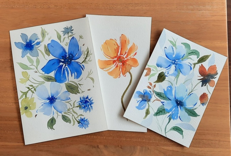
out. The first project, this is going to be the easiest. It's a simple orange flower. It looks like a poppy flower. So we are going to focus on just one flower and create some movement
within the petals. For the second project, we are going to paint this
beautiful composition. So we have more flowers now, and I love the looseness
in this arrangement. We're also going to work a little bit fast here because we want the wet petals
to touch the leaves, so we have a nice
bleeding there. I also like the
color combination. I think it's quite unique. It's not the usual
combination that we do, not the pinks and yellow, so we're going to do blue
and burnt sienna here. Now, for the last project, we're going to do
midnight blue florals, that's what I call it. I love this composition. It has different elements, and we're going to also
add some white gouache. This is optional, but I think
it elevates the painting. So aside from practicing
those brushstrokes, we are also adding
a little bit of texture and a bit more
character to this painting. So we will put in a
little bit more effort, but you can definitely do this. It's a very, very approachable
way to paint florals. Alright, so now let's
move on to the next video as we discuss the
materials for the class.
3. Materials: Okay, so let's first talk about the
materials that we need. For the brushes, we are going
to focus on round brushes. So this is the silver
brush black velvet, and I'm going to be using mostly size eight
for this class. So what we want is
a brush that can hold a lot of water and
still keep its point. And I will be discussing
a lot more about brushes in the next videos. So size eight is really perfect for medium
size paintings, and we'll also be
using size six. But of course, you
can definitely use whatever brush
you have at home. So our goal in this class
is for you to really build your brush confidence with the brushes that
you have at home. So next let's talk
about the paper. For the paper, I'm using
different kinds of paper here. I have here the Bao Hong
Academy, it's 200 GSM, and I got this in
a large sheet and just cut it into smaller
sheets like this. And you can see that
it's quite thin. That's something that I would recommend if you
want to save money, get the thinner paper because it's usually
cheaper as well. For the exercises, you can use student grade paper or any
cheap watercolor paper, we're just going to
practice the strokes. Next, what I'm going to show
you is this Bajo Academy, but this is in a
watercolor block form. So you can see all the sides are glued so that the paper will stay in place and will not warp or become wrinkly
when you paint on it. This is also 300 GSM. You can see it's thicker compared to the first
one that I showed you. So I'm going to be using this
for one of our projects. I'm just going to also
show you the texture. This is cold press. So cold press paper is really, really nice for loose florals. So if you see hot press paper, that is a smoother paper. That's perfect for more
realistic paintings. Alright, so here I'm
going to show you the Bao hung artist grade paper. So this is the artist's quality, and it's 100% cotton paper. The thickness is 300 GSM. And I really love
painting on this paper because I feel like the
florals have more depth, and the blending of the
colors looks really better than student grade paper. Here I'm just going to show you the comparison on the left
is the artists grade. Paper on the right is
the Bao Hong Academy. If you are on a budget, I would suggest getting
the Bao Hong Academy, which is their
student grade line. It's really a good
quality paper. So other grade brands
of paper are arches, Fabrian Artistico,
Saunders Waterford. And then for the paints, I am using Shinhan PWC, and they come in tubes, but I just pour them into
small half pans like this. So it's like a customized
set for myself. And a lot of people have been asking about my palette here. It's actually just the lid
of this core watercolor tin. I just changed the
paints inside this tin. You can definitely use any watercolor brand
you have at home, since we are really focusing
more on the brush strokes. Alright, so for
the next material, I'm going to be using
the whole in gouache. This is the white gouache. You can definitely skip this part if you don't
have white gouache. I just love adding
some highlights in my paintings or just some
white flowers like this. I do feel like it just elevates
the painting even more. So if you don't have this, it's okay. You can skip it. Lastly, we need paper towel to blot out the excess
moisture in our brush, and we are going to
discuss more about that later and also a water jar
for rinsing our brush. Alright, so that's
it for this lesson. Now let's move on
to the next video.
4. Get to Know Your Brush: To build our brush confidence, we need to first understand
and get to know our brush. So this is my favorite brush. This is the silver black
velvet in size eight. It is a round brush, it's very versatile, and you can paint so many things
using this brush. So now let's talk
about the parts first. Okay, so here you
have the handle. And then you have the ferrule. So you can see this
part is black, so you cannot really visualize
what the ferrule is. But this is another brush, and you can see
that silver part. That's the ferrule
holding the bristles. Okay, now we have
the bristles itself, and the thickest part
is called the belly. And then, of course, at the tip, you have this nice
pointy tip of the brush. So I will be giving you some
tips throughout the lessons. Tip number one, the
brush size matters. So when you want to paint
some nice loose petals, it's best to use
some bigger brushes. So this is a size
eight and a size six. So when you're using
the size eight, it will be easier for you to
create some broad strokes. I will be giving
you a quick demo. This is my size
eight round brush, and you'll notice that it's just easier to glide on
the paper and create these broad strokes
because the bristles will fan out more compared
to a smaller brush. Now, let me give you the demo of this size six round brush. So when you're using
a smaller brush, it just takes a little
bit more effort to create these strokes, and sometimes it can
get quite frustrating, and then you will
overwork your florals. Okay, so you can see that if you are also
using a smaller brush, it can hold less amount
of water and paint. If you're painting a
smaller size painting, then you can use smaller
brushes as well. But if you're painting briger
size or medium paintings, you might want to use at least
a size eight round brush. So you'll notice that the stroke of the size six round brush
is definitely smaller, or the thickness, it's not as fat as the size eight
round brush, right? So you can see the
comparison here on the left, it's a size eight on the
right, it's size six. Let's go to tip number two, we are going to talk
about soft brush versus a dense brush. So throughout the
years that I have been painting loose
watercolor florals, I find it easier to paint a loose style
using a soft brush, or I end up getting better
results using a soft brush. So this silver black velvet is a mix of squirrel hair
and synthetic hair. And what I love about
this is that when you press it on the
paper, it really spreads. The bristles really spreads
and creates a broad stroke. I also love how the bristles
just follows my flow, and you can see it right here. It's easier to just create
some nice expressive strokes. Okay, so now let me
show you another brush. This is a student grade brush. You know, the one that comes
in sets or like value sets, they are also good, but I
think if you're a beginner, it might take some time
for you to get used to it. So here I'm just going
to show you guys when you dip your
brush in the palette, you'll see that bead of water towards the
tip of the brush. I guess that's okay if you're
painting loose florals, but if you're painting
something with more detail, it's probably going to ruin your painting because
you'll end up with a big puddle of paint
on your first stroke. So usually with these
types of brushes, they don't hold water that well. It usually releases abruptly, which is something that you don't like when you're
painting with watercolor. You want the water
to be controlled as it is released on the paper. And also, if you
use a dense brush, there's more friction
on the paper. So if you press your
brush onto the paper, you'll end up with
a stiffer stroke or a more rounded
stroke like this. I think if you're going
for that kind of floral, that's okay, something that has a more perfectly
shaped petal. But if you wanted something
looser or with, like, a jagged edge, I would suggest that you
use a softer brush. Usually with dense brushes, it also the bristles
doesn't spread as wide compared to a soft brush. And that means you
might not be able to achieve that nice
expressive petal. So this is how you know
if the brush is soft. So you can see the black velvet. If I press it onto the bristles, it's going to follow
the direction. And then if you're going to
do that on the other brush, you can see it just snaps
back to its original form. So that's how you
know if a brush is quite dense or
if a brush is soft. Let's go to tip number three. This is sort of an overlap
with tip number two. So a good brush
releases water evenly, and we've already discussed a little bit about that
in the previous tip. So I'm going to
show you guys again how a good brush
releases water evenly. So this is my silver
black velvet, and going to just put a lot
of water in this paint. You can see that even if I
dip my brush in that puddle, it's just going to
coat the brush evenly, but you won't see any
puddle towards the end. It's not beading up
towards the end, and I'm just going to paint
some strokes on the paper. So you'll notice that the way the water or the
paint releases on the paper, it's quite even. It's not a lot of puddle. Alright, let's try
out the other brush. So there are definitely
good cheap brushes. Even if they are synthetic, there are now very, very good synthetic brushes
compared to before. So here, I'm just going to
show you guys if you end up choosing not so good brush, it's going to look like this. Alright, so sometimes
it's just not your fault. It's really how the brush
works on the paper. So let's just grab some paint. And then if you put a small dot, it's going to create just
a small beading. Alright. So let's just try to
paint some strokes. All right, so you'll
notice that because this brush doesn't
release the water evenly, on the left side,
there's more water. And on the right side,
you can see that it's a bit drier compared
to the left side. So it's definitely not even. Now, let's try painting
the center of a rose. It's usually filled
with smaller details. And if you're using a brush that doesn't release water evenly, then you'll end up
with some beading in your first stroke. So it's going to end up like a small puddle
in the middle. Okay, so if your brush
is acting this way, it's not releasing water
evenly, don't worry. We can still troubleshoot it. You can just grab a small
piece of tissue paper. Let me just demo it for you. So grab some paint. So this
brush has too much paint. I'm going to dab the side of the brush onto
the tissue paper, and that's going to absorb the excess water or paint
that we don't need. So here I just
painted a small dot, and you can see that it released just a tiny amount of
paint onto the paper. I think it's just
the right amount. All right, so don't be
scared to dab your brush on the tissue paper if you
feel like it's too wet. Alright, I hope these tips help you in getting
to know your brush. Now let's move on
to the next video.
5. How to Hold Your Brush: In this lesson, we are going to learn how to hold
the brush so that you'll feel more confident
in painting those strokes. So tip number one is to find a comfortable way
to hold your brush. So typically, I would say to hold it like a pen
first like this, then you slowly move your grip towards
somewhere in the middle. I think that's the
most comfortable way to hold the brush. You can adjust, of
course, along the way. So you want to be able to easily move your brush
using your wrist. Tip number two is don't
grip your handle too tight. That's because holding it too tight will show in
your brush strokes. It's going to look
stiff and really heavy. If you grip it too tight, you will put a lot of
weight into your stroke. So let me just show you
what will happen if you try to grip it too tight
and then try to paint. All right, so right
here, you'll notice that you will have
stiff strokes. It will look heavy, and the tendency is for you to
just push down your brush, just add unnecessary weight. It's also a lot harder to move your brush if you're
gripping too tight. Okay, so I'm doing a couple more strokes so you can really observe what will happen if you grip your
brush too tight. And after this,
I'm going to show you what it looks
like if you hold your brush more comfortably and it's usually towards the
middle of the brush handle. So holding it in
a relaxed manner helps you create
these flowy strokes. It's just easier to
move your brush. Okay, so if you're holding
it in a relaxed grip, it's quite evident
in your strokes, you'll see a lot
more flowy petals. So you still have control
over your strokes, but it doesn't feel
heavy or stiff. So this is an exercise that you can also
try to do at home. Try to grip your brush too tight and try to observe
what will happen. And after which, try to loosen your grip in your brush
and start painting, and you'll notice a
huge, huge difference. Another observation is that when you're holding your
brush too tightly, you end up pressing the side
of your pum onto the paper, making your strokes
even heavier. Whereas if you loosen your grip, you will most likely lift
your wrist and try to move making your
strokes look softer. Tip number three, where you hold the brush handle matters. I'm going to discuss how you can fully utilize your brush. So when you're holding
it near the bristles, there's a purpose for that, and that is to create
the small details. So I am using my size eight round brush and just
using the tip of the brush, I will be just creating
some thin lines. If you need to add some small
details to your florals, you try to hold the brush near the bristles because that
will give you more control. So you can paint
some small dots, create some short strokes. So it's basically for
adding some small details. So now let's try to hold it just roughly in the middle
of the brush handle, and then we can use this
to paint some petals. You can see how it's
easy to maneuver your brush if you're holding it in the middle of
the brush handle. I typically hold my
brush in the middle of the brush handle for
my usual florals. But if I want it
to be even looser, then I hold it towards the end of the brush
handle just like this. So when you're
holding it this way, you still have some
sort of grip to it, but you also let
your brush flow, and you sort of let
it go on the paper. So I'm going to paint
another flower here, so it's easy to really
move your brush up and down and create
these organic strokes. It does take a while to get used to this way of holding a brush. Sometimes it feels a
little bit awkward. But this is one of my favorite
ways to do it if I want some really loose
expressive flowers. For tip number four, try to rest on your pinky
finger when painting, and I know this is an overlap
with the previous tip, but I wanted to reiterate it. So when you're painting
loose florals, try to rest on your pinky
finger only so that it doesn't feel heavy on the paper as you're
painting the strokes. So if you rest your
entire hand on the paper, laying down your
hand on the table might put more weight
on your strokes. So just resting on your pinky
finger also helps you give that sense of balance when you're painting
smaller strokes. Let me give you a demo. So right here, I'm going to
paint a four petal flower and going to rest my hand
on the pinky finger. So this is just going
to help me give that balance as I'm painting
these flowy strokes. So when you're painting these
tiny strokes like this, you can also rest your
hand on the pinky finger. So by keeping these
tips in mind, you'll have more control over your brush whilsti allowing your strokes to feel
loose and natural. So just try to experiment
with different grips and hand positions to see
what feels best for you. The more you practice, the more confident you will be
with your brush stroke. Alright, so that's
it for this lesson. Now let's move on
to the next video.
6. Master Water Control: Okay, in this lesson,
we're going to learn about the water
control in our brush. So this is very important when you're painting
loose florals because you don't want to end up with blobs of paint on the paper. And it's also one of the
most asked questions online. It's about how do you
how much water do you need in your brush or how
do I control the water? These are all very
practical tips, but it's definitely going to
help you in the long run. So tip number one, you can tap the excess water on
the rim of the jar. You can see this brush
is really bloated. It's filled with a lot of
water that you don't need. So you want it to be more
controlled by tapping the excess water onto
the rim of the jar. So now you have just
the right amount of water in your brush. Okay, so let's go
to tip number two. Don't be afraid to blot out the excess moisture
in your tissue paper. I used to be afraid
to do this because I feel like I'm wasting
paint when I'm doing this, but it's definitely
very, very helpful. And something to watch out
for when you're painting is these small droplets on
the ferrule of the brush. You can see that droplet here. If you don't blot out that part, it's going to go to your brush. It's going to add more
water to your brush. And when you're about to paint, you end up having
a blob of stroke. It's not going to
look that nice. So make sure to blot
out that excess water. So I usually just tap the
side of the brush or let it roll on the tissue paper to just absorb
that excess paint. Help you better understand
how to control water. We're going to do a quick demo. So I'm just going
to grab some paint. This is permit rose. You can use any color, or you can just simply
watch this video. So I'm just adding
some water onto my paint and making it softer, so I can grab some more pigment. Then next, just going
to add some more water. So what we're going to do
is we're going to paint on the paper with more water or more paint than
usual in our brush. I'm going to make sure that this brush is absorbing
a lot of paint. I'm not going to tap the excess, so it's literally just grab that paint and
put it on the paper. So once you put it on the paper, you'll definitely see
just some puddles, and it's definitely a lot of
paint mixture on the paper. Alright, so it looks like
this if it's too wet. So if you tilt your brush, you see that puddle building
up towards the bottom, and it's not going to
look good if it dries up. So you might end up
with some hard edges. Not unless that's the look that you're going for
with the petals. But if you want
some soft petals, you want to avoid some puddles. Okay, now let's do something
that's more controlled. So I tap my brush
onto the side of my palette and also on
the rim of the jar. So let's just try to paint. And you'll see that the
strokes are more even. Alright, so you can see
the difference here. You have puddles on the left
side because it's too wet, and on the right side,
it's more controlled. The stroke is more even. So what if you painted an area with too
much paint mixture? So let me just show you how
you can troubleshoot it. So this is too wet. So what you can do is you can grab you can rinse
your brush first. Make sure it's clean, tab the
excess water in the brush, and then we are going to absorb the excess moisture
on the paper. I'm lightly just tapping
my brush onto the paper, just letting my brush absorb
the excess paint mixture. You can also try to
tilt your brush and let your brush absorb
that puddle of water. Alright, so I think
it looks good, and you can see the even stroke. Now, this part is still wet and you still
have that puddle. So that's the difference between too wet and also
controlled stroke. Definitely, over time, you
can try to practice this. Next time, you
don't even need to tap your brush onto
the rim of the jar anymore because you've already mastered how to control
the water in your brush. Okay, let's go to dry brush. So with the dry brush, I'm going to intentionally blot out the moisture in my brush to show you what dry
brush looks like. So you can see that I cannot really paint an opaque stroke. You can see a lot
of whites in there, and my brush also
doesn't spread. It doesn't expand as I press it onto the paper because
it's quite dry. Dry brush is good
for adding texture, but if you want
some loose petals, you definitely want your
brush to be a bit more wet. Now, this brings me
to tip number four. Wet brush helps
create flowy strokes. So using a wet
brush will help you create those beautiful
expressive strokes because you can easily move on the paper without
a lot of friction. And you can see the bristles really expanding as you
put pressure on it. Let me show you what it looks
like if it's not too wet. So here I just blotted
out my brush to intentionally blot out or take
the excess moisture away. So you can see the
brush is not expanding. The bristles are not expanding. And we're not able to
easily move on the paper. So this can be one
of the reasons why beginners have a hard time controlling their brush because the brush is not that wet. Okay, now let's move on to
tip number five that that's the importance of
water to paint ratio. Order to activate the
watercolor paints, you need to either wet the
paint or you need a wet brush. So here I have a dry brush, and if I try to
pick up some paint, nothing is really happening. Now, let me grab a
little bit of water, and let's see what will happen. So most beginners are scared to grab some water and
dip it in the paints. And this is usually
what happens. So they get a little bit of water and dip it
into the paints, and they don't really
get the full color or the full potential
of the pigments. But if you get enough water, you can try to really swish
or brush onto the paints, and you can get that
nice, rich color. Alright, so now you
see the difference. If you just add some more
water to your paints, you can definitely get
the most out of it. You can get a really rich color. So it's also important
to learn how to mix your paints with water because when you add more
water to your mixture, you get a lighter value. If you put more paint
into your mixture, then you get a darker value. So right here, I am just grabbing this paint
straight from the pan. I have a wet brush, and let me just show
you some brush strokes. So you can see how
opaque that looks. It's a technique that
you can do when you want to paint some
second layers. Okay, so you can also try to paint the strokes onto
the palette first. You can add a little bit of
water to lighten the value. So just remember if you want a darker color to
show up on the paper, you need more paint
in your mixture. So it's going to be a
little bit thicker. Now, if you want it to
be a lighter color, then you add more
water to your mixture. So right here, I'm going
to show you where I do these strokes,
these dark stroves. So I added here in
the second layer, you can see the dark
values in the flour. Water control is also important when you're doing a
second layer or when you want to adapt to a flower using the
wet on wet technique. So let me just show
you how we do this. Go to paint a five
petal flower first, and I want this to remain
wet as we do this technique. Alright, so this flour
is already good. We're going to grab
some permanent rose, and I want it to be
a little bit thick. Now, if I grab this
paint straight from the pan going
into the petal, you will see that the paint looks feathery or the
strokes look feathery, and you don't really have
a lot of control over it. So what we need to do is to dab our brush on a tissue paper, just draw out the
excess moisture and start painting
those strokes. So we sometimes do
this if we want to add some veins or texture
on the petals. You can see that the
strokes are quite visible. You can see the
shape of the strokes without it being
blurred too much. Okay, so let me show
you another example. So this time, I'm going to grab some water and just
add it to the mixture. You can see it's
now more diluted. And if I paint it
on this wet petal, you can't even see any strokes. It's just blending
in with the petal. So there is no visible
lines or strokes. So it's really important to plot out the excess moisture in our brush and also to make sure that your paint mixture
is quite thick. Right, let me just
show you another demo. So I just painted these
two petals and going to create a thicker mixture
of permanent rose, going to blot out the
excess paint in my brush. Again, don't be afraid to blot
out that excess moisture, and we're going to
paint some strokes. The strokes are soft
and yet still defined, and I know it takes a lot
of practice to do this, but I wanted to show you
that you can do it by controlling the
moisture in your brush. Okay, so now let's
do the other petal. And then this time, I'm not
going to blot out my brush. Gonna dip it straight from that palette and just try
to paint on the petal. Okay, so you can see that the strokes are
sort of blending in with the background
or with the pedal and it's not really as defined
as the one on the right. So I'm showing you
these examples because it's a technique that you can apply to so many florals and also even
different subjects. I hope these tips were able to help you understand
how your brush works and how you can control the
amount of fer in your brush because I understand we are all using different
kinds of brushes. Let's now move on to the next video as
you learn more about brushstroke exercises to hone the muscle memory in your hand.
7. Practice Brush Stroke Exercises: In this lesson, we're
going to play around with the brush stroke exercises and also explore
some brush pressure, create some thin
to thick strokes, some petal and leaf
strokes as well. Now, this is going
to really help build your brush
confidence. So let's start. So my first tip for you is to
explore the brush pressure, and it is very important
to really maximize or utilize the entire bristles, the entire belly of the brush. Don't be afraid to apply pressure onto your brush
to create varied strokes. So usually with beginners, they are scared of pressing
their brush onto the paper. So they usually use
just the tip or up to half of the bristles, and they cannot get the full
potential of their brushes. What we want to do in
this lesson is to learn how to dance with your
brush by being more familiar with the
strokes and how you can switch from more pressure to light pressure in
one single stroke. But, of course, first
you have to practice. And I know you've probably seen these exercises in
my previous classes, but it's going to be a good refresher for you if you have been
painting for a while. So when you use just
a tip of the brush, you can create some nice
thin strokes just like this. Just apply a light pressure. Now I'm going to apply
a bit more pressure, and you can now see
the lines are thicker. Okay, now let's just add
a bit more pressure. I'm pressing about three
fourths way off the bristles, and now I'm going to really
press the entire brush, and you can see
those wide strokes, and the bristles are
really fanning out. Now, this is the classic thin
to thick stroke exercise. So we're going to
start with the tip of the brush, lightly press, and then live towards
the end and then press again until you form kind
of like a leaf shape. Alright, so there's another one. You can grab any
color that you want, and you can also stop halfway. All right, so you can see
that the bristles are fanning out when you press it
really hard on the paper. Now, this is a really good
exercise to create or hone the muscle memory in your hand so that every time you
paint a petal stroke, you automatically know
when to apply pressure and when to lift your brush to
create a thinner stroke. And as you're painting this, make sure that your brush
is also wet so that your brush can easily
expand on the paper. You can definitely use student grade paper
for this exercise. I'm using the Bao Hong
Academy in 200 GSM. Alright, let's do
some leaf strokes. Right here, I'm going to start at the bottom
part of the leaf. I'm going to press my
brush towards the middle and then live and just
drag it towards the end, create that pointy tip. Now, if I live right away, I will get these rounded edges. So it's also a
technique if you want to vary the shapes of the
petals or the leaves. So you can see the difference. On the left side, you
have pointy tips because we dragged our brush and
lifted it towards the end. But here on the right,
you have rounded edges because we lifted our
brush right away. Now, feel free to do a couple more leaf exercises to observe how your brush
moves on the paper. Let's practice some
elongated leaves. I'm just going to lightly press my brush and live
towards the end. So I'm not really putting a lot of pressure onto the bristles. I want this to be
thin, long petals. Roughly just one
third of the brush is really touching the paper. So you can do an S movement. So you have these curvy strokes if you want to add some
movement to your leaves. So when you're painting leaves, you want to add some movement to make the leaves
look more organic. So you can also
try to wiggle it a little bit and then
live towards the end. And you'll notice that the leaf is facing down.
Let's do it again. Just wiggle a little bit, then lf and make the
pointy tip face downwards. Now you can do this
in different angles. You can experiment with this. I'm going to start right
here at the bottom. I'm going to lightly press my brush and then move it
up, going to the left. So what I love about painting leaves is that every time you paint this technique
or use this technique, it's going to look
slightly different. So I'm going to
start right here at the top and wiggle
my brush going down. So you can do this
in different angles, and you'll be able
to create leaves that face different directions. We'll start from the
right, going to the left. So it feels like I'm pushing my brush to the other direction and also remembering to wiggle my brush to create
that jagged edge. I'm just going to show
you the direction of the leave so that it's
easier for you to follow. For tip number four,
we're going to do some petal strokes using
the tip of the brush. And this is an example. You can see those bits
and pieces of strokes. It's really a good way to add some character to
your loose florals. So let's just try
to practice that. I'm going to be using the
tip of this pointy brush, and we're going to
stipple our brush, create some small dots. And you can see I'm resting
my hand on my pinky finger. All right. So now let's try to create some letter C curves. So using the thin
part of the brush, just try to press
towards the middle of the stroke and then drag
and live towards the end. Now, it doesn't
have to be perfect. What you want is to
learn how to bend that tip of the brush to
create these wispy strokes. So I'm just going to
do a straight line. And what you want is that
in one single stroke, you have a thin
and a thick part. This is another way to really hone that muscle
memory in your hand. So try to do this a
couple more times. You can do a leaf
stroke like this. So start with a thin stroke
and then press and then lf. So it looks like tiny leaves. You can also switch to a smaller brush if you're
more comfortable with that. Usually, if I want to really
practice that muscle memory, I try to use a bigger brush
and paint these tiny strokes. So I'm holding my brush near
the bristles because I want a little bit more control when it comes to
painting these strokes. So just notice how
only the tip part of this brush really bends or
touches the paper's surface. You can paint some
letter C curves. This is a stroke that
I used often for adding some embellishments
on the loose florals. And you'll see
more of that later on as we practice our florals. So I also like to do this
in different directions. So here I'm going to start
from the bottom going up. Okay, so let's do this from afar so you can see how
my hand moves. So we're going to add
these small pieces of stroke from the florals. Alright, so I'm resting my
hand on my pinky finger, and we're doing these
small letter C curves, just using the tip
of the brush and really lightly bending
it on the paper. And again, I'm holding near
the bristles because I want a little bit more control when I'm doing these
wispy strokes. So I am going to do
some broader petals. We're going to hold our
brush in the middle. So now we are going to start from the bottom and
just press or brush, go up, and then down. So you can see that
we're using or utilizing the side of the brush to
create a broad stroke. So we want to do this
in a curve manner to add some shape to your petal. You can see we are using the side of the brush to
create a broad stroke. So what I love about
painting loose florals is that no petals are alike. You can see we have two
different petals here, even though we painted using
the side of the brush. So that's really, really unique about painting loose florals. Okay, let me just
do it another time. Going to start here at the top, and then another
one on the right. And you can see those
white dots there. It means that my
brush is not too wet. So that's why it
produced this texture, which looks like a little bit, like dry brush technique. And I think it looks great. It adds some character. So if you want a really
opaque brush stroke, make sure your brush is
loaded with a lot of paint. Okay, so now we're going to use just half of the brush
to paint a petal. Then you'll see that the
stroke is definitely thinner compared to pressing your brush
really hard on the paper. Let's do another one.
So this is just half. And I'm going to show you again, if you really press your
brush onto the paper, you get a wide stroke like this. It's really important to
understand how your brush works. For petals, it's a combination
of strokes for me. So you mix broad
strokes and also thin strokes to create some
nice wispy petals, right? So I just loaded up my
brush with some more paint. Let's do another petal
so you can just move your brush up and down if
you want a bigger petal. So these are some brush
stroke techniques that you can apply to
painting loose florals. We will get more into some gestural flower
exercises in the next video.
8. Explore Gestural Floral Exercises: In this lesson, let's practice some gestural flower exercises. So we are going to do some
quick flowing marks to build confidence when it
comes to painting petals. Now, I am going to use this
reference photo because it has some nice angles for the petals that we
can try to mimic. And I'm also going
to change the color. I know this is a white flower, but I'm going to
use orange color. I'm also using a size
eight round brush. So what we want to do is
lay our brush flat like this and then pull it and
then lift towards the end. Then you'll get a
nice pointed tip. You can also add
some gestural marks, some thin lines just like this. And that's my tip
number one for you. You need to combine different
strokes to form a petal, and I feel like it looks
more organic this way. You can definitely use other
colors for these exercises. Alright, let's practice
another petal. So just grab some paint, and we start at the side
of the first petal. Just press and then pull it down towards the
center of the flour. So you can also go back
to the other petals, add some thinner curve lines
using the tip of the brush. So this is also all
about trying to figure out different angles
that will work for you. I'm going to start at the
bottom left and then push my brush up, going
to the center. I'm also trying to lift my brush so that I have a
nice pointy tip. Then you can use the
tip of the brush, add some thin curve lines
in between the petals. Now I'm going to rinse
my brush and just add some short strokes. So because this is at an angle, the length of the petals
are going to be varied. So some will be longer
and some will be shorter. So when you're
painting the flower, you always go back to the
center of the flower. Okay? So I'm just
using the tip of the brush to create
these quick marks, and it's going to add some
character to the flower. Okay, so now we are
going to try out this flower that is top facing. And I'm going to
start in the middle. You can put a small dot
just as a guide for you. And then we are going to
start painting the petals. I'm going to use this
brilliant pink color. It's a pastel pink color. So we need this flower
to look like a circle. So I'm going to
start in the center, push my brush up and down to create the
shape of the petal, and I'm going to add some
thin strokes beside it, just to add some character so that it doesn't look too chunky. Okay, so now I'm going to
start from the outer part of the petal going into the
center of the flower. So I'm just really
pushing my brush, adding a lot of pressure, and then lifting it
towards the end. Sometimes we can
try to also tilt our brush and paint the petals
from a different angle, and that will produce
some varied strokes. Sometimes it's unique and it will be a nice addition
to the petals. And try to notice that whenever we're
painting these petals, I do it in a curved
manner, just like this. You have that nice curve edge. So that's going to add some
movement to your flowers. Let me show you this again. So just press, and then
you're going to lift. It's like a check mark. So you lift towards the
end and make sure that you have a lighter
pressure towards the end so that you have that
nice pointy tip. Now we can just use the tip of the brush just to add some thin lines,
add some character. Alright, so now we have learned
some basic petal strokes, and that will be the foundation
of painting flowers. So this time, let's
create the same flower, but I will be adding
some contrast and depth, and I will be
showing that to you. So let's just paint
the same petals. So I can also rinse my brush and just really press my brush
and move up and down, create some sweeping strokes, and then add some gestural marks using the tip of the brush. All right, let's paint
the shorter strokes. I'm just going to
really press my brush lightly to create
this short stroke. Now, coming from
the center, again, press your brush and move
it to the left and we like a loop and then use the tip of the brush to
add some thin marks. And that's something that
will help you create petals that are more
organic or more loose. Okay, so let's just
grab some red orange. We want a deeper color. Gonna dab it in the
tissue paper and add some dark spots in the center of the flower
just to add some depth. Okay? We can also add it
in between the petals. So you'll notice that we are also creating these
gestural marks. We're doing some really
quick, thin strokes. And I'm using just
the tip of the brush to create these
gestural markings. You can also add it in the white spaces
outside the petal. Just to add some movement, we want our strokes to
have that curve line. So negative space and
loose florals help define the shape of the flowers
without directly painting them. So instead of, like,
painting the petals, you're painting around it to let the unpainted areas
form the shape. So that's why we
you'll notice when we're painting these
loose five petal flowers, I do leave some white spaces
in between my strokes. Alright, so let's just form
a five petal flour here and I'm going to add the last petal with
more white space. All right. So let's do
one more petal here. I'm doing a loop to create this nice shape and using the tip of the brush to
create some thin strokes. Let's do another one
on the left and just press and then pull
in a curved manner. Always go to the
center of the flour. And then right here,
we're just going to form small marks using the tip of
the brush, just like this. So instead of painting
broad strokes, we're going to do
smaller ones like this to create a
more negative space. So we're painting all these
bits and pieces just to let the unpainted areas
look like it's a petal. Okay, so I'm just fading away some marks because
it looks too dark. So in order for that negative
space to pop up even more, you need a high contrast. So you want the strokes
to be more pigmented, so grab a more pigmented paint, and you want to have
some nice crisp edges. So just like what
I'm adding here. Don't worry, we will be practicing more
about this later on. Now let's just practice
some more gestural marks using this flower that
is facing at an angle. So you'll notice you have longer petals at the
pack and almost, like, flat lines in front
because the petals are folded. So now we can start with
some small yellow dots as the center of the flower. Then we'll grab some paint. I'm just using brilliant pink. You can use other
colors as well. Okay. Okay, so let's
do the petal on the side first because
it's a thinner petal, I'm going to use just
half of the bristles. You see, I'm not really
pressing my brush so much. Then we need to lift towards the end and then add
some gestural marks. So I'm also leaving
some white space. So let's do another petal, press and then lift. Alright, so adding
that white space really helps in creating
the mood of the flower. It looks more airy and feel free to rotate your paper if it feels more
comfortable that way. So in front of this flower, I just painted a side
stroke, like a thin line. Okay, so what we did here was to add as less stumber of
strokes as possible. So we need minimal strokes, and sometimes that works
a lot better and creating loose florals because it's not too crowded, not too chunky. Okay. Let's practice
one more time. I'm going to do another
five petal flour. So we are just going to
focus on the strokes, use any color with the press, and then push it down, then live towards the end, and then make sure that you
use the tip of the brush, can tilt your brush up, then create these
thin organic strokes. You can see I'm leaving
some white spaces in between my strokes and rinse your brush so we can
create a lighter value, then just really
press your brush, create some sweeping motion. Just going to grab a
little bit more paint. Let's do one more
from the right. Okay. You can see that I
started from the center there. It's up to you whether you
want to start from the center or from the outer
part of the petal. Here, from the bottom, just
push going up as you lift, make sure that you put lighter pressure so that you
have some nice pointed tip. Right here, I'm going to be
leaving this negative space. I intentionally left
that big white space to just play around with the brush pressure
like what we practice. Okay, so I'm just using
the tip of the brush now to add some
gestural strokes. Everything that I'm
teaching here in the class are all
just guides for you. I still want you to be able to create your
own unique strokes. So what's great about
playing around with brush pressure and
all these factors is that when you're
painting flowers, they don't all look alike, and that's the beauty of
painting loose florals. So I would say that just
have fun when it comes to practicing painting
these gestural markings. So another advantage of adding gestural marks
is that you can use this to add as a second layer just to add more depth
to your florals, right here, I'm showing
you a darker color, a darker pink, and
a lighter pink. So when you're painting gestural
marks as a second layer, you want it to be darker
than the base flower. So make sure that the flour is already dry when you're
adding a second layer. Okay, so I'm using a
size eight round brush. And for these markings, we're going to use roughly
just the tip of the brush. Just let it bend
slightly and create these little sea curves
in between the flowers. So I always imagine
these strokes as the folds in the petals, and they can also be the
shadows in the petals. Sometimes I add these
markings outside the petal, so it's a bit similar
to negative space. A lot of our lessons
here are overlapping. It just means that they are all interconnected with
each other, right? So I do love to
combine my strokes. Sometimes I want to add some small dots and combine
that with short strokes. All right, so I think we
can add a darker color. I've just added a little bit of that violet to my mixture, and then we're
going to add that. So with the second layer, you can add another color. So these are the sample
strops that we just did. It's actually similar to what we have practiced in
different lessons. So it looks like an
elongated C curve. So you just use the tip
of the brush to do, like, a check mark and make sure that you
have nice pointy tips. Alright, so that's
it for this lesson. Now let's move on
to the next video as we try out our first project.
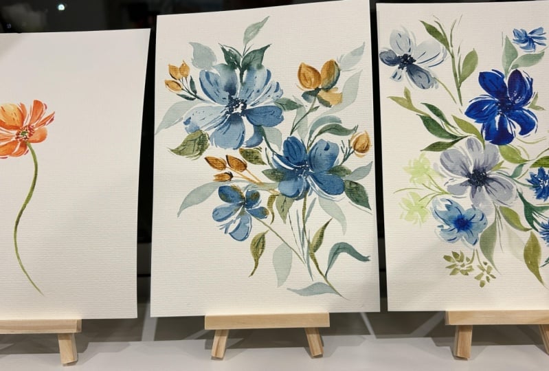
9. Project 1; Orange Poppy Flower: Before we start, here are
the colors that you need. So for the first project, we're going to do this
simple orange poppy. So the first project in
my classes is always the easiest because I want this
to be a warm up for you guys. Okay, so let's start. So we are going to be using the same reference photo that we used in the
earlier lesson. But I know this is
not a poppy flower, I think the way the petals move, it looks really nice. And I think we can apply that
to painting this flower. Need to prepare
our colors first. So I'm going to grab permanent yellow light yellow
orange and also vermilion. When it comes to being more confident in doing
your brush strokes, I do believe in repetition. So usually I paint the same
flowers again and again, and it always turns out
different or I always learn something new from
every project that I paint. Let's start with a
ring of yellow dots. I am using a size six
brush for this part. And then for the petals, I'm going to switch to my size eight round brush because it's just easier to move on the
paper with a larger brush. Let's grab some yellow orange. I'm going to start here at the middle or the
center of the flower. Just press my brush
and move up and down, and you can see I'm really using the belly of the brush to
create these broad strokes. Now you can grab a little
bit of that vermilion, or you can use a darker
yellow orange or a more pigmented color
to add those thin lines. Alright, so now let's
add another petal. I'm going to use vermilion. And I'm going to start
from the tip of the petal going into the center. Just press and then push
it towards the center. You'll see I intentionally left a white space there
as a negative space. Now let's do another
one on the left. Just press your brush and
then move in a curved manner. Towards the end,
you have to lift your brush so that you have
that nice pointed tip. Okay, so I just rinse my brush now and tried
to soften this part. So we have this invisible anchor in the middle of the flower. All the petals are going to go to the center or come
from the center. So now let's just do
some shorter strokes. And I can also do a thin line that will mimic the
petals that are folded. Alright, so we're doing
different lengths for the petals because this is a flower that is
facing at an angle. Okay, just press your brush
and you can do a loop. Alright? And then
now we can start adding some character by
putting some thin lines. So this flour is still wet, and we're going to
grab some vermilion. Just going to add
some thin lines beside or in between the petals. So it's going to give
this more depth. Alright, so it's
looking really good. Now let's just grab
some permanent red. Going to dab it in
my tissue paper and add this very pigmented
color in the center, add a ring of dots. Okay, so now let's
grab some green. I am using olive green, but if you don't have this, you can simply use sap
green and add a little bit of brown just to create
an earthy green color. The brush is too wet, so I dab it in the
tissue paper first, and then I'm going to just add a small.in the center
of this flour. Okay, so now let's add a stem, and I'm adding this while the flower is still
wet so that I can connect the stem seamlessly towards the
base of this flower. Now, this is optional. If you want some
character to your stem, you can drop in some
darker green color. I just added some sepia
to my green mixture. Alright, so let's wait
for this to dry up. I'm using a fan, but you can also use a blower or simply wait for it
to dry on its own. Okay, so I am
switching to my size four round brush
for the layering. Now let's use vermilion and going to look at
the reference photo, you'll see these lines
within the petals. So they are the folds in the
petals and also shadows. Now we're going to
try to mimic that, but we're not going to
add all the details. We just have to add a few thin lines using
the tip of the brush. Again, just lightly touch your brush onto the paper to
create these thin strokes. I usually start at the top, and then just move it down. It doesn't have to be
one straight line. Sometimes I do broken lines or add some dots in
between my strokes. You can use the pinky
finger to help you balance your hand as you
add these small details. And you'll notice I'm
holding my brush near the bristles so that
I have more control. So we're playing with
pressure as well. You can see that some strokes
are a little bit thicker, some are very, very thin,
like hairline thin. Okay, so that part was
still a little bit wet, and I'm just going to
leave it as is for now. Okay, so we're going
to grab permanent red. This is going to
be a deeper color, and we can add some
small markings outside the petal to create
a negative space. So my tip is to do as few strokes as you can so that you don't
overwork a flower. Alright, so it's looking good. I'm going to grab some
permanent yellow light and just tap it around this green center just
to make this flower even livelier and add some pop
of color. And that's it. Congratulations for finishing
your first project. You can also do this
in other colors. So now let's move on
to the next project.
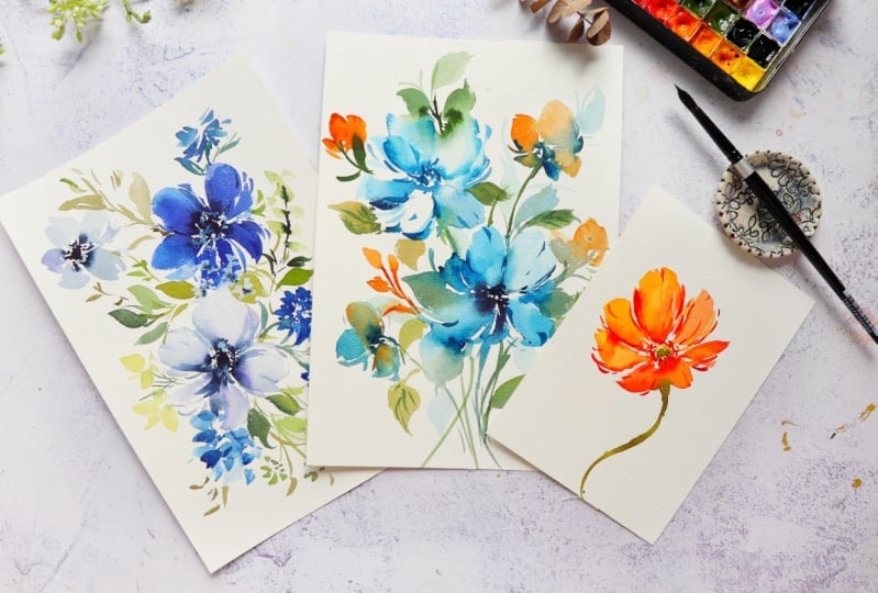
10. Project 2: Loose Florals in Prussian Blue and Sienna: Before we start here,
the colors that we need. For our second
project, we're going to explore a different
composition. So we're going to paint
different stalks of flowers and combine them
into one floral painting. We're also going to explore painting with blue
and print sienna. All right, let me give
you a brief overview before we start painting. So we're going to start
with the two main flowers which are the blue flowers, and we're going to explore
some negative space there, and then we're going
to add some stalks. While the flowers are still wet, we're going to work fast and add those leaves so that they will
blend in with each other. It will look very
flowy and ethereal. And then next,
we're going to add these smaller flowers that are a mix of royal
blue and burnt sienna. I think it's just fun to work on a wet on wet
flower like this. And then we're going
to add some fillers. So you can play
around with this and add your own embellishments
on the florals. You'll notice I'm also adding
some blue colored leaves. And then when the
flowers are already dry, we can add a second
layer and add those tiny bits of strokes that will give character
to the flowers. Okay, so that's it.
Let's start painting. Let's start with
preparing our color. So this will be a full minute
of just mixing colors. I'm just grabbing
some Prussian blue for the main flowers. So we just want it to
be ready and going to watch it just for you
guys to see the color. And then next, we're going
to grab some burnt sienna. You can use other browns in
your palette or other blues. Now, because we're
working a little bit faster to add some bleeding, we also want to prepare
our greens so that we can immediately add our leaves
after painting the flowers. So this is perline green. And then if you don't have that, you can mix sap
green with indigo. It's not exactly the same, but you'll get a
deeper shade of green. You can also do sap green and bunt umber to get that
earthy green color. So for our paper, we're
using seven by 10 ", and my brush is a size
eight round brush. Let's start with the
color Brushian blue and going to paint with the
bottom flower first. You can put a small
dot right there, just as a guide that it's
the center of the flower. We're going to use the
side of the brush and just push and pull our brush
to create a petal. Alright, let's rinse
our brush to create a lighter value and I'm
also made sure that my brush is a little bit wet so that I can easily
glide on the paper. All right. So I'm
just grabbing a little bit more of
that brushian blue. You can see it's a
darker color now. I made it more pigmented. Let's do one more petal. You can see I'm really pressing my brush to create
this beautiful petal, and I have that dry
brush area right there, and I'm going to take
advantage of that and add some thinner strokes beside it to create a negative space. So sometimes we have some
happy accidents like this, and you can turn it around
and make it look beautiful. Now let's do one
more petal here. I'm just going to glide my
brush up like a check mark, and always make sure that you're pointing
towards the center. Alright? With a wet brush, I'm just trying to fade away this side to make
it look softer. Alright, so this was supposed
to be a five petal flower, but I can't fit in one more. So now I'm just going to add some thin strokes that will just add some
character to this flower. All right let's grab indigo, and you want to blot out the excess moisture
in a tissue paper, and we can add
that in the middle while the flour is still wet. So when you're using
100% cotton paper, the paint also stays wet a little bit longer than
student grade paper. Now they can add some stem, and I'm going to make
this a little bit curve. And then you can
add some leaves. Now we can grab a darker
green and drop it in the leaf just to
add some shadow. I usually like painting
these thin stems just as a guide for me so that I know where to put the
other flowers later on. So now, while this blue
flower is still wet, we can grab some green paint and add the leaves and look at
that beautiful blending. That's because the
flower is still wet. So we want the blue
and the green color to kind of mix together. I'm going to rinse my brush and just add a leaf right here at the bottom and really just fading away the
side of the petal, making it look very flowy. So I think it looks
more dramatic this way. All right, let's go
to the second flower. I'm using prussian blue again, and I want this flower to be diagonally across the
first one that we did. So it's a little bit higher. I'm going to put a
small dot as a guide. So I'm just going to pull
my brush up and down, always going towards
the direction of the center of the flower. And we can rinse our brush
to create a lighter value. So I'm painting with
almost like just water, and we're also holding the
brush towards the end of the handle to create these
beautiful expressive strokes. Then while that
petal is still wet, we can drop in a little
bit of that paint. Okay, so make sure to paint the petals from
different angles. For this part, I'm going to intentionally do
a negative space. So that petal is going
to look like white. And that's why I'm grabbing some darker blue color to
add some high contrast. All right. Let's do one
more petal right here. I'm just trying to make a loop. Now let's grab a
darker blue color. This is still prussian blue, and I just want to use
a tip of the brush to create some thin, short strokes. Alright, so we're just going to accentuate the negative space. So while this flour
is still wet, we can add a ring of
small dots in the center. So I'm just letting
that darker color flow into the wet petals. Alright, it's
looking really good. Now let's rinse our brush
and grab some green. We can add a stem
right now while the flower is still
wet and I want this to be a little bit
curve just to add some movement to
our composition. Okay, so it's time to add some leaves while the
petals are still wet. You can see that beautiful
bleeding over there. I just love the dramatic effect. Now to add some more
contrast in that area, we can get a more pigmented perline green or
any darker color you can also use indigo and just drop that into the wet leaves. Okay, maybe we can add a
longer stem right here, and then we can add some
flowers using the color Benziena we're going to do
a cluster of small peta, so I'm just going to
press my brush and just drag it down and
lift towards the end. And then we can do
another one on the right. So just make sure that you add
a little bit more pressure to your strokes just
to make it more fun. I'm grabbing a little bit
of this brush and blue and going to add that to
the Prinziena petals. All right, so I'm just blotting my brush because it's
a little bit too wet. Now we're going to
start from the side of the brush and going
into the center again. Alright, so we can do
some shorter strokes right here at the bottom, just to give an impression that this is a
flower on its side. So we're going to leave
the blending as is. We're not going to
move around the colors in the petals so that
it won't look muddy. I'm just grabbing some green and just adding another stem. Okay, so we need
another smaller flower or like a secondary flower
for this composition. So I'm using this
brush and blue and just pressing my brush, go up. You can see that we have created a beautiful
texture there. You can use the tip
of our brush to just add some negative space. You'll notice how the bristles expand as we press our
brush onto the paper. Just make sure that you
always lift your brush towards the end of the stroke so that you get a
nice pointed tip. So this is a really
fun exercise for you. You can mix and match
different colors and just let them bleed
into each other. All right. So I'm going to grab
a little bit more of that burnt sienna
and just drop it in. And to add some contrast, we can grab some indigo
or Prussian blue, any dark color, put it in the center while this
flower is still wet. Alright, so this flower turned out a little bit
too heavy for me, and I'm just going to grab
a clean brush and absorb the excess paint just to add
some glow to that flower. I'm just bringing in back some
more of that burnt sienna, just to brighten up this floral. Now we can add some thin, short strokes just to
add some character. Now let's do some fillers. I'm using the burnt sienna. You can just tab our brush to create these petal like strokes. So what I like about
these projects is that they're quite simple. So we're painting just
a five petal flower, but at the same time, we're able to practice our strokes and just play
around with the brush pressure. Alright, we can grab some greens and add some more leaves. And you'll notice I'm trying
to wiggle my brush and then live towards the end to
create a jagged edge. We can also add burnt
sienna to our greens. So I'm usually adding
the leaves near the flowers just to shape
the form of the flower. We can drop in a
darker color just to add some contrast and shadow. So looking at this from afar, all the Benziana
colors are at the top, and I want to add a
little bit more color towards the bottom half. So we're adding a few
more flowers to again, play around with the angle of your strokes to create some
nice expressive petals. I'm also making
sure that my leaves are facing in
different directions. So the leaves and painting
here are pointing down. Alright, so the petals
are already dry. I'm grabbing a size
six round brush and a more pigmented
Prussian blue color. And we're going to
add a second layer. Just using the tip of the brush, we can just add these tiny
strokes in between the petals. I also like adding
these quick flick of brush strokes towards
the tip of the petal. Let's do one more over
here on the second flower. So this is a way to give more definition to
the petals as well. Just use the tip of the brush to create these wispy strokes. If you think you
overdid the strokes, you can go back in
with a clean brush, and you can fade away some of the strokes to soften that area. All right, so we're almost done, adding some veins on the leaves, just to add some
more definition and using just the tip of the
brush for this detail. Okay, so I'm going to
show you how to add some shadow leaves or
the barely there leaves. I want a blue color,
but I want it to be very diluted in water. So this is going
to be super light. Alright, so let's just add
some leaves right here so you can see it, like
in the background. So you almost cannot see it, but it adds some depth
to your painting. It fills in a white
cap, as well. And I think it also adds some flowy effect to your
loose floral painting. Now, you can try to
sway your brush, just dance with your brush to create these beautiful leaves. Alright, so we are done. I hope you enjoyed painting
this floral composition. Now let's move on
to the next video.
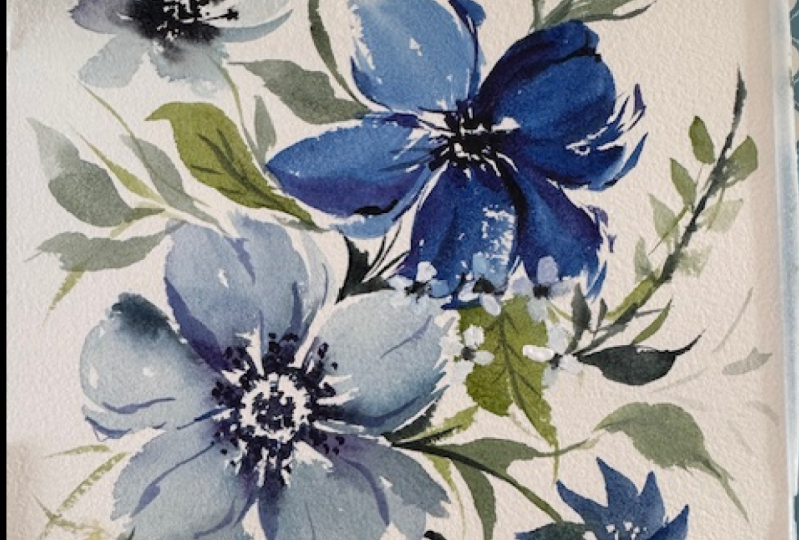
11. Project 3: Part 1 Main Flowers: Before we start here are
the colors that you need. For our last project,
we are going to paint a more detailed painting, and we're going to apply
all the exercises about brushstrokes that we have learned into this
floral composition. Let's do a brief
overview of our project. So we are going to start by
painting two main flowers, and this is going to be a blue
themed floral composition. But you can definitely
change the colors. Make this easier and
more approachable, I split the project
into three parts. So the first part is all
about the main flower, and the second part is all about adding the
secondary flowers, just like what I'm
painting here. These secondary flowers will definitely complement
the main flowers. So we're doing
wide brush strokes for the loose petals
of the main flowers, and here in the
secondary flowers, we're just tapping
our brush using just the tip to create
these short strokes. Now, part three is all about adding leaves and also fillers, and this way we'll
be able to fill in the small gaps in
between the flowers. There's also another way to experiment with
holding your brush. You can do some nice
expressive leaves by holding your brush towards
the end of the handle. So when the flowers
are already dry, we can go back in and
add a second layer using a deeper color and just the tip of our brush to create
these wispy strokes. The next part, it's
going to be optional. I'm going to use
white gouache to add some highlights and some
small white flowers. You can definitely
skip this part if you don't want to
add these details. But if you don't have
a white gouache, you can also use a white pen
or maybe just poster paint. Alright, so it might
seem daunting at first, but this is very doable for you. We have prepared for this project through the
exercises that we did. Alright, so let's start. So the first thing that we
need to do is to grab indigo, and we're going to dilute
it in a lot of water. We want this to be
quite translucent when we paint it for
our first flowers. I'm just going to swatch it for you guys so you
can see the color. Next, we'll also grab indigo, but this time, it's
more pigmented. Using a size six round brush, we can start by
tapping the tip of the brush to create a
ring of small dots. So you want these dots
to be a little bit wet because we're going to
pull the color later on. All right, so I think we can
add a little bit more color. I'm going to use
permanent violet, and I'm going to mix
that with the indigo, and I'm going to add a few dots on this ring
that we did earlier. So we're going to
have two colors. Switch back to a size eight so that we can have
a nice fluffy petal. I'm going to grab this
very diluted indigo, and let's start here with
the ring and going to just push and pull my brush
going up and down motion. Then you can use the
tip of the brush to create these wispy
strokes on the side. All right. Let's do one more. You see I'm holding my brush in the middle of
the brush handle, so you can use just the side of the brush to create
a broad stroke. So I think I'm going to grab a little bit more color
and place it on the petal. Alright, let's do one more. And I'm pulling the color from the center where we have a
very concentrated color. And I'm just going to
add a little bit of that violet into
some of the petals. So again, try to press, and then you can
pull your brush, then go back up and do a quick motion so that you
get a nice pointy tip. So I'm really pressing my brush to create a nice
expressive stroke. So here you can see
a dry brush area, and I'm not going to fill
in that white part anymore. I'm just going to put
some small wispy strokes to give an illusion that
it's a negative space. So that's a happy
accident for me. Okay, so you can
see I splattered a little bit of the paint, and I just plot it out
with some tissue paper. While the flour is still wet, let's grab a deep
color of indigo, dab it in our tissue paper to blot out the excess moisture, and I'm going to
put this color in the center of the flour and
let it bleed into the petal. Let's now move on to
painting the second flower. I'm going to use the
color royal blue, but you can definitely use
other blues in your palette, and I want this to be a
more pigmented mixture. It means that there is
more paint and less water. Alright, so this is the
color that we will be using. Let's start painting
the second flower. I'm going to paint
one petal here, just touching the
first flower and doing a check mark very
quick so that we have some nice whisp strokes and just using the tip of the brush to create some shorter strokes, then descrab some more
paint and just really press our brush and then
live towards the end, and we're always going to
the center of the flower. You can do some sweeping
motion moving up and down. And to make it look
more interesting, I added a little bit of
violet to my blue mixture, so we can add that color in. From the outer
part of the petal, we're going to press
going into the center. Use the tip of the
brush to create some small markings
beside the main petal. Again, make sure
that you are leaving some white spaces in
between your strokes. Now, let's press our brush
and live in a curve manner, going again to the center. So now we have completed all
the petals of this flower. We can just go back in and add some shorter strokes using
the tip of the brush. This is going to add some
character to our flower. You can also add
these small bits of stroke to extend an area
or add some volume. Now to add some depth, we can go back in with some
deeper color of indigo. So I'm grabbing it from the palette straight
into the paper. That's why I have a
really dark color here, and I'm doing this while
the flower is still wet. So there is an element
of timing here. You do want the flowers to still be wet when you're
adding these details. So I do want to add some bleeding between
the leaves and flowers. So I have to add
the leaves right now while the flowers
are still damp. I'm mixing sap green and burnt umber to get that
earthy green color. And we can just paint it
in between the petals. I'm letting the leaves touch the petals so that we'll
get a nice soft blending. So in order to frame the shape
of this phi petal flower, we can add some darker
leaves around it. So you can grab a little bit of indigo and add it
to your sap green, or maybe add some sepia. So I'm just going to
rinse my brush and paint another leaf and you'll see
that we have a lighter value. Alright, this is the
end of Part one. Let's move on to
Part two as we learn how to add these
secondary flowers.
12. Project 3: Part 2 Secondary Flowers: Alright, for this
secondary flower, we're going to add a flower that is on its side or at an angle. I'm using just indigo, but diluted in a lot of water. So to start, we can put
a small dot right there, just as a guide that it's
the center of the flour. Alright, let's start with
the fully loaded brush and just try to press and then
live towards the end, and we're pointing towards
the center of the flour. Do one more on the side, and then create some
thin wispy strokes. One more at the bottom, and we're really just letting our brush glide onto the paper, and I'm holding my brush around the middle
part of the handle. So I love how
expressive this looks. We're going to do one
more here at the top, and I change the
color a little bit. So it is very nice. We leaving some spaces
in between our petals. Now let's grab some indigo and blot out the excess moisture. We to add this in the center just to give some contrast
to this loose flour. Okay, so let's mix
up some color. This is royal blue with
a little bit of indigo. So I want a nice, rich color, and we're going to use that for our
secondary flower. Let me just watch it for you. So that looks good. Now
let's start painting. So a while ago, we were
using the full belly of the brush to create
some beautiful petals. Now we're using just the tip
of the brush and kind of stippling it onto the paper to create these short strokes. These are going to
mimic some short petals that are clustered together
like a small ball. But I'm also making sure I have some white spaces in between my strokes so that
it doesn't look like just a blob of paint, right? So we can also try to
rinse our brush and tap the excess water then I'm going to blur out some of the petals just so that some
of them will look softer. All right. Let's do another
one right here at the bottom. Again, I'm doing it in a circular motion so that
I can create a small ball. Alright, we can rinse our
brush and soften the edges. Going to keep stamping my brush. You can see that
almost about one third of the brush is just bending. It's not the entire belly. Grab any green in your
palette I'm using this perlin green or shadow green. Okay, so just connect
it to the main bouquet. Let's do another
side facing flower, but this time, I'm going to use just the tip of the brush. So we are going to do some check mark strokes
just like this. So it's a quick stroke, and we're leaving some spaces
in between our strokes. So I'm also going to
tilt my brush so that it's easier to paint
some of the petals. Again, all the petals are
facing towards one point, which is the center of the
flour. So it's looking good. We can rinse our
brush and tap out the excess water or blot
it in a tissue paper. I'm going to soften
some of the edges. All right, so I
think it looks good. You can add a couple more
strokes to add some character. Alright, so let's look at
the painting from afar. You can see that we have a lot of darks in the right side, and I think I wanted
to add some more in the lower left side
just to balance it out. So I'm just tapping my brush
using the color royal blue. Just making sure I
have some spaces in between my strokes, it's going to look
like small flowers. So you can rinse your brush
and soften some of the areas. Just press your brush, and you'll be able to create
a petal like brush stroke. All right. So when you're
doing a floor composition, you want to add
different shapes. So we can add an
elongated filler. So let's just grab our green.
This is just sap green. We can add a longer stem
right there and some leaves. Now, let me dilute some sap
green in a lot of water. You can also add a little bit
of yellow into this color. Then just dab your brush. You can see I'm
really just pressing or stamping my brush onto the paper to create this
nice rounded shape. And then we can grab
a little bit more of that green and also some brown. You're going to add it in
the center of this filler. Alright, so I think we need
a little bit of yellow. So I'm using my white guache, and I'm going to add it with
the color greenish yellow. But you can also use just yellow guaheO if you have just plain
yellow watercolor, that's going to work fine. But I wanted to add
some pastel color here. I think it's going to help
balance the composition. We're just going to paint
some smaller flowers. I'm just pressing my brush like this and lifting it
towards the end, and I'm also using the tip of the brush to create some
check mark strokes, add some wispy strokes. So just remember it's
all a combination of different strokes
to create a flower. Okay, we can add some stems to connect it to
the main bouquet. So I think we're
ready to move to the next part of this project, which is all about adding the leaves and
finishing touches.
13. Project 3: Part 3 Leaves: Now, this is part
three of the project, and we're about to
add some leaves. I'm using sap green with
a little bit of brown. So I'm using a size
six round brush to add these wispy leaves. And sometimes I hold
my brush like this. I hold two brushes at a time, and I know some of
you can relate. So I'm also using
some shadow green. This is a deeper green. And I also like holding
my brush towards the end of the handle when I'm adding some nice
expressive leaves. I really feel like
I'm able to just add some movement when
I'm painting like this. You can tilt your brush, create some really thin strokes. You don't even have to
paint leaves just yet. Just paint some sticks, and that's going to help you
decide later on whether you want to fill it in with
some leaves or not, right? So we also need to
play with values, make sure you have
a deeper green and a lighter green color
in your composition. So I decided to do some
last minute florals here. I'm grabbing some blue
and just pressing my brush in different
directions. You can see I'm holding my brush towards the
end of the handle. I love how you
still have control, but you're also letting
your brush do its thing. And with practice, over time, you can definitely
do this as well. So I'm going to add
a little bit of those yellow flowers
at the bottom, pressing my brush and lifting. So this time, I'm using a
size eight round brush, and we can just add
some more leaves. And you can play around with the pressure
in your strokes. You can just tap your
brush, add some stems, and you can press your brush to create
some broader leaves. Thing that I like to do is
to add some detached leaves. So I will put some short strokes or
broken lines like this, and it's like a negative
space painting. So you just let your
eyes fill in the blanks. So when you're doing a bouquet, don't put all the details in the center of the flower
or near the main flowers. Try to extend some areas by adding some small
leaves like this. It's further away from some of the elements in
this composition. Alright, so let's check
this flower is already dry, going to grab a smaller
brush and use indigo, going to bring back
in some contrast. So we're just tapping our brush, creating these small dots. It looks like an anemone flower. Alright, so we can add
some veins on the petals. I'm using royal blue with a
little bit of that violet. You can also use just indigo. Using the tip of the brush, we can create some nice whisky
strokes within the petals. Right here, I pulled this
color, and it's still wet. So I think it looks too much. I'm going to just
blot out that area. All right. So now it looks good. Don't forget that you
can always blot out the excess moisture
in your brush using a tissue paper. All right. So we're just going
to keep adding these short thin strokes. Now, if the center color bleeds into the strokes
that you did, that's okay. Next, let's move on
to the second flower. I'm using this royal blue color, and we're going to do the same. Just using the tip, we are going to create
these wispy strokes, just like what we had
practiced in the exercises. If you'll notice all
these wispy strokes are a little bit curve. They're not just straight lines, and that's going to add some
movement in your strokes. So this part is optional, like what I said earlier, I'm going to be using
white gouache and I will be adding a
ring of small dots, and that's going to be the
highlight of the flower. I usually like adding this detail because it makes
the flower look alive. It looks like a
three D painting. And at the same
time, you can use the white gouache to
add some white flowers. I'm adding it here on top of the blue flower so that you can really see the white pop up. And just to add some contrast, we can grab some indigo and add a few dots on the white flowers. So we're almost done. I'm just going to add a
few finishing touches just to make this
composition pop up. And we need to add
some second layer on those secondary flowers. I'm using royal blue. It's more pigmented
than the first layer. So we can also add some darker center and
some of the flowers. Alright, so I'm going to
add some more strokes here. I'm really just
pressing my brush to create these
petal like strokes. Congratulations for
finishing the last project. I hope you enjoyed painting this floral composition as we were able to apply everything
that we have learned. And I hope to see
your project in the project gallery
section of the class. Alright, let's now move
on to the next video.
14. Lets Wrap Up: Alright, so that's a wrap. Thank you so much for watching. I hope this does help you gain more confidence in painting
your brush strokes. To sum up what we have learned, we talked about how brush size, grip, and brush pressure
affects the strokes. We also learn the importance of water control to
paint flowy strokes. Lastly, we practice different
brush stroke exercises and gestural marks to hold the
muscle memory in our hand. Remember, brush control comes
with practice and play, so don't be afraid to experiment and loosen
up your strokes. The more you paint,
the more natural and effortless it will feel. I would love to see
your work so you can share it in the project
gallery section of the class. Under the Projects
and Resources tab, you can click Create Project and upload the
photo of your work. I would love to hear your
thoughts on the class as well. If you found it helpful, leaving a view would
mean so much to me. It not only supports my work, but it also helps other
students to decide whether this class is right for them
in their watercolor journey. Thank you for joining
me in this class. Keep painting, and
most of all, have fun. See you in the next one. Bye.
 Joly Poa, Watercolor Artist