Transcripts
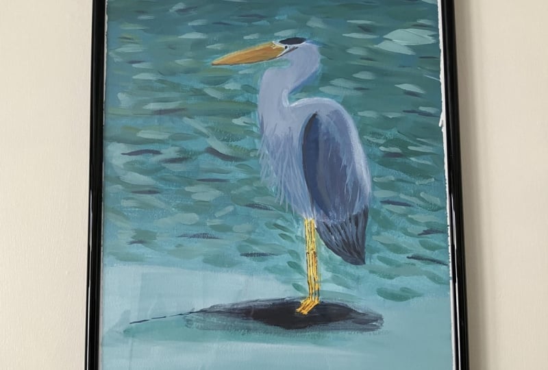
1. Welcome!: Hi there. My name is Anna Stasia. I am an artist based in Santa Cruz, California creating under my studio name. Follow the Sun Ark. I have been painting since I was a little kid and I'm doing a professionally for about six years now. I've also been teaching for two years, and my favorite thing about that is seeing what my students create. So in today's class, I'm gonna do a little demonstration and show you how to draw and paint this great blue hair and peace. This class is perfect for a beginner to intermediate painters. You're gonna learn a lot everything from sketching proportionately to brush control and mixing techniques and layering. So it's a really great way to practice your skills and learn more eso in the next video I'm going to talk about the supplies were going to be needing, so make sure you've got everything and we're gonna dive right into painting
2. Supplies: Also today, we are going to be painting a great blue heron, and this is one of my favorite birds. And in general, I really love painting birds. I'm just getting all the details of the feathers. It's pretty challenging sometimes, but also very rewarding. Just so interesting toe look at and observing detail. So I have a reference photo here, and I'm gonna use that to make a sketch in a showing. Since this is kind of like a detailed shape, you wanna get the portions right? It's a little harder to do Once you start painting, I'm so our first up is gonna be toe sketch out the shape on the surface and then we'll move on to painting. So supplies you're gonna need today are a pencil, and eraser will use that for the sketching from just any old pencils will to like a mechanical or one of these number two ones. And I like to use a kneaded eraser. Um, these air, like stretching, flexible on it. Don't leave the little crumbles on your paper. When you were raised, they work really well. So that's what I use. You're gonna need a surface. So today I'm using a canvass board. You can also use a stretch canvas of wood panel or a heavy paper like mixed media paper. Watercolor paper, regular printer paper will not do very well with acrylic paints. Just gets too wet and flimsy, and you're gonna need some brushes. So we have, um I have a few sizes. I usually just work with three sizes, a larger flat brush and medium flat brush in a small flat brush. And these are size 24 size 12. And I was a size 46 The number is lost. Um, but that's what I use. And then in my arsenal, I have some other little brushes, but you don't need a lot to get started. Just a few will do. And then you're gonna need your paint. Of course, I have my go to paint palette. These are my favorite colors that I've been using lately. Um, it's nice for like a consistent feel across my work, so I'm just going to use this palette today. And so my primaries that I like to use our fellow blue yellow either cadmium yellow or this isn't a Zoe yellow. I've been trying out, um, some form of magenta. This one is Quinn, Acri Dune. And if I'm saying that right yet when a crew doomed magenta and then I have his bright, awkward green, that's great for like a bright pops of turquoise. Um, but it's optional. It's just a nice toe at a little splash. And then I love using Payne's gray too dark and my colors and to get different shades of gray. It's great to mix in with your other pigments on, of course, White. I was used a lot of white paint, um, was toe kind of tone down my colors and stuff, and you're gonna need a palette for your pain. So I love my little master stones. Stay wet palette who has a lid so you can reuse the same palette again and again before the paint's dry out. And you're gonna need a water for rinsing your brush and a rag for a dabbing the water off the brush. So if you don't have your supplies, yeah, you can pause this video. Go grab, um, gets set up, Um, and then we'll start painting right away.
3. Begin with a Sketch: Now we are gonna sketch out our hair in. So when you're, um, drawing from a reference picture and it's like a complicated shape, it's good to break these things down into more simple shapes to get it accurately. So over here, a kind of see an oval for the body. And so I will begin with that. And you also want to find the center line. So you know how much room to leave for the legs and for the heads of the midline was right in the middle of the body. So I'll make this oval pretty central here. Who pulled off to the side a little bit? Yeah, yeah, yeah. Okay. On then. See, the neck comes out. Kind of at the midline here. Yeah, in for of his. Up on. That was kind of like another circle shape. Yes. I wanna think about proportion to So this circle is gonna be a little smaller. A little trick I like to use is my pencil is a measuring tour, So I want to see how big this arch of the neck is compared to the mobile. It's about the bodies about 1/2 times larger than the neck so that I can measure this circle up here and make sure of God about. It's probably a little bit too big still. So really, take your time with this part, making adjustments to get the proportion right? I want to try this more. 2.5. So that's looking a little better. Don't make this smaller. So this just slightly off, okay? And then I want to pay attention to the negative space to when you're sketching, so you'll notice at the arch here the body goes or like the shoulders, they go down a little bit, and then the next starts. So we'll make that little bump here. And no, I should have made this a little closer here, okay? And then the bottom of the head is really straight. So you have, like, this curve here, this curve here and then the curves in the middle. And then it's like a street line, And how far does it stick out? So we split it in half. The beak is about the same length of the back part of the head there. Measurement. Okay, it's a simple shapes and then just kind of really pay attention to the detail, the curves, everything. Ingles. Yeah. With the back of the body goes straight down. Four vertical. This is where the little tail feathers would be, and then the legs come out great about here, Actually pretty close to the neck. There's not a lot of distance there. The penny to bring this part down even more. Yeah, Newsy little puff here, Legs airy here. When the first knuckle was right at the bottom of the tail here that's lined up with that, these Yeah, Yeah, yeah, yeah, yeah, yeah, yeah, yeah, There this bottom needs air a little bit. Bottom part of the leg. A little bit longer than his got his feet down here. Okay, That looks pretty decent for a quick sketch. No race. All the lines in the middle Just so I don't get confused while I'm painting. Second happened
4. Painting the Background: Okay, So once you're happy with your sketch and you've comparative to your reference and made sure all the angles and everything look pretty accurate, there's no weird spots that jump out at you. Then we can begin painting, and we're gonna work from the back to the front, and I'll start with my big brush for the background. Um, and it's up to you. How many details you want to add in the background? I'm just going to keep it simple with a Grady int going from any kind of a darker blue to lighter blue, maybe since sand on the bottom looking, standing in the breaking waves on the beach. But you can get creative, um, and set him in like a different swamp scene or something like that. Lots of options. Just getting a little bit of water. And then one of my favorite mixes is this fellow blue with turquoise. I'm gonna mix that up on my palette. It was like to add a little bit of white. You've painted with me before you know this, but what it does is that it improves the capacity of the paint. It's a lot of times pigments that all depends on the paint brand, but a lot of pigments are translucent on their own, which means if you lay the color down, you'll still kind of see what's underneath. So in this case, it would be the canvas. It wouldn't cover the campus of the pigment entirely. But if you add a little white, it increases the capacity. So then it'll kind of lay on is a more solid color. And also I want to lighten it a little bit because I don't want to go too dark for this background, so that color is looking pretty good to me. I'm going to start at the top here. We find it hard to spread your pain around. You can also a little bit of water. Send it down. It will be more smooth. There's different weights of paint, so I'm using kind of a mix of a soft body and heavy body, and, um, I have a lot of the heavy body pants. I've been using those water down mostly. But as I restock my paint supplies, I'm adding more soft bodies because I do like the fluid paints a little bit more, but if you like texture and your pain. You can go for the heavy body. They're really good for that. Okay, I'm gonna make more of my color As I run out, I'm gonna be adding more white as I go along, too. Create that, Grady and water, cause my white paint is really thick. Okay, They kind of want to go carefully around your shape. But also, you wanna hug the lines very closely. See that it looks like the background is behind the animal. No. Wanna have any, Like, weird white spaces. And also using continuous brushstroke to some kind of going along with these long strokes, side to side from one edge of the canvas of the other edge. Then you wanna kind of re create that for, um, you're painting around the bird to So instead of like having these brush strokes, that kind of outlines a bird. Give it a weird halo. You can start like that, just toe, get the pant as close as you can, and then just kind of smooth it out. So it has a consistent direction. Gonna get into the white. Now you have some more of that aqua. We want to use a smaller brush to get into these little areas to. I'm just doing careful with my big brush. How much control you have. Okay. And while the paint is wet, you can do some lending and create a nice food. Grady in. It's a quote. Paint quickly dries out to Well, we have a small window of opportunity, and but the blending going and then just loading in more white to get a nice pastel colors , we go down towards the bottom of the scene. Another way to do this will be to just do the background first and then sketch the bird on , needs it with the paint. Or I suppose you could do it with a pencil and I'm gonna rinse my brush because I want to get pretty bright at the bottom not to have to have too much blue in there. So when I get all the blue paint off and you know when you're insecure brush, just push it around. Smash those Brooks is at the bottom. Agitate the pain off, and then you really want to get the excess water off and dried off on your rag so, you know, get pools of water in your paint anything like that. I'm just gonna go directly into the white paint makeup like a a tiny amount of blue mixed into it, but not so came gonna happen anyway, simply dipped into the blue. That's a pretty cool effect. So leave it. Yeah, be accidents. It's a favorite painting, Teacher says. Cool. It's looking good. See what comes out? A little bit of texture to that ocean to while we're here, we'll get some more of that first darker color. We can add in some little strokes. Build up some texture. So the first layer was a very soon with radiant, and the second layer is gonna be in adding a little bit of texture to give you that illusion of the surface of the water. So I didn't switch to my medium brush, and I mix up my color. If you can even see that being a little dark barrier, I like to go in with random brushstrokes lines going across. This is a nice texture. Who could do the same thing about lighter version, and most thing you can remember when you're creating texture, I want to get shadows, mid tones and highlights. So usually the base code is gonna be the mid tone, and then you can add a slightly darker color to create the shadows and the lighter color to create the highlights. And just with those three variations of a color, you can create pretty good texture on the trick. Here, too, is not toe over blend. So you really want to show the texture of the brushstrokes. And that's what's giving that engine lived in water. Yes, this part. You can even create the physical texture. So I'm getting little like ridges of paint on my pace and look how it's turning out. Well, I think I will leave it. Don't be afraid to paint over the lines a little bit, too, because you want to make it look like the background is going behind the hair in. Otherwise, it kind of have that awkward spot. Good transition differ to play with different variations. A lot of times I paint very intuitively, um, value. This comes with practice, too, and you'll start toe feel more comfortable trying different colors, thinking outside of the box, doing your own thing. So now I'm going into a little bit of turquoise down here to breaking it up and I'm gonna get softer as I get to the bottom, that texture. We have that spot in between the legs to make sure you still that and try to match what's around it, too. No way I'm working as I started from the top and worked my way down. But you can kind of bounce around, back and forth, see how it goes. Make sure you take it all the way to the edges to Yeah, though it's pretty good filter to keep playing with that texture as long as you like, but also be careful not to overwork it. As I was saying, Um, if you're happy with how it looks, it's good. It's probably better to stop than try to keep working it, because a lot of times it will start to go kind of downhill. So right now I feel good with this. I'm not over analysing any details or anything, so leave it as is here ago. Having more brush strokes and another little detail you want to think about now while we're working on the background is creating a shadow under the bird. Um, otherwise he looked like he was just kind of sitting on top of the background, but a shadow will. You could appear, because if he's actually really there in the scene, I'm gonna get my darker color and water it down a bunch, so blends in nicely. Um, on the right color. You don't want a too dark. I'm not gonna put too much pain on my brush. Just so doesn't take over this piece. I was going to make a little line here where the base of a speak will be the last movie. I can go a little darker and then rinse it off. Dry it off. You can blend it in the scene, just kind of by doing a swipe little soften the edges. Good. Bringing a little more of that white back in here. So if your shadow does spread out, you can pay number normal thing about acrylic paints. Okay, Zika always go back into that later and darken it. If it's not just right, that'll kind of come together once we put the burden. See how he's looking in scene
5. First Layer on Bird: So now the fun part. So for the bird, you're probably not gonna want to use your big brush. Lester canvas is really big. Um, just because he's a little bit smaller in the background. So I'm gonna go with my medium brush some. And the first thing I'm gonna pay attention to is the highlights and shadows. And that'll be my base coat so you can see there's, like, a dark line here, Dark pointed out the tail feathers. Then the rest of the bird is pretty light on. Does have that little cap on his head to. So to find the perfect color See what we mix up. Start with little stay low blue patterns. Some teens gray Be a little magenta just to give it some purple hue. It's not a super monochromatic painting. Okay, so this is gonna be good for the darker spots. So it couldn't do this outline here for the wing, starts from the shoulder and goes down to the legs. I just got this little cap there. Mm. Brothers kill fillers. Rinse that off. And, um, out of white already. Let's reload. Godel up blue kind of crept into where the white Waas. We're gonna do a little mixing here too. So I'm not gonna use Just wait. Maybe just a hint of gray. I should say to the side touches magenta. Too much little in between there. The colors that are my palate. Little thing I like to do while I'm mixing colors is utilized. What I have on my plate already since since I have those light blues already I could mix that in get kind of a shade of grain. Slightly pinks likely bloom very pleasing. We'll carefully fill in the rest of the body here, Try not to go out of the lines. What did you No worries. You can always fix it. - Kind of nice. We have this dark blue down here cause we can kind of blend in some shadows, like under his belly. Here I had a little shadow. The bottom of the knock. Okay, so I've got a couple things going on here. So I really like this mix of the pink, gray and white. So I added in a couple little brush strokes of that. And then there's the more dominant blue grey that's crept into these areas into the shadows . Generally, when you're doing shadows. You want to use a cooler color like blue. Um, so that would be for like, under the neck here, just to give it that dimension from just a little line of a shadow along the edge Will dio . And then it's nice to add in some warm colors for contrast to Otherwise it will look kind of flat, but by adding a little bit of pink in there, um, just gives it a little bit more color, and life makes it a little more interesting part from the background to Also, another thing I was considering is adding in a little bit of purple until the background, but it might be too late for that. Although it is an option. You're working on this painting. Okay, so now I'm gonna grab my smaller brush and get some of the details. So color in the beak get a little bit of yellow, uh, and pink to make orange. It's very dark, so I'm gonna Adam some white. So were a touch of blue. Just so it's not so right. Great. Down a little. Well, it's a good color. I think C always looks different. Um, you know if you mix the color on your palette, looks good, and then you put it on the painting and the context is always different. So, um, either might be darker than you thought it was, or lighter than you thought. It waas or just like to vibrance too loud, so you can always go back and adjust and repainted. If it's not exactly the polarity, we're going for part of the process. So my little brush just going very carefully here, toe from the beak You were here. You want to pay attention to details, so the the beak stops kind of further out here. Look where the neck is here. Lined up with that, and then it angles up. Kind of goes under where the eye is going to be. It was all the way to the base of the face at the top and on the bottom. It just starts new farther out. Just details like that. Um, then you kind of start to figure that out. As you practice your observation skills, it's really easy to be painting what you know versus what you see. It's a common problem. So you think you know what a bird's beak looks like, but every birds because difference. That's why you have to look really closely at the details and see, like where each line starts and stops. That's how you get life like drawings and paintings can. Their legs are also yellow, so I'm going to use that same color. The pain man. Yeah, for little areas like this, I looked a water my paint down just so it's like a nice fluid consistency, really easy to work with. It's harder to get like globs of paint just gives you a little bit more control. Okay, so that's a good base layer, and then we'll go back in and refined those details.
6. Refine & Adjust: Okay, So you think we could go in with our second coat on the bird body now and just kind of smooth out that shading? Add in some feathers, so we'll get my original color. You want to wait until the first code is pretty dry to go back in a second layer on this time since my painting is pretty small and constructing with this small brush. Yeah, I really like that grey. Just a touch of pink and and because it's a nice, warm, huge tone, that's the word. I'm looking for us, okay? And I do want to add in some highlights to Since we are using an off white, just pull a little dollop of straight white on a clean part of my gallop or small waters blue already, and make sure you change your water out if it is to colored, especially after painting that background and might be really blue, and that will go into your colors if you want to really bright white, get a fresh water. Good to change it out several times as you're working. Well, come breaking up face a little bit, okay? You should in the back of the neck is really break, too. You can kind of imagine where the sun is coming from. So in this case, it's like up in the corner here, kind of. So if the sun is shining down, all of the surfaces that are facing that direction are going to be a little bit lighter. And that's where you gonna put the highlights So called some more on the back of the body here. And that also indicates where shadow is gonna be. A So that's why I kind of extend my shadow out towards the front of the bird. Since the light is coming from this direction talking about back of the back, you won't go back into my grave. It's a double. Highlights down. It's a little spot of white feathers down here. So breaking bad off to who? Still kind of wet, Splendid. And so wait to do that section. Okay, just making sure all of the shadows and highlights are in the right spot. What I'll do is I'll add some weight to that and just blend that blue and lightning tail feathers here a little bit. They got a little too dark, you know, I'll give this a few seconds to dry because I do want to break it up a little more, just fixing things. Here, there, jump out of me. I'll fix up my beak a little bit. No, super happy with the color. Think it's to berate of a yellow. I'm gonna dial it down. You gonna warm some? Keep in mind when you mix all three primaries, you get brown. So if you want to make a version of brown, you're just adding adjusting the levels of each primary color. So, initially I used mostly. I was a little bit of pink for the beak, Um, just like the tiniest drop of blue. So I added a little bit more blue to here and more white to keep it nice and light. And that's giving me more of a brown color instead of orange. I think that probably looks more lifelike because when you see him in a picture in real life, you see the beacon, the legs and it's like, Oh, that's yellow. But which version of yellow that's what do you want to figure out in your painting? Since this is making too bright for me, let's try to great down a little That looks a lot more natural. Yeah, you could go back over the legs, too, but it's still good to have a couple of layers for each part is that the colors come up more intense. Good feeder. Always tricky. Want to paint? And we want to get some highlights and shadows on the legs to so they don't just look like brown sticks. So I see. Get a little shot over here. Drop of gray. Going a little shadow under the news. Didn't do much for contrast. Trump pink. That's going to great. Drop a yellow Too more. Okay, okay. Yeah. This is a very detailed work, So just take your time. Be patient bottoms of the toes. It's nice to have the shadow, too, because it adds a little bit of an outline. Little making pop against the background on that will do the same thing with the highlights . So saying concept of you're three colors support, some wired. We're starting a drop of yellow with nice and bright. Sure, it's a very consistency. And your brushes and super loaded you get the backs of the legs here. Topsy tools. Now I think I'm gonna take a break from the bird for a little bit just cause I can see the paint is still wet. And I wanted to dry out a little bit more before I add more details. Eso I'm gonna fix up the shadow here, so it looks like to mam, looks like it's kind of floating in space a little bit or hovering above the ground. And that's all. Due to where the shadow is, that's not quite right under his feet. Um, and that is an issue for me. So get my shadow color again. Not a little great to it. Little bit of a purple hue. I think some of that color into the background. It's in this time. I'm gonna make sure put it a right under his parents. My brunch here to get some water stopping the edges. So now it looks like his action standing on the ground who rain. Okay,
7. Finishing Details: see, I'm just gonna work on different sections now, refining the details. This is gonna be, like the last step of the painting. Pretty much because the backgrounds all set the shadow looks good. The base code is here. It's got a good foundation from So I'm looking to see where the paint is, Dr. So I think the beak is gonna be my next spot. And that will give a little bit more time for the bottom to draw him. So since I didn't have those highlights yet uh huh. Notre color to the top to be son was falling with it. Okay, These are basically the same colors we used for the legs. Usually they match, but not always. Depends on the bird. Morgan, my little shadow color. Come along on the bottom. Not strong of the line with be couples closes if you want more goals. So you can always grab your mid tone color to touch up. Hold up. OK, Got weird. Okay, Do tells details. - No , but I had a chance to breaking that up with an ad in some feathers. Good. So fillers aren't too hard. If you just want to look for different sizes and where they are, how they're patterned. And then you can just use a simple brush stroke for each feather. So there's really long feathers for the tail here, and then the wing stops right around here. I'm just gonna start with that. It's a little easier to if you start from the bottom and then working way up. And then it looks like there's another layer feathers here. Okay, Mowing goes up. We'll just keep going with that texture and others get smaller as you go up. Oh, it was almost like a stippling technique stool. Just like barely press the brush down. I'm mixing lighter colors as I go up the wing, too. There we have a few layers of feathers. You've accepted beers longs. Yeah. Look at the doctor feathers at the very bottom. Okay, Smothers air Looking good. So now I'm gonna go back to my darker color and just redefine whose initial lines I made His crown has a nice little whisper that goes off the back. So we want to get that great and one brush stroke. That'll dio Yeah. Okay, now the very last each house unaware did a lot of details If you are feeling frustrated, any point you might wanna take a little break and come back to another time because these little details can get a little frustrating, especially if you feel like you don't have a lot of control over the pain from the colors and everything. It all comes with practice, but cheers to you for taking on this challenging piece. Um, so, yeah, if you need to take a break at any point, feel free and then come back to it when you're feeling fresh and re inspired or if you're doing good, just carry on and we'll do the little final details here. So the last things left are the wispy fathers that were coming off of the body and die. I would say the I for the, um, very end of my painting just because it's the part that gives the animal life and up until the point that everything else is finished, I feel like it's just not ready for that soul just yet. Not just how I work. Yeah, so you can do daughter her. I'm see you think you can do a little dark spot for the I be a multi step process, so we'll start just dio to We left that Dr and proceed with the Miss P Feathers. So get some more of that white pain to my clean spot here. Uh, water nice and fluid. And for this part, you can use the smallest brush you have. So if you have an even smaller one than this, um, you can go grab that and use that for this part. I just don't want to be able to get a good amount of paint on so you don't have to keep reloading for every little segment of a stroke. So we'll start back here with the white back of the body, and you know, these little wisps you're working with down strokes. So you start at the top and then go down and just kind of feather off when you end the stroke. Kind of like 1/5 motion, and I'm barely pressing the brush down. So it's just with the very end of the brush. If you press down any more than the very, very tip, the line will get thicker. Um, good, very thin lines. For this part. I feel like I wanna add in some shadows here, tone. So just add some little darker wisps in between my white strokes, and then I might do another layer of the white strokes. Justo, those back to the front. There are a lot of these on the front of the bodies. Well, smooth leftist. OK, no, that's more detail to the I know. Done yet. Okay, So my goal with this next part I've still got the white paint on my brush. Um, is I want to make a dot That's slightly smaller than the blue spot we made so that it leaves an up line that hopefully can see so that detail the video. Well, it's good to a lot of dry. Um, but you can try to go right over. I'm gonna take some of my Payne's gray and add little people to the middle of that white spots. The same thing. You want to make a little circle in that circle that's smaller than the white. So that outline, So basically three dots stacked on top of each other. You know, at this point, I think it's looking really good. It's up to you how much time you want to spend working on the details on sometimes is it. It is really good to take a break and then go back to it. Also, step away from the painting. Take a look at it from the distance and see if there's anything that jumps out at you. Some you can also flip it upside down or hold it into a mirror and look at the reverse version of it. Um, and that'll give you some extra insight that you might not see Just because you have been looking at this for a really long time because it is, um, so some ideas. So, yeah, keep working on it and let me see those finished paintings when you're done, too. I always love to see what you come up with.
8. Thanks for Watching!: we did it. Thank you so much for painting along with me. I hope you had fun and learned something new. I would love to see what you create it. So please take a picture of your painting and uploaded to the project's tab of this class. And also let me know if you have any questions along the way or any frustrations, anything like that. I'm happy to support your creative journey beyond this class to so remember toe. Stay creative, keep practicing and have fun, and I will see you in the next class.
 Anastasiya Bachmanova, Artist at www.followthesunart.com