Transcripts
1. Intro: Hello friends, and
thanks for tuning into this video class on painting seascapes with water
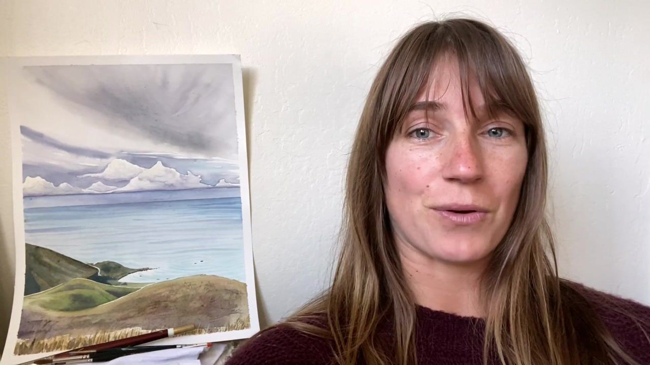
color. My name is Anna. For those of you
who do not know me, I'm an artist based
in Santa Cruz, California, working
under my studio name, Follow the Sun Art. A lot of my personal
inspiration comes from being in and near the ocean. I really wanted to dive into painting seascapes in this class because it's not
always so simple. There's a lot of elements
and a lot of like dynamic stuff going
on when you have a seascape, there's the sky. What's going on in the sky
which reflects in the water? Is the water smooth? Is it wavy? Is there wind? Are there rocks? Is there sand? Just so many different
elements that we need to consider when we are approaching
our seascape paintings. In this class, I'm
going to break it down into different sections. We're going to cover a few
different ways to paint skies, some different ways
to paint water, as well as go into
the details like the things you might see
like sea foam waves, rocks, cliffs, things like that. But yeah, I love
painting seascapes, one of my favorite subjects
that is endlessly inspiring. If you'd like to
see more of my art, you can always check
it out on my website. But in the meantime,
grab your supplies. Feel free to take some
notes and let's dive in.
2. Techniques: We are going to begin with a
basic techniques refresher. If you're pretty new to
watercolor painting, this will be really
useful because these are the basic techniques
that we're going to be using to create
our paintings. If you've done some
painting or maybe you've just gone
over the techniques, feel free to skip
this part or you can use that as a warm up
or just refresher. It's always good to go over
and practice these things. You have the tools to go
about with your painting. I'm just using like a scrap piece of paper
for this practice. You don't need to use your nicer heavyweight
watercolor paper for the techniques practice. My go to these Canson
mixed media paper pads. They're a lighter
weight, 90 pounds. They do buckle a
little bit with the, of the watercolor medium, but it doesn't matter too much because we're just
practicing for this. It's nice to have
like a scrap sheet of paper if you need to practice any techniques or anything like that before you put them
onto your painting. Any specific little flourishes
or anything like that. I've got a variety
of brushes set up my water and a towel
for drying my paint. Of course necessary component. We're going to begin with
the wash techniques. Wash is you're basically
filling in an area of your paper with one color. You can either use them straight from the paint palettes or
straight from the tube, whatever paint you're using. Or you can mix your
own unique colors in the mixing palettes. Here I've got like a
variety of blends that I commonly use for different
elements of my paintings. It's a little messy,
so sometimes I'll give it a good wipe
down to clean. But anyway, you can pick
any color to start. Doesn't matter too much. One of the most basic
things about water color is controlling the
saturation of your color. If you use just a
little bit of water, you're not agitating
the paint too much. You'll have a
pretty faint color. But then if you really just
stir that pain around, wake up that pigment, then you'll have a much
more concentrated color. That's a good thing
to play around with is see how saturated you
could get the color, see how light you could
get the color to. That's basically a
wash. What I just did right there with
this round brush, I'm just holding my brush at an angle so I get a
lot of surface area. I could do it vertically
or horizontally, whichever way it feels
comfortable for you. You're not using too much water but just enough to get the flow. Generally, you're not
going back over your, you lay it down, let it dry. Otherwise, you might get like
some uneven splotches or blooms If you drop
too much water in unwanted effects
usually keep it simple. Just lay down your
color and let it be. Depending on the space that
you are using your wash for, you can use different brushes. There are flat brushes specifically designed
for the wash technique. I'll show you some of mine like this wide flat wash brush, and then there's a
smaller one for example. Those are great because they stay wide and you can just brush back and forth to get your wash filled in with whatever color. But if you're going
in smaller areas, you can also use a
smaller round brush for more control in whatever
space you're working in. Depending on where
you're doing the wash, you can just find the
right brush for that step. Then the next technique we're going to do is the wet on wet. Which means you're
putting wet paint on wet paper, a lot of water. I'm going to begin
just by wetting a section of my page
just with water, even moist, not like
puddling or anything. Then I'm going to
pick up a color, plop it in, you'll see
the paint starts to flow. It's doing its own thing. I'm rinsing my brush and
grabbing another color, second color or third color, and then I'm going to throw
that in, in the ******. This is one of my favorite
techniques because you really see the personalities
of these pigments. Like this blue for example, it really loves to
push that pink away. Then some pigments will just sit in place
where you put them. But it's good to play around with the
different colors and see how they react
to the technique. I'm just trying
different colors now, popping them in sometimes if you feel like there's
not too much movement, you can also just brush the paint around a little bit
to get it to flow better. But ideally, they'll
just go on their own. They don't need too
much manipulation, but this is a way to get a lot more interesting color variation within a shape compared
to the wash. You can see there's a lot more going on with the different colors. Sometimes I'll use
similar colors, like different shades of pinks or different
shades of orange, just to get that variation. It really adds a lot of
interest to the painting, The next technique
is going to be. Wet on dry, which is
a great way to make define shapes on your painting. They'll have a hard edge
versus a soft edge. I'll grab a color
basically, you know, you're just painting
lines or shapes. You'll find this
property of water color, that the paint is not going to flow where the page is dry. Like where we did the
wet on wet technique, that paint is flowing
because that section is wet. This paint is only
going to go where you brush it on sometimes. I'll also combine techniques, you can do like a little wet
on wet within this shape. You'll see that color
is not going anywhere, it's just staying within
the painted shape. Another thing I like
to use this technique for is if you're painting objects that are
adjacent to each other. In a painting, you usually
have to be really patient and wait for the first part to dry before you proceed
to the next part. Or else there was some thing over here that I wanted to paint and I
started going for it. The shapes just merge together and the paint
flows into each other. Generally, you'd wait for
this to dry first before you paint the next thing just
to keep them isolated. But alternatively, you can use the white space as a
barrier if you just leave like a little
millimeter of space between the first thing you painted and the thing
you're moving onto. You'll see this way, the shapes do not merge together
and you can proceed. It's like a stylistic thing. What I love about this method of painting is you get this bold line and
between your shapes, which makes things pop
a little bit more, gives them a little
bit of focus. That's something
you can also use as utilize that white space between your different elements. But yeah, if not then you
just want to make sure you're waiting for the sections to dry before you proceed
to the next part of your painting that is
wet paint on dry paper. It gives you hard edges
and define shapes. Next, we'll have dry on dry, which is a great way
to create texture. A lot of watercolor paper will have a little bit of
a toothy texture. It's got some grain, it
creates a cool effect. Let me show you how
I load up my brush. I want to start with,
ideally, a dry palette. I'm using a tiny
amount of water, just enough to
activate my paint. But not enough to really
get like a pool of water like I did in that
first pink I used. Sometimes I'll go to the edge of the palette where it's
like more caked on. Also, if you're using
the two paints, you can use the paint straight out of the tube with no water. That makes it a lot easier here. It's still more of
a wash technique. It's a little tricky to
get the right consistency, but I'm just going to
keep working on it. The idea is to unload
the water from your brush and just get the paint and it's
thicker consistency, See here, now I'm getting
that scratchy sound. That means I'm getting
the dry and dry technique and you can see the texture, it's picking up the grainy
texture from the paper. Try that out. It might
take a couple tries. Sometimes if you start with like a wet brush and you're
going along eventually, you'll unload enough paint
that you can get the dry on dry texture, okay? Yeah, that's great for creating texture like if you're doing rocks or sand or something
like that or a dirt trail, really useful for a lot
of different things. Then the next one is dry on wet. For that one, I'm going to again wet a section of my page. Again, evenly moist,
not puddling. Then I'm going to dry my
brush off on my little towel, load it up again the same
way we just did for the dry, for that texture, we'll
brush it onto that shape. This is a good way to get
defined shapes with soft edges. These two are similar because
you can define shapes. The paint is not going
to flow too much, but you can see the
edges are very soft. Usually, I'll use
this technique if I'm painting like a
landscape or something. Maybe there's something
in the distance like mountains or coastline
or something, I wanted to fade
into the atmosphere. You'll have those
soft, blurry edges. That's a good way to add
some depth to your painting. It's not a super
common technique, but it is a good one to
know for certain scenarios. Okay, and then we'll
go over some blending. We can blend a color into
the white of the page, and we can also blend
two colors together. I'm going to begin with
a saturated color here, just painting a little blob. And you can do the small scale. You can also do a larger scale then to blend it to
the white of the page. I'm rinsing the
pigment off my brush. Drying it off a little bit. Then just take note of the direction of my
brush I'm pulling, my brush is pointing in the
direction I want to blend in. My brush strokes are
perpendicular to that direction. I'm blending to the right, but my strokes are up and down. Then I'll repeat that step. I'll rinse and dry until I can really get it to
the white of the page. I use that technique a lot. You can also use it
from a dry section, you can reactivate the paint. That is another awesome
property of water color. I'll find one of these dry
areas and get some water. Just brush that around
to reactivate the paint. Then same thing, I'm pull it
to the white of the page. And repeat with the
rinse as needed. If you want to blend two colors together, start the same way. Leave a little bit of space, a little bit of white
space between your colors. And then again, I'm
rinsing to have a clean brush between
all my colors. Same thing. I'll just
go back and forth a couple of times to blend
those two colors together. Another great thing to practice
is your brush control. Your different brushes
can have a variety of effects and it's good to get to know them and play
around with them. One thing we can practice
is thin to thick lines. For example, this round brush, I can make a really
thin line just by using very light pressure at
the very tip of my brush. I can also get a
pretty thick line by pressing down and
spreading those bristles out. Then you can alternate
from thin to thick. Thin to thick. That's a good watercolor
painting drill you could do to work
on your brush control. Then a couple other techniques
that are really useful to know are techniques to
touch up your painting. Sometimes we'll get paint
where we don't want it. Sometimes with
watercolors you only get one shot because once the
paints there it's there. You can't really layer and cover things up as
you can with say, like acrylic paint or
oil paint for example. But you can reactivate
and lift the paint. There's a few ways
to go about it. Depends on where your painting is and how bright
you want to get it. If a section is still wet, you can just go right
in and mop it up. If you got paint
where you didn't want to see that section, I lifted up a bunch of
pigment there and it's brighter if you just painted
something and it's like, oops, I didn't want that there. You can just really
quickly lift it up before it settles
into the page. That's an example of lifting
when the paint is wet. You can also lift the
paint when it's dry. I'll just put some water down here on this purple section, then same thing, I'm just
pressing into the page. Sometimes it's more effective. I got a little bit
of pigment up, but really not a ton. Some pigments lift better. Maybe that's not
the best example, but you get the idea. I'm going to try it out
with the pink here as well. See if that's any
more effective. That seems to work a
little bit better then. The other technique
is scrubbing. This time I'm going to
agitate the paint and you can see a it's reactivating, I can lift a lot more pigment up with the scrubbing technique. You want to be careful
with scrubbing though because if you brush to aggressively can tear up the paper and then it
has an uneven texture. Just be careful with that one. But yeah, you can reactivate to lift paint up or
to soften edges. There are some ways to touch up your piece if you've got
any unwanted effects. Those are basic techniques. We can go ahead and move into some more
specific exercises. Feel free to practice
that as much as you want, if you want to refine
any of your techniques, if you struggled with any of them, you can pause the video, you can work on those
a little bit more and then jump back in
when you're ready.
3. Color: Before we begin, I want
to talk a little bit about your color palette that you're going to
use for your painting. You definitely want
to give some thought to your colors before you begin, Really take a moment to look at your reference where you are out in the field or
looking at a photograph. Just pay attention to the
colors you see around you. Depending on the
time of day, um, and what's going on in the atmosphere and
in the water that's going to affect your painting
and your color palette. Let's cover the
different times of day. At dawn and dusk, you tend to have pastel hues. There's very soft
color contrast, not too harsh between
the lights and the darks on the colors
are mostly similar. On the value scale, you tend
to have a lot of pinks, purples, yellows and blues. You can see all of
that in this piece. There's pinks, just light
very similar shades of blue, purple variations of each color? Pretty much. Okay.
Then at midday, when the sun is high and bright, you're going to have
more vibrant colors. And that's just the science
of light and color. The more light that is
bouncing off of the object, the more vibrant the
color is going to be. You do have higher contrasts. The high lights are
really going to be illuminated very brightly. Then the shadow areas are just
going to appear more dark. A wider range on your value
scale from light to dark. Also, the colors are
just more saturated. Just rich, blue, rich yellow. Whatever else you have
in your scene, okay? On an overcast day, when it's cloudy or foggy, your colors are going
to be more toned down, which means that they are
more on the gray side. A couple of ways
you can do that, you can grab whatever
base color you're using. If it's like blue or
yellow or purple, you can add a
complimentary color to it. So you can refer to a
color wheel for that. If I'm going with blue, you could add like a
splash of orange to it, just to gray it down. Then another way to
approach it is to start with a pigment like
pains gray for example. Then add your colors to that. Add some yellow for your
yellow, blue for your blue. You're more muddying
up your colors. Which you usually would
avoid when you're painting. But it's good to get
like a little messy just for those grade down tones. Then the contrast is
also going to be medium. The colors are more similar. Of course, you still want
to have some dark areas and light areas for the contrast
and structure in your piece. But similar to the
dawn and dusk a day, it's going to be more
on the subtle side. Sunset and sunrise. Super fun to paint
because you have all those fun
colors when usually you might have a more
monochrome painting, shades of blue or gray. Here you get to use
all of those fun, warm colors like yellow,
red, orange, pink. There is very high contrast
because you've still got the sun up and it's
shining very strongly. The highlights are
going to be bright, the shadows are
going to be dark. Your colors are also
very saturated. As we know, if you
ever seen a sunset, some of the brightest colors
that you ever see in nature, really avoid muddying
your colors up. Use them a little
bit more saturated. So using less water, you can really go heavier on the pigment for
sunsets and sunrises. Then also, you want to keep in mind using
complimentary hues. In some of the other examples, the colors are similar
on the value scale, so maybe like different
shades of blue and purple. For the most part
here you're going to have complements like
orange and blue. For example, yellow and purple. This combination will also help with the contrast
in your piece. Aside from just using light
and dark to create contrast, you can also use the colors
that will enhance that Complimentary colors help
a lot with contrast. Then another thing
that I want to brush on is setting the
tone of your painting. Oftentimes, if I'm going for a certain mood
in my painting, or there is like an
overall color tone to a certain scene, I will use an initial wash
over the entire page. Before I start painting, I will do my sketch first, and then I do try to save the white if there are any really
bright highlights. This will also help enhance those highlights even more
like on the sea foam, for example, or in the clouds. I might do this, I'll
go around those parts, but otherwise just cover
the entire painting. The way you do this is you grab a large wash brush that's
going to hold a lot of paint. And you want a mixing
palette with like a good room to mix
up a lot of water. You're going to select your
pigment that you're using and then water it down so you
have a really light version. You can test it on your paper, and then if it's too vibrant, you can just use water to
spread it out for your wash. If you feel like it's light, then you can add more pigment. That's easy as well. Then
for your color selection, warm colors give warmth. That's usually what I'll
go for my paintings because I just love
that warmth personally. I'll use a yellow or yellow
ochre to wash over the piece. Then if you have a dawn
or dusk time of day, you can use a pink wash because that's color in the scene. The other times you
might use cool colors for a cooler tone,
like blues purples. I personally don't
do that too much. Maybe for a night scene that
would be pretty effective. Yeah, you can play
around with that. Even do like some
thumbnail paintings to see how that affects
your finished painting. The overall tone
in this painting, I used a wash of yellow just to create that
warmth in the piece. Yeah, play around
with that and give some consideration to
your color palette before you begin your painting.
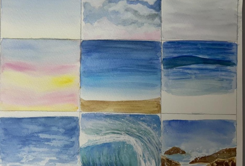
4. Skies: All right. Seascape Skies. Let's grab another
sheet of paper. You can use heavier
weight watercolor paper if you would like to. You can also use the
same mixed media paper, because these are all still
just going to be exercises. I've got a ruler here. I'm just going to section out my page a little bit so we can do smaller thumbnails with all of these techniques. Just give yourself enough room. I'm not like being specific and measuring
this out or anything, but just give yourself
enough room on your page in these little sections to work on the different
techniques. We'll do some skies in this one, maybe some of the
ocean sections too. We'll just do the mini
thumbnails to get a feel for the different ways we can
go about our paintings. Then once we've got all the basics down all
the different elements, then you can use these as a reference for your
larger paintings. Skies, We can have
a variety of skies. You want to look at the
colors that are in your sky. Just one over the
color palettes. For a dawn or dusk, there's a lot of
pinks and blues. You might want to do a wash
with a gradient for that on a bright day might just be clear blue or you might
have some clouds. You just want to plan out what technique you're
going to use for your sky. We'll start with
the most simple. Maybe like a bright day at dusk, I'm going to use a
flat wash brush. You generally would
use for your sky. Depending on the size
of your painting. Again, you might want
to use a larger brush to fill in the sky
just so you can be efficient and get it all filled in before the
paint starts to dry out. Let's say we've
got a bright day. I'm going to be like selective. I have this color over here, It's called bright
blue and it's been one of my favorites
to use for skies. But maybe you have
like a light blue or just like a different shade. Just use whatever
is on your palette. We will all have
different pigments and there's no wrong or right one. Sometimes certain pigments are useful in certain situations, but for the most part, just follow your intuition. You can also do swatches. Yeah, I do want to control
the saturation of my colors. This, for example, is really
a little bit too bright. But remember also the paint
dries a little bit lighter, better to go, more
vibrant, I think. Then I'm just grabbing some
water and I can dilute it. I'm using these
long brush strokes horizontally to fill it in. We can create a gradient. Remember that
blending technique? We can use that here.
Then maybe I'll go in just with some water to get
it to fade to the white. A lot of times on
the horizon there is like a hint of another
color from the atmosphere. I usually like to throw in a
little splash of yellow just because gives it a
little bit more energy to have that splash of warmth. Or if you've got a dawn
or dusk environment, you could use a little bit
of pink on the horizon line. Yeah, just going with the pink
and then rinsing my brush so I don't get the pigment too saturated or accidentally
mixed green. If they collide,
you want to have that little bit of white
space between them. That's a nice clear
day, blue sky day. Then let's try a cloudy dame. Next, I might start at the same way using a
little bit of more water. Because we're going to use
a lifting technique to create the clouds again, beginning with a wash. Then maybe this time I'll throw in a little bit of pink
on that horizon. Okay? And then I'm going
to grab my towel and lift up some clouds here,
some cloud shapes. What's really the
easiest way to make clouds is just lift them up. You can bunch it into like a little corner here so you can get more of that poofy
shape of the clouds here. I'm going to let it
dry and then we'll add a little bit of shading
to the clouds because if we just leave them
white and simple, there's not a lot
of depth to it. Let's let it dry for a sick. When that initial wash is dry, I'm going to grab
like a gray color. One of my favorite combinations
is purple and brown, or ultramarine and brown. You get a purple, bluish gray. But it's really a
beautiful color. That's ultramarine blue and
a dark brown like umber. Or you can do a little bit
of purple in there too. Here, I'm going to just line that at the bottom
of the clouds here. I lost them in this example. Basically like that. Then I'm rinsing my brush and I'm just going
to blend that color out but not all the
way to the edge. I still want to
maintain some white. A blending technique, but a little bit more texture so
we're not going for smooth. Sometimes you can go like a little heavier with the water, just something you have to experiment with there. We've got some little clouds, then you can always
go back in to say sky ended up really
light like this. You can also just
go back in with the wet on dry technique
and go around the clouds. Just fill that background
area in again, if you feel like you
need a little bit more vibrant color here. I'm using that white space trick to paint adjacent to the clouds. You can also let them
dry and start painting. Once that's ready here, I'm going to rinse and just
blend towards the horizon. Gradual blend and any little
touch ups you need to do. Okay, let's do an overcast day. Overcast is really
fun because you can just go in with like the
wet on, wet, dry, wet. I love to start by just wetting
the whole section of sky. I think overcast days are some of my favorite
skies to capture. Just because you really get to use the water color
advantages of the flow. That same gray that I used, I'll throw that in. Basically, I'm just playing
around with different colors. Sometimes you want to, again, just observe your scene
and see what you see. There might be a little bit
of yellow at the horizon, maybe even some pink. See what other colors are
popping up in the clouds there? Pinks and purples,
maybe some blues. This is really just the
wet on wet technique. Start there then. If there's any areas
of sharper contrast, like you see the
different layers of the clouds or
something like that, then you can let it
dry a little bit when just still wet but
not totally dry. You can go in with that
dry wet technique. Again, loading up the
paint when it's more in like a pasty consistency
versus watered down. You, wherever you
lay down your lines, you'll have soft edges
but defined lines. But here you can see the paints just drying and I've got a nice, really super easy overcast
sky that looks amazing, in my opinion. Yeah. Really fun to do
those cloudy days, sunset and sunrise clouds. Those are probably some of
our favorite paintings. Whenever I have a sunset
or sunrise painting, like the vibrant colors just
always pull the viewers in. There are some different
ways you could go about it with like a wet on wet technique and just plop in those more vibrant colors.
Again, observation. You want to see what colors
you're seeing in there. Maybe pinks and purples and oranges and yellows
and super saturated you're using really stirring up that pigment to really get
that concentrated color. But I'll show you guys a
little technique here. Let's see, we'll start
with a little bit of blue, then I'll leave white
sections here for the clouds, like pastel, but I'm
leaving some white were. I'm going to lay down
my yellows for example, but going with that blue
sky at the top here, more of a wash, going
in very loosely. That was my wash brush
I was just using. Then I'm going to switch
to my round brush. Going to let this dry a little bit. Don't want to rush it. When this is sufficiently dry, then I can just make sure
my brush is real clean. I'm going to start with yellow. For sunsets, the lights
coming from the bottom. Basically, the way the
clouds are going to go are yellow on the bottom or
lighter colors on the bottom. Usually that horizon line will
be really bright as well. So we'll throw some
color down there. Again, just going in
like pretty loosely, creating a lot of layers there with some
space in between. Then I'm going to grab
some orange next. Get a little more
saturation in there that's going just on top of all
the yellow sections. Then we'll go into some pink. I do find it better to
do this wall the paint as wet so you can
have some blending. It gives it a more natural feel. Tend to work quickly,
just overlapping. I'm still leaving a little
bit of space because we're going to have like a
darker color at the end. With the pink, I can start
layering over the blue. With the yellow,
you can't really get that effect so much, but the pink layers over
the blue pretty nicely. Okay, then I'll make that same color I
used for the clouds. Like that grayish hue, a little bit of brown,
a little bit of purple. That way that shadow
is really toned down. And that's going to be at
the top of each cloud. We can still leave like a
little bit of space between the clouds just so they
have some separation. This gray color doesn't like blend into the yellow too much. You still want to make sure
you have some vibrancy. That's your basic
sunset or sunrise. A variety of different
sky conditions here that you can choose from for your painting,
different techniques. You could just do a
very simple wash. You can add in some clouds
with some extra steps. You can do a wet on wet for
cool dynamic cloudy sky. You can do a
combination of the wet, wet and dry wet to create
vibrant clouds as well. Hopefully, that helps
with your skies. You can pick and choose from
the different techniques depending on what specific
scene you're painting.
5. Seas: Now we're going to get into the sea part of our seascapes. I'll show you a couple
of different ways that you can paint the water. Main things to note is the
reflection of the sky. You're going to usually
be using similar colors. If you have a clear blue sky, your water will probably
be a clear blue clouds might have some reflection of
those purply grayish hues. Of course, the sunset
ocean is going to be very similar colors
just reflected. But yeah, mainly we
just want to get the texture of the
water accurately. You could do something simple like a gradient like
if it's a really calm, not windy day and you just
see the blue gradient. This is also a simpler approach. If you want something
that's not too complicated, something you can begin with, we can just do a simple
gradient for the water. Usually it's a little
darker at the horizon. But again, observation is
the most important thing. I'll start with my
horizon line here, then doing the wash technique. As I move forward, sometimes
the color might change. Maybe I'll throw in a little bit of turquoise
in the foreground. You can work with it
a little bit shifting colors until it depends on
what you're cutting off to. Do you have a sandy beach
here or is it just water? You can take it all the
way to the bottom edge. If not, then just end there. If you do have your water connecting to a beach down here, you can blend to the white because we've got like that
sea foam as a transition. Then I'll get my sand color, which usually I'll
mix yellow and pink. But you can also
use a yellow ochre. That's the color
I usually mix up. Maybe like a little
bit of pink in there. Makes a nice sandy color. But yeah, natural hue, you might have a yellow
ochre or a light brown. That's really good for sand. I'm going to leave a
little bit of white space there that will be like
my connection there. Sometimes I might go
over the water again. If it dries and it still
feels a little bit light, you can do a second layer
to brighten the intensity. Also where the water
meets the land, You want to help that
transition a little bit. It's not just white
to the sand color. There's shadows. It's a lot more
dynamic than that. I might grab like a
purple or gray color. Then on the sand down here, I'll add a little shadow there
to see how that changes. Maybe this line could be like wavy to how the water comes in. It's organic, very
organic line. Let's see. Once this dries, then you can definitely layer
again if you need to, with more color intensity. Then if you just
brush along this, eventually the paint
gets off your brush and you get a natural blending. But then you can also
do the rinse, dry, and brush to really
transition to that white. Really important, if you've
got waves in your seascape, you always want to save the white for the clouds,
for the sea foam. Just take note of that
before you start painting. The white of your page is
the white in your painting. There's no white watercolor
paint. You want to save it? I showed you guys the lifting
and scrubbing techniques. It doesn't always get
all of the pigment out because sometimes it'll
settle deeper into the paper, it'll soak in some colors,
even stain the paper. Just really important
to plan out where your white ******
are going to be and paint around those areas. You can blend into them, You can leave a hard edge
between them and then soften it or whatever you need to do
just to save the white. Okay. Then once
that sand is dry, then I can jump back
into that area. Maybe add like a
little more texture or a little more shadow
to that sea foam there. Just a little line of
darkness right at that edge, which will give it some depth. You can blend it into
the white up here. You can blend it into
the sand as well. That's like a very
simple sea that you can do to create an
awesome seascape. And you can shift the colors for whatever your sky calls for. It's always going
to be reflecting. This would be a
good reflection for a clear day or
maybe a cloudy day. For an overcast day, I would use lighter colors, more grays and purples
and things like that. For the sunset, I would use same shades of pink
and purple and yellow. Okay, then let me show you guys another way to create
some texture on your water. Just starting with my blues. This time I might jump around
between different colors. Let's see, you're
getting intuitive here, not thinking about it too much. We could do the bottom of
the sea foam the same way, just blend into the white. I'll also show you guys
how to create waves. Okay, and we'll let
that dry a couple of minutes after this
initial wash has dried. Then I'm going to go
in with a second layer to create a little more texture. This is a good technique for maybe when there's like a little bit more texture on the water, say on a windy day perhaps, or if there's some
swell in the water. I'm going to grab a
variation of colors. Right now, I'm
just layering with a similar color that
I did my wash with. Then we did our techniques
practice in the beginning. Here I'm using that
really thin stroke and then going randomly,
shorter lines, some longer lines, but all horizontal and very
thin brush strokes, Sometimes there's a
little overlapping, not going too dark
with these colors. Sometimes depending on the
sky above and the reflection. Sometimes I'll mix up the
colors with the sunset colors. For example, throw
in some yellows, greens, oranges, yellows, pinks, whatever is going on in the sky. You can mimic those
colors in the foreground. Then as I get to the front, I'm going to gradually fade out. This technique, just using a little bit of water
to brush it around. Still doing thinner those horizontal movements
with my brush stroke. But spreading it out with water, it fades to the sea foam
in the foreground there. Yeah, that's another technique to create a little texture. And then you could
spend more time with that too and just overlap, maybe different colors also then where the water meets the sand or whatever
other features are there, whether it's rocks
or something else. You can just do the
same technique. I could do the same thing
that I did with this beach, just on the bottom here. Okay.
6. Waves: Okay. Next up I'm
going to show you guys a little bit more
detail with the water. We're going to go
over how to paint sea foam and how to paint waves, because those are pretty big
elements in our seascapes. Sometimes if you want to add a focal point of a wave
or something like that, it's good to know how
to paint that too. I'll begin with sea foam. These two ocean overview
demos I presented, I kept the sea foam
really simple. We just did that soft gradient. But let me show you another
way that I like to paint it. I'll work in the square here. I'll just start going along
with my basic seascape, starting with the
sand down here. Just to set up my scene. That's where the wave is
going to be washing onshore. Start with that
and then I'll grab some blue for the ocean and start again with the horizon
line back here then. Yeah, you can use
either technique, either just that side to side wash or you could
do the layering. But let me show you. I'll do just like
half of this for now. Then the rest of
it, I'm going to do a different transition
to the foam. I'm going to use these
squiggly strokes, just starting from
the top edge here, pulling some of that blue down. And the strokes are going
to be more concentrated at the top and then
gradually decrease. If you look at a
picture of foam, there's a lot of
these little holes where you can see the color
of the water through. And then the bubbles will
be a little bit more concentrated at the very front
here where it's washing. But then the bubbles
pop as the wave washes. Next time you're at
a place with waves, just take a moment to observe
them and see how they work. Also, I recommend
looking at photos. If you can't get to a beach
right this very second, you can also look
at some photos and see how just the patterns. That's what helped me figure
out this painting technique. Especially when I
transition to water color. Because with acrylics I would
just use the white paint to paint in the C foam in a very similar motion with
that squiggly movement. But with water color you
have to work opposite because the white
is already there. The white is the page. It's like negative
painting almost. Instead of painting the
white and the C foam, I'm painting around it. Then sometimes I'll
do another layer just to intensify the color. That's like my general
operations with water color. I usually won't do
just one single layer, maybe on some instances. But for the most part, I like to do multiple layers to really get that
richness of color. Okay. It's pretty simple. We just paint in that
negative space pretty much. Then the rest of it, I'll do the same as I
already showed you here. Adding that shadow under the sea foam and onto
the wet sand as well. That'll give it some depth. Can use a purple color or a blue color and then
rinse and dry my brush and just blend that line in
so it's not so intense. Then I'm also a pretty big fan of the splatter technique
as well as adding color. Those are additional details I'll usually add into the foam. One thing I'll do
is little splatters on this small scale,
it's a little tricky, but I'll grab a pink or purple, just really watered down, So it's a very subtle touch. You can just do a tapping. It's okay if it gets
on the sand too, because I think that's one way I like to paint sand that texture. Then either mask and cover the places you don't
want to get this splatter on, or you can always lift them up. Lift up the spots
that you don't quite like a little bit of splatter. Actually, before you
do the splatter, you might want to
add some colors. Sometimes the white can be really flat and
boring when really, there's like a lot more
color and texture. Just to add more to the foam. I'm going to go in here with a stippling motion like a dab, dab, dab with that blue. Then maybe with a little pink, sometimes I'll throw in yellow, just those primary colors. Then I'll rinse, and
then I'll just spread those colors out just to get
like a nice splotchy effect. You can also do wet on wet. Sometimes I'll just wet
the whole C foam area. If there's a bigger area of it, I'll wet most of the sections, maybe leaving some
white highlights. And then just plop my colors. And using the wet
on wet technique, that's another way to just add a little more energy to what
could be very flat white. Then let me show you
guys some waves. We'll start with a
really simple one. Say we have a seascape
like this, ready to go. You could do something as
simple as just adding like a thicker dark line color is not quite dark enough,
something like that. Just like a dark line across maybe like narrow on one side. And then it peaks up
where the wave is going to crest and
then tapers back down. Then rinse and dry and
blend the bottom edge. Then you can stack your waves. Also, maybe I'll add another
little peak back here. It doesn't have to go
all the way across. I might just make
this one go halfway. And then same thing, the top edge is going
to be a hard line. And the bottom edge, you want
to blend in to the piece. That's a very simple
way to make waves. If you want to do a
more detailed wave, like a little bit more focused, usually I will start
by sketching it out. It's great if you have a photo or a live wave to work from. Of course, the live
wave breaks so quickly. It's a little hard. Photos
are good if you can take some yourself or you can look up some reference
images as well. We'll sketch off the
top of the wave and then will curl down somewhere. But you'll see the
top of the wave to the simplest wave that I've seen drawing waves
described is you have this top line that
curves and then it's a series of C. You'll have
a backward C here, the top of a curve for the
lip of the wave curling over. Then from here you'll C shapes to get the
curl of the wave. When you're painting waves, your brush stroke direction
is really important. When we did the flat ocean, we keep our brush
strokes horizontal to indicate the flatness of
the water with the wave. You're using your brush
strokes in that direction to indicate the curl of the
water. That makes sense. Okay. We'll have the lip here. Every wave looks different. So just really be observant
about those shapes. And then I'll do
these squiggly lines for the sea foam breaking over. Make sure you have an eraser
handy so you can take out any lines that
you don't need. While you're sketching, you don't really need to do
all those pencil lines. I wouldn't. I'm just
demonstrating so you guys understand
what I'm talking about. But you can just sketch
in essentially like the top part of your
wave and where it curls over maybe like
outline some of the foam. So you have it
mapped out and you know where your paint
is going to go. Then we'll start
painting right in the curl here on the
top of the wave lip. That's where the colors
are going to be lightest. Then it's darker, there's a band of darkness
right in the middle. And then it starts to reflect the sky again at the bottom. It goes from light to dark to light again where the light
is shining through the water. Then of course the C foam will do similar to how
we did it here. I'll begin with
the light colors. Sometimes you might have like a little bit of yellow
green in there, or maybe it'll be a
little bit turquoise. I'll just start with my
light color and lay that down here on the
lip of the wave. Sometimes there's
like some white sea foam washing up into
the wave as well. But I'm going to take my water on the brush and
just blend that in. I don't have any hard edges just yet then you can go right
into your dark color. I'm just making a
little mix here. This is where it's
going to be dark. Just laying that out and blending it in. This is our base color here. Then we'll go back
in with our texture, but I can start adding a
little bit of shadow on the sea foam to got some of
this color on your brush. Also, you could paint the top of the wave while you're
waiting for that to dry. Hint of that turquoise
the same color as the curl of the wave. Then we could also do whatever
is in the foreground. If it's just water
or more sea foam, you can just paint
whatever in there. Yeah, usually I'll wait for
the paint to completely dry, but you can also play
around with like pushing the paint around a
little bit while it's wet. Sometimes you could get
some cool effects this way. But generally, I'll
wait for that to dry or I'll work
on other areas of the painting until
that is ready. Yeah, I might just like work
on the sea foam right now, throwing in a little bit of
pink in there for color. Touch of yellow for warmth also makes a nice contrast
with all the blues. Then I'd like to get a
darker concentrated color. Toss that in on the
bottom of the sea foam, so let that just flow. I also want to note if
there's any spray behind the wave because you'll get
that mist floating back, that'll change the intensity of the color in the background. Just demonstrate if I have a bit of that dark
ocean peaking through. I want to paint the mist in. I'll leave like a little
white edge there. You can lay your color down and then lift it
up while it's wet. Using this brush to lift
up that dark color, I just put down and see how
it lightens it and creates that really cool effect.
That's one way to do it. Or you can also do the
negative painting, start with a very light wash
and then do a second layer. Just painting around where that mist would be.
That makes sense. When that first layer is dry, we can start adding
more color here. This part gets a little
bit tricky if you find yourself frustrated on the
first try. Don't fret. Just keep practicing. And it'll click into
place the more you do it. Even for me, Like
sometimes it doesn't always quite work out the way I envision
it the first time. But it really is
more of a marathon, not a sprint, doesn't go. Q Going to grab well, I did grab some more
intense turquoise. I'm using like a
flicking motion, following that curve
that I was describing. Then I'll rinse the
pigment off my brush and go into a little
bit more blending. It's not super intense, but always using
that brush direction that we laid out
in the beginning. Those curved shapes here. I'm just going back and
forth with those lines. Then if you go in too soon
with your darker color, it might spread out and flow into that turquoise
color we just did. But you can see it's
always different. Every pigment is different. It just depends. You can try
it out and see what happens. Sometimes I find that the paint flows too much into
the first color, the top color that I did. Then I'll wait a little bit,
but if I'm getting like a soft effect where the
color is sitting nicely, then I'll just go
ahead and do it here. We're doing that dark part of the wave, this brush stroke. I'm just going back and forth my fingers or you could use a little wrist action
there. Very small motion. But I find doing this
motion with my fingers. Say your hand was
like a compass. You could draw a circle. That helps me keep
a consistent curve. I'm not trying to be very deliberate with my strokes
and like forcing it, but just use the natural curve of your hand motion like this to create a
consistent texture here. That's what works best for me. You might find your
own technique, just play around with it here. The paints, like
getting off my brush. Now I'm moving into a
dry brush technique, which you can
totally do to create even a little more texture,
but that's a basic wave. I would be pretty
happy with that. You might want to just
define the foam a little bit more where
the lip is falling over. Just make sure that's
not totally lost. Maybe do it like a little line. I really love to go in with a pencil and add a
little outlining. Yeah, I can play
around with that. Sometimes where the wave
is curling over here. Sometimes I'll do like some
little horizontal strokes. There's so many little details. If you start looking at waves, you'll notice all these
things even now like I paint waves so much. But even now I'll find a
new little things that I can improve on in my paintings. There's a little peeling wave
and we've got the sea foam. Lots of good aspects. Next up we'll go over
some sand and rocks and that'll tie up our
different elements that we could put
into a seascape.
7. Rocks: Okay. Go ahead and demonstrate
a rocky coast line. So again, I'll
preach observation. You really want to
look at your piece. But here, I'll just do
imagined rocks as an example. Just starting with a sketch
of some jagged rocks. If you have rocks in the water, note the tops are going to
be the textured section, so a lot of squiggly
jagged lines, and the bottoms are usually flat if there's
rocks in the water. That's how it's
going to be sitting. So we'll do a
couple layers here. Into a little pool of water. Yeah, I'll just do
the rocks because we already went over the sand. Pretty straightforward.
I'll usually just do a wash of a single color. Of course, the color
depends on the sky. Again, because the wet sand here is going to be reflected. You might need to reflect those sunset colors
or some grays, whatever is going on in the sky, we'll reflect in the wet
sand and also just take note of that shading and maybe
creating a little texture. All depends on your
piece. You can play around and figure out
different techniques. But the rocks are pretty unique. From here, we can
start with some water. Let me mix my color up. And we'll do a little
horizon line again. Then I'm going to just carefully paint
around these rocks. It's okay if you go
over a little bit because we'll kind of cover them up with a
darker color anyway. But I'm here just using water
to kind of pull that down. Actually, there would
usually be a little bit of sea foam around the rocks because when the water
is constantly moving. So there would be some white
space like around the rocks, mostly just on the bottom of
the rocks, bottom and sides. Just include that little detail. Then down here, I
might just go into that sea foam
effect I showed you guys after the waters
crashed in a little bit. Maybe for imagine scene, a little bit of
turquoise in here, tide pool comes in. So sea foam coming in to Okay. So, starting with
the background, then we will work our way for. Just kind of touching
up around this area. Definitely, you know, slow
down, take your time. I myself tend to rush
through paintings often and, you know, it shows
when you rush, take your time to slow down. Get all the details. We'll give that a moment to dry and then we'll
work on the rocks. In the meantime, you can
also work on some blending. Here I've rinsed and dried
in my brush and I'm going to just hone in on those sea foam areas that
would be around the rocks. I would like to soften
them a little bit and maybe lift up some more of the paint because I really just jumped right into
it for this demo. But if you plan on ahead, you can just save
that white space for the waves coming in. Okay. For our rocks, you can have different colors and light and shadow
depending on the lighting, say if you have an
overcast or cloudy day, the lighting might be
a little bit more. You wouldn't have
such harsh contrast between the highlights
and shadows. But for example, on a sunny day. You would probably have
almost some white highlights on the rocks to some
really dark darks, like almost black,
a lot more contrast where depending on where the sun is hitting it and
where the shadows are. And so you have a sunset
going on in the sky, then it's going to
be more backlit. So really, the entire rock
will be pretty dark. Um, And there will be a
little edge of light. And in that situation, I might stick to my
complimentary colors. So you have a yellow highlight on the edge and
purples and blues, you know, warm and cool colors, just to enhance that contrast. So aside from just
using the value, how dark or light the color is, you can also use color
to create contrast. So keep that in mind, depending on the
lighting conditions, that's going to affect all the other elements
in your scene. So I think we're dry enough. Here I'll just show you a basic way and then you can adjust depending on the
lighting conditions. I'm going to begin with a wash. I'll mix up we'll find a
neutral medium brown color, maybe a little bit on
the yellowish side. Of course, it depends
because rocks common all different colors. I'm going to use just a
little bit of white space on the edge on the top edge
just to create a highlight. Then where it's overlapping, I'm just going to edge
in here pretty close, and I'll let the
layers dry in between. Then I'm going to do a
wet on wet technique. Here, I'm going to grab
some purples, blues, maybe different shades of
brown and just plop that in for a very simple yet
effective technique. We shod be able to get
some cool textures. I throw in some purple at first, then some of that
yellowish brown, and then a little bit
of dark brown as well. Then I'll just let that
flow and dry and move on to the next rock using
the same technique. Then also, the rocks tend
to be on the bottom edge, can even go in with some
gray or in this situation. At the bottom, the rocks
are going to be wet and there might be some
muscles and things, so we can just plop some of
those darker colors on too. Then I can move on to the
next one in the foreground. If you find any places that
are puddling too much, you can always go in and lift up the black really
took over on this one. Just using a dry
brush to lift up. That's cool because I think
any technique you go in with, you might get
accidental effects. That are quite effective for rocks because they do
have so much texture. The more texture,
the better, really. Here I lifted that up and created some more
splotchy areas, which I think looks
great and created more of a highlight on
the tops of the rocks. So really like that,
what happened there? Then I'll go in
and do this rock. But at this edge because
the paint is still wet, I'm going to leave
that millimeter of white space just to separate the rocks and also keep them
from merging into one shape. Then the same thing going in with that wet
on wet technique, rinsing my brush
in between colors, hardly ever use black
or gray really, but in this situation, it's pretty nice to have Just
let your paint guide you. Again, all the pigments have
their own personalities. You can just see
what the paint does. Another really important
thing if you've got rocks in the water like
this is reflections. The way to really pull the scene and make
it realistic is to add the reflection of the rock. I'm going to use the
same general brown tone, and we're leaving
a little bit of space for that white foam, but then I'll just do these horizontal
lines indicating the reflection of the rock. Okay. And I might throw in, like, do like a tiny bit
of wet on wet in there. So throw in a little bit
of extra brown. Okay. Or dark brown or just to match the color
as best as I can. I'm not making it
all one solid block. I'm leaving some of that blue showing through in
between the reflection, so we know that it
is still water and then doing my best to
mirror that as well. You would use the same
technique if you have sea cliffs or bluffs
in your scene. So say this was a
really large scale. Imagine these are big old
cliffs and you're viewing this from way above
or really far away. I would use the same technique, use that wet on wet method to create the rocks and then do
the reflection underneath. Um, and my area,
we do have a lot of bluffy areas like that
where it's not just beaches, there are sheer cliffs
going into the water too. That comes up a lot and I would do it exactly
the same way. Maybe you might have
some trees up top, which I'll demonstrate
right now as well. If I have, if this is
more of a far away scene, I could add some little
trees for scale. Just sitting on the rock. And I'm just okay to layer
it over the water color. I mean the color of the ocean. So that totally change we went from small rocks to cliffs. Large cliffs, pretty fun. Okay. Can kind of go back in and mess around with
them a little bit, lifting up some of the paint. Some other things you can play around with is dry brushing. So maybe later on
after it dries, you can go in with some textural strokes using an intense color like that
dry brushing I showed you, and you can create kind if there's angles and
fractures in the rock, you can kind do a
cross hatching motion like that with the dry brushing, can do that with any
of the colors that we used for the wet on wet. That'll just add a little bit more just a little bit
more texture and interest, so you can play around
with that technique. Yeah, we got our
rocks and bluffs and sand and skies and water, pretty much all of our
elements together. Okay. Um, I encourage you guys to
practice these techniques, and then put it all together. Maybe you have a
favorite seascape photo or several favorites. You can choose one to start
the simpler, the easier. If you're newer to watercolor, you can choose something
simple that's maybe just water and sky and
practice with that first. Then as you get the
techniques down, you can find images that
have more elements, like rocks and waves and
clouds and things like that. Take it in your own direction, whatever level you're at, whatever you're
comfortable with. And of course, I would love
to see your painting so make sure you send it to me or
share it on social media, Facebook, Instagram,
and TagmamFollo on art. And yeah, I'd love to share. Also, if you have any
questions at all, you can also reach
out and let me know if you want to send me a
photo of your painting, had any issues or anything. Just let me know and
I'm happy to give you specific advice or talk through any helpful
techniques that could help you achieve the visual
that you are after. But yeah, thank you so much for watching and enjoy
painting sscpes. We'll see you soon in
the next class. Okay.
 Anastasiya Bachmanova, Artist at www.followthesunart.com