Transcripts
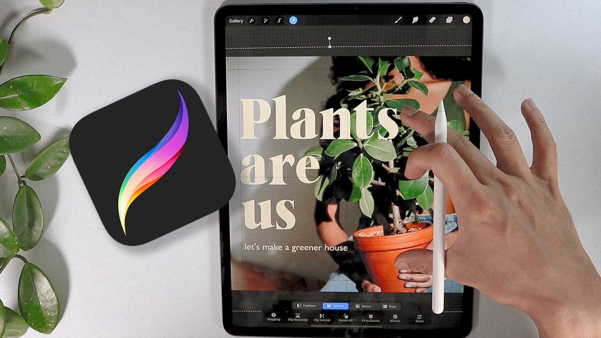
1. Intro: Hey there!: What comes into your
mind when you hear about the Procreate
app? Let me guess. Digital drawing. Digital art. Illustration or painting. Yes, for sure. But what if
I told you that procreate can also make a basic
complex graphic design for any type of content, poster collages,
social media content, even animation, and
the list just goes on. Yes, we can. And that's what
we're going to do today. In this class, we're going
to learn the basic of graphic design using
the procreate app by creating a beautiful poster. Hi, I'm Ryan. And I am a graphic designer
living in Montreal, and I work with
different companies branding and social
media content. This class is for beginners and want to learn more
about graphic designs. All we need is our
ipad pro Apple pencil and procreate app installed. And we're good to go. These are the breakdown of what
the class is all about. First we'll learn the basic
principle of graphic design, also the elements
of graphic design. I will show you my
go to resources to streamline your workflow. We'll be getting
some inspiration. And lastly, we will create a fun project to sum up what
we learned in this class. As we go along with the project, we will touch on the basic
tools, tips and tricks. And how to make our
workflow seamless. And all the while, all the tools and techniques using
the appropriate app. Let's get started and I'll see you on the next
video. See you there.
2. The Project: For your project,
you'll be creating a poster from scratch together. We're going to be making
this beautiful poster. Starting from the sketch all the way through the
advanced details. Then on your own, taking everything
that you've learned, I want you to create
your own poster. Be sure to post your projects down below in the
project section, and I can wait to see
them. Let's get started.
3. Basic Principles of Graphic Design: Hey guys, welcome to
this class and let's get into the basic
design principle first. Before we get into
creating our own poster, I'm going to create
a new canvas first. This is just like a crash
course to graphic design, but we'll make it concise
and I'll give you some example so you will
understand it even more. So it's very practical and
yeah, let's get into it. So we're going to make
it basic for now, but we're getting into
a little bit more. This graphic design principle is pretty much I learned
from design school. This is very much the foundation of what my design
looks like today. And this really guides
me every time I create a content or
videos or anything. I usually ask myself this and do have this
acronym right here. I'm going to just change color. This is going to be the
acronym that I usually put in my head before I
create or even if I created already
content contents. I usually ask myself if these questions or if my
content has a good contrast. Truly the difference between
like a black and white, you can just make a content white over white or
black over black. Because there is no contrast. It doesn't make sense to
make a content like that. You need to have a
little bit of contrast or make your composition pop. And that was contrast
is all about. So we're going to get
into these one by one. R is repetition. Repetition is like a pattern or anything that kind of make it like a signature of
your composition. And these are elements
that you have to repeat two or 34 times
to make it noticeable. A is one of the most important. Sometimes we neglect this like alignment or you can say it like a margin of
your composition. We do it on purpose
because we want to make things balance or
make a symmetry. Is proximity. Actually, it goes hand in hand
with alignment. Balance of everything
in between. So you cannot just put all
the texts in one corner. So you need to have tech
content in one corner. So you need to have
proximity or the alignment. This goes hand in hand. We're going to get
into this first. We're going to get
into contrast. First, I'm going to show you one of my composition that I made. Let's take an example of this social media post that
I created a while back. And as you can see,
there's a good contrast. There's a repetition of elements like those
textures right there. There's a good proximity. There's a good contrast between text and everything.
Everything pops. They don't have
anything that you can't read or you can recognize. There is like a
repetition of elements. Those flowers right
here as you can see. I'm not sure if you can see, but those are just like a
detailed that you will notice. After all the important parts, there's a focal point in here. Basically, the focal
point is going to be phone with the gentleman
right here holding plants. We have this text
right here which is one of the focal
point as well. We have a secondary focal
point right here and a call to action stick example of what contrast is going to be if we don't implement a good contrast. Let's say this
background right here, as you can see, this is still a good contrast because you
can still read the text. But if you put it
just like this, I don't think there's
a good contrast between the background
and the text. That is a good contrast. What I'm talking about, there is definitely
an alignment here. As you can see, I'm going to go to this right here
drawing guide. I did put an
alignment right here. I'm not sure if you can see will change the color for sure. As you can see, I put an
alignment on purpose right here. Elements look or the
composition look professional. And it doesn't just
like you throw stuff in your canvas that
is like alignment. We have a proximity
of everything. There's a certain proximity
between the logo, the text, and some
other texts right here. Yeah, Repetitions
or the patterns behind or the
background, basically. That is the basic principle
of graphic design that I usually use before and after
I created composition. We did repetition desire, like the pattern and different elements that
repeats in your composition. I usually make it more engaging. If you have pattern
repetition of elements, contrast alignment, proximity, we were
able to touch on that. And it's just a brief
graphic design principle. There's quite a lot more. But these are the only one
that I just asked myself, RAP you can read it as one word. This usually makes my composition
professional, engaging. And usually I don't get wrong
with principle in here. And I'll see you on the next video for the
elements of graphic design. So we're going to combine
these basic principle of graphic design and some elements
we can make a cohesive, engaging, and content wise. And I'll see it right there.
4. Elements of Graphic Design: Hey guys, thank
you for tuning in. So we were able to
have a little bit of crash course of what the basic principles
of graphic design. Now we're going to
learn a little bit of a crash course of what the elements of
graphic design are. So there's quite a few elements, but these are the
only one that I usually take into my content. We're going to be
looking into like six or seven different
elements of graphic design. And some of them you might know and some of them
will be like new. But first one I'm going to be sharing is going
to be the shape. The shape will be different. Variation, you can have
like a circle shape, you can have rectangle, you can have squared, but these are the basic
shape that usually follow. You can have different
shape like organic shape. You know, geometric
shape just like this shape is probably the most basic graphic
design that you will use. And the number two is
going to be color one, graphic design elements
that you won't miss even if you're
using black or white. That's still color is, so it
doesn't matter which one. So black, red, you know
different colors as you wish. And another thing is line, like a straight line, you know like a wavy
line or zigzag. Use it for anything. It can have a frame on it, can have like an arrow to it. It's like usually used to
anchor something and like a leading lines or it's
going to be type or text. Let's just put text right here. One of the indispensable
part of making content because you have to have information
in your content. So I'm going to include quite space or basing
in between elements, so important to put the space in between so it doesn't
look crowded. And it's easier to
read If you have like a base between shape,
text and all that. We'll get into some example
in a little bit texture. These are the one that you saw
in the previous video like patterns because
if you don't put texture it looks like
it's just like in, it's kind of basic putting
texture in your design. Usually level it up a little bit like texture over layers and layers so it creates a little bit less
generic because you kind of different touch to it. And lastly, who will
forget a photo or images? One of the most important
part of design elements. So you know, product images, your photo, your logo
or anything like that. So that's pretty much it. The elements that I usually
incorporate before I hand in my composition to
a client or to myself. I usually ask this if I have minimum five of these
into my composition. So let's get into some of the graphic design
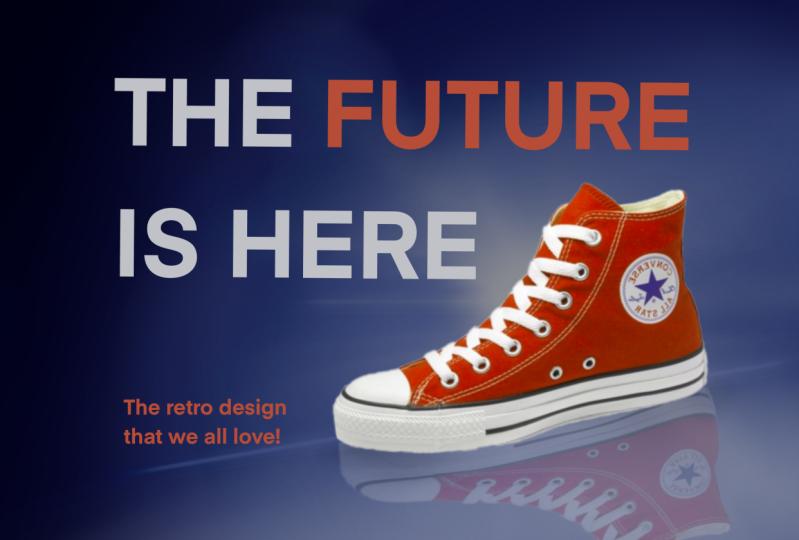
composition that I created. All right, so this is
one of the example, this is actually the one
that I created a while ago. And just to give you
an example of what a good graphic
design looks like. Also graphic design
is very subjective. So some of you won't see this
is a good graphic design, but I find it is a good example is off, we need the shape. So this is definitely
a shape right here. It's a rectangle, or actually it's a triangle shape color, so we have a
discolor right here. This is a magenta color, blue colors and white and
kind of like a dark blue. So we have a warm color
and a cold or cool colors. And usually it's good
combination because they contrast. We need a image. So this is an image right here. The photo that you look at here is definitely image
of a product. We have a good space right
here, texture right here. It's kind of plain texture,
but as you can see, we have a reflection of
the shoe which is kind of like a texture
repetition of elements. We did repeat the
elements like the shoes. We have a focal
point right here. We have a text for sure. This is definitely
a text. Right hand. We do have a line, I believe this is considered line as well
in this one right here. And we have a contrast between the big text
and the smaller text. Looking back, the contrast
is pretty good right here. Because between
all the elements, we have a smaller
elements right here, which is not a problem since
it's not a focal point. This is going to be the
focal point alignment. You can see this
part right here, and this part right here
is pretty much equally aligned and the proximity of
everything is just on point. And that is why I ended up like this because I implemented
the graphic design principle. Some of the elements of graphic design that usually
is going to be the one that we're going to be using when we are going to
create our poster. That's it for this crash cars of elements of graphic design. And I'll see you in another
topic and see you there.
5. Where to get Inspiration?: Hey guy, thank you
for tuning in. Almost done with all the theory
of a good graphic design. We're going to learn
more about, you know, sometimes we have a creative block or
sometimes we have like an imposture syndrome
that you can't think of anything and you're supposed
to work on some projects. So what do I usually do if I
have this creative block or, you know, I cannot
think of any design? I just go ahead and
check what's on B hands. This is B hands right here, so it's a B hands dot. And this is usually where
I found my inspiration. I also go for Bal and Pinterest. These are like three of my
favorite things to look into when I'm having a hard time coming
up with some things. If you're struggling, let's
say you're trying to create a logo design of let's
say logo design. And you can just check on it. And then you can see all
the logo design right here. Not just for logo, but poster for music. If some of your
clients want you to create a music poster
or like an event, you can always go ahead in here. As you can see it, they have good resources to even have a mock up of
how it looks like. We go for dribble, let's say poster social media. This is usually the keywords
that I type in and you can see it's pretty good here that you can put into
your composition. If you're just new
to creating or designing doesn't necessarily
mean you're copying it. Just take some of the elements in graphic design
principle that was implemented in these
different compositions and then you're just going to
put your personality to it. I think that's what's
going on right now. Everything has
already been created. I don't think there's some kind of originality at this point. The only thing
that sets you from different composition or
content is your personality, the branding that you're working and you learn this
along the way. As I did usually the first few years,
it's going to be hard. You're finding your
own inspiration, you're finding your own
style and all that. But along the way
it's going to get better because when
I was starting, I usually create stuff that's already being
created just like this. I usually copy this. Well, I still learn
how to create this. The brain is being
wired to create stuff And also
Pinterest. Also good. Let's say let's look
for T shirt design, Halloween and stuff like that. So let's take a look
at what's in here. You can definitely
just go ahead here and see what usually is good
or what's not good. But if it's here in Pinterest,
they are really good. You just take all the elements
that was implemented here and you just make it your
own with your style. Couple of inspiration
usually will go a long way. That usually is my process. You can also use
Google for sure. They're pretty much
universal with Google. So you can just put
in like poster for, you can just say poster design. Halloween, minimal, depending
on what you're looking for. It's good to have
a specific keyword for you to get what
you're looking for. These are a good design as well. Pretty much it for inspiration. Hope you learn something from this quick one to you
guys on the next video.
6. Go-to Resources: Guys, thank you for tuning in. This is going to
be the last theory that we're going
to be discussing. Before we move on to
the actual creation of what we learn or
implementing what we learn, I'm just going to share
all my resources that I usually use when I'm
creating different content. Since I work as a full
time graphic designer, I only have a few hours to
complete some projects. So sometimes I don't really usually create
it from scratch. I usually source some of my materials just like
on different graphics, images, icons, and all that. So I get some help from
different website. Because if I do
it all by myself, I don't think I
could finish tasks. Usually I get like
different tasks, like maybe ten different
content to make each day. So good thing that I have these different sources that I usually get mostly for free. These are just free.
And some of them I do recommend for beginners, since these are all, some of them are free and not. I've been using Creative
Fabrica for a little bit. I've been downloading
a lot of templates. I also considered their
fonts and you could find different stuff right here depending on what
you're looking for. But mostly I just use fonts because they
have a good fund. We're going to go for font, one of the website that I use
mainly when I was starting because they're
kind of like free mostly for personal use. But some of them you just
need some attribution. So whatever fund you need, you can just customize it here. You can just, you know,
old school can have all this old school and get
Mexican funds right there. So pretty much easy to use. It's called Fun.com They're free stock photography that you can use for
your composition. You don't need to
attribute them since they are pretty much royalty free depending on what
you're looking for. Let's say example, you're trying to get a shoes kind
of good quality, or maybe you're
looking for Halloween. Since Halloween,
around the corner, you can just type Halloween. And you should be able to get some of the
Halloween photos. You can put it into
your composition. Same as pixels. You can pretty much have the same thing.
You know, flowers. You can just type flowers and then you can get all the
flowers that you need. You can also be specific to it, maybe you're looking for
rows and stuff like that. There's definitely rows
here for everyone. So the one that I usually
work with right now is icons into my graphic
design content. So you can just go here, maybe need some check, and you have all the checks. These are also
free at some sort, but this is a good way to
some personalized icons that usually guides your audience Emoji.com So when you use
it into your composition, it's not going to
be hard for them to understand what
you're trying to say. So let's say we want some heart. Yeah, you can just
get this heart right here and you can have this. I just, you know, save them, mainly use these emojis
for like attack. I was surprised that
I have to use this. Mostly because some of my
clients want some emoji in their composition content
just to be more relatable. Colors as well usually
go to colors C 0, 0, L, 0 R, and then I
look for trending colors. And these are all good colors and they usually have
a good contrast. So you won't go with this, so you just have to click them. And then they're a
hex code right here. Rgb, CMYK, Whatever
you need here. I just print screen
this one here and I'll export it to my canvas, and then I'll just
copy all the colors. And another one is
free vector resources. So if you're for
Halloween vectors, yeah, you can have this
vector for your project. It gives me a good result. Since I don't have to
do all of the graphics, you just have to attribute the name of whoever
created this. Is there mostly the
resources that I go through pretty much every day for my
graphic design journey makes my work flow a little
bit faster because I don't have to do pretty
much anything from scratch and so I can work more and move on with
another project. Yeah, see you on the next video where we actually
create a poster, implement what we learn
from the design principle, elements, spiration and all that. I'll see you right there.
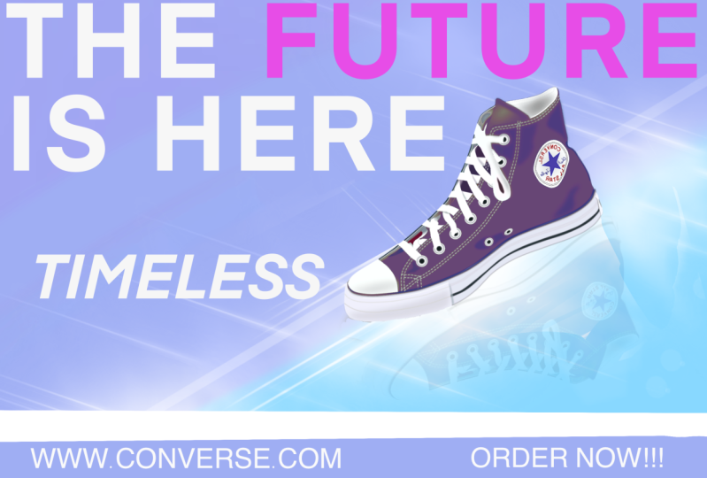
7. The Project: Create a Social Media Poster: Hello guys. So I
decided that today we're just going to
make this poster here. We'll try to replicate
it as much as possible. So let's get started. Exit first into the
gallery of procreate. We're going to get in, we're going to do some screen sizes. You can just click
this part right here plus icon and then you
can see screen size, yeah, we'll black
canvas to work on. So for this one we'll recommend we're going
to go to Canvas. And then we could
turn on the guide, and then we're just
going to click on it. And then we're going to
Edit, Growing Guide. We're just going to establish
like some alignment. We're going to be working on some text images and
different elements. We're going to go for, we're going to go here
on the grid size, you have to make it bigger. You can say I'm
going to the left, actually I'm going to the right. We're going to make probably this one right here or this one, but I think this is
a little bit better. So we can see and we can
also move it just like this. It's like equal divisions
of every columns and rows. I have 12343 by four and I'm
just going to click Done. And we have some, you know, a good understanding
on the framing of the elements so we know
where we put things. And if it's like, if
it's not balance, we can calibrate our balance
and symmetry by theory. This will help us to navigate and put elements in
right places technically, but we can always
break the rules. But for now we're going to just follow this because this is kind of my workflow when I'm
working with poster, social media post and any
other graphic ssign actually. All right, as you can
see we're going to be working on shoes, but feel free to put any
product that you would like. It's going to be the same principles
that we'll be applying, but we're going to insert
our first image first. I'm going to put the subject
first, which is the shoes. And what I'm going
to do is to go to the ranch icon and then you go to Add if you're
out of the ad, because you can see if
it's blue, it's selected. If it's not, then
it's just like gray. So let's go to add, it's photo. All right, so the shoe is here. And we could start
playing with it. For the transform tool, which is this one right here, the layer, you can rename it. I will rename it
to click on here, any part of the name rename, you can just put shoe and enter. I'm going to go back
to Transform Tools. Right here, I'm going
to play with the flip, you can actually flip it to
orient you want to flip it. You can even fit to
canvas just like this. You could manually also
transform it like this. You can do, make sure that it's actually on uniform
because if it's like free form especially distort like that, it's
not going to work. Free form it seems like it's doing it but
if you do like this, it's going to be like distorted and it's not equally
and it looks weird. If you just leave
it to free form, I'd recommend that
you go uniform. So whatever you touch those
points right here or nodules, you're sure that it's
not changing anything. Okay, So I'm happy with this. I will probably rotate it manually with this green
points right here. That's when you can reach rotate your subject or your images or anything that's
on that layer. You can also rotate
it just like this, but I feel like I want to
manually rotate it myself. And you can also do
with your two fingers, you can like squish it just like this to make it
bigger or smaller. Just reminder when
you're working with images right
now it's like this. You can change your
background color on the layer like this. You can just pick which one
or you can disable it and you can make your own background
dropping just like this. The only thing with the
background color right here, you cannot make
it like gradient. Yeah, I actually if it's
like a dynamic pose, I prefer to have it
on a separate layer. But feel free to
go ahead and make your background color on
a background color layer. I'm here, I'm going to hide
the shoe first because I want to make a background
color gradient, I use a brush. I usually use the air brush
because it's a bigger brush. I'm going to go with blending. What do they do?
Medium hard blend. And I'm probably going to
add a blue color right here. Maybe just like this, you reveal the image,
it's kind of red. You can also change the
subject or the color of the subject with going to
adjustment hue saturation. Make sure you select
the shoe layer first and then you can change the color of your shoes
specifically for this one, since it only has
like one color, will be easier for us
to change the color, I'm going to go to
adjustment human saturation. As you can see, it
changes the color. It's pretty convenient
if you want to change the color at some point. If you want to experiment, I usually do this
but not too like, as stream, like super saturated. I usually just make it
a little bit natural. We're going to go in the blue. It can incorporate it seamlessly with this one
right here, don't worry. Our background, I'm
going to change the background so it's a
little bit more dynamic. It's not like blue. I'm going to go back to
the layer right here. I'm going to go another, get the same brush, but I'm going to go for
like purple here. I'm going to go brush it
here, something like this. Don't worry about that yet, because we're going to blend it. If you go to the adjustment, there is something
called gubler, your background just like this, it has a little bit, but if it's too much you can go back and you can change thepacity
to something like this. You have to go back to
the layer and then we can try to make it a little blend here and then you go back to gush and blur here. And then you can just
blend it just like this. If it's too much color, you can lower the
saturation of the color. With this, it's not
too much distracting. You can all the way like this. Or if you want to go overboard, you can always change
the saturation. But I think I'm going
to go with this for now since it's just, you can also change
the brightness if you want it very dark. Just like this. It's procreate, has a very flexible way to go around color
that you want it. We're going to make a mirror
like glass here and then we're going to make a
shadow of the shoes. It looks like it's
reflecting something. It's like a real glass. I'm going to make a
new layer right here. I'm going to use a
different brush. I'm going to go for, I think it's a luminance
and then flare. Since it's a new layer, we can always modify it. I'm going to go all the way
here. You can test it out. Just like this.
It looks like it. Looks like it's
going to work. I am repositioning it just like this. All right. I think
it's going to work. We're going to move the shoes. It fits into the glass
effect, It's really sharp. The layer, I'm going to go
ahead and then the color, it's not too distracting. Then I will copy the shoes
right here. Duplicate it. And then I'm going to
go something like this, but I'm going to flip it as
well, something like this. And I'll put it somewhere here. If it's too big, you
can make it smaller. We're just going to put
it like this for now. If it's too much, you can
always make it smaller. Then we could also
distort or warp it. It looks like it's really there. We can also put the, this layer below then it's
easier for us to navigate. You can do free form
just like this. And I'm going to warp
it so it goes here. Because usually that's how
like reflective shadow works. I think that's good. We can lower the opacity of that shoes, it looks like it's
reflecting pretty good. Use the opacity a
little bit more. Warp it again because
it looks like it doesn't look realistic. Maybe we could add mesh. Yeah, I think add mesh is going to work a
little bit better. Add a little bit of text
right here. Add text. We're. Wrench icon right here. A text right here, texture. To modify your text, you can just select all of it, just like this and
then select all. Then you go here like the A, think it's the lighting
that has to be fixed. Also the alignment. I'm going to put it to the left because was like I
don't like that. Make it bigger, just like this. If you don't like
the font style, you could also Super Bowl, you can also choose your font
style here style design. So you can pretty much navigate how your text is
going to be styled. Here, size, you can
make the size bigger. Kerning is like the space
between letters tracking, as you can see here,
between words. I believe the letting is what
we just did, the opacity. You can change it
here if you want to make it all caps or not. Here, these are just alignment. You want to underline it.
This is like outline. This is something
like text vertical. Never use it, but feel
free to use that there. The style of your text. It depends on the font
that you are using. They probably have
different style, but I'm going to be
using Future right here, so it's a little bit bigger, so I'm going to use bold. They have different style
here, so that's how it is. And we're going to just
put it right here. I think that you can add
existing text here on the layer. You can just add a text. Select all of it and go
back to this part here. You pass it, I'm
going to put it 100. It's a little bit more contrast. I'll put it on top
of everything. I think the shoes are very big, so I don't think
that's too good. I'm going to select
both of the shoes. Hopefully it's going to be okay. Make sure that you're aware of this since
it's already been cut. We already rendered it. I'm make it maybe
just like that. We're going to, let's see, I'm going to rename it as light. I guess I will move the light a little bit
lower, something like this. It still look like a mirror. Let's see if I
could modify this. So far, our composition
looks good. We could definitely turn off
our guidelines right there. We're going to go add canvas disabled for now so we have a clear view of what
we're working on. I'm trying to make the background a
little bit less right. I'm going to go here
adjustment actually, I'm going to go
first to the layer. I'm going to rename it
as PG or Background. I'm going to decrease the brightness,
something like this. You can see it gives it
a little bit more pop. You can always modify
it as you wish, but I feel like I'm going
to go something like this. The light here, I'm going
to change the brightness to less, something like this. I think it looks great. And I'm just going to make the text stand out a little bit. We're going to
emphasize some letters or some words in here text. We're going to
emphasize the future to a different color which is, I think this one
is going to make stand out quite a bit,
but not too much. Let's see how it goes. I'm going to fix some
alignment issues right here. We can even make it bigger. Now since we make the
shoes a little bit lower. Quick dip we can
go snapping here, magnetic and snapping
when we move this give us some computation and we could preview it again. And I think it looks good. Okay, there's just
a problem here. I think the text shifted a
little bit because I think, okay, to leave the space
there and that should fix it. So far it looks good. We can enhance the
shoes right here. It just has a little
bit of more pop. What I'm going to
do, I'm going to add another background
after the light source. And I'm going to go for airbrush and
probably I'm going to go for soft blend all
the way up I think. And then decrease the
opacity as you can see, creates a bit more subtle glow. But we can also test it out
first, something like that. But I think it's the
opacity is too much. You can add a little
bit of text in here, any text that gives you a
little bit more context. To do that, we're going to
add another text right here. We could add text. I
think that's good. The retro design that we could
position it probably here. Yep, I think that's good. Usually if you
pose it somewhere, there's like a fine print
or to contact or how to get into this promotion
calligraphy on line. This color right
here. You can sample this color using your fingers. Just drop it like that. And you could also
create a new layer. Then you can just put it right
here with your one finger. It aligns pretty well. You can just drop some color. We can make it a little bit
bigger, just like this. Now we have to do the
free form so it's not like uniformly stretched
or something like this. Yeah, something like
that. You could put some more details here, but if it's too much, you
can always make it smaller. You can copy here, duplicate it. You can put it here. Make sure that the layer is
on top of this, it showed up. I'm going to use my pencil. Drag it on top.
Website here, I guess. Converse.com I think it's big, just for very fine details. Duplicate it again. Maybe put your social
media right here slash sometimes they do put
like a QR code right here. I'm going to put a QR code
that this is the QR code. It doesn't have a background, but you can add the new layer, put this layer below the
QR code on the line. Can just trace this,
maybe see like square, then position it just like
this and just drop the color. And that's a good QR
code right there. Usually they do put
QR code now because it's easier to navigate going, just center it here. Usually a good poster
or a campaign. If you remove this
part right here, it looks like I'm going to
group it, so it's easier. It looks like it's just
an ad or a poster. You can just navigate
your shoes right here, you can put it a little
bit lower, just like that. Or the future a little bit
lower, just like this. This is quite a good
advertisement or a poster. If you remove this,
you can change it to whatever the product
that you're working on, and I think it's
going to be okay. And as you can see, we
were able to make this. It's quite easy. I hope you will try this and you learn
something in here. You could actually save this. So you could print it or
post it on social media. You can go ahead and click
the ranch icon share. You can go, I will
recommend saving it on PNG. The quality of the image
is a little bit better, a little bit crispy and sharp. You can, as you can
see, it looks good. Let's try to post
on social media. This is how it looks
like on social media. As you can see, it looks good. I can't even post
it or print it. Hopefully, learn something here. And I'll see you
on the next video.
8. Closing: Thank you!: Hey guys, Welcome back. This is actually the
end of the class and thank you so much for
spending the time. I really appreciate it. And I hope that you learn
something new here and inspire you to create your poster
using the procreate app. And I can't wait to see
what you come up with. And I'll be happy to see
your beautiful project. And if you have any
questions and clarification, feel free to send me a message. I would appreciate
if you leave me a review or feedback how the course is and so I could improve my teaching
in the future class. And I'll see you on
another class by now.
 Bryan C'ngan, Graphic | Web Designer