Transcripts
1. Hey there!: Hey there, and welcome. Hi, my name is Brian. I'm a content creator
and graphic designer. In this class, we will be
working our magic to create this trippy surrealism poster
using the Procreate app. I'll share with you some of my poster tips and
tricks and ways to arrange everything
and not to get lost in the abundance
of all the elements. We will create two
poster compositions that are out of this world. We will apply some basic
graphic design principles to create a good contrast, color harmony, and balance of all elements to create
history in a poster. Let me point out that this might look complicated than it is, but don't worry, just believe in the process and
go with the flow. This is an intermediate class, but if you're a beginner with a good understanding
or basic of Procreate, I'm pretty sure you'll
be able to follow along, so grab your iPad and
let's get started.
2. Project: [MUSIC] For this project, you'll be creating a
Surrealism Poster of your choice or you
can follow along and use all the assets
that I'll be providing in the project and resources
tab down below. The main goal is to
play with colors, movement, composition, and cutting images, blending them and making them
fun and trippy. Once you've finished, go to the project and resources
section of this class and click on the
Create Project button and share what you've made, and tell us a bit about
your process and results.
3. Resources: These are my go to website
that I like to go. This is Unsplash,
and pexels.com, I'll also go for pngimg.com to have some
transparent images, these are all free, all you have to do is
to attribute them. Now, let's get ahead, I'm going to go type in
a sample images here, you can pretty much select anything that's pretty
interesting or this one. I actually like this one, so I'm going to download it, and you can easily download, you can do that, but I
pretty like to just go in, and then add to photo. If you want to print it out, make sure that you get the
original size somewhere here, so you get the best
quality of the images. We can also download
that by this. Let's take a look at Westphalia, because I usually incorporate
a lot of subjects as well. This one looks good. I like to have this color
as much as possible, like the orange van, blue, or orange and teal look. Usually they gave me a lot of flexibility in terms of design, because they are really,
really natural colors, that goes with all the
composition I'm doing. I like this one as well, so I'm going to just
get it just like this, and then I'm going
to add to photos, and it should automatically be saved on my gallery of photos. It's easy for me to
incorporate all the elements. These are great subject, and what are we going to do, we can just keep going. I probably will put a bird
there just to give interest, so these are nice. This one right here,
this kind of free, so you can just get that part, and pretty much to the same, I can just add to photo. It should be on the photo. This is a transparent
background, you just easily incorporate
it into your composition. That's all there is for here. I'm going to think all the
images for the project of this class so you can follow along, and
I'll see you there.
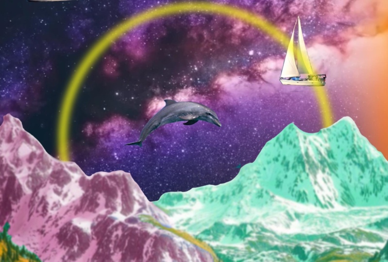
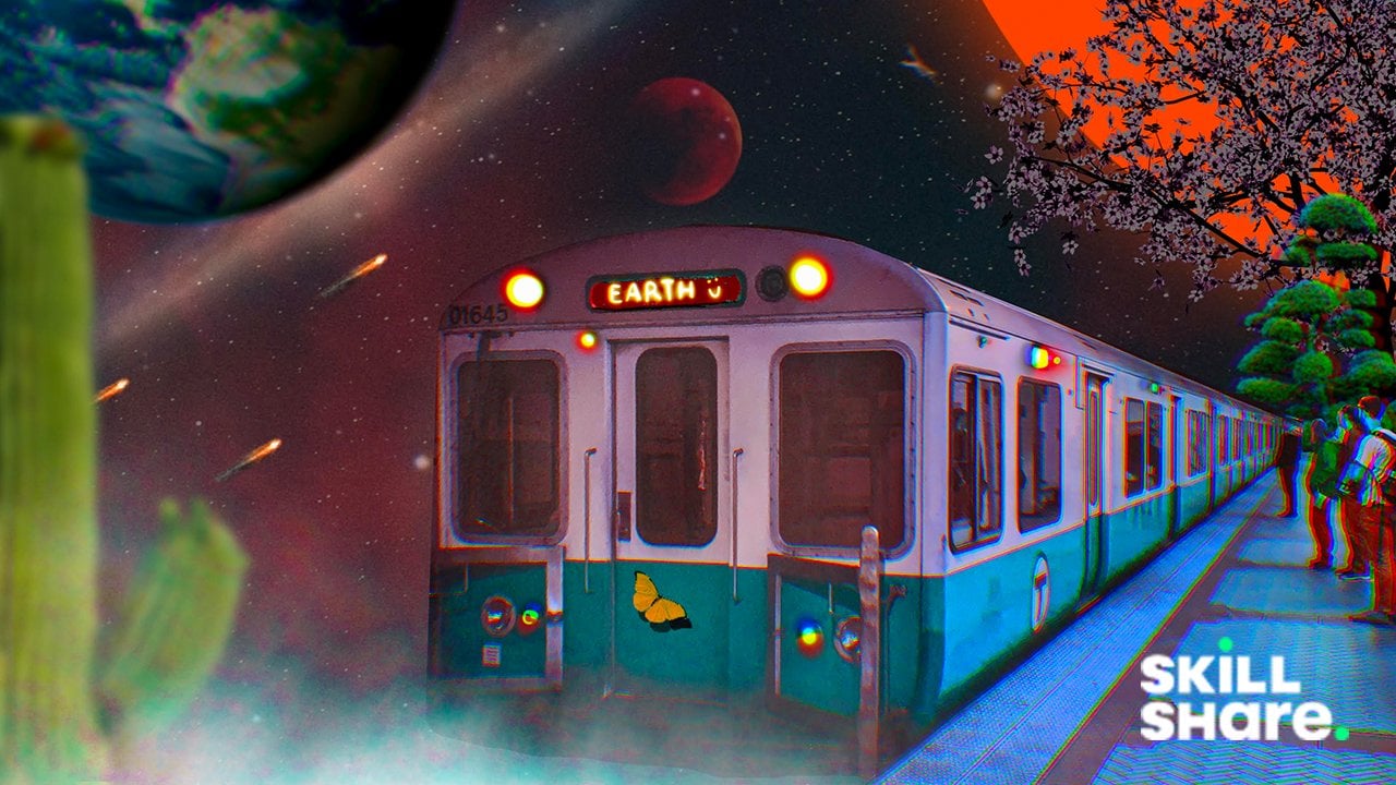
4. First Poster: We can start
creating our Canvas. I'm just going to
go ahead and create a Canvas that I could
print after this. I'm going to go 11 by 17 inches. I'm going to go for 250. This is our Canvas. It's 11 by 17 and we
have a DPI of 250, so it's high-quality, so we can just print it out. You can also crop this, and then you can just post it on your social media platform. I ended up getting this image right here
because I think it has a good opportunity for me
to manipulate the image. I can incorporate some of background images and
click them together. What I'm going to do, I did
share the link actually here. If you go to the restores
is in materials, so you can just get that. I'm going to import our
first image right here. I'm just going to go
to Action and add it, so insert photo, so it's quite nice
color already, so I don't have much
things to do here. All I have to do is to
make sure that the colors and all the elements and the patterns and the
textures goes with this one. What I'm going to do now, I'm going to go cut
the background. I'm going to go
selection right here. I'm going to go try automatic
and see if it works. I could increase the
threshold right here. As you can see, the threshold
is going up. That's good. I'm going to go get all
the blue ones in here. It's always tricky to have
those extra blues here, so I probably leave them there because it's
being problematic. Let's see how it goes. I'm just going to invert it. I'm going to go to the layer here and I'm going to mask it. I didn't delete anything. I just hide something here, so I can just turn
it back on and off. I could probably trim those colors right
there if I want to. But that's the
first step so far. Then I'm going to insert
one of our images here. It's a cloud, just going to
position it just like this, just to cover something here. The cloud's right here, I'm just going to rename
it quickly, cloud. I'm going to put it just
below the first layer. I'm going to rename
it as walls so I can easily get into this. Although you can see
the thumbnail here, it's also a best practice
to rename your layers. I will just position it
just like this to somehow cover up some space
here because we have a big canvas
size right here. I want to make sure that they
have a good proportions. I will remove the background as well so I could
get the selection. I probably will try automatic
again to see if it works. I'm just going to invert it. Again, I'm going to mask it. I could even position it
again like this so it has a bigger atmosphere
and all that. Also, insert another image
of this one right here, I think it has a good contrast
with what's going on. You can twist and
turn it, reverse it. I need to put it just
below everything, so just like this and see
if it has a good contrast. It's overpowering everything. It's dark here and
here, it's super white. I'm going to go to
the cloud layer, I could probably
go to adjustment, I could reduce the brightness, or I could put color, probably I'll go
for orange tone. It should give you
some orange look and something like this. Think I'm going to go with that. It's not that colorful. I'm going to go
again second time. I'm going to increase
the saturation just to give it more
like a pump in colors. I could probably increase
something like that. I'm going to apply
another adjustment, which is the
chromatic aberration. It's going to give
you more colors and holographic effect
if you do that. It gives it more
a trippy look and that will give you more
interest in the composition. I'll probably do that and the same thing with the
van and probably will apply a little bit of chromatic aberration just to give it more like a trippy look, not too much because
you don't want to have super blurry composition. Something just like this
to give it a little bit of trippy look because that's what we're aiming for
at this composition. I like that, it's getting there. For this one, I probably
want to go ahead and correct or put some
adjustment here as well. Probably I'm going to go something not too dark because right now,
it's super dark. I want to make it a
little bit like a muted black and I can
go for saturation. If you want to have different
colors and combination, I think I like this one here, but I'm trying to
find a color that suits with the blue tone, probably something like this. I'm just going to go play with the saturation and the
brightness and hue. I'm just looking for
a good tale look. I think that's good
enough for this one. I'm going to apply another
chromatic aberration again, just to match with
the overall looks. As you can see, there's a chromatic aberration
percentage in here. If you go super extreme, you can see a lot
more colors to it. I guess that brings a
nice holographic effect or more trippy because
you're getting all these different
colors and whatnot. I guess I'm going
to go with that. I'm going to apply probably motion blur just to give it a little
bit more interest and movement just like this. Just to give it a trippy effect, get another layer
but below the skies, get the color of this car
right here, the orange. I'm going to go get
the monoline brush. I'm going to put the layer just above the sky so
it shows up here. I'm going to go put
an orange circle. I'm going to drop
my one finger right here so I can get
a perfect circle. I'm going to drop the color. I'm just going to position it
to where I wanted it to be. Something like this
probably here. I will actually get more
trippy with the trees. I'm going to go to
the layer mask, I actually going to combine
the layer mask of the van. I could just get the liquify tool and
then I could probably experiment with the twirl
or pinch and I could make the composition
a little bit more interesting and trippy. I think that's too much, but it just gives it more
movement of some sorts. It gives it more inviting and a little trippy if I say so. I'm going to go
add another image right here just to
give it more interest. I'm going to put the
birds somewhere, probably touching the
clouds just to give it more interest onto what's
happening into the scene. A little bit bigger so it's more catchy to the eye's color grade, this one right here as well. Let's see if we can get
more interesting result. We could even pump
up the saturation or we could find another hue
that fits into the space. I think I'm not going to do that because it's going to
be too much colors. I'm actually going
to add a layer. I'm going to put light
flashing here just to give it more interest with the van and so I'm going to add layers. If you go to luminance, it's one of the free
brushes on Procreate, it's built-in light pin. We just need to
get probably white here and then we
could blend it with some nice glow of the lights here just to give
it visual interest so it doesn't just
look like a static. I'm going to blend it screen. We're good with this
composition right here. We could go for
another composition, something that's moving and some more trippy than this one. I'll see you on the next one.
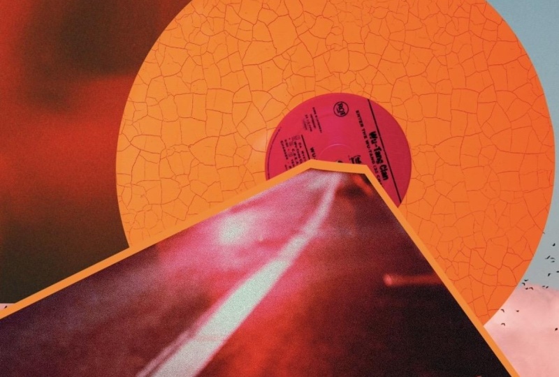
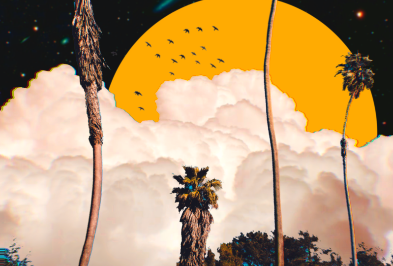
5. Second Poster: We're going to go ahead and
create a new art board. I'll be using the
same art board, which is 11 by 17. I'm going to insert a
couple of images that I found on Unsplash
or Excellence. I'm going to go
insert photo here. I'm thinking just
to make like this. What we're going to do now, we're going to
mask it and delete all the axis and a
part of the photo. I'm going to go for free hands and hopefully I'll get
all the good side. We're just going to go
ahead and start here. You can do this pretty much a couple of times
to see if you get it right and I'm just going
to move it just like that. I'm going to finish it right there and I can proudly
close it just like that. I'm going to feather
it out quite a bit. Let's see the result here. I'm going to go for layer 1, and I'm just going to mask
it and see how it looks. I think it's okay
for now since we don't have anything
on the space. I'm going to insert one
of the photo to make this composition a
little bit more lively. I got this cloud here, so I'm a fun of clouds and I'm
going to just put it here. I will put it just below
the background color. Something like this, but
I'm not really a fun. That's one of the things
when I'm doing collages, it usually doesn't go
for what I envision, so I just deleted the photo. I'm going to reinsert it again. What I'm going to do, I'm just going to reduce the opacity of the photo so I know how
to position it correctly. Hopefully that helps. Make sure that this
part right here goes all the way here, so it does not look
like it's pretty cut. If you can move around
just like this. Ensure you have a good
space here as well. I will just probably
do this here. I'm going to twist
it a little bit so it has more intriguing point. I probably going to go here. Now let's see if
that's going to work. I'm going to increase
the opacity to 100. Go to the selection
again and then try to roughly trace the path. We could always modify it. I will just mask it
and see how it looks. I'm going to go to airbrush
and I'm going to go for a soft brush and make sure
that you're on the layer mask. Let's try to soften the edges and probably bring
back some details here because I went overboard
and delete some good stuff here and you can just
switch to black and white. You can take your time
here because this is actually the define detailing
that we're going to do. [MUSIC] I just have to remove
this part as well. I think I should have done that when I was doing the mass. [MUSIC]. I think we're almost done. [MUSIC] I think we have a
good point right now. I know it still
doesn't look good, doesn't look right but don't worry, we're
going to get there. Right here, I probably
will increase size. Probably going to go like this, just above the cloud layer. Probably going to go for orange, just like what we
did in the last one, just to give it more
visual interests. I'm going to go "Edit
Shape", "Circle", and make it a little bit
bigger, just like this. We're going to fix something
here because right now this one looks odd here. What I'm going to do,
I'm going to go to this layer again and I'm going to go bigger
here, something like this. If you go to organic
on the brush library, there's a rain and this one
will give you a brush for a cloud and that will give us opportunity to hide some
imperfection of this collage. Let's try that. Add a new
layer first and then we can start putting some
clouds right here, different shape
and we can always change the brightness
of the cloud to something super bright so it blends perfectly
with the atmosphere. Change the opacity as well. You can also use the
cotton here if you want. It's a different
texture as well, but I think that it's too much. I'm just going to go
decrease the opacity of the clouds layer. I think that's good enough. We can change the color
of the orange here, because I think it's
to unsaturated, so we're going to
saturate it quite a bit. We can even change it to
something more darker. We can even play around with it since it
has its own layer. The thing that I
like to change is to color grade this image right here because it doesn't
really go with the flow. It's super unsaturated. What are we going to do here we can pump up the brightness. We can saturate it so it gives it more of an
orange and teal look. We can start manipulating
the hue here. We could even go
for curves here, and we can start pumping up
the highlights of the photo. The thing that I'm
going to do now is the background image, because it doesn't
really go with the flow with what we have right here. I'll try to change it to some teal look that
goes with the color, but not too much. I'm going to just increase
this one right here. I could increase the saturation, increase the brightness, or decrease it,
something like this. I think this is going
pretty good right now. Added this part
right here because I don't like the thing that's
hanging right there. I probably will go
back to the brush. If you go to your recent, you still have the recent
brushes that you used, so I'm going to go use
the medium brush here. But I'll make sure that I go to the layer mass of this image. I just want to connect
something here. Found this one as
well on Unsplash. I just get rid of
the background. I will use this
selection tool freehand. I'm going to go start here and
point this one right here. This is good for a
geometric shape. [MUSIC] I think we're good. We can just select the layer
here and we can go mask. I could just put this
one right here just to give it a little bit more
interests and whatnot. It's like a State band. I will just color
grade this one right here because I want to
make it orange as well. I'm going to merge it, modify the color so I can just go hue, make sure that it has the same
color of this one [MUSIC] I think this is good. I think that sets the tone. I could even
duplicate them here. I'm just going to
put it right here. Birds are going everywhere. I think the message that
I'm planning to say here, it's the end of the world vibe. I can gush and blur this
here so it gives it some illusion that
they're out of focus. I can make it darker so it pops even more because the original color
doesn't really pop much. Doing this make it a
little bit brighter or darker depending on
what's going on. It just gives it a
little bit of interests. I could probably decrease the opacity here because
it's too much for that, but it's still a good way. I will increase the lights
of the car right there. There's a little bit
of life going on. I will use the light pen and I could use some
brighter color here. I'm just going to
lighten up those cars, [MUSIC] changing the color as well. [MUSIC] We created something that's similar of what we
did previously. This is more calm and relaxed. This is more end of
the world thing, but it's still a dreamy vibe. It gives opportunity for you
to put something else here. You can even put
different texture, but I like this composition
just because of the colors. There's movement going on, there are birds around,
a statement here. I hope you like this
composition right here and see you on the next video.
6. Thank you!: Hi again, and thank
you so much for spending your time with me
and watching this class. I hope you enjoyed it
and learned new things inspire you to create
Surrealism Poster. As always, I'll be
here waiting to see your beautiful project. If you have any
questions or something, feel free to ask anything and
I'll see you on next one. [MUSIC]
 Bryan C'ngan, Graphic | Web Designer