Transcripts
1. Hey there!: Oh hi, hey there. My name is Brian and I am a content creator and graphic
designer here in Montreal. In this class, we're going to learn more about
digital collage. We're gonna be using
Procreate here on the iPad. And this is actually
my fourth class of doing collages on Procreate. Think this will be my last
class for collage. Maybe not. I don't know, a lot of fun
creating this class for sure. Gaps in this hazard would be creating three different things. Yeah, three different
composition. First one is gonna be kinda
like a stranger things. And you will learn how to turn the images into a night mode, which is very interesting, different light
facts and yell out of this cloud compositions. And the next composition
that we're going to make, it's gonna be kind of like clouds with light's
dropping down. Third one is going
to be kind of cars, roads in different elements, always going to
be spacey kind of space vibe because I'm
into that kind of allowed. I hope you will learn from it. I can't wait to see
what you come up with. And definitely I'll be
providing all the assets that we'll be using in this class
so you can follow along, and this is definitely
a self-expression. Let's go ahead and dive into, and I'll see you there.
And I'll see you there.
2. The Project: For this project,
I invite you to participate and take advantage
of the free resources. In the Resources panel. You'll be creating a digital
collage of your choice, or you can follow along. The main goal is to
play with colors, movement, composition,
cutting images, blending them, and consider this as a form of
self-expression. Once you finish, go
to the project and resources section of
this class and click on the Create Project
button and share what you've made those a bit
of your process and results.
3. Where to Get Images?: Hello guys, and welcome to
this first part of the class. And this part, we're going
to definitely don't miss this part because this is the
foundation of our collage. Alright, so it's
gonna be how to find your images and your
assets for free. So the first thing that I
recommend is actually Google. You can pretty much
find everything here. But I suggest that
you go back souls to Unsplash ENG IMG and Deviant Art first before
you get into Google, because google is gonna be the last resort to
take a look at clouds. These are clouds,
but sometimes they are not supposed to use
them in production. So I think that you
have to be careful. You can actually go
into filter right here. You can select HD right here and see you get the
highest definition. As you can see, it's all license of all, it's better you go to these free stock
photography right here. Sometimes they have
a little bit of requirements like you put
their names if you want to post it somewhere else or
if you're selling it in digital form or in
printing Pexels. Unsplash, also Deviant
Art as well for the PNGs. These are like,
let's say example, we can look for maybe
waves and stuff. So you can search for ways and
you can have all this one. You can even select what
type of resolution to need. If you want to original one, you can select it and
go to the smallest one. Given unsplash.com, you can have all these good
resolution straight here. You can just cut them are
blending into your composition. And you have all
this planet and you can have the original size, which is a pretty big size
for this kind of thing. And you can PNG IMG.com is sum
it says my go-to for PNGs. Let's say, let's go get a cat. All the cases already
been cut here. So if you want to do
a collage with cats, this is gonna be the best place. Sometimes they're
not good qualities, especially you can see the
resolutions right there. It's 557, so that's
not a good resolution, especially if it's
the focal point or if it's your domain subjects. So this is okay, I guess you just have to look
which one is the best one. The higher the quality or the higher the
resolution means, the higher the quality is. Just that. And Deviant Art is
actually also a PNG. Let's say we want to, we need some trees, PNG and Deviant Art. You need to register
before you down, you can download these assets. These are PNG, so you can
just download them and then you can just cut some of these and then put it
into your artwork. Basically, these are the
only one that I consider. If you have something else
that you can recommend, please feel free to go on
discussion and post it there. I'll see you on the next lesson.
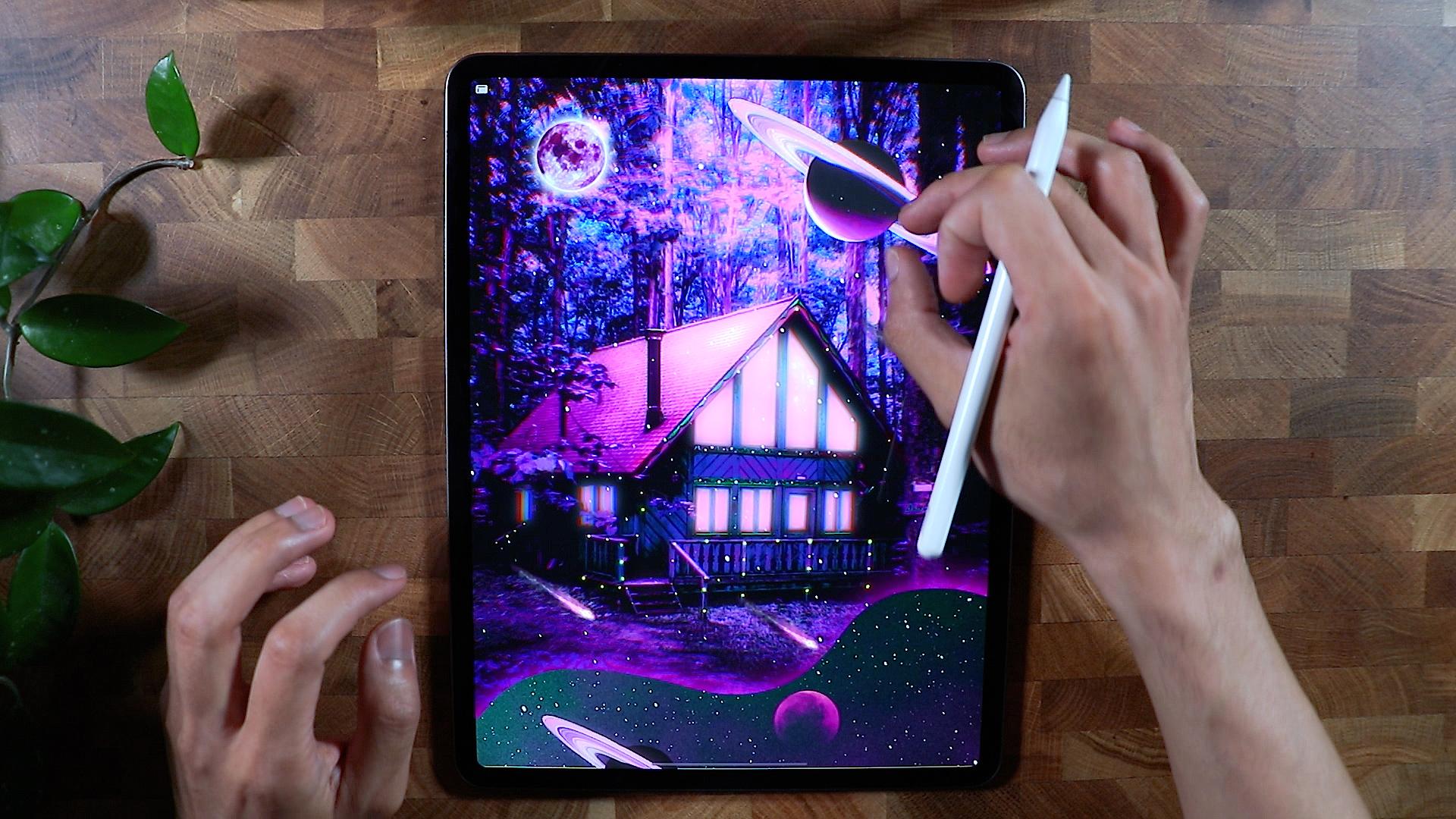
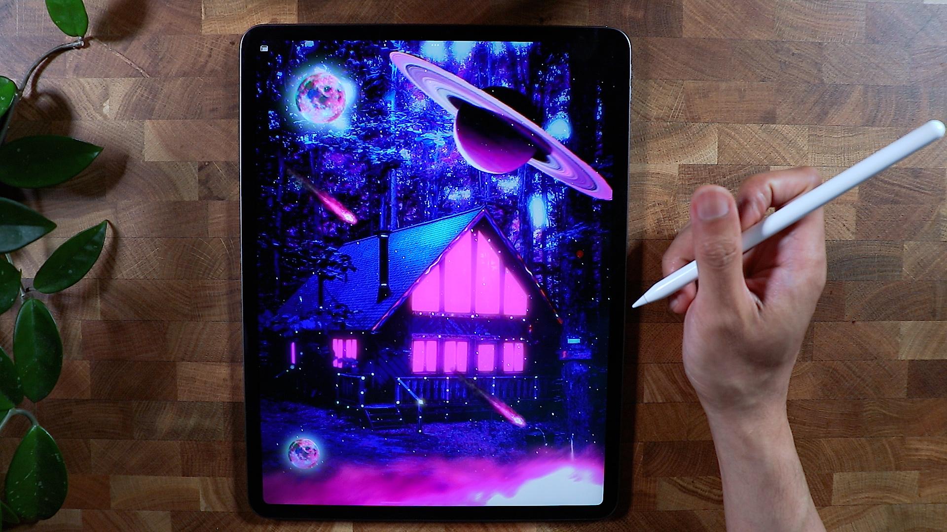
4. First Collage - Part One: Hello guys and welcome to the first collage that
we're going to make. So this is going to be really similar to
what we're gonna do, are pretty much done with it. So we're just going
to recreate this. This is kind of like
a stranger things, kind of collage posterior
but also like dreamy. And what I was looking for for this kind of colored tones
is kinda like spacey. And just look at this details
right here I have this. I'm not sure which one is this, kind of like Saturn. I put some moon in a couple
of like overlay stars. And Amanda shall lay a
little bit brighter. So it looks more like
Jimmy, trip people up. Let's get started with this. I'm going to go back to
my gallery right here. And I'm going to create
a screen size of, yeah, this one right here. You can see that I'm going
to insert our first image. So I'm going to hit the
wrench icon right here. Insert photo. Okay, So this is gonna
be our main image. I'm going to just
position it carefully, make sure that I have my
art board filled with the main image and probably will scale it a little bit
more just like this. And I think this is good. I want to do a new
layer for this. A thousand ways to color grade. I will just use this technique. They use a kind of
magenta or purple color. And I'm going to change
the blending mode to probably overlay
something like that. And I'm going to decrease the opacity to why I
wanted to achieve. So this is one of
the ways that you can also color
graded and all that. We're going to duplicate
the main image first. I'm going to just also
rename it to main. And I'm going to merge them
together and I'll try to color grade right now since I already have the purple cast, I could just kind of
like maybe increase the saturation or decrease
it or color balance a first. So there's a lot of
ways they can do this. Probably gonna go mid
tones here and we can go something like this. We're just going to fine
tuning it while we have here. So I want to retain
this red right here. So you can also create
your own color palette. But I think this
is good for now. And we're going to
pump up the colors on. If you go to Adjustments,
there's a curve. You can select the
colors you want to achieve where you
want to change. So I'm going to go
for gamma first. I'm going to add
points right here. So what this curve is doing is, you see the two
points right here. This point is actually
the highlights are the brightest on the specific we're talking
about the chalets. So these are the
brightest of the chalet. So if you put more
points in here, you can hit the
highlights and add colors or make it brighter
or darker like this, so it gives you a
different colors. So this is purely experimental. Couple of points in here. You can just specific
with red if you want, but we'll see what's
going to happen here. I'm trying to make decomposition bit darker
and a little bit subtle. So this is getting
more interesting right now because we're
getting kind of colors. So the red is the one that
we're targeting right now, lower the colors and just retain this
highlighted right here. So as you can see, if I go like this, I don't see the red anymore. So I want to retain the
red because I liked it, you know, casting when
we darken the image. So I'm gonna go for a green. Let's see what we can do here. So the green, we don't
really need the green, but then we're good to blue. Add couple of points here. I could go pump
up the blue here. And I think this is good. And we can start going
for another adjustment. We're gonna go for
hue saturation. You can start darkening
the composition right now. Something like this,
but not too much. Slowly changing it and see
what's good or what's not. We have been cast right here,
but don't worry about that. We're going to do
something on that one, and that'll be our base color. The next thing that
we're gonna do, just duplicate this one for now. And I'm gonna go
get the selection. We're gonna get all these
windows right here. So what I'm gonna
do, I'm gonna go to the selection,
make sure it's ad. So we're continuously selecting a part of the image
that we need. So I'm going to go start
from here, put some points. This is actually
the starting point. So I'm just going
to go continue. And you can see this
moving a broken lines. That means it's being selected. And once you don't see
those white lines, it means you're good
so you can move again to do your next selection. So this is just going to point
a to point B to point C, and then going back to point a. You can see here it's quite easy because we're just pointing and the shapes is very geometrics. If you didn't hit this part
right here like this one, it will just continue
adding more selections. So make sure that
you get this year. This is actually
like ending a loop. You don't, it will
just continue and it's not gonna be good
for a composition. I think there's one more here. So I'm just going
to get this part and we should be able
to finish this up. We're able to get
all the windows of the the chalet or the house. I'm going to use my three
fingers here to swipe down. I'm going to copy and then swipe again like this and then paste. And you should be able
to see this right here. So we did select it, duplicate this one right here. You can turn this into light's coming up from
the house on that layer, select and you can
go Color Fill, it will fill up with this
color that you just selected. So it's a good start and we have a backup right here
just in case on top. And then we can decrease
the saturation. So we have something going
on right here and you can see there's kind of like
artifact that was left. It looks a little
bit more authentic. And on the, this one right
here, I'm going to rename it. Light. Also need to rename it. Like to. You can use the
bloom feature here to make the light
a little bit more. Maybe just a little
bit of caste, or you can change
the blend mode. We're gonna go for
hard light tray here, so we have something
going on right there. We can also bloom it and
think we can add one more. And also the section are
really hard or sharp edges, we can actually
make it less sharp. And maybe like 2% same
as the light here. So I'm gonna go
Gaussian blur it. Something maybe 3% error. We can bloom it
again to save desk, but not too much. I think that's it for now. And then we can work our way with the main image right here. So I'm gonna go probably use the bloom feature to increase
how extraterrestrial life, but I'm going to increase
the saturation as well. And probably I'm going to
go for color balance again.
5. First Collage - Part Two: Now we're going to
introduce blue. So it adds more, kinda nice contrast with
some of the colors. I'm going to go for the shadow. And I'm going to introduce
a blue tone, not too much, but targeted
shadows, the darkest part of another composition
that's being targeted. We can go here. And it gives you a green cast, which I'm not really
looking forward to. We can go to the
highlights as well. We can make the magenta. Maybe. You can see it gives
a color to the brightest. We're going to play with it. I didn't like to have
those magenta color. There's just giving it more
cohesiveness to the image. So I'm gonna go probably curves. I'm going to go with the red, and I'm going to just do
some adjustment here. Probably the highlights. I'm going to increase
the highlights, this one right here to
enhance those color. Go blue and get some
interesting color on, probably under midtone
and the dark tone. Lastly, we're gonna go
to gamma and let's see if we can get some
interesting result here. This is going crazy. Yeah,
I think this is good. I want to make it a
little bit more darker. So I'm gonna go to
hue saturation. I'm going to darken it
quite a bit right now. I think we should now do the darkening and we can
increase the balloon effect. So you can see more of that kind of like
extra terrestrial light. As you can see, it's
getting more interesting, but not too much. And we could also create a
chromatic aberration here. Yeah, something like this. Okay, So right now I will create a new
layer, something here. And I'm going to paint, and I will use, if you go to
luminance right here, you can use the pen, white pen. And I'm gonna be
using yellow color. And we'll test it out first. And I think it's good. But I think I'm going to
get the super yellow. And we'll start putting
some colors here. It looks more interesting. And I think it's too yellow. Or just kinda put lights here. Probably make red to
color this part as well. So it doesn't, it's
not just purple and I just add a little
bit of red in here. You can increase the
brightness of your brush. We're gonna make here
something like this. I'm going to change
the blending mode to, I'm gonna change it to screen
and decrease the opacity. And I think that
blends pretty well. I'm going to insert
the planet. Alright. I'm gonna make it a
little bit bigger. It's easier for me to
do this selection. I'm gonna go selection
freehand. As you can see here. I'm going to start taking the planets from
the original state. So we can, I'm just going
to trace it just like this. And don't worry, if you don't get it perfectly because
we're gonna go apply filter. Okay, and that's it. I'm going to go to the layer. I'm going to mask it and
see if we can refine it. So I'm gonna go to the layer, I'm gonna go get
Layer Mask first. If you can get your
mono line brush, makes sure you're
on the black mode. So we can remove some stuff that we don't
need, something like this. And also this one I think
I missed a lot here, so I will just get rid of the
excess color. That's good. And also here, since
we're using filter here, okay, I think we're good
to go with this one. I'm going to merge it. And since the light is coming
from this house, I'm going to flip
it just like this. So we're good with that. You can always reposition
it as you wish, but I think I'm
good with this one. And we're going
to go color grade this planet right here first. Looking for, can
increase the saturation. I'm looking for purple. Decrease the brightness as well. The thing we're good with
this, we're gonna do it again. This is kinda too much. I'm going to decrease
the brightness and probably can get more. I'm going to insert one of
our star image tray here. Make it more dreamy. And so I'm going to probably, yeah, screen is
the best one here. This starts, adds more contrast, decrease the opacity,
just add elements here. Alright, so we're
getting this right here. I'm going to duplicate
the movement. I'm going to rename it first. And also this one I'm
going to rename it pointed so we don't
get lost somewhere. Duplicate the moon,
make the moon brighter. Something like this. I'm going to take a boom
effect as you can see. It gives a nice
glow to the moon. Probably Gaussian blur it. And probably going
to Gaussian blur the moon a little
bit, probably 2%. So it's not too sharp. And I'm going to merge them together so I can
move them pretty much where I wanted and
color grade them to this kind of color that we were looking
increases saturation. Now getting colors just yet, I think this is a good start. I'm going to go back and just
increase the saturation. Something like this until
we get that nice color. And also a nice trick
is to dramatic play. Chromatic aberration
usually gives you a little bit pump of color. So probably five per cent. And you have a nice moon and you can even Christo
brightness or the saturation again and look for that color that
you're looking for. And that usually is
the only way that you can solve the problem. And this one right here, forgot to take care this. We're gonna go back to
the planet and apply. It's either Gaussian
or motion blur. Probably going to
go motion blur. And as you can see, it gives a little bit of the edges or the
selection less choppy. So it's a little bit
more, it gives you, is it softened the edges of
this planet, so that's good. It can get a
chromatic aberration. So it's a little bit more, it's more like pump of colors. Ingrid, good with this planet. So under shall lay. I know there's a lot of steps, but this is usually my process. And I'm gonna go balloon to get more
lights here and there. But I think it's kinda too much. I'm gonna go another layer here. This layer right
here, I'm going to put it on the top part, luminance, brush
and Nebula here. I'm going to create,
I'm going to use a maybe purple color here. And so I can enhance. The color, will change the
blending mode to overlay. And I'm going to just
enhance while we already have some just
going to go around here to give it a little
bit more pump of colors. I'm going to add a
couple more elements. So I'm going to add this one. So it looks a little
bit more apocalyptic. It probably too much, but you can always remove it. And I can use this
one right here. Something like this.
Or make it smaller, smaller, and I'm going to color graded to the color
that we have. So it's easy to do that. I'm just going to,
Yeah, that's it. Maybe color graded or
increase the brightness. Think this is good. We can duplicate it as we
wish to interpret more here. We can increase it
just like this. But I think it's
ruining the composition and the sure thing. This is quite alright. Just to give it a little
bit more mystery to it. And just going to add a
couple of these here. Just to make it a
little bit more dreamy. But it probably here. I think we're good to go here. I can wait to see what
you come up with. Hope you enjoyed this. See
you in the next class.
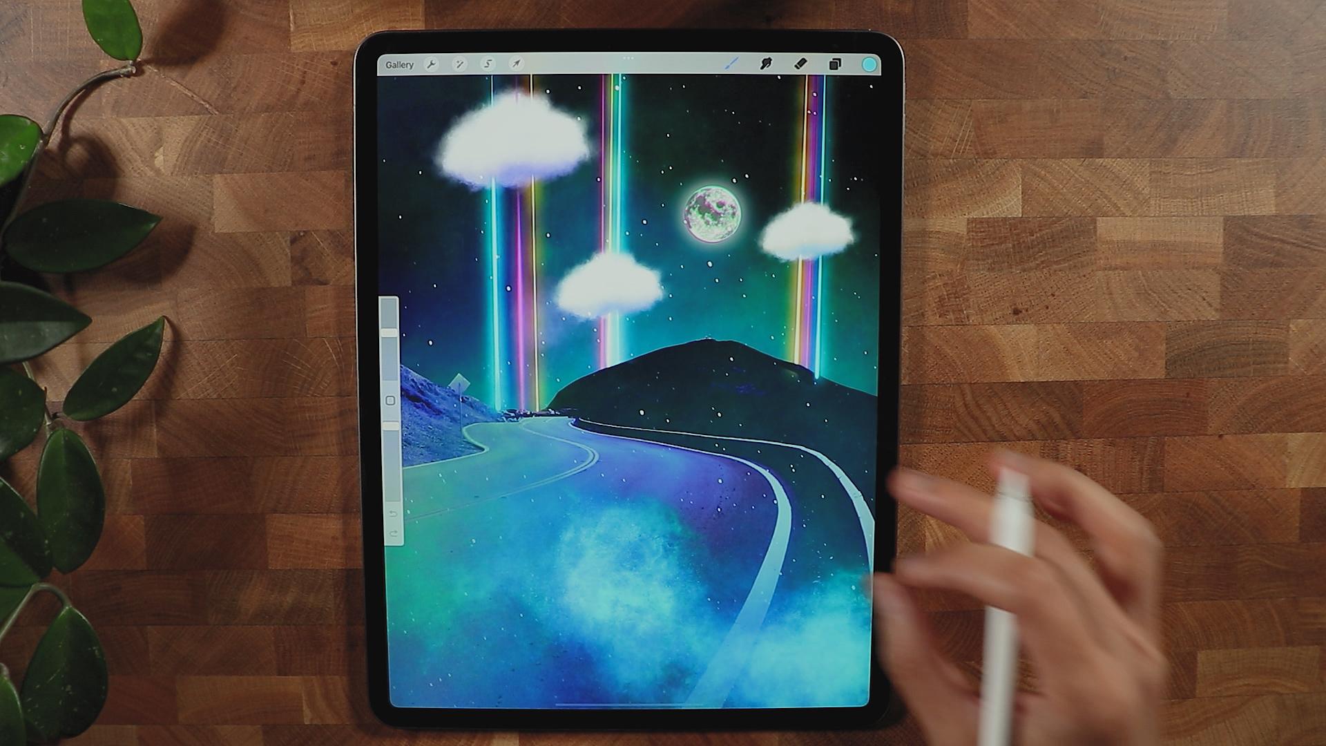
6. Second Collage : Hello guys and welcome back. This next collage
that we're going to make is going to be
something like this. These are the layers I created. So we're going to go
start with the basic. So we're going to
create a new art board, which is a screen size. Alright, so first things first, I'm going to insert our image. We have our first
image right here. This is actually the one
that will anchor everything. I'm going to fill
up the spaces here. I will select a sky, although it's white, but I want to change it
as we go along. So I'm gonna go selection. And I'm going to go this time, I'm going to use
automatic to see we can select this selection. Automatic. Makes sure to turn
off anything here, make sure that it's just add. And we can start
with the selection. So I tap it and you can
increase the threshold by dragging your pencil
to the right. And make sure that
you're getting just the part that
you will need. Not because as you can see
right here, it's disappearing. So that means that will go away. I think this is a K, but there's a little
bit more here, so I'm going to increase
the threshold. This is k. We can modify this white. We're going to invert
this selection. And we're going to go
to the Layer Mask. And as you can see, we were able to get
rid of the background. As you can see, if you
change the background, it changes the
background as well, just to get rid of
this part right here. So I'm gonna go, I'll get mono line brush, but make sure you're on the
block so we to guarantee that this white artifact
from the masking. So I don't really need
to make it precisely. Then we will be
okay for this one. So I will insert image here. I'll be using this one as a
background because I think it's not too busy for
what we're gonna do. And it also looks great. I think it will enhance and the class that
we're going to make, I'll try to color grade first. I'm going to merge it layer, rename it to main. And this is gonna
be our background. So I'm going to put pg and for the main, I'm
going to color grade it. I think I'm going
to use curves to introduce colors,
something like this, because right now,
if you hit the red, you will integers
like color red. So this is gonna be the
brightest of your composition. So as you can see, this is
the brightest one right here. It gives you a tint of red, also this one right here. So it just gives
you, and the black, this one targets the shadow of or the darkest part
of the composition. So as you can see, it
gives it Palatina, Fred. I think we're getting good to this one because we're getting
different tone colors. So I'm going to go for green. And again, this one is the
targets is highlights here. I think I'm gonna go LRA here. And she just different colors. You can go blue. And you can introduce blue
to your composition. Kinda like this color. And it has a good transition. So we're gonna go generalize it. So the gamma is going to be
targeting all the colors. As you can see, it adds
kind of lighter tone to it, but I think I don't need so you can delete
it if you want. Double tap into it and I'm
gonna go to the background, probably going to color
a gradient as well, just something like this. I want to introduce
different colors and probably decrease
the brightness. And we didn't do it one more
time because we max it out. As you can see, we're having different
colors right here, but not too much. This is, is this wild in, we can always make it
a little bit darker. I think this is okay for now. I think we have a good
color combination here. We have kind of like dark
side, we have the bright side. And I'm going to
create a new layer to create the clouds I'll be using. We're gonna do costume clouds. So I'm gonna go to luminance
and nebula brush right here. This is not for Cloud, but I find it nice to
make a cloud out of it. And we can do experiments. Usually they use
this for creating some atmosphere or galaxy. But if you make
the brush smaller, it will actually create
nice elements of cloud. So make sure you're on the
layer and make sure you have a decent brush so you
can start by making a circle. And then you can move your
way, something like this. I don't really I'm not
an expert on a club. I know that it has to have a texture and also
something like this. I think this is a good
thing so it can modify, we can erase it with
the same brush. So you can have it. Hello but more cloudy and stuff. And you can go back and add
more, something like this. You can also add new layer to incorporate that texture
with darker tones. On this side you can create. And also you can
actually declare pit. So it won't go anywhere. Because if you don't clip that, as you can see, if
you don't clip, it goes pretty much everywhere. And we don't be like that. We make sure that we clip it. Just goes to the original
image right there. And you can increase the
saturation to suit your needs. And you can add a little
bit more if you want. You can come back to
the original layer and add more details to this. This is quite good for
what we're looking for. Then we have a good Cloud. You can join them together, merge and rename it as clouds. And we could position it somewhere else or
something like this. You can even color graded and you can increase the
brightness as well. We have our own custom Cloud so we can duplicate
it and hide it for now. So we have a backup just in case we mess up the
cloud or something, make a new layer to create the light's
coming from the sky. I'm going to use the light
pen and I'll be using different color from
this here so we can use this kind of orange. Is it orange, her Salman, I'm going to start
with this orange. Here. We will see what
we can do about it. Maybe I'll use this instead. So let's start from
the top and then you can move your way down. And you can press right here
so it will be straight. And we can add a
new layer for now. So we can easily customize
it individually. So I think this is good. We can add another color
you have probably read. Let's see. I think
I like this one. Merge them together and see, I'm going to put the light. We can apply the bloom effect so the stands out
a little bit more. We can do some more. And they're a little
bit more illuminated. I'll put a slight chromatic
aberration just to give it a different
color in there. This is quite good. I'm going to darken the
domain image right here because it's sticking out
mostly the brightness. And what we're gonna
do, We can put the Cloud on top of it, solve the problem of masking it. And I'm going to create a mask, this one, I used a brush here and see if we
could remove this. And I'm gonna be using airbrush. There's a soft
brush right there. And let's see if that works. Okay, it didn't work. I'm going to
duplicate this cloud putting right here a
little bit smaller. Still have the history
of the colors I use. So that's great. I'm gonna go to the
recent, the light pen. I start with this. I'm gonna make the brush a
little bit smaller so it won't stand up because
this is the one that we really need to stand out. Something like this. And
then I'm gonna get the blue. So similar, something like this. And the last one is
gonna be this one. Okay? So we have that and
they're on the same layer. So I'm going to just Blum, Blum, Blum effect a little bit more. One more, I guess. Okay. And a chromatic aberration
to finish it off. Not too much because
it might change the look with the Cloud on top. We're just going to remove this. We can just use the eraser here. I'll use a soft
brush for this one. I think it's easier for me to move around with the
more soft brush. Okay, make it smaller just to
carry this part right here. We can actually just
duplicate this. I want to make a
Gaussian blurred side doesn't look pretty similar. Motion blur a little bit,
something like this. I think it's good.
Use the same brush. I am going to apply Bloom effect to illuminate the color
or pump up the light. Probably one more. I think that's good enough.
And I will also apply chromatic aberration and a
little bit of motion blur. Just to blend it with what's happening with
this color right here. Not too much so, but
something like this. So I will delete this
part right here. So what's missing here? I'm going to use the nebula
brush again and make sure I make a new layer and get
this color right here. And I'm going to add
another image right here. I'm going to add the
moon right here, just something to look at. There'll be a great addition. So this one right here, I'm going to increase
the brightness and apply Gaussian blur, has a nice light. And I also go into apply
Bloom effect to the Moon, play chromatic
aberration right there. And let's see, get some
interesting color. Just scared because
the color right here, it has the same
tone as this one. So it gives it a
little bit more. Something interesting
to look at. Hope you like this composition, you can definitely remove all. Let's see, we can remove
some to just stick bridges. One cloud right here, I
think it's also good. It's very minimal if you
want to stick with this, but it's up to you. And I think this is the end of this tutorial and hope you
learn something new here, especially with creating
your own Clouds. And I can't wait to
see what you come up with with this composition. Be waiting for your composition, and I'll see you guys
on the next collage.
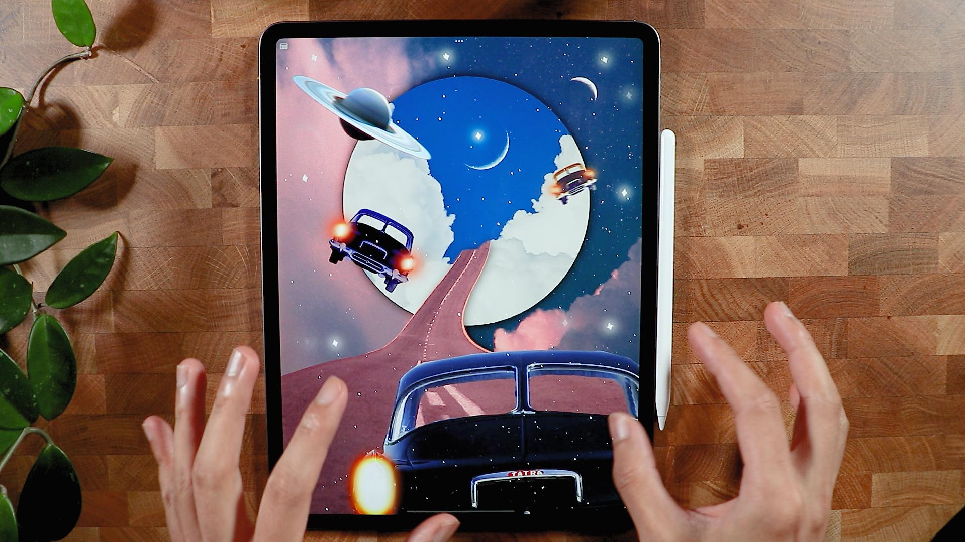
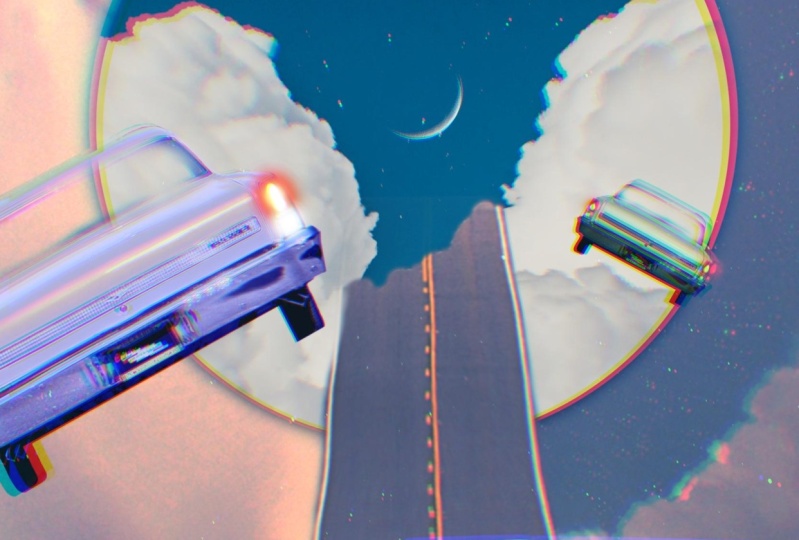
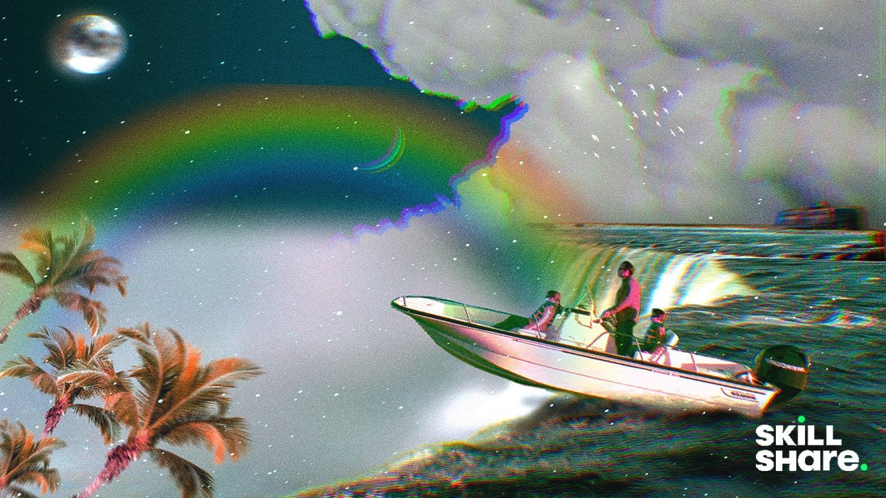
7. Third Collage - Part One: Alright, thank you for
watching this class are going to create like this. If I look at this image
here reminds me of Harry Potter troubling time
machine and also one piece, but kind of like it because it gives you some direction
where you're going to look. And also after you look at it, you'll explore two different
elements right there. So I think this is a
great project for, for everyone to try. Get started screen size, I'm going to insert
our first image. So ranch, insert. And this is gonna
be our first image that will be cutting. So I will just position
it just like this. Make sure that
fills up the space and you can go a
little bit like this. I just wanted to get a
couple of angle here, but you can always
just get all of it. And then you can
reposition it later. Go for selection and go
free hand like this. And I'll make sure that I don't get access
stuff right here. So this is a one of
the easier way to do some masking and I'm just
gonna go right here. No, not really. It can zoom. It says test so you can see
and connect that right there. Alright, so we're pretty
much done with this. Just a curved part. It's a little tricky, but once you pass that, it's going to be a thing. We can just go
straight here. Got it. Then let's just close the loop. Let's go mascot. And I'm just going
to double-check it. I'm gonna put it black just to see how we
did with the masking. I think it's pretty
sharp. I think it's okay. We will insert the
background first. Okay, I'll be using
this image right here. And I'm going to make it a
little like this, I guess. So it has a little bit more
dynamic the decomposition. So I'm going to put this
at the bottom part and I'm going to rename
this first, like wrote. This one is going
to be background. So BG it is, I think I'm good
with the background, so I'm just going to merge it just like that so I don't
have to think about it. And I think we're starting
with a good place. The colors are really popping complimentary
to each other. So this is like dar, or cold and bright
or a warm color. And I think I'm going
to insert the car. This is the car that we'll
be using for decomposition. I will just mask it. So I think I'm going to use, I'm going to make it for now. So we have a leg room
for the resolution. So I'm gonna go selection. I will use freehand again
here because it looks like this car is geometrics. So I'm going to start from
the wheel and I'm going to move my way down right here. I'm just going to make
sure you're inside of the image or the one
that you're getting, it's better than you're here. So it's better to
just do this one. And I think I'm gonna
go straight here. I won't get that side mirror
because it doesn't seem like it has decided mirror on the other side,
as you can see here. It won't look natural. So here I'm going to
just go straight thing, it's gonna be okay. Something like this. And just gonna go
super-quick here. This one. Close it. For this
part right here. I'm gonna go get a soft brush and kind of get rid of the
windshield of the car. So I think I'm gonna go for one the line to get rid of this. Okay. I think we're good with the car. Remove some part that we
don't need, can merge it. So it's easier to manipulate, duplicate them three times. And I'm going to put them something like
this and I'll make the car sway a little bit. I'm going to put it
somewhere here for now. I will put the road a little
bit, something like this. So it's not too big. Maybe free formats make it
quite a bit just like that. And I will use the liquify tool. And I'm going to use push. I'm going to make it a little sway a little bit
just like this. So it's more
interesting. I think. Something like this. It's not too much,
but I just wanted, I think that's going to add a little bit more interests
to the composition. I will make a new layer and
I'm gonna yet monoline brush. I'm going to create
a circle right here. And I'm going to drop
my finger here to make a perfect circle trap of color. Put it at the back
all the way here. I'm going to just do this thing. I'm just going to
make it calculated. Guess how big the
circle is going to be. Insert a photo. I'll be using this
one right here. I'm gonna make it
big and I'm going to clip it to this
layer right here. And so we have a little
bit more interests to, while we're doing here. And think, Let's see if I can
what I'm doing right now. I'm just trying to
reposition this. Oops. Yeah, I'm gonna
go something like this. And I'm going to work
my way with this one. I'm going to mask the road. So I'm gonna put a mask
because I'm going to make it like coexists with
the clouds is like a portal. And I'm going to make, Let's see if it's going to work. Yeah. So I'm going to use monoline brush and I'll
be in the black modes. And make sure I'm
on the layer mask and I shouldn't go
start painting. I can just do this
for now and then modify it as we go along. And I'm gonna go to white mode. And then I'm gonna
go restore some of the part of the image. It fills up the space and
I'm gonna do tweak it again. I think there's
this kid looks like there's something there that
they have to look after. I'm going to make a
copy of this road. And together those mass layer, I'm going to meet
the copied layer. I want to hear, I turn it into black because
I want to make a shadow and something
like this thing. And I'm going to
Gaussian blur it. And so it just gives
it a little bit more.
8. Third Collage - Part Two: Something to look at and a
little bit more realistic. And I'm gonna go soft
brush or eraser modes. I'm going to go soft brush. I'm just going to read some
of the part that I don't need, especially after here. Because I don t think when you do Kassem shadow right there, but I can also decrease the opacity in this layer right here, this
circle right here. I'm going to duplicate it. And I'm also going to decrease the brightness and add
another adjustment. We're gonna go Gaussian blur it. So it creates a little bit of dimension. Something like this. Oops. And we can color grade
some of our elements here. So this car, I'm gonna make it smaller and I'm going
to color graded. I'm gonna make a
little bit probably brighter or give it
a different color. And I'm gonna go curve, and I'm going to color green. I'm going to give them a punch. So under gamma, I will increase the saturation of this car or make it a little bit brighter and give a pumpkin off color. And I can, since it's too
far, I'm gonna make it. And I'm blind motion blur,
something like this. I could also just some curve and make it a little bit
standard from the crowd. And I'm going to go for blue, and I'm going to
incorporate color, blue tone to this. So it looks different
from the others. Yeah, something like this. And now since it has a color, we can saturate it
or D saturated, hear a different tone. I'm gonna go stay
with blue tone. Yeah, something like this.
I think this is good. And we can add a new layer. And we can add a light
on the light pen. We can get white color. And I'm going to put color
to this one right here. So it gives it more. Or we can actually get the red color and
start to color here. Something like that. It has has something
glowing there. I think that's good.
I can even bump it. Yeah. So you can see it gives
it a little bit more punch. Not sure about this, but
we can make it bloom. So it stands out a little bit. You could change, or we can
also incorporate motion blur or something like that. And we could change
capacity to not too much. And I think we're good to go. I'm just going to
modify some color here. Reposition the main
background here, I think I want to show I'm
going to show this part. There's kind of like something
to look out over there, adjust the brightness,
maybe like this. And also look for a nice color that would
go in this composition. Yeah, I think that's
when it looks great. And we could call it
a dirt road as well. And think something
similar to this, but not too much because
I don't want to make it. I think this is good. And we can incorporate the star. This one, I liked this
one because it gives a little bit more texture to it. So I'm gonna just think I always probably lighter
color for this one. I think I'm going to
add one more image here, this one right here. So it gives an element of a
time machine or time travel. So I'm going to quickly
select this part right here. I just quickly I'm going
to refine it after this. I'm just going to do some rough am going to
close it and mask. And I will just get a brush, kind of monoline brush. And I'll make sure that
the selected layer mask, I will just put
more details here. I'm gonna go switch to
black mode to get rid of this part that I don't need, I will apply some filter
so it doesn't make it super sharp and a lot of
errors on the Selection. Alright, I think this will work. I'm going to combine
or merge this layer. I'm gonna apply
motion blur to it. So it won't look
worse than it is. Because if I don't apply it, I need a little bit more
time to refine those edges. But if I apply this, I usually do this as a trait, usually works and nobody
noticed that I did that. I'm going to go
chromatic aberration just to give it more. And I'm going to
pump some hue and saturation to make it blend with the scene and see which
one goes with this. I think blue is good
for this competition. Also, it's good because there's a cast of this color right here, so it's going to
work pretty good. I will just maybe increase
the brightness, saturation. I think we're good to
go pretty much here. I'm just kinda put
a new layer first, can add more stars to it. So I'm just going to, I can use the stars or
you can use to light pin to put a little bit of
stars here and there. I have my custom
brush for this stars. I'm just going to
put it everywhere, something that I
want to add this. And I'm going to apply the balloon effects to make
it stand out a little bit. Bloom. Something like this, I think is quite a
lot to be honest, but I can always delete As part the part that I don't
really want to stand out. I can make it less obvious. Yeah, I think this is
a good composition and you can move your
way somewhere else. But I think this is good for if you want to learn
more about it, you can do practice. And I can't wait
for you to send me your composition and
what you come up with. And I'll see you in the next
collage and see you there.
9. Thank you!: Hey guys, welcome back. This is actually the
end of the class. And thank you so much for spending time would be
watching this class. I really appreciate it and I hope that you learned
something new here and inspire you to create a digital
collage on Procreate or any software that
you'd like to use and can't wait to see
what you come up with. I'll be happy to see your
beautiful project as usual, if you have any questions
or clarifications on how to get started with digital
collage of procreate. To send me a message or post any topic on the discussion
panel down below. And I'll for sure,
I'll get back to you. See you on the next class.
 Bryan C'ngan, Graphic | Web Designer