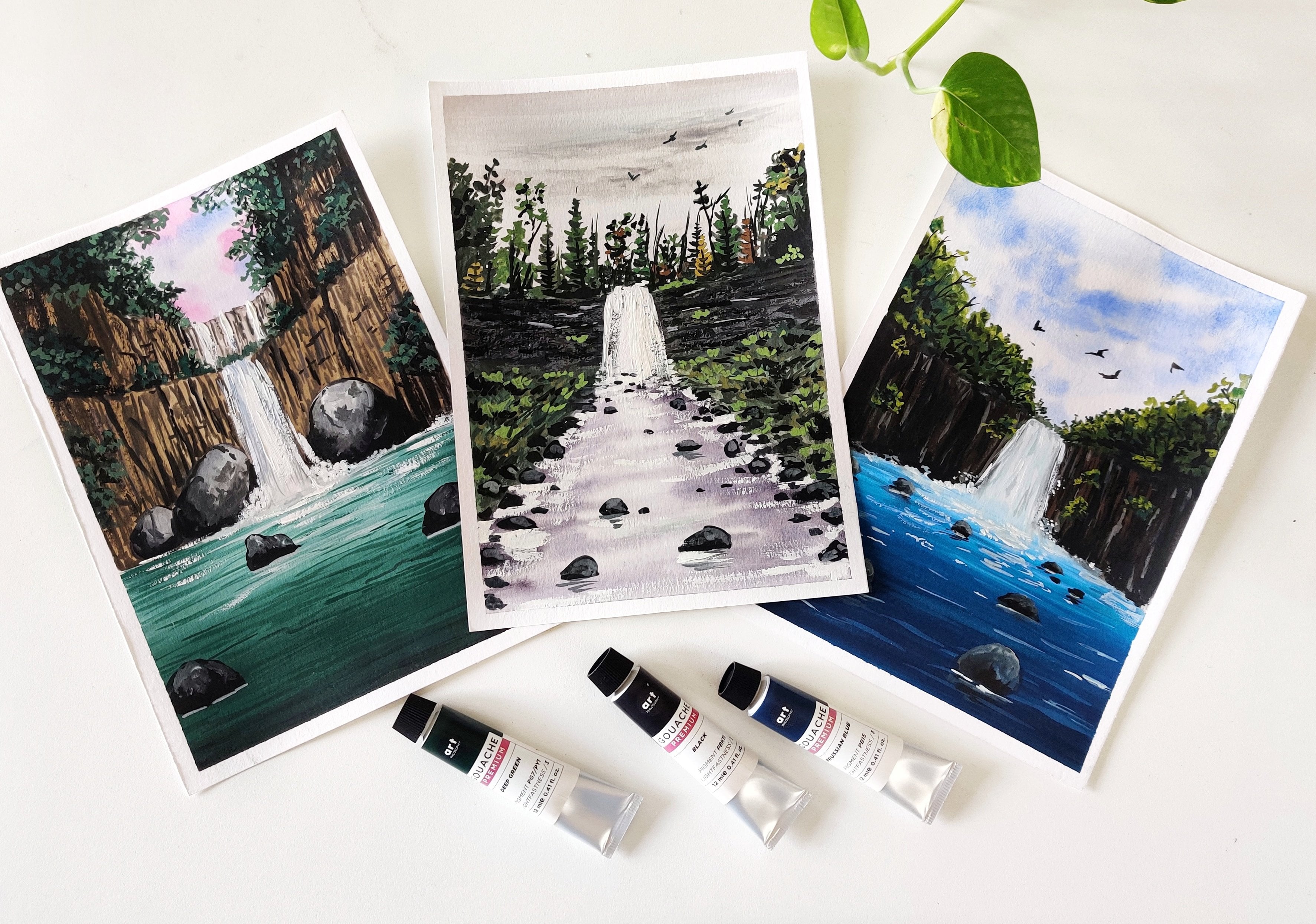
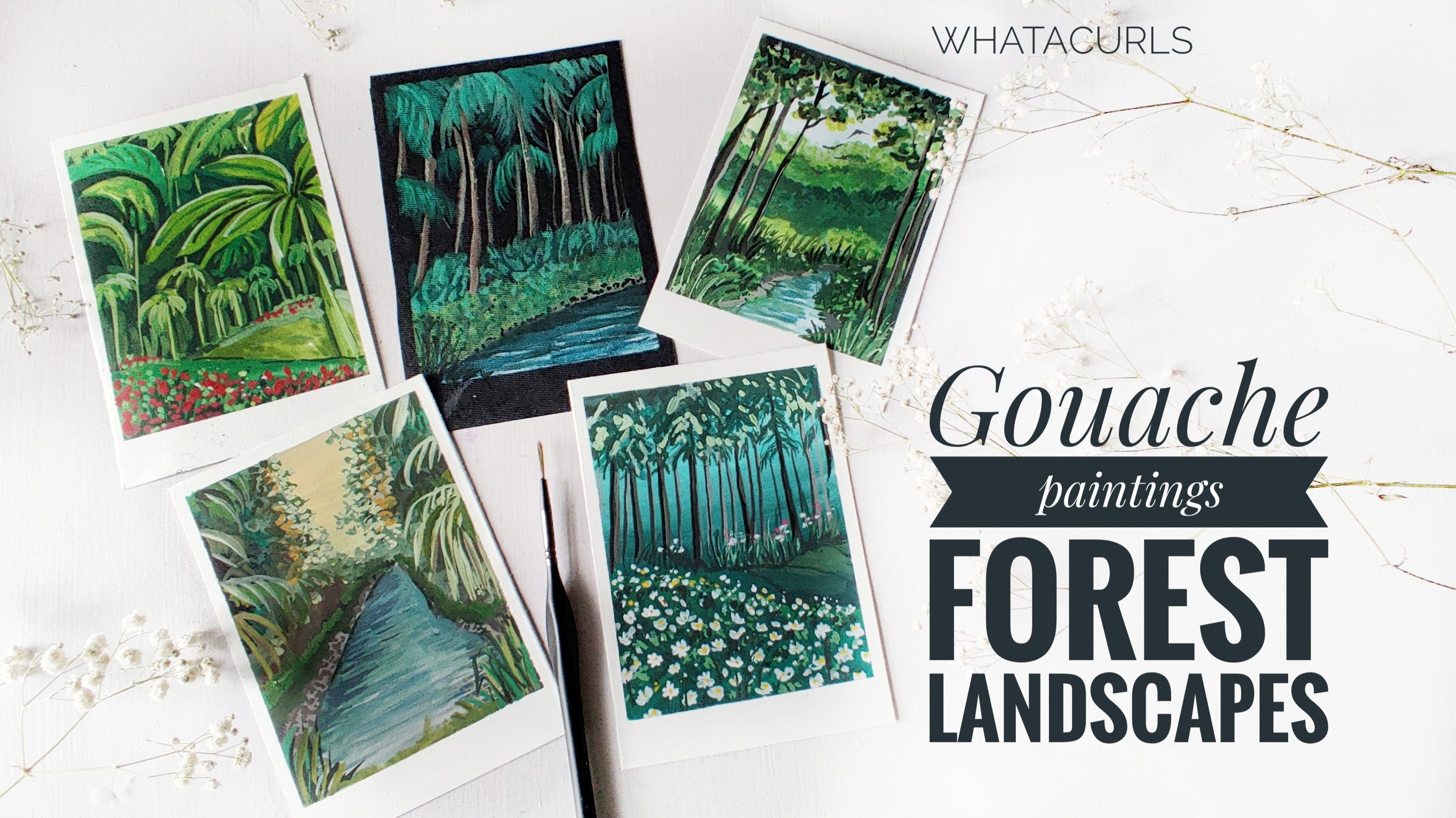
Transcripts
1. Introduction - Wildflowers: Wildflowers are the loveliest or fall because they grow in uncultivated soil in
those hard drugged places where no one expects
them to flourish. This class is all
about wildflowers. Hi everyone. I'm Shannon Superman,
an artist and an art educator based
in by-and-large, India. Welcome to my new class on painting wildflowers
with the gouache. In this class we are going to
learn these four paintings. This is going to be
afforded challenge, where we will paint each
painting one at a time. We will brush up on gosh, techniques like or how to achieve crisp and defined edges. Create soft and graded washes, preserved desired areas by painting outside
the focal elements, build layers to achieve
depth and dimension, to achieve seamless
blend in the painting. We will also talk about
the color values to understand the light and darker values of the
painting elements. We will put highlights on
warm and cool colors as well. Finally, we will create these
for wildflower landscapes. By the end of the class, you will have all the
necessary skills. You will be confident to paint
these gorgeous landscapes. Grab your paints, and get
ready to paint with me. Without any further delay. Let's get started
with the class.
2. Materials!: Welcome back. I'm glad you decided
to join my class. Before we begin, let
me walk you through the supplies that we are
going to need for the class. The paper that I'm
going to use is this 100% cotton 300s GSM paper. We pass this mild texture to it. You can see this texture, something like this. 100% cotton paper. So it allows me to go with certain watercolor
techniques as well. And the size of
this paper is about 7.5 inches by 5.5 inches. So it is a smallest
I used to paper. Next, we will talk
about the colors. I'll be using. Brushstroke, gouache paint. You don't need all
of these colors. If you do not have
gouache paint, then you can go with
post-hoc colors as well. Next, we will talk
about the brushes. Starting with There's 3
fourth inch flat brush. I'll be using this for
the larger washes. Then I have a size
eight round brush. This is for regular strokes. Mixed store, we will use a
filbert brush off light brush. These two are
optional pressures, but it's good if you have them. Then I have size two round
brush for the brushstrokes. Size triple 0 as a fine liner. I'll be using these to paint final details
in the painting. Then I have this
size four brush. This is all low, worn-out. I'll be using this to
create certain texture, like dabbing,
spreading the colors. You can use any old brush. Then for mixing the colors, I'll be using this
ceramic palette. If this easier to
clean it as well. I'll use this piece
of glass to stick the paper masking tape. So we would need masking tape and any hard surface to
tamp down the paper. Then we would need a napkin
and some tissue papers for wiping off the extra colors
and water off the brushes. Next we have pencil, and it is for marking the basic composition
of the paintings. Also, I have this separate
tubes for white and black. I'll be using them
in the paintings. Jars of water for cleaning the brushes and aching
clean water for the washes. That's all about the supplies that we would need
for the class. You can use any
alternative supplies that you already have.
3. Know about Wildflowers: What are wild flowers? Wildflowers at the flash
that grows in the wild. They are not seated or
planted intentionally. They grow wild and free and symbolizes happiness
and freedom. Wildflowers come in vivid colors and can grow in any
given conditions. They might look like a
complex structure as a whole. But if you simplify, then it is very easy to paint. You can feel lost in the process of painting these wildflowers. These are, is repeated
combination of simple patterns forming
wildflower meadows. Here are some wildflower
meadows that I have painted. Some of you might have already seen them on my Instagram feed. It was fun painting
all of these. Now, if you'll notice
these three paintings, they have similar backgrounds. The only thing that is different is the wildflowers
in the foreground. I have experimented with the three different
wildflowers here. Feel free to experiment
with different WileyPlus. Once the class is done.
4. Techniques: This is a warm-up session
where I'll be discussing the techniques and tonal values
involved in the painting. Beginners, but not
miss this chapter because it is very
important for you all to understand
the techniques. The first one is wet
on wet technique. We first wet the surface and
then we apply wet paint. This helps us in
achieving soft washes. We will mostly be using this for the skies or Rome
or flat washes. Next one is wet on dry. We apply wet paint
on a dry surface. This allows you to create controlled and we
find the edges. You can even use it
for detailing work. Next is layering. We add new layer of paint over existing means to achieve desired effect or
depth in the painting. It should only be done
over a dry surface. I have already painted surface. It is still wet. So let's see what happens when we
paint over a wet surface. The first layer
will be quite okay. But if we try to work on it
to achieve certain shapes, then it will start picking the existing colors
from the base. You can see it is
not able to retain the shape that we are
trying to create. It just looks like a mess. We need to work on
a dry surface when we want to do the
layering technique. The colors look bright. Now, I'm adding the
paint on a dry surface. You can see we are easily able to draw the desired shapes. Next is blending technique. Blending is gently merging two colors to create
a gradual transition. Let's say we have
a yellow and pink and we want to create a
nice blend between them. We will apply the two colors. After applying the colors, wash your brush and
take a clean brush, wipe off all the water. We will gently run
the brush over the two colors that in gets easily marched
into each other. So now you can see that is a
transition from L0 to pink. In between, we have
this orange is shade. That's how you blend two colors. Now suppose you have one color. I've taken pink. You can pick clean water and start running the
brush over the paint. As you can see, the openings
get split over here. And it creates a
nice transition. You can even use white color. Next is negative
painting technique. This technique we
him to paint outside the focal element in order to preserve the
whiteness of the paper. Let's say we have
this sketched area. We will try to preserve
the white areas and we will paint outside
these focal element. Next is flattering technique. Load your brush with paint. Gently splatter the paint
on the desired area. This is really helpful to create noisy texture
in the painting. We will talk about
the tonal values. As artists, we can create the illusion of
light and darkness. Using tonal values, this is defined as the lightness
and darkness of the color. Let's say we have
this green color. We will explore its tonal value by adding white and black. In watercolors, we add water
to make the colors lighter. But in Gosh, we add white. Mixing green and white, we get a lighter green color. The mode, while we add the mode, lighter shades we get. Now let's explore
the darker side. I'm mixing a bit off
black with green. This results in a darker green. These are the tonal
values and it is quite helpful in painting the light and shadows in the painting. Next, we will see how we can add you warmer and cooler shades. Let's say we have green color. We want to achieve a more
brownish or yellowish green. I'm going to make so a
low ocher with the green. You can see we have
a warmer green here. You can experiment this with
any other color as well. Now for the cooler part, I'm going to make some
green when the cobalt blue. You can see this is
more like a cool green. You can use a particular
color and explore the war more and coolers will explore the tonal values for these warmer and cooler sheets. If you add white, getting a light up
is still color. By adding black, we will
get a darker color. Same with the cooler palette. And white, we will get
a bluish green color. If we add black, we will get a darker
greenish blue color. This is how you are
going to experiment with colors and create
your own sheets. It's that simple. You don't have to own all the ready-made sheets
that's available in the market. You can create your own church
with the existing colors. I hope this chapter
was helpful to you. Let us move on to
the next chapter.
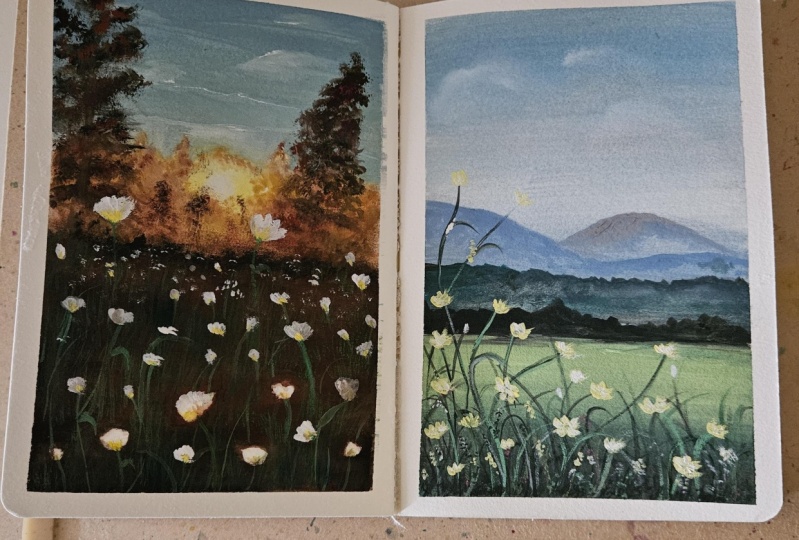
5. Day 1 - Practice: Let us have a look
at the elements of the painting. The dark. We have this graded sky. In the distance area. We have mountains. In the middle region. We have this grassland area with lots of trees and bushes. In the foreground. We have
clean grassy area with these wildflower plans
and some beautiful flats. Before we begin, let
us practice some of the important elements
of the painting. First, we will practice
these white flowered plant. We will start by painting the base layer using
a darker color. You just have Google idea of
brush creating this texture. You can add leaves, blades. This is to me, no
area look fuller. You can practice these
leafy brush strokes on a rough piece of paper. Then we will add some
elongated short, adding some leaf blades as well. We will also be using a
lighter tonal value of green highlights in the plan. So we are trying to
depict a month of plants. We will be adding some dots
using different colors. The filler elements. You would need a fine brush for painting these fine lines. Next is painting the flowers. I'll be using a lot
to paint the petals. I'll be using a
lot of the petals. We will be going with
the layering technique. We will allow this layer to dry. Once this dries, we will add another layer
off white color. Here though, paints have dried. Now I'm taking white. Overlapping the veins on the existing local love will get highlighted when
the base layer is dark. But now we're just practicing
it on plain paper, right?
6. Day 1 - Wildflowers & Serene Mountains: Welcome to day one of the class. Let us begin by sketching the composition of the painting. I'm mocking two horizontal lines somewhere in the lower half to divide the painting into my background
and foreground area. Then I'm adding Mountains further away from
the midground area. We have a mountain
range and distant area. That is it with the composition. We will address of the
details as we paint. Moving on, let us
mix the colors. I'm gonna take white,
black, portion blue. For the base layer. We will go with wet
on wet technique. Let us apply clean
water onto the paper. I'm applying water
on your paper. Use a large, small brush on a flat brush that it is easier
to cover the entire area. Now we will start by
painting the sky. I'm mixing the color
by taking wipe, bit of Persian blue, alert Hilbert of black. So this gives a very
dull and moody kind of blue color to the sky. Here we have a wet surface. I'm going to apply the same
color mix on the upper part. As we move towards the horizon, we will reduce the intensity of this blue color by
adding more white. Next, we will take a low
ocher, burnt sienna. We would need these
colors to add a sense of warmth in the lower
areas of Horizon. Take a tiny bit of these two colors and mix it
with the existing Bluemix. Apply near the horizon just
above the mountain area. So our base layer for
this guy is ready. Next, I'm going to use my filbert brush to add
some details in the sky. The paint gently nap no brush to create the
impression of the Cloud. I'm trying to depict some
wispy clouds in the sky. You can also use a round brush
or a flat brush as well. Also, you need to do this
while the paper is still wet. The paper has dried. You might end up creating
very sharp edges. So be mindful of that
when you are creating. You can even use a spray
bottle to keep the paper lamp. Next we will paint
the mountains. So I'm going to make sure
that the paper is still wet. I'm just running the brush
once again with clean water. Switching back to my flat brush. We are taking the similar shade, but a little darker
version of that. So a blue and white,
maybe a little black. In order to look darker. Danielle Skye, that will
be fine. All right. So in the mountain
with flat brush, it is easier to paint
the straight lines. Now, I'm adding a bit of yellow ocher for the
distant mountain. This mountain is further away
from the previous mountain. Adding some darker color at the bottom of the
mountain in the front. Adding in some darker
shades in between to either sense of depth and
dimension in the mountains. Moving on, we will
mix motion blue. Once Yana and black. This will create a
darker blue color. Now let's paint the
midground area. You'll see there are
some green layers. We are going to create the
simple expression of the same. We will paint the darker layer, creating some tiny bumps. The elements that are
away from the viewpoint, they appear bluish due to the
haze and atmospheric dust. As the elements get closer to the viewpoint,
it appears clearer. This rule of perspective, if you remember, you can
paint any paintings. Moving on, let us take
olive green, viridian hue. So these two are warmer and
cooler shades of green. I'm taking both of them. Right next to this layer, we will add another layer, which will be slightly greenish. It appears greenish
because we are moving towards the new point. Now we will mix these
shades of green with darker blue color
that we already have. Applied the paint horizontally right next to the
previous layer, mixed up with
off-white color mix and apply in-between
the green layer. This prevents this area
from looking flat. Next, we will move
on to another layer, mix black with green. So we will have a
darker green color. Apply this layer right
next to the previous one. Make sure you are not simply
painting a straight line. Painting it in uneven manner
makes it look organic. For the last one, I'm using this flat brush
to get a nice position. Okay, so now I'm taking
black for the last layer. By painting multiple layers, we are emphasizing on the
depth of the painting. It also tells us that the mountains are
quiet far from us. Now I'm using the tip of the brush to create the
impression of the trees. We do not want these layers
to be boring and flat. We will add some gray shapes. The midground area is
located at a steep area, like a valley or so. Thus, it appears darker
at its mortem part, whereas the foreground part, it is located at
a greater height. So this line marks as the division between
the two slopes. Alright, so we will let it dry. I'll write the
midground area appears. Now, let's paint the
foreground area. Quite a yellow
ocher, olive green. A bit of what he didn't you. I'm mixing all these colors to make lighter base still lean. Apply this on the foreground. Month area. This area is somewhere on the
higher or greater height. Does it IPOs bright as
the light falls on it? Now as we approach
the foreground, we will paint it darker. Let's make some darker
green color here. I didn't black and darker green. To make it darker. You can paint the desired colors and then blend it
using a damp brush. This darker green area
is for the shadow of the wild grasses and that
we are going to paint next. If you feel the lighter
area is not light enough, then you can mix a bit of
white on the same layer. So we will allow this layer to dry because we cannot
layer on a wet surface. We will leave this to dry. Next on the boundaries
of the foreground area. I'm going to paint some trees. We are going to use
lighter and darker colors to add highlights and
shadows of the trees. Make it look naturally. Of course, for the
darker colors. I'm using olive green. For the lighter highlights. I'm adding a bit of olive green. As we can see, the
trees are being formed. We can also use some black for the shadows in the bottom
part of the trees. Next, I'm just marking though, outlined for this area
using a darker color. Just slide your brush so
that texture is created. Genki. Okay, let us now move on to paint
the foreground grasses.
7. Day 1 - Wildflowers & Serene Mountains: Let us move on to paint
the wildflower plants, which is the hero
element of the painting. I'll be going with size two round brush will
take black plus green, like a darker green color to paint the base
part of the plant. Since we will be painting a
bunch of Wildflower plant, it is going to be our
dense at the bottom level. It might look like a
black color right now, but after drying, it is going
to appear darker green. I'm roughly gliding my brush, go fill up the area. We will add some vertical
shorts of the plant. Next we will paint the
upper part of the plant. Paint some tiny lines. You can also use a
fine liner brush. Now I'm switching to
a fine liner brush. This has a very pointed tip. Little tiny areas. Then we will add the leaves, lids, and the notes. No base layer needs to
have some filler element. We will randomly add
some dots depicting the bulbs and the
parts of the land. We are preparing for the
base of the flowers. These bulbs, we will
paint the flowers. You can take some
reference image. It replicate the similar shapes for the plants and leaves. Next we are painting the
elongated shoots of the land. We are adding the nodes
and leaves blades, them irregular way so that there's no symmetry
in the wild grasses. Next, moving on to
lighter leaf blades. I'm using green.
The lighter color. I think suddenly few notes and highlights on the
existing nodes. This shouldn't be a mix
of light and color. We perform a nice contrast. Mix green with white to farm
over the lighter color. This will act as the
highlight in the plant. Take your time to pin this. Do not rush through the process. Painting the lower areas darker, suggests the cast shadows
of the plants itself. Adding some more shorts
on the upper part. There is no fixed
number as such. You can add as many
plants as you want. But you need to make
sure that you are not covering up the entire
background area. Next, I'm going to take a bit
of black with burnt sienna. Apply some GARCH
in the lower part. This Wilbur depicted
as part of the plan. We will also added on
the longer their church shall repeat the same
with black color as well. Next, I'm going to
mix a green color, mixing olive green version, blue and yellow ocher. Again, to form greenish dots. These as the filler elements in between will make it look wild and dramatic because it is
the wildflower plant, right? So let us try to bring out all
the wireless of the plant. Next time I didn't
white, pure white. On some of those. In the lower part. I think in some more leaves bled them in
different direction. You can add shadows to
the existing leaves. Okay, so we will leave it here. Alright, so let us move on
to paint the wildflowers. I've taken a yellow
ocher and white. This will give us a muted color, lighter and darker
shade reading. I'll start adding the
flowers one petal at a time. Again, there is no
fixed position as such. You can randomly on
this bottom area. Again, you can use any
color off your joys. Add some flowers on the
elongated short as well. The pains in the form of notch, that's looping flower bunch. Next we will take
quite paint and add some flower buds on media. So again, we will also add them on the
shoots off the land. I didn't quite
helps us to create a nice contrast in the painting. This will act as the highlights. I'm a bit of this
yellow to white and make it like an off-white color. I'll be overlapping
the paint on the area, creating white petals
on the flowers. Here. We did not intend to
create a yellow flowers. We wanted a mix of
board, low and white. You can randomly add some dots on the shorts of the blanch. Now I'm covering the upper area and flattering some white paint. Now take a pasty green color. The highlight on the short, because this is not visible
on the black background. So we are creating
the highlights. You can add lighter colors on darker area to make
it as highlights. Adding some darker lines
along the existing lines. To emphasize though, I'm adding one more shoot. Some nodes and leaves. Because I felt on the right
side it was very empty. I think somebody
who's this point, who can step back and have
a look at your painting? If it needs any tweaking
or finally deals, feel free to make any
changes to reopen. Okay. So I am done. Let me remove the masking tape and reveal the final
look of the painting. There you go. This is
how our painting looks. Let's take a moment
to appreciate how beautiful these wild
grasses have turned out. The distant mountains as well. I just love it. I hope you
have enjoyed today's session. If else painted along
with me and do share your class project and
the project's gallery. I would love to see
your creations. Okay, then I'll see you in
the next chapter though. Until then, bye bye.
8. Day 2 - Practice: Welcome to day two. Today we will learn to paint
this sunlight, wild flowers. So let me describe the
elements of the painting. It is, it has a
simple composition. In the background. We have a sunlit
pine forest ground that is a huge pine tree. From background to foreground, that is wildflower meadow. Let us practice some
of the elements. Like I said earlier
in the background we have this Sunday find forest. Let's see how we can paint it. We will leave a
circular space for the sun using a
lighter yellow color. Then we will paint the
sunlit effect around it using shirts
off low and brown. Cheers off low and brown
and blend them together. Now I'm applying this lighter
yellow on the upper part, giving it a circular shape. On the inner radius of the sun, we will soften the hard
edges using thin water. Now add darker colors
around this area. To enhance the glowing
light in the center. There is no light
without darkness. Using an old brush, we will create the texture. You can use any brush to create the texture unit
to just make sure that the brush is damp or dry. Mixed for the sunlit
effect in the fields, we will print brown color in the same right in
front of those Andres. On the sides. We will
paint to using black. This black color will enhance the sunlit effect
in the mid areas. Then we have the flowers. So you can paint these
in two different ways. Like we learned in the
techniques chapter. Either we can go with
negative spacing or we can paint it using
layering technique. I will show you though,
negative technique. We will leave some
blank spaces for the white flowers in paint
outside of the focal element. No purpose of going with
negative technique is that it helps us achieve bright
and refreshing flowers. Whereas with layering technique, the flowers or the focal element lose their brightness
and we need to apply multiple layers to gain that whiteness or that vibrancy. This layering technique is
helpful when we want to include some additional
elements in the painting. The flowers. Now we
have this empty spaces. We will use wet on wet
technique selectively. Like we will only apply what
inside the empty spaces. And then we will drop
the colors to create or, or tinted or apparent. Next we will paint the flowers
using layering technique. So I'm taking thick white paint. I'm applying the paint
their desired shapes. I'll use this for the
distance flowers mostly. He already using this old brush. I'm creating texture. Make sure your brushes and ****, if it is read your
lawn, get this texture. All right, let us move on
to the painting session.
9. Day 2 - Wildflowers and Sunlit Pine Forest(part1): Welcome to do two of the class. Let us begin with the painting. I have already mastered paper. Now let us take the colors to get started
with the painting. Months, Yana, potion,
blue, white, black. We will mix these colors
to paint the sky. I'm taken Persian blue, or tiny bit of burnt sienna. It will create a
moody blue color. This mix I'm adding white. So it will look like
a muted blue color. We will be painting the sky. So to paint the sky, I'll be going with
wet on wet technique so that the colors spread
really well on the paper. I'm applying the water
throughout the paper. That is most sketching involved. Well right now IGDA scholar mix and apply on the top part. This will be depicted
as this guy. As we move downwards, we will add white, but the mixture then gradually reduce the
intensity of the color. So we will have for
graded effect in the sky. With the help of a clean brush. I'm pulling the paint down. I didn't lighter hues
towards the horizon. Okay, Now moving on, we will take meant L0 color. You can take any yellow
apart from lemon yellow. Mix a bit of white
to this color. Now we will be painting the sunlight effect in
the center of the IPO. Apply this mix in
a circular shape. Then I know warranty or
not to this L0 mix and apply it around this circular
and go horizon area. Next, we will just add one
Tiana around the corners. The mid area will
have sunlit effect. So it is going to
appear lighter and the corner areas are
going to appear darker. Next, I'll be taking they still yellow color with
my size two round brush. You can pick any similar brush. We will paint
though sunlit trees around the Sun that
we have painted. Do live this circular
space for the sun. With a clean brush, we will smash the inner area of the sun so that we don't
have any sharp edges. Next, we will gradually
add up those trees. I don't own those sunlit effect. **** and low plus one
Tiana and dab the brush. To create these
tree-like shapes. Apply a look alerts
strokes on the sides will act as though base for
the upcoming layers. I'm adding some dots
in the mid areas to avoid complete whiteness
in sunlight effect. On the upper part of this area, I'm adding some foliage shape to suggest or bunch of trees. Then on the sides, I'll be painting some fine trees using darker brown color. As we move towards the center, we will use lighter
brown or LOE shades. That we read in
the sunlit effect. To blend smoothly into
the sunlit effect. Not worry about creating
perfect reshapes. It's okay if you like to
paint basic tree shapes. But C2 in that you achieve
those sunlit effect properly, because that's what is
the germ of the painting. We will use a low
as the undertone, and we will keep adding some brownish knobs to reflect those Sundays
in the painting. Not completely covered. This aloe leaves some tiny
bit of spaces in-between. Adding some vertical
lines as well. Drunks. I didn't multiple layer
of this brown color. Those are just our dense
forests like APRN. I didn't the color and
smudging it with my fingertip. And this helps it in
achieving organic look. Darker mix, probably
black color. We will paint along
this horizon line. Now I'm using a damp brush
to blend these two layers. You can take one Tiana
and apply the same layer. Next to blend in
the yellow part, we will use the Alex Hello. Next, I'll be using black color, dabbing the paint
on this brown area. Next with the help
of this old brush, I'll be creating some
fixture on this area. Just dab the beam,
choosing various colors. I really enjoy
creating this effect. This is the reason why I do not like to throw away
my old brushes. Napping some black paint
on the brown area. Moving on, let's paint
the foreground element. Before we paint, let us mark some flower shapes in
the foreground area. Draw the basic shape
using a pencil. Draw them in different sizes. Doesn't have to look like flour. Or now we will just preserve the white
area for the flower. Once we are done
with the background, we will add the
details later on. Next, we will be painting around these flowers using negative
painting technique. I have already explained this in the techniques chapter four, areas we will apply brownie, she'd leave the blank
area for the flowers. Paint around these shapes. We are painting this brown color or LEA in the midsection, so do not apply it on the sides. For the sides, we will go
with the darker colored. Mine is black color. Difference in colors
is to reflect the sunlit effect on the grasses that we
are going to create. Once released the midpoint, we need to blend
these two sheets. So I'm going to apply
burnt sienna or what are black or
darker brown shade. It should smoothly
transition into each other. I'm going to use my brush. You can use any brush as well. Just to get you a good
picture of the grasses. Some black on the lower
part of the mid area.
10. Day 2 - Wildflowers and Sunlit Pine Forest (part2) : Alright, so we have painted the base layer of the
foreground grasses. Moving on, we will paint a pine tree at the
midground area. I'm using mics off black plus
so very little bunch IANA. This gives us a
darker brown mix. We will start with the
trunk of the tree. Branches and foliage. The ground part of the
tree will be narrow. As we move downwards, we will make it wider in shape. Painting the pine tree
is an optional step because our primary focus is
to paint wildflower meadows. You can skip this as well. Some spaces in
between to make it look organic and irregular. Don't want to achieve the
symmetry on both the sides. Next, we will add brown shade on the right side of this tree. To achieve a slight
sunlit effect. Apply some tiny dots. To do, pick the
tiny leafy shapes. On the right side. We will add all partly visible tree foliage. Then tough brown color, give it all sunlit effect. Next, I'm taking this old brush and applying some
vertical brushstrokes. Who suggests the leaves
of the wild flower plant. The mid areas, we will
add round strokes. On the sides, we
will apply black. This will help maintain the sunlit kind of
effect on the fields. Moving on, we will
paint the flowers. We will use wet
on wet technique, selectively applying water
only inside these blank areas. I'm taking a law applying on the lower part of
these empty spaces. Then partly on the
outline to us, well, this will
create a nice spread. It will appear as white
flag with a load. Next, we will mix a
darker green color and the stems and
leaves in this mental. Since we're painting on
our dark base layer, it will not be clearly visible. Anyway, we will
still do our jobs. Your, My adding the
leaves and the stems. One thing went gosh, colors is that
they appear darker when they are wet
and after drying, they tend to appear
a bit lighter. So the green is going to
dry lighter in color. Now, applying lighter
green strokes for some highlight the not cover up the entire area. We still want to retain
the brown areas as well. Apply some leaf-like shapes. The Descent area, the
leaves will appear smaller. So you can just simply add the doors or tiny
leaf-like shapes. We will paint the flowers that are further away
from the viewpoint. The ones that are closer to the viewpoint appears
bigger in size. If I'm using an off-white
chaired by mixing brown and white paints
are on midground area. It was just no district flowers. You can change the color of the flowers as well if you wish. Now I'm applying some
thick white paint. Oops, I just made
ground flowers. These are mid sized flowers. Some tiny lines using a fine liner brush to
suggest know better. Our definition to the flowers. Ben, go shoot off the flower. It shouldn't look like. These are flying in the air. But at the same time, do not make it a
compulsion to paint eaten every stem of the flowers. We will also add some shorts for the flowers in
the midground area. Next, we'll take a
thick white paint. Some motor floss. These thicker paint makes a
flower look more dimensional. All right, We have painted the foreground
wildflower fields. Now let's add some
elongated wildflower against the sunlight. Draw the outline for the same, and then fill in sketched area. Some white paint mixture. We will add the stem on
the shoot for these flaws. I think some filler elements
like dots and lines randomly make the meadow
look very wild and free. We are almost done. Lastly, we will add some
boards in the painting. Use any darker color, right? So we are done. It's time to fail. Yet another masking tape. You go, the brightness of this painting GRU up every
time you look at it. I hope you enjoyed
today's session. I'll see you in
the next chapter. Until then, bye bye.
11. Day 3 - Practice: Welcome back to the
three of the class. This is the practice session. Firstly, let me walk you through the composition of the painting. In the background, we have cloudy sky reflecting the
yellow hues. On couch. On the top-right that is dried tree branch with some
boards poaching on it. From midground, foreground, we have these gorgeous
wildflower fields. That's all about the
painting composition. Now let us crack this, the elements of the painting. Let us start with
wildflower fields. Here we will go with negative
nickname for the fields. Let's say this is
the field area. I'll be marking this
area for the flowers. This will preserve
the white areas for bright and vibrant
flowers in the painting. The space and paint on
the outside of this area Onto apply this
base layer to dry. Meanwhile, let us paint the sky. I'm using wet on
wet technique to achieve softer
clouds in the sky. The sky will be reflecting
some bluish hues. We will use a yellow ocher and brown black painting, some angular strokes
for the sky. The leftmost part, I'm
adding this darker shades. Just not good, cloudy area. Going back to the fields now, we will fill in the
preserved white areas with red colour. Suppose we are painting
the flowers on a darker, let's say red on black, and we will not achieve the
vibrancy in the flowers. You can see these flowers are, when compared to the
flowers painted on white. You need to add
lots of layers to achieve that vibrant effect. Four distinct area, we will
add smaller sized flowers, stems using green color. Here's how you can add
shoots and leaves. In the middle. I'm
showing it separately. Then with white, we will
add some boards in the sky, also some highlights
in the fields. Then we have this
supporting element, which is the tree branch here. Or you can add any trees, no compulsion on
painting the same thing. You have options like
painting the foliage is painting pine tree, etc. But just be prepared in advance of what
you want to paint.
12. Day 3 - Cloudy Sky and Wildflowers - part1: Welcome to the project
section of D3. I hope you have already gone through the
practice session. Now, let's start
with the sketching. With the help of a pencil. Let's mark or the basic
composition of the painting. Somewhere in the mid area. We will draw this horizon line. The horizon line, we will have the scribe and below
will be the land. Draw the outlines
for the flowers. We will be using
this markings for the negative technique to
preserve the white areas. Smaller shapes are for
the distance flowers, and the bigger ones are for the flowers in
the foreground. This weight will create a sense of dimension
in the painting. For these flowers, I will try to define the shape like
adding some petals, some layers to it. Roughly adding some
shorts of the flowers. Alright, that is it with
the sketching. Moving on. We will paint the sky. The sky. We will go with wet
on wet technique. Let's apply clean water. I'm using a flat brush
of three-fourths inches. Sketch to flowers as it is, and apply water
outside this area. Make sure to apply even coat
of water above the horizon. Next, we really think
that colors weren't Dumbo and also a bit of black. We are applying wet
paint on a wet surface. So I'll mix the colors in
medium consistency and apply it in mid area of the
sky in angular strokes. Next, I'll be mixing
one number with a yellow ocher to create
alloys and brown color. On top right area, we will apply diluted sheets to suggest the lighter
part of the sky. I'm also applying some
diluted black strokes. Those are just the gray
clouds in the sky. I add some darker strokes
in the mid area as well. Towards the horizon, we will
be adding darker colors. So I'm mixing black plus rounds to give us a darker brown color. As we approach the horizon area, we have areas reserved
for the flowers. Gently apply the paint
around these flowers. Define the boundaries and the other horizon using
any darker color. Now run your brush
to blend the colors. I had some darker clouds
using dark brown color, making the sky more
dramatic near the horizon, on the leftmost side. Moving on, we will paint
the midground area, take olive green and apply
it along the horizon line. Again, leaving these negative
spaces for the flowers. Next, we'll mix a
lighter version of green color added along
the horizon line. This is to add a sense of
highlight and then listen. For the rest of the area. We shall apply black
colored as the base. My following negative
painting technique, Lee whitespaces for the flowers. I'm adding black paint. By adding very little
amount of water. We could have fully painted
this area with black, then painted the flowers
using layering technique. But we would not achieve the vibrancy that we
want for the flowers. Because anything applied over black layer loses its
vibrancy and brightness. We will avoid that
in this painting. Alright, so we have painted the base layer by leaving
these negative spaces. Now we will allow this
to dry completely. Next, I'm going to paint the branches that are peeking through the sides
of the painting cream. Since this tree branch is
not our primary focus. So we can either skip this step or even paint some
other kind of tree. It's just up to your wish. I'll be adding this
mercury branch. You're splitting those
branches into multiple parts. You can even add the foliage, will prefer keeping it darker color on the
sides of the branch. Those are just the shadows. Now with the help of
a fine liner brush, I'm adding some tiny tweaks. You need. I need weeks or so satisfying that you don't
feel like stopping at all. We will add some boards
verging on the three branches. We will leave it here for now. Morning run, we will
paint the details on the base layer of tomatoes, olive green, using
PSI stood on brush. And we will dab the
paint in the end, the impression of the leaves. What's the foreground? We will add the leaf blades
using darker green color. I have mixed black plus green. Currently it is appearing
like a black color, but as it dries, you can see it looks like
a darker green color. Keep applying even if you cannot see the exact
color right now. Darker green color towards
the horizon as well. Now, if you observe, you can treat this darker
green lines in the foreground.
13. Day 3 - Cloudy Sky and Wildflowers - part 2: In the next step, we will paint the
student wildflowers. Let's take million red. You can use any
other color as well. Red paint and apply
dotted shapes. Who saw just do
this ten flowers. Make sure to apply
thicker paint because we are painting on a
darker background. Then I add some
flowers closer to the foreground in
slightly bigger shape. If you are applying
T-note or medium consistency paint after drying, it is going to show though background color that
is the darker color. So apply very thick paint. I had some tiny dots in-between. Next, we will apply paints
inside the reserved area. For this particular area, you need not apply
very thick paint because we have a
white background. Lock all the blank spaces
with this red color. I think some green lines goes, I just those stems
off these flowers. Using lighter green
color to highlight. Mix all four black, darker green and lighter green. To bring in a nice
balance of colors. I had some leaf-like shapes. Next, we really did go red color by mixing
a bit of black. Well million red. Me adding some definition to the flowers. I didn't know the shape of
the petals into flowers. Adding darker shades at
the bottom of the flowers. I don't send so for shadows. Bring out the highlights
on the upper part. Being spatially on
the district flowers. The bottom part, I'll add some more flowers using
layering technique. Apply thick layer of paint here. Moving on, we will
paint some words, adding some white paint on the already painted Blackboard so that I can create a nice
contrast in the painting. We'll also add some freely
flying birds in the sky. Also adding some white paint as highlights on the distance. Flowers. Use a fine liner brush to get a nice precision. All right, So we are
done with this painting. Let us remove the masking tape, will reveal the final
look of the painting. There you go. This
looks so pretty right. I hope you're enjoying the class negotiating your class project under the projects gallery. I'll see you in the last
chapter of this class. Until then, bye bye.
14. Day 4 - Practice: Welcome to day
four of the class. Let's start with the
composition of the painting. We have a graded
sky. On the top. There are valleys
and mountain ranges and the distance area
in a far away land, that is a lake near the values. The mountains have clustered
pine trees on them. In the foreground. Are these vibrant wildflowers. Alright, let's start to practice though elements
of the painting. First, we will paint the
mountain ridge on a wet layer. Really paint though
the student mountains. For the distant mountain, you need to make
sure that you are painting it very
bluish in color. Those are just the haze
and atmospheric mist. For the rest of the mountains, you can come up with any
other color as well. It makes them adding
darker layered mountain, which lays somewhere
in the middle ground. Try to build our essential for the students in the painting. Here we can see we
have this three layer. I'm not exactly
showing the process, but I'm giving you
an overall idea of how it is going to look. Now we will add or
what brushstrokes to searches the
clusters of pine trees. You just have to adapt
the brush vertically. This step is very easy
with the flat brush. On the foothills of the
mountain valley area. We'll add this lighter
color to suggest the highlights or the lighter
area in the mountain. Moving on, let us see how we can pin the wildflowers
in the painting. Paint obviously for the ground. Over this layer, we will
paint the wild flowers. In order to paint
the wild flowers, we will allow the
paint to dry first. Meanwhile, let us
see how to fill up the areas with stems and leaves and other
filler elements. Just like other paintings, we will add some brush strokes
to suggest those stems, and then we will add some more dots and leaves
to fill up the area. Here in this painting we
will add lots of colors, such as the leaf blades
and the filler elements. All right, I'm going back to the base area for the flowers. We will draw the outlines of
flowers using white color. Draw the blooming
shape of flowers. You can draw any shape
of flowers you want. Once we sketch the outlines, we will fill in the area with white color as the white race
for the upcoming colors. The reason for doing
this is to achieve vibrancy in the elements
that we've been. We could also have gone with negative technique of painting. But I wanted to show
you all an alternative or achieving vibrant
and bright effect. Suppose you forget to leave the areas or you make mistakes. Then you can wipe color
and create your desire. Next for the flowers,
I'll be using. Yellow. You can use any
other colors as well. I'm adding this color,
yellow and orange. Lastly, for the leaves or
the shortage of wildflowers, they really add a lot of layers like adding
green colors and then purple and ferritin to
add contrast in the painting. Since it is foreground and
is closer to the viewpoint, it demands a lot of
attention and details. I'm just showing you the way
of painting the strokes. But in the painting we
will add a lot of colors. You need to be patient with the process and
enjoyed thoroughly.
15. Day 4 - Mountains and Wildflowers: Welcome to the project section. Let us start with the sketching. We will start by drawing
the distant mountains. These mountains are very
far from the viewpoint. Somewhere near the
foot of the mountain, that is the Valley area. There will be a small lake that is a pine tree in
the midground area, covered in the mountain. And the leak foreground area is for the wild flowers. That is it with the
sketching rest of the details we will
add as we paint. All right, so let's get
to the painting part. I'm taking ultramarine
blue and white. Mix these two colors to
form a lighter bluish hue. Apply it on the top
part of the paper. Here I'm applying thicker
paint using my filbert brush. Next, switching to my size
or 3 fourth inch flat brush. Spreading the color
using clear water. This creates a gradient
effect in the sky. It is okay if you apply water on the mountain
area as well, because it will act as a
base for the mountains. Applying another layer of
bluish hue on the top part. Next I'm taking olive
green, burn Dumbo, ocean blue, mix green and blue
with a width of one gumbo. We'll apply this color mix on
the last mountain we have. The color spreads quite easily
because of the wet base. It will also help us achieve blurrier background
at the distant area. For the next mountain, I'll be mixing slightly
greenish tone, adding more of brown and green. This is literally
concentrated tone. Use any flat brush or
round brush. That's okay. For the next mountain, I'm using shades of green and
blue along with some black. Just creates our darker mix. Apply this mix on the mountain. The left side. Not fully
apply this color mix. We will save some area
for the lighter shades. I'm taking a yellow ocher, mixing it with some
blues and greens to make a lighter green color. It doesn't have to
be exact same shade. You can mix your own
lighter green color, a bit white if you want. Now, apply it on the
foot of the mountain. We will also apply
the same shared over the darker areas to create
sort of layer in the mountain. For the next mountain range, we will apply darker color by mixing burnt umber and black. Using different
colors here creates a separation between
these mountains. For the next adjacent mountain, I'm using black color. We will also apply it to the
mountain on the left side. Make sure to leave some gaps in the center area for the lake. I'm covering up this area
is our full pine tree. We can add another
layer for that. For now, I'm painting the base layer towards somebody to go and I'm
adding another layer of mountain using green color. Next we will mix yellow
ocher, olive green, and a bit of black, a very darker,
bluish green color. We will apply this color mix from midground to
foreground area of the empty space. You'll see in the middle of
the paper is for the lake. Moving on, we will
add some details on the mountains using
the same color as that of the mountain. Here where I'm going with black. I'm adding some vertical lines depicting the pine
trees on the mountains. Using a flat brush will
be very helpful here as you can paint those
straight lines very easily. These straight lines,
I'm going to dip it. Clustered pine trees. Next for the mountains
that are further away, we will green color. These are a bit away
from this viewpoint. We will paint the lines smaller. Mixing a lot of good
olive green and black. We will repeat the same
for all the mountains. You can use any NACA, lighter colored, It's up to you. The peak of the mountain. We will paint these pine trees. Next, I'm adding some yellow
highlights on the mountain. Also, the foot of the mountain. Next I'm adding some details on the farthest mountain using
this alloys green color. Next, let us paint the lake. I'm using civilian blue. You can use any
other blue shades. We will apply this blue paints
inside the reserved area. I'm also mixing a bit of white to make a
lighter tonal value. Also to add slight
variation, I'm mixing, mixing this green and blue with the slight black color to add shadows on the sides
of the lake. Board. So midground we will
apply this green color. I think some highlights
using yellow ocher. Moving on, we will paint the pine tree using
olive green color. I'm painting the foliage. Next using darker color. I'm adding the shadows
in-between the pine trees. You did not create
the exact same shape. You can go ahead and paint
your own style of pine tree. Since it is all black
in the background, we are not able to distinguish the pine tree and the
student mountain. I'm adding some green color
on the mountain area. Next we will use white
highlights on the lake area. Also, when you add
this white color and blend it with the blue, it feels like a
lighter blue color. Also add some tick white
wins in the form of repulse. If I had a sense of
movement in the water. I think some white paint
along this valley to suggest to create an
impression of flowing water. Adding some lines using darker green color in
the midground area to suggest some
depth and also to create some segments
in the ground level. Moving on, we will
paint the flowers. So here we have not left any negative area
or white areas. So we will sketch the area
and then paint it white. I'm using white color to paint
outlines of the flowers. You can paint flowers of
any shape, file sizes. We will also add the
base for the florets. Paint some smaller
circular shapes. Just the flower buds or some random flowers in
the bunch of flowers. This is not the final shape. We are at to add the details. This is just for the
reference purpose. We are outlining the shapes. Moving on. I'm taking
my damp brush. I'm using a mix of
black plus olive green. With this mix, I'm
trying to achieved this leafy texture in
the foreground area. Next we will fill in
the white outline, the areas using white-collar. Reason for doing this is to vibrancy in the flowers
that we are going to paint. Paint on darker layers. We will let you in
looking flowers. You can also go with
negative painting technique. We are painting this
as the white vase. We will allow it
to dry completely. Next, we will add the short for these flowers using
darker color. Randomly add some
lines in between. You don't have to replicate the exact same shapes
as I am doing. You can come up with
your own composition for the wildflower meadows. Switching to my fine liner brush to add some final details. We will also add some elongated, short and tiny leaves on them. Nabeel brush to create the impression of
values in-between.
16. Day 4 - Mountains and Wildflowers | part 2: All right, So we have
already painted the tszuj. Now, let's add some leaves. I'm thinking Boolean
blue and yellow. With this color mix, we are going to add the leaves. The color right now
it's not that visible. Once it dies, it is going
to appear much later. Next, I'm going to use a lighter green color by
mixing a bit of white. And you can add different tonal
values of green by mixing blue and yellow to it. I'm adding, but he
didn't green also have some cooler shirts in
the foreground area. We are not planning a
realistic painting, so it is okay to any
contrasting shade. I'm going with polio. Since we are painting
though foreground. So we can add all
these tiny details, but make it more than, I think this Bhopal shared
on the florets as well. Makes them using black color, who are darker colored
lose the shadows of the wildflower Blanche. Next I'm adding some
because I used to use. Moving on, I'll be
painting the wildflowers. I'm going to take
scarlet, red, and yellow. Mix these two colors to form. An ordained just
shared this color, apply it on the white areas. So we really fill in the
white blank areas here. Next we will use
red color to add some definition to the flowers. You can define the petals
and add any shape you want. I think smaller dots in-between. It was I just DO flower bunch. The shorts that we added earlier and not
that visible now. So we will again,
for the flowers, some thick white paint in between to bring in a
nice contrasting effect. Adding some more red color. For the flowers. Bright and vibrant. This looks like a Lindy process. I went a little overboard
with all the extra colors. You can keep it
simple and short. But the layers you add your will surely add a lot of
depth to the painting. Sometimes patients is very important in the
painting process. We tend to hurry and finish the painting as
soon as possible. But if we take our time to
enjoy each and every stroke, then it is surely therapeutic. Moving on, I'm taking
this black color and adding some final details
to the distant mountains. I am adding some
clustered pine trees painting along the
edges of the valley. Next we will add black doors in the center of each flower. Lastly, we will add some free
flying birds in the sky. Right? So we are done
with the painting. This marks the end of the fall
day wildflower challenge. Now let us remove
the masking dip. There you go. This is how
our painting looks like. I hope you had fun
learning session. Thank you for joining my class. If you have painted
along with me, then do share your
class projects under the projects gallery. I would really love to
see your creations. Thank you once again, I'll see you in my
next class. Bye bye.
 Shanan Subhan, Watercolor/Gouache | Art Educator