Transcripts
1. Class Introduction: Summer and sunflowers,
they're connected, they just belong together. And in this class we're
going to paint a sunflower. We're going to do that in wash down when it is going
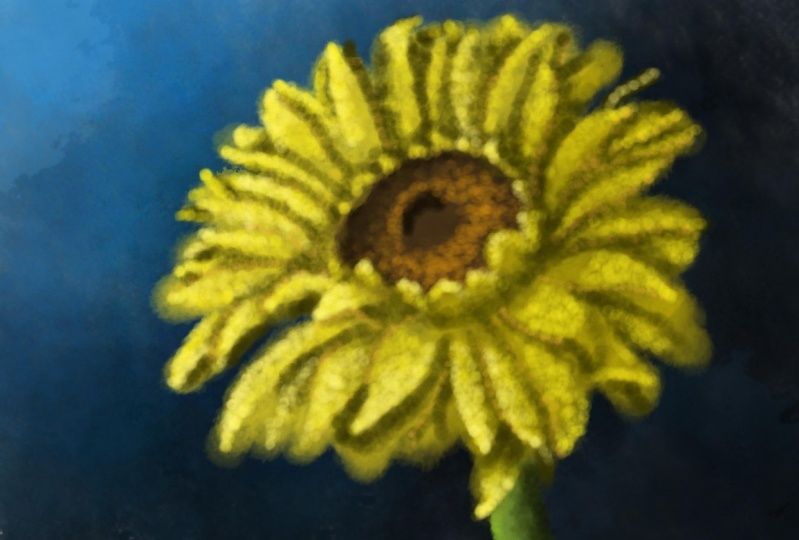
to pick any wash brush. Now actually we're
going to take one of the appropriate brushes
and we're going to alter it to create a very unique
style of painting with it. Are you curious already? My name is Benjamin
Alma and I'm an artist, illustrator and artist
from the Netherlands. And I'm going to take you through this process of painting a very particular
style of flower in a stippling style with
guash creating our own rush. Inprocriate. That's going to be
quite the adventure and we're going to
do that together. If you don't know how to paint, if you never painted
with gash style before, inprocriatef, you don't
even know how to paint, don't know how to sketch,
it doesn't matter. But even if you
know how to paint, to sketch, if you create
beautiful flowers, I would encourage
you to still come along and look at this from a whole different perspective and pick up a whole
different style. But we're going to have some fun together because
it's really fun. Altering brushes, making
them do what you want to do and see the outcome
in a beautiful painting. That's what we're
going to be working on together in this class.
2. Preparations & creating a Brush: Welcome to this
first lesson where I'm going to show
you what you need, how to set up your canvas, and how to create the
brush we are going to use for this little
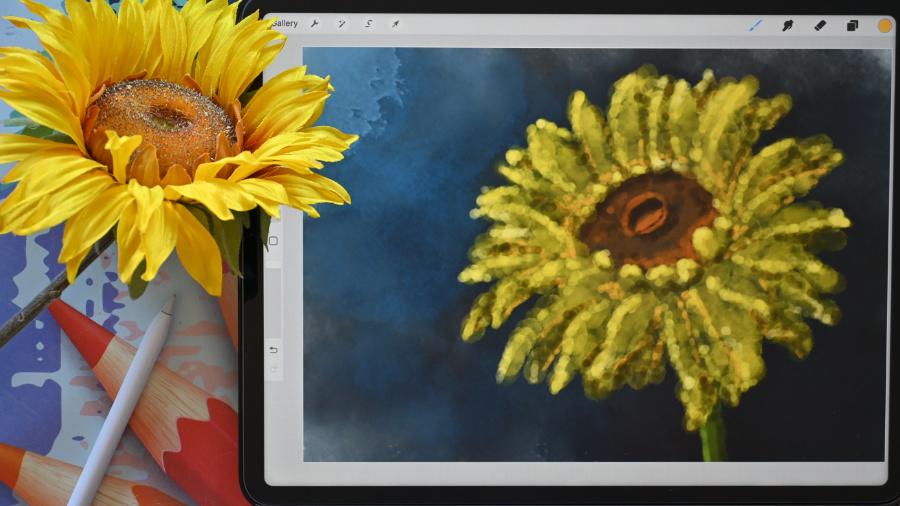
guash adventure. So let's start that. Well, you see the flower here which
we're going to need. And you see the flower there actually is
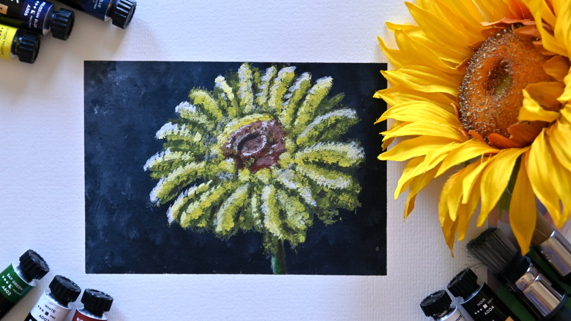
not a real flower. It is silk flow. Very nice flower. This one won't wither. So I
can use it as long as I like. I can make this class
as long as I want. But don't, we're not going
to make a long, long class. Well, we need to set up a
canvas. Let's start with that. We're going to our gallery. Normally you greet it here, you're going to say plus here. And you're going to
press this little black folder, Fingi there. And here we can
add a new canvas. And we're going to
create a new canvas. Depending on where you are, you either need a US
size or a European size. I'm going for the European size. I'm pressing millimeters. Now let me show you the US. First ten US. Size. If you have a US. Size, I'm going to make it slightly larger than what it is. Because I can shrink it
down to a postcard size. But if I want this
to print larger, I can't go larger. So I'm going to a regular
letter size which is 11 inch for the width and
8.5 inch for the height. This we're going to set on
three deep that prints nicely. The layers depends on
your ipad color profile. Make sure it's RGB and RGB 2.1 Those prints on every
machine really well. Time laps and canvas properties. Whatever you have, I'm going to change these
settings and time laps, whatever you have it set done, dimension is the most important, 11 by eight, a two inch, and then you say create. I'm not going to touch that
because I'm going to create a European size four. And that is 297 by
210 millimeters. The rest of the settings
are exactly the same. I can shrink this down. I can print this
on an A four and shrink it down to
a postcard size. I'm going to say Create. That takes care of our canvas. Now you either have a US size or you have a European size. The next thing which we're
going to need is of course, that sketch I've supplied. So you need to download it. It's a PNG so it is transparent. And what you're going
to do is you're going to tap that wrench. You're going to say
insert a photo. You're going to find that photo and that is
a square like this. And you need to move it
wherever you like it. I like where it puts it right
away, not in the middle. I don't want this
thing in the middle, but not totally to the side, either slightly off the side. I might move it a little
bit to this side. I like that so that we can have some space here so that it's
not totally in the middle. And then we're going to
just tap that arrow. And now that one
is totally done. The next thing is we
need a brush for that. We're going to create
our own brush. We're going to create
a stipple brush. And I want a different kind of effect on this whole painting. And what we're going
to do, you're going to tap this brush and you're going to find the
painting section that comes with procreate. And you probably
need to slide down on till you see this brush. We're going to use this as
our base, but change it, what we're going to
do is we're going to slide it to the left
and say duplicate. And that duplicate one
you're going to tap on. Now we change the brush. First of all, I
want this brush to behave like a, a brush. I want to change a few things. I'm going to explain
that in this class, why I change these things. That's for another class, but for now, just follow me along and go to the rendering. Now it's sat on a light glaze
but I want a heavy glaze. The flow you said on Max, the wet edges go to 13, 111, 13% These burnt edges we're going to put
to 50% multiply normal and luminous
b***ding is off. That is what we're
going to do here. Now it gets a
slightly different, stronger texture which we need to compensate for what
we're going to do here. In the wet mix,
we're going to make this a bit more watery brush and therefore we
pick the dilution, which is the amount of water. We're going to set this to 44% The next thing
is the charge. We're going to
change a little bit, we're going to put this to 26. The next thing we're going
to change the attack, and the attack goes
to, what should we do? Around 36% There you go. The grate is now set to nothing. I want a nice smooth brush and now you see
something changing here. And that is why I
needed to change the rendering to get
a nice strong brush. Because it's now
a lighter brush, this needs to go to
smooth these settings, we just leave none, that is now it behaves
more like a wash brush. The main thing which
we're going to change is the shape and the grain. It now has a certain shape and the grain which imitates
the bristles and the paper. But we want to change that. I want to change the shape
a little bit more rounded. I press here, shape source, you see added. I press on it. Yes, I press on it, indeed, I'm going to say import. We're going to use one
of the source libraries, the library that
comes with propriate. We're going to pick this
blotch which is more rounded, pick the blot, the
blood should be there and say we're done with this. Now, a few things we need to make sure
that the settings are right and the settings
are set to none. Zero, the count is one. This is non, it is
a randomized brush that means basically
whenever you tap it, it changes the
shape a little bit. Right here, you need
improved filtering and this is zero that is done. The next thing which we're
going to change is the grain. The texture it really puts down as if it is on
paper or something. I want a different grain. Whatever this is, I'm going to say Import Resource Library and you're going to slide down until you see
gas somewhere. I think I'm too high. They go, oh, that
didn't go well with it. I need to find them again, alphabetic from here on Gouache. Go go wash one and Gah two. And we're going to do the gah, We pick that one
and we say done. Now we've got a different
kind of texture, but I do want to have this texture really
behave as a texture. So I'm going to say
change this to texturize. Now it's going to behave
totally different when moving. It's going to behaving more
like a very strong texture, which I want, but I'm going to change a few sentences
or go through them. The scale I want to set to max, I want the largest possible
texture with every press I get that is on the depth to keep on the b***d mode is
going to stay here, multiply the brightness
in the contrast, I don't want to change, I
don't want any filtering. With this and this setting here. The three D grain
behavior is when you call three D painting, which
we're not going to do. I think that are the
settings I need, Make sure the scale is on Max. Now we've got a different brush. The last thing we're
going to do is about this brush. Change the name. Now we're going to call
it stippling brush. Stippling brush, you
can change the name. I'm going to put in
my name by Benjamin. You can sign the brush
with your signature. I'll put whatever you
like there and say done. And now we have a new brush, the standard A brush and the
sting brush we have now. Now these, ignore those,
a different lesson. We're going to add a new layer. We're going to rename
sketch bottom layer, the original layer
with the sketch. I'm going to move that on top. We're going to actually
lock this one, slide it to the left, and say lock so
we can't paint on it accidentally and we're
painting on this one. I hide it for now. I show you the differences
between the brush. We're picking just a blue color, doesn't matter where it is. With the original gua brush, if I stipple a little
bit, it looks like this. If I paint paint over it, it just puts down a new layer. You cannot b***d
with it really well. It just puts on that new
layer with the new brush. Slightly different. Select
the stippling brush, or the size is around 13. For this demonstration, I get a whole different texture
in it then I have here, then I have the whole
different texture. I can layer this a lot more than the previous brush because
it behaves differently. And even when I paint, it paints a little bit less. There you go, the fig you go. And you can a b***d. This brush, if you don't press it too much,
it's going to b***d. Not that we need, we need
the stippling effect. All right? I'm going
to clear this layer. I'm going to layer two. I'm pressing on it
and I'm going to say we're ready to
start painting. Painting is for the next lesson. We've set up our canvas. Now we've got a new brush, we've got the sketchy.
3. The Background: Welcome to this lesson. We're gonna paint
the background. In this lesson, we're going
to start with the background. Create a nice dark background to really create contrast
between the yellow flower, mainly yellow of course, and the sunflower and a very dark background.
Well, let's do that. All right, for that we're
going to need our brush. Of course, we good as well. We've already have that brush selected and you should
have two layers. The sketch on top, this layer, tap on it, say rename. This is going to be back ground. There you go. We've
got our background. Now what we're going
to do with this brush, we're going to slide it
all the way to the top. A nice large brush
and that you get this nice texture
effect like this, but not this color. Now we're going to start
with a black color, slide. This somewhere to the blue,
somewhere in the middle. Slide it all the way
down. That's it. We have a black color
and we're going to start adding notice
with this brush, if I press a little bit
or if I press firmly, it's going to create
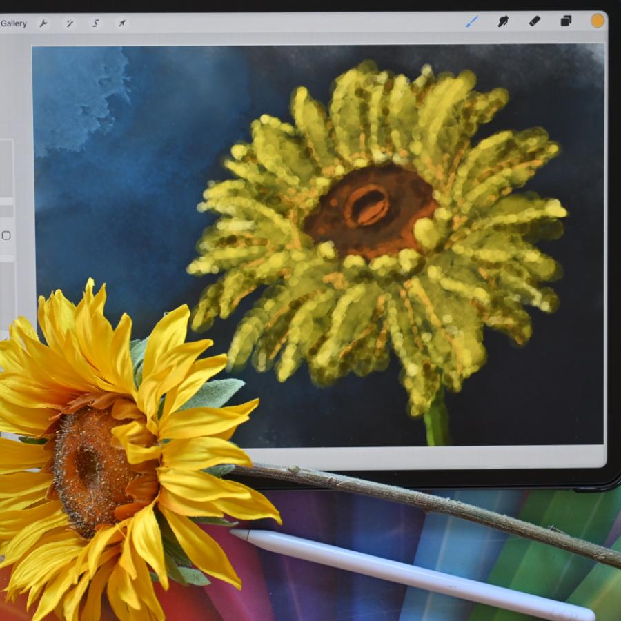
this color variation already with the flower, the photo that is supplied. And let me show
you the photograph that is supplied with the class, but I'm going to show you it on a different device for a minute. Right here is the other device that should work well,
perhaps a bit dark. Since the photo is
from this side, we're going to use the
angle is towards this side. We're going to use this
as the lighter side and this is the darker side. And the light, we're going
to let shine from this side. So this is going to be,
this is going to be dark. And there we go, So this I want lighter and this
side I want darker. And I'm going to
make a little bit of a transition and get
in these splotches. But this black is
perhaps slightly boring. So what I'm going to do,
I'm going to add some blue. I've still got it on this blue. I'm going to this
side a little bit. I'm not pressing hard anymore. I want the go a little
bit of blue in here. I press some harder
where it's really dark, add tint of blue in there. Go, and now I'm going
to really lighter blue, whichever you like. And I'm going to put
that into, there you go. I like this. The only thing
I don't like here yet, I'm going to get a really
dark blue over here. I want this to be gone. But I'm going to go
for somewhere in the middle to get a little
bit of a transition. There you go, a
little bit in it, still a little bit color. I like this. The only thing which
I might have is really light color there, Really light blue in
the middle somewhere. A splotch like that
is fine with me. I like this background.
That's good. Here's a nice background
here. A dozen medicines. Most of it will be flower, so you can create just a
simple background like this. You can very colors. But for this yellow, the black will stand
out very nicely. Well, that's it for this lesson. Really short, we've
got our background, a nice dark background to create contrast
with the flower. And the next lesson
we're going to paint our flower paint. Let's call it stipple
slightly different. Well, let's do that
in the next lesson.
4. Stippling the Sunflower: Time to do our flower. We're going to paint, paint, stipple, whatever you want
to call this, our flower. For that, we have
everything set up. We've got a canvas, we've
got the background. We do have the sketch. And now it's just
only a matter of painting with this brush
we've also developed, first of all, I'm going
to bring back the sketch. Now, as you may notice, I'm not seeing the
sketch at all anymore. I've no clue what happened to the sketch while
the sketch is still there. Because if I hide my
background there, we see the sketch really well. What I could do with
this is unlock it, tap on this, and invert it. Now, it should get
a different color, a lighter color than before. Now I want to lock it again so that I won't paint
on it accidentally. Now I can see my sketch. I'm going to paint under it, so I need a new layer above here where I'm going
to put the flower. I might want to have
this sketch on it, unlock it first, little
bit less strong. I tap on it for the opacity
around 50% is better. Now I want to lock
it again and go to that layer where I'm
going to put the flower. Let's say flower,
rename this flower. Let's go for the petals. First petals, right? I'm going to paint
the petals for that. What I'm going to do,
I need some yellow. I'm going to move to the yellow, where yellow I like. This is really yellow, Yellow. I want to start with a bit of a darker shadow color, yellow. What I'm going to do, I'm going
to move this along there, along the top to get slightly darker around there,
a quarter of it. I'm going to do it right there. I'm going to go to that brush, make sure you have
the stippling brush, and make sure that the size is not that ridiculously large. We're going to go
for around ten, 11% Let's try that. Let's tap on it and
stipple in like that. That's just what we're
basically going to do. Put down these spl, we're starting with
quite large sludges, but I don't think
this is dark enough. I'm going to tap on it. I'm
going to clear this layer. I'm going to go back to it, slide it a little bit more down. Not all the way a half, but
a little bit more dark. Let's see. Yeah, I like
that better. Good. Then we get some more
contrast with the next one. Now, if you go outside of the flower, that
is not a problem. We're not going to make
an accurate flower. We're just going to stipple this in and have
some fun with this. Not even go that detailed, worry about some of the
details of this later on. Now we're just following the
sketch as good as we can. And I'm going to do
the whole flower everywhere where there's
yellow around here too. I'm going to put
down this color. There's some yellow
there, obviously. There's yellow here at
the bottom a little bit. And there we go,
there's nothing. So I'm not gonna
paint anything there. And we're getting there. Let's see, we're there. I'm gonna ignore that bit. There we go. Right. That is basically that bit. If you zoom in, you can still
see the sketch pretty well. If I hide the sketch, this is what we're getting. A stippled flower. I add some more of this
color a few spots. Let's bring back, make sure we have the sketch
and there we go. All right, that is that bit. The next thing I'm going to do, I add a layer under the
background, under the petals. I'm going to rename
this to the heart. This is going to be the
heart of the flower. I'm going to pick a total
different color as well. Procreate will
remember these colors when we go back to them. Later on, I want to move this to pretty much the
middle of the red. I want a brown color. So let's go to the orange. The orange is nice for this. Let's go to the
orange, orange color. Let's pick a dark brown for now. Make sure you're on
that right layer and stipple that in everywhere,
under in the heart. There you go. The last
thing we're going to do at the last layer we're going to add to create a new layer. I'm going to rename this will be that little bit of
the stalk that is there. For that we need
some green color. I'm going to move
it to the green, more to the yellow
it was around here. That is nice dark color too. We're going to stipple in. There you go. That's stark. If I now hide the sketch. We have this flower. We, of course, that's
not the complete flower. We've just blocked in the flower now where our main
subject is going to be. In the next lesson, we're
going to add some details. Well, not really details, but bring in some
definition into the f.
5. Refining the Sunflower: We've got a really
rough flower now. We want to define it, refine it a little bit. In this lesson, refining
is probably a nice word. Bring in definition,
refine the flower. Create something prettier
than what we have. So let's do that. For that, I'm going to bring
back the sketch. First of all, I'm going
to actually unlock it. I want it really strong
because I can't see it because of all the
yellow it b***ds in on its. Now I'm going to make
sure I'm locking it and I'm going
back to the petals. The next thing what
we're going to do is we've got this tone. And I'm going to use
this as a middle tone. I want to go back to
that yellow we had. I'm actually going to slide
it a little bit there. Let's put it around there. That color, more brownish color. I'm going to lower the
size to 5% of this. And I'm going to say, okay, I'm going to look at this petal. First of all, if the
light comes from here, then this petal under it
is basically blocked, and now you can see it. We
know what we're going to do. We're going to add
a layer above this. For now, we go to go wrong, we probably need, because
there you go, a light brush. This petal, let's see, there's a petal under it. Here's a petal under it, and we're going to do
those petals under it a little bit darker. That should bring in some
interest into the drawing. If we hide that sketch, See, now we're getting some
definition in it right away. All right, let's keep on going. Let's see, this is under
it, that's under it. But this one is basically almost under it too, under here. But as you can see, I'm
doing this rather roughly. I don't want to
have some detailed, here's one under it. I want to have a nice stippled, a bit of a rough painting.
This one is under it. Let's see, this one
here is under it. Now, this is tricky. This one goes
under. This one is. This one is really, I'm
pressing harder on that one. I'm not using anything like a clipping mask or
something that is not right to a little bit here. But I want this to be its
own layer definition. All right. These
flowers at the bottom, these petals at the bottom. I do want slightly darker too, so that you can get a little bit of definition
between all those petals. This is dark too, by the way. That's for this one.
On the same layer, we're going to use
a light color. We're going to slide it
to a nice bright yellow. What I'm going to do is along some of the edges of
the pellets, petals, panels, a nice lighter color. So you can get some definition
that is a bit random, whichever ones are in the light. We're going to add
a little bit of definition then on the site where the light is coming from, like this one at the end, this 12, following the
shape a little bit. Even this one, this one
on top, definitely. Here we want, let's see, let's go to this
one on top of here. This one is in front to
the ones that are in front at the top basically. Let's create another petal here. There you go. This a little bit, and this is a petal under
it, I'm bringing above. Now add it, that's
too much of a line. Let's add some on top
here too, with this one. All right, now let's go
to these petals here, define them a little bit. There we go. If you
hide the sketch. Now see it becomes a lot more obvious that this is
actually a flower. Let's bring back the sketch. Let's see, this one is
catching quite some light, and this on top here. And that we obviously
too, let's do that in it. Now we've got some
nice definition. The next thing is we're going
to go even to the wide, but close to the wide. And some of these tips, like this one definition here, define those a little bit
more even on this one here. There you go. Just a little bit of extra light. There we go. Might do slightly on this side, a little bit, perhaps
a little bit there. And bring in a little bit of definition, these two on top. I missed one here
at that nice light. And there we go, the sketch. And now we have this, what
we have our flower petals. What we're going to do next
is on top of the heart, we're going to add
a new layer two. We're going to go back
to that brown color, which is probably
bro where is it? That's the green color,
there it is, right? The brown color, Pick
the brown color. I'm picking all wrong colors, Pick the brown color. Let's see, we're going
to bring in that hard. So we're going to
go, first of all, really dark, Bring
back the sketch. Now this part here, when
you look into that, that should be nice, dark. There you go, around here, some shadow to then randomly here, let's do some. All right, But there you go. The next thing is
with the same color. We're going to add
some light color, not too light right here. Let's see what that brings. That's nice and add this part. Add a little bit of
light around that top here where the light is hitting. Just a few spots of
light here and there. Now let's remove mask. See, now you get
that idea already. There you go, that
this is a sunflower. Let's do the same at the stark. Let's add a layer on top of it. Pick that green.
Where is the green? There's the green.
Pick a lighter green. Not too light, but
definitely a lighter green. Let's add a color. And then pick a really nice dark green, especially in here
where the shadows are. There you go. Now that got some definition too. All right. Basically we could
be done like this, but what I want to do
is I want to perhaps a little bit more of a
tone of yellow in it. Just a little bit of variation. For that, I'm going
back to the petals. I'm adding a new layer, and I'm going to call
this a clipping mask so that it paints only
over what's under it. I'm going back to that yellow. I'm sliding it perhaps, to this color, a bit larger, 23% at some of the
bottoms of those layers. Petals, Slightly darker color. There you go. Yeah,
I like that better. I'm going to do that with
a lighter color too. Where it is lighter, I'll add in slightly
lighter colors to change the tone a little
bit from what it is now. There you go. Now we've got a
interesting part. Let's see the heart. Let's define this a little bit better
than what it is now. Let's go back to
that darker color. And maybe to a
smaller brush, two, 3% the heart on top of it. Let's round this
slightly better. See now you get a better
heart that looks nicer. I like that a lot better. Then I may want to add a
little bit of a line here. Let's see how that works. So that we can see. You can create a little bit
of lighted line there and a shadow line under
it. Okay, there we go. See that looks
more like a heart. Now I do want to bring in
another color on the petals. And let's see what I'm
going to do for that. On top of here, I'm going
to add a new layer. I want to play a little
bit with some orange. I'm going back to the yellow. Move it to the orange. Yeah, that would
be a nice color. Bring back the sketch to
like on this side here. That brush is, As we
still pretty small. I want to bring in a
little bit of definition. I want brush probably
3% for this, At this here, there you go, This bottom to create
a little bit of a interest between
some of these sides. Now, if I hide the sketch, now see that looks nice. I like that slightly more
definition. This is too small. I'm going to change that. There you go, Right there. I want it on here, at the bottom, under
here a little bit, right here to create
some interest here too. Define it a little bit more now. This definitely needs it. There you go. Round this bottom here, bit here at the bottom, around this bottom,
on that petal, above these small
petals that are there. Just define that a little
bit more to around here. On top of it, there's a different petal.
Do that here too. Define some of these
petals slightly more. And there too,
perhaps around here. Okay, let's check that
hide the sketch scene. Now we get a little
bit of definition. Now this I don't like here. I'm going to take whatever
erase it there is, I'm going to erase this. That is too much.
Bring back the sketch. The brush, I still want it, but not line as a
line as I had it. There you go. See, And now we're getting a little bit of
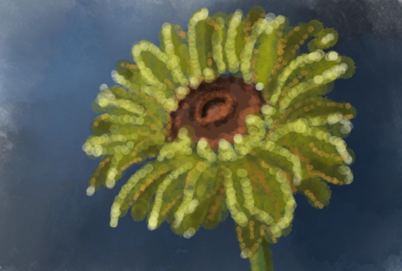
color and definition in it. Nice. I like that. All right. I'm going to leave it like this.
6. The Project: Well, thank you for being
with me in this class. We've created a lovely
summer postcard with a sunflower
using an alt brush. Not a completely
self made brush, but an altered brush to
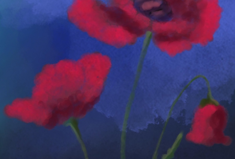
create a nice effect. Now, summer, there's more to summer that only
sunflowers, of course. More flowers, insect, beautiful skies or
you can think of. And I will chal***ge
you to create another summer postcard as
a project using of course, the same brush and
the same techniques, create something
totally different. Post it, I'd love to see it, show it to everyone, and create a lovely summer scene with this brush and
these techniques.
 Benjamin A, Art Teacher, illustrator Art by Benjamin