Transcripts
1. What wil you discover through this Class: When I think of autumn, one thing automatically comes to mind and there
are toadstools. In this lesson, we're
going to create an autumn postcard
and the main subject, the star of this painting, will be a beautiful toadstool. One of the photographs I've
taken from a toadstool, we're going to use that as a
reference for this painting, but that's not all
we're going to do. We're not only going to paint, we're going to create
our own brush. We need a special brush to
create this special scene. And I'm going to walk you
through the steps on how to take an existing brush
and turn it into a brush that is way closer to quash painting than the
standard procreate brushes are. So we're going to have
some fun together, not only creating a brush, but also of course, painting this beautiful autumn
scene together.
2. Tweaking a Brush: As said in the intro to
paint this postcard, we need a brush, we
need a special brush. We need a brush that
is closer to the ah, than the standard
procreate brushes. In this lesson,
I'm going to take you through the steps on how to turn a standard brush
into a brush that is way closer to A
than it currently is. Before we're going to start with this lesson, I want to show you. Here on the right, you see the standard procreate gouache
brush, that is this one. You can find that
one in painting and gach that has some
texture in it. It's quite nice, but what it doesn't do is if you look
here at the transition, it doesn't do like
gach really does. When you go over a
layer again with a new gach color or a wet
brush, it's going to blend in. This brush actually
doesn't do that. What we're after
is more like this, where it blends in a little bit. Where the color blends
in the stroke blend in. And where it doesn't
only layer but also interacts with the
previous layer. We need that. I'm going to add a new layer above this,
probably height everything. I'm going to show you
that brush, There it is. The gas brush, I've
got just one color. If I lay it down like this, it's a bit large. You get a layer like this.
If I put a next layer, as you can see, it doesn't interact with the
previous layer. It just puts on a next
layer and a next layer and next layer, you get edges. Even if I go very soft, I cannot blend these edges away. It just creates a new edge. Layers and layers
and layers, Real. If you have a gouache
painting somewhere, Benjamin, you should have
a painting somewhere. There it is. As
you can see here, there's a nice
transition here too. You can get harsh lines, but you can also
transition very nicely. Or as you can see here
in the green where it transitions the darker colors
into the lighter colors. And the other way around,
you have that choice. But this brush doesn't
give me the choice. What I need is I need
to create a new brush. And in this lesson, we're going to go through
that process. So you need to find that brush that is in painting and ga, what we're going
to do, we're going to make a duplicate of this. So I'm going to slide it to the left and I'm
going to say duplicate. It says Ga one. We can rename it
whatever we want. We're not going to change a
lot of things in the brush, but just what we need now. You have a lot of options, most of them are set.
We're not going to touch. But the two that
we're going to touch is rendering and wet mix. We're going to go to rendering. Now, at the moment this brush
is set to a light glaze, and that means it just
puts over another layer, a light layer over
the previous one. What I want is a
more heavy glaze. So you have a few options here. Glazes and blending. Now, blending is when you
put another layer on it, it blends with the
previous layer. Oil brushes, for
example, do that. Ah, brushes do that,
but not that strong. So I don't want that. I'm
going to go to heavy glaze. What this does is a normal glaze keeps the tone you
put down consistent. But with a heavy glaze
that keeps not only the tone consistent but also the paint opacity When
you're mixing it, it keeps that also consistent. We want that, the
flow and everything. I'm going to put on
the max, I want that. But I also want some wet edges because I want these
edges to blend in. That is this option
here, the flow. If it's not on the max, in
yours move it to the max. The wet edges, I want
somewhat edges around 12, 13% 14, somewhere around there. Then if you want it
precise, you can type here. And if I want 13%
then that's it. Now, I touched, it
wasn't the idea. I put it to Max. There you go. Now I can put it to the
13% What this does, it softens and blurs the edges around here of
the brush strokes you make, that mimics the pigment of
paint bleeding into the paper. When you use in real life, you use what color paper, the pigment goes into the paper, and this mimics
that a little bit. The next thing we're going to
change the burnt edges too. I want the edges to nicely burn into the previous
paint under it, and I'm going to put this
to 50% 50% there you go. And what this does, this creates a color burn effect
around the edges again. And it also darkens the edges when you
overlap a little bit. We need that later on
because the brush is going to be slightly lighter
than what we see here. Now if we get some
stronger edges, that just looks better. All right, I've got that. The rest. Let's see. I'm
not going to touch that. I want to leave this to
multiply and normal. These are the mode the
burnt edges are in, it multiplies whatever
is under there. And the blend mode
of this brush. I want just normal. All right. The next thing we're going to change is the wet mix. Now there's a lot
of options here. We're going to start
with this one, the pool. What the pool does is dihute, pull the paint and the color of the brush stroke into
the previous strokes, the previous layer
you already put down. But while it is on, this doesn't work like
I've demonstrated. It doesn't do anything. It just puts the layer
on layer on layer. And it doesn't interact with
the color and the paint, the previous one. Why is that? Because pull only works together
with the other settings. You can slide this on enough and it's not going
to do anything. You can actually test that.
We can do that right now. It's now at 85% I'm going back to this canvas,
Put down this color. I'm going to put down the next. Now it should pull this color right here at the edge
into the previous one. But as you can see, it
doesn't do a thing. I'm going back to the brush. I'm going to put this to zero. None of it. As you can see, I'm getting exactly
the same thing. It's not doing anything. Let's put this poll
then to the max. They go max, done again. As you can see, it's
not doing anything. It's not pulling that paint into the previous
layer three times. Exactly the same thing because pool on its own
doesn't do anything. We need to adjust
the other settings. We're going to start
with the dilution. What the dilution does, it simulates how much water
you mix with your paint. You get a more wet paint and a more wet paint can go
into the previous paint. Now, I don't want the pool
on the max, by the way. I've got to slide that back. We're going to go to 96%
Around 95, 96% fine. The next thing is
then the dilution. We need some dilution now,
you can play with that. You can put it all to its max, and as you can see,
now it's gone. Now, it's not going to
blend anything anymore. All my paint is gone. We need to find a
nice middle spot. We're going to go
somewhere around 44% Now, if we do this on its own, the paint is now gone too much. We need to change these two settings here to
the charge and the attack. What the charge
does, it determines how much paint is
applied to a stroke. Now there's a little paint, if charge, you can see it dark. And again it adds more paint. I want to go say around 26%
Let's move it there for now. And the attack, we're going to change that to what
does the attack do? It adjusts the amounts of paint that sticks to the canvas. If you put it higher, there's more paint
sticking to your canvas. If you put it too high, it just defeats the whole
purpose of blending. We want to have some attack, we want to have some paint
stick to the canvas, but not all of it. It gets darker again. Let's say 35, 36%
Let's go there. The next thing we're going
to change is the grades. This determines the chunkiness and the contrast of your brush. Now it's very textured. I can demonstrate that though. Let me clear this
canvas for now. Clear What we have for a brush now is if I
put down this brush, you see there's a lot
of texture in it. And if I put down the next one, as you can see see now, I can work away these edges a little bit if I don't
press too hard. If I press really hard, it
puts down a lot of paint. If I press down a little, it blends away these edges a little bit and
that's what I want. But I don't want
this text paint. What I want to simulate is as if I'm using a smooth paper, a hot press paper. Now it's more simulating a cold press paper where
you see the texture a lot. Let me find an example for that. The example is, this
is cold press paper where you can see a lot of
the texture coming through. This is hot press paper where it's nice and smooth
and the colors, as you can see with rug wash, start to pop and you get
nice, smooth, strong paint. Well, here you get this texture. With this painting, I don't
want all the texture, I want something more
smooth like this. And I want the brush to
do all the texture work. I don't want this
lots of texture, so I got to get rid of that. And how do I get rid of that? That is by the grade. I can invert it by going to negative. So then the stroke inverts, I can make it stronger, but I can also get it
away by putting it to. So all the way now I should get a nice
smooth brush stroke. My brush is not totally
perfect because I realize I have not say, I said counsel on
the previous one. Let's go for the heavy glaze. Said this to 13% there you go. And my burnt edges, was it 44% higher, Even 50% you can't do that, 50% There you go. The rest, I kept like this. This is now. Okay.
These are the settings. A heavy glaze flow to the max, wet edges, 30% burnt edges, 50. We're leaving this to
the settings it takes then dilution goes to
44% the charge to 26, the attack to 36,
the put goes to around 95% and the grade
is smooth and the blur, and the blur, jitter and
the wetness, jitter. I don't want this to blur, I don't want it to jitter with
all kinds of little edges. I'm fine with this. We should have a different kind of brush now let's try that. As you can see, this puts a
nice smooth paint with steel. If I zoom in some texture in it, but if I put now a
second layer on it, you say, hey, nothing happens
exactly the same as there. But if I now very
lightly touch this, I can actually pull this paint into the other one and work that line
a little bit better away. Let's go zoom in. I can take that, see
that edge is slowly disappearing because
I can blend that in. Now if I want that, if I put a different
color on it, I'm just going to get whatever color I have here
for the demonstration. It should now actually
blend these two colors. If I go very lightly, you see that there's
a very light green. See that you get a
different brush. This is what I like. This is good lower,
a little bit. Now the brush behaves
differently to a smooth brush. Now the brush is called one. I don't want that,
I want to make sure that it's got a nice name. I'm going to about
this brush on one, I'm calling this, press the spelling checker
and did it right. And hot pressed. You can put your
name, you can sign it like this is paid by Benjamin. And I want to actually
call that art by Benjamin with a small letter. There you go, by. By
Benjamin. And there you go. Now it's my brush, hot pressed. And that's the one
we're going to use. Now that we have a brush, we can start painting with it. In the next lesson,
we're going to set up a canvas, do the sketch. And after that, we
start painting.
3. Setting up and Sketching: Now that our brush is ready, we need to set up our
canvas to paint on. I'm going to show
you how to do that. I'm also going to show you in this lesson is how to
sketch the whole scene. We're going to create
a sketch as a guide. Now if you really don't
want to sketch at all, the sketch is supplied. But I would really encourage
you to come along with me and sketch the scene
before we start painting. I've still got this canvas. This is just a random canvas
I need to make a card of. Now, this depends
on where you're at. You can, if you're in the stage, you want to make your
postcard US size. If you're in Europe, you want
to make it European size. I think postcard in US is
four by six in Europe, about 10:15 centimeters,
something like that. But what I'm going to do is
I'm going to use an four. And you can use for
the US a letter size so that if you want to print it on a larger paper,
you can still do so. But if you want to shrink
it down, you can do that. Shrinking down is
not a problem in procreate. It just goes fine. But if you want to
blow something up, you get all these pixels
and edges and things. We're going to work
slightly larger. And what we're going to do,
we're going to tap the plus, we're going to say
a new canvas here. We're going to change
the dimensions. Now the first thing,
you either choose inches or you
choose centimeters. If you're doing inches, you may want to do it 12 " wide. You want to do it I think around 8 " high, something like that. You get a nice size,
we'll check that. That pretty much looks
like a postcard. 12 by 8 ". If you're in Europe and
we're going to change this to centimeters or millimeters depending on let's
go millimeters, I'm going to do this in a four, then the width would be 279 millimeters by
210 millimeters. Now when you create it, make sure this is on 300. You want it to be 300 DPI to
print nicely color profile. I'm not too worried
about S. Rgb is fine. Don't change it to
CMYK if you do that. This is for printing press, there's a lot of
people in procreate, make the mistake to put
it to CMYK somehow. There's a persistent, incorrect, outdated information
online that you should put it to get a better
print. That is not true. You're limiting your colors unless you plan on printing
it on a real printing press. Even if you have a graphical
laser and I've got one, an expensive laser that
puts out high graphics, even that one's SRGB these days, stick to the SRGB. Most printing goes
fine with that. The rest I'm not
too worried about, I don't mind canvas properties
and all of that is fine. The dimensions are important. I've cut my dimensions, and I got my color
profile right now. If you end up with
two layers here, then you may want to change
the size a little bit down. But I'm sure you've got still plenty of layers
left to paint in, because we're not going to
need many layers anyway. I'm going to say create. I'm going to work in this size. Now you can see it's
slightly higher, It's slightly different
than that one. I'm going to use the
European size this, I can just shrink it
down and if I get the real postcard with it, this is postcard side, see I'm getting a perfect size, the same size, same height, about the same with
the same ratio. And that's important. All right, good. That's my canvas. Now I want to paint
on my canvas. I'm going to only use
this guache brush. But first of all, I
want to make a sketch. So what I'm going to do, I'm
going to go to sketching. I'm going to pick one pencil. Hb pencil is fine. I'm going to pick a color, I don't want this green color. I'm going to slide this
somewhere to the blue. Doesn't really matter where. Slide it to here
where I get some, not a black color, but a
bit of a grayish color. I like that because graphite
isn't black, grayish. I'm using that. And now I should get a nice line. That's fine. The next thing we're
going to need is of course, a reference. Now I've got the reference
here on a different screen. I'm using it like this, so I'm putting this up
right so I can look at it. And I might just as well
do that right away. I'm putting it upright like
this so I can view it. But there's another way
you need to download of course reference that
comes with the class. You can add that into Procreate as a reference,
you tap on the wrench, You go to canvas, slide this on to
reference. You say image. If you have it on your canvas, in your photo role, your
image, then there you go. You can move this
picture around, you can enlarge it, you can pick it up on this
and put it wherever you like. Then you have your reference to. Now I prefer, for this one, a larger reference,
I'm going to put it. Where I can see it. But
you can do it this way. If you don't want the reference, put it away, There you go. Download the reference and
we're going to use that. We're going to not
totally follow the reference but
roughly first of all, what I'm going to do is I'm
going to create the cap. Now a little bit here, I'm looking at the reference, it's a little bit
under an angle. I want the cap to be slightly
larger than in the photo. I want to tool to take up
nice space in my drawing. Like with this, uh, painting, I want it to be, of course, the center stage of the image, but slightly larger than
it is in the reference. There we go. I'm just
sketching that in. Let's see, I'm
just sketching in. There you go. I like
that. That's nice. Just an arch and a straight
line under an angle. If you don't want to sketch, I'm going to provide
the sketch with this class so you
can use my sketch. All right. The next
thing is of the star. Now I've got the,
I need the star. I want it a little bit under
an angle there go straight. I don't want this to
be straight down, but I want it to be slightly
under an angle two. That's all there is
to it. And that's it. Now the ground,
I'm going to make slightly different round
this a little bit. I'm going to add
the ground to it, basically something like this. That's the first part. Now the scales I'm not going to draw in, I'm going
to paint them in. I want a rough reference. The next thing which I see on my reference are these leaves. I want these leaves to
be in it, and I want, of course, the blades of grass, a little bit of this moss. We'll do that with
the paint again. But I do want leaving it. So what I'm going to do, I'm
going to put it right there. I'm sketching in the stalk of the leaf actually that
is technically see a branch there now
because pretty sure this might end up as
a tree eventually. There you go, There it is. No, no noticing
that end is around here and that one goes, there you go there. That one I'm just following
roughly as you can see, quite roughly the example. And the next one, it
is straight here, but I'm going to
move it slightly so it looks a little bit nicer then It doesn't seem
like it's growing out of here. I'm moving that
one slightly over. There you go. There's that one, there's the second one, and then there's a third one behind. I want this to overlap
the other one slightly. And that one goes right there. Since I've got my
mushroom larger. This one doesn't go right there on top
but comes under it, but I don't think that's
an issue with it. We're moving it
around a little bit. There's the last one, this one Stark to. I'm going to give
that a little bit of an interesting right. There's my element. So I've got these leaves. There you go. I've
got my toadstool, and I'm fine with this. This is enough for the
sketch. Well, that's it. We finished setting
up everything, and our next step, we can actually start
painting together.
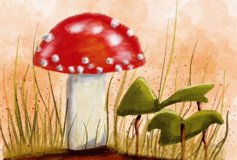
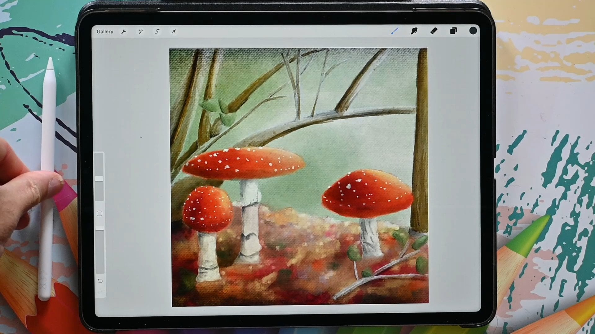
4. Painting the Toadstool: We've got everything we need. We've got a brush, we've got a canvas, and we've
got a sketch. So now we can start painting. So we've got the sketch. The next thing is
we're going to paint. Of course, for that I'm going to add a new layer by tapping this. Plus we're going to get
a new layer above it, but I don't want it above it. I want every layer to go under my sketch that I can
clearly see what I'm doing. What I'm also
actually going to do, I'm going to lock
the sketch that I don't paint accidentally on it. To lock it, you move
it to the right, to the left that is
not in the right, move from the right to the left. And you say, look, now
I can't paint on it. It gives me this notification, and I'm going to say
Counsel, All right, good. There we are now
for the mushroom, of course, totes too. We need some red. I'm actually not going
to start with the red. I'm going to approach
this really as a Guh painting and we're going
to go with the hood first. If I want a nice bright red
color in a Gah painting, I'm going to start with yellow. May sound strange, I'm going
to move this to the yellow, doesn't really matter where. As long as it's yellow, somewhere in between
the green and orange. I'm going to move this over to a nice and there we go
with ah, painting. What I would do actually
first is the background, but I'm not going to
do that with this. We're just going
to paint and then we'll do the background finally. Because with
procreate we can add layers anywhere we want. But with ah painting, I might actually
have started with the background and
then work from there. All right, I've got my brush, so I need to go to these
brushes where we put it, there was painting
somewhere down, it should say hot press. This will be my brush. The size we can go
slightly larger, around 16% if you want to do do you press with two fingers
or this little undo button? All right. I'm going to
put my first layer in. What I'm going to do
is I'm going to paint. I'm going to make
sure I'm not lifting my pencil per accident. If I do lift my pencil per
accident, what happens? Then? You get a second layer. And I don't want that,
I want one layer. This is good enough
for this yellow. The next thing which
I'm going to do is I'm going to go to
the next color. I'm going to move
this into the orange. I want to get a
nice orange color. I'm going to go for a
slightly smaller one, and I'm going to do some
orange right on this side. There you go. I'm
pressing nice and hard. But when I'm going to the edges, I'm pressing really soft. And as you can see, that
starts already blending now. I don't want that
too much blended. Keep on press now, do less pressure
and there we go, we're going to get
something like this. I'm going to zoom in a
little bit. There you go. Good. I'm going to
do that next color. I'm going to pick, I'm
going to keep on going, is going to the red. It's just touching the red. I'm going to lay down a red color that is a very light red. And
that's the whole idea. I'm going to put that on
everything as you can see. Now these other colors start
mixing in really nicely. That's the whole idea. You
keep on going, keep on. If you press hard,
you get the color. Go with less pressure, you get a slight color and
you start mixing more. If you want the strong color, if you want the lighter color, go a little bit lighter. And somewhere in between
until you get what you want, that's a layer like that. I'm going to put down
another layer on top of it. But right here I'm
going to go with little pressure
because that's where the sun is a little
bit. There you go. I want this to be
a nice transition. Go over it one more time. There we go. Now, there
I've gone outside too much, so I'm going to redo this part. Get my transition in
a little bit better. Get the nice strokes
in. There we go. I'm going to go
for a lower brush, 5% I'm get my edge in
nicely. There you go. Now I like this. If I like the shape except for under here, we'll put it a bit
more straight. Now here I don't want all
that red like my shape. I'm going to preserve
this. And I'm going to add a new layer on top of it where I'm going to
keep on painting. And we're going to
use a clipping mask. Clipping mask, What it does, it make sure that it paints
only on whatever is under it and it won't go outside It only regard where
I've painted already. We're going to go for a
nice red. There you go. We're just sliding this over, keeping this in
the same position. That is a too small rush. Going to round 10% There you go. If I paint here now, as you
can see, nothing happens. Well, something happens,
but we can't see it. There you go, Here
I'm going to go a little bit less
pressure again so that I get this under it
again, this color. But on top I want a light spot as you see here, a new layer, There you go, with
a light color. There we go, that's a nice
high light like that. Now I'm going to the next color. I'm just keeping this sliding. This should be a nice dark
color. Now, there we go. I like that. That
works fine for this. At the edges. I'm going to
blend this a little bit. There you go. We can do this quite roughly because
then you get also the shapes in the tos
to the nice shapes. I like this, this is
looking really good. I'm going to get this
brush to 5% because I want these edges to be like
this, a bit stronger. There you go. And play with
this a little bit here. Change the pressure, press hard, then press a little
bit so that you get these nice transitions,
these interesting shapes. There you go, there nice. All right, next
thing is there's, of course in this cap
is a nice highlight. We need that to be in there. We're going to try to see
what happens if we do white. We're keeping this red, we're
moving this to the white. Let's say add there. There should be some highlight white in it. Little bit there. Now, with hardly any pressure, will try to blend this in, but not with this color. Because if I do that,
as you can see, this should be okay. Then a bit white. I want the blending to be
done with some red again, because this is too
obvious. Now, is it? I'm going back to that red
color, that middle red. Now it should keep my colors. I'm going to not a dark
red but the one before it. I'm pressing so that I
can blend this in nicely. Going over it, picking up
this color a little bit. There you go, blue strokes, And now we've got
some nice highlights. I'm going back to
that white again. I'm going to try to pre. Now I need one good stroke, and then I'm going to hard
press and blend this in. I'm going to do that here too, again. There you go. And you can see it makes some
very interesting strokes. There we go. Let's
check that I like that. That looks nice, doesn't it? I may want to have a little bit of white there too,
some high light. But I want to work that
away. There you go. Nice, good. All right. Painting looks rather nice. See, this is looking
really good. I like that. I'm not sure if I like this, but for painting this works, so I'm going to not
touch this anymore. I like it like it is here. The next thing of course
then I need is the stock. We can do the scales. Well, we're going to
do the stock, okay, I'm going to do the
stock on a new layer. We just on top of
this add a new layer. But I'm actually going to move
that layer under the hood. Next layer under the hood. You could rename
all these layers, of course, give them names. If you want this
to have a name tap on it, then say, rename. I taped it twice they go, and you can give it a
name stock like that. Then you can rename this
the hood or the cap, whichever one you prefer, and then you know
what you're doing. All right? I need my
sketch back. Of course. Otherwise I don't know
where I'm going now. In the photograph
it is quite white. What I want a bit of yellowish color, I'm
going to the yellow. I'm pushing it a little
bit to the yellow color. I'm not getting a white,
white, yellowish tone. And that should work very nice. Go back to my painting, which I have about 5% Let's
go to 8% that's nice. I'm painting this in, that should go nicely under the
hood even if I go too far, so matter at all. Now that is the base. All right, that is nice. I could now hide
the sketch and see, you got that nicely. Except for this part I don't
like go for a smaller brush. Had a bit of a
better line there, right? I like that better. This now needs to be slightly
wider. There you go. I like this. I'm going to
do exactly the same thing. Add a new layer, tap on
it. Say clipping mask. And here I'm going to play with this color because I want to make sure there's some shadows in it and things like that. Now we're here, what we're going to do is I'm
going to move this to the grayish side like that and add in
discolor on top of it. That is now a very
strong there go. I'm going to move
by hard pressing, paint this in a little bit. Now you can see I get
these nice strokes there which I actually want. I'm pressing now I'm playing a little bit so that I get a little bit of definition
texture on here. Some strokes here and there
And I like that. All right. That looks pretty
nice, doesn't it? Good, I want a little
bit darker on it. A little bit of a darker shadow. Now, I'm going to
exaggerate this a little bit more than
it is in real life. And I'm going to
move this to the blue halfway to the light blue. I'm going to get a little bit of a blue color in the middle. Blue, grayish color. I'm going to add a new layer. I like this layer below it,
so I want to keep that. I'm going to say
clipping mask again. I can experiment with this
now that's a good color, Just around the edge,
perhaps around there. I want to lay down
a layer like this, might have slightly more there now without
hardly pressing it. I want to get these
blends in a bit. There you go. Oh, that
is nice bit more. Here I'm pressing a bit more
and then I'm blending it in. See, now we're getting
something really interesting. See, that's the
power of a brush. It simulates a, uh, brush way more
than the standard. I might want to have
some dark spots there because that
looks nicely here. I'm hardly pressing,
adding a few here, there is a hole in
it. I see that. But I'm not going to do that
hole. I like it like this. Now look at that.
That definitely looks like a
mushroom, doesn't it? The only thing I want to
change, I'm going here. I want to add a little bit
of shadow around there, a little bit more up here to create a little bit of
a nice rounded shape. There we go. There
is a lot better. All right, I think
I might leave it like this and not
touch this anymore. What would be next, The scales. Well, we're going to add a layer on top of everything obviously. And I'm going to call this
then right away the scales, I want that color back. I had that of whitish color. That yellowish of white
color, there it is. I'm going to see if this brush will make nice scales and it
will with one press. That's the whole idea. Let's go, let's see. How large do I want? I've got it on 7% now that's too large.
Let's stick to the five. What we're going
to do is what I'm doing is we're pressing
in these scales. And I don't want it all
the way under here. I want it a little bit less
than it is in the image. And we're going to work on
these scales in a minute. Let's add a couple here. Smaller here, so I'm pressing less bit larger
there. There you go. Let's see, do I like this? Yeah, I do perhaps want one
there, maybe one there. I like this. This is a nice
arrangement of scales. This one goes up there. Okay. For the next one, I'm going to lower
this a little bit, 3% Now I'm going to
tap on them like this, and I'm going to make the
color a little bit stronger, especially on the site, the top and the site where
the light is coming. To make it myself easy, what I'm going to do is to get this a little bit stronger, I'm going to add a new
layer on top of this. I'm going to move
this to the bottom. This will be my
background layer. I might just as well rename
it background layer, but later on we're going to actually work on the background. But for now, I just
want a color in it so that I get
a nice contrast. Doesn't matter which color. To take a light blue
color for the contrast. And what I'm going to do is
I'm going to hold this slide. I need to get rid of this. Now we've got the wrong color. There you go. Hold
this, tap it there. And it should go right
away. Everything. Now I can see my
scales a lot better. And I can also see that this
scale here is terrible. What I'm going to do, I'm
going to get an eraser. I'm using therefore
that airbrushing. A hard airbrush, I'm on
the background, right? I need to go on the scales. I'm actually going to remove
this scale completely. And this scale I don't like, might call slightly larger. The rest I'm fine with, but I don't like that scale. Okay. I'm on the scale again. I got to go back to my, uh, brush instead of the eraser. Pick my color again. There you go. That is on
the hair a little bit. I like that. That's good. See, that is a lot better. That looks way nicer. Now, I got to continue this, obviously from the drawing. I can see that from the photo. I can see the sun is around here somewhere shining
from this side. That is what I'm actually
bringing in with these colors. There you go. I like that. Now I'm going
back to that grayish color. Dark grayish color. Let's try that and
see if that is not to that in this edge a little bit. I don't mind if I go over
on to the hood itself. But I'm not pressing hard. Now, if you have a
problem with pressing, what you could do is also
slide the opacity and lower it to about 50%
and then 50, let's say. And then press that should pretty much give the same idea. See that works. But if you can tap lightly, then please use that instead.
And now look at that. See, now we're getting
some nice scales. I said that is a bit
over the top perhaps, but for this drawing,
it looks nice. Am I saying drawing
I am painting for this painting, it looks nice. Get some nice definition. Do I have the I want
a bit more here. Perhaps a bit more there. Now I'm going to
that middle color, we have that other gray. I'm going to make
a little bit of a transition between the colors. So on top of it, there you go. That should fill up this. The gaps I have in between the high light
and the dark color, see like that, is still
a bit transparent. So we want to create a little bit of a transition
there I think I am. We might have a little bit
more there. There we go. And knife, but
that definitely is missing the dark edge It, and this one I want
slightly more. They go. All right, good. There's my toch too with some nice scales. I like that. Now let's
go back to the stark and layer where the clipping
mask on top of the stark. We're going to use this
dark color steel perhaps. That is a little bit
too, a bit more here. Now I'm using strokes again
with that small brush. Yes, I do want that a bit
stronger than what I have here. If I've gone too strong, then very lightly I can move this color around.
That's better. Good. I like that better. All right. Going to
move this larger, going back to that middle gray, and add a little bit of that
middle gray around there. Blending this in. There you go. Now that is nice. All right. Good bit. Perhaps here, some more tones and now I
like the shape of this. All right? And we're going to stop with the toads too
and leave it like this. Well, the main star of
our postcard is ready, is looking really good. I hope yours is looking great. But it's an empty scene on
that toadstool, a bit lonely. So we need to add
some more details, some more elements to it. And we're going to do
that in the next lesson.
5. Creating the Plants: Let's give this
toadstool some company. In this lesson, we're
going to paint the plants that are next to the
toadstool on the photograph. We're not going to
paint everything that is in the photograph, but just some main elements to support the scene
and actually create, turn this postcard into
a full atom scene. Well, we've got a
toadstool and probably from the video you might notice is getting
slightly darker. We're approaching autumn
and it's a rainy day today. Even some of the leaves
are starting to turn. There might be some changes, but I'm pretty sure you can
see the ipad very well. That's what it is. The
most important thing, of course, now we've
got this part. This looks really
nice, doesn't it? The next thing is we
need a sketch back, and we're going to work on, let's do the leaves first. All right, We're going
to do the leaves now. Somewhere we need a new layer. It doesn't really matter
where we put this layer, since it's not influencing the others. We need some green. Of course now bit of, it's not an autumn green, it's not a light green,
it's not a dark green. I'm going to move this
somewhere in the middle. I'm going to decide
what color I like. I'm going to move
this to the green. Let's go for a middle green. In the middle of the green and slightly there
in the middle. I would say around here. Let's give that a try. That's a good
color. I like that. That is good enough, right? We're going to do those leaves. 5% I'm going to do. I'm going to do the A leaf. I'm not lifting my brush, that's my first leaf. And if I don't have the
Pt shape, that's okay. I'm going to go for 4% I think, because otherwise I won't manage the corner here.
Yeah, that should go. Well, I'm going to do this
one now. There you go. I'm going to have the stark, the branch over it later on keep the same pressure. There you go. Don't lift it, because
otherwise you're going to have a second layer there.
That's the next one. And then the third one that goes over the other
one a little. I noticed that button of the shirt is
tapping on the ipad. Let's move that up a little bit. All right. I've got
these, that's nice. I'm going to lower this to
about 2% And I'm going to give this a dark side
that should be here. As you can see, it's
not going to do much. Only a little bit, might be two. I'm going to remove
that. Let's go 3% let's go a little bit darker. I'm sliding this down to a
darker color. That's better. I'm making a mistake. I need a clipping mask for this because I like the shape.
The shape is fine. Add a clipping mask on top of
the leaves. Clipping mask. Rename the leaves to leaves. There you go. All right, to the clipping mask. And then I can go outside and
I'm doing the same as with the toads to not totally
the same at the edge. I'm pressing really hard
where I want to dark, and then when I'm
approaching the other color, I'm letting go of the pressure
that I can move it in, create some nights
color like this one. Let's see, this one, we need some strong
color right there. And remove it, because
I want to make sure you can actually
see very well. I'm going to go for a
dark color under here, that this is a different
leaf then this one. If I hide the sketch
now you should see clearly two leaves now. All right, this one under here, that is pretty much going
to 4% in the darker color. I'm now half pressure, I would say, giving it a
darker tone, but not a dark. Dark. Because the dark I
want there, there you go. Actually I'm going to blend
this in a little bit. Creates some nice blends there. I want this to be even darker. I'm going, there you go. The blue background
is coming through a little bit still because
this is a bit opaque paint. Because of the glaze, right? I'm checking the
photo down here, it is actually quite dark. And round here too. I'm just creating some
nice strokes like that. Let me hide and look at that. See nice paint strokes
a bit too much perhaps. Let's go over it,
this one a little bit with a light pressure blending
that in a little bit more. There you go. All right, that's now I want some highlight
on these leaves too. I'm going to a lighter
green, definitely. This one where the light comes. I'm going to press hard,
but careful there. Now, I'm going to blend
it in a little bit, only a little bit of pressure. I like that. This one on top, here on the back a little bit. Let me blend that
in. There you go. Now I'm getting nice and
this one only on the edge. So what I'm going
to do is I'm going to go for a small brush. Let's see if I can get the
edge and I can get the edge nicely, like this painting. The edge basically. There you go around here. We want that to create a
little bit of that fault. There we go, See
that looks nice. Let's go for light, no white but still a
little bit green in it, like this for 2% there. Go give this a nice highlight here and then blended
in a little bit. This, I want to have
a highlight here too, so that you can clearly see
blend that in a little bit, that there's a
different leaf there. There you go. We're going
to do that right there on this edge to brush
this in a little bit, nicer than it is a
little bit here too. There you go. All right, those are our leaves. I like them like
this. That's good. Maybe I want that dark, really dark color
around this edge here, a little bit under
here is a shadow. But blend this a little
bit and then create this into a one again,
only at the bottom. There you go. Oh
yeah, that is good. Might do this one
slightly nicer. There we go. Next thing we're
going to do the stalks. Those go under it, on top of it, that is 21, goes over it, the others go under it. We need two stalks. Layer under the leaves. I rename that.
Stalks in the back. That is not back, starks back. I'm going to the red
orange there here. See where this brown
color appears? I'm going to do it. Wow.
A little bit like that. I think I'm okay with that. Not in the red, In the yellow. Somewhere in between the red and the yellow's still orange. I got that. Let's see if this is small
enough. This brush? Yeah, that is good.
I've got it still on the 2% I think. All right. I'm going to paint in a. There you go. That's one. This will be two. Now that one continues here. All right. This one we need to have to have in
front in a minute. But let's add some highlight
here too with the same call. I'm going, I want
a clip mask now, again that we only touch it. I want some dark at the bottom, under here, and then a
little bit at the edge. There you go. That's
more than enough. Let's hide this
sketch for now so that we can clearly
see what we're doing. I'm doing this here, under there, then
some dark here. Now I notice that I
need to go back to this mask to that previous
color A I on the right layer. All right, I renamed
that per accident. Did name that I want
this to be better of. Now I'm going to
the clipping mask. I'm going to that dark color, there you go, under here. That's impossible.
What I'm doing here, there should not
be a shadow there. Let's remove that, because
this is way behind. I'm going to do that
the same as the other one. There you go. Nice. All right, and
some highlights. So basically slide it
up to a lighter color. I want that to be the transition
that in a little bit. Here goes light, then
there's a high light there. And I'm going to stop there, paint that in a little bit. That's good enough for these, right? These looks good. The next one I need a
layer on top of it. Rename the stars in the back. I want to rename
this Starks Fronts. Only one really, but that works. All right. I'm going
to do the same here. Pick that middle color, get back my sketch. And this one is right there, painting that in till
I'm meeting the ground. There you go. Now I'm going
to move on top of it. Say clipping mask again. Get that dark color first. I want, I hate my sketch so
that we can see what happens. The dark color around
here bit under there too. Didn't move it all the way up. It's little bit under
under the leaf. I might give this a mid
tone till about there. A bit darker there.
There you go. Now we're going to
go that light color. I want some highlights
right under there. There you go. Nice. Okay, good. Those are ready to
those are our leaves. Easy as that. All right. The postcard is starting
to look better and better, but this is not something
I would send to anybody, the floating elements.
We need more. In the next, we're
going to add more.
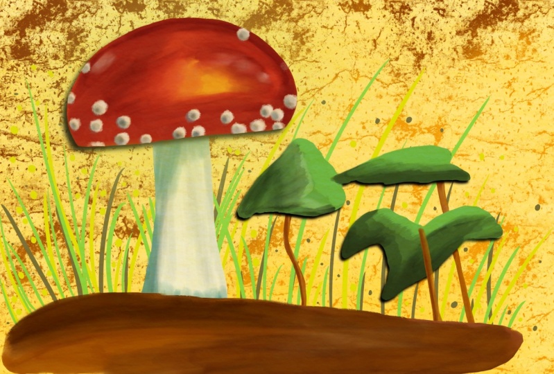
6. Adding the Ground & Ground Cover: This postcard needs more. It's still too empty. We've got a lot of space. So we got to fill that
with some more elements. In this lesson,
we're going to do the ground and things that
grow out of the ground. We're getting there,
we're going to add some ground under it. Let's bring back the sketch. And I want to have
some ground here. The ground goes actually in
front of pretty everything. I'm going to add a new layer. I'm going to rename that and say the ground enter for the color. I want a brownish color
to something like this. Lighter, darker, perhaps
a little bit darker. And I need some brown. There you go around here.
Let's go for the middle. And makes it nice for everyone
in the middle, middle, middle, but further down. And then somewhere in
the middle into the red, but not as light, as orange as the previous one. There we go, We need
a larger brush. Let's go 8% for this. What we're going
to do is I'm going to paint in the grounds. Need to make sure it goes in
front of that mushroom too. Now I have a problem because I lifted my brush and I
should not have done that. Let's go again. There you go. Keep on pressing. I'm not
going to go all the way down. There you go. But I'm creating a
bit of a transition like this between the
background and the foreground. And make sure this is
another car on top of it, that it is nice
color. There you go. I like that. That's good. That's all I'm going
to do for the ground. But we need some shadows in it. We need a clipping mask again and clipping mask and
we need some shadows. We're going to go here to the dark gray and let's
see how that looks. Oh yeah, that looks good. And create a little bit
of a shadow around here. Now, we've got to play a
little bit with this brush. There you go, nice. But
here we need strong shadow. There you go, I like that. Then some shadow
around here too, for the leaves and the starks
branches on top strong. A little bit less strong
around here, too strong. Then there you go. We can remove the sketch. We don't need it anymore. There you go, I like that. Let's add a dark color, one more layer like this. Let's add a little bit
of transition there. I could correct
this a little bit. Yeah, let's do that. Let's
go back to the color. Let's add a little bit
there now. That is better. Let's do that. There you go. A bit more playful.
Good, I like that. All right, that's the ground. Well, over the ground in
the photo there's grass. We're going to do
a bit more grass in here and then
I'll show you how to turn that grass into an interesting Ss and
keep it painfully, but we're advancing nicely. Or not, we need a new layer. And this is going to rename, going to call this simple. Because everything that's on the foreground will
be on this layer. And we're going to
play a little bit with that. I want a green. What I'm going to do, I might
get some of olive green, so more to the yellow,
olive green like that. I think I might like that. Now I want some grass blades, but I'm noticing this brush actually is not behaving
the way I want it to be. What I'm going to do is I'm going to duplicate my own brush. We're going to work
with some taper, and there is no
taper on this brush, and I want some
taper on this brush. The taper is that it ends
smaller like you see here. I'm putting this the size
to about 28% the bottom. I'm not doing the top. I'm moving and making a taper and let's see what
happens. There you go. It's not really tapering yet. We're going to play
with this a little bit. Do this again. Opacity pressure. Let's leave that to that.
Yeah, there you go. See that is good. Now,
we got a tapering brush. See that? We're going back. I'm opacity and I'm going to add my own taper
on top, not at the bottom. That makes it really easy. Now, I can create blades
of grass wherever I like. That's the first one. I want to lower the size to 2% Now I'm going to go
with a lighter one. I'm going to add some more
even in front of the mushroom. Yes, I do like this. There we go, that's enough. And I want a really
nice dark one. Go back to the 4% add a few like this going
there, bit thicker. There we go. I like that. That
is good for this. Now we're going to
move to the back, we've got this background layer. What we're going to
do, I'm going to clear this background layer and I'm going to use that actually
for my grass place. The next one I want longer, I'm going to go to 3% I want to pick a
different color for this green bit darker they go, these will go in the back. The need to go taller too. And then there's one long one in front of
it and the other, I don't want that
long. There you go. See now that looks very nice. Let's go for a really light
color in the back too, to fill it up a little bit. A few long ones. There you go. Now let's do a few really dark
ones to behind here, that looks nice
from behind there. Now we've got this here. I'm going to remove
that in a minute. Go, that looks good, doesn't it? Right now I want some
different color too. I'm going back to that
brown that is still there. I'll go to the yellowish yellow. Move it to the
orange around there. Let's add a few of these blades to get that idea that we have a
bit more autumn color in. There you go. I like
that. That is good. All right, now here
some problems. What do go to take the eraser and as that away the
background, the foreground. Obviously, I want the foreground in front of it. That's it. Okay. Now this is a bit uniform. I want, this is a
bit more playful. What I'm going to do is
actually on the foreground, I'm going to add a new
layer on top of it. And I'm going to add
some sting splatter myself so that I
have full control. You could use a splatter
brush for that. We're going to just that what we're going to do first is
the color we already have. We need a brush back again. Let's see, I've got it on 3% and just add a little bit
of these brown colors. I'm going to erase whatever
is in front of this. I don't like that
with the splitters. I don't want them
on top of that. There you go. Now we're going to bring back
that dark color. There we go, right? Nice and vary a little bit. Press hard press a little bit less to get some
variation in this. Okay, there we go. I like that. I think
I'm going to stop here. You can do this as
much as you want of the only thing
which I want to change with the front,
the foregrounds, I want to have some
really light blades, especially right there
so that you can see them really well
bit thicker blades. They go add a little bit of variation and now you can
see some nice blades there. All right, and that's
that this postcard I would send to almost
send it to somebody. It's just not totally
finish. Of course. Need a background, perhaps
some finishing touches, but that is the for
the next lesson.
7. Adjustments & the Background: Let's add the
finishing touches to our gas autumn painting. Not only the finishing touches, we also need, of
course, a background. I don't want a white
background on my postcard. Some postcards that looks good. Some paintings are
great with white, but this one really
needs a background that contrasts the elements
that are on it already, but also complements them. Let's start painting.
We're going to finish this painting. In this lesson, what we still need is work a little
bit on the ground. Get a bit of a nicer
transition between this line and the four
and the background. And of course, create a background transition between
the grass and the ground. And we need a background
what we're going to do, the ground layer, let's under the ground layer or
above? Probably above. Let's try above. If we do that, we get a clipping mask. So you have to unclip it. Oh, I did that wrong, right? Let's redo that. Even I make mistakes. They go, I should have gone above the clipping
mask. They go. Now we've got a layer above it. Let's see, we're going to
use one of these colors. I still have this green
color. Might work. I've got that. Let's go for 5% and
let's go for an opacity of 50% on top of here. That's it. Let's add a
little bit of color. There you go. A little bit of extra
color in the background. Even move that onto
the foreground. Move that up a little
bit a day ago. Make that slightly fill that
in a little bit day ago, go back just a layer
Now I'm going to 100% going to 2% I'm going to add some
lines like this, create a bit better transition. See between the backgrounds
and the rest. There we go. Might even do a
little bit there. Good, that's better. Just a little bit so that this
is not so obvious anymore. Now, I don't really like, if you go really soft, then we're removing that. That's better right now. The last thing we
need is a background. I want a bit of an autumn
color, yellow, ocho column. I'm going to the background. I'm adding a layer above it, but I need to this layer on top of it so that this last layer is
really at the bottom. I'm calling this the
background color. Okay, So that I really
know what that will be. All right, for that I want
some effect behind it. Now, I might go back to
the original as brush. Let's first pick a color. I want a contrasting color. I'm moving this to
yellowish orange. I want a yellow ocher
color, a bit like this. Perhaps a bit more
darker orange. And then not on top, top, but a little bit down. We're going to try this color. Let's see what that brings. Now I want a different brush. My brush, I want that
original gouache brush. Let's move it all the way up. Let's press in like this,
create a background. Yes, that is great. Some darker colors here, a bit lighter there. I think that is fine. I'm not going to do anything
about this anymore. That is my paper. Sorry. Yeah, that
is a paper, is it? But that is my painting. Now, you can play, of course, with whatever you like. You can make this
a different color background, do a
different texture. There's plenty of brushes,
but I'm not going to do that. I'm going to leave my
painting like this. This is my guache
Autumn painting. Our postcard is
looking really good. You can print this,
send it to somebody, post it online.
It's really nice. We're finished
with the postcard. But in the next lesson, I want to give you a project, an extra to do with all these
techniques you picked up. Now I'll see you in
the next lesson.
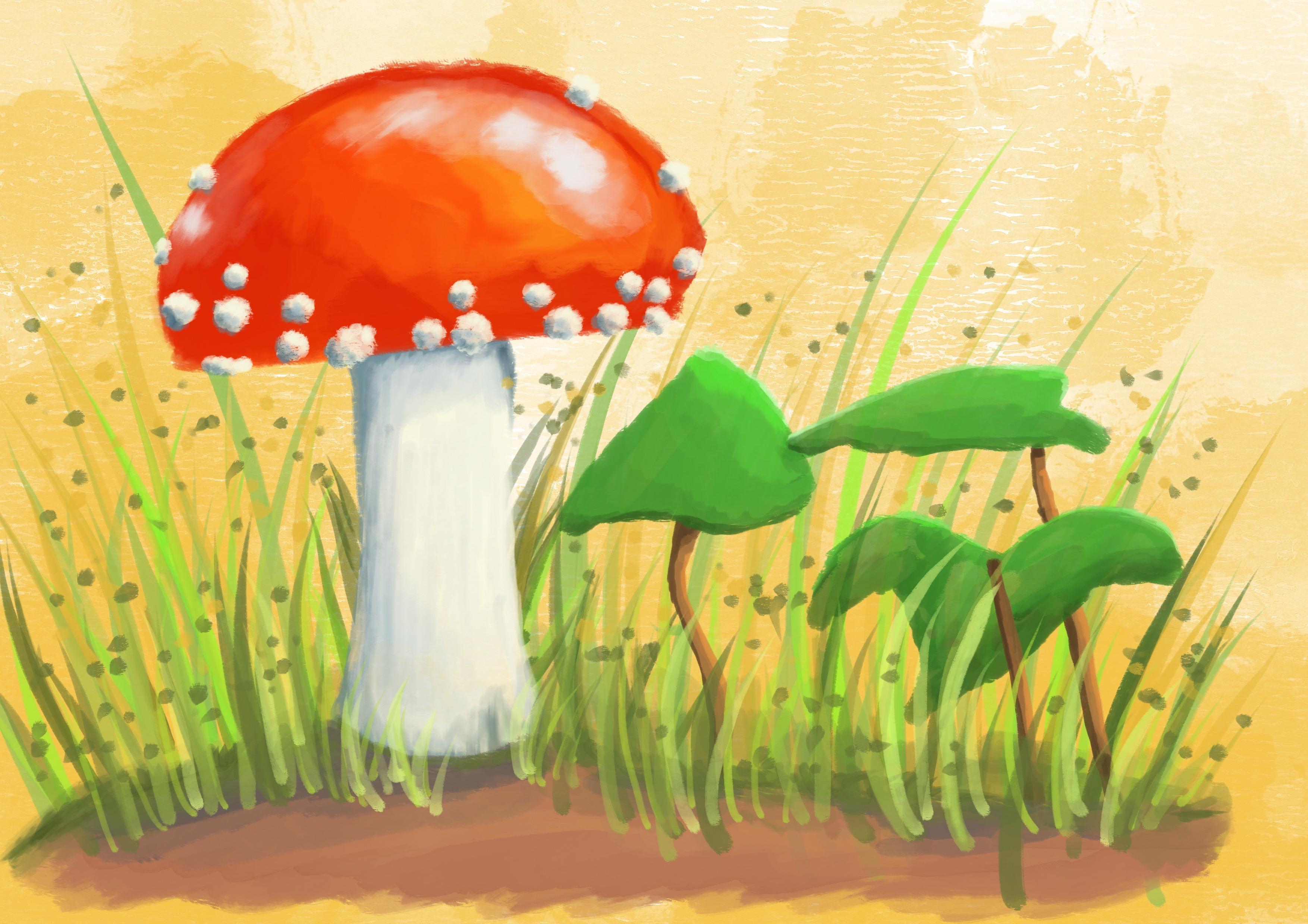
8. There's much more to Autumn: Well, that's one postcard
with a toadstool. But autumn has much more to offer if you would go
walk in the woods or just along the side of the road here in Autumn
there's a lot more to see. There's actually a lot of fungi and mushrooms
and toadstools, other fungi that grow, that you could add to a
beautiful postcard too. I would challenge you
to, as a project, create another postcard with all the techniques
you already picked up and of course the
brush we've created together and create
another autumn scene. You can do pine cones, acorns, and of course
different mushrooms. There's plenty to pick from. Create another postcard and
once you're done with it, I would love to see it. So please post it,
make sure I see it. You can post your
results of the class and the Ra project here at the
project section at Skillshare. Then we can all see it and enjoy the beautiful artworks
you've created. Now if it is not autumn at your place or you can't
find any autumn images, I've supplied an
extra reference, as you can see
already here for you to use in the projects. If you can't find anything, use that image and create
another postcard with that. Thank you for being
with me in this class. I hope you really
enjoyed it just as much as I enjoyed
creating this class.
 Benjamin A, Art Teacher, illustrator Art by Benjamin