Transcripts
1. About this Class: In this class,
we're going to have some fun with procreate. We're going to use procreate
to create a paper cup. Lightbox may have seen
them in real life. You may have seen
him in Procreate to play with them a little bit. We're going to try to create
a paper called Lightbox. Was actually light
effects in a two. As close as we can
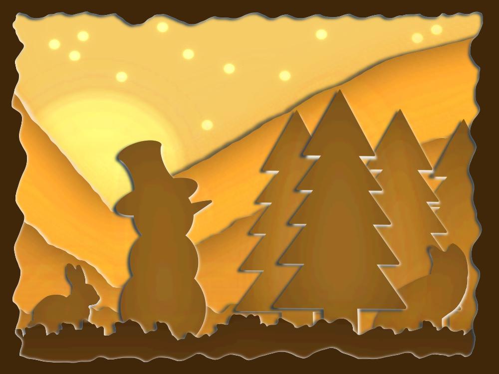
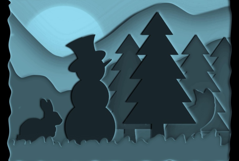
get to the real. For that, I've got a nice scene in mind,
which I wanna do. Nice winter scene
with a snowman, Bonnie, some trees,
some mountains. And I want to
create a nice seat. With that. We're gonna do some drawing. We're going to use some tricks. We're going to use
some features to add light effects and do some
paper cut effects with it. We're gonna do some
tracing showing you how to bring in your own
images and turned into a figure, a
paper cut thing. Yeah, I definitely gone to bring all of these
elements together. We can create the
beautiful paper cut. I want to show you just simply step-by-step how I
would approach that, how I will do this,
accomplish this in. So I will see you in the next lesson where the fun starts.
2. Getting everything ready: Let's start with
setting up our Canvas, bringing in the pictures, doing our color palette. And then we're ready
to start creating this lightbox paper cutout
scene. Alright, let's go. Since this is gonna be a fairly simple scene
with many colors, and I know I'm not
going to print this. I'm just going to use for a canvas to screen
size with my iPad. And that is 22732
pixels by 248 pixels. So I'm going to just pick that. And I'm going to
work in this canvas, nice and easy so that I don't
have to set up the Canvas. Now for colors, what
I'm going to use this, I'm going to basically
going to use two colors and probably some yellow
for the two colors. I've already prepared
the two colors. It's a dark brown. It's a light brown.
And the best thing what I can do is now probably give you
the values of these soda dark brown would be, I'm gonna go to value here. What you're gonna do here
is type in these values. That is six, the red,
green, and blue. The red, the R is 6032, green is 39, and
the blue is nine. Then these values here, I'm not sure if this
totally matter, but these are the
age as feed you and the saturation values and
the balance set on 33%, 85% now fit a few degrees less than 85% and 25 per cent
one want to do. I'm going to create a
screenshot of this and show that on the screen
while I'm filming. The next color is, second color is a lighter brown. And for the value,
the rate is 114, the green is 75,
and the blue is 22. And the values here, U is 35 degrees. Then we have 81% and
45 per cent i'm, I'm going to do is create
a screenshot of this too. While I'm talking
you through this, you will see that
in the screen and the other girl color
we're going to use for our background is this yellow, orange tone with a read of 245, a green of 204, and a blue of 103. And the h value is 42 degrees. We have 58% and 96%. And I need to make a screenshot
of that one too, right? That's better screenshot. And we're going to
use a yellow light. Now we can do this too. We use this yellow
light later on too, which is the red
is two for free, greenish two to zero, and the blue is 112, and the age is 49 degrees, then we have 54%
and 95 per cent. Now, I'll make a
screenshot of that too. You can prepare this, these colors very easily. So what you're gonna
do, tap on your color. Normally it will be on the disk. You go to fail you and you
just put those values. You can type them
in and just type the values and then
you're ready to go. The other thing we're
going to need is two images and let me
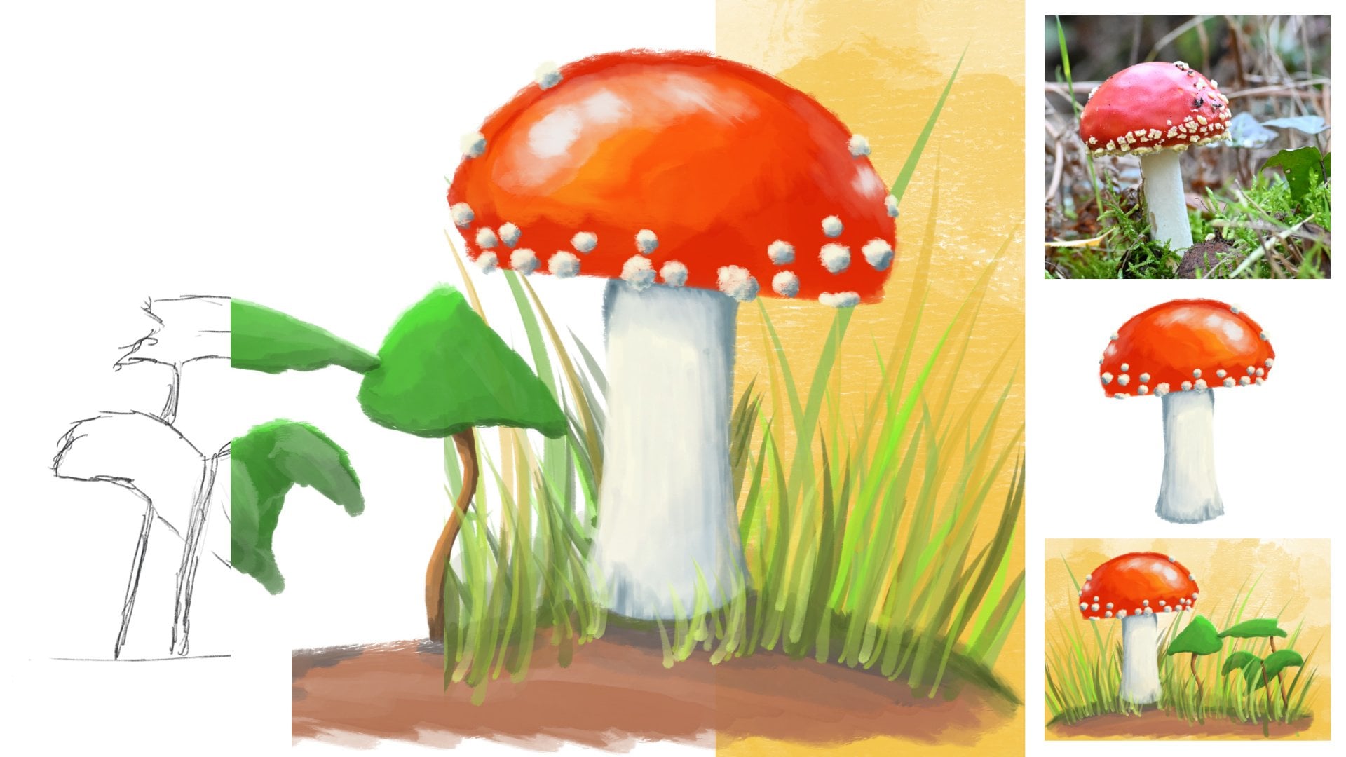
go to my camera roll. That's the image of
this fox is supplied with the class and the
image of this bunny, at least the silhouette
of this bunny. Those are the two images
we're going to use later on. We've got our canvas, now, we've got our colors. The brush. What we're going to use
is we're going to use the brushes here, airbrushing. And we're mainly going to use, most likely these two here, medium heart and
the heart airbrush. And use those too. Draw and paint and do
all of our values. And that's it. We don't need anything
more than that. So if you set this up, get the canvas ready, download those images,
set those costs, and then we're ready
to go and start working on our light box.
3. The Snowman, Bunny & Tree: Time to create our
paper cut lightbox. We've set up our canvas. We know with brushes
we're going to use. So now it's time
to start drawing. We're going to draw
most of it herself, except for those two elements
I showed you before. When you use some special
effects in Procreate. Really, this whole
Lightbox effect. Simple tricks, some
simple drawing. All let's get into that. Alright, well, we're going
to use the heart airbrush. Lets pick that one here. So it's in Procreate. If you have a lot of
brushes like I do, you may have to
scroll all the way down until you see airbrushing. Then pick the heart airbrush. We're going to start
with that dark value. We're going to create some
layers in our light box. As a light box would have certain layers and
we're going to stack them on top of each other, do some effects to create a really light bulb,
Lightbox effect. The first color I'm going to
use this really dark color. And now this brush is set
on something's really huge. I don't want that. Let's see, eight per cent old and has a nice around there, a little bit larger. Let's go for ten per cent. I want to put my brush
on ten per cent. The first layer I'm
going to create is simply the first front
layer we're looking at. And that is very simple. One we're gonna do.
We're gonna start somewhere and create a
little bit of a frame. And just keep on painting. Make sure you don't stop
painting and hold the pencil. Then it's going to
automatically create a line. And there I need to connect it. That's all we're
gonna do for this. The connection I need to check. Yeah, that's nice. If you
connect the two lines here. So you're drawing. So you
have this line already, then you come from this side. If you get something like this, you may want to erase
this part inside. It's not a problem, but are outside releases then the
outside inside the frame. This is where we're going
to see you want to have this nice smooth line,
removing this again. The next thing we're
gonna do is we're going to fill this with color there. What I'm going to do next
is I'm going to just drag over this color
here and fill it. Now. Mine is looking good, nice, no white lines left, but perhaps yours is
having some white lines. Let me demonstrate that. If I'm dragging it over, you can see here a line, the thresholds drop threshold. I'm going to put that all
way down to about yeah, that's good with like this.
I don't wanna do it again. Now, if you look very closely, there you go, You see
all these white lines. We don't want that.
So that is why we're going to put
the threshold higher. Now, doing it again, dropping the color, holding
my pencil, sliding it over. And now it's not far enough. Let's see. That's pretty good
already, okay, So make sure there's
no white lines left. So slide the line until
it's filling it nicely. Alright, That's our
first simple border. We're going to add a new layer. Now this layer
needs to be on top. It's the front layer. The next layer, what
we're going to add is a little bit of
foreground layer, very simple layer
with some grass. I'm going to hide this layer. I'm going to go to the
next layer, the new layer. And I'm going to create a
little bit of foreground. And it doesn't really
matter where it is. And just, just do some scribbles
like this. There you go. That's good enough. And we're going to
fill this to make sure you only feel
the bottom line. Now if we can show them to see, we've got something
quite different. Now, the next layer, which we're gonna
do, we're going to add a background layer. I'm going to make sure
this is on the bottom. You could rename this layer. So I could say this is
the background rename. This will be our backgrounds. And for that background, I'm going to just fill
with that mid orange, that dark yellow, not that really light yellow,
but the dark yellow. I don't want to just fill
this layer with debt. Now, there's another
way to fill a layer. Instead of sliding this over, you can tap the layer
and just simply say fill layer and it's going
to fill the whole layer. We're going to make use
of this later on too. Alright, so I've got
this setup. Now. There's no difference
between the border and this little foreground part. But we're going to
do that later on. We're going to
leave it like this. Now, the next thing
we're going to need a new layer and that should go behind this
foreground layer, add a new layer in there. Here we're going to
draw our first part, which will be the snowman. And we're going to put
the bunny on that. We might do our first
three and the two. Yes, why not put them
all on the same layer? I want to start
with the Snowman. What we're gonna do is
we're going to create actually a very simple snowman. And what I'm gonna do,
I'm gonna draw a circle. And that's not going
to work of course, because I'm using
the same color, I'm gonna go to that
lighter brown color. Now probably I have a line, so I need to clear that line. Okay, We're gonna do that again. We're going to draw a circle, doesn't matter where you're
going to draw the circle. Just a circle. Trying to get as close
to circular she can. When you reach the end, hold it. Don't do anything with it. Now you see that edit shape. Now mine is pretty much
like a circle already. And you have the choice. It's still sees
this as an ellipse. So what we're gonna do
want to say circle. Now, if your circle
is really off, you can move these around until you have a
nice perfect circle. And the easiest thing is
to do to line up these two and these two in
a straight line. This is pretty much my circle. This is good enough, good. I'm going to tap somewhere. That's the first
part of my snowman. And what we're gonna do
is I'm going to fill the snowman with
that brown color. The next thing what I'm gonna do is I'm going to
duplicate this layer. I'm going to select it,
I'm going to move it. The second part of the snowman. Make sure this is on uniform. I'm going to make that smaller. And there you go. I'm thinking I might do
a three-part snowman. Than the next thing
which I'm going to do, I'm going to
duplicate this again. And I'm going to move that,
that will be its head. And of course
slightly less again, and that would be my snowman. What I'm going to
do with this one, I might just move
it a little bit. And with the heads, I might move it a
little bit too. That's nice. I got mine
by the way, on snapping. So it snaps nicely on. When you select it. You
can do the Snipping on, you can do the snipping
off, magnetics are on. So it's going to center
that automatically. For me, without the magnetics, I can move it anywhere I like. That is just an easy
handy tool to have. That's the first
part of our snowman. Let's create the head
of the snowman tool. We're going to add a new layer. Later on. We're going to
just merge all these layers. But for working on it, It's way easier to use one layer so that we can
move wherever we want it. Alright, the head, I'm
going to draw for the head. I want the hat under an angle, and I'm going to draw
an ellipse for that. Just an ellipse. I'm going to hold the bottom, the pen, and then it
creates this nice ellipse. I'm fine with the shape. I'm good. I'm going
to fill this. I'm going to move this on
top of the snowman and yes, this is way too large. So I'm gonna just make
it slightly smaller. There you go. Looks good.
Now that's not all I need. On top of it. I need some more. And for that, I'm going to
create the head itself. What we're gonna
do is I'm going to create the first part. Hold it like that. And then here are
the same distance. Second part, hold it. I'm okay with that. Then. Top of its Top Hat,
I'm going to hold it. Then it creates a
nice smooth line. I'm going to fill this,
and there you go, we have a snowman. Now, I might move this a
little bit more perhaps. I think I like that better. Yeah, good. The next thing
is I'm going to need a nose. So I'm just going to let the snowman look
up a little bit. And I'm going to create a
simple nodes like that. I'm going to hold it. There you go. Now, if I fill this, this is going wrong because
actually this is not filled. If I hide the head, you can
see there's only a node. So what I need to do is I
need to close the nose. I'm closing knows I can do this. And now if I bring back
the head, there you go. There we have our snowman. Now, if you're happy
with your snowman, we're going to merge
all these layers down. Merge them down. That's our snowman.
Alright, good. The next thing I'm gonna do
if the snowman actually, I need some shadow
behind it and I want a light side so that you get the idea of a
paper cut site. What I'm gonna do is
with the snowman, I'm going to duplicate it. And I'm going to take
the bottom layer. I'm gonna hide this top layer. What I'm gonna do, I'm
gonna say alpha lock. Next thing is we're
going to need some kind of shadow
color for that. I have a color and that
is not in the palette. So I'm going to show you that
pellet that is this color. I'm gonna make a
screenshot of it. So now it will appear
on your screen. The red is 56, the green is 57,
and do blue is 75. And then I have the
yuan 280 degrees, then we have 51% and
the balance is 30%. Alright, goods and that color. I'm going to fill this
snowman and create a shadow. Now, I put it on alpha lock. If I fill it now, it should
only fill my snowman. There you go. But this
is a very harsh line. I want a bit of a shadow effect, so I need to switch off the Alpha Lock tap,
simply tap it. Then I'm going to
the Magic Wand. I'm going to say Gaussian Blur. And if I move this now, this thing is going to blur. So I'm going to create
that shadow effect. 675 per cent might even be good. This is too much. Definitely go for six or 5%. Let's go for the five per
cent. I like that. Good. Right now it's shadow layer. If I bring back my regulars, the snowman now and move this layer a little
bit outside of it. There you go. I see, you already get the idea. I cut this with paper. Now to enhance this
effect even more, we're going to duplicate this shadow line and we're
going to need the top one. The bottom one is now
a shadow, shadow. The middle one of the fish
normal will be our light one. What we're gonna do here,
we're going to choose the white color for that. Make screenshot again, show
that that you can see it. The red is here to 41, The green is 245. Blue is 248. And I've got
here about 207 degrees now, another bout of Secondly
to another seven degrees, 3% and 97 per cent. I'm going to use that
for my white color. I need to put this
on Alpha Lock again. So tap on the layer,
select Alpha Lock. Now I can drag over the white and as you can see there
you go nice and wide. And I can move this over. And we're going to
add a little bit of a white idea that
this is too much, but we'll work on that. Let's switch on the Alpha
Lock first. Let's see. I want to move it down a little bit. There you go. I wanted to be gone
mostly on this side. Now on the bottom there will be some and keep it like dense C. And now you get the cutout idea by adding that little line here, it actually strengthens that. Now we could, we could make this slightly smaller
if you wanted to. If we make that snowman
slightly smaller than move it slightly less strong and
you get the better cut idea. Good, will keep it like that. That's basically
what we're gonna do with all of the
elements in the scene. We will create a
shadow behind it. We're going to create that
paper cut side effects. And then later on
we're going to add our impression of light on it. But that's for the last part. Alright, well, let's
keep on going. The next part is we're
going to use, use. We're going to do that, Bonnie. Alright, this is what
I can do with these. I could merge these, or probably we have lazy enough. I'm going to group
this into a new group. And I'm going to call
this the snowman. And there you go. And if I want to
alter this later on, move this later on, make it perhaps
blue with smaller, I can do that very easily. The next thing is, I'm going
to bring in Dead Bonnie. And I'm going to say add photo. I'm going to in my photo
roll select the bonnie. There's the bony
way to use which with a white border
around it for now. We're seeing, okay. But I want this, I don't want the white border. We need to remove that
and that's very simple. Select the ribbon, select here automatic and choose
the white is now black. Everything, don't worry, it
has selected all that white. What you're going to see
next you hit the wrench, you're going to say cut. And we're left with a bony only. And that is what we want. Really nice and easy. Now the bunny is way too large and the body
has the wrong color. So we're going to
change the color first. Tap on that. Oh sorry, no, that light brown color. Slide it over to the
bunny. There you go. That is good enough. And we're gonna
make them Bonnie. Smaller, makes sure
you tap that arrow, makes sure this is on uniform. I still have snapping.
Doesn't really matter. And I'll think I want to actually put up magnetics
off so that they can really put this under
where I want it, that we have. The next part. I think
this is way too large. We're gonna make this smaller. Start with the snowman. Select it. There you go. That's a better size. And now I need to
create a smaller bunny. There you go. All right, I'm dead size.
And that's pretty good. Now if the bonding, we're
gonna do the same thing, we're going to
duplicate that image. We're going to
select Alpha Lock. We're going to choose
debt, shadow color. We're going to fill it. We don't see it because
it's behind it. Say motion blur. We know we want five
per cent Already. Good. And if I move the money
now, there's the shadow. There is no there is
no blue of course, because still my
alpha lock is on. Switch the Alpha Lock off. Now go to the Blur,
Gaussian Blur, say five per cent. Good. And now I need to move
it where I want it. I think I'm fine with that. I duplicate this image, I take the middle one. Now we're going to
say Alpha Lock again. And I'm going to fill this
layer with the white. Up here. There you go. Alright, we're moving
this to this side. One and make it smaller again, as with the other one. There you go, That is
better. I like that. Might make this one even a
little bit smaller day go. Now we have that
nice cut effects. We now have two of the three
objects for this layer. In the next one is a tree. We're going to make a
tree, really simple tree. Let's do that. Before I'm going
to make the tree, what I'm gonna do is
I'm going to bring back these two layers. Need to make sure everything
is in the right place. Oh, I'm going to say I
have this on Alpha Lock, switch off the alpha lock. Select these three
and say group, this will be my bunny. Diego. Now I know what everything is. Let's start with the snowman. I'm going to move the
snowman into this layer. That's good. The next
thing we're going to do, I'm going to take the
bunny and I'm going to move that into the
layer two. Good. Now we've got the snowman, we've got the bony. Alright, it looks good. Next thing we're going
to need is some trees. New layer. For the trees. We're going to just make
some simple pine trees. We've still got
the pen selected. So on touch airbrush, we're going to take
the light brown color. What we're gonna do, we're
going to create a triangle, doesn't matter where it is. Trying to get as close to
a triangle as possible. When you finish hold it. And it says polyline created. We're going to edit this shape. Because now you can see this
is not really a triangle, this is further away. So what I'm gonna do, I'm
gonna move this until it's pretty much
roughly a triangle. I think I like that a site from this point
here, this is not good. So we want to correct it
a little bit of a line. I'm going to fill my triangle. There you go. That's my tree. Well, not much of a tree yet, but we're going to use this
as the base of the tree. Let's move this a
little bit down. Now, the one that I
just want to move it, Degas, we're going to make it smaller in a
minute. Okay, good. Next thing is we're going
to duplicate this one. And I'm going to
say my snipping, I'm going to put those
magnetics on again so that I can keep it
nicely in the middle. Creates a slightly smaller tail. That looks good. And I'm going to duplicate
that one again. I think I may have to align these a little bit
better, make it smaller. All right, looking good. And the bottom one
doesn't look good. So may need to move
that one over. That's better. Now
we're getting there. Top one, I'm duplicating again. I'm moving it. And of course, obviously making it
slightly smaller. Over pretty much. That is about in the middle. That's pretty good. And I'm
duplicating that one again, creating even a smaller one. I may want to say
that to free form. I want to make that
slightly larger like that. I think I'm okay with
my tree like deaths. But except for the bottom
one is that's too large. What I'm gonna do is
uniform, slightly smaller. Let's move it. It's still larger than that one. Yeah. That's better. Alright. Good. Next thing is I'm going
to merge all of these. Merge down, Merge Down, merge down, and merge down. And now I'm going to
put this on free form. I'm going to make this
slightly taller but narrower. And there you go. I like this better. Next, we're going
to create a trunk. Let's make it
ourselves fairly easy. Create a new layer
under the tree. What I'm gonna do is I'm
going to draw a square, hold it, Edit Shape, and then I can choose square. It should create a
nice square for me. You could choose
rectangular or a square. There you go, and fill
this one too with brown. And I'm going to move it
into the right direction. There you go about
in the middle. I think it's a bit too wide, so we're still having
this on free form. I might make it slightly
less bright day ego. That is a lot better. Okay? Now I'm going to merge
these two into a tree. Merge, merge this one down. Now we have one tree. I'm going to duplicate this. And I'm going to
duplicate it one time. I'm going to select
the duplicated one. Let's hide the top one. Let's pick the right color. But first we need to set it on alpha lock picking this
column, we're filling it. And the next thing, Guassian blur, we go back
to the five per cent. We need to switch off the
Alpha Lock first year. I keep on forgetting that
Gaussian blur, Alpha Lock off. Five per cent. That's good. Alright, and my
duplicate this right away. And the next thing what I'm
gonna do is I'm going to just choose the white color, make sure we have
the white color. Go back to the layer, say alpha lock than
say Fill Layer. Now it's Y2 and alpha lock off. And let me show you
that it's white. If I move it, they see
there are these white. So that's the easy way while you're in layers,
you can do that. That seems a little bit of time. Alright, I need to
bring back that tree. Move the shadow. There you go. Nice. And I'll move that white part. The paper cut effect
might do off magnetics. I'm switching them
off so that I have a lot more control on
what I'm doing here. I'm going to create a
slightly smaller tree too. There you go. I think I might like that. The only thing I don't
like is the shadow being on top of it
and that is not good. So I need to move that
layer. There we go. Now I know what I'm doing. Now I see what I'm doing. Wasn't completely right. Okay, That's better. Alright. And now we
have our free elements. Now we have our
three main elements. There's one missing
actually does the fox, we're gonna do the flux
in the next lesson. Then add some more elements
to create a complete scene. Let's do that in
the next lesson.
4. More Trees, the Fox and Mountains: Most of the elements
are there now, except for that fox. It is missing out on
a fox in the scene. I also want some
mountains in the scene, even rising or some, depending on how you look at it. And even some snow or stars. Again, depending on the
way you look at it. But we're going to
start with this, folks. Let's do that. What we're gonna do next is
we're going to add the fox. So we're going to tap the range. We're going to say
Insert a photo and you need to select the dead fox. And then we've got
this huge folks. What do we do next is, let's put this on uniform and already determined
the size of the fox. I think that's still too large. I think this might be, let's put the fox there
roughly the right way. The fox is looking
to the wrong side. So what we're gonna
do is we're going to say flip horizontally. There you go. Now it's
looking more at D rabbit. And now I see that
this fox is too large. Let's go for this. That is about the same serratus
about the good size. Let's put the fox there. Let Emily have looked at the
rabbits now, peaceful see, nothing is happening
at the moment, but who knows what
happens afterwards? Alright, so I've got my fox. What we're gonna do
next is we're going to add a layer of both of the fox. And I'm just going
to trace the lines. And what we're gonna
do is I'm going to start with this line. I'm just tracing the
outside of the folks. I've only actually need
to do the outsides. Nothing inside because we're not having any details
with this drawing. There you go. Now I need to make
sure this is close so I'm going to hide
the layer above it. I don't want to make sure
that that is not a nice line. That is better. Make sure this gets close so
that I can fill it. Now I bring back the
foreground and there's my fox. I can hide it or even
delete that image. Don't need that anymore. I'm going to duplicate the fox. I'm going to say to that
layer, go alpha lock. I'm going to choose
the right color. I'm going to say fill layer. Switch off the Alpha Lock, magic, the magic wand,
say Gaussian blur. 5% is good. You already see an outline. Oh, no, no, move
it a little bit. Don't enlarge it. Good. And we're going to
duplicate this layer. Duplicate, we're going to
choose that white color. With this layer,
the middle layer, we're going to say
alpha lock, fill layer. Switch off the Alpha Lock
and move that white. I might want to make that smaller too like
with the other ones. So that only goes. But I wanted to go
I'm think I'm me. A little bit too small. One. Sum. That's
good. Alright, Good. There you go. Now we have all our elements. I just need to group this group. And there we go, rename. This is the fox. Okay, there you go. Alright, the next thing what
I need is a new, Let's see. I'm going to put the fox is now nicely in
front of the tree. We might want, might
keep it that way. Now, all we want this fox really behind this tree
now on this tree on top. There you go. Yes, I want the folks
behind that tree, but I want to duplicate this
tree a couple of times. Duplicate and duplicate. And what I'm gonna do
next is I'm going to put this true trees, two trees under everything. I'm going to move the trees. I'll select the
arrow, move them. And I want to make
them slightly small. There you go, Get that other tree and
move it the other way. Also, that one goes slightly
smaller, bit too high. Now, There you go. I don't want it to
overlap too much. This is nice. And
this tree here, I know that there's this one I'm going to duplicate again. And I want to move right there. And now we have the choice to
move it behind or in front. I do want this tree to
be behind everything, so I'm putting that
one at the bottom. There you go. Let's move
it a little bit more. I'm going to even make
that one slightly smaller. Make sure you can really see the tree well with the
outline a little bit. Alright, and I think that
duplicate that is nicely. We might do one in-between there or let's
keep it like this. Charles, you could, you
could do one day or two. I'm going to leave it like this. Alright, good. We've got our main elements. Now under this, we're
going to add a new layer. And we're going to create a little bit of background here. Behind here we want to have a
little bit of a background. Therefore, we need
that light brown color and we have a new layer
which kept the color. We've got everything. So now I need to scribble
a line behind here. I want the line to
go around here, but I'm not going to
go for straight line. I'm starting at the
end, scribbling, scribbling a little
bit like that, until I reach the end. Now I fill this with the
brown color. There you go. Now again, it's all one, brown, blue, but
that will change. This one I'm going to duplicate. As with the others, I'm
gonna do my alpha lock. I'm going to select that color. I'm going to say fill layer. And I'm going to say
no more alpha lock. And with this one,
I'm not going to do actually cuts sites
might do that. Let's see what we're
gonna do with that. I'm going to first
of all, blurred too much five per cent. I'm going to move it like this. Remember we might do a white. Let's see what happens
when we do a wide one. We duplicate this. We're picking the middle one. We're going to say Alpha Lock. We're going to select
the white color. And we're going to
say fill layer. And then no more alpha
lock and move it. I'm going to move it
to the other side. That might still work. Okay, let's do that. And let's group these and call it whatever background foliage. Bush's. Let's call it pushes. Alright, good bushes,
weird, renamed bushes. There you go. That's better. I still know bushes. Oh my goodness. Bushes. Bushes. Finally,
I've got Bush's. Okay. And let's rename this layer so that we know
what this is to rename it to, let's say grass, Good. The layer one is just
the front layer. Alright, now I need
some mountains. I'm gonna do mountains
in two parts. Behind the background. Add
a new layer for mountains. Let's do some short mountains
and some long mountains. Let's start here. Who started outside again? I've got the white color.
I don't want that. Let's make sure we've
got that brown color. I've added a white color. That's my first mountain. I would say, let's fill
this with the brown color. Good, Let's duplicate this and
do the same process again. Alpha Lock, choose to
color, fill color. And we might just as
well duplicate it again, and it's on Alpha lock so
that we can quickly fill it. Fill color now on alpha
locket and on alpha lock this one and go for a
caution blur on this one. But now I need to do to
Gaussian Blur twice. Caution blur it. And there we go. Let's see. Let's move to first shadow that should
come behind there. And then we're going
to move the white that should only come
in front of that one. Nice. See, we've got a
little bit of a mountain. And next one, what are we
going to do is group these. I'm going to call this
front mountain. They go. And the next thing under it, I'm going to add
a new layer with the final mountain and make sure I got the right
color this time I do now. And a bit of a larger mountain. Let's move it like that. So no, I don't like that one. Let's do it again. I
think that's better, although I may want to move it. Right, Derrida with
or even shorter. Let's do one shorter and
move it like debt. Good. Hopefully I've closed it. Will find out in a minute. Yes, I've done that. Good. Let's duplicate it again. I'm gonna put this
on Alpha Lock. I've got the brown color, I'm just going to
drop it in there. Now. We're going to switch
off the Alpha Lock. You don't see anything yet. But when I'm going
to caution blurred is you can see I've
got the right color. Five per cent. Yep. Move this layer. I want to shadow right there. And I'm going to duplicate
this alpha lock, pick that white
color, drop it in. There you go, white-collar. Now, move this
layer to this site. And there you go. Nice. Group this tube. This one needs to get
rid of the Alpha Lock. Group. It last, now, not the last
group. There's one more group. We're going to do
one more element. That's not really a group. This is the mountain. I don't
need to front mountain, back mountain. This is obvious. What is behind it. We're going to create
one more layer. We're going to
create a rising sun or a setting sun or a moon. However, you want to call this. For that, we're going
to draw a nice circle. We're going to go for
the brown color again. Now, we're not going to go for the brown color for
this, of course, we're gonna go for
the light yellow color, That's way better. The light yellow
color for the sun. I don't want brown
color for some diva. I've cut a new layer. So what I'm gonna do
is I'm going to draw a new circle around here. Hold it until it
gives me the option, edit shape, say circle
or minus, pretty decent. I like that. I'm going to
fill it with that color. I'm going to move
it a little bit. Like dance. I like it like that. Now with this, I'm not gonna do shadows and stuff like that. While I have this one, I already have a nice circle. I'm going to duplicate this. I'm going to move it and
we're going to create little circles like that's slightly smaller
around that size. And I want to see
everything I'm doing. I'm going to duplicate this. And I'm going to move them
just at random places. Duplicate. Move on
there. Duplicate. And if you run out of
layers, you can just, you could keep one of them and
merge the others together. Duplicate. Let's see where we are. We need some there.
Well, that's okay. You could add more or less what we're gonna
do evolve this. I want to group all of
these. That's a lot of them. Group them. And then I'm going to
select that group, tap on it and I'm
going to say flatten, and now it's just one layer with all these
little things on it. And I said, I'm not going
to be shadow with dose. We're going to
leave dislike this. One layer isn't right yet. We need to adjust one
of the layers and that is the first grass
layer we created. It has no shadow, it
has no cuts site. So we need to do that. Alright, the next thing, the thing we learned is grass. I'm going to duplicate that. I'm going to set this
again to alpha lock. I'm going to choose that
color for the shadow. I'm going to say fill
layer makes sure the alpha lock is off now again. And then the last thing, do five per cent. There you go. And we
need to move that layer. There you go. It's behind there. And I want the shadow
to be on this side, everything is on this side. So if that layer,
I want the shadow to be on that side
too. Not that much. Good. I like that. I'm going to duplicate
this one and say, No, I'm not clipping mask. Say alpha lock, That's better. Pick the white color,
fill the layer. No more alpha lock and move
the layer to the other sides. To get that cut effect. There you go. Nice. And now I need to do, of course, same with that first frame, but let's hang on. Let's group these first. Let's rename it to the grass. And let's duplicate
the top layer. So the first front layer, we're going to say alpha lock here and need that brown color. I'm going to fill that layer. And then alpha lock off. Go for the Gaussian blur. Five per cent. There you go. I'm going to move
that layer this way so that there is nothing here and
nothing on the bottom. We don't see the button, but
I think this should be okay. Duplicating this, picking
that middle layer alpha lock, fill layer alpha lock off. And let's move it. It now needs only on the
bottom and on this side. And I'm okay with that. Can we It's not that much there. Give it slightly a
little bit here, but most there are right now. You can at least see
all the layers nicely. Front back. Everything is there, but everything is now on
top of each other. No light effect, nothing. That is for the next lesson, the final lesson, we're going to add our light effect
to all of this. And then you also
will know why we haven't merged some of these layers but
kept them in texts. Alright, I'll see you
in the next lesson.
5. Let there be Light: The final part, we now have all these layers cluttered
on top of each other, but no real light effects. We need to add some light
effect to all of this. I'm going to show
you how to do that. Now with a light box. The light of course is behind it and it gives you
that affect that. Further you move to the front. The darker it gets, the closer to the lighter,
lighter it will get. And you have some shining parts. And we're going to
need to bring that in, at least simulate
that a little bit. Now, this is a little trick, at least the trick
I'm using for it. And I'm going to
show you that first. I'm gonna start with
that back here. Oh, I don't want that. Find the debt last layer. I merged the oh, I didn't need to do that. I have merged the sun and the
stars or the snow with it. Um, well, let's see
if that goes well. I'm going to first
of all blurred. Now. I need to separate them
because that's not gonna work. Okay, undo that. I need. I've put the sun and the
moon and the stars into one. What I'm going to do, I'm going to separate
that for that, I'm going to choose that ribbon. I want to make sure
it's on freehand. I'm going to trace around. That's not good. And do that again. I'm going to trace
around the sun, not take these things. I noticed sonars, they're good. I'm going to say cut. And I'm going to say
paths right away. And now it should be on its own. New layer above the
star, doesn't matter. Now I can go wash in blood is a little bit around 80
per cent would work. I think. That's pretty good. Yeah, I like that. Alright. Now I can go to that
layer below it. Caution blur this
a little bit too. But not that much is
too much already. Let's do three per cent. I think I'm fine with the
free percent. That's nice. Alright, good. The next
thing I'm gonna do, I'm gonna go back to
the sun or the moon, or sun, moon, whatever it is. I'm going to pick Blum. Blum, what you can do, you can add a light effect at a blooming light
effect to everything. What we're gonna do,
we're gonna say the burn, we're gonna go to the
maximum, the size, right? Somewhere in the
middle transition. We're going to keep
on Macs for now. And I'm going to just move
this and add a light effect. See the ego as way too much. Of course, we need to find a middle ground
where it is nicely. Going. There you go. This psi ones. If I do one too much, it gets to here, I want some
of this transition here. You can see them 123. So I'm going for
80%. Alright, good. Nice. Let's do this again. Switch it off. We've
got our Blood sun. Let's go to the balloon. The burn on maximum
the size and the same. Let's move to transition down and just let's see
what's happening now. And I'm going to slide again
and now it takes longer. See, and now I have perhaps
a little bit more control. I like this. So 46% bloom
is on 60% the sizes on 55. You can lower this,
make it larger. See what 55, 50 around 50, 55. What's the nice sweet spot? And if you do less burn, see, you get, don't
get the effects. So we want the maximum effect. Do it like this. Good. With those stars. I of course need the same thing. I'm going to select that layer. I'm going to go to debts. Bloom. And I'm going to
say again the size, I'm going to keep on around 55 to transition max for
this one, I would say. Let's see if we can add a little bit of a
light effect to this. We can. There you go. But now we're having
a slight issue. As you can see, we've got
too much blue around it. I don't want that. Let's move the size. There you go. We're
moving the size down. Splay will see if you move to the size of the bloom too much, it gets all roundup larger. You do this, the more it
goes around the object. And we will don't want it
that much on the object. We need to find that sweet
spot like this, around 28%. The burn. We're good with this one. Lowered burn a little bit. 50 per cent to transition. We're keeping it on
max. There you go. So the bloom here is 20
ft per cent transition on max size 28 and a burn on
64 per cent for this one. And that already creates a whole different
effect, doesn't it? Really nice. I want to start with this and I'm going to work
my way from the back. The back it would be lighter
as it would be on the front. For that, I'm going to
pick that brown mountain. And that is why I got
everything in layer still and not merge these layers because then the effect just
doesn't work that well. The mountain I'm going
to do just to bloom, transition max, this
around the middle, burn maximum, and want to make a nice light mountain of this right here,
right like that. Just 100 per cent. You get right away. You can see the effect. See, this brings
in an atmosphere. Now the only thing which we
have here is that transition. So we're going to try
to get rid of that. Let's see if we manage that. The burn max, Let's
go for the lower. You go, we've got that lower. We can still move this
to 100 per cent to burn. If we do it too much, it doesn't do anything. But the nice thing is, the more you do your burn, you get a nice transition. We want that, we're
going to keep this around 50 per cent. We're going to move this away. And let's keep it on the max, around 50 per cent here, and the max here too. Next thing what
we're gonna do is we're gonna take
this little hand. We're going to pick a brush, and in this case, airbrushing
muscle and airbrushing. Let's pick the nice soft brush. Let's see, I've kept
this around 50%, 60. Let's do 50 per cent here. Size. I'm fine with five per cent. And we're going to blur
this a little bit. We're not erasing it. We're blurring it
into the background. There you go. That is nicer. So we keep this nice transition. We have a little bit of
a light effects here. And there you go. See. Now we're getting a
totally different idea of our mountain, of our scene. The next mountain, we're
picking the mountain. We're going back to D bloom. We're going to say
50% maximum there. Max, max, max
around 50 per cent. Let's go for a real
50 for this one. And let's start adding color. Now, the trick is to not go hundred percent because then we get
the same light, we want to go less. I'm going about 94% to
get a different brown. See, this is a different light because this one
is closer to us. Let's light comes through. I think I'm fine with this. There's a blur or allow rounded. I don't mind this. I'm not going to edit anything
with this transition. This is good. For now. The bushes, that is
this layer behind it, we're going to do
exactly the same bloom around 50 per cent,
hundred percent. We're going to
move this until we have a slightly darker brown. Then that layer. And again, the transition around it, the size of the bone around it. I'm okay with that for this one, no need to edit that one. We're getting there. The next one are the trees. Now there's two trees
on the same layer. That other bushes.
That is the factory. We need to do that one first and then we need
to do these two. They're on the same layer. Bloom. I'm gonna go for slightly
larger on this one. Let's see the
effect of that 1 h. To move it to lights, I need to look at this back
and make it slightly lighter, darker than that one. I think for this one
I'm okay with 90%. I like that. That's good. Okay? Right, the next one, we've got those two batteries. We're gonna do one of them. And then remember
what we're doing with it and do that
on the other one. Bloom, want to set
it to 50, 55%, burn, totally, move it
way too light and now get a little bit
darker than that tree. So we had that on 90% is
going to go under the 90. Let's go for 88. Now
here, there you go. I would say 87 per
cent will do it. Alright. The next tree that is distri, that is on this side, we're gonna do the
same again, Bloom. We had, I had around 55%, 54. Just want to max
this one on Macs and we're going to
move it to that 89%, I think 87, I was,
there you go. 87. There we go. See, now we're getting
already that whole effect. We want to offer a
lightbox simple. With this. We're going to remove
this a little bit. Let's do that right away. We're on that layer. Yeah. This is just too much, Diego. And I might go back
to the other trees. And remove it there too a
little bit, not too much. And the last tree,
remove it here. A little bit too. There you go, that's better.
Getting really nice. We're having done the trees. We're now at the front. Let's do the front tree
while we're doing the trees. Let's do the front tree. And we need to
remember this too, because all these elements. Now hang on. We need to do the phosphorus. Of course, those are the fox. The fox is behind the tree. Where's the fox? There you go. The fox choose to Fox. Bloom around 50, 55%
burn fully again, I know the other one is 87. So I need to go back
to that 87 per cent. I'm going with this one
for that is there is a nice contrast between
the tree and the fox. If I go too much, there's not enough contrast. I think I could go 86 to 85, 85% for this one. And let's read, I'm still having that tool to remove, to blur. To blend in. That's the right thing. To blend in the blur a
little bit with this scene. And now I'm gonna do
these other ones. The snowman, the bonnie, this tree in front of it. Start with the tree blown on the percent and let's move it to get I would say 82 is good. 83. Can we get away with 83? Now, let's go for 82. I think AD2 is a
nice one for this. Remember that A22. I want to do the same
with the snowman. Whereas you Bonnie, I'm
getting to the body first. So let's do the bonnie
them around 50, or did we do 82% or they go 82? Let's do the snowman now two
and then we're almost done. And 82%. There you go. And The Snowman,
I definitely need to blend in the blur alone. It's a little bit of the
background and the bunny, I think I'm fine with
the bony like this. There you go. Now, the last element
is the grass. We need to change that
a little bit too. Perhaps not as much, much noise. Also not sharper management. We want bloom. Yes, fame queue size around
50 per cent for this one, bit lower, the restaurant. And let's give it some color. There we go. This is, of course, a different color. This is a darker color, so I'm going 100 per cent again to get that light
effect a little bit. There you go. Let's see. Is there
a lot of transition? Yes, There's a lot around here. So I'm going to
take that still on that layer and I'm going to blur whatever is
above it a little bit into the rest of the scene
day you go the front one, you can just leave it like this, just plain as it is to get
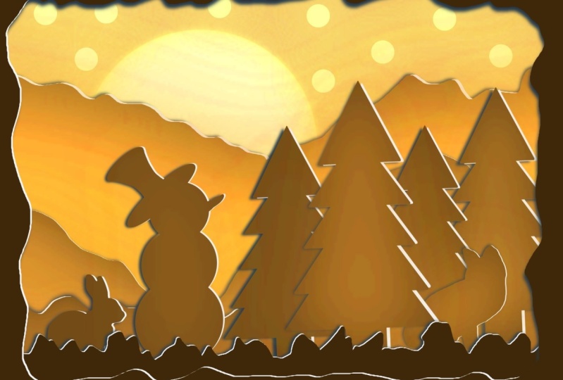
the most contrast areas. There. You have it our lightbox. And then we have our light
box or paper called Lightbox, at least the first one. We've got one in a certain
tone, our brownish, yellowish tone, but we can
take out a tone for this. We can change this very
easily in Procreate to a totally different
color scheme. We're gonna do that
in the last lesson, which also would
be the projects. Once you entered last lesson.
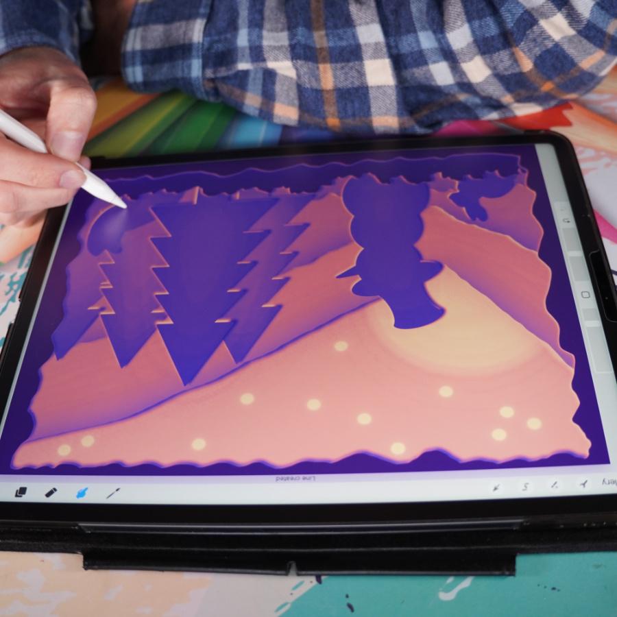
6. Using Gradient Maps & The Project: Welcome to the project
slash final lesson. In this, I'm going to change the color scheme on this,
what we've created. And of course we want
to give you a project. Well, let's start with
the project first. For the project, what you
can do, so of course, post this exactly
the same scene, or perhaps you want to create your own lightbox in Procreate, we've totally
different elements. The techniques I've shown, you can do that and I love
to see what you create. So if you do the same and
posted or create the same, and then do a whole
different scene and just let all of us enjoy your lightbox looking
forward to see them. The next step, what
we're gonna do is we're going to change the
color scheme on that. Let me show you how to do that. To do that, what I'm
gonna do first is I'm going to go to my gallery. I'm going to create a duplicate. I'm sliding to the left. I'm going to say duplicate because I'm going to
mess up the scene, but I want to keep my original
because I simply like it. What I'm gonna do first
of all, let me see. I'm going to group these two. Now. I've got everything in a group. Yes. And I'm going to select all these groups and
even the background. And I'm going to
group all the groups. And on this group, what I'm going to say, I'm
going to flatten this. Now it's just one image which
I can actually play with. And we're going to do
duplicate it a few more times. Duplicate, I'm going to hide it. Alright, I'm going
to take the top one. I don't want to just alter
the color scheme on this. And how to do that is
you can do this very easily in Procreate you
shipping that range. Again, we're going to
change the gradient map. Now you could play with the
hue saturation brightness. You could change the
color balance on it. You can do curves to create. But what we're gonna
do is we're going to use that gradient map. And as you see, it picks
one of those gradient maps. I have no clue which one
is selected as Venice. And as you can see, what
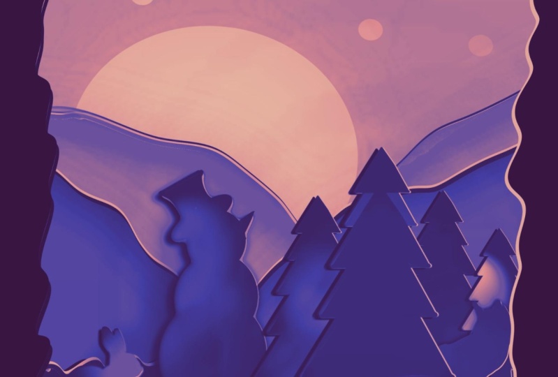
happens in one-click, a totally different color. Let's see you can pick
mystic. Interesting. Then I've got some here which
ignore, I've made those. You can change, you can
do breeze very nicely. These are mine again. So we had the instant,
instant fairness. I like this one. The place
is very interesting. You might want to have
some neon colors, red, or get a really nice dark scene. Pick a gradient which is nice, Mocha, or even dipole proxy. You can pick whatever you like. I like to finish one.
I like that one. I'm going to say, don't you go, I liked so on c, total
different color scheme. Alright, When I hate
this one, the next one, what we're gonna do,
You can also make your own color scheme with this. So we're going back
to that gradient map. We're going to just
say simply a plus n. This is interesting
too, isn't it? It just picks totally
gray tone colors and you have to change
your colors yourself. So what we can do, let's say
we want something bluish. We're going from a
really dark blue. So we have to move
this to a dark blue. There you go. Nice dark
blue to a very light blue. Let's pick that. So the blue again, you will have to remember pretty much blue you picked.
There you go. If you want to add your own
separate colors to here, let's say you want to change
the gradient a little bit. You just pick somewhere and you could change
the color here. Let's go with a total
different blue. Then you get a whole
different effect. You can even add, see a lot of tone to it and create
more gradients. This interesting too, but let's keep it in blue for this one. So then it goes from a gradient from dark to emit to light. It does it automatically. So if you want to change that
a little bit, this is nice. See a little bit
more polish, then. You can do that too. Some different tones
the way you like it. There we go. Now it's just probably calling this gradient map done now I've got loads
of gradient maps. And you can just change them, create whatever you like. It's calling it as
gradient, by the way. If you want a different,
totally different tones, let's go into the rats. New gradient map. Nice and to the red's. Nice dark, going to
a nice light red, even orange, you get that. But I want to transition
here to be slightly quicker. So I might move this up a
little bit to change gradients. A little bit. There you go. And it's not doing that, done. And so now I've got
the blue gradient. I could rename this. And I've got that light
gradients and stay you go. So you can create your
own color sets with this. You can do interesting
things with it. Now I didn't apply the blue one, so I need to go back. And if it is, well, it's still there,
the Gradient Map. There you go. Alright, now, I do like this. Very interesting. All kinds of colors. 11 more
thing I'm going to show you with this background one, Let's hide the rest. I'm going to duplicate this one. I did. Okay. What you can do with
that gradient Two, Last one we're
going to show, I'm gonna go back to that gradient. And you probably already seen here that you can
slide to adjust. You can go from a
very light tone to very dark tone for this, the lighter tone Mike work. And then you get a
different effects. These are pretty much the same. But to show you,
you can go darker, you can go lighter with it too. So do you have that option two? This way, you can create
your own color schemes using gradient maps is a really quick way to
change the colors you have. You can, of course use it
for any coloring, any, any picture you've
made in, Procreate, anything you've done, you could do it two
separate layer still, we've now collapse into one. We can play with it in one go, but you can use this
on separate layers to, of course, credit maps,
right? Handy feature. I think that's it. Yeah. That's it for this one. Yes, we're totally
done with that. We've got a really nice
paper cut lightbox. Now, what would be
fun is to create a real paper cuts
light box from this. But that's for another class. I might actually do that
as a good idea to do something with this and create the real paper cup light box. That would be fun, but
not for this class. This class ends here. Make sure you follow me
here so that you get the notification whenever
the new class is ready. And there's plenty
of other classes I have for you to enjoy. Perhaps you want to
check out some more. Thank you for being
with me in this class. There was, was fun to create
something totally different, but really fun to do. And who knows? I might see you
in another class.
 Benjamin A, Art Teacher, illustrator Art by Benjamin