Transcripts
1. Welcome to the Class: Every painting is a small step
in our journey as artists, a chance to learn something new, experiment without fear, and grow a little with
every brush stroke. Hi, everyone, and welcome back
to our sketchbook series. I'm Ana Kashiodas, a self
taught artist from India, and I'm very happy to have you
join me for another class. So this class
focuses on learning a new subject while painting
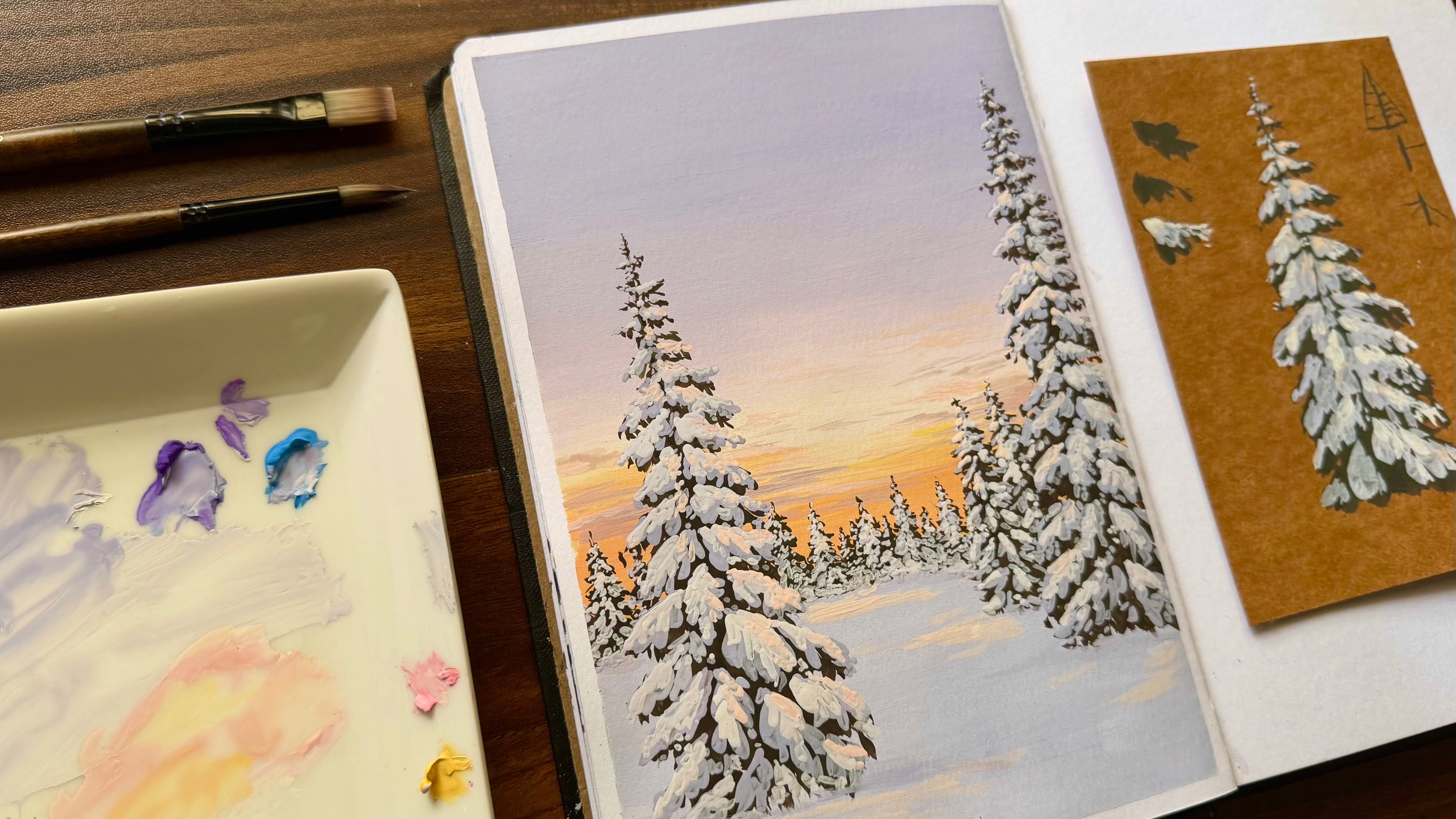
a new sketchbook spread, which is going to be a beautiful
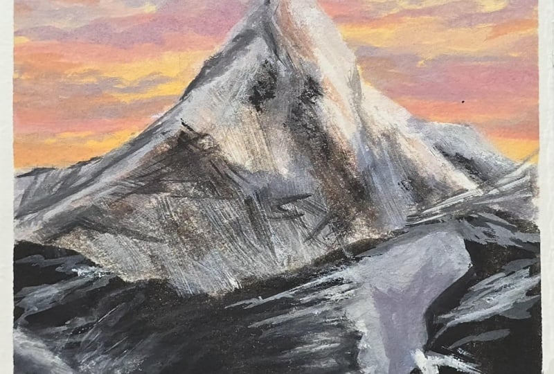
sunlit, snowy mountain. The class is completely
beginner friendly. If you have no prior
knowledge of Gauche, feel free to check out my previous class which covers the basic
properties of the medium, and it'll give you
a strong foundation to get started with this lesson. And if you're new to the series, you can also explore the
other classes that are present in the Gouache
Sketchbook Series playlist, where we have painted
several spreads over the past few months. So talking about today's class, this class is divided into
different lessons with each one focusing on a specific component
of the painting. So this structure makes
it easier to understand each concept without having to go through everything
in a single lesson. And if you have any
doubts or questions, feel free to leave them
in the discussions below. I'll be there to help
clarify anything you need. With that said, make
yourself comfortable, take your time, and let's
get started with a painting.
2. About the Project: H now before we get
into the main painting, let's start by understanding
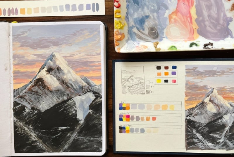
the reference. This is a rough sketch
that I did along with a quick color study in order to understand the
placements and values. So these are the
sets of colors along with white that you'll
require for painting this. I have tried my best to
keep the color palette very minimal while still achieving all the different
color variations. First, we need burnt
umber, burnt sienna, blue, which is ultramarine
blue, purple, orange, cream, that is a
skin tone color, lemon yellow and black, along with some pink,
and a lot of white. Using these colors,
you can mix and achieve all the required sheets. If you mix them in the
right proportions, you'll be able to get the correct values based
on the reference. Now, talking about
the reference, if I were to divide it
into three components, the first one would be
the background sky. Here you can see a
gradient that transitions from a light violet
shade to a cream color. And then gradually
moves to orange. So this is the color
transition we'll be creating. I have also introduced a little
bit of yellow in between. It may not be very evident here, but it'll become much clearer
while we are painting. So the background sky
becomes our first component. Next, let's break
down these clouds. For the clouds, we'll be using the same color palette,
nothing different. Again, we'll be using
the same set of colors, but in different proportions to achieve the required sheds. Moving on to the third component,
which is the mountain. Even though it's
a snowy mountain, the colors are mostly a
reflection of the sky. The lighter side
receives sunlight, so it also reflects the
warm tones of the sky. Here again, we'll be using
the same set of colors. However, for this section, I'll also introduce black
and also burnt sienna because I need a
much darker value to enhance the depth
of the painting. Although I can
achieve a dark shade by mixing burnt umber and blue, but black helps create the
deepest values more easily. So that's why we are
using black here. Now to understand the values, notice that the lightest
colors are visible in the sky and in the areas where the sunlight
falls on the mountain. The second value
can be easily seen in the clouds and some
of the background areas. Finally, the darkest values are the shadowed portions
of the mountain. To simplify the process, I created a small study with a rough sketch to understand
these values beforehand. As you can see, the
lightest values include the background sky
and the sunlit areas. The second value
is represented by the clouds and the
background mountains, while the darkest
value appear on the front face of the mountain and the
deepest shadow areas. So this is the simple study I made before starting
the final painting. You can also do a quick
study like this to understand the values before
beginning your artwork. With that, let's take the edges of the sketchbook
using a washi tape, and then we'll start
with the sketch.
3. Materials: So let's start with
the materials. I'll be continuing with
the same sketchbook that we started
this series with, which is a 245 GSM sketchbook
from the Bran sen Sangam. Make sure you use a thick paper for this project because we are using gouache and
we need a paper that is thick enough
to hold the paint. So that's the main
requirement here. Next for sketching, I'll be using the pencil and an eraser. For brushes, we have
these two sets, which consists of flat
and round brushes. Make sure you use smaller
versions as well. Next to mix the paints, I'll be using the palette. For mixing the paints and cleaning the brushes
from time to time, we'll also need some water. Also, to keep the
brushes clean and dry, we'll need a tissue or a cloth. Next, if you need to secure
the edges of your page, go ahead with a washi tape. And finally, I'll be using
this HimiaJeygah gouache set.
4. Sketch: Now that we have taped
the sides of the page, let's start with a sketch. Like we normally do, I'll divide the page into half, both horizontally
and vertically. You don't have to measure it. Simply you can go ahead
and mark it roughly. Now based on the reference, you can see that the
mountain starts around here and occupies the
entire bottom part. To mark the peak
of the mountain, which is not exactly
in the middle, but slightly more than
that, I'll mark it here. But before that,
let's start with a lower portion that
is the area over here. So I'll mark it this way
based on the reference. Now for the smaller mountain,
here's the ice part. And over here, you can
see a pathway like this. So I'll simply mark
it with a line. Now, to start the
main one around here, just about the previous one, I'll start making
a slope towards the tip where we
had marked earlier. You can check the
reference from time to time and follow
it accordingly. So this is going to
be the front face. Now imagine a triangle in two D. If I have to make it three D, I can add a side like this, and with that, you're
getting a three D form. So this is the same
concept here as well. So if the light is hitting
from this direction, the front face
would be receiving light while the other
side would remain darker. So that's what we're
applying here as well. Basically, this is
quite distorted because mountains do not
take the exact shape of a triangle or anything, but this is the general
concept that you can keep in mind while
sketching the mountains. Further, I'll reduce the height of the mountain a little bit because we'll also have to include the clouds
in the background, which is, again, a prominent
feature in this painting. Uh Now, here in the front
portion around here, I'll first shape it
based on the reference, and then I'll mark the area where the sun hits the mountain. You can see the sunlit area and the reference around here, so I'll shape it first. Marking this area would actually help us a lot when it
comes to painting. And once the sketch is done, before we move on, I'll remove the dark lines
from the sketch. And with that, we're all good
to go with the reference. So let's not wait any further and move on
to the painting part.
5. Sky - Colour Palette: So here the first part is painting the
background gradient, for which we'll be requiring
these following colors, namely purple, blue, burnt
umber, yellow, cream, orange. We also need a bit of pink
and a good amount of white. So get these colors
ready and we'll get started with
painting the background.
6. Painting the Sky : H so now the first step is to mark the
gradient background. For this, I have
taken these colors, mainly white, cream,
lemon yellow, orange, and pink on the warmer side and
on the darker side, we have blue, purple
and burnt umber. So these are the colors
that we'll need. For that, I'll begin with some
purple and a bit of blue. As you can see, the
color is very vibrant, so to lighten it,
we'll add white. So make sure you add white in small batches and also you can slowly dilute the
paint by adding water to get the
right consistency. If you look at this, this is the kind of color
we are getting, but I want it to be
a little darker, so I'll add some burnt umber. You can see the paint is quite thick and difficult to mix. So the more paint I add, the more I make sure to add enough water to achieve
the right consistency. Here, I need the color to be a little lighter
for the first step. It's still a bit
too dark for me, so I'll add in some more white. You can continue mixing these colors till you
get the right value. I'll add in some burnt
umber to correct the color. So basically, it shouldn't
be a pure purple base, but you should be able to see a slightly tone down purple. You can see the color has
now softened slightly, but I still want it to be
even lighter. Don't worry. We'll be using these colors
later on in our class, so don't think you're
wasting any paint. There's nothing like
wasting paint with gauge because you can always
reactivate and use it anytime. So before we begin
the first layer, make sure all the sides
are taped properly. So with this color, we'll
start with the background sky. Now that this layer is complete, let's move on to
the next one for which I'll keep the color light, but I'll also add
in some more blue. Make sure you have enough paint on your palette so that you can actually continue painting
without any interruption. Slowly, you can mix in
more white and blend it. As you can see, this is
the color we have got. You can notice a
slight transition, but we need to even go lighter, so I'll add a little more white. Now, before I mix,
I'll clean my brush so that I can get an
even lighter color. Then I'll add a bit of
blue and using this color, I'll transition it
into a lighter shade. And with this layer, you can clearly see a shift
in the color. Again, I'll clean my brush thoroughly and add
a bit more white. Then I'll blend it properly. So I'll go over this area and
blend everything smoothly. Since I have a good
amount of paint, I can easily go back and forth to create a
seamless blend. So make sure while
you start painting, you have enough paint
to cover the area. Now you can see the kind
of blend we are getting. I'm fairly happy with
how uniform it looks. Now it's going to shift
towards a cream color. As you can see, there's a
slight change in color, and it's now moving towards a warmer side as I add a little bit of
cream to this color. Just below this layer, I'll add a good amount of this color. You can see the color spreading evenly across the surface. You're probably wondering why we shouldn't blend blue
directly with this color. For example, let's
take these two colors. So if you mix cream
with a cooler color, which is violet or blue, you'll be getting a
darker muddy color. And also, if you add a
bit of white to this, you're going to get
a grayish color, completely different
from the color that we initially obtained. So we need a nice transition
from this to this color. As you can see, this is the
kind of transition we need, and towards the bottom, it becomes much warmer. But if you mix violet
directly with these colors, you're going to
get a muddy color. That's the reason why we are not introducing cream directly. Instead, we are first
lightening the purple using the white color
and then slowly introducing green
in order to reduce the intensity of the violet
present in the mixture. And once that's achieved, you can slowly increase
the amount of cream. So this is the basic idea
behind this gradient sky. So whenever you're transitioning the background sky from a
cool to a warmer color, introduce white in
the transition layer so that you get
that smooth blend. So here, I have slightly
added the amount of cream. So if you find that your brush
has too much blue on it, take some time to
clean your brush thoroughly and then
introduce the color. We are done with the section. At this stage, I'll add a bit of yellow to make
the color warmer. Then I'll add some pink and
orange along with yellow. Don't keep the
colors too vibrant. Always blend them gently
with the previous layer. Always do a swatch
test in order to understand how the
color is transitioning. So around here, I'll
add this color. And slowly, you can blend
it with the previous layer. I'll just correct
the previous layer by adding a bit of white. So don't worry if the blend doesn't look perfect
at this stage. We can always correct it later. Next, I'll add some pink to this mixture and finish
off with this color. As you can see,
the transition of colors is happening beautifully. It's always better to do a quick swatch test beforehand so that you
get the colors right. Now, let's wait for
this layer to dry. Once it's completely dry, we'll move on to
painting clouds. If you want the background
to look more paste like, you can lighten these colors further by adding some white. So let's wait for this layer
to dry and once it's done, we'll move on to
the cloud section.
7. Clouds - Colour Palette: Moving on to the clouds, we need these following colors, that is purple, blue, green, yellow, pink, orange,
and a lot of white. And with that, we'll be
creating this set of colors. So you can keep
your palette ready. You can also clean
your brushes and refill your previous
water with a clean one. And with that, let's move
on to the cloud part.
8. Clouds - Painting Technique: Now, meanwhile, the paint dries, I'll demonstrate how
to paint the clouds. As I mentioned earlier, the clouds are basically a
mixture of these two colors. This is somewhat the color we
need to get for the clouds. So let's take some
purple and to that, I'll add some cream color. You can see that we are
getting a muddy color, but I need it to be a
little more pinkish, so I'll add a bit of pink. And once you add, this is what we'll be getting. You can do a quick swatch test. This looks quite dark, so
I'll add a bit of white. Now, this looks pretty good, but I need a further
lighter version, so I'll add in more white. Now, this color looks pretty good with
the background sky, but let's first prepare
a good amount of paint before we get
started with exercise. We had mixed these three
colors to achieve this color. So here we are basically
mixing a cool color and a warm color to
get a mixture of gray. But in this case, we don't
want this particular gray. We want it to be more
towards the pinkish side, which is more towards
the warmer side. So that's the reason
we had added pink. Now, using this color, our main idea is to spread the paint in a
horizontal manner. So imagine this is the cloud. We'll be working the brush
in a similar motion. For that, you can hold
the brush like this. And then using this round brush, you can simply tap the brush onto the paper to
create this texture. Basically, I'm
pressing the brush onto the paper and releasing it, which results in
these small strokes. So using this brush technique, you can create abstract
shapes to form the clouds. So this is how I'll be
creating the clouds. You can first practice
a few clouds using this technique and then
do it on your painting. But if you find it difficult
to use a round brush, the same method can be applied
by using a flat brush. This can be a little easier because the surface is already flat for this brush.
So the method is same. You're simply dragging
the brush this way to get a similar texture. And keep this in mind that
it's not a long stroke. You're just spreading
these small strokes in the shape
that you want. Again, you can go through the reference to
get the shapes of the clouds or else it's completely okay to go
ahead with your own idea. And apart from that,
you can also try using different brushes and see
which one works best for you. You can also make small
clusters like this. And don't worry if
this doesn't look like a cloud because in
our main painting, we'll be using multiple
colors to get that effect. So it'll look more like a cloud than the ones that we just made. Now with this concept,
let's get into the main painting once the
sky part is fully dry.
9. Painting the Clouds: Just like we saw earlier, I use some purple, a little bit of pink,
and also some cream. Now, to this mixture,
in order to lighten it, I'll add in some white. Always use enough water to
make the paint consistent. I find this color a little
more towards purple, so I'm adding some cream. If you want it to
be more warmer, you can use these warm colors. But here, I'll keep it like this and lighten it using some white. Now, this is the color we got. I'll add a little
more cream now, so take your time
to mix the colors because that's a
very crucial step. Now, I don't want it to be
this gray but slightly darker, so I'll add in some blue. Here, you can see there is a very minute difference
between these three colors. To lighten this color, I'm adding in some white and some more blue to make
it a little bit darker. It's always a trial
and error method. So make sure you give yourself some time to first mix
the color and slowly, once you're satisfied, you can go ahead and start with
your main painting. As you can see the
colors are ready. So this is how the
cloud should be. The first set would
be at the top. The second set would be here, which would be invisible
just behind the mountain. And here at the bottom,
we have the final set. I'll just mark this
line for reference. Now that we have
a good amount of paint using this round brush, I'll use the previous method to add clusters of
clouds like this. You can check the
reference in case you want it to be
exactly the same, or else you can
experiment with it. So our first step is to
use this color to mark the clouds and later on we'll slowly add in
the other colors. And with that, the
first color is done. Now you can clean your brush, and let's start by adding a little bit of white
to the same mixture. I'll be using this color, not everywhere, but mainly in the bottom part
of the clouds. As you can see, I'm not
getting into too many details. I'm just blending
this color with the previous layout
in this manner. I'll also extend it
further outside as well. So I'll be repeating this
step for the clouds present. Next, I'll clean the
brush thoroughly again. Now to introduce
the warmer color, I'll use this set of colours
that is pink and yellow, which when mixed gives
us a warmer orange. As the previous color has dried, I'll just add some
water to reactivate it. Now, this looks a
little bit dark, so I'll add some
white to correct it. Now using this color,
I'll just go below these dark clouds and add a very thin layer to the bottom. As you can see, the color is more towards the
background orange. Now, to correct it, I have
added a little bit of pink. And since it's quite vibrant, I'll add some white to
reduce its vibrancy. Now using this color,
I'll just fill in these gaps in the clouds
just like we did earlier. Let's use this color and
finish a second layer. Now for the upper clouds, I'll add some white
to add these details. Again, I'm mainly working on the bottom part of these clouds. Take your time, give it a watch, and then you can try
it in your painting. If you look at this, you can see that they are
quite vibrant now. In order to match them
with the previous color, I have led them a little
more using white. And now, as you
can see, they look much better and more in harmony. So using this color, take your time and fill
in these details. You can repeat this step
until you're satisfied, but make sure you don't overdo. As you can see, the
violet is quite light, so I'll take some
blue and add it to our first mixture
to darken it a bit. I'll also add some more orange. As you can see, it has
turned more towards a gray color now,
which is quite darker. So using this, I won't
fully redo the clouds, but I'll add it only in a few areas to show
the darker shadows. You can either skip
this step or you can slightly work this way
to get the values right. Lastly, I'll clean
the brush thoroughly, and I'll take some
white and add it to this warm mixture,
along with some yellow. As you can see, the color slightly started getting warmer. Now using this color, I'll add some highlights on these clouds like this to show the light. Not everywhere, but
especially on this side. As you can see, I'm not
working everywhere, only in a few particular areas. And with that, our
clouds are all done. Now, let's wait for
this layer to dry. And in the meantime, let's
move on to the mountain part.
10. Mountain - Colour Palette: Next, for the mountains, you'll
need these colors, black, burnt umber, blue, purple, yellow, orange and white. We'll be creating
different variations of these colors
for the mountain. So before we start
this painting, make sure you clean your
brushes thoroughly and change the water as we want these
areas to stay light and clean. Also make sure all your
other tools are also clean. And with that, let's move on to the next part
of a painting.
11. Mountain - Painting the shadows: Oh. Now, let's start
with the mountain. As you can see, the lighter
areas are mostly present in the mountain in the background and also here in the front. For these areas, we are not
directly going in with white, even though they look like snow. They are actually snow, but if you look closely, you'll notice that they don't appear to be white anywhere. So these are the areas that
we marked earlier where we shaped them according
to the places where sunlight was
hitting the mountain. And because of that, these
areas receive a warmer color, more like yellow orange, while the shadow areas here are more towards
blue and purple. And if you take a moment to observe the painting carefully, you'll notice that this
color is not exactly gray, but is more towards blue, just like the colors
in our palette, which is similar to the colors present in the background sky. So basically, the
colors on the mountain are simply a reflection
of the sky itself. So let's begin with the
lighter colors first and then we'll move on to the
shadow areas present over here, which are mostly a reflection of the sky colors that we see. As I said, the sunlight color
is more towards this area, the warmer side of the sky, which is the yellow and
yellow orange color. With that concept,
let's get started. For this, let's begin
with a thin flat brush. Now using this brush,
let's go ahead and start mixing some white
with a shadow color, which is the blue one over here. I'll also introduce some
burnt umber because the shadow area is not
purely the sky color, but it's quite a bit darker. To get the darker shade, I'll slowly mix in
burnt umber and also reactivate the paint
using a little bit of water. No. As you can see, this is the color we got, and it is quite darker than
the previous palette we have. Now, if you look at this
part of the mountain, which is the other
side of the mountain, as we had seen earlier, this side would be darker while this area in the front
is relatively lighter. So keeping that in mind, I'll start with the
darker area first. I'll make it a little
darker for that side by adding some more
blue and burnt umber. Again, you can see that it is quite darker than
the previous color. So using this color, I'll go ahead and mark the
side of the mountain. I'll add some white to
lighten it a bit and fill it in here because I
don't want it to be this dark. And as you can see now
it looks quite fine. Next, I'll bring in some purple. Basically, I'm using the same
colors from the palette. And using this color,
I'll go ahead with the front side of the mountain
that is visible to us. So I'll just share the area that is receiving
the shadow first. The mountain behind,
which is not actually visible here is a little
darker and more towards blue. So I'll also fill in that mountain in the
background in this manner. Next, I'll quickly
clean my brush and then add some white to
lighten this mixture. And using that, I'll just
block in this entire area. And most importantly, make sure you have enough
paint and water so that you can fill in this area without having to remix
the paint every time. If you observe here,
there is actually a bend or a crack
like shape over here. So I'll just mark that as well. While doing so, make
sure you don't touch the area that we have
left for the sunlit area. And here in the front,
it's further lighter, so I'll add in some
more white because this is the area where the snow is present on the mountain range, which is present in the front. You can also see these
pathway areas in the front. So I'll be using the same color and simply marking in the paths. It doesn't have to
be very precise. You can simply draw
a line like this.
12. Mountain - Painting Sun-lit Areas: Next, I'm cleaning my brush thoroughly to start
with the warmer side. Now using the clean brush, I'm taking some white
into our warmer mixture, using the same
palette as before. We need to keep it a little
more towards yellow, so I'm adding a bit of yellow. Using that, I'll just block in these areas that we had
left for the warmer side. Now I'm taking in
some orange and pink. This is the same
from the palette, and I'll slightly
touch not fully, but only on the sides like
this using this colour. H I'll also mark the border like this, which differentiates this side. So I'll stop here for the
warmer side with this color. Next, I'll clean my brush and
bring in some more white. And using this color, I'll just directly
work on these areas, especially on the
other side where we hadn't added the
pink orange mixture. Next, I'll clean my brush
again and take some white with a shadow mixture
that we have on our palette. After lightening it further, I'll use the normal
brush stroke like this to define the shadow
area more precisely. And here, as you
can see, I'm just defining the front face
of the mountain alone by lightening it further because I find this
color a bit too dark, and it doesn't really
differentiate the side of the mountain that we
had marked initially. In the same way,
I'm also lightening the background
mountain because I find it a little
too dark as well. And also this area, but we'll be working
on this later on.
13. Dry Brush Technique for texturing the Mountains: And now, in order to
texture the mountain, this is the technique
we'll be using with around brush and burnt umber. So let's first take
a lot of water. The kind of stroke I get
are basically like this. But the more I continuously
repeat the stroke, you can see the kind of
texture I'm getting. So lesser the water, the
better the texture gets. I hope this is clear. This is basically
the technique we'll be using for texturing
the mountain. So the point is to use less water in order to
get a better texture. Also, while making
these strokes, make sure you don't put too much pressure onto the
paper with your brush. Instead, keep your
hand very light. An inverted V is what we are actually planning to repeat in order to get these textures. Also, make sure you handle your brush carefully
without damaging it. I'm just showing you
different types of textures you can get
using this method. So you can simply
give it a watch and then practice it
on a rough sheet. And in case you
want to darken it, you can go over and repeat it so that you get the
specific area darker. So in this manner, you
can see the kind of texture you'll get when
working on mountains. Also, the strokes
that we use are not going to be
exactly horizontal. Instead, they'll be more like
slanting lines like this. So just like I mentioned, it's mostly some sort of an inverted wheel that
we'll be creating. And this is the dry
brush technique where we use limited amount of water
in order to get this texture. So make sure you use
very little water while doing this technique.
14. Texturing the Mountains: H now let's start
with the round brush. I'll start by normally
marking the areas. I'm taking a little bit of black and burnt umber together, and with that, I'll
mark the areas here. Basically, using the pointed
tip of the brush like this, I'll just make some small lines. As you can see, the stroke is a mixture of thick
and thin lines that I have created by varying the pressure I'm
putting on the paper. Basically, I'm dragging
the brush as a line, but not making it
a continuous one. It's more of a
discontinuous line. So you can practice
this a little before working on the main painting so that you get the hang of it. So this is what I'm doing here. H next, I'm going ahead with some brown. As you can see, I only have a very little
amount of water, but I'm still
working on the paper so that you can get
the texture right. And over here, as you can see, I'll start making
these textures. Basically, like we
mentioned earlier, it's some sort of an inverted V using these landing lines. And wherever you find that
there is too much water, you can brush it on
a piece of paper to get rid of the excess
water and then proceed. Here, as you can see, we are
getting a very good texture. So I'll just continue using this technique
throughout these areas. Even on the ends of
these warmer areas, I'll add a little bit
of it here, especially. And if your brush is way too dry and no paint
is coming out, feel free to slowly
dip the tip of your brush in water to
reactivate the paint. Then slowly restart
the same process until you get the right texture. Now, for areas that you
require to be darker, go ahead and add some
black to this mixture. Now, here I'm marking
the dark areas first, and then I'll go
ahead and repeat the same process
until I'm satisfied. On the other side, I'm mainly going ahead with
a further darker color to show the shadow present on the other
side of the mountain. Take your time.
You can go through the reference and then
create these textures. As we move down, you can see I'm not focusing too
much on this area, but the shadows and
rocks are still visible, and that's what our dal goal is. Even for the
background mountain, I'll add some texture. No. See, now I'm not making bigger strokes. I'm making smaller ones so
that my details stay in place. Now, as you can see,
the mountain is getting better with
these tiny details, so you can repeat
the process without overdoing it until
you feel satisfied. Oh. Now, before we finish this up, I'm also going ahead with some opposite
diagonal strokes like this to enhance the
overall texture. As you can see, the more you
work with this technique, the brush gets slightly damaged. The bristles of the brush are quite separated
at this point. So make sure you add some
water in between so that you don't damage the brush
completely during the process. And with that, we
are winding up here, and let's move on
to the next part.
15. Painting the Mountain in the front: Next, let's start by
filling these areas first. I'll use a bigger flat brush
to fill this dark area. For that, I'll start with
black and burnt umber. So we can start by using
sufficient water to mix the paint in order to
get the right consistency. Here, I'm actually adding
more burnt umber because you can always darken it later
if you add black to this. Now, using this, I'll just
block in these areas. First, you can simply outline
the mountain and then go ahead and block in the entire area using
this dark color. As you can see, the snow area
is not fully present here. Since the brush is quite dry now because of the
previous filling, I'll just go ahead and
create some textures because this is basically a path that we'll have
to show on later. Here we'll be filling
it mostly with a dark colour and only a
very light path is present. Next, I'll fill in the
dark area completely, leaving a small space for the pathway that we
had seen earlier. As you can see, we
have now filled the dark area of
the front mountain. With the remaining color,
I'll just go over and darken a few areas in the
background mountain as well. And most importantly,
don't overdo it. So only if necessary, go ahead and make
these corrections. And with that,
let's go ahead and detail this part in
the next lesson.
16. Creating depth in the Shadows: Now, using a flat brush
and a little bit of water, I'll reactivate
this blue palette and remove the excess water. Now I'll just use it over the sunlit area of our main
mountain in the background, but make sure the color
is very, very light. We are just creating a
subtle texture here, so make sure you remove
all the excess water from the brush and then go ahead and make a few
strokes like this. Now, using the same color, I'll repeat the same texture in the shadow area here as well. So wherever you feel there
is a need for correction, I'll just use this color, remove excess water and then create the
texture like this. As you can see, the texture
is slowly getting better, but make sure you remove all the excess water from
your brush and only then proceed so that you
don't disturb or damage the painting
that we did earlier. Even here on the side, I'll be repeating the same. But again, I'll use
it very lightly. So overall, don't overdo it. Only if you are
confident enough, go ahead and add these
textures in this step.
17. Enhancing the Pathway: So in the same manner,
I'll use this color to add the texture to this
section of our painting. Here, in the same way, I'm going ahead with slanting lines. So based on the
reference, you can go ahead and start creating
these textures, especially along the pathway. So I'll first mark
the texture this way. Basically, these are set of
veins that I'll be creating. Once the basic marking is done, I'll go ahead and use
a thicker paint and make it darker by
taking more paint, and I'll correct the pathway. As you can see,
this is what we'll be doing on the
other side as well. And Now, once the step is done, I'll mark the pathway
using a brighter white. Since we also need a
little touch of brown, I'll mix some brown into this color and
repeat the same process. And I want it to be a
little darker over here. So I'm taking burnt
umber and black, and again, I'm adjusting
the texture over here. So I'll repeat the process
until I feel satisfied. You can take your time
and add these details. Now, looking at this area, I feel it's becoming very light. So I'm going ahead and
mixing in some more black, and I'll mark these
areas once again, especially in the middle
and wherever required.
18. Adding the Final Highlights: Finally, in order to
add the highlights, I'll clean my brush thoroughly, but this time, I'm using
a thin round brush. So I'll start by taking
some white directly, and using that, I'll highlight the snow area that is
present in the front. You can use your reference
to mark these details. So I'm not covering
the entire snow area. I'm just adding a
few highlights here. Now using the same white, I'll go ahead and highlight the mountains that are
present in the background. So make sure your paint
is at good consistency so that you get a good stroke while adding these highlights. Also, using the dry
brush technique, I'll mark a few textures
here and there, just like we did earlier. Again, this is not necessary. Only if you're confident enough, please go ahead and
proceed with this step. Here in the front area. I'll add a few
textures because we had actually darkened it
in the previous lesson, so I'll just correct it now. Here, the main step is to
properly mark the pathway. So just around the pathway, I'm adding a little more
brightness using this color, and slowly you can bring in some veins like this in
different directions. I repeat I'm purely using
this dry brush technique, so I'm removing the excess water and then proceeding
with the step. So before I wind up, I'll just go ahead and add a few minute details wherever
I think it's required. Finally, I'm taking
this dark color, which is basically darker shade of blue that we
have on a palette, and using that along
with some black, I'll just darken the sides
of the mountain like this. And with that, we are
wrapping up the project. Oh
19. Thankyou: And with that, we have completed our class and also our project. So once you have
finished your painting, make sure to click
a few pictures and upload them in the
project section below. I'd really love to
see your projects. Your work can also inspire others to take that first step, finish their painting, and
be a part of the series. And don't worry if you're not
completely satisfied with your final painting or feel like something is missing,
that's completely okay. Especially if you're a beginner, don't put too much
pressure on yourself. It's all part of the
learning process, and every painting helps
you grow and improve. So just keep that in mind and focus only on
enjoying the process. And apart from that, we still have several more
spreads to complete. So let's slowly work
through them and keep improving our skills as we continue this
journey together. So to submit your project, simply click a photo
of your painting and go to the projects and
resources section below. Click on the submit
project, upload your work, add a title, and feel free to share your
experience as well. Once you're done, just
hit the submit button. And if you enjoy the class, feel free to leave a review. It would really help me and also encourage me to come up with
more classes in the future. I really hope you enjoyed this class and found
it informative, and I'll see you soon with more spreads in
the coming months. Until then, have fun painting. Thank you, and take care.
 Anagha Sivadas, Artist, India