Transcripts
1. Class Introduction: Hello, everyone, and welcome
to Watch For All Painters. I came up with this course
because I've met a lot of students that were not happy
with their old portraits. They were worth rendering,
and the paints were missing that
textural effect that a simple workplace
stroke can have. So whether you're looking to prove your old painting skills, we just want to dive
into a new medium, this course is going
to be real helpful. In this course, we're
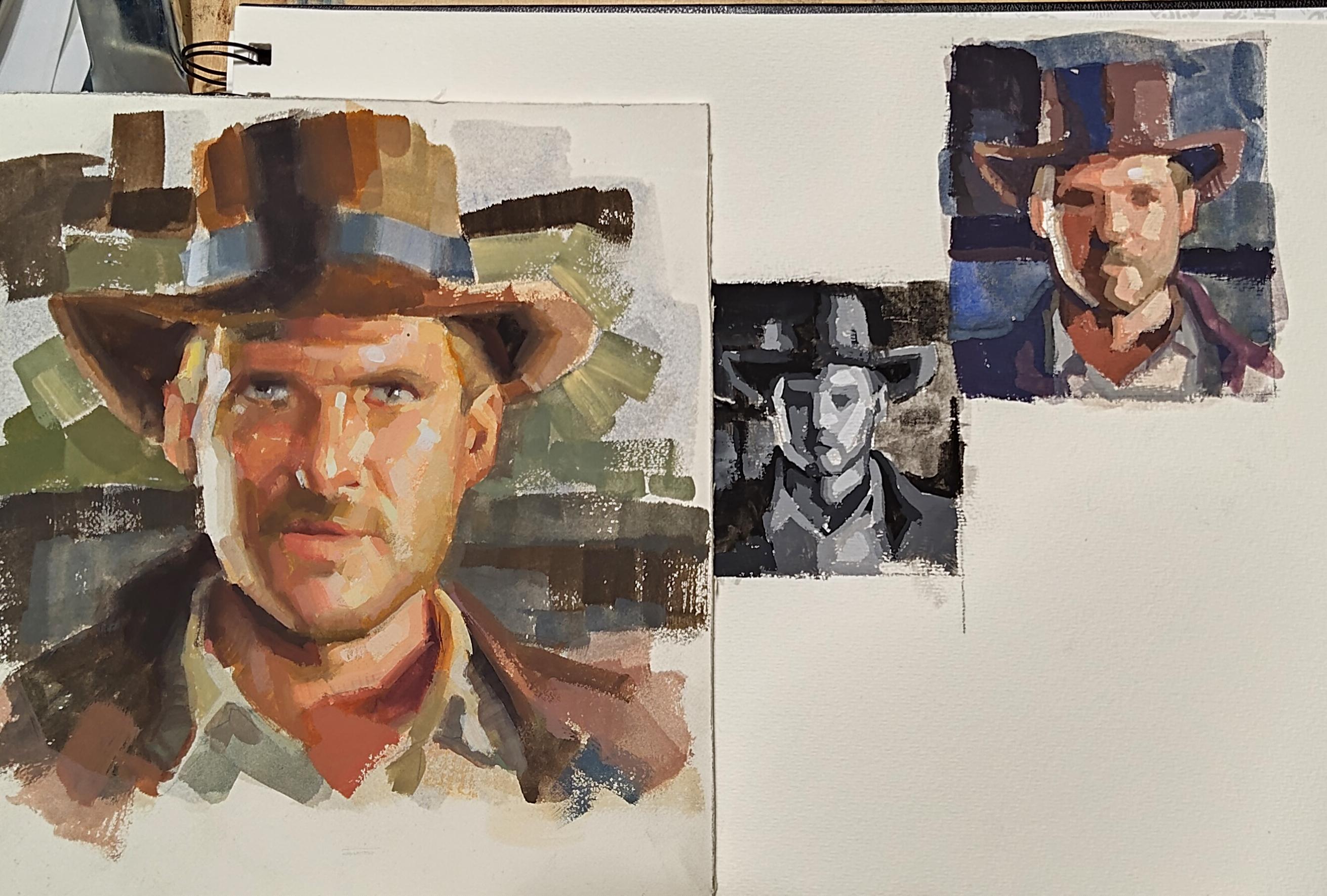
gonna paint Indy. The process I use is
called tile painting. What I mean by
tiles is basically brush strokes that represent
a piece of information. That information
can be anatomy or just serve as a transition
to trim the form. My main goal is to
give the tools and confidence to
approach your paint with dust and without fear, which will lead to
looser brush strokes and more powerful portents.
2. Setting up your materials: Okay, guys, I'm going
to go over supplies real quick and show you how to set up your space so you
can get to painting, okay? First of all, we have our
butcher tray palette here. I believe it's made out of enamel. Check out the resources. I'm going to have
a link for you so you can if you
choose to buy one, you can get got our
shop paper towels here. These paper towels are way more durable than your
regular paper towels. That's the main reason
why I use them. Feel free to use regular
paper towels if you want to. Got our brushes here. These
are watercolor brushes. Short handle, different sizes, different types of brushes. We got rounds, we got flat. We got brights, another
round real small, and another flat real small. Feel free to get different
sizes, different shapes. I would say start with maybe four or five
different brushes. You'll be in good shape. Get a cup for water
so we can clean our brushes and we can
grab a little bit of clean water so the
paint flows better. This is really useful. It's just a spray
bottle with water. And what I use it for is to spray water on the paint
that's dried already. That way I can reactivate
it without having to get more paint
out of the tube. Pencil, eraser, so you can do your drawing before
you start painting. And the colors I have here,
go from left to right. Usually that's the way I
set it up on the palette, as well. I'll show
you in a second. We'll go Avery black, traman blue, burnt
sienna, lzarum crimson, cat red, medium, yellow
ochre, naples yellow, real useful for fleshtones
and titanium white. The way I set it up,
I br a paper towel, and you can either dunk it in the water or can
kind of fold it, put it on the palette and
then use your spray bottle. To wet the paper towel? Make sure you do both sides. And the reason we're doing this is when we put our pin out, it doesn't dry as fast. If you don't do this, your pin's gonna dry within the
first 30 minutes, and you're going to be
wasting a lot of paint. So I'll show you one
that's already done here. That's the way I
set up my paint. Every time I paint. Every time I do art, whether it's oils or wash, I do it the same way
from left to right, white on the right, my
darkest on the left. And the reason we
use burned Sienna in this setup is sometimes I
don't feel like using black. And the way I get
my darkest dark is by mixing ultramarine
blue and burned sienna. But you'll see that
on their first video. Oh
3. BW Thumbnail: Alright, guys. I'm going to start with the
black and white. I think I'm gonna
do this little one as a black and white thumbnail. So go ahead and follow along. Don't forget to wet the
surface a little bit. Also, I have a dry paper
towel on my left hand at all times to wipe off excess
paint or to dry my brush. So feel free to do the same. Try and kill the white. I'm just gonna grab a
little bit of black. Really diluted with water. Gonna change. My water position
overhear more accessible. All I have just black and water. Yeah, I think that works. Remember, we trying to
kill the white at this moi Now, we're going to try
and get our darkest dark, which in this case is
gonna be just pure black. With just a little bit of
water so the pain flows. You don't want a lot of water. So I think I'm going to go and pick this area
as my darkest. At this point, we want to simplify the values
on the thumbnails. So if you see a lot of
values on your reference, go and combine squint first, and you'll find out that
the values compress. It's like magic, really. So that's going to be all part of the same value at this point. Let me do this core
shadow on the head. It's gonna be part of it. It's the reference I'm using, it's really dramatic lighting, so there's a lot of contrast. I think I'm going to
include this part. It may be a value. Yeah, it may be a value
higher than this, but I'm going to combine
it at this point. Something I usually do on
the bigger paintings, too. I'm going to grab a bigger brush and kind of block
in the background. So I'm gonna grab a little bit. Why am I a little more water? Because I don't want it
to be as dark as this, but I still want it
to be dark enough. So the portrait kind
of comes forward. I want to go back
to my darkest dark and kind of restorish this core shadow because it was I guess I used too much
water in the beginning. I think this shadow here can
be part of the same value. Maybe a little bit
of calligraphy. So design elements
in the background. Maybe connect these shapes. Every time I draw or paint, I look for opportunities
to combine shapes. For instance, this and this are three different shapes
than combining into one. And what that does is just visually it's more visually
appealing to the eye. When you simplify
shapes into one, you get that feeling that it's well structured and
it just flows better. Maybe a little bit more here. I'm still on the same for
value. I haven't moved on. See, when I have it
loaded on my brush, I look for areas that I think
belong in the same family, and I move around fix
the shape a little bit? No worry I'm not gonna
worry about the eyes. I think I'm going to go up one value and not even
worry about the eye. Remember, on the reference, this area is really bright, so I'm going to try
and paint around it. If I lose it because
it's really small, it's really easy
to make mistakes. I'm going to have to come in with almost pure white
and re establish, but I'm going to try and
preserve that as much as I can. Actually, before I move on, there's a shadow under
the jaw that I mean, maybe one values above this one, but I go ahead and establish
right now before I lose it. So that's pretty good. And
indication would be no, so I don't lose it and the aye. Okay, so let's move
on to the next value. And since it's used
black and white, why not just add a little
bit of white to our black. And as you can see, just making a really cool gray mix it in more black hair
so you can compare. What you want to do is just go one step up from the black, and you want to
compress your value. So you work with maybe
five or six values. So they need to be
closed, but not perfect. This will be perfect. It's
all guesswork, really. So I'm going to go ahead and introduce this value
squint squint. So I think here. If it doesn't flow, add
a little bit of water. So what I mean? When I talk about tile
painting, this is where I mean. There's a shape, and then I'm adding another
shape right next to it that represents a value higher or lower than the
shape that was already there. In this case, it's
a little higher, but it's just another tile. So there's a tile
and then a second tile next to each other. And that's how we
make transitions. The thing with these
little tiny thumbnails is that you need to stay
with small brushes. Okay. As you can say I'm
just closing shapes. Maybe add another tie
here for the ear. Case. Look for places where that value may work on. You may be wrong, but you can
always come in and fix it. See, I'm trying to exhaust all the places where
this pile belongs. No way around it. Got to
keep mixing your paint. If you use add water,
it's gonna kill your chroma, your opacity. So you just got to keep mixing. I think this shadow may benefit from this
value I'm working on. Connect this. Always
connect the shapes. I pile right next to
the one I have here. It's a bit of way to soften
edges without blending. If you put a tile
that's brighter, just a little brighter than
the one you had there. I'll look like it's a soft edge or a softer edge without the need to go
in and blend with water. Okay. I think I'm going to
move on from that value. And I feel like this
value that I'm mixing now is going to go
on a lot of places. So I'm going to I know there's
two separate values here, but on this thumbnail, I'm going to combine
it just one. Can Bar would go here. You'll notice that when it
dries when watch dries, usually dries darker or lighter
than what you put there. And it takes a little
bit of getting used to, but once you get used to
it and calibrate your eye, it's just second nature, really. Okay, I'm going to
close this also. And this is part
of the shirk area. So it's going to be
a little brighter than the shadow area here. But I'm just going to add
a pile next to the black. So it's not a super hard
edge when I come in later with a little
bit of brighter value. This can also be a shadow here. Make it here. I'm going to do the same thing I did
here. I'm going to do it here. I'm going to use this
for this at area. I mean here, here, it's black and
then the next step up and then the next step up. But I'm saving room here
for a step higher than that Always working in tiles. I know this is going
to be a little brighter, so I'm
going to say that. Part of the hair probably can benefit from this
tile I'm working with. The shadow area of the ear, maybe along the edge
of the jaw line. See, I'm not worrying
about eyes really. I'm just going to
indicate eye sockets. If you squint, I can
barely see the eye, so I'm just going to follow
what I see when I squint. All right. Let's keep
working with this brush. So I'm going to go up one value. I think this is going to
be in the light side, so it's going to
make quite a jump. Let's see if this works. I'm going to try it first on the highlight part of this head. Squint de little bit. I think it may work, not for the brightest part, but for the transition. I think that works. Same here. Remember, these are just lose studies before you
start your painting. So don't worry about likeness
or proportional errors. Excuse as long as you get the general feeling,
you're gonna be okay. You notice I'm not
Once I move up, I'm not putting the tiles
alone by themselves. They always or they almost always go next
to another tile. And that's because if I put
it on just a white paper, it's going to be
hard for me to judge if it's a correct value. But if I put it right
next to another tile, I'll be able to know or to judge better if it's
the right value or not. Close the 5:00 shadow here. Another transition here. Don't be afraid to go over paint that you
have there already. For instance, I'm going to
work this value that I have here and maybe I go in here and goes over the heil that I
had there already. I mean, it's okay if
you make a mistake. You can always come back
and re establish that. I want to a transition here. I think this tile can
work for the shirt here. We have to mix more tape. They had here. All right. I'm going
to move on. I'm going to move up one value. So this is getting into
the lighter areas. And I think the big
highlight on the left of the face can benefit
from this value, which is not the lightest,
not a highlight. But it's pretty close. I'm going to close the
forehead area with this one. And the nose. Let me kill a
little bit of this way here. Maybe I'll use the same
value along the edge of that core shadow and move up. So this is almost pure wade with just a little bit of
that gray that I had there. Keep it simple. Don't
worry about anatomy. Use big planes, big
brushes, or big strokes. It's a tiny thumbnail. Now it down. Right here. Okay. Before I place highlights, I'm going to reestablish this
dark area on the jacket. I think it's not pure
black but one step up. Okay, that's pretty good. Think of this as
abstract shapes. You're not pinning a jacket or you're not painting an eye. You're just pinning shapes. I have transition here. Every time you see
a hard edge that doesn't that jumps out, get a value, a step higher
than what you have there, and then put it
right next to it. And it'll look softer. When instance here, I had almost I think
that's pure black. I'm going to grab a small brush. Make sure there's no paint on it and make something
that's a little higher, a little lighter than pure
black going right next to it. So maybe a little
little lighter. Go next to it and create that
transition, that softness. Okay, now that
everything's laid out, and play around the background and there a little bit
of these proportions. I know I come in with a lot of black and kind of
darken this area, the background and
go inside the hat, so you lose that edge. And this side, stay
outside of the head. And use it as a design element. So lose that edge. Lost edges are just their grave. What they do is it loses an edge but invites your
viewer or whoever's looking at your pin to kind of make it
up with your imagination. So it's almost like an
interactive technique. A ding that ground. Maybe I want too dark. So maybe go in and add a little bit of
white little do gray. I think that's pretty good. I think that's pretty weird. I feel you just need to reestablish or kind of
cover this ear here. I know it's a lighter
passage here, but I don't want it to grab
the viewers attention. Ears are ugly, right? So you want him you want
him in the background. You don't want it to be
screaming for attention. I'm just going to cover
it up with a little bit darker than the
virus light that I have. And now, I need to fix where the ear ends
and the head begins. I see the reference, it's a
little darker than I had. And basically, that's going to separate this background element from the foreground element. That works. Use a transition here to your
solvening edges as you go. Maybe here. And that should be good enough
for a thumbnail. Well, one more thing. I'm going to use that value
I was working with and add a tile translation tile here because
it looks really, really hard edged right now. So that tile works. Real simple, broad shapes, no detail, no blending. It's great practice.
4. Color Thumbnail : Okay, Roy. We're back and now we're going to do
the color thumbnail. First thing I'm
going to do is do a little wash like we did
in the black and white. But obviously, we're
gonna use color. So everything. But the face and the first wash. So I'm gonna do
something neutral, maybe some blue with some yellow ochre, a
little bit of red. That's pretty dark, but we're
gonna do a lot of water. I I'm gonna be careful and not touch or if I go over this highlight park. I'm gonna make sure it's not too dark because I want to preserve it as much as
I can. It's pretty nice. It's got a little warmer with this wash to might do a little bit of the
shadows and the face. Is pretty good. Now I want to do a
pass on the face. I'm going to go by the
color zones on the face, which is yellow on the forehead. Red, the middle. Some neutral hard blue
here in the jaw area. Again, who is killing the white, so it doesn't have to match. Okay, I think we're
ready to start. Like, before we're gonna go, we want to start
with the darkest. In this case, I'm not
gonna use pure black because I want the dark
areas to be chromatic. I want to do blue with some red. This is burnt sienna. I
like to use burnt sienna with blue when I don't
have access to black. It's a really nice chromatic
black or really dark color. So I'll show you here.
So let's use ultramarine blue with just a little
bit of burned senna, and that burnt sienna
neutralizes that blue, and it looks almost
black. Real chromatic. I like it. All right, so let's start again with
this shadow, bring it in. Makes a little bit
more of that black. So that's nice. I think used the lines are kind
of like a design element. Yeah. That's pretty good. Again, I might not worry
about the eyes or features. I'm just going to deal with
it in the black and white. Real simple, real, real
broad, real abstract. So I want to come in and fix
some of the shapes. Here. I know he's casting
a shadow right here. I'm going to add it now because
I don't want to lose it. I mean, if you lose it,
you can find it again. If you draw it the first time, you can draw it at second
time or third time. So this one, I'm going to
move pretty fast, I think. Now that you saw that
black and white, you probably have
a pretty good idea of what the process entails. It's a little more complicated because you're
adding color and temperature. I I think I'm going to mess in
this whole shadow into one pretty warm
shadow right here. This shadow area starting from here all the way
down to the chain. It's going to be a pretty
warm shadow because it's right around
that middle area where it's really
warm on the face. Someone grab some water. Probably coming later
in more values. But for now, I'm just gonna
do this one big shape. Don't be afraid to use that same color that
you have already loaded in other areas that
are similar in value, and similar in temperature. Collecting. I have to get a little
cooler but around the same around the same value
in order to find this color right here. Okay. I Okay, I think we're doing pretty good, but I need to get the value
right for the background. Similar to this blue. And I'll just make
this blue darker. We'll see. I'm I'm gonna mix
that blue over here. Like a little prayer. Okay. No, we should
take care of this area. On this same pile, I'm going
to bring some cool red, which is lyserin and then go a little lighter
with maples yellow. I kind of neutralizes
the purple, but it brings it
up in value also. I'm trying to use the
jacket right here. I think I can use it here too. And now mix. I'm
going to try and find the value and temperature
for the shirk. I'm still in the shadow area. I can see here that
I'm trying to get. I'm trying to keep the
worms from cool separate. And the background, usually
or something else that's not in the face separate from
this fleshy mixture. So this for the shirt in the
shadows looks pretty good. Then just trying to
get a general feeling. I'm not trying to be exact. I'm just trying to paint shapes. Since I'm doing the shirk, I'm just going to go
up a little bit and the shirk in terms of value. So maybe I'll come in here. What we're trying to do is
we need to we're trying to cover the face
cover the surface. And then we can take
another pass and be a little more exact on
the values that we see. It's okay to go from face in the shadows to jacket
to shirt to background. It's okay as long as you
stay close in value. I don't want to paint the
shadow here on the face, and then paint highlights
here on the shirt. You could, I mean, at the end, but with this process, you want to kind of stay within the same value
range every time that you move you need to establish
this right here. Similar value to this right here, but
different temperature. So I may be even able
to use this right here. This little pile a little more. Cooker, carne. Let's see what it looks like.
Yeah, it kind of works. M Yeah, moving along. You want to establish the darkest areas in the
background with some black, some of that red, and go here. I know this is going to
be kind of a highlight or the rim light on the head. So I'm going to do I'm going
to go dark right next to it, just to create
contrast and drama. Use that same value on
the design elements. See, all we're trying to do
is frame the face better. Someone that did this really
good was Norman Rockwell. It was a master of composition. Okay. I think I'm gonna
go up in value so I can establish the fleshy
ears and the nose. Actually, let's let's do
the facial hair first. I'm using some yellow, some red and blue in order
to get that his car type. That's a little bit too dark. I'm gonna need more
red and more yellow. My some yellow,
some maples yellow. You can see I'm
making it warmer, but still cooler than this. So you see the difference.
And the reason why we like to mix like this is because
I'm right next to this. If I was here alone, I would think that's
really, really warm. And it is warm, but
next to here, it's not. So color and color
temperature is relative. U I want to get
rid of the mouth. I haven't made the mouse. That's good enough. Let's move up to a
more fleshy color. So a lot of red, a lot of I introduce white naples yellow. And that alone, you
may get me a good ear. Maybe audio is here. I'll use that same color for
under the eye right here. That connection,
remember, C? The shapes. Link them up. You'll end up with a stronger
painting that way. We'll use the same
color for the lips. That same color for
this transition tile. It's looking pretty good. I'm going to go back in value and reestablish these darks, mainly because I want to
fix this shape right here. So again, blue with red. Make a little bit of bunt
cena to neutralize it. Or blue, so it's darker. We want to be chromatic. A little bit of water
so it flows better. And being, right there. We'll separate this
shadow right here. Okay. Moving along, moving along. Next thing I'm going to do
before I jump into the lights, I want to get a good sense of the hair around the sideburn
areas on both sides. When you do something
on one side, try and see if you can do it
on the other side as well. So let's figure out this here. I think this is gonna
be good for this side. My it go up a little bit to get some volume
into this hair. And I know, I may be able to use the same one and
this other side. I don't know. Let's
see. I think it works. Okay, let's kind of
block in or finish up the head because it's really at this point, it's
kind of bothering me. It's jumping out. A
5. Finishing the color Thumbnail: I think that works. I'm going to leave
this with no pain. I think it matches the value and temperature of what's on the reference. So I
may just leave it. Here, though, it's
supposed to be a little warmer and a little lighter. So I'm gonna maybe Maybe dark in the background. And if you're dark
in the background, your Vallow here is gonna
appear later than what it actually looks like right
now. So let's do that. Let's come in and dark
in the background. I'm kind of working
on this pile for the background. So let's see. So if it's too dark, keep grabbing from
this pile right here until you find what
you're looking for. And maybe two per boy. I think that works, but I still need to make this lighter. A That works. Okay, let's go into the lights. I'm gonna mix a good kind of warm light that I can use on most of the face from some
nipples yellow, some white. Try and grab some of that
red that was already there. Red. Let's see this works. Sold to dull. I need to add a
little pink to it. So pink is red and white, so just add red and white. And that'll make it more fleshy. I think that works, actually. So again, I'm trying to use it everywhere I can
before I move up to next one. Um, Ling the shapes again. Good. I think here need more
that 5:00 shadow. That's a little
dark. So let's see. D and grab some of
these right here. With some maples. Can I reactivate that
blue that was getting dry and add some burnt sienna. That's a little bit,
this bunianasre strong. Will be real ochre. And let's see if that works. It's a little too dark. So let's add some maples yellow, some white, and some red. So I think that
works for the beer. Now, there are some areas that I need to go a little
lighter, for instance, here and here, as well as here the side of the nose and obviously
the forehead. So that makes a
good fleshy tone. H. No, I can fix some shapes. I think I need to
fix this right here. Well, at this point, we
have everything covered, and we can go in and add more. We could stop or we can go in and add more
transition tiles. For instance, one
transition tile that may help is right around here. Let's go here. So it's pretty dark right here, but on the reference,
it's a little lighter. So let's see if we
can get ilusion of gradiation that goes from dark to light. Again, designing my shapes. Another area that
may benefit from a transition tile is here. See, not want to
worry about ice. I just want to get
ilusion of ice. I can use that same. Maybe a little darker value,
but still pretty warm. Here. So you see the shadow right
here it's really sharp. If we add a tile of a
value that's between this and that we'll we'll get the sense of
softness of a self edge. So that's one in between.
So now it's dark. Light? Lighter. I'm gonna get rid of this dark
spot. I wasn't open. Quin. Whatever disappears,
don't paint it.'s gonna go in and kind of
find all these shapes. I saw when I lived
them pretty basic. But I want to give
them I want to kind of give it a
sense of structure. As you can see, at this point, I'm just going all
over the place and just fixing or adding fixing some shapes and
some design elements. So calicorh and some tiles here along the course shadow just to get rid
of the sharpness. Okay. I've been
neglecting this area. I think it looks the same. Value. I see under
reference picture. So I may just leave it in Okay. So instead of
airing a lighter passage, I'm just gonna paint the shoes. Just to give the illusion of a shirk remember just
painting shapes. So reflective light here. And then just to finish it off, I'm just going to highlight
almost pure white, just white and a little
bit of blue right here. I think that's good
enough for a Tom Nil. It's enough information
to get me started, but not too much detail
where it's gonna confuse me when I move on to
my final painting.
6. Setting up and toning the white: Before we squeeze paint out, we need to place a wet
paper towel on a pallet. This is to make sure the
pin doesn't dry too fast. I do this at the beginning
of every painting session. You need all the
colors I have here. Leti pallets are
great for training. You will have the
drawing. Feel free to trace yours if you want to dive straight into painting. You can use fixative
spray or just hair spray to fix it, but
it's not required. Next thing we're going to do is to wet the surface
we're working on. Whether it's paper or
illustration work, doing this allows
for the paint to cover the surface
with less effort. Think of it as
priming the canvas. Next, we're going to kill
the white of the canvas. We do this every time
because it's easier to judge your values when you have a
mid tone value on the canvas. In this case, I'm going to kind of go for the general color that I see in the
reference picture. So there's going to be a lot of red in the middle of the face. I'm going to add a little bit
of gray on the background, and I'm going to try to match just a general color of
the heat and shadows. But at the end of
the day this is just to kill the white of the canvas and so you can judge
the values correctly. When you're tuning the surface, it may take you a
few tries to get the right ratio of
water to paint. Don't worry if the color doesn't match or if it's way
off at this point. We're going to cover it anyway. Almost done here. When you're done, let it sit for a minute. Go get a coffee or tea and
come back with fresh ice.
7. Tiles and more tiles: Okay, guys, we're
getting to the fun part. This process is really
methodical and almost zen like. We're going to try and go from darkest dark to lightest light, trying to exhaust
each value and use everywhere we see it before
moving on to the next one. Squinting is key here. We squint in order
to simplify values. When I squint here, I just see a big shape with the
first value and mixing. By the way, to mix the shadow, I'm using some blue, maybe some black and add a
little red or something warm. Try and avoid using straight out black or blue for shadows. They will look lifeless
if you do that. Okay, moving on, I'm going
to speed this up a bit. I'm trying to use that
first value everywhere I see it before going
up in the value range. Now I'm starting to move
up to the second darkest. This one is still pretty warm. My main concern
right now is value. I'm not too worried
about color temperature. We can always
adjust that because we're using gouache
as we use oils. Make sure you're not using
too much water here. You want the paint to
flow but not get diluted. As I move up, in value, we're starting to get closer
to the dark mid tones. I think I'll cover the
background as well. I left that out until now because it's a completely
different temperature, but I feel I need to address it in order to judge the
rest of picture better. Notice how I'm starting to introduce more
yellow into the mix. As I move up, I'm trying to hold off from adding
white as long as I can. Yellow ochre is great, but naples yellow is
your best friend when it comes to skin tones. If you've never studied
the planes of the head, this hand is a great tool. It helps to have it handy when you're drawing or painting. It's basically a
simplified version of all the different
planes of a human face. Here you can see how this
little triangle is so helpful at finding the
connection between the corner of the eye to
the corner of the mouth. By simplifying it, you end
up with a plainer looking, well structured
drawing or painting. It reads well and design wise, it's very strong and
appealing to the eye. I'm starting to venture
into the light parts. Okay, I'm gonna go
silent for a little bit. I want you to pay
attention here. Notice how in my palette can clearly see the cool
colors from the warm ones. I started mixing cooler tones when I introduced
the background, at this point, I'm
fighting the urge to add that strong
highlight on the left. But I'm living that blank
for the time being. At this point, I'm still
thinking broad strokes. I want to cover as much as I can with big tiles before
adding more transitions. Something I forget to do when I get in the zone is
to clean my palette. Once I start to
get dry patches on the palette and it
starts to look muddy, I take a break, clean up the palette with water,
and come back fresh. And Okay, time for a break, guys. Go get a coffee, some water, some tea
or something to drink. Clean out your
palate and come back to paint with a fresh
palette and fresh ice. Okay, guys, now that we're
back with a fresh palette. I'm gonna go ahead and
introduce some shadows, some darker tones that I
missed on the first pass, such as this shadow
that's inside kind of inside the color and
next to the neck. Mixing some blue, some radiant, some lazarin maybe
some cat red medium. I'm going to go over and add those dark tones that I
miss in the first pass. You don't have to do that, but I feel like they're going to help me define the shapes better. For instance, the dark
corner of the mouth, the dark axon below the
jaw line, et cetera. As I add darker
tones that I miss, this is probably a good spot
to go over how tiles work. As you can see, even
without blending, by placing the proper
values next to each other, it creates illusion
of a gradient. This is what we're going after. The ability to mix and find the correct color value
for a transition. I'm gonna let you watch
for a few minutes here. I'm going in and out from the
dark areas into the light. Here, I'm looking
for places that stand out that need attention. Something worth mentioning
about gouache is that many times the color you mix will dry
either darker or lighter than what it
looks like when it's wet. I believe it's the
chalky nature of it. It takes a while to
get the hang of it, so don't worry if you have
trouble in the beginning. Something I like
to do is to have a small piece of paper
next to the painting, and if I'm not sure
about a value, I'll place a small
stroke on the paper, wait for it to dry,
and adjust the corny. As you get more
experience with it, you won't need it anymore. This is another reason why it's such a great training
tool for oils. You'll rely on your
mixing intuition. Okay, guys, I'm going to place a few more tiles here before
I place the highlights. I'm going to do a
little more modeling. What do you mean by modeling
is just placing more tiles, more transitions to make the form turn a
little bit better. After that, I'm going to take
a break and then I'm going to come back and go
for the highlights.
8. Finishing strong: Okay, we're bad guys. The moment we've been waiting for
the lightest lights. I'm going to start by
adding a few highlights. The way I miss highlights
depends on the situation, but a good rule of thumb is
that they're usually cool. Sometimes I use pure
vidian green and white. Other times, I'll mix
a cool purple with a cool red and blue,
the add white to that. Try not to add too many
colors to it, in general, it's not great to add more
than three or four colors to the mix because
your colors start to get muddy and too gray. My hand gets in the way
sometimes. I apologize. What I'm doing here, I'm
supporting my hand with my pinky in order to
blend two small tiles. Y After you place
your highlights, you'll be able to judge
other areas more accurately. This is where you train
your eye to perceive value plus temperature.
Remember squinting? I'm still squinting for value, but I'm opening my
eyes for color. Some of the tiles
I need to use now require some temperature change, especially in the beard area. Remember a squint for value,
open your eyes for color. Sometimes a little
blending is okay. The way you blend with
gouaches by using a clean brush with a
little bit of water. It takes a bit of
practice to get the right amount of water.
You don't need that much. Notice how the eyebrow went from super sharp to kind
of a soft edge. This is called working an edge. Generally, we'll
have softer edges around areas with hair. I'm going to try to do very little blending
in this painting. When you work in oils, because
of its workable nature, you blend without
noticing sometimes just by placing a tile
against another tile. At this point, I'm
refining shapes. This is more about design and
anatomy than anything else. What it means is
that I am moving dynamically between the
darks and the lights, adding tiles of a different
value, temperature, or both in order to get that gritting effect
we talked about earlier. Notice how warm the half
tones at musing on the nose. Something that really
helped me getting started is the color
zones of the face. They can vary a little bit, but for the most part,
are pretty consistent. The zones go like this. Most red stays in the middle, yellow on the forehead area, and gray below, especially on males because of the
5:00 shadow or beards. I'm going to blend
this eye a little bit. I feel I can use it
as Anchor point. What I mean by anchor point is one area with more level of detail that helps me determine what level I'm going to take the rest
of the painting to. As you can see, it takes
a lot of back and forth. You have to be careful
when blending. If you use too much water, the paint may come off and you
have to repaint that area. Or maybe you brought too much of a cool color
into a warm area. Blending takes
fins, but honestly, it's a lot of trial and error. H I watched a lot of Bb as growing up. One thing I will never forget. There are no mistakes,
happy accidents. In this case, I made
a mistake on the eye, but a little blending helped me get a better
shape than I had before. Remember, it's just shapes that you are painting, not eyes. Adding some dark
warm accents here, they help to anchor the shapes. A few strokes is
all this ear needs. The thing with ears,
you don't want them to grab the
attention of the viewer. I like them to be as
understated as I can make them. Time to refine the
highlight area. Now that I have pretty much
all the information I need, I can open my eyes
a bit more and replace some tiles with a
more appropriate value. For instance, I had a
highlight value here, but in reality, it was more
of a light, fleshy color. I can add a few more tiles to close the gap leading
up from the beer, and I'll be really close to
being done with this pass. Remember, we want to use these exercises as training,
not a finished painting. In addition, we can leave
them sketchy and raw. I feel that they're
more powerful that way. Notice how I add a stroke
and immediately go to my palette and mix a lighter or darker mixture that will go right next to it. This is a common workflow as you approach
the final stages. Something I learned from
my illustration classes is adding this red stroke on
the edge of cast shadows. This is an old technique. It's mostly used
in sunny scenes, but it can be real
useful anywhere. It basically resembles where the light kind of
infiltrates the shadow. I'm not exactly sure how
it works in real life, but in art, it works and
looks more realistic. If you see me glazing often, it's because glazing helps with darkening some areas without having to mix a fresh batch of the value we're
trying to darken. It's a technique that's been
used forever with oils. It's a little more
complicated because you have to wait until
your paint is dry. With wash, it literally
takes seconds to dry so you can practice that
technique as you need it. Here I'm fixing some shapes and adding more
transition tiles as I go. Sometimes I don't feel like
cleaning the whole tray. So I just wipe some areas of the pallet with a clean towel. Something I forgot to mention is that I always have a paper towel on my left hand to wipe off excess paint
and dry my brush. Remember this guy. Let's see if we can find another
matching set of planes. Yep, there it is. Keep an eye out for planes of the head drawn tutorial in
the near future. I. Something I often do. I
start with big brushes, then switch to small ones. Then I switch back
to big brushes. In this case, going
back to big brushes was necessary because the hat
needed a little love. Going back to bigger brushes allows you to simplify the
painting a little further. Remember, less is more. Remember the spray paddle
in the supplies list. Here it is saving the
day. S, I'm almost done. I don't want to
squeeze more paint out and it's getting
a little dry, so a little spray here
and there does the trick. Okay, guys, we're approaching
the finish line now. Just keep watching as
I add a few more tiles to turn the form even
further. Real subtle. Remember, a painting
is never done. It is only abandoned. Thank you for being
here. I appreciate it. As always, shoot me
an email if you have any questions and
keep pressing play.
 Roberto Zavala, Master the Art of Painting