Transcripts
1. About the Class: Hi, everyone. Welcome
to this Guash class. I'm Bianca Rela, a visual artist and
Skillshare top teacher. I've had the privilege
of partnering with Schminka, silver Brush Limited, and Ark and Mounts brands
that share my passion for inspiring creativity and making painting enjoyable and
fulfilling for everyone. I truly believe that
painting is for everyone. My purpose is to inspire people to discover and pursue
their creative passion, whether you're picking
up a brush for the first time or looking
to refine your skills, I want to help you build confidence and
enjoy the process. I love exploring
different mediums, and gouache has become
one of my favorites. Its versatility and
rich vibrant colors. Whether you're new to guach or looking to refine your skills, this class will guide
you through creating a lot of beautiful subjects with easy to follow techniques. Guach is such an
exciting medium. It gives you the boldness
of a fake paint, the softness of watercolor, and the flexibility
to work in layers. You can create crisp edges, blend effortlessly, or rework details
even after they dry. In this class, I'll
show you how to harness its unique qualities to bring depth and expression
to your painting. Focus on a lot of techniques
like master and consistency, how to get the right paint to water ratio for
smooth application. We'll also learn building
depth and layering and understanding how
opacity works in guash. Lastly, we'll also
create texture and movement with bold and
expressive brush strokes. By the end of this
class, you'll have a finished painting of a
wonderful landscape and a deeper understanding
of how to confidently use guash in your own
creative practice. I can't wait to see you
bring this painting to life, so grab your brushes
and let's get started. Oh
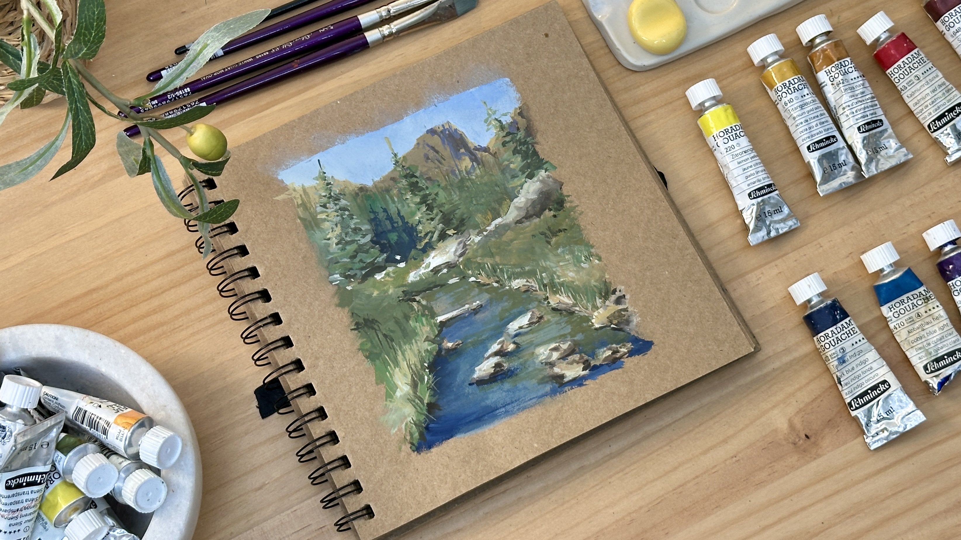
2. Materials: Before we dive into painting, let me walk you
through the materials we'll be using for this class. I'll also share why I personally
love and recommend them, though feel free to use what
you already have on hand. For this class, I'll be painting on a tone paper sketchbook. I'm using an anco
scrapbook album made with acid free craft paper. It's eight by 8 " in size and
has 180 GSM weight paper. I specifically chose tone paper over white paper because it gives an immediate sense of atmosphere and mood
to your painting. Tone surfaces help you
instantly establish mid tones, allowing you to focus on
highlights and shadows. Achieve a richer and
warmer underpainting and soften the brightness of gouache for a more cohesive,
natural looking result. It also gives your
landscape and seascape a grounded and earthy
feel, which I really love. Now for the paints, the paints I'll be using are from Schminka, a trusted brand of
artists grade Guache. Schminka paints are known for their high pigmentation
and vibrancy, smooth, creamy
consistency that's easy to work with and
excellent light fastness. So your paintings
stay vivid over time. Here are the
specific colors I'll be using for class projects. Titanium white, a mask
Tav for gouache painting, cobot blue light, fair
green, raw umber, Cadmium red deep,
violet, Van **** brown, indigo, cadmium yellow deep, and titanium gold ochre. Feel free to use any brand
or substitute colors that are close to these. One important thing to keep in mind when building your palette for landscapes is to
have the primary colors, red, yellow, blue for mixing. Earthy tones for grounding your landscapes and most
importantly, the titanium white. This is essential in
guash for mixing, layering and creating opacity. I'll be using a few favorites from silver Brush
Limited for my brushes. First is angle brush. This is synthetic in size
one half or three eighths. I use this for
most of my washes, and its shape gives me control for both broad
strokes and tighter edges. Another one is the
blender brush. It's called the white gold
mop oval from silver silk 88. This has a stiff texture, making it perfect for
blending colors smoothly. And lastly, the
ultra round brush from silver Silk 88 size six. I use this for adding
details and fine lines. Other essential materials
are mixing palette, two cups of water,
one for rinsing, and one for clean water, a paper towel or rug to wipe off excess paint or
water from your brush, and a pencil for sketching out your compositions
before painting. These are all the materials
that we'll be using, and I'll see you in
the next lesson.
3. Tonal Value Study: Welcome to this first step in
our gouache painting class. Before we bring out our colors, it's important to prepare
with a tonal value sketch. This sketch helps us assign the light and dark areas of our composition so that our final painting
will have depth, dimension and strong
visual impact. On a clean sheet of paper, I begin with a small
thumbnail sketch. I start by drawing a
simple horizon line, keeping in mind that this
will ground the seam. I position the large
rock on the right side. It takes up about two
thirds of the paper. I'm drawing big shapes first, not details, just to get
the composition right. Next, I sketch the shoreline leading it toward
the foreground. To keep the
perspective accurate, I imagine a vanishing point that helps guide the
angle of the shore. I then draw a simple
boat dock on the shore. This, together with the rock will serve as our focal point. I also add a small rock on the lower left corner to
balance the composition. And finally, a tree on the right side of the rock
to add vertical interest. H now let's move on to the tonal value study. As we look at the
reference photo, I gently squint my eyes to see where the lights
and darks fall. This helps simplify
the shapes and values. I begin shading the
dark areas like the shadow side of the big rock and the
shaded parts of the boat. These are the parts that
appear darkest when I squint. I do the same on the
tree and the shoreline. Keeping in mind that the light
is coming from the left, which means our cast shadows
will fall toward the right. I now shade the water starting darker in
the foreground and gradually lightening as it
moves toward the horizon. This gives a feeling of depth. I add deeper shadows on the rock to show its
form and texture And for the distant mountain, I shade it lightly just enough to separate it
from the sea and sky. Finally, I give the
sky a very light tone, darker at the top and fading
as it reaches the horizon. This helps push the sky back and completes our sense
of atmosphere. And there you have it our
finished tonal sketch. This guide will help us
paint with confidence knowing exactly where our
lights and darks should go. In the next lesson,
we'll practice painting the elements of the
landscape. L see there.
4. Blending and Layering Techniques: Now that we've finished our total value sketch,
let's begin painting. In this lesson, I'll
show you how to use gouache to paint different
elements of a landscape, like creating soft
blends for the sky, layering texture on rocks, and painting natural
organic shapes for trees. I begin by preparing my
palette with three colors, cobalt blue light, raw
umber, and titanium white. I mix cobalt blue
and titanium white together to create
a light sky blue. Then I add just a
touch of raw umber to tone it down and give it a more natural, desaturated look. One tip I would like to share is don't use too much water. I want the paint to stay
opaque and creamy so it lays down smoothly
and with rich color. Next, with a soft flat brush, I begin painting horizontal
strokes from left to right. Moving across the paper, the goal is to apply the
paint evenly and smoothly. Now, let's practice how to
blend it into a second color. I take another
color and apply it slightly overlapping
the first one. Then I grab a completely
dry blending brush, no water at all, and gently brush over the edge where
the two colors meet. Another tip, keep
the pressure light. We're not scrubbing, just softening the edges to
blend the colors smoothly. Let's do it again.
Apply the next color with a slight overlap, and then use the dry
brush to blend it in. This simple two step method, apply and then blend helps you build muscle memory
for painting skies. This is also a good time to experiment with
different tones. Maybe try adding more white for a pale blue or a touch of
more umber for a moody sky. Now that we've practiced
blending a soft sky, let's move on to the second
and third exercises, layering to paint rocks and creating organic
strokes for trees. These techniques will help you develop confidence
in controlling color and texture using wash. Let's begin with
drawing the rock. I start by sketching
a simple rock. My strokes are a little jagged
to keep it a rough shape. Then I shade in the
shadowed side lightly. This is just a guide for where
my darkest tones will go. The ba son of the light
inside of the rock, I mix raw umber, titanium
white, and a bit of violet. My first wash looks
a bit too light, so I add more raw umber to make it thicker
and more opaque. Here's the tip. Color
mixing can take time, and that's completely normal. If your mix doesn't feel right on the first try, don't worry. Enjoy the process, and
it's part of learning. Now, I gradually add more violet to my mix to create
a darker tone. Well, the first layer is
still slightly moist, I layer this darker color
over it using my angle brush. I apply this to the shaded
areas to build depth, and this becomes our midtone. Next, I add van ****
brown to my mix to get a rich deep brown color. I apply this in the
darkest corners, especially around
the base of the rock and on small shaded edges. I use dabbing strokes at
first to suggest form, then switch to my
tiny flat brush to define the base and
sharper shadows. Always step back or view your painting through your
camera from time to time. It helps you see
if your values are working and keeps you from
overworking the details. Now to finish, I add subtle highlights on the
parts hit by the light. A few strokes are enough. You want to avoid overpowering
the mid and dark tones. If some areas need
soft refinement, dab gently until
you're happy with the. Reminder, that's
the beauty of Gach. It's layer friendly
and forgiving. As a bonus, let me
show you how to paint the reflection
of the rock on water. I start by painting
a light stroke where the water fragment lies. While it's still moist, I mix the rock colors
with the water tone, the new sideways broken strokes with my angle
brush to mirror the rock. Finally, I darken the base of the rock to separate it
visually from the water, a simple trick that
adds so much realism. Now, let's proceed on
our third exercise, which is painting a tree
with organic textures. Our first step is to mix green and titanium ochre to get a nice natural green colour. To darken it, I add a
bit of Vandek brown. Using a round brush, I start with the lightest
tone of the tree. I rub the brush in
circular motions to create natural organic strokes
that look like foliage. To make the mid tone green, I use less water
and more pigment and add a bit of Vandyck
brown to desaturate it. I layer this over
the light rid base with the same circular motion, allowing the foliage
to gain depth. I also brush rock some
light green on top of it to help the toes connect
and blend together. Now I use the darkest toe on the rightmost part of the tree where the light wouldn't hit. I use the tip of the brush to paint the crowns of the tree, keeping the movement
loose and spontaneous. Then I paint the trunk
using Vandek Brown. Don't worry if the
stroke is shaky. That actually makes it feel
more natural and grounded. And to finish, I
add tiny highlights on the trunk and some branches just enough to bring
the form to life. And that's our tree
technique practice. You can repeat this with
different colors and shapes to explore your
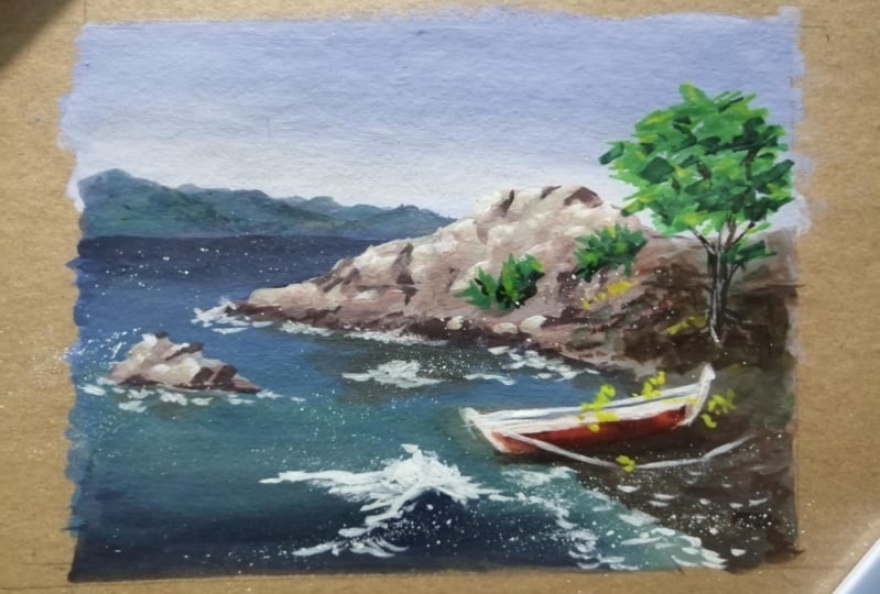
own expressive style. Now you're ready to begin
your full class project, painting our ocean shore
scene with a rock and boat. Let's bring everything
together in the next video.
5. Project 1: Pencil Sketch : Let's begin with
our pencil sketch. We'll simply repeat
the sketch we did earlier in the
Thumbnail value study, but this time it's a bit bigger, so no need to
overthink this part. Just follow the basic steps and basic shapes and placement
we already planned out. First, I draw a
soft border around the paper to help guide
the size of our painting. This isn't a hard frame, just a guide to help
us stay centered. Next, I start sketching
the horizon line, placing it on the upper third of the paper to give more space
for the sea and the ground. Next, I sketch the horizon line, placing it on the one third of the paper to give more space for the sea and the foreground. From here, I will
draw the shape of a rocky hill on the left
side, sloping upward. From here, I will
draw the shape of the rocks on the right side. And then also the shore
together with the boat. Keep it very simple. No need to add details at this point.
6. Project 1: Painting the Sky and Water: Welcome back. In this lesson, we'll begin painting
our class project, starting with the sky, distant mountains
and water fragment. I love using tone paper
for gouache because it's helping me visualize the
midtones right away. Begin by preparing
my sky mixture. I take titanium white, cobalt blue, and just a
tiny amount of raw umber. The raw umber softens the blue. It takes away that overly
bright or artificial feel and gives it a
more natural tone. I start mixing until I find a soft dusty
blue that I want. Now, with a soft brush, I begin laying down horizontal strokes
starting at the top. The paint is thick
and creamy not too watery because I want it to
feel velvety and opaque. As I move toward the horizon, I gradually lighten the color. I add more titanium white
into the same mix and even a few drops of water
just to soften it further. The idea is to build
a gentle gradient from top to bottom. Then I use my dry blender brush. The brush is totally dry to
smoothen the transitions. I'm slightly brushing
over the edges, softening the overlaps.
Here's a minute tip. If you notice any harsh tricks, just go back with a clean dry brush and
lightly feather the edge. Guash is very forgiving. You can always
blend and repaint. Sometimes I like to add
a second layer or even a third just to deepen the sky value and make
the gradient richer. I do this in light layers, always blending as I go. Next, let's paint the
distant mountains. I add a bit of indigo into my leftover blue mix to get
a slightly deeper tone. I begin applying the mountain
shapes with my angle brush, which gives me a
lot of flexibility. It's great for painting
soft curves and sharper edges depending
on how I hold the brush. The tonal value here should
be just darker than the sky. That way, it still
feels distant, but clearly sits in
front of the sky. While the paint is still moist, I take a bit of
leftover green from my palette and tap it gently
into the mountain shape. This creates subtle color
variation that gives the illusion of depth and
texture even from afar. Another tip I'd like to
share is use just the tip of your brush and barely press
when tapping in the color. This creates a softer
transition and helps the colors melt
into one another. Now for the ocean, I mix more indigo in my palette to
get a nice rich dark blue. I start applying the color
in sideways strokes, moving left to right
across the paper. These strokes give the illusion
of movement in the water. As I move downward, I lighten the tone slightly with some white and cobalt blue, especially toward
the middle ground. Again, I'm skipping over the shapes of the
rocks in the boat, so I paint slowly and
carefully around them. For the section
beneath the rock, I mix raw umber, indigo, and a bit of white to get a
cooler bluish green tone. I paint this section
carefully and then take my dry blender brush again to soften the transition
between the two watercolors. Every time I shift colors, I go back with blender brush. It really helps unify the
tones and keep painting fluid. A As I approach the foreground, I increase the contrast. This part should feel darker
to push it forward in space. I repeat the layering and
blending process here too, working in passes to maintain depth without
visible strings. Layering takes time, but it adds so much richness to guash. Think of it like building a
soft sculpture with color. You're sculpting the
light and shadow. As I reach the shoreline, I switch to a light blue mix, still pink and
creamy, not watery. I gently shape around the boat, keeping the brush
pressure light. To finish the water section, I use indigo and my angle brush again to add a few wave
effects on the foreground. I keep them minimal, just a few expressive strokes. Then I take the blender
brush one more time to lightly soften the edges and blend them into
the base layer. This keeps everything cohesive while preserving
a painterly feel. Again, we're not going
for hyperrealism here, just enough detail to
suggest texture and movement while letting the expressive brushwork
shine through. And that completes the first
part of our class project. We build up the sky, distant mountains
and the ocean layer by layer blending as we go. In the next video, we'll bring the painting to life by
focusing on the rock, the boat, and the final
accents and highlights. I'll walk you through adding form, contrast and character. I'll see you there.
7. Project 1: Painting the Rocks and Boat: Now let's continue with the
second part of our painting, focusing on the rocks,
the boat, and the tree. These elements bring structure, storytelling, and balance
to our composition, and we'll work together
with layering techniques, detail strokes, and reflections
to bring them to life. I start by mixing Rumber and titanium white to get
a creamy base tone. Then I add a touch of violet
to neutralize the warmth. It keeps the rock from
feeling too yellow or flat. I make sure the mix
is thick and opaque. That texture helps mimic the solidity and rough
surface of a real rock. I apply the color to the sunlit
areas of the large rock, starting along the outer edge where the light
hits most clearly. Then I slightly darken
the tone by adding more violet to the mix and
begin layering in mid tones. As I paint, I thicken the
consistency with extra pigment. You'll notice the
difference in opacity. As I layer, it gives the
surface visual wave. I also paint the small
rock on the left using the same base color
to maintain harmony. Next, I start on the bottom
part of the large rock. I test a few strokes with my mid tone mix,
raw umber, violet, and now a bit of Vandek brown, but it looks too purplish, so I adjust it by
adding more brown. Always check your values against the painting by squinting
or stepping back. This helps you place
your mid tones and shadows more confidently. I now mix Van **** brown with leftover greens to create a
deep brown for the shadows. This tone will anchor the base of the rock and
define its shape. Since my first layer
is still moist, I apply this shadow tone
gently using small strokes, being careful not to disturb
the layer underneath. I continue by adding dark lines and broken strokes to
suggest texture and form. I also use the camera
view to step back and evaluate where to add
contrast or refine the shapes. To blend everything together, I switch to my tiny flat brush. This lets me soften
transitions between the base, mid and dark tones without
overworking the surface. My encouragement is that
there's always a stage where the painting might look messy
or unclear, but keep going. Guache is a layering
friendly medium. Just grab gently, build slowly, and trust the process. I now add tiny dots of dark
tone to help suggest form. Be careful not to overdo this. It's easy to overpower the lighter areas if you
place too many darts. To finish the rock, I
take a light and mix of my base color and place a few highlights
where the sun hits. These small touches
bring the rock to life. I also paint the far
right rocks fragment, using the same technique, starting with the
dark cream tone, then deepening it slightly
for shadow and shape. Saturday Now for the shoreline, I use a slightly
different color, less violet, more raw umber, so it feels warmer and grounded. After the base wash, I take my blender
brush to softly connect the land with
the water fragment. Then I paint the reflection of the rock using sideways strokes that mirror the rock shape. I keep this soft and
simple just enough to suggest a reflection
in calm water. Now, I take white guash
straight from the tube and use my tiny flat brush to create the bubbles and water
splashes around the rock. Use a dabbing motion and keep the brush dry to get
the best texture. This white stroke should pop
against the darker tones. Here I add a few wavy lines
in the foreground to show gentle waves near the shore and even splatter
some paint for fun, loose touch that brings
life to this area. Next, I take Vandek Brown to
paint areas near the waves to create contrast and
make the white pop more. A few more white dots here
and there finish the effect. This final strokes help
suggest movement and light. Let's move on to the boat. I mix orange, a bit of
red, and Vandek brown. But if you want
something easier, you can use Bncena. I carefully paint the
bottom part of the boat, keeping my stroke steady. I darken the edges slightly to give the form more structure. Then I paint the upper
part of the boat in white, making sure to keep the edges sharp for the fine silhouette. Now, I add dots of colors, just a few accents to suggest minor details without
crowding the form. For the shadow, I mix the shoreline color with violet and paint the
shape under the boat. I also darken the bottom
edge of the boat itself, then add a light
highlight stroke on top to bring contrast
and visual focus. Lastly, let's add the
tree on the right. I mix green and raw umber
for a natural earthy green. Using a round brush, I wiggle the tip in loose circular strokes to
create soft organic tree shape. I begin with the
light green tone, then add Vandek brown to deepen the color and
paint the mid tone. Half the tree remains light, the other half gets
the richer mid tone to show light erection. Then I mix an even darker green for the shaded areas
and apply it sparingly. I paint the trunk using
thick Bandic brown. And just add a touch of
white for subtle highlights. I finish off by adding light green touches at the top define the
crown of the tree. Don't forget to add soft shadow underneath the tree to
anchor it on the scene. To finish, I step back and
look at the entire painting. I add small highlights
to the boat and maybe a few orange touches to bring warmth and
brighten up the seed. And there it's
done. We've painted the soft skies, layered
textured rocks, shaped a boat, added
movement in water and brought nature to life with
a single expressive tree. I'm so happy to see you
complete this class project. I hope you enjoyed learning
this gouache techniques from layering and blending to
adding expressive accents. I can't wait to see your
version in the project gallery. Tag me if you share it online and love to celebrate
your work with you.
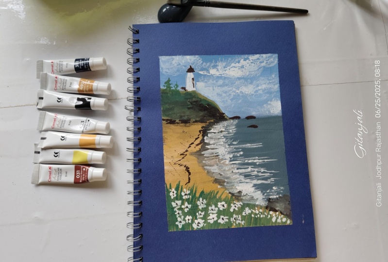
8. Project 2: Pencil Sketch: For a second class project, we'll be painting a
beautiful seascape featuring a lighthouse
sitting on a rocky hill. This is a classic and expressive
subject that gives us a chance to play with light,
texture, and atmosphere. Let's begin with a sketch. First, I draw a
guideline border just to estimate the size
and placement of the painting within
my sketchbook. You can lightly mark
this with your pencil. It helps frame the
composition nicely. Then I add the horizon line. I place it on the upper
third of the page, following the rule
of thirds to create a more balanced and visually
pleasing composition. On the left side, I
sketch the outline of a rocky hill gently
sloping upward. And right on top of this hill, I place the lighthouse. I'm keeping the
structure very simple, just the basic shapes, no details at this stage. Before jumping into painting, I highly encourage you to
make a tonal value sketch. This doesn't have to be fancy. Just use your pencil
or a gray marker to define and identify
your lightest lights, mid tones, and darkest darks. This step helps guide your
painting process and makes decision making easier once
you start layering color. Next, I draw the shoreeline curving it diagonally
across the paper to create a sense of movement and lead the
viewer's eye into the scene. And finally, here
in the foreground, I sketch the grassy area again, just the outlines for now. I also add a few horizontal
lines on the shoreline to indicate where the waves
will break or recede. That completes our
pencil sketch, simple, clean and
ready for paint.
9. Project 2: Painting the Sky, Sea and Shoreline: Let's begin the painting process
by preparing our paints. We'll start by the sky, so we'll need titanium white, cobalt blue, and raw umber. I'll begin by mixing titanium white and a bit of
cobalt blue and a tiny amount of
raw umber to create a muted bluish color
for the clouds. I'm using my angle brush and I start painting from the
left side of the sky. As I apply the paint, I vary the direction
of my brush strokes. This helps add movement
and texture to the sky, avoiding a flat
and uniform look. Next, I mix a slightly
deeper bluish tone to begin painting the sky
area around the clouds. Since the earlier layer
is still a bit moist, we'll be able to
blend and soften the transition between
colors nicely later on. As I continue painting
across the sky, I keep in mind the placement
of the large cloud, leaving some areas
light and soft. I then go back to
my bluish white mix to begin adding
clouds and shapes. To soften the edges and create the illusion of fluffy
atmospheric clouds, I use my blender brush, and I gently dab and blend around the cloud
edges and even tap into some areas of
the sky to create patches of cloud for
a natural effect. Now I create a lighter
blue mix for the sky near the horizon line and
carefully paint along the edge of the hall
to keep it clean. For the horizon line, I use a whitish mix
with a touch of Rh umber to give it a
warm, distant glow. Then I gently add some subtle
strokes to help define the shape of the clouds using light pressure for
a soft effect. To add more contrast and depth, I apply clean white paint in certain portions
of the clouds. This helps them pop out
and look more dimensional. Don't feel like you need to
repaint the whole cloud. Just highlight the parts
that catch the light. Next, we move on to the Sea. To mix the base color, I combine cobalt blue, raw umber, and a bit
of titanium white. This gives us a
greenish blue tone, especially when we add more
raw umber into the mix. I begin by painting
a crisp stroke along the horizon to define the edge of
the water clearly. Then I adjust the mix by adding more blue to create depth
in the distant water. I really enjoy
mixing guh paints. Yes, it can take time, but it's a therapeutic
process and you really get to understand how colors shift
as you tweak your ratios. Once I'm happy with the color, I start painting
the sea in layers. I apply the paint in
horizontal strokes, blending immediately after each stroke while
it's still wet. This helps keep transition smooth and prevent harsh lines. As we move closer
to the foreground, I shift the tone to
a greener shade to suggest shallower
water near the shore. Again, I blend these areas
with my blender brush, keeping the transition soft. To indicate waves, I add
strokes of white paint, just a few highlights
across the water surface. Don't worry if your painting feels unfinished at this point. With the rest of the
scene still blank, it's hard to judge how
the portion looks, but trust the process. As long as your values
are placed correctly, your painting will come
together beautifully. Now, let's paint the
shoreline and sand. I mix Rumber with a bit of titanium white and begin
painting the horizontal strokes, letting some of the paint
overlap the edge of the sea. I this helps create a natural transition between
the water and the sand. As we move into the foreground, I apply the paint
thicker and more opaque, layering it gradually. Then I switch to criss
cross strokes to add texture and mimic the look of uneven, slightly rough sand. Now, I take Vandek
brown and mix it with raw umber to paint the darker details
along the shoreline. I keep my brush
brooks horizontal and blend them gently into the sea to show
subtle transitions and shadows along
the water's edge. I also continue refining the light shoreline outline
with sketch earlier. Next, I paint white
marks for the waves. I rub the strokes lightly with my finger to create a rougher, more organic texture, a gentle smear that mimics
the motion of water. Since my titanium white
paint is quite thick, it looks beautifully opaque, giving us a strong
contrast over the sea. I built on this by adding more horizontal white strokes
to define the wave forms. You'll notice I make
the wave thicker and more pronounced in
the foreground while keeping the ones
near the horizon smaller and thinner to
suggest distance and depth. Now, let's work on the
foreground greenery. I take fair green, ah umber, and a bit of titanium white to create a muted green shade. Using this mix, I paint
the foreground with a playful textured strokes that evoke movement like wind
blowing through the grass. As you place your colors, keep in mind the tonal values. The foreground should appear darker and richer
than the midground. To deepen the tones, I add Vande brown
to the green mix. Then I apply diagonal strokes to maintain the texture
and dynamic feel. Now I switch to my round brush
to suggest grass blades. I mix in a bit more
white to create a pastel green for
this lighter stroke. Grass blades are all about
fluid organic motion, so practice a quick
upward stroke with varying heights
and gentle curves. It might take a
little muscle memory, but just keep it
loose and fluid. I also alternate my tones
using some lighter strokes and others in darker shades to create depth and
variation in the grass. Next, I create a mix
of raw umber and titanium white to get a
yellowish cream color. This will be used for
highlights on the grass. I lightly layer
this over the top, imagining the sunlight brushing
across the field and keep my brush strokes soft and breezy as you can feel the wind. Now, let's paint the rock
formation on the right. I use a mix of white and the leftover cream
and brown tones. As we've learned, it's all about placing tones
intentionally. I paint the darkest tones near
the base using deep brown. Then apply a grayer mid
tone around the middle. Finally, I add highlights to bring out the
edges and structure, creating volume and shape. Et's move on to the
rocky hill on the left. I start with the bastone
using the cream mix, then gradually introduce darker values to
define the form. I use gentle upward strokes to blend the dark
tone into the light, making sure the transitions
feel connected and natural, not like separate layers. To show distant
trees or textures, I add small green patches, then layer a slightly
lighter tone at the top of the hill to
suggest where the light hits. I refine this by blending
the layer softly and adding a few more scattered green
tones to finish the texture. Now, for a finishing
detail, the pine trees, I paint a few simple
vertical accents to create contrast and
rhythm on the hill. Next, let's paint
the lighthouse. We'll give it form by painting each side
in different tones. One side is a mix of white and a touch of blue for
the shadow part, and the other side is pure
white facing the light. I use leftover brown tones to
paint the roof and details, including a window and a
few accents at the base. Finally, we'll add a pop of color with wild flowers
in the foreground. I begin by using white
strokes for the petals. This base will make it easier
to layer color on top. I mix a hint of violet into my white to get a soft purple. Then gently dab the brush to create the
impression of petals. I even splatter a few strokes across the area to
suggest scattered blooms. To deepen the color,
I mix violet, red and white to make
a fresh lavender tone. I add it over the base
petals and also sprinkle a few small strokes
into the ripe as if the flowers are
spreading across the field. To wrap up, I paint a few
yellow green stems and add tiny highlight strokes to bring the floral patch to
life. And that's it. You've just finished painting a peaceful seascape
with soft waves, a hilltop lighthouse, breezy grasses, and
cheerful wildflowers. You've done an amazing job. Now let's take a step back and admire all the textures and tones we created using
just a thoughtful layers.
10. Final Thoughts: And that's it. We've completed
our gouache painting, and I hope you enjoyed the
process as much as I did. Guache is such a versatile
and forgiving medium, and I hope this class gave you the confidence to
explore it further. Remember, the best way to grow as an artist is
to keep on practicing, experimenting and most importantly, painting
from the heart. Let your creativity flow and use your art to inspire others. I'd love to see your work, share your finished painting in the class project section or tag me on Instagram, so
I can check it out. Ing your interpretations
always makes my day and encourages others in the
community to keep creating. If you enjoy this class, I'd really appreciate it if
you could leave a review. Your feedback helps me improve my classes and allows me to create more content that inspires and supports
your artistic journey. And if you're looking for
more ways to explore guash, be sure to check out
my other classes, where we dive even deeper into techniques and creative ideas. Thank you for joining me today. Keep painting, keep
experimenting. And most of all, keep
creating with joy. Seeing the next class. And
 Bianca Rayala, Top Teacher | Watercolor Artist