Transcripts
1. About the Class: Do your landscape paintings
ever feel overwhelming? Like you don't know where
to start or when to stop? That often happens when we
try to paint everything. In this class, we'll
simplify the process, so painting with gouache feels more confident
and enjoyable. Hi, everyone. Welcome
to this gouache class. I'm Bianca Rayala,
a visual artist and Skillshare top teacher. I work with brands like Schminka silver Bush Limited
and Arkon Mounts. I love exploring
different mediums, and gouache has become one of my favorites for its versatility
and rich vibrant colors. Whether you're new to gouache or looking to refine your skills, this class will guide
you through creating landscapes with easy
to follow techniques. Guache is such an
exciting medium. It gives you the bonus
of opaque paint and the softness of watercolor and the flexibility
to work in layers. You can create crisp edges, blend effortlessly, or rework details
even after they dry. In this class, you'll learn a clear and simple approach to painting landscapes
with gouache. We'll focus on identifying
the focal point, breaking the scene into sky, midground, and foreground and
choosing what to leave out. From there, we'll lock in
big shapes and values early to create depth and atmosphere without getting lost in details. I'll guide you through a
step by step gouache demo, turning a reference photo into a simplified
expressive painting. The focus isn't on copying, but on capturing the feeling of the place with loose
intentional brushwork. This class is beginner
friendly and perfect for anyone who wants to feel more confident
painting with gouache, especially in a sketchbook. By the end, you will
have a simple approach you can use again and
again to paint less, simplify more and
enjoy the process. I can't wait to see how you bring these paintings to life, so grab your brushes, and let's get started.
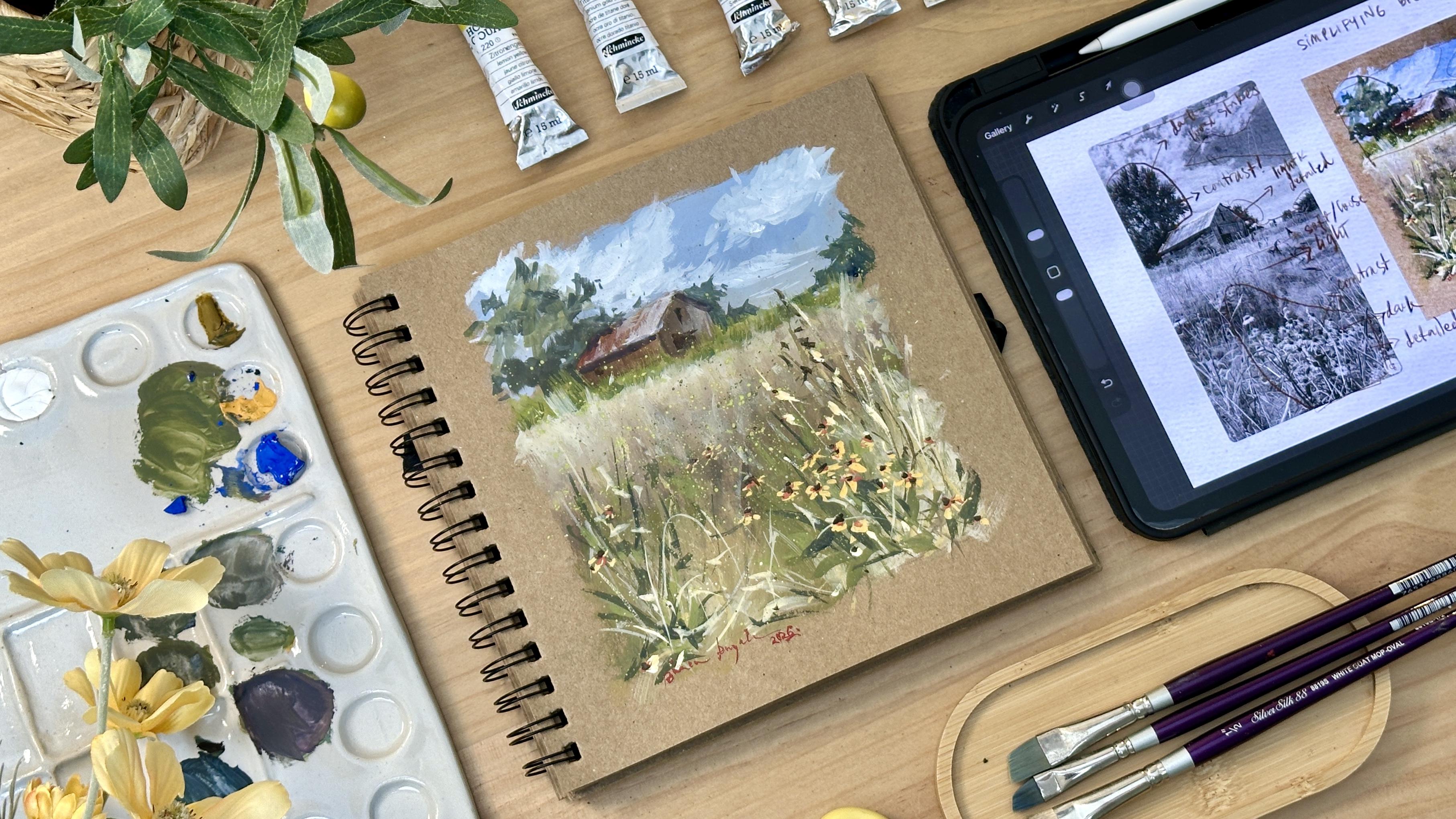
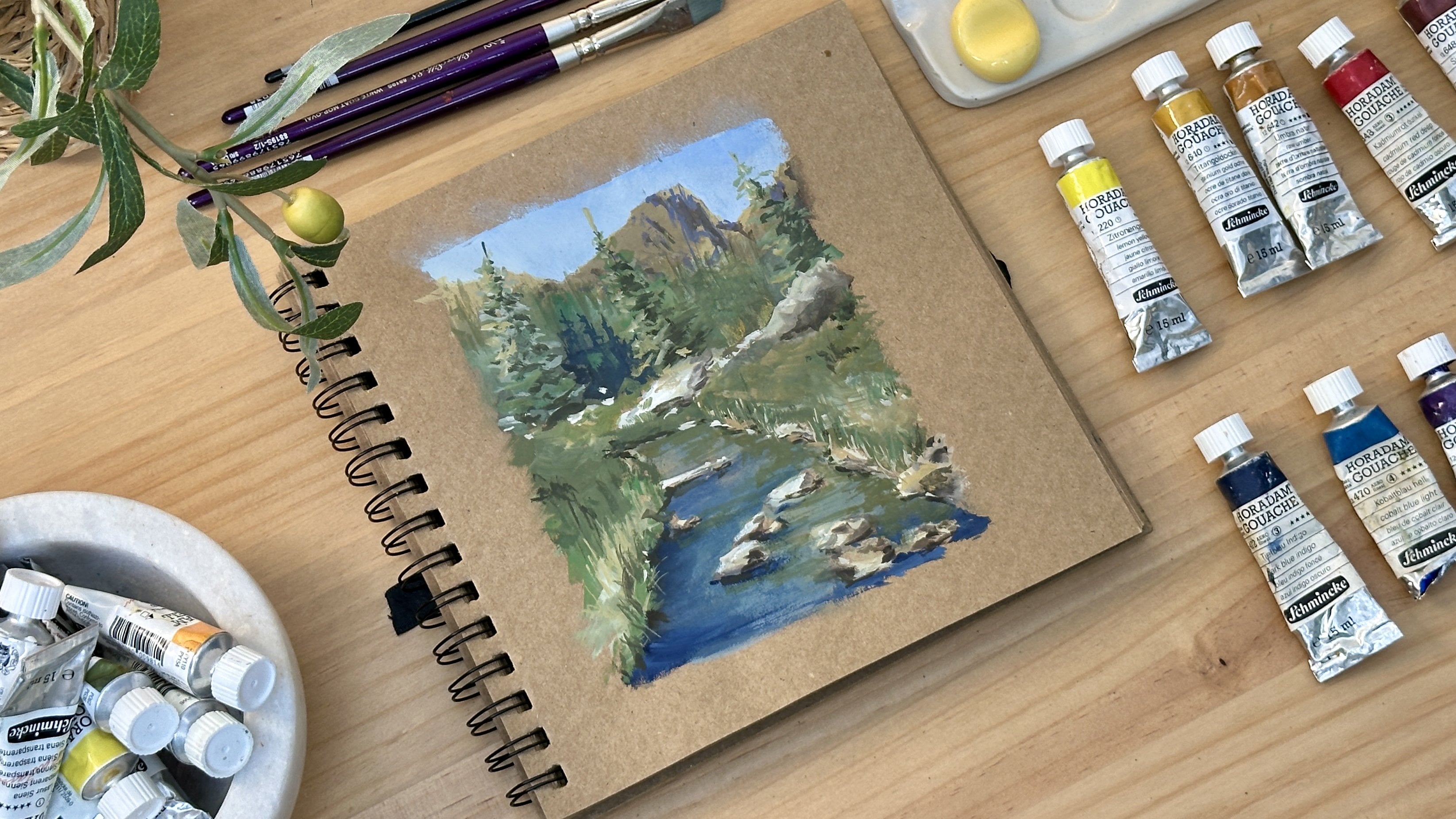
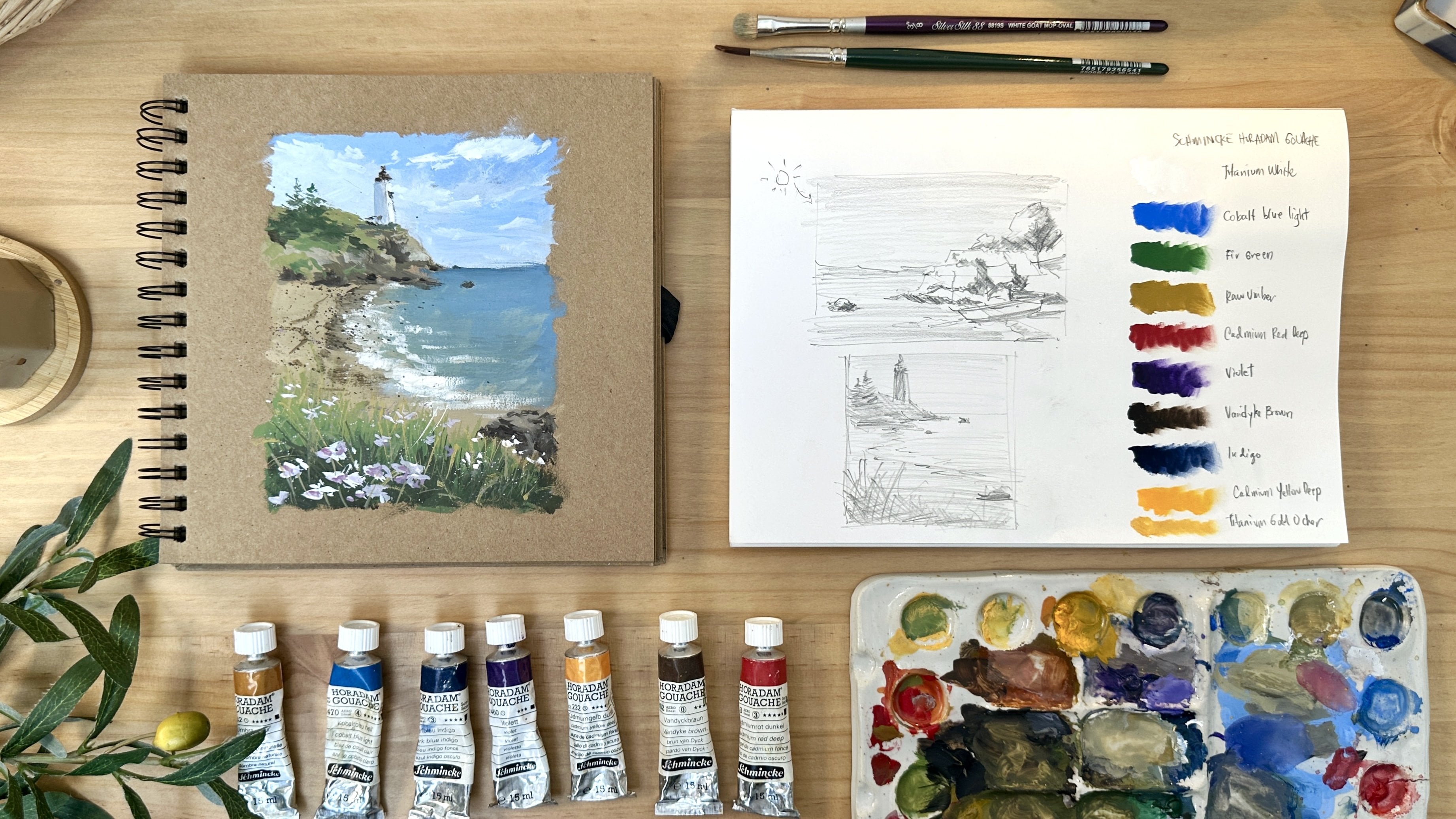
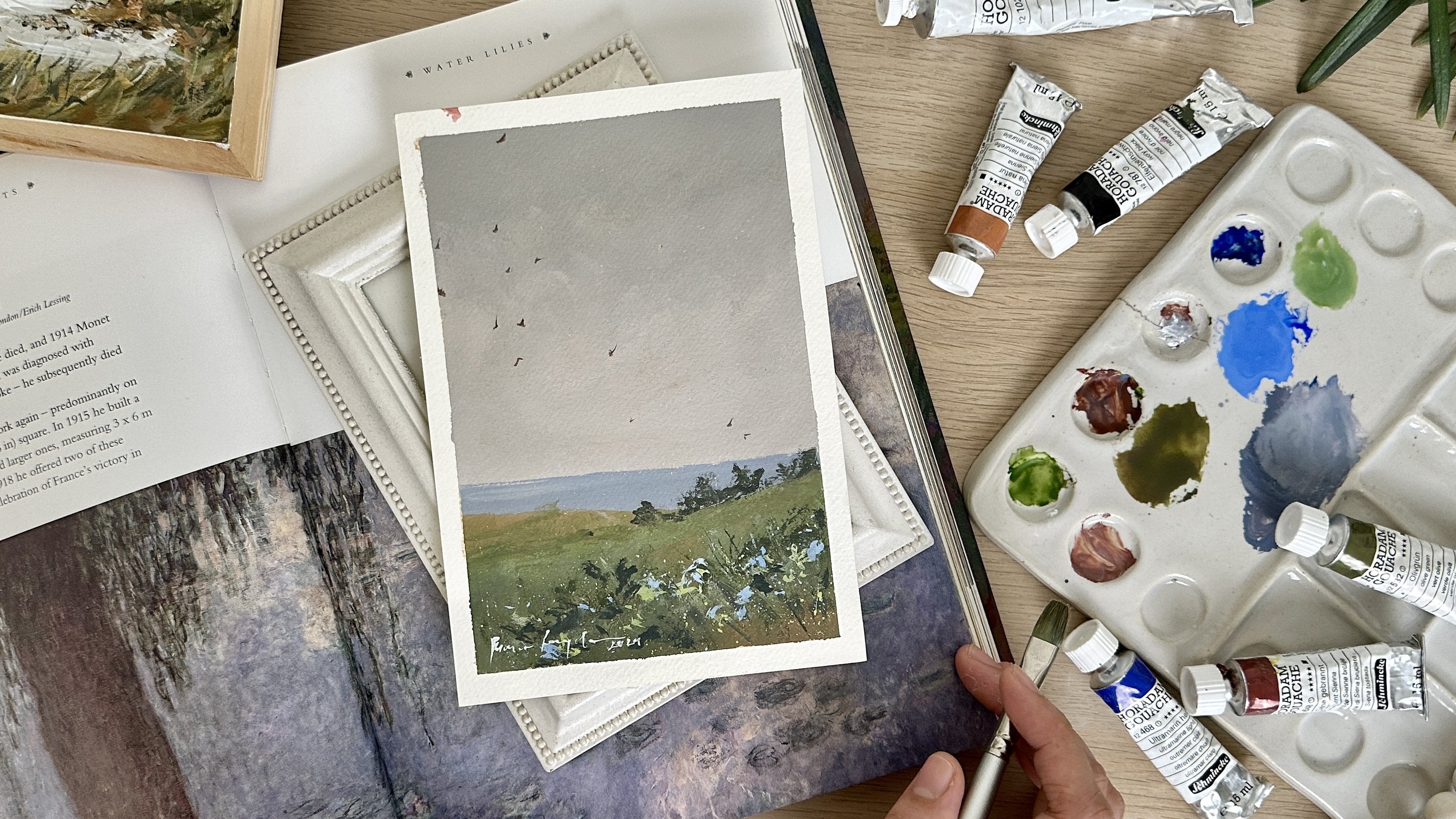
2. Materials: For this class, we'll keep the material simple
and approachable. Let's start with the paper. I'm currently using
this craft sketchbook that I got from a local
stationary store. One of the great things
about gouache is that it doesn't require a very
specific type of paper. As long as your paper has
a decent weight around 200 GSM and a medium
grain, it's good to go. I personally love painting on tone paper like this
craft sketchbook, more than painting on white
paper for several reasons. First, tone paper already
gives us a middle value, which makes it easier to judge lights and darks
right from the start. Instead of filling
the entire page, we're simply adding
shadows and highlights, which helps the painting
come together faster. It also encourages
simplification because the paper tone already plays a role
in the painting, we're less tempted to
overwork or overdetail. The colors feel more
harmonious and highlights like flowers or light catching the grass feel more
intentional and expressive. Most importantly, toned paper
feels less intimidating. It allows us to
paint more freely and focus on atmosphere
rather than perfection, which is exactly what we want for expressive
gouache painting. For the paints, I'll be
using SchmikaHadum gouache, which I really love for its rich pigments and
smooth consistency. The colors in my palette
are titanium white, lemon yellow,
titanium gold ochre, raw umber, cadmium red
deep, cobalt blue light, indigo, violet, fair
green, and Vandek brown. We'll also need a palette
for mixing our colors. Now for the brushes,
I mainly use the silver silk 88 ankle brushes in sizes one half and 38. I use them for almost
everything from blocking in the sky and fields to painting the barn
and foreground. They're very versatile and
great for expressive strokes. I also have this silver silk 88 white goat mop oval brushes in sizes one half and 38. I use this for
softening edges and creating smooth transitions
between colors. They have a nice
rounded deep and a slightly rough
hair texture which works beautifully for
atmospheric blending. For smaller details like
leaves, stems and flowers, I use a silver silk 88
ultra round brush size six. And for very fine delicate lines like thin stems or
for signing my work, I use a black velvet
liner brush size one. You will also need a
pencil, an eraser, a cup of water, and a piece of cloth or tissue for
cleaning your brushes. I'll be sharing the
reference photo and the list of colors in the final painting image in the resources
section of the class, so you can easily follow
along at your own pace. I
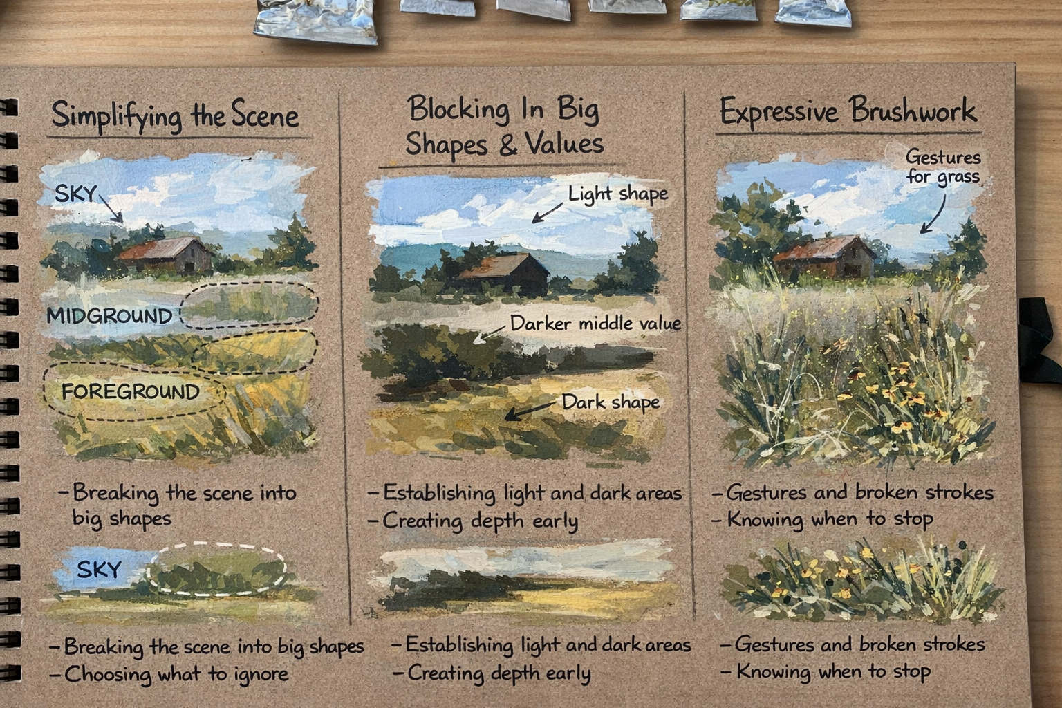
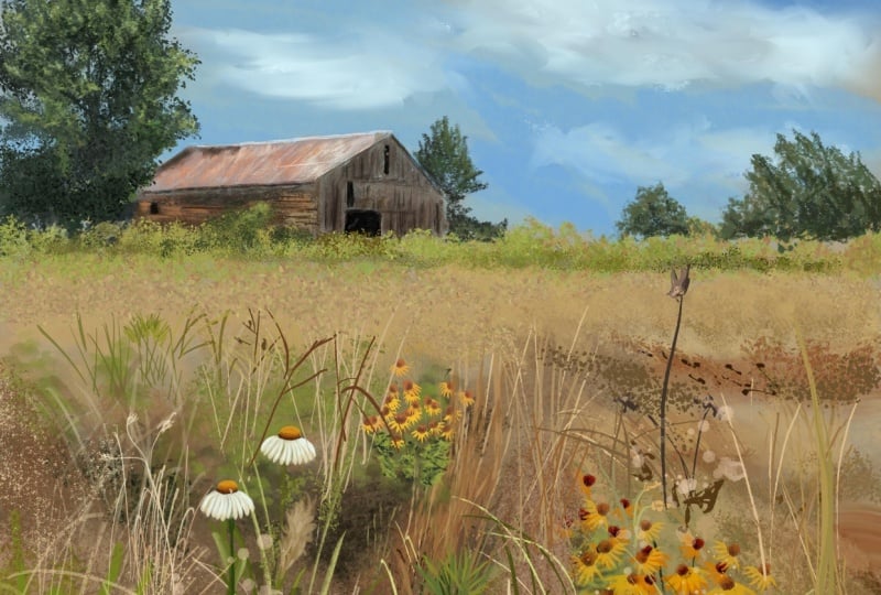
3. Simplifying the Scene: I have here the photo of our reference converted
to gray scale. Putting an image
in gray scale is very helpful because it
removes the distraction of color and allows
us to clearly see the values and big
shapes in the scene. When a color is taken away, it becomes easier to understand
light and dark areas, identify contrast, and simplify the image before
we start painting. When we talk about
simplifying the scene, our goal is to understand where to focus and
what to ignore, so painting feels
less overwhelming. The first thing we
need to identify when looking at our subject
is the focal point. The focal point is the
area of the painting that naturally draws
the viewer's eye. It is usually created
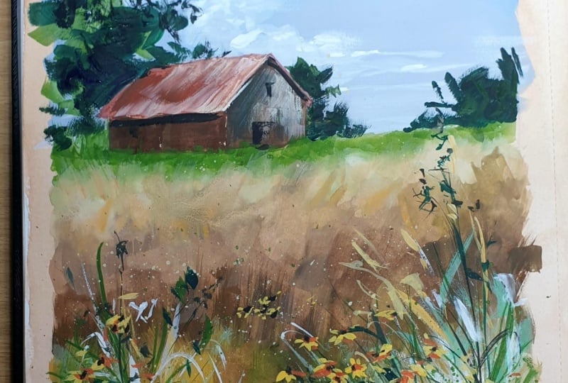
through contrast, clarity of shape, and placement. In this image, the barn
immediately stands out because it has the strongest contrast
and the clearest shape. The barn being the focal point, anchors the entire scene. It allows the sky
and the field to act as supporting elements
rather than competitors, and it lets the foreground grasses naturally lead
the eye toward it. Looking at the
picture, everything else supports the barn. The sky stays quieter and
lighter in the background. We can still paint some details, but not in a way that
overpowers the focal point. Field becomes large volume
as in the midground, so we can paint
it simply and use slight color variation to suggest texture rather than
adding too much detail. Lastly, the foregone grasses and flowers can be slightly
more detailed, acting as guiding shapes
instead of focal details. After breaking down the scene, the next thing to
do is to identify the big shapes so we
can better imagine how to proceed with a simplified sketch and how
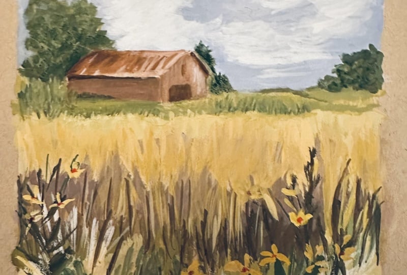
to approach the painting. I have here the gray scale
reference and the photo of the finished painting for
a side by side comparison. Let's look at the clouds. Focus on the big shape. By doing this, we can easily visualize how to
portray the clouds in our painting by
following the main shape from the reference instead of painting every small detail. Next, look at the big shape
of the tree on the left. Since we are not
aiming for realism, when painting the
shape of the tree, the most important thing
to consider is the tone. The dark tone of the tree
creates strong contrast, which helps make
the barn stand out. Notice how the dark tree behind the barn pushes the
barn forward visually. The barn is painted with
lighter tones and some details, while the tree behind
it is painted with darker tone but loose
expressive strokes. Before we talk
about tonal value, it's important to understand how contrast plays a big role in creating interest and clarity
in an expressive painting. We use contrast in
different ways, not just through light and dark, but also through size, brush strokes and
level of detail. For example, we use big shapes against smaller shapes
to create hierarchy. We use loose simple strokes in supporting areas and reserve stronger or slightly more defined strokes near
the focal point. We also balance light areas
against dark areas so that the focal point naturally stands out without needing
too much detail. Using this contrast
intentionally helps guide the viewer's eye and prevents the painting from feeling
flat or overworked. It allows us to
keep the painting expressive while still
being clear and readable. Next, let's talk
about tonal value. Total value refers
to how light or dark a color appears and it is
what helps us create form, depth, and atmosphere in
the painting without color. For a simpler explanation, let's use a five step
tonal value scale with one being the lightest
and five being the darkest. Looking at the picture, the sky has the
lightest tonal value, so we can assign values
one and two to the sky. Next, if you squint, we can see that the
barn is darker than the sky but lighter
than the foreground. This means that the tonal value of the barn can be
around value four. The large field in the midground can be
assigned value three, keeping it softer
and less dominant. Lastly, the flowers and grasses in the
foreground should have the darkest value around value five to ground
the painting. By applying proper tonal values, we can create aerial
perspective and a clear sense of depth
in our painting.
4. Pencil Sketch: Now that we've understood
the subject and planned how we want to
execute the painting, let's start with a
simple pencil sketch. I'll begin by slightly drawing
a border on my sketchbook. Keeping this very loose, there's no need to
be precise here. I personally prefer a free
hand border rather than using masking tape as it
keeps the sketchbook feel relaxed and
less intimidating. Next, I draw the horizon line, placing it slightly
above the mid line. Keep your pencil pressure
light at this stage, you should be able
to erase it easily. I'll add a few soft lines to suggest the grass
surrounding the barn, and then think of this as
guidelines, not details. Now, I'll sketch
the barn's roof, placing it slightly off
center to the left. Don't worry about
perfect proportions. This is just about placement. I'll also add some loose strokes to indicate the trees
on the left side and use simple shapes and keep your lines light and relaxed. Lastly, I'll draw small shapes to position the cluster
flowers in the foreground. I'll also add a few
directional lines to suggest the flow
of the grass bleeds. Again, this is only to help
us visualize the scene, so we won't be painting this
sketch exactly as it is, and no need to overthink it. Let's take a final look
at the composition. If everything feels
balanced and clear, we're ready to start painting.
5. Painting Process Part 1: Now that we're done
with the sketch, we can begin painting. I'll start by
preparing my paints. For the sky, I'll
use titanium white, raw amber, and
cobalt blue light. Raw amber is a
beautiful color to help diffuse the
brightness of cobalt blue, making the sky feel
softer and more natural. I mix these three colors together to create a
creamy light blue. I'm also mindful of the
amount of water on my brush. I don't want the paint to
be too watery or too thick. As I paint the sky, I use
diagonal strokes instead of horizontal ones to suggest movement
and subtle texture. I carefully paint
around the barn. And as I work across the sky, I make sure to consider
the transition of tones. The area closer to the
horizon should be lighter. Next, I take my blender
brush to soften the strokes and to create
smoother transitions. I repeat this process applying paint with
the angled brush, then blending gently
with the blender brush. Now, I'll paint the
clouds using white with a subtle tint of
rhombo and cobalt blue. I don't want to use pure
white straight from the tube because it
can look unnatural. As I paint the clouds, I recall the big cloud shapes
we observed earlier. I continue using the
diagonal strokes but very lightly so I don't accidentally lift the blue layer underneath. I gradually build opacity while keeping the
brushwork fluid and soft. Next, I mix amber and indigo with a little water to
create a muted olive green. I also mix lemon yellow, indigo, and amber to create a
brighter yellow green. I use this brighter mix
for the green grass near the barn applying it
with downward strokes. I add some white and lemon
yellow to adjust the slightly. So this area doesn't
look flat or monotone. I continue painting
with small strokes along the horizon line, keeping the movement
loose and natural. Now, let's move on to the large mass of the field
in the middle ground. I mix raw umber with
a bit of white, then I add violet
to soften the yew. Take your time when
mixing colors, test them on the paper if needed until you're
happy with the shade. Once I'm satisfied,
I begin painting. I try creating jagged
edges using my brush, but I find it easier to turn
the sketchbook upside down. This helps create more
natural grass textures, and I also swift downward
strokes and notice how this approach creates a convincing impression
of distant grassland. I transitioned into a slightly
darker tone by adding burned cena to the
mix, creating warmth. I soften some areas with a blender brush to keep
the transitions gentle. Next, I darken the mix again by adding more burned
chenna violet and white, slowly adjusting the
tone bit by bit. Then I switch to
Vandyck Brown for an even darker shade
in parts of the field. I continue using
downward strokes and I keep the paint fairly dry. I don't add much
water because I want the field to feel
rough and textured. As we move closer
to the foreground, I begin transitioning
into greener tones. I keep the tonal values
consistently dark to build depth. I use a mix of rumber, white and leftover browns, adding touches of
green and yellow. As I paint, I mimic the natural movement
of grass and flowers. Don't be afraid to experiment, blend colors, play with strokes, and enjoy the process. I believe that's a secret
to expressive painting. Well let go of fear, step
outside the rules and allow each brush stroke to
reflect the joy of painting. Now that the base layers of the middle and
foreground are done, let's paint the grass
blades on the left side. I use my brush to paint lines of varying heights to create
movement and rhythm. I repeat this on the right
side using my liner brush, but this time with a slightly
yellowish opaque color. As I build up details
in the foreground, I'm always mindful that
this area should support, not compete with
the focal point, pay attention to the
stroke direction, and how much detail you add. I mix different greens to paint more leaves in
the lower section. I also want this
area to feel full, lively, and busy, but
not overly realistic. I vary the tone, starting
with olive green, then adding Vande brown
to deepen the color. Now I add leaves and
plants on the left side. I often squint when
looking at the reference, which helps me focus on dominant shapes and avoid
painting every detail. I'll also add splatters to create a beautiful
organic effect, and splatters are
great fillers and help avoid overworking the area.
6. Painting Process Part 2: Next, I mix indigodeno my green mixture to paint shadows and accents
in the foreground. As we increase color
intensity here, our goal is to create
contrast against the softer, blurrier middle ground. Now, let's add the flowers
using a small round brush. I use a thick mix of gold ochre, so the flowers really stand out. I apply small dabbing strokes, keeping the overall
cluster shape in mind. I don't paint each
flower individually. Instead, I dab my brush in a loose pattern to
keep it expressive. I add fine connecting lines
using the same color, then use my liner brush again to add more accents
and highlights. You will notice the foreground starting to feel
fuller and more alive. I also splatter some white paint to add light and sparkle. Next, I paint the orange centers of the flowers by
mixing red and yellow. Make sure the paint
is really thick. I dab small dots here and there, and then add brown dots for depth and white dots for
highlights to make them pop. To at this point, take a step back and look at your painting
from a distance. This helps you decide
whether you need to add more details
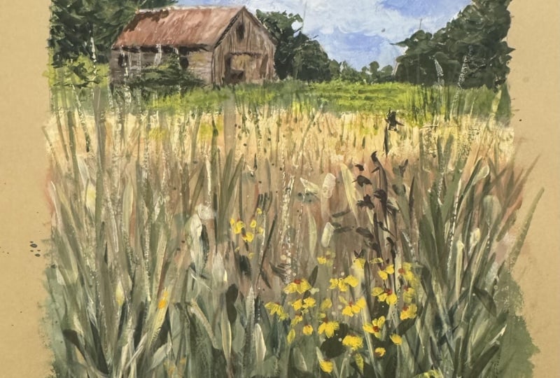
or leave it as is. Now, let's paint the barn. I mix burncena with
white for the roof and carefully paint it using my angled brush following
the roof plane. Then I use a darker
shade for the sidewall, working with an
almost damp brush. Next, I paint the
front wall with a slightly different brown tone to give the barn dimension. To add texture, I mix red, violet, and buncena
for the roof. I use a liner brush
for the fine strokes, and then a round brush for highlights using a
dry brush stroke. I smudge some strokes gently with my finger
for rough effect. Right. I add more white
near the bottom, smudge again and soften
lightly with a blender brush. And Now, let's mix a bluish green color
for the background trees. Since the barn is detailed, the tree should be painted
loosely with big strokes. I start by painting around
the barn to define its shape. Then block in the tree mass. I blend different greens
to show light and shadow using swinging bush strokes
to suggest wind and movement. I continue adding
trees behind the barn, letting them contour
the barn's shape. To finish, I add simple
impressions of doors and windows and don't forget
the shadow under the roof and the cast
shadow from the tree. These small details
make a big difference. Finally, I add a
few last touches, some grass blades
here and there, a bit of texture in the middle ground to bring back light. I also softly rub and
blend strokes as needed. And lastly, I
signed my painting. I hope you had a wonderful time painting and learning with me. If you have any questions, feel free to leave a message in the discussion
section of the class.
7. Final Thoughts: And that's it. We've completed
our gouache paintings, and I hope you enjoyed the
process as much as I did. Gouache is such a versatile
and forgiving medium, and I hope this class gave you the confidence to
explore it further. Remember, the best way to grow as an artist is to
keep practicing, experimenting and
most importantly, paint from the heart. Let your creativity flow and use your art
to inspire others. I'd love to see your work, share your finished paintings in the class project section or tag me on Instagram so
I can check it out. Seeing your interpretations
always makes my day and encourages others in the
community to keep creating. If you really
enjoyed this class, I'd appreciate it if you
could leave a review. Your feedback helps me improve my classes and
allows me to create more content that inspires and supports your creative journey. If you're looking for more
ways to explore guash, be sure to check out my
other classes where we dive even deeper into
techniques and creative ideas. Thank you for joining me today. Keep painting, keep
experimenting and most of all, keep creating with joy. See you in my other classes.
 Bianca Rayala, Top Teacher | Watercolor Artist