Transcripts
1. About the Class: There's one thing that will
elevate your painting from a mere depiction of a seed to
an evocative piece of art, that would be mastering
atmosphere and mood. By mastering these elements, you can create
paintings that not only capture the visual
beauty of the subject, but also its essence
and emotion. Hello, everyone.
I'm Dian Carala. I'm a watercolor and guash
artist and educator. I'm also a skill
share top teacher. I work with brands
like Etcher Studio, Silver Brush Limited,
Schmika, and Arcan mounts. I truly believe that
painting is for everyone. Over the years, I've taught thousands of students
across the world, and it's my purpose
to inspire people to discover and pursue
their creative passion. In this class, we'll capture the enchanting atmosphere of
the Grand Canal in Venice, inspired by the recent
trip of this iconic city. I'll guide you through
the techniques to paint with
atmosphere and mood, bringing the vibrant essence of Venice to life to your paper. During my visit to Venice, I was captivated by the city's unique charm
and breathtaking scenery. The interplay of light
and shadow on the water, the historic architecture and the narrow canals
all combined to create an atmosphere that was
both magical and inspiring. This experience deeply moved me, and I couldn't wait to translate that inspiration into
watercolor painting. This led me to create this class where I can share with you the techniques to capture that
same mood and atmosphere. We'll focus on using
color to convey mood, mastering watercolor
techniques to achieve desired
atmospheric effects, using value and contrast
to depict the distance, and expressive brushwork
to add texture and detail that capture
the spirit of ni. For a class project, we'll start with a brief
overview of the subject. Understand the composition and identify the mood that
we want to portray. And I'll demonstrate
step by step, how to translate this scene
into a simple pencil sketch, and then into a
watercolor painting that conveys the emotion and
feeling of the scene. Whether you're a beginner or an experienced watercolorist, this class is assigned
to help you enhance your skills and bring
your paintings to life. I can't wait to share this
exciting class with you, so let's get started.
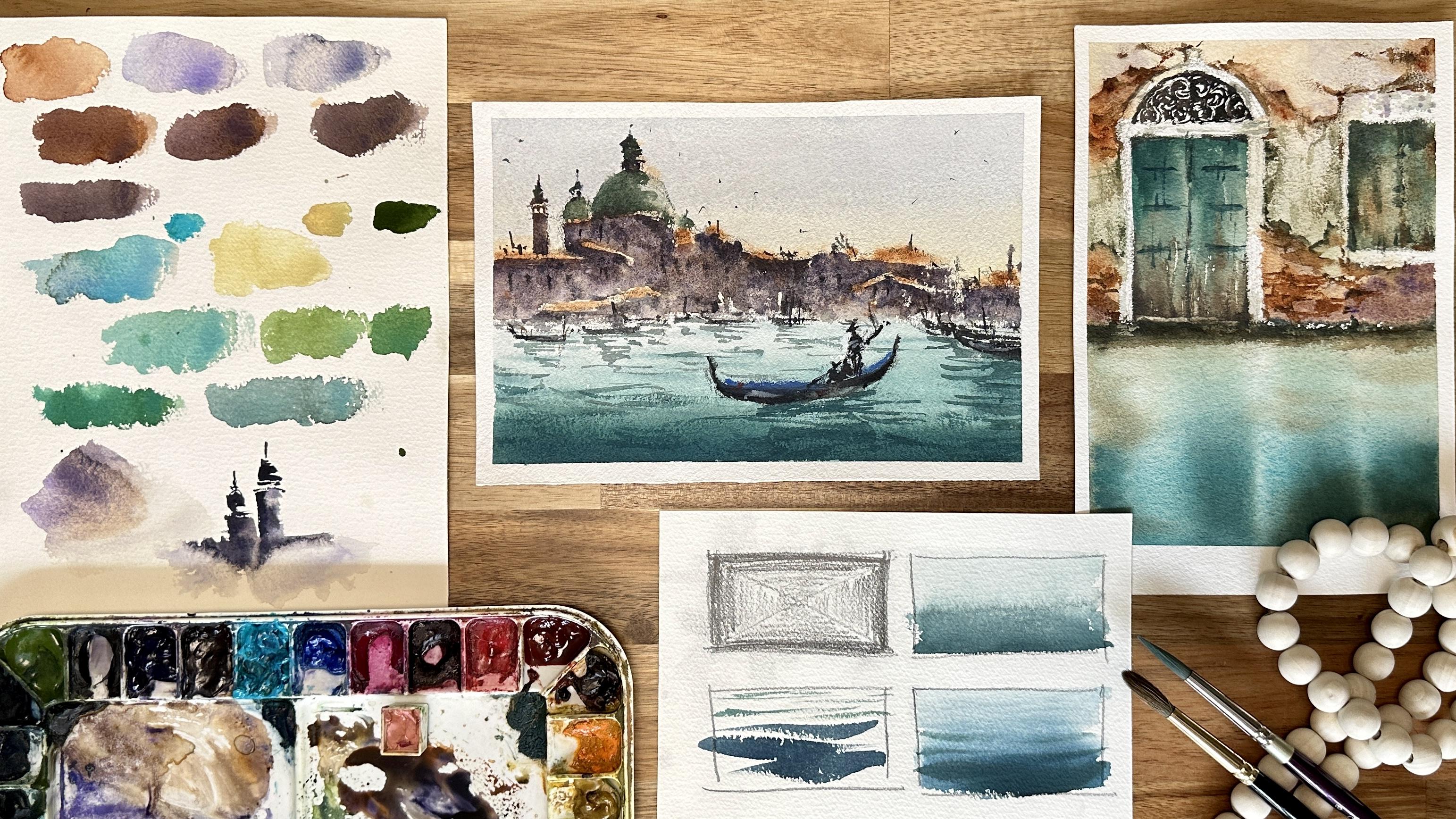
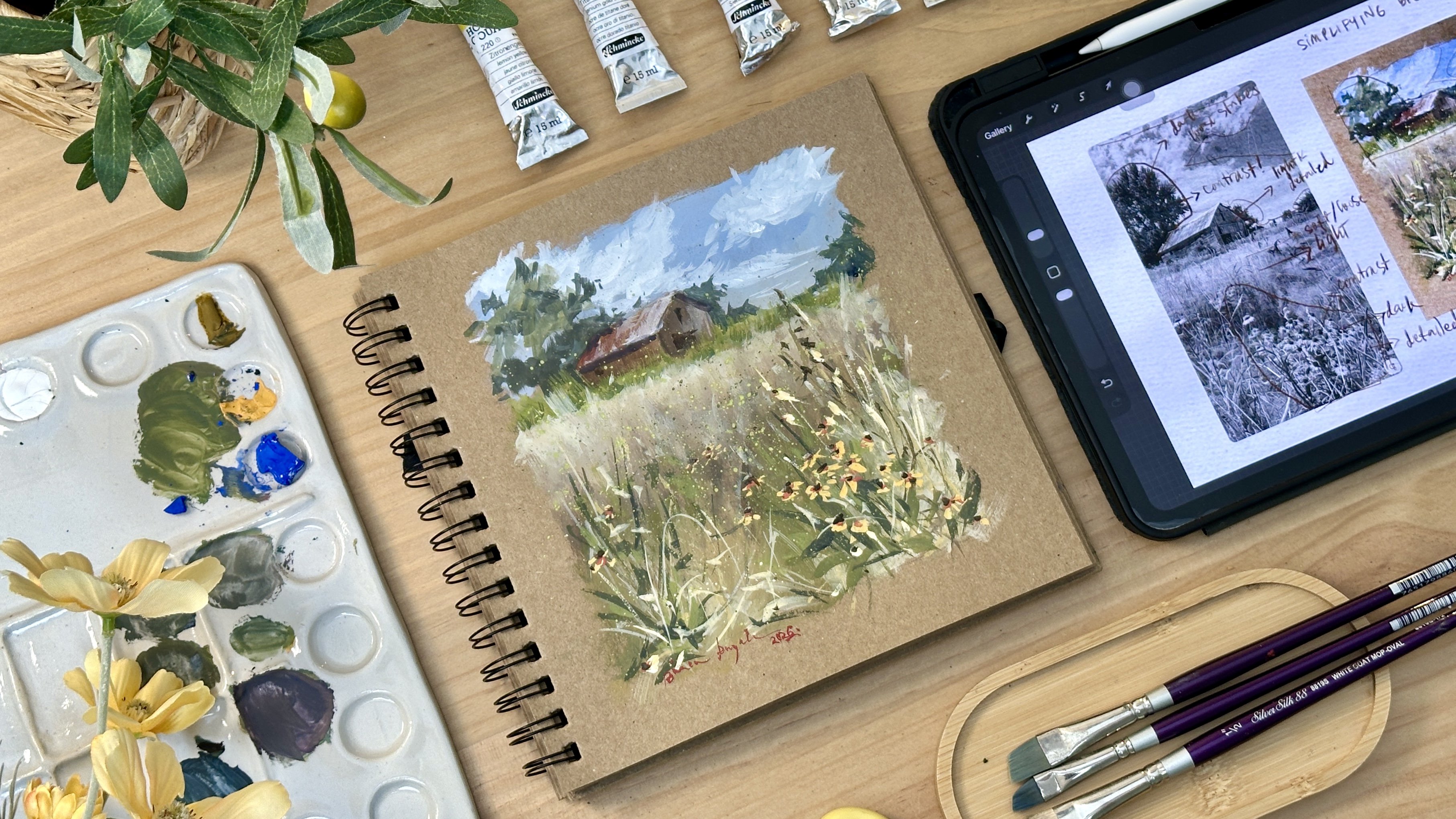
2. Materials: B. Before we start our
watercolor tutorial, let's go over the list of materials you'll
need for this class. We'll be using some high
quality supplies to help you achieve the best results.
Here's what you'll need. We'll be using Bow
Hm watercolor paper, cold press 300 GS M 100% cotton. This paper is excellent for
holding water and paint, providing a great surface for creating textures and washes. For the brushes, I'm using
Renaissance size eight. This red sable hair brush is perfect for painting
all the base washes. Its natural hair allows for excellent paint
and water retention. This is silver silk,
ultra round size eight. This brush is ideal for painting
fine lines and details. It's versatile and offers great control for detailed work. We'll be using artist gray
Schenka watercolor paints. These paints are easy
to mix and blend, offering high pigmented colors. The colors we'll use in the
class include Naples, yellow, yellow Ochre, burnt china, a bit of parin dark
red for highlights, cobalt blue, cobalt
turquoise, deep sea violet, cobalt violet, paints gray, olive green, indigo, ice blue. An alternative color for
ice blue is royal blue, or you can simply use titanium white to mix with
your other colors. Feel free to use your own
set of colors if you prefer. The key is to use a
small group of colors and mix them to create
different shades. This will help you achieve a harmonious and cohesive
look in your painting. Additional supplies
will need our board and masking tape to hold the paper
in place while painting, two cups of water, one for rinsing your brushes, and one for clean water
to mix your paints. Tissue paper for cleaning your brushes and blotting
excess water or paint, pencil and erasor, for sketching your initial drawing on
the watercolor paper. And a water sprayer for
keeping your paints and paper moist allowing for
smooer blends and transitions. I'll be using a
heat gun to speed up the drying process
between layers. However, this is
optional and not necessary if you prefer to let your painting
dry naturally. Make sure you have
all these materials ready before we begin. Having the right tools will
make a big difference in your painting experience
and help you achieve the desired atmospheric effects. So gather your supplies, and let's get started on creating beautiful
venetian landscapes.
3. Mood and Emotional Connection: Before we dive into
the techniques, it's crucial to
understand how to identify and convey the mood you want to portray
your painting. Establishing the mood
is essential for creating a compelling
and evocative artwork. The most important thing to
identify and define the mood for your painting is to understand your
emotional connection. Reflect on what drew you to
the scene your painting. Your emotional response
to the scene is a key indicator of the
mood you want to portray. It will also guide
your color choices, brushwork, and overall
approach to the painting. During my trip to Venice, what truly captivated me was the quiet atmosphere of the cloudy late
afternoon in the city, and the calm waters, as I enjoy the
tranquil Condola ride. This experience will be the foundation for the mood we want to portray
in our painting. The brush strokes and
the color palette should reflect the
desired emotional tone. For instance, to
capture the diffuse overcast light of the
cloudy late afternoon, we'll use a palette of soft
grays and subdued blues, blending them to mimic the gentle light and understated
hues of the cloudy sky. Smooth, blended brush
strokes will help achieve the gentle
transitions in light, reflecting the serene ambience
of the late afternoon. Then to portray the
overall stillness of venice during this time, we'll focus on creating smooth, uninterrupted brush strokes and soft transitions
at the background. Now, to portray the
stillness of the water, will use soft flowing
brush strokes and subtle washes to depict the reflective
quality of the water. Techniques like wet and
wet blending will help achieve the serene look
of the water surface. By integrating these elements, our painting will embody the serene and reflective mood of a cloudy late
afternoon in venice, capturing tranquility
of the calm waters and a quiet atmosphere that made
the experience so memorable.
4. Modern Techniques to Create Mood: Let's look at the modern
techniques to create mood and atmosphere in
your landscape paintings. One of the key
techniques we'll be discussing is the use of
color to convey mood. Color is a powerful
tool in painting, and the way you
use it can greatly influence the mood and
emotion of your artwork. Instead of relying
on pre mixed colors, try mixing your own
to create rich, deep and dramatic hues that add a unique touch
to your paintings. For example, when painting the background of a
scene like San rigoro, you might be tempted to use
a pre mixed brown or gray. However, by mixing
your own colors, you can achieve a more dynamic
and atmospheric effect. For instance, instead
of a flat brown, try mixing burnt henna, cobalt violet, and
deep sea violet. Here's how you can do it. Burn chana, it provides a warm, earthy tone that serves
as a great base. Cobalt violet adds a hint
of coolness and depth, creating a subtle contrast. And deep sea violet enhances the mix with a rich
dramatic quality. By blending the colors, you'll create a background
that has more character and mood than a single
pre mixed color. The resulting
shades will reflect the complexity and
atmosphere of the scene, making it more engaging
and visually appealing. Start by mixing burnt henna with a touch of cobalt violet. Gradually add deep sea violet until you achieve
the desired shade. Test the mix on a scrap piece of paper and see how
it looks when dry. If the color appears too warm, add more cobalt violet
or deep sea violet. If it's too cool, balance
it with more burnt henna. Let's do another example. Water can be particularly
challenging to pain, especially when
trying to capture the right mood and atmosphere. Instead of using cobal torquoise
straight from the tube, which might appear too bright, we can mix it with a bit
of Naples yellow and olive green to create a more natural and harmonious color. Cobal Turquoise offers
a vibrant base color that reflects the
brightness of the water. Naples yellow softens
the torquoise, adding a warmth and
a more natural tone. And olive green introduces
an earthy element, balancing the brightness
and adding depth. By mixing these three colors, you can achieve a more subdued
atmospheric water effect that complements the overall
mood of your painting. Now, start with cobalt
turquoise and gradually mix in a small amount
of Naples yellow. Add a touch of olive green until you achieve
the desired shade. Test the mix on a scrap piece of paper to ensure it
matches your vision. If the color is too bright, add more olive green. If it's too dull, increase
the amount of Naples yellow. Another modern technique
that adds depth and mood to your painting is the use
of lost and found edges. This technique involves
creating areas where edges are well defined or the found edges and areas where edges blend into the
background or the lost edges. This contrast helps to
direct the viewer's eye and creates a sense of
mystery and atmosphere. Now found edges,
these are sharp and clear drawing the attention
to specific details. For instance, the
edges of buildings or boats can be more defined
to make them stand out. Lost edges, this blend
into the background, creating a softer, more
mysterious effect. For example, the
distant buildings or reflection in the water can have lost edges to
suggest depth and distance. To create lost and found edges. First, is to identify key areas. Decide which parts of your painting should
have sharp edges, and which part should blend. This helps in guiding
the viewer's focus. Normally, we want sharp edges on the focal points and some parts in the background that
we want to highlight. Next is to learn how to
blend for lost edges. For softer edges, use a wet brush to blend the
paint into the background. Create a stroke, then soften
it with a damp brush. This can be done while the
paint is still wet or by reactivating the dry
paint with a wet brush. As you practice, you'll
learn to adjust as needed. Balance the sharp and soft edges to create a harmonious
composition. To many sharp edges can make
the painting look busy, while too many soft edges
can make it look flat. Another technique is the use of value and contrast
to depict distance. Using value and contrast is
another effective way to create mood and depict distance in your landscape paintings. By varying the lightness and
darkness of your colors, you can create a sense of depth and make different elements
of your painting stand out. For example, when
painting the water, you can use darker tones
in the foreground and gradually lighten the tones as you move towards
the horizon line. This technique helps to
create a sense of depth and distance adding to the
overall mood of the painting. Now, to use value and contrast, number one, dark tones is
used in the foreground. Start by applying darker tones to the water in the foreground. Use a mix of cobalt
turquoise with a touch of olive green
and Naples yellow, and then limit the water to
create a rich dark color. Second, do gradual lightening. As you paint closer
to the horizon line, gradually lighten the
tone by adding more water or mixing in lighter colors
such as Naples yellow. And lastly, we want to
see smooth transitions. Ensure smooth
transitions between the dark and light tones by blending the
colors on the paper. Use a wet brush to soften the edges and create
a natural gradient. Even in painting the waves, use the same principle to enhance the sense of
depth and distance. Long thick strokes can be used for the waves
in the foreground. This will make them appear
closer and more prominent. The waves turn thinner and shorter as you get closer
to the background. This will make the waves appear
more distant and subtle. This helps to create a
sense of perspective and adds the overall
mode of the scene. The tone of the waves should also follow the
tone of the water, ensure a smooth
transition between the foreground and
background waves by gradually lightening the tone
and thinning the strokes. By using the color
mixing techniques, the concepts of loss
and found edges, and value and contrast, you can add a dynamic
quality to your painting, making it more interesting
and evocative. Let's try to apply
all these techniques in painting our class project.
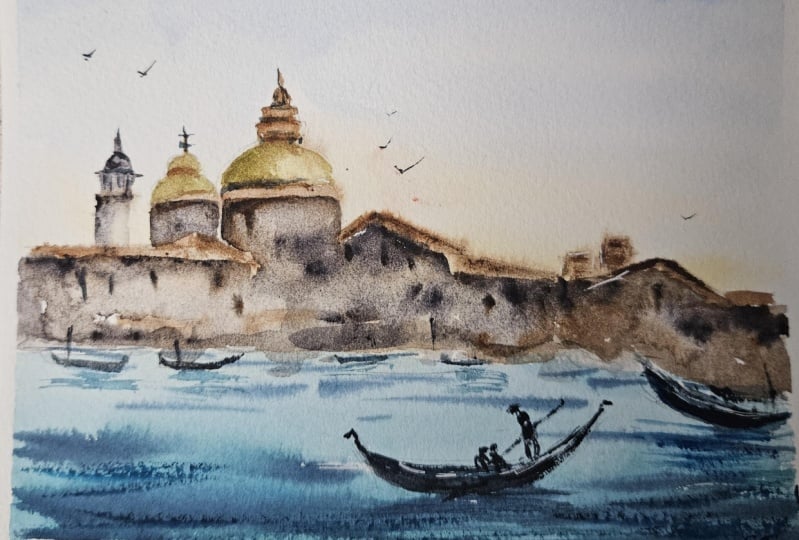
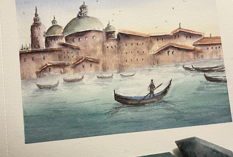
5. Class Project: Pencil Sketch: Let's begin with
a pencil sketch. Start with the horizon line below the mid line of the page. Next, let's draw a
rough sketch and outline of the San
Gregorio Church. I draw some lines
showing the tower, the roof, and also the dome. I try to make my sketch
very loose and relax, so the lines won't
look too stiff. You don't have to copy exactly how the silhouette looks like. Just get the main thing or
the highlight of the scene, and the other elements can
be some sort of lines. Now, let's draw some
shapes here on the left, like little roofs
at the background. It can be as simple as this. Next, let's draw a
tip of the gondola on the right and some lines to
show reflection on water. Maybe another one here is a
focal point in our painting. The gondola has a
distinct shape, so it's nice to capture
that as much as possible to complete the Vee
fields in your painting. Of course, we should also add a gondolier standing on
the stern rowing the boat. And also make the lines of the reflection a mirrored
image of the object. Lastly, let's draw
some more gods near the horizon with basic shapes
and also some wood poles. This is our pencil sketch.
6. Class Project: Painting the Background: First phase of the painting is focused on the background
sky and the church. I'll miss the paper with
few sprits of water. Now I'll take yellow
ochre and paint a horizontal stroke starting
on the horizon going up. We want a nice warm
undertone in the painting. Next, I take some cobalt
blue and cobalt violet and makes a bit of tortoise
blue to get this nice, cool purplish blue
color for the sky. I cover the paper
thoroughly and try to blend it with a
yellow layer lightly. Now, let's paint the
roofs with burn shanna. Since we are painting
wet on wet now, I want you to prepare a
thicker mix of burn shanna so that strokes will be controlled yet keeping
that soft edges. Here I paint the outline
of each roof one by one and just let the paint somehow spread since the
surface is still wet. I'm just adding a few
more thick strokes here, and I try to make sure the roofs will pop out
from the background sky. Next, I take my heat gun and dry the fragment before
proceeding on painting the church landscape. I take paints gray and
cobalt violet to get a nice purple color and
makes a bit of burn to it. We want to create
a nice deep shade for the silhouette
of the church. As I paint this, I now use my synthetic brush for
a much defined stroke. I start with the intricate
details of the tower. Make sure the paint
mixture is really thick and creamy to get these
fine lines and strokes. I also try to remove
the excess water from my brush every
after wetting my brush, so I won't accidentally create puddle of
water on my stroke. So just paint the
initial outline the soften the stroke by carefully spreading
the pain to have that smooth transition of tones. Now, as I paint the lower
part of the silhouette, let's do some color play and
blending using two brushes. I start with a thick
horizontal stroke of pain, then I take another
brush loaded with water, then I try to spread
the paint from the initial stroke to create that soft flow of
color in the surface. While it is still wet, carefully some paints
on the wet surface. M. Let's do the same technique
on the other parts. First, create dark stroke
with a synthetic brush, then using a sable brush
loaded with water, gently spread the
paint within the area. You'll see a nice and soft
gradient wash of water color. Don't forget to some dark paints on the wet area to create. Carefully paint around the
roofs and try to define the shape of the roofs
negative painting. Still using the three colors,
cobalt violet, Brenana, and a bit of deep sea violet, create different
shades and tone by altering the ratio of paints
and water in the mix. Now, the fun part, I splatter
some water on the fragment and look how the colors move and create nice misty blooms. It creates extra interests
and texture in fragment. Now, I'll add some dark marks on the edges to further
enhance the architecture. Mostly, I place the dark
spots under the roofs to create an impression of shadow and give sense of death. Next, soften the edges on
the horizon line using a clean damp brush
so you can have a seamless transition between
land and water fragment. Then let's platter
some more water here and there to create
a misty feel in it. Now, let's paint the
domes and find details. Using my pointy synthetic brush, I start with a broken outlines. You don't have to trace
the sketch completely. Suggestive lines is enough to keep the painting look loose. I'll mix olive green,
cobalt violet, and cobalt turquoise to create this very nice green
color of the dome. I paint the side with
thick paint first. Since I wanted the leftmost
side to be darker in tone, I layer it up with a darker shade by adding
burnt chana in the mix. Now I clean my brush and gently spread the color to
completely color the dome. So there you can see
dimension on the dome by simply assigning the
right tones as you paint it. Darken some parts
as needed to c. Let's finalize this fragment
by drawing some details, lines and strokes to
enhance the picture. I also add some dark
highlights here and there for extra texture and add strokes
for windows and doors. Again, you don't have
to be very particular with what exactly
you're painting. We just need to capture
the essence and mode with loose strokes
and play of tones. L et's finish off by adding
some lines and dots of colors at the horizon to create extra
contrast between roofs.
7. Class Project: Painting the Water : Now that we're done
with the dome, let's move on to painting
the grand canal. I take Cobal turquoise
and Naples yellow and try to create a rich
turquoise blue color. I take a bit of
olive green and mix some more of Naples
and turquoise. I suggest that you create a mixture that is
plenty enough to cover the entire fragment if you are still practicing
with color mixing. I start painting the bottom part with this rich blue green color. The idea is the tone
will gradually decrease as we come closer to
the horizon line. To do that, a little by little add water on my color
mix to dilute the color. I paint the area with
horizontal strokes, and it's okay to
cover the gondola since we'll paint it with
dark color later on. As we get closer to the horizon, notice that the tone is
changed to a lighter one. I want to make a darker shade
of turquoise for the waves. Let's mix indigo tortoise
and some olive green. The mix has to be
creamy as well, so you can make defined
strokes for the waves. If the mix is too watery, it will just create blooms on your initial layer of color. I'll make quick
horizontal strokes to create impression of waves. Make the stroke thicker
for the bottom part, but as we approach the horizon, the stroke has to become
finer and shorter. Following the tips
will help create aerial perspective
on your seascape. As you paint tiny strokes
near the horizon, use a very light tint
of paint as well. I'll now dry the water fragment, so we can proceed on
painting the gondola. We need to make sure the
layers completely dry so we can paint all the details
and elements very well. Now I take paints and mix it
with cos here in my palette. I'll use this color to paint the gondolas
at the background. After an initial stroke, take a tissue and dab it
on to fade the holler out. Doing this prevents
those details in the background to
take too much attention. Using my left over
turkis paints, let's paint the
reflection and water. Do quick downward zig
zag strokes for this. Let's paint the
gondola on the right. I take a dark,
creamy paints gray, start with the outline and
paint the entire thing. If you notice, I
intentionally leave some white painted area
to create highlight. Don't forget to paint the
reflection underneath. Here, I'm just adding
a few more lines on the water fragments to show
gentle waves on the water. Now let's paint the focal point. Using paints gray, I
start with the tip of the gondola and painting it with really
dark opaque paint. As I reach the middle part, I gradually decrease the
tone to create dimension. I take cobalt blue
and mix it with an opaque light blue color
to paint the details. You can mix your blue with
to achieve the same effect. So here I'm just painting the blue element
on top of the goo. It's important that
you are consistent with a colorful reflection. It will definitely look off
if the shade is varying. Mix paints gray with white to get an opaque gray color
to paint the gondolier. Be mindful of the proportion of the human figure
and the boat. I'll add a few dots here to show passengers and also the
pull to road the boat. Now, let's add some dry brush
stroke on the foreground. Just a few stroke to add
texture in the water. And they also add
white highlights on the gondola and also
define the shape some. As accent, I take
a thick red paint and dab it on the gondola
and also on the gondola. Let's finalize the painting
by adding a few contrast here near the horizon line where I find a lot of unpainted spots. I do this just to connect the land and water
fragment together and create united picture. And Lastly, some white highlights in the boats and
maybe tiny birds in the sky. Don't forget to dub the stroke with tissue to fade
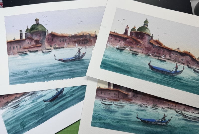
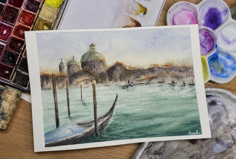
out the holler. This is our final painting. Um Uh
8. Final Thoughts: Thank you for joining me today
for this watercolor class. I hope you enjoyed painting the serene Venetian landscape with me and found inspiration, the peaceful and lovely
city we aim to capture. As we wrap up, remember that creating mood
and atmosphere in your painting is
all about conveying the feelings and experiences
that inspired you. Feel free to experiment with the techniques we covered today, using a limited color palette, blending bruh strokes, playing
with loss and found edges, and capturing the
subtle transitions in change in value and contrast. And remember, don't hesitate to make the painting your own. Personal touch will always add a unique charm to your work. I'd love to see your creations and hear about your experiences, share your paintings with me on Instagram or in the
class project section. I'm excited to see
how you interpret and apply these techniques
in your own art. If you enjoy the class, please consider
leaving a review. Your feedback is so valuable
to me as it helps me better understand your needs and continue to improve
in my teaching. It also serves as a
wonderful encouragement, inspire me to create even more engaging and
helpful content for you. And if you're interested in exploring more
watercolor techniques, be sure to check out
my other classes. Each one offers unique insights and approaches to enrich
your watercolor journey. Watercolor landscapes, painting with modern
watercolor techniques. Watercolor for beginners, techniques to paint
loose landscapes. No more flat paintings, master value and
contrast in watercolor. Thank you once again
for being part of this wonderful class
until next time. Always paint to inspire
and paint from the heart. See in my other classes.
 Bianca Rayala, Top Teacher | Watercolor Artist