Transcripts
1. About the Class: Have you ever looked
at watercolor painting and wondered how a simple landscape
can feel so full of light, depth, and atmosphere? Often, it's not about
adding more detail. It's about understanding
how to simplify, place values, and use light
and shadow intentionally. When we study the work
of master painters, we're not just
copying the painting, we're learning how
they simplify a scene, what they choose to emphasize, and how they translate what
they see into a painting. Hello, everyone.
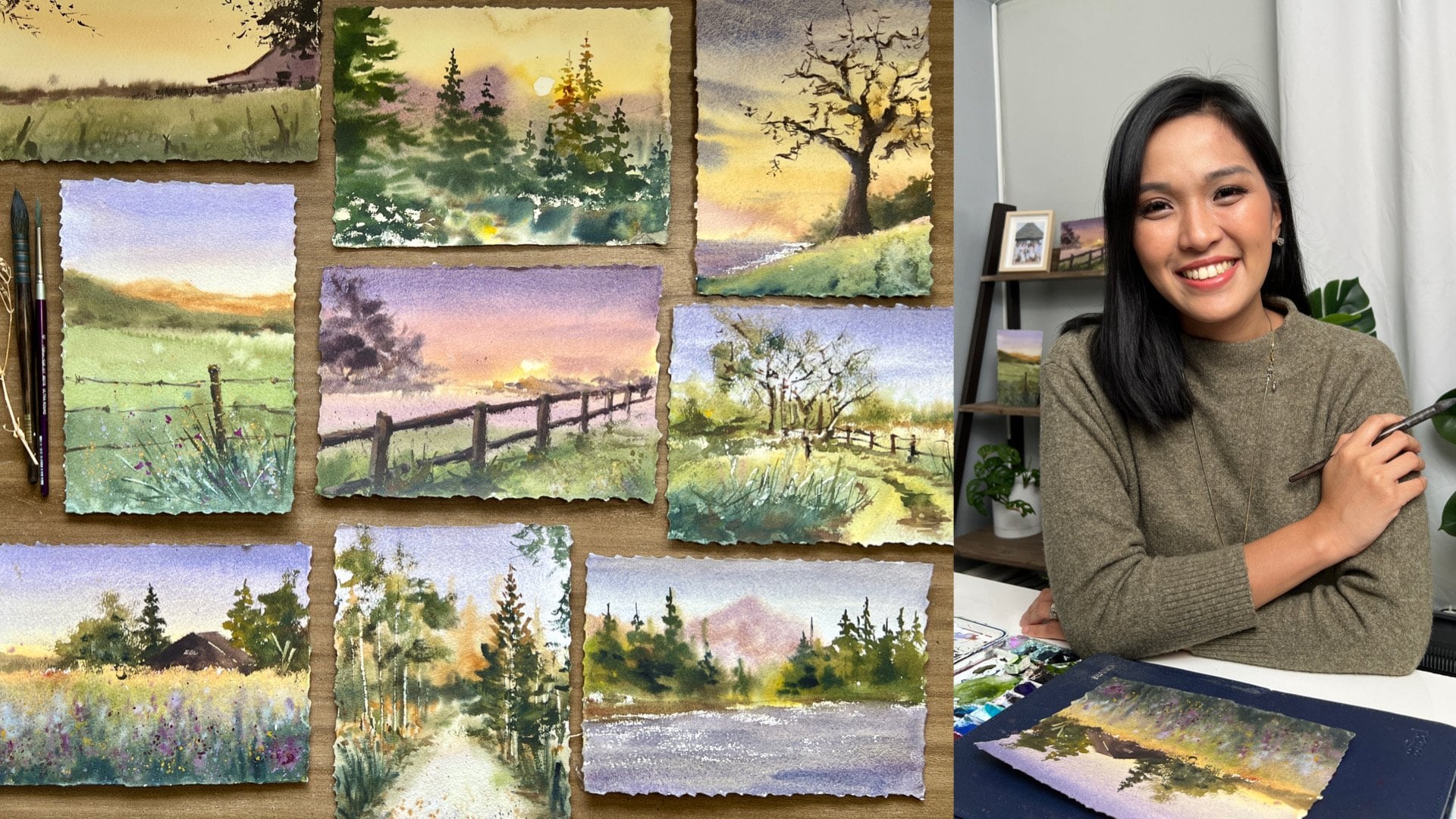
I'm Bianca Rayala. I'm a watercolor artist, educator, and
Skillshare top teacher. Over the years, I've had the
joy of teaching thousands of students from all over the
world here on Skillshare. My classes are all
about making watercolor approachable, joyful
and meaningful. I work with brands like Schminka silver Brush Limited
and Arc and Mounts. This class is part of my watercolor Master study
series where we learn watercolor by studying
the techniques and artistic decisions
of great painters. In my previous class
in this series, we explored how Joseph's Bookwch captures atmosphere and
mood in its landscapes, especially how we simplify
scenes and creates that soft, beautiful light so if you
haven't taken that class yet, I highly encourage you
to check it out as well because it will
really complement what we're going to learn here. In this class, we're
going a step deeper. We'll focus on how he
uses light and shadow, how he simplifies scenes
into strong value shapes, and how he uses warm
and cool colors to create that beautiful
sense of depth and glow. The painting we'll study today
may look simple at first. It's a quiet
countryside with barns, trees, and grazing cows. But as we go through
the process, you'll see how
every part of it is intentional from the way the light displays to how
the shadows are group. How colors are mixed. Everything works together
to guide the viewer's eye. I'll walk you through
my entire process from observing the painting, understanding values
and temperature, mixing colors and building
the painting step by step using loose and expressive
watercolor techniques. This class is perfect
for beginner to intermediate artist or
anyone who wants to paint more confidently
and understand how to create light and
atmosphere in their work. I hope this class helps you build rhythm of
creative practice, rediscover the joy of painting, and maybe even surprise
yourself along the way. So prepare your brushes gather your materials
and paint along with me. I'd love to see your creations and hear about your experience. Share your sketchbook pages
with me on Instagram or in the class project
section here on Skillshare. I can't wait to see how you bring these paintings to life, so grab your brushes, and let's get started.
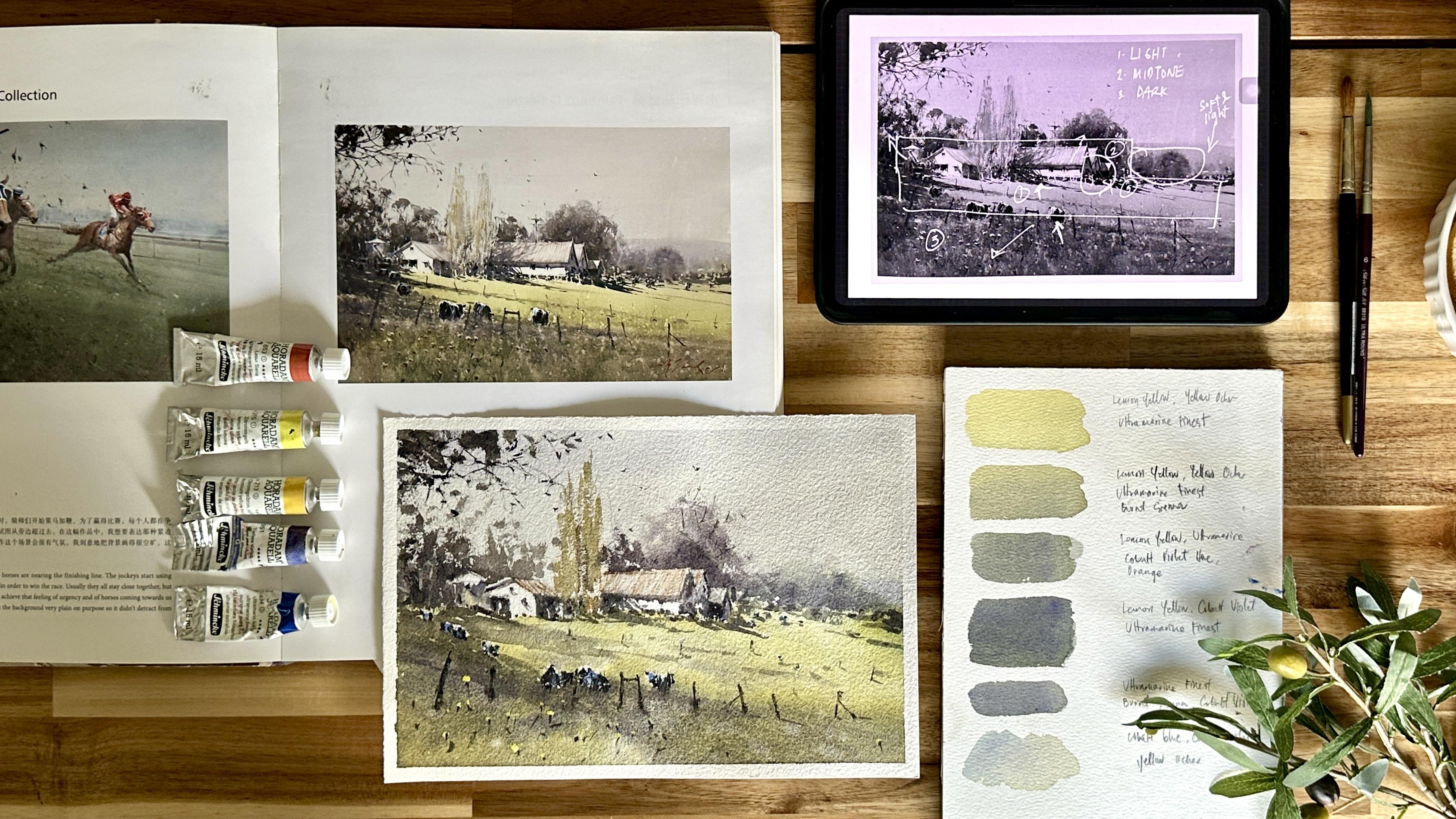
2. Materials: Before we start painting, let me quickly share what
your class project will be. For this class, I'd love for you to create your own master study inspired by this landscape
painting of Joseph Zbukvic. Once you finish your painting, don't forget to upload it in the project section so we can all see and celebrate your work. And since this is
a master study, it's very important that
we always acknowledge the original artist,
Joseph Zbukvic. If you share your
work on social media, I encourage you to
credit and thank him and mention that your painting
is inspired by his work. It's a simple way
to show respect and appreciation to the artist
you're learning from. Now, let me quickly
walk you through the materials I'll be
using for the class. For my paper, I'm
using 100% cotton, watercolor paper,
300 GSM, cold press. I'm using Bao Hong
Artist grade paper. I really love how this paper
absorbs water and paint. It gives me enough time
to work wet and wet while still holding
beautiful textures. For my paints, I'll be using
SmicaHadu watercolors. I'll be working from
my usual palette, and you can actually
find my full list of colors in the research
section of this class. But just to guide you, it's helpful to have a mix of
both warm and cool colors. Some of the key colors we'll
be using are lemon yellow, yellow ochre, ultramarine blue, cobalt blue, olive
green, cobalt violet, burnt chena, cadmium orange, ice blue or lavender
and titanium white. We don't need all the
colors in the world. What's important is having
both warm and cool version so we can create that
beautiful glow of light and depth
in the painting. For my brushes, I'll be using my go to brushes from
Silver Brush Limited. I'll use my Renaissance
sable brushes in size ten and eight for
most of my washes. My silver silk 88
ultra round brush for more controlled
strokes and details, and a black velvet
liner brush size one for very fine lines
like fences and accents. It's also helpful to have a large flat brush for pre
wetting surfaces as teded. Other materials
we'll also need are pencil and eraser for
sketching, a water sprayer, two cups of water, paper towel or a rag, and masking tape to hold your paper in place and
create a clean border. And lastly, you can download
the reference photo of Joseph Zbukvic and my masters study in the research
section of the class, so you can paint along with me. Feel free to use whatever
materials you already have. What matters most is
understanding the process.
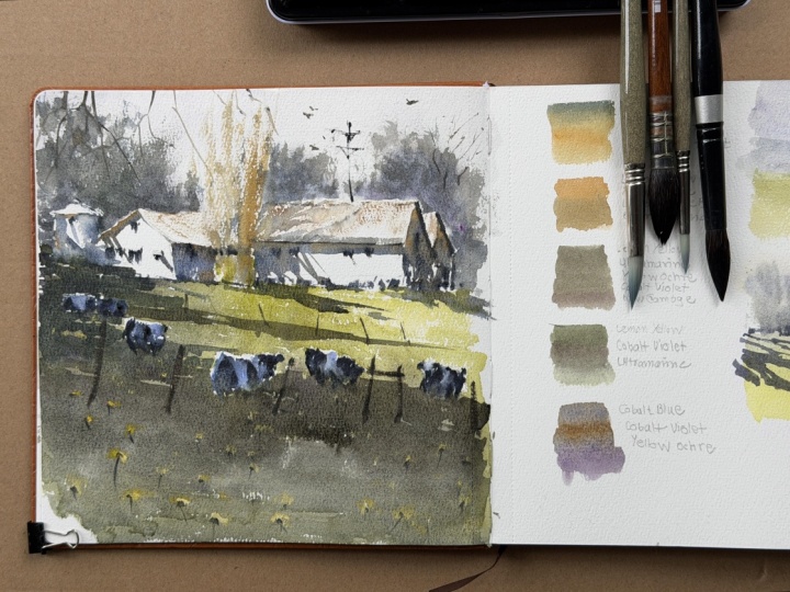
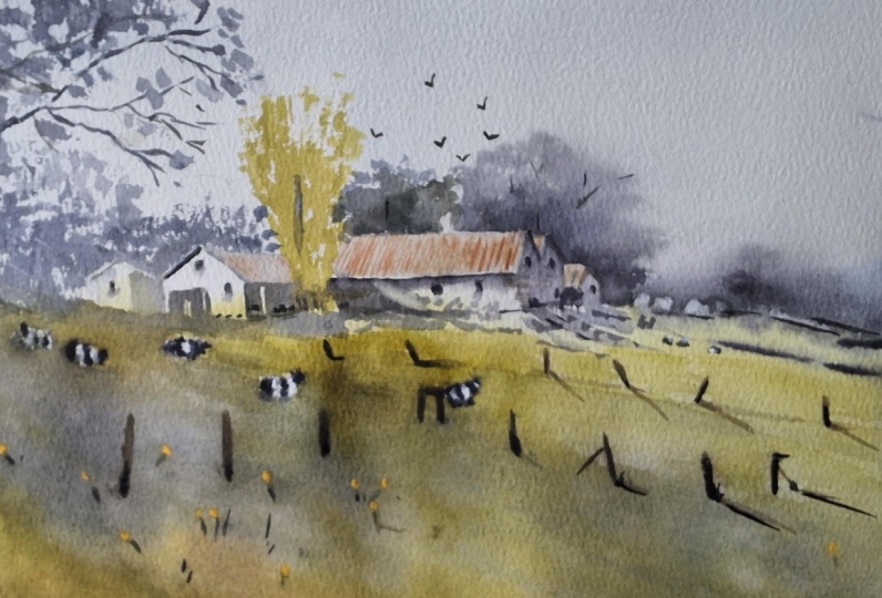
3. Observing the Master Painting: Before we begin painting, let's take a moment to really observe the master
painting together. In this class, we'll be studying afternoon shadows
by Joseph Zbukvic. He shared that this is one of his favorite locations
in Australia, the old making sheds
near Melbourne, and it is painted
late in the day, which is why we see these long, beautiful shadows that creates such a strong sense
of atmosphere. You'll also notice the
cows in the foreground. They help lead the viewer's
eye into the painting. And interestingly,
he mentioned that he often places cows in
his compositions, even if they're not
actually present because they help
strengthen the visual flow. Now, as we study his painting, we will look at the
following areas to effectively learn
from his work. We'll start to observe
his composition, how he uses light and shadow, how he applies warm
and cool colors, how he creates atmosphere
and use of edges, his brushwork, and how he preserved light
and simplified forms. The barn is positioned
slightly off center, close to where a rule of
thirds line would be. This makes it feel
balanced and not static. It gives a painting a natural
and pleasing arrangement. There's also a clear
sense of movement from the dark foreground across the sunlit meadow
and toward the barn. The cows and fence posts
subtly guide the eye inward, creating a visual path that
pulls us into the scene. Each element has
space to breathe, and together they create
a composition that feels balanced, cohesive,
and intentional. Looking at the heart
of the painting, which is the light and shadow, what really stands out to me is how strongly the
light is emphasized. If you simplify the scene, we can see two dominant shapes. First is a large glowing light
shape across the meadow. And second, is a
strong shadow mass in the foreground and
around the trees. Joseph doesn't make the light bright by adding
more brightness. Instead, he makes it powerful by darkening the
surrounding shadows. The foreground is
intentionally deep and cool, almost like a stage, allowing
the light to stand out. The shadows are grouped into one connected shape
rather than scattered, and this creates clarity and strengthens the
overall design. The cast shadows
from the barn and trees are painted with
loose organic strokes, which keeps the natural and expressive feeling
in the painting. So what we're really trying
to see here is that light is emphasized by making
the shadows stronger. Now, as I observe the colors, I can see how temperature
supports the light. When we say temperature, is the use of warm and cool
colors to create atmosphere. The sunlit meadow is warm. It's filled with soft yellows and warm greens,
and in contrast, the shadow contrast the
shapecialgground areas the word cool blues
and muted violets. This contrast between warm and cool enhances
the glow of light. The warm pulls the
light forward, while the cooler tones
allow the areas to recede. Another thing I notice
is the use of edges. The sky, distant mountains and background trees are painted
with very soft edges. They almost dissolve, which
makes them feel far away. As we move closer
to the focal point, the barn and parts
of the foreground, the edges become
slightly sharper. This shift in edges help guide the eye and
reinforces depth. Now, this sky is painted with a simple blend of
warm and cool washes, creating a natural atmosphere. The misty mountains in the
distance are barely defined. It's softened with subtle
textures and splatters. Here we can see that
Joseph paints atmosphere in a very simple but very
intentional approach. It allows the painting to
feel light and atmospheric. Now, looking at the brushwork, the trees are painted with
loose expressive strokes. They're not detailed, but they clearly suggest
form and structure. This reminds me that we don't
need to paint everything. We just need to paint enough for the viewer to understand. Now, as we look at
those preserved lights, looking closely at the barn, especially on the right side, I notice small areas
of untouched paper. These preserved whites
represent light. So here we can see that
instead of painting the light, Joseph protects it by
leaving it unpainted. Now, let's move on to the cows. The cows are simple shapes
with just a few strokes, yet they're immediately
recognizable. They're not just subjects. They're part of the
composition and helping guide the viewer's
eye into the scene. As I take everything in, I can see that every decision
in this painting is very intentional from placement and composition to light and
shadow to temperature, edges and brushwork,
everything works together to create a unified
atmospheric scene. And as we begin painting, this is what we want
to carry with us. We're not just
copying what we see, we're learning how to observe, simplify, and make thoughtful
artistic decisions.
4. Understanding Value and Temperature: Before we talk about
color temperature, let's first understand
how values are used in this painting
because in watercolor, value is the foundation. It creates structure,
depth, and clarity. If we simplify what we see, this painting can be grouped
into three main values. One is light, the sunlit
meadow and parts of the barn, two is mid tone. This is the trees behind
the barn, the distant land, and shaded areas
of the structures, and three, dark, the foreground
and the cast shadows. Even without color,
these three values already make the painting work. Let's start with the light. The light displays very
intentionally across the meadow, forming one large, clear shape. It's not scattered, it's
grouped to create impact. This becomes the main focal
point of the painting. Now notice how the
light is supported. The foreground is much darker, almost like a frame, and this contrast makes the
light feel brighter. The shadows around the trees and near the barn
are also connected, forming one strong, unified dark shape rather than
many small ones. The key idea we want
to see here is that the strength of
the light depends on the strength of
the darks around it. Now let's look at the mid tones. These are found in the trees behind and around the barn and the distant landscape
and the parts of the barn that are not
directly hit by light. They sit between light and dark, helping everything feel
connected and balanced. The distant areas are
softer and lighter, which helps push them
further back in space. Value also creates
depth in the painting. The lightest and softest
areas are in the distance, the darkest and strongest
values are in the foreground. This contrast guides
the viewer's eye and creates a sense of depth. So even before we add color, the painting already
works because the values are clear
and intentional. When your values are right, your composition reads clearly. Your light feels believable, and your painting has depth. Now that we've understood how values are placed
in the painting, let's take it one
step further and talked about color temperature. Because once your
values are clear, temperature is what brings
the painting to life. It creates that feeling of
light, depth, and atmosphere. Color temperature
simply means whether a color feels warm or cool. Warm colors includes yellow, orange and warm greens, while cool colors include blues, violets and cooler greens. In watercolor, we don't
just look at color. We look at how warm or cool a color feels in
relation to another. If we observe the painting, the sunlit meadow is warm with yellow and
yellow green tones. The roof and light heating
the barn also lean warm. The trees behind the barn are more neutral to slightly cool. The distant mountains and background are
cooler and softer, and the foreground shadow and cast shadows are the
coolest and darkest areas. So here, Joseph is not just
painting light and dark. He's using warm and cool
contrast to enhance the light. Warm colors bring light forward while cool
colors push areas back. Notice how the sunlight across the field leans
toward warm tones. It feels bright and glowing. Then look at the shadows in the foreground and
around the barn. Instead of just
making them darker, they are painted
with color tones. Instead of just
making them darker, they are painted
with cooler tones, blues and muted violets. This contrast between
warm light and cool shadow is what makes the
light feel even stronger. Temperature also
helps create depth. The background is
cooler and softer, so it recedes the midground, like the trees and
structures sits in between, and the foreground is
darker and slightly cooler, which frames the light. Even within the same value, cooler colors tend to move back while warmer colors
come forward. As you paint, instead of
asking what color is this, try asking, is this
area warm or cool? Does it support the light? If your light feels weak, cool down your shadows, and if your painting feels flat, introduce more
temperature contrast. Even with contrast, we
still want harmony. You can achieve this by
using a limited palette, letting colors mix naturally and repeating colors
across the painting. So remember, value builds the structure and temperature
creates the mood. And when they work together, your painting begins to feel
more natural and alive.
5. Color Study: Or. As we begin mixing colors, I want to remind you that
this activity is meant to be a basic and
foundational guide to understanding
warm and cool tones. As we go through the painting, the exact mixes may slightly vary depending on how the
colors relate to each other. Our goal is not to
match colors exactly, but to create a sense of
harmony across the painting. So instead of focusing on
copying my exact mixes, try to understand the process
so you can confidently mix your own warm or cool colors using whatever palette you have. Let's begin with the lightest
area, the sunlit meadow. I'm mixing lemon yellow, a bit of yellow ochre and a touch of ultramarine fineness. This creates a
natural green that feels warm but still balanced. I'm keeping this mixture
light and diluted so it stays transparent and
allows the light to glow. Now, to build depth, I'll take that mixture
and a bit of burnt henna. This softens the green and gives us a more earthy mid tone. I'll use this for the
transition areas, places that are not
fully in light, but not in deep shadow either. For the trees, I'll create a slightly richer
mixture using lemon yellow, ultramarine fines, and a bit of orange and a touch
of cobak violet. This shifts the color toward
a cooler temperature, which helps push
the foreground back and makes the light in
the meadow feel stronger. For the shadows, I'm
using ultramarine blue, burned enna and a bit
of cobalt violet. This gives a rich, cool and
slightly muted shadow color. If I want it cooler, I
add more blue or violet. If I want it softer, I add more burnt enna. Mm. For the sky, I keep it simple. I'm mixing cobalt blue
with cobalt violet, and in some areas, I'll mix
in a bit of yellow ochre. This creates subtle
temperature variation so the sky doesn't feel flat. As I mix, I'm not thinking
about exact colors. I'm asking myself, is
this warm or cool? Does it support the
light and shadow? And I adjust the mixes as I go. Remember, there's no need to get every color
exactly the same. What matters most is that you
begin to understand how to control temperature and create
harmony in your painting. Let's move on to the next lesson where we'll be doing
the pencil sketch.
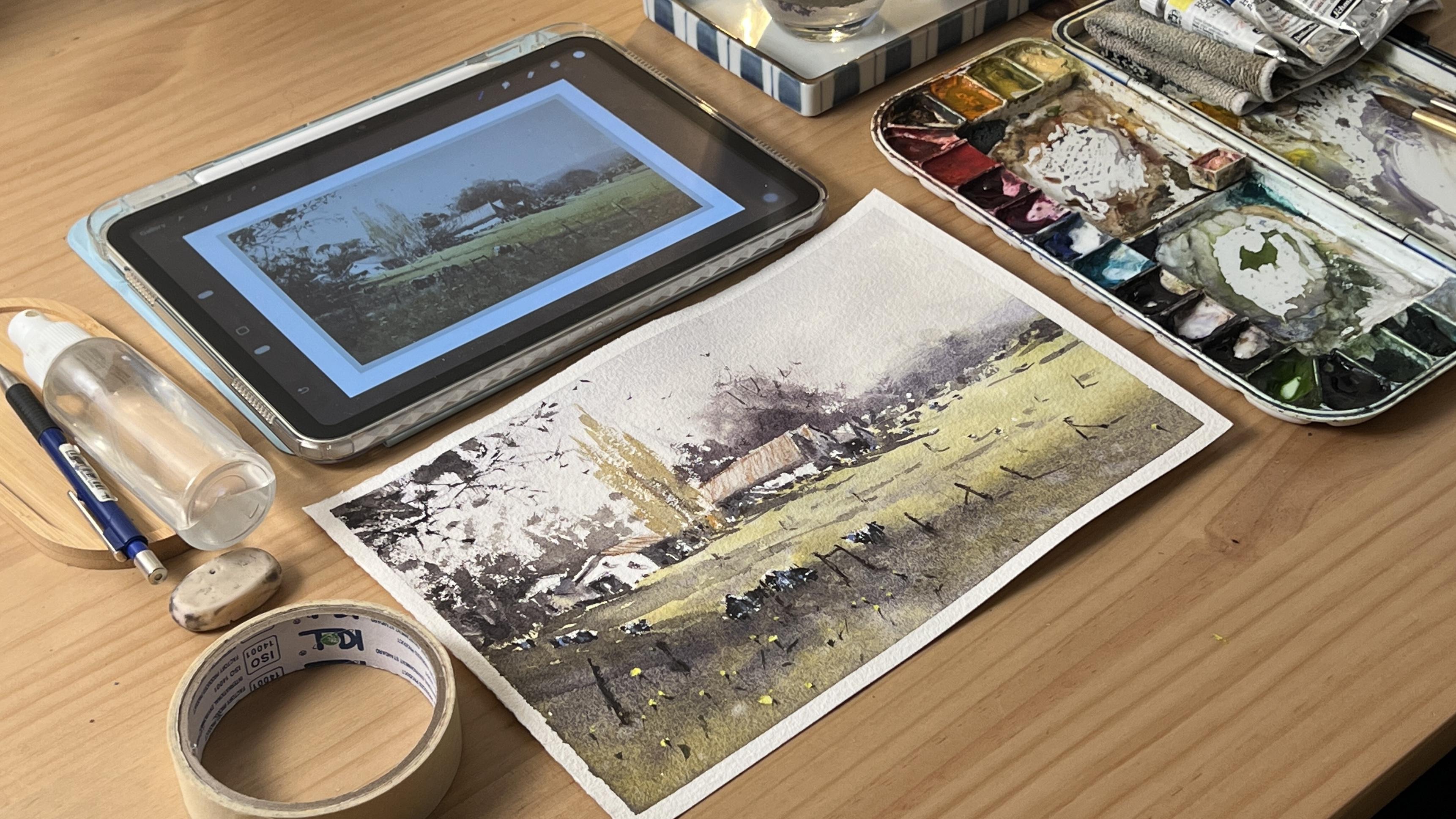
6. Pencil Sketch : Alright. Before we begin
our pencil sketch, let's tape all sides of
the paper onto a board. This helps secure
the paper and also prevents it from
buckling as we paint, especially when we start
working with more water. As I look at the
reference painting, I'll start by placing the horizon line somewhere
below the middle. This helps create a more
balanced composition and gives space for the light
to really stand out. I lightly sketch in
the distant mountains, just a soft indication,
nothing too detailed. Next, I'll draw the barn
here on the left side. I'll try to keep my marks very light and loose
at this stage, just mapping out the placement. Then I'll add the two trees
in between the barns. I'm not actually focusing
on details here, simple shapes to
suggest their form. Now, let's place the other barns near the center of the paper. As I draw, I pay
attention to the angle of the roof so they feel
natural and grounded. I also sketch in the tree
line behind the barns, again, keeping everything
loose and minimal. Next, I'll draw
some guidelines for the cast shadows
across the meadow. I try to keep the
direction consistent so the light feels
believable later on. Let's add the water
tank here on the left. And as I go along, I'm
also taking note of the areas where the paper is left unpainted
in the reference. These are important. These are important because
they represent light, and I want to make sure
I preserve them later. Now I'll sketch in the cows. At this stage, I'm not thinking about drawing
cows perfectly. I'm just focusing on
their overall shapes. They may look a bit
abstract for now, but once we paint the
lights and darks, we'll start to come together. B Finally, I'll add the wooden fence post across the meadow and I vary their height and spacing so
they don't feel too uniform. Now, looking at
the whole sketch, I can really see how everything
is intentionally placed. Most of the elements are
grouped on the left, but they naturally lead the eye toward the
light in the field. And that's what makes the composition so
beautiful and effective. Oh Let's move on to the next lesson
and start painting.
7. Painting Process: Background Wash : Begin painting. I start by lightly misting the paper
with my water sprayer. This makes the surface
lightly moist and helps the first washes
flow more smoothly. Now I'm going to mix
the color for the sky. I take yellow ochre and cobalt
violet with lots of water, then I add cobalt blue. You'll notice that this
gives a soft neutral warmth. Because of the
violet, the mixture stays balanced and
doesn't turn green. I load my brush well and begin painting the sky using
horizontal strokes. I add a bit of violet in some areas where I want the
sky to feel slightly cooler. Then a touch of
yellow ochre near the horizon to bring
back some warmth. Already, we can see
a soft interplay of warm and cool tones
in the background. I leave the trees and the lighted parts of the
barns unpainted because I want these areas to glow with the natural
white of the paper. Next, I take cobot
violet, cobot blue, and a bit of lemon
yellow to create a cool, purplish mix for the
distant mountains. I make this mixture slightly
creamier than the sky wash, so it feels a little
closer to us than the sky. I make this mix slightly
creamier than the sky wash, so it feels a little
closer than the sky. I paint it while
the sky is still moist so the edge stays soft, perfect for that
atmospheric effect we want in the distant mountain. Now, let's mix a beautiful green for the meadow
using lemon yellow, yellow ochre, and
ultramarine blue. I add the colors little by little until I get
the mix I want. I'm aiming for a glowing
yellow green that captures the fresh sunlight
heating the field. You'll notice that the
paper is already drying. So at this stage, I need a more flowy
consistency to carry the wash evenly
across the shape. And just as I mentioned in
our color mixing lesson, feel free to vary the
ratio of your colors. The goal is not to create the exact same mixture but to achieve the right
color temperature. As long as the mix
feels warm enough, we can portray
light successfully. As I paint the meadow, I intentionally leave the cows in the brightest parts
of the barn unpainted. Now, I want you to pay close
attention to this next step. As we move into the foreground, we need to shift into a
cooler, darker green. So as you watch the
mix I'm making, you'll notice I add more
violet into the green. This gives me that cool contrast beside the warmer meadow. I paint the shadowed part
of the field carefully, keeping that sloping shape to create movement and
flow in the painting. Remember, light shines
brightest when it is surrounded by
strong dark contrast. So here, I'm not afraid to go bolder and darker in order
to emphasize the light. Sometimes it can feel a little scary to add darks
into a painting, but with practice, we
slowly learn to trust it. Here I'm dabbing in a few darker spots around the cows to strengthen
the contrast. With some gentle strokes, I also add streaks of
shadow across the field. Again, don't be afraid of the
dark values in the shadows. As long as the
area is still wet, we can continue adjusting
and deepening the tone. But once the surface
begins to dry, we may need to remoisten it first before
adding another layer. This helps us avoid hard
edges or unwanted blooms. Now, I'm checking
the mountain area to see if it's still moist. As I look at it, I
realized that the tree beside it should also
have a soft edge, so it feels like it belongs
farther back in the scene. Since the paper has dried a bit, I slightly moisten the area with a flat brush so I can create
that soft edge trope. Now, I mix a cool purplish
green for the tree. As I test the surface, I'm happy with the
moisture level. It's not too wet
and not too dry, just to creating soft
but still defined edges. As I make the strokes, pay close attention
to how I hold my brush and how I slightly
turn it as I paint. This helps create more fluid
dynamic marks for the trees. We do the same kind of dabbing
strokes near the horizon. But here, I intentionally leave some small unpainted gaps. Later, this will appear as
spots of light in the meadow, and this is a beautiful
way to suggest both cast shadow and
scattered light, which adds a lot of interest
to the final painting. Now, I take Brncena and
cobalt violet with a bit of ultramardan orange for
the tree behind the barn. Again, I slightly moisten the
area with a damp brush so I can get a combination of soft
and hard edges as I paint. I paint carefully
around the roof, creating a sharper edge
to define its shape. Make sure the area
around the roof is dry enough so you can
outline it clearly. I also deepen the dark just above the roof to
increase the contrast. And again, always remember, light shines brightest where
the contrast is strongest. Now that this part of the
meadow is slightly dry, I splatter a bit of water in the foreground to create
soft blooms and texture. I continue adding more trees to help define the shape
of the barn's roof, and this time, notice that I'm no longer wetting the area. Since we want this tree to
appear a little closer, I paint it with
drier, sharper edges. Now let's paint the
tree on the far left. I press and flick my brush
with varying pressure and angles to create those
loose organic strokes. Be careful not to paint over the areas we want to keep light, like the top of the water tank and some sides of the roof. U To finish off the trees, let's paint this area
on the upper left. I mix a warm grayish stone for this because it is a tree
that feels closer to us. I also scratch lightly with my finger to
suggest branches. And finally, I take a liner
brush to paint the twigs, along with a few
dark dots and dabs of colors to create more depth. As we continue with
this masters study, it's really important to
keep asking ourselves what the artist might have been thinking and how we
executed each strope. That's how we begin
to understand his decision making process. And that is how we truly
learn from a master, so we can carry that insight, style, and wisdom into our
own paintings in the future. No.
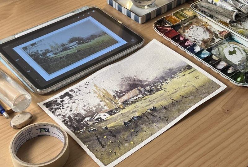
8. Adding Shadow and Contrast: Let's continue painting
the cast shadows to build contrast and further
develop the painting. We'll start with
the cast shadows around the trees and barns. I first check if the
paper is already dry. When painting shadows,
the surface needs to be dry so we can create
clean defined strokes. I mix a cool grayish green and begin with a
shadow under the tree. I connect it to the base, so it reads as one
continuous shape. I do the same as I
paint a cast shadow under the barn using a
smooth horizontal stroke. I also keep the
mixture transparent so the underpainting
can still show through. Then I slightly
deepen the shadows in the foreground to sharpen the
contrast around the house. Now, let's paint the
shadowed walls of the barns. I take this step slowly
because it's very important. We define the structure of the barn by painting
its shadows. One helpful tip is to
squint from time to time. This allows you to
see the shadow as one big shape instead
of separate shapes. We're not painting objects, we're painting shadow shapes. This shift in thinking helps train us to paint
more effectively. I also leave a few small gaps unpainted to preserve light. Notice that I use the
same color mixture for all the shadows in the focal area so
everything feels unified. Next, let's paint the trees in the middle using
dry brush strokes. Make sure to remove
excess water from your brush to achieve that
rough textured defect, and try not to go over
the same area too many times so you don't
lose the light or covered unpainted spaces. I continue building the
shadows and cast shadows. As I mix, I make sure my grays stay on the cooler side
by adding more blue. The process remains the same. The key is maintaining
the right consistency. We want the mixture
to be cool and dark but still
transparent and fluid. This helps create
an atmospheric feel rather than something
heavy or dull. Now, let's focus
on the roof area. This part is very important
because we need a crisp, sharp edge to define
the shape and make it stand out against
the softer background. Next, I paint the
shadow underneath the roof with a single
horizontal stroke. I keep the value consistent
with the other shadows. We're almost done
adding shadows. I add a few more cast shadows on the right side of the meadow
using small dabs of paint. This may look random, but they are placed
intentionally. Make sure to leave small gaps of light by preserving
patches of green. Now, let's finish the
shadows on the left side. I'm simply repeating
the same process, squinting and observing
where the shadows are placed and then translating
that into the painting. As we do this master study, it's important to notice
how Joseph paints light. He doesn't paint
the light directly. He paints the shadows
around it. This is the key. We emphasize light by strengthening the
shadows around it. Now I slightly
adjust the tone of the roof by glazing a very
light layer of paint. I also add a few strokes of burncenna between the trees
to separate them slightly. While the air is still moist, I add some fine lines on the roof for detail
using burncenna. To finish this section, I add a fewer darker
accents where needed. I squint and compare
my painting with a reference to check if any
values need adjustment. Finally, I add the small
windows and their shadows.
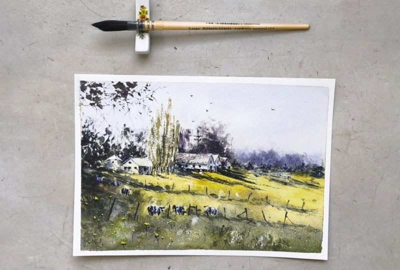
9. Adding Final Details: So now we're down to adding the final details like the roof, the cows, and enhancing the
foreground with flowers. I repaint the line details of the roof since the
initial layer has faded. I gently soften the strokes with my fingers so they don't
look too dark or harsh. Next, I darken the
shadow underneath. These adjustments are
only done when necessary, so it's always good to compare your work with the master
painting as you go. Now, let's start
painting the cows. Again, we're not painting
objects, we're painting shapes. I begin by placing
the darker spots, then I add a soft
lavender tone to suggest the shadowed white
parts of the cows' bodies. As I do this, I'm
shaping the silhouette. Even though we're not
painting them realistically, these simple marks are enough to create an impression of cows. As I observe how
Joseph painted them, I can see how intentional
each mark is. The addition of opaque
white highlights really brings the cows to life. It's such a simple but
powerful approach. I continue adding
small dots of paint near the horizon to suggest
cows in the distance, and it's amazing how
just a few marks can communicate so
much to the viewer. Then I add a few more
touches of white paint on the cows in the foreground to make them stand out even more. Next, I add small
highlights on the barns. I place them loosely, mostly within the shadow areas, but I'm careful
not to overdo it. Now I'm using a thick
mix of lemon yellow. I add dots in the foreground
to paint the wildflowers. H. I scatter them in a natural way, avoiding symmetry and
I vary the sizes. It's beautiful how
the simple touches bring a sense of life
into the painting. Then I paint a wooden post
using a dark brown mixture. I use a creamy consistency to achieve a slightly
dry brush effect. H After that, I paint the case shadows of the post using the same shadow
mixture we used earlier. I also add few more details in the lighted part
of the meadow, making sure to
include cast shadows so the elements don't feel
like they're floating. I darken some of the pose in the foreground where needed to strengthen the
overall contrast. Lastly, I paint the tiny stems of the flowers using
a dark green mix. I use light, swift strokes and very gentle pressure
to keep them delicate. Then with a liner brush
and a pale gray mix, I add a few tiny
birds in the sky. Be careful not to
make them too big. And that's it. Our
painting is now complete. I hope you learned so
much from observing and studying the work of
Joseph's book which I did.
10. Final Thoughts: Thank you for joining me today
for this watercolor class. I hope this session helped you reconnect with your creativity and reminded you
that painting can be simple, freeing and fun. I hope you enjoyed
painting this with me, and I hope it helps you better understand how
to work with light, shadow, and color in watercolor. I'd love to see your creations and hear about your experience. Share your sketchbook pages
with me on Instagram or in the class project
section here on Skillshare. Let me know which subject
you enjoy the most or how this practice helps
park your creative flow. If you enjoy the class, please consider
leaving a review. Your feedback means a lot to me. It helps me improve
my future classes and truly encourages me to keep
making more content for you. If you want to keep
going with your journey, I invite you to check out my other watercolor
sketchbook classes or try my watercolor travel
class where we paint scenes inspired by real
places and memories. They are a great way to stay inspired and keep that
creative momentum going. Until then, keep
painting with freedom, follow your curiosity, and I'll see you in the next class.
 Bianca Rayala, Top Teacher | Watercolor Artist