Transcripts
1. About The Class: Are you looking for a class that
helps you bring out the fearless artist in you? Join and explore the
world of human figures and learn to paint them
the heart-led way. I'm Bianca Rayala, a watercolor artist and
educator from the Philippines. I love watercolors and I'm so passionate about sharing
my love for arts. My goal has always
been to inspire people to pursue their
creative passion and purpose. My watercolor journey
started last 2017 and I used to love painting
florals and landscapes. Painting people was never on my list as it was
so intimidating, but when I saw the joy of capturing special moments
through painting, I took the courage to
try and you know what, it was truly a liberating
experience for me. Since then, fear started
to fade away and I developed a deep love
for capturing character, personality, and emotions
through watercolor. In this class, I'll
help you overcome your fear of
portraying people and show you how to turn
simple sketches to a creative and expressive
watercolor work. You will learn how
to incorporate the head knowledge
that you have about watercolor into a painting style where the heart freely
leads the hand. I will take you
on a step-by-step journey to painting an
expressive human figure, so that by the end of the class, you will be able to not just overcome your fear
of painting people, but also enjoy the process of
painting the heart-led way. Are you ready to dive in. I'll see you in
the first lesson.
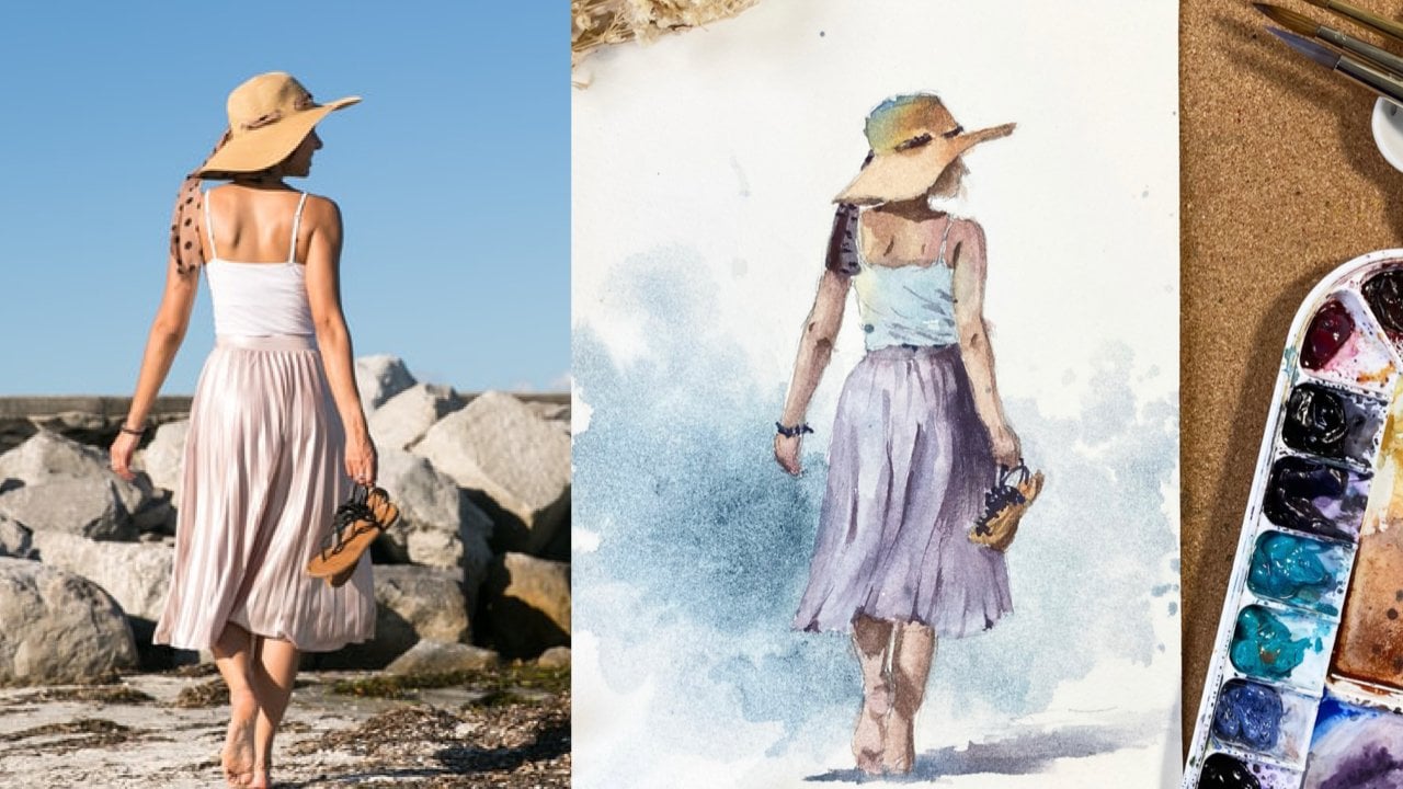
2. Overview: Heart-Led Painting Style: Welcome to class. First off, I've
provided a copy of the reference photo,
pencil sketch, and final painting in the resource section found in the project and
resources tab. I encourage you
to save a copy of the reference photo for you to have a better
learning experience. You may also choose to
prepare your own sketch based on the reference
photo or simply use or trace the template that
I provided if you'd like to focus more on learning
the painting process. To give you an overview
of the process, I start with painting
the first wash. This step is where I
build color connection and initially set up the
tonal values of the picture. The next step will be enhancing
the contrast and shadows, and we finish off by adding
details and highlights. The painting process is
simple and straightforward. But what makes it extra
fun and exciting is the element of painting
as our heart leads. I want you to paint with a watercolor techniques
and principles in mind, but the heart leading
the rhythm of the hand. It is ideally a teamwork
between the head, the heart, and the hands. Yes, it is very
important to fully understand the mind
of watercolor so we can anticipate what will happen despite the
unpredictability of water. But it also takes faith to create a free flowing painting. It is faith that gives us that sense of
excitement or carry on, even on stages that our
artworks felt like a mess. It is faith that enables us to put everything you know about watercolors into
practice without being limited by the fear
of making mistakes. As you take this class, I want you to have
one goal in mind and that is to set aside every fear of committing mistake
and just enjoy the entire time you're
spending creating. The more you're relaxed and
embrace the joy of painting, the more surrendered you'll be in painting as your heart leads. I'm sure you're more than
ready now to start painting. I'll see you on the next video.
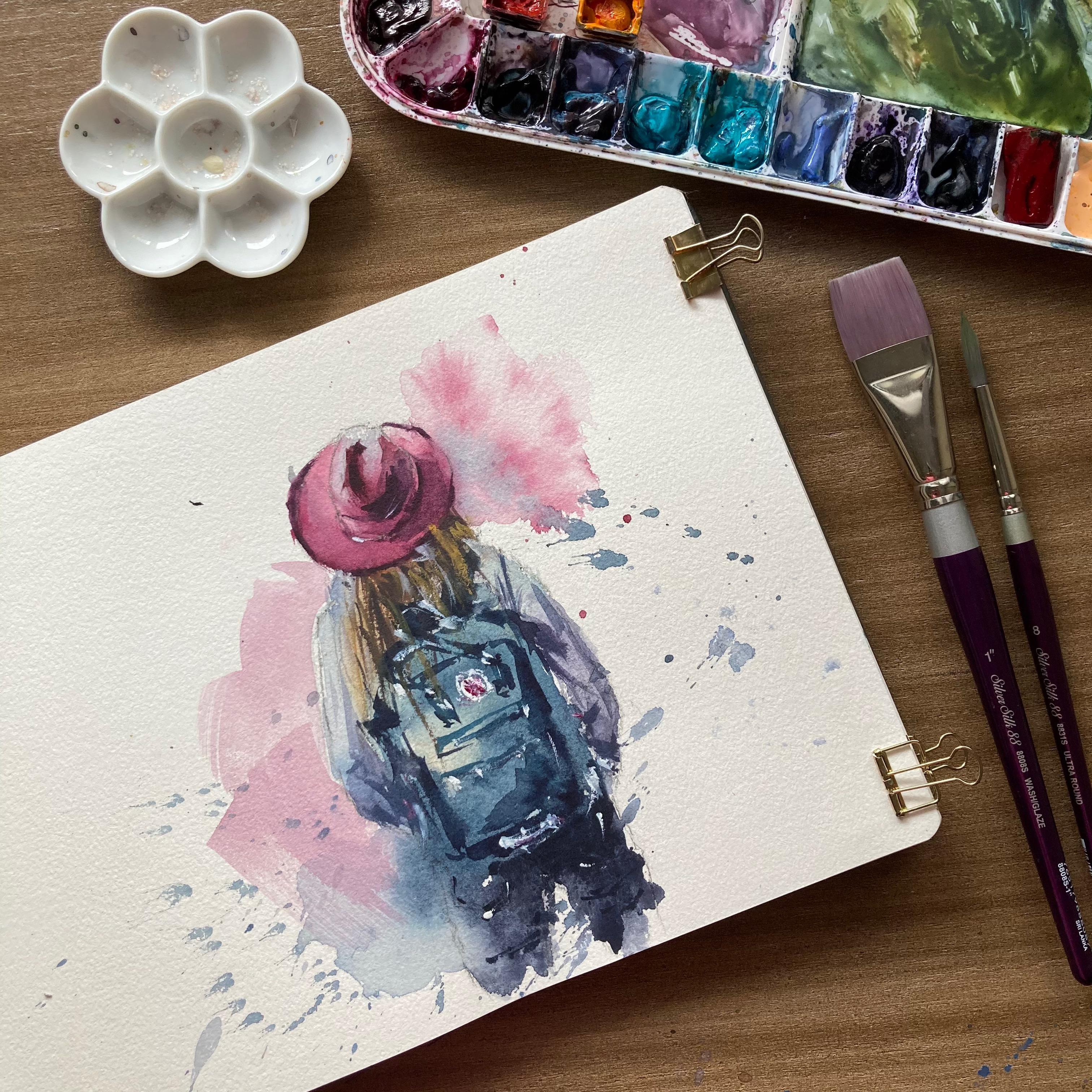
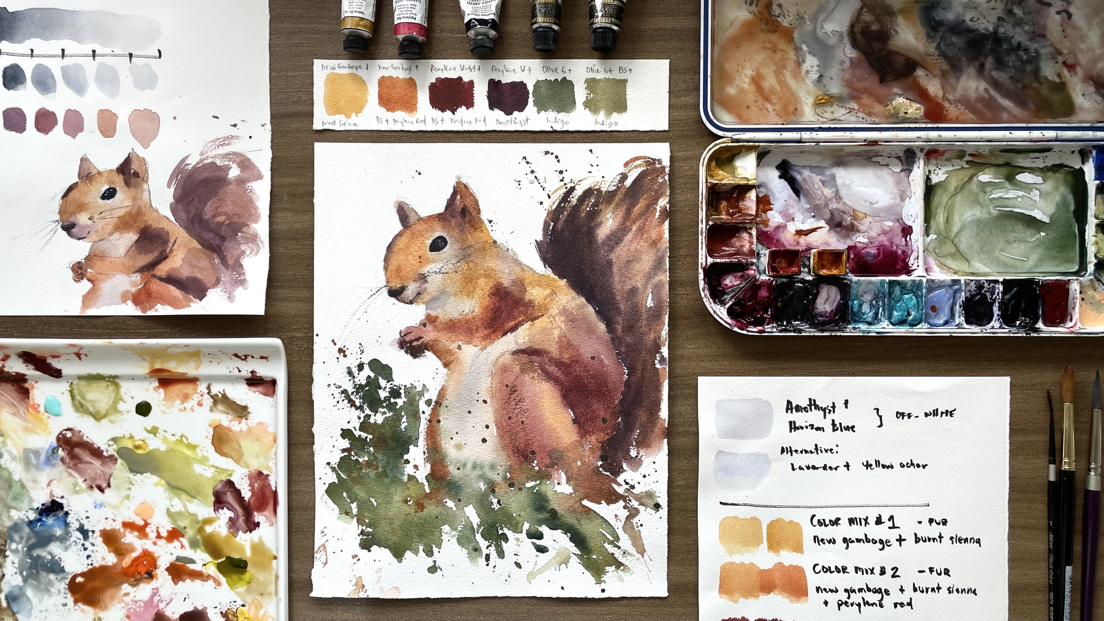
3. Materials: Now let's prepare all the materials that we'll
be needing in this project. I will be using
just a handful of materials for this class. First is watercolor paper. I prefer working on 100 percent
cotton paper because it absorbs good amount of water and it doesn't
get dry immediately, giving me more time to work. For the paints, feel free to use any watercolor
set that you have at home. I still use my main palette, which I use for
most of my classes. There are no particular colors that I would require you to use. For the brushes, I use Silver Brush
Renaissance brush, which is made of
pure sable hair, Silver Silk 88 synthetic round
brush and the flat brush. I used the natural hair
brush mainly for washes, splatters, and building
color connection on the first layer. The synthetic brush on the
other hand is the one I use for adding details
and highlights. In this synthetic
flat brush is used for special dry brush effects. Don't forget to prepare
two cups of water, tissue paper,
pencil, and eraser. That's it. Let's start
painting on the next video.
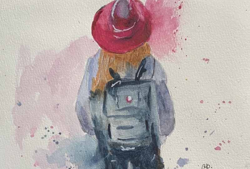
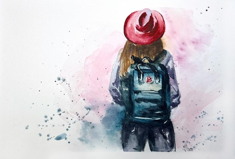
4. First Wash- Color Connection: [MUSIC] If you've seen my other classes on human
figures here on Skillshare, you would know that
they always start painting from top to bottom. I will do the same thing, starting from the hat
down to the hair, clothes, backpack, and pants. One principle I want you
to bear in mind as we do the first wash is
color connection. Color connection is painting
the picture as a whole, rather than part by part. It is creating continuity
and smooth flow of colors within
the entire figure. Starting from her hat, I prepare a pretty
pink color using Perylene Violet and
Quinacridone Rose. Observe the tonal values of the hat based on the
reference photo, so you could identify
which part has light tones and which
part has dark tones. Doing this would give
the hat dimension and keep it from looking flat. [MUSIC] Observe that there are parts
of the hat that I paint with light wash of the
same pink color and some parts with a
slightly saturated color. Now, I paint the top
part of the hat, which has a reflected light on, with a mix of horizon blue
and amethyst genuine. [MUSIC] While this layer is still moist, I will blend in a creamy
mix of pink to paint the dark tones on the
crease of the hat. If you are using a
natural hair brush, since this kind of
brush holds much water, it is important for
you to understand the level of wetness
of both paper and brush to be able to create soft yet defined strokes
like what I'm doing. Sometimes, you need to remove the excess water from
your brush or learn the appropriate dampness
of the paper in order to have this soft
yet controlled strokes. It takes a lot of practice
to understand this, but I'm sure you'll be able to get it if you won't give up. [MUSIC] I'm darkening some parts since watercolor tend to
fade as it dries. [MUSIC] Now, I got a bigger natural hair brush
and load it with lots of water and a little pigment to it in order to create
a special effect. I let the pink pigment
from the hat to naturally flow and bleed to the wet
surface that I created, and I also splatter some paint
to create a loose effect. Don't get limited by what I do. Feel free to do what
your heart leads. Next, I transition to
painting the hair. I paint first the
reflected light on her hair using my light
blue and violet mix. [MUSIC] Then I transition to
a blonde hair color using Yellow Ocher with
a bit of [inaudible]. Since I paint the
yellow portion of the hair while the blue
one is still moist, I didn't create any hard edges
between the two color mix. Using amethysts genuine
and horizon blue, I paint the visible
portions of her blouse. I increase the ratio of the color and the
amount of water in my mix depending on the
intensity of color that I want. I make my mix watery to paint the parts of her sleeves
that are lighted by the sun, while I create a saturated
and creamy mix to paint the parts of her
sleeves that are in shadow. [MUSIC] As I paint the left sleeve, I do the same process of
observing the tonal value in the reference photo and
copying it to my work. I also do some splatters
when I feel like doing it. Again, I want you to
keep in mind that you have to follow as
your heart leads. There are no rules on where to place splatters and
special effects. It is always up to you. I usually use my
natural hairbrush to make fluids splashes
and splatters. I load my brush
with a watery mix of pigment and splatter
without hesitation. Remember that fear and doubt are the most obvious
mistakes in watercolor. You must learn to trust
yourself in order to overcome this common weakness and
splatter with full confidence. Now, let's mix the
colors for the backpack. I use indigo, lunar blue, and some horizon blue to paint
this top part of the bag. I add some more indigo to paint the parts with darker tones. [MUSIC] As I continue painting the bag, I make bold strokes
for dark areas, then spread the color to
paint the light areas. You can see me
moving a little too fast while doing
this process because I'm trying to avoid having unnecessary hard
edges on my work. I get a thick mix of indigo and paint over those dark areas. Since the layer is still moist, the amount of water
in my brush as I paint those indigo
strokes should be very controlled to
avoid creating blooms. At this stage, the image
usually looks odd. But remember what I shared
in the previous lesson; have faith and
trust the process. Don't quit, and keep going. Take a few moments to
evaluate your work and see which areas
you need to adjust. In my case, I feel
adding more splatters, so I decided to add some more. I notice also the tiny part left unpainted on the lower
left corner of the bag. Now, I feel that creating
some color bleeds on this side would make a good
and balanced composition, so I grab my big brush
to make color bleeds. [MUSIC] Now, let's paint her pants using Payne's gray and
amethyst genuine. I make sure my mix has a distinct dark shade
and differs with the color of the bag
so they won't look like a one piece of object. I lighten the areas
that are lightened by the sun and darken those
that are in shadow. This concludes the first wash. I'll let this layer
dry for a while, and then I will proceed on the second stage
of our painting, which is painting the shadows, details, and contrast. See you on the next video. [MUSIC]
5. Adding Shadow, Contrast and Details: On this stage, we
will be enhancing the shadow and contrast
to define our painting. If you find blooms or bleeds
in your initial work, it is completely okay. Consider it as a natural beauty and unique special
effect of watercolor. I am now shifting to
synthetic brush since I want to create defined
and controlled strokes. I start again with the hat. I get a thick mix of pink color and paint the shadowed
parts on top of the hat. This is to show the dents
and crease on the crown. I just try to copy the
shadows that I see on the reference photo so
I can create dimension. I soften the stroke
using the same brush, but I clean it first and
wipe off the excess water. I add Amethyst Genuine to my pink mix to get a
deeper and darker color for the spots that should have the darkest tone like
the cast shadow. I paint the cast
shadow on the brim of the hat with a dark
mix and notice that I left a small unpainted part on the band to separate the
brim from the crown. This part is really
crucial because we don't want to lose the
reflected light on the crown of the hat and at the same time
we want to create the impressions of creases
and dents on the top. Using some suggestive lines, I partially outline the brim of the hat to define the shape. Next, let's proceed
on defining the hair. For the hair, I
usually define it using dry brush strokes. I create a very thick mixture of yellow ocher, burnt sienna, and a little bit of
Horizon Blue and Amethyst Genuine to get a
darker hue for the hair. Make sure that your
brush doesn't have too much water in it for
you to achieve dry strokes. Next, let's define the backpack starting
from the straps. Notice that my mix for
this step is creamy, so the strokes would
really stand out. I am slowly building
the details and form of the backpack by
painting the handle and folds. To simplify the process, I look at the dark spots on the reference photo and paint
them the way I see them. You don't need to be too particular on the
specific parts. Since the bottom part of
the backpack is still wet, I will skip on painting
it for a while and paint first
the right sleeve. Using a darker mix of purple, I paint the folds and
shadows on the sleeve. Be careful not to put too many strokes so it won't
get too much attention. Let's go back to
painting the backpack. Again, focus on the
dominant shapes and dark spots that you see
on the reference and build the overall look of the bag using few
suggestive strokes. If you'll notice, I just do
some random strokes to show the design of the bag without
going into too much detail. Now we need to
separate the side of the backpack from
the left sleeve. We do this by adding
contrast so they won't look like one
piece of object. For the pants, I get the
battery mix of paints gray to paint some subtle details of
the back pockets in folds. Don't be afraid to
use dark tones, especially on areas that
really needs to be dark. I retouched the hair some
more using a few dry strokes. Then let's show the light
coming from the left by putting contrast on the
left side of our figure. Using a flat synthetic brush, I fill it with a thin mix of my leftover pigment and paint the negative space from the left
shoulder going down. I do this stroke on the
swift motion and again, the key is to do it without
hesitation in one go. I enhance the contrast
between the arms and the backpack by adding
some more dark strokes. The same thing I'll
do with the hat. I will add darker tones and suggestive strokes to
make it more voluminous. I adjust the tonal value
of the brim and since it already has the same tonal
value with the cast shadow, I need to darken the
cast shadow a little bit more to make it extra visible. We're almost done
with the painting. Let's just add some
final touches and highlights using a very
thick mix of paint. Just be careful on
doing this step so you wont overdo and put
too much accents. The last step, I take an opaque white
paint to add some accents. I take small amount of paint
straight from the tube, so my paint is really
thick and opaque. There's actually no rules on
where to place highlights. Just let your heart dictate
the movement of your hand. This is our final painting. I hope this inspired
you to set aside fear and let your heart
and hands flow together. See you in our final video for the key learnings
from this class.
6. Key Learnings and Class Project: I'm so happy you
made it this far. I hope you enjoyed the
entire painting process. In this class
helped you practice the wonderful teamwork
between the head, heart, and hand. Let's quickly summarize
the important points in painting the heart midway. Again, we paint the human
figure in two steps. First is the base wash, where we set up the tonal values and build color connection. During this stage, your
work may look awful, but I encourage you to trust the process
and keep the faith, everything will be better
after the second phase. The second phase is where
we enhance contrast and shadows to build the dimension
and define the painting. It is important to refer
to your reference photo, but be careful not to be focused on copying every
detail you've seen. Remember that it is
completely normal if you don't get it right
during your first try, don't be discouraged,
but I really encourage you to keep on trying. As you repeat the process, you will learn something
new about your paint, your paper, and brush, so you don't actually waste
your time and energy, you gain precious learning
from your experience, everything can be
learned through constant study and practice. I encourage you to take my two
other human figure classes here on Skillshare to further explore this style of painting. For our class project, paint the same
human figure that I did in my demo and please share your final work with me by uploading it on the project
section of this class. If you find my class helpful, I would greatly appreciate receiving a review
from you as well. I upload new classes
almost every week. So don't forget to
follow me here and on Instagram so you know when
I have new classes for you. Feel free to suggest
a topic that you'd like to learn from me too. Thank you again for
being with me here, and I'll see you on
my other classes.
 Bianca Rayala, Top Teacher | Watercolor Artist