Transcripts
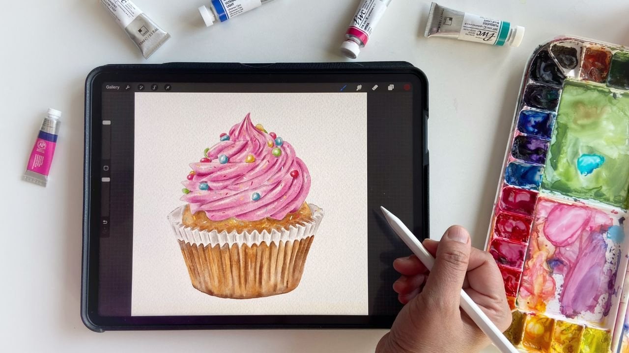
1. Intro: There is something really magical about painting on paper. The creamy and smooth texture of Gouache makes it so special and unique from other mediums. With gouache, you can experience the super smooth watercolor strokes to a very thick acrylic texture. Hi, my name is Disha. I am an artist and illustrator currently living in Dallas. I normally work with watercolors and started exploring gouache about a year ago. Initially, I found it really tricky to work with gouache because of many reasons. But with time, and practice I think now I have found my own style to work with this medium. I can completely understand the struggle a beginner can face with gouache, which encouraged me to create this class in which we'll just work with the basic techniques of gouache- Wet on Dry and Layering and create some fun and cute illustrations. Gouache is a water-based medium made with natural pigments, water and a binding agent, and sometimes chalk to increase the opacity of the pigment. In this class, we'll explore this creamy, and opaque medium and create some fun and simple illustrations. This class is for absolute beginners who want to understand this medium and explore its full potential. And if you already have some experience with gouache, you are still most welcome to join us and create some fun illustrations with us. We'll take inspiration from our everyday life objects like from our kitchen, from plants around us or even internet, Do not limit yourself to bring ideas on your table and get creative. So grab what do you want to paint and get started. I have also provided some of the images and sketches for your reference in the Resources tab. So feel free to use those images and sketches and paint them for the project of this class. See you in the class.
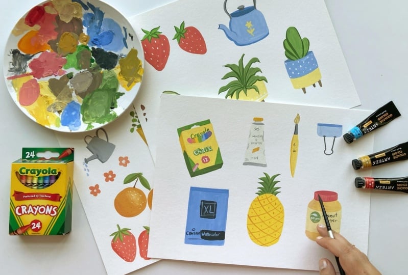
2. Supplies: In this lesson, we'll talk about the supplies that we need for this class. The first apply is the Gouache paints. I'm going to use my all-time favorite gouache from Arteza. These paints are really good in quality yet very affordable. You can use any brand that you have. Winsor Newton is another very popular brand among gouache artists. So just use whatever you like. Next supply that we need are brushes. For gouache painting, I always recommend using small to mid-size brushes, large end soft watercolor brushes like this one is not an ideal choice for using gouache because the technique and the thickness of the gouache paint is quite different from watercolors the pressures that we need for gouache paints should not be very soft or very stiff. I normally use this round six brush which is not very soft. And this is the largest size that I use for my gouache paintings. And other brushes that I normally use is this round size five brush, a liner brush for long and thin strokes. Then I also use a flat brush for flat backgrounds and larger areas. And sometimes I also use a size one round brush for details. After brushes, we need some paper. So my go to paper for all gouache painting is always Canson XL. I really love this paper because of many reasons. Like it is very thick and it can take a good amount of water. The texture of this paper is very smooth as compared to normal cold pressed paper. It is 300 GSM. And the most important thing is it is very affordable. Gouache paints can also be used on black paper like this one. Dark surfaces like cardboards, craft paper, and even on wood. Then we need two jars of water, One jar for rinsing the paints from the brushes and the other jar for rinsing the clean brush. By using two jars, we don't have to worry about changing water at frequent intervals. One tip I want to give here is when we rinse the used brush in water, we need to swirl the brush for a long time in the water in order to get rid of the paint completely, this may end up in making the brush really wet, like you can see on the screen. So if you just rinse the brush like I do, you'll end up dropping these drops on your paper or painting, which can actually ruin the painting. So the best way to avoid that is by dabbing the brush properly in paper towel or cloth and dry completely before you start painting again. I hope this tip helps :) Next important supply is a palette to mix paints. I prefer to use a ceramic palette or any open palette. I really don't recommend using airtight palette like this one for gouache paints. The reason is once the paint is dried and when you try to use it again by adding water, gouache paints do not behave exactly how they do when they are used fresh from the tubes. They lose their creamy texture and you'll need to add more water than usual, which will make them more transparent. That is why I don't recommend using an airtight palette or pans for gouache paints like we use for watercolors. Next supply that we need is some sort of towel, or paper towel or a cotton towel. I prefer using a regular cotton towel like this one which I can wash and use again, instead of wasting paper. And we need a pencil for sketching an eraser and some loose sheets of paper for planning our sketches.
3. Gouache Basics: Gouache paints are also known as opaque watercolors because they can behave just like watercolors when added more water to them. They are made of same ingredients with the difference of the size of pigment particles. And some paints also have some chalk or white medium mix to make them look more opaque and pastel. On the other hand, gouache is also compared with acrylic paint because of their opaque nature. Well, they are quite different mediums from one another because their formula is not same. Gouache can be reactivated with water, while acrylics cannot be. So in my opinion, gouache is a medium which stands somewhere between watercolors and acrylic paints. And yet it has its own unique properties which cannot be achieved by any of the mediums. Now let's take up some gouache paints and get to know them more in detail. Just before I start, I want to mention one thing here that I'm covering a very first and basic technique of gouache painting. While gouache can be used in many ways and with many techniques. But since this class is a foundational one for beginners, where we'll be taking simple steps to get more comfortable with the medium in this class. First thing that every beginner struggles with is water and paint ratio. We all know gouache is an opaque medium and it gives the best results when it is used with its full capacity. Some artists like to use it as watercolors too. So it's completely up to you how you want to use them. I always use fresh gouache from the tube. Now, I have this orange paint in my palette. I will show you how gouache behaves with different water ratios. Let's just use it in a very thick consistency by not adding enough water. You can see how dry and streaky the strokes are coming off on the paper. This technique is good for building up textures in your painting. Then if I add some water to the paint, it becomes very smooth and creamy and still it will not lose its opacity. This is the consistency I love to paint with gouache. The paint flows nicely on paper with the brush without leaving any streaks and rough texture. And yet it is very opaque. You can see how my brushes moving smoothly on paper. Once you start playing with different consistency of gouache and water, it will get much easier for you to understand the right consistency for your work. Next, if I add more water to the paint, it behaves almost like watercolors. It becomes transparent and you can see the difference right on the paper. So it's completely okay to use more water like this. This is completely a personal choice, so feel free to decide how you want to use the gouache paints. For the projects in this class, we will be focusing more on the second consistency level than others. And the second technique that we will be using in this class is layering. Due to the opaque nature of gouache, it can be layered easily, Light colors can be layered on top of dark colors. And this is the reason we can also fix our mistakes in gouache, which makes it a very forgiving medium. So when you are using layering technique, just make sure that the lower layer is completely dry before you put the second layer. And the paint for the second layer is not very watery. Because if you use more water in the second layer, there are high chances that the lower layer will get activated again and it will ruin your painting. So for example, here I will take some white paint to add on top of this orange color. I am not adding a lot of water to the white paint, at least keeping it less than what I used for the orange paint so that it doesn't become very dilute. And here you can see how easily we can see the white on top of orange. This is what we cannot achieve with watercolors at all. Now we have practiced the water and paint ratio and layering technique. Let's jump over to our next lesson.
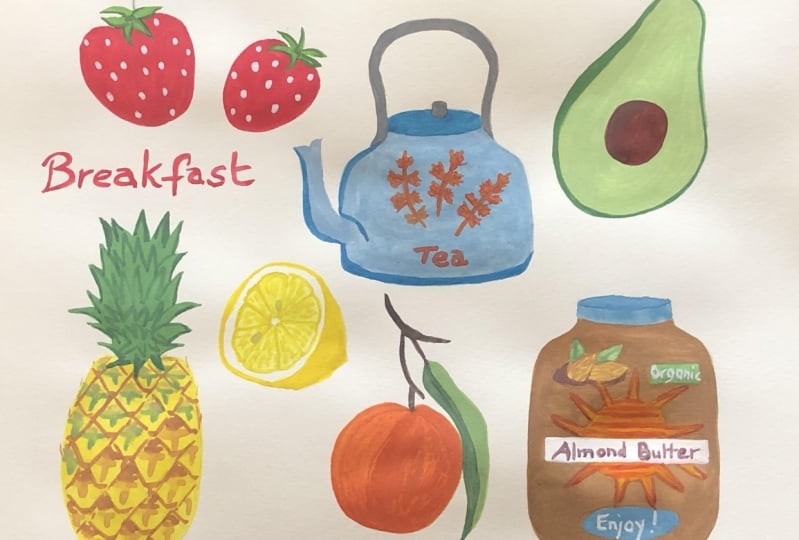
4. Inspiration & Sketching: Now we are ready with our supplies and have a good idea about the basics of gouache. Let's plan some illustrations. There are so many ways to get inspired from everyday items around us. Nature is of course, the first thing that comes to our mind. But today lets do something different. Let's find some inspiration from our stuff that we use on everyday basis, like food, fruit, dishes, cosmetics, grocery, and even some kids supplies. Another way to find inspiration is looking on the Internet. I usually go to Pinterest for wonderful ideas I have a board on my Pinterest called Elements of illustration. Here I have saved many simple cute illustrations that are made inspired from everyday objects. And other wonderful source of inspiration is Unsplash.com, where you can find thousands of royalty-free images on any topic. So let's find some strawberry images. As I mentioned earlier, we will make the process as simple as we can. So I am going to make a very simple and minimal sketch of strawberries. We're not focusing on realism at all in this class. Strawberry, just making a triangular shape with round corners. Then some leaves on top. And then adding some dots for the seeds. I think I'll draw two Strawberries just to add some interest. Then I really loved painting kettles. So let's look for a kettle. We didn't want to copy anything. So just getting an idea of the shape and outline that's it. I think the shape of the kettle is a little bit off right now, but we can always fix it because this is just our rough idea. And we are going to make our final sketch on watercolor paper anyways. And if you just want to start on the watercolor paper with the sketching, if you're comfortable enough, you're most welcome to do that. It's not necessary to go with the loose sketching and practicing the sketching part. You can always go ahead and start your sketches on your watercolor paper. Another thing that I really love to paint are plants. For that I'll go to my plants inspiration board on Pinterest for some cute plant ideas. And just remember we are not going to copy anything. We're just taking ideas, here. And if you want to get some more ideas, you are most welcome to go and check out this board. I provided all the links to the inspiration boards and website in the description of the class. So let's make two potted plants for our project. I am just trying to make a cute and short tiny pot, with some leafy plant. I'm really sorry, I don't know the name of the plant, but I really like how it looks. Then adding the legs. These pots look so cute. I must say the plants bring so much life in any space. I see so many creatives have their studios full of plants. I really wish to have some in mine someday maybe :). Now add in the leaves of the plant. I am just making the very random line, random shapes of the leaves. Not worrying too much about details because we're not focusing on the details at all. The second I'm making is a taller one than the first one. This will give us more freedom to add some designs on it when we paint. Adding the legs like we did before. Maybe we'll divide this pot in two colors and add some designs. When we are done with the base layer. Some polka dots, or maybe we can decide later. And I think for the plant, I'll draw something like a cactus- like this. Yeah, I think it looks good now. So let's go to our next illustration. I always love to paint avocados with gouache paint. So we'll make one avocado. Avocado is quite simple to draw. It's like an egg. Or the shape of an egg with quite narrow top. And the lower portion of the avocado has to be very round and quite large as compared to the top and a seed. We're making a cut avocado here. For the next illustration, I picked this pack of chalks from my son's school supplies. And I found it quite interesting because I think adding some stationary stuff to our spread will make it more interesting. So just making a simple rectangle first and then I will add some dimension. Now in such illustrations, you can simply make a simple rectangle and give it a 2D look instead of adding any dimensions. So it's up to you as you like, just keep your process as simple as you want to are as complicated as you would like to. I'm going to add some text like chalk or number of chalks. And you should always feel free to add your own ideas to modify the design and even color choices of the illustration. So for this one, I could have removed this top portion, but I think I'll keep it. And if I find it difficult to paint, maybe I'll skip it when I'm painting. And then I will take this tube of paint as reference. I've seen many cute paint tube illustrations and magazines and even on some websites. But I never tried to paint them. So I think it's a good time to do that now. Adding some text and some tiny details. That's it. And now I'm just looking for more stuff that I can paint. Let's just look at some brushes. I think this brush is looking nice. It's so much fun to paint stationery items. I think this is the first time I'm drawing stationery items on paper. Yeah, I don't remember doing it before any time. And it's really fun because you can always make tweaks to the shapes and colors and make them more bold, if you like. Now I just grabbed this clip. Let's try this one. The shape of this clip seems a bit confusing to me for a simplistic style. But we'll see later, maybe we'll change it later or even not include in our final project. Let's see how it goes. And then I think sketchbook can be a good idea too, as we're making so many art supplies here. So why not a sketchbook? Just drawing a rectangle. And then we'll add some information. Making the spirals on top. You can add any kind of information that you want to show or you can just make it very simple, blank sketch book cover. This is going to be a very simple one. For now I'm just taking the reference from the Arteza black sketchbook. Black color is not what I want to paint with. But we'll see later when we start painting. I think that's it. I think we have drawn many stationery items. Let's have a look at all the illustrations. And I think we can still add some more food illustrations. So I'll go back to Pinterest and look for some fruit. I think a pineapple can also make a great addition to our spread. Pineapple usually is not a very easy subject if you want to make it realistic. But in simple flat style, I think it's gonna be so easy and fun. So we'll start with the pineapple shape, just making an oval shape for the body. Then adding some leaves on the top. And we can add some diagonal lines and dots for the details when we paint. And for the last illustration, my son came and he said that just paint the peanut butter jar. So let's make one. I have provided all the sketches in the Resources tab for you if you want to use the sketches for your project. But do feel free to use any objects that you like in your home for your illustrations for the project of this class. The shape of the jar looks a little off. I know, but it's fine because this is just a rough sketch. We can always make the corrections when we start painting. Alright, so I think we have made a good number of objects to paint. Now it's time to have real fun. Let's jump over to our next lesson and start painting.
5. Strawberries and Kettle Part1: Okay, so now we have decided our elements. Let's start with the painting. First, I'll start with the strawberries. Just going to make the sketch just like I did in the sketching video. You can be very loose with your sketches and you can also trace your sketches on the watercolor paper. In future lessons. I will also show you how you can trace your sketches on watercolor paper if you don't have a light box. Now the first sketch is ready, let's start with the paints. For this illustration, let's take some peach and red and mix them. And we'll see what shade we get. Mixing colors and in gouache can be really tricky sometimes because in most cases, gouache paints are made of more than one pigment. If you're using the pre-made shades like I'm using right now. So there are very high chances of getting muddy colors if you don't pay attention to the pigments used in paint, color mixing in itself can be a full class for gouache, it takes time, but it's real fun. So the best way to reach the right consistency for gouache is to see if your paint is easy to mix on palette , has a very creamy consistency and you are still not able to see the palette under the paint. That means that your water to paint ratio is absolutely right. I think I'll add some more red to this mixture. Let's see. It takes a little hit and trial initially when you are just starting out with mixing the colors. So finally, taking up time and doing some practice, color practice is really helpful for the gouache. Now the shade is looking much better than before. So I'll start with the painting. It's always a good idea to swatch your paints on a scrap piece of paper if you are not very comfortable with the shades and we want to just get more confident with your shades. So it's fine. But I'm not doing it here and I'm not swatching the colors at all because I just wanted to, you know, enjoy the process. And this class is not meant for perfection at all. We are just having fun and we are just playing around with the gouache, how this creamy texture of gouache works. So it's completely okay just to go with the flow. But if you want, you can always swatch your paints before you start painting. So you can see that I started with a very simple flat layer of the mixture I made on the strawberry. Now I will follow the same rules for the second strawberry. You can see that I'm simply laying down a single flat layer of to paint on my illustration. The flat and matte finish of gouache makes it more unique and interesting. And this is the reason that many graphic designers and artists love this medium more than any other. Because of their, you know, crisp edges, it's very easy to scan the gouache illustrations and then clean backgrounds as compared to watercolors. Okay, so now the first layer is done. We will let it dry for some time. And in the meanwhile, we'll start with the next element. That is our kettle. I'm going to sketch all these illustrations by hand. But if you're not comfortable with sketching. You can use the sketches that I've provided in the resources section and trace them. For the kettle I'm planning to use sky blue shade as the base. And I'll add some white in it. And I wanted to mention one important thing here is that if you want to lighten the shades in gouache paints just add some white gouache in it, unlike watercolors where we add water to lighten them. This is one another similarity of gouache sprints with acrylics, where we add white instead of adding water to lighten the shades. Just adding more water to make it easy to mix. I think the shade is looking nice and I will just remove the darker pencil marks. Because I paint with watercolors a lot, so it's a natural tendency that I don't like to have dark pencil marks on my paper, but with gouache, you can actually cover them up, cover the dark pencil marks easily. Now you can see how creamy and delicious this paint is looking on paper, I really loved the texture of gouache. So whenever I feel like I'm really bored with watercolors, or I don't feel like painting my florals with watercolors, gouache is the next medium that I hop on to when I just need a change for my illustrations. So for each illustration, basically we are going to cover the first layer with a very flat color. And after the first layer is dry, and then we will come back and add more details. And if required, we can add shadows and use different tones of colors wherever we see it as required. Alright, so the body of the kettle done, we'll just let it dry for some time. And we'll come back with the handle. I think we'll use a different color for the lid and handle when we come back. In the meanwhile, let's go to the strawberries Now they are completely dry, so we'll paint the leaves on top of the strawberries. For the leafs, I'm taking some green paint and we'll add some white to make it a little pastel. And just mix it like we did before. And you can see that I am adding water little by little because I don't want to rush to make it very dilute. I'll add a little bit of yellow to make it a little more interesting. So you can just play around with colors. If you are just new to gouache paints, I would say just take some primary colors and make their combinations, mix them, make a chart of the gouache paints. And then you can understand how you can create different colors with just three or four primary shades that you have. Using the same technique for the leaves. Laying down flat layer. And once the layer is dry and then we'll come back and add the details. Now, I let it dry and once it is dry then we'll add some dark green strokes just to give some dimension to the strawberries. Now, the kettle is completely dry. Let's paint the handle and the lid. For the lid I think we can go with a darker shade of blue. So I'm just taking the same blue with less amount of white. Here. You can see on the palette how I'm taking the blue that I've used before. Even if you don't put the dark and light shades in your illustrations, Still, it can give a different stylized feel that many artists, they just have their own style. So if you are one of those artists who just want to give a unique standard to your style. It's completely okay. I will just add a dark line in the Spout and the lower portion of the spout. And just to give it more dimension. And I think similarly I'll add dark stroke on the bottom of the kettle. We can really see the form of kettle right now. We can also add a small illustration on the kettle, which we'll see later.
6. Strawberries and Kettle Part2: And now for the handle of the kettle, I'll take the grey color, and will add some white. The reason that I use a lot of white in my colors is because I don't prefer using very saturated colors. Especially when I'm painting with gouache paints. I really like the pastel shades that we get by adding white paint in our colors. So this time I'm using my liner brush to make this thin handle. And I think I'm gonna use the same color, the grey color for the knob of the lid. Alright, so the base layer of the kettle is also done. Now, let's move on to our Strawberries until the paint on the cattle is drying. And we'll start with the seed. For the seeds, I'm taking mid yellow. I'm not sure how it's going to look, but we'll see. So just taking some medium yellow and adding a tiny bit of white to make it little soft. And let's see. It's too dry So I'm just adding a tiny bit of water. This color is not clearly coming out. And I think I added too much water. Maybe. Let's try using white and sort of adding smaller, size one. Now you can see clearly that how much white stands out on top of the strawberry as compared to the yellow shade. And I'm not really adding water to white paint at all. Now after painting the seeds, let's add some details to the leaves for that. I just took some green And I'll just add a touch of black to the green to make it little darker. And as Black is a very intense and very strong color, so you just take a very slight amount of Black. You need to be very careful with that. And just trying to make a nice shade. And making the circle in the center to give it that effect that the leaves are coming out from one center. Then making these strokes on the leaves. So the strawberries are done. So now it's time to add the final details to the kettle. And I'm just thinking of small, tiny illustration to add in the front of the kettle. So maybe we can just make a very small flower or so. I'm just going to use a very light yellow, mostly using white. And going with very loose hand, I'm going to use the smallest brush that I have. You can make anything or you can just leave it like that. You can also use polka dot as a pattern on the kettle. So just feel free to use any ideas that come to your mind at the moment and that makes the process really fun. This is kind of a doodling, I would say. I'm not really happy with the color, so maybe I'll add more white and just cover it up with the white color. White is like, it stands out more on dark colors. And it looks better than other colors, but this is like a personal choice. Like in strawberries, I like white better than the yellow shade. But it may be different for you. And now I'm just adding a touch of black to the blue paint just to add some tiny details because I just thought why not add some dark shade to the mouth of the spout and just make some finer details on the lid just to give it more interest. And so so just doing whatever comes to my mind right now, I'm not even looking at any reference image right now. And another thing that I wanted to do was just add a dark gray line in the handle as well. If you just want to give it a flat look, you don't have to use different shades. You can just go with one or maximum two shades or tones. Oh, it's looking perfect. So I'll call these illustrations complete. Now it's time to move on to our next plant illustrations and avocado.
7. Avocado and Plants: So our next illustration is the avocado. I already made a sketch of avocado on the paper. And I took some light green, adding a little bit of yellow to green, and we'll add some white as well. Going to mix the colors exactly like we did before, using some water and just making a nice mix. And then we'll bend the, I will go just leaving the circle for the C. Alright, so now this one is done while this paint is drying. And start sketching the blinds. And we'll start with the big thing. I always work on multiple illustrations at once like this, because I'm not a very patient person when it comes to wait for the paint to dry. So while one illustration is drying, I used that time to work on the other. And to be honest, I'm not a very big fan of using a hair dryer. I don't know why, but I love to work this way because this gives me the opportunity to paint more than one subject and less time, which at the end gives me more satisfaction. I'm just adding some more green to the same mixture that are used for avocado. Just to make it little darker. The shade looks good for the leaves. So we'll start with the first plant. For the first layer, all you have to do was just paint all the leaves evenly with the same Connor. And then once the paint is dry, and then we can come back and add more details and some darker strokes to give it more damage. Wash bins dry very quickly. So if you're walking on multiple illustrations like we're doing today, or you're making a very large painting, but gosh, brains. And that gives you a link to the pure brush in water at frequent intervals just to keep the paint right enough to paint smoothly on paper. So now I will leave it to dry and start painting the other plant. I'm just using the same mixture and I'm going to use the same technique, just laying flat layer of paint and the same thing that we're doing with other illustrations. So as you can see that in this class we are just following one basic rule. And that is simply just making a nice mixture of the paint, creamy mixture of the paint and laying flat layers. And this is the most basic and simplest form of painting when quash. The main purpose of making this class was to build the confidence with this medium. And once we are comfortable with, gosh, we can always explore more techniques. Okay, so we're done with the first layer of the plants. Let's come back to the avocado. So for that, I'll take some dark green shade for the skin of the avocado. And as this is a cut piece, we just made up ten line of doubt rain just to give an idea of the skin of the avocado. Just covering the outer boundaries of the piece. Now for the same, I'm taking some burnt umber and we'll make a nice mix using some red that's already in the palette. And this one looks good. So I'll just lay down the layer of this brown. Just to give it some dimension, I'm just adding a touch of dark brown on the left-hand side. Which makes it look more interesting. Alright, so the avocado is done, let pain the bots. Now, we can use any color for the part. And I think I'll go with the sky blue again, which we used in the catalog. Taking the same mixture of blue and bite, same as in the catalog. And you are free to use any colors, any color combinations that you love. You don't have to use the same colors that I'm using here. So what I'm thinking is just to make the upper section of this part as blue. And in the lower portion will add some other color. The front is done. So now using dark blue shade for the inner walls, which are visible from the front. Adding such tiny details always help in bringing out more value and interest in your illustrations. And for the second part, I just took some yellow and added some white to make it pale yellow. And we'll just make even layer of yellow on the first part. And I think I'll use the same color for the lower portion on the second part. For the small corners like we have in this illustration, you need to be very careful with your strokes. Are you can just use the smallest brush that detail brush to paint on such areas. Okay, so now it's time to actually do the plans. Let's make all dark green shade by adding some green Danube rid of black. And for this gap does looking blonde, I'm just going to add dot thin lines for the definition. This plant is not exactly at characters and honestly speaking, I don't know what plant I'm making here, but anyways, we are just adding these dark lines to make it look more defined. And just to define the separation between the leaves. Just making simple strokes. And I'm going to do the same thing with the land. Using the liner brush may gain ten dark lines on the bottom bar of every leaf. Now making go round shaped by just using the brown And this mixture of yellow and white for the legs of the ports. Starting with the first leg, I think a brushes quite large for these legs. And I'll switch the brush to my small, round one brush instead. When Gosh, printing, smaller brushes are very helpful in making details and took over smaller areas. Instead of using large size pressures. And for the legs behind, we can use some darker tone of the brown to add some more brown to that mixture and make them dark go and load. The last step is to add designs on the board. For that, I'm taking white color. I'm going to use the creamy white for making some details on the part. And I think we can use polka dot pattern on this blue colour. You can use any ideas. You can even take inspiration from the Pinterest boards and anywhere, even if you have some potted plants at your house, you can also take inspiration from there. So here I'm just going to use small dots for getting acute pattern of polka dots on this blue color. And you can see it's already looking very cute. And for the second, I think I'll make two lines and the bottom of the pot, using this same white color. You can use a dark color also, but I'll use white here. Simple lines, just like a barter. Simple. And I think we can also add some dots on top of these lines, something like this. So now we're done with our page one. Let's move on to one next illustrations.
8. Tracing Tip: In this video, I just wanted to share a tip for you on how to trace your drawing on the final paper. For the second set of illustrations, I already made all the sketches and just left though peanut butter jar to give you the demo of tracing. So we have this being inverted jar sketch on the loose sheet of paper. Now just flip it on the backside and they could dock pencil. If you have a pencil, 6B pencil, I'm using a 6B pencil so that I get very dark marks. And I'm just willing to cover the whole sketch of the peanut butter jar with these random strokes. This process is a bit messy, but it works if you don't have a light box and a tracing paper. So in that case, you can just use your Docker pencil to make such monks. And then flip the paper back and just take a very sharp pencil are even. You can also use a pen and then trace over though. Illustration on the watercolor paper. Just try to keep the paper intact on the place so that it doesn't move. And if you just want to be very sure of whether it is tracing are known, you can simply keep one hand on the paper, the other side of the pupil and check if you can see the sketch on the final paper. And here we have the final sketch. If you want to make any adjustments, you can always go ahead and use the pencil and make the adjustments.
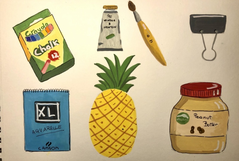
9. Crayola and Pineapple: Alright, so now we are going to paint our next set of illustrations will start with the back of chalk. And as you can see that we have very bold colors in this. I really liked the vibrant colors that I used in this package. So what I'm going to do is we can just start with laying down the background color using those yellow. And as you can see that there's a slight gradient in the yellow shade from center to the gardeners, but will not worry about that at all. We can simply make a flat layer of yellow shade. And it's also completely okay if you want to create the gradient or even if you want to change the colors of the illustration, that is completely fine. Here I'm just removing the documents inbox using my needle Eraser. This is my all-time favorite eraser while I'm painting because it can be needed and molded into any shape and size and it never leaves any dust behind it does not even damage the paper. I highly recommend this eraser for watercolor and wash artist's. Okay, so now I'm taking media Lou and I'm just mixing some white and the yellow and willing to make a nice mix and start with the yellow background off to backup chalk. Here I'm going to use the same brush, round five brush. But since there are too many elements in this illustration, you can select a smaller brush for such illustrations. So just laying down very lame flat yellow color. And for the dimension, if you look at the side, we would need some different shade or dogs or maybe lighter shade of yellow. But for now, the forced labor is going to be the same. And once the paint is dry and then we'll come back and make those adjustments. Alright, so the first layer is done. Now we can move to some other object. What I'm thinking is using the same we are lucky in that I already have in the pallet. So why not paint though pineapple first? This way we won't even raised our paint. So I'll start with the pineapple and when lay-down of every flight yellow layer, of course. And then we'll come back and add details. Now the first layer of the pineapple is also done. So we'll move back to the back of Crayola and start with the green portion of the back. Just trying to make a nice green shade. As you can see that I'm not exactly using the same shades as we see on the park. So feel free to use your own artistic license and your own style and modify the illustration. I think the brushes too big, I'll switch to my smaller RAM one brush for this one. I think I'm gonna just flip the side of the paper to make it easy. Working on low shifts like this makes it really easy. You can just move the paper around according to your own comfort. Now I'm going to be the top portion of those back. If you want, you can skip this part. It's not required at all. But I think it's going to bring some interest, so I'm just keeping it. And you can see that how easy it becomes when you work with smaller brushes and guage. Because it helps in controlling your paints and her strokes, even filling up the smaller spaces. This portion is also done. Now I think we'll move to the next part returns though, jogs which are visible in the back. So I just take these scholars in the ballot and start being thing. Okay, so the Jocks are done. Let's move to the bottom section of backward. I'll just use the dark shade of green to give it some dimension. I forgot about this joke. So just adding something to this chalk. And now there is a red blob, the front of the job back. So just making that. Now going back to the reference, we can see that we have some text over here which says jog and the number of chalks and the park. So we'll see how we can achieve that. So for the chalk text, there is a dark green background, so I'm just trying to cover that first. And then we'll come back. Once this, this layer is drive that will write it down with the white. Trying to copy the same thing, which I see on the back. But it can be simplified. You can always go ahead and simplify or designs, or even you, if you want, you can make them more complicated. That is a personal choice. So I'm just creating that bubble, kind of a shape, let's say is chalk. And once this is dried and I'll come back with the white color and right talk in a proper manner. Then I'll use the same green shape to write curl on the top. And I'm using my liner brush for writing the text, which comes in really handy while writing small alphabets with the paint. So we have added enough off our elements on the jock PRG. We'll let it dry. And in the meanwhile, we'll work on the pineapple. For definable. What I'm thinking is just adding some diagonal curved lines on both sides from left to right and right to left, and then making some dots on the top. So for that I'll just make some doc, tune of yellow. I'm just using the same shapes that I already have in the palette. And I'll add, I think, some brown, just to touch of Brown to make a darker shade of yellow. Now I'll use the liner brush to make those long curved lines crossing each other. And now I'm just going to simply add some dots using the same shade of yellow. And now I'm just taking the same green as I used in the Crayola and covering this area of the leaves of the pineapple. I don't know whether they are called leaves or what. I don't know the exact name of this. One thing I really love about painting a primate will illustration is that it structurally so amazing and symmetrical? I went, if you want, you can just pay the pineapple in so many different styles, starting from a very realistic to a very funky and of flat whimsical style. So it's always fun to create such illustrations. So I've just laid down one layer of green. Once this is dry, we'll come back and add some dark tones of green, like we did in the blacks illustration. Now moving back to the chalk pack, we need to add some text for the jog and the number of jokes. So for the text, I'm just taking white paint from the tube and not adding water at all. I'm just dipping my brush to make it little bit so that it can activate the paint. And we need very thick consistency of the PTO. So going back to that blob of junk or the bubble of drug and is going to be very careful while writing the text. Just take your time and don't rush with the details. Such tiny details actually take a long time. Okay. And then k. Now I think I'll add some dark yellow on the left-hand side, just like we did with the green portion. Alright, so we are done with this illustration. Now we'll move to our next illustrations and we'll paint this tube of paint brush and the clip in the next video.
10. Paint tube, brush and clip: Now let's start with the paint tube illustration. For that, I'm taking some gray and we'll add some white to make a nice light gray shade as the original tubers whiten color. So I just wanted to keep it close to that. But please feel free to use any color that you want to just laying down the first layer. And for the top portion, I'll use a little dark tune just to make it a little separated. And for the CAPM planning to use yellow shade, the actual deal doesn't have any color, it's just white, but I just wanted to use this illusion. I really loved this combination of light gray and yellow. Alright, so actually I took a break for about 15 minutes after this first layer. So the first layer is completely dry. So I will go ahead and start with the details. And I will take the same yellow sheet as in the cap and make this rectangular shape. I'm just taking the elements from the actual tube. And I really loved the way this tube looks. So we'll see what we can add on what we can skip. And then I think we can take some darker tone of gray to add more details and some dimensions to the two. So adding this dark tone just to give it a feel of the cream of the tube. And I think we can use the same shade for adding some dimensions. For that, we can just simply go ahead and make some rounded mounds like this on the sides of the tube. Such marks will give a field lab. The tube is already holding some paint inside. So it's completely fine if you just want to go with the very flat structure. But I really like the look of it. And next we'll start with the brush illustration. And I'm taking the same yellow color. You would see that I am using this yellow sheet a lot because the reason is I think I am really obsessed with this color and I'm really liking the color schemes, the palettes, the palate that we have created here is looking beautiful. So I just want to keep somewhere around those colors only, but feel free to use any colors or any ballots that you want to use. Just covering up the handle, being very careful. Far smaller illustrations, as I said earlier, that you should use smaller brushes. For the brush as drying will paint the clip. The clip. I'm taking the blue again and I'm trying to keep the colors similar for all the illustrations, but there's no foundation of using the similar ballot or limited colors. If you want, you can just go ahead with a limited color palette or you can use. All the colors that you have just play around with the go wash. The purpose of the class is to learn the process of painting with cosh and the simplest way. And just to mention here, if you have noticed that I have also changed the illustration of the glove because ideally was not happy with what we created in the sketching video. I've also provided a sketch of this clip for your reference if you want to use that. Now I'll take some dark green color to go back to the tube and we'll add some text. Just going to use my liner brush and make some local kind of a logo. Because when sudden Newton logo is very complicated, so I just simplified it and writing Windsor and Newton. And if you're wondering how I'm writing it upside down, the fingers, I think you cannot see on the screen, but I have already written it down with the pencil. So it's very easy to know. Cover the pencil marks where the paint, you can skip all the stuff. You can just add some logo and you don't have to write the text at all. I think I'll just go ahead and add some dark yellow vertical lines on the tube elsewhere. And that's it. We're done with the two. Now coming back to the brush and we need to color the federal branch. For that, I'm going to take a dark shade of grey because this portion is usually a metallic. So I taught using a gray shade would be a nice idea. It doesn't look metallic at all, but it will look nice. The combination of the yellow and gray is really giving a very nice and vibrant feeling. Alright, this one is done and writing six. And using the same logo that we used for the paint. It so much fun to create your own illustrations and this way, now it's time to pain though. Brush hair. So I think use Naples Yellow and just cover the brush here. Yeah, it's looking fine. When when it is dry, we can just add door three strokes with a darker Don't just to give it a field of Hamming here, which I'll show you later. Now I'm coming back to the handle of the brush. I'll add some dark stroke on the left-hand side to give it some dimension. And doing the same thing on the federal off the brush. So I'm going to use the same dark gray color for the clip handles. I'm not sure whether we call them panels or what, but whatever it is. Now, just looking at this illustration and thinking how I can add these two areas that the body of that loop is joined with these handles. So I'll keep it very simple and not really copying what I see in the clip. That doesn't have to be super realistic anyways. Then using a dark tone of blue, and I'll add one stroke on the top. Again, giving the dimension to the clip. And it's done. So before we move on to our last two illustrations, I think we can just back to our other illustrations and add the final details. So I'll start with the pineapple and take some dark green color to add the dark strokes to though binder beliefs, just making one stroke on each leaf to give it some interest. That's it. And the pineapple is done. So next I'll move to the Crayola back. And I forgot to add the number 12 on it. It's going back with the white color. And just giving some tiny dimension to the Chaco was looking quite flat. Yeah. I need to add this hair in the brush from just taking a very dark shade of yellow, almost brownish don't, and make toward three long curvy lines like this, just to make it more interesting. Okay, so we are done with the details. Now let's move to our next video in which we'll start with the last two illustrations.
11. Sketchbook and Peanut butter: Alright, so now it's time to pay down last two illustrations. And for the sketchbook, I actually changed my mind because I wasn't very comfortable with the black color. So what I'm thinking is instead of using that art is our black sketch book will use Canton axle for the reference. And for that, I'll just take some blue color and use my flight brush for this because this is a larger area. So we can just make a nice mix of blue and covered the whole sketchbook with even layer. Just making some nice even strokes covering the whole area from the sketch book. I feel the first layer and sketchbook looks a little light. So what I'm going to do is just add another layer of blue just to make it a little darker and even. And I'm adding this layer when the first layer is completely dry. So always be very careful while adding layers, because when you add a layer on top of a wet layer, there are Huygens was that the lower layer will get activated. In this case, the color is same, so it should not be a big problem, but still we need to be very careful. Now coming to the peanut butter jar, I am thinking of adding the red colored to blend. So I'm using the same read as we used in the jog illustration. I'm going to just use that for the lid of the jar. Adding some weight to the red and make it a little pinkish red. Alright, so I'm using my round five brush for the lift and just making a very even flat layer of one solid color. And once darkness dry, we'll come back to add though dimension and the details. So the LED is done, we'll let it dry. And in the meanwhile, we can move to the jar for the peanut butter. I'm taking some Naples Yellow and I'm going to add some dark yellow are yellow ochre to get a very muddy dark tone of your law, which can look like peanut butter. I think this color is looking fine, so I'll go with it. And Governor though, area above and below the label. So the peanut butter layer has done. I'll take some dark red to add on top of the lid to give it some dimension. Just making nice shape on the top. And then I'll add some vertical lines on the side of the lift. Will let it dry now. And we'll go back to the sketchbook. For that, we'll need some black color. We'll add a square in the center or to sketchbook. Simply going to make a square with this color. Just looking at your reference and adding the necessary details. You don't have to add everything. So I'm just trying to cover whatever I think is important and we'll leave the rest. Right? Canson here, writing freehand with a brush can be scary and you can practice it on a scrap piece of paper before you start writing. Or you can simply write it with a pencil first and then cover it over the paint. Ok, so we'll leave the sketchbook for now and we'll come back to the peanut butter jar. The label of the jar, I'm taking a lighter version of this, yellow. Again. You can take any color. I think I'll be okay with this one. Adding some weight on it. And just going to cover the area of the label. Now to add a little entrust to the peanut butter jar, what I'm doing is I'm taking dagger version of the same mix and going to make the shadows like this. Just like we did in our cattle and other illustrations. Now we'll let him drive for some time and we'll come back to our sketch book. And if you look at the reference, again, we need to write XL and give a blue border. So we'll take the blue again and we'll just try to excel. And then a lot more details. Let's write watercolor. Making those border. I'm really happy another's sketchbook is looking. And I think we can add some dark tone on the top just to give a feeling of edge. So I'm just going to use a darker tone of blue and made a border kind of a thing on the top only. So let's sketch for gas also done. And now we're just left with our peanut butter jar. The jar we need to act to reduce on the labels for reference. I'm just looking at this job and we can take some ideas like the circle, we can add this green circle, some texts and one or two peanuts. Maybe. We'll keep it simple. So I'll start with the green circle on the left. And now I'm mixing some browns and yellows to get a nice shade for the peanuts. I'm taking Naples Yellow and adding some yellows and browns in that email swatch it here. It looks good. So I'll just create a very random shape. And that will give an idea of, of peanut doesn't have to be very perfect. And once it is dry, we can add some lines on it, the differentiate. And now we can add some text on the top. Maybe we'll try peanut butter. For that. I'm going to take this dark gray color. If you're not very comfortable writing directly with the brush, just go ahead and first try it with a pencil and then use the brush. Alright, it looks good so far. I think we can add some more dark tone, some at some point to give it more interest and dimension. Just like this. Now, the green circle is dry, so we can add some illustration or maybe we can write organic, Something like that. I'll see what we can do. So I'm just taking some white paint and in a thick consistency because we need to write it down on a dark color so we don't want to get to be very light and transparent. So just trying to write organic. This is a scary moment for me because the size of the circle is very small. And I'm not used to write such small things with brush, but we'll try and maybe a leaf on the top. So not bad at all. I think I'll call it done now. I'm really happy that we made it so far and we actually created more than 12 illustrations in the class, which is really amazing. And it's time to talk about your project for this class in the next video.
12. Final Thoughts: Your project for this class is to create some funny illustrations using very basic techniques that we learned in the class. We created 12 illustrations in the class. And if you want, you can just use the sketches that are provided in the resources section and use those and create your own illustrations with your own color choices. And other thing that I wanted to mention is I've also provided some reference images for you guys. If you want, you can also use them. I hope you enjoyed the class and this class in some way held you in building some confidence with Gosh, I'm really excited to see your projects. Please submit your projects and the project section, and I'll be more than happy to give you feedback. See you in my next class. And
 Disha Sharma, Artist & Illustrator