Transcripts
1. Intro: I have always been inspired by the beauty and variety
of wildflowers, their colors, shapes, and the way they grow
freely in meadows. In this class, we'll capture that natural charm
in watercolor. Hi. My name is Disha. I'm an artist, illustrator, and teacher who loves
painting with watercolors. In this mini class, we'll paint a loose and
expressive wildflower meadow together using some
simple techniques and playful brush strokes. This class is
perfect for anyone, whether you have never
picked up a brush before or you even
paint every single day. We'll start with the most
basic watercolor supplies, do a few brush exercises, plan our composition,
and then bring it all together into a
beautiful wildflower meadow. Your project for this
class is to paint a loose floral meadow
along with me. You can use any
colors that you like, maybe create your
own arrangement, and really let your
creativity flow. Once you're done, share your painting in the
project gallery, and I would love to see your
unique meadow come to life. So grab your paints, relax, and let's get started.
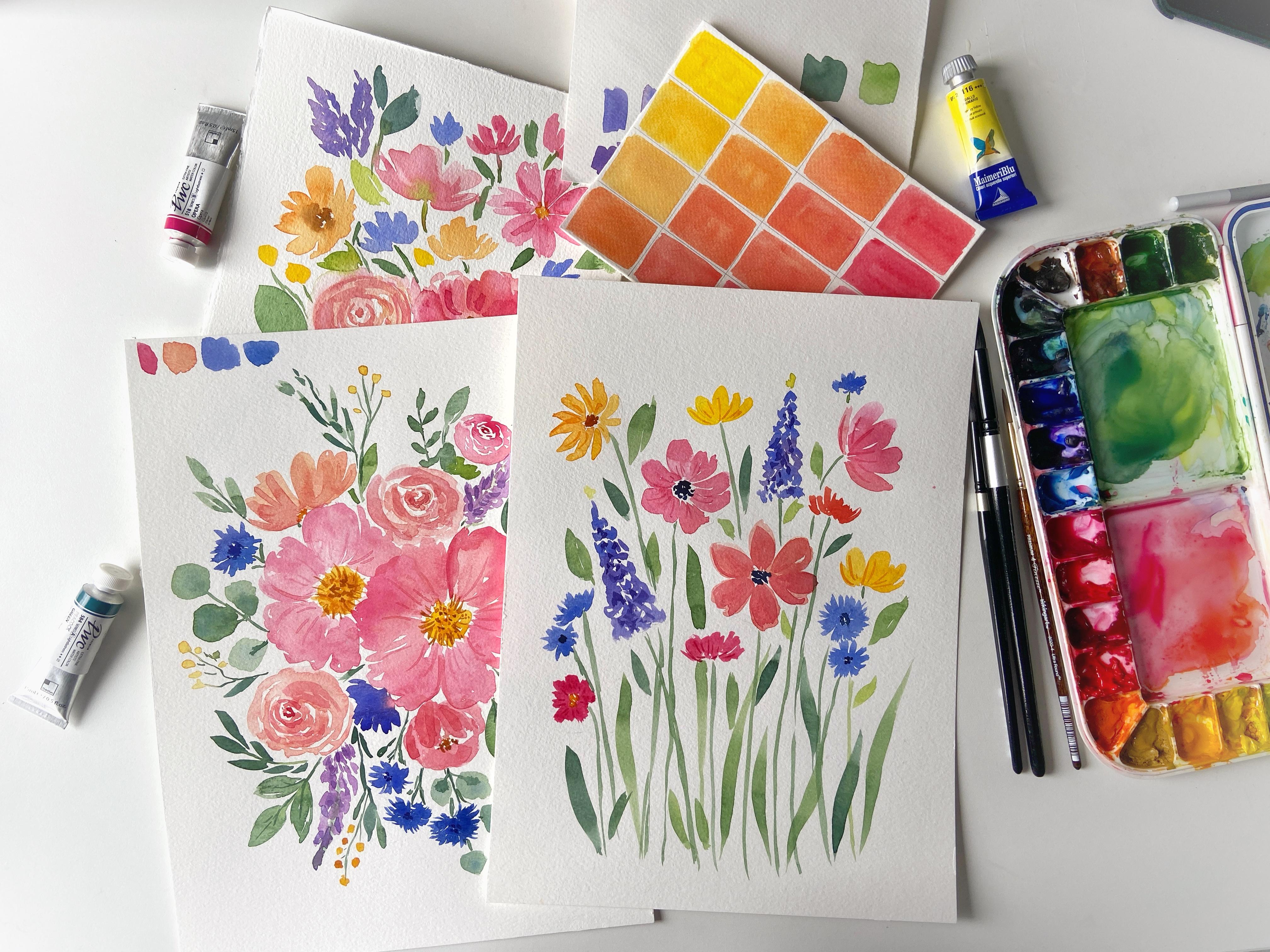
2. Materials: Et's talk about the materials that you'll need
for this lesson. First, let's talk
about the paper. I'll be using Canson
xl watercolor paper, which is 300 GSM
and cold pressed. You can use any student grade or professional grade
paper of your liking. I love this paper because it has a lovely texture and making it ideal for painting
simple floals. One of the best thing
is that this is very fdable and still offers
very good quality. I'm going to use
nine by 12 " size, but you can use a different
size if you want to. I'll just tear out one
sheet from this pad. After paper, we are going
to use some brushes. I'll be using a bunch
of round brushes. This is size ten size
12 and size six. I'll be switching between these sizes throughout
the lesson. And if you have a liner brush or a small detail brush,
that is also helpful. But don't worry if you
don't have multiple sizes, you can complete this lesson
with just one brush as well. Now, talking about the paints, I'm going to use a variety
of colors from my palette. You can use any watercolor
paints that you have, whether they are
professional grade or just student
supplies are even good. And if you just want
to have fun here, student grade, watercolor works just fine for this exercise. So don't stress about having the perfect supplies,
use what you have. Apart from these supplies, we also will need a pencil
for light sketching, kable eraser, which is good for lifting graphite from the paper without damaging
the paper itself. But if you don't have this one, you can also use
a regular eraser, a jar of water for
rinsing the brushes and some paper towels
for cleaning and blotting the excess
water from the brushes. Now let's move on
to our project.
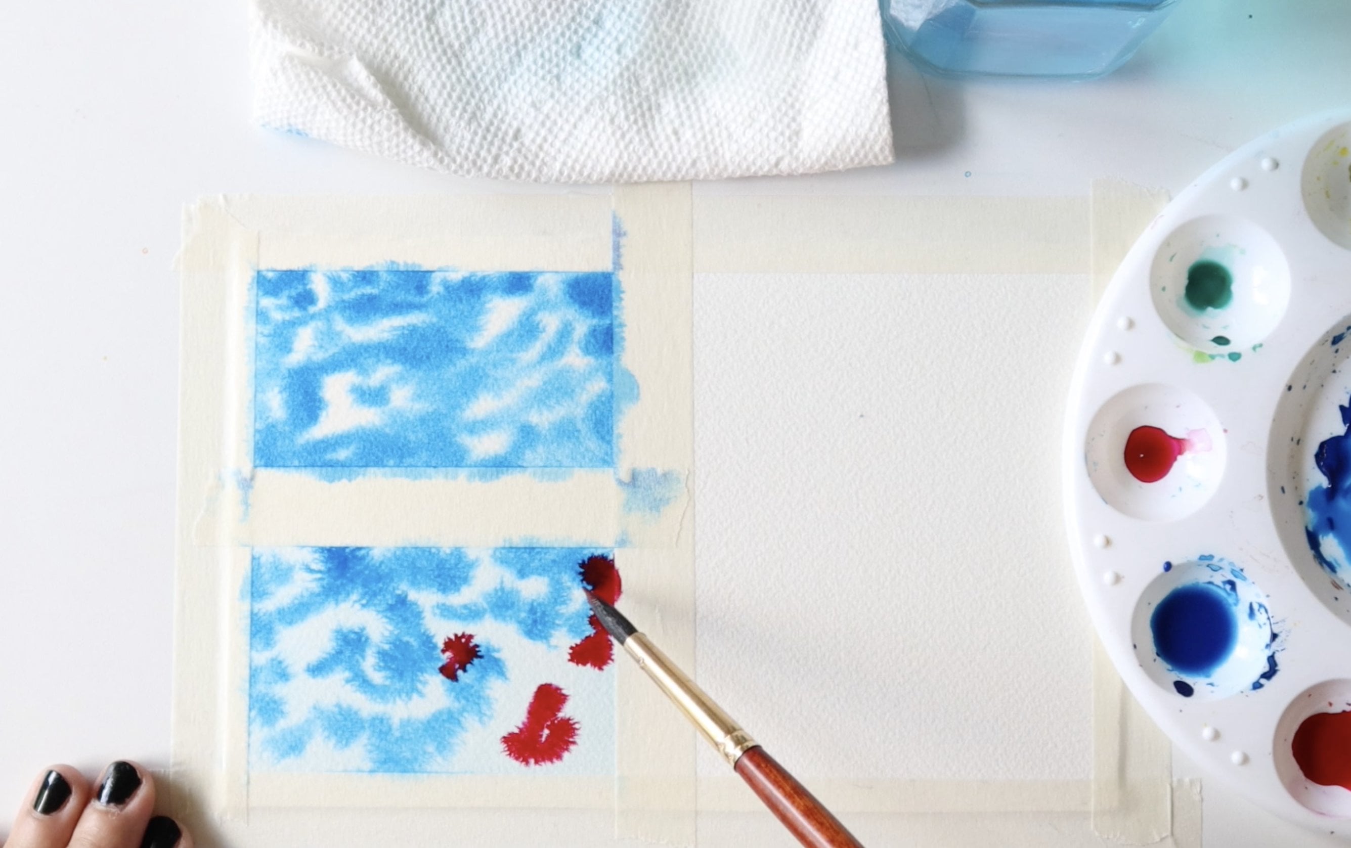
3. Warm Up Exercises: Before jumping right
into the painting, I always take a moment to think about how I want to
place the flowers. But even before that, let's go through a
few simple exercises to get comfortable
with our brushes. These exercises
will help you get a better feel for brush
control and stroke variations. I'll set aside my
watercolor paper and grab a smaller sheet of
student grade paper for this form of exercise. You can use any brush
for these exercises. I'm going to use size six. And to start with, let's explore
how the brush tip works. Try making thin lines using just the tip of the
brush like this. Next, apply slightly
more pressure to create thicker lines. This helps you understand
how much pressure is needed to achieve
different stroke weights. Now, let's practice
C shaped curves which are incredibly useful for painting petals and foliage. Starting with the
light pressure, then twist your brush
slightly as you move like so. If you want to make
the shape thicker, simply add another
stroke to build it up. Another great exercise is
practicing wave like strokes. As you move the brush upward, use minimal pressure to
keep the stroke thin, and while coming downwards, apply more pressure to
create a thicker stroke. This technique is
especially useful for painting natural
and organic shapes. For petal strokes, let's start
with the tip of the brush. Then press down and finally lift while
slightly curving it back. This creates an
elegant almond shaped petal Let's make one more. Try repeating this on the other side to form a
complete flower shape, leaving small white caps between the strokes
always enhances the delicate and airy feeling
of the floral paintings. Now, let's practice some leaf
shapes using some green. This follows the same
technique as before, but with more pressure to
create a broader shape. There you go. Let's
try one more. And for a wider leaf, I'll make a slightly
curved stroke, and then I'll add another one
at the bottom of this one, leaving a little white
space in between. You can also try a larger
brush for a bolder effect. For longer grass like
leaves, start with the tip, then press down while pulling the stroke longer and
lift off naturally. I recommend practicing
these exercises as much as possible before
you start any painting. They'll always help you build confidence and fluidity
in your brush work. And now let's move on
to our main painting.
4. Rough Composition: Okay, so let's begin with a loose plan of our composition. Since this is a loose
style painting, we don't need an
intricate sketch, a rough guide to help
us plan some elements. This piece is meant for
practice and enjoyment, so don't worry about
perfect accuracy anyways. To start, I'll be painting a
bunch of daisy like flowers. I lightly sketch a
few circles to mark the placement of my main focal flowers in
the arrangement. I always call them
as hero flowers. Maybe one flower will go here. Another will be slightly
bent sideways on the right. A third flower can be positioned at a
three quarter angle, which means the petals on
one side will appear longer, while the other side, the
side that is towards us, will have shorter
petals for perspective. In addition to daisies, I'll also include lavender or other small delicate flowers. Let's place one over here. Another smaller bloom can
go in this direction. Maybe a yellow flower here
and one more on the site. Let's add a final
daisy over here. Once the main
placements are set, we can always add more
flowers later if needed. Now that we have
the rough layout, I'll take the Ned
eraser and gently lighten the pencil marks so that they are just
barely visible. You may not see them
clearly on the camera, but this step helps keep our guidelines subtle
while painting.
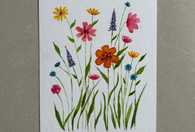
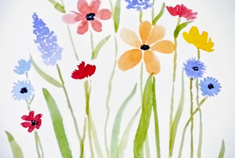
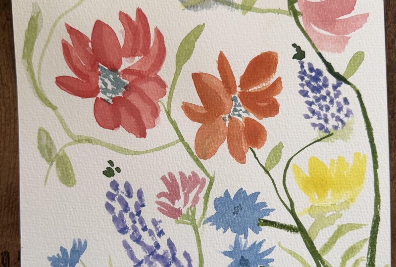
5. Flowers: Now, let's start
painting the flowers. For the first one,
I'm going to use a peachy color rather
than a pure pink. I'll start from the center and paint the petals just
like we practiced. To keep the painting
interesting, I'll vary the shade
slightly as I go. Now I'll leave this
flower as it is for now and come back to
add the details later. Next, I'll use a deeper
pink for another flower. This one will have
thicker petals, so I'll sweep my brush in different directions to
create natural movement. I lifted my brush a little
too early, but that's okay. Small adjustments can
be made as we go. For the next flower, which is facing towards right, I'll paint an almond shaped petal to create a
three quarter view. As you paint, you will
notice that colors appear darker when wet
and dry much lighter. Since we are using
a lot of water, some colors may fade
very significantly. If that happens,
we can always add another layer later to
bring that vibrancy. Now I want to add another
flower with warmer tones. I'll use some orange shades. I'll rotate my paper slightly
to get a better angle. I'll switch to a smaller
brush for this one. This larger brush feels too
big for the detail I need. These petals will
be smaller as we are viewing the flower from
a different perspective. So just make sure that you don't paint all the petals
of same size. And next, let's paint some yellow flowers,
something like buttercups. Place one here and another over here. If you look closely, you
can still see some of the graphite pencil marks
showing through the paint. That's why I always recommend keeping your pencil
lines very light. For this demo, I
intentionally made the pencil marks darker so you could see
them on the camera. But in your own painting, make sure that you just have very faint lines which are
not visible under the paint. Now, let's add some cornflowers, which I absolutely love. To mix the perfect shade, I'll combine some
ultrabarne blue, purple, and a little
bit of cerulean blue. Using light, sweeping strokes, I'll paint the petals like this. You can cover the center of the cornflowers if
you would like, since their centers
are typically a very deep and dark blue, so it doesn't matter if you are covering the
center right now. I'll add one or two more here, but this time, I'll paint them from a side
view for variation. Maybe I'll place one
over here as well. Now let's add some
lilac like flowers. I'm not entirely sure if these
are lilacs or lavenders, but let's just paint some
triangular pyramid shape, something like clustered petals, very tiny petals like this. We'll keep on wearing
the shades in the middle to add
some dimension. I'll add another one here. And on the top of each
of these flowers, we'll add a tiny hint of green, just a very light touch, just to suggest some
stems or buds like this. Okay, kind of looking like a Christmas tree,
but that's fine. I feel like we need
one more flower here, so let's add a bright pink one. For this, I'll use a pure vibrant shade
of permanent rose. This is such a beautiful shade. I'll place it right here. I'm also using less water to keep the color rich and intense. That's it. Now let's
move on to the greenery and see if we need to add
more flowers afterwards.
6. Greenery: For the stems, I'll start with a Cisix brush and a
medium green shade, not too dark just yet. Let's paint some
simple flowing stems, making sure each
flower is connected. The stems don't need to
be perfectly straight. They can be little curves, giving them more natural
and organic feel. If you would like, you
can also switch brushes for this part depending on the level of
detail that you want. Now let's grab a sized
ten brush and dip in some lemon yellow,
mixing with green. Let's paint some leaves. Now, I'll just add a tiny
bit of indigo for it. Indigo is a very strong color, so be careful if
you're using it. Actually, I think it
looks good like this. And also, I'll vary the sizes to make them
feel like wild grass, giving the painting
a more organic feel. Now, I'll add a few
smaller leaves in spots that look a little empty just to
bring some balance. Oh, I missed this little one. Let's add that in two. Now it's time to add the
details to our flowers.
7. Final Touches: Now it's time to add the
details to our flowers, and I'll start with this one. To me, it looks a
little bit pale, so I'll mix a touch of pink with orange to get
a similar shade, but with a little
bit more vibrancy. I see that I added purple here, so it's not blending well. I lift some of it from my
palette before continuing. For this second layer, I recommend using a slightly thicker
consistency of paint. This will help add richness without losing the transparency. I'm just painting
over the petals, nothing too complicated here. For this next flower, I think I want to give
it a look of an anemone. What I'm thinking
of doing is adding a very dark indigo
shade to the center. I'm not sure whether
it's going to work, but let's try and see. Actually, it's really
looking very beautiful. I really am happy
I gave it a shot. Since this turned out well, I'll do the same thing here. Now for the smaller flowers, I'll add a pop of
orange, yellow. Actually, let me switch to a thinner brush to
avoid any accidents. And for the corn flowers, I'll deepen the center with
a rich dark blue shade. For the taller flowers, I'll add a little
depth by painting some dark areas randomly just
to create more contrast. At this stage, you can
leave it as it is. The painting is
technically done, but if you would like,
you can add more details. You can use a thinner brush or a brush with longer fine
bristles for precise strokes. For example, I'll add
a few delicate lines to certain flowers
like this one here. And maybe one here. Just enough to enhance some details without
overdoing anything. Since this is still wet, the effect is not
quite visible yet, but you get the idea. We don't need a
lot of extra paint at this stage, subtle touches. As I mentioned earlier, this
step is completely optional. Sometimes I do it and sometimes I leave the
painting as it is. Don't stress about it too much. And there you have it a
beautiful wildflower meadow. I hope you enjoyed
this class and I can't wait to see
all your projects. Don't forget to share them
in the project gallery, and I'll see you in
my next class. A
 Disha Sharma, Artist & Illustrator