Transcripts
1. Intro: Do you love painting
watercolor flowers in a loose, expressive style, and have you ever wanted to
try that digitally, but not sure where to start? You are in the right place. Hi, my name is Disha. I'm an artist and illustrator, and I love painting both
digitally and traditionally. In this class, I'm going
to teach you how you can paint loose style watercolor
floals in Procreate, using some watercolor brushes, and how to achieve that soft and traditional watercolor look in procreate itself. This class is for anyone
who loves flowers and watercolors and try to paint some digital watercolor
floals in Procreate. If you have zero to
little experience, you are welcome to
take this class. If you have been using
Procreate for a while, but wanted to try some
watercolor painting, this class is
perfect for you too. I have provided all
the helpful resources in this class to get you started
with your project without any friction
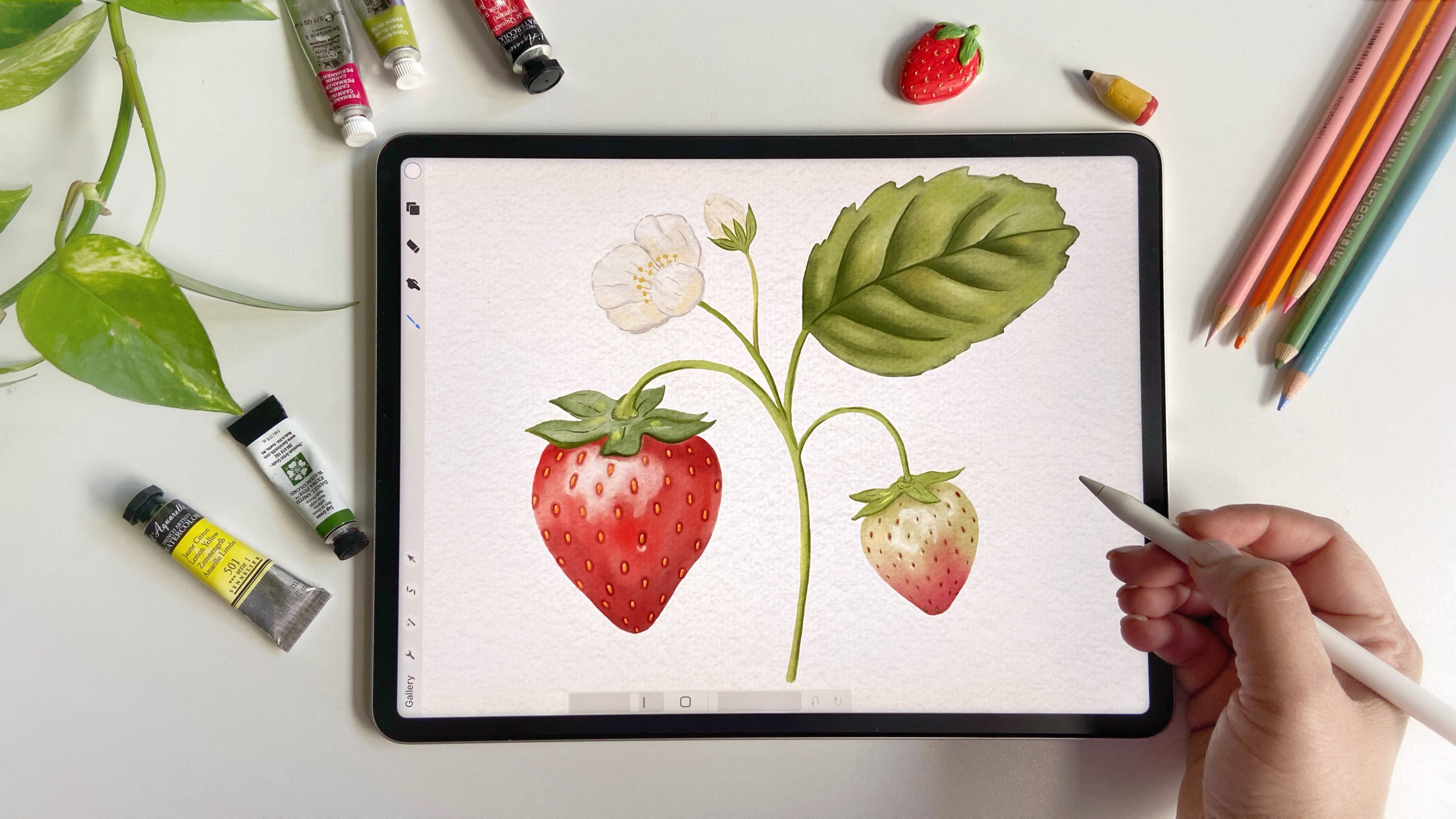
and overthinking. In my other class, we painted some realistic
watercolor strawberries using some watercolor brushes that I've provided in the class. And in this class, we
are going to explore some looser style of
watercolors in procreate. By the end of the class, you will have a beautiful
floral arrangement of your own, which you can print and
hang on your wall or even gift it to someone and even turn it into
a greeting card. The possibilities are endless. We'll use simple tools and easy techniques to
paint the flowers? And I've also included a few templates to help you out get started
with your project. This quick and joyful
class is designed to boost your confidence in
digital painting and that, too, with a smile on your face. So what are we waiting
for? Let's grab your iPad and your Apple
pencil and let's get started.
2. Inspiration: So I'm going to talk
about how I gather inspiration for loose
floral compositions. I normally look for
beautiful bouquets and floral arrangements
on Pinterest. It's honestly such
a great place for finding references for
this kind of painting. As we are not going to paint in a realistic style in this class, so we are not going to copy
the arrangements exactly. Just going to use
the images to pull some ideas and get
inspiration from them. Over the years, I've
gathered over 2000 pens in a floral inspiration
board on Pinterest. And if you're interested, you can access this board. I've provided the link to it in the class
description below. You will see lots of beautiful arrangements in this board. For example, this one here is so pretty and as we scroll down, there are so many other, which are actually my favorites. Look at this one. It's
absolutely gorgeous. I love the colors that
we see in this picture. It's mostly warm tones
which I'm really drawn to. That's something I
love about Pinterest. You can find so many unique
combinations and styles. This one here, another
is a great example. It has blues, purple, pink, and then a pop of warmth
with some yellow and greens. It's just so lovely. So we'll take some inspiration
from a few of these. Let me show you how actually I use these images to
plan out a painting. So let's just pick
one arrangement just to give you an idea of how I go about creating
a composition. Now, one way to work with
Pinterest and Procreate at the same time is by splitting
the screen on iPad. You can swipe to open the doc and then drag
Procreate App to one side. If Procreate is already open, you will see the
icon right here. Otherwise, tap on the last
icon to see all other apps. So I'll just drag Procreate
to the right of Pinterest. And now we have both
windows open side by side. This is super handy. Another
option is to save the image from Pinterest and to do that, just tap on the three dots on the pin and select
Download image. That saves it to your
iPad's photo library. But just remember we
are just going to use it for our inspiration
and we are not going to copy it directly because this is not
royalty free image, so just keep that in mind. Now, I'm going to
open Procreate. Then I go to the Canvas
and tap on reference. I don't want the image on the Canvas itself
just as a reference. So I'll just import the
saved image through here. Now we have got our
reference image ready alongside our canvas. This is usually how I gather inspiration and get started
on loose floral pieces. Now, throughout the class,
you'll see me using different images to take
ideas for different flowers, which will help us in making a unique arrangement and not a copy of just
one image itself. In the next lesson,
I will talk about the resources that are
included in the class.
3. Class Resources: Here, everyone. Before we
jump into the painting, I want to quickly
walk you through the resources that you'll
get in this class. First, I've provided
three different bouquet arrangement templates
for you to choose from. These are in PNG
format so you can easily download them and
use them in Procreate. So here are the
three arrangements. This is the first
one. This is the second one, and this
is the third one. Feel free to choose whatever arrangement
you like the best. For the class demonstration, I'll be using this one, but you're welcome to pick the one that inspires
you the most. Next, I've also included
some colors watches. These are some of my favorite color palettes to
get you started. You can simply download and
import them into Procreate, which makes color
picking quick and easy. You will also find a
Watercolor paper texture included in the resources. Once you download the files
from the resources tab, save them into the files
folder on your iPad. I've saved mine in a folder called Watercolor
Loose Florence, but you might find yours
in the download section. Inside that folder, you will find the two versions
of the Canvas. One is in the appropriate format and the other one is a JPECFle. You can choose whichever
works for you. If you're using the
appropriate version, just tap to open it and
you're ready to go. Once you open the
canvas in Procreate, check the layers panel. You'll see the paper
texture layer at the top, which is locked and it
is set to multiply mod. You don't need to
touch this layer. Just make sure to
paint below this to retain that nice
watercolor paper look. If you're using the JPEG file, you can insert it
into any canvas of your choice using the insert
a file option Iprocriate. Now, talking about the brushes, I'll be using my watercolor essentials brush
set for this class, which I created specifically for procreate
watercolor paintings. That said, you're welcome to use any watercolor brushes
you already have. Even some of the default procreate brushes
work really well. One brush I really like is found under the drawing section
in Procreate brushes. Its name is gloaming. It gives a very lovely, transparent watercolor
effect that's quite similar to
traditional watercolors. And in case if you would like to use the watercolor
essential set, you can find the link in
the class description. I'm giving a 10% discount
to my Skillshare students. You can find all the details
in the description below. So that's everything you need to know about the templates, color palettes, paper
texture, and brushes. Now let's move on
to the next lesson where we'll start
painting our project.
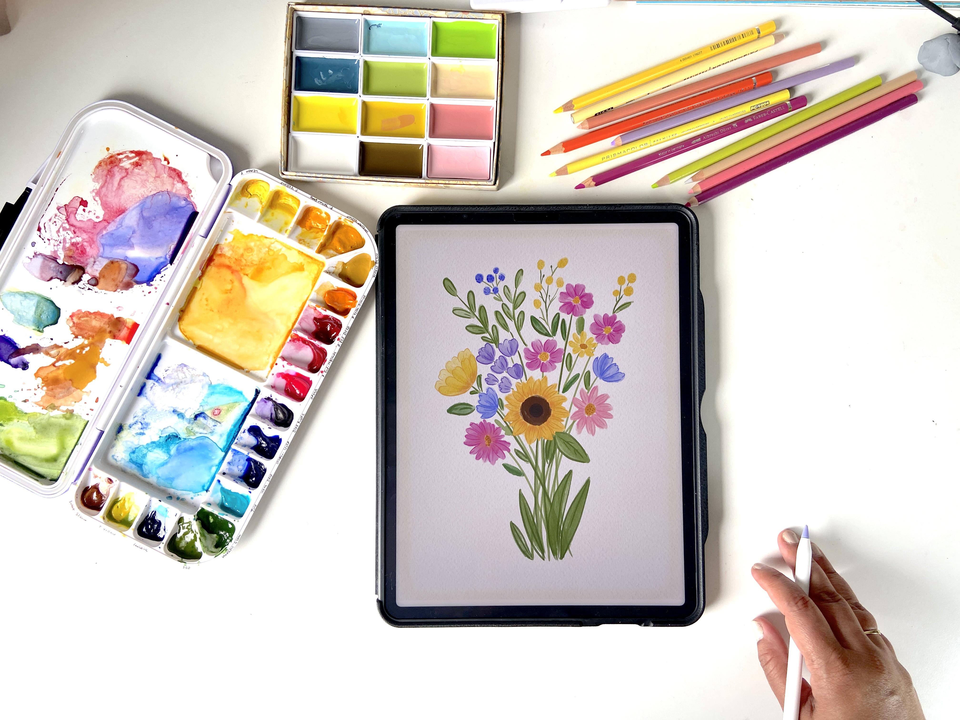
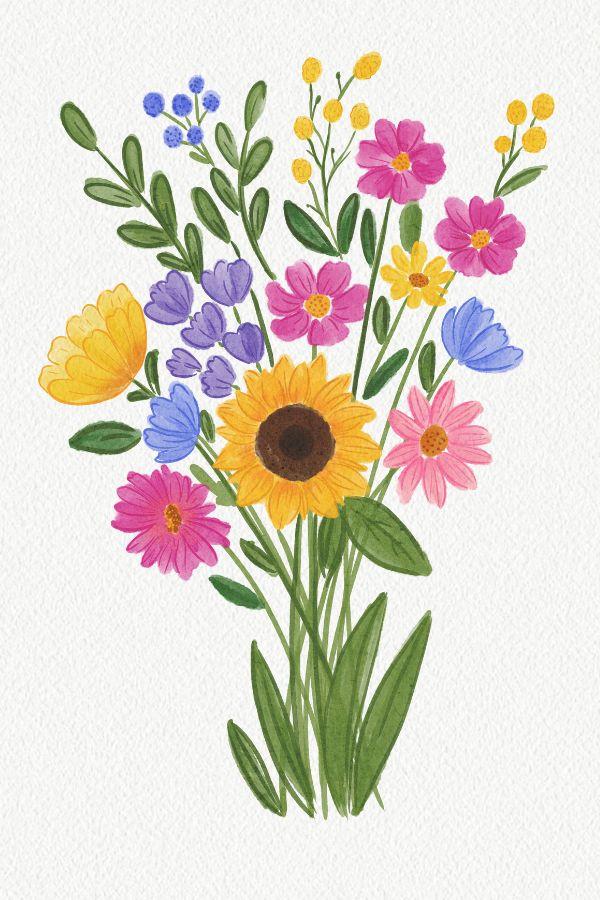
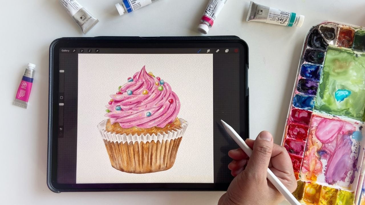
4. Sunflower: Once you have inserted
it into the canvas, reduce the opacity
of the sketch layer. This keeps it from
overpowering your painting. I will set mine to about 10%, which is nice and light, but still visible
enough to guide me. Later we might revisit this layer to enforce
some outlines, but for now, we are good to go. Let's call this
our sketch layer. You don't need to worry about the paper texture right now. This is purely our sketch layer. Now, let's create a
new layer underneath the sketch layer so we can
see it clearly as we paint. One of the images I
found on Pinterest had a beautiful sunflower that really stood out to me.
Let me show you that. This one right here. Just look at how lovely this sunflower is. I'm going to use this as an
inspiration and of course, it's not going to
be an exact copy, but we'll try to
capture its essence. For the center of the sunflower, I'm going to use a
rich dark brown shade. For this project, I'll be using my custom watercolor
essential kit for Procreate. These are my got brushes for the digital
watercolor paintings, but feel free to use any
brushes that you prefer. Procreate itself has some
really good brushes. For example, if you go
to the drawing section, you'll find the brushes
like glowing, Eagle Hawk. All of these work beautifully and can give you some
watercolor effect. I'm going to start with the
watercolor primary brush and reduce the size. Let's begin with the
center of the sunflower. You can totally sketch
it out if you want to. But since this is a loose
style watercolor glass, I'm skipping the detailed sketch and jumping straight
into the painting. Keep in mind, the center of a sunflower is usually
quite prominent. The diameter is often about twice the
height of the petals, don't be afraid to make it. I'm just creating a
simple circular shape, not worrying too much
about perfection here. Now, I'll deepen the center by adding even a darker tone
right in the middle. So far so good. Now let's
move on to the petals. You can continue painting on the same layer and
I'll do that for now. I'm selecting a yellow shade
bright, but not too dark. Using the same watercolor
primary brush, I'll start painting the petals
in simple petal shapes. Nothing too complex,
just organic strokes. Some petals can be thicker, some can be thinner. It's completely okay if
they look a little wonky. Remember, we are embracing
a loose tyle here, not aiming for any
realism or perfectionism. So petals may even look
like they're folding in and you'll notice these
wide gaps between them, we are going to
fill them in later. Trust me, this is a very
simple and freeing process. Sometimes we overthink it, where you don't actually need a fancy technique,
just go with the flow. Now that we have the
first layer of petals, I'll create a new layer for
the second set of petals, filling in the gaps between the ones we have
already painted. Let's just stick with the
same yellow shade for now. At this stage, everything
might look like a little rough and blended
together, but don't worry. We are going to add
definition later using a detailed brush to
outline and refine everything. Now let's bring in a bit of
orange to add some depth. I'm using the same brush
just making it smaller. I'll pick a more orangy tone and softly add it around
the base of the petals. Okay. Next, I'm going to
switch to the smudge tool. I usually stick
with brushes from the same set and this set
includes a few blending tools. I'm going to use the blend
one brush reduce its size, and gently blend the orange
upwards away from the center. That soft blend really helps with the loose
watercolor look. One thing I really love
about working in Procreate is how easy it is to rotate
the screen while painting. It just makes the process
so much more comfortable. Now, this is a little too
soft and undefined, messy. So let's bring it to life. I'm going to switch to
the pale detail brush. Instead of the yellow
we used earlier, I want a deeper yellow. Let's test this one. No dark enough, let's go
darker. This looks better. With a smaller brush size, I am going to gently
add some lines to the petals just enough to give them structure
and some energy. These little strokes can really make your
flower come alive. This pale detail brush is
super useful for moments like this when you want to add delicate finishing touches. You'll see I'm just slightly sweeping through
adding subtle lines, nothing too precise or rigid. I kind of like
where it is going. I might come back to
it later for someteks, but for now, the
sunflower is almost done. Let's move on to the next
flower in our composition.
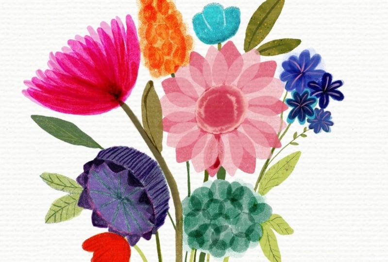
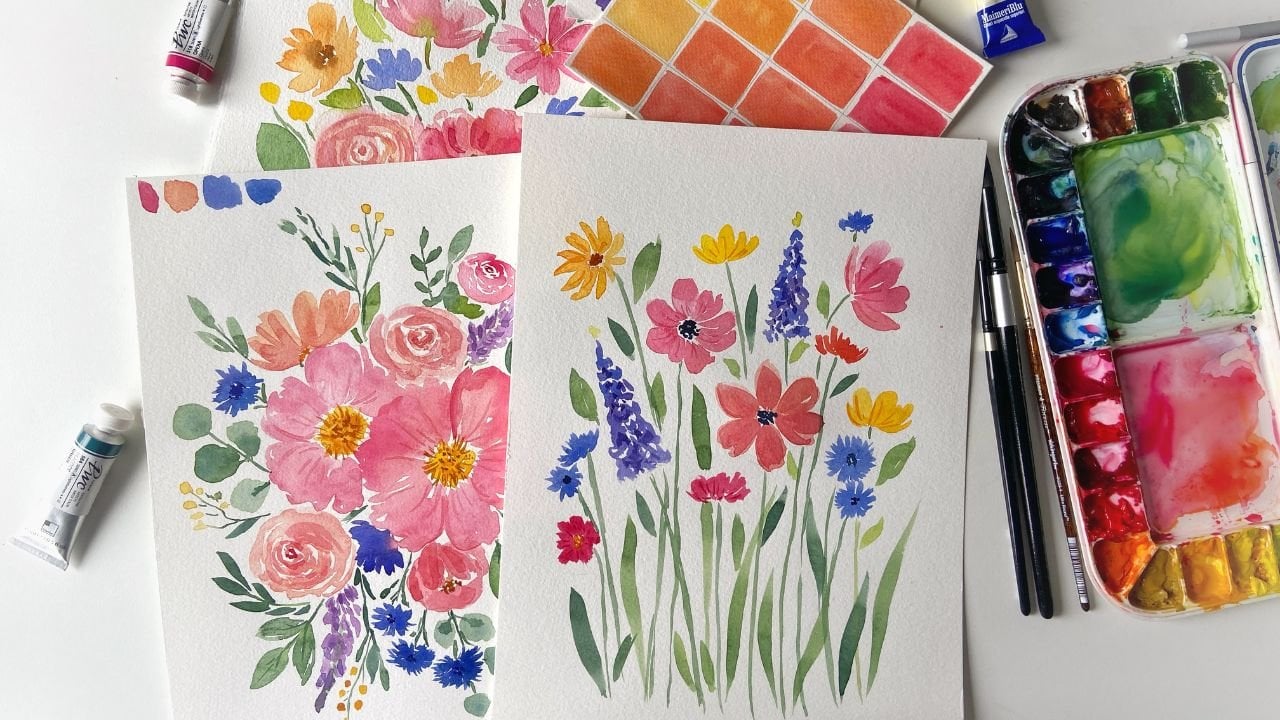
5. Pink florals: All right, so now we are
done with the sunflower. Let's move on to
some other flowers. Let's take this for now. I really like the
flowers in this image. It's a beautiful
reference and personally, I'm always drawn to compositions with
bright and warm shades. The vibrant magenta paired with yellow really
caught my attention. I'm going to use those shades
for the next few flowers. I'll use this magenta to stay. I'm going to paint these
three flowers in that color. I'm going to go ahead and make
a new layer for this one. Now for these flowers, I'm just loosely following the sketch outlines,
nothing too precise. These are very simple
floral shapes. There we go. If the color looks
a little too light, feel free to add
another stroke on top. I'm just making very loose
simple strokes here. At this stage, I'm
not too worried about how the
strokes are looking, even if they overlap a little
bit, that's totally fine. If you want to
clean it up later, you can come back and use as much tool to soften
the harsh lines, or you can also leave it
like that. Either way works. Now that we have got the
base of these three flowers, let's add the centers. I'm going to use the same yellow and grabbing the
pale detail brush. Maybe a slightly
darker yellow for some depth. This looks good. To enhance the
look, I'm going to tap in some darker yellow
dots in the center. Just a few dots to
give it some texture. Now, I want to add those little definition lines like we did in the first flower. Since we are on the same layer, I'm just taking that
same magenta shed and using the pale detail
brush with a smaller size, These little lines
really help in defining the shape and showing the
contours of the flowers. Otherwise, they might
just look like blocks. Perfect. And now let's move on to the next set of
flowers in the next video.
6. Supporting Flowers: Now it's time to paint
some supporting flowers, and I really like these tiny purple flowers
in this bouquet. I'll take the color
from here and start working on some
supporting flowers. Now, just because we have
marked the circles does not mean that the flowers have
to be circular in shape. You can get creative
with the petal shapes, maybe something that
looks more like white flowers or
abstract flonce. I am going to stay on the same layer since these elements are not
touching each other. Usually, I create layers
when the elements are overlapping or are
very close together. But here they are
spaced out enough, so one layer should
work just fine. I'm using the same brush
we used earlier on the primary layer
and I'm going to start creating some
small floral shapes. If it doesn't look quite right, we can always adjust or
redo them later. No stress. Perfect. If you would like, you can add some detailed
lines to these as well. I'm switching to the pale
detail brush again and gently defining the edges
with some tiny strokes. Just enough to give it a
bit of definition and form. That looks good to me. Now, I think I'm ready to move on
to another reference image. Let's go back to this one. I would like to use the colors from these for a
couple of the small flowers. I already have
these shades saved, so I'm going to grab
it and switch brushes. Now, let's create some
almad shaped petals here. And here as well. Let's deepen the
color just a bit and add some outlines
for this flower too. There we go. I am happy with
how this is looking so far. Now we can move on to
the other flowers. We have got a few more to go,
including some wildflowers. For the wildflowers, I had a reference image
I really loved. Let me find it. This one. Especially, I love these
tiny flowers in this image. These tiny wild flowers don't
need to be copied exactly. I'm just using the
reference for inspiration, especially the colors
that I'm seeing here. I'll be using that bright
yellow from the palette. I and I'll paint this
one and this one here. For this flower in particular, I'm going to use the
intense texture brush. The reason is that if you look
closely at the reference, the petals have a fluffy look. Just to recreate that effect, this brush, I think,
works really well. Let me show you what I mean. I'll take a darker color and hide the paper
texture for a moment. When I paint with this
brush on a clean canvas, you can see that it has a subtle paper like texture to it. If I compare it to the
primary layer brush, there's a noticeable difference. That is why I'm choosing
this brush for now. Of course, you can use
any brush that you like, whatever is available to you. This is just one I
prefer for this texture. Let me erase that example and turn the paper texture back. I'll also switch to a new
layer for this flower. I'm grabbing intense
texture brush again and making the
color a bit lighter. I'm just going to
paint some blob like shapes to suggest petals. You can layer the strokes
once or twice if you want to deepen the color
or add more interest. Feel free to
experiment a bit here. This looks good so far. Now, I'll go back to the palette and pick a slightly
darker shade. I'll try the pale detail
brush to add a bit of texture on definition and
let's see how that looks. I'll make it smaller and add a few light
strokes and markings, just to give a suggestion of texture and fluffiness
to these petals. It gives a nice soft
look to the blobs, adds a bit of life to them. Looking good. Perfect. So now let's move on to the next
flowers in the next video.
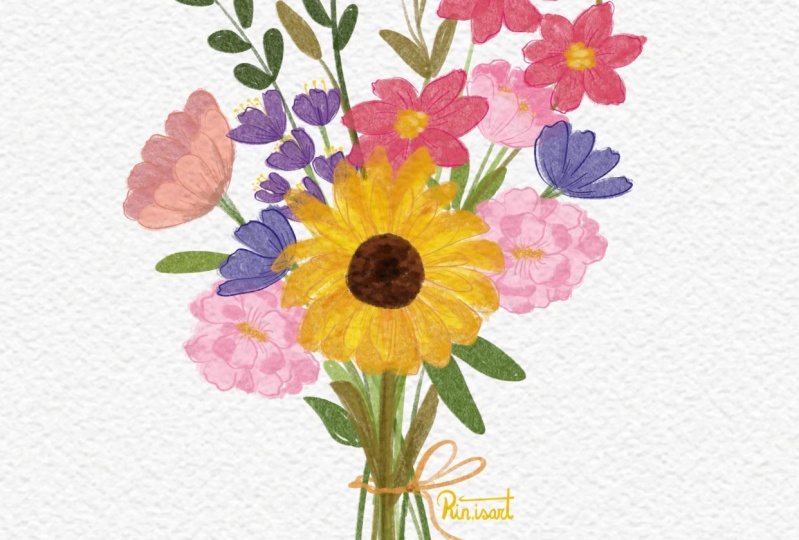
7. Supporting florals -Part 2: All right. Now it's time to add more flowers in our bouquet. Let's take another
reference image, something different this time. I think this one will work well. I actually really love this
purple too, but for now, I'm going to go with
a yellow shade, the same one we used
for the sunflower. Feel free to use any colors
you like, of course. I just want to show
you how to approach the shape and structure
of this flower, especially when we
view it from the side. Let's start. We'll use the yellow shade and the
primary brush again. Now, there are a couple
of ways to approach this. One way is to paint the entire
flower shape as a blob, and then you can add
the details later. Another option is to build it up petal by petal like
we have done before. I'm going to use
the second option. So I'm creating
overlapping petal shapes, which actually gives
a nice glazed look very similar to the
glazing technique in traditional watercolor. That's looking good so far. For the petals in the back, you don't need to
get too detailed. You can either
leave them implied or add a bit of darker shade
to give a sense of depth. I'm going to switch
to a layer below this one and paint a few
petals in the same style. I actually like how that looks. So it's not absolutely
perfect, but that's okay. Now, one tip I want to
share here is that if you want to make this selection a
little darker to add depth, you can use the
adjustments in Procreate. First, let's merge
the two layers, the petals on the top and
bottom and then let's use the freehand selection
tool to select the part that you want to
darken this area here. Once it is selected, you just click on feather and increase it to about
let's say ten. This will soften
the selection edge so the changes blend
very smoothly. Then head over to the hue
saturation brightness under adjustments menu. Here I'm going to
reduce the brightness a little and increase the
saturation a little bit. You'll notice how it shifts the color just in
the selected area, exactly what we wanted. If you want, you can do another pass to create
even more depth. This time, I'm selecting a
small inner petal shape. Again, feather the selection about 10% and tweak the brightness and
saturation slightly, but not too dramatic. Just enough to adjust
the shadow and form. That's actually
looking very nice. Next, we'll add
some line details. I'm going to take a dark color and switch to pale
detail brush again. You can refine it
more if you want or leave it a little loose.
That's totally up to you. Ooh, something went
a little off there. Let me just grab the eraser
and clean that up quickly. Okay, so the flower is done. Now let's move on
to the next one. I'm going to use
a pink shade for it, referencing this flower. It looks like it's from the
daisy or Dahlia family, and what I want to do is instead of making a cup shape or something
like a buttercup, I'm going to paint a flower
that is more like a daisy. For that, I'm choosing
a pink shade. I'm not following the
template exactly. I'm just loosely painting
out a daisy shape here. Next I'll take darker pink
and add a few touches in some areas just to create more visual
interest like this. Now I'm going to blend the
hard edges using those much. That's looking really nice. Now let's add the
center of the flower. I'm grabbing a darker shade
and using the same brush to loosely paint a circular center doesn't have to be perfect. Looks good to me. Now let's
move on to some details. I'm switching to the
pale detail brush and adding some small
dots in the center. Actually, I think a
slightly darker tone might work even better. There we go. Then with a darker pink, I'll add lines to
define the petals. You'll see I'm just keeping everything very
loose and organic, just sort of dancing
with the strokes. Great. I think the sketch is looking a little
bit dark though, so I'm going to lighten it
slightly. This is better. Now, let's add
another pink flower here and maybe one
more in this spot. For this one, I'll
use a magenta shade. I'm going to create
a flower that is loosely inspired
by this reference. It's not exact match, but I'm using the
overall shape and flow. Again, using the
primary layer brush, building it slightly
and building out the shape like this. You can see I'm just trying to capture the
overall structure of the flower without worrying
too much about exact details. Now, to make this
more interesting, I'm switching to an
orange yellow shade and add a bit of that
into the center. Let's much that gently
so the two colors blend together which creates a
very beautiful transition. Next, I'll add the flower center using a very dark shade here. I'll start here and just have a bit more
right in the middle. Then we'll add the detail lines. Feel free to adjust
the colors if needed. It's coming together
really well. If you want to add more depth, you can always use the
selection tool and adjust the hue saturation and brightness like we did earlier. But in this case, I don't think we need it. Instead, I'll add a
bit more interest to the center using pale til
brush and some dotted texture. There we go. This
looks really good. Let's add a purple or
yellow flower in this spot. I really enjoyed painting
the daisies earlier, so I'm going to stick with that style using the
primary brush again. Okay, now we have finished
most of the flowers. It's time to move
onto the greenery. In the next video,
I'm going to show you how to add those leafy elements. After that, we'll do some
final touches and we'll be.
8. Foliage: Now for the greenery, I recommend creating a
completely separate layer. This layer should go below
all your floral layers. I've already saved
a few green shades in my palette, so
I'll use those. I'm starting with the
pale detail brush to draw the stems first, and then we can add the foliage. Let's make the brush
a little thicker, just testing the stroke. Yeah, the size will work. For the stems closer
to the bottom, you'll want slightly
thicker strokes, and as you move upward, you can gradually reduce
the size of the brush. I'll place one here. I'm just going through and
making sure each flower has a stem and I'm adjusting
the pressure as needed. Remember, changing the pressure on your Apple pencil gives you thicker and thinner lines depending on how hard
you're pressing. If you notice some overlap where a stem is peeking
through the flower, don't worry, we'll
erase those later. Because these are
watercolor brushes, some transparency and
layering is expected. Okay, now the stems are in, I'm going to erase any bit
showing behind the flowers. Like here. And here that looks better. Okay. Let's create another layer. This one on top of the stems, and now we'll paint the leaves. I'm going to switch to the
primary layer brush again. I'll be changing up the green shades a
little going between dark blue greens and lemon
tones to keep it interesting. If you want a darker look, just layer over the same
area a couple of times. That's another reason
I recommend keeping the stems and leaves
on separate layers. It keeps things cleaner
and easier to control. Now I'm leaning toward a dark bluish green for
a few of these spots. Switching to a lemon green now. Maybe let's add a few
leaves coming out from behind the sunflower. Like so. Trust me, these brushes
are super user friendly. You'll find it really easy
to paint anything with them. Again, if you want more depth, you can layer the
same color to build intensity without needing
to switch the sheds. Now that almost
everything is done, let's go ahead and
hide the sketch layer. This will give us a clearer view of the artwork that we
have created so far. We've already added
outlines to the flowers. Now, let's add a bit more
detail to the foliage. I'm switching back to
the pale detail brush. I'm just adding
some dark strokes around the leaves
here and there. Very loose, nothing perfect
or too thought out. I actually have to keep
reminding myself that it is not a realistic botanical painting because I work in both styles. Sometimes I slip into focusing too much on
precision and details. If you don't love the
strokes that you're adding, you can always merge them
slightly for a softer. Once the leaves are done, you can go back to the stems and deepen a few of them
using a darker green. This will add some nice contrast and makes the greenery
pop a little bit more. Just be careful
not to overdo it. All right. I think it
looks pretty good. Now, I do feel like
there are a couple of areas we can balance
out a little bit more. One is this spot here. It looks like to green. Let's break that up by
adding a bit of color. I'm thinking of
using a blue shade and painting in
some wild flowers. You can use primary brush or the texture brush,
whichever you want to. And you can also deepen the
color if you would like. Once that is in, I'm
switching back to the pale detail brush and add
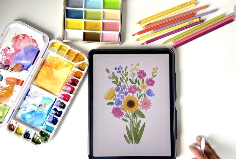
stems to these new flowers. That's it. This is a complete
floral composition in a loose style painted using watercolor
brushes in propriate. And you can also purchase the watercolor brushes
that I'm using here. I would love to see
what you have created. Please share your work
in your project section, so I can also check it out and share with my followers
on Instagram.
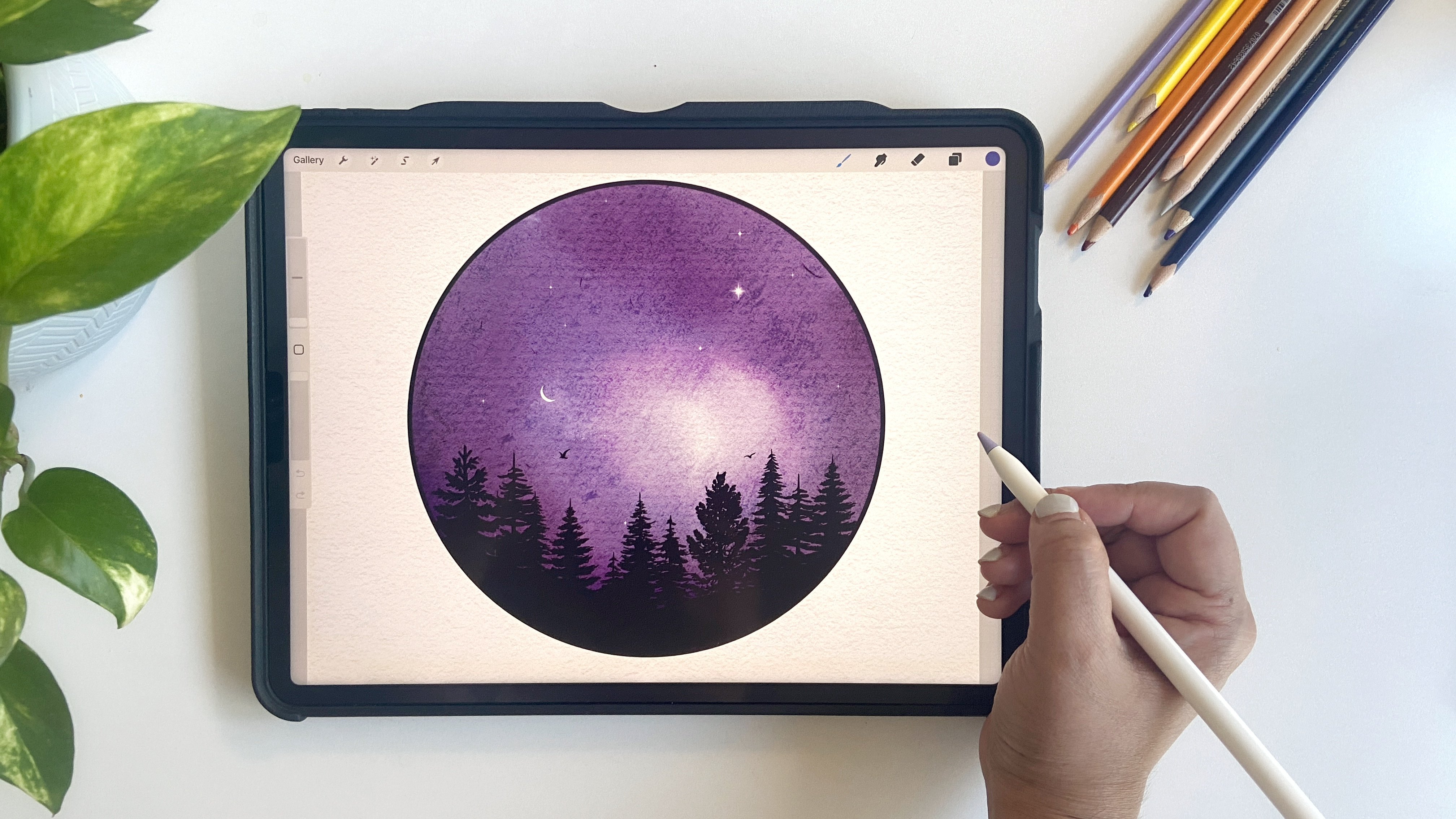
9. Bonus Composition: Okay, so let's talk about
the floral arrangements. Now to start with, I usually use a gray or black color for sketching and use
the six we pencil, which is my go to pencil for
sketching inappropriate. It just feels the most natural and gives a very
nice sketchy look. So what you can do is just take a look at the floral arrangement
that you're using for reference and observe how the flowers are grouped
together in the bouquet. You will notice that there
are some large flowers, some smaller ones, and even a few little buds that
you can add in yourself. It's totally up to you. Before jumping into drawing
individual flowers, I like to first think about the overall shape of the bouquet. Usually, they form kind of a V shape with the stems
bundled together at the bottom. So I'll just loosely
sketch out that shape. Super rough at this stage, just to get an idea
of the structure. Next, I will lower
the opacity of that sketch layer and
create a new one. On this layer, I'm
going to start placing the basic circular shapes
to mark out the flowers. For example, let's say
there is a big flower here, so I'll add a circle for that. Then another one about
the same size next to it. Maybe there's one that's
turned to the side. I'll draw that one
as more of an oval. Another might be facing
slightly downwards. You don't need to be exact. This part is just about placing things and getting
the composition right. You can totally
change the things around or add your own
elements if you like. Like in my reference image, I have a side view dahlia with a stem and I might pop in a few bids
wherever I feel like. Let's say I just want to add
a few supporting flowers, maybe something like lavenders or some little filler elements. I'll loosely sketch
one over here. Maybe another one there. I might add some circular buds that
look like wild berries. Those always look very
pretty scattered throughout. Maybe a couple in this area too. Now for the foliage, we always want a good balance of greens among the flowers. Wherever you see a gap, feel free to tuck
in a few leaves. I'm just loosely adding
some here and there, maybe two or three
around different spots. It's looking a bit messier now, but that's totally fine. We are just building
the structure for now. At this point, you'll
notice I'm not even really looking at
the reference anymore. That's the beauty of
using your inspiration. You're not copying it exactly, borrowing some ideas and
going off on your own. Once I have got a layout that I'm happy with, I'll move on to
refining the sketch. To do that, I'll lower
the opacity again and either using
the six B pencil or even a monoline brush, whatever works for you to go over the sketch
and clean it up. This dage is especially
helpful if you're planning to share your sketch with someone or turn it into a template. I have included some refined templates for you in the class, but this is basically
how I build them. Okay. Okay, I think it's looking good. I'll just center it a bit. We can close this window and
hide the reference for now. What we have here is a
great base for painting loose floris and we're ready
to dive into our project.
10. Outro: Thank you so much for
joining me in this class. I hope you had fun and loved painting watercolor
flores with me in Procreate. I would love to
see your projects. Please do share your project in the project section
of the class. And if you want, you
can also share them on Instagram and tag me at
the rate mark, Tisha. That way I'll be able
to see your project, and I would love to share
them in my stories. See you in my next class.
 Disha Sharma, Artist & Illustrator