Transcripts
1. Introduction: Hello and welcome
to my watch clock. Today we're learning food
illustration with Bosch. Bosch is a wonderful
medium length a is very forgiving and it gives
you opaque matte finish. That means victory
in strategic them, say DLP engine for
food illustration. However, which can be very
tricky for beginners, especially if you come from
within ground just as I do. That's why today we
are fainting death. As simple through the
illustrates, shown. These simple pair. It has sketchbook about with the sequent fair your
learning process. And you learn this keys that you can apply for your future. Food illustrations or
sketches of common objects. In fact, in this class, we will learn how to start the illustration we've
been on your banking to add multiple layers and blend them to add shadows
and highlights. A further increase
the realism to add infrared color variation to
finish with the background. That gives our money
to the whole sketch. And you will also
learn how to make a gradient and use a
limited palette of color, our plans and look. And when we meet together
some basic colors and achieve plenty of
different colors and shapes. When we also learned how to choose a brand that fits
your needs enough these, but I feel it's your pocket as well because when you start with beginning you I don't know
if you like it or not. So I will add few to choose, right, the value for you. I'm very excited
about this new class, so it's going to be
a very fun class. So easy back details, education on as well. And I can't wait to
start sketching. We do. So don't hesitate. Come join me in this class. Now, for me thing.
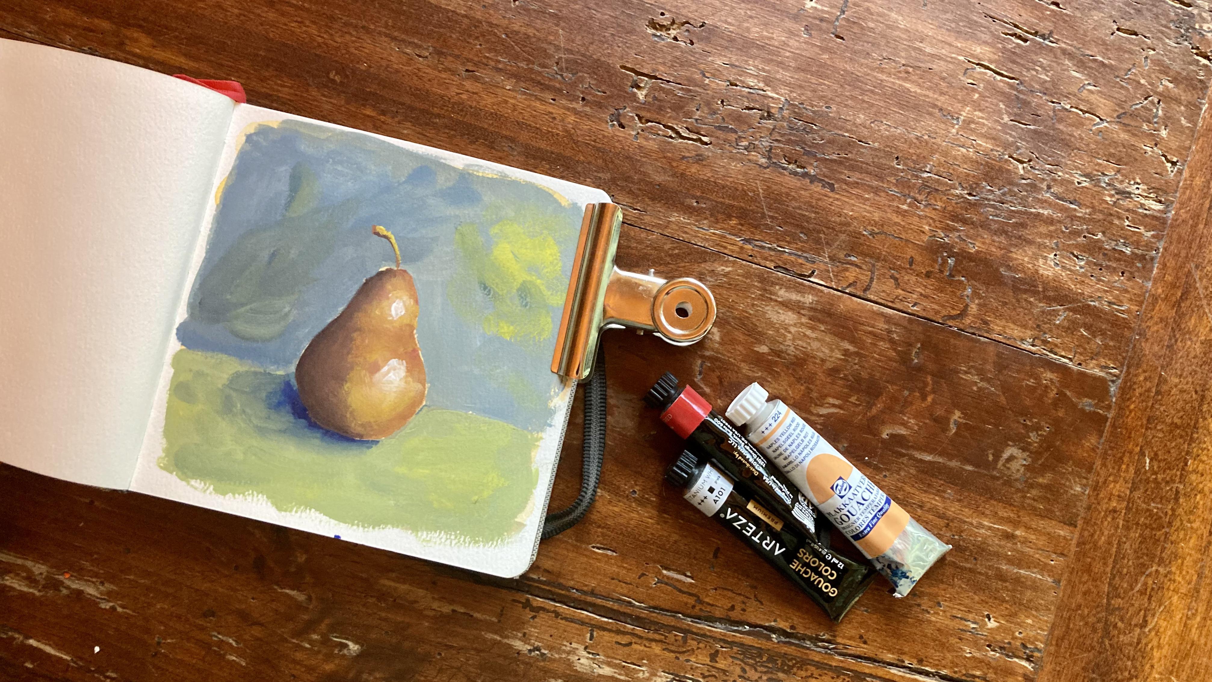
2. Supplies: Let's talk about supplies. First of all, you will
need a wash sector. Frobenius set suggests that you don't spend too much money, but you buy a set with that instead 24
colors, for instance, could a brand with a good
value for money is Artesia? Will you find some premixed
colors that are very convenient because mixing colors is not so easy when
you're a beginner. Then you need a pencil and an eraser for
the pencil sketch. Some brushes. For brushes. I will use a larger brush here, but if you don't have it, you don't really need it, then I will use a filbert
or a flat brush to paint the shapes and the ground around one
and also agitate one. So these are the
brushes that you need. Then you need some white wash. What quash is really important. So it's better to buy
the in larger tubes. It's better if it is titanium white that you recognize it from the pigment PwC because
it is more opaque. And of course you
also need paper. You can use this square
sketchbook from a teaser. It's a watercolor sketch book. It cellulose. You don't need cotton
paper for washes off. So you don't need
very expensive paper. Or you can also use a mixed media sketchbook
like this one from Fabriano. You say it says temper our
washer or colored pencil. This is very good for quash. Also use it a lot. So today we will be using
this small square sketchbook. Sketchbook. It's ideal for publishing
your drawing on social media. Then will we need the palette? I use? Lead over your words so I can throw it away
when it's dirty. So important is
that it is white. Could you want to
mix it with white? Then we will need water. Just like for watercolor and kitchen paper to
dry your brushes. Then you would need,
if you have it, palette knife like this one, to take paint without
contaminating it with your brush. I always contaminate. And for the background, I use some watercolor or
you can use some worship, but you don't need an expensive
artists trade sector. You just need some
children paint very cheap. I use this one. And that's it for material. Let's start sketching.
3. Gouache Brands and Storage: When you start with
for sure one of the most difficult choices is what the brand of
Galatia to purchase. I always suggest the TBI
sector student grade center. So that's not too expensive. And you can have some
convenience premix colors that help you to achieve
a good result even if you are a beginner
and that's what ID. I have many wash tubes. I started with in great brand, a 24 color set, that, which is my
recommendation. For instance, Artesia,
which is very affordable. And then when you finish
a tuba of the colors, if you prefer, you can replace
it with the Nyquist gray, that bright light
or dark islands or Winsor and New York don't. I have the moral here are alone. My name is also nice Brandon. So these tubes are
all very expensive. But if you buy a tube just when you need it
and not altogether, it becomes very affordable. The results are by 30. If you use artist
grade gouache should, but they were off shirts, even student grade
paints like CAR, T-cell, Royal London ETL, or reads
can give a very nice results. So I think that you can start with these
glass with your student. Greg said, don't hesitate. And if you like the
medium where you can upgrade to enact
this great brand. Also, I use these air-tight
palette for quash, squeezing fresh from job. So I had these
air-tight palette. I squeezed cargoes
from the tube. Is you see how I added some colors that I
lie like Naples, yellow or raw sienna
with a very nice colors or orange that you might
not have in your sector. And before I put this box, the way I spray with a
little bottle of water and the paint stays fresh for
weeks and weeks and weeks. Just remember to use it. The ones know why it
at least once a week, if you don't use your
boss, you opening, you sprayed, you put it away. But these are just
very convenient. The cell you only use the
painted that you need. You don't waste any paint. And the very convenient
because you just take out your box and you can pay them
then you put it that way.
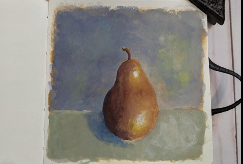
4. Sketch and Underpainting: For this sketch, I will be using my reference image that I have running an
iPad the next to me. And you will find the
resources section. So it's a very easy sketch. There is around on top. Then it goes down. And then here you have
around basically. And I don't engage it. And you're going to use here, it's a BTE you'd regular, remember the pair is a
fruit from the soil. It's not plastic. So this is the shape
of our work there. Then we will put a line behind like a table and we arrays
the unnecessary lines. And also we can use a kneaded eraser or a
normal eraser to lighten, take it away some graphite. In any case, under wash.
You don't see so much. The graphite is in water color. We can just make it like. Okay, let's start with the background for the ground that you can choose any color. And just to get rid of
the white of the paper. This first wash can be either water color or
a very watery wash. It's called an underpainting. And its purpose is to get rid of the white of the paper
and also to lay down a base so that wash is
easier to spread and blend. I like it very much and
I do it all the time. I think it's very useful
and make everything easier. With my big, big flat brush. We let these dry and I will see you when the background is dry. I will also put a tape
so it stays flat. Okay. I see you later
when this is dry.
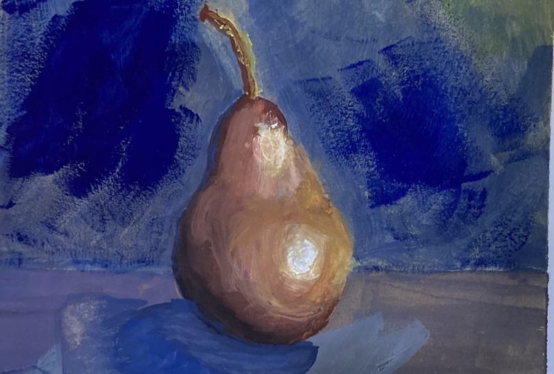
5. Let's Paint the Pear: Now, let's touch it
with the back of our hand to check
if these is dry. It's almost dry. We can start, I prefer
watercolor to wash, but you can also use very light watered-down
wash for the background. Let's start with our Slack
to or the filbert brush. And let's start applying. On the left-hand
side darker colors, we must decide the
direction of light. So I will put an arrow here. That light source is on
the right-hand side. So we start from the left-hand side with
the darker values. You could maybe do the opposite. If you are left hand
side it is start from the right hand side. I start from the left-hand side. So I move towards survive and I don't smudge
what I have done. So I start by mixing some burnt sienna I take
from my premixed palette. I think some burnt sienna
here with my brush. And I add to it, I don't want to contaminate, so I rinse my brush and
then take some blue. Here. I take some blue,
ultramarine blue, and I mix it so I get them in really dark value
exceeds any blue. We also cannot sum. When Jen do have it
more on the right side. More burnt sienna. Remember that wash always dry, darker in light values and it dries lighter
in that values. So it's not really the
colors that you will see, but this is just a first wash. If T is a two-block colors and we can water it
down, just delete all. Because if it is water down, it is more difficult to
reactivate it in the next steps, in the next layer soil. Stride, but always look
at your reference photo. But we don't have to
do with identity. Cool. Rebooted a dark stripe here. Then I take more
burnt sienna here. I always add some magenta. I can take some magenta. I can take some magenta with my palette knife
and put it here. So I have it. So you
see it better also. I put my palette
knife in the water. So I have a burnt sienna that is more on the red dishes more or like Rust could
be an Indian red. And I overlap it to the
previous brush stroke. And you see, and I have
this reddish brown. Now I can reinsert a
blend of the tool. Now I just take
some burnt sienna, just burnt sienna
and burnt sienna. Very little magenta. Just enough for water
to make it run. I need some yellow ocher. I put here. I mix it with the
burnt sienna plus magenta. Magenta. And I just Spain to
the right hand side. These would be dark maybe here. So I can add some white or
just some primary yellow. Some primary yellow here. You see I'm mixing colors
while they are wet. It's a wet on wet
technique. These one. Okay. Now it's not yet beautiful, but it will become beautiful. I rinse my brush in the big jar of water that
they use to rinse the brush. And then I just agreeing
to fit in in the water. I drop it right on my
paper and they blend it. Very, very lightly, but
we're not happy with this. It goes to steal a bit flat. Then we want to see the
brush strokes is going where an oil painting
disease starts to show. So we want something
even darker here. So I take a patch of black. Black is very staining. So a literal touch is enough. And they mix it with my round. And they put it
here on the bottom. And then I go again. Not every is my gratia because black will
contaminate all my paint. Some more burnt sienna. I mix it with my red. I think some of these
round to darken it. And we slightly overlap pits, so is the gradient basically. Now I think my wife, because there will be
needing some wise sooner. I just squeeze some on my Padlet because here I
need a lightened volume. You see this mixture of burnt sienna, yellow,
yellow ocher. I pick some white and
that will lighten it. And we'll apply it. And we'll apply this
mixture with white. Well, I see that I have lighter. And then here we blend it again. I raise my brush very lightly. Blend columns. And then I take some pure
yellow ocher mix with burnt sienna and a
touch of magenta, but lighter than this, and that will apply again here. I can also some pure white here. To lighten it. I like that. I see the brush strokes. It's like oil painting. And now I blend the edges again. We did cleaning
almost dry brush. You can blend it. You take some more color here. And it's easier to blend
it with more color. Onto DACA. Add some blue, or be careful when you have
a drop here on the brush. Always. Right here. It's out of, you see there
is a little mistake here, but it's not important
because it's very forgiving. We have some water, it's very forgiving washer. And I can go over it. And then when I put
the background, I can go over here, be slightly careful
on some more magenta. With all these layers, you make it more interesting. Yellow curve, magenta, magenta. Here. And now I've saved. We can blend everything
is safe, the result. And then we will apply
highlights when it is dry. Very gently. You blend everything. Okay. You see the brush strokes
so they are interesting. You can also put the
little brush strokes of pure magenta just to
give it some interest, say with primary yellow. And you blend it. So
it's not too flat. Color variation that
makes it interesting. Always pat dry your brush
and blend what you've done, so on until you are satisfied. I think I am satisfied. Maybe lighter on this side. So some white, some yellow, a yellow, some yellow ocher. The more layers support the, the easier it is to blend. Okay, Now, last blending. And we let this dry and we can continue
with the background.
6. Let's Paint the Background: Go to the background now. To be harmonious
debit ground master, use the colors that
we have used for the pair plus white
all mix together. So what I can do, I take some water
and mix together. For instance, these
all occur the cell, some blue and some y. We can increase the war
to have a cooler and cooler the ground so that more white so that it makes
a contrast with the pair. I think I want some more
blue and some more white. So we have a gray. And we need to water it down. And we start applying our background first
wash of background. Maybe we need a
second wash later. So I use it for the table. Can choose a different color
for the wall. And around. Good, we know that the
light comes from here. We can add some yellow and
some y towards the light. You see it's more greenish. Water it down towards the light. Then if you don't apply
heat that you can put the second war
convective, Nathan. These can be quite watery. This big round yellow
peeping, true, but at least you don't
have the white background. You can hear my dog. And then we need to
put shadow here, but we go to the wall. For the wall, we can put
even more blue to heavy, even cooler and
watch more white. So to have a different
sensation feeling between table here holds so 43 and then we will add some interest with some
different brushes stroke. You can vary your
donate of course. Just followings care. Your pair. Watering. Keep adding water
because wash dries very, very quickly on your palette. Going in all directions. Like we did crisscross motion. You just carefully
around the pair. You can go with a smaller
brush if you don't. Trust state. And in the mean why the
pair is getting dry. And we can add highlight later. Here there is some color
variation using one blue and, and more white. Some strokes. And the more layers you are, the more texture you have, the easier it is to blend. And to reach. Painterly. Look.
Here I have Eclipse, I take it off. And slightly maybe darker
here away from live. Always a crisscross motion. I can now add some of these
gray fur color variation. I use the brown that
makes gray blue. Use all your colors with
different composition. Here there is a mistake, but wash is very forgiving
so I can fix that. Okay. Now, again, the table. For the table we need to
now to add even more. In some light and some yellow. I use some primary wet
yellow, green side. I use all my white crisscross movement. So to give a nice texture
and the painterly Luca, almost 0 it is
though it was only. But we need to put
a shadow here then. And for a shadow, I will add some blue here. And like this, I can fix it later. For now. For the moment being,
it's just a darker area. I need to fix the pair
here with some darker. So I rinse my brush
in the dirty water, and then a finance
lease will clean water. And I take my mixture weeks, blue, burnt sienna,
brown, and black. And I just cheat. And you see, it's like magic. It's gone. Okay. Just let me blend
the Toledo to apply some white very lightly. And it's very, very likely. Now you take the round brush for the shadow and you
can add some violet. We're assuming occur. If you have violet purple, It's perfective or
you can make it, or you cannot delete or
your symbol like adjust. That can very much this
edge with the pair. I mix it with my previous color so I have some continuity. Okay. And then I take some
blue for instance. And I just did you feel that Russia. So you can blend it. Now you can add some lighter
strokes here and there. Some poor yellow. Yellow here. Maybe to give some blue. It's just some color
variation here and there, so that you have a really
painterly feeling. Okay. Yellow is very nice. Primary loss of I as more. Okay. I see there is some
paper color flowing through is not why Because we have the yellow underpainting, but I don't mind it. I quite like it because
it can be an island, but if you don't like it, you can just get rid of it. We turn detail brush. I don't like these ones, so I could read on this
one with some paint. And we need to put
some white highlight. Highlight. Now we need to
put some white highlights. So I take a perfectly
clean Russia. So clean it. Very well, received, very well. I think some Y again and squeeze some fresh
white on your Padlet. Just find a little
spot for your y. You can see everything
is I can put. Then we go to the highlight.
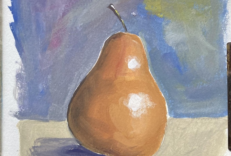
7. Final Touches: Let's go to the highlight. Here we have our,
we have our Kenya. I watch my reference image. I see that I can put
the highlight here. And then I highlight here. Okay? You can leave it like this, but you can also
smooth the edges. You can leave sharp
edge on top but as magic below so that you only have one here TO
rinse your brush. Moist brush and just
slightly here and here. And if you're not happy, you can repeat the process. You can also had bid
with your little finger. I need some wider here. Okay. Yeah. Okay. Then once dry we can improve
it if we don't like it. One thing that I always
suggest is that you take a picture and watch it. Also. You can see all that mistakes. I want to smudge it. We take some primary yellow
and they use it too much. Once again, some
primary yellow light. They use it around the y so
that I get a nice transition. And also use some yellow ocher so that you have a
nice transition. And then you blend it. Ok. Need some more white matter area. And then when these is dry, you can put down later white
circle for the highlight. Let's try now, although
it's not dry, Let's see, I use some pure white or with my detail brush and just
put some strong white. Now, we need the detail
brush for the stem. For the stem, I'll take
some burnt sienna, pure white, pure sienna here. And I make a C curve like
this with the larger. Now I needed that today
with some darker sides. So I take some of these blue, mix it with the burnt sienna
and with my detail brush. I tried to make. Here. You can always, you can also
use this very dark color for you to get rid of the white. The shadow. Just don't want to
hurt the edge here. So I take my feed best again. Let's be very clean. And also you take
some yellow and gt. Okay. Here you see you will have
darker. It's wrong here. So I have left darker,
round line here. If you don't have it, you
cannot delete here now with some darker
brown by the sun, you can go like this to
give this around feeling. And you blend it with
some maybe some sienna. Okay. I don't want to
touch it any longer. Maybe you can give a
yellow highlight here just to give some very, very light like this. To give so covariation. Okay? And everything. But you can leave some
brush strokes. Okay? Here we are. We finished. Relation.
8. Wrap-Up: Congratulations, you have the sketch DO
pair along with me. It's a great result. It may be your first
two sketching wash up. You'd see it wasn't
too difficult. And I hope you have
login to plenty of tips and tricks
and new skills. If you have finished
your project, please central not hated data to upload it in the
project gallery. I can give you my feedback. And other students
can see what type of results so you can achieve
for in these plots. Some. Also, if you post
your bear on social media, don't forget to tag me. And I would be very happy to share your photos
to my stories. You can find me on Instagram. We might exhibit. Excellent. Thank you very much for having
follow the class with me, and I'll see you in
my next class, java.
 Elisabetta Furcht, Anyone can paint!