Transcripts
1. Class Introduction: Hello, everyone.
I am Chen Chibi, an artist from Vietnam and
welcome to my new class. Was for beginners how to
simplify a tulip garden. In this class, you
will learn how to analyze a reference photo, simplify tunip shapes,
and the oven garden, create some new sketch, and finally paint a
beautiful tunip scenes step by step in your sketchbook. If you enjoy glass painting, feel free to check out my Bfi. I offer a variety of glasses, especially focused on flowers. That's on for now, grab
your brushes and paper, and let's start painting.
2. Tools and Materials: Hello, everyone. Welcome
back to the class. In this lesson, we go through
the tones and materials. You will need for this class. First, you will need a
set of glass paints, I'm using a 12
color set from ini. But any glass set
work just fine. We have a dedicated lesson
on today's color palette, don't worry, your colors aren't
exactly the same as mine. Next, we need some brushes. I using four brushes, Filbert brush for
the flower petals. A large rough brush
for the leaves, a smaller rub brush
for the stem, and a flat brush
for the background. For this project, I will
be working on graph paper. I've painted this design in
a graph sketchbook before, but I've also tried
it on white paper, and it also turned
out beautifully, feel free to you and sne what
the colour paper you have. That's it. This design
really pops on graph paper. Finally, you will need
one or two containers of water to clean your brushes
and a mixing palette. I'll be using the container and the mixing palette
from the Himi pset. Uh, and if you use
this type pin box, you need a punt line
to pick up the pin, and we also need pensaw which
I believe everyone has. And that's on for the tones and materials for
our today's lesson. So in the next lesson, let's analyze our
reference photo and create some new sketch.
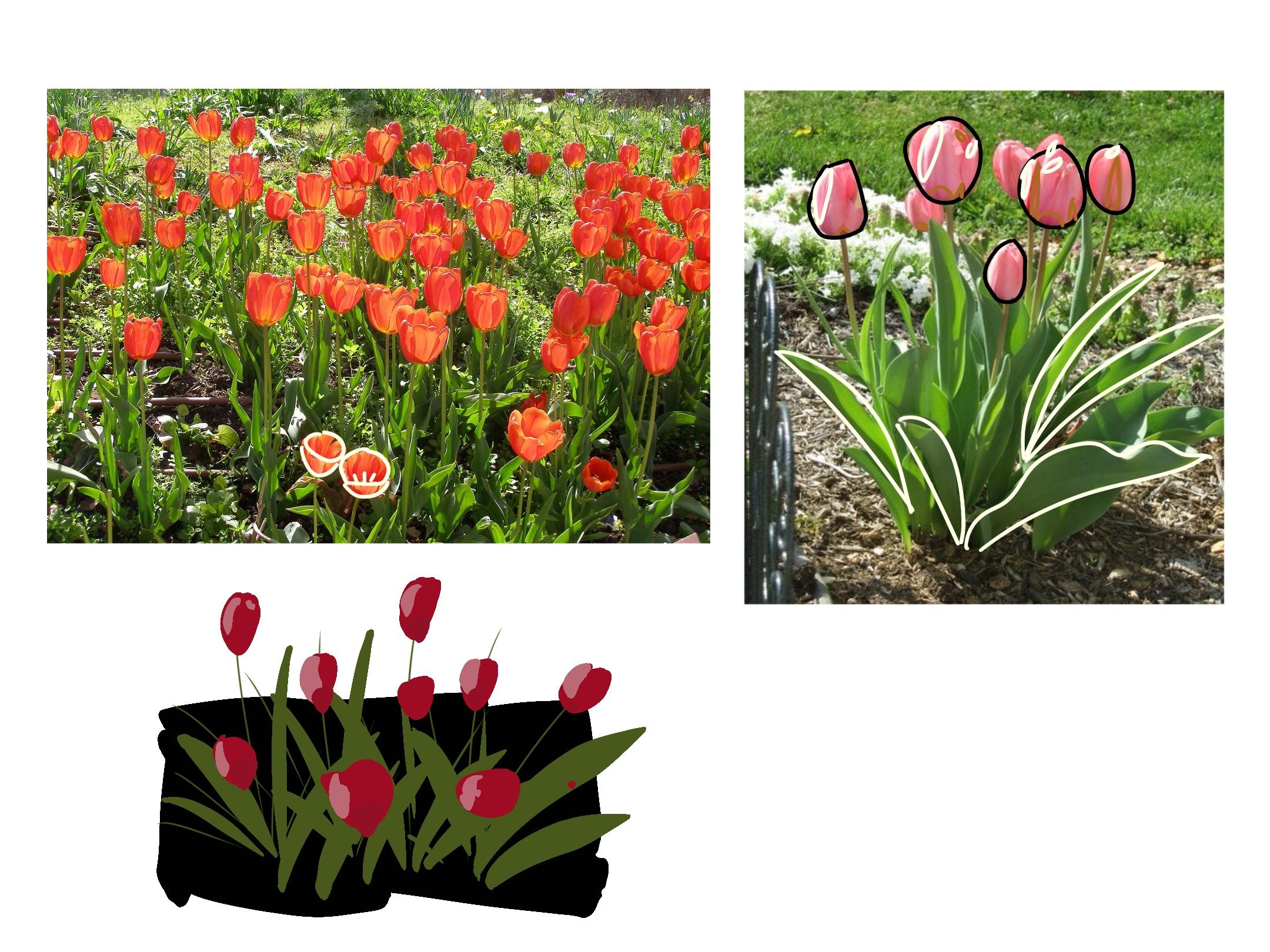
3. Analyzing the Reference Photos & Creating a Thumbnail Sketch: Before we start painting, let's take some time to analyze our reference photos and
create some new sketch. As you can see on my scenes, I'm using two
reference photos of a tulip garden and combining
the best elements from both. Before painting, I always spend time observing
the shapes of the flowers as well as the
shadows and highlights. Nowadays, I do this mentally, but here I will walk
you through my process. So first, let's analyze
the shape of the flowers. So as you can see, it
has the cup shape. And some flower will have a
big upper part like this one, and some flower will have
a big lower part and this one depending on how
opening the flower is. And I also try to analyze the
shadow and the highlight. So if you look at this photo, it seems that the light is
from the left hand side. So we have more why the
highlight is quite random. We have more
highlights on the on the left hand side of the photo. And the shadow part here. We have the shadows at the
bottom of the flowers. And we also try to analyze
the shape of the leaves. If you are a highly
detailed person and you want to create
something which is more ret, you can try to, to paint, I mean, the curvy
shape, I believe here. But for me, I will simplify it. So it just kind of a long
oval shape like this one. And if you look at
this reference photo, you can see that there is no flower which
really opening up. That's why I will borrow some flowers from
this reference photo. You see we have some
flower which really open and you can see the
essential the flower here. I have this type of and we have just analyzed the shapes of the
flowers and the leaves. And now let's create
a thumbnail sketch. I will create the thumbnail
sketch on this book create, but feel free to use any paper and pen and
sketchbook you have. We just want to make a draw before moving to
our final painting. So I will start. I will I will start with a rectangular
back ground. But feel free to explore
other saves if you like, for example, layer this
one on my sketchbook. So it has a brow shape. But for today's demonstration, I will put the rectangular
one here because it is easier easier for
everyone to plan. And we also have some
If you look at this, we have routes here
several rules. So I think I, I will being some storm foot. So the flower ft. So it have several
roots like this. So if you look at the reference
photo here in this photo, the flowers seem to have
quite a similar highs, but I will vary them to make the conversation become more
dynamic and interesting. So let's paint some flower. We will vary the high. Add some flower with
open shape and this one. Not important for now, but I've been asked here. And some So I think that's on for now. I won't try to create a very detailed bending here because it our
thumbnail sketch. So in the next lesson, we will explore our
today's colour palette.
4. The Color Palette: Now let's talk about our color
palette for this bending. For the flowers, I'll be using orienal red as my main color. This is orienal red. It is a warm
slightly melted red, so I will mix it
with some white, gray, a lighter tone. Since I'm painting
on grabbed paper, the color will naturally
appear a little bit softer. If you're working on white pal, you may want to slightly darker shade to achieve
the similar effect. For the leaves, I will use olive green as
the base colour. This is olive green. And in order to have the
light or shade up the green, I will mix it with lemon yellow. And if I want to make it darker, I I will mix it
with a little bit, black If you don't have olive green or orient
red on your color palette, feel free to use any
green or any red color. If you want to be more creative
in today's demonstration, we use the red colour, but you see we have tulips
in many different colours, feel free to use,
I mean, purple, orange, yellow, any
colors that you like. Term for the serm I will create a muted green
by mixing, I mean, this cha mixing with green
with olive green here. So this color is
suitable to paint. I mean, the stem the flowers. And that's it for
the colour pant. So you don't need to have the exactly
similar colour as my. I mean, you can use another
shade of bread, for example, maybe mil may be a scallet anything you
have on your paint box. And for green, I really
like olive green. If you don't have olive green on your colour panette and if you really want to try to mix one, I have a dedicate lesson
about this on my class, how to paint with glass, you can check my profile, but any green will be fine as long as you find
it natural enough. And that's it for
today's color pant. In the next lesson, you
will start painting.
5. Pencil Sketch & Painting the Background: We will start our
painting process by creating a pencil sketch. You may want to look at our thumbnail sketch we created
on the previous section. But it is quite simple, so I don't think we
need to depend on it, and we also may have some adjustment for
our final painting. So I will start with square one. I want to make a signature here. I want to sign my name here, so that's why I think
I will make it hi. I forgot to mention
that we also need a wound in the lesson
about tools and materials. But I do think that
everyone has I think we will say something about this. If you are confident enough to draw a rectangular
without the ruler, it is perfectly fine. And I think I know is too
long too long for our table. Okay, so we just repeat what we just made on the Bi
pass to a thumb sketch. So And I think that's enough for
the pencil sketch because when we paint
the background, we will cover
everything in black and I cannot see the pencil
sketch here anymore, so I don't want to spend
a lot of time on this. So now let's mixing some
let's mixing this is black. I mixing some black
with olive green. I think it needs to
be even more black. The loser a painting
is the better. So don't try to create a
perfect rectangle here. But now I find that this type of graph paper I am using
don't billing like was pen, so I need to bid a lot. I to bit more than I expec pin here to cover the entire
area in a black win pan That's good enough for now. So now we need to wait for
the background to dry. So I will end this lesson here, and I also go to change my water container and see
you in the next lesson.
6. Painting the First Layer: Now let's painting some
leaves and some stems. You see the bail is not perfect. I don't really I don't
really like scrap paper, but it is good enough. So I mean chose that way I mean, this one is olive green,
poor olive green. We will add the highlights
and the shadow later. Now, just Don't try to make the perfect leaves. So you may want
to hold the brush up further from the I mean, the tip so that your brush
shop will be naturally. You see, the grab people don't
really like what I spend, but I think it's still good enough for
our today spending. We even charge through it. Another leap here. I think that's enough
lips for our painting. It is a very simple painting, and the loser we paint
the better it looks, and we will mix this ochre
with live to paint the stems. Have some flower here. That's good for now. We will
make some adjustment later. So now because, I mean, the stem generally
behind the leaf. So after painting after
painting this stem, we might try to repaint
some area of the leaf. I will try to add
some flowers now. For flower on this part, you may need to wait
for it to dry bud. But let's been some
flower for now. So we have some wie here. So I mean, I am mixing oren red with a little bit of wie for the base
colour of the flowers. I'm using my fibert brush. Actually, I plan to use fiber brush at the
beginning of the lesson, but now I do feel that
it will be easier to use this vow brush so I changed this vow brush
because it is smaller, so it is easier for me to have some control over
the shape of the flower. So generally for the flower, which is which is the
highest I will try to make is smaller and it
has oval shape. For the flower, which is at the bottom of this
painting here, I will make it look good. And for this one, I
plan to make it have the open shape thus we can
see the center of the flower. So I will instead of the capsap I will make
it wow like this. I really want to make
the color more opici, but it is difficult for now because the paint
is not dry yet. So again, let's take some rest we will need
to wait for it to dry before painting
the shadow and the highlights of the
flower and the leaves.
7. Adding Highlights and Shadows: We'll come back to the glass. So now let's try to add some highlights and the
shadows into this painting. And the first thing I
will do is I win you my eraser to erase
the pencil mark. There's not a lot here, wd. Try to make it. Try
to make it clearer. So, so now the flower
is a little bit pale. So I believe after adding some
more shadow and highlight, ve been looking
more interesting. So I will use this. So this is that is
poor oriental wet. So now I don't mix
it with with any Y. So I will try to add some
shadow part of the flour here. So Because when we analyze
the reference photo, you see that the shadow
part is quite random, so you don't have to
try to make any part. It is too perfect. But we have more shadow on the right hand side than
the left hand side. This is open shade flower on why we have the shadow bad at the bottom of the flowers, so So you see, just by adding the the shadow bad
on the flower, it looks less boring. Um we've been adding the shadow part of the leaves first before coming back
to add the highlight of the flowers because
I want to wait for the paint to be a
little bit dry because I don't want to to
add the highlight on the top of the wet flowers here. So I live green here. I will use a smaller brass
to adding the highlight and the shadow because
adding some black So, I mean, we assume that is the light so the light
is from the left hand, so try to add more shadow on the right hand and the
bottom of the leaf. Also, we can it's okay to bend some more leaves at this stage. Okay. We don't have to try to I mean, don't need to make this layer exactly on top on
top of the previous layer, just as some random shape. And the more rolls out shop, the more beautiful
the painting is. I do think that we need some
more leaf in this area. And that's enough for the
shadow of the leave now. And now I will try to add
more highlight on the flowers before coming back to add the
highlight for the leaves. So for the highlight
of the flower, I will make actually the I mean, the flow I don't want to touch this right here because
later I may need to put some black onto it to create even
more dark shadow. So normally for my
daily painting, I will use a big palette. But it is it is not very convenient for feming
sodas while today I am using I think a little bit too small
too small mixing palette. Shry this color first. If it is lighter than the
reversal, it is good. I think I need to
make it even lighter. I think more more we. Now, it becomes too
light. So it is okay. We, we can add any many we want. Oh, I have an accident here. So I need to this in this too. So it is really
difficult to cover the mistake now. But it is okay. It makes our painting
even more more he paint. I think I've been adding
more hal onto the leaves before we need to
wait for it to dry before finalize out
to the spending. And I've been adding
this lemon, you know, into our olive green to create the very large
shade of the leaf here. I think for now, I will
leave the painting here and wait for it to
dry before finalized, adding the final touch.
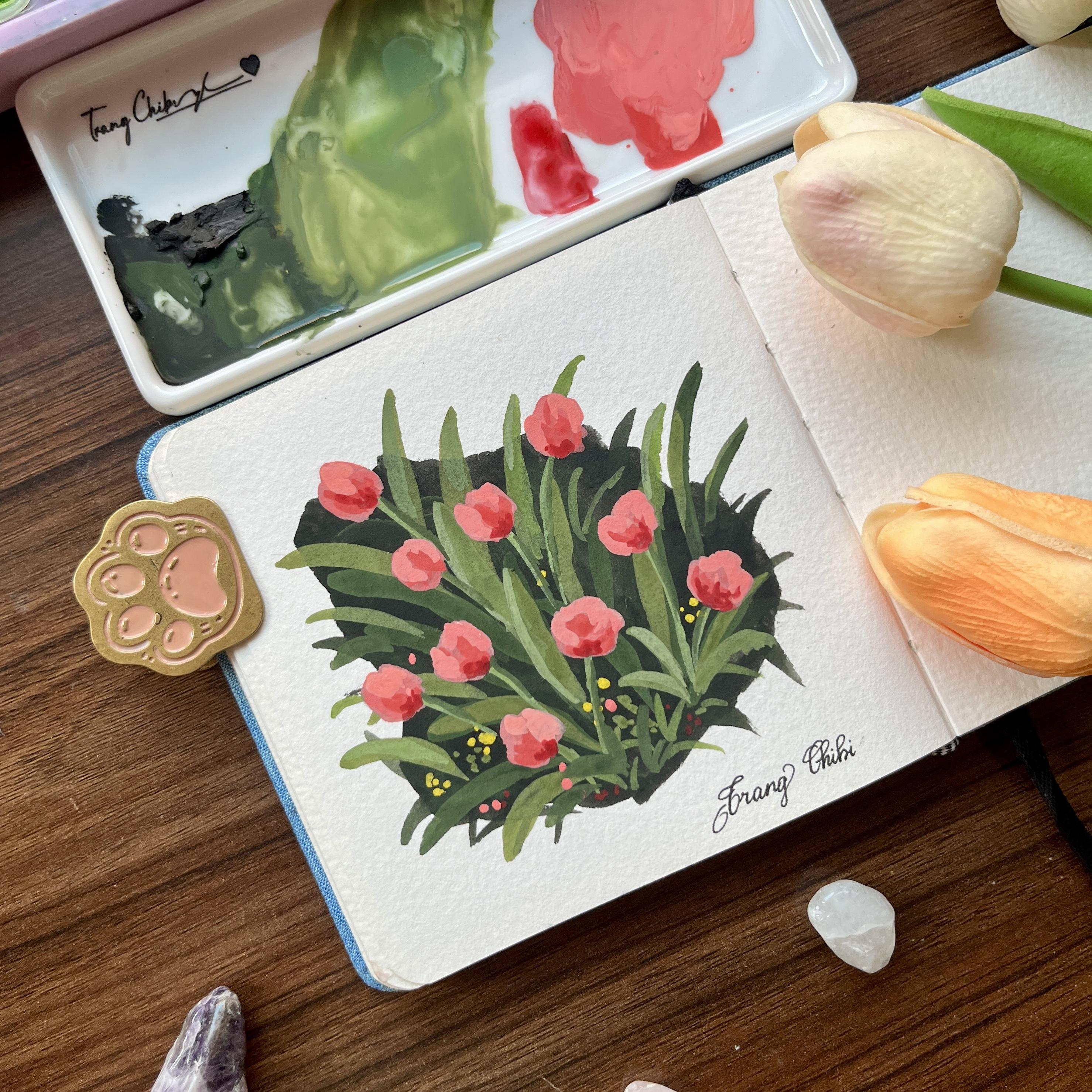
8. Adding More Depth: Welcome back to the glass. So if you look at
the painting now, it already has the shapes and the light and
the shadow part. So now we just need to
add some final touch. So the first thing I
want to add is I want to make the bottom of the
flower even darker. I think I Okay, so we've been adding this IO
and the red to the black. Now, it is too black, so I think I need to book. Okay, so it And if you remember we
have sent the flower, it is kind of a brown. So I don't if you have a plant umber in your
palette, feel free to use it. But here I only have ochre. So I will make it with a
little bit black to make it a brown So just dot to mark the flower cential I don't look at the
wifens photo now, baby, my flowers cential is not exactly similar to what
we see in the wif and photo, but it is okay for
out today spending. I don't think we need to
be too realistic here. I think I want to ask and You might want to look at the reference
photo if you want, but I do think that
as long as the flower has the shadow and
the highlight, even if it is not look similar
to the reference photo, it still look good. There are some
area which I think the pain has not
covered the back well, so I add some pain here. Something like that. What I don't like on this scrap paper is not really watercolor paper, so it has a really good
reaction with water. So there are some stem
is too I think I, you know, I go into
this to make it. It's more like the stem scallop. So we are adding some
high ion to the stem. So this area, they will try
to this ban to fix this area. I want to ask some area, which is really y on the leaf, so I will ask why here. Why and olive green
and lemon yellow. This gallo I think we need some wine. One thing I think it
is the drawback of what paints is because when
you paint it with water, when the paint is still wet, you see one shade of color, but when it dry, you
see the difference. So that's why I, it is a little bit difficult to say whether it is light enough. But, I mean, for this
style of painting, we don't have to be
too realistic here. Try to fix the safe of the flower here. Not got enough, so I think that's enough for
our students spending. Ah. Not enough,
because now I see the highlight of some
leaves are too obvious, so I mean just like I mean, it is the just moist plus to to repaint the part between the highlight and lead to
make it become more natural. I don't want the hana
to be too obvious. And I think that's enough
for our today spending. We need to wait a little bit for the paint to dry completely. And in the next lesson, we will review our
final painting and I will I will also give you some more chick and lips to for spending and also show you
some of my trinity painting.
9. Final Thoughts: Now the pen is already dry, so I will sign my name here. And also erase the pens mask. Okay, so I will take up
the masking tape here. So you see the paper
is still a little bit. It is not flat yet. So I normally, I have to put it inside a book
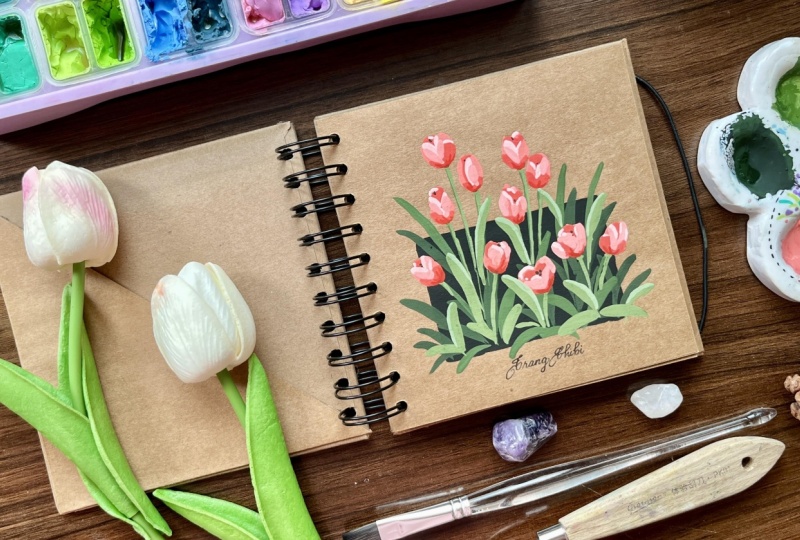
to make it flat later. But that is the final reason of our painting session today. So I have painted before
ending this lesson, I want to share with
you some of tunips I have painted on my sketchbook. So, uh let's see. This one, I have
a share with you. So you can try this design. I will put the photo a bit
on the project session. And I also I also try to paint with the
phone background here. That is yellow, that is red. And also on this
grab sketchbook, here is the painting I shared with you in
the beginning of the class and also I will also try the different
color scheme here. So it is purple or white. So I will try to put on the photos of my actually
painting on the pet session. So you don't have to copy the exact deside
we made today together. But that the wrap
of today's class, I hope you enjoy the process. Don't forget to upload your final painting
onto the Bose gallery. I would love to see your work. And if you fled this
class had phone, feel free to leave a review. It really supos me and hurts other students did
cover the class. Happy painting, and I will
see you in another class.
 Trang Chibi ❤️, Watercolor and Gouache Artist