Transcripts
1. Introduction to Gouache: Hello, everyone. Welcome
to the Guha journey. My name is Maheg and I'm
thrilled to have you all here. Before we dive into
the world of Gosh, I want to share a bit about
myself and how I got here. It's a story that I feel
some of you might relate to. Like many of you,
I didn't grow up thinking that art could be
more than just a hobby. I love painting and drawing
as a kid, but life, school, and expectations of
what a real career should look like kept me
from exploring it seriously. But that all changed during
the lockdown when world slowed down and I finally had the chance
to pick up my brushes. Art became my creative
escape, my therapy, and a way to break some beauty to an otherwise chaotic time. Realize that art could be
more than just a hobby. Fast forward to today. Here I am sharing my journey and everything
I've learned with you all. So whether you're
picking the gauche for the first time or you've
been painting for years, this course is designed
to help you explore, experiment, and fall in love
with this amazing medium. I used to be the
one watching videos and be amazed at how others
painted with such ease. Now, I want to be
that person for you, helping you discover
your creative potential, one breaststroket at a time. Before we begin, let me show you a few of my favorite
coach paintings. I love experimenting with luring and textures
to create depth. This one is a
dreamy nature scene where I played with tending to soften the edges and create
that hazy magical vibe. And here's another one, a
bold and colorful landscape where I led the shapes and colors to all the storytelling. This something about simplifying shapes, using soft colors, and adding those tiny details that makes a painting
come to life. Don't worry. We'll dive into all these techniques
later in the course. Most of my work is
inspired by nature and anime movies,
particularly studio Gibli. Alright. Let's
talk about gauche. It's one of the most versatile and big enough
friendly mediums out there. If you're wondering
what guh actually is, think of it as a perfect mix between watercolors
and acrylics. It's water based,
like watercolors, so you can dilute
it with water to create soft translucent effects. But it's also opaque
like acrylics, which means you can layer
light colors over dark ones. Something watercolors
can't do easily. So why should you learn guh? First of all, it's
incredibly forgiving. Made a mistake? No problem. You can wait for it to
dry and paint over it. It's also incredibly versatile. You can create bold
graphic illustrations or soft dreamy landscapes, all with the same medium. Whether you're new
to painting or you've tried other
mediums before, wash is a fantastic choice
to grow your skills. Plus, you don't need a ton
of supplies to get started. A small set of paints, a few brushes, and some decent
paper are all you need. I'll walk you through
everything in the next video, so don't worry if you're
not sure where to begin. Did you know that quash has
been around for centuries? It was a popular medium used by illustrators and designers long before digital art came along. Even famous artists like Henry Mattis and Mark Chugle
used quash in their works. But what makes quash so special? In my opinion, is it mad finish. Once it dries, it
has the smooth, velvety look that's perfect for scanning or
photographing your work. No glare, no reflections. That's why so many
illustrators love quash, especially for creating
book covers or prints. I hope you're as excited as
I am to start this journey. By the end of this course, you'll have a solid understanding
of how to use quash, creative, and texture, and bring your own ideas to life on
paper. Let's get started.
2. Getting Started with Gouache - Tools and Materials: Welcome back, everyone.
In this video, we are going to talk
about the tools and materials you'll need to
get started with Goh. The best part, you do not need a huge collection of supplies
to create beautiful art. I'll show you
exactly what I use, and so you can start
painting with confidence. Let's start with paints. I personally use
gouache jelly cups. These are perfect for beginners because
they're affordable, vibrant and come in these fun jelly like cups that
make mixing super easy. They last a long time if
you take care of them. If you're not using these
paints, don't worry. There are plenty of great
gouache brands out there. You can use the tube
ones or the cup ones. It depends all on your budget and how comfortable you
are with the medium. Just make sure the label says guache and not acrylic
or watercolor. The difference is that
gouache is re wettable. You can let it dry
on your palette and reactivate it with water. Acrylics, on the other hand, they dry permanently.
Next up, brushes. I like to use brushes
with soft bristles. My go to sizes are round
brushes in sizes six, four, and zero, one for details. Round brushes are
super versatile. You can use the
tip for fine lines or press down for
broader strokes. If you're experimenting
with textures, an old tampered brush
works wonders, too. For paper, go for something
thick 180-250 GSM. Wash works best on thicker paper because it absorbs the
water without warping. I personally love
cold press paper for its subtle texture, but hot press paper is great if you prefer
a smooth surface. Lastly, a few extra tools, a mixing palette or even a ceramic plate or a steel plate for
blending colors. A jar of clean water
for rinsing brushes. Keep two jars if you want to keep your light and
dark colors separate. Paper towels or
maybe a rough cloth for dabbing excess water
and cleaning brushes. It is also helpful to have
a scrap piece of paper nearby for testing colors before you paint, and that's it. With just a few tools, you're ready to dive
into the world of gosh. In the next video, we'll start exploring basic techniques
like getting the right paint, consistency, blending and
layering. Let's get started.
3. Gouache Basic Techniques: Welcome back, everyone. Now that you've got your tools
and materials ready, it's time to dive into
the basics of gouache. In this lesson, we will cover three fundamental
techniques, understanding paint consistency, blending colors, and layering. These are the building blocks
of working with gouache, and once you master them, you'll have the confidence to create pretty much anything. When I first started using wash, I struggled with
the consistency. Sometimes it's too watery, other times it was too thick and blending felt impossible. But trust me, with
a little practice, it all starts to click. So let's break it
down step by step. The first thing you
need to master when working with Guash is getting
the right consistency. Gach is super versatile, but its magic lies in how you control the water
to paint ratio. Let me show you three examples to help you get a feel for it. If you don't add any water, the paint straight out of the tube or jelly cup can be
thick and hard to spread. It might even crack
when it dries. While this can be
useful for textures or a dry brush technique which we are going to use in
the later modules, it's not ideal for
smooth coverage. If you add too much water, your gouache will
behave like watercolor. It becomes transparent
and loses its vibrancy. This can be great for washes
or light backgrounds, but it won't give you that bold opaque look
gouache is known for. The ideal consistency is creamy, like melted ice cream. Add a few drops of water and mix your paint until it glides
on the paper easily, but still gives you
that solid opaque look. A little water goes a long way. So start small and
it just as needed. Always always test your paint on scrap paper before
applying it to your artwork. This helps you check
the consistency and avoid any surprises. This is similar to
watercolor blending. Start with one color,
add a little water, and pull the edges
to soften them out. You can also blend two
colors by overlapping them and adding water to the middle for a
smooth transition. Soft transitions between colors, try blending with water. Apply one color, then gently add water to the edges to
create a gradient effect. This technique is especially
useful for creating atmospheric elements like
skies and misty landscapes. Using white quash
is a game changer. If you want pastel tones
or soft highlights, mix your color with
white and blend it in. Second technique is to
blend with white paint. Instead of using water, you can blend using white paint. Mixing your colors with white as you transition
from dark to light creates smooth gradients while maintaining the
opacity of quash. Two
4. Blending, Layering: Dry brush technique. If
you want to texture, rough look, try the
drybush technique. Load just a little
bit of paint on a dry brush and lightly
drag it across the paper. This is great for
creating grass, fur or even clouds. One of the best things about gouache is that it's
an opaque medium, which means you can layer
light colours over dark ones, something you cannot
do with watercolors. Let's talk about how
to layer effectively. If you apply paint while the
bottom layer is still wet, the colors will blend together. This can create a
soft creamy effect, but it's harder to
control the edges. For example, if I paint this black base and
immediately add white, see how they flow
into each other. For crisp, clean layers, wait for the bottom layer to dry completely before
adding the next one. This is ideal for
details like painting leaves or flowers or any
highlights over a base layer. Watch as I paint
this black base, let it dry and then add
white details on top. When layering, always start
from brought to detail.
5. Painting Foliage: For example, when
painting a bush, I start with a light green base, then add darker
details for depth, and finish with highlights
for definition. This gives the illusion
of tip and texture. And that's it for the basics. Consistency, blending
and layering are the foundation
of gouache painting. I encourage you to spend some more time practicing
these techniques, make watches, try gradients, and play around with layering. Do not rush the process. It's all about experimenting
and having fun. In the next video, we will
take these skills further and explore how to build dab and
texture in your artwork. See you there. So
6. How to Paint Trees: Welcome back. In this session, I'll be sharing some tips
and tricks on how to paint some common elements using
wash. For example, trees. Trees are not just a
staple in landscapes, but they're also a great
way to practice layering, blending, and adding details. I will guide you step by step as we create three
different types and shapes of trees using simple techniques and a
limited color palette. For this exercise, I will be using the following
shades of green. Dark green, olive green, grass green, light green, and a touch of yellow
for highlights. These are the same
shades that are used for the bush in
our last section. You can adjust these
colors as needed, but make sure to start with a darker tone
for the base and gradually work your way to lighter tones for
dip and highlights. A few tips to keep in
mind while painting trees or any other elements with
gouache, patience is key. Always let your base layers dry completely before
adding any details. This prevents smudging and
keeps your colors vibrant. A tampered brush is great for creating loose textured leaves, but smaller round brushes work perfectly for more
defined details. And lastly, don't overthink it. Trees are naturally imperfect, so embrace their irregularities. They are what make your painting
look organic and unique. So be it any shape or sizes, we will start with dark
green as a base color. Once the base layer is dry, we will repeat the
layering process just like we did for the bushes. Once the base is dry, we will start adding details. I will be using olive green first to build up the mid tones. If you have a tamper
7. Building Shapes : Brush. This is where
it really shins. Lightly tap the brush onto the tree shape to create an
undefined leafy texture. If you do not have a
tampered brush, don't worry. You can use a smaller
round brush to paint individual leaf shapes or
even tiny clusters of leaves. The key here is to let some of the darker green
show underneath. This creates depth and gives the illusion of
layers of foliage. Now for the highlights, switch to light green
and add small dabs near the top or outer edges of the tree where the light
would naturally hit. Finally, take some yellow
paint and lightly mix it with the light green for
the brightest highlights. Use this sparingly.
It's great for adding a final touch of realism or
stylization to your tree.
8. Adding Textures: So as we painted the
bush in the last video, we'll be following
the same technique for adding highlights
to the trees. Start by selecting four
colors light yellow, light green, sage
green, and dark green. Use a dry round brush and gently stiple light yellow as the base layer to
establish highlights. Next, we'll use light green, applying it in a dabbing
motion over the yellow. This will help create volume
and a natural gradient. You can start by dark colors or light colors that
depends on your choice. Now we'll add sage green
to the middle areas, focusing on softening
the transition between the lighter
and the darker tones. Finally, we'll use darker green to deepen
the shaded areas, especially near the bottom and inside edges to
enhance the contrast. To add warmth and texture, lightly applied touches
of yellow ochre. This will simulate the effect of dry leaves catching sunlight. And finally, you can add
some details to the branches and the bark of the tree
using brown and yellow ochre. To give the highlights,
use yellow ochre. Starting with the
shaded areas first, start with burnt
umber and brown and then lightly add yellow ocher
to give the highlights. You can also add
some branches in between the trees to make
it look more realistic. And there you have it,
trees of all shapes and sizes with depth,
texture, and highlights. In the next section, we will be working on a full composition together where we will combine all the techniques
we have learned so far. I cannot wait to see how you
bring everything together.
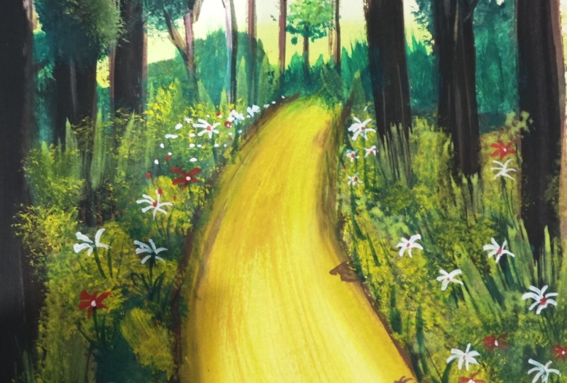
9. Creating Your First Gouache Landscape: This final section, we will bring everything
together and create a beautiful forest
path illustration using the techniques we
have learned so far. You will get to
practice layering, blending, and adding details
in a full composition. I cannot wait to see how
your artwork turns out. First, let's start
with the paint colors, dark green, olive green, grass green, light
green, yellow, yellow Ochel, brown,
light blue and white. The name of the shades might
differ from brand to brand. So notice carefully the
shades in this tutorial, so you'll get an idea what
shades to exactly use. Start by painting the sky
at the top of your paper. In light blue with
white to create a soft gradient that fades
towards the horizon. Paint the path using
yellow ochre for the bees, add a mix of brown
and yellow ochre to create shadows and texture
along the edges of the path. The path should
narrow as it moves into the distance for a
sense of perspective. Blend a small amount of
white into the middle of the park to give it a
soft sunlit effect.
10. Sketching Your Landscape: Once the sky is dry, add faint, desaturated tree
elutes in the background. You can use a mix
of dark green and a little white to
create muted greens. Keep these trees
small and loosely defined to give the
impression of distance. Start with dark
green for the base, then layer olive green and
11. Building Depth with Layers: Green for depth, finishing
with yellow highlights. You can use downward strokes to create the foliage texture, layering from dark
green to light green. Use irregular shapes
for the canopy and lay the greens carefully
to maintain the depth. Oh Along the edges of the path, paint small bushes using the bush technique that we
learned in the earlier lesson. Start with grass green and
lay lighter greens on top. You can use a tampered brush to dab textures for
an undefined look.
12. Final Touches & Detailing: For some final touches, now, this is
completely optional, add tiny pops of
color by painting small flowers or mushrooms along the path or
near the trees. Use a small brush to add
details like tree trunks, branches, and shadows
under the tree or bushes. I hope this
introductory module has helped you get a solid
understanding of quash, what this versatile medium is, how to use it effectively, and, of course, what to do
and what not to do. From mastering
consistency to blending, layering and adding details, you have now built
the foundation for creating beautiful wash artwork. In the upcoming modules, we will take things to
the next level as we paint five complete
illustrations together. Each module will feature a unique reference with
varying levels of complexity, new elements,
creative challenges, and most importantly,
lots of fun. Whether it's a dreamy landscape
or a vibrant still life, there is so much to
explore and learn. So are you excited to paint? Because I sure am. Let's grab our brushes, mix our colors, and get started on this
creative adventure.
13. Enchanted Forest – Spirits of the Woodland: Welcome to this magical journey into the enchanted forest. In this module, we will be
painting a bread taking scene, a mystical stack spirit glowing in the heart
of a lush forest. Before we dive into
colors and brush strokes, let's prepare our
canvas and stretch the foundation for this
dreaml masterpiece. For this painting, I am using a 300 GSM mixed media sheet. You can either use
a sketchbook or a separate sheet,
whatever you prefer. If you're working
on a loose sheet, I highly recommend using masking tape to create
clean, sharp borders. This gives a professional
finish to the painting. If you find masking tape too strong and worry about
tearing your paper, simply stick it onto
a tabletop first, then peel it off and
apply it to your paper. You can even repeat this
step a couple of times. This reduces the
adhesive strength while still keeping
your edges intact. Notice how the tape
will come into play at the very end when we reveal
those crisp perfect edges. Now, let's lightly
sketch our composition. You can use a Edge B or a
two edge pencil for this. We don't want dark pencil marks, as squash can pick up graphite and create
unwanted smudges. Sketch out the basic shape
of the civ entrance and, of course, our mystical stag. Keep the lines simple and light.
14. Sketch & Palette: Let's begin by lightly sketching the basic layout of
our forest scene. At this stage, keep your hands relaxed and your
pencil strokes gentle. I'm using a light hand here intentionally because
when we sketch softly, it allows us the freedom to
make changes, erase mistakes, and adjust proportions
without leaving any harsh marks or
smudges on the paper. The first thing I do is map out the horizon line and the space
where the forest will set. I loosely indicate
where the trees will rise and how they'll frame
the stag in the center. Think of this like setting up a stage before placing
the lead character. Notice how I start with
faint vertical lines. These will eventually
become the tree trunks. No detailing yet, just
a structure to work on. As we move further, I start defining the
background caves. These will be nestled in between trees on one
side of the sketch, adding a sense of
mystery to the setting. When sketching caves, use irregular jagged lines
rather than smooth curves. Nature rarely follows symmetry. I use overlapping lines
to indicate depth and darken some areas to
hint at shadowy openings. Be mindful of where your
light source is coming from. I imagine the light filtering
in from the left side, so I keep the right edges of
the canvas slightly darker. Before finishing,
I softly go over some lines to increase the
contrast only when necessary. Along the cave shadows, the base of the tree trunks and the contours of the stag's body. These brings a bit of dimension without
overworking the sketch. Remember, we are painting
an enchanted scene, so perfection isn't the goal, flow and movement are. And
15. Base Layers: Now that our sketch is ready, it's time to lay the foundation
of our enchanted forest. In this step, we will
focus on creating a dreamier atmosphere using smooth gradients and
warm undertones. Before we dive into the details, we will begin with
a warm base layer. I'm mixing burnt amber and yellow auger with plenty of
water to create a light wash. This technique is called
an underpainting, which helps unify the colors and prevent patchy white
spots on the paper. Applying a warm tone
first also makes the final layers more
vibrant and cohesive, a technique which is often
used by classical painters. So for this painting, I'm using Himema jelly
cup quash set. Accordingly, I'll tell you the name of the shades that
I'm going to be using. So I'll be using a mix of deep earthy tones and
flowing ehrl highlights. So here are the
name of the shades, burnt umber, yellow
auger, earth yellow, light tan, spemenGreen,
light green, naples yellow, black,
and, of course, white. Before we start painting, I always recommend squeezing out your colors onto the
palette beforehand. This makes the painting
process smoother and more enjoyable rather than constantly reaching for colours
and breaking the flow. Did you know that
in many cultures, forests are considered sacred
gateways to other reals. They represent mystery, wisdom
16. Setting the Mystical Mood: And transformation.
Keeping this in mind, let's step into the world of magical realism with
our first layers. Now let's build the
cave structure. Start by applying a dark layer
of black and burnt umber, using loose wavy strokes to
mimic natural cave texture. Think about how caves
look in real life. They are uneven,
rugged, and mysterious. If your paint dries too
quickly on the palette, just sprinkle some
water to reactivate it. Guash is wonderful because
of its reworkable nature. To make our painting look
three d, we need depth. We do this by blending from
dark to lighter tones. Lay burnt amber over the black, then lighten it by gradually
mixing in light tan and earth yellow as we move
towards the cave center. This technique creates
an illusion of distance, making the cave entrance
clue from within.
17. Preparing Your Forest Gateway: If you've painted
landscapes before, you might notice
that the base layer is often the unsung hero. It's like the secret
ingredient in a recipe. Without it, the flavors wouldn't come together
as perfectly. So in the next video, we will start bringing life to the forest by adding
textures and layering. Get ready to make the
forest feel real. H.
18. Bringing the Forest to Life: To life. Here, we will use layering techniques to
create dense, rich foliage. Let's start by focusing on the cave and the
surrounding trees. This is where the
texture comes in, and we are going to
build up the layer slowly to give depth
and dimension. Instead of flat fills, I'm using loose peVy strokes
with a round rush to suggest the uneven surfaces of natural
rock. No blending here. I want those labs
to sit on top of each other like geological
formations over time. This technique helps bring out the natural textures you'd
find in a real cave. Now notice how I don't try
to smoothen these strokes. I let each layer
speak for itself. Some strokes are lighter,
some more opaque. Gosh lets me play with
this beautifully. You just have to control
the water to paint ratio. For textured layers like these, go a bit drier with your brush. Think of it like sketching with paint rather
than coloring in. If you accidentally overworked the surface or it feels
patchy, don't worry. Let it dry completely
before layering again. Bush is wonderfully forgiving. You can always come back
with another layer. Also, if your paint is drying
too quickly on the palette, just sprinkle a little water. You will see it come
back to life instantly. One of many reasons squash
is a dream to work with. Once we have that rich
earthy base in place, it's time to introduce
gradients to add dipped. But without
traditional blending, instead of smoothing one
shade into the next, I'm building it up in patches.
19. Tree Textures: A small tip. Don't use too much water or you will end up activating
the layer beneath. Instead, load your brush well with pigment
and tap gently. Think of this as controlled
layering, not mixing. To add dimensions,
I alternate between warm browns and
greens placing them next to each other rather
than over each other. Think of it as a patchwork
of shadows and sunlight. The dry brush technique
really shines here. With a light hand
and minimal water, you can drag pigment across the textured paper to create
the illusion of bark, moss or even lichen. This stage is all about restraint. Don't
cover everything. Let the parts of
your under layer show those accidental
gaps add characters. Quash is great for this. It doesn't strain the paper
the way watercolor does, so layering doesn't get muddy. Et's talk about cave openings. I darken the cave interior using pure black with a
touch of pain screen. I leave uneven patches
mimicking how light filters through cracks or
bounces of nearby rocks. Even without detail, these
irregular shapes and tonal shifts trick the eye into believing the
cave has real depth. To art To art highlights on
the cave edges, I go with a mix of light
tan and naples yellow, try brushing gently along one side of the rock formations. This suggests where the light hits and helps the textures pop. This contrast of
light and shadow without blending really
brings the cave to life. As we near the end of
the forest laying, I use the tip of a
small flat brush to add linear strokes, creeping roots, and
even subtle plant outlines along the cave walls. These venetian textures
anchor the sea. The idea is not to outline
everything but to imply it. Sometimes I soften the area with a damp brush to create
depth in the background. Other times I use pure pigment to bring a
branch or a rock forward. With quash, you're always
painting with purpose.
20. Spirit Silhouette: In this video, we will be bringing the spirit of
the woodland to life. Our mystical stag is about to
step out from the shadows. Let's start by mixing spare
mint with a touch of white. You'll want to make sure
that the spare mint is the dominant color but
softened by the white. Now we're going to apply this to random parts of
the center area. Think of it as letting the light flow naturally
through the forest. Some areas will have more of this color while
others will have less. This randomness is what creates that organic
glowing feel. Start applying this
mix along the center right between the darker
cave and the mystical stag. Let's focus on building up the light in a few
random strokes, allowing the green to gently fade into the
surrounding dark areas. It's important not to cover everything as we want some of the deeper
tones to show through. The beauty of this effect
is in the contrast. It's a transition between
the dark cave and the glowing center that creates
this magical atmosphere. Now that we have applied this payment white
mixture in the center, it's time to blend it out. Use a wet brush to gently blend this payment with
the surrounding areas, making sure there is no
harsh line between the two. You can keep layering this, applying more sparement
and white where needed, and blending it out to
create smooth transitions. This technique will give
us a soft glow that feels almost like
light filtering through the forest canopy. Once you've created that
first layer of dreamy green, we are going to add another
magical touch to the center. We'll be mixing
naples yellow with white to create a soft,
buttery yellow tone. This color is perfect
for creating warmth and enhancing the glow that we want in this magical
part of the painting. You will notice that this will add a subtle warm
to the painting, and it helps to transition from spemen green to the
surrounding darker areas. You can layer the colors
until you achieve that soft glowing gradient in the center portion
of the painting. This technique is
all about subtlety. Each layer should
melt into the next, creating a smooth transition
from cool to warm tones. Now let's take a moment to step back and look at
the center section. Notice how the colors
blend into one another and how the brightness in the middle contrast with
the darker tones around it. This dreamy magical center
is the heart of our forest. It's where all the mystical
energy comes from, and it's essential that it does not overpower the
surrounding elements. The balance between
the light and dark will make the
whole scene come alive.
21. The Mystical Stag: I'm starting with an olive green and adding a bit of
black to darken it. We want this tag to feel like it's part of
the mystical world, so it needs to have an
almost ethral presence. For the antlers, use a smaller brush to
capture the fine details. The thinner the brush,
the more control you'll have for
intricate features. We will begin by painting the stags Silhot with
darker shades and later, we will add the highlights
that will make it appear as if it's glowing
in the misty forest. Okay for the glowing effect, I'm mixing yellow
ochre with white. Applying this blend on
the edges of the antlers, the lighter color gives the stag that magical aura
we're aiming for. Notice how the light
on the antlers start to transform the stag
into a glowing spirit. Now, this technique is
called highlighting. It's what turns a flat painting into something
alive and vibrant. Next, we will add some
finishing touches and minor details including
leaves and reflections. These small elements will bring our enchanted
forest together.
22. Finishing Touches: We have reached the most
exciting part lighting magic. In this section, we'll
work on creating the glowing highlights that make our forest come alive
with an ehrl glow. Lighting in a painting is
like seasoning in a dish. It can make or break
the atmosphere. Here we'll use highlights
to create the magic. Start by taking white wash and adding soft dots or
strokes to your painting. I'm adding some grass and
stones at the bottom, using a mix of greens
and browns to make the forest floor feel
crowded and real. Small brush strokes of white
on the edges of the leaves, stones, and other elements will reflect light and add
realism to the scene. These finishing touches
will make the painting look more complete like the
forest has truly come alive. Less is more when
applying highlights. Just a few subtle strokes
on the edges or within the forest will add enough magic to make
the painting shine. I'm also adding some
glowing light to the cave edges where the light from the spirit will reflect and create a soft ethral effect.
23. Lighting Magic & Final Details: As we finish, notice how the last touches make your
painting go from good to wow. It's like the forest itself is glowing with
life and mystery. Did you know forest cover
31% of Earth's land area, providing oxygen and shelter
to countless creatures. Their beauty is a reflection
of balance in nature, just like we aim for
balance in our composition. Look at the work you
have accomplished. From sketching the
first rough lines to adding the
glowing highlights. Each step has led to this
beautiful enchanted forest. The final step is removing the masking tape and
seeing the neat, clean edges that add that
perfect touch to the painting. With a steady hand
and gentle pull, the tape reveals crisp,
pristine borders. And there you have it, your
very own enchanted forest complete with glowing
spirits and mystical depth. This is just the beginning. Keep exploring new techniques and stories through your art. The world is full of magic, and your brush is the
key to unlocking it. I hope you all learn something
from this module and feel more confident in bringing your own enchanted
forest to life. I would totally recommend
following along, as I've tried to be as
descriptive as possible. If you still have any questions, feel free to reach out to me. I'm always happy to help. If you feel like this
was an easy reference, hop on to the next module. Art is all about pushing boundaries and learning
something new each time. So get ready for
the next adventure.
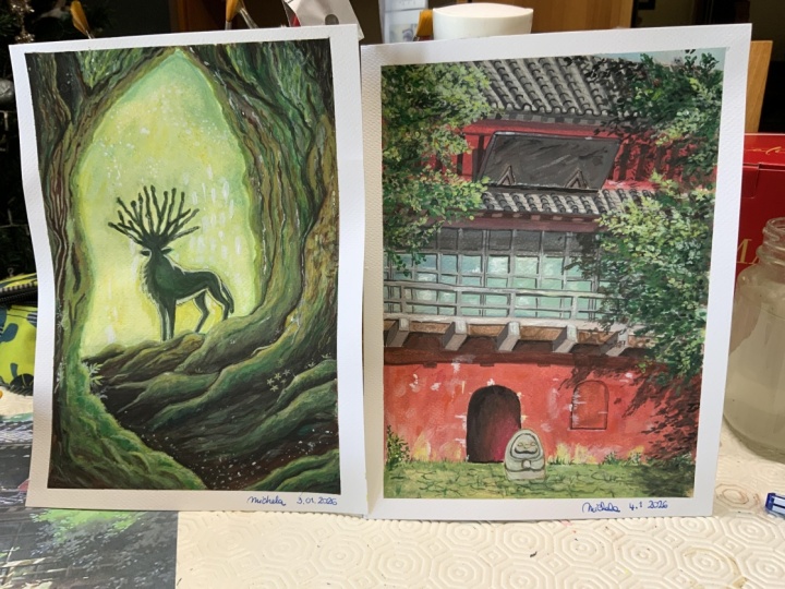
24. Weathered Temple in the Forest: Welcome to Module
two, where we will be bringing a weathered temple
in the forest to life. Before we dive into the details, let's take a moment to look at the final painting we'll be creating throughout
this module. This will give you
a clear picture of where we are headed. Now we'll start with sketching the temple and forest scene. As we learned in the
previous module, it is essential not to press too hard with your pencil
during this stage. Keeping the sketch
light helps prevent any unwanted sponging
once we begin painting. This sketch will
serve as a roadmap, so take your time to get
the key elements in place. As I sketch, I'll focus
on the basic shapes, the structure of the temple, the trees, and the
surrounding foliage. The temple's roof and walls need to be
positioned precisely. Be light handed and make sure everything is in proportion before we move on
to the painting. This is the foundation that will guide the
rest of the painting. Remember, we are going to be using the underpainting
technique here, especially because of
the earthy weather feel we want to achieve. The underpainting
will help build a solid base and dip
for our final layers. So it is crucial we set up well. The
25. Sketching the Scene: I'm starting with a light underpainting using burnt umber, thin down with plenty of water. This helps to tone the paper and gives the painting a
warm, earthy base. I spread it across the
entire sheet evenly using broad brushstrokes to make sure no spot is left uncovered. It doesn't have to be perfect. Just make sure the paper
is fully covered with this light brown wash. Once the underpainting
is dry or setting in, I lightly mess my
gouache palette with water using a spray bottle. This helps to keep the
paints moist and workable, especially since gouache tends to dry quickly on the palette. I recommend taking out all your paints ahead
of time to speed up the process later so you won't have to worry about
mixing while painting. I like to keep things
ready before I start. This includes different
shades of brown, greens, and a few lighter tones like acres and tans for highlights. Preparing your palette ahead of time helps you focus on painting without having to pause every few minutes
with everything set, let's begin layering the scene.
26. Underpainting the Sky: Now that our sketch is complete, let's dive into the painting. In this section, we will focus more on the
temple's textures, adding depth and details. The roof is made of tin, so we will use a mix of gray and black to replicate
the metallic texture. When painting tin, you want to use brush strokes that
mimic the tin panels, so be sure to pay
attention to the direction of your strokes to create
a realistic effect. H Use a finer brush to add details to the roof, focusing on the edges and shadows where the
light wouldn't reach. This will help give it
a sense of dimension. For now, keep the roof a bit muted as we'll refine
it more in later steps. When we approach the
temple entrance, we will add some burnt
umber on the edges to give the entrance a
deep, shadowed effect. Then add red to
highlight the curves, creating depth
around the entrance. This will give the illusion that we are walking
into a dark space, enhancing the natural
roundness of the doorway.
27. Roof and Walls: To make it even
more interesting, I add a bit of spiced apple. It's an orange tone red, slightly warmer and brighter. I layer it on top of the
base in light strokes, almost like I'm dusting
the wall with color. This creates
variation and depth, like the paint on the wall has been faded by sun and time. You don't want solid color here. Let your brush trans a little. A few random streaks and patches actually make
it more believable. If you've ever looked
at an old building, you'll notice the
color isn't uniform. Some parts are brighter, some more faded, and that's
what we're going for. Let's move to the
entrance of the temple, one of the most important
parts for setting the mood. I use burnt umber, a deep earthy brown to
darken the edges of the Dry. This helps to create
the illusion of tip. It draws the viewer's
eye in and makes the doorway look like it's
receding into the structure. I then take some of
our vermilion red again and gently outline
the curves around the Dv. This contrast between
light and shadow gives the entrance a more
rounded, treedy effect. It's like you're creating
a soft frame for the dove, one that tells the viewers, there's more beyond this point. By now, the walls
should feel warm and warm and the roof should
have a soft metallic tomb. The whole temple is starting
to look like it belongs, not just in the painting, but in the forest itself. Every stroke you've
added so far is helping tell the story of a place
that stood quietly for years, blending into the nature.
28. Adding Depth to Temple Textures: I hope you're able to follow along with the
process till now. In this section, we will be focusing around adding shadows, statue, and texture
to the forest crown. Use a smaller or a fine detailed brush to
add intricate details. Remember, the finer the details, the more realistic
the piece will look. With a medium size round brush, I'm now focusing on adding more structure and
texture to the tin roof. Using a mix of burnt
umber and a little black, I begin drawing diagonal
lines across the roof. These lines follow
the direction of the tin panels and help mimic that slightly red
corrugated surface you often see in the tin sheets. At the bottom edges on the roof, I curve the lines
slightly to suggest the natural bend and
flow of aged metal, where the panels may have wbed
or sagged a bit over time. These lines don't need to be
perfect or evenly spaced. In fact, a little bit of variation makes them
feel more natural. Just focus on
keeping your strokes consistent with the perspective
and flow of the roof. This deep really helps the roof feel textured and dimensional, giving it more realism and pulling it
forward in the scene. Oh We will mix burnt amber with red and paint random leafy shadows that seem to creep up from the
ground onto the walls. This gives us that
overgrown look with leaves and vines slowly
overtaking the temple. Imagine how shadows
from nearby plants and vines would look as
they fall across the wall. Some sharp edges, some soft edges like the sunlight is peeking
through layers of leaves. This helps create that
overgrown feeling. Like nature is slowly creeping up and wrapping itself
around the temple.
29. Shadows, Statue: We're almost there. Add
the steel window bars next and use a lighter shade to add highlights to the bars. In this part of the painting, I'm focusing on bringing the
window to life by adding all the intricate details using a medium
sized round Brush. I'm starting by painting
the window frame, carefully outlining
the outer edges to give it a clean,
defined shape. Then I begin adding the window railings using
a mix of burnt amber and black to get a rich dark tool that contrasts well
with the temple one. Then I layer in the
horizontal lines, making sure they intersect
cleanly with the verticals. These crossbars help give the window a strong
structured field. To add realistic texture, I vary the pressure
of my brush strokes, pressing a bit harder
for thicker lines where shadows fall and using a lighter
hand for the highlights. I also include small elements like window handles or hinges, placing them where the
opening edges would be. These tiny touches
might seem subtle, but they help crown
the window in reality. After defining the structure, I add shadows underneath the railings and along the
inner edges of the frame. These are painted with
a more dilute mix of burnt umber gently
blended to soften the transition and
give a sense of depth as if the light is falling
unevenly across the window. To make the glass panels
feel more realistic, I've added a soft background
layer inside the window. This is a gentle mix of light blue green and
a hint of white. I apply it in thin
smooth strokes using a flat or
soft round brush. This subtle tint creates the illusion of
light reflecting off the glass as if the outside world is just barely visible behind
the reflections. It adds a sense of calm and realism without distracting
from the windows details. Keep this layer very soft. No harsh lines here. Think of it like painting
light in air, not objects. With all the railings,
shadows, textures, and glass stones in place, the window finally starts to feel like it belongs
in the scene. These are the little details that really makes a
painting stand out. The more attention
you give to them, the more depth and emotion
your scene will carry.
30. Forest Ground: [No Speech]
31. Finishing Touches: This is the final section
of this module where we'll focus around adding
greenery highlights, and completing the landscape. So let's start by adding some greenery to
this earthy temple. We'll start with olive green and dark green applying the
darker tones first. This will represent the moss and vinees growing
around the temple. Use a small brush or a tampered brush to create a textured
effect for the leaves. The texture of the
leaves created using both the brushes
are a bit different. If you want the leaves
to look more realistic, I would suggest to go with the smaller brush and paint the shape of the
leaves as desired. If you want some random strokes, go for the tampered brush.
32. Adding Greenery: I'm starting with deeper shades, a mix of olive green
and dark green, I use a small round
brush for this. You can also use
a tampon brush or sponge if you want a more
scattered textured look. But I personally prefer
the round brush because it gives me more control for
leaf shapes and details. Using just the tip of the brush, I start tapping and
dragging gently to create small curved shapes
that resemble leaves. I focus first on the shaded
areas like corners of the walls around the
base of the temple or creeping up from
the ground where moss, vinees or thick greenery
would naturally grow. Once the dark piece
is in place and dry, it's time to layer on
the lighter sheets. This is where the painting
starts to really come alive. I mix sage green and then begin lightening it by gradually adding yellow and
a little white. If you want a more vibrant tone, you can also add lemon yellow, but just a small amount
goes a long way. With this lighter shade, I go back over some
of the darker areas, but only in small patches. The goal is to highlight
parts of the leaves, especially where the light
would naturally hit, like the top edges or the
outermost parts of the vines. I gently dab or pull the brush to shape
individual leaves. Think of them as
little tear drops or tiny curved strokes. Don't worry about making
every leaf perfect. The beauty of greenery
lies in its randomness. One important thing
to remember here is don't overdo the
lighter colors. If you add too much
yellow or white, you'll lose the beautiful dipth created by the dark
greens underneath. Think of the light tones as a
gentle touch just enough to give the impression
of sunlight peeking through the trees and
bouncing off the leaves. I like to step back
every few minutes and look at the whole piece. This helps me see where
a little brightness is needed and where it's better to leave it
shaded and natural.
33. Adding Highlights & Final Details: All right, we are almost done. Now it's time to add just a final few touches to
bring everything together. Using a very soft touch and
a tiny bit of white paint, I gently brush a
few light strokes on the red walls of the temple. This gives the
effect of sunlight gently fading the
surface over time, like how real old
walls look when they have been exposed
to the sun for years. Remember, less is more
here. Don't overdo it. Just a few soft highlights are enough to make the walls
look aged natural. At this point, I
like to step back and look at the full painting
from a little distance. This helps me check if
everything feels balanced, especially the contrast between the temple and the
surrounding forest. Lastly, you can add some highlights to
the red walls using a very light touch of fight just to give them that weathered
sun faded effect. But remember, don't overdo it. A few subtle strokes
will do the job. If something feels too
plain or too sharp, you can always go
in with a bit of shadow or a gentle
highlight to fix it. These little adjustments at the end can make a
big difference in how complete your painting
feels. That's it. We have finished our
weather temple scene surrounded by layers of moss, greenery, and gentle light. I hope you enjoyed
painting along and learned more about
how to create texture, how to lay your colors, and how to add depth
to your artwork. Thank you so much for watching this course and joining me
on this creative journey. I really hope you picked up something new and
helpful along the way, whether it was a new technique, a better understanding of textures or just a fresh
way to look at your art. This was the last video
of the course and I'm so proud of everything we
have painted together, but we are not done just yet. Once you've finished
all the lessons, I have a really exciting and fun project
lined up for you. It's designed to help you apply everything you have learned
in your own unique. You'll get to experiment, play with colors, and make something that truly
reflects your style. Hop on to the final
project next. As always, keep painting, keep exploring,
and keep growing. Can't wait to see what you
create. See you there.
34. Project: Now that you have
completed the course, I hope you all have
learned something or maybe a lot about
painting with Gosh. So here's a fun little
project for you all to taste out everything
you have learned so far. Our final class
project is to paint white daisies on a
greenish black background. So this reference will let you practice smooth
background blending, laying light over dark, and adding those fine little
details with a fine brush. This is the reference
that I'm talking about. This is a fairly
easier composition to practice when working
with Gosh. So I have multiple versions of it, starting from the cover
of my sketchbook, then the actual reference. And once you're confident
enough that you can paint daisies and
blend the background, you can add multiple flowers
or maybe in multiple shades. That is totally up to you. And if you feel that
you're bored of daisies and you want to
paint some new flowers, maybe add a marigold
version of it. So all these references
have one thing in common, and that is the plain
black background. And then you can
just layer on top of it using all the techniques that we have learned
throughout the course. So feel free to take a screenshot
of this reference right here or just pause the
video for a second, study the reference, and
then start painting. This project is meant to be fun, relaxing and
confidence boosting. A perfect way to wrap
up our Gach class. And once you're done,
don't forget to upload your version on
the project gallery. I would love to see
your take on it. So happy painting.
 Mehak Vithal