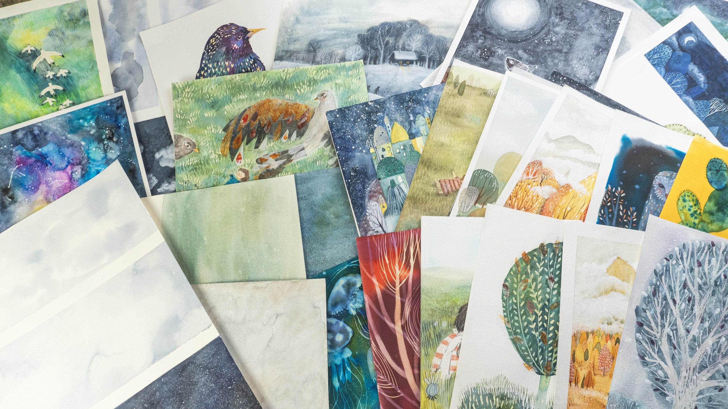
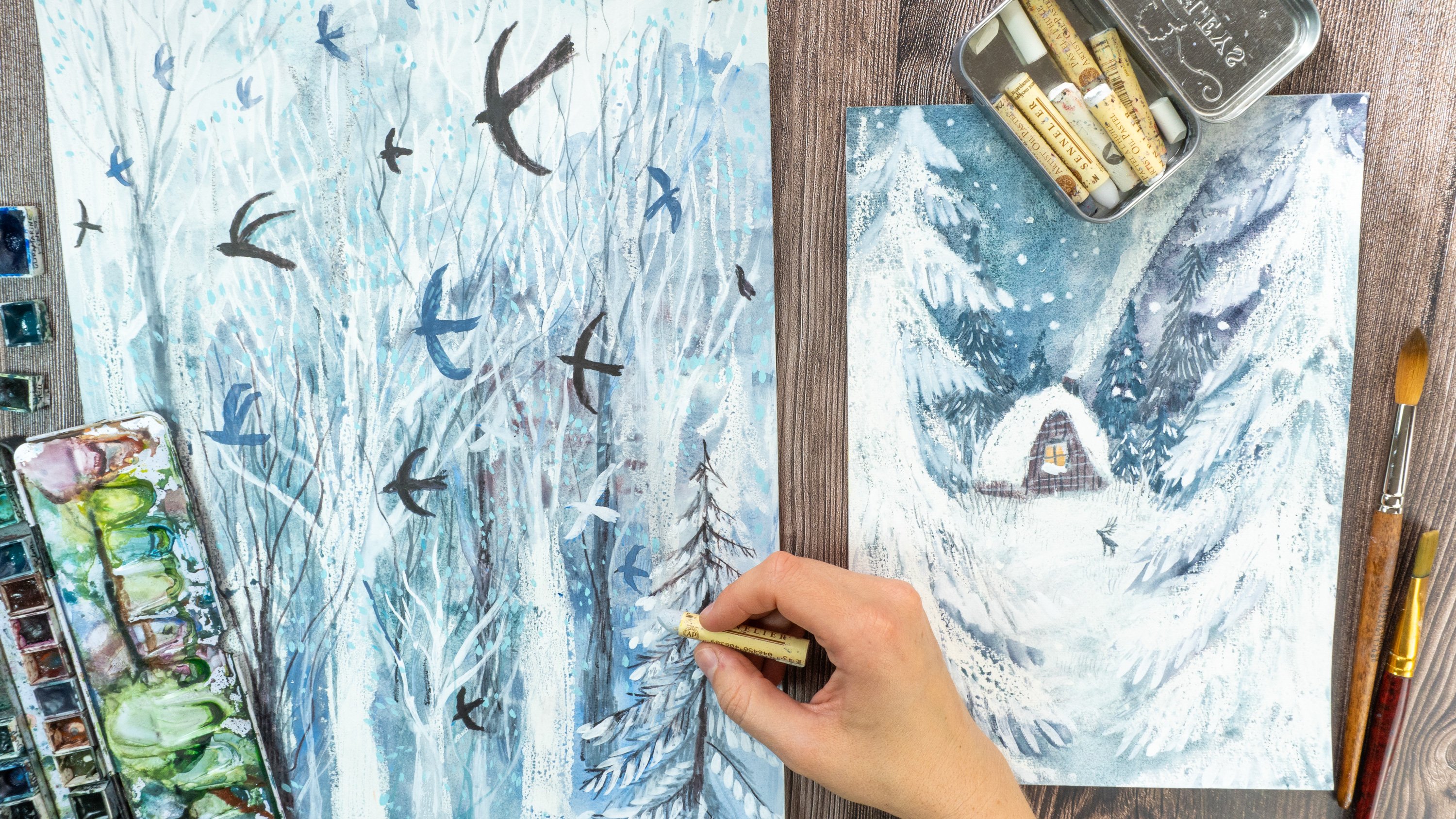
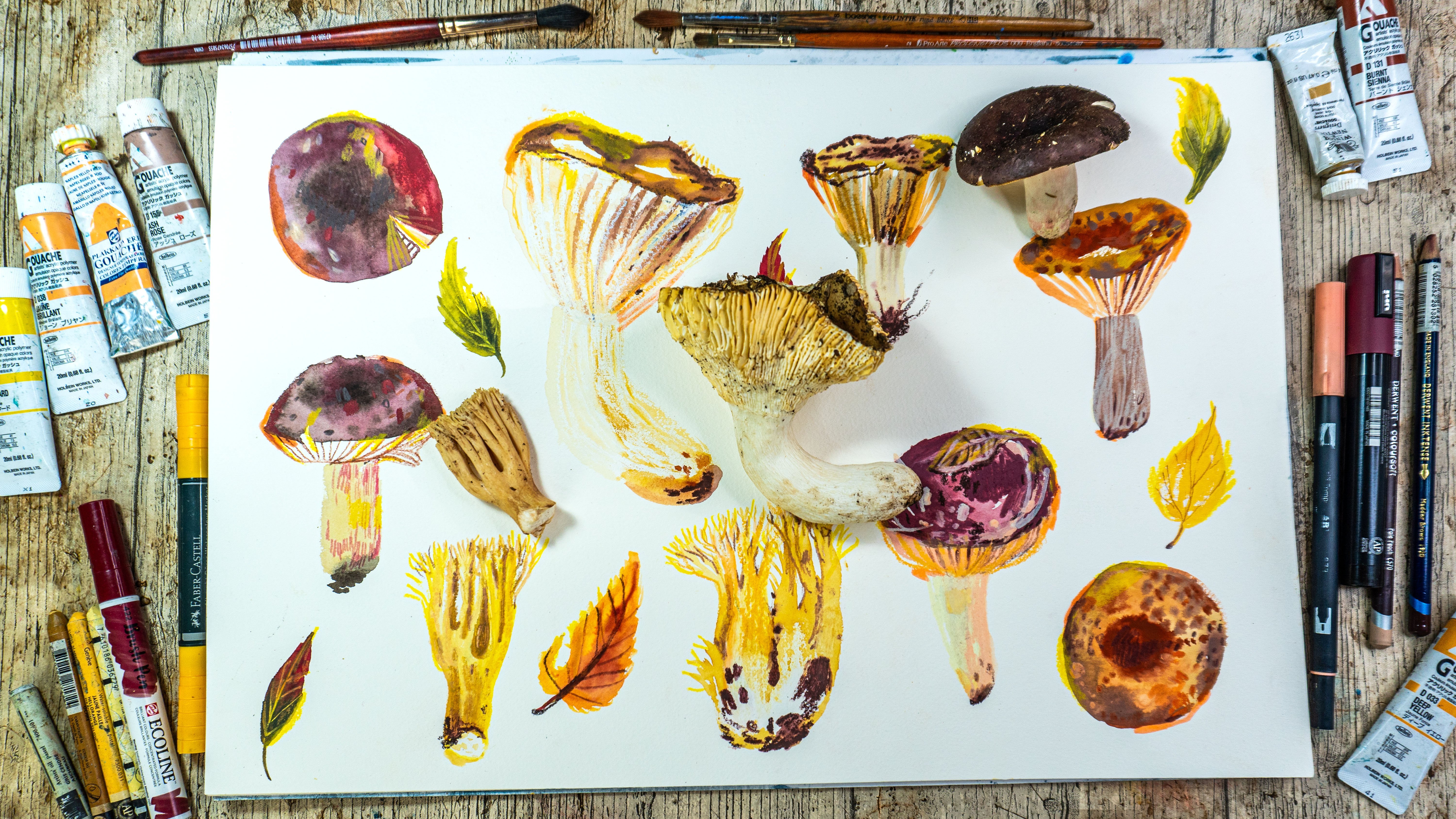
Transcripts
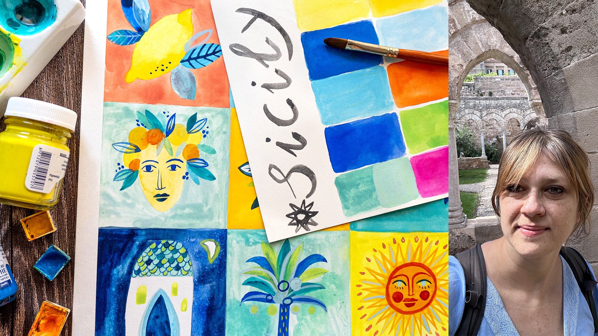
1. Introduction: If you're searching for
a source of inspiration, if you like Byzantium art or if you simply love
gold and watercolors, then I invite you to this class. My name is Ana. I'm an Illustrator, teacher. I teach here on Skillshare. And I decided to prepare
this class because lately, I've been to Sicily, and I rediscovered
the Byzantium art and how great impact
it had in my art. And I wanted to share the
source of inspiration with you, but not only, I
wanted to share with you simple tools that I use
in my creative process. Order to digest inspiration and to show you how
you could apply it to your art in order to
improve your style and develop your artistic voice and all of it through
simple steps, through exploring colors,
exploring inspirations, and through a watercolor, fun, easy and colorful project. Join me in this journey
full of inspiration.
2. Class Project: The classes project
will be creating an illustration based on the inspiration
of Byzantium art, and it will be made
with watercolors and golden art supplies. To do that, first, I will show you a little
bit of Byzantine Sicily, and hopefully, it will spark your imagination
and inspire you. Then I'll show you
the art supplies, especially we will see
different possibilities. We have to paint with gold, and then we will explore colors. We will see how to create color
palette from observation, Afterwards, we will see we will search for
an inspiration. We will do a useful
exercise that will help to explore your inspiration
and apply it to your style. And then we will unite all those elements to
create the final project, the watercolor
illustration based on the previous exercises. Also be sure to check out the project and
resources section of the class where I will leave you some helpful resources
for your project. I will leave you PF with photos from Sicily Link to the
Inspirational Mood board, List of art supplies. Also, I really invite you to see all the lessons before you will jump into the
final project. First, it will be
helpful for you. And second of all, I really highlight the importance
of your own research, of your own inspiration. And the class will give you the tools for this in order to create your personalized and
your unique final project. Once you've finished,
remember to applaud your project to
the projects gallery. I cannot wait to see
what you came up with and remember also to like and to comment on each
other's projects. It's very encouraging
and inspiring to see what we
created all together. And right now, relax, take a seat and enjoy
a little trip that I will take you to discover
mysterious Byzantium Sicily.
3. Explore Bizantine Inspiration: L et's discover together Sicily, mysterious, full of
breathtaking art, mystical place of rich
history, thousands of years, epochs, and its unique beauty comes from mixture of
different times and cultures. And the special
mixture of Byzantine, Norman and Arabic worlds, sculptured incredible buildings
and filled them with art, which is one of its kind. You can discover quiet, pure spaces made
of light stones, and silence You can
immerse yourself, imagine the times
that have passed, but still testimony
the greatness. Then you enter to places
like Capela Palatina, Palatine Chapel that makes you speechless, so rich, glorious, magnificent a place that represents the
kingdom of heaven, and also the Kingdom
of Earth since it was a King's chapel
in Royal Palace, and it's all in the
heart of Palermo. I'll leave you some images from this chapel and from Salajeo, which is Rom of the King
in the same royal palace. I leave you with their
uplifting mosaics and art, which is also a mixture of Byzantine Norman
and Arabic styles. The Byzantine gold mosaics
that glow with ums and colors and ornaments, geometrical,
beautiful mosaics. Also caras, which are
Arabic style ceilings, full of symbols and
geometrical patterns. Sicily is also full of treasures that reflect the
richness of great epochs, stone gems, gold, and this mysterious
beauty of antique times. Something fascinating
and so inspiring. There are so many things that
can be a great source of inspiration for your art,
colors, shapes, themes. Let us explore it together. Oh.
4. Art Supplies: Let me walk you through the art supplies that we
will use in the class. So I will be working with watercolors and a
little bit of gouache. Yeah, I will work
with watercolors. I will show you some of the
textures that I create, and the final project will
be painted with watercolors. But you don't have
to follow my steps. You can explore the theme of Byzantine art in Sicily
with your own supplies. So this is my palette
of blue of cool colors. I have also palette
with warm colors. So I will use both of them. And as for the watercolors, I will also explore metallic watercolors,
not all of them. I will work with
golden colors, copper, and the colors that I
will use for my project. If you have other
metallic colors that you would like to use, obviously, again, go for it. There will be a separate
lesson where I will show you different art supplies
that I have at home gold art supplies,
golden art supplies. So I want show you
now all of those. You can watch the
lesson where I explain better and swatch
each one of them. Basically, I will use for my project golden watercolor
and wash. And also, this supply, I will
talk a little bit more about it in the lesson
about gold art supplies. I will also work with ah. Again, if you want to paint your project with
Guash, go for it. I will use it to
make some colors, for example, I will use white. Sometimes I will use blue. For the exploration of theme, I like to work with Wah. As for the paper, I will
use both sketchbook for exploration of the motifs and the block of
watercolor paper. This time I will use quite fancy watercolor
paper arch or arches. Depends I heard
different pronunciation, so I'm not sure which
one is correct. So this is really good
watercolor paper. I wanted to I used it because it really holds
huge quantity of water, and I really love to
work with this paper. So since the project
is quite precious, I want to achieve texture, so I decided to use
more expensive paper. If you don't have it, or if you or if
you don't want to use good watercolor
paper for this project. Then obviously use the paper
that you have at home. You can use whatever
watercolor paper you have at home or
maybe mixed media paper, if you if you work if you work with other water soluble colors. And obviously, pencils. I work usually with
synthetic pencils. This one is natural. I have it, I like I have some natural brushes. Or
you don't have to use it. I use it because
it's really thin and good for painting details
and tiny tiny swatches, tiny strokes, and tiny spaces. I will use different shapes
and sizes. This is medium. Those two are rounded
like cut, tongue shape. So I like to work with them. And pencil, erase,
obviously, and masking tape. And in the next lesson, we will explore
golden art supplies.
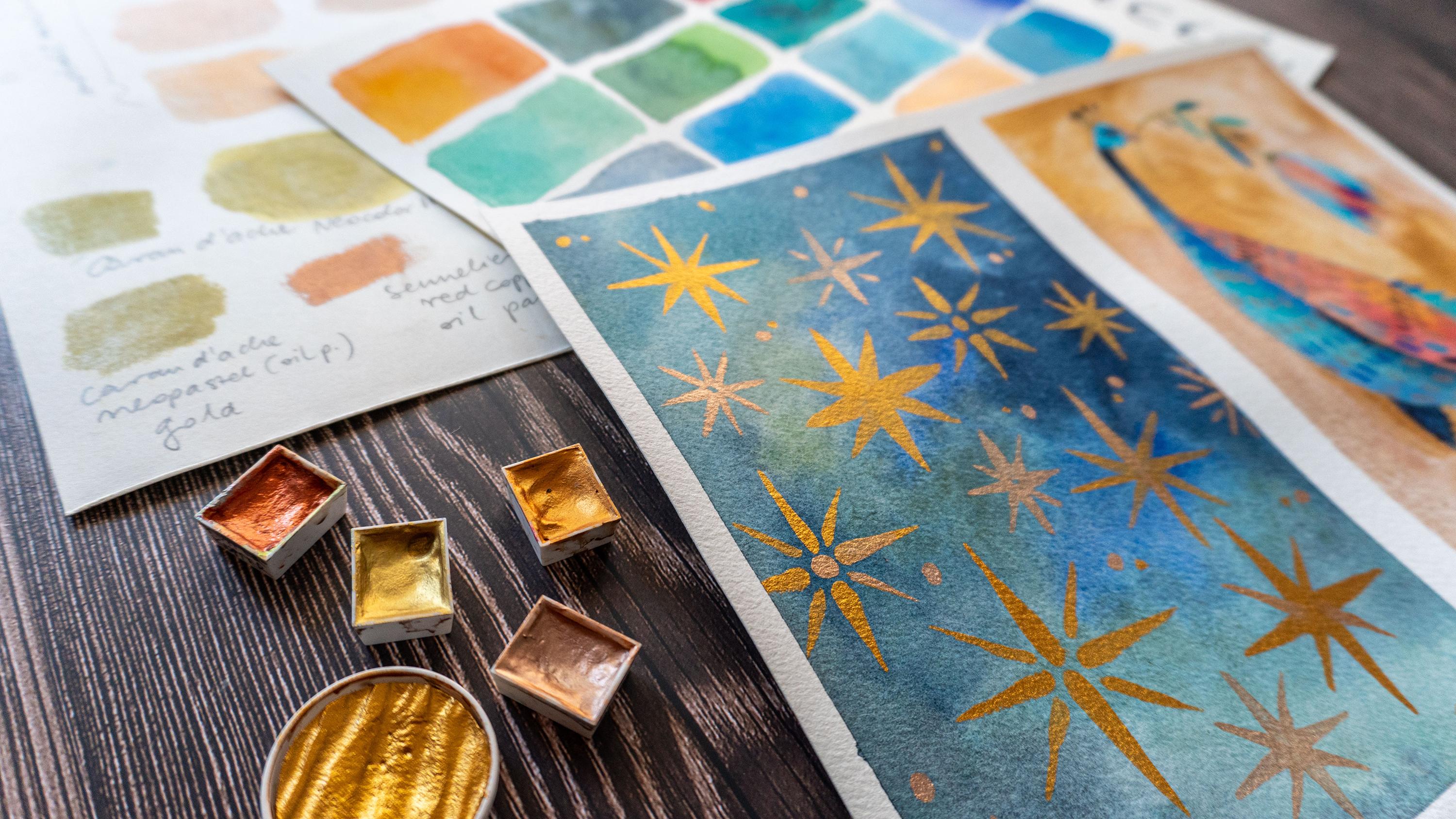
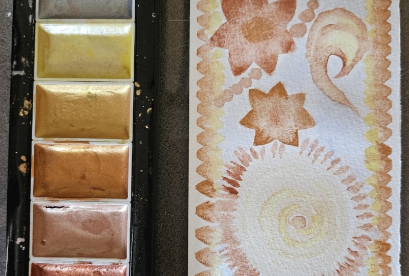
5. Explore Golden Colors : Let's study gold. I will swatch with you the art supplies
that I have at home, metallic and gold art supplies. In this way, we will see
together how they work, the textures, they
create opacity. Maybe it will be useful for you. I encourage you to
find the supplies that you have at home
and swatch them. Maybe you have something
different. That's okay. I will show you what I have. Also try to use some things that maybe
are not so obvious. Maybe there are some
colors that you can use that you used for other things like maybe
ceramics or maybe your kid. Your kids have some
cheap metallic supplies, grab what you can find, and let's start swatching. When I say that you might have something at home
and try to use it. For example, I have
those two colors. I accidentally found them. I forget that I have them. I think I took them
even in high school, and I'm not even
sure what are they? It's not written,
if it's guash or if it's acrylic. You know what? It doesn't matter.
I will test it, I will try it and
see how it works. It works fine on paper. And the color is cool. It's opaque kind of
antique gold ipe. So I encourage you
to test some colors. Maybe you will find
something at home. For example, maybe something to paint on glass or ceramics. Why not? Maybe not to
paint on entire paper, but for example, you
could use it for details. So yeah, just search at how much you have watch it and
test different textures, opacities, and see what
will work best for you. After swatching the two
colors, they're really nice. They have this
antique old gold vibe and which is really cool. Maybe not to the colors
are not too bright, but but still okay. L et's watch another color. I have a watercolor,
golden water color. I'm not sure what brand is it. It was a gift from my friend, and it's not written, but I really love it. It's really luminous. And as you can see, the difference between the two, the previous two is that
watercolor is more translucent. The other one was more opaque. I will try also wet on wet. Swatch out your
materials also to see which one do you prefer
if you prefer opaque layer, for example, or more
translucent as the watercolor. Let's continue with watercolors. I wanted to show you this set of metallic watercolors
that I have. It's nothing fancy. I think it's made in China. It's also a gift, but I decided to swatch it. To be honest, I don't have any good quality,
metallic watercolors. Let's see how those,
those beauties work. I will swatch the colors that I will choose
from my project. I will continue with gold, but also this, metallic co. I will swatch only
the colors that I think that I will
need for my project. If you think that you would like to use some other
metallic colors, definitely go for it. It's obviously your interpretation
and your inspiration. Since I don't have really
good quality metallic colors, I cannot see to do
the comparison. But in comparison to the
top one, the gold one, you can see the difference,
they are less opaque, they have less pigment, but they are still good. Also, that's another
tip or advice for you. If you have some mediums
that you wouldn't try them, test them, Maybe you
have some mediums for kids or something like that. I will test with you,
other art supply that I rarely use or quite never. I would say I bought it
in a shop, I saw it, and it intrigued me, so I decided to try it. It's Akashin from Schmincke. So basically, it's medium
that you add to watercolors, and it's shiny, pearly, medium, and you add it to a metallic watercolor
at least in th, so let's test it. You basically apply
it to the color. I do it with a pipette tip. I saw basically that
you have to use a lot of it in order
to see the effect. Maybe you can already
see the mixture. To be honest, it's not really
metallic color effect. It's more like adding Perly
layer two watercolors. I'm not sure how to explain it, but the difference you can see between the
metallic colors above, the blue color and the
blue with this per liquid. Maybe it's something
that you will like. If you have it at home, then test it. Try it. I'm not a big fan of it, but maybe that's something
that will work for you. I decided to create
a gold with it. Let's see how it works. I mixed some yellows, warm yellows and ocher to
create this goldish color. Here's the color swatched. Well, obviously, it's not the
same as the metallic gold, but you still can use it. I think as a good alternative, you can see this,
this pery particles. I'm not sure if it's visible. I will show you at the end of swatching the
reflection of light, so you will see better
the metallic reflections. The next in my table is guh. I have gold Gach from
Windsor and Newton, and let's try it. Let's see if it will be more
opaque than our watercolor. You can use Gach in two ways. You can use it as a
dense opaque medium with a high coverage, or you can dilute it and
use it as watercolor. Let's test it. The last in the line are metallic
pastels and pencils. Let's start with woody pencils. Those are basically like
I would say, ox, pastels, they're very oily,
have high coverage, and they're water soluble. Let's watch them and
see how they work. There's metallic, but
not so as water cools. Let's try to dilute it. Also let's test the silver one. Another pastel on my table is wax pastel neo color
two from Caran dash. There are also water soluble. So let's test the gold version. I will dilute it. This is gold. But
as you can see, it has this greenish tone, and it seems like
really old gold. You can see that it's very
different from water colors, the opacity is much more
higher and it's not so bright, it's not so shiny as
other water colors. Maybe I could use
it, for example, for details or for
some small areas. Maybe it's not so suitable
for example, for backgrounds, especially if you want
very shiny background. The last are oil pastels. I have two different brands, two different kinds of
gold metallic pastels. The first one is
again, Carns pastel. It's similar as the color, but it's not wax pastel, and it's not water soluble. I will swatch it underneath
to see the difference. You can see they are
almost identical. The difference is in the medium. The wax pastel is not so
oily and it's water soluble. Now let's skip to the senala oil pastel This
is really, very good brand, and I found this, I think it's bronze
or red copper, something like that, and it really intrigued
me in the shop, so I decided to take it. And it's really gorgeous. The color is really
really gorgeous. As you can see, it's
really battery. That's the
characteristic of Cenea. And also the metallic
reflection is quite good. Also, in this case, probably it's good
for smaller areas, for details maybe, but the color is really very good at
least in my opinion. If you have oil pastels,
wx, pastels, metallic, colors, or even pencils,
you can test them. Okay. That's it. For
my art supplies. Obviously, there's a huge
range of other art supplies. There are also gold leaves, for example, if you
know how to use them. You can use them as well. I'm trying to show you here
the glossiness, the outcome. But the best way for you is to swatch your metallic colors, your gold colors that
you have at home. Obviously, if you want share it with us within your project, it's always great to
learn from one another. For any reasons, you
cannot use gold colors, maybe you don't have at home, or you just prefer not to use metallic
colors or you don't have the glossy medium
that I showed you. I will show you another
solution in the next lesson.
6. Alternatives For Gold: In case you don't have gold
at home or for some reasons, you don't want to use it. The first solution would be
the one that I talked to you about in the previous lesson
using Aqua shine medium, which, in addition to
a normal color gives this shiny glitter effect. Or simply you could use
just a yellow color. In this image, you see two
illustrations that I did, and I used yellow
for the background. I think if you use a right
tone of yellow, warm yellow, it can also give you
this impression of gold. So it's up to you. Right now, you have all the possibilities
in front of you, pick one, and let's get started. And in the next lesson, we will start to
explore the motives, the inspiration from
the Byzantine art.
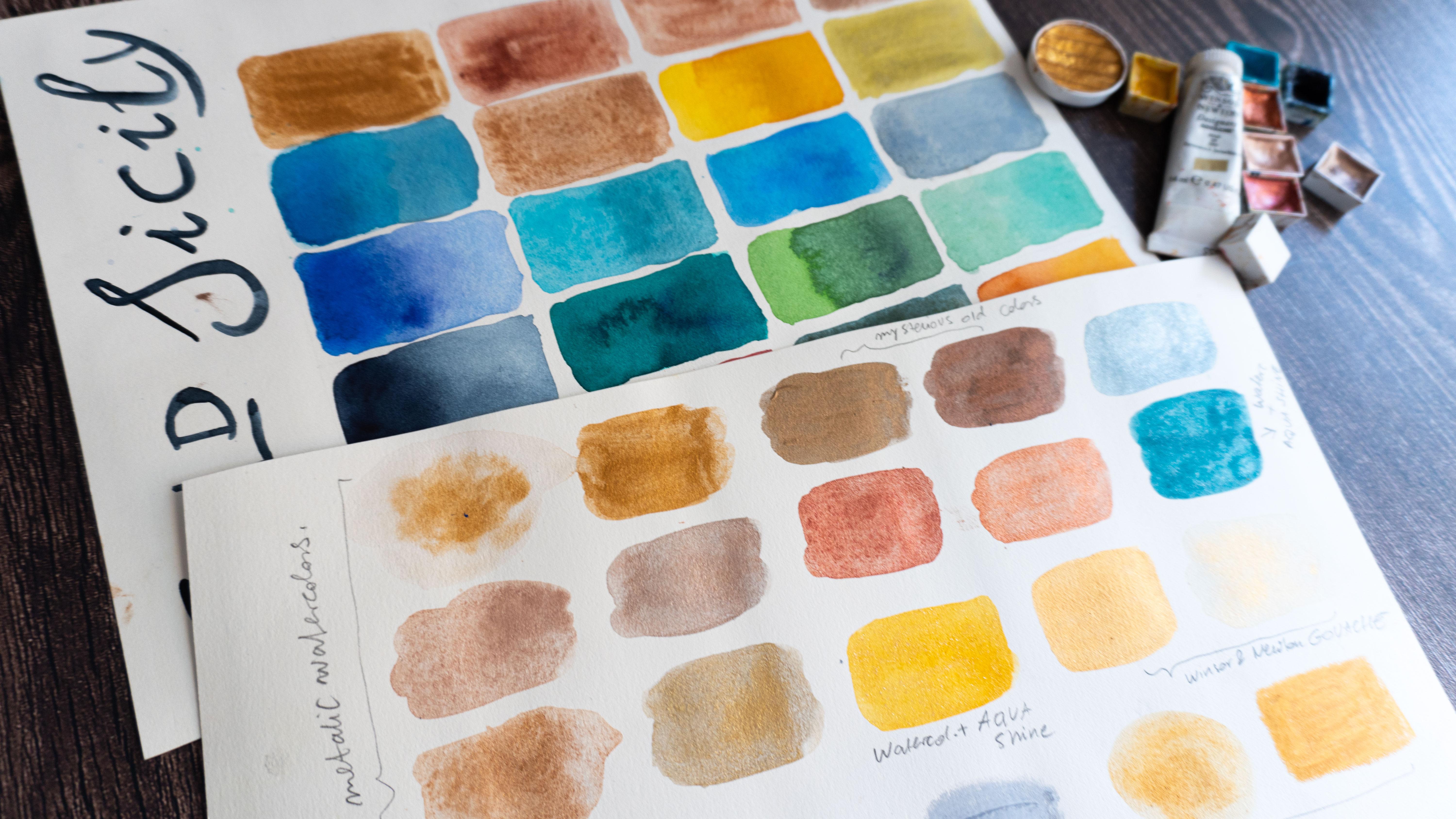
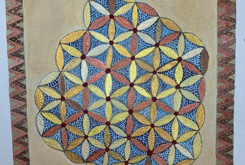
7. Create Your Color Palette: So Let's search for the color inspiration
for our project. When we think about
Byzantine art, when you look at the mosaics
or at the treasures, at the icons, what
strikes you most? What do you love? How would you like to
apply it in your art? Well, L et's start from colors. So when I look at the colors
of the Byzantine art, I'm just so amused
by the boldness, the brightness of colors. So I will try to recreate
it in my palette. I will search for
intense bright colors that I can see in gems
and in the mosaics. I will also try to some
way and somehow recreate the light that is reflected in the gold in the
mosaics and in the gems. Whatever colors you will pick. It will be fine. The
most important thing is that they will inspire
you and your art. Let's create our
colorful mood board. I created this chart, and I will fill the
squares with the colors, but you can work whatever in the form that suits you best. You can just swatch
colors in a free way. It's up to you. I will start with my gold
colors from the other lesson. I will swatch the colors that I liked the most from the palette. It will be most of
the gold to colors. If you want to switch other
metallic colors, of course, I don't want to repeat myself so switch the colors
and in this case, metallic colors
that you would like to have in your project. I will also swatch the yellow color that
could fake the gold, and the color that I talked to you about
in the other lesson, so I will search for
this warm yellow. Now I will try to recreate blue colors blue colors
from mosaics and the gems. If you observe mosaics, there's a lot of kinds of blues
and turquoise and greens. So I love those colors, so I will go for them. I will s for them. And also the gems that are
sometimes in the treasures. I'm not good at the names, so I have this
little cheat sheet with names of blue stone gems. Some of them, I already know, for example, with I
worked with azurite, Lapis lazuli pigment that
I used to paint icons. And I will, I will try to recreate if it's possible
those bright blues. You can also swatch the colors before you will paint
them in the chart on a different paper so you can
see if the color is good. For example, I found this lapis lazuli azurite,
also as watercolor. This one is from Sena. I found it by chance in a shop, and it was quite expensive. So I think it has a real
pigment in it. Let's watch it. So it's not so bright. It's not so intense, but it has a really good
feeling and texture into it. Obviously, you don't have to search for real
pigments right now. We will try to create the colors that will
just inspire us. For example, I will
mix this lazoita with stokise and with other colors, and I will create my
blues for the chart. I decided to use a
palette of colors that I had that I used for the other project about
Sicily and the other class, since there are a lot
of greens and blue, so I will use it. If you have also some dried
colors that inspires you, you can also use it
for your project. Oh Now I'm jumping into the greens since
I finished the blues. Again, I'm watching at my photo references at the
colors on the mosaics, but also at the stone gems. With the greens, I
will also try to recreate the blending of colors. I want to create the
effect of gem of the light that it reflects
of different colors that are created inside of a em stone. Here I am painting
the emerald green. This is a cold green. I'm adding a little bit of
blue, and while painting, I'm adding indigo and
other blue colors in order to create the different
colors that are inside gem, especially when it
reflects light. I'm starting to
swatch this effect. So on the pres mood board
that I prepared for you, there are those two photos
with green stone gems, and I will try to
recreate it now. Also with the light
and the shadows that it has and the light
that it reflects. So I want to include this kind of greens
in my palette as well. I also have another
pigmented water color based on the natural pigment, which is malachite,
or malachite. Not sure how to pronounce it. Sorry. It's from the Polish
brand, Roman Schmal Aquarius. I decided to take
it and test it. It was also more expensive than regular watercolors,
I really love it. It's very subtle.
It's really delicate, but it creates a really
lovely pigmentation, and the color is Yeah, I think you can feel
when you paint with it, that that it's not artificial
pigment. I will use it. I will also add a
little bit of again, another color turquoise to add the blending subtle colors. Again, don't be upset because I'm using those
natural pigmented watercolors. Obviously, you don't
have to use them. You don't have to
have them at home. As you can see, I recreated
blues and turquoise based on normal
regular water colors. What I usually do
and a good thing to do is to separate the colors that you used
for your color palette. So then you will know
for your final project, what colors you used. Otherwise, if you remember them, then you don't have to do it. I usually do it otherwise, I get a little bit lot. Those are my greens and blues. So few spots left. Obviously, I can add
more colors if I like, but I will add warm colors. So usually, I'm going for cool turquoise colors that's something that
naturally strikes me, and I often very
often use in my art, and warm colors are
not so natural for me, not Istinctively,
I use blue colors. For you, maybe it
will be different. Maybe you prefer warm colors. Yeah. Anyway, the red that I
see in Byzantine art, again, I'm watching at my
photo references and also both from mosaics
and gemstones. I will search for ruby
colors, for example, Again, I'm trying to
create the depth of the gemstones shadow and light by adding a darker
red into the swatch. This is my color palette. I will call it done. I couldn't help myself and
I added another green. That's because I remembered
I have this granulating, multi pigmented cascade
green of Daniel Smith, which I really love, and I thought it would
be perfect for gem. So if you have any
granulating water colors, I think it will be really great for creating the gem texture. I also created this orange, a warm color, which
is also often seen in the Byzantine art. Those are my colors and I am ready with my color
palette, more or less. Obviously, I can also
mix those colors in between them, blues and greens. I can make them lighter, darker, the same with reds, but the bases is already
there and I'm ready to go. So I cannot wait to see your color palette if
you want to add it to your project or
your final project and tell us what colors
inspired you and why? In the next lesson, we will explore the themes. We will see what could we
paint for our final project.
8. Inspiration: Let's search for an inspiration. We will do simple
sketches, simple, quick drawings, small
studies in this lesson. I think it's useful not
only for this class, but it's very useful as an exercise in your
everyday life as an artist to create very
simple shapes and forms. And it is useful for
multiple reasons. It takes off the pressure
of creating final piece. And in this way, by having
fun by doing simple shapes, you create without pressure, and you can find
many fun solutions, and they can become your actual
style or visual language. So I think it's useful. This kind of exercise
is useful as an artist. So in this class, we will search for isn't an inspiration I will look at my
photo references at the mood board on pin test
that I prepared for you. So you can also have a look or search for your own
photo references. So as I said, it's very simple. I will use just one color. I will use squash and brush, but you can use whatever
medium you want. You can do it with pencils
or With other mediums, I invite you just to make
it simple to make it fun. So let's get started, and let's start exploring
our inspiration. And remember, often
inspiration comes to you by doing by
working and painting. So let's have fun, and let's get started. The good thing to get
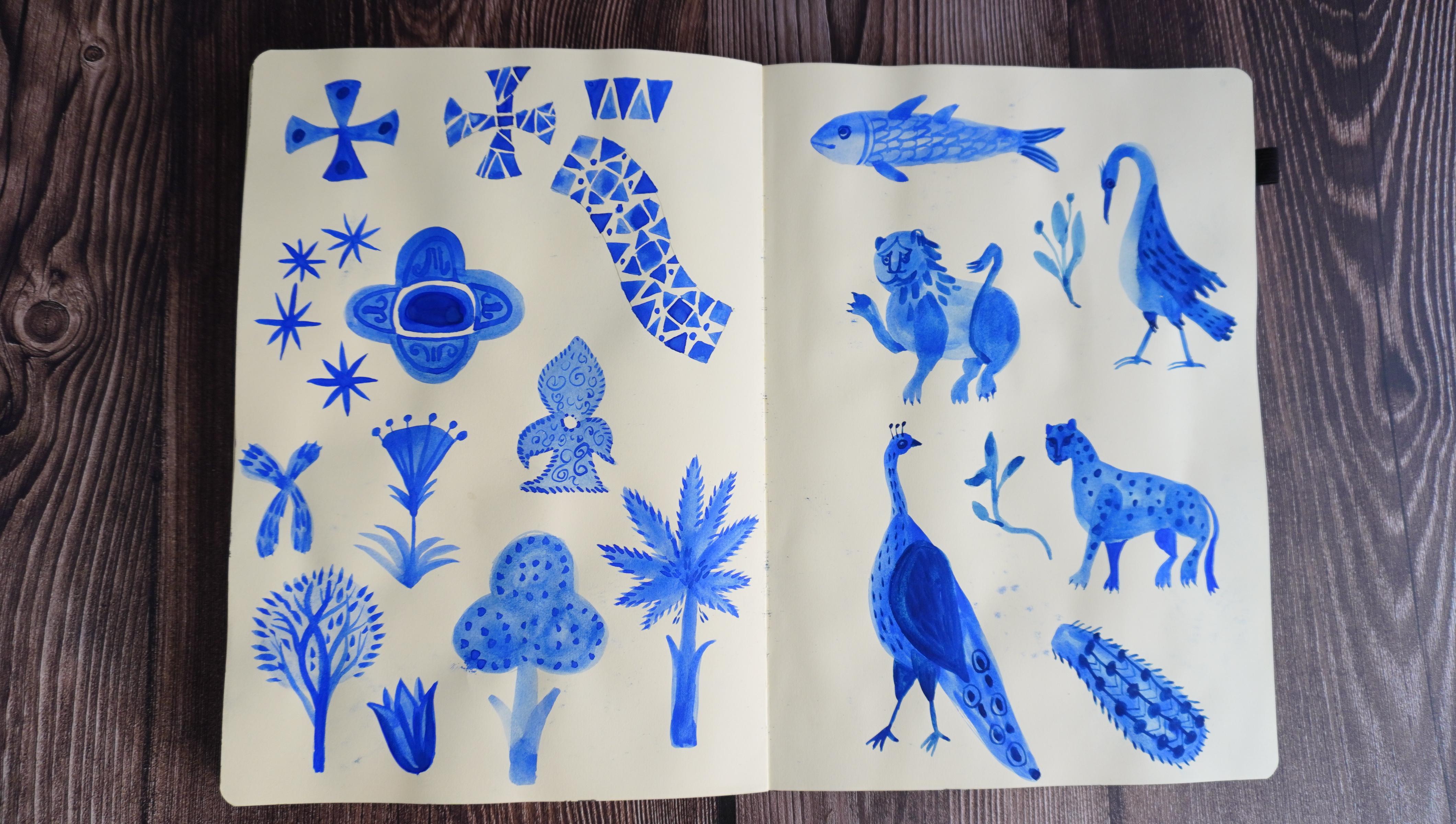
started is to start simple. So Byzantine art has a lot
of geometrical shapes, so I will paint them. It's good to warm up your hand and to get
used to paint shapes. Also geometrical shapes, especially those
Byzantine ones are great source of
inspiration, who knows? Maybe you could use them
for your final project. I will paint the photos, the and from the photos, the shapes that I
see crosses and also geometrical shapes mosaics. You could, for example,
also explore mosaics. To do that, you can sketch the shape that you
want to draw and then fill it with simple little pieces and
make your own mosaic. This is also a good
exercise for precision, for example, why
not try to do it. You can explore different
patterns from mozics. There are lots of them. If you're into those kind
of geometrical shapes, then maybe you would
like to explore it more. Yeah, it's up to you. It depends what
inspires you most. In the meantime, I
drew also the shape found on the crown on
the treasure crown, in the museum that I saw. Maybe I can use it now. Maybe I could use it
in the future project. Since I'm drawing
in my sketchbook, I can always turn
back to those shapes, and if they inspire me
for something else, I can use them in the future. I also am drawing the stars. I love this pattern, this starry pattern
that is so often on the ceilings of
Byzantine buildings. I'm also inspired by the floral shapes in
the Byzantine art. They are so I don't
know, simple, yet very inspiring
and just beautiful. So I will also include
them in my studies. Oh. So I finished also the floral explorations. Those are the
shapes that I drew, trees, and some flowers. And what I noticed it is very interesting that
those kind of shapes. I don't know if I
already told you, I really love simplified shapes, so I really enjoyed it. But for example,
this kind of tree. I already draw in my art. So this is incredible
that I found inspiration. Obviously, I was inspired
by this tree because I draw trees in
this way in my art. Maybe I was inspired
as a little kid. I grew up in Poland. So maybe I watched
some Eastern icons, we also use simplified shapes. So yeah, that's
very interesting. I'm curious if you will find some links in your art
in the Byzantine art, if you will be inspired by something that you already draw. Yeah, that was fun
to discover this. I've done geometrical shapes. I've done floral shapes. I already feel that my
drawing is improving. I have bigger control in
painting in brush strokes. Right now, I will paint animals. Again, I'm looking on my photo
references on the mosaics, and I'm pretty I'm excited with this exercise because I really
love simplified shapes, and Byzantine art is full
of this kind of shapes, and they are very
inspiring for me. And I think that drawing animals will
help my visual language, my artistic voice to
find the solutions. How to draw animals in general, not only for this class. I already told you this in
the beginning of the class, that this kind of exercise
is useful to explore your artistic style and voice. So right now, I'm painting fish, and then I will skip
to other animals. If you observe the
Byzantine art, it is full of different animals, and often you can find
cats, for example, lions or geops, cat family. It's linked to the
symbolic meaning of most of those animals. I love the ways. Probably They didn't know exactly how Lens was in the
real life, or maybe not. Maybe it was the language. Sometimes they're really funny. So I'm definitely
inspired by this style, this kind of representation, which is not realistic, figurative, but
simplified and stylized. So I'm trying to
draw the lion here and then we will see what
other animals I will draw. I think that Watching for
the Byzantine looking at the Byzantine art can help me to draw lions
and this animals. Again, to find visual style. For this family of animals. In this case, the trick here is to really simplify the forms. As you can see, the
lion was made with just circle and val in
this really funny face. You can look at the
photo references, but also you can interpret
it in the way you want, and I'm ski to paint
my favorite birds. I will stop here. I
finished my studies, animal studies and other. So you can proceed and do
more of them if you want. I'm very happy
about the outcome. Again, I think that
thanks to this exercise, I animals in a way
that I wouldn't draw them in other circumstances. So I'm about it and Yeah. I hope that you will find this lesson useful as well
and that you will come up with shapes and forms of
the elements that you will draw that you will find
them good for your style. And When you finish, then pick one of the elements. It can be geometrical shape, it can be plant or animal. It can be one or more of shapes, and we will dive into
the final project, and we will join and unite all the previous elements of this class and paint
the final illustration.
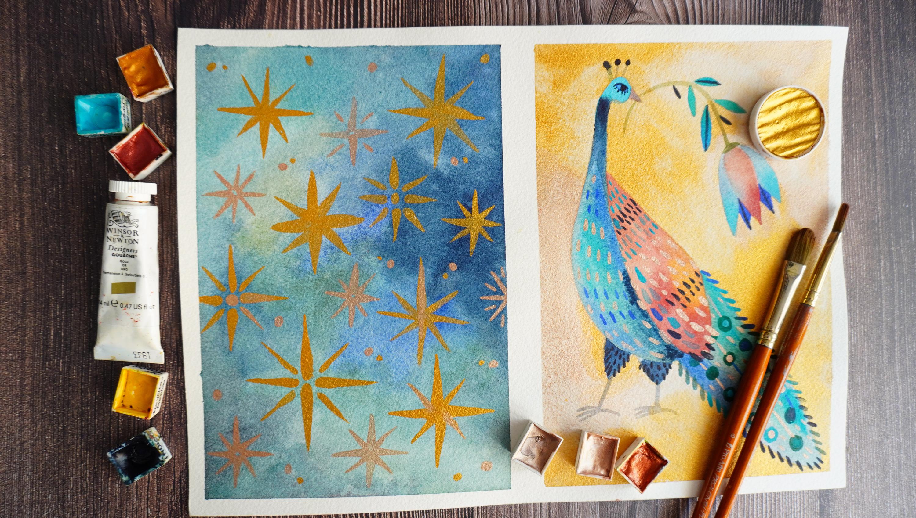
9. Final Project: I'm very excited that we are
beginning our final project, Let's gather all the elements
from the previous lessons and unite them and make the
final project out of it. Take your cool palette, take your motifs, and think
about what you want to draw. You can do it in several ways. You can do just
one illustration, you can do more
small illustrations. In the last class about Sicily, I divided the sheet into
multiple small squares. You could do it as well, or Yeah, whatever you
feel right for you. I divided my sheet
into two frames, and I will develop two motifs
that inspires me the most. The first one will be the sky of the ceilings in the Byzantine
chapels or mausoleums. I really love it,
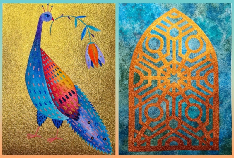
so I wanted to try to recreate this motif. And in the other square, I will paint a peacock. So I chose to paint a peacock
from from the animals, and yeah, I was tempted
to paint a tree, but I really paint
a lot of trees. I also paint birds, it's my comfort zone, but still it's new visual
language, new peacock. I will enjoy to paint to develop the sketch from the
previous exercise. So pick your motives that
you want to develop, grab your watercolors,
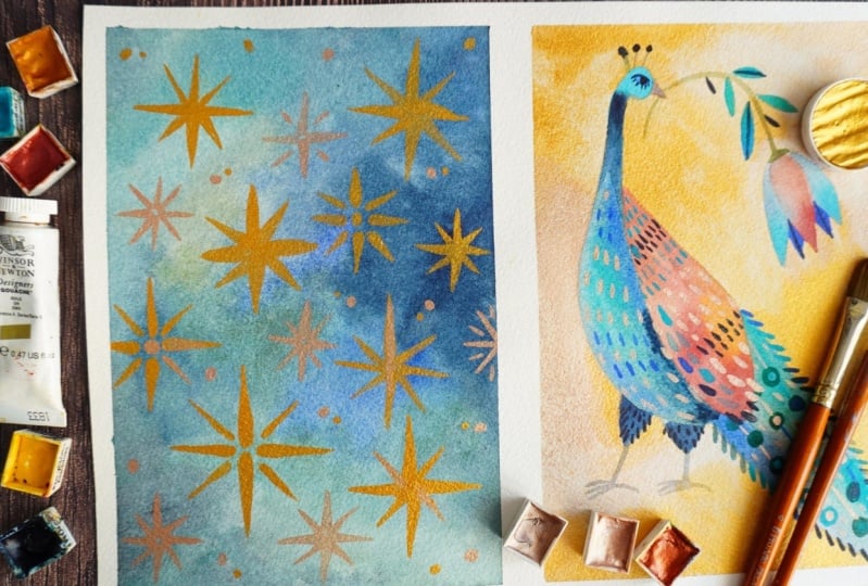
and let's dive in. The first illustration
will be the starry night. I will paint the sky. Right now, I already
have the colors that I picked during the creation
of the color palette. Rather than creating
a flat blue layer, I wanted to do something more
whimsical, more magical. The impression of
the galactic sky may be that evokes emotions, the same emotions
that I have when I look at the mosaic ceiling, very good emotions that
sparkles my imagination. I wanted to do
something more dreamy. And also on the other hand, I would like to do textures that evoke and remind
of the gem stones. So something that
includes light, shadow, different tones
and values of colors. The colors that will blend. So I really invite you to
explore your own inspirations. This lesson with the project that I will do is not
tutorial for you to how to develop a night sky or the illustration that I do rather than painting
with you together. I'm happy to share
with you the process. I will explain you a little
bit the steps as well. Yeah, but it's not the tutorial about watercolors,
this kind of sky. I explain also how to
paint this kind of sky in the lesson about the imaginary world
painted with watercolors. But, shortly, it's about
blending watercolors. First, I painted with
watercolor on the dry paper, and while the color
is still wet, I'm painting with
different colors into it so the
watercolors are blending. I proceed with blending of different blues and
greens also in this case. Since I really love textures, watercolor textures, I will try to recreate
it here as well. So I will speed up the process and show you the finished sky. So since I love textures, I will water into the painting. While it's still wet,
I finished the sky, but I wanted to add this little sparkling texture and it's achieved by
spraying the water into it. So let's try to do it. As you can see, there
are little dots. Some sometimes
it's more visible, depends on how wet the color is, sometimes it comes out
better and sometimes not. So I will sketch the peacock. I canceled the first sketch
because it was too big. I will help myself with
very light with outlining, with pencils, the
shape of the peacock. You can do it. Also as well, you can draw first your
animal with a pencil. So I thought to use
the color palette in this way that I will paint the gold stars
onto the blue sky, and for the peacock, I will reverse the colors, the peacock will have the
same colors as the sky, and the background
will be golden. There is this space
left on the right. Probably I will fill it
with some other motif. Probably it will be flower. I will pick one of the
motifs and use it as well, and somehow I will I will
put it near the peacock. Well, I will look at my photo
reference of the Peacock. I will try to
recreate the colors, but I won't look at
the photo anymore. I'm trying to memorize
now the colors, the patterns of the tail, and from now on, I will work with my memory
and my imagination. It's also a good exercise
for you now to work more on previous sketches and
with your imagination. I'm canceling the
sketch not totally, but I want to lighten the lines, so it won't show
through the water, and then I will start to paint. As I already told you, I want to use the same
color as for the sky. I will recreate
this blues that are blending inside the
shape of the peacock. The wing will will
have warm colors. I waited for the
blue colors to dry. So the red colors
won't blend into it. I wanted to separate
the w from the. I will paint it with the same technique
by blending colors, but it will be warm colors. No, I decided that I will draw a flower that's coming
out of the beak. No, that the peacock
is holding in his, it will have the same
colors as the pack. While the colors of the peacock
and flowers are drying, I will start to paint stars. I will paint
different shapes and sizes was based on the shapes that I saw
on the Byzantine art. I will play around with
the forms and the scale. I'm using the water color
in the end, it's opaque. It covers well, the
background color, so it's basically almost
the same as squash. I finished the stars. I used the gold, but I
also added in the end, the other gold from
the other set, which is rose, pink gold,
something like that. I think the effect
is interesting rather than using
just one of gold. Now the peacock and the
flower are, they are. I can paint the background, and in this case, I will paint around the peacock. I will also blend different gold again to
create this blending texture. A little bit of precision
here is needed. But I don't have
a lot of details, so I can manage it. Also, a good thing is
to change your brushes. When you go to smaller areas, you can use smaller brushes, then it's easier to control the precision and not
overlapping with color. The other elements.
So as you can hear, as you can see, I'm
blending different golds. So in this way, it
will be similar. The effect will be similar for the sky. H. Here's my sparkling
gold background. There's a little bit of s, so I will show you the shiny
effect of all the textures. As you can see, I added also a little bit of gold
to to the wing, those are the stars
with different gods. It's all very shiny and
I like this effect. It's time to finish the peacock, I will paint details. I'm trying to
remember the patterns that I saw, but also here, I can play around and play with my imagination
a little bit and let my style show a bit even more when I'm not looking just at
the photo reference. I invite you obviously
to do the same. M Well, I will proceed
with watercolors. I think I will add some tiny
details of gold as well, but there's already
a lot of gold, so I'll try not to exaggerate. Even if it's difficult, I often exaggerate with
details. We'll see. We'll see. If you want, you can use your favorite art
supplies to apply details. It doesn't have
to be watercolor. It can be pencil or markers or whatever
whatever you wish. 00. Oh. Who. Oh. I will call it doe for now. I think I exaggerate it a
little bit with details. I think I could have done
it a little bit less, but that's fine. That's okay. I like it anyway, and I must admit I really
had fun with this project. I really had fun with
painting the stars, and especially with
painting the peacock, because it's a new way. I never drew bird in this way. I always tend to
stylize, to simplify, but it is a new way
and I really enjoyed the process and that I discovered new ways
of for example, of applying details,
to tiny patterns which are different from the
things that I usually do. And I hope it will
be the same for you. I really wish that you will
discover new ways of drawing with this class and that you
will paint fun elements, whatever it will be
geometrical shapes or plants or animals, and that you will
enjoy it as well and that your project will be gold. Obviously, I'm kidding you can use whatever colors you want, but I'm sure it
will be glorious, and it will shine
like Byzantine art. That's it for the final project. I cannot wait to
see what you came up with what ideas and
what inspired you. Let me know if you
enjoy the process, if you liked the idea of being
inspired by Byzantine art, and if it changed for your art, for your artistic voice, And I invite you to see the final lesson
where I will share with you some final thoughts. And yeah, I cannot wait to see you in the
project gallery.
10. Final Thoughts: So thank you so much for
joining me in this class. Congratulations. I
hope you enjoyed it. I hope it was super fun
and inspiring for you. And I would like you to share
with us your final project, share with us your illustration. And also, it would
be lovely to see the colors that you created. What inspired you
share it with us also you the subject that you
painted and the studies. In the end, I would like to
ask you to leave the review. If you like the class. It would be very helpful for me. Share it with your
friends, if you liked it. It will help my channel grow. So I hope you enjoyed it, and I hope to see you in
my other classes. Te T.
 Ania Kropla Malinowska, Award-winning illustrator