Transcripts
1. Introduction: Hello and welcome to this intermediate level
watercolor glass. This is a perfect
class for students looking to progress along
their watercolor journey. It has a lot of simple, easy to follow steps, along with an introduction to a few challenging techniques. The subject for our class
is the European goldfinch, a common bird found in gardens
across two continents. What I found interesting about the reference that we're
using is the light. It's bright but yet it is soft, create a lively
depiction of the scene. We will have to
learn how to create soft shapes and
smooth transitions in our watercolor painting. As always, our focus will be on bold and
playful brush work. Our focus will be on large shapes and how
to connect them, not perfection in minor detail. We will embrace all
the happy accidents that happen along the way. We will find joy. We will find fun in the unpredictability
that the medium of watercolor affords us. My name is an Ruda. I am a watercolor artist
based in Mumbai, India. If you want to learn more
about me and my work, I would suggest to come find me on one of my social
media handles. I have a small Youtube channel where I post more
short form videos. We find a few birds
there as well, but you'll find a lot
of urban sketching and product reviews too. I'm also fairly
regular on Instagram. My Instagram is unfiltered in the best possible way where I post both my failures
and my successes. If you want to have a chat
about watercolor and wildlife, that is the best place to do so.
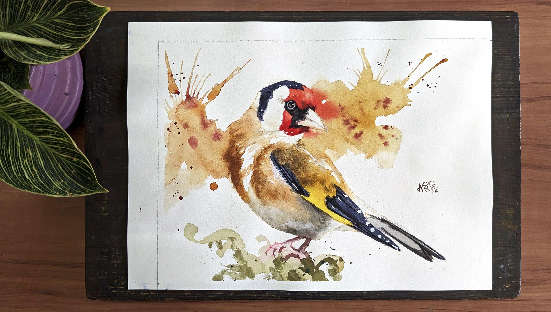
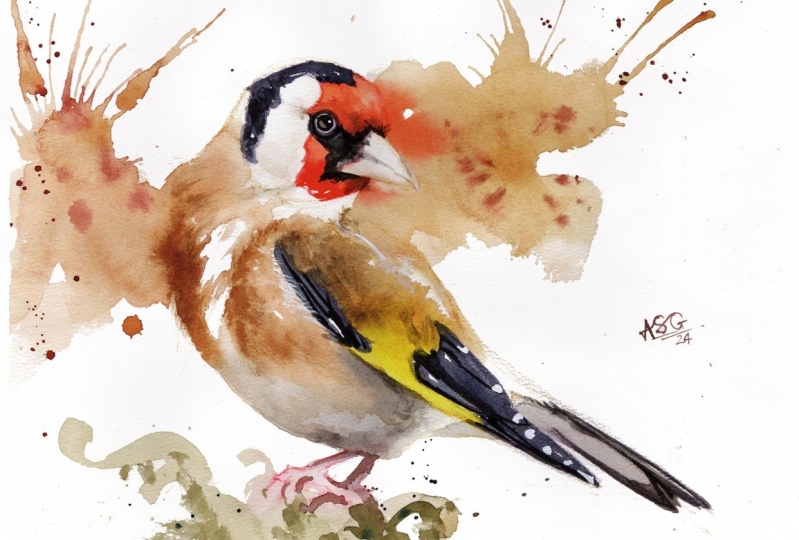
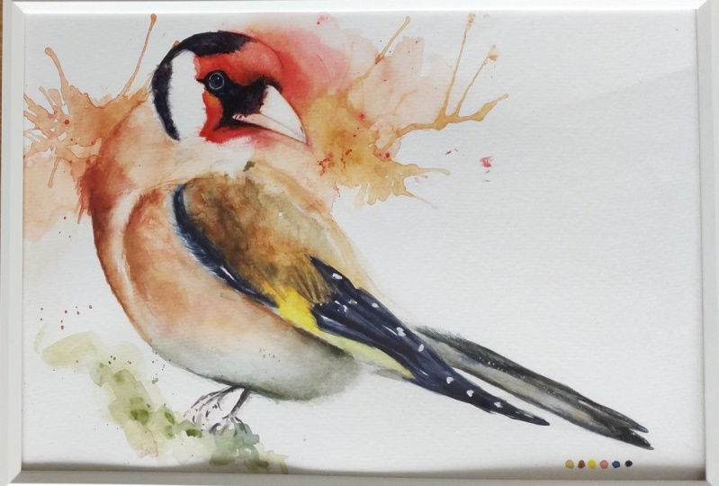
2. Approach & Materials: This right here is the
goldfinch painting that you will be able to achieve by the end
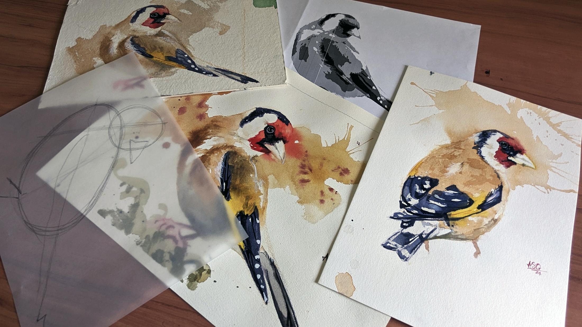
of this class. There is a scanned
version of this in the resources folder
for this class. Apart from that, there are three other files there
that you will find useful. There is this line
drawing template. Instead of giving you
an exact line drawing, I have isolated the building
blocks for this finch, the two major spherical
shapes and the angles. If you use this to construct your finch on
your watercolor paper, your proportions for the
drawing will be perfect. Then there is the
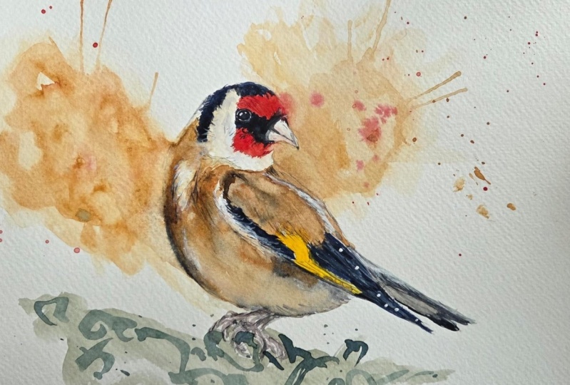
reference photograph. The original reference
photograph that I use when painting this finch. It's a photograph
I downloaded from Flicker under a Creative
Commons license. Deriving from this
reference photograph. I have this. It's a value study. It's a posterized black
and white version of the reference photograph. Those of you who
have already taken my colorful class
here on Skillshare, know what I'm This isolates the four major
values in the painting. Paper, white, light
tone, and dark. I will occasionally refer to this version of the
reference photo as the class goes along. Say for example, you can see here that have used
midtone value. That is to correspond with the one marks that you see here. Let's talk materials
starting with paper. This is Bou hong
watercolor paper, cold press texture,
300 GSM, 100% cotton. Now, I haven't used
this entire sheet. I thought keeping it to a smaller section would make
the video more concise. The area I have used
is 14 " by 10 ". I will be mounting it on this
solid wooden drawing board. It's nice to have
a surface that is separate from your table
because in the class, occasionally I will be lifting
the drawing board off and moving it around a little
bit for the mounting. I use this, it is a
simple masking tape. I also keep this small
aluminum box handy. I use it to occasionally prop up my drawing
board like this, so that I can control
the flow of my washes. Other material you will
need is as follows, A pencil and eraser for your line work containers
for your water. I like having two around, one with a little bit of clean
water and one for washing my brushes palette
for mixing color. This is a broken piece from
my regular folding palette. Before you ask, No,
this is not paint. I have managed to
damage the surface, a spritz bottle to keep
your washes active, and a cotton rag or some paper tissue in case you have any spills
and need to mop up. These are the brushes
that I use in the glass. Let's start with
the biggest one. This is a size four mop brush. It's made with goat hair. This is a size ten round brush. Actually says ten. It's closer to 12, assuming it's synthetic hair. Very soft. This is from Da
Vinci's cosmotop range. It's a size eight round brush. Its hair is a mix of
atul and synthetic. This one is from Princeton's
Aqua Elite range. It's a size six round
brush, synthetic hair. This is another local brush. I'm assuming it's a
size three round brush, the number has long
since been missing. This one is another local brush, it's a size zero synthetic
head round brush. Any brushes similar
to these six in your collection will work
perfectly fine for this class. Let's talk colors in this class, I have used a limited
selection of six colors. Any colors in your
collection similar to these six will
work perfectly fine. I have used oreolin
by white nights. Yellow occur by Shinhan PWC. Burnt sienna by white nights. P red by Shinhan PWC, azure by white nights. A lot of other brands call this color to the tune of thalo blue and lamp black
by white nights. Apart from these,
I have also used some white quash at
the end of the class. Another tool I use are
these colored pencils, water soluble colored pencils. My line work for the goldfinch
has been done using these. But to you, I would
advise just use a regular lead pencil unless you're feeling
really adventurous. Now let's begin our painting.
3. Undertone: I hope you're ready. Let's begin. This first lesson is about putting down
a simple undertone. In this goldfinch, I
am going to consider the form shadow which
is on his belly. As the undertone, I have a piece of
scrap paper under my drawing board
to test my mixes. I don't do that very often, but as a learner, that's a good practice to keep the shadowy color
for the undertone. The first one I mixed is a mixture of burnt
sienna and thalo blue. Second mix that
I'm making now is one of yellow ochre
and theloblue. I want to have some green
ready on my palette to put down some abstract shapes
under the goldfinches feet, perhaps to give an indication
of some vegetation. I'm dipping my size ten brush in clear water and I'm going to wet down the belly
region of the pitch. I hope you are able to
see it on your screen. As I lay down that water, some of the watercolor
pencils that I used for my light work begins
to melt into the wash rather than focus on
exact color matching. Not just with the
reference image, but also with the mixes
that I have made. I would like you to focus on the consistency of
the color pudlesre. Both the puddles
on my palette at the moment are at consistency. I am dabbing in the
paint into the wet area, similar to what I see
in the reference image. The exact nature of
those brush marks doesn't matter that much. Because since I'm doing it
into already wet surface, it will just go with the flow. I am pulling some of that water into the legs of the finch. Now I will make some
abstract green marks. There's no need
for accuracy here. Just have some fun
with the brush. Be playful with
those. Good chance to loosen up before the
rest of the painting. As you can observe
in the reference, the shadowy part is stronger
right under the way. That said, we'll be working on this area again,
further down the line, even if you don't get the strength right
this time around, you can adjust it.
The next pass, if you feel that you're
losing control of that wash, you can always come in with some paper tissue and blot it. Next, I want to apply that shadow color to the
underside of the finches tail. Nice and easy. Just a
simple flat application. I'm tempted into making a few adjustments
to that wet wash. I would advise you not to do the same unless you
absolutely feel the need. After these few
minor adjustments, we can move on to
the next lesson.
4. Bringing the Gold: I hope you're as excited as I am because this is the lesson
with all the bright colors. The first mix I'm making is for the golden feathers of our bird. It's a mix of yellow
ochre and burnt sienna. I will be adding a very tiny touch of blue
just to take the edge off. For the initial part
of this lesson, I'll be working at ink line. I've used that
aluminum box of mine to place my drawing
board at a small angle. The next area we are
going to be working on in this lesson are the red
feathers of the bird's face. This red appears to be leaning
towards the orange side. I'm going to add a
touch of yellow to red. Both the gold and the
red on my palette at the moment are at a
coffee consistency. I do want to create another
puddle of gold on my palette. I want this to be of a
lighter consistency. I want this to be around a, I'm dipping into that
consistency, gold puddle. With my number four
size mop brush, I'll be laying down
the first brush stroke on the outside of the pitch. I'm going to use that brush to first gently cut out the beak. Now with the flourish
of my brush, I'm just going to lay down
a playful abstract shape. I'll now switch to a
slightly smaller brush and bring that wash into
the body of the finch. There are some fluffy
white feathers at the spot where the
two wings come together. Just be mindful to leave a
little bit of white there trying up some of those edges. We are painting
feathers after all. And feathers need
to appear messy. Some parts of that wash, especially in the background, are drying up a bit
faster than I expected. I need to keep them
alive for the next step. I'm going to gently pour a
few drops of that coffee, consistency golden
mix into the wash. I am going to lift
my drawing board off the table and manipulate
the flow of paint. If you're feeling
extra adventurous, like me, you can try
blowing some of it. Just a simple blow,
surrender control, Let the paint do what it wants. I want my drawing board to be flat for the next couple
of color applications. Next, I'm going to put in that lemon yellow marking
on his wing. I'm going to let the
yellow touch the gold. There's no need for us to
have a hard edge there, let those two colors
flow into each other. I'm apprehensive of taking the
yellow down to the edge of the wing because I don't want to risk it flowing
into the pale gray. I'm going to take further
advantage of the golden, wet wash by adding in the red
feathers on the fins face. The edge of the
red which touches the gold will softly merge. The red will beautifully
bled into the gold. Timing is of the essence here. It's something that
can't be taught, it just comes through practice. I want to have some variety
in that red section, so I'm mixing a
tiny bit of blue to the red to add some
darker patches. I also want to use
my synthetic brush to lift a little bit
of that red off. My paper is beginning
to form puddles. It's rather lumpy. I mean, I don't
stretch my paper and I've also used the other side
of this particular sheet. Puddles by themselves
aren't a bad thing. You just need to
be mindful of them and manipulate them
a little further. You think they're going
to give you a problem. Now, to add some variation to
the golden in his shoulder appears a little darker for me to successfully
add pigment there. Now, wet and wet, the puddle that I've mixed on my palette not only
needs to be darker, but needs to be thicker than the paint which is
already on the paper. In adding that darker paint, I have somewhat lost the transition between
gold and yellow. Now I want to put in some more yellow and this time I'll take
it to the edge of the rig. This time, that
background wash has stayed wet for a lot
longer than I expected. I'm going to take
advantage of this and splash paint
into that wet wash. Next, I turn my
attention to some of those darker
markings on the finch. To me, those markings
appear cool, almost bluish, for my color mix, I'm going to start
with yellow blue, then I'm going to add a little
bit of pyal red to that. If I think that I
need to go dark, I'm going to add a
little bit of black. I want the consistency of this
mix to be that of coffee. Ooh, that's an awkward
angle for me to paint in. And I can't move my
border around too much because I need to
be mindful of the camera with the cleaned up brush. I'm just going to try and scruff up one of the edges there. I'm not very happy with
the shoulder of my gold fach before I start with
that bluish ink color. I'm also going to strengthen the gold bit a
little bit further. If you're happy with your finch, you don't need to do this nice and easy. Just remember to
keep your strokes aligned with the
direction of the pethers. This is, again, an
uncomfortable angle. It's forcing me to use more rests than I
would have liked. Maybe I can just turn
the board a little bit. Maybe that will make it easier. I had initially
planned to stop here, but in water color, there's always room for improvization. What's on my mind? I
am thinking of adding some darker linear strokes to all those blue areas
while they are still wet. For that, I'm just going to
create a slightly darker, thicker mixture by adding
more black into the puddle, which is already
there on my palate. For this pit. I'm using
the side of my brush, so apply the pit. I am still using my
number six brush, but I would advise you to
switch to your number three. Just a few dark lines of varying thickness
viewed in isolation. They might look untidy, but if you step away from, step away from your
piece, maybe stand up, take a few steps behind.
It will all make sense. Take a look at your piece. At this point, I am applying
finishing touches to mine. I'm sure yours looks
different and you will require touches that
are a little bit different. I want to lift away some
paint from his shoulder, but each time I wipe the
brush with my fingers, I'm actually adding color to the brush because my
fingers are all dirty. With that in mind, I better stop and let us all move on
to the next lesson.
5. Tail & Beak: I took a small break
after the last section. The paints in my palette
have dried quite a bit. I need to be mindful of that. When I'm adjusting
their consistency, I'm going to start with
the tail of our goldfinch. In the reference image, I can see the tail to be a
little bit as compared to the wing feathers
warmer, darker. So I am going to add more
black to the mixture. But I am not going
to make it thicker. I still want it to be at a
light coffee consistency. I'm going to apply
it as I see it in the reference with
simple linear strokes. In every painting, one needs to balance the lose elements
and tight elements. In this one, I am going to
go a little tighter with the tail because I think there are already
enough lose elements. Don't hesitate to use your finger as well if you
want to create some smutches. Next, I turn my
attention to his beak. His entire beak
doesn't need color, just the bottom mantle. That color needs to be considerably light lighter
than the background. The actual color
here doesn't matter. I'm just mixing in everything which is there on my palette. What matters is getting
that light value correct. For that, you need to be
sure to have your puddle at a consistency that is even less than you can call
it green perhaps. My plan is to wet
the lower manduble, maybe even the tip of his bill, both the areas where I want
there to be a little value. I'm going to wet the area beyond the point where
I need that value. Then I am going to come in with a very slightly
loaded brush drop in the pigment at the
bottom of the beak. Before the pigment
can flow too far up, I am going to come in
with my tissue paper and blot the wet wash. It didn't go quite as
smoothly as I had hoped. I ended up fidgeting there before I felt satisfied
with that area. But luckily in
sections like this, water color can be forgiving.
6. More Flowing Gold: In this lesson,
we'll be tackling the breast and very
area of the fine. If you take a look at the
reference image one more time, you will notice that the golden color in this area is a little
bit different from that. On the way, I might even
exaggerate that difference. To do that, I am going to modify the color mix from
the last time around. It's still going to be burnt
sienna and yellow oper, that's going to form a
majority of the mixture. But instead of adding blue this time I'm going to add red. I want there to be greater
warmth in that mix. The color mix I have in that large mixing area
is of two consistencies. The mixture at the
bottom is quite thick, it's thick, coffee,
almost milk consistency. While the color at the top
where I just sprayed water, I want that to be
tea consistency. I'm now going to carefully begin wetting down the
front part of our pitch. I'm not sure how visible
that water is on the record, But to help you along your way, observe the reference
image that has just popped up to the top right
corner of your screen. This image is what we
call a value study. Those of you who
have already done my house would be very
familiar with it. The bits in that image
which are white, I will not be laying
down any water. But the bits which are
any shade of green, those are the parts of the
paper that I will be betting. I mean, not the entire finch, just the front parts
that I mentioned. It's always wise to deve
more white parts than you think you actually need because you can always cover
them with paint, but you can never
get the white back. Just as we did in one of
the previous lessons. We will start with the
T consistency page. Again, I'm going to start with a little bit
of it in the body and then take it outside
with bold and playful brush. I had been working with my
drawing board flat so far, but now I think I need to
put it at the end line. I am going to work with my
drawing board at a tilt now. No need to worry about
brush strokes here. Just drop the paint into that wet wash that we laid
down and let the paint flow. This is also a good opportunity to have fun with some
different brushes. I'm scuffing up
some of the edges to better define the white
area as the way I want them. I'm also going to repeat
the trick of dripping a few droplets of paint into
the wash and blowing on it, lifting the board off the table, and manipulating the flow. And now the fun part, I love doing that. Let's take another look to our value study
On the top right, you might see that the
grays are stronger, right near the finches
leg and under his wing. I'm going to add some
strength of tone there. The color I use for this
task really doesn't matter. I'm picking up any
dark leftovers I can find on my palette. What matters is
getting that strength, getting that value, right? So far, we were
only working with the lighter values
of the gold tone. Now just like we are adding
mid tones to the underpart of the wing and the part
where the legs begin, There are also a couple of mid tones on the chest
area of the finch, one to the left,
one to the right. Let's turn our attention there. For this, we will require
the thicker part of our mix, the part we left as
milk consistency. If the consistency
of the mix is right, it won't flow all that much. It will stay in place but
still give you a soft edge. Again, I'm scuffing up some of the edges to maintain
that feeling of feathers. I can, again, take advantage
of some of the areas, especially those
in the background. I think I want to do
some red splatter there, just as I did on the
right hand side. I'm going to take a few minutes to manipulate some of the edges. I would advise you
to do the same. These are judgment calls. Your wash will be different
from mine at this point, so take a look around, see what needs to be adjusted. Using some very
dilute paint to add further definition to the goldfinches face
is something you might also like to try a dry brush Mark the side of the brush really lends
the feeling of feathers as it stands. Now
the tonal values of the breast area
look perfectly fine. But from experience I know that they're
going to dry lighter. To counteract this, I feel
that I can get away with adding some further strength to the dark patches on the area. My color mixture is to
be thicker and darker. This time I'm adding more brown. I might even add some of those
dark leftovers on the pal. With that, I'm satisfied
onto the next lesson.
7. Final Stretch: In this lesson, we are gradually going to take our goldfinch
painting to its conclusion. Let's start by
painting in his face. For the face, the color I'm using is very similar to
what I used for the tail. It's a mix of the red, the blue, and a
whole lot of black. We want this mixture to
be at milk consistency. I'm largely going to be using my number three brush again, I'm at a very inconvenient
angle for my hand, but as far as this
face section goes, it's okay to be untidy. I mean, after all, we are painting a wrinkly patch of skin here. Again, I need to stress
on the importance of edges. Make sure you get
those edges right, especially where where the black section
overlaps the peak. Gentle reminder to you
to enjoy the process. At this stage,
there is no hurry. There are no wet washes
that we need to connect. Take it nice and slow, enjoy the feeling of
the word coming alive. That entire black section
isn't just one flat surface. There is variation
of tone there, and that is what I'm
emphasizing at the moment. Next, I want to put
in the division line on his beak here. The exact color I
mixed, doesn't matter. I'm just going to mix in all the colors that already
there on my palette. What matters is getting
the value right, just a little bit stronger than the previous layer we
applied to the beak. The stroke doesn't
need to be perfect, just needs to be clean in the sense that it's
best if you can put it down in one or
two press strokes. Just sharpening up the bill. Adding in a little
further variation as I see in the reference. Next we move our
attention back to the goldfinches
stall in the tail. I haven't added dark
linear strokes. That's what I'm going to do now. I'm just going to
pick up the dark, which is already there on my
palette, and put them down. Now I turn my attention
back to the legs of the goldfinch and also the
vegetation is seated on. For the legs, I'm mixing
some black into the red. For the vegetation,
I'm putting ocher and oreolin yellow into the existing black
on the palette. This should give me a
dirty, muddy green. I don't want to go too
dark in this section, nor do I want my colors
to be too bright. Because I don't want
the viewer's attention to be drawn to the legs
or the vegetation. I'm putting down this
slightly darker pigment based on what I see in
the reference image. As for the vegetation, I want to be more
abstract and more loose. I'm going to put down
the strokes just the way we did it the first time
around, loose and playful. Also, I'm going to keep the
red and the green connected. I don't want there to be a
sharp edge between those two. Just a tiny bit of fun splatter. To finish off this lesson, I wanted to add some
dry brush texture in strategic spots. I've sped up this footage. I went and tried all of
the brushes I had out, but none of them were giving me as good a result as I desired. I did have another brush, a secret weapon in my drawer. But as I have not shown you this brush at the
beginning of the class, I hesitated to use it, but I did eventually pull it out in my hand now is a very small, very old flat brush. I'm sure it's been in my
drawers for almost 20 years. I can't expect you to
have something similar, but this is a reminder
to not throw away your brushes even when they get old and they can't do their
original function well, you can still find
some use for them. This tribe brushing
isn't actually essential to use an
old timey proverb. I'm just gilding the
lily at the moment. Let's move to the
final lesson now, where I teach you how to
paint in the goldfinches eye.
8. Eye: To paint in the eye. I will largely be using my plaque with a tiny
touch of burnt sienna. I need this mixture to
be at milk consistency. I am going to leave
a small rim of paper white around
the edges of the air. As of now, I'm just painting in that entire pupil as
a dark flat layer. For this, I'm using my
smallest size zero. While the paint is still damp, I want to lift some of it from
the lower side of the eye. For this, I'm going to come
in with a clean brush, just slightly damp and gently begin to lift
away some of the paint. This will begin to give the eye the illusion
of being spherical. I think it's obvious by
now that I'm not trying to replicate the eye that I
see in the reference image. I want to add my own
sense of drama to it. As that black paint dries, I'm pulling out some white. This squash is opaque
in nature so you can apply it above all the
previous layers of paint. I'm going to use it to get back any of the whites that
I missed earlier, starting with that back area that I unsuccessfully
tried to lift. Next, I'm going to pull out some fluffy strands
of feather from his chest area to overlap with those dark
markings on his wings. Just like you can see
in the reference image. Now, some fluff in the tail. Next, I want to add those
white markings on his wings. Those white spots
sometimes in watercolor. It's not always
possible to preserve those white markings as
the white of the paper, especially when
they're so small. I often give priority to large connected shapes over
preserving such tiny whites. It's much easier
to come back with white Gh like I'm
doing right now. However, you need to be careful
that you don't overdo it. Having too much Gh does
sometimes bring down a ping. Now that the dark
in the eye is dry, I want to come back and put in a small white highlight with that our
goldfinch is complete. Only addition that is needed is a small signature
and then I am done. Putting down my signature
is a way of me telling myself to stop and not to
add any further details. I hope you enjoyed painting your goldfinch as much as I did. Please hang around till the next lesson for
some bonus advice.
9. Conclusion: I hope to have a wonderful time painting long,
glorious gold ficha. Please do leave your version down in the project
section below. Nothing gets me more
excited than getting a notification about
a new class project. I will be here to provide you all the feedback
that you need. If you have any further
questions about the class or there's a particular
section that you're finding
challenging to do, you can start a discussion, No question is too small, and I will be here to
answer all of them. Also, a heartfelt
request from me to you. Kindly consider leaving
a review for this class, not just about the
things that you enjoy, but things you believe
that I can do. Better Feedback ensures that I can make classes
that you truly enjoy. It also ensures that the algorithm knows that there are people
watching my classes, which in turn ensures that my classes reach a wider
worldwide audience. You're on Sk chair. It takes a lot of time and effort to put together
these classes. It really hurts me when it doesn't reach enough
water color enthusiasts. That's it for me.
I have a lot of exciting plans for this
channel in the coming months, stay connected, so you
know when the next class is out. I will see you soon.
 Aniruddha Gupte, Urban Sketcher & Wildlife Artist