Transcripts
1. Introduction and Overview: Hi there and welcome. My name is Dolores not scrunch. I'm coming to you today from sunny, Manitoba, Canada. So today I wanted to introduce a method for you to add gold foil accents to some of your art pieces that you've created in Procreate. I've given you a class already on how to do this in Photoshop. But I've been using Procreate extensively and I thought that this would be a really great opportunity to share a new technique with you. It's taken experimentation, but I think I've got it all worked out. So in this class I'm going to show you three or four different methods. And we're going to import some assets that I've found for free. And yeah, we're going to create some really fabulous artwork. We'll start out by looking at examples and I'll show you what to strive for. In the first lesson, we'll actually do a little bit of a review of the process in Photoshop that will give you a really good overview as to what we are going to do in co-create. I'm trying to get this intro down real quick because we've got trades people all over the place working on the other end of our house here. It's been a madhouse. If you haven't done so already, make sure you hit that follow button. That way you'll get information about my classes as I post them. This class is completely suitable for beginners. So if you've got a little bit of experience with procreate, that's great, but you really don't have to. And also you really don't have to do it in Procreate. If you've got any other sort of a paint program, you should be able to get through these don't problem. Are you ready to get started? All right. Let's get to it.
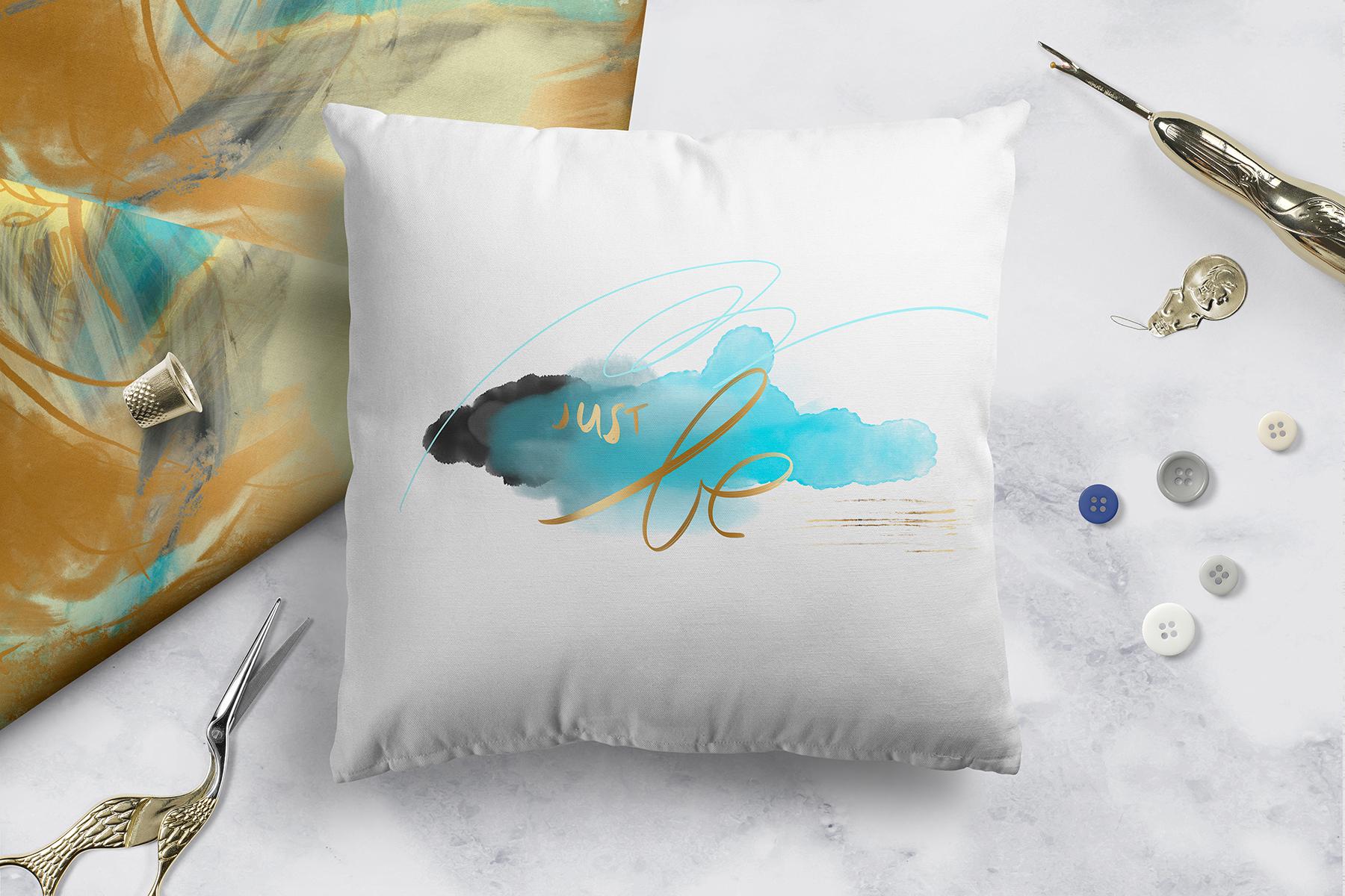
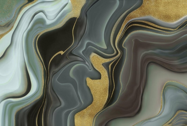
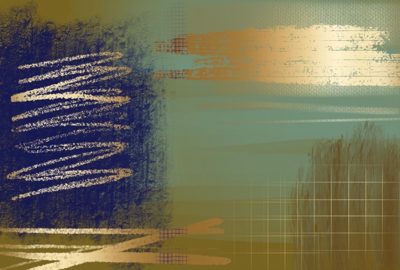
2. Overview and Examples: Hi guys, welcome to lesson 1. And less than one. Here we're going to do an overview of some of the ideas that I had in mind. Let's get started. About a year ago that I had that other class, digital alcohol ink, where we produced an artwork that's somewhat looked like this. And at that time, I figured out using Photoshop, how you add this kind of a gold trim or gold accents marbling that I had created. I had a lot of interest in that class. And I've found that the artwork that I created that look with was something that was picked up. I've got numerous different contracts or art licensing for the abstract art that I produce. So I thought that I would explore it a little bit more. And I especially wanted to figure it out with the procreate app. I'm using Procreate a lot more to create my abstract art pieces. I really just didn't know how to do the same process to create a clipping mask, to add that accent. I decided I do a little bit of experimenting. And so in this class, that's what we're gonna do. We're going to add a clipping mask to be able to put this gold foil stamping. I'm really interested in and doing it for my abstract, large abstract paintings. So I do a lot of paintings that are 48 inches by 32 inches, really large pieces. And I wanted to be able to add this kind of accents with gold foil. So we're going to be exploring, doing that sort of a technique. I've always been enamored with gold foil. And it started way back when I was creating business cards, wedding invitations. So we're talking 30 years ago and I worked with a company, sunset demographers in Winnipeg. And they did some amazing and beautiful typography and hot foil stamping. So that was my first sort of exposure. This beautiful accent that you could do with gold foil. So the letter press machine is something that is a kind of a good view of it. You can put a roll of whatever kind of a surface or finish you want for your lettering at the post to the thermography which uses the resin and the powder. Foil stamping uses a roll, a die. It's actually a three-dimensional sort of a stamp. And that stamp uses pressure and heat, set the goals or whatever. I mean, I've seen it with just shiny black or what? You don't see an example here to show you real quick. But of course, all the different metallic silver, gold, but also things like the shiny black in the course materials. So I'm giving you this link, which will explain the difference between foil stamping, letterpress and embossing. So they all have their qualities. And of course there are limitations. So you can actually get little portable versions of this. Here's an example of a simple machine that you can buy and do hot foil stamping yourself. Now I've seen a lot of artists also using doesn't gold foil. So gold leaf. Gold leaf is something that you buy in sheets and you use an adhesive paint on the adhesive. And then you position your gold leaf so thin that you can actually brush off the excess. So it'll stick where the glue is and then the rest of it you can brush off. You can get actual real gold, do this width, or you can use kinda imitation foil and it looks great. It's beautiful finish. I've always loved that lock. Now I went through and looked at a bunch of examples that I found on the sites that sell my work. Because I had asked what was actually funny, funny story because my agent, when I sent him all those alcohol ink pieces said to me, You know, I'm not sure if that's the kind of thing that selling right now, I'll put it out there, but don't do too many more pieces like this. And then in the end, I got several contracts for it. So yeah, he didn't he didn't know that it was something that was just really selling in this past year for sure, I found this artist who does incredibly gorgeous, large abstract paintings drawn dairy V-R-I. And he uses a lot of foil accents on his pieces. Would look at this. How gorgeous is that? It's just absolutely fascinating to me and the effect is so fantastic I was really motivated to try to learn how to do this with Procreate because I'm now using it so much for my painting, like for doing large pieces. So I really wanted to learn how to do that. And I was just curious as to how it would compare with Photoshop. So that's why I'm bringing you this course so that you can kinda do that comparison yourself. Now just remember this isn't actionable foil. So when you are selling on the POD site or in some other way, be sure to add that to your description that this is simulated foil, not the real deal. My original course for marbling was in Photoshop, but I wanted to experiment with that and produce some pieces completely done in Procreate, including that gold accents. So I'm going to go into procreate and show you that. I think first what we'll do though is we'll review how that's done in Photoshop or how I did it in that course. And then that'll give you a little bit more of a perspective as to what this course is going to be about. Alright, so let's meet Matt. Next lesson. We'll do Photoshop, gold accents. I'll see you there.
3. How to Create Gold Accent in Photoshop: Hi guys. In this lesson, I'm going to be reviewing the whole process in Photoshop. Let's get started. So this is the course that I was talking about, the digital Marvel and alcohol ink textures in Photoshop class. And in this class, I showed you how to actually create the mask. The first four or five lessons actually show you just how to create the marbling. I'm not going to be showing you that in Photoshop since this whole course focused on that, I'm going to be just showing you how to create the mask. So let's go right into Photoshop right now and just do that. So I brought him one of the marbling experiments that I was doing in Procreate, I wouldn't completely consider this done, but it'll be perfectly fine for what I'm going to be showing you. So I duplicated the layer, I've got this original layer, and then this is the duplicate. And let me just get rid of this one. Don't need that. These two, I'll show you here the mask that I created in Procreate. So when I go into Procreate with you, I'll be showing you how to do it, and this is how it looks when you open it up in Photoshop. But if you're a straight just in Photoshop, this is what you do to create the mask. So you can approach it in two or three different ways. What I usually do is I go into hue and saturation and I take the color out of it completely. So we're down to minus 100 saturation, which makes it a grayscale. Then I go into my levels and kind of experiments with adjusting the levels. What I wanna do is create basically just kinda of areas of color are areas of black. And can use grayscale as well, but you can use put it this way. Whatever you have left here on this document when you're done are on this layer is what will show through in gold. So anything that's pure blocks or really block is going to be almost pure gold. And then these will be just sort of like really thin areas of goals. So if you were to look at maybe some of the examples that we were looking at. You can see that this is one here with a really solid areas of gold. But sometimes you have real nuances of goals. Some smaller areas are lighter areas. Maybe this would be a good example. I'm trying to find one that shows you see and hear how you've got from areas that are kind of faded out and gold. So that's what these little grayscale areas will do. Well, you can actually adjust this to the point where you're getting rid of a lot of that. So that might be how I would choose to do it. It unit takes a bit of experimenting honestly. The other thing you can do is go under image to adjustments and go to threshold, which will eliminate a lot of it as well depending on how you adjust it. And then there's a third method where you go into the filter gallery. Let me just undo what I've done. So you would take this grayscale, go into the filter gallery, and then go into one of the sketch filters. And you'll see that if you use something like photocopy, you can get really just kind of the ridges are edges. And of course you can make adjustments here. So that's one that I often use as well. So what this will end up doing is giving me just the gold where you see it there. I can still adjust this. So I could go into levels and I could adjust this a little bit more, make some areas darker, slide this along to get rid of some hit. Okay? And then I'm ready to make this into a clipping mask. So usually I would create a folder, add a mask to that, select all of this and copy. And then I'm just going to turn it off to make it easier for you to see and option click into your mask and hit paste. So now anything that I put into this folder, it's going to show gold through any of these areas that are white. So that's not really what I want. I want it to be the opposite. So let me go into my mask. So you can option click into your mask and invert. So Command I. And then what I would do here is just, I'm going to use this cool because I just happened to have it. So I'm going to slide that gold into there. Let's turn this one off. And you can see now that I've managed to add the gold just as a little bit of an accent in spots. Okay? So that looks quite authentic. Looks a lot like gold leaf. And that's basically how you would go about doing it in Photoshop. So if we were to go back and try one of those other, Let's just duplicate this layer again command J and hide this momentarily. Let's use that same method, hue and saturation desaturated. Adjust the levels. What's coal? Kind of extremes here. Pick a lot of the white out of it. You can invert it here or you can wait till you get it into the mouse. Let's just in Britain here. Select all and copy. Turn on that mask again and paste. So I option clicked into there. So now anything that's white will show through goals. So now we would get a heck of a lot more gold. So that's another method of doing it. So very easy. Once you know the steps for that's Photoshop, gold accents in a nutshell. So in the next lesson, let's go into procreate and we'll see if we can duplicate this sort of an effect completely in that out. All right, so I will see you in that next lesson.
4. How to Create Gold Accents in Procreate: Hi guys, welcome to lesson 3. In this lesson, we're gonna do the entire process again. This time we're going to be doing in Procreate, read, explain clipping mask. And we're going to also import some of the assets. Let's get started. So for my first Procreate example, I'm going to use one of my abstract artworks. I was thinking, well, I'm gonna try a couple of different things. I'm going to try adding gold to these items which are on their own layers. So that would be one possibility. There, basically straight black, no in-between tones know, grayscale. And then I'm going to try it with this one. So this one is just more of that kind of detail that, that I've got here. A dotted kind of a texture, looks like a halftone and then just kind of a textured brush I used here, maybe a stucco brush. So I'm going to try both because I want to show you the difference with a solid black and white and then with the kind of grayscale. So first thing I need to do is import my goals. So I have that saved here on my iPad. So I'm going to insert a file here on my iPad. I've seen this JPEG image. Now this image I found online at me, I think it was called, this is a site where you can find tons and tons of free images and you can actually donate. So I donated for the use of this particular gold. 1, 2, 3, 4, 6, 7, 9. I think I just searched it out with soft, cool metallic or something like that. So he wanted to download it for free. You're able to do that. You can choose. I went to the largest size. And when you do hit free download, you are given this screen which allows you to donate. So if you click on that, you can donate whatever you think is fair. Now I've imported to twice. That's okay because I'm going to use one for each of these. So I'm going to just hold on this particular layer and move it down to be just above the tonal kind of detail. And then I'm going to move this one to be on top of this. So the first thing I want to do is enlarge it to make sure that it covers the area that I need it to. So it's more than covering both of those elements. And then now what I do is click on the actual layer thumbnail. And there I can click on clipping mask. So that's going to clip it directly to that layer. You can see this little arrow and that's what tells you that it is connected to this layer. Now, you can make all kinds of other adjustments. You can go in and of course, make adjustments here. I don't think there's anything here that's going to make it any better or different than what I have. But I just want to show you when you see that letter N, that stands for normal. If you change it to another one, you see that the letter will change based on whatever blending mode you've selected. So I think I'll just put it back to normal in this case. I mean, that's really how simple it is to add the clipping mask here and procreate. So I'm going to just hide that one. Actually, I think I'll just leave it on. Why not? Let's try that same thing here with this layer. And now we're working with a grayscale kinda of an image. So let's see how it works when we apply that clipping mask to the grayscale image. So it's a little bit harder to see that it's done anything at all. Let's hide these two. Now that I turn it on, you can see that the gold has been applied here. Let's just make that big enough that it covers right out to the edges here. So you can see as I'm adjusting it in size, that it's applying the gold everywhere that I have that grayscale. And you can see that there are different levels of the goal. They're based on the underlying layer. So that's great. If you have that all set up, you're ready to go. You've got your gold attitude, which I think overall that's a really great effect for this abstract piece. Now it only gets complicated when you don't have these kind of things separated out. And you need to create the mask. That's possibly a little bit more complicated. I was interested in trying one of my marble images. I'm just going to hide that, hide that. So this is marbling. I've done another class where I've done marbling with gold trim. I showed you this. I use over one when we did the Photoshop application up a clipping mask to get the gold in there and here in Procreate, It's a completely different process. I'm going to show you how to do all the steps to create a gold clipping mask that works with your image. There's a few steps involved, so I'll show you that in the next lesson. So I'm me there.
5. Continuous Tone Clipping Masks: Guys, welcome to lesson 4. So in this lesson, we're going to be creating a continuous tone clipping mask. You'll see what I mean when we get into it. Let's get started. Okay, For this next demonstration, I am going to use this marbling that I created right here in Procreate. I'm going to duplicate the layer. I'll hide that original, take this layer and turn it into a grayscale. So I'm going to go to hue saturation and brightness. And I'm going to completely desaturated so, so there's no color left. Next we're going to go into the curves. And with the curves, you can adjust individual channels or you can do them all at once, which is what I'm gonna do. It works perfectly well for this particular exercise that we're doing. So when you click on the line, you'll get a node. And that node, if you move it up, you make it lighter. If you move it down, you make it darker. Moving from left to right increases or decreases the contrast. So I think I'll start by really lightening and darkening. Now let's increase that contrast a little bit. And you'll find that this will take a bit of experimenting to get exactly the kind of setting that you want. What I want I'm going to be trying to do here is getting rid of a lot of this gray and creating a little bit more of the deep black color. I'm also going to be using my automatic selection to get rid of a lot of the extra green in the background. And you'll see that in a minute. I can see when I'm dragging this one over, I'm getting rid of a lot of gray in there. You can add up to 11 nodes. Once you're happy with the first stage, you can click on your canvas and hit Apply. And then you can go in and do the same thing again. And I find going through a couple, maybe two or three times, you tend to sort of get a better control over what you're doing. So I think I'm getting close to what I think would be great for this. And now what I need to do is bring in my gold and apply it as a clipping mask. So I'm going to go back to my insert a file here, bring in that golds and enlarging it. Now, if you want to enlarge in exact proportions to what you imported, you can just grab the corners, but if you wanted to do it free form so that you can move the individual sides and you don't change the proportion, then you just hit this free form here at the bottom. Then let's go into our layer here and hit Clipping Mask. And we can see that there are a couple of things wrong here. First of all, we can't see through to the other layer. So that's the problem I'm going to address. First, we need to be able to actually get rid of a lot of this white that's blocking the background. And I think when we do that, we'll also be able to get rid of some of this great. And the way we're gonna do that is with the selection and we're going to do an automatic selection. So this is just like using the magic wand tool in Photoshop. So you click on your image. And I've got red here as my background just so that you can see what I'm doing. Whichever color I have here is the color that will show you what I'm actually selecting. So if I start selecting, you can see this line along the top is telling you what the selection threshold is. So the more I pulled to the right is the more of my image that is being picked up. And you can see here now that if I was to eliminate this blue here, all that would be left would be these areas in here. So you kinda have to decide what it is you want to get rid of. And then you can swipe with three fingers down and hit Cut, and that will cut right through. You can see the grid in these areas. If I was to turn the other later on, you'd see that those areas that I just caught are now showing through to that image at the bottom, just like curves. This is one of the things where I hit it more than once. So it will go back automatic feature and on the right layer here, again, you can see, I don't know if you can see that, if it's going to show up on your screen, but you can see the moving selection in the background here that shows you what I have selected. So try that one more time so that you can see what I'm doing. That as I'm dragging, you see, I'm selecting more or less of that background. Three-finger swipe down, cut. And now you can see that there's a lot of my image showing. So if I was to turn that off now, you could see what's left that could be made into gold paint. So now you can see that the gold is being applied to just those areas that are left. So then if I turn on my color layer, you can see that the gold has applied beautifully to these areas. And it looks very, very natural, just like it would if I was doing an alcohol ink painting or something like that where the Incas just, the gold ink has just naturally run into these areas. You can try it both with adjusting the curves and without, I think got the automatic selection might do a lot of this. So that's worth trying as well. It's just going to give you a slightly different effect. That's another wonderful way to add gold to your images. So let's meet in the next lesson, we're going to take a look at a couple more things. There.
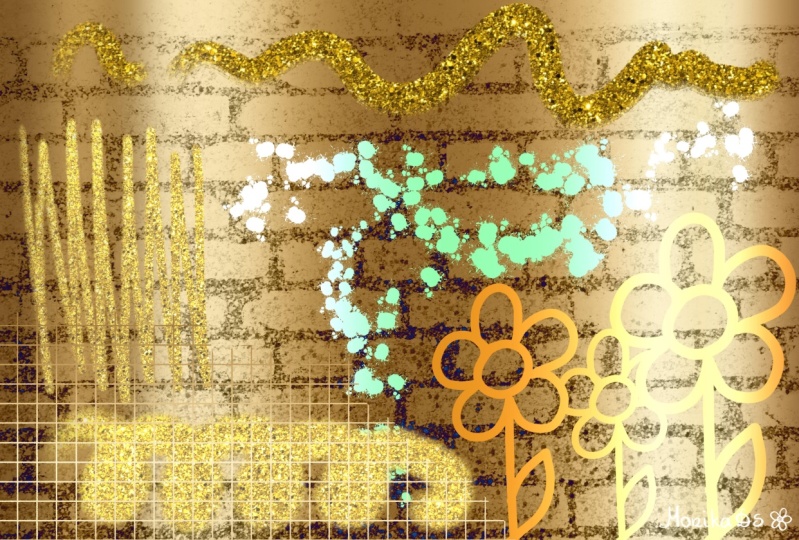
6. Ideas to Get you Going: Hey guys, welcome to lesson 5. So this entire lesson is going to be just an ideas exploration. I'm going to show you some of the experimental work that I did. Let's get started. So like anything new, there are always a lot of unknown variables. So I want to thank you for being patient with my camera and my sound. This is one of the first times I've used my new studio space to record. So there are a lot of guts to get lined up in a role. I wanted to spend some time in this lesson showing you just different ways that I have applied this new technique that I've learned. When I learn something new, the first thing I want to do is apply it to as many different ideas as I can. I'm always trying to come up with new ideas for art licensing. And when I do, I always have to come up with a series or a collection. And so yesterday I sent one of my example pieces. For this one here that we looked at earlier. I set this to one of my agents and ask, is this something that you might be interested in? He sent back yes. With three or four exclamation marks and said series of four variety of colors. It's pretty cryptic, but thank goodness he likes them. So I'm going to do a whole bunch of them. So I kinda showed you this one. But I went through last night while I was just sitting around watching TV and decided to try a few other things too. I do have two agents to cover very different things. So I wanted to try some stuff out with lettering and BB, some patterns. I'm going to be doing a lot of experimenting in the next couple of weeks. One of the first ones I decided to try was something with some lettering. So I just quickly put watercolor, kind of stain or wash in the background and then did some quick lettering. This brush is a purchased brush. I really like called scrapie I think, or something scrape by 0x0 pixels. So I really liked that one for a script brush. So I've done a couple of different examples here, and I'm going to show you how beautiful it looks once I add the foil. Now it's not just lovely and that really changes, really, I don't know, makes it that much more interesting. So that was one and I tried another phrase. So let's hide this one. Show this one. Now this one here, I still have to apply the clipping mass. So click on the mask again, hit Clipping Mask. And yeah, like I think this is going to be something that I'm going to really have fun playing around with. So I thought just for the fun of it too, I would experiment with a different kind of a goal. So I've brought in a glitter, but let's just pretend I wanted that bear and I want to get in glitter. So now I've got the glitter positioned. I also found this on pixel B for free. So I made a small donation and look at how pretty that looks. So that got me going. I decided to go into some of my other existing art and just play around and experiment. So this is. A document that I did just for the fun of it yesterday too, I experimented with putting that gold to sort of soft gold over a wash. So perhaps to show you without the gold, That's what it looks like. So that turns into this, which I think is just super pretty. So another thing I added here was a week. I mean, it doesn't really work with that circle in the background there, but I just wanted to show you the idea. And so there we have glitter over top of that kind of burnished gold. And we just get rid of this thing in the middle here. And there's another really neat artwork just combining the British gold. Glittery gold. Yeah, like it's just giving me so many ideas. I just can't wait to try this out with different types of gold, different goals. Maybe rose gold's mixed in with some different colored backgrounds. So it's been very inspiring to learn this new technique. So let's take a look at it here. Now a lot of times when I'm doing a series for art licensing, I will start with a document that looks like this, and it has tons of different layers that I can turn on or off and create different artworks from it. So let's say this background I would have and then I could do some lettering over top or I can add them. Nice dark elements. I do these just for efficiency. So I'll do a whole bunch of the painting and then I'll go probably into Photoshop and do a whole bunch of recompose. So let's say something like this. I could cut to use pieces of it to create new abstract artwork. So I do a lot of that when I'm putting together these sort of designs and collections for my Asians. So let's just take a look at this with the stages. So let's say that with some black and I mean the colors aren't great. This is not something that I would ever consider finish at this point, but I just want to show you how cool it is when you add the goal to it and how different it looks. So I can go in here and just turn off layers for an odd layers to create completely different looks. So that's something that I may cover in another class at some point is just the efficient handling of a document like this. And using it in photoshop to create a whole bunch of layouts. There's of course no reason why it couldn't be doing them here, procreate at this point. So it's just a matter of preference. I am still kind of going back and forth between procreate and Photoshop at this time. So let's take a look at something else here now this one I thought was pretty cool too, because site did that same kind of an idea with the gold over this sort of mixed wash kind of idea. And then in this case, I also experimented with changing the opacity and changing the blending mode. So definitely take some time to experiment with that as well. It's kind of neat that you can do this and something like this. Now with this in the foreground, I could easily go in, grab my glitter, resize it to fit that elements. Make sure it's on top at the clipping mask. And then I've got that gorgeous glitter over top of the sort of faded back wash though have in the background. And that was a really fun idea. You can see I was kinda going nuts last night. So now here is another one where I experimented with both glitter and the regular gold. And I mean, right now it's not that exciting, but as soon as you add the goal hit looks awesome, like really, really nice. It looks like a lot of the examples that we were looking at online yesterday or I guess for you it was like 10 minutes ago. So one of the places I think that I'm really going to be able to use this simulated gold effect is going to be in greeting card design. Alright, next. So in this one, you can see that I've added gold in with these lines. I could easily get rid of that. Important. My cleaner again, I'm going to put that above this layer here, but a resize it so it fits the entire butterfly, make that into a clipping mask. And how pretty is that? They can really see this being something that I will experiment with. Rid of some of those, even add a layer over top that has outlines or mean you could experiment with these blending modes, kind of like that color dodge, or add light. That's what's nice to linear light. So trifled with working with these blending modes or take that clipping mask, apply it to the butterfly wing outline, and then try with some of your blending modes. So when you do this, you still get a metallic look. But the metallic is being controlled definitely by the blending modes. So let's say we go back to normal in there. We could also go in and play with the brightness. And I think with this one I would resize that because what makes it look metallic is that fluctuation from light to dark. So another quick idea for area. Now in this one I get something a little bit different where I applied the gold to that layer. So it's an exact duplicate. And then I just shifted it over just a little bit. So that's just moving it. And then you get that little bit of gold peeking out through the back. And then with this one here, I had just started playing around with this one. I have gold applied here to some of these crazy lines, just abstract kind of intuitive lines. And then I added this in the background. What I wanted to do here was to create a layer that goes kinda like Andre from the sides. So I'm going to create the layer. I'm just going to use black. I'm going to go for this Nikko rule brush that I love. I'm going to go nice and big. So I'm going to go in and kinda gradients are going from dark to light here on the edges. Just kinda building it up. And then I'm going to move that to be on top of that layer. And then I'm going to make this into a clipping mask, make sure it's actually on. And then you get that really cool effect of the gold coming in from the edges. Let's just make some adjustments here on the goal. And I quite like that. I think also with this web got this block, sort of greenish stuff in the corner. I am going to insert that glitter, make it big enough. If it's too big, you can always make duplicates of it and then merge them together. But I think you get the idea from what I'm doing here. I'm going to put this over top of this layer and make it into a clipping mask. And then you see little bits of gold in the corners here. Can you see it here? And that's accomplished by applying that as a clipping mask. So I'm trying to microphone's today or sound input devices at the same time here if I wasn't happy with my sound earlier on. So I've got my headphones on, just hanging on my shirt as a microphone. And it's really not ideal because I often hit the cord and it makes my camera move. So I've also got another input device, the microphone that I use on my computer, and it's sitting in front of me. So I'm really hoping that I'll use a sound from that and then not have to use this stupid cord. So thank you so much for being patient. I really appreciate it. And by the way, thanks to all of you who take the time to comment and give me such great reviews. I so totally appreciate it. You have no idea. It really gives me the incentive to keep doing this. So thanks. Thanks a bunch of really appreciate that. If you haven't done so already, make sure you hit the Follow button so that you will be informed about my courses and anything else that I do. Any other kind of news I have coming out, So yeah, I guess I'll meet you in the next lesson. It'll be just a wrap up and talk about some next steps and ideas for yeah. All right. I'll see you there.
7. Conclusion and Wrap Up: Hi guys, welcome to lesson 6. So in this lesson, I just want to show you a couple of mock-ups. And then I just want to thank you for having been a part of his class today. It's always fun to learn something new. And when I learn something new, I love to share it. If you haven't done so, make sure you hit that follow button. And if you have any examples that you want to post, I would love to see them. When I see a student posts work, it just makes my day. I'm happy to promote and share whatever it is that you create. Also make sure you check out my boards on Pinterest, I have two sites, dealers, art dealers, mask grant and teacher Dolores nows Grant. I've got several stores as well. My biggest one is that Zazi oil. And I've got one here in Canada. Aren't aware. Make sure you check out any of the other classes that I've done as well? I'd love to see you there. Thanks for hanging out with me today. Bye. Now.
 Delores Naskrent, Creative Explorer