Transcripts
1. Introduction: Hi. My name is Elizabeth, and welcome to my new class Geometric color
blocking collage. I love exploring color, and I love coming
up with new ways to really kind of consider
color relationships, especially as we kind
of strip things down to some basic color
combinations and maybe even lean into some
color combinations that aren't as naturally
aesthetically pleasing. This class, we are going
to be working with construction paper and glue, scissors or a paper cutter to cut different strips of paper and work with a bold background to do some different
geometric collaging. We're going to really
lean into the idea of how can we put the strips of paper
together in unique ways? One way you can do this is through weaving the
paper strips together. That creates a really
fabulous collage element that you can then put on a background
paper and kind of have that interplay of the colors of the paper strips
that you've woven together and the
background color. And then how else can
you work back into that piece and kind of build off of that basic color block? There's lots of ways
that we can work with squares and rectangles and strips of paper and
interesting color combinations to do some very simple collages. This is a really fun
class where we are exploring color
relationships and composition in a way that could inspire some ways that you organize
future artworks, even when you go beyond collage, basic colors and
geometric shapes. This is a creative exercise, as well as helping you to
expand your artistic growth. And by the end of it, you will have a really
fun collage artwork or several, hopefully, that you are excited
about and that have inspired you to a new stage
for your creative growth. So I hope you'll
join me in class as we explore color
relationships and composition through Geometric
collage. See you in class.
2. Class Project: For our class project,
we are going to be working intuitively and kind of organically with
different elements of geometric paper as we consider different
color relationships. So we're looking at
color relationships and color theory and
ways that we can combine different
colors or even strip down the color to a basic
color in black and white. And then how can we play
around with collaging geometric elements together to create really
dynamic composition? These can be small
studies that you use for inspiration
for future artworks. These can be artworks in and of themselves and become pieces that you get really
excited about. But we're just going to be using construction paper
and scissors or a paper cutter and some glue to create some color blacking, focusing solely on strips of paper and squares
and rectangles. This really kind of strips
things down to the basics. It's also kind of
sort of inspired by the neoplasticism theory that Pie Mondragan was working
with in his piece. Is known for really
bold graphic pieces that have the traditional
primary colors, red, yellow, and blue,
and then black and white, and focusing on different
relationships and scale between different sizes of
squares and rectangles and lines to break
up the canvas. He was really
focusing on stripping down art to its
most basic sense. We're leaning into
that a little bit, but I'm really trying to create some interesting dynamic
compositions that might be full of energy or create a sense of excitement
or ways that we can, strip it down a little bit
to have more of a and piece, and then color is a really important aspect
of this class too. So the different
colors that you put together will change
how this works out. So what I want to explore in my class project
is what happens if I use the same
compositional ideas and collage
construction methods. But I explore different colors in the different mini collages
that I'm going to make. So throughout the demonstration
section of class, you're going to see me
kind of work through some different thought
processes of creating an initial composition with a certain color
pairing or grouping, and then I'm going
to try to recreate that with a different
color grouping. Then compare them and maybe
make several of these and see how does color change
how the composition feels? Then we can take that
another step and we can play with the
same color groupings, but we can then change the
composition and change the relationship of how
much color to each other, the ratios of color and
then the arrangement of color and really
do all of this just through collage and
kind of getting into some of the theory and the
interesting aspects of composition and color
relationship and what those communicate to the viewer and to ourselves and what that
expresses about ourselves. Is going to be a
really fun class, so I'm excited to get to it. So let's hand it over
to the material section of class. See you there.
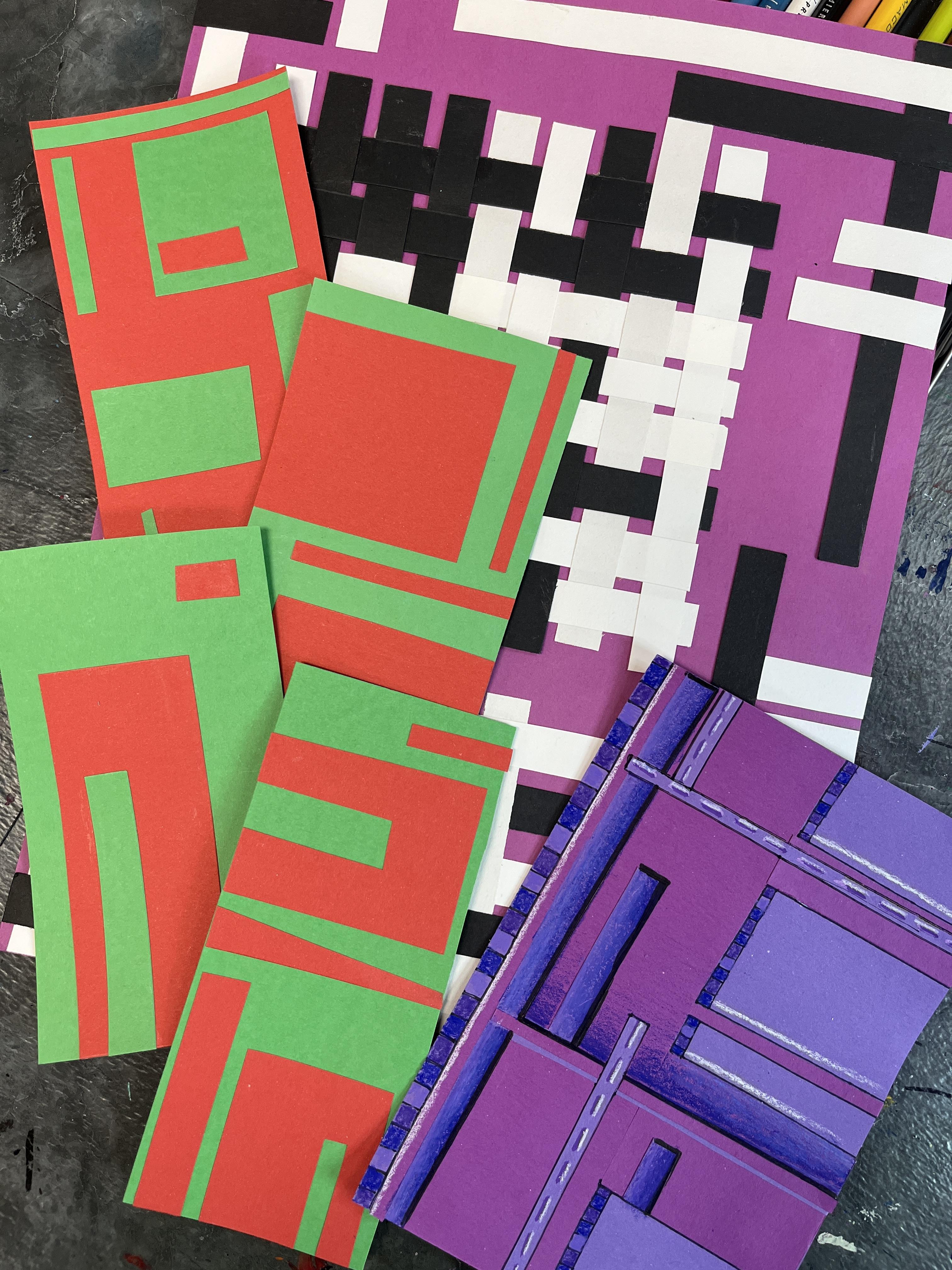
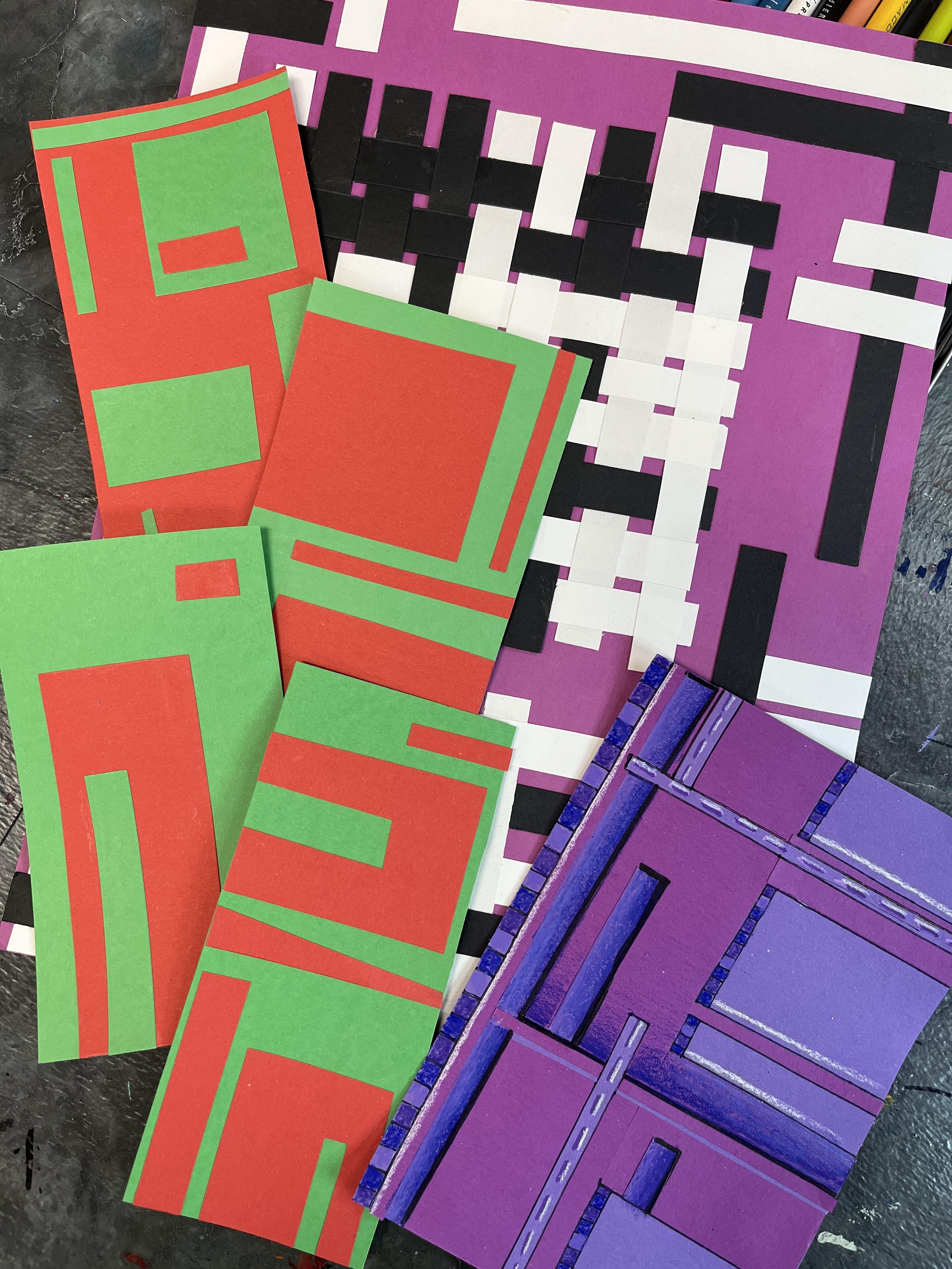
3. Materials: The materials for color blocking geometric abstract collages are construction paper of whatever different
colors you want to. We're going to cut
those down into strips. So I used a paper
cutter to cut mine, and actually this
project started as leftover scraps from something
else I was working on. I have since made some
additional strips of paper. You can vary the width of
your strips if you want. But for the example that
I show in this class, I keep my strips even because that's the strips
that I had on hand. Then I also went with black
and white strips of paper, but you could use any colors you want to and play
around with it. I really encourage you to go
minimal with your colors. If you want to follow I did, pick one color plus
black and white, or keep your color scheme
limited to three colors. You're going to have
your background paper, so that's going to
be one color and then two colors for your strip. Don't have a paper cutter,
you can absolutely use a ruler scissors to make
nice straight strips. I have a glue stick,
and then I like to have a scrap of
copy paper on hand because that's where I
do my gluing so that the glue mass stays on
one part of my desk, and then I have a
nice clean area to put the strips
together for the weaving. Let's head on over to our
first less. See you there.
4. Color Theory: Alright. Let's
talk color theory. So color theory is the concepts behind different
color relationships. When we were going to school, the primary colors were considered to be red,
yellow, and blue. And then those colors, when combined, would make
the secondary colors. So orange, green,
violet or purple. Right? So red and
yellow makes orange, yellow and blue, makes green, and blue and red make purple. All good basic
color theory ideas. These are all kind of
the standard colors. We know now that the true
primaries are magenta, yellow and blue, not just
any yellow and blue, but we're not
painting, so we don't really have to think
about that too too much. So we can kind of live in the
land of these basic colors. Then we also have different
values, and we have neutrals. We can also think
about the role that gray and black clay, as well as white. White can then be a paper
that we also collage with, or it could be our
background paper, and we could build up our
colors on top of that. And then we also have
brown as another neutral, and then we have any
other color too. So I happen to have some
of this very pale light, yellowy, orangy, peachy color. So it's kind of another neutral. It's a warm neutral,
but it's a neutral. So we can also kind of
think about value, too. So this would actually fall under the value scale or orange. This would be a very
light tint of orange. So depending on the
construction paper or the papers that you
have to work with, you may have more or
less color options to play with for
our class project. I tend to lean into the basics. I tend to take out
most of my neutrals. I'm not work with these
three and set those aside. Sometimes I play with black
and white. I love contrast. Black and white are
a great way to add some really dynamic pops
in and of themselves, both white being a
resting area and black being a very strong hue. And then they in turn then make all of these other
colors pop greatly. So in one example
I'm going to show, I'm going to play with the idea of one color and
black and white. That would be a
monochromatic color scheme, mono one Chroma color,
monochromatic one color. That's a very basic
way to do it. So in that example,
I work with black, white and purple and I keep
it very bold and very clean, and I have just the same size paper that
I'm working with, and then I'm manipulating how I use it to build up my collage. That's one option. You
could absolutely do a monochromatic color
scheme and pick any color you want to from your color options and then
work with black and white. You could also start
with a black background, and you could work with a
color and white on top of it or two colors on
top of the black, or you could build up two
colors on top of white. What I'm recommending
that you do is you pick at least two colors to play with and then build up some
mini collages from there, and I'm going to show
you how to do that. I'm also going to show you
how to do it with three, and that's where I have the
purple black and white one. But you could absolutely
work with more colors. And then if you
decide to go into the optional mixed media
additional lesson, that changes the whole
game up altogether. You can still have a relatively
limited color scheme, but you can also just
open up your colors and really play with a lot of different colors in that way.
Some things to think about. We're not mixing our colors. Everything is going to just
be pure unless we're getting into the mixed media side,
the optional lesson. So if you're going to
just do two colors, then you want to start thinking about which color
might be dominant. You want to have it be equal. So let's look at
this. Let's actually take red and purple. These rectangles are
cut to the same size, right now, the
color relationship between the two is equal. If we start to put more
red and less purple, then red is our dominant
color and purple becomes our lesser ratio color, red has a larger ratio to purple as far as
their relationship. And then vice versa two. If we have more purple and less red, then purple becomes
the dominant color, and red might be the accent
color in our collage. We can play with different
ways that we cut up our papers and put them together to play with
the color ratio. And that's what I'm going
to share with you in the next lesson is picking two colors and
playing around with different compositional
options as you do that. I'm going to show you
four different examples, three that I've made earlier, and then one that I make with you so I can show
you my process. More of those mini
ones that I did, the more complex my compositions became because the
more comfortable I became and the more
experimental I became. The other thing we can think
about is color temperature. We have our warm colors. They're going to
give a different vibe because we
also are thinking about how the colors make us feel and what
we want to play with. We're working abstractly. You can absolutely do some representational collage
for your class project. I'm going to show you
abstraction because I want to focus on color relationships
and composition. That's my key goal.
Then through that, that is going to have a
positive lasting impact on my art making
from here on out. The great thing
about this class is we're working on
some fundamentals, we're having some playful
fun with collage. We're adding in an optional
mixed media lesson if we want to elevate it and
take it to another place. But ultimately, the skills that we're working on in
this class are going to be ones that are going
to positively impact your art making practice for the rest of
your art journey. It's great. We have
our warm colors. We have red, yellow and orange. We have our cool colors with
our green, blue and purple. If you're thinking about
color relationships that way, you might want to
focus on warm colors when you're starting to
put your colors together, you might want to
focus on cool colors. We already talked
about monochromatic. That's a whole other one. If
you have more color options, then you can play even further. I have another blue on my table. I could take the
purple out of there. I could play with
these three colors and have an even cooler
color scheme. If I have another blue, actually, I have three
different blues. This is another variation
on monochromatic. It's not a true
monochromatic because this is a teal and these are blues. This is a close light
blue to this one. They're very close as far as
a hue and then it's tint. This is the odd color out, but they work really well
together in a color composition focusing on values of blue
and just blues in general. So that would be one
fun way to do it. If you have more colors
accessible to you, where you have a broader
range of paper color options. Now, I can expand this. If I want to keep going with my experimentation down the road and I can add in more colors. I can take out that light and I can put my purple back in, and I could still be living
in the land of cool colors. It's just an expanded
cool color scheme. I can also do
majority cool colors. Let's say I do blue and purple, and then I want to spice
it up a little bit, so I'm going to pop in a red. That would be another
really fun way to go. I can also take my red
out and I can try yellow. There's a whole
other kind of feel. I could take my yellow out
and I could go with orange. Now, orange and blue are
complimentary colors. They're on the other
side of the color wheel. We know with color mixing with our paints and our
colored pencils and other different mixing
part media that we can mix any complimentary
colors to neutralize them, which is a really fantastic
thing to play with. But we're not mixing
color. We are combining colors
through color blocking. So this is really fun because I have a complimentary
color pairing, and then I've added
a third color. So this just gives it
a whole other kind of vibe, which is really cool. Other complimentary pairings
that we could consider. Would be purple and yellow. Those are also compliments. And then we also
have red and green, which is the one that I end up playing with in our next lesson. I'm going to blame
it on it being the holidays at the
time that I'm making this class because all of my art is leaning
towards reds and greens. It's really funny because
I don't normally have that happen to my art when I create art in December,
but here we are. So we have these different
color relationships. We have some optional additional colors that we can play with. And then we also have all of these great neutrals
that we can add in too, depending on what color
options you have on hand. So as you start to explore the next lesson and
you think about what papers do you
have on hand and what color relationships
do you want to explore, think about the ideas
of primary colors, secondary colors, warm colors, cool colors, monochromatic. So one color plus
black and white, you might also have some
different tints and shades. If we were mixing paint
and painting paper, for a collage that would give us a whole another
option to play with, that would be a really
fun additional thing to do would be to paint some papers
and then use your paint to give you even
more variation to your paper colors and then explore color
relationships that way. I really wanted to strip it
down and keep it simple, which is why I'm focusing
on construction paper. But this would be an expanded monochromatic color scheme
by using my light blue, my regular blue, my
white, and my black. I could even pop in my gray. It would still technically be a monochromatic color scheme because gray is the
lighter version of black. Black is the absence of
color, white is light, and then we have her colors
over here on the right. Play around with your
colors, have some fun. And when you feel like you have a handle on what colors you might
want to play with, jump out over to the
next lesson or watch the next lesson and see how
I play with two colors to build up my color blocking
compositions to get some inspiration
for what you want to do as you start on
your class project. Either way, I'll see you
in the next lesson real soon. And
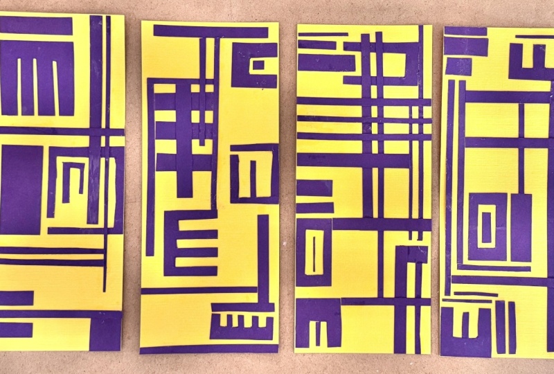
5. Color Blocking Basics: This is an example of three different
studies that I did playing with the
colors red and green. Now, Christmas is coming. So I think that definitely impacted the
colors that I chose. But red and green are
complimentary colors. So they go well together
when we combine them, and they're both very
saturated colors. They have kind of a good
balance of hue brightness. I just use my red and
green instruction paper, and I started with
a basic shape. So I decided to go with this rectangle size
for the beginning. And then I just
began cutting out different sized
pieces of the red. So I had my first color, green, and then I decided
on my second color, and then I started cutting
out these different shapes. And then what I did
was, I'll show you. I I quickly make another base, and it doesn't have
to be, you know, perfect cut, and it can be a small square,
it can be a rectangle. It's whatever you
want it to be. But if I scooch these off to the side, then I get my scrap paper, and I've got my
glue stick ready. And then I just have
these different kind of random random blocks of color, and I play around with
where do I want to put it? Then I can always cut some more. I can even play with different ways that I can manipulate those
blocks of color. The blocks don't have
to stay as rectangles. Maybe they become something more than that. Sometimes
I'll plan it out. Sometimes I'll just go for it. The more I did, the more I
just built them up as I went. Then I put some glue on
my little piece of paper, and then I just decide where
this is going to stick down. And then these are just studies. Maybe these will become
mini somethings. I don't know. But for right now, I didn't want to worry
too much about it. I do like the repetition, so what I might do is
play with that same idea. The more that I do, the
more ideas that I get for how I can play with
these color blocks and have different ways
to really continue to increase my compositional
considerations. I was really starting
with just the basics. This was, let's see.
This was my first one. I just did a couple of big rectangles and then some stripes then I
played with that. It's fairly evenly balanced out. Then I did this one.
I want to lean into more of an asymmetry.
I have the green. Then I did a big
rectangle of red, and then I did a
thicker stripe of green and then it
was really open. This was a scrap. This tiny
red piece was a scrap, so I just after the fact,
decided to add it in. Then I wanted to
play with what if I started with the other color? I started with the red and
I started building this up. This is actually the orientation
that I built it up from. So it's just a fun way to consider color
relationships using blocks. You could use any
shapes you wanted to, but I really wanted to
lean into the geometry of this and really go with
rectangles and squares, primarily rectangles because
it gave me a doorway, an easy way to get
into this idea. Of playing with color. Then you see does it feel like it needs a little
bit more balance? It's also a really great idea. We're looking at the color. The color is the focus, but it's impossible to
not also then consider composition when
you're thinking about where to place the colors
and all of that good stuff. So having some different ways
that we can break it up, and then you can see you
just want to cut some more. Maybe everything isn't a
rectangle or a square. Maybe we play a little bit
with some angles. I love that. I'm going to lean into that now. I can tell you this is not
this fourth one, whoops, the fourth one that I'm doing is not something that I would have come up with when
I first started. I needed to work my way through
these different pieces. And then whenever it
goes off the side, I just trim it off and then
play with it like that. Then what we can do after we have some of these basic
color expirations down, I love working back into my
collages with other media. I love drawing back into
them with colored pencil, with paint markers, and that's absolutely something
that we're going to explore in future lesson. For this one, I just
want you to play around with basic
color relationships. Pick two colors or
one color with black, one color with white or if
you want, go up to three. But I think starting with
two is a really good idea. Any two colors and
construction paper that you want are totally fine. You can also totally
do this digitally. You could paint on Procreate and have your solid
color background, and you can use
your selection and your color field
tool to build up some basic nice geometric
color combinations to really play with those
color relationships and the basic geometry. At least two colors or one color with black or
one color with white and start exploring
different ways that you can play around with how much
color ratio there is. So which color is going to
be your starting color? Which color are you
going to then add in? And then do you
want to try to get an even balance of color closer to what is
happening here, or do you want to have
a more dominant color, which is happening over here. And then after you've done that, if you're curious to
take it a step farther, you can check out
the next lesson where we start working back into our geometric collages with some different
mixed media approaches. That makes media optional
step is one that you could incorporate into any collage practice
that you might do. It's one that I
share in a couple of different ways in
some other classes that I have here on Skillshare. Play with color, play with
balance, play with symmetry, asymmetry as far as
that balance goes, play with design, play
with composition, and see what happens. Then for your class project, be sure to share this step because this is a really
important part of it. It can stay here for
your class project and just be a really simple
color exploration. Or you can move on to the bigger one and play with the idea of
weaving the color. This is the same idea. So if you just look
at a couple of this versus this, it's the same. The exact same idea
is happening here. It's just approached
in a different way. This one I'm weaving at
as my starting point. I still have dominant areas of one color over another color. This one obviously
has three, we've got the purple and then we've
got the black and the white. Then this is the
same kind of idea. The difference also though, is that this was all strips. I cut a ton of strips, they all started the same size, I changed as I went along and
I needed some more pieces. I changed the size of my strips. I didn't change the width, I
just changed their length. Here, I started by cutting a bunch of different
strips and squares and rectangles and then from that stash of geometric shapes, I could then start to
build up my compositions. You can do this same
approach here with big and merge those two also. There's a lot of
different ways to go. One way or another, I want you to play with color
relationships and composition and
how that all plays out because we have
the optical effect of the colors we put together. We have the different
aesthetics and different vibes that we get from different
compositional setup. We've got a lot of
different stuff happening in this class. I really want you to
play and explore and see what comes out
of all of that. Then share it in
your class project. Have fun playing with
color relationships. I can't wait to see what
colors you play with and how you decide to cut it up
into geometric shapes. Then I'll see you
in the next lesson to take them a step further
and take them beyond a color study and a
composition study into more of an elevated
refined artwork. See you soon.
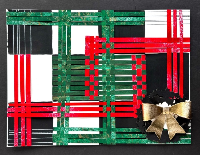
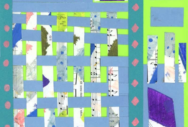
6. Collage Weaving: Now that we've talked
about color combinations, I want to share with you a
way that you can play with your color combinations and composition by weaving
paper strips together. I happen to have a ton of
paper strips left over from a previous project that I had
done in a different class, and I wanted to find
a way to use them. This also happened
to come out of wanting to have a creative
art making session, but not really having a plan about what I wanted to work on. And I love that resulted in an artwork that then resulted in inspiration for this class. So these are just
strips of paper. They're all cut about
the same length. When I've done paper
weaving before, I've done it with
different painted papers, watercolor and acrylic
that I've created. So this is one of the
first times that I'm doing this with just solid
color strips of paper. Initially, I thought I wanted
to do a blue background. Later in the video,
you'll see that I swapped that out because I was just feeling a different color. But I'm just using the
gradual weaving of the strip, so the over, under over of a weaving technique to
build up structure. And I'm also kind of
playing with composition as well because as I
grab new strips, I'm making decisions about whether it's going to be
a horizontal strip or a vertical strip and whether I'm going to grab a black
strip or a white strip. And then every so often, I'm
kind of doing like here, and I'm adjusting my strips to kind of get the
spacing that I want. You can weave it
super tight so that you don't see your
background paper through. You can also weave it a
little looser and have little pops of whatever
color your background paper. Is a very easy way to work with paper to create some
really dynamic interest. And this is also the first
time that I'm doing it with such high contrast value with
just a dark and a light. And I love contrast
in my artwork. So I'm really enjoying the
process of building up really interesting dynamic lines and creating different
blocks of color. By the interaction of the black strips and
the white strips, both with each other and
then within their colors. So I've got some more areas where I've got some
more white happening. I've got areas a
concentration of black, and it's a really fun way to just kind of let the blocking of the color evolve rather
than doing straight up collaging with strips
and squares and rectangles. So this is just another
option that you could explore if you
wanted this point, all I know is that
I want to create some weaving blocks of color
with the strips that I have. I know that I'm going to have a third color for my background, but I'm not quite sure
where it's going to go from here. And I love that. I love the open endedness of it and the fact that I'm just playing with one concept at a time and I'm letting
the artwork evolve. So then you can kind of decide how big or small you want to go. You can weave any size
strips that you want to. You can even vary the
size of your strips. You can have some wider strips
and some narrower strips, and you could absolutely have more than two colors that
you're weaving in here. But I really wanted to play with monochromatic and
keep it very simple. Ultimately, I had black
and white strips, so that was kind of
the starting point. And then it was just
a decision about what the color background
was going to be. So then the final step is
just kind of adjusting your strips and getting
everything nice and secure. Because I'm going to glue this down to a bigger
sheet of paper, there's going to
be a lot of glue. But I also didn't want any of my strips on the
edges to slide out. So I'm just putting
a little bit of glue on each of the
strips that they overlap at the outer edges of the weaving to secure
the weaving as a whole. Then I'm going to
adhere all of that to my background paper as I decide
where that's going to go. I did find that the glue on the black paper did leave
a little bit of residue. The glue dries clear, but it is a different consistency
than the paper. So I've got the matte paper, and then there's a little bit of sheen from where the
glue got on there. So if you are going
to do this, just be a little bit careful when you're dealing with
your dark papers. In the end, this
was an exercise. This was a fun, creative thing to do because
I had some time. So I wasn't too
worried about that. Now I'm going to
put glue all over the back because
I really want to make sure that this
sticks really well. And then you see my strips are sliding a little bit,
but that's okay. I didn't wait for the adhesion on the outer edges of
the weaving to dry. So that might be a good idea
to wait for that first. And then I'm deciding
where on the paper I want to put this
before I put it down. Then I always have
my scrap paper to keep my gluing area clean. But because there's a lot of
glue on this woven piece, I'm using that instead of flipping the whole
thing over to really do some rubbing to
kind of get it to adhere nicely to the
background paper. Let's send over to the
next lesson to see how I continue to build
up this composition. See you soon. Mm.
7. Collage Composition: Now I'm going to continue
building up my composition. So I've created my
initial weaving, and that has some color
blocking within it, and then I'm going
to continue to use the strips to help unify the woven color blocking
with the whole background. So now I'm trying to use the strips in mostly
their full sense, and I'm kind of placing
them in different ways horizontally and vertically to build up an interesting
composition. I'm also playing with
overlap so I'm leaning into the idea of the under over
aspect of the woven pieces. It's almost as if
the woven piece had been stretched out and
kind of layered across where there's lots
of different spaces where the purple background
color can come through. And this is very much, you know, letting your own preferences
and your ideas and getting sparks of inspiration as you put down each
additional strip of paper. This could be sketched
out in advance, but I really love letting
the artwork evolve. And since this was
an artwork that came out of just
having some time and having some strips
around and having a very loose idea of what I might be able to
do with those strips, I really loved the
process of this, really, truly constructing
the composition strip by strip as I went along. I was thinking about
the strips that are on the purple paper as being
kind of separate from, but also in harmony
with the woven piece, playing with
different heights and spacing them out and just
having a lot of fun. And we've referenced Pied
Mondrian before in this class, and that's definitely, I
think, coming into play here, the different ways that
Mondrian played with larger and smaller squares
and rectangles as he built up his grid compositions and
the really fabulous use of lines that he had
for how he broke up the canvas space and
then where the color was. And I this piece also came about around a time where I had been teaching a class about Mondrian. I have a Piet Mondrian inspired
class here on Skillshare. Mondrian is very much
on my mind this year and kind of coming
into play with all these amazing
composition ideas. So I did lean into the initial strips in
their full sense. On the left side of my paper, I did use two strips to build
a longer strip because I have a vertical artwork
rather than a square one. And then I'm also having
them go off the page, and then I'm going
to snip off where they overlap the edge,
where they go off the side. And then using those then
smaller pieces as inspiration, those will kind of
become part of it, too, as I add more variety and variation as I build
up this composition. And you'll find that as you go, the more strips
that you lay down in the outer aspects
of your collage, the more interesting
compositional decisions you'll get to make. So where do you need to
add more of each color? You'll kind of keep assessing
the balance and the unity. Where are the strips in
the outer edges kind of connecting with or in relation to the strips
in your woven section? If you do a combination
of the two? It's really fun to kind of keep reassessing your
collage and kind of where do you want to
put more for the color. So let's hand it over to our next lesson
where we talk about some optional mixed
media techniques that you could add on
top of your collages. See you there. Mm
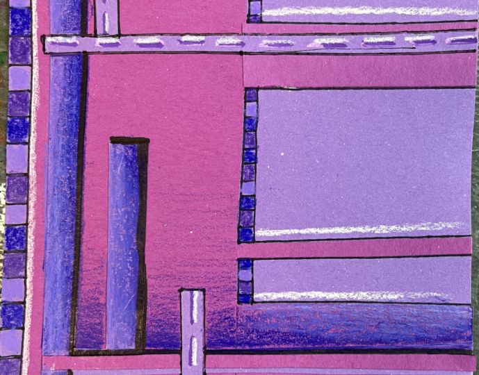
8. Optional: Mixed Media : Mm. I've created another collage using color blocking and layering to build up the
different effect that I wanted. I went for very similar colors. I've got a warmer
and a colder violet, the colors that I felt like
I wanted to work with today. Then I've got some paint pens. I've got my colored pencils. I'm going to grab
my fine liner, too. I'm just going to
see where this goes. When I work back
into my collages, especially when I'm
doing collages that are just created from
solid colored paper. I like to lean into value and I like to add
different patterns. You could approach us
anyway you want to. The idea is, this is our
starting canvas now. We had our two base colors. We created a
composition by playing around with different
color blocking to break up the solid color with the
other color and then break up secondary color with more of the first color until we
get to something like this. This doesn't have
to be what happens. We could absolutely work back
into a more simple collage that doesn't have much or has very little
layering of the paper. But I kind of got carried away and I was pretty warmed
up from creating these. When I created this one, I was ready to go and
keep going with it. So I'm going to just start with some colored pencil first, and I'm going to have
some fun leaning more into the violets and then I'm going to kind of see
where it goes from there. I love adding value. So when I start
adding more darks, when I push the darks darker
and I push the lights later, I end up with a lot of interest happening in the artwork and it really starts to
make it come alive. And there's no right or
wrong way to do this. So this is just kind
of me intuitively going back in and kind of seeing what else
I want to do with this piece. This
is very geometric. It feels like a violet
version of a pit Mondrian, which is kind of interesting. But I want to see
what happens if I add even more linework and
if I add some value. Now, going in with
color pencil into a layered collage can
be a little tricky, but I try to lean into the ups that happen with the
different layers of paper and kind of use
that to build off of. You might find some
sections, though, of your collage
that need a little bit more glue along the way. At any point in time,
feel free to strengthen up the collage pieces
so that they're not floating around and kind of getting in the way of the mixed media work
you're trying to do. So having your acoustic on hand during this stage
is a good idea. So I'm just playing
with color and adding some more visual
interest to my piece. You can play with solid
color or you can play with value scales and have
some dark that fades out. It's completely up to you. This is also a fun time to kind of play with what colors you can layer to get even
more color interest. So I put that solid purple in over my lighter purple.
I didn't really like it. I wasn't too happy with
how that turned out. So now I'm going to lean
into some darks and some lights so that I
can pull those values. Back and just add
some more interest. There will definitely
potentially be some offward stages in
this process of creating, and that is normal. That's okay. It's going to look a
little odd when we start to draw into our paper
collages because we're adding a new medium that's going to be a
different kind of thing. We have the different colors and the values
that we're adding, that's not necessarily
a tricky thing. It's the texture change that I find throws me off
for a little bit. So I just kind of have
to keep working it until I get enough
balance going with my textures so that
it starts to make sense to have these textures introduced into the
smoothness of the paper. Then another thing
that really helps, just like we have
created a balance with our color blocking, when you go back in with
your mixed media work, if you decide to do this step, it's very helpful to think about having things kind of
appear in more than one area. Sometimes you want to
have a dominant section where there's one thing that really kind
of draws the eye. Oftentimes, especially when
we're introducing new colors, it helps to if I have something over here,
repeat it over there. That's one easy way to start
working with this phase of the project options by
playing around with where can you mirror things so
that it all makes sense. I've got some blue over here now because I was trying
to darken up my violet. So now I'm going to
think about where I can put some of the same kind of value scale on the
other side of my collage. And it doesn't have to
be perfect symmetry. It just needs to feel kind
of balance between the two. I often kind of find
that the edges that I create throw me off a bit. At first, where I'm trying
to color between them, you just kind of
have to lean into it a little bit because
there's going to be sections where it's
just really hard to get the color pencil
into those spaces. Then the great thing
is anything that might go too far beyond what
you're comfortable with, you can remove paper,
you can add more paper, you can keep working back
in with different media. There's all sorts of ways to resolve any strangeness
that might come up. If you're going to
push sharpened pencil, you can get into where the two layers create
that height variance. This one, I don't want to
shade all the way up there, so I'm going to
let that fade out, but I'm still going
to put some of my light in this part of it. Kind of feed it
more on a diagonal. And it's gonna look
different because this is the warmer purple, and this is the cooler purple. So what we can do is we
can take some white, and we can create it even later. And that just kind
of is a nice way to kind of bring
the two together. I can even go over here
and add some white in, too, if I wanted to, a dusting. I kind of want to play with
adding some draw details. So I'm going to add some black
outline to a couple spots, and that's going to create
some nice illusion of depth. It's also going to
add a nice crispness. You could do it a
lot of different places or you could just let it kind of paint a
couple select spots. Talking about
balance, I'm going to also do it along this edge. And then I think
what I want to do I started to add some marks that create kind of
a pattern of sorts. So I'm going to do some
stripes on the edge. You could measure
things out, you could be a little bit looser with it. These ones I'm going to
make a little smaller. So I have that repetition. But I also have some
variation. I love that. That is just adding
such a nice touch. I do feel like I want to do a little something to break
up the colored pencil. I'm not loving it as much as
I have in my other pieces. I'm I grab a sharpie and I'm going to mir
the same effect, but I'm going to do it
with a thicker line. Now I can kind of
play with popping in some colored pencil
a couple other places. So maybe I do an
imperfect pattern with some of my colored
pencil purples. The color pencil is going to go over your fine
liner a little bit. Could go back over
your ink lines, but because of the waxiness
of the colored pencil, the ink might not go back
over the colored pencil. You can really start
to see how the collage becomes a foundation for the other elements when
we approach it this way. I'm going to do
the same thing on the sides with these
other squares. All right. I am loving that. I'm going to do a little
bit more of that. But I want to get a
little bit more of the gradient play to make sense. I'm going to take advantage of this little rectangle to
do another value scale. A value scale is anytime
you have values fading out. You've got your darks
fading out to your legs. It's a range of your values. Then I want to
repeat my Sharpie. I think I'm going to
do the same thing with this rectangle. It went off a little bit, and I'm going to lean into that. And create shapes there. Then even though this
goes off the page, I'm going to mirror
that there too. Do have some paint pens. Not totally sure if I
want to add these in. Some of the colors absorb into the paper because construction
paper is very porous. You can keep layering over it or you can change it up
into a darker color. Paint pens do stay
wet for a while. You do want to be careful
not to smudge them. I think that may be it. That may be all that I want
to add to this one. Although it is
really nice to put in some bright pops of white. Maybe just a couple
spearing lines. Then I feel like if those are there, maybe I'll double up. But offset a little
bit to add some pops. Do my dash drains. Then I also feel like I need
a white line over here. As straight a line as I can get. That's great. I'm
happy with that. If you want to, this
is an optional step. You can take any of your collages that
you might have made and play with different ways that you can work
back into them. This would also be really
fun to do if you're choosing to do this
project digitally because you can easily use the variety of different brushes
and drawing tools that are available in programs
like Procreate to draw back in to your
color blocking artworks. Have some fun with
this. I would love to see how it all turned out. So let's head over to the final lesson to wrap up
the glass. See you there.
9. Final Thoughts: Mm. Thank you so much
for joining me in this color blocking
geometric composition class. I have had so much fun exploring composition,
color relationships, ratio of color and scale
and sizes as we approach all the different ways
that we can manipulate paper and color and
collage pieces. You're just focusing on
geometric, squares, rectangles, strips of paper to create some really dynamic,
interesting pieces. These can then be studies
for future artworks. These can be artworks
in and of themselves, but it's a really
fantastic fun way. To get at art making, it'll open your eyes to some of the different
things that go into considering
how we put together an artwork regardless
of the medium, and then you can use
all of these concepts to further push your own
growth artistically. I hope that you are interested in sharing your
work in the student gallery. It's so fun to see how
everyone interprets project love it if you took
the time to leave a review. Share your thoughts about
this approach to art making, ways that maybe
you've explored it, if you've already done
the class project, ideas you have, for ways you can continue to explore
these concepts. This is really fantastic
for me as feedback as I consider how to create and what to include
in future classes, as well as for other students who might be considering
taking the class. I'd also love to stay connected, so be sure to click
the Follow button if we aren't connected
that way already. So you get notified of future
classes that are coming up. I have a ton in the works. I have a ton more ideas, and I can't see an end to
creating new classes anytime. So I don't want you
to miss a beat. I want to be able
to stay connected across multiple classes. And following me on Skillshare is one great way to do that. I'd also love to connect
over on my YouTube channel. I share a ton of stuff over there, different art approaches, things that I'm experiencing and exploring in my own
artistic practice, art adventures I go on,
sketching in the wild, all sorts of things related to art over on my YouTube channel. So that's another great
way that we can in the universe and
kind of continue to create a sense of
creative community. I'd also love to connect
with you over on Instagram, follow each other, if you're also sharing your art journey. My Instagram is really
a chance for me to kind of document my artistic
growth and my process, as well as share what I'm up to creatively with anyone who's
curious to follow along. Instagram is a really great way to connect with community
around the world. I'm so excited to see what
you created in class. Thank you so much for taking
this one and exploring color composition and
all the fun things that we explored in class, and I'll see you next time. And
 Elisabeth Wellfare, Artist, Art Educator