Transcripts
1. Introduction: But Hello and welcome to the
watercolor painting tutorial. Today we'll be painting a
beautiful Clematis flower, a common and beloved
bloom in many gardens. Clematis is a delightful
subject to paint, offering a variety of colors, shapes and textures to explore. In this tutorial, we'll focus on deep purple flowers surrounded
by delicate leaves, buds, and a soft
warm background. This tutorial is a
great opportunity to practice the wet
on dry technique, along with softening edges to
create smooth transitions. We'll primarily work with
the wet and dry technique, even for parts for
the background. You'll also see
how we can adjust the reference photo to better
match our artistic vision. We'll simplify not
only the composition, but also the painting process, making it more approachable
and less overwhelming. As always, I will guide you step by step through
the entire process, breaking the painting into manageable sections to make it both enjoyable
and achievable. At first glance, this project
might seem challenging, especially if you're new to
watercolors, but don't worry. With patience and
a steady approach, you will find it
easier than it looks. Remember, you can always simplify the painting
further if needed. With my guidance and a
structured approach, I'm confident you will create
a piece you'll be proud of. Whether you follow
my instructions exactly or at your
own personal touches, this painting is an opportunity to create something
uniquely yours. Is your creative journey, and I'm here to support and inspire you every
step of the way. By the end of this tutorial, you will have a vibrant
and expressive painting that will bring a smile to your face every time you see it. So gather your supplies, take a moment for yourself, and let's start creating this joyful piece.
Happy painting.
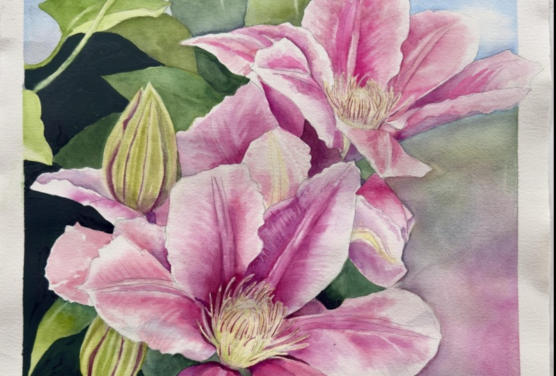
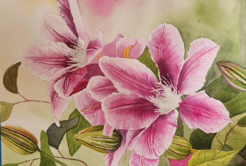
2. Project and Resources: But I've prepared a selection
of helpful resources for your project available in the projects and
resources section. You will find a PDF with the supply list I used
for this painting, along with a reference photo and an image of my finished
artwork for guidance. Line drawings in various sizes are also provided so
you can print and transfer them onto
your watercolor paper in the size that best
fits your needs. My painting is in an
11 by 15 inch format. Additionally, there are
working progress photos to help you follow the process
and focus on specific areas. Feel free to explore
these materials and use them to create your own unique and beautiful painting. Please share your
progress shots and final painting in the projects
and resources section. I also encourage you to
take the time to view each other's work in the
student project gallery. It's always inspiring
to see what others create and the support of your fellow students can
be incredibly comforting. Don't forget to like and
comment on each other's work. Lastly, I highly recommend watching each lesson
before you begin painting. This will give you a
clear understanding of what to expect at each
stage of the tutorial. If you find this class helpful, I would greatly appreciate it if you could leave
an honest review. Your feedback will help me
improve my content and assist other students in deciding whether to join this class.
Thank you in advance.
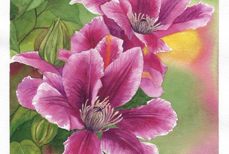
3. Inspiration and Painting Plan: Clematis is a popular
flower in my area, and I've seen dozens of different species with a
variety of shapes and colors. Over time, I've taken many photos of these
beautiful flowers, and I thought that would make a wonderful subject
for this tutorial. I chose this particular
reference photo, even though it's not the
type I typically use. Normally, I prefer photos with strong highlights and well
defined cast shadows. As I find they work best
for watercolor painting. However, I was really drawn to the shapes and composition
in this image. The original photo
was quite busy with many flowers and leaves
filling the background. To create a more focused
and harmonious composition, I decided to simplify it
and introduce warmer tones. Using Procreate app on my iPad, I experimented with
the background, looking for a way to
make it more cohesive. I felt that adding a
yellowish hue would create a nice connection
between the greens and pinks. I also adjusted some
of the highlights, darkened certain areas,
and played around with the colors on the right
side until I was satisfied. I realized that we don't need the right
side of the image, the elements that are on the right side in
the reference photo, as it would make the
composition too clattered. Instead, we will
make the flowers and buds the main focus
of our painting. Once I had a clear vision, I started thinking about how
to approach this painting. The first thing I
always consider is whether I need to
mask out any areas. I decided that masking
the main flowers and buds would make painting
the background much easier. After completing the background, we will remove the masking from the flower edges and reapply it only on the stamens so we
can paint the petals freely. For this tutorial, I've divided the painting into
clear sections. We will follow this order. Background, we will start with the main colors and then add
background twigs and leaves. Then we will paint
buds and leaves. These were masked earlier, so we will paint them next. Then we will paint
flower petals. We'll break this process into two stages for better control. And lastly, we'll paint stamens. We'll complete the
painting by adding the fine details of the stamens. Now, if you're ready, let's begin our journey with step one, masking out the main shapes.
4. Masking: I've already
transferred my sketch onto the paper and secured it by stapling it to a gator
board on all four sides. I've also taped the
edges to create a clean white border
for the final painting. The paper is dry and
straight from the block. But since it's firmly
attached with staples, there won't be any
issues with buckling. The size of my painting
is 11 by 15 ", which fits perfectly on my 12 by 16 inch watercolor block. This extra margin allows enough space for staples
and masking tape. If I painted directly
at 12 by 16 ", I wouldn't have that margin, so I prefer working with
a slightly smaller size. For this project, I'll be using Windsor Newton masking
fluid with a yellow tint. Before using it,
I'll gently roll the bottle to ensure the
pigment inside mixes evenly. I also keep an old
bottle cap from a previous masking fluid bottle to use as a small container. We'll also need a piece of soap. I keep it in a small
container for easy access. A brush dedicated
to masking fluid, never use your good brushes as masking fluid can ruin them. And of course, we'll
need water for cleaning the brush
during the process. I always pour a small amount
of masking fluid into a smaller container instead of working directly
from the bottle. Masking fluid dries quickly
when exposed to air and leaving the battle
open for too long can cause clumps to form inside. Even though I close the
battle quickly each time, I still get occasional clumps. This is something
we want to avoid, as masking fluid
should have a smooth, runny consistency
for best results. Now, wet the brush
and gently rub it on the soap to create
a protective layer. This prevents the masking
fluid from sticking to the bristles and makes
cleaning much easier. Dip the brush into
the masking fluid and apply it to the areas
we want to protect. We will use masking fluid
twice in this painting. First, we will protect
the edges of the flowers, buds, and some leaves so we can freely paint
the background. And later, the second masking, once the background is complete, we will remove the
first layer of masking, paint the background
leaves and buds, and then mask the stamens
before painting the petals. In the class resources, you will find an illustration
showing exactly where I applied masking fluid at
this stage, marked in green. Another illustration shows
the stamens marked in pink, which we'll mask out later. Take your time and aim for
smooth, precise edges, as they will define the final outlines of your
petals, buds, and leaves. Avoid brushing.
Jacket masking edges can lead to uneven
lines in your painting. Since there's quite
a lot to mask out, work carefully and don't hurry. If you notice your brush
bristles becoming stiff, that's a sign the masking fluid is starting to dry on them. Rinse your brush regularly and reapply soap to keep
it in good condition. Here is an example of a damaged brush and a
brush in a good condition. The bristles on my
current brush aren't glued together
because I use soap. In contrast, one of my old
brushes used without soap now has stiff stack together bristles making it
almost useless. Once you've finished
applying the masking fluid, let it dry completely
before moving on. In the next part, we will
start painting the background.
5. Background: The masking fluid
is completely dry, we can begin working
on the background. Let me start by showing you the brushes I'll be
using for this process. This is an inexpensive
old flat brush I use to prepare my colors. It's much easier to
pick up more paint from the well with this brush compared to my regular
round brushes. For the actual painting, I'll be using around
size ten brush, but I recently purchased a new 1 " flat brush
with a short handle, and I'm going to use it mainly for painting
the background. Although I usually
prefer round brushes, larger brushes are better for painting bigger areas quickly, and I bought this one
specifically for backgrounds. Of course, you can use whatever
brush you have available. The larger the brush, the better because
fewer brush strokes will lead to a smoother finish. Before mixing colors, I always spray my paints
with clean water. I do this from time
to time throughout the painting process to keep the paints
fresh and workable. For the background, we
will need a few colors. I'll start with
the lightest ones, Burnt Sienna and
Windsor Yellow Deep. Tse will be used for the upper part and the right
side of the background. I'll also keep Windsor
yellow handy in case I need a stronger,
brighter yellow accent. It's always a good idea to
repeat some of the colors from the main subject in the background to create
a visual connection. That's why I'll be preparing quin acredon magenta
and permanent rows, as these will be the main
colors for the petals. Adding them to the
background will create a nice link between the
background and the main subject, and we can even suggest some flowers within
the background. And we'll also need some green. I'll begin with Windsor green
yellow shade as my base, and I'll mix it with Windsor
yellow deep to warm it up. I'll then add burnt sienna to shift the green
toward an olive tone. For the darkest
parts of the green, I will add paints gray, which I often use to
darken my greens. I'm sure I will also use
green gold along the way, as it always adds a
lovely warm green hue. We're going to paint the
background starting from the upper part and
working our way downward. If we use a large brush
like this 1 " flat brush, we can apply either the wet on wet technique or the
wet on dry technique. It doesn't really matter with such a big brush
because we can quickly cover the area with either method without worrying
about creating hard edges. The goal is to create smooth color gradients
and seamless transitions, which will form a
beautiful background for the main subject. I've started by applying a clean water glaze
to the upper part, and we will add paint
onto the wet surface. Later, you will see that I switch to wet and
dry painting to demonstrate how both techniques work when using a large brush
and well diluted paint. I've covered the upper half
of the background with water, and now I'm applying
a warm mix of burnt sienna and
Windsor yellow deep. This warm yellowish tone
works well because it shifts the overall color temperature of the painting
to a warmer side. Additionally, it complements
the main subject's color, making it a perfect accent. Purple and yellow are
complimentary colors, so they will work well
together in this painting. The reference photo,
the background is only green and pink, which looks nice, but feels
a little too monotonous. So adding these worm colors helps break up the dual
color composition. In the upper part, I want to
create a smooth transition from the yellow brown area
to a green area on the left. On the left side, I
will add a darker green by incorporating more paints
gray into my green mix. However, I don't want
to go too dark just yet because my plan is to add
some darker elements later. In the final painting, you'll notice that I added
a twig with simple leaves. I know that the colors
will dry lighter, so I'm confident that I
can apply a darker tone now knowing that it will
lighten as it dries. But I also don't want to
go too dark right now. And as expected, I'm also
using green gold here. I love this color and I love how it warms up the green tones. There's a lot of water
on the paper now, so it's important to remember
to tilt the painting. Tilting the paper helps the paint flow and
mingle naturally, creating those lovely smooth
transitions between colors. On the right side, I'm
adding the pink mix of quinacredon magenta
and permanent rose. The paper is expanding slightly, forming a small
indentation in some areas. When this happens, the paint
can pull into those valleys, which we want to avoid. If you notice something
like this happening, till the painting to help
spread the petal evenly. Leaving paint in one of these little valleys can
cause uneven drying, and you may end up
with unwanted blooms. It's best to keep the paint spread evenly
across the surface. On the right side, I'm switching to the wet on dry technique now. You'll notice that my brush
strokes leave a hard edge, but I'm working quickly to prevent the paint
from drying too much. This allows me to create
smooth color gradients, even when working wet on dry. With the edge of the brush, I'm lifting out some
paint to suggest simple petal shapes and give a hint of flowers
in the background. However, I don't think it worked quite as well as I'd hoped, so I wouldn't repeat this
technique next time. I think just having the pink area on its own is enough to suggest
flowers in the background. We don't need to
create any shapes. As I move to the left, I shift the color toward green. I mix a darker tone using
green gold and paints gray. Working wet on dry has
the advantage that the paint doesn't get
further diluted by water, unlike with wet on wet painting. This means I can achieve
a darker tone because the paint is applied
directly onto dry paper. The paint will dry
slightly lighter, but not as much as it would if I were
painting wet on wet, where the additional water layer further dilutes the pigment. On the left side,
I'm also dropping in some pink paint to suggest flowers just like I
did on the right side. Now, the entire background is covered with the main colors. While the paint is still wet, I want to add some
finishing touches. I'm going to use a clean
damp brush to lift out paint and create
some leaf shapes. Two. After lifting the paint, I will add a different
green shade to that area, helping to create soft, blurry leaf shapes
in the background. However, this technique only works if the paint
still has a shin to it. If the paint has already
dried and the shin is gone, it's better not to touch it. In the upper part
of the background, I can still see that shin. So I'm able to lift
some paint and create these warmer
green shapes. In a moment, I will try the same technique in the
lower part of the background, which is drier and you
will see the difference. I'm also adding some spots of even darker green to
create more depth. But again, I can
only do this when the paint is still wet
enough to manipulate. The lower part of the
background is dryer because I applied the paint with
the wet on dry technique. With less water on the paper, the shin has already disappeared and the paint
doesn't lift as easily. You'll notice that when I
try to lift the paint here, it doesn't come off evenly and my brush creates
a darker contour around the lifted shape. This is because the
paint is no longer wet enough to lift smoothly. Also when adding new
paint at this stage, it won't blend as
seamlessly with the rest of the background due to the
differences in wetness. This is why we can only
manipulate the paint effectively when we still
see that sheen on the paper, signaling that it's still wet enough to lift or
add more pigment. Now, leave the background
to dry completely, and in the next
part, we will add some simple twigs and leaf shapes to finish
the background.
6. Twigs: Make sure the background is completely dry before moving on. I allowed mine to dry
thoroughly overnight. Now that it's fully dry, we can work on enhancing
the background by adding a few elements to make it
more visually interesting. While a plain background can often be sufficient,
in this case, we want to introduce
an impression of the typical leafy surroundings that accompany clematis flowers. Clematis blooms are always surrounded by simple
delicate leaves. I don't want to overcrowd the background with
too many leaves, but adding a few will significantly enhance
the overall composition. I'll be using the same colors
from the previous stage. Green gold mixed
with paints gray will form the darker
green I need. I'll also add a touch of Windsor green for
some variation. In the upper part
of the background, I'll introduce
quinacradon magenta, mixed with a bit of
green and pains gray. This combination
creates a muted purple, which is exactly what
we need for the twigs. If I mix it further
with more green, I will get a brownish tone, which might also
work for the twigs. I may also need a
lighter worm green, which I can achieve by mixing green gold
with Windsor green. Again, I don't want to
overwork this part, so I will keep the
elements very simple. First, I'll bring out a warmer green leaf shape by using a bit of
negative painting. I'll apply a darker green around the leaf shape using the
wet on dry technique, and then smooth it out
with a clean de brush. This is enough to
define the edge of the leaf without adding
unnecessary detail. Next, I will paint
a simple twig. I'll begin with a light
brown tone using burnt CNA from my palette to establish
the placement of the twig. Once I'm happy
with the position, I will pick up my
darker magenta mix and drop it into the shape. Then I will use a
light green mix to paint very
simple leaf shapes, no intricate details, just basic silhouettes
of the leaves. Now I want to add
another twig with similar leaves on the left
side of the background. The paint will partially
spread because I've touched an area
that's still wet. Ideally, I should have dried that area with a hair dryer
before painting over it, but I'm okay with this effect. However, you can learn
from my mistake, and before painting a twig
in a similar situation, make sure to dry that area with a hair dryer so that your shapes will stay exactly
as you intend them to be. The line drawing I provided. I've also included
these twigs in case you would like to
paint them as I have. However, feel free
to make adjustments, add more leaves, remove some, or create your own unique
leafy arrangement. Next, I'll add a
simple twig shape in the bottom left corner. There's a lighter large leaf
shape in the background, which provides a nice
backdrop for the darker twig, which I will paint in a Y shape. I also want to darken
this area a little to cover any imperfections
from the previous layer. Initially, I aim to create
a negative leaf shape, but eventually I went over this entire area
with a darker green. I intended to keep the bottom left corner darker to contrast with the lighter
upper right corner. This dark section
helps create a deeper, more defined background
for the petals. The contrast between
the dark green and the lighter clematis petals adds depth and enhances the
shape of the petals, making them stand
out more clearly. Once you've finished this step, dry everything
with a hair dryer. Afterward, we can remove
the masking fluid. You can simply rub it
off with your finger, but I prefer to use a rubber masking pickup
tool for better control. Removing the masking fluid will reveal how well it was applied, whether the edges are
smooth or jagged. If the edges are jagged, I usually smooth them out with a scrubber brush
before continuing. In this case, I think
everything looks good, so no further
smoothing is needed. In the next section, we'll apply masking
fluid to the stamens.
7. Masking Stamens: O this step we will return
to using masking fluid. Before we begin painting
the main subject, it's a good idea to mask
out the statements. Since they are very
small elements, masking them will make it much easier to
paint around them. If you don't have masking fluid, you can try painting
around the statements, and if accidentally
you go over them, you can later use
an opaque paint like guash to correct it. We will use gash in the
final stages anyway, but I prefer to mask the statements out
for a cleaner result. Because the stamens
are so small, I need a precise tool for
applying the masking fluid. I found that the tip of
my brush was too large, so I decided to use
an embosing tool, sometimes known as a
dotting tool for nail art. This tool is metal
and doesn't have a reservoir to hold
more masking fluid, so I have to dip it into
the fluid more frequently. However, the tiny ball on the
tip of the tool allows me to apply the masking fluid with great precision to each stamen. I'll be masking all the
stamens that are protruding, and later I will use a brush
to mask the central parts. I will repeat the process
for the second flower. In the class resources, you will find an illustration
that shows exactly where I applied the masking fluid at
this stage, marked in pink. Once the masking is applied, leave it to dry completely. In the next part, we'll begin
painting the main subject, starting with the
buds and leaves.
8. Initial Layer on Buds and Leaves: Now that the masking fluid
on the stamens is dry, we can begin painting. In this step, we will apply
a simple initial layer of color to the buds and leaves that were
previously masked out. The goal is to
establish a base layer, which you can see in this
working progress shot. As you can see, this
layer is very simple, just a wash of color on
the buds and leaves. For this stage, I'll be using the same colors as before
with one addition. First, I'll prepare
some new mixes. I'm combining burnt sienna with Windsor yellow
deep for a warm tone. Below that, I will
have green gold. On the right side
of the palette, I will mix a darker
green from green gold, pains gray, and windsor green. Above that, I will clean a
spot to mix a purple from quinacrodon magenta with
pains gray for a dark purple, and also quinacrodon magenta
with ultramarine blue, adding a bit more blue for a vibrant violet that I can see in the crevices of the buds. Start with a very watery
mixture of green gold and the yellowish brown
mix and apply it using the wet on dry
technique to the first bud. Don't focus on details and don't worry about perfectly
matching the colors. This is just the initial layer, and while the colors matter, the main focus is
on tonal values. As we are using the
same colors throughout, there will naturally
be color harmony. Don't worry if your mix is
slightly more yellow or green. The key is to keep it simple. The aim at this stage is
to create a roadmap of colors and establish a
foundation for the next layer. What we are doing now
is that we are applying the lightest tones that we
can see in the subject. When we apply the second layer, it will add depth and
saturation to the painting. If we only applied
one layer of paint, the colors may not
have enough vibrancy. At this point, you can add
some darker areas by applying stripes of darker green in
the shaded parts of the buds, but we will develop the
darker tones in later stages. This stage is really
straightforward, simply filling the
white areas with color. The work in progress photo will guide you
through this step. A couple of things
to keep in mind. Since we're working wet and dry, try to keep your
paint fairly watery. The colors I'm using aren't
pale but have a medium tone. The consistency is milky, not too thick and not
overly watered down. The best way to test your paint
consistency is to compare the tonal value of
the paint you are applying to what you
see on my paper. If your color looks
lighter, add more paint. If it's darker, add more water. No. Once the initial
layer is applied, dry everything thoroughly with a hair dryer and let
the paper cool down. In the next part, we'll develop these elements further
by adding more details.
9. The First Bud and Leaf: Now that the initial
layer is completely dry, we can start developing
the tones and colors of the buds and
leaves to give them form. In this part, our
aim is to transform the flat silhouettes of the plants into more
three dimensional shapes. Let's begin with the first bad, and for this, I'll be
using a size ten brush. Start with the purple
color and paint the long dark
crevices on the bud. I feel that the brush is
a bit too large for this, so feel free to switch to a
smaller brush if you prefer. The goal here is to paint the
main structural elements. The butt is divided
into sections and the crevasses are
the darkest areas. We want to define each part by painting these
dark crevasses. I'm using a fairly dark color, but it often surprises me how many layers we need to build up to achieve
the right tone. You will see that I continue adding more paint to
darken these areas. After applying the dark purple, I gently soften the
edge on one side. I also use a dark green to paint the crevices
on the left side. Now, I'll dry the
bat quickly using a hair dryer so that I can continue developing
the colors and tones. I'll use the hair dryer
frequently to speed up the drying process instead of waiting for the paint
to dry naturally. After using the hair dryer, wait a minute for the paper to return to room temperature. The heat from the dryer can cause the paint to
dry too quickly. So if you start
painting on warm paper, it will be difficult
to control the paint. Once the paper has cooled, I apply a darker green in
the middle of each section. The initial green is lighter, and while the paint
is still damp, I run the darker green
along the center, leaving the edges of
each section lighter. I also keep in mind that the bottom part of the bad
is generally darker in tone. On the right side of the bad, I'm using more brown. I apply the paint wet and
dry and then smooth it out. At this point, I'm starting
to build up the darker tones. I've already established
the general structure and distribution of colors, and now I'm adding more layers to darken
the areas that needed. I dry each layer in between
to avoid painting wet on wet, which would cause
the edges to blur. Drying the layers
ensures that I can add darker tones and
maintain sharp edges. I switched to a smaller
size four brush to paint more precisely. Notice that with this brush, I use very short brush strokes to paint many lines
close together. This technique helps to darken certain areas and adds
texture to the painting. In the final painting, you'll notice that the sides of each section are quite light. These areas catch more light, and we will create
this effect by lifting off paint with
a scrubber brush later. If you go too dark in some areas and lose those lighter
sections, don't worry. We will retrieve the light
tones with the scrubber brush. As you can see, I'm not
applying just one layer here. I'm layering multiple
transparent washes, each contributing
to the final look. This method of building
up color values and saturation is very effective
for realistic painting. By gradually adding each layer, we can adjust the
colors and tones until we reach the
desired effect. Once you finish the bud,
move on to the stem. For the stem, we simply want
to create a round form. To do this, apply
a darker tone on the right side of the
stem and near the bud. Leave a lighter area on the
left to suggest a highlight. Again, don't worry if you accidentally paint over
the highlight area, as we can always lift the paint later with a scrubber
brush to reveal the light. Lastly, there is a
small leaf on the left, and here I'm using a
negative painting technique, which is just one approach
to painting this. I imagine where the veins are and paint section
between them, leaving the veins lighter. Of course, we could
also paint the darker veins directly
with a dark green, and we will do this
in other leaves. I want to show you
different possibilities. We'll also paint other
bads slightly differently, so you can see that there are many ways to approach
painting the same subject.
10. Finishing Buds and Leaves: In this part, we will almost
finish the buds and leaves almost because lifting out the highlights will be
covered in a separate video. Let's continue
working on the buds. This time, I'm starting
with the purple again. The distribution of colors
is slightly different. The crevices on the left
side are now also purple. I'm using a smaller brush
to paint these details, and then I will switch back to a size ten brush to
cover larger areas. This stage, we're focusing on painting the darkest
elements, those crevices. It's a good idea to start
with these because they are the most prominent
structural elements that help establish the
general form of the bud. Plus, these are
the darkest areas, so it's a good idea to define
them as soon as possible. By identifying the
darkest areas, we establish reference points
for the other tonal values. Once we've painted
these dark areas, we know we can't use such dark tones for
other parts of the bud. With the tip of the small
brush and a darker tone, I darken the bottom
part of the bat, then dry this layer. Now I will switch to
the size ten brush and using a warm mix of green
gold and Windsor green, I'll apply the color to the
first section on the left. Next, I will mix a darker
green, green gold, Windsor green, and paints gray, and apply it close
to the crevice. This helps create
a rounded form. I'll continue applying
these two greens to the next sections, leaving the sides lighter while keeping the bottom darker. On the right side, I
will use brown and even darker green and
then dry this layer. Finally, with a small
size four brush, I will add tiny details. I will refine the shapes and add the darkest
tones where needed. The next but will be painted
a little bit differently. I will try to do
everything in one layer. I will start with
a dark purple to establish the crevices
and define each section, and then immediately
start painting each section using
various shades of green. Notice that this time I'm
not using the hair dryer. I'm just applying more paint. Once I apply a
lighter warmer green, I then layer a
darker green on top. Since I'm painting over
an already damp area, the paint is more concentrated and it won't spread as much. This technique won't
give us sharp edges, but it will help establish a general distribution
of colors and tones. We can always create sharp edges in the next layer
once this one is dry. Now I can move on
to the last bad. Notice that the buds are
actually quite simple to paint. The key is painting
these elongated stripes, curving them slightly to
suggest the rounded form of the bad and paying attention
to colors and tonal values. Once the layers are dry, we'll come back to the
buds in the next part. But for now, let's finish this section by painting
the two leaves. Oh for the larger leaf, I first want to
suggest its form. And to do that, I will
apply a dark green near the central vein and smooth out the color
towards the right side. This creates a darker
area near the middle, which suggests an indentation. I repeat this on the left side, darkening the left side and lightening the paint
toward the middle vein. I try not to let
the sides mingle, keeping the lighter middle vein running through the
center of the leaf. Now we can dry everything. Once it's dry, we'll
finish the buds and leaves by lifting out a few highlights and adding the veins
in the next part.
11. Retrieving Highlights and Adding Veins: Now that everything
is completely dry, we can begin the easy
part, creating highlights. I'll be using a size
four, scrubber brush, a Windsor Newton galeria brush that I use in almost
every painting. You don't need the
exact same brush, just a slightly stiffer one that allows you to wrap
the paint gently. You could even try use
a regular round brush, but a stiffer brush makes
the process easier. Start by dipping
the brush in water, then remove the excess paint by dabbing the bristles
on a paper towel. Gently rub the area where you
want to lift off the paint. This will activate
the dried paint, and you can remove it by dabbing the area
with a paper towel. This is a simple yet
effective method for creating highlights, especially in areas that
should have highlight, but where we may have
accidentally painted over them. Green is an easy color to lift, so be careful not to
use too much force. If needed, try adding a bit
more water to your brush to activate the paint rather
than scrubbing too hard. Sometimes after lifting, the highlights may
appear too white. For example, I feel that the lighter spaces on
the bad are too pale. In this case, you can always
add another layer of paint and glaze over those areas to
introduce a bit more color. Now, let's finish the leaves. As you can see, the leaves in this painting are quite simple. I didn't focus too much
on intricate detail. To finish the leaves, we can use a small brush and a darker green to add some veins, which will give them
a more natural look. We're not aiming
for hyperrealism, so we don't need to focus
on every little detail. Simple veins like this will add interest and make the
leaves look more organic. At this point, the entire
background is complete. If you want to add or change any details
in the background, now is the time to do so
because in the next part, we'll start painting
the flowers. We'll be changing the water and colors on our palette entirely. Since we still have
greens on the palette, it's a good opportunity
to make any twigs. For example, I decided
to darken the leaf in the upper left corner because there is a nice lighter
green behind it. Think it will look
better if the leaf in this area will be darker,
creating more contrast. I will also add a slightly darker brown tone to the twigs to make them
a bit more defined, but that's just a tiny detail. In the next part, we will
begin painting the flowers. That
12. First Layer on the Petals Part 1: In this part, we will start
painting the flowers. By the end of this stage, we should transition from white petals to
something like this. Please don't be
overwhelmed by this part. It's actually a
very simple step. However, because there
are quite a few petals, we will need to repeat the
same process for each one. But don't worry, it's
not complicated, and you will see it's easier than it might initially seem. Before we move on, let's
prepare our colors. I'll spray my paints
with clean water because they are dry now
as it's another day. This is also a great
opportunity to change the water in your water container
and clean your palette, since we'll be using a
different set of colors. Let's prepare two mixes. On the right side
of the palette, I'm mixing permanent rose
with queen acrodon magenta. I'll prepare the same mix
on the left side as well. This combination of
magenta and pink will be our main
color for the petals. But we also need
some darker tones. To achieve a darker tone, let's simply add Paine's
gray to one of those mixes. Pain's gray will not
only darken the color, but will also shift it
slightly towards purple, as Paine's gray is
essentially a very dark blue. It's not great, really.
This will give us a wonderful range of colors
and tones to work with. And this will be
the only two mixes we use for the petals. There will be a tiny
area with yellow, but overall, these two
mixes form our base. I'll be using a size ten
brush for this part, and we'll be
painting wet on dry. Pick up a medium value pink, choose any petal you'd
like to start with. I've chosen this
one and apply this color wet and dry in the
center of the petal. Now, rinse your brush, blot it on a towel, and with the scleen brush, gently pull the pink colour towards the edges of the petal. This creates a transition from the darker center to
the lighter edges. Repeat the rinsing and
blotting process a few times to ensure you're not dragging too much paint
towards the edges. Once you finish the first petal, move on to another one, but avoid those that are directly touching the
one you just painted. We don't want the paint to flow from one petal to the next. Again, pick up the pink
color and apply it in the middle part of the
petal close to the center. Then using a clean done brush, soften the edges towards
the petals outer edges. For this petal, the area near the center of
the flower is darker. While the pink is still wet, you can drop in
the darker purple near the center to suggest
the shadowed area. This is a great opportunity
to practice softening edges, which is a very useful
and common technique in watercolor painting. We will repeat this
process on each petal, so let me explain the reasoning behind
it while you watch. You might be wondering
why we're using the wet on dry technique
rather than wet on wet. Well, we could certainly use the wet on wet technique here. And if you feel comfortable
with it, feel free to use it. The results would be very
similar but not quite the same. There are two main
reasons why I'm choosing wet and
dry at this stage. First, painting wet
and dry gives us slightly more saturated colors once the paint dries
compared to wet on wet. Reason for this is that when you use the wet
on wet technique, the initial water layer
dilutes the paint more, and it dries paler than
when we apply paint wet on dry because we don't have that
initial water layer. The petals have a fairly
strong saturated color, and to achieve that, we will
apply at least two layers. Having the first
one applied wet on dry gives us a solid bold base. And the second reason is
perhaps even more important. With the wet on dry technique, we have more control over the paint and
especially the edges. We can soften the
edges if we want a smooth transition or leave them harder for
a more defined line. With the wet on wet technique, we can only create soft edges because the paint spreads
in the water layer. Having the option to create both soft and hard edges
is crucial in this case. It allows us to create folds and highlights on the edges of
the petals more easily. If you take a closer look at how I'm smoothing out the
paint towards the edges, you'll notice that I
intentionally leave some hard edges and
unpainted areas. Those unpainted areas will
represent the highlights, and the hard edges will suggest the folds and the delicate
texture of the petals. Reference photo we're using isn't ideal in terms
of light and shadow. I typically choose photos with strong highlights and well
defined cast shadows, as I believe
watercolor paintings look more interesting
in those conditions. However, I really love
the composition of this photo and the
shapes it offers. So I thought it would
be worth painting. Unpainted white areas of the petals are just
suggestions of the highlights. This layer is also just
the initial layer. We are not focusing
on details yet. We are simplifying
the petals and focusing only on the
distribution of color and tone. I'm simplifying each petal into a very basic gradient
from dark to light. From the reference photo, I only need to gather the
basic information where the strongest pink or purple appears and how the petal
bends or curls. I remind myself that
the goal is to paint the middle part with a dark pink and leave
the edges lighter. That's the only color and tonal information
I need for now. The other important
information is about the form of the petal. Whether it's seen from
above or from the side, how it's curled or bent, this will determine how I soften the pink
toward the edges. At this stage, we also want
to suggest the form of the petal by applying our brush strokes in the
direction of the petals shape. So if I know that the petal is bent or curved in a certain way, I will paint in that direction. This creates an immediate
impression of form. If we simply brush from left to right in horizontal strokes, it won't make sense. We need to follow the form
of each individual petal. When you reach a point where there are no
more petals to paint because the unpainted petals are touching the ones
you've already painted, use a hair dryer
to dry everything. Notice how the saturation of the color decreases
as the paint dries. When it's wet,
it's very vibrant, but once it dries, it will become paler. If we had used the
wet on wet technique, it would have dried even paler. Once the petals are dry, give the paper a few minutes to cool down before continuing. You don't want to
paint on hot paper.
13. First Layer on the Petals Part 2: After drying the first round, continue working on
the other petals. This initial layer will provide a nice base for the next layer, where we will focus
more on the details. In my painting process, I ended up drying the
petals two more times. I think watching me apply
the paint to every petal and explaining exactly
the same process for each one might not
add much new information. So I will show you shorter clips of the other petals
and key areas. You can follow along
with the progress shot from when I
finished the stage. I believe it will be helpful for guiding you
through each petal. I do want to point
out two petals that besides purple also have
a little bit of yellow. One of them is the small
petal on the right hand side. Here I started by applying pink on both sides of the yellow
stripe in the middle. Then I picked up Windsor yellow deep and applied
it to the middle, letting it blend with the pink. There's another petal that also has a yellow
stripe in the middle. Use Windsor yellow deep
for that one as well. I really enjoy painting
subjects like this where there are lots of
small sections to work on. It's like solving
a jigsaw puzzle. We paint one small
section at a time, and in the end, all these pieces come together to form
the whole image. It is a bit time consuming, but are we in a
hurry? I hope not. Take your time to paint
each section with a calm, patient and relaxed mindset. Some of those small sections
may not make much sense, and we might not always understand exactly
what we are painting. For example, these darker areas between the two main flowers, I can assume that there's
another flower behind them, but I don't know exactly what I'm painting, and that's okay. We are painting what we see. It might not always make sense, but if we follow the process and recreate the shapes and
colors from the reference, it will all come
together in the end. So continue working on
the rest of the petals. Take breaks if you
need to and don't feel pressured to finish
quickly. There's no rush. Nothing bad will
happen if you take a break or continue
painting tomorrow. Don't rush because
haste makes waste. If you get impatient, you might make mistakes. When I finish applying
this initial layer, I noticed a tiny area
between the petals. So once the petals were dry, I mixed some darker green again quickly and fill
that area with green. Now we have a lovely
initial layer, and we are ready to start
working on the details.
14. Adding the Middle Veins: This part will be
quick and easy. The goal here is to paint the veins running through
the middle of the petals. To be honest, I'm not entirely sure if these should
be called veins, but for the sake
of this tutorial, let's call them veins. I'll be using a size four
brush for this step. We will use the same colors as before to paint these lines. Start with a lighter tone to establish the direction
of the veins. Using a lighter
tone allows us to test the placement and
shape of the lines first, and then we can come back and go over them with
a darker purple, particularly near the
center of the flower. In the reference photo, these lines are
not very visible. They are more pronounced
on some petals, but generally they don't
stand out too much. However, for those
of you who are familiar with or
have grown clematis, you will know that these petals
are very characteristic. Many species of clematis have these veins or lines
running through the petals. I've taken photos of
various clematis species, and I can say that most of them feature these distinct
lines, if not all of them. So I think we can take a
little artistic license here and emphasize this feature a bit more in our painting. Typically, there are three lines running through the
middle of each petal. Though sometimes there are five. For our painting,
three sufficient. These lines also help to
define the overall form of the flower because they indicate
how the petals are bent. The direction of these
lines is quite important. So try to follow the
reference photo or maybe my finished
painting or the work in progress shot to get the
lines placed correctly. Once you've painted these lines, we can move on to the next step.
15. Building Up the Petals: Before we start painting, let me explain the general
idea behind this part. I didn't want to break it
down into smaller sections because we will be repeating the same
process on each petal. So I'd like you to get
a general understanding of what we are doing here and the thinking
behind this stage. Our goal now is to develop
and finish painting the petals by adding more details and
applying darker tones. At this stage, I actually didn't reference the photo much, which is why my painting is
simpler than the original. I focus more on
observing the petals to get a sense of where the
dark tones are distributed. Since I already
know how the petals are bent and I've painted
the middle veins, I now just want to
add darker tones to create a more convincing look
and add some fine details. Keeping these general ideas in mind will help us
paint the petals without stressing too much about following the reference
photo exactly. Let's use this petal as
an example as it includes all the elements we'll be
focusing on for each petal. In general, we want to darken the middle part of the
petal near the center. Applying an additional layer of pink and purple will give us that rich purple
look in the center contrasting with the lighter
edges of the petals. We want to create a more
three dimensional effect in the middle section
of the petal, where we've painted
the three lines. To do this, we will
paint shadow on one side and leave a lighter
tone on the other side. This will suggest that the middle part of the
petal is slightly rounded. We'll also add some veining to the petals to help
define their form. Small veins branch out from the main veins running
down the center. Finally, we might want to add a slightly ruffled
effect to the edges of the petals by emphasizing
the sharp wet and dry edges. Let's look at how
to achieve this. First, I start by painting a settled shadow in the
middle of the petal. I paint the shadow on the
left side because in my mind, the light source is coming
from the upper right. This already gives the
petal a bit more depth. I also darken the bottom part of the petal near the center of the flower to
create the illusion of the petals emerging
from the center. The dark purple I will add shortly will enhance the
sense of indentation. Now I switch to a
smaller brush size four to paint the veins. Notice that in this case, the lines don't extend
all the way to the edges. This is one of the
tricks to create the impression of a
subtle curl in the petal. It's a bit counterintuitive, but leaving the edge
lighter while painting the veins inwards will help create a rounded
three dimensional form. I'm also painting the veins branching out from
the middle veins. I apply these general techniques
to all the other petals. That's really all I'm doing. Of course, each petal is unique and requires an
individual approach, but the basic principles
stay the same. I believe that the
most important aspect is getting those dark tones right and adding
that second layer to intensify the color
in the middle areas. The second layer will not
only make the purple more vibrant but it will also create
a greater sense of depth. The dark tones
close to the center help enhance the cap like
shape of the flower. Additionally, by adding
these darker tones, we can create better
contrast between the petals and make each
petal stand out more. The veins and texture
suggestions are just additional elements that bring interest and
realism to the painting. I always start in
the center of the petal and work my way
out to the edges, repeating the process
for each petal. It's really quite repetitive and I honestly didn't look at the reference photo
too much because I had a clear idea of the look
I was trying to achieve. For larger petals,
you might want to divide the process
into three parts. Start by painting
the middle section, adding shadows along
the middle veins, then paint one side of the petal and finish by
painting the other side. You can also try a
different approach. You can apply a
stronger color to the middle part of the
petal and smooth it out, then dry it with a hair
dryer and once dry, finish the petal by
painting the veins on top. If you lose any highlights, you can always left the paint out with a
scrubber brush if you like. Once you've finished painting the petals, we will remove the masking
fluid from the stamens, and in the next part, we'll finish the painting
by focusing on the stamens.
16. Painting the Stamens: Let's begin by applying
an initial layer to establish the general color
and shape of the stamens. Use a well diluted
Windsor yellow dip with a touch of or pink mix. Apply this very pale
orange to the stamens, leaving the middle
part slightly lighter. Next, pick up a touch
of green followed by some purple and apply these colors at the
bottom of the stamens. The stamens are light in color and reflect the
hues of the surroundings. The purple will
indicate shadows and the colors reflected
from the petals. Repeat the process on
the other flower center. Once the paint is applied, dry everything
with a hair dryer. When the initial layer is dry, prepare a mix of green
gold and windsor green, then mix it with the purple. This should create
a purplish brown, which we'll use to
define each stamen. Also prepare a dark mix of pains gray quinacrodon magenta and Windsor green for
the darkest areas. Using a small size four brush, I will start by defining
the dark center of the stamens and then paint
the edges of each stamen. This is somewhat
intuitive because the pencil lines are
barely visible in my case, so I'm making up
the shapes as I go. I keep in mind that the stamens
form a rounded shape in the center similar to an olive with a few
stamens branching out. This gives me enough
information to draw each stamen with the
tip of my brush. Actually overworked the center. It's easy to get caught
up into details, but you can simply paint each statement with a
simple brushstroke. I just felt like painting
each one separately. Once I've drawn each statement with the lighter brown tone, I pick up a darker purple and go over some of the lines again
to define them better, making each statement
more prominent. In the final stage, I darken some of the statements to suggest a deeper
shadow in the area. When I apply the darker paint, I blur some of the lines, so I will need to repaint
them once everything is dry. I repeat this process
on the second flower. Once the previous layer is dry, I go over some of the lines again to define
them more clearly. For the last step, which isn't necessary but can help refine the stamens
or correct any shapes, I use white guash. The guash I have is from
Windsor and Newton. I mix it with
Windsor yellow deep and our pink color to
create a creamy tone. I use this mix to define some of the lighter statements and to create highlights that
may have been lost. For that, I will use more white. This will be the final
step of the process. Um, Once finished, you can sign your painting,
and it will be ready. In the next part, I
will show you how I remove the painting from
the Gator board. Yeah.
17. Removing the Painting from the Gatorboard: Once the painting is finished, I always sign it in the
bottom right corner. For signing, I use the color of the
background in that area, but in a darker tone. In this case, I will
use a darker green. If the background is
dark in the corner, I will mix the background
color with white gouache, making my signature lighter
than the surrounding area. I always write the first
letter of my name, my surname, and the year. This is very
important to me as it helps me easily track
my progress over time. After the signature is in place and the painting
is completely dry, I remove the tape revealing a nice white border
around the painting. This additional border is helpful if you decide
to frame your painting. To remove staples, I always
use a palette knife, which I also use to separate a sheet of paper from
the watercolor block. I gently insert the
palette knife under the paper at each
staple and pull it up. Now that I have a painting
with staples around the edges, I need to remove them. And to do this, I just use large scissors to cut away
the margins with the staples, leaving just the white
border around the painting. The process is now finished and the painting is completely
flat thanks to the staples. I can now scan and post it. Let's now move on to the
last part where we will do a quick summary and recap what we've learned
from this tutorial.
18. Recap: Thank you so much
for joining me in this watercolor
painting tutorial. I hope you found it
enjoyable and that it has inspired you to try
this painting yourself. Let's take a moment to recap what we've covered
throughout this project. We learned how to
break the painting into smaller
manageable sections, making it easier to approach a complex piece step by step
without feeling overwhelmed. We explored how to
paint the background using either the wet and wet
or wet and dry technique, both of which give similar result when
following simple guidelines. Also painted the buds and simple leaves creating
a beautiful background for the main flowers. We tackled the
intricate structure of clematis flowers by simplifying their petals into basic shapes. By following simple guidelines, we were able to paint the petals without the need to follow
the reference photo exactly. Used a structured approach by working with
transparent layers, gradually building up the forms. Throughout the process, we paid attention to the
tones and colors, developing them with several transparent
layers step by step. I hope you enjoyed this
process and you feel inspired to paint this
beautiful garden flower. Thank you again for
spending this time with me. Happy painting by
 Krzysztof Kowalski, Watercolor artist