Transcripts
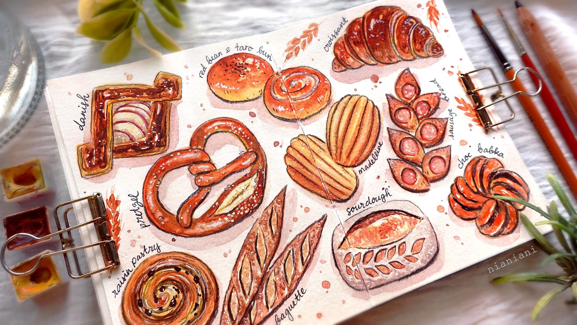
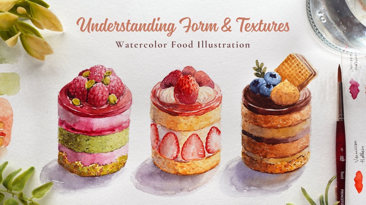
1. Introduction: Everyone. My name
is Nia, and today, I'm going to share
with you how I paint this collection of baked
goods in a sketchbook spread. I love painting breads,
cakes and pastries. I decided to dedicate
this whole class to paint them in a simplified
and stylized way. I would say that this is
almost like a doodle style, and it doesn't require too many painting
techniques to finish. So I would consider that this painting is
suited for all levels. In this class, I
will be sharing with you the whole process
right from the beginning, listing the ideas that
I had in mind and which pastries that I wanted
to include into my painting. Then I will break it down
into simpler shapes, so it's easier for you
to sketch it later on. After that, I'm going
to form the layout. This includes my trials
in different sketchbooks. And then I will sketch
them out in my sketchbook. And of course, I will also share with you the
painting portion, which I will break per
item as short lessons. Then all of this is finished off with the final
decorative elements, as well as final adjustments to bring the whole
painting together. A lot of the chosen
baked goods that I've included in
this composition. I've painted from memory
or from imagination, but I understand that
for a lot of people, it really helps to have
some form of reference. So I've compiled
reference images which are similar to what
I had in mind as I paint, and I will include these
references in the lessons. However, I will also
compile them as a file that you can download in the
projects and resources section, so you can either open
it in your devices or print it out so you can have it right next
to you as you paint. Like any of my other classes, if you prefer to get straight to painting without
the sketching process. I will also have the
downloadable outline available in the projects
and resources section, where you can just
print it out and trace it straight onto
your watercolor paper. This way, you don't have to
plan sketch or anything, you can just get
straight to painting. And if you've never
taken any of my classes, I would recommend for
you to just have a look through either a few lessons
or my previous classes. So you get used to the pacing, since I do cut through parts where my hand is either
inactive or off the camera. So I will be painting at a
faster speed than usual. And when you are
ready to paint along, please pause in
between each steps so you can paint at your own
pace without feeling rushed. If this sounds like a project that you're interested
in tackling, please join me in this class, and let's move on
to the lessons.
2. Supplies: In this lesson, I'm going to
go through the supplies that I'm going to use to
complete this painting. Firstly, let's go
over the paper. I'm just going to use
my sketchbook here. This is a sketchbook that I
made and the paper that I used for this particular
sketchbook is Canson X L, 300 GSM, and it's
a cellulose paper. You don't really
need any fancy paper for this type of illustration. You just need to use
watercolor paper. In fact, I'm pretty
sure this was actually the backside of the
watercolor paper, but it still worked
out quite well. In terms of the size for both
of these pages as a spread, this is 21 centimeters
by 14.5 centimeters. Yes, this is fairly small. If you're not comfortable
painting a such a small scale, you can adjust this
painting to fit a larger scale that
you're comfortable with, either by using the
sketchbook that you usually use or a larger piece
of watercolor paper. Next, for this whole painting, I'm only going to
use two brushes. In the beginning of
the first class, I accidentally picked
up a round brush. But for the rest of the class, I'm just going to use these two. This first one is
by George Jorn, and this is a size for
synthetic round brush. This is quite old and
it's a little bit fraed, but it's still usable for this type of simple
illustration. This is a fairly small brush, which I'm going to use as
my larger size brush for this painting because I am making this at
a smaller scale. Again, if you're going to adjust this for a larger painting, I would suggest for you to use a larger size brush according
to your chosen scale. For smaller details, I'm going
to use my size zero brush. This is by Windsor
Newton Spter Gold two. Again, though, if
you're adjusting this for a larger painting, you don't have to use
something as small as this. Next, you will need a clean jar. I'm just going to use one here, which is fairly large. If the water gets sturdy, I'm just going to
switch it out and refill it with clean water. However, you can
also do this using two jars if you don't want
to keep changing your water, one jar is for cleaning
your brush and the other one is only for reactivating and
picking up paint. Next, you will need tissue
or a kitchen towel. This is very important to always have by your
side as you're painting in order for you to take access paint
off your brush. This way, you can
have full control of the brush load before
applying your paint. So nothing puddles up. This is especially important when you're painting
at a smaller scale, because oftentimes the
bristles tend to absorb too much paint to cover the small area that
you're going to paint. The palette, I'll be using this cheap plastic palette
that I got from Dio, mine is a bit yellow now, but I really like this
because I've used it enough times that it created
some micro scratches, so my paint doesn't
beat up as I mix them. If you have trouble
with beating, you can also use porcelain
palette as well. But as for me, I
find that if you use your plastic
palette enough times, it's just going to
turn out like this, which makes it much easier to see the paint that I'm mixing, even though my palette is already a little
bit tinted yellow. With this said, I would suggest for you to use a light
colored palette, so it's a bit easier to see the colors
that you're mixing. Next, for the
little salt grains, for my pretzel, I'm going to mask it off using
this masking fluid. This is by Marie. I really like this brand because it's quite light
and easy to apply. It has a very small opening. But because I need to
apply very tiny dots, I'm going to use the silicone
brush tool to help me out so I can make
those very small dots. If you don't have access
to the silicone brush, you can also use a toothpick, or if you don't want
to mask at all, you can also use
bleed proof white at the very end to paint
on the salt grains. For the planning
stage, I'm going to sketch using this sketchbook by potentate or you can also just use regular paper or
just even print paper. For the sketching
portion, I'll be using this pencil by Pentel Sharplet, and this has an HB filling, and I'm also going to
use a pentel eraser. Is optional. But since I don't like to wait
for paint to dry, I'm going to use a
normal hair dryer to make the drying
process quicker. Lastly, for the writing, and for the outline, I'm
going to use these two. For the writing,
I'm going to use my snowman drying pen
and the size 0.3, and this is waterproof. There's no worry
if I accidentally splatter some paint on
top of the writing. You can also use the same
pen for the outline, but I personally like
to outline using colored pencil because I like the pencil texture against
the watercolor paper. It just feels more hand painted
and a bit more whimsical, but of course, the choices
are yours to make. For the colored
pencil, I'll be using Derwin light fast in
the color chocolate, or you can also use any
dark brown colored pencil. It doesn't have to
be anything fancy. In fact, sometimes
I like to just use my cheap faber castle hobby grade watercolor
colored pencils. Next year are the colors
that I'm going to use. Firstly, this is Crimson
Lake by Holbein. CPA by Holbein, Quinciana
by Daniel Smith, mineral violet by Holbein, Titanium gold ocher by Schminka, on brilliant dark by Schenke and the yellow
medium by Daniel Smith, and bleed proof white
by doctor PH Martins. Those are all of the
supplies I'm going to use, and here is a list of all of them combined so you can
get your tools ready.
3. Ideation Library: L et's create an ideation
library because I want to include different pastries and make goods for the spread. And I already had some
that I've thought of. I'm just going to
list them down, and once I've done this, I'm going to sketch and
simplify the shape, so it's easier for
me to visualize as I think about the layout
in the next lesson. Sometimes if it's a bit too difficult to visualize
the shapes and twist of the bread or pastry or
sometimes it's a bit difficult to figure out the
colors as I'm painting. I'd like to look for
references for each type of pastries before sketching
out the simplified shapes. I'm going to combine all of the pictures that I've
used as reference, and you can download this in the projects and
resources section. However, if you're
stuck for ideas, you can actually switch
the process around. Personally, because
I already wanted to paint certain
breads and pastries, I listed them down first before looking for
the references. But if this isn't
the case and you want to customize
your painting fully, you can search online first or walk around your
favorite pay crease and collect the pictures
that you like before listing them and
simplifying the shapes, so it's much easier to compile and play around
with your layout. Because I love painting
pastries and baked goods. A lot of times I didn't really directly use these references, or maybe I've seen them once before and just created
my own version. But I compiled the pictures
similar to what I had in mind because I feel like it'll
be easier to tackle this painting with a
little bit of reference. I find that by doing this, it's much easier
for me to process the information mentally
because I already have the simplified shapes ready to pick
instead of having to visualize both the shapes and the layout at the same time. Personally like to choose
around ten to 12 items because having too many options could also end up confusing us. This doesn't mean
that you're only stuck with those
ten to 12 items, but they're just going to
be the main go to ones. If in the middle of
the layout plan, you end up getting other ideas, or if something else
just fits better, you can always add them
on along the way as well. After listing all the items, I'm just going to
quickly sketch them out. I'm going to do this
in order of the list, so it's easier to follow. For the pretzel, I
really love the shape, so this is going to
be priority for me. I like to start by drawing a hard shape with a curve at the bottom
instead of a point. Then I double the line
and add a couple of twists in the middle before
extending the tail sideways. Next will be the classic
butter croissant, which I like to
simplify by drawing a chubby crescent
shape and I start dividing the roll from
the middle outwards. I've painted a baguette before, but I want this one
to look extra crusty, so I made the tips a bit more pointy to suggest more crunch. Next for the pano chocol, I like to think of
a puffy pillow, which is flat on the side with a bit of
chocolate picking through. This one is very simple. I'm just going to create a snail shape with some
extra layers on the sides, and I also added some
dots for the raisins. This chocolate bobca is really interesting because
it has many twists. But for this one, I'm making a mini one with
only a few twists. I just start with an oval
that I divide in two quarters and I direct the lines
as a woven pattern, so the lines are either facing vertically or horizontally
alternating from each other. Depending on the viewpoint, you might be able to see
the bottom like this one. But for the final painting, I decided to paint from the top view so you can
only see the pattern. The med lanes are
so cute and simple. This is like a soft
upside down trapezium. I rounded the shapes and divided into six
horizontal lines, then connecting each line at the top with
small curvatures, so it looks like a shell. Next for the canal, I created a flan shape with
a dip at the top, and I'm going to create
some pointy tops along the edges and then connect them down with some
horizontal lines. Next are the Asian buns. Bread and Asia are usually really soft brioche
buns with fillings. There are so many flavors, and these are just the ones that I can think
of at the moment, which are red bean paste, which has some black
sesame on top and taro with taro jam
spiral on top. I want to make the sour
dough crusty as well. And for the slash, I made a big leaf shape on
the left side and added some smaller leaf shapes as decoration for extra puffiness
on the right hand side. For the big leaf shape, I added some textures that I'll explain
later in the painting, so you can see the exposed
puffy crumbs inside. Lastly, this is
another Asian bread, which is the sausage bread. This is basically cut from a bread roll with
the sausage inside, and the sections has
small cuts of sausage. However, in the past, I remember buying one which
are leaf shaped, it's more or less the same idea, but the tips are pointed, so it's a bit more crusty and crunchy instead of
the soft bioche. I find the shape of
the bread look really interesting because they really look like leaves placed
on top of each other. It was also really tasty because the tips were quite crunchy. But just like the previous ones, this has a circle inside
each leaf as the filling. By the way, these sketches
are just ideas that I had in mind at the stage
of my thinking process. This can still change
along the way, even for the sketch layout if I suddenly get any
other ideas along the way. It just helps to have
these by your side as inspiration and yours might look completely different
from mine, but that's okay.
4. Layout Ideas: In this lesson, I'm
going to create small thumbnail layouts using the items that I already sketched out in the
previous lesson. It helps if you
have the previous sketches right next to you, so you can always look
back for information on the shapes of each item as you're compiling
everything together. Here I haven't figured out which sketchbook
I'm going to use. While I'm thinking
of the layout, I like to frame it according to the different sketchbooks that I have or the
options that I have. This way, I can have a
better visualization of the overall layout and
which one will work better. This first and second one. I'm just sketching
on a single spread on a ring bound book, and I thought about this on a
double page spread as well, so I'm going to try
it out later as well. Notice as I'm sketching, and I'm not too worried
about the details. I just want to indicate the
basic shapes of each item, so I can see them
in relation to each other and how it'll balance
out the whole composition. I generally want to
place the prezel first because like I mentioned
in the previous lesson, I've been really wanting
to paint the pretzel. This takes priority
and I also want to place it in the middle
because for me, I find that it has the most interesting shape in my opinion. The previous layout,
I suddenly had other ideas like the breadsticks
and the doughnut twist. I didn't end up
using them though. I just wanted to
see how it looks in comparison to the other
breads or baked goods. Sometimes I like to switch
out some of the items as well depending on the space that I still have left on
my thumbnail layout. It is not set in stone, whatever you drew out or
sketch in the previous lesson. If you have any other
ideas that might pop up in your head while you're
sketching out the layout, feel free to try it out. Just limit yourself so it
doesn't get too overwhelming. Depending on the
space that I have, sometimes I like to
also double up on certain items for more of
a dynamic composition. You can also repeat certain items if you can
do this on several items, so it doesn't look too weird
if you only repeat one. Another thing that you might also want to think about is how you present the items and which angle you're
viewing it from. As an example for
the sour dough, you can see the
side of the loaf, but later on, I'm just
going to paint a top view. Same goes for the Bobca. I didn't really like how
it looks on the side, and I find that later on it didn't really work out
with the layout that, I decided to paint
a top view instead. Here I'm indicating the elements that I really like
in this composition. I'm just going to keep them
there and try to move and change the others to fit
around the ones I marked. For the round Asian
bread along the way, I thought about
switching this into pretzel buns or even
small bread rolls with different cuts and shapes. But this is just
to keep in mind. I still haven't really
made my decision yet, so I just drew it out as an
option for the final sketch. And as for the Danish, I haven't made up my mind what
I want the filling to be, whether it's apple or berries. So again, I just
sketched out the option, so I can refer back to
it for the final sketch. Before drawing out
the final sketch, I decided I'm going to
draw a larger version, so I don't get too used to sketching out the
tiny little items, and I feel like this is a better representation for the scale of items for
the final composition, and it helps to see it a larger. Again, though nothing
is set in stone, this can still change
for the final sketch. But I just find that this is a good opportunity to break away from drawing the
tiny little items and only using my wrist. Instead, I'm now moving my whole arm to
create larger shapes. So I guess at the same time, I'm also using this opportunity for a slight warm
up for my hand. After drawing out the
slightly larger items, I can now also see that there are large
spaces in between. I'm going to try to fill in
the space as much as I can. One way that I
thought about is by adding some typography or
text into the composition. I think it'll look
if I name each item, following the curvature
of each item as well. I find that this is just
a cute little touch, and I'm also going to finish
off with some splitters just to fill in the rest of
the awkward spaces. Oh.
5. Sketching: I feel like I'm ready to sketch the outline for the painting. I've decided to use this double
page spread and I'm going to start by figuring out
the spacing for each item. To do this, I'm going
to sketch very lightly, and I'm only going to draw simplified silhouettes
off each item first, so it's easier to
move them around and balance out the composition
without taking too much time. Notice how I'm holding my
pencil quite far back. This makes it much easier to draw loosely without
too much pressure. This is very important
when you're sketching straight onto your
watercolor paper. So the pressure
of the pencil and erasing won't damage the
paper that you're using. Watercolor paper can
be quite sensitive. Make sure if you're
going to be erasing a lot to draw very lightly. Even for this final sketch, I was still adding things up and moving things along the way to fill in some spaces for the sides like
these breadsticks. At first, I really liked to look and the placement
of the breadsticks. But I later realized if I added these two breadsticks
on the right hand side, there's still a bit
of space on the left, so it will look imbalanced. But at this point, I
didn't realize it, so I'm just going to keep
the breadsticks for now. I'm fairly happy
with the placement for the rest of
the items, though, so I'm just going to
clean out the outlines and draw out the rest of
the simplified details. Here at the corner on
the right hand side, I decided to change the
angle of the Bubka. I'm going to just draw a
bur side view of it to showcase more of the
interesting pattern on top. For the leaf bread, I
find that it's much easier if you draw a
straight line first. This way, it's much easier to place each leaf
which are slightly overlapping each
other as they fold alternatively to create
the shape of the leaves. Then I want to slightly thicken the bottom so it
doesn't look too flat. Then finishing up
with slight ovals or circles inside for
the cut sausages. For the croissant, I'm going to draw this on a slight angle, so you can see more of the pastry layers on
the right hand side, and the layers will be
hidden on the left. I feel like I've
drawn the rest of the items quite a fair
bit in the past lessons. So you probably know how
to draw them by now. But just as a reminder, if you want to get
straight to painting, I'll have the outline available for you to
download and trace onto your watercolor paper in the projects and
resources section. And if you want to scale it up, you can enlarge the outline to suit the size
of the paper that you're planning to paint on because the outline
will be high res. Once I finished catching, I just want to make sure
the lines are fairly clean. They're not too or too dark. You can take the access
pencil marks off by your as, or you can also use
a needable as. I.
6. Pertzel: Let's begin to pate. I'm going
to start with the pretzel. Here, I just squeezed out my masking fluid on a scrap
small piece of paper. So I have easy access to it, and I pick up the masking
fluid with my silicone brush. Just going to make some
different sized dots on the pretzel, mostly concentrating
at the bottom, as well as the twist
of the pretzel. While doing this,
I'm just trying to imagine as people sprinkle, they might miss certain spots, and some areas might be
heavier than others. This is something
that I'm trying to depict while placing
the masking fluid. I'm trying to randomize
the placement, so some areas are a bit more
concentrated than others. I didn't really refer to this
picture as I'm painting, but I just want to show you
that this is the type of pretzel that I'm trying to
paint for this composition. Once I've sprinkled enough salt, I'm going to wait for
everything to dry. Since these are
really tiny dots, it didn't take too long at all. Once it's dry, I'm going
to begin to paint. The first color that I'm going to use is Jon brilliant dark, and I'm going to use a medium to thin consistency that I've activated on my palette with also a little bit
of along the side. I'm starting with just
the jon brilliant that I'm tapping in with the side of my brush to create
an uneven surface. And at the center, I use a really thin
consistency of the omblian and CPA mix to create a slight
crack in the middle. I'm going to leave
that to dry now and move on to the actual pretzel. For this, I want the color
to be much stronger. I'm starting with a medium
to thick consistency of titanium gold ocher to paint the connecting lines as
well as some of the sides. Next, I'm going to
follow this up by adding some quinciana into the
titanium gold ochre. Still working in a
medium consistency. I'm just going to cover the outer part of
the pretzel for now. While the surface is
still a little bit damp, I'm going to add more quincena, and I'm going to
place this along the inside of what
we've painted so far, so we can see a
lighter version of the color along the outside
from the base color. Then with what was
left on my bristles, I'm just going to paint
the rest of the pretzel. Since I've used up
most of the pigment, I'm only left with a
thinner consistency. Then I'm going to
follow this up with a thicker consistency just
like I did along the outside. Next, I'm going to create
a darker brown from a mix of sepia and Qin red. Just like before, I'm going
to place this in the middle, and I'm creating a
thinner line this time, so there's a gradual
gradation from the darkest in the middle
with lighter edges. I felt like the titanium gold
ocher was already too dry, so here I'm just going
over the edges again, using a thicker consistency
to connect to the colors. Now I'm going back to the crumb, and I'm going to use a medium consistency of
Shon brilliant dark. I made the shadow
of the cut look n and I also dot the
edges of the shadow, making it look a bit
more like crumbs. Now going back to the now
dry surface of the crust, I'm going to create soft highlights in the middle
or the highest points of the crust by reactivating a bit of paint using
a clean damp brush, then taking off the
reactivated paint with tissue. Once I'm done and everything
is completely dry, you can also use a hair dryer to make the drying
process quicker. Then I'm going to take off the masking fluid to reveal
the sprinkles of salt. At the bottom, I've made
a bit of a mistake. It turns out that the bottom
was still a tiny bit damp. It's not completely dry yet, so I accidentally smuched it, but it's completely
fine because I'm just going to cover it with
a shadow later on. But once I'm done, I'm going to create a bit
of shadow for the salt, so it doesn't look too flat. For the shadow of the salt, I use the mixture of Jan
brilliant dark with a little bit of sepia in a very,
very thin consistency, and I also switched to
my size zero brush using only a very light load to cover the bottom left corner of
each of the salt grain, so it has a bit of dimension. Please don't forget to control
the load on your brush. Since we are painting
on very tiny areas, you want to make sure that your bristles are not
puddling wet as well. Here still using the same color, I'm going to exaggerate
the crack in the middle. Then I'm going back to the Jan brilliant dark and just dotting some random
textures for the crumbs.
7. Rainsin Pastry: Next in line is this
spiral raisin pastry. Just like the Pressel,
I didn't really paint side by side
to this image, but this is the type of
pastry that I'm referring to. This is a very simple one. Let's start with
titanium gold ochre, just like before, I'm using
a medium consistency here. I'm placing this in the
middle of the spiral. And for this particular one, whenever I'm painting, I always follow the
line of the spiral. Moving along, I'm
going to use quincena that I mix into some
titanium gold ochre. I'm using a medium consistency here to fill in the
rest of the pastry. And just like before, I like to paint lines
following the curvature of the spiral while leaving a
bit of white negative areas, so we can see a slight texture and the layers of the pastry. I want the inside of the pastry to look a bit more
vibrant and yellow, so I added some
hands yellow medium into the previous mix, and I'm applying it the
same way as before. I'm just going to clean
out the edges here using the same orange mixture from Quinciana and
Titanium gold ochre. Then I'm going to follow
up using a darker brown by adding more Quinciana and CPA this time into
the previous mixture, and I'm using a light
to medium consistency. I don't want the
pastry to look burnt, so I'm trying to make the
lines a bit thinner for this, and I'm being quite careful with the amount
that I'm applying. If you're unsure,
you can switch to your smaller brush to
apply the darker color, and please use a
lighter consistency. This way, you can always layer a bit more color if you feel like the brown
isn't strong enough. I also want to paint the
edges or the outline using this dark brown because this area will
be the most baked. Lastly, to paint the raisin, I created a really
dark brown from a mixture of mineral
violet and spa. I'm just going to
paint blobs using the tip of my brush
in different sizes, and I also left out
some negative space, so these blobs doesn't
look too heavy and dense. If it's too difficult
using your larger brush, you can also switch to your
small brush so the load is easier to control. Hh
8. Apple Danish: Next in line is
this apple Danish, and this is the image that I
use for this particular one. I found this image
before sketching, and I really like the look of the layers of the
pastry and the filling, but I'm going to simplify the
details for this painting. I first use a mix of titanium gold ochre
with hansa yellow to paint the inside
of the pastry. I realized that the inside
should be a bit rounder, but it was too late,
and I didn't really mind how it looked
once it's finished. I'm just going to
go ahead and paint the edges using this yellow
as the pastry puffs up. Just like the previous
raisin pastry. I'm trying to follow the
lines of the pastry. This way I can build
on the layers as well. Once I've painted the edges, I'm going to paint in the
rest of the pastry by adding some quincena into the
previous yellow mix, like the raisin pastry, where we can see the layers from the side of
the puff pastry. This time we're looking at
the top layer of the pastry, so it's lying flat, but it has some blistering
from the crispy crust, which will have some highlights
from the glaze as well. So I left out some random white spaces to
depict those highlights. Oh To make the top layer of the pastry look more crunchy, I'm going to add a
darker value brown. For this, I'm using a
medium consistency mix of quincena and a bit of CPA. I'm going to apply
it the same way as I did the previous layer. But this time I'm leaving
more negative space so you can still see some of
the base layer peaking. Once I'm done with this layer, I'm going to add more
of a darker tone brown, and this is the same mixture but with added spa in the ratio. I'm going to limit the
amount of dark brown because I don't want the
pastry to look too burnt. This is just to indicate
some of the dark swells, which might be in shadow to contrast some
of the highlights. Once I'm done, I'm going to apply the same thing
for the bottom. Now that I'm done with the
texture for the top layer, I'm going to switch to my
small brush to paint some of the visible layers
on the side of the pastry using my small brush. And I'm just doing
this by adding lines following the outline
using the midtone brown. Once I'm done, I'm going
to paint the filling, I'm starting with a base color a medium consistency to a light consistency of
hon brilliant dark, which I'm going to
spread out lightly. Next, I'm going to paint the
shadow around the corner, so the filling looks deeper
than the puffed pastry. For the color, I added
a touch off sepia to my Jon brilliant dark and I'm using a really
thin consistency, so the shadow looks
nice and subtle. Once I'm done, I'm going
to dry everything off before painting on the
rind for the apples, and for the rind, I
use a little bit of the dark brown mix with
some crimson lakes, so the crimson lake
looks a bit muted. I want the line of the
rind to look uneven. On top of this, I use the thinner consistency
to go over it again, and I try to wiggle my
brush really lightly. So there's a slight difference
in the weight of the rind. At the moment, the apples
look fairly flat, though, so I'm going to add
some shadows in between using the same
light shadow mixture, which is from anllan dark with a little bit of CPA in a
really light consistency.
9. Crusty Baguette: In this lesson, I'll be
painting the baguettes. I want mine to look
very crusty and I also want some flower
dusting around the crust. I didn't really use this
image as reference, but this is probably the closest
representation that I can find of what I imagined. Just like the pretzel,
I'm going to use a mix of John Brilliant dark with a touch of spa for the inside crumbs, because we are painting
on a small area. I am using a light brush load
and a medium consistency. As I'm applying the paint, I'm just placing it randomly without putting
too much pressure, so I leave out a lot of
white negative space. Here's a close up of
the texture again, but in a darker color, so you can hopefully
see it a bit better. If you're trying to
cover a larger area, you can try to move the brush in a larger way these strokes, and I would also
play a bit more with the pressure instead of just
using the tip of my brush. This way, I can cover
a larger surface area. In this case, since
I'm only painting a very small part
of the baguette, I make sure to use a lighter brush load and
just the tip of my brush. Next with the same
color mixture, but a thicker consistency
and a little bit more CPA, I'm going to place
the starker color at the bottom of all the cuts. This is just to show a bit more definition and also
as a little bit of shadow. After this, I'm going to pick up the paint
that I've already pre mixed beforehand from
the previous pastry. This is from a mix of
Quinciana and Sepia, and I'm using a really light consistency to paint the crust. I'm painting this the
same way as I did the crumbs by leaving out a
lot of small white space, so the crust looks textured. It's important to
keep the consistency very light for the base
because I want to show an illusion of a flower dusting without using
white at this point. Next, I'm going to use the same color mixture in
a thicker consistency. I'm using a light
load on my brush to outline the top part
of the cuts this time, so it looks a little bit more cooked or baked
than the rest. What was left on my bristols. I'm also going to add this color to the whole crust,
but very lightly. I'm applying the
paint by wiggling my brush and randomly
adding some dots, so the paint is applied
with a slight texture. Once I feel like I have enough, I use a clean damp
brush and pull the paint that I've
already placed to smudge and make more
of this texture. I like to repeat these
steps until I create a soft textured layer with a little bit of the base
color peeking through. Then for a bit more detail, I'm using the same color mixture and creating smaller dots on top and also darkening
the sides to add volume to the bige Next, I'm going to use a very
thin consistency of quincena to layer on top
of the crumbs again, and I also try to leave out a little bit of the base
color still picking through the sides
and also some of the white negative space
that I've left out. To finish this off,
I'm going to define the cuts by using the
dark brown mix again, and I'm also using
a dry brush load in order to create those
really fine lines. But if it's too difficult
for you to control, you can also switch to your
small brush to do this. I'm just going to repeat the same steps again to
paint the second bigete. Oh. For the second one, because it's slightly hidden
behind the first pie. I use a slightly darker color, so it's the same mix, but it has more in the ratio. And I'm just going to place
a medium consistency between those two pets and softening the edges with a
clean damp brush, but I applied it the same way as how I painted the textures. Lastly, to add a bit
more detail to the cuts, I a mix of CPA and
mineral violet to just only parts of the cuts. So the color of the
outline is even, some are darker than others. After this, I'm going to
add the darker layer on the crumbs with a really light
consistency of Quinciana. Then use the same color to
paint some tiny dots on top for extra detail
once the surface is dry.
10. Asian Soft Bread: Next are the Asian buns.
I picked these two. The first one is a
red bean paste bun with black sesame topping, and on the right side
is a custard bun. But where I live, we also
have a Taro version of this. So I'm going to change the swirl to purple
instead of yellow. I've actually painted these
types of bread before, so I didn't really use
these images as reference, but these are similar to the
look that I'm going for. Now let's begin to paint. I'm going to start with
a light consistency and a heavy brush load of titanium gold ochre
to paint to the base. Then while the surface
is still damp, I'm going to add quincena into the titanium gold ochre
and place this at the top while leaving the
bottom still as the base color. I'm applying the paint,
I tried to press the side of my brush with
different pressures. The accumulation of pigment is slightly different
throughout the surface. While doing this, I also left out a bit of white
negative space. These are soft bunts, so the texture is much
more subtle compared to the crusty bigett that
we painted earlier. Here's a close up of the texture that I'm trying to achieve. This is much smoother than
what I painted for the bigete. But by applying more pressure
to the side of my bristles, I can cover a bit more
area and by moving it in little wavy forms and taking my brush off
little by little, is creating subtle uneveness to the application where some areas have a bit more
pigment than others. Once I'm done with
the first layer, I'm going to build up
on the saturation. So I added a thicker
consistency of titanium gold ochre at the bottom and more
quinciana at the top. While the surface is still damp, I'm going to take
off a little bit of the wet paint on the
top right corner to create a highlight. Now moving on to
the custard bun. I'm starting with a titanium
gold ochre just like before. But for the top part, I tried to use a
lighter consistency because I'm going to
paint some purple on top. For the Tyro swirl, I'm going to create
a soft purple from john brilliant dark
and mineral violet. I'm using a medium to
thick consistency and I'm just going to follow the swirl and paint it on top of the bun. Now I'm going to use the darker
brown from Quinciana and titanium gold ocher to paint around the swirl while leaving
a little bit of space. You can still see
the base color in between the swirl and
the darker brown. I also left out the bottom
still with the light color. So we can see that the top is a little bit more
baked than the bottom. Once I'm done, I'm going to
increase the saturation, so I'm going back in with the same mixture for the
top part of the bun. I'm going to leave
the custard bun to dry and move back to
the red bean bun. Here I use the mix of sepia and quincena in a light
to medium consistency. I started with the top, then I used the
clean damp brush to spread the paint
towards the bottom, while still leaving the base or the bottom of the bun light. I'm also going to do the
same for the custard bun. Once I'm done, I'm going
to try everything off completely before adding on
the black sesame topping. To paint the black sesames, I just use a thick
consistency of CPA, and I've also switched
to my small brush, so it's easier to
paint on the dots. I actually like to mix painting dots as well
as tiny little ovals, so we can see the black
sesame in different angles.
11. Madeleine: Next are the medalins. These are another
simple one to paint. I'm going to start
by using a mix of shown brilliant dark with
titanium gold ochre, and I'm going to
use a heavy load on my brush so I can cover
the whole medalin. Notice that I'm just spreading the paint and this
time instead of doing small strokes or dotting motions because I just want to
cover the flat surface. Once I'm done with
the first one, then I'm going to paint the
one at the back as well. If you run out of paint, just reload your brush
and cover the area again. Next, I'm going to use a mix of titanium gold ochre
with Quin Ciena, and I'm going to use a medium consistency and
a medium brush load to a light brush load
so I can paint the lines in between to form
the shape of the shell. I'm painting on a slightly
damp surface here. It's not ping, but it's
not completely either, so some of the paint are
softening up on the sides. It looks a bit too messy. I just use a clean
dry brush to move the paint around and
soften the edges. I'm going to increase
the definition by using a thicker consistency
of a darker brown. I'm still using
the previous mix, but this time I added
a little bit of CPA, and I'm going to use a medium consistency and a
really light brush load, so you can see that the tip of my bristles come to a point. Again, I'm just going
to paint on the lines, but I try to make the
lines thinner this time. After painting a few, I can see that the paint
is slightly spreading out. Before everything
settles, I'm going to use a clean damp brush to spread some of the paint and pick
up the excess pigment, to paint the rest of the lines. I've also smudged the paint a little bit more
on the left side, so it looks darker than
the right hand side. To add a bit more form, I'm going to add the
first mixture again. This is from titanium
gold ocher and a bit of sh brilliant to paint the
bottom bit and the top. The area in the middle looks like it's puffing up slightly. Let me just try to paint this quickly without
the shell texture. Hopefully, it's a bit
easier for you to see the volume and the form
that I'm trying to achieve. As you can see by darkening
all sides and leaving the center of the cake in the lightest tone
from the base color, you can create the
illusion of the volume and puffiness to this
otherwise flat surface. I'll also draw the cross
contour lines so you can hopefully imagine the form as a grid to better
visualize it. As you can see from the grid, the highest point will be here, and that will be
the lightest part. I'm just going to repeat the same steps for
the second medlin. Here I'm using the mix of titanium gold ocher
and quinciana, just covering the lines, then I'm going to soften it
up using a clean dam brush. This time, the base
color is completely dry, so you can see
that the edges are much harsher and it's a
bit harder to soften up. Next, I'm going to
use the same mixture with added sepia for
the darker brown, and I'm using a dry brush
load to paint on the lines. This time the lines are slightly thinner than
the previous one, and this is to indicate the
deeper areas of the lines. Since the base is fairly dry, I'm going to soften the blend up by going back to the
previous midtone brown. This is to create a
softer transition from the darker lines. And I'm going to paint more of this brown in a
light consistency on the right hand side
compared to the left. So the right hand side looks like it's in
a bit more shadow. After this, I'm going to go
back to the previous Matlin. You can see that the paint is evening out as
it's completely. So I'm going to go back
to the dark brown again. This is the same mix, but I've also switched to my smaller brush to
realign the deepest areas. I'm also going to do this for
the Madelin on the right, and you can go back and forth
to do this to balance out the contrast between the values until you can see the
three dimensional form.
12. Croissant: The next pastry I'm going
to paint is the croissant. I'm sure all of you know what
a croissant looked like. But here's a nice image that I found and that you
can use as reference. Mine is going to be puffier to suit the style
that I'm going for. Here I'm starting with
titanium gold ocher and I started to paint
the right hand side where you can see
most of the layers. Then I used the rest of the paint to paint in
the left hand side. I started with a medium to thick consistency and after
covering those areas, I'm just going to spread out the paint with whatever
was left on my bristles. Not going to wait
for anything to dry, and I'm going to move on
to the midtone brown. This is a mix of titanium
cold ocher with quincena, and I'm using a medium
to light consistency to paint the separate
sections while leaving the light
base along the sides. While applying the paint, I like to follow the
curvature of each section. Any white negative
space that I leave out will follow the curvature
to help enhance the form. Here's just a quick
demonstration of what I mean by the curves. You can see this going
across all sections. I'm going to paint and direct the application following
those curvatures. On the right hand side because we can see the layers more. Once I get close to the
sides of the pastry, where the layers are,
I'd like to paint some thin lines to depict
those thin layers. After I'm done with the base, then I'm going to use
the dark brown mix. You all know it by now. This is the same
color with added spa, so the value is darker and the
color is a bit more muted. Each layer that I'm adding, I'm going to paint in smaller
sections than the previous, so you can still see parts of the base color
showing through and you want to make sure you imagine which areas are
more baked than others. On the left hand
side, I feel like I need to separate
those sections. I'm going to use the same
mixture with more sepia in the ratio to divide up the
sections and define them. On the right hand side, I'm going to add the
darker brown again for the top area while leaving
the side as the base color. As for the layers, I'm
using the same brown in a lighter consistency and I'm just painting on thin lines. To make everything look a
bit more baked and crunchy, I'm using the darkest brown. This has more sepia in
the ratio just like the color that I use to
separate the left hand side. I'm placing this on the
top side of the pastry, and you can also use
more quincena if you want the color to look
less muted and more vibrant. Lastly, I'm going to add some
extra lines for the layers.
13. Sausage Bread: Oh. Next, for the sausage bread. This is the only image I could find to
represent the spread. It's like this, but
with a sausage filling. I painted this from memory and I had this bread from
more than a decade ago. But hopefully, you can use this reference if you want to
include the spread as well. The bread that I had was a mix between soft bread
and a crusty bread. For this one, I'm
not going to make it as textured as my baguette. I'm starting with a base color from a medium to thick
consistency mix of an brilliant dark with a bit of quincena and titanium gold ocher that I've already
had on my palette. I'm just going to spread it
out evenly for the base. While the surface is still damp, I'm going to take off some paint using tissue
by just dabbing it off, especially for the
area of the sausage. Next, for the Maton brown. I'm using a mix of
shan brilliant dark with Quinciana and a
little bit of CPA. I'm going to place
this color while the surface is still a bit damp. I'm mostly placing
it for the tip and also the edges of each cut. But I want to leave
a little bit of the base color surrounding
the sausage pieces. I'm just using a light
consistency because we're still going to build
on the darker tones, and I'm just going to finish
off the last two here. O O For the next color, I'm using the same mixture, but with added sepia this
time for a darker brown. I also added a bit more
quinciana into the mix, so the color is a
bit more vibrant. I'm only applying this to the tip using a
medium consistency, then I'm going to soften
the edges using a clean. As I'm softening the blend, I want to pull the paint around
the sides and the edges, so the sides are
lighter than the tips. Ex, I'm going to paint
the sausage filling. For this, I use Crimson Lake mixed with Jon brilliant dark, but since the color
is a bit too rosy, I added a little bit of handsy yellow medium
to warm up the tone. I'm twirling my brush
as I apply the paint, so when I leave out some
white negative space, it will follow the curvature as highlights to show how juicy
the sausage filling is. Once I'm done, I'm going to
paint the outer layer using the same color with
added crimson lake and also a bit of
quincena this time. I also switch to
my size zero brush to just outline the
sausage pieces. I like to disconnect
some of the lines, so it doesn't look too. At the moment the sausage
looks a bit out of place. I'm going to add a shadow in between the bread
and the sausage by mixing some CPA into the previous mixture in a
very light consistency. I'm also only applying
this to the top t. Now I want to separate
each of bread by adding a bit of shadow
in between as the overlap. For this, I used a mix of Jan brilliant dark with
a very tiny bit of CPA. I feel like I need to increase the saturation for the bread. Here I'm just going to glaze
this orange mixture from quincena and Hanzo yellow medium and alight to
medium consistency. After this, I'm going
to add a little bit of shadow at the bottom
part of the bread. So I picked up the
darkest brown before, and I'm just going to place it at the bottom of each slice. If some of the lines
are too harsh, I'm going to soften it
easing a clean dam brush.
14. Sourdough: Next, I'm going to paint
the sour dough bread, and this picture is a very good representation
of what I'm going to paint. Let's start by
painting the crumbs. For the base color,
I'm going to use Jon brilliant dark in
a medium consistency. Just like how I painted the crusty breads to
create the texture, I like to use the
sides of my brush and I like to tap using
different pressures. Some areas are
darker than others. I also left out somewhat
negative space. For the leaf cuts, I'm just going to use
the tip of my brush. I'm still going to try to
make it a little bit uneven. Next, I want to depict the crust peeling on one side
of the big cut. For this, I'm going
to use a mix of honbllan dark with a bit of mineral violet as
well as Quinciana. Since this crack is part of
the inside of the crumb. I wanted to look
textured and uneven and I want the middle part to
be thicker than the sides. The same color in a
thinner consistency. I'm going to paint the
texture on the crumb, and since this area
is quite opened, a small crust is also starting to form hence
the darker brown. As I'm painting, I like to
follow the direction of the crumbs by doing uneven
oval rotations vertically. Here's a quick example of the crust contour of the crumbs, and this is inside of the crust. So it's a little bit deeper. I want to think of this as
I'm painting the texture, which is why I like
to move the brush following the slight
curvature as I'm painting. Here's just a larger close up of the texture that I'm
trying to paint. To add extra thickness
to this opening. I'm using a dark brown. This is from a mix of CPA and Qin Ciena that I still
have left on my palette. Then using the same mix
in a thin consistency, I'm just going to redefine
the inside of the crack. Going back to the
midtone brown here, you can see I'm only
picking up using the tip of my brush so I can
make finer textures. At the bottom, I also want to thicken the edge of the crust. Here I'm using a mix of
CPA and mineral violet. But you can see that I'm using
almost a dry brush load so the line can be uneven
and also very delicate. Again, you can also switch to your small brush to paint
the really thin line. For the smaller leaf cuts, I'm going to switch to my small brush this
time and create the slight texture using the previous mixture from Jean
brilliant dark Quinciana, and a bit of mineral violet. Just like before I'm using
a light consistency, and I still try to create the slightly textured by leaving
bits of negative space. After this, I'm going to pick up the dark brown mix from
CPA and mineral violet, and I'm going to use a
medium consistency and light to dry brush load to paint one side of the leaf cut, just like the larger cut, and this will help thicken the crust surrounding
the crumbs. So the crumbs look like they're positioned a tiny step
lower than the crust. On the other side, I'm going
to try to make the line, and this will create the that the light is
heavier on one side. After this, I'm going
to paint the crust, which is heavily
dusted with flower. I'm going back to the
previous color mixture, which has shown brilliant dark mineral
violet and Quinciana. This time, though, I
picked up the color, which has much more
mineral violet compared to Quincana
on my palette, and I just used a
lot of water to reactivate it and use a
really light consistency. I want this to look very
textured, as you can see, I'm just tapping using the tip of my brush and also the side of my brush to create an uneven
textured light base color. Little by little, I'm going to layer the same
color at the bottom to create the form and the thickness of the
sour dough bread. Here I'm still using
a light consistency to lightly layer on a
little bit more texture. Then I added a bit of CPA, still working in a light
consistency around the edges to build more
volume for the bread. As I'm painting the edges, I'm still following the
same application method, which is to tap using my brush, so I don't lose the
uneven texture.
15. Chocolate Babka: For the last bread, I'm
going to paint a bobca. I couldn't find a picture that actually represented
what I imagined, but here's a picture which shows a different
style of the twist. If you prefer to paint
yours in this style, you can also change
this element. Now onto the painting, I'm going to start
with titanium gold ocher in a medium to light consistency as I like to use for the soft bread base. I'm going to loosely
paint and divide each section into around three
or four layers of bread. I like to direct
the line as I paint according to where the
twists are facing. For this case, I want the direction to
alternate each other. I also want to leave
out some white space for the area for the
chocolate filling. Well, the surface is still damp, I'm going to add quincena with
some titanium gold ochre, and I'm going to work in a
medium to light consistency still to paint on top of
what I initially painted. Next, I'm going to
add the chocolate in between the bread
with some dark brown. I just use CPA for this, and as I'm applying the paint, I want to make sure that
nothing puddled up, so the paint doesn't take too
long to settle and dry off. I'm not going to wait in
between the application. However, if you can see
your paint puddling, I would recommend for you to take the excess of using tissue, if not the dark brown will
just travel and cover the puddled area instead of creating a soft
edge in between. This will just establish the area of the
chocolate and the bread. Now I'm going to increase the saturation on
the next layer. I'm going to use
the same mix from Quinciana and
titanium gold ochre, and I also switch to
my small brush this time to paint on the bread
area in between the chocolate. I like to switch this in between with just titanium
gold ochre by itself, especially towards the
inside of the twist, where the areas are less
baked compared to the top. As I'm plying the paint, I like to wiggle my
brush around to leave some white negative space while following the curvature
of the bread. But for this one,
because I don't want the surface to look crusty, I'm not doing a tapping motion, but I'm just dragging my brush
in different directions. Next, I'm going to enhance
the color of the chocolate, just like before, I'm using CPA, but in a slightly
thicker consistency. I'm applying the
thick consistency mostly towards the center
where it's also darker, and I drag the color outward, so the outside is slightly
lighter than the middle.
16. Cast Shadow and Splatters: After completing all the breads, I decided to add some
ca shadows as well as platters to fill in
the rest of the space. But before then, I
want to make sure that the whole spread is clean
off extra pencil marks, so I'm just going to
erase them all off. I just want to apply a
very thin cache shadow from a mix of mineral violet, CPA, and a bit of quinciana. It's just going to
be a simple shadow. I'm only doing one layer
lightly in a thin consistency, and I want the light to come
from the top right corner, which means the shadow will
be on the bottom left. If you like the look of
the c shadow, of course, you can apply a slightly
thicker consistency or even layer a slightly darker
value closer to the object. But for me, I'm just going to keep this very simple
because I don't want the c shadow to take away from
the actual bread elements. After applying the cacho, I feel like the
composition looks a bit better and less floating. But after this, I still
see a lot of white space. I'm going to fill it up with some splatters that
I paint on manually. This can represent
some bread crumbs. You can actually
splatter the paint, but since I want them
in specific areas, I'm just going to
paint it on int of splattering that
is more loose and a. This I just use the
color that I've already premixed on my palette since
I have a lot of spare. After that, I decided to take the excess off using tissue. This is because I
want the splitters to be more subtle and light. But if you prefer the
darker splitters, you can skip this step.
17. Outline and Writing: No. I want to make the
bread pop out more. I'm going to outline it
using my colored pencil. This is a really dark brown. You can also use a pen for
this for a different texture, but I love the texture
of colored pencils because it gives it more
of a whimsical touch. I'm just going to
start by outlining all the pastries and breads for now and see how it
looks from there. Like a lot of my paintings, the finishing is
fairly unplanned. I just look at the
condition of the painting as a whole and what it
needs as additions, and I just go from there. I'm just going to continue to outline the baked goods for now. And then we'll move
on to the next step once I'm ready to look
at everything again. Oh Oh. O O. O Oh. O M Oh. Once I'm done with the outline, I'm going to add the writing, which is just going to be the names of the
breads and pastries. Since I'm not very
good at spacing, I decided to write it with pencil first before
going over it with pen in case some of the writing bump
into each other. I've decided to use
script for this, but you can use any
font you would like. It'll just give a
slightly different feel. If you're, you can also try alternatives
with pencil first, then choose the one that you're with for the final pen writing. Okay, so now I'm ready
to write with pen. This is just my usual
waterproof ink pen. I'm not very good at
lettering or writing, so I'm just keeping
it simple here. But if you're good at
cligraphy and lettering, you can also make something
that's a bit more playful, fun, or even more
fancy with your pens. Oh, I Once I'm done, I'm going to just erase
the pencil writing. I have a look at this
again and I feel like there's still a bit of
space that I can fill in. I'm going to just
paint the wheat plant as extra decor on some of
the larger empty areas. I was trying to think of
some form of mini breads, but sadly, I couldn't
really think of any, so I just kept it
simple for this one. I feel like a different
pop of color for the extra elements would
also work as a nice accent. Feel free to even add things like leaves
or maybe rosemary or flowers if you would like to explore a bit more
with your composition. For the wheat plant, I
first sketched it out with pencil starting with a
center line for the stem, and then I added
some leaf shapes for the wheat on both sides. This is just to
indicate the spacing. Then before painting,
I want to make sure that those pencil marks
are light enough. I lighten it by erasing a
little bit of the outline. After that, I'm just going
to paint it using one color. This is just an orange brown mix that I have on my palette. You can also use a mix
of titanium gold ocher with a little bit of
CPA and quincana. I'm using a light to medium consistency to paint
on the leaves and the stem. For the stem, you
can also switch to your smaller brush so you can make really nice
thin delicate lines. Not totally sure of the
anatomy of the wheat, but when I look at images, they tend to have these long in hairs growing out
from the grains. I'm just going to use
my small brush in a light consistency with a light load to add
those delicate lines. It's important to
use a light value as well because if you accidentally made the lines too thick, it'll still look fairly light
instead of something that's too thick or dense and heavy
if you use a darker color. After that, I want to make sure everything is completely dry, and I also want to layer the same color on
top of the greens. So they look a little
bit darker than those hairs that I
previously painted. This time, I also painted some subtle lines on
top of the green, so it has a bit more texture instead of just a flat color.
18. Line Details: After drawing on the outline, this makes the
whole painting pop, but it also looks a bit more
illustrative and simplified. So I decided to add some extra textures by
adding some pencil marks, things like light
dots for the metyln, a little bit of etching
for the soft breads, some redefinition for the
salt grains on the pretzel, and more fine layers
for the pastries. For areas in shadow, it also helps to
thicken the outline. There's a variety
for the line weight, which makes the painting
look a bit more interesting. Oh 00
19. Highlights: Oh. Lastly, I also want to define some of the finer textures using
bleed proof white, especially for the
flower covered crusts, but also for some
highlights for some of the breads and pastries to make them look
a bit more glossy. I'm keeping this simple, though, and I try to not do
too much because it can really take away
from all the colors. For the medlns here, I'm just adding some dots
like I did with the pencil. But as for the sausage bread, I wanted the ends
to look like it has a very slight flour dusting. I'm using the bleed proof white in a very
light consistency, which makes it a little
bit transparent. And I'm dotting the pointy ends, concentrating most
of the dots there, but dispersing the dots further apart as it gets
to the other side. It looks fairly flat for now, so I'm going to make
some of the white more opaque and paint on smaller
dots very sparingly. I also want to add some
highlights on the sausage slices. This will serve as
highlights, though, to make it look a bit more juicy instead of the flour dusting. The blobs and the dots that
I'm making here are a little bit thicker compared
to the ones that I applied for the flour dust. For the bobca, I'm going to add highlights for the highest
part of the bread, which is this curve
right at the top here, and I'm using a fairly
thick consistency for this. For the sour dough, I'm going to realign the crust here
to make it look thicker, and I'm also going to add some
dots to the crusty bread. I'm moving to the
baguettes here. I'm just adding dots to give more definition to
the flour dusting. For this, I'm just placing
the dots randomly, and I'm also going
to do the same for the sour dough
crust as well. Again, please limit
the amount of white. It is a fun final touch, but you might accidentally cover a huge portion of your painting with white if
you're not careful. Now moving on to
the raisin pastry. I'm going to add
highlights to the raisins. Then I want to break up some of the densely painted
areas of the pastry by adding more delicate lines
following the spiral shape. For the pretzel, I want to
add harsher highlights, so I'm painting on thick lines again at the highest points, and I'm only doing this in some areas as exaggeration
for the highlights. So please avoid lining the middle part of
the whole pretzel. Now on to the Apple Danish, I'm just going to
add dots on top of the pastry as a little bit of
highlights from the glaze. I also want to add a
little bit of the glaze between the flesh and
the skin of the apple. Then for finer details, I decided to add smaller dots to represent a little
bit of sugar dusting. As for these soft buns, I just want to add a bit more texture as
well as highlights. Usually, these buns
are fairly soft, so the surface is quite uneven. For some of the highlights, I made this zag motion, still following the curvature of the cross contour
of the bread. I also added some dots on random parts of the black
sesame as highlights, so they don't look too flat, and I'm going to apply something similar to the
other soft bread as well with the addition
of highlights following the swirl
of the taro jam. Finally, we're finishing
this off with the croissant. I want to make the surface of the croissant a bit
glossy from the butter, and I'm making a mixture
of markings like dots, blobs, and zig zag lines following the roundness
of the pastry. Just like the Danish, I'm
also going to add somethin delicate lines for extra detail to the visible layers
on the right hand side.
20. Closing & Class Project: Congratulations for
completing this class. I hope you enjoyed watching
through the lessons, and hopefully, it sparked some inspiration for
you to paint your own. For the class project,
I would love for you to paint side by side
with the lessons, but you can also make your own customizations
if you would like. Mine was a combination of breads and pastries from
different countries. But you can also personalize
yours by walking through your favorite bakeries and getting some
inspiration from there. Once you're done
with your projects, please don't forget to post
it in the project section. This way you can
share it with me, as well as other students. I'm really curious what you will include in
your composition, if you're going to make
some customization or even just paint this whole
composition in your own style. I'm always really thrilled to see what you guys come up with. If you enjoyed this class, please don't forget to leave
a review or some form of feedback to help me build
more classes that you enjoy. And if you would like to
see more Tutorials by me, I have a YouTube channel Manani where I post weekly
watercolor tutorials, or if you would like
to see more art by me, you can also follow me on my Instagram at IG
Underscore Nan Yani. So this is the end of the class. Thank you so much for watching
Right to the very end. I wish you the best for
all of your projects, and I can't wait to see it
in the project section. Hi.
 Nianiani, Watercolorist and Graphic Designer