Transcripts
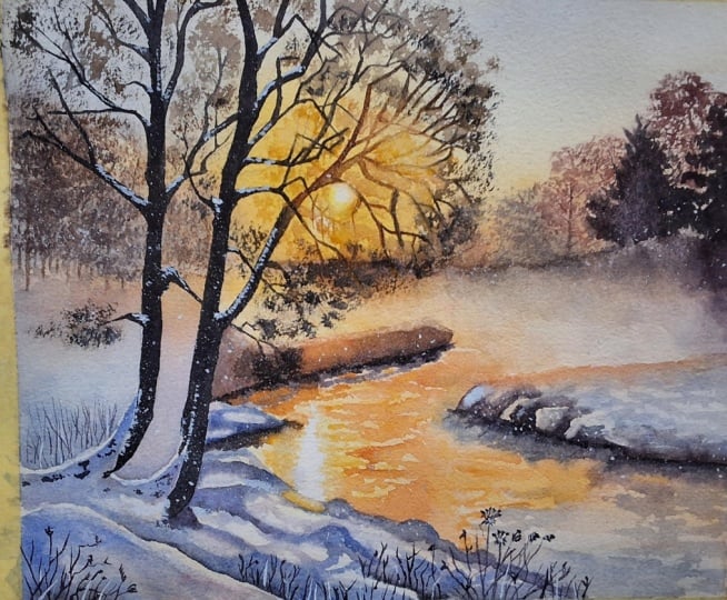
1. Introduction: Hello and welcome to my frosty morning watercolor
painting Tutorial. In this class, I'll
show you how to paint a beautiful winter scene with warm light and a
cozy atmosphere. It's a wonderful subject
for those of you like me who love
painting winter scenes. There is always something
magical about them. Every time I paint
a winter scene, it brings back childhood
memories of really cold, snowy winters that were also full of
happiness and wonder. Gently falling snow is
something I've always loved, and my loved ones know I wait every year for
the first snow. Maybe I'm weird,
but I love winter. In this tutorial, we'll
learn how to interpret a photo and create a painting
from that preference. As always, I will show you my painting process
along with my palette, the reference photo,
and the finished piece. So you can see how I filter
the reference through my eyes and bring the painting
to life step by step. We'll try to capture a sense of winter light and a
misty atmosphere. No matter your level, I encourage you to give
this painting a go. I'm sure you will come up
with a wonderful result. Let's get started.
Happy painting.
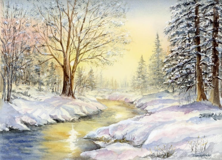
2. Project and Resources: I've prepared a selection
of helpful resources for your project available in the projects and
resources section. You'll find a PDF file with the supply list I used
for this painting, along with the reference
photo and an image of my finished
artwork for guidance. Line drawings in various sizes are also provided so
you can print and transfer them onto your
watercolor paper in the size that best
fits your needs. I painted it on a 12
by nine inch size. Additionally, there are working
progress photos to help you follow the process and
focus on specific areas. Feel free to explore
these materials and use them to create your own unique
and beautiful painting. Please share your final painting in the projects and
resources section. I also encourage you to
take the time to view each other's work in the
Student Project Gallery. It's always inspiring to
see what others create and the support of your
fellow students can be incredibly comforting. Don't forget to like and
comment on each other's work. Lastly, I highly recommend watching each lesson
before you begin painting. This will give you a
clear understanding of what to expect at each
stage of the tutorial. If you find this class helpful, I would also greatly appreciate it if you could leave
an honest review. Your feedback will help me
improve my content and assist other students in
deciding whether to join this class.
Thank you in advance.
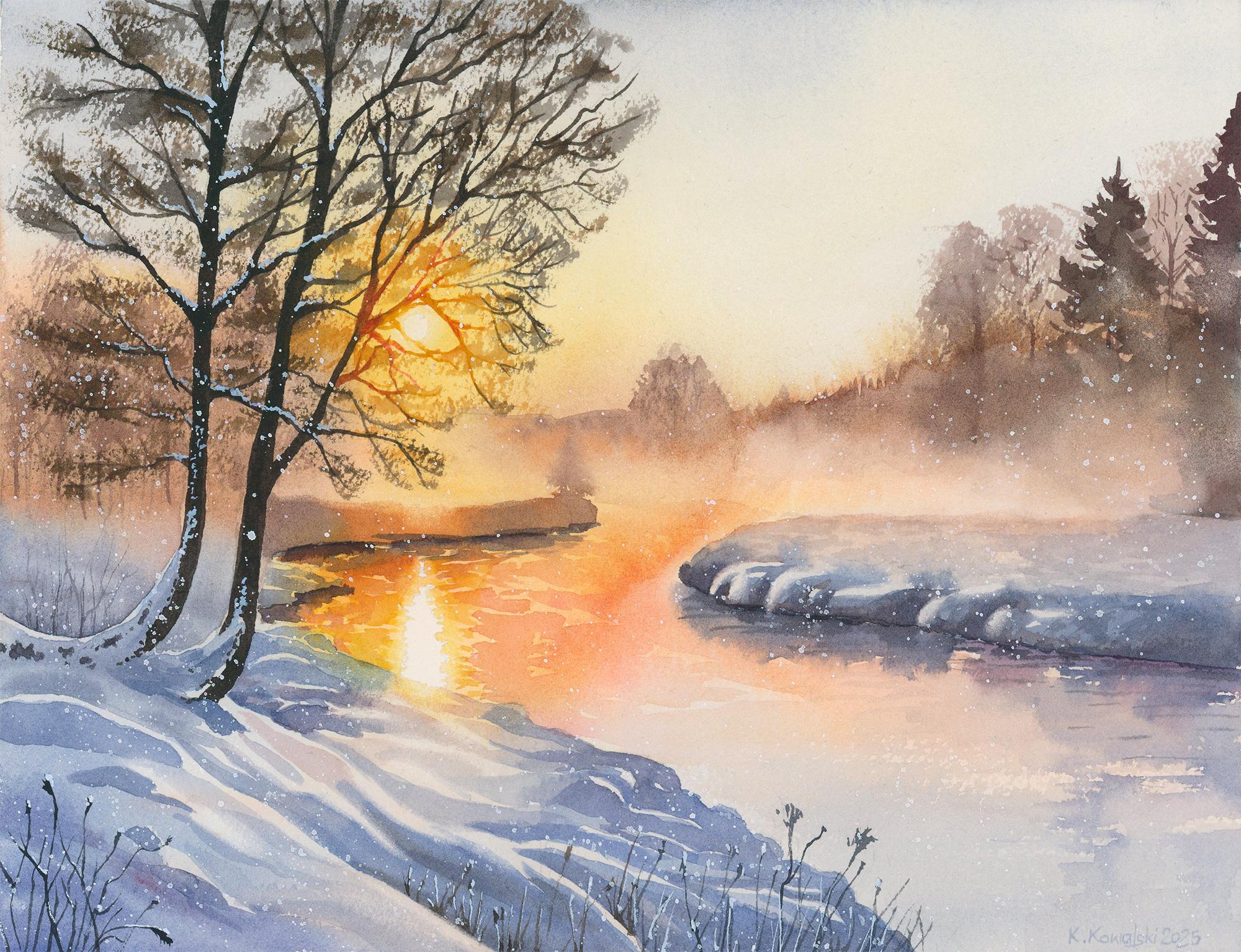
3. Inspiration and Painting Plan: I've been looking for a
winter reference photo that features both snow and
worm light because I think this contrast between
warm sunlight and the cool snow covered landscape creates a really interesting and eye catching composition. This reference photo immediately
caught my attention, but as always with landscapes, the more I looked at it,
the more worried I became. I could see an infinite amount of details I would
have to paint. In fact, I'm not entirely sure if this photo is even real or AI generated because when I was studying the branches and dry
plants in the foreground, something felt a little off. But even if the details
aren't perfect, it doesn't really matter because I like the overall composition, and it's still a great
reference picture. I've already learned that
when I paint landscapes, I can simplify a lot of things. I don't have to
capture every detail, and I definitely don't need to recreate the photo precisely. Landscapes give us a lot
of freedom when it comes to interpretation and
turning them into paintings. I never start a
painting right away. I give myself some time to think about how I'm going
to approach it. I consider whether I need
to mask out something. I think about the
colors I will use, any elements I might
remove from the scene, and most importantly, which order of layers will
be the most efficient. Start painting only
when I have answers to all these questions and when
a plan forms in my mind, which sometimes can
take even a few days. But all this preparation is very important for me because
later when I paint, I already know what
to do at each stage. I've taken all the
steps in my head first, and then I simply repeat
them with real tools. So here is the painting
plan I established before I started and which
we're going to follow. We'll start by masking out the sun and its
reflection in the water. Then apply the first
initial wash over the entire painting to
establish the overall mood. Then we will paint the trees in the background with that
beautiful mist in the distance. After that, we'll come a bit closer and paint
the middle ground. Next, we'll paint
the foreground. Then we will add ripples on the water and paint
the water reflections. Once that's done, we'll
add a bit more detail to the snow and paint the dry
plants in the foreground. Then we will paint the
main trees, and finally, we'll finish the
painting by adding foliage and snow details
with white gouah. So now let's move on to the first step and apply
the masking fluid.
4. Masking: I've already transferred
the line drawing onto my watercolor paper
using a light pad. I used staples to attach
the paper to a Gator board, and I also added masking tape on all four sides to create a nice clean border around
the finished painting. Now I want to apply masking
fluid to two small areas, the sun and the light
reflection in the water. Because these are
such tiny shapes, I won't be using a
brush or dealing with soap on the bristles to prevent them from
sticking together. Instead, I'm using a
small embosing tool, which is much
easier to clean and won't be damaged by
the masking fluid. I'll be using Windsor
Newton masking fluid. I pour just a little bit into an old cup
and quickly close the battle to prevent
the fluid from drying out and forming
clumps inside. Then I simply dip the tool into the masking fluid and
cover those two shapes. You don't need this exact
tool to do the job. If you have a brush dedicated to masking fluid, feel
free to use it. You can also use a toothpick, a pin, a needle, a dip pen, a silicon brush, a ruling pen, anything small that lets you apply a tiny amount of
masking fluid to the paper. Once you apply the masking, let it dry completely. After that, we'll be ready to apply the first layer of paint.
5. Initial Layer - Setting the Mood: So now the masking fluid is
completely dry and we are ready to apply the
very first layer over the entire painting. This layer serves
two main purposes. In the upper part, it will
become our sky color, and in the lower areas, it will establish the overall
mood of the painting. It shows us where the
warm and cool tones are, and it gives us a soft base
that we can build on later. I want to draw your attention to the three back
washes I got here. This happened because once
I laid down the colors, I decided to add more
paint with more water, which turned out to be a
bad idea because I didn't notice that parts of the layer had already
started to dry. Adding more color created
uneven wetness on the surface. And the new wetter paint
pushed the pigment around. To avoid this, make sure
your paper stays evenly wet and try to add more color only to areas that
are still shiny. If they are starting to dry, it's better to wait until
everything is fully dry and then add more
paint in the next layer. In my case, it didn't bother
me because the brown and blue back washes will sit
behind the darker tree details, so they will be covered later the orange one didn't
really bother me at all. For painting the background, use the biggest brush you have so you can cover the
surface quickly. I'm using a 1 " flat brush, and I think it's finally time to buy something
even bigger. I'll also be using
a spray bottle filled with clean water. First, I'll spray my paints to soften them and make them
easier to work with. Now, let's prepare the
colors for this layer. I'll start with Windsor yellow, which is my cool clean yellow. I will use it around the
sun and its reflection. We also need a warm yellow,
Windsor yellow deep. I'll also prepare
quinacridon red, which adds a lovely
fiery tone and mixes beautifully with the warm
yellow to make a rich orange. Next, we'll need
burnt sienna for the blurry tree silhouettes and for neutralizing the blue, and of course, ultramarine
blue as our main blue. We'll mix ultramarine
blue with a touch of burnt sienna to create a more
subdued toned down blue. First, we have to wet
the entire paper. You can do this by simply
applying clean water with a large brush or by spraying the whole surface
with a spray bottle. I'll use the spray bottle, and then with my 1 " flat brush, I'll distribute
the water evenly. Make sure the entire surface is evenly wet and has a nice shin. Now, I'll begin with
Windsor yellow and apply it around the sun
and the reflection. Then I will switch to the warmer yellow Windsor yellow deep to
create a warm halo. Next, I'll start
adding quinacrodon red to get those soft
warm orange tones. I'm using a light mix. I don't want the colors
to be too intense, or they want to look natural. The exception is right next to the sun and its
reflection where strong yellows look
brighter because they are surrounded by
muted cooler blues. Next, I will pick
up ultramarine blue mixed with a touch
of burnt sienna. Burnt Sienna mutes the
intensity of the blue, which is what we want here, a calm, wintery sky. Notice I'm using a lot of water and keeping the
value very light. We don't want to go too
dark at this stage. The burnt sienna also shifts the blue slightly toward green, and that's absolutely fine. If we compare the sky
to the snowy areas, the sky is a bit more greenish, while the snow is more bluish. Don't worry if your sky drifts into a
slightly green tone, especially when it meets yellow. Now, I'll add more
of that orange tone, a mix of quinacradon
red with yellow. Winds are yellow deep and bring some of that color into
the water as well. Remember that
whatever appears in the sky is reflected
in the water. Next, I'll pick
up a light mix of ultramarine blue and start painting the blue areas
in the foreground, middle ground, and the water. In the foreground, there's also some reflected worm
light on the snow. So I'm adding a little
bit of orange there too. The tones right now
are very light. We are building the foundation, and later we will
deepen everything. The paint we are
applying now will become the highlight areas once the
darker layers go on top. Continue painting the
water with orange and then gradually shift back
to blue toward the bottom. Finally, run your brush with a light blue over the middle ground
on the right side. While the paint is still wet and you can see a hyen on the paper, we can add the silhouettes
of very distant trees. For this, I'm mixing burnt sienna with a bit
of ultramarine blue, and I'm applying it to create a soft blurry tree
line in the distance. Do this only if your
paper is still wet. If it's already starting
to dry, don't do it. Let everything dry completely
or use a hair dryer, then rewet the paper and add the tree line
in a second step. It's absolutely fine to divide this process
into two steps. My case, the paper is still wet, so I'm adding the browns. On the right side,
I'm keeping in mind that there is
fog in the distance. I'm painting only
the upper parts of the trees and leaving
the lower parts light. Later, this will help create a fog effect when we
darken the river banks. Thanks. I also wanted to make the yellows and oranges
a bit stronger. So I added more of those colors, but that turned into a mistake because the
paint had started drying. I should have waited and
done that in the next layer. To soften the hard edges, I sprayed clean water
over them, which helped, but at the same
time, other areas started drying unevenly, and that caused some
washes, but that's okay. They are in areas that will be covered by
darker trees later. Now, let everything
dry completely, and once this layer
is fully dry, we'll move on to painting
the background trees.
6. Distant Trees: The first layer is
now completely dry. You can see those back washes, but they won't be very noticeable
in the final painting. The paper remains
perfectly flat, even though I used
a lot of water, and that's because
the staples hold it firmly in place while
it expands and shrinks. Now, let's prepare a brown
mix for the background trees. I'll start with burnt
sienna as the base, then darken it with
ultramarine blue. I'll also add a little
permanent Alizarin crimson to shift to hue and give the brown a slightly
different character. For this part, I will use a size ten brush and a
thin size two liner brush. A liner is very similar
to a rigger brush. So if you have a rigger, it will work just as well. The only difference
is that the liner has slightly shorter bristles. I lightly spray the left side in the area where I want
to suggest some trees. I don't want it soaking
wet, just slightly damp. You can also simply apply a very thin layer
of clean water. The point is to have the paper just a bit damp so that when I use the thin brush and the brown mixture to paint
a few vertical lines, those lines will softly blur. That's exactly the
effect I want for these distant tree trunks. Will add a few simple
branches here and there too. Nothing complex or detailed, since this area sits
far in the background. Next, I'll switch to
the size ten brush. I will hold it almost
parallel to the paper and pick up the brown mix using the belly or side
of the bristles. The paint shouldn't be too wet. If it is, dab the brush on a paper towel once to
remove excess moisture. With the side of the brush, I will make a few very gentle
almost dry brush strokes. This dry brush technique creates a simple suggestion of foliage. Keeping the bristles
nearly dry is essential. Only then will the texture
of cold pressed paper show? If the brush is too wet, you will get a smooth,
unified stroke. But here we want that
irregular textured effect. Now I will move on to
the distant river bank. I'll begin with the brown
mix I've been using, but I will leave a small
gap in the middle. In that gap, I will
switch to burnt sienna, which is warmer and then
add a mix of Windsor yellow deep and quinacrodon
red right in the center. This helps convey the warm light of the strong sunlight
hitting the ground. On the right side, I'll start by applying
a light wash of water and then add the
brown to the upper portion. The damp paper allows the
paint to spread downward, creating a soft
lighter foggy effect. I'm also incorporating
some orange tones to enhance that warm atmosphere. Now I'll begin
shaping the trees. I keep the lower edges
soft in the void, adding too much paint
at the bottom because I need that lighter
value to suggest fog. I focus mainly on the
tops of the trees, blending out the lower parts, and again, using
dry brush strokes to create a loose
impression of foliage. Next I'll mix a darker
brown using burnt sienna, paints gray, and permanent
Alyzarin crimson. With this dark mix, I will
paint the pine trees. Starting at the top, I'll form the pine shapes with just
a few brush strokes, remembering to
soften the bottom. I'll paint one more tree, and in a moment, I'll
add branch details. Looking at the reference, I noticed that the right side
can use a bit more brown, so I've extended
that area downward. I also added more
brown in the middle as that section should be slightly deeper in tone
according to the photo. Now, using the size
two liner brush or a rigger brush or just the
tip of a smaller round brush, I'll add a few simple lines
at the ends of the branches, angling them slightly upward. These small strokes help enhance the look
of the pine trees. Finally, I'll add a
few simple branches, nothing too detailed, and
that completes this section. Let everything dry thoroughly. In the next part, we'll paint a very simple middle ground.
7. Middleground: Once the previous layer
is completely dry, we can add the middle ground
on the left and right sides. I'll prepare ultramarine
blue as a clean base and also a darker blue mix using ultramarine blue
with burnt sienna and permanent Alyzarin crimson. Let's start on the left side. There are three small
areas to cover. Begin with the darker
blue at the bottom, then transition upwards to clean ultramarine blue and a
touch of quinacrodon red, blending this area with the
trees we painted earlier. Drop in a few darker vertical
stripes and let them blur. This suggests subtle
indentations in the snow cover. Paint similarly in the small
area between the trees. Finally, add some blues to the very small riverbank
behind the trees. Notice that I'm also leaving
gaps in the upper parts to suggest sunlight catching the snow, creating highlights. On the right side, start
with the orange in the top section and then
transition to blue. Use light tones, don't
go too dark yet. We can always deepen the values later with a second
layer if needed. Begin lightly to create just enough contrast with
the foggy background. At the bottom of this area, use darker blues to create the characteristic edge
of the river bank. Imagine parts of the
land tucked behind each other with the ones further
back in deeper shadow. I'm also leaving gaps to suggest areas where sunlight hits,
creating highlights. In the final painting, these highlights appear smooth. We'll create this effect later when we will be
using a scrubber brush. So don't worry about perfect
smoothness at this stage. Just leave the unpainted gaps. Now I'm adding slightly
darker shadows where needed, and a few very
little brush strokes at the top for extra texture. I'm mixing an even darker
tone using ultramarine blue, benziena and permanent
Alizarin crimson, and I will apply this
in the darkest areas. Finally, using the tip
of a clean de brush, I'll gently blend the colors to create smoother transitions. Uneven areas, hard edges or
visible brush marks are fine. A little texture adds
life to this area. That completes the section. In the next part, we'll move on to painting the foreground snow.
8. Foreground: In this part, we'll focus on painting the snow
in the foreground. I'll be using a size ten brush, and here we'll need a
slightly cleaner blue. I'm preparing some
ultramarine blue, but I won't use it
at full strength. I will dilute it with plenty of water to create a
very light tone. Now we need to cover the entire area with
snow but not with a uniform wash. Our goal is to suggest folds and
gentle hills in the snow. I'm not following
the reference photo exactly because that
would be too complex. Instead, I'm imagining
small hills of snow leaving gaps at
the tops to catch the light and painting
the main body of each hill behind it
one after another. The hills get larger as they come closer
to the foreground. I also want to remember that the snow catches
some worm light. In the area below the sun, I'm using a mix of quinacredon
red and ultramarine blue. This reddish purple tone helps suggest the worm light
reflecting on the snow. Don't forget to paint the
snow on the trees as well. Use bigger bolder brush
strokes as you get closer to the foreground and
vary the shades of blue. Add some darker shadows to suggest deeper
indentations in the snow. At this stage, the painting
may not look perfect. All these layers can make you feel like it's not going
in the right direction. I've had these thoughts
myself, but don't give up. Everything will come together
once we add the main trees and especially when we add the falling snow.
Just keep going. It will all come together
beautifully in the end.
9. Water: Now it's time to paint the water and add shadows under
the riverbanks. Right now, the riverbanks appear to be
floating in the air, but adding shadows
will anchor them and make the painting
feel much more solid. I'll begin with a dark blue, a mix I already have on my palette and add
a bit of brown. I will apply this as a
shadow under the riverbank. But that's not enough. We need deeper shadows and stronger
colors in some areas. I'll use Windsor yellow deep and a warm orange mix of Windsor yellow deep
with quinacrodon red. The goal here is to use short horizontal brush strokes to suggest tiny
ripples in the water, deepen the colors, and
create the shadows. I'm focusing particularly around the white reflection in the water because this
is an important area. I want the yellows
and oranges bright and the shadows under the
river banks rich and dark. As I move downwards, my brush strokes become
larger and more relaxed. I'm not trying to add small
precise strokes everywhere. I even use a dry
brush technique to leave irregular gaps
for added texture. While the paint is still wet, I will use a purplish mix to add the shadow or more accurately the reflection
under the riverbank. On the right side, I'm painting a rough shape of the tree
reflected in the water. I intentionally leave
some gaps to create additional texture and spots
of light in the water. Finally, I'll mix a darker tone
using ultramarine blue, paints gray, burnt sienna, and permanent zarine crimson. With a liner brush, I will add this dark
color just under the river bank and a few random horizontal strokes
across the water surface. And with that, this part of
the painting is complete.
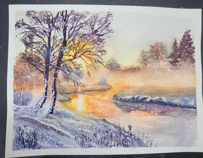
10. Plants: This part will be quite fun
and interesting to paint. We'll focus on the foreground, adding more shadows to the snow, softening some edges, and finally painting
some dry plants. I'll start with a dark purplish
mix and a brush size ten, painting tiny little
holes in the snow. These are small details, but I think they add a lot of character and are
worth including. Now I'm zooming out a bit and looking at the
snow area as a whole. I'm deciding which
parts should be darker and where I could
add additional shadows. I'll use a very watery
paint consistency because I don't
want to overdo it, but I do want to
deepen some areas. With the size ten brush
and my diluted blue mix, I darken snow hollows and add subtle shadows
here and there. Once the snow is darkened, I'll dry everything with a hair dryer and move
on to the plants. For this, you can use a small round brush,
a rigger brush, a liner brush, or
anything that allows you to create thin,
precise lines. I recently ordered
some Chinese brushes, and I thought I would
test the smallest one. When wet, it comes to a super fine point,
almost like a needle. I've already painted with the larger sizes
and I'm pleasantly surprised by how well they hold paint and how comfortable
they are to use. I'll start with a very
dark blue and test it in the back first to get
a feel for this brush. It's extremely fine. And while I'm not sure whether the bristles are natural or synthetic, they
work beautifully. The bristles are
actually very long, and it takes a little getting
used to how I hold it, but it's very nice to work with. Now, I'll pick a very dark tone and start painting the plants. I'm making random
elongated brush strokes, and at the ends of
some of those lines, not all of them, I'm adding organic shapes that
resemble dry flowers. I'm painting more plants
on the right side, imagining that some are growing behind the
little snow hills. I try to avoid making
the lines too regular, otherwise they
won't look natural. I also noticed that the
area around the sun looks too pale and since
everything above is now dry, I can use the technique that created back washes
in the first layer. This time, the back
washes shouldn't appear. I'll add a warmer yellow around the sun and spray it
lightly with clean water. This lets the yellow
blur softly without causing any back washes because the surrounding
paint is dry. Now we can let everything dry, and in the next part, we'll make a few small but
quite important adjustments.
11. Softening the Edges: In this short part,
I'll show you how to enhance the impression
of light in a painting. I'll be using a scrubber brush, a Windsor Newton galeria
brush size four. You don't need the
exact same brush. Any smaller flat
brush for acrylic painting with slightly
stiffer bristles will work. I wet the brush
and then dab it on a paper towel to
remove excess water. Using the clean de brush, I gently wrap the areas around the sun very close to the
edges of the masking fluid. The masking fluid
is still in place. After activating the paint, I left some of it
with a paper towel. I repeat this process around the masking fluid on the water. Next, I leift paint
from the edge of the ground that touches
the masking fluid. Using a gentle round
motion with the brush, this creates a glowing
effect along the riverbank. I also add a bit
of warm yellow and orange to create a subtle
halo of worm light. We can also use the
scrubber brush to soften hard edges
in the highlights, we intentionally left while
painting the riverbank. I lightly rub these area
so that the edges of the paint are reactivated
with a small amount of water from my brush
and then left the paint with a paper towel to create
smooth, soft transitions. I repeat this process
in the foreground, mainly around the purplish
areas that catch more light. I also soften the edges of
the distant river bank, especially in the middle where
the strongest light hits. One last tip if you
apply too much paint in the background and lost the soft foggy effect,
you can restore it. Use a soft watercolor brush, wet the area you
want to lighten and gently dab that area
with a paper towel. This will lighten
the area and create soft edges preserving
the foggy effect. Let everything dry
and in the next part, we will move on to
painting the trees. And
12. Main Trees: In this part, we'll introduce a strong focal element,
the dark trees. I want to draw your attention to the area of the tree
where the sun is. The tree will mostly be dark, but the parts near the sun
should include browns, reds and yellows to naturally enhance the illusion of
sunlight streaming through. For painting the trees, I will use a very dark
mixture of burnt sienna, paints gray, and
permanent azarin crimson. I'll start with a
smaller size six brush and then switch to a liner brush for the thinner branches. Pick up the dark mix and starting from the bottom
with the main trunk, paint the tree using a
wet on dry technique. You can choose to lightly sketch the main branches with a pencil first or
improvise as you go. I can still see
some pencil lines, but I am mostly improvising while looking at the
reference photo. Now, I'll switch to a
liner brush which is ideal for painting the longer
thinner branches. Of course, a rigger brush is perfectly fine
if you have one. Pay special attention to
the width of the branches. They should never be wider than the main trunk and they should gradually taper
toward the ends. Avoid making the branches
too straight or uniform. Let them bend naturally and
grow in different directions. Two In the area where the sun heats, I switch to burn CNM and
then to Windsor yellow deep. The sunlight is bright, so these warm tones make the
branches appear to glow. I'll also add a touch of quinacradon red for an
extra worm highlight. I'll continue working
on the branches and meet you at the
end of this stage. The Once the main dark tones
are in place, I decided to darken the
area just behind the tree. This adds depth and gives a bit more three
dimensional fiel, pushing that part
slightly back in space. I apply a darker blue here and a little in
the shadows in front. With the main trees completed, we are ready to move on to the next part where we
will add the foliage.
13. Foliage - Dry Brushing: In this part, we'll transform our bear tree by adding
foliage to bring it to life. I'll be using a
size eight brush, holding it almost
parallel to the paper. We'll use a dry brush technique, so I'm picking up dark paint
on the side of the bristles. If there is too much water, I dab it on a paper towel. The brush should be
just slightly damp. Using the side of the bristles, I'll create lots of texture on the tree to suggest foliage. This is just one way to do it. If you have an old worn out
brush with frayed bristles, that can work wonderfully
for creating foliage also. Those Chinese brushes I recently bought are
also great because they fan out nicely
and allow you to apply many
irregular brush marks. But to keep it simple this time, I'm using a regular round brush. It may take a while to cover the entire tree, but don't rush. Patiently add as much foliage
as you think is necessary. Remember to adjust the
colors in the sunlit areas. Use more winds are
yellow deep there to suggest sunlight
hitting the branches. When you've finished
creating the foliage, dry everything
with a hair dryer, and in the final part, we'll add some finishing
details with ah.
14. Finishing Touches with Gouache: In this final part, I
will show you how to use gouache to add the
finishing details and enhance the painting. I'm using Windsor Newton
designer's gouache, and I'm squeezing a small
amount onto a green index card. I like using colored
cards because it helps me to see the
gouache clearly. First, I'll mix a tiny
bit of ultramarine blue into the white gouache
to make it slightly bluish. Using a liner brush, I will add this gouache color to the tree to suggest
snow on the branches. Guash is opaque, so you can paint light colors
over dark areas. If it dries too transparent, it means there is
too much water. Just a tiny amount
of water is enough. The consistency should
be fairly dense, almost straight from the tube with just enough water to
move the paint around. I imagine where the snow would naturally settle
on the branches, and I apply lots of small dots. I also use white guash to add snow on the tiny plants
in the foreground. And even add thin brush strokes to suggest frozen
stems and grasses. Next, we can remove
the masking fluid to reveal the pure
whiteness of the paper, creating a strong sense
of light in the painting. There is nothing more white in the painting than
whiteness of the paper. As a final touch, I like to add falling snow, one of my favorite
effects in winter scenes. For this, I use a
larger brush size ten with a slightly
more dilutedquah. To spatter the paint, I tap the brush on the
handle of another brush. It can get messy, so make sure there's nothing
too important around, and alternatively, you can flick the bristles gently
with your fingers. Add as much snow as you like. Once finished, you can
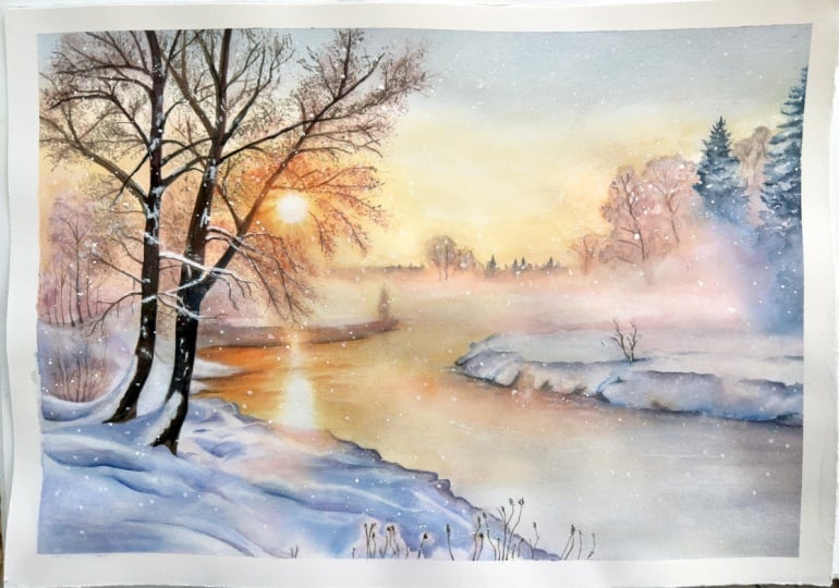
proudly sign your painting, and after removing
the masking tape, I noticed the upper edge of the river bank was
a bit too hard, so I softened it slightly
with a scrubber brush. And now I was completely
happy with the result. I hope you're happy with
your painting, too. In the next part, we'll summarize what we've
learned in this tutorial.
15. Summary: First of all, congratulations on completing this frosty
morning winter scene. It's a little bit
challenging project, but the result is
a magical painting full of light,
atmosphere and depth. Let's take a moment to recap what we've learned
in this tutorial. We explored how to interpret
a reference photo, simplify complex
details, and create a clear painting plan
before starting. The planning part is
really helpful because it makes even detailed
winter scenes manageable. Learned how to apply
an initial wash to set the overall mood, combining warm and cool tones to suggest sunlight and
snowy landscape. We discovered techniques
for suggesting depth, including softening technique
using dry brush strokes and layering colors to create distant tree silhouettes
and middle ground elements. We explored how to create
folds in the snow adding subtle shadows and
warm reflections to enhance realism and light. We use the brushes to paint delicate dry plants and
added subtle shadows, improving texture and bringing
life to the foreground. We learned how to use a damp brush to lift
paint and soften edges, creating glowing light around the sun and reflective areas. We painted strong focal trees
using careful brush work, adjusting branch thickness,
and adding foliage with the dry brush technique to create texture and
natural growth. Finally, we added
snow highlights and final details with gouache to bring the painting together, enhancing contrast and the
sense of winter atmosphere. Thank you so much for joining me on this
creative journey. Completing this painting
is no small feat and I hope you're proud of the
winter scene you've created. Happy painting, and
I look forward to seeing your frosty
landscapes come to life.
 Krzysztof Kowalski, Watercolor artist