Transcripts
1. Introduction + Welcome: You enjoy mixed media art or you love drawing and painting,
charming building facades, or perhaps you're just looking for a fun project to help you practice both foundational
drawing and watercolor skills. This course is for
you. Hey, everyone. My name is Erika, and I'm a traditional media artist
who enjoys working with a range of mediums and subjects from still life
to animals to scenes, urban sketching, and more. I have over 15 years of experience working in
creative and artistic fields. First as a graphic designer, then I worked as head art teacher in a school environment, and today I run my own
business where I sell my art, and I also help artists all over the world level
up their art skills. It's been incredibly
rewarding for me to take what I
was already doing on a local level to the online space to be able
to reach even more people. I'm very passionate about sharing my skills
with others and also encouraging other artists along the way so that they too, can stay consistent with their
art practice long term and enjoy the immense happiness and fulfillment that
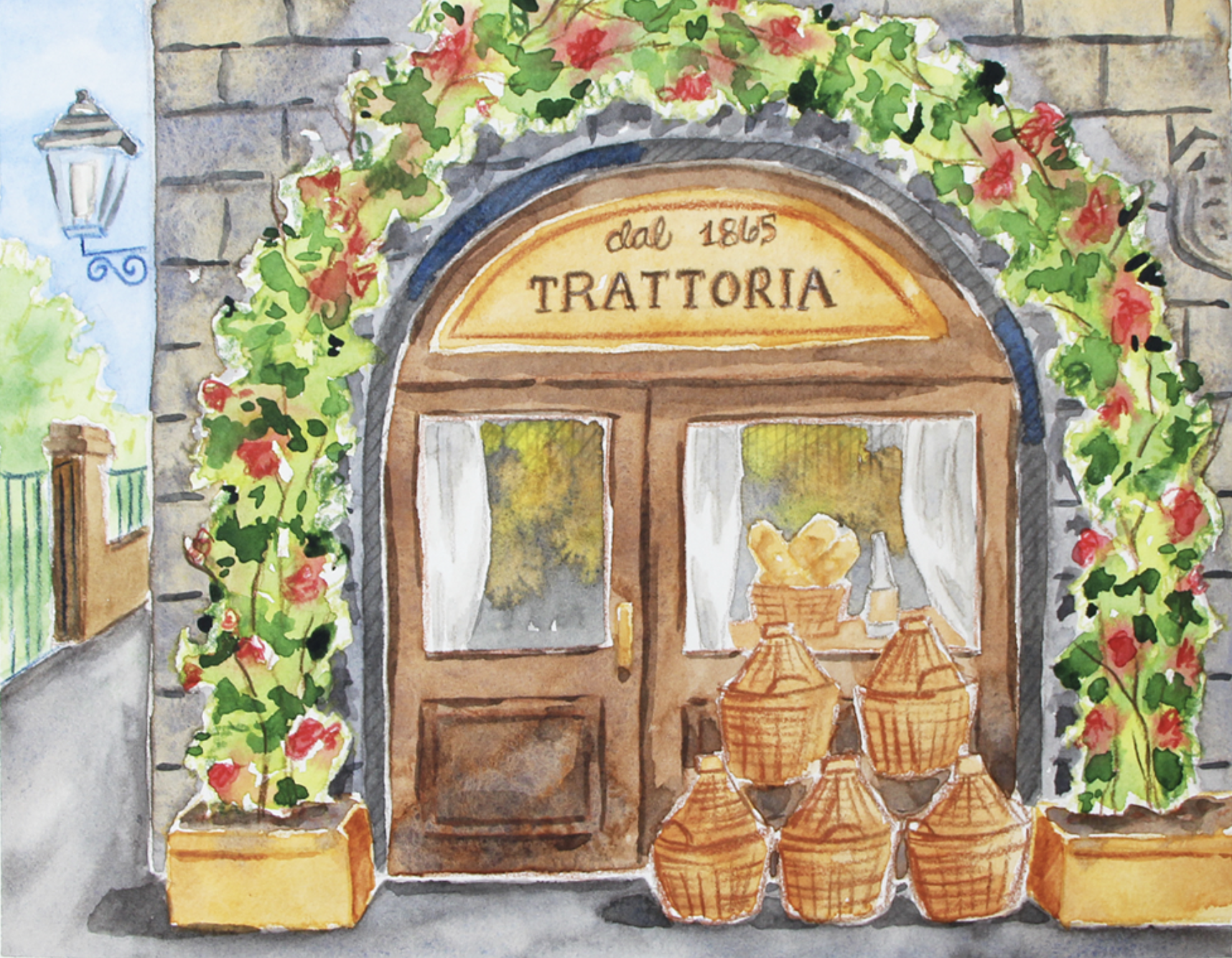
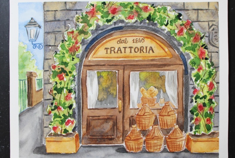
come with this. This course, I am taking you through my entire process for this mixed media Italian restaurant building
facade piece. We're bringing
together the magic of colored pencils and
watercolor to create unique, balanced and harmonious results. I'm taking you
through a beginner friendly process where we're first creating our pencil
sketch freehand in our sketch and then after transferring our sketch onto our
watercolor paper, we move on to our
colored pencil process, then the watercolor, and then finally back to the colored pencil for
final textures and details. This is honestly the
process that I would recommend for
beginners to ensure better results and to allow you to practice foundational
drawing techniques and get comfortable with
drawing this kind of subject matter in a
less overwhelming way. This way, you don't
have to worry about damaging or scratching
your watercolor paper. We want to avoid doing too much erasing on our watercolor sheet, which can damage its sizing. We also want to make sure that our linework isn't too dark, that it shows through our
transparent paint at the end. But even for myself,
this is exactly what I in order to better prepare for the final piece and ensure
higher quality results. Throughout these class videos, I'll be sharing tons of tips, techniques and tools
that you'll be able to take with you to sketch buildings and scenes with greater confidence,
especially frontal facades. I take you through a straightforward
process teaching you to break down what you're
seeing into simple shapes, how to work large to small, general towards
specific to ensure better proportions and a better utilization
of your drawing space. We practice our
watercolor washes, our layering, our color mix and developing a nice
range of values throughout our painting to create
believable depth and dimension. I also explain how I choose my colored pencils for
something like this and the techniques that
I use to combine these two mediums for
great expressive results. In this one, we also get to practice using a
reference photo for visual information
so that we can bring in a certain level of
realism into our piece, but at the same
time, not allowing that reference photo
to constrict us. We practice making
artistic choices and bringing in lots of
ourselves into our art. Alright, with all this said, if you're ready, let's
jump right in.
2. Course Project: By the end of this course, you'll have completed a vibrant mixed media piece
that brings together colored pencils
and watercolor and features a beautiful
Italian restaurant facade. And more importantly,
you'll have practiced important
drawing, watercolor, and mixed media techniques
that you're going to take with you and use long
after the class is over. As we work on this
project together, you'll build confidence drawing buildings and
architectural scenes, creating watercolor washes and developing depth
through layering. As well as bringing
colored pencil and watercolor together for
unique expressive results. If you're new to
drawing in general or you don't have much practice
sketching buildings, I would highly
recommend going through this process as
described in the course, working on your drawing
first in your sketchbook, and then transferring onto
your watercolor paper. If you're farther
along and you have more experience drawing
buildings and scenes, then it is totally up to you. You can go ahead and
create your freehand sketch right on your
watercolor paper, but I want to
encourage you to do as little erasing as possible
so that you don't damage it. Also make sure that
you're drawing lightly so that you're not able to see your linework through
the watercolor at the end. I want to encourage
you to slow down and enjoy every phase
of this process. Take as long as you need to before moving on to
the next class video. And if you're a beginner,
it might be worth watching the class video through or at
least skipping through it. That you can understand
the objective in that phase and the key
techniques that we're using, and then you can watch that again and give it
a go on your own. Was you're done, don't forget to upload your work to
the project gallery. Sharing your work is a great way to celebrate your progress, inspire others, and also get feedback from
me if you need it. I've prepared a set of
downloadable files, which you're going to
be able to find in the Projects and Resources tab right below any of
the class videos. Simply click on this tab, scroll down a little bit, and you'll find a section that is titled Download Resources. Click on any file that
you wish to download and it will be saved onto
your computer or device. To post a photo of your
work here on Skillshare, all you have to do is click on the Projects and Resources tab. Once you're in, you'll
see this purple button on the right that
says submit project. When you click on this button, you'll be taken to a
new page where you'll easily be able to both upload
a photo of your piece, as well as share any thoughts, experiences, struggles or questions that you
might have for me. Here you can create a
title for your project and click on that larger
content section underneath. And if you want to add in
that photo at the beginning, you can go ahead and click on that image icon on the bottom. Simply find the photo
that you're wanting to share on your
computer or device. Select that file, click Open, and it will be immediately added into this content section. Then under your image, share anything you'd like, whether it's struggles,
questions, wins, aha moments that you might have experience
throughout this course. Anything you'd like to share. I always love hearing from you. At the bottom of this
content section, you'll see different icons. One is for formatting your text. You can use the other
one to add emojis, the Adimage icon, which
we just talked about, and you can even embed links. You're free to add even more
pictures if you'd like. They can be process
or supply pictures. And over here to the right,
we see this preview area where we can see a thumbnail or cover image for your project. You can go ahead and
change it to a title image that you have created in
a more horizontal format. You can just go ahead
and leave it as is. Once you're ready, go
ahead and scroll back up. Click on the Green
Publish button, and you'll be all done. If you'd like to share your
work over on Instagram, please do make sure to tag me at Erika Underscore
Lancaster Underscore Art. I love seeing student
work over there and giving you shoutouts
in my stories. And, of course, go ahead and tag the Skillshare
account, as well. It goes a very long way and inspires other students
to share their work too. Skillshare is a
safe learning space for all of us to continue
growing together. So make sure that you're
using this gallery, and let's all connect
and help each other out. I can't wait to see your work and to help out with
whatever you might need. Let's move on to our next class.
3. Supplies: In the first part
of this process, we're going to be
working on our free hand drawing and creating a solid
looking sketch that we can then transfer onto our
watercolor sheet using tracing paper or whatever
transferring method we prefer. Working in a sketchbook or a separate sheet of drawing
paper and then doing our transferring is going to allow us to practice
our drawing more comfortably and not have
to worry about damaging our watercolor paper
by doing too much erasing or simply
drawing too dark, which would both affect our Cm. I would recommend working
in a sketchbook that is at least nine by 12 " in size so that you can then easily
transfer that drawing onto a watercolor sheet that is
also approximately that size. I personally enjoy using tracing paper for
my transferring, but you're free to use whichever transferring method you enjoy. I will be linking to a couple of step by step tutorials
where I take you through my entire process of how I use tracing paper
for my transferring, as well as how I use a
lightboard or a light box. Do my transferring
onto watercolor paper. Those are going to be available for you in the Projects and Resources tab right below
any of the class videos. Once I'm ready to
start my final piece, I'm going to be working on a sheet of watercolor
paper from arches, and this is going to
be hot pressed paper. Hot Pressed paper is the smoothest type
of watercolor paper, but you can certainly
use cold press or whatever kind of
watercolor paper you just be aware that
because we're bringing in colored pencils which
are a drawing medium, because we go in with
sharp pointy tips, the tip of that
pencil is going to skip over the tooth
of your paper. So you're likely
going to end up with more broken lines and marks, which isn't necessarily
a bad thing. It just depends on
your personal taste. The more texture your paper is, the more broken lines and marks you're likely
going to have. Also, you're likely
going to have to sharpen your colored pencils more often because the tips will become blunt a lot faster. Before getting started
with your drawing, it is important
that you decide on what size you want your
final piece to be. Whatever size you decide
this final piece to be, it has to fit in both
your drawing sketchbook and your watercolor. From the beginning, I decide that my final piece is going to be 10 " in times 8 " in height. And so that is the size that
my sketch is going to be in my sketchbook and the
size that I'm going to be transferring onto my
watercolor sheet. This hot press
watercolor paper pad that I have is nine by 12 ". So I do end up
cutting a couple of sections so that I can get
it in the size that I want. As I was creating my freehand
sketch in my sketchbook, I primarily used an HB pencil, which is what I would recommend so that you can
keep your drawing lighter and cleaner
and so that you can easily correct
mistakes as you go. I'm also sharing a two B
pencil here because I use a softer pencil grade for my tracing and
transferring process. I also always have a couple
of different erasers on hand, both a soft graphite eraser
and a kneadable eraser so that I can
correct mistakes and refine my preliminary
sketch as I go, as well as to clean
up my last sketch on my watercolor sheet before
starting with my other medium. Have a simple pencil sharpener
on hand so that I can sharpen my colored pencils as I go when I get to that
part of the process. And I also have a roll of
regular 1 " masking tape, which is what I use to tape down my watercolor sheet onto
my black cutting mat. I just run my pieces
of masking tape over my clothes one or two times
to weaken that adhesive. Make it a lot less
likely that I'll damage my watercolor paper at
the end when I remove it. I'm going to be
using this set of prisma color premiere soft
core colored pencils, which are regular
wax-based colored pencils. This is a set of 72 colors, but we're really only
going to be using ten, and you by no means have to use my same exact colors to
arrive at great results. But just as an FYI, the ten colors that I'm
going to be bringing in are yellow ochre, lime peel, olive green, crimson red, French gray
50%, French gray 70%. Indigo, burnt ochre, sienna
brown, and dark brown. I'm going to be swatching
all of these colors out for you on a scrap
piece of paper so that you can see what they
look like and you can replace whichever you don't
have with something similar. For the watercolor washes, I'm going to be using
a combo of paint from Windsor Newton's
professional line and a couple of colors from my white Knights watercolor
set from St. Petersburg. I'm using only seven
different colors, and these colors are Russian
green and raw sienna from St. Petersburg white
Knights and Windsor lemon, a zarin crimson, burnt sienna, ultramarine blue and cobalt
blue from Windsor Newton. And really, the only reason why I'm bringing in those
two colors from my white knight set is because I really like that green
from St. Petersburg. I also ran out of my raw sienna for my Windsor Newton set. I'm also going to be
swatching out all of these colors for you on a scrap piece of watercolor paper, along with the main color mixes so that you
can see what they look like and replace whatever you don't have with
something similar. For my painting process, I'm going to be using three
different round brushes in sizes 310 and 14. As long as you have something
similar, you'll do great. I have my container
with clean water, which I make sure to
change along the way and a couple of my Blu
Scot absorbent towels, which is what I like using to stay on top of water control. I would also recommend
having a few scrap pieces of watercolor paper on hand to test out mixtures and
consistencies along the way. And finally, I do want to
remind you that I created a set of downloadables to
go along with this course, which you're going
to be able to find in the projects
and resources tab. You're going to find the
reference photo that I was loosely inspired by
my outline sketch in case you'd like to
skip over the freehand sketching part of this
process and simply transfer it onto your
watercolor sheet to move on to the colored pencil
and then the watercolor. But if you'd like to look at my outline sketch
as you're working on your own freehand so that you can see
those shapes clearly, that is available
for you as well. I'm also going to make a
photo of my finished painting available for you as a reference in case you like
to use it as you're working, and your supply checklist will
be there for you as well. Alright, go ahead and
collect your supplies, and I'll wait for you
in the next class.
4. Preliminary Pencil Sketch (Pt. 1): All right, everyone.
So first things first, we need to create our
preliminary outline sketch in order to be able to transfer that onto our sheet of watercolor paper and then move on to creating
the final piece. What I like doing
in order to ensure that my sketch is exactly
the size that I needed to be for my final piece is I take the watercolor sheet that I'm going to be working on. I place it over one of my
sheets in my sketchbook, try to center it as
much as possible, and then I simply trace
around it using my HB pencil. To create a rectangle, which is going to be
my drawing space. I end up with a rectangle
that is ten by 8 ", which is exactly the size
that I need my sketch to be so that I can do my transferring successfully
onto the final sheet. Let's get started with
this drawing process. I'm going to be using
my HB pencil so that I can draw lightly and
refine my drawing as I go, erase mistakes as needed,
and that kind of thing. This is the reference
photo that I'm going to be loosely inspired by. When I use reference photos, my objective is not to
copy the reference photo as always change
the composition, sometimes a little
bit, sometimes a lot, depending on what I think
will improve it and what I think will lead to
better drawings or paintings. For me, it's also very
important to bring myself into my pieces if I want
to change colors or anything like that.
I go ahead and do that. There is a lot about
this photo that I but I'm going to be bringing
in more color into my piece, maybe add flowers
to add a pop of color in those plants
around the doorway. I also want to add in light effects and a variety
of values and hues in the windows so that the
restaurant looks like it's open and ready for business and
not closed for the day. Another thing that I
want to do is I want to place the doorway for
this restaurant a little bit off center and to the
right so that the focal point is not completely right smack
in the middle of the piece. The first thing that
I do when I'm getting started with a drawing
like this is I do my best to replicate the longest vertical
and horizontal lines that I see in the image. In all my drawings, I go from general
towards specific, large to small, and that is
always going to be helpful. In this case, this is
an elevation view of the front of this restaurant,
the front facade. So we do see a straight vertical and a straight
horizontal in this view. It's not a two point
perspective view or three point perspective
where you have diagonals. Support yourself with those
longest straight lines that you are able to see, and that is always going to
be a good place to start. This is the ground line where the wall
meets the sidewalk. Of course, we have a
variety of objects down here that are
covering up this edge. But try to ignore all
of those elements, try to tune that out. You know that it's going to be a straight horizontal line. Using the sections
of those lines that you are able to
see, for example, that section in
front of the door, use that and then go ahead and complete that line to the
best of your abilities. It would be very
cool to add in this diagonal right here
in the composition. Because it adds extra depth
and interest to the piece. This is an elevation view of this restaurant
entrance, it's flat. By adding diagonals
over here and a bit of a different perspective for these elements over
here on the left, that is going to add
more interest and depth. The shapes that we create
in an elevation view, house or building are
going to be flatter because it's a flat forward
facing view of that building. Whereas over here, we see
something like this going on. There's a little gate section. And I'm going to bring these. I'm going to move these a
little bit more to the left. This would be a horizontal line. Horizontal, horizontal. This is the forward facing
face of this structure. This is going to have
a horizontal line and a horizontal line, and this is a diagonal. I need to fix this. Horizontal,
then bring it down. This would be the forward
facing face right here for the structure and then the gate with the black
metal work goes like that. And then a little
section here and here for the upper planes
of this structure. What I'm going to do
is I'm going to take out this red sign right here, but I'm going to keep
the lamp behind that. I'm trying to ignore or tune out the red sign right here and
I'm just drawing that lamp. G bring this down. Move this line This is in perspective. I'm just going to
complete this form. That's the street
lamp right there. There's a bit of a cylindrical form right there in the middle. That's a very loose lamp
there and we do see a little bit of a metal
design element here. Going to erase this line
that I no longer need. Add some extra details
into this fence here. What I'm going to
do is instead of adding those buildings in
the faraway distance here, I'm going to be
adding some trees. This way, I can not only add some more natural
organic elements, organic forms that can
counterbalance all of the more geometric
structures and forms that are taking place with all
these architectural elements. But I can also repeat the greens that I'm
going to be using around the door so that
everything can be a little bit more integrated
and more harmonious. Looking for ways to repeat
colors or repeat rhythms throughout the piece
is going to lead to more harmonious
integrated end results. With that sorted, let's go ahead and work on the
detail right here. I like guiding myself
with tick marks before starting to draw the
actual shapes so that I can make sure that the
shape itself is going to be the size that I want it to be and in the location
that I want it to be. In this case, I'm just
trying to decide on the width for that arch shape where the door is going to be. This is the initial
width that I'm going to give it in
terms of the height, perhaps the highest
point of that arch will reach this line
right here so that I can have a little bit of space for the plant that is going to
go all around the storeway. I'm going to go
with this width and this height and start
drawing this shape. If I find that it's
too small or too large or I want to move it more to the left
or to the right, I'll go ahead and do that later. Instead of going
in and trying to create a perfect
curve for that arch, what I'm doing is I'm
creating straight lines. I'm just bringing those
straight lines together. Then I will turn them
into more of a curve. I'm doing my best to create
a symmetrical shape here, refining as I go. I'm going to bring
this down with a vertical and bring this
down with a vertical. I'm just trying to
get those angles for my lines as
symmetrical as possible. I think this is a good size
for that focal point area. I'm just going to continue. We do see a little bit of
that thickness of the wall. We do see a little bit
of that inner plane for the wall created by the
thickness of the wall, which is very important to add in because it's going
to help add depth. This is the inside of the wall, that little inner section that provides the
wall thickness. Then from here, I'm
going to start breaking this up into medium
sized shapes. I see a horizontal here And sometimes when
you're creating those straight horizontals
or straight verticals, you see errors in alignment. Here what I noticed is
that I was starting to angle my line too low. It was not aligning with this
changing angle over here, so that means that my shape
is not perfectly symmetrical. Helping yourself
with plumb lines, whether they are vertical or
horizontal lines can be very helpful when you're
trying to create symmetry or when you're
trying to align things. From here, I'm going to break up this space into this
smaller shape over here and this other shape over here that is slightly
larger where the window is. Maybe if this is
the halfway point, maybe the door is going to reach this point here so that I can leave a larger
area for the window. With these medium
sized shapes in, I can go ahead and start
with my smaller shapes. We're going to be having
some fun with lettering in this one and we're going to be adding the name
of this restaurant. When it comes to adding
handwritten lettering, I do like creating
horizontal lines for myself before starting to draw the letters so that I can make sure that my
letters will be aligned. Tratoria will be right here and I can also add
another horizontal for the top edge of those
letters so that I can make sure that the letters making up that word will be
the same height. Then for the smaller letters
or words above this, I can go ahead and
add in a couple of other horizontals and I
can make that space or that distance between these
two lines a little bit shorter than this over here because those are going
to be smaller letters. With this in, I'm going to
go ahead and start adding the window in the door and the window in this
other section over here. Because the window in the
door and the window over here are aligned and I want
them to be the same height, I can always support myself
with another horizontal line. If I drag a horizontal line
across and over here as well, I can use these horizontals
to make sure that these windows are going to be the same height and that
they're going to be aligned. Now I can erase the extra
sections for these lines here and I can add in
the design and the wood beneath these also helping myself with a couple
of horizontals so that I can make sure
that that detail in the wood is aligned as well. I know that when it comes
to this section over here, we can barely see what is
going on behind those baskets. We have to get good at
visualizing what is being covered by other elements when it comes to drawing scenes. With this, I'm going to
start adding in the plants, which is an important
element in this piece. The plants around the doorway are a very important
element in this piece. If I simplify all of the plant section
into a basic shape, simplified shape, if you will, it would be pretty large, so I'm going to go ahead
and add it in right now. I want some asymmetry and irregularity to be present
throughout this plant shape. I don't want this entire shape to be exactly the same width. I also don't want to create a very patterny shape when
it comes to those leaves. I definitely want some
asymmetry throughout it because otherwise it's
going to look too patterny, too structured and these are organic elements that
we're going to be adding, which again really help
counterbalance all of the man made
architectural elements that require more symmetry, more precision, straighter
lines and that kind of thing. Just make sure that everything is very irregular and when we sketch the plants in with the colored pencil work
and the watercolor washes, we want to make sure that
we're very loose when we're sketching the organic
elements in this piece, both the trees and the plants and flowers
around the door. So for now for my sketch, I'm just adding this
in very loosely. But my intention right
now is definitely not to create a
perfect shape that I'm going to be perfectly
tracing around with my colored pencils or perfectly filling in with my
watercolor paint, especially when it comes to organic elements like
trees and plants. You want to sketch them in and paint them in
loosely and really freely move your hand around and move your wrist and rotate
the angle that you're using your paintbrush at
so that you can really get everything in in a
very fresh loose way. It's creating a little
bit more asymmetry here. I'm just going to
continue giving this the size and the
location that I want. I'm going to have
sections of these plants over here at the top cropped off the picture plane because if I try to smush this so that
everything fits in perfectly, I think it's going to look a
little bit too controlled, too cramped even, so I'm going to have a
section cropped off. But I do like the size of this. In the reference photo,
there's a section right here with very sparse leaves, very few leaves, and I don't
want to do this in my piece. I want my piece to be
fuller in that area. I just expanded that shape.
5. Preliminary Pencil Sketch (Pt. 2): Instead of having
the focal point B right smack in the
middle of the piece, it's going to be
slightly off center, which leads to asymmetrical
balance and greater interest. All of my major elements
have been added in all of those large and medium
sized shapes from here, I'm going to be adding
those smaller details. I'm going to use
my needed eraser to lighten up the graphite in
this bottom section so that these lines and shapes
don't distract me or confuse me as I am drawing these
elements on the ground. I definitely like
this box right here. I'm going to keep it. I start with the front plane of the box. We have a rectangular
prism planter over here and over here where the
plant is growing out of. I really like the addition of
these boxes because again, they add extra depth to an otherwise very
flat looking facade because this is an
elevation view. Let's draw some rectangular
prisms down here. This is the front plane. This is the side plane
or the inner plane, and this is the top
plane of this box. Before I add anything
else over here, I'm going to try to replicate this rectangular
prism over here. First, I start with
the front plane. I used another long horizontal
right there to make sure that these
boxes are aligned. Can even add another
horizontal over here. This is the front plane
of this box on the right, and then I have
another diagonal. I'm going to close
this with a vertical, add another straight
horizontal up here for that top
plane and a diagonal. We have the front plane, the side plane,
and the top plane. This one looks a little
bit larger to me, so I'm just going to make slight corrections so
that they can look a little bit more
similar. All right. This looks pretty close to me and whatever else
I want to change, I can do it right on
my watercolor sheet as I'm doing my transferring. By the way, in that photo, you do see more of the inner
plane or side plane of this box on the right than you do for this box on the left. This is happening because of our vantage point in relation
to these two objects. We are closer to this
box than to this box. We see a little bit more of this plane than of this plane. So the little I don't know if this would
be considered a tree, but you can actually
see little twigs or trunks coming
out of this box. I'm just going to use my
artistic license here, same thing over here, adding
a few little tree trunks, very thin tree trunks. If you want to add
in extra details to those boxes, you can. But I do want to remind you, you don't have to add in
all of the details and textures and everything into
your preliminary sketch. You can actually add that straight on your
watercolor sheet. Going to erase these extra
lines that I created. I don't need this
one anymore either. I'm going to add in
those little curtains. I think that's a nice detail
to include in the piece. Then I'm going to start
adding in these baskets. We have five. Starting with
the ones at the bottom, sometimes it's helpful to get the middle one in and then
add in the one on the left and on the right to make
sure that everything is centered and in the size
that you want it to be. Make sure to create curves down here at the
bottom because these are tapered cylinders and
cylinders are curved. You can see how I created
these three lines. I just want to in a
very general sense, create a shape or line
for myself to make sure that these baskets are going to be in the
location that I want them, they're all aligned
and sitting on the floor and they're also the size that
I want them to be. Maybe they're not perfect,
but they're pretty close. From here, I can start adding in the upper section
of these baskets. I start with a curve because
these are cylinders. Then these upper sections or the lids of these baskets
are more like cones. I see something like that, and this curve
wraps around there. Here we have another one. Because these are at ground
level below our eye level, we see a little bit of that
curve wrapping around, going around and
behind the lids. If this is looking good, I can then go ahead and add in the little handle if I want
to add the handles in, which I don't have to
if I don't want to. And then I can do the same thing with the
baskets above these. I start with the curve at the bottom and we
know that these are two and they fit right in between these two and these two. I start with the curve and this curve would be
less visible than the curve in these down here because these are way
below our eye level. Essentially, the lower
the cylinder is, the more we're going to see that folder circle at the
bottom of the cylinder. If the cylinder is higher, closer to our eye level, the closer to our eye level
that the cylinder is, the more that curve
is going to turn into a flat
horizontal rectangle. These two are not quite
at our eye level, but the curve should be at least slightly less pronounced. In these baskets over here, they are sitting above these. But I try to go with
the same process, starting with this initial
shape and making sure that that shape is in the right location in relation to these and also
in the right size. From here, I just go ahead and close this shape again with a curve that is
at least slightly less pronounced than
these down here. Then once that's looking right, I can just go ahead
and add the lid. And if you're adding
these in and they're not exactly in the same location as the baskets in the photo, that is totally okay. What's most important is
that proportions wise, the size of those boxes looks believable in relation to everything else
that you've already added into your drawing. And what's also more important than having those baskets
sit exactly where you see them in the photo is
that their structure and three D form looks
believable as well. To do that, you need to acknowledge these as
being tapered cylinders and everything that I
was just mentioning about having curves along
the bottom and all that. I'm going to fix this, make it a little bit more centered. I really, really
love going through this preliminary
sketching process and doing it separately on my sketchbook because
it's I'm preparing things and planning things
and it's like a thumbnail, if you will, before jumping
into the final piece. I can really get a sense
of everything that I'm going to be changing and how I'm going to be
improving things, what I'm going to
be simplifying. I can even start thinking about the colors and the
techniques that I'm going to be bringing in first with my colored pencils and
then with my watercolor. These are kind of
bigger branches that I'm going to be
adding into this section. I'm going to add in this
detail on the wall. It's going to be cropped
off the picture plane, and the letters in this
small little sign, whatever it is, can
be just added with little scribbles because
they're so small and secondary to the larger
letters over here. I'm also going to add this
other sign down here, which is partially
covered by the plants. Okay, so there are some
smaller elements like a little pot right here that
I'm going to be taking out. I'm also going to be taking out that table that is
sitting right here in front of the door because
if the restaurant were open, it wouldn't make sense for that table to be in
front of the door. As I said before, I want this restaurant to
look like it's open. I'm going to be
adding some lights in the windows and stuff. That would be counterproductive to the message that
I'm trying to send. When it comes to these elements in the window, I'm
going to change them. So I'm just going to draw some bottles of wine
and maybe some bread. Just quickly sketch in a
little bottle of wine. I'm going to do a basket
with some bread here. This is closer to our eye level, so it's a little bit
more horizontal down here and up here
and I'm just going to do loaves of bread. Just bringing in my artistic
license to change things up. Great. The very last thing that I'm going to be adding are some lines because
I do want to add a brick pattern or
texture on the wall. Having those straight
horizontal lines is going to help
me do that easily. Just trying to distance
my horizontal lines apart relatively evenly and making sure that this line would connect with
this line over here, this line, this one would
connect with this line, and so on and so forth. Otherwise, they
won't be aligned. When it comes to the verticals, the verticals are shorter
and I just make sure to add them in like that. I'm going to add in a
little handle on the door. That's something I
haven't added in. And with that, I'm going to
be all done with my sketch. I'm happy with how I've
simplified things, how I have removed some things
and added other things in. Now I am ready to
do my transferring. I'm going to be using tracing paper to do my transferring, use whichever transferring
method you prefer, everything else, all of the missing little
things like the letters, I'm going to be adding straight
on my watercolor sheet. I'll do my transferring, and once my sketch is
on my watercolor sheet, I'll be back to talk about some final refinement and
extra details I'll be adding to my sketch before jumping into my linework that I'm going to be doing with my
colored pencils.
6. Refining Drawing on Watercolor Paper: So I finished doing
my transferring with my sheet of tracing paper. And as you can see,
I ended up with a very light drawing on
my watercolor sheet, which is one of the
reasons why I enjoy using tracing paper instead of carbon paper or
something like that. I can control how light my drawing is going
to get transferred. And this is because I personally don't want my graphite to show through my colored pencil and my watercolor
paint at the end. And it doesn't
really matter what transferring method you use. As long as you end
up with results that you like, then continue doing. I said, no matter
what transferring method you use, most
likely than not, your drawing is still
going to need some work before moving on to the
next part of the process. For me, this means completing some lines or shapes
that weren't fully transferred or maybe changing shapes slightly and
just making sure that I have a nice clean light looking sketch before moving forward is going to be very important. Another thing that I'm going
to be doing in this part of the process is adding my
letters in pencil first. I switch on back to my HB pencil to keep my drawing
nice and light, and I'm just going to
go ahead and complete these lines you can see how because of
my masking tape that I've placed around
my watercolor sheet, some of my drawing
did get cropped off. That is perfectly fine. I always anticipate
some of it being cropped off and it's
totally up to you how you want to position
your drawing when you're doing your
transferring and how much you want to crop
off from either side. I need to draw the
shorter vertical lines in those bricks to bring
this line down a little. Using my needed eraser, I gently tap over my drawing to partially erase out some of these lines that might
need some fixing. You can see how as I was
doing my transferring, I curved my shape
over here more. It's more of a smoother
curve than what it was before when I was creating my preliminary sketch
on my sketchbook. I'm not pressing down hard at all as I'm creating my sketch, bringing out my kneaded
eraser again and doing some gentle
tapping over this line. It's a little bit wonky, so I'm just going to
make it straighter. I use my needed eraser
quite a bit for this part of the process to do gentle tapping over shapes and lines that I want to
correct or make lighter. I'm just going over my drawing here to darken my
linework just a bit. Make sure that I have my
shapes and lines just right. I am not pressing
down hard at all though, because if I do, I'm going to start
creating grooves or scratches on my watercolor paper and there's no taking that back. Be light handed as you're
doing all of this. For your shapes and
edges of your plants, as long as everything
is very irregular and loosely drawn, you're
going to do good. Also make sure that
you understand where your branches and little
twigs are going to be because we're going to be
using these shapes and lines in just a bit when we
bring out our color pencils. I just want to make
sure there is a lot of asymmetry in this shape. This is a branch right here. Some sections are more narrow, other sections are
wider and there is no thought out pattern
anywhere throughout this. Everything is very asymmetrical. More little branches
coming out of this pot. It's good to have some
brown sections of branches or twigs
showing all throughout that plant section
just because it provides a structure
to the plants. Just finishing up by adding
these brick patterns here. I didn't actually
transfer these, so I'm just drawing
them right on here. All done here. Let's
get started with the handwritten lettering
and pencil first, cleaning things up a bit here before I get started with
the handwritten lettering. Already traced over these lines
that tell me how large or tall these letters
uppear going to be and how large these
letters are going to be. What I like doing in
order to ensure that my word is going
to be centered in the space where I
needed to be is I counting the letters in the words that I'm going
to be adding in and starting by placing the letters that are right here,
right in the center. Then once those
letters are drawn, I can add in the letters to the left and to
the right of that. I bring out a notebook
and write the word here or words if there
are multiple words. What I do is I count the letters first,
so one, two, three, four, five, six, seven, eight, nine, total of nine letters. The letter right
in the middle is going to be this T right here. I'm going to start with
this T right around here and first I just
create normal letters. Whether they are capital letters or lower case letters,
it doesn't matter. I just draw the normal
letter and I will be creating bubble letters
around this in just a bit. First, I just do one on the
left, one on the right, then I need another A over
here and an R over here, and then another R over here, and then an I over here, then a and then an A. See how I ended up with something that is
relatively centered. Let's do the same thing
with these letters up here. Up here, we have Dow incursive
which means since or from, and we have 18 65. We do have to account for this empty space in
between these two. I just count it as
an extra letter. In this case, we have one, two, three, four, five, six, seven, eight, a total
of eight letters or numbers. In this case, the
empty space and the one need to be close
to the center line. What I do is I just create a little line here
down the center, and then I start
with this one over here because this is
cursive and in cursive, the letters are joined together, I should just write
those at once. I'm going to go ahead and add in these numbers and then
I'll tackle that 865. Then here, I'm just going to make a little teeny
tiny tick mark, barely visible there
just to visualize where that word or abbreviated
word should finish. I'm going to do dull. If I wanted to turn these into bubble letters or
give them more thickness, all I need to do is add some
extra lines right above or below the lines that I've already drawn in to give
them some thickness. And the font here for
Tratoria is a serif font. Serif fonts have those little
extra lines or sections, which makes the fonts look a little bit more
classic or formal, if you will, and SanserifFonts don't have
those little sections. If you want to make
that font look more like the font in that
reference photo, then all you have
to do is create extra little sections
where you see them there. Those are my little
hacks or tips for adding in lettering into this piece. Now I'm going to
go ahead and erase these horizontal lines
that I had created for myself before I don't
really want those to show. I'm going to use my
needed eraser one last time to clean up
excess graphite that I might have on my
watercolor sheet because once we start
painting over this linework, we're not going to
be able to erase it. Do any cleaning up that
you might want to do. I just noticed that this line
here is a little bit wonky, so I'm just going to
fix that real quick. Everything is light and
clean and everything that didn't get transferred
properly is now in.
7. Choosing Colored Pencils: Time to get started with the colored pencil
part of this process. I'm going to explain what I'm
going to be doing to choose my colors as well as the objectives for this
part of the process. I have my prisma color premiere soft core colored
pencils right here. These are regular
wax-based colored pencils. What I like doing is first
pre selecting my colors, keeping my colors limited
to a certain amount, and just making sure that those colors go
hand in hand with the paint colors that I'm
going to be bringing in for the watercolor washes in the
next part of the process. Keeping your number of colors limited to only a certain
amount is going to ensure that
everything looks more harmonious and
cohesive at the end. Remember that repeating
colors throughout the piece is going to lead
to more integrated results. With those things in mind, what I do is I observe
that reference photo and I take out the colors that are similar to that from
my prisma color set. As I mentioned before, I will be bringing in an
extra pop of color for little flowers in the plant section
around the doorway. I need to decide what color I'm going to be
bringing in for that. I am thinking maybe
a red or a magenta, first, I just want to bring out the colors I will
be using more of. I take out some lighter browns and some darker browns from my set I also see a grayish
color for the brick wall, and I think these French grays are going to do beautifully, and then we definitely
need some greens. I'm going to take
out a darker green and a lighter green from my set. As you can see, as I'm
choosing my colors, I'm making sure to bring out lighter versions and darker
versions of these colors. This is so that I can make
sure that even in my linework and my marks that I create
with my colored pencils, there is already going to be a little bit of a
range of values. But most of the value
work is going to be developed with the
watercolor washes. Check to see how bright
this poppy red is. This is a warm bright red. I think this poppy red will do beautifully for that
pop of color in those flowers and this terra
cotta is a nice warm brown, could be useful for the
baskets and the wood. Right now, I am just bringing out possible colors
and in just a bit, I'm going to be taking some out. This could be a nice
yellow ochre looking color for the pots or planters. Nice beige golden neutral color. Here's another dark brown
that I might decide to use. Here's another red that I might decide on instead
of the poppy red. Golden rod might be helpful. Instead of bringing
in black for, say, the lamp and dark areas
that I want to push more, I'm going to be bringing
in this dark blue, which is indigo blue. With these colors, I
have more than I need. I like swatching these out, and if any of these
colors are quite similar, I remove one of them
because it's not necessary to have two colors or more colors that
are very similar. Starting with my browns, I have the se three. This one is definitely
the lightest, so I'm going to keep that one, but I think that I can
do without one of these. This one is the darkest. This one is somewhere
in between, so I can probably do without, especially because since
we're not really going to be doing super realistic
shading with colored pencil, there is no need to
bring all of those in. Then I have these
two darker browns that I also think are
going to be quite similar. This one is dark umber and
this one is dark brown. They are both pretty dark. This one is definitely darker. I think I'm going
to keep this one. I like that it looks
a little bit warmer and these 2 grays are
going to be for my bricks. They are both French gray. This one is 50% French
gray and this one is 70% French gray,
lighter and darker, I am not going to be taking out these two because I need a
lighter and a darker version. As you can see, this one
is lighter than this one. When it comes to my greens, I have a lighter green, a medium green, and
a darker green. I don't need a lighter, darker and medium
green because a lot of that value development
in the plants is going to be done with the water color. I'm just going to
swath these out. I like this green because it's a medium green and it's warmer. This is a lighter green.
I really like these two. I'm going to take this one out. When it comes to these two, they are relatively similar
in the sense that they are both golden neutral colors. In terms of value, this one is definitely darker
than this one. But because I have a lighter
brown and lighter brown is a great way to darken this
golden neutral color, beige looking
color, if you will, I really don't need
both of these. I'm going to keep the lightest one and I'm going to
get rid of this one. Indigo is an absolute
must because I want it for darkest areas
and black objects. Then I have these two options for the red flowers
in the plants. This is poppy red, and this is crimson red. So as you can see, the poppy red is a lot warmer than this one. I like both, but I think because there's
already going to be a lot of warmth
in the piece with the warmer browns and
the golden beiges, and even my grays
are warmer grays. I think if I bring
in the crimson red, which is the cooler red, that is going to help
balance things out a little bit more between
warm and cool colors. That is exactly
what I do to choose my colors for a mixed
media piece like this. I ended up with a
total of one, two, three, four, five, six, seven, eight, nine, ten colors. The next thing that
I do after having chosen my colored pencils
is I sharpen them, and I'm going to make sure
to continue sharpening them if I notice that they
start becoming blunt. Just as an FYI, let me tell
you what these colors are, but you by no means have to use these exact same colors in order to arrive
at great results. More so focus on what I
was mentioning before, which is make sure to bring in lighter and darker versions, especially of your
most important colors. In this piece, we're going to be using a lot of grays and browns, which is why I'm
bringing in a light, medium and darker brown. But when it comes
to my other colors, I just have a lighter
and darker version or just one when it
comes to the indigo.
8. Colored Pencil Process (Pt. 1): The objective with this part of the process is to trace over the linework that I
already created in pencil and also to
add more detail, some alternative shading and extra expressive lines
and marks for texture. Because this is going to
be a mixed media piece, we don't want to go overboard
with the work that we do with the color pencil
or with the watercolor. We need to create a
balance with both. The first thing that I'm
going to do is I'm going to go in with my lighter gray. This is 50% French gray. I'm going to trace over my
pencil work in the gray areas, which are the bricks, I'm going in loosely
and lightly. I'm not pressing
down hard at all. It is not my
objective to burnish my paper or to create very clean looking
lines at this point. I'm observing that photo, noticing if I'm missing any gray areas that need
to be traced around. I'm going to trace
over this arch. Maybe leave little
sections where that plant is going to be overlapping some
sections of that arch. In which case, you
wouldn't really be able to see the
edge of that shape, so you don't have to trace around this
shape super perfectly. And But this is still wall. That is why I traced
around it with gray. Then the street is also gray, I'm going to trace around that. This is also gray. I'm going to start tracing over this little gate over here,
starting with the wall. I'm using my light brown. This is my burnt ochre. I'm tracing over my
pencil work with this first before going any darker. I'm going to switch
to my indigo because the gate metalwork
here is black. I'm going to trace
that with indigo. I haven't added
in some verticals that I need to add
in into this gate. I'll do that right now
with my colored pencil. The lamp is also
going to be indigo, and I also trace over the black sections of
the lamp with my indigo. Observing that reference to remember what is
black and what isn't. Hopefully, you can see how
I'm going in quite loosely. I am not spending too long in any single area or trying to
make my lines super perfect. Sometimes I'm using
multiple lines to go over that pencil work. Going back to my light brown, I'm going to start tracing over my line work around the door in those wood sections the
wood sections, especially. I'm going to add in an
extra shape inside of that larger shape for the
design and that wood. Same thing over here.
At least the sections we would be able to see
through the baskets. I'm going to trace around
the windows as well. Then I'm going to
use my yellow ochre to trace over the
handle in the door, which I want to be more of a
golden color and I'm going to use the yellow ochre for
these planters as well. Any extra details or lines
that you would like to add in, you can go ahead and add in. I'm definitely going to be
adding extra lines and marks to the baskets to describe a
little bit of that weaving. Going back to my light gray, I'm going to be using grays in the white curtains
when I paint them, using a light gray
colored pencil is going to play well with that. Or the spread basket, I'm going to be using
my lighter brown. This is burnt ochre. I'm going to go back
to my yellow ochre to trace around the bread. For the bottle of wine, I'm going to be using
the darker gray. This is 70% French gray.
Trace around that. The little label. When it comes to
this section right here with the letters and
the name of the restaurant, what I'm going to
do is I'm going to invert those colors in that
area. I'm going to flip them. Instead of having the letters be a gold color and having
the back of that be brown, I'm going to make the
letters a dark brown color and the entire half circle, it's not even a half circle, but this arch shape right here behind the letters is
going to be a gold color. I can create that same contrast and still get in that feel. I'm going to trace
over this section with my yellow ochre. Then I'm going to switch
to my dark brown. I'm going to make sure that this colored pencil
is nice and pointy and sharp and I'm going to trace over my
letters and numbers. And very carefully
filling in those shapes. Just using back and forth
motions with my colored pencil. As long as your pencil
is nice and sharp, then you should be
able to fill in that very narrow shape
relatively easily. You can see how I'm
adding in those serifs. The little extra sections that I was talking about before. The O does require a little bit more finesse
because it's curved. I'm doing my best to get the same thickness in
all these letters. Okay and there we go. I'm going to get started with the baskets for the baskets, I'm going to be using
my Sienna brown. Going right in and tracing
over my pencil work first and then I'll worry about details that
I might want to add in. This hot press paper
is nice and smooth, so I'm not having any
issues with the tips of my pencils skipping over that tooth or
anything like that. I'm going to add
in a little bit of a weaving texture here. What I'm going to
do is I would first do the would be horizontals in this weaving pattern following that soft curve that I already created along the
edges of this shape. And these lines don't
even have to be complete or they don't have to reach from one edge of
the shape to the other. I think it's cool to incorporate line weight variation into
this part of the process. This just means making
sure that certain parts of your lines or marks
are thinner and lighter than other parts
of your lines and marks. To do this, it's very helpful
to work swiftly to keep moving and to not try to create perfect looking lines
because if you do that, that's going to lead to
a lot of stiffness and a flatter look flicking your hand as you're creating that line is helpful as well. Right. I'm doing
those horizontals in all these in the lids and in the base bulk
of these baskets. Sometimes making my way
from left to right, and other times making my
way from right to left. It adds variety
into the drawing. Now I'm going to create
the would be verticals. For this, it's helpful to start with the line
right in the middle. Then as you make your way
toward the left and the right, just angle it out. Toward either side, guiding yourself with the shapes
that you've already created. Start in the middle with a vertical and then
make your way out until your lines are a similar angle to this
edge of your initial shape. Vertical, vertical, angle,
angle, angle, angle. Vertical, vertical, angle,
angle, angle angle, down here as well, then, vertical, angle, angle, angle angle, and down here as well.
9. Colored Pencil Process (Pt. 2): So now we've achieved
that weaving pattern. I'm going to use my lighter
gray to trace around the glass sections and also the artificial candle right here in the
center of the lamp. I can trace with gray because that would
be a white color, so I'm just going to
do that with gray. Another thing that I'd like to add is a little bit of detail into these curtains and I can do that with a
light gray as well. By doing this thing, you can convey those fabric
folds in the curtains. Doing something like this,
just a few organic shapes and same thing with
this one here. Loose organic shapes. Let's get started
with the plants now. I'm going to use
my sienna brown to trace over the branches
and twigs first. It gives me a chance to
start visualizing the plants and also to understand where all of these leaves are growing out of good
place to start. Bit of a thicker tree trunk down here and then
thinner branches as you make your
way up and around. Sometimes I'm guiding myself
with my pencil work and other times I'm just
adding in extra branches. Remember what I said
in the beginning about how when it comes
to organic objects, I really like going with
the flow a little bit more Not being too controlling or planning
things out super carefully. We can continue adding
more leaves or more twigs and branches depending on
how things are looking. I'm going to start with my
lighter green and I'm going to create an irregular
organic shape for this tree over here first. Get myself warmed up. You can see how when it
comes to plants and trees, I like creating marks inside
of the shape as well, which helps convey those
overlapping sections of leaves, clusters of leaves. Same thing over here. I am letting my hand and my wrist go. I'm not trying to carefully trace over that work
that I did with pencil. I'm using it as a guide to
help me understand the size and the location of this important part
of the composition, but I'm not going by my
pencil work super strictly. If I do, my lines are going to end up looking very
stiff and very flat. So again, when it comes to organic natural objects,
loosen up your hand, your arm, your wrist, just focus on creating
something that is very irregular and asymmetrical. This is a scribbling motion. No planning anything.
Just trying to let go, creating expressive
lines and marks. If you want to loosen up by practicing these marks and lines on a scrap
piece of paper first, I would highly recommend
that and then go ahead and do this on
your final piece here. Adding in some extra
marks and lines inside of the shape to convey a little bit of a sense
of leaf clusters. Now I'm going to be
adding some of this in with my darker green,
which is olive green. This lighter green is lime peel. This one is olive green. I'm just going to add
in some extra marks and lines along what I've just created
just here and there, so that there can
be a variety in value along these edges. Make some sections pop. See how I'm just going
over some sections. I think that's enough. Now I'm going to be adding some little flower effects
with my crimson red. The point here is not to go in and try to draw the petals. We're seeing these flowers
from a bit of a distance, so I'm just trying to create a little sense of a
flower being there. I'm not going in and
drawing the actual flower. Same thing with these leaves. I used lines and marks
to convey leaves, but I didn't draw
the actual leaf. I'm doing this kind of thing. That kind of mark.
Little scribbles. Make sure that
you're not placing your flowers in a very
patterny organized way, luster them together
in different ways, distance them out
in different ways. Variety is so important. I think those are enough flowers and when we're doing
our watercolor washes, we're going to be adding
in that red wet on wet. We're going to have a
lot of free flowing, organic effects
throughout the plants. By the way, I forgot to add in that little
table line here. My bread basket and my wine look like they are floating.
There you go. I'm also going to be adding a little bit of a
weaving effect or pattern here in this basket. Same thing. First adding
the would be horizontals. And then adding in the
would be vertical, starting with the
line in the center. Next thing that I'm going to
be doing is I'm going to be adding a little bit of hatching in these sections right here, what we're able to see
through the glass. Now, as I said in the beginning, I'm actually going to be adding some light effects
in these sections. In my painting, these
sections are not going to be as dark as
they appear in the photo. There's going to be a variety of values and hues in these areas. But these are still areas that I think would look good
with some shading because they are darker than
everything else because it's the interior of the
building that we're seeing. I'm going to be adding
some alternative shade to the darkest areas. So I'm going in with
some cross hatching. First, I go in with groups of straight vertical
parallel lines, and then I simply
choose an angle for my second group that I draw over that to create
cross hatching. When you're doing hatching
and cross hatching, your lines don't have to be
going at any specific angle. You can choose an angle
and just go with that, but stay consistent once
you choose something. You don't want to start in one angle and then
change that angle a lot as you're moving
forward because things can end up looking
a little bit messy. I'm going to be adding
in some hatching over here as well because
this is in shadow. So I pick an angle and I try to keep that
angle consistent. It's kind of challenging to keep that same
angle when you're filling up a shape that has
an arch or curve to it. So do be careful and try to keep that angle consistent
as much as possible. You are going to see me
do a little bit of fixing and cleaning up with my
soft graphite eraser. Linework was getting a little
bit messy and I wanted to clean it up before moving on
to the watercolor washes, because once you
add the watercolor, you cannot erase anything. There is a certain amount
of erasing and lifting that you can do when it comes
to colored pencil pigment, but I wouldn't say that
you can erase it 100%, so just be as careful as
possible since the beginning. Y I'm going to add in a little bit of
scribbling here with my dark gray to convey
some letters there. As I was doing my transferring, I decided to leave out
the little plaque down here because since a section of my drawing got cropped off, it just wouldn't make
sense for me to create it. But if you have more space here and you would
like to add it in, by all means, go
ahead and do that. Just completing a little
bit of those bricks here. Little lines or those bricks. I'm going in now with my
darker gray and I'm just doing some quick shadow effects under or in between
some of these bricks. Just like what I did
with the plants, I am using my darker
gray to just go over certain sections of my lines that I created with
my lighter gray. This creates a little
bit of a shadow effect. I'm going to leave the
trees over here in the farther away distance
just with the lighter green so that it doesn't
compete as much or distract the way from the plants over here in the focal point. I do, however, want to
go in with my darker brown to create a little
bit of a darker effect. In some of these sections, these columns in the wall. Create at least somewhat of a variety of brown values there. I'm going to use my
lighter brown to just do a little bit of
detail right here. Connect the candle with
the base of the lamp. Using my light brown, this is burnt ochre to just create a little bit
of texture here. There's soil and dirt
in the planters. I'm also going to use this
light brown to create some hatching in the
inner or side planes of these boxes for a little
bit of a shadow effect. And finally, I'm going to be
adding some shadow shapes. If you look at that
reference photo closely, you're going to see
some cast shadows below the baskets
and to the left. By the way, I did go
back to my light gray because these shapes are on
the sidewalk, which is gray. I'm just creating a
similar shape there. I'm just doing some hatching
inside those shapes. To keep the shadows consistent, I'm going to do shadow
shape over here to the left of this
planter and over here. And that is pretty much it. That's all the work I'm going to be doing with my colored pencil.
10. Watercolor Swatching: Before jumping into
the watercolor washes, I'm going to go
ahead and swatch out the seven colors that I'm
going to be bringing in. This way, you can see what
these colors look like on paper and whichever
color you don't have, you can just replace
with something that is similar
that you do have. The first color that I'm
going to be bringing in is this beautiful rich green
from St. Petersburg. This green is a bit
on the warmer side, but it is quite dark
and I'm going to be mixing this green with
this Windsor lemon from Windsor and Newton to
create my lighter green values throughout the plant section and also over here in this
tree in the background. Windsor lemon is a bright, cool yellow, which
looks like this. And by adding this Windsor
lemon into my green, I can create a variety
of green values. If I add more yellow
into my green, I get a lighter green
and if I add less yellow into my green,
I get a darker green. I can get a whole range of
green values to add depth and realism to the plants by just mixing different amounts of
those two colors together. Aside from these two colors, I'm going to be using
a zarin crimson for the flowers and a zarine crimson is a cool red, which
looks like this. I'm going to make
sure to drop in this lizarin crimson for
my little flowers while the greens are still
wet so that I can get nice wet on wet, soft
expressive effects. Another color that
I'm going to be bringing in is cobalt blue. I'm going to be using
that to paint the sky. Cobalt blue is a blue that
is neither warm nor cool. Some artists even refer
to cobalt blue as a true primary blue precisely because it's
neither warm nor cool. Another blue that I'm
going to be bringing in is ultramarine blue, which is a warmer blue. It's leaning a little
bit more toward the purple side in
the color wheel. I really enjoy using a combo of ultramarine blue and a
brown to create my grays. Instead of using a
ready made black, such as ivory black, lamp black, et cetera, I actually
like creating my own grays by mixing
together different colors. For this one, I'm going
to be creating my grays, using a combo of ultramarine
blue and burnt sienna, which is a warm brown. Burnt sienna looks like this. As you can see, it's
a reddish brown. When I mix together
equal parts of ultramarine blue and burnt
sienna, I get a gray. If I add more blue than
brown into my color mixer, it's going to look like
a dark blue and if I add more brown than
blue in my color mixer, it's going to look
like a dark brown. If I combine a 50, 50 amount of each, I'm
going to get a dark gray. This is a very versatile
way to create your grays. You can make it a little bit
warmer by adding more brown into the mixture or a little bit cooler by adding more blue. The last color that I'm
going to be bringing in is raw sienna and raw sienna is a light
beige golden brown. It looks like this. Let's go ahead and get started with our watercolor washes.
11. Large Washes: So I did take a moment
to change my water just to make sure that I'm starting with a fresh container, and I'm going to also make sure to change it along
the way because dirty murky water is going to affect the vibrancy
of my colors. I have these three
brushes on hand, and I'm just going to make
sure to change between them depending on the
size and complexity. Shape that I am painting in. Something that I do want
to recommend is try not to spend too long in any
single area of your piece, fussing too much about
little imperfections that happen when you're
painting with watercolor. Try to embrace those
organic, imperfect effects, those uneven washes because that is the beauty
of watercolor, when we start trying
even things out too much or even blend
colors too much together, or we just try to
perfect things too much. This is going to get rid of that freshness and looseness
that we're going for. Try to paint quickly
and swiftly, yes, you can go in and manually move that paint after it's
been placed on paper a bit. If you want to soften
transitions or even do some lifting in areas that you've
darkened too much, that kind of thing is fine. But stop yourself from doing unnecessary things
from doing too much. I'm going to start with my size 14 round brush and I'm going
to create a good amount of this gray that I was
talking about before by mixing together burnt
sienna and ultramarine blue. I'm just going to arrive
at a gray that I like. You can even test your
gray out on a scrap piece of watercolor paper if you want to see
what it looks like, and if you want to make
it warmer or cooler, it's completely and
totally up to you. Just add in more blue or
more brown accordingly. Here I have a nice puddle
of gray on my palette. I would say this is a coffee
consistency right here. I'm adding a tiny bit
more water into it, get more of a T consistency. What I'm going to
do is I'm going to start painting
the brick wall. This brush that I am using
comes to a nice fine tip. So as I get close to the plants, I'm lifting my brush a
little bit and just doing a little bit of a
scribbling motion and pushing that paint into those very irregular shapes that I've created for
the edges of my plants. Making sure that the
edge is very irregular. Now, if you live in a very dry warm
environment like I do, and your paint is
drying way too quickly, just make sure to go over
that section where you started and make your way
back down a little bit, and then go back to where you started and make your way
down a little bit more, and so on and so forth. Cleaning up my
edges a little bit here while the
paint is still wet. Beautiful. I'm going to remove this gray from
my paintbrush bristles. I'm going to take
a little bit of my raiena I'm going to
drop in a little bit of this golden beige brown in some sections to
add a little bit of a tonal variation and
also a variation in hue. To make that wall look a
little bit more realistic, a little bit more worn
out, if you will. Now I'm going to do
the opposite side. If you need to make
more of your gray, go ahead and create more. Just make sure that the gray is similar to the
gray that you are using on the opposite side so that it looks like it's
part of the same wall. Trying to get a t consistency
as well on my palette. If you need to add a little bit more water into your mixture, go ahead and do that before taking a good amount
of this gray, loading up your paint
brush bristles well, and then just go ahead and do the same thing
that you are doing. On the other side.
Making sure to lift your paint brush and just use the tip of
your brush as you are coming into contact with the edge of your plant so that you have that
nice irregular edge. You don't want to
create a smooth edge. Continue coming back
to where you started. If you fear things drying
a little bit too fast, just continue coming back to
where you started to re wet. Going back. Things are still nice
and wet and workable, so I can do a number of
things, whatever I need to do. If you need to lighten, you can go ahead
and do some lifting by pressing down the bristles of your brush in any area where you want to remove
some of that color. If you want to go
ahead and darken, you can just add a
little bit more of your gray into different areas. I'm going to add a little bit of my raw sienna into
certain sections as well, just like I did on the
opposite side to create a variation in hue and value. Make things look a little
bit more interesting. There we go. I need
to paint in the wall right here and those sections
are definitely way smaller. I do want to be a
little bit more in control when
I'm painting that. I switch on over to my
size three round brush. I need more of my gray. I just add more
ultramarine blue, more Burt sienna, do my best to get a similar gray to
what I was using before. Always test out your colors on a scrap piece of watercolor
paper as needed, and I'm just going to go
ahead and get started. I'm also going to paint in this interior plane of the wall. A little bit later, I will be adding a second layer into that plane to
darken it further. For now, I'm just connecting those two shapes and then
with a second layer, I can separate the
shapes by darkening the interior plane of the wall that has
the hatching on it. Just doing little
scribbling motions as I get closer to the plants for that irregular edge and making my way to the right, which by the way,
if you are left handed and you work
better right to left, then make your way
right to left. I'm not going to be adding raw
sienna into these sections because these sections are more in shadow away
from the light. They are being
covered by plants. Plant is creating a shadow
on this part of the wall or it's the interior plane of the wall facing
away from the light. I'm not going to be
adding raw sienna here. I'm going to switch on back
to my size 14 round brush. I'm going to add
some cobalt blue onto my palette and I
really only need a bit. The sky is a small
section over here. I'm making sure to use
a t like consistency when it comes to
this cobalt blue so that the sky isn't too dark. I just load up a good
amount of this cobalt blue, and then I just do
the same over here. I make my way around the tree. And that is transparent glass. So you can make your way
all the way to the candle, the edges of the candle, because you would be able to see the sky through the glass, paint right up to the
edges of the candle, right? There we go. A That's the sky painted in. If you want to create any
soft, subtle cloud effects, you can just do a little bit of lifting while that blue is still wet using the slightly damp
bristles of your paint brush, just do a little bit of lifting, twirl your brush in different
ways and just press it down and your brush is going to act as a little
absorbent sponge. You're going to
be able to remove some of that pigment
off the page. I'm going to start painting
in the tree right here. I'm going to make two
different greens, a lighter green and a
darker green right here. Both of them have lemon
yellow and green in them. It's just that this one has
more yellow than this one. I'm not really
planning on going too dark for this tree in
the distance because I do want the
greens over here to look lighter generally
speaking than the greens that I'm going
to be using over here or at least not have as much
contrast to them. I'm going to take a good
amount of this lighter green and I'm just going to start painting this
in very loosely. Making sure that I am lifting my brush and using
just the tip of my brush in those edges, bringing the green down all the way through here because you can see
green through the gate. Putting a little bit
more of my green into it to darken it more. I'm going to place some of this darker green
here and there, just to add a little bit of a tonal variation in these
trees in the distance, not have things just be super
flat with one same green. Bringing this down manually. I'm adding a little
bit more green into my green color
mixture to darken it more. I feel I need a little
bit more contrast, especially down here
in shadow areas. I remove that green from my paintbrush bristles and I'm just fixing edges a little. Sometimes because I'm
making sure to work quick, I end up with edges that are a little bit messy or irregular, so I do that cleanup
work at the end. Okay, so in the spirit of filling in the
large areas first, I'm going to paint
in the sidewalk. The sidewalk is also
going to be gray, so I'm going to add
more ultramarine blue and more burnt
sienna into this puddle. I can make this
gray a little bit warmer or a little
bit cooler just so that it looks a little
bit different from this one here, if I want to. I think I'd rather make it a little bit warmer by adding more brown into it so that it
looks like a grayish brown. I make a good amount of this grayish brown load up
my paintbrush bristles well. I'm just going to
go ahead and get started with the sidewalk. Painting right in up
to those baskets. And all of this area over here. Depending on how thick or how watery your
color mixture is, you may or may not
completely cover up the little hatching lines that you did for the shadows
under your baskets. Try not to go too thick too soon when you're
painting with watercolor. First, we're using a T, maybe coffee consistency, and then you can
darken as you go. I remove that gray from
my paintbrush bristles, remove that excess water. Right here, I'm just doing a
little bit of cleanup work, softening some edges, creating some
irregularity down here. I think things are looking
just a little bit too dark. I'm doing a little
bit of lifting to create some softer values in this area because right now everything looks
very dark and very flat. There we go. By doing that, I lightened
some areas and added dimension back into the sidewalk because it was looking
a little bit too dark, a little bit too flat. This is actually
the following day. All of the work that
I previously did with my watercolor is completely
dry at this point. I'm going to continue painting
in those larger shapes and medium sized shapes first before moving on to the smaller
shapes and details. This is my size 14 round
brush, by the way. I'm going to start painting in the wooden sections over here in the door and the window and also the beige golden
sections over here. For this, I'm going to be using my burnt sienna. Is
my reddish brown. I will be adding a teeny, tiny bit of
ultramarine blue into it just to provide a little
bit more of a darker look. Burnt sienna is what I would
consider a medium brown, at least with most brands. It's not super light like
yellow ochre or raw sienna is, but it's not super dark either. So a dark brown would
be like a sepia or even burnt umber is
darker than burnt sienna. Remove that burnt sienna from my paint brush
bristles and I add a little bit of my ultramarine blue into it just
to darken it a bit. I want to make sure
that I have enough of this brown on my palette
before getting started with those large washes that
I'm going to be painting because I want to be able to paint those large
sections quickly. I don't want to be left with
lines and defined edges. As I'm moving forward, I
want to be able to pick up that bead where I left off and then continue
filling that section. Make sure that
you're well prepared when you're painting
large areas. You want to have
a good amount of paint ready for you
on your palette. I added a little
bit more water into that mixture to get it a
little bit more watery, more transparent or
paler or lighter. I am soaking up and loading
up a good amount of this brown in my
paintbrush bristles and I'm just going to go
ahead and get started. Same thing over here, same
principles I have in my mind. I'm starting on the left
because I'm right handed I want to leave
that intersection there with a lighter brown, so I'm making my
way around that. Trying to make my way
around the handle as well. I'm just trying to paint
things in as swiftly as I can. Right now, my
working environment is pretty warm and dry and our working
environment really has an impact on how quickly or how slowly things
start drying on us and it can change day by day. It's something that
we need to be aware of and work around and sometimes even
change our techniques. I I'm going to work around the
baskets because I want the baskets in a lighter color. I'm just going to carefully
make my way around them, making sure that just the tip of my paintbrush is coming into contact with the paper in
those very small areas. Of course, you can always have a smaller brush in your non
dominant hand and switch between them once you
make your way down into these more complex
areas, smaller areas. You can always have two
paint brushes on hand. But of course, switching between two different brushes can be a little bit more difficult because as you're switching
between your brushes, things can start drying
and then once again, you're left with
those texture lines and marks and visible edges
that are drawing on you. So I'm going to add a tiny bit more ultramarine blue just
because over here, things are a little bit
wet and workable still, I have a little bit
of time to drop in some paint and develop a bit of a darker
value here and there. Can also develop a little bit of a shadow effect over here
in between the baskets, just to convey a little bit
of a shadow in these areas. Because the baskets
would be blocking that light from hitting
that section of the wall. Remove that paint from
my paintbrush bristles, remove that excess water. Softening some edges before
allowing everything to dry. I'm going to leave that
alone, allow that to dry. In the meantime, I'm going
to be painting the planters.
12. Planters + Plants: So for that, I'm going to
be using my raw sienna. I'm going to add a
little bit more of my raw sienna on
my palette and to darken the raw sienna for the darker inner
planes of those boxes, I'm going to be adding
a little bit of burnt sienna into
the raw sienna. First, I go in with
the plain raw sienna. Just paint in that front plane then paint in this
front plane over here. Then I add a little bit
of my Burke Sienna into this color to darken
it a bit and I use the slightly darker
version of my color to paint in this shadow
plane of these boxes. If your lighter color
is still workable in this front plane and you want
to darken certain areas, just drop in a little bit of
that second color here and there to provide a little
bit of a range of values. I still have some of
the darker brown here, which is a mixture
of burnt sienna and a bit of ultramarine blue. I'm going to go ahead and
use this to quickly paint in a little soil dirt section here that the plant
is growing out of. And if any bleeding happens
here because all of this lighter color
that I used to paint the boxes with is still wet, I'm perfectly fine with that. Bleeding can look quite
beautiful and interesting. I'm still continuing
to just embrace those little imperfections and irregularities that
are happening. Those little imperfections
can actually make things look more realistic
and more interesting, especially when it
comes to painting exteriors of houses and
buildings because usually, unless the building or
the house is new and recently There's going
to be some amount of imperfection here and
there because of the wear and tear and abrasion that happens
on a day to day basis. Colors fade and
things get dirty. I'm going to start painting
in the plants for this. I want to make sure that
I have at least a couple of different greens ready
to go on my palette, and I also want to
make sure that I have the Alizarin crimson puddle
on my palette ready to go. I'm going to continue using my size 14 round brush for this. I'm going to be creating
two green color mixers, just like what I did. Or the trees over
here in the distance, I want to have two versions
of my green ready to go, one lighter than the other one, so I'm just going to
be adding more of my Windsor lemon into one of them and less into the other so that I can have
a lighter green. And then what I'm going to be doing is I'm going to be pushing those darkest areas
in the plants and creating a little bit more
detail with a second layer. So with this first layer, we're just creating
the lighter values and mid tones
throughout the plants, and we're going
to be dropping in the Alizarin crimson as well. To create those little flowers with a nice wet on wet effect. Then after everything is dry, we're going to go
back in and add more detail into
the plant section. Here I have a lighter green, which is a mixture of my
green and Windsor lemon, heavy on the Windsor lemon. Over here, this is a mixture of both colors green
and Windsor lemon, only it's heavier on the
green from St. Petersburg. I'm going to remove this green from my paintbrush bristles. Make sure I remove it entirely. I'm going to be placing my
zarin crimson right here. Red and green are complimentary colors
in the color wheel. They're opposite and
complimentary colors mute each other down. If your green and your
red start intermixing, you're going to get
a more muted green or a more muted red. So it might be worth separating them on
your palette so that these puddles don't start
intermixing if you're looking for vibrant
bright colors. Because of this as well, you also want to make
sure that you're completely rinsing out your
paintbrush bristles as you're moving along
painting the plants and the flowers and changing between
your green and your red. With a clean brush
I'm going to get started with my
lighter green first. I load up a good amount
of this bright lighter green and I'm going to make
my way from left to right, really moving my paintbrush
in an irregular way. I'm not trying to
fill in this shape. I'm using little scribbling
motions up and down motions, pushing my paintbrush down
in a variety of ways, shifting the angle that I'm
using my paintbrush at. You can also see how I'm leaving little sections of
highlights unpainted, just with the white
paper shining through, and how I'm going back to where I started to re wet that area. Here I'm going to take a
second. I'm going to stop. I'm going to remove that green from my paintbrush bristles, take some of my darker green, add some of the darker green
over the lighter green and some sections here and
there to start creating a variety of green values
throughout the plants. Then once I have developed a little bit of a
range of green values, I remove that green from
my paintbrush bristles, I take some of my zarine
crimson and I pop it into those little sections where I sketched in those flowers. I remove that red from
my paintbrush bristles, I go back to my lighter green and I'm going to continue
filling in this shape. Same thing. I'm going to make
my way maybe until here, and then I'm going to
do the same thing. Remove that light green from
my paintbrush bristles, take some of my darker green that is heavier on the green, and then I'm just
going to darken some areas to provide a little bit of a
range of green values before rinsing out my
paintbrush bristles and adding some of my lazarin
crimson for the flowers. Remove that green, remove
that excess water, and add a little bit more
of that lazarin crimson onto my palette right here on this puddle that
I had already started. I'm just going to pop in those
little flowers as blooms, remove that red from my
paintbrush bristles and I'm going to make my way down over
here in this lower third. I'm going to add more
of my Windsor lemon into the green to lighten it nice and quick before
this section here dries. And I'm going to
make my way down, leaving little sections
of paper unpainted, little scribbling
motions, making sure there's a lot of irregularity
throughout this shape. Remove that light green from
my paintbrush bristles, remove that excess water, load up a good amount
of this darker green, can add more green into
the puddle if you need to, and then just going to pop it in there,
just here and there. You can go by the shapes and the marks that you
already created with your colored pencil and place the darker
green in those areas. But you don't have to go buy your colored pencil
super strictly either. In fact, if you want
to add more flowers, then the flowers that you added with your colored pencil,
that's fine, too. I'm going to add more
zarin crimson into the puddle to thicken up
this little puddle a little. And then I'm just going to
pop in the lazarin to get those nice wet on wet blooms
here before my paint dries. So seeing everything as a whole, making sure that
I have the amount of red flowers that
I want in this area. I do feel that I have a little bit too much
water and paint over here, still, a little bit of
excess water in these areas. I once again clean
my paintbrush, remove that excess water, and I just use the tip of my paintbrush as a
little absorbent sponge to lift up that excess
paint and water that I have pulling in some
sections here and there. But all in all, I'm pretty happy with how
things turned out here. My flowers look
soft and diffused, so I had those nice wet on wet blooms because I
painted quickly and I applied the darker green and the red while that initial lighter
green layer was still wet.
13. Small Areas + Objects: So I'm going to move on to
paint the little baskets, and I want the baskets to be a lighter brown than this one, but a darker brown
than this one. I'm going to be mixing
together burt sienna and raw sienna right here on my palette once I
have a nice color, I'm just going to take some of this and I'm going to
paint them all at once. This back wall is already dry, so I'm not getting any bleeding. These are relatively
small shapes. So if you want to
use a smaller brush, you can feel free. But I'm also constantly helping myself with my absorbent towel, tapping the tip of my
brush onto it to remove that excess drippage
just to make sure that I have enough control
of what is happening here. That initial lighter color
has been painted in. What I'm going to do
now is I'm going to add more burnt sienna into
this puddle to darken it, get a slightly darker brown, and I'm going to drop
in a little bit of this burnt sienna into
shadow sections in my baskets to create a slight range of brown values before
allowing this to dry. Now I'm just going to go in with a clean and only
slightly damp brush to fix things just a tiny bit before
allowing things to dry, fixing edges, cleaning
things up a bit. Awesome. Going to
leave that alone. I mentioned before
how I'm going to be switching the
colors right here. I'm going to be flipping them. What I want in here is a very
light golden beige brown. I'm going to be
using raw sienna in that area where we have the
name of the restaurant. I'm going to load
up a good amount of this raw sienna and I'm just
going to paint that in. I want it nice and
light so that there is contrast between the
background and the letters. I want the letters
to be legible. If I go in with a color
mixture that is super thick, that can actually
lower the contrast and not make the letters as
legible as I want them to be. I had gone slightly into this shape with my darker brown as I was painting in this area, right here, I'm just
doing a tiny bit of scrubbing after
having painted in that lighter color and I was
able to fix that easily. From here, I'm just going
to drop in a tiny bit more raw sienna in a
slightly thicker state, in some sections here to create
a slight range of values. And provide just a little
bit more interest and dimension to the sign there. I'm going to finish painting these two elements right here and then I'm going
to move on to these. For this, I'm definitely going
to need a smaller brush. These are definitely
smaller shapes. First, I'm going to
tackle the wall here. For this, I'm going to
be using a combo of burnt sienna and a little bit of ultramarine blue just to
darken the brown a little. I want a similar brown to
what I used over here. I'm just going to
mix those two colors together until I arrive
at something that I like, a bit of a darker brown with
my size three round brush, I'm going to go ahead
and paint that in. I'm going to paint in the
entirety of the structure, the wall at once, and then with a second layer, I can separate out the planes by darkening
a section of it. I remove that brown from my paintbrush bristles
and what I'm going to do is I'm going to paint in the top of the lamp,
which is black. For black areas or black shapes, I'm simply going to
create my gray that I was using for the sidewalk
and the wall over here. If you remember, this
gray that we are using is a mixture of ultramarine
blue and burnt sienna. I just mix those two colors
together right here on my palette until I get
something that looks like gray. If I go in with a super thick dark black looking
color right away, it's going to look very flat and very heavy
and I'm going to get rid of my opportunity to create lighter values
in that metal. What I want to do is
I actually want to go in with a coffee
consistency, I would say. If your gray is just too thick, add a little bit
more water into it. If you want, you can even leave little highlight sections left unpainted right there because this is supposed to be metal
and metal is reflective. Leaving a little teeny tiny
highlight here and there can really help convey that
metallic material. But as you can see, it
looks gray and not black. By going in with my gray in a pretty
water down consistency, allowing that to dry
and then going in with a second layer and darkening
the shadow sections. In a second layer, I can
actually develop a little bit of a range of gray values in
that lamp and at the end, it's going to look a lot more realistic and it's going to
have a lot more dimension. Going to use the same
brownish gray color that I just used to paint the
black sections over there. The candle, whether
artificial or natural, they're usually white objects. When it comes to painting
whites with watercolor, we need to incorporate the whiteness and
the brightness of the paper to really help
convey that white color. But this doesn't mean that we shouldn't go in and
develop a range of values. So to create a little bit
of dimension in the candle, which is a white object, I'm just going to be using a little bit of this same gray, but I'm just going to
make sure to incorporate a lot of the whiteness
of the paper. In that candle. Because
if I cover it up, it's not going to look white, it's going to look gray. There it is. It's
a very light gray. You can even leave the center of the candle free of paint. I'm going to use just a
tiny bit of this same gray to paint the glass edges. Just creating a little
bit of a shape, a gray shape right
along my linework that I already created with
my colored pencils. I'm going to allow
that to dry and then later on I can
add more detail. For now, I'm going
to go ahead and start painting
these elements in. I'm going to switch on over to the medium brush that I am bringing into this
painting process, which is my size
ten round brush. I'm going to be painting in the inside of the restaurant that we're able to see
through the glass. To paint that in, I'm
going to be using exactly the same combination of mixtures that I was
using for the wall. I need my gray color mixture, which is a combo of ultramarine blue and bird sienna
and I also want to have raw sienna on hand or that light effect that
I'm going to be adding. All we're going to
do is we're going to paint in the gray and
then we're going to be dropping in a little bit
of raw sienna as blooms, especially up here to create a little bit
of a light effect. Add a little bit more
ultramarine blue into this gray, a little bit more birtsiena. It was looking a little too
much like a grayish brown, so I'm turning this into a little bit more
of a neutral gray, not too warm, not too cool, taking a good amount
of this gray. I'm just going to start
painting in this area. My brown is already
dry around it, so I don't need to be super careful to avoid creating
blooms or anything like that. I'm going to remove this gray from my paintbrush
bristles quick. I'm going to add some raw sienna right here on my palette, golden Biji brown, and I'm
going to drop some of this in. Going to take a little
bit of my Windsor lemon, which is my cool yellow, I'm going to drop some
of that in as well. Beautiful blooms. Going to do the same
thing over here. I'm actually going to
have the smaller size three round brush for those smaller complex areas in between the curtain
and the bread. I'll change between
my two brushes. Once you drop in your colors, don't move them around
unless it's absolutely necessary because you might get rid of that bloom effect
completely if you do. You're just going
to start merging those colors together
to the point that you don't have
that organic effect, changing to my smaller brush, taking a little bit
more of my gray, helping myself with
my absorbent towel. This is a small shape
that I'm filling in. Quickly changing on over
to my larger brush again, taking some of my raw sienna and I'm going to drop it
in here before things dry. Removing that raw sienna
from my paintbrush bristles, taking some of my Windsor lemon. I'm just popping in some
Windsor lemon. Great. I'm going to leave that alone. I'm not going to
touch it or move it. I did fill in a little bit more of this shape by accident when I was painting
the darker brown. I'm just going in
with a tiny bit of scrubbing with my smaller
size three round brush. It's nice and clean and I'm just removing a little bit of this
dark brown from this shape. I'm going to be
painting that shape in just a bit with my
plain raw sienna, give it a little bit
of a golden look, but I'm going to allow it
to dry before I do that. I don't want to paint
in the curtains and these little elements over
here until this dries completely because I already have quite a bit of
effects going on there and if I have bleeding between my curtains
and those areas, I think it's going to be
a little bit too much. The meantime, I'm going
to get started with my second layer in some of
these areas and jump around. The first thing that I'm
going to do is I'm going to darken this interior
plane right here in the arch so that I can really
convey a little bit more of a shadow effect and add
depth to the piece. For that, I'm going to go back
to my brown color mixture, which is a mix of ultramarine
blue and burnt sienna. Try to get a similar gray to what I was using
before in this area. I'm going to continue to use
my size ten round brush, which is the medium brush that
I chose for this process. This is a coffee to
milk consistency, so it's not super water down, especially because this is
the second layer already and I'm looking to push the dark. I'm looking to create
shadow effects. The lights are already in, the light values are
already created. I'm looking to expand
the range of values and deepen and darken
sections within those larger lighter areas
to create more contrast, add more depth, and more
realism to the piece. Once again, just making my
way from left to right, because it's what comes more easily and naturally to me
as a right handed person. You can see how by just
doing some overlapping with that same paint color or that same color mixer that we were using before in this area, I've created a darker look. I'm going to add a little bit of an ultramarine blue effect. I I add more ultramarine
blue into one of these little
corners of my palette, I'm just going to
do a little bit of a blue effect here and there. Just dropping in some
ultramarine blue. I got a little bit of
ultramarine blue on the wall, so I remove that paint
from my paintbrush pitels, remove that excess water, I'm just going in to
remove that color. I'm going to add a little bit of a darker value as well right here in this plane of this
pillar of this wall over here. This is the same color mixer that I was using to paint this. It's just a little bit
heavier on the ultramarine. If I want to make it
look more like this, I simply add more
burtsienna into this and then going to use
my size three round brush. To add a little
bit of darkness to this plane that is facing
away from the light. Maybe a little bit here as well. Now, if you want to add
a little extra effect after you painted that in
drop in a little bit of your raiena while this is still wet lifting a little
bit of that color. From there, I'm just
going to be adding a little bit more
detail into the lamp. I'm just going to use the same color mixture that
I have right here, my mix of ultramarine
blue and burnt sienna because it's what I was using
to paint the lamp before. All I'm going to do is create
some little shadow shapes, maybe darken some planes that are facing away
from the light to expand that range of values in that metallic
section in the lamp. Also in the glass
here and there. Look at those abstract
shapes that I am painting. I'm not trying to trace over my linework with perfect lines. I'm more so creating abstract,
irregular shadow shapes. I'm going to do a little
bit of scrubbing to fix this edge of my
candle just a bit. I left a little sliver of
white paper unpainted there. I'm just softening the
look of it a little. Awesome. I'm just
going to soften this dark gray shape that I
just painted into my candle. It's a little bit too
dark and jarring to me. Tiny bit more gray right here. I'm going to leave
the candle alone. If I continue adding gray to it, it's going to start looking
gray and not white. I think that's enough
detail in that lamp. I can start painting
in the curtains and the little
elements over here. By this point, these sections
are pretty much dry, so I'm going to
start painting in the bread and the
little elements. I'm going to use my size
three round brush and use my plain raw sienna to paint
the little loaves of bread. Maybe add in a tiny bit of burnt sienna just for a little range of values here
to separate out the loaves, remove that burnt sienna and just sculpting the
breads a little here. I don't want to overly
describe these elements. I'm going to add
more burnt sienna here on my palette and I'm going to use my burnt sienna to paint the basket and
the table right here. Remember, we can separate
out the elements with a second layer just by adding some shadow
effects in between them. We can visually separate
them out. All right. So for the wine, I'm going to water down my gray, take just a small
amount of paint. Going to paint in that bottle. I had some of this gray go right into the brown but I just had painted in for my table. I'm just doing a little
bit of fixing here. I'm just going to go back to my burnt sienna and I'm going to paint in the label
with the burnt sienna. Repeating colors so that everything is harmonious
and cohesive. Add more of my raw sienna
into this little section of my palette to make it look a little bit lighter and
more like a golden color. I'm going to use this to paint
the handle of the door in. And now the only sections
that I'm missing when it comes to this first
layer are the curtains. I switch on over to my medium sized brush
again, my size ten. I want the curtains to
look like white curtains. The same ideas that I was explaining when we painted
the candle still apply. I don't want to paint
the entire shape of the curtain with gray. I just want to paint a bit of gray to develop a slight
range of light values. Remove that gray from
my paintbrush bristles. Soften things, make sure
that there is plenty of white paper shining through to convey that white curtain color. If after having placed a
little bit of this gray, I want to darken
areas even further, then I can go ahead and take more of my gray
and add it into certain sections here and there to increase
that range of values. But I want to be careful
that I don't overly cover up that white paper or create effects that are
too stark and contrasting. Softening edges here.
14. Adding Details + Shadow Shapes: And now we're going
to be moving on to adding more detail and
more shadow shapes, especially here in
this focal point area. I took a quick sec to change my water
because it was looking pretty murky and I'm going
to start with the plants. As I mentioned before,
with that first layer, we were developing the
lighter green values, and now with the second layer, we're going to be
creating darker green. So think of these
as little shadow shapes under and in between
clusters of leaves. I add more of my green into the section of my palette where
I was creating my greens. If you think that
there is way too big of a jump or discrepancy between the green values
that you've already created and your
new green puddle, then I would recommend
adding a little bit of yellow to create a
bridge transition tone. As you move along, you can add more green into your mixture to push
areas even more. For this part of my process, I have both my size 14 round
and my size three on hand because my size
three round brush is going to be great
for little teeny, tiny leaf shapes
that I'm going to be doing with a bouncing motion. First, I'm using just the
tip of my larger brush. I need a little bit
more of a darker green. I'm just creating
little shadow shapes with the same scribbling motion. Keep things very loose
and very irregular here. If you don't see enough
of a difference between the green values
that you've already created and these
darker green values, add more green
into your mixture, darken it and thicken it
up a little bit more, then use it that way. Remember, the point here
is not to completely cover up all of the
lighter green values that you've already created. It's more so to expand that
range of values and create little shadow effects to really convey those overlapping
groupings of leaves. Notice how I'm shifting the angle that I'm
using my paintbrush at, doing little scribbling motions and moving my paintbrush
in different ways. Sometimes just the tip of my brush is coming
into contact with a paper and sometimes
I'm pressing down the belly of my
brush a little bit more. I'm going to go a
little bit darker. Add more green into my
color mixture here. Just add a bit of a darker
green here and there. If you want to intensify
the red flowers, add more zarin crimson into
the section of your palette, and you can just drop in a little bit more
of your zarin crimson. I wouldn't recommend
intensifying every single one of them because you want those
soft diffused effects. That variety of effects is important and what I
mean by this is you want some of these flowers and leaves to have that soft look to them and you want other
shapes throughout this area to be a little bit
sharper and more defined. It's that combo that really creates that depth
and that believable look. So I'm going to
switch on over to my size three round
brush and I'm going to take some of this darker green and by doing a little bit
of a bouncing motion, you create little leaf shapes. Because since this
is a round brush, if you press down that brush, you create a little leaf shape. You can add these for extra
detail here and there. Make sure that you're clustering these little leaf shapes
together in different ways. H with a bouncing motion. Make sure your leaves don't look super patterny
and organized as well. Cluster them together
in different ways, make sure their orientation
in space is different. Bring in that variety that
I was talking about before. I think that's enough for now. If I want to add more
little leaves later, I'll do it then. What I'm going to do now is I'm going to create
a little bit more of my gray color mixture
that I was using for my wall and I'm going to create some shadow shapes in
between my bricks. I'm not looking to
paint perfect lines. Once again, I'm looking to
create shadow shapes with this same gray that
I was using for my wall and my size
three round brush. What I'm going to do is
I'm just going to start creating little shadow
shapes in between my bricks. Using my linework,
I'm still able to see my pencil work
through my paint, and if you can't see yours, I would recommend maybe
sketching that in again lightly before
starting to do this. Because if you just guess where those shadow shapes would be and you start painting
in these shadow shapes, you might end up making
some mistakes and these lines have to look
aligned throughout the wall. But also notice how I'm not
creating perfect lines. My intention is not to create perfect
horizontal lines here. It's to create abstract, irregular shadow
shapes in between my bricks, how do I do this? I do this by pressing
down my brush and lifting and pressing and lifting in a very irregular unplanned way. Sometimes my lines are not
even connecting and touching, and that is going to make things look a lot more realistic than going in and painting perfect lines because
these are not lines. These are shapes,
they're shadow shapes. All right. Awesome. Now I'm
missing the vertical shapes. It's a little bit wonky. I'll fix it in a bit. A
little bit wonky here. Alternating pattern for
those vertical lines. I'm going to fix this wonkiness
a bit, softening that. This one too. While that paint is still wet, I'm
going to move on. This helps enhance the brick
texture a little bit more. I'm going to create
a little bit of a shadow effect right here under this detail in the wall. Just thinking of
its three diness Now I'm going to move on
to adding a little bit of a shadow effect and
more detail in the door. Back to this color that
I was using in the door, which was a mixture of burnt
sienna and ultramarine blue, heavier on the burnt
sienna so that it looks like a dark brown, still using my size
three round brush and I'm just going to be adding a little bit of a shadow effect. In the wood detail.
Here, I'm using just the tip of my brush and I'm trying to stay away
from the look of outlines. Again, I'm thinking of these
as shadow shapes created by plane changes throughout
the wood, not outlines. I don't want to
go super dark and contrasting with my detail here. Again, pressing down and
lifting that helps me create irregularity throughout this
elongated shadow shape. A bit of a line weight variation throughout all of these
is what I'm looking for. If you want to see
them as lines, think of creating a line
weight variation throughout that line have certain
sections look whiter, darker even, and other sections
look thinner and lighter. Now, here, here. M. As we continue expanding that range of values
and adding more detail, this piece is really
starting to come to life. I'm going to darken
certain sections in the plant pots as well,
starting with the dirt. I just create more of the
same color that I was using here and create a little shadow effect where the volume of those plants would be creating a
shadow in the dirt. Adds irregularity and
depth to these areas. I'm going to use more of my
raw sienna plus a bit of burnt sienna to create a little bit of a shadow
shape right here, shadow shape right here and I can darken the interior plane of these boxes with my
burnt sienna mixer that I was using before. Just developing a second layer right here is going
to darken that. I'm going to do a tiny
bit of lifting because I think things are looking a little bit too flat
throughout that plane. So just removing a little
bit of that color. I have just a few
more things that I want to do before
switching on back to the colored pencils
and one of them is darkening the shadow
shapes under the baskets. For that, I'm going to be using my same gray color mixture that I was using
for the sidewalk. Make a little bit more of
that or at least similar to that that same combo of ultramarine blue
and burnt sienna. Paint in those
shadow shapes again. I am using my size
ten round brush, but I should be using my
size three round brush, I think is more
appropriate for that. So I switched to
my smaller brush. A bit of a shadow
shape here under the door and here to the
left of this planter. Give it a little bit
of a squared look. Adding just a bit
of darkness here. I don't want it to
look like an outline, so I soften that using more of my gray combo burnt sienna and ultramarine blue and going in with my
size 14 round brush, the largest brush that I'm
using for this process, just to quickly create some final shadow
shapes on the wall. Because the plants are blocking that light from hitting
these sections of the wall, I should create a little
bit of a shadow shape here. I'm making sure that
this shadow shape that I am painting in is very irregular because the shadows are being created by a very
irregular shaped object. Make it a little bit darker. Add more of my two colors into my mixer, thicken it up a bit. Doing a little bit more
layering here and there. Just to finish up, I'm going to create some of the same brown that I was using for the door, mixture of burnt sienna
and ultramarine blue, heavier on the burnt sienna so that it looks
like a dark brown. I'm making sure to go in nice and water down because
what I want to create right now are just some lighter
mid tones here and there. Make this look like this
is receding a little bit. Create a little bit
more of a shadow shape here behind the baskets. A little bit of a shadow
shape under the handle. I'm going to be all done. I'm all done with
the watercolor. I am going to allow this to dry and then I'm going
to switch on back to the colored pencil to add a little bit more contrast and definition into the letters and maybe just add a little bit more detail into the plants with some lines and marks and also
to the baskets right here.
15. Final Colored Pencil Details: We're moving on to
the very last part of this process where we're just going to be adding a
little bit more detail, maybe more expressive
lines and marks, adding a little
bit more contrast into certain little elements. I'm only going to be using these five colors from the ones that I was
previously using. This is my darker green, which is my olive green. This is light brown, which is, for me,
my burnt ochre. This is dark brown, indigo, and my red that I chose for my flowers, which
is crimson red. Let's go ahead and
finish this piece. I want to go over
certain little branches, just sections of these
if you want to add more, you can definitely add more. Just don't go overboard. Just to make those branches
pop a little bit more. This is my dark brown
that I'm using. Down here, taking
my crimson red, I'm just going to do a
few more expressive lines and marks in my flowers here. You can even add more in other little sections
if you want to. Same types of lines and marks that I was using
in the beginning. Some of these are
still quite visible, so I don't need to go over them. As I said, you can choose to add more I'm going to make sure to sharpen
my dark brown before going into those letters. I want to go in
with a nice, fine, pointy tip, and I'm just going to trace
over my letters again. This helps darken and
clean them up a little. Going in with my burnt ochre
now, my lighter brown. And just darkening this
section here a little with the same brown, I can add a little bit more
depth and dimension to these brown letters
by just adding a little bit of a lighter brown to the left of my shapes
and lines for my letters. Creates a little bit
of a shadow effect that helps raise those letters, makes them pop a
little bit more. If you want to go in
with your dark green and create a few more lines and marks in those leaves,
you can do that too. Same thing as with the flowers. Switching to my burnt ochre now, my lighter brown and
just going over some of my previous lines
and marks here for the baskets to make them
pop a little bit more. Since these elements
are closer to us, we would be able to
see them more than, for example, the elements that we're seeing
through the window. It's nice to create a little
bit of that distinction, what is closer and what
is farther away via just adding more detail and
contrast into closer elements. I'm just loosely going over the lines and marks
that I already created in a very loose way. The last thing that I'm going to do is I'm going to go in with my indigo just to darken this section of the
lamp a little bit more. And I also want to darken the metalwork in this gate over here, clean it up a little. Just went over
those lines again. And with that, I'm all done with those last colored
pencil details. You can take it
further if you'd like, and continue adding more
textures and details, but I would recommend coming
back to see the piece as a whole so that you don't end up overdoing it and so
that both mediums, both the watercolor and the colored pencils shine and are able to balance
each other out.
16. Thank you: Congratulations for making it
to the end of this course. I really hope that
you enjoyed it and that you learned
many new tips, tools, and techniques that you can take to future artwork. Make sure to share your work
in the projects gallery, which you're going to find in
the Projects and Resources tab right below any
of the class videos. I always love seeing
your work so so much and would be happy to help out with anything
that you might need. If you enjoy this course
and you found it helpful, I would really appreciate it
if you could leave a review. It helps me know that I'm
on the right track and also helps get my courses out there
for more people to enjoy. Don't forget to
follow me here on Skillshare so that you can know when I share a new course. Make sure to check out
my YouTube channel for new free tutorials every single week
and my Instagram for special tips and
inspirational posts. Thank you so very much for
joining me on this one. I wish you a wonderful
rest of your day. Enjoy your art practice and
see you very, very soon.
 Erika Lancaster, Watercolor + Sketching + Artist Mindset