Transcripts
1. Introduction + Welcome: Are you looking to get
started with urban sketching, or line and wash shop,
or house facades? Or maybe you're a
little bit farther ahead and you're looking
to learn new strategies, tools, and techniques
that can help you arrive at better results
more consistently. Or maybe you want to have
a better understanding of how to create artwork where you're stemming from a reference photo
or something that you have in front of
you in real life. But you want to know how
to change the composition in order to improve it or bring more of yourself
into the piece. If your answer was yes to
any of these questions, this course is for
you. Hey everyone. My name is Erica and I'm a
traditional media artist working with a variety of different drawing and
painting mediums. I enjoy challenging
myself and continuing to grow my skills with a variety
of different subjects, from still life to landscapes
to animals and more. I'm also constantly creating
helpful resources for beginner and
intermediate artists that I share via my website, my Youtube channel, and of
course my membership site. I have over 15 years of experience working in
creative and artistic fields. First as a graphic designer, and then I moved on to working
as head art teacher in a school environment
for many years before starting my own
art business on the side. I am incredibly passionate
about continuing to grow as an artist as I help others move forward in
their own journeys. And it is always my
objective to create courses and tutorials and
classes that are thorough, that are transparent, and that actually provide
tools and information for you that you can
take with you to future artwork that you
may choose to work on. I want to empower you to
reach your artistic goals. In this course, I am
taking you through my full process that
I have separated out into phases that I
went through to create this line and watercolor
wash bar facade piece. Both drawing and painting skills are required to create
this type of artwork. So this course includes
classes on both. I have chosen what
is referred to as an elevation view of
this bar or facade, which simply means that we're standing right in
front of the building, almost in the middle of it. We're not closer to one corner
or edge of the building, or the other corner or the
other edge of the building where we would see multiple
planes of that structure. And thus that would require a deeper understanding
of three D, form and perspective in order
to draw that effectively. If you're wanting
to get started with urban sketching or
house or shop facades, elevation view
drawings are always a great place to start because they are a
lot simpler to draw. And once you've developed
your skills with these, you can move on to
other perspectives. In this course, I
walk you through the exact process that I would recommend any
beginner go through. So instead of going right in on our watercolor paper
right away and creating our preliminary sketch
there and risking doing a lot of erasing and even damaging our
watercolor paper, we're actually creating
our outline sketch on a separate sketchbook or
sheet of drawing paper. And that we're doing
our transferring onto our watercolor sheet
in order to keep our watercolor sheet fresh and intact and arrive at a
nice clean outline sketch. Of course, if you're
more advanced, you've already built up your
drawing skills and maybe you have practice with
the specific type of subject that we're drawing. You could go ahead and create
your outline sketch right on your watercolor sheet
and skip those two classes. And I have included my
outline drawing along with your other downloadables
that you're going to be able to find in the projects
and resources tab. For those of you
who would like to skip over the drawing process and jump straight
into the pen and ink and then the
watercolor washes, you can simply trace over my outline drawing and transfer that onto
your watercolor sheet. But if you're interested in improving your drawing skills, I would highly recommend working on your
drawing freehand, like I'm going to be doing. Once our preliminary
pencil sketch is ready, we go ahead and move on to
the pen and ink process. I share my method and my favorite techniques that help me define edges of
different shapes, that help me add a little bit of shading and also
add some detail. And from there we
move on to bringing the piece to life using
bright water color washes. I've added an extra class in the beginning where we
observe the reference photo. And I explain how I'm
going to be changing the composition in
order to improve it, to make it more
visually aesthetic, and to also bring more of
myself into the piece. So I explain what I'm going
to be removing and why, what I'm going to be changing in order to make the
composition better. I want to encourage you
as we're moving along to bring yourself into your drawing and into your painting process, especially if you're
more advanced. All right, so with
all that said, let's go ahead and jump into the next class where
I'm going to be explaining all about
the project that we're going to be working on
together in this course.
2. Course Project + Must-Know Information: There, and welcome to this class where I'm going
to be explaining all about the project that
we're going to be working on together
in this course. By the end of this course, you'll have completed a pen
and watercolor wash piece. More specifically, we're
going to be drawing and then painting the exterior or
the front facade of a bar. Broken up my process
into nine phases, each of which has its own class. Before getting into the
preliminary sketching process, we're going to be
taking a few minutes to observe our reference
photo so that we can take some notes on what we like and what we want to
keep and make part of our piece and what
we want to change to improve the composition and bring more of ourselves
into the artwork. Don't skip over this class
because I provide lots of ideas and tools that you can take with you to future artwork. I see so many
beginners just taking a photo and trying to
copy everything as is. But this is not the
way to go about it. You need to start building up your eye for composition and practice asking yourself some questions before
getting started, such as, what do I
like about this photo? What don't I like
about this photo? And what if I change this
or what if I change that? How can I bring more of
myself into this piece, more of my style? How can I communicate
more of the mood, message, idea, or story that
I'm wanting to communicate? And how can I improve the
composition as a whole? And if you're more advanced, I would highly recommend you think of how you can make
this piece your own. And plan for those
things that you want to change in this
point in the process. After that class, I take you
through the drawing phases. First, we work on our
preliminary pencil sketch, and we do this on a separate sheet of drawing
paper or a sketchbook so that we can avoid doing too much erasing on our actual
watercolor paper. We're going to be using
for the final piece. And I share must know
information on three D form and perspective that you
can take with you to future drawings of
houses and buildings. Once we're happy with our
preliminary pencil sketch, we're then going to be
transferring that pencil sketch onto our
watercolor paper. I explain how I like to do my transferring
using tracing paper, but you can use whichever
transferring method you prefer. Once our preliminary
pencil sketch has been transferred onto our
final watercolor sheet, I explain all about my favorite pen
and ink techniques that I use to define edges, to add some shading, and to add some detail. Once our pen and ink
drawing has been finalized, I then take you
through how I select my colors that I'm going to be using for my watercolor washes. I swatch out all of
my colors for you on a scrap piece of
watercolor paper so that you can see
what they look like, and you can choose
whichever colors you have available that are
most similar to mine. Or if you'd like to change
some colors that is up to you, you can also plan for your
own colors at this point. Once our colors
have been planned, we go ahead and
bring the piece to life with those bright
watercolor washes. As I walk you through
my painting process, I share must know tips that will help you keep your
painting looking fresh, relatively loose, and how to avoid
overworking your piece. As with all of the courses
that I create for you, it is my objective to share must know information and tools with you that you
can take with you to future pen and Wash artwork. To post a photo of your
work here on Skillshare, all you have to do is click on the Projects and Resources tab. Once you're in, you'll see this purple button on the right
that says submit project. When you click on this button, you'll be taken to a
new page where you'll easily be able to both upload
a photo of your piece, as well as share any thoughts, experiences, struggles or questions that you
might have for me. Here, you can create a title for your project and click on that larger content
section underneath. And if you want to add in
that photo at the beginning, you can go ahead and click on that image icon on the bottom. Find the photo that
you're wanting to share on your
computer or device, select that file, click Open, and it will be immediately added into this content section. Then under your image, share anything that you'd
like, whether it's struggles, questions, wins, aha moments that you might have had throughout this course. Anything that you'd
like to share, I always love hearing from you. At the bottom of this
content section, you'll see different icons. One is for formatting your text. The other is to add emojis, the Adimage icon, which
we just talked about, and you can also embed link. Free to add in even more
pictures if you'd like. They can be process pictures, supply pictures over
here to the right, we have this preview area
where we essentially see a thumbnail or cover
image for your project. You can go ahead
and change it to a title image that you have created in a more
horizontal format. Or you can just go
ahead and leave it as is and have it just be a cropped section of one of the images that you have
uploaded into your content area. It's up to you.
Once you're ready, go ahead and scroll back up. Click on the green
Publish button, and you'll be all done. If you'd like to share your
work over on Instagram, please do just make
sure to tag me at Erica Underscore
Lancaster Underscore Art. I love seeing your
work over there and giving students
shoutouts in my stories. And of course, go ahead and tag the Skillshare account, too. It goes a very long way and inspires other students to
share their work as well. Skillshare is a
safe learning space for all of us to continue
growing together. So make sure that you're
using this gallery, and let's all connect
and help each other out. I can't wait to see your work and to help out with
whatever you might need. Let's move on to our next class.
3. Supplies: Hey there and welcome
to this class. We're I'll be explaining about the supplies that I would
recommend having on hand. As you move forward
in this course. You don't have to have exactly
the same pencil grades or pen tip size, or colors in order to
arrive at great results. But I would recommend
having something similar. And I will be providing some little tips and
information along the way that will help you get ready and enjoy a smoother process. Do make sure to download all
of the files that I'm making available for you in the
Projects and Resources tab. Simply click on the Projects and Resources tab
that you're going to be able to find below any of the videos included
in this course. Scroll down just a bit and right under the download
resources title, you're going to be
able to find all of these downloadables that
I've created for you. The downloadables
for this course include my outline sketch, in case you'd like to skip over the freehand drawing process and trace over my sketch in order to create your outline drawing
on your watercolor paper. I've included a photo of my finished piece
which you're free to use as reference
as you're working. The reference photo
that I used to get loosely inspired by
and your supply list, simply click on the file
that you'd like to download and it'll be downloaded onto
your computer or device. All right, with that said,
let's jump into the supplies. I'm going to be starting out this process in this drawing
sketchbook from Strathmore. This sketchbook is
nine 12 " in size. I'm going to be bringing in
two different pencil grades. One of them is an HB pencil and the other one
is A to B pencil. And these are pencils from
my Erwin Sketching set. I have a couple of
different erasers on hand. One of them is a regular
soft graphite eraser, and the other one
is a needed eraser. I'm going to be
transferring my sketch onto a sheet of watercolor
paper from arches. This is cold press
paper and it is 140 pounds in thickness
or in weight. I will say that usually
when I bring in drawing tools such as pens or
water colored pencils, anything like that,
that has a point to it. Usually, I like using my ready cut sheets of cold
press paper from Strathmore. That paper is less textured
than this paper from arches. Just be aware that the more
textured your paper is, the more your drawing
tool will skip over that tooth or that
texture of the paper. And this might be something
that you don't enjoy. I personally do like the look of broken lines and I make sure not to press down the nib
of my pen too much. Because pressing down
the nib of your pen, especially when your
paper is textured, can really damage that tip. You can also use hot
press watercolor paper, which is the least
textured of all. And I will be cutting off a section of this
watercolor sheet because it's a little bit too long for this particular composition. So the final piece
is going to be 10 " in width times 9 " in height. For my pen and ink process, I'm going to be using
a uni pin fine liner, and this is from
Mitsubishi Pencil Co. It has black ink which is
waterproof and fade proof, which is perfect and important. If you're going to
be combining pen and ink with watercolor washes, you definitely want
to use something that is waterproof and smudge proof. And this pen is 0.5 in tip size. I'm also going to be
using a couple of different sheets of tracing
paper from Strathmore. One of them to do my actual transferring of my sketch onto my sheet
of watercolor paper. And the other one is going to be used just to keep my paper protected as I am working
on my ink process. Once I move onto
the pen and ink, you're going to notice how
I place a clean sheet of tracing paper under my
hand as I am moving along. And this is in order to keep my watercolor sheet protected
because I don't want to get any graphite or hand oils on my watercolor sheet as
this can really affect the way that the
watercolor washes sit and get absorbed by
that paper later on. So two sheets of tracing paper will be
used in this video. I have a roll of regular three fourths of
an inch masking tape, which is what I'm
going to use to tape my watercolor sheet down
onto my black cutting mat. All I make sure to do is run the pieces of
masking tape over my clothes a couple of times before using it to tape
my watercolor paper down. This helps soften that adhesive and makes it less likely that you'll damage your
watercolor paper at the end when you
remove your tape. In terms of my paint, I'm going to be using
a combination of paint from Windsor and
Newton's professional line, Daniel Smith and also I'm
going to be bringing in some burnt sienna from my St. Petersburg white
knights paint set. And this is just
because I ran out of my burnt sienna from
my original pale. I'm using a total of seven
different colors and these colors are Windsor
Lemon Pyalscarlet. Cobalt blue and torpe blue, raw sienna, burnt
sienna, and pains gray. You do not have to use these
exact same colors that I'm going to be using in order to arrive
at great results. Just use whichever
colors you have that are most similar to mine
and you'll do great. Before jumping into
the painting process, I'll make sure to swatch out
these colors individually on a scrap piece of
watercolor paper so that you can see what
they look like on paper. And choose whichever color you have that you feel
is most appropriate. I have large mixing
areas in this palette, so I don't need to bring
in a separate palette. Moving on to my brushes, I'm going to be using a total of five different brushes for the watercolor painting
process and two multimedia, cheaper brushes for
the white quash. The white guash details that
I'm going to be doing at the very end are completely
optional though. That is up to you if you
want to add them or not. The brushes that I'm going
to be bringing in for my watercolor washes are
a size six mop brush, three round brushes in sizes 1410 and 3.3 fourths
of an inch flap brush. The cheaper multimedia
brushes that I'm going to be using
for my guash are a size for round brush and
a size eight flap brush. I like using separate
brushes for my gash and my water coloring because guash is an opaque
painting medium. And if I don't make
sure that I completely rinse out all of my guash
from my paint brush bristles, I can run the risk of making my vibrant watercolor
washes look chalky and more
opaque or even muddy. So I would rather just use
separate sets of brushes. I have a container
with clean water, which I change a few times
throughout this process. You can always bring in two or even three
containers of water. If you so choose to
rinse out your paint, brush bristles in one of
those containers and actually take cleaner water from
the second container Whenever it is that
you want to bring out some water into your color
mixtures to make them paler or more translucent
or whenever it is that you need clean water
for specific techniques. This way, the majority
of that pigment and murkiness stay in
that first container where you're doing your rinsing. Moving on from there, I have a few blu scott
absorbent towels on hand. I love these towels because they are cheap and I can reuse them over and over and over again before having
to throw them away. But you can certainly use any
kind of absorbent towel or even regular kitchen
paper towels for your water color painting. But it is very important
that you have some sort of absorbent towel on hand
so that you can stay on top of water control and do any lifting that
you might need to do throughout the
painting process. And finally, when it
comes to the guash, I'm going to be using
permanent white guash from Windsor and Newton. And for my guash, I also have a separate little
mixing palette. And this is so that I can alter the consistency of my guash for the techniques that
I'm going to be using. At the end, I can just bring in a couple of drops of water. So will my paint brush and Mike wash to make it more liquidy or to make it a little bit thicker depending on what
it is that I need. And that is it in terms of the drawing and painting
supplies that I would recommend having on hand to move forward in
the next class, we're going to be observing the reference photo that we're going to be using for this piece and taking some notes on the
changes that we want to make in our composition for a better final outcome.
See you there.
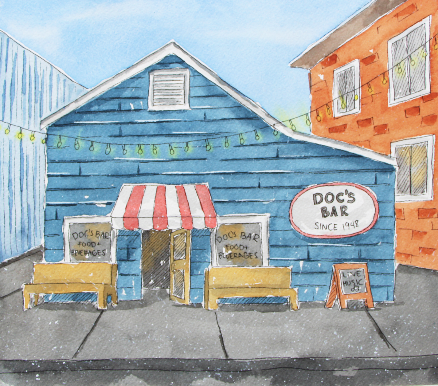
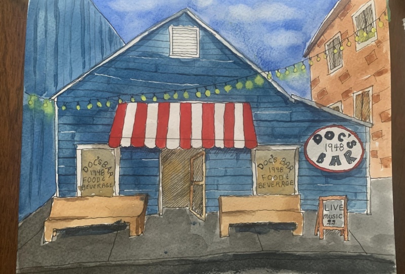
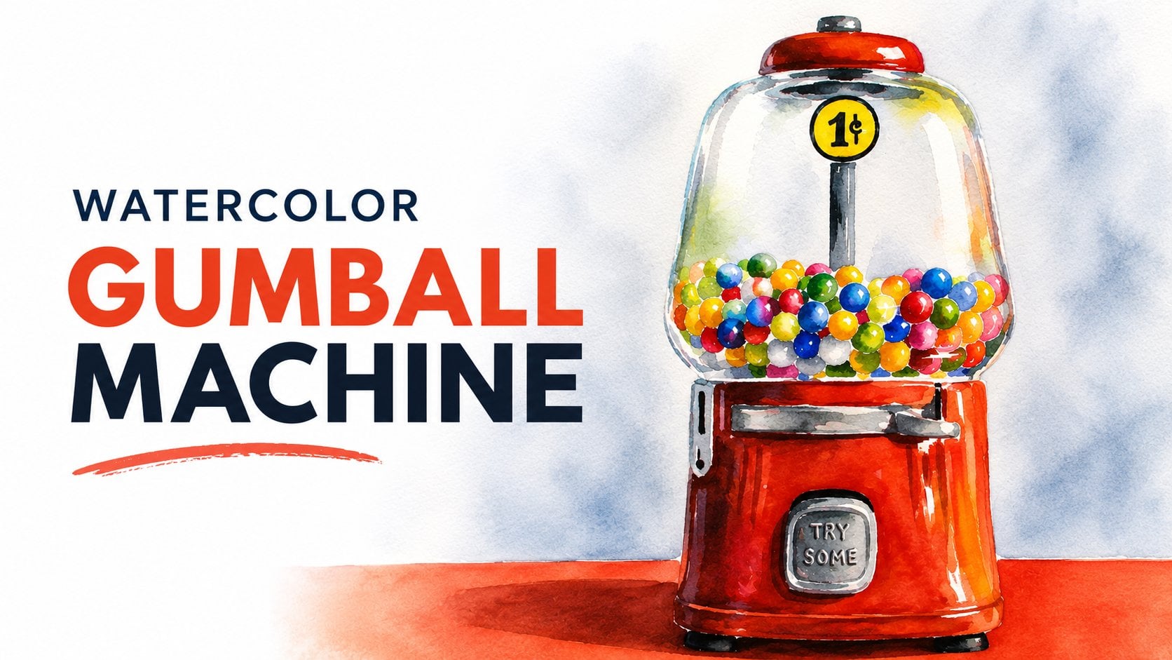
4. Reference Photo Observations: Not only am I a huge proponent
of taking time to observe your reference photo or
whatever it is that you have in front of you in real
life before jumping in. But also it is super
important to plan your composition before getting started with the final piece. This is something that
a lot of beginners don't do or don't
know how to do, so they skip over
this part if they're using a reference photo or they have something
in front of them. In real life, they don't make time to make
compositional choices. Meaning they try to draw or paint everything
exactly as they see it. And they don't think
about how they can make better use of their
drawing or painting area. How much negative
space is going to be left around the object
or the subjects? What format is better suited
for the composition on hand? Whether it's better to remove certain elements that
are just going to be confusing the viewer and are not adding anything
to the composition. Whether certain colors
or things are going to be changed in order to
better communicate the mood, message, idea, or story that you're wanting
to communicate. Whether certain elements
can be moved around in order to make the composition
more visually pleasing. If you want to
bring things in to add more of yourself
into the piece, a lot of beginners don't
give thought to any of this, so they just find
a reference photo or something that
they're going to be drawing or painting, and they go right in without making any
sketches beforehand, any thumbnails or
anything at all. And this, in my opinion, is a huge mistake. This is why I wanted to share this full class before jumping into the
watercolor washes, because it is my goal to help expand your horizons and give you more actual information. I want to empower you to feel confident creating
original artwork from scratch in the future. That is not only super
aesthetically pleasing, but that also has a
ton of yourself in it. Very few artists are sharing
this information online. So it is definitely
not your fault I have chosen a reference photo
of this cute little bar, and this is a great photo for
me to explain these things, because in many ways, it is less than ideal. So I'm going to show you
the changes that I make in order to make this composition
more visually pleasing. I am keeping what I like about this reference
and I am changing what I don't in order to make this a more successful artwork. So I'm going to start out by mentioning some
of the things that I love about this photo that really drew me
to this reference. And then I'll be moving on to explaining some of the
things that I'm going to be changing first and foremost in terms
of what I do like. I think that the facade
of this bar is very cute. I like the simplicity of it. I like that it's
relatively small. I'm really drawn to stripes, so those red and white stripes
in that awning are very, very cool against
that gray outer wall. I also really love
the opportunity to bring in some handwritten
lettering and some words. Although I'm pretty
sure that I'm going to be taking
many of those words out and I'm going
to be simplifying those words, those sentences. I like the benches in front
of this bar that gives me an opportunity to practice perspective and adds more
depth to the composition. Another thing that
I really like about this building is that
it's asymmetrical. So if I were to cut it in half, the left half is not the
same as the right half. Asymmetry is always going to be more interesting
than symmetry, moving into the things
that I don't like that I'm going to be
changing or removing. First and foremost, the bar is too cramped
in this picture plane. A little section of it on the right is even
cropped off the picture, and there is not enough
negative space around the bar. When it comes to designing
visually pleasing, successful compositions, the negative space is just as important as the
positive space. If you're looking to create
something that looks balanced and something that the viewer wants to
keep looking at, you don't plan for
your negative space. The viewer's eyes are not
going to have space to rest and you're going to be
creating a sense of stress. If you don't leave
enough negative space, things look too cramped. And if you leave too
much negative space around the object
or the subject, you run the risk of things
looking way too empty, as if the object
or the subject is floating in a vast
sea of emptiness. There is not enough negative
space around the bar. And if I just go ahead
and draw it as is, it's going to look too cramped. So I'm going to make up for the information that
I'm visually lacking. And I'm going to finish up
that right edge of the bar and I'm going to open up the picture plane
allowing more space. That's the first thing that
I'm going to be changing. Alongside this, there is
a very dark shadow shape, probably created by some post in front of the
bar that we can't actually see because it's off the picture plane and it's
right on top of that awning. I'm going to be removing
that because all that shadow shape does
is confuse the viewer. I, myself, don't know what it is exactly that's
creating that shadow. You can bet that the viewer of my final piece is not
going to know either. I don't think it adds
anything to the composition, so I'm just going to
be removing that. Another thing that I'm
going to be changing is the cable with those
cute little lights that is right in
front of the bar. The visual line created by those lights is very straight
and almost horizontal. I'm going to be
changing that to create more of an asymmetrical
kind of curve situation. I really like those lights. I think they are super cute, and I think the lights
will definitely add interest and personality
to the composition. But I don't want to keep
that line super straight. And horizontal straight
lines like that sometimes visually cut the composition
into parts in a weird way. And straight horizontal lines
can just be very boring. Another thing that
I'm going to be doing is I'm going
to be removing that live music sign that
is to the left of the door. And I'm going to be taking that standing little blackboard that we can't really see very well from this vantage point. I like that chalkboard, but I'm going to be
moving it so that we can actually read it from
this vantage point. I'm going to place it
somewhere where we can view it from this vantage point and
where it makes sense. When I'm creating my
drawing and I'm going to be writing live music on that sign. I'm going to be
changing the door, instead of it opening toward us. It's going to be opening
toward the inside of the bar. This way I remove some of the
noise in front of the bar. In the entrance, I'm
going to be removing the red kind of drain or sewage that is
in front of the bar, and I'm also going
to be removing that blue trash
can on the right. Those are, I would say, the most important changes
that come to mind right now. And as I am moving
along creating my preliminary sketch
in my sketchbook, if more changes come to mind that I want to
make, I'll do them then. When it comes to the colors
that I'm going to be using, I'm going to be changing some of the colors present in
this photo as well. And I'll let you know
what I end up using, what my color scheme is going to be in the class where I'll be swatching out these colors and giving you some painting
tips for success. That is it for this class. I look forward to seeing
you in the next one, where we're going
to be working on our preliminary pencil
sketch in our sketch books.
5. Preliminary Pencil Sketch: Let's jump into our preliminary
pencil sketching process. Our pencil sketch that we work on right now in our sketchbook, or whatever other drawing paper it is that you
choose to draw on, has to be the size that you
want your final piece to be. Why? Because we're going to
be tracing over it and that's what we're going
to transfer onto our sheet of watercolor paper. So a little trick that I like
doing is after I have cut my final watercolor sheet into exactly the size that I
want my final piece to be, which in this case is 10 " in
width times 9 " in height. I place my watercolor sheet over one of these sheets
in my sketch book. And I trace around my
watercolor sheet to create that rectangle
drawing space. So that I can make sure that
the drawing that I create fits exactly the way that I want it to fit in that rectangle. By doing this, I can ensure that my drawing is not going to
be too small or too large, and I can make sure
that I'm going to be leaving enough negative space around the bar once I have created that rectangular
space to draw in. What I'm getting
started with right now are just a few lines to help me start visualizing where
the bar structure is going to be drawn in. I started by placing a horizontal line to help me visualize where the
ground actually is. And then I started by
adding in vertical lines. These vertical lines are
going to help me create those initial largest shapes
the way that I see it. The front of this bar can be
divided into two sections. The most important part, which is the one that has the triangular section at
the top where the door is, I see as being the main
part of the bar structure. Then there is an
extra section on the right where the
bar logo or name is. Those initial vertical
lines that I added in. Help me visualize
these two separate. Now you can see how
I just added in a longer vertical line right in the middle of this largest
portion, where the door is. The reason why I added that
longer vertical line right in the middle there is because by having that
vertical line there, I'm able to more easily draw the symmetrical
triangle that I need right at the top of this larger
portion of the structure. So you can see how I'm constantly helping
myself with straight, vertical, and horizontal lines. I made sure to bring
down the bottom edge of this building below
that ground level that I was visualizing. It's all about simplifying
what you're observing into a combination of
basic shapes or forms. In this case, this is an
elevation view of this building. So we're seeing the flat forward facing
front of this bar. Which means that we can use squares, rectangles,
and triangles, and straight verticals and straight horizontals to help us create that overall
shape that we're looking for for the
front of this bar. If there were two
point perspective or three point perspective
going on in the scene, it would be a different
thing that would require a deeper understanding of
three D form and perspective. Because with those
kinds of perspectives, we see multiple sides or planes
of the structure on hand. But for this one we're just
seeing the front of this bar. We're not seeing any of the other sides making
up this structure. Go ahead and use
simple flat shapes, squares, rectangles,
triangles, and combine them. Place them next to
each other until you arrive at an overall shape that is similar to
what you're observing in the photo right here. I just erased out a
few lines that I'm no longer going to be needing
using my soft graphite eraser. I'm making sure to
keep everything very light so that
I can continue refining my drawing as I go in the beginning of
your sketching process, it's essential that you keep your sketch very
flexible and malleable. And you do this through
sketching lightly so that you can continue erasing mistakes
and refining as you go. And by the way, if you
feel the need to bring in a ruler so that you can keep
these longer lines straight. There is no shame in having
to bring in a ruler, because especially
when you're creating these largest shapes and forms, of course, these lines
are going to be longer. And longer lines are harder to draw for most of us
than shorter lines. You can see how I'm
continuing to focus on those general largest
shapes and I am not. Concerning myself with
smaller shapes and details. Right now, I am focusing on getting those overall
shapes and proportions. Looking right before moving on to the medium sized shapes. And then the smallest
shapes go at the end, now getting proportions exactly the same as what you're seeing
in the reference photo. When it comes to the width
versus the height of this building is
not 100% necessary. Meaning you can
change proportions slightly and you're
probably going to be fine. Even the angles of that triangular portion or the diagonals can be
slightly different as long as they are
similar to what you're observing and the
overall proportions of the building look believable. Use your visual measuring
skills and ask yourself, how does the total
width of this front of the bar relate to the
total height of this bar? Get something similar
to what you're seeing. And you're going to be fine. The more you sketch freehand and continue developing your
observational skills, the better your visual
measuring skills become and the better you become at recreating
proportions effectively. Once I was happy with that largest shape for the
entire front face of this bar, it was time to move on
to medium sized shapes. I decided to get started with the awning shape above the door, which the awning does
require a little bit of understanding of three
D form and perspective. Because it's a structure
that is coming toward us, it's important to get in those slight angles
looking right. If we want to make
it look believable, make sure that you
pay attention to those slight diagonals going on on either side of
the awning shape. And then there's this long
rectangle right beneath it where that awning
portion is dropping down. Very much looks like
a trapezoid shape with a long rectangle
along the bottom of it. I draw in the door
shape and also the two window shapes on
either side of the door. I try to leave a similar
amount of space between the edges of the door and
the windows on either side. And I make sure that the
window shapes are aligned with each other
because that's what usually happens in buildings. And I also draw that
top vent shape. Notice how I'm keeping
everything as simple shapes. I haven't really started
to add in any detail in the windows or any decker in the windows,
anything like that. I'm keeping everything
super simple, judge, and then I start
drawing the first bench. And just like with the awning, to draw the benches, you do need to bring in your understanding of three
D, form and perspective, because these are structures
that are coming forward, and we actually see a couple of different sides of the bench, especially this one on the left. Judge, even with the benches, I start with the
largest portions of it, simplifying everything
into basic shapes, and then I'm going
to turn these shapes into forms by adding
in that plane. On the right, Judge, I simplify
the bench, first, Judge, into the back portion of the bench and the seating and
legs portion of the bench. And once that looked good to me, I started building the bench. Look at how I just drew in a
couple of long rectangles, one for the back
of the bench and the other one is going to be the section where the legs
are going to be drawn in. It's hard to see how the
legs work in this bench, so I do bring in my
artistic license and intuition to just get in the bench structure to
the best of my abilities. It's so important to just make up for the information
that you're visually lacking in a reference photo or whatever scene it is that you have in front of
you in real life. And to be able to
combine what you're seeing with your intuition and what you know to be true about this specific type of object
element that you're seeing. Of course, making time
to draw pieces of furniture that you have at
home is super helpful as well. Draw some chairs that
you have at home, draw some coffee
tables, draw a sofa. And through that practice, you're going to
be able to tackle this kind of drawing
a lot more easily. Once I'm done with that
bench on the left, I get started with
the other one. And you can see how I start by drawing two long rectangles, one for the back of
the bench and one for the seating and legs
portion of the bench. See, I started with these
two long rectangles. I make sure that
these long rectangles are aligned with the
bench on the left, because I do want to make
these benches seem like they are both on the ground so they have to be
aligned with each other and once those
rectangles look good to me, I add in a sense of structure
and three D ness by adding a little sense of
that side plane on the left. I cut into the rectangle
that I created for the seating leg portion
to create a sense of those two little
legs right here, I start adding in the door, which as I said in the
beginning of this tutorial, I changed the door. Instead of opening out, the door is opening in
because the door is a flat rectangular prism that is receding away from
us into the bar. I have to make sure that I
add in those diagonals along the top and the bottom to make it look like
it's opening inward. Once my basic general door
shape has been created, I go ahead and add in extra little windows
inside of that door shape. I then add in a floor
line inside of the bar. Continuing with
medium sized shapes here I start adding
in that ellipse for the sign that has
the name of the bar right here on the right
portion of the building. I decide to add in
this ellipse a little bit higher than what I see
it in that reference photo. And that's because I want
to leave some room for the smaller blackboard sign that I'm going to be
creating beneath it. Before drawing that ellipse, I did create a few tick
marks for myself just to decide how wide I
would be making my ellipse and how tall I
would be making my ellipse. As I mentioned in the
beginning of this tutorial, I would be changing
the location of the standing blackboard
that is in front, a little bit of a distance away from the entrance of this bar. So I decided to
change the location and also its
orientation in space. The perspective
that we're seeing that sign at, I am changing. And this really entails
me visualizing what this structure of the sign would look like from a
different perspective. This is the sign where I'm
going to be adding that live Music handwritten
lettering later on. Okay, so I'm officially in the smaller shapes and details part of this
sketching process. All of my larger shapes, my larger structures
have been added in. And shapes, proportions,
perspective is all looking good. I can now move on to
adding more details. This said, it is not necessary to go all out with
your details in this sketch that
you're creating in your sketchbook or separate
sheet of drawing paper, because you can always add more details right on your water color
sheet if you want to. Plus there are some
details that are going to be added right away
with pen and ink, without me having added
them with graphite. First, it's all up to
you and how comfortable you are in terms of going right in and drawing that
detail with pen and ink. Or if you want to add it first with pencil, it's up to you. Part of the process should
be relatively easy to do because all of your most
important lines and angles, they're already there for you. So it's just about
adding in an extra line alongside that shape edge or line that you've
already drawn. For example, that
little detail that I added along the roof. All I did was create more lines following that line and that shape that I
had already created. Same thing with my windows
and the little vent. The stripes on the awning
are also relatively easy because I already have those diagonals on either side. Observe what happens with the awning stripes in
that reference photo. And notice how the ones in the center are more
straight up and down. And then as the stripes move toward the left and
toward the right, inside of that trapezoid
shape for the awning, they get more and more diagonal. And then I start adding
in the lettering. When I'm going to be adding
handwritten lettering into a pen and ink piece
or pen and wash piece. I always draw guidelines
first so that my letters look aligned and so
that I don't start changing their size as
I am writing that word. I also want to make sure that my letters fit where
I want them to fit. And this is why you'll
notice that before actually writing all of these words
or adding these letters, I'm creating horizontal lines
or curved lines for myself. And then I draw the
letters using those lines. In this piece, I'm
going to have a few of these words added
along a curved line. Here I am adding in that string or cable of lights right
in front of the bar. You can see how I really changed that line created by this
cable with the lights. Instead of making it
straight and horizontal, I made it curved, and I also made
sure that there was a lot of asymmetry
in that curve. Once I was done with that, it was finally time to add in the buildings on either
side of the bar. As I mentioned before, this is an elevation view drawing of this bar
because we see the flat, forward facing face of the bar. It's facing directly toward us. We're standing right in front of the front face
of this restaurant, almost right in the middle of this front,
forward facing face. We're not too close to
the left edge of it or the left corner of it
or to the right corner. We're actually almost right in the middle of this building,
standing right there. And this means that there is one point perspective
going on here. So when I am adding in the sides of these buildings
on the left and the right, I have to visualize those
diagonals that would be converging in that far away vanishing point behind the bar. I'm going to make sure to leave a one point perspective tutorial down below for you in the
text section of this post, I would highly recommend learning about one
point perspective. And later on, if you
want to move on to more difficult or challenging
urban scenes, I would recommend learning about two point perspective and
even three point perspective. But if you really want to
understand why I am using diagonal lines as I am drawing these buildings and these
windows in these buildings. All it is, is one
point perspective. And I am visualizing
converging lines that would meet at that vanishing
point behind the bar. And all of the would
be horizontals, meaning the top edge and the bottom edge of
all of these windows that I am adding into these side planes of
these side buildings. The top and the bottom edges
of those windows need to be diagonals that would converge
at that vanishing point. So as I am doing all of this, I'm always visualizing
that vanishing point and those converging lines. If I stop visualizing
that vanishing point and don't use diagonals that would converge at
the vanishing point, I really risk throwing off the believable sense
of perspective. In this drawing, understanding one point, perspective
is essential. Right here, I decide
to change the windows. You can see how I leave those long lines that would converge at
the vanishing point, because I'm still going
to be using those, only I'm going to be creating a different amount of windows in that top floor of this building and the middle
floor of this building. I'm just going to be
using my artistic license and changing the windows that I see in that reference photo while still using those
converging lines. So while still paying
attention to what matters, I am allowing myself
to make some changes. Notice how I decide to align the top and bottom windows there while using those slanted
or diagonal lines. Also, because one
of the rules of perspective is that things
get smaller and smaller, the farther away
they get from us. I make sure that the windows
that are nearest us for this building on the
right are a little bit wider than the ones
that are farther back. Then I go ahead and erase
those diagonals that I no longer need after my window shapes
have been added in. Once those window shapes
have been achieved, and they look good
to me in terms of perspective and also
proportion and alignment, I go ahead and start adding
in a little bit more detail. And again, this is much easier because there is no
guesswork involved. I already have that
shape drawn in, so I'm just following the
lines that I already have. Once that's added in, I
go ahead and start adding some diagonal lines that
I see on the sidewalk. On the concrete, I
will be taking out that red sewage or
drain, whatever it is. And I will be adding in that little step in between the actual
street and the sidewalk. So I start by adding in that horizontal line where the sidewalk is
going to be ending, then I just add in
another horizontal line right beneath it to give that
sense of that little step. Then the last thing
that I'm going to be adding into this
first pencil drawing are just some horizontal lines all throughout the
front of this bar wall. And this is to create the illusion of the
wooden wall here. All I'm doing is filling up this front wall with
horizontal lines. And I'm trying to make
sure that these are as straight and horizontal
as I can make them. You can see how I'm
starting at the left. And I am pulling that
horizontal line all the way across to the right edge
before moving down. And that really helps me make sure that the space that I'm leaving between my lines doesn't
get smaller and smaller. And it just helps me keep
my lines straighter. Of course, there are
certain sections where you're going
to have to skip, but it is important to continue visualizing that line
that you started and keep that line consistent when you are
able to restart it. And that is it for our
preliminary pencil sketch. In our next class, I'm going to be explaining how I like using tracing paper to transfer my outline sketch onto
my watercolor paper. And how I finish refining
my drawing so that I can move on to the pen and
ink process. See you there.
6. Transferring Sketch: With my drawing finished, it is time to move on to
the transferring process. Once we're happy
with our sketch, it is time to prepare
our outline drawing on our actual water color sheet so that we can move on
to the penick process. What I'm doing is I am using
a sheet of tracing paper. And you can feel free to use whichever transferring
method you prefer, whether it's carbon
paper or a light box or anything that you are more comfortable with that
you enjoy using. I just like going
with tracing paper. It's something that
I always have in my studio and I
like how I'm able to create that drawing on my tracing paper
and I'm able to re, use it over and
over and over again if I want to work on this
piece more than once. So let me explain how I
used tracing paper for my transferring throughout
the entire process of my first drawing. I was using my HB
pencil in order to keep my drawing nice and light
and as clean as I could. But once I begin with my transferring process and I'm drawing over my tracing paper, I am using a two B pencil. A pencil that has softer graphite in
its core than the HB. And the reason this is is
because I have to deposit a good amount of graphite on my tracing paper in order for
my transferring to happen. If I had continued
using my HB pencil, which has harder
graphite in its core, then I wouldn't be
leaving too much graphite on my tracing paper as I
traced over my drawing. And if I don't have enough
graphite on my tracing paper, then the transferring
is not going to happen because the way
that we get our sketch transferred onto our watercolor
paper is through pressing down the graphite that is on the tracing sheet onto
the watercolor paper. If there is no graphite
on our tracing sheet or there is just a
very small amount of graphite on our
tracing sheet, then we run the risk of not
transferring anything at all or transferring a
drawing that is very, very light or is missing
plenty of sections. And this is why
it's very important to use something
like a two pencil or even a four B pencil when you're tracing over your drawing
on your tracing paper. After I placed my tracing
sheet over my drawing and of course I made sure that my entire drawing was covered
with a tracing paper. I started tracing over
all of my shapes and all of my line work that I can see through that tracing sheet. You shouldn't have any trouble seeing through your
tracing paper. Of course, there are certain
tracing papers that are thicker than others that allow you to see less through it, and there are other
tracing sheets that are thinner and you're able to see through them
way more easily. I've never had any issues with this tracing paper
from Strathmore, but you can see how rough
my lines are and my shapes are that I'm creating with this to be pencil over
my tracing paper. I'm going over all of
my lines and shapes two to three times in a
relatively rough way. I'm not pressing down hard, I'm not trying to make holes
through my tracing paper, but I am going over all of
my lines and shapes multiple times and you can see how
my lines are pretty rough. They're messy or feathery even. And that's okay. I'm not trying to
create perfect, super clean lines that
would defeat the purpose. If I just go over my
lines and shapes once, then just a small
amount of graphite will get deposited on the
tracing paper by me going over all of my
lines and shapes multiple times and being a little bit
rough about the process, instead of trying to go in and create very clean single lines, I'm getting more of that
graphite on my tracing paper, which is exactly what I want. Your drawing doesn't
have to be perfect and super clean on
your tracing paper. And you should be
able to do this relatively quickly as
you're doing all of this. It's normal if you have to re, sharpen your pencil
once or twice because since you're
being a little bit rough and going over
everything multiple times, your pencil tip is
probably going to become pretty blunt pretty fast. There's going to be
time later to perfect our outline sketch before getting started with the
pen and ink process. Whatever kind of
transferring method you use, whether it's a light box or carbon paper or tracing
paper or anything else, there is always going to be
some amount of refinement of your drawing required before moving on to the next
part of the process. Don't expect yourself to
create a perfect transfer. Always expect that you're going to have to be doing
a little bit more work after you do your
transferring. All right? So I am done with
that initial tracing on one of the sides
of my tracing paper. And now I need to get graphite
on the opposite side, because this is the side
that is actually going to be coming into contact
with my watercolor paper. So I need graphite on this
side of my tracing sheet. If I have no graphite on this
side of my tracing sheet, which is actually the
side that is going to be coming into contact with
my watercolor sheet, then nothing is going
to get transferred. Because remember what I said, the way that the
transferring happens is the graphite gets pressed down
onto the watercolor sheet. So the face or the side of the tracing paper
that is coming into direct contact with
the watercolor sheet has to have graphite on it. If I'd be okay with
doing my transferring in the opposite direction to what is actually
happening in that photo. Meaning, if I wanted
my final piece to be a flipped image or a mirrored image of what I'm seeing in that
reference photo, then I would be
fine because I can simply transfer it in
the opposite direction. And I would be able
to do that because I already have graphite
on that side of my tracing paper
that would be coming into direct contact with
my water color sheet. But if I want my image to be in the same direction as what I am seeing in
that reference photo, then there is no way around it. I need to also get graphite
on the opposite side, and that's why I'm doing
my second tracing. I flipped my tracing
paper over and I'm going over my entire
drawing again now observing those lines and shapes that I'm
able to see through the tracing sheet and going over everything twice or three
times very roughly. Again, something that's
very important is make sure that you place your tracing paper over
a blank sheet of paper. Because this time since you
already have graphite on the opposite side and
you're pressing it down onto that paper behind
the tracing paper, you're going to be
transferring your sketch. Of course, you're going to
be transferring the mirrored or flipped version of
what you actually want. But I definitely wanted to
keep my first drawing intact. If you don't want to ruin that first drawing
that you created, make sure to flip a page
in your sketchbook, or you can always use a sheet of regular printing paper or another sheet of recycled paper. Place it behind
your tracing sheet. And this way you won't
accidentally transfer your drawing onto pages where you don't
want to transfer it onto. All right. So I'm almost
done with my second tracing. I'm still using my tub
pencil by the way. So to be pencil has been used on both sides of
my tracing sheet. Okay. So now I have
graphite on both sides of my tracing sheet
and I'm ready to do my transferring onto my
sheet of watercolor paper. I taped down my watercolor
sheet onto my black cutting mat with my regular
three fourths of an inch masking tape. And then what I did was I
placed my tracing paper over my watercolor paper in the direction that I want
to do my transferring in. And I taped down the
top two corners of my tracing paper down
onto my cutting mat with a couple of small pieces
of masking tape as well. This way I can make sure that the tracing sheet
won't be moving around As I'm doing
my transferring, just tape down the
upper two corners and not the bottom two
corners so that I can lift up my tracing paper
as I go so that I can make sure that I'm not missing any
important lines or shapes. I still have a to be pencil
on hand and what I'm doing is I'm going over all of my line work one last time. You can see how I'm
continuing to go in with pretty rough lines. I continue going over
everything multiple times. Because if I just go
over things once, then I'm not going to
really be pressing down too much of that graphite
to do my transferring. I'm not pressing too hard, but I am going in
firmly so that I can make sure that I'm pressing down that graphite on
the opposite side. I don't want to press down so hard that I start
making holes in my tracing paper and I start scratching and damaging
my water color sheet. Because that damage,
I will not be able to take back the opposite
side of my tracing sheet. The one that is coming into direct contact with
my watercolor paper has graphite on it. And as I'm going over
everything and I am pressing down with
my to be pencil, some amount of that graphite on the opposite side
is going to get pressed down and transferred onto my sheet of
watercolor paper. Something I do want to mention is the more textured your
watercolor paper is, it's just a lot more likely that your transferring
will come out a lot lighter than if you are doing your transferring
onto smoother paper. And this has to do with the tooth or the
texture of the paper. Not allowing you to fully press down that graphite onto
it in a uniform way. The more textured the paper is, the less uniform
that surface is. So when you press down
that graphite onto it, it's going to get transferred in a way that is not that uniform, which leads to a lighter
drawing or a lighter transfer. Personally, I don't mind this too much because
I do want to make sure that the drawing on my watercolor paper
is very light. Because I do want
to erase out all of that pencil work once I'm
done with my pen and ink. And I'm also going
to be perfecting some lines and doing
refinement shapes. Once I'm done with
my transferring, remember to sharpen
your pencil as needed as you're moving through this
transferring process. The pencil tip is probably
going to become pretty blunt pretty fast. All right? I'm all done with
my transferring and you can see how
I ended up with a very light drawing and this is because I'm using paper
that is pretty textured. However, I am perfectly able to see all of my main
shapes and lines. At this point, I'm
just going to be working on refining my sketch. So for this, because I
am drawing directly on my water color sheet
and I want to make sure that my drawing ends up
pretty light and clean. I switch on over to
using my HB pencil. Again, I don't want to use my softer pencil grade on my
water color sheet because all I'm going to be
doing is getting a lot of soft graphite on
my water color sheet. And I can start smudging too much graphite on
my watercolor paper, which can later on affect the vibrancy of my
watercolor washes. Make sure that you switch on
over to your HB pencil to do any drawing that
you might need to do on your water color sheet. You can see me go over all
of my main shapes and lines, making those lines a
little bit darker. And perhaps completing
little sections which didn't get
transferred properly. I'm also going to be adding in some final details that I hadn't added into
my drawing before, such as the little light
bulbs hanging from that wire or cable
in front of the bar. I'm going to be
doing a better job withdrawing the letters. I'm going to be adding in
those horizontal lines for the wood texture
in front of the bar, which as you can see,
I didn't even really transfer lines in the vent at the top of the
bar, et cetera. There are some details like
that that I would just rather as straight on
my water color sheet. As you move along
with your practice, you might find that
you just end up transferring the very
basic general shapes. You can transfer that and freehand draw everything
else that you're missing, your smaller shapes and details right on your
watercolor sheet. Same thing with the
pen and ink you might find as you continue
with your practice that the less transferring you have to do and the
more you can go in right away and just draw those smaller shapes
and details with pen and ink without having to draw them with pencil first. But in the beginning,
I would highly recommend going
through this process, especially because ink is permanent once it's
laid down on paper. There is no taking that back. And there is no better way to really plan for those texts, those details, even those
letters that you're going to be adding than going in
with pencil first. And I know that
this process might seem tedious or very
time consuming to you, but I promise you
that you're going to get so much more out of going through all of these phases and you're likely
going to arrive at much better results
than if you had just gone straight into
the watercolor sheet and started drawing. And I know that you see a lot of very skilled and very
experienced artists that do pen and
wash type of work where you see them go straight onto the watercolor
sheet and create a great sketch that shows believable perspective and three D form and
all these things. And they very easily, seemingly go into their
watercolor washes. But the thing is that they have a lot of experience
with this kind of piece and they already have a great eye for
composition developed. So they know what looks good
and what doesn't look good. Not to mention, most
likely than not, lots of the videos that
you're seeing are very sped up and they have certain
sections cut out of the videos, so you're not seeing
the entire length of the process that it actually took them to create
the piece on hand. So just keep that in mind and know that you're still
building up skills. Very likely if
you're a beginner. Through this process
and over time, once you have more practice, you have more of an
understanding of three, form and perspective,
and composition. You're going to be able to skip certain parts
of this process. Okay, I'm almost done. I'm going to take
my needed eraser. All I'm doing is
some gentle tapping over some of my pencil
work to clean up some sections where the
lines look a little bit too feathery or lightning sections that look a little bit too dark. Just to finish up
my pencil drawing, I'm going to be adding
some final details that I haven't added in. And I'm also going to be
redrawing those letters. I definitely want to make sure that I know what
I'm going to be doing for all of the letters before going in with my pen and ink. Right here, you're
going to see me make some corrections in this sign where we see
the name of the bar. And I'm adding in
that curved line again at the bottom
so that I can add in the since 1948 phrase that
I hadn't added in before. That is another change
that I made in that sign. Instead of having it be
right in the middle, I'm adding it at the bottom. I also redraw some of the letters in the windows
on either side of the door, and I will be adding in more letters and phrases
into the windows later. When I do, I'll make
sure to add them in with pencil first before switching
on back to my pen and ink. Right here, I am finally adding in those little
light bulbs hanging down from the cable that is running across
the piece here. I just add in a couple
of little shapes, a little triangle and a little circle at the bottom
for each light, making sure that I'm leaving a relatively equal
or same distance between each one of my
little light bulb shapes. And I'm also going
to be adding in those horizontal lines for the wood wall in
front of this bar. There are certain details
like these lines and the little shapes
for the light bulbs and also the letters even which I just like
adding straight onto the water color sheet because transferring them is just a
little bit too complicated. And there are even more
details and textures and shading that I'm
going to be adding in right away straight
with my pen and ink. There are certain decisions
that I allow myself to make once I have seen a little bit more development in this piece, especially with the pen and ink work that is coming up next. See, I don't even finish the shapes for the
little light bulbs. I just wanted to decide what combo of shapes or
lines I would be using. And I make the
decision to just add them in straight away
with the pen and ink. And that is it for this class on transferring
using tracing paper. We're now going to be moving
on to the next part of this process where
we're going to be working on the pen and ink.
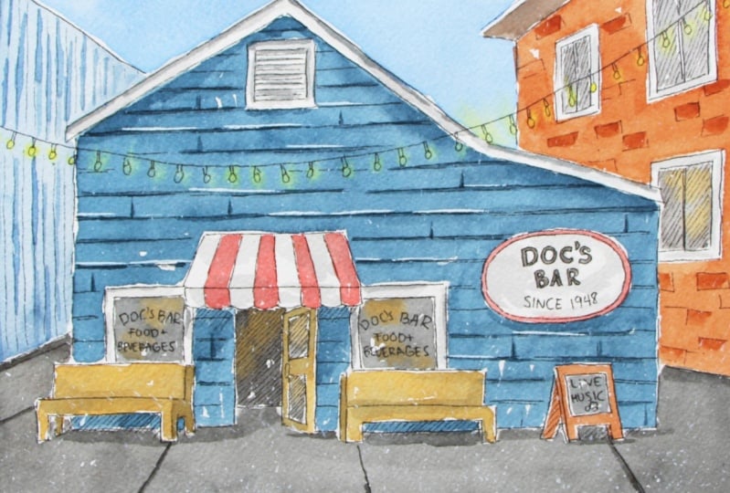
7. Pen + Ink Drawing: All right, my friend,
we're finally getting into the pen
and ink process. So the objective with this
pen and ink process is to, A, define edges of
our main shapes. B, we're going to be
adding more detail and texture and we're going to be doing some quick
shading as well, using hatching, especially in darkest shadow areas that
we see in that photo. And what I get started
with is with defining my edges of all of my important
shapes in my drawing. I start by carefully tracing over all of my pencil work
and you can feel free to make your way from
larger shapes towards smaller shapes or from left to right if
you're right handed, like myself or opposite to
that if you are left handed. Or you can also make your
way from top to bottom, whatever you're more comfortable with and whatever is going to help you avoid smudging
your drying ink. You can see how I am bringing in an extra sheet of tracing
paper to place under my hand so that I can make sure that I'm not
smudging my graphite that I have on my
watercolor paper or any of the ink that
I'm going to be placing. That's something else
that you can do To avoid smudging your
graphite or your pen, Use that extra sheet of tracing paper and place
it under your hand. As you're moving along in whatever direction it is that you're going to
be working toward. Just make sure that
you're careful. Your ink should dry
pretty quickly. Whether I'm using my pigment
liners from Stadler or my micron pens or these
uni pin fine liners, the ink is pretty dry
in less than a minute. I've never really had any
issues with smudging, but it's just worth
staying mindful throughout the process and being careful in those areas that
you've just worked in. In this part of the process, I tend to jump around the
entire piece and I just stay mindful of where that ink might still be a
little bit too fresh. Aside from this,
something that is key is making sure that
you're keeping it moving, you're keeping it flowing, and that you're not
staying stuck in any specific area or
element in the piece. This is important because
if you spend too long in one single area trying to make
everything super perfect, your lines are likely going
to end up looking very stiff. And you want to avoid
creating stop and start marks in these lines
that you are laying down. It's preferable to have little imperfections in
your lines, slight wobbles. Or even have lines be a
teeny tiny bit crooked. Then having super perfect
lines that are way too stiff. You move too slowly. You can also run the risk of creating stop and start marks, little dots where that ink flows down the
nib of your pen. Because you stopped
and you're hesitating, keep your lines flowing. You don't have to
move super fast, but make sure that you're
keeping it moving. Don't worry too much about little imperfections
and little mistakes. Because oftentimes when it comes to pen and wash
pieces like this, those little
imperfections actually add interest and
personality to the piece. As I am continuing to
trace over my pencil work, I am making sure
to bring to mind which elements or
objects are overlapping, other elements or objects. Because pen and ink is permanent and you don't
want to trace over sections of shapes that wouldn't really be
visible because there's another object in front of it covering up that section of
that shape or that edge. Before getting started with
a new element or object, I take a quick little break and I notice what is
in front of what, and I take note when I
need to stop that line. Something that I'm always
making sure to do as I'm moving along is arriving at
line weight variation. I'm trying to stay
away from the look of coloring book pages or a cartoony style where my outlines are super
thick, super stark looking. And where there is only
one same thickness and line weight all
throughout the piece, because that is going
to lead to flatness. Think of coloring book pages and how in coloring
book pages there is only one thickness
and one level of darkness all throughout all of those lines making
up that image. There is only one
single thickness, one single line weight. And what we're trying to
do here is we're trying to develop line weight variation in all of our lines and marks. Meaning we want certain sections of our lines and marks to be thinner and lighter
and other sections to be thicker and darker. You can see how I am oftentimes
approaching these lines. In sections or segments. Sometimes those lines
are not even connecting, which helps me create less
of an outlining look. Also by making sure that
I'm keeping it moving, certain sections are going to be lighter and
even more tapered, while other sections
are going to be thicker and a
little bit darker. Another thing that
you can practice manipulating or
changing as you're moving along is the angle that
you're using your pen at. If you are using more of an upright 90 degree angle or perpendicular
angle from your page, more ink is going to flow
down the tip of your pen, creating darker, thicker lines. Whereas if you use
a different angle, let's say more of
a 30 degree angle, 35 degree angle from your paper, Less ink is going to flow
down the tip of your pen, which is going to
lead to thinner, lighter lines, or
even broken lines. Instead of always using your
pen with one single angle, practice shifting and changing the angles that you're
using your pens at. Another thing that can
have a great impact on how thick and bold your lines end up looking is the pen tip size itself
that you choose to use. As I said, I am using
a 0.5 tip size, which is pretty
medium, I would say. But when I was first getting
started with pen and ink, I tended to reach for
a very large tip size, something like a 0.8. And larger tip sizes in
and of themselves are going to lead to
thicker, bolder lines. Whereas if you go for
something like a 0.1 or a 0.3 the lines and marks that you create are going to be
thinner and lighter. Nowadays, I much prefer smaller
to medium pen tip sizes. Okay. So you can see how I just went in with my pen
and ink and started drawing those little
shapes that I have chosen to draw the
little light bulbs. I am now adding more detail around the
sign in front of the bar. You can see how I just
added an extra set of lines around the ellipse
that I had already drawn. So I'm just following that shape that I had already created. And now I go in to
draw those letters. See how I am using
the letters that I had previously created
with pencil as guides. I am now going in
with my pen and ink and drawing bubble letters around those regular letters that I had created in pencil. I always make sure to decide what kind of handwritten
lettering I'm going to be using for each word before going
in with my pen and ink. Bubble letters are going to have a heavier visual weight
than regular letters. Larger letters are going to have a heavier visual weight
than smaller letters. And capital letters
are going to have a heavier visual weight
than lower case letters. So I want to make sure that the first thing that we see
is the name of the bar. Whenever I am deciding
on the type of letters that I'm going to be bringing into all
of these signs, I always give thought
to visual hierarchy. So where do I want to pull the viewer's attention
toward first? Or what do I want
them to read first? And what do I want
them to read next? Whatever words I want
them to read first, those letters need to have a heavier visual weight than letters or words that I
want them to read after. Notice how I am approaching these long lines in
the front of the bar. In sections there are little sections
where these lines are not even connecting. This makes the
process of drawing those long lines easier for me. Then I'm going to start
adding in some of these letters which
are secondary. They're not as important as the name of the
bar, for example. And I just add them in
with regular letters only. I'm making them all capitals. I'm not going to be
using bubble letters in those words because there
is not enough space. And also, I don't want
these words to compete with the main letters
and words which are in the main sign that
has the name of the bar. Once I was done with
that, it was time to move on to doing some
alternative shading. All I want to do is add in a little bit of
a shadow effect. So a darker midtone in dark shadow areas that I'm able to observe in that
reference photo. I choose to do this
with hatching. Hatching is one of the many alternative shading
techniques that we can use along with cross hatching,
scribbling, stippling, and others that can help us
develop a range of values in our pieces in order to create a believable sensation of
shadow and light and depth. Hatching involves
laying down groups of straight parallel lines and the angle that you create
with your straight lines. Doesn't have to be exactly
the angle that I am using. You can pick any angle as
long as those lines are parallel and you keep a consistency within
that group of lines, make sure that as you're
filling in those shadow areas, you're keeping it
consistent in terms of angle and as much as possible, try to keep the space between your lines consistent as well. Right here I go back to using
my pencil to add in some of these letters and words before tracing over them
with my pen and ink. I made sure to add in the live music lettering in the little blackboard
sign in front of the bar. Once I'm done with
these letters, I'm going to finish up by adding a few more details and a little bit more
alternative shading. I'm going to be drawing in
a few short vertical lines in between the long
horizontals that I already created in
the front of this bar. And this is just to communicate
that wood texture better. And I'm also going to be
creating that brick texture in the building to the
right in just a bit. You're going to see me
continue with my hatching to develop some more shading in
darkest areas in this piece. This is a mixed media
piece where I'm going to be combining pen
and ink and water color. And whenever we're working
on a mixed media piece, it's so important not
to overdo it with both mediums or however
many different mediums it is that you're going
to be bringing in, give some thought to how much you want to
be doing with pen and ink and how much you're going to be doing
with water color. If you do too much with both, the piece is going to
look overly described and overdone when we're going
for a somewhat loose, expressive, fresh looking piece. So I do decide to bring
in some amount of hatching to really push those
darkest areas in the piece. But I'm just going to be adding this shading in those
deepest shadow areas. The rest of my value
development or my shading is going to
be done via water color. This way I can
ensure that I won't be doing too much
with both mediums. Right here, you're going to
see me switch on back to my pencil to create
a few lines on this building to the
right before drawing in the little shapes
or lines that are going to help me convey
that brick texture. This is important because those lines that I am
creating right now would converge at
that vanishing point in the center of the piece. And it's important that
I'm able to visualize those converging lines when
I add in those bricks. Remember how I said before, how everything that you draw in these walls of these buildings
on either side of the bar, because this is a side plane, you need to use those
converging lines. Especially if you're
drawing elements like windows where you would have
straight horizontal lines. If you were standing
in front of that wall, anything that would be a
straight horizontal line would actually turn
into a converging line. Notice how I'm
creating these lines and shapes very loosely and I'm making sure that they are not too organized or to pattern me. It is not my intention to
fill up the entire wall with bricks and I don't
want to describe too much, so I'm constantly taking breaks
and seeing everything as a whole and making
sure that I don't go overboard with the
bricks that I'm adding in. Judge, I also don't want
to add too much detail to the secondary building
because I don't want it to distract from the focal
point, which is the bar. I do a little bit more hatching
in other shadow areas. For example, right
below the awning, above the door, right
below the benches, and right beneath that live music sign in
front of the bar, the wall of the
building on the left, a little bit too empty to me and I want to balance things
out a little bit more. So I observed that
reference photo four ideas. I notice that that building has some straight vertical
lines in its design. So I just start filling
in this shape of this building wall with
long vertical lines. If you feel more comfortable drawing these lines in pencil, first, by all means you
can go ahead and do that. I make sure to skip over
the little lights that are hanging in front of the
main focal point bar here. You can see how as I make my way back toward the
back of the building, I add in these lines
more and more quickly. And that helps me create
lighter, thinner lines. I allow everything to dry
for around 5 minutes. Then what I do is I use my
soft graphite eraser to go over the entire thing so that I can remove all of
that graphite work. I does stuff those eraser bits
with one of my dry towels that I use for water coloring
instead of using my hand, because this way I
can avoid getting any hand oils on my
water color sheet. And then just to finish up, I decide to go in with
a few extra lines right beneath some of these
lines that I've created for the wood texture
in front of the bar. These are just a few extra
lines that I'm adding right along some of these lines that I've
already created, which are going to help me
communicate a little bit of a sense of shadow beneath
these pieces of wood. It helps add a little bit
more detail and interest, and visual weight to
this focal point, which is the bar facade. If after having worked on
your watercolor washes, you want to go in and add more
details with pen and ink, you can certainly do so. Of course, you have
to make sure that everything has completely dried. And I would recommend not going overboard with the
detail. Less is more. Always take breaks and come back to see
the composition as a whole and ask yourself if more detail is really necessary. And with that, I'm all done
with my pen and ink work. Take as long as you need with
this part of the process. I look forward to seeing you in the next class where we're
going to be choosing our colors and swatching
them out before getting started with
the watercolor washes. See you there.
8. Swatching Colors + Painting Tips: Welcome. It's so important to know what colors
you're going to be using, what you're going to be
creating a painting this way you can avoid
unnecessary accidents, muddiness, and you can ensure a more harmonious and
cohesive final result. I'm going to be swatching out
all of my colors for you on a scrap piece of
watercolor paper so that you can see what
they look like on paper. And choose whichever
colors you have available that are
most similar to mine. I want to encourage
you to stay loose. I want to encourage you
to use larger brushes. As a rule of thumb, I like
using the largest brush that I feel I can get away with
for the area on hand. So as long as your brush
comes to a nice fine tip, you can use a medium sized brush to paint in smaller areas. And the reason why I say this
is it's important to work relatively quickly
if we're looking for fresher, more
expressive results. It's very important that we just keep it moving,
keep it flowing. We want to avoid getting
stuck in specific areas and continuing to too much with our paint in
any specific area. If you do that, you
might end up with results that are not
as fresh and loose. Also, you can even
start overworking your piece and overworking your paper and you
don't want to do that. We're going to be painting wet on dry throughout
this entire piece. Many of these areas that
we're going to be painting are just going to be painted
with one single layer. Because we're going to
be painting wet on dry. We do have to remember that
dry paper is thirsty paper, when we paint on dry paper, things dry very
quickly, of course. How quickly or how slowly your paper
starts drying on you. Going to depend on
the specific type of paper that it is
that you're using. Usually, more textured
paper is going to absorb that paint and that water faster
and smoother paper. But also even just
the quality of the paper and whether
it's 100% cotton or not, is going to have an impact
on how quickly that paper starts absorbing that paint and that water when it's
been placed on it. But another thing is the environment that
you're working in. If you're in a warm environment, a cold environment, a
humid or dry environment, if you have a fan on
a heating system on, you have to remember that
all of these things have an impact on how quickly things dry throughout the process. And also of course, because
of this on your end, results always before starting
to paint with water color, just take a note of the specific environment that you are in in that given day. Because of course, the
environment changes day by day. Take some notes and continue
remembering throughout the process that perhaps
it is worth, you know, turning off that fan or
spending a little bit longer in that first layer So that you can then drop in a little bit
more color to get soft, diffused out effects while that initial layer is still wet. Or perhaps making sure
that you're using a larger brush that
can really allow you to load up a good amount
of paint and water in those bristles so that you can go in and paint nice and quick. It's so important that before
jumping into any new area, you use your critical
thinking skills to acknowledge the
size of the area, the effects that you want for the area on hand, et cetera, so that you can arm yourself
with the right tools, the right paint brush sizes. Make sure that you've prepared yourself a good amount
of paint mixture, that you have it ready to
go on your color mixing palette so that you can load up your paint brush nice and quick. Make sure that the consistency
of your color mixtures is what you needed to be
and all of these things. Because if you just start
right in without thinking, that's oftentimes when
the big mistakes come in that are very difficult to correct or make less noticeable. With all that said, let
me go ahead and share my specific colors that I'm
going to be using with you. To begin, I have cobalt blue. This is the blue that I'm
going to be using for my sky. And it looks like this. Another color that
I'm going to be using quite a bit in combination
with other colors in order to create
darker versions of other colors is Pains gray, which is a cool biased gray. Pains Gray looks like this. Making sure to clean
my pain fresh bristles out between colors so that I don't contaminate
the next one. Another blue that I'm going
to be using is Antwerp blue. This is the blue that
I'm going to be using a lot of in the actual bar. And I'm going to
mix in some paints, gray into it, to mute it down, darken it a little bit more, but Antwerp blue
is a bright blue, just like how in the drying
phases for this piece. I changed things and I used my artistic license and brought more of myself
into the piece. I am also making sure to do
this as I am choosing colors. I am choosing colors that
I feel work well together. I am keeping my color scheme limited to a certain
amount of colors in order to make sure that things look harmonious and
integrated at the end. And I am changing the
color of the bar itself, I am going to make it
a lot bluer and a lot darker than how it appears
in the reference photo. So this is all to say. Bring yourself into your
color selection as well. Bring in your knowledge of
color theory and composition. And also think of
the mood, message, idea, or story that you're
trying to communicate. Make choices, make decisions. Don't just copy what you
see in the reference photo. This is in time going
to help you continue developing your very own
artistic style and voice. And that is what I want for you. Antwerp blue is a little
bit unnatural for the sky, so that's why I chose to use
cobalt blue for the sky. Aside from these,
I'm going to be using some Windsor lemon for the teeny tiny light bulbs are hanging in front
of the buildings. I'm going to be
dropping in little, teeny tiny blooms of my Windsor
lemon with a small brush, while the color of my
buildings is still wet. So that I can get those nice, diffused out soft effects
in my little light bulbs. Moving on from there, the red stripes
for my awning are going to be painted
in with pal scarlet. Pal scarlet is a warm
red, it looks like this. Aside from these colors, I have a couple of more neutrals that I'm
going to be bringing in, A lighter brown and a slightly
darker reddish brown. As you can see, I've
been making sure to keep my cool colors separate from my warm colors on
my mixing palette. And this is so that they
don't start intermixing and turning into brown
saturated colors. When cool colors start
mixing with warm colors, or complementary colors, meaning opposites in the color wheel,
start mixing together. You start getting
a saturated color. Or maybe even a brown or a gray, depending on how much of those two colors
are in the mixture. You start the saturating or
muting down your colors. If you want bright colors, make sure that you're
keeping things organized on your mixing
palette and that you're cleaning up your papers bristles well in between your
different colors. Okay, so I'm going to be
bringing in a couple of browns and I'm going to be preparing my brown color
mixtures over here, because I don't want
my browns to start intermixing with my
warm or my cool colors. So I'm just going to use
this extra area over here. First, I have some raw sienna. This is a light
Beijing golden brown. It can be easily replaced
with a yellow ochre. If you don't have the raw
sienna looks like this. Let me go ahead and
swatch it for you. Finally, I'm going to be
bringing in burnt sienna, which is a reddish brown. This is what burnt sienna
looks like right there. It's a reddish, medium brown. That's going to be
super helpful for the brick wall in this
building over here. These are all of the colors that I'm going to
be bringing in. Honestly, I don't
need anything else. I will be creating color
mixtures with these. Of course, for example, I will be mixing these two
together to create a darker, more muted blue for the front wall of the main
bar, the main building here. I will be mixing my burnt
sienna with my gray as well to create a darker version of my burnt sienna
for shadow areas. I also will be adding in a
little bit of paints gray into my raw sienna in order to create darker values
for my benches. In other words, the raw
sienna is going to be the base local color
for my benches. And then in order to develop
some darker shadow areas, darker values in some
sections of those benches, I'm just going to be
adding a tiny bit of my paints gray into
the raw sienna. In order to create a darker
version of the raw sienna, I'm going to be mixing
together pains gray and burnt sienna to paint the
sidewalk and the street. I'm going to be
using a mixture of the cobalt blue and the paints gray for this
building over here. As you can see, I will be using the paints gray a lot to create darker versions of
different colors by just adding in a little bit of the paints gray
into the mixture. With that, we can
go ahead and get started with the
painting process. I'm going to make sure to change my water
before jumping in. In our next class, we're
going to be starting by painting those large
areas and large shapes. We're then going to be
moving on to painting medium sized and smaller shapes. And after that, we're moving on to painting some
extra details. See you in the next class.
9. Painting Large Washes: Okay, we're ready to get started with the
painting process. We're working large to small, which means that
we're starting with those large areas and shapes. So the first thing
that we're going to be painting is the sky area, As I said, that's going to
be painted with cobalt blue. I'm going to make sure to create a good puddle of plain cobalt
blue with water added in. As I'm creating this
cobalt blue color mixture, I want to make
sure that there is a good amount of water in it, but also a good amount
of color as well. I am going for something between the T like to
coffee consistency. If you've checked out my water
color one oh one course, then you're already
well aware of the four main consistencies that we use when painting
with water color. What I'm going for right here is to coffee so that I can load up my paint brush bristles well and paint this area
nice and quick. If you go in with a color
mixture that is super dry or that has more
paint than water in it, likely going to have trouble loading up your paint
brush bristles well, so that you can go in and
paint nice and quick. Along with my cobalt blue, I also want to create
a little bit of a Windsor lemon little
puddle over here. Because once I paint the sky, because a couple of
little light bulbs are on that section, I'm going to change on over to my size three round brush
and I'm going to take some yellow and create some little blooms for
that glowing light effect. If I don't drop in the yellow, while the blue is still wet, I'm not going to get a bloom. And this is why it's
so important to have that Windsor lemon puddle on
your palette, ready to go. My puddle of Windsor
lemon is a little bit thicker than the color
mixture that I am using. For my sky, I would say that the Windsor lemon is
somewhere between the coffee to milk
like consistency. Using my size six mop brush. This is a pretty large
absorbent brush. I'm going to go in and swivel my paintbrush in this
paint mixture to really load up my paintbrush bristles well with a good amount of paint and water
in my bristles. I'm going to go in and
paint nice and quick, All throughout this area. Learning to paint nice
and quick is essential, and learning how to control your water and your
brush is also essential. I live in a pretty warm and usually dry
environment myself. I need to paint pretty quickly, especially when
painting on dry paper. If I don't want things to
start drying on me and have those sharp defined edges around these shapes
that I am painting in. I'm going to switch on over to my size to brush nice and quick. Take some of my Windsor
lemon and pop it in a couple of those light
buls that are in the sky area. Now if you want to darken
some sections of your sky, all you have to do is take a little bit more of
your cobalt blue, add it into your mixture, and just drop it in your sky While that initial
layer is still wet, everything is still
wet and workable, so I can go in and drop in a little bit more
color if I want to. If my sky had already
started to dry, I wouldn't be dropping
in more color. Okay. Once I have a good
amount of color in my sky, if I want to go in and
pull out a little bit of a cloud effect or simply remove some
pigment from some areas, the bristles of my brush. Just use your brush as a little absorbent sponge
to lift up some pigment. Essentially, I removed all of that blue from my
paintbrush bristles, and I also made sure to remove that excess water
in order to use my paintbrush bristles as a little absorbent sponge to do this lifting and the
subtle cloud effect. Notice how much I am using my absorbent towel
right there to my left to blot the bristles of my paintbrush on it and
remove that excess water. If I go in with
too much water in my paintbrush bristles to
try to lift up some clouds, I am going to create back
runs or splotchiness. Notice how I just dropped in the yellow and allow that
yellow to do its own thing. It expanded out quite a bit because my blue was
still pretty wet. If you drop in your yellow when your blue is already
starting to dry, the yellow is not going
to expand out as much, You're not going to
see as much movement. But my blue is still pretty wet. So it expanded out quite
a lot. I just left it. I didn't try to
control it and try to bring in the yellow into the light bulb shape
or anything like that. What I'm trying to create with my yellow blooms is just
a little glow effect. I'm going to remove some
of my excess paint and water that got on my
masking tape over here. And I would recommend making sure that you
are absorbing up any excess water and paint that collects along the
edges of your piece. Because if you just
leave it there, that can create little back runs along the edges
of your painting. Things are drying
relatively quickly for me in my current
environment. So I can go ahead and start painting in these
side buildings. Even though the sky is right
there right next to them, the sky is already pretty dry, at least along the edges here. I'm not going to
have any bleeding happening if I paint
in my buildings. Not that there's anything
wrong with bleeding. Look quite beautiful. But you just want to
anticipate, right? Anticipate what's going
to happen this way. You can actually
plan when you want bleeding to happen and when you want to stay away
from that effect. Okay, I'm going
to change on over to my size 14 round brush. I think that this is a good
size brush for this shape over here and also for
this shape over here, for the brick wall of this
building on the right. This building over here is
going to be painted in with a mixture of cobalt blue and
a little bit of pains gray. So I'm just going to add in a little bit of pains gray into this cobalt blue that I
was just using for my sky. To darken it and mute
it down just a bit. I don't want this
blue to compete with the blue that I'm going to be using in the main building. I'm going to be using
it pretty water down. I would still consider
this a T to coffee like consistency because it has a little bit more water
than paint in it. I have my size three round
brush on hand so that I can quickly pop in a few bright
yellow blooms right here. After I finish painting
that blue wall, and I'm going to go ahead and load up my paintbrush
bristle as well. Notice how I take my time
absorbing a good amount of paint in my paint brush
bristles, It's pretty loaded. And I'm just going to go
in and paint this nice and quick If I feel that it's too
dark or that it will compete too much
with the blue in my bar. All I'm going to do, dip my paintbrush in my
container of water and quickly run my paintbrush over this shape to
soften the color. Just water in my bristles to paint this nice and quick if I want to achieve
those yellow blooms. Because if things
start drying on me, I'm not going to get the
blooms nice and quick. Run my paint brush
bristles over everything. If I want to soften the color, I can just go in with a clean, damp rush and soften
that color a bit, and simultaneously keep it
wetter for a little bit longer so that I can change on over to my small
size three round. Take a little bit of my Windsor Lemon right on the tip there, and pop in a few bright
yellow blooms there. Now, it's going to
be time to paint in the brick wall over here. For that, I'm going to be
preparing some burnt sienna. You can see how my initial
burnt sienna puddle is dry on my palette. I need to reactivate that, create more of that
color mixture or enough for me to be painting
this next shape quickly. I'm going again for a tea
of coffee like consistency, I want a good amount of
water in this mixture. This is still my size 14 round. I'm going to load up a
good amount of paint in my bristles and I'm going to go in and
paint nice and quick. This is a little bit harder
because I have to work around the little windows. And you can leave
teeny tiny sections or shapes of paper shining
through if you want to. That is going to create the illusion of
little highlights. It's not like we're coloring
a coloring book page. We're not really going for flat, even perfectly filled
in shapes here. When we're painting
with water color, we're looking for at
least a slight range of values in all these areas
that we're painting in. And you can even leave
teeny tiny shapes like these free of color
if you want to. And they're going to look
like little highlights. Okay, I need to stop what I'm doing here and switch
to my other brush, my size three round, in order to create those
little bright yellow blooms. Quickly changing to my
size three round brush, taking a little bit
of my Windsor lemon and popping that in while
the brown is still wet. This one here as well, I just
skipped over the ones that are on the window shapes
because I'm going to be painting those in later when I actually paint in the windows. Okay. So I'm going to be
painting this roof section right here or underneath
the roof, I should say. And I'm going to be
painting that in with gray. If I leave it white like that, it's not really going
to make sense because that plane is facing
away from the light. So what I'm going to do
is I'm going to add in some planes gray into my burnt sienna that
I was just using. And I'm going to
create a darker, almost grayish version
of my burnt sienna. Okay, so this looks like a darker or chocolate brown when you mix in that grey
into the burnt sienna. Doesn't really
matter what blacker grade is that you're using, you're going to end up with
something similar to this, a darker version of
the burnt sienna. And I'm going to be using my size ten round brush because
this is a smaller shape, trying to avoid painting in that narrow edge that I did slightly paint over
with my blue accidentally. But that's okay, I can do gentle scrubbing and lifting later I painted in that shape. Then if I want to
darken a little bit, I can just add in a
little bit more paints gray into the mixture,
darken it more, drop in a little bit
of my even darker brown to create a little bit of a value range in that shape. That's it, because I was
painting the sky pretty quickly. You can see how I got some blue along that edge that I
wanted to leap white. That kind of thing
is honestly to be expected when you're painting nice and quick like
we're doing right now. I can just go in
at the end and do some gentle scrubbing and
lifting once everything is completely dry and I'll probably be able to lift
up some of that blue from that white little edge shape before starting to paint in
the front wall of the bar. I'm going to go ahead
and change my water. I don't want this murkiness to affect the color that I'm
going to be placing next. Okay. With my clean
container of water with me, I'm going to start
creating the blue that I'm going to be using
in the front wall. This bar right here
on my palette, I have a mixture of cobalt
blue and pines gray. What I'm going to be
using for the bar is Antwerp blue plus pines gray. For teaching purposes, I like keeping things
nice and clean and really showing you
what specific colors look like or what mixtures of
specific colors look like. Which is why I take my time
to clean out my palette. If I feel I don't
have enough space, feel free to just add in
whatever blue it is that you've chosen for your bar into your cobalt blue plus
gray color mixture. If there is a little bit of cobalt blue in your
mixture, that's fine. Just make sure to test
out your color mixture on a scrap piece of water
color paper before starting to paint to make sure that there is a difference
between this blue over here for this building and this blue that you're
going to be using over here. Because as I said, I don't want these
two buildings to start merging together visually. Antwerp blue paints gray. This is Antwerp blue right here. I want a good amount of this
color mixture, bright blue. Can I add in some pains
gray, more water. Go into the pains gray. Swivel my pain,
brush in there to reactivate the pains gray. And bring out some pains
gray into my mixture. A little bit more Antwerp blue. Let's see what this looks like. Looks like a pretty nice blue
for the front of the bar. Perhaps a little bit
more of my paints gray. I'm going for a coffee
consistency here, not super water down. I like that I have a good
amount of this puddle on my palette so that I can make sure that
I don't run out of color mixture as I'm making my way through the
front wall of the bar. Another color that I want to make sure that I have ready to go is a little bit
of Windsor Lemon. The Windsor lemon
can definitely be more of a coffee to
milk like consistency. It doesn't have to be as watered down and to paint in the bar. I'm going to go back to that I was using for
my sky, it's at shape. As I said before, I like
making sure that I'm going in with the largest brush that I feel I can get away with. For the area on hand, I load up a good amount of this Antwerp blue plus
paints, gray color mixture. And I'm going to go right in. Nice and quick. I'm going to
try to avoid the windows, I'm going to leave little, teeny tiny high light shapes just to help
enhance that wood texture. I just want to go in with one single layer and I
haven't reloaded my brush. I'm going to make sure to go
back to the place where I started as I'm painting the sin in order to
achieve those blooms. I have my size three
round brush on hand with me because I want to
paint in those blooms. Before this dries, I'm going to quickly switch on over to my size three round. Take a little bit of my Windsor lemon pop in those blooms. If I don't do this now, things are going to start
drying on me and I'm not going to the blooms that I want. Okay. Continuing
where I left off, and thankfully the edge
didn't dry on me here. But if it had started to dry, I just embrace those
little imperfections. And do remember that
water color is going to dry lighter than how it
looks when it's wet. And I do want this front of
this bar to look darker. Taking a little bit more paint. A few little teeny
tiny high lights. And I'm going to
paint in the shapes along the sides of the
door in just a bit. I'm going to approach
those separately. Hopefully, you saw
how much I could paint with just one
single paint brush load. And that is it for
my first layer, a little teeny tiny
drop of water flew out of my container when I
was swiveling my paintbrush. And you can see that bloom that I created accidentally
right there. That's fine. I'm just I'm
going to leave it alone. Sometimes those little
imperfections that happen along the way create more points of interest throughout
your piece. They end up giving more
personality to the piece. I want to encourage you to embrace those little
imperfections that happen along the way. I'm going to be painting in those smaller dark blue sections along the left and right
of the door in just a bit. But first I'm going to continue painting those larger washes, those larger areas,
before moving on to the smaller areas
and smaller shapes. So I'm going to
move on to painting the sidewalk and the
street right beneath it. And the sidewalk and the street portion
beneath it are going to be painted with a mixture of
panes gray and burnt sienna. And I already started
using this mixture to paint in this bottom plane
of the roof over here. So I can just work right here. Of course, you can
see how it's all dry on my palette right
now, but that's fine. I'm just going to
reactivate it and create a little bit more
of the same color mixture. Burke, sienna to gray
out and darken it. I'm going to add in
some of my paints gray until I arrive at a grayish brown
looking color. If you add more of your black
or gray into your mixture, it's going to look more gray. If you add more brown
into your color mixture, it's going to look
like a darker brown. This is for the sidewalk. I do want to look a little
bit grayer than brown again. You can see how I am making sure to create a
good amount of this because this is a large area that we're going to be painting. I'm looking for a
coffee consistency, tiny bit more brown. All right, there you go. Let me swatch it out for you so you can see what
this looks like. You can see how it's
a grayish color. A little bit of a warmer gray because I mixed in so much
of that burnt sienna, which is a warm brown, reddish brown into the cray. I'm going to be using my
large mop brush for this. Again, to paint this area. Nice and quick, load
up a good amount of this color mixture
in my paint brush bristles and I'm going to work left to right just
because I'm right handed. And that's what comes a
little bit more easy for me. I'm just going to avoid
painting in the benches. I want to take care of all of
the large shapes initially, and then we'll deal with the
smaller shapes and elements. Taking a little bit more, I was able to paint an approximately half
of this entire shape, just one paint brush load. I achieved that by making sure that my color mixture was
what I needed it to be, that it had a good amount of
both paint and water in it, and also that I was using an appropriate brush
for this large area. Okay. Almost done. All right. Perfect to clean
up the edges here. If you have something
like this happening where you see a little bit
of texture or a line, just leave it be, allow
it to dry later on. If you want to make it less noticeable with a
second layer of gray or by going in
with a tiny bit of gentle scrubbing with
a slightly damp brush, you can go in and soften that. I want to really encourage
you to for the time being. Oftentimes that kind
of imperfection is going to look a lot less
noticeable at the end, after everything has dried. Because remember
that water color looks lighter w it has dried. And if you go into something
like that and try and fix it while that paint
is still wet or damp, you're probably going
to end up making things even worse,
even splotchy. And you can end up
creating back runs and things like that by going
into paint that is drying. So don't be a perfectionist
and try to be patient. Know when to keep working
and when to stop. Okay, so I'm going to paint in these smaller shapes,
either side of the door. For that I'm definitely
going to need a smaller brush than the
one that I've been using. I'm going to go in with my size ten round brush and I still have some amount of this blue color mixture
right here on my palette. So I'm just taking a
good amount of this. I'm going in and
painting nice and quick. There are also a couple of little shapes under the benches that I should paint in the same color because they're also part
of the front wall. So I'm going to paint
those into right here and right here. With that, I'm all done with painting those larger washes. Let's move on to the next
phase where we're going to be tackling those medium
sized and smaller shapes.
10. Painting Medium + Small Shapes: Now that we've painted those larger washes and they've dried, let's go ahead and paint those medium size
and smaller shapes. I'm going to go ahead and
start painting in the windows, the dark portion of the
windows where there is glass, and you can see into the bar and also the doorway
for those areas. I'm going to be using my grayish brown color that I was just using
for my sidewalk. I don't need a because these shapes are a lot
smaller than the sidewalk. But it's that warm
gray that I was using for a little bit
of a light effect. I'm going to be
using my raw sienna. Instead of going with the
super bright Windsor lemon, I'm going to go with
the raw sienna here. I'm going to paint
in these shapes with my size 14 round brush. First, going in with gray painting in the windows. And I'm going to leave little
shapes left unpainted. The paper is left shining through to create a
little highlights in windows or the glass portion of the windows, I should say. I removed all of the gray from my paint brush bristles
and I'm going to go in with some raw sienna, just dropping it in to create a little bit of a
light effect in the windows. Okay, Going in with my gray
color mixture. Brownish gray. You can see how I'm
not using my gray in a super thick dry state. This gray color mixture
is pretty watered down. I would say it's like a teat of coffee consistency
that I'm using. That's important because the darker the color
that you're using, the easier it is to create very flat negative holes
in your paintings. When working with water color, that's something that
we're trying to stay away from that heaviness that very flat dark
blocks of color create. I'm making sure to go in with my gray in a consistency that is going to be helpful for me going in with my rosen. Again, popping it in into this gray shape in a
very irregular way to create a little bit
of a light effect. I need to make a
little bit more of this gray color mixture
here for my doorway. Bert Sienna Pain gray, a little bit more of my
pains gray so that it can be more similar to the gray
that I was just using. Good amount of water
in there so that it's not super dry and thick. I don't paint in stark, flat looking black shapes. And going in and
painting in this shape, removing that gray from my paintbrush bristles and
going in with some raw sienna. Popping it in there, remove that raw sienna from
my paintbrush bristles. And I'm going in to paint in these little glass
sections in the door. Remove that gray from my
paint brush bristles. Remove that excess
water going into my raw sienna and in a little bit of a
light effect there, I'm going to be using
this same color to paint in the windows of
this building over here. I'm going to make
more of this more of burnt sienna plus
paints, gray mixture. If you want to pop
in a little bit of a light effect into
some of these windows, you can prepare a
little bit more of your ciena or yellow ochre. I also want to have
a little bit of my winsor lemon because
I have a couple of little light bulbs that fall on this window and on
this window over here. Start with the gray. I have
my size three round brush on hand trying to
avoid the white parts, the window I'm
going to switch on. Over to my size
three round brush. Take a little bit of my
Windsor lemon in there. This little light
bulb is actually on the frame of the window. Not much blooming is going to happen there because
I painted it on dry paper. That's okay. It's just one
to take a little bit more of my gray color mixture paint
in this other window. Switching on over to my size three round brush to
take a little bit of my Windsor lemon and pop it in there into those little
light bulbs right there. Finally, the last window, this is becoming almost
all water and no paint. I'm going to add in a little
bit more paint into that, making sure not to go too thick. I'm going to paint in
the bottom window. I'll be adding a little bit
of raw sienna into this one. Remove that paint from
my paint brush bristles. I'm going to remove
a little bit. Lift up a little
bit of this color. Just looked very dark. Just looked a little
bit too dark, especially when I compared
it to the windows on top. So I just removed
a little bit of that color while
it was still wet, going to pop in a little
bit of my raw sienna. And there you go. All right, so there are a few
things that I want to do here before moving
on to painting. The benches and the awning
and also the signs over here, order to develop some
light gray values in the white stripes
of the awning. And also along the
windows here and here, in this white portion edge of the roof and also in
the little vents. Maybe even along these
windows, even in the sign. I don't want those to be
completely flat white. What I'm going to do
is I'm going to add in some light water down gray. Just develop some
light gray values. I was just using this gray. I'm going to go in, add in a little bit more water into
it to water it down more. Because I want to use
it in a consistency. Right now I want to go in
nice and light because these sections of elements
that I'm going to be painting in right now are actually supposed to look white. They're painted white, or
they're white objects. When we're painting white
objects with water color, it's essential to go
in very light with our color, very water down. And that you have plenty of that white paper
shining through. Because when we're
painting with water color, it's the whiteness
and the brightness of the paper under the paint that stands in place for our high lights and our
light local values. And white objects
or elements have the lightest local value that you can possibly create
because they're white. I'm going in super water
down with my gray. And all I'm going to be doing, I'm going to start down
here in a very irregular, loose way, just creating a little sense of gray values
throughout the awning. You can see how I'm leaving
paper shining through. I'm not going in
and painting it in a perfect way or
anything like that. I want to develop slight
gray values in the sign, which is also mostly white. I want to develop some
light gray values along the edges of these windows in
painting in gray, also a Edge of the roof here. Just painting in
some light gray, very loosely, taking in a little bit more of
my water down gray. If you can't see the gray at all that you start painting in. Add in a little bit more
paint into your color mixture just a bit and you can do a
little bit of overlapping. Going to do a
little bit of light gray here along the
edges of these windows, these window frames not covering up the entirety of that
white paper just a bit. And finally, the little
vent right here, irregular, loose, keep some paper shining
through unpainted, soften the edge right here. I'm going to leave that light
gray to dry completely. And then I'm going
to be painting in the right stripes and
the awning and also the red edge around
the sign here. And I can even go in later to darken more sections right here, especially along the roof and in these fence and other
secondary places. Let's paint in the benches. I'm going to clean out a
section of my palette here because I have a
lot of this water down gray that I've
just been using. And for the benches, I'm going to be
using my raw sienna and a little bit of raw
sienna plus pains Gray. For my shadow areas right here, this is just a puddle
of raw Sienna. Right next to it, I'm
going to create a puddle of raw Sienna plus a
little bit of pains gray. A little bit of pains
gray to darken. Oops, that's quite a bit to add more raw sienna into
it, more raw sienna. When you're mixing different
paint colors together, make sure that your
color mixtures don't become too water down. The more colors
you mix together, the easier it is to accidentally create color mixtures that
are super water down. Because every single time you dip your paint brush in
your container of water, you bring out at
least a tiny bit of water into your color mix. If you're careful about removing
that excess dripage from your paint brush
bristles after you've swiveled your paint brush
in your container of water. Even then, you're
still bringing out a little bit of water
into your color mixtures. When you're mixing
colors together, make sure that
your color mixture is not super water down. I would say that these are a coffee consistency right now that I'm going to be using. This is my base local color for my benches and this
is the darker version of this local color that
I'm going to be using in shadow areas or to develop a little bit of dimension
in the benches. I think I'm going
to go ahead and use my size ten round brush. I'm going to go in with
my lighter color first, which is the plain Ross Sienna. I'm going to start with
this one over here. Make sure that you keep coming back to that place
where you started. If you want your
shape to stay wet for longer so that you can then drop in your darker color while that initial
layer is still wet. And can I use my artistic
license here to drop in a little bit of a
shadow color into some areas so that it's not just a flat value
all throughout. That's one bench. That's
one bench right there. Then to paint the other one, okay? Can paint in a little
bit of a darker value, can absorb a little bit
dropped in a little bit. Too much paint and water there. That is it for my benches. I'm going to make sure to create an even darker version
of my raw sienna. Because the door is in shadow. It's not only
beneath the awning, but it's also going into the bar where there
is just less light. I'm going to make
sure to prepare more of raw sienna and raw
sienna, the gray. And you can see how this is darker than the one that
I was using before. Because I added more
panes, cray into it. I'm going to be painting
in the door with my smallest brush because
this is a pretty small shape. First I'm going in with my plan raw sienna all over the door except for the glass sections that
I already painted in. Then I'm going to drop in a
little bit of a shadow color, especially in the top
part of the door and along the left edge
of that door shape, which is the farthest section
of the door away from us. All right, Now that this
gray is completely dry, I can start painting in the
red stripes of the awning. I'm first going to
change my water because you can see
how gray it looks. And I want these red stripes to be very vibrant and bright. All right, I'm using my size ten round brush to reactivate
this red on my palette. This is pal scarlet. And I'm going to switch
on over to my size three round brush
because these are pretty small, narrow shapes right over the gray that
I had already painted in. You can continue leaving little, teeny tiny sections
of paper unpainted there it is. Now that I have activated the red on my palette, I'm going to continue using my size three round brush and my red to paint in the
edge of this sign, I got a little bit of red
in that white portion. I'm just going to quickly do a little bit of
scrubbing and lifting. Just because that red and
that section was already dry, it was okay to go in
and do that. All right. I still need to paint
in this sign gray. For the portion of
the chalkboard, I need a little bit
of my burnt sienna. For the wood section there, burnt sienna over here. I'm going to prepare burnt
sienna plus paints gray. Okay, so I have my plane burnt sienna and burnt
sienna with panes gray. Set it right here and
I'm going to paint in the little sign with my
size three round brush. First I'm painting in the
lighter color of the two, which is the plane burnt sienna. I'm going to use
this gray to paint in the docs bar
lettering right there, so that I can give
the burnt sienna in the sign a little bit of time to dry before painting in the gray in the
chalkboard section. Because if I paint in
that gray right now, it's going to start
bleeding into the reddish brown
because it's still wet. In the meantime, I'm going to switch on back to the main sign. I'm going to carefully paint in my bubble letters with my
gray using my smallest brush. Another thing that I can do
while this dries is I can use my gray color mix to paint in this front plane of
the sidewalk and also the visible
portion of the street. This is going to
help us visually separate out the sidewalk
from the street. Just going to switch on over
to my size 14 round brush. Take some amount of this gray
mixture from my palette. I'm going to paint this in, use some dry brushing, create a little bit
of texture here. Notice how I am
painting this in, in a very irregular
way and I'm not going in and just trying to fill up
these shapes at the bottom. There we go. I think the
burnt sienna has dried. So I'm going to go
in with my size three round and paint in the chalkboard section because I'm not using my gray in a
super saturated thick state. The letters are still legible. We're all done painting those medium sized
and smaller shapes. In our next class, we're
going to be working on those final watercolor details.
11. Painting Details: Let's get started
with the last part of the watercolor painting
process in which we're going to be adding
those final details. Another thing that I
can do right now with the same gray is I
can darken sections in those white parts that I had already started developing
gray values in the awning. I'm going to leave as is. But for example, if I want
to add in a little bit of a darker gray along the windows, give them a little bit more
of a sense of dimension. A little bit more
detail or right here along the top
edge roof portion. Seeing these more as like
shadow shapes that I am painting in right
now with my gray. And I'm not trying to cover up the white shape or anything, I'm just adding a little
bit more depth and detail into these areas. Right here, for example, I can add in a little bit
of a darker value very loosely in between some of
these sections in the vent. I'm expanding that range of gray values in these white areas while still leaving some
white paper shining through. If I wanted to fix
a little bit of this blue that I
accidentally painted in, now that everything is dry
over here, I can do it. I just go in with some very light
scrubbing, with a clean, slightly damp brush to just
lift up some of that color, whatever I'm not
able to lift out, I just leave alone. There you go. At least
I was able to soften it went a little bit outside of my bubble
letter here in the sea. I'm going to soften that too. Doing a little bit more
scrubbing very carefully. Right there along the sea where
I went out of that shape. A little something that I
want to do, for example, is add in a little bit more of that wood effect right here
in the front wall of the bar. And I'm going to be doing
that with a little bit of a darker version of the same color that
I was using before. I'm going to create
a little bit more of my An plus paints gray mixture
right here on my palette. Going to add in a little bit
more paints gray than it had before because I'm going to be creating a little bit of
a shadow effect under those wood sections
in that front wall. Now this consistency can be a little bit thicker
than it was before. If I was using a to coffee consistency
for my first layer, I can now use a coffee
to milk like consistency in this second layer because I am looking
to darken shadows. For this, I'm going to be using this three fourths of
an inch flap rush. Because the shape of this
brush is going to help me go in loosely and develop a little bit of a shadow
effect very quickly and in an irregular way along the wooden
sections of the wall. Instead of going in
with a round brush and creating perfect lines
by going in with this flat brush and lifting
up my paint brush bristles up As I'm making my way toward the left
or toward the right. I keep things very
irregular and these end up looking more like
abstract shadow shapes after they've dried than very stark looking lines that we can oftentimes
create with a round brush. I'm making sure to skip
over certain sections. I'm not adding in the
shadow everywhere. Okay, that's enough. Can I be doing some of
the verticals here? Just gently touching
a section of my brush to some of those verticals that I
created with my pen. I'm going to darken. A little bit along these lines right here that I
created with my pen. I'm going to continue using my flat brush because
it's going to help me create a little bit of a long
shadow shape right here, right along these lines, darkening little
shadow sections, softening the edge a little, just water in my brush. Another thing that
I want to create is a little bit of a shadow
shape under the benches. So I'm going to continue
using my gray and developing a little bit of a shadow effect right
under the benches, right here under the sign. And you can see how I am now using my flat brush in a
slightly different way. Because these shadow
shapes that I'm creating are no longer super
narrow shapes, but more abstract and thinner in certain areas and
thicker in other areas. All I'm doing is I am pressing
down my paintbrush to different degrees to change
the thickness of that shape. But I'm still using
the flap brush in a lateral way as I am creating those more
irregular shadow shapes right here in the doorway, keeping everything very
loose and very irregular. Another thing that I
want to do is I want to paint in a little bit
more detail in the bricks. I'm going to be using my Bert Sienna which is what I was using before
for the brick wall. I'm going to go in with my
size three round brush. I'm not trying to
fill in these shapes, I'm just going in
and pressing down the belly of my brush
and adding a little bit of a darker value in
some of these shapes. Really trying to stay
away from the look of any organized pattern as I
am painting in these shapes. I'm just trying to enhance that brick texture a little bit more and add more interest to
this part of the painting. Okay, a couple more
things that I want to do. First of all, I want to add some darker shadow shapes
on dry in the benches. I'm creating a
little bit more of my raw sienna plus paints, gray mixture right here. Then I'm going to switch on over to my size three round brush. And I'm just going to
paint in a little bit of this darker raw sienna
right here along this right edge of the bench to enhance those
shadows a little bit more. Because I think
things are looking a little bit too
flat in the benches. Create a little bit
of a shadow shape along the front plane, very loosely, developing a bit of a variety of values
there in the benches. I want to create a
little bit more of a sense of balance
because I have more detail and values developed in this building
than in this building. What I'm going to do
is I'm going to create a little bit more of
this color mixture that I was using over here, which is cobalt blue
plus panes gray. And I'm just going to be
going in with my flap brush and just like what I
did in the bar wall, I'm going to be creating
those long shadow shapes. But now, instead of going
in a horizontal motion, I'm going to be using
a vertical motion. I'm going to clean out a
section of my palette here. So that I can make sure
that I'm going in with the exact same color mixture that I was going in with before, which is cobalt blue
plus Pains gray. I don't want to go in with my Antwerp blue plus Pains gray. And remember that I keep
cleaning my mixing palette because I want to
make sure that I'm keeping things super
clear for you. It's something that I like doing when I am filming tutorials, making sure that I'm using the exact colors that I am
telling you, that I am using. But you by no means
have to clean out your palette when you're
mixing your next colors. If you don't have to,
unless of course, you feel that you have to clean out an area to keep
your colors vibrant. Because a color that is very different
from the color that you're trying to create could be seeping in and could be
changing that color. Well, maybe you want to clean
things out a little bit, but you don't have to clean out your palette when I
am cleaning it out. I want to make sure
that I'm using exactly the same color mixture that I was using
before. All right. So cobalt blue and pains gray. I want to go in with this
color mixture in a T like consistency because I don't want those lines that I create
to be super stark looking. I water this color
mixture down quite a bit and I'm going to switch
on over to my flat brush. I'm going to take a little bit of color from the edge of my
puddle right there. I'm not trying to draw
or paint perfect lines. Okay. I'm lifting
up my paintbrush, just like what I did over here, lifting up my paintbrush. I'm avoiding painting in over
those little light bulbs. I don't have to go over or along every single line that I
created with my pen and ink. I just want to add in a
little bit of detail loosely. I do not want to distract
away from the focal point, which is the bar that creates a little bit more of a sense of balance
throughout the piece. Because I've now added in a little bit more
detail over here, just like I did over
here in this building. If you have any
lines or shapes that look a little bit too stark
in the front of that bar, go in with a clean
and slightly damp brush and soften some of them. I'm still using my flat
brush because I can just go in and use my paint brush
with these kinds of strokes, which is really helpful when you're painting in
shadow shapes that are narrow and long like this. And you can see how
easily I am softening things while still keeping a little bit of
that shadow effect. Whenever I feel
that I've collected too much paint in my
paintbrush bristles, I go into my container, so will my paintbrush in there. Remove that paint from
my paintbrush, pristles, remove that excess water and go back in to do more
softening if I feel I need to make sure that you're not going into
your painting with too much water because
you definitely don't want to have water dripping
all over the place. Last thing I'm going to do
is I'm going to go back to my Antwerp blue and Pains
gray color mixture. And I'm going to add
in quick shadows under the roof and along some sections here and
there in the front wall. Antwerp blue plus pains gray. Make sure that I'm going in with a maybe coffee to milk
like consistency. I'm going to go in with
my size 14 round brush. Taking some amount of my dark blue mixture and adding some shadows
where it would make sense. Right along the
edge of that roof. Once again, notice how abstract and irregular these
shadow shapes are. I don't want to go in and
create a shape that is consistent in thickness
from start to finish or lines in any way. Trying to skip over the
little light bulbs, removing that paint from
my paint brush bristles. And if I want to go
in and soften edges, just try to do that while
the paint is still wet. Drop in more color,
if you want to wall, that paint is still wet. I also want to add
in a little bit of a shadow under this, right here, under the
awning, on the blue wall under the benches. A little bit of a narrow
shadow shape right under the main sign that is basically it
for the water color. If I continue pushing and adding more detail and doing
more softening, things like that, I can start
overworking this painting. So I'm going to leave things and we're going to be moving on to the very last phase in this
process which is optional. I'm going to be bringing in some white and I'm going to be sharing the techniques that I use to add some final details, maybe bring out some
highlights and also add some splattering for visual
texture. See you in the next.
12. White Gouache: All right friend. So we're in the very last phase
of this process. This is optional as I
was mentioning before, if you like how your
painting looks as it is, you don't have to
add the white quash. The objective with
this last part of the process is simply to enhance that texture in
the front wall of the bar. And I'm also going to be adding a little
bit of splattering along the bottom of this piece to create a little bit
of visual texture, especially along the sidewalk. Guash is usually pretty thick, straight out of the tube, so I squeezed out a small amount onto
this mixing palette. Then I add in a couple
of drops of water. Swiveled my paint
brush in that mixture and just taking a little
bit of guash at a time. I am ready to get started. This is a multimedia flap
brush that I'm going to be using and this is permanent white guash
from Windsor Newton. All I'm going to do is I'm going to create a little bit of a highlight effect right along some of the shadow
shapes that I just created. With my darker blue water color. It's not necessary
to do it everywhere. I would recommend not
adding this everywhere. Less is really more. When you're adding
in your white quash, it's very easy to go
overboard with the white just here and there. Less is more when you're adding
in white quash like this. Okay, just to
finish this one up, I'm going to be
adding a tiny bit of white splattering for
texture right here. I'm going to be using a
size for multimedia brush. This is a synthetic brush and it does have a
good snap to it. I know that I'm going
to be able to do those flicking motions with
my index finger, and those bristles are
going to snap right back, helping me create that
splattering effect. I'm going to add a little bit more water than I did before into my guash because otherwise I'm not going to be able
to do the splattering. I don't want it to be super watery that the guh is going to become transparent and I won't be able to see that
splattering at all. But if I don't add enough
water into the mixture, it's not going to be able to get splattered onto that paper. When you're doing your
flicking motions, make sure that the consistency
is what you need it to be. And make sure that
the paintbrush that you're using is going to be helpful If you have
any doubts at all. What I would recommend
doing is doing some tests on a scrap
piece of paper. It doesn't even have
to be watercolor paper to make sure that the splattering is happening as you want it to happen
on your painting. And then you can
go ahead and add it on your actual piece. And with that we're
all done with this pen and watercolor wash
bar facade piece.
13. Thank you: If you made it to this point. Congratulations. I really hope that you enjoyed this course and that you learned a lot of new things that you can take with you to future artwork. Don't forget to share a photo of your finished piece over in the Projects and Resources tab. I cannot wait to see your work to answer
any questions that you might have for
me and provide any feedback that
you might need. Also, don't forget to follow
me here on skill share because I have lots of new courses coming down
the pipe line for you. And make sure to check out
all of the free resources and inspiration that I'm making available for you over
at my Youtube channel, my website, and
over on Instagram. I would love to connect with
you over there as well. Thank you so, so much for
joining me on this one. I wish you a wonderful
rest of your day. Enjoy your art practice
and talk to you soon.
 Erika Lancaster, Watercolor + Sketching + Artist Mindset