Transcripts
1. Introduction + Welcome: If you love painting food
items with water color. Or you've been working on your food illustration
for some amount of time. And you're interested in
learning new techniques and methods that can help you arrive at better results
more consistently. This course is for you. My name is Erica and I'm a traditional media
artist working with a variety of different
drawing and painting mediums. And I enjoy
challenging myself to draw and paint different
kinds of subjects, ranging from still life to
animals, landscapes and more. My day to day life revolves around creating and
selling my artwork, as well as creating
helpful resources for beginner and
intermediate artists that I share via my website, my Youtube channel, and of
course my membership site. I have over 15 years of experience working in
creative and artistic fields. First as a graphic designer
in an advertising agency. I then moved on to working as head art teacher in a school
environment for many years. And I've been running
my own art business for six years now. I'm incredibly passionate about continuing to grow as an artist and helping and motivating others to continue on their
artistic paths as well. In every single class, tutorial, and course
that I share, it is my objective to be fully transparent
with what I know and my own personal
techniques that I use and provide the tools that
will help you succeed, not only with the piece on hand, but that you can also take with you to future pieces
that you work on. I want to empower
other artists to stay on their paths and
reach their full potential. In this course, I am
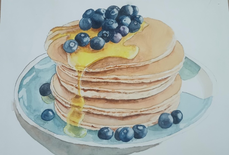
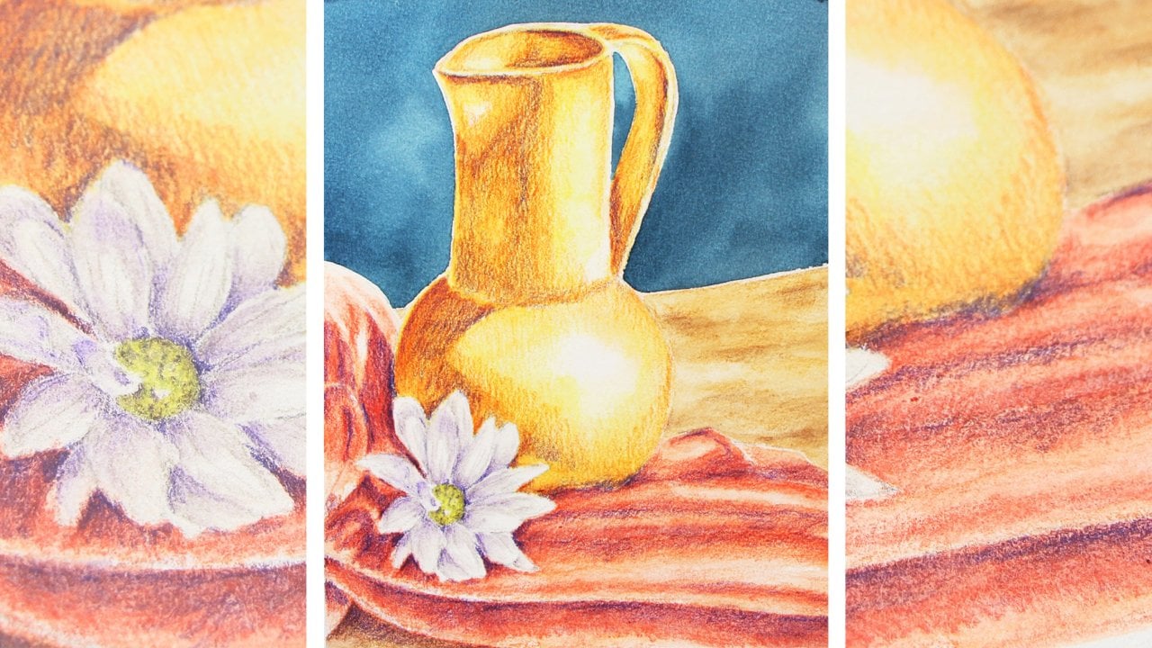
taking you through my entire painting process for this realistic stack of pancakes with blueberries on top that
I painted with watercolor. I've broken up my process into phases and each phase
has its own class. I would consider this
course appropriate for artists who have been painting with watercolor consistently, at least for a few months. And this is because
achieving higher levels of realism really calls for
greater observational skills. More attention to detail, at least a basic understanding
of color mixing, so that you can achieve
that wide range of both value and hue
required for realism. And the process is
going to be much more enjoyable for you and you'll be able to arrive at
better results. You already have a good
understanding of the medium, you have practiced basic washes, and you already
have a good level of water and brush control. If you're just getting
started with watercolor, I would highly recommend
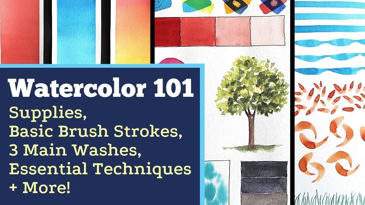
checking out my watercolor one oh one course that is
available here on skill share. That course covers all of
the must know information on watercolor that you should definitely be aware
of as a beginner. And I also provide
essential exercises that will help you progress
your skills faster. I also have a full course on color theory here
on skill share, which I would highly
recommend if you're just getting started with
any painting medium. It is super thorough and it includes everything
that you should know as someone just getting started with color
and color mixing. If you're ready to learn
all about my method for realistic watercolor,
food illustration, and my favorite techniques that help me arrive at
higher levels of realism while maintaining painterly qualities,
let's jump in.
2. Course Project: The end of this course,
you'll have completed a realistic watercolor
illustration of a stack of pancakes
with blueberries on top. I've broken up my
process into six phases, each of which has a
class of its own. This realistic
watercolor illustration was created in two layers, and I'm going to be
explaining all of my favorite watercolor techniques
that allow me to create soft diffused out effects and also sharper
details and how I do my layering in
order to arrive at a believable sensation
of depth and dimension. I explain about the paint
colors that I'm going to be bringing in and the main color mixers that I'm going to be using in order to develop that range of both values
and hues needed for realism. You do not have to use the exact same paint
colors that I'm going to be using to
arrive at great results. I'll be swatching out all of these paint colors on a scrap
piece of paper for you. That you can see what they
look like and replace whatever colors you don't
have with something similar. As I move on through
the painting process, I share must know tips
that help me arrive at realistic results
while maintaining those painterly
qualities that I love. I also provide must
know information to layer watercolor while avoiding overworking
your paintings. All of this is information
that you can take with you to future watercolor pieces that
you may decide to work on. To post a photo of your
work here on Skillshare, all you have to do is click on the Projects and Resources tab. Once you're in, you'll see this purple button on the right
that says submit project. When you click on this button, you'll be taken to a
new page where you'll easily be able to both upload
a photo of your piece, as well as share any thoughts, experiences, struggles or questions that you
might have for me. Here, you can create a
title for your project, and click on that larger
content section underneath. And if you want to add in
that photo at the beginning, you can go ahead and click on that image icon on the bottom. Find the photo that
you're wanting to share on your
computer or device, select that file, click Open, and it will be immediately added into this content section. Then under your image, share anything that you'd
like, whether it's struggles, questions, wins, aha moments that you might have had throughout this course. Anything that you'd
like to share, I always love hearing from you. At the bottom of this
content section, you'll see different icons. One is for formatting your text. The other is to add emojis, the Adimage icon, which
we just talked about, and you can also embed link. Free to add in even more
pictures if you'd like. They can be process
pictures, supply pictures. And over here to the right, we have this preview area
where we essentially see a thumbnail or cover
image for your project. You can go ahead
and change it to a title image that you have created in a more
horizontal format, or you can just go
ahead and leave it as is and have it just be a crop section of one of the images that you have
uploaded into your content area. It's up to you.
Once you're ready, go ahead and scroll back up. Click on the Green Publish
button and you'll be all done. If you'd like to share your
work over on Instagram, please do just make
sure to tag me at Erica Underscore
Lancaster Underscore Art. I love seeing your
work over there and giving students
shoutouts in my stories. Of course, go ahead and tag
the Skillshare account too. It goes a very long way and inspires other students to
share their work as well. Skillshare is a
safe learning space for all of us to continue
growing together. So make sure that you're
using this gallery, and let's all connect
and help each other out. I can't wait to see your work and to help out with
whatever you might need. Let's move on to our next class.
3. Supplies: I'm going to be working on
watercolor paper from arches. This is cold pressed paper. It is 140 pounds in
thickness or in weight, and it is 100% cotton. I did cut off a couple of
sections off my sheet so that I didn't end up with
too much empty space around my illustration. The sheet that you're going
to be seeing me work in is 7.5 " in height
and 10 " in width. I used a total of
six different colors from Windsor and Newton's
professional watercolor line. And these colors were
Windsor, lemon, raw sienna, burnt sienna, Antwerp blue, a lizard, and crimson
and paints gray. As I move forward in
my painting process, I'm going to be swatching
out these colors for you, as well as the main color
mixers that I'm going to be using so that you can see what they look like on paper. And you can just replace
whichever colors you don't have with colors that you do have that are similar to mine. And your painting is
going to turn out great. I brought in a total
of four brushes, but one of those was for my
masking fluid placement, and the other three were for my actual watercolor
painting process. The watercolor brushes that I brought in are all
round brushes, and their sizes were 1,410.3 And the other smaller multimedia
brush that I brought in for my masking fluid placement
was also a round brush. In size one, I used colorless masking fluid
from Windsor and Newton. This is a great masking fluid that I've never had
any issues with. And in terms of my other
painting supplies, I have a container
with clean water, a couple of my blue
scot absorbent towels. I used a roll of regular 1 " masking tape to tape my watercolor paper down
onto my block cutting mat. I always also make sure to have a couple
of scrap pieces of watercolor paper in
order to test out colors and translucencies
or consistencies. And finally, another
thing that you're seeing on screen here is my sheet of tracing paper that I used
for my transferring or my creation of my
preliminary sketch on my watercolor sheet. So for this one, I traced over the photo using
my tracing paper, and then I use that
tracing paper to do my transferring and prepare
my preliminary sketch. It's totally up to you
if you'd like to go with tracing paper or any other
transferring method, but if you're interested
in learning how to use tracing paper for your
transferring process and how to prepare that
preliminary sketch prior to jumping into
your watercolor painting. I have a full class on how
to use tracing paper to do this process in
my watercolor one oh one course that you have available here on skill share. This is one of the
final bonus classes. So if you'd like to learn
how to use tracing paper for your transferring
and the preparation of your preliminary
outline sketch, you can go ahead and
check that one out. All right, and finally, I do want to remind you
that I've made a few downloadables available
along with this course. Which you're going to
be able to find in the Projects and Resources
tab here on Skill Share, right beneath the class videos, you can just click on the Projects and Resources tab below any of
the class videos. Scroll down a tiny
bit and you're going to find a
subtitle that reads, Download Resources This one, I have made my outline
sketch available, so you can actually
trace over my outline sketch instead of
the reference photo, because I always end up
changing a few things. And sometimes it's
just easier to trace over the outline
sketch instead of the photo. But I'm also attaching the high resolution
reference photo so that you can observe
that as you're moving forward with
your painting process, You're also going to be
able to find a couple of photos that I took after
placing my masking fluid. You're going to find a photo
of my finished illustration, which you're free to use as
reference as you're working. And of course the
supply list with the list of colors
that I used as well as links to all of the different items that you're going to be
seeing me used today.
4. Masking Fluid Placement: I'm going to be placing my masking fluid just a
little bit here and there. Mostly in the blueberries, the syrup, and also the plate. For my masking fluid placement. I'm going to be using this very old cheap multimedia brush. This is a size one round. What I'm going to be
doing just so that I'm able to use it for
a little bit longer, is I'm going to be coating my paintbrush bristles with a little bit of
dishwashing soap. Because if I just go into my masking fluid with
my paintbrush bristles, just as they are,
I'm going to ruin this brush and I'm
not going to be able to use it
anymore. All right. My paintbrush bristles
have been coated. I have formed my bristles
into a nice fine tip, and I have removed the
excess dishwashing soap that was just dripping down those paint brush bristles
because I don't want to get too much water into
my masking fluid. And I'm just going to
pour a little bit of this masking fluid from Windsor
and Newton into this lid, which I wouldn't necessarily
recommend using your lid of your masking fluid bottle as a little container because masking fluid dries
very quickly. And it can just make opening the bottle of the masking
fluid difficult for you. Any little plastic lid, anything like that
will do just fine. All right, I'm observing that reference photo
and I'm going to start placing a little bit
of masking fluid at a time, very thin application so
that it can dry quickly in lightest highlight areas
that I see in the syrup. Any highlights in the blueberries
and also in the plate. In the ceramic plate, these highlights are super
important to get in. I will be taking a photo
of my piece after I've placed my masking fluid in case you'd like
to check it out. But right now I'm just observing that reference
photo and I'm just placing it loosely where I
see those highlights there. Now, your highlight
shapes don't have to be exactly the same as you see
them in that reference photo. Sometimes I create
little highlights when those little
sections are not a pure white highlight
but a very light value that is perfectly okay as long as you
don't go overboard. As long as your highlight shapes are irregular and abstract, they are relatively similar to what you're seeing in
that reference photo. In terms of shape,
terms of size, and in terms of location, then you're going to end
up with realistic results. But you can definitely check out that attachment
that I'll be making available for you where I took that photo after placing my
masking fluid after it's been dried and has yellowed a little bit so that you
can see exactly where I placed my masking fluid
in case you are curious. Okay. That top section
I think is good as is. I see a little bit of syrup in this blueberry and
this blueberry, a little strip of syrup
that is dripping down. I have left that out of my
little composition here. I'm also trying
to make sure that my high light shapes are not
super large because that can end up looking very
stark at the end when you remove that
masking fluid and have that large
white shape showing. Of course, you can always
soften the look of that large white high light by just reactivating that paint a little bit with a clean
and slightly damp brush and softening that
look a little. The light is hitting these
pancakes from the right. In general, if you see
the stack of pancakes, most of the lighter values
are along the right side, darker values are
along the left. And you can also tell
in the ceramic plate, there are darker values over
here on the ceramic plate, and there are lighter
values over here. The pancakes are stacked
in a very irregular way. It's hard to tell, but
you can definitely see a darker cast shadow in
the front, over here, right beneath the pancakes
that are covering that light and
impeding that light from hitting the
pancake beneath it. But you can very clearly see the cast shadow on
the lower left, over here in these
bottom blueberries, the cast shadow is always going to be opposite
to the light source. If the cast shadows
are on the lower left. This means that the light
source is on the upper right. When it comes to the
brightest highlights, especially when you only have one single light
source, those lightest, brightest highlights are
going to be on the side where the light is hitting
the objects or the subjects. This is especially easy to tell if there is only
one single light source, if there are multiple
light sources, or it's another
lighting situation where it's just the softer, more diffused light, then the location of a light source may not be as easy to tell. But we have to get
really good at noticing those kinds of things. Because if we don't think
about those things, our value development throughout
the piece may end up not conveying the level
of realism that we're looking for because things
are just not consistent. Over here, the section
of the plate is behind the pancakes and the light is able to reach
that area directly. I can see some
highlights over here. This plate is made up of a
reflective, smooth material. Highlights are also important
in the plate going to be protecting a little bit of this front central lip or
edge of the plate over here, a little bit over here as well. I'm just going to be missing a few little highlights here and there in the blueberries
and I'm going to be all done with
my mascular fluid. All right, so the
blueberries are a little bit more opaque, if you will. But I do want to incorporate just a few little
highlights there. Even though I don't see super bright highlights
in the reference photo, I don't have to add highlights into every
single one of them. But I'm trying to place
the highlight shape in the light side facing
toward the light. All right, that's
it. I don't want to go overboard with
the masking fluid. I think I've placed enough. I'm going to go ahead and pour the remaining masking
fluid back into my bottle. I'm going to close my masking
fluid, nice and tight, and I'm going to
go ahead and wash the bristles of my paint
brush that I was just using so that the
masking fluid doesn't dry there and completely
ruins those bristles. All right. So my
masking fluid has to dry completely before
starting to paint. And you'll know that
your masking fluid is dry once it looks a
little bit yellowish, a yellow transparent film
on your watercolor sheet. At least if you're using
colorless masking fluid, like I am when you first place your masking fluid
on your paper, it looks opaque and milky. And then as it dries, it becomes more
transparent and yellowish. And it stays a little
bit tacky to the touch, but it's no longer sticky.
5. Pancakes + Syrup First Layer: While my masking fluid dries. I'm going to start preparing
my first color mixtures that I'm going to be needing
for the first part of the painting process. And these are the color mixtures that I'm going to be using for the pancake sections
that are free of syrup and also
the syrupy sections. The way that I'm
going to be doing this is I'm going to be painting the sections of pancake that have
the syrup on them, separately from the sections that don't have
any syrup on them. You notice in the reference
photo the syrupy sections, the parts of the pancakes
that are covered in syrup have a different hue, a slightly more
yellowish golden hue. When you compare those
areas to the hue of the other parts of the pancakes that are not covered in syrup, Those other parts of
those pancakes that don't have any syrup on them
are not as yellowish, they don't look as golden, they look more like
a more opaque beige, especially those larger
sections of the pancakes. The side sections are
more of an off white. But what I want you
to notice here, what's most important is notice
that difference in hue or color between the syrup areas
and the non syrup areas, because that is going to inform your choices when it comes
to choosing the colors that you're going to be using in your color mixtures to paint the syrupy areas versus
the non syrupy areas. Both areas, both the syrup areas and the non syrup areas have a variety of values within them and we're going to be
developing those values. It's very important
that we do if we're going for higher
levels of realism, but it all is going to come
down to your color choices. When it comes to the
syrupy sections, I'm going to be
using Windsor Lemon. I'm going to be
developing values in the syrupy sections by adding rawciena into the
lemon yellow racienas, the light Beijie Brown. And I'm going to be using a little bit of burnt sienna in the
syrupy sections as well, so that I can develop a range of values in the syrup areas. When it comes to the sections
with no syrup in them, I'm going to skip
the Windsor Lemon. The first color that
I'm going to be using is the Raciena. I'm going to be
bringing in the burnt sienna as my midtone. And then to develop darker
values and shadow areas, I'm going to be adding in a
teeny tiny bit of pains gray, which is going to
help me create me add a little bit more burnt sienna
so that I can show you. Pains gray plus burnt
sienna is going to create this deep dark
chocolate brown. And I can get it as dark
as I want to make it by just adding a
little bit more pains gray into the mixture. A teeny tiny bit of paints gray so that I can
show you here, you can see how
I'm able to create a very dark chocolate
brown here to help me develop that range
of values that I need for the non syrup areas. Then these are the
colors that I'm going to be using for the syrup areas, Bringing in quite a
bit of Windsor Lemon. So that I can make the hue in those general areas look
different from each other. But that range of values is
important in both areas. You have to have light areas, mid tone areas, and darker
areas in the syrup areas. And then lights, midtones, and darks in the non
syrup areas as well. I'm going to go ahead
and start creating my puddle mixers over
here on my palette. This is plain Windsor lemon
and then this is raw Sienna. Then I need my burk Sienna. Okay, so let's get started. My masking fluid is
completely dry and I have these two paint
brushes on hand. This is a size ten round and
this is a size three round. And I'm just going to be
switching between them depending on the size of the
shape that I'm painting in. For example, this narrow, complex shape over here. It might be helpful to switch to my smaller brush
to paint that in, but for my larger areas, I'm going to stick to using
my size ten round brush. You can just switch between
them as you see fit, making my way from my
lightest color toward my darkest color using
my size ten round brush. I'm going to go ahead and
start painting in this area. Make sure that you're observing
that reference photo and you're painting the sections
that have the syrup in them. I just spring out a
little bit of water from my container and just
using a little bit of water in my brush and just painting in a
little bit of water, softening this bright yellow. And simultaneously, because I'm running my
paintbrush bristles over that area that
I just painted with a little bit of water in
my paintbrush bristles. I am going to be keeping that section wet
for a little bit longer so that I can then
drop in my second color. And I'm going to have those nice soft, diffused out effects, because I'm going
to be dropping in the second color while that
initial color is still wet. Okay, to make my way down here, I haven't even taken more
color from my palette. It was just that first load. Then I've just been using
water in my paintbrush. Taking a little bit more
water, making my way down, pulling that color
all the way down, running my pain bush, bristles over everything a couple of times more before going
in with my next color. You can see how light this color looks because I have
softened it so much with water and have been pulling it down to
cover that entire shape. Now that I have that nice
even sheen throughout this entire first syrup shape, I'm going to go ahead and
take my bit of raw Sienna, which is my next color. I'm going to be dropping in this color in shadow
areas that I see. This is a mid tone, if you will. I'm not trying to
cover up all of that first bright light layer. That's not the case
at all, remember, we're just trying to expand
that range of values. I'm focusing on the little
midtone areas that I see, grabbing a little bit
more raw Sienna right here under the pancakes
where I see a little bit of shadow in those areas. Hey, I don't want to cover up
my bright yellow entirely, so I'm going to
go ahead and take my last color before
allowing this to dry. And I'm just going to be placing the darkest color in the
darkest areas that I see. The little shadows created
by the blueberries. Just keep everything loose. There is no need to
be overly obsessive about getting everything exactly like you see it in
the reference photo. We are going to be darkening certain areas with
a second layer. And that second layer you can go in and create darker
shadow shapes. I've done all of
my initial layer there. That's all I want to do. I have not gone in with
my paintbrush to try and merge things together or soften things or
anything like that. I just dropped in my color confidently and try to leave things be as
much as possible. If at this point in the process, after I've dropped
in all of my colors, if my paint is still
wet and unworkable, and I want to go in to
soften any little textures to help merge my colors together a little bit more
or create softer gradients, anything like that, or
even lift up some color. For example, here, I think this has expanded a
little bit too much. I can use the bristles
of my paint brush as a little absorbent sponge
to do some lifting. I'm going to switch on over to my size three round brush
and I'm going to be doing exactly the same
thing for all of my other smaller syrup sections, starting with my Windsor Lemon. I'm going to do
this section here, This is too bright,
too saturated. I'm going to dip my paint
brush in my container, soften that with just
water in my brush, and pull that color
toward the right, just water in my brush. I'm going to take a little bit more painted in this
section right here. These are smaller shapes. Do your best to stay
on top of water. Control, help yourself
with your absorbent towel. You can just touch
the tip of your paint fresh bristles onto
your absorbent towel to remove that excess water. That's my first layer there. Moving on to the medium color, which is the raw sienna, dropping it into shadow areas
and midtone areas here. Trying to leave certain
little sections where my windsor lemon
is more dominant. I don't want to cover
that windsor lemon up completely because
then I risk there not being enough of a difference in hue between the non syrup sections and
the syrup sections. All right. Moving on
to my last color, which is the burnt sienna. And I notice right there,
the darkest areas are here. Which makes sense because
there are a lot of blueberries blocking that light from
hitting those sections. Just a little bit over here. And that's all I'm
going to do there. I drop in too much. I run the risk of that burnt
sienna covering up too much. Doing a little bit of lifting before allowing
everything to dry. Pressing the bristles
of my brush there, I think I absorbed
way too much color. Looks too light, so I'm
dropping in a little bit more. But at Sienna, I'm going to work on this area over here and then that little, teeny tiny section over here. I remove that darkest brown
from my paint brush bristles. I'm going to go in with
the plain Windsor lemon. Again, just going in
with water in my brush, softening, running
my paint brush bristles over that little
shape a couple of times. Going in with the raw sienna, which is the medium brown, dropping it in, finally going
in with my burnt sienna, which is the darkest
brown that I'm using in the syrup sections. This is a very small shape. That's all I'm going to
do, going into the little, teeny, tiny, syrupy
section right here. Water in my brush painting,
that little area, in going in with some Rosana, so small, doing my
best not to cover up all that Windsor lemon plus
it's in the light side. If I go in with
the darkest brown, I want it to be super minimal. That's enough. That's all
I'm going to do while this. I'm going to create
my color mixers that I'm going to be needing for
the non syrup sections. I'm going to switch on back
to my size ten round brush. As I said, for my
range of hue and value that I'm
going to be needing for my non syrup sections. I'm going to start
with the raw sienna. I'm going to be moving on to the burnt sienna as
my medium color. Then I'm going to be
creating a darker brown, which is going to be a
combo of burnt sienna and a little bit of pains gray and I'm not going to be
using the Winsor lemon. Here's my Burkiena
little puddle. Then over here I'm going
to create the third puddle that I'm going to be using
for the non syrup areas. This is going to have a little
bit of pains gray in it. See how quickly the gray
darken that burt Sienna. I didn't want to
go with that dark, not for this first layer. So I'm just going to add a
little bit more burnt sienna. Create a chocolate brown.
I think that's good. Test out your color mixtures on your scrap pieces of
water color paper. So I'm going to start with this bottom pancake right here. This syrupy section is
almost completely dry, so I shouldn't
have any bleeding. I'm going to keep using my size ten round brush for
these small areas. I'm going to be
painting the top part of the pancake which is
like a lighter brown and a beige brown separate from
the off white side sections. I'm going in with
my first color, which is the raw sienna, using the same technique
that I was using before, where I go in with
this first color and then just go in with water in my paintbrush
to soften the color. Try to make my way
around the blueberries, Going in with just water in
my paint brush to soften that everything is wet here, running my paint brush bristles over everything a
couple of times. Okay, now going in
with my medium color, which is the burnt sienna, I'm primarily dropping in the burnt sienna into the midtone areas and
shadow sections that I see. Notice a little
shadows created by the upper pancake on
this lower pancake. Just let your paint
merge together. Going in with a little
bit of my darkest brown. And I'm just reinforcing the darkest areas nearest
the pancake on top. That's all I'm going to do. For that one, I'm
going to switch to my smaller brush to paint in this little
section over here, my size three round. It's exactly the same process. The tricky thing here is to
not get lost because you can accidentally start painting in a side or an
off white section. Just be careful with that and keep looking at that
reference photo. Okay, first color has been painted in going in
with the medium color, dropping it into the
shadow sections. And then finally,
the darkest color just closest to the
upper pancake there, go in to do any lifting
that you might need to do. If your darkest brown has expanded too much and covered
up that entire section. You can go in with a clean and
slightly damp brush and do some lifting to reveal a little
bit of that paper again. Sometimes if the darkest
color expands too quickly, it's going to eat up all
of those lightest values. And then it's going
to look very flat because you don't have
any lighter values. All right. So I'm just
going to keep making my way up until I
reach the top one. And I'm going to make
sure to skip over that little side section
of the pancakes. I'll be painting that later
that's a lot lighter. And I want to make
sure that I do keep those side sections very light and very different
from the top sections. So I'm just going to change
to my size ten round brush. And I'm just going to keep
making my way through these using the exact
same technique. Start with the section here. What's cool about painting food items that I
love so much is that many of them are very much like painting
organic objects, going in with just
water in my paintbrush. Now they're like organic objects in the sense that
there's a lot of irregularity and
imperfection involved. No, two pancakes are the same. Every single pancake is going to have its own irregularities, its own imperfections going
in with my medium color. Now the same thing happens with fruits
and vegetables and flowers and trees and
clouds and rocks. Going in with my darkest
color now and placing it just in the darkest shadow sections right on top of this shape. Changing on over to my size three round brush going
in with my racist. There's that first
lightest layer going in with my medium color, dropping it along the top of the shape where
there would be shadow going in with
my darkest color. Moving on from there, changing on back to my size ten round brush and I'm going to make a
little bit more of this Siena plus water
mixture because I ran out making sure that my puddles have the
right consistencies. Because as we move on working, we are getting a
little bit more water into our puddles and watering
them down little by little, even if we remove that excess water drippage offer
paint brush bristles. Every time we go
into our container, we are bringing in at
least a teeny tiny bit of water into our mixtures and we're watering them down. So you want to make
sure that you're keeping an eye on your puddles, on your palette and making sure that the consistency is
what you want them to be. Okay, so going in
with my first color, which is the Rosiena, taking a look at that reference
photo and making sure that I understand the shape that I'm going to
be painting in. Going in with just
water in my paintbrush. Going in with my medium color, and then going in with
my darkest color. Using my smaller size
three round brush for this small shape in
the left running, my pain brush bristles
over this shape 23 times, going in with my medium
color burnt sienna, and then going in
with my darkest color which is burnt sienna, plus a bit of pains, gray. Everything is still
wet and workable. If I want to do any softening, any lifting, I can go
ahead and do that. It's going to remove
some of this dark brown that was expanding
a little bit too much into the
lighter value zones. Moving on to the next pancake, I'm going to make a
little bit more of my rowena little puddle here. And going right in. You can see how light
this color looks. I always want to go in
light and translucent or that first layer so that I can build up my
values incrementally. Going in with my medium brown, noticing where the
darkest shadow areas are, and dropping it in
in those areas. Okay. Going in with
my darkest color now. And I'm just going
to be dropping it in to the darkest
areas that I see. Going in to just pull a little bit of this
pigment toward the left, expanding the shape
a little bit. I want to soften edges between
my colors or values and a change to my
smaller brush drop in a little bit more of my darker brown into
this area right here. This little, teeny tiny
section right here is so small and is in shadow, I'm going to go in directly with my medium brown which
is the burnt sienna. And then I'm just going
to place a little bit of my darkest brown here and there. Now onto the final pancake, I'm going to make
sure I have enough of that raw sienna
there. Burnt sienna. Burnt sienna, plus a teeny
tiny bit of pains, gray. Let's work on that last pancake starting with the first color. Take your time. This
is definitely a shape, the largest that
we've painted so far. Take your time with this area. Make sure that you
run your paint brush, bristles over
everything multiple times as you're painting
in that first layer, so that you can keep
things wet for longer. Okay, first layer is done, going to go in with
my burnt sienna. This top pancake has very dark values and it makes sense because
it's the top pancake, there is nothing covering it up. This section over
here especially, is in the light side. Well, I'm not going
to use any of my darkest brown over here. I may use a tiny bit
of it over here, but I'm not going to be using my darkest brown in the section. I'm just going to be developing a very subtle range of values here so that things
are not super flat, but I want to keep things light. That's enough there. That's
all I'm going to do. I'm going to move on to
painting these areas. These are much smaller,
so I'm going to use my smaller brush ross. This is a very small section, I just went in with my first
two colors in that area. And not the darkest one, painting the section
in first color, then just a little bit
of that medium color. Specially here next to the blueberries a little
bit along the edge. Then this other area here will have a tiny bit
of that darkest brown. Because this blueberry right here is creating a little bit of a shadow, keeping things wet. Going in with my medium color, which is the burnt sienna right here next
to the blueberry, a little bit along the edge, a little bit along the
edge of the syrup. And going in with
my darkest brown to create a tiny bit of a shadow shape here along the blueberry
and along the syrup. Cleaning up the edge
here with a clean brush. Now I'm going to be painting in the side sections that I left. I'm going to start at
the bottom so that I can give all of
that chance to dry. All of this here
is completely dry. I shouldn't have any bleeding. Going to be painting
these sections in with my smaller size
three round brush. What I'm going to be doing
for these light sections, for this first layer is I'm
just going to be going in with a down Rawsiena, Wd down. You want to use a
T like consistency so that those
sections can really look like a off white color. If you go in too dark, too saturated, too thick. Even with your raciena, which is very light,
those sections will likely not look off white. They'll look too similar
to the top sections. Make sure you're going in
nice and light watered down. I'm just going to be painting these sections very
quickly, very loosely. I'm not spending very long in these sections at
all like I did with the others because
I'm not really trying to develop that wide of a range of values as I was doing with the tops
of the pancakes. I just want to lay
down a little bit of a hue in a quick way. And then with a second layer, we're going to be darkening certain little sections
here and there. Maybe even dry
brushing a little bit, leaving little specks of
paper shining through. You can see how quickly I'm
moving through this process. I'm not spending too
long in any single area. All right? So this
is the first layer done all throughout
the pancakes, both the syrup areas and
the non syrup areas. Once this strikes completely, we're going to come back and
we're going to be pushing those darkest shadow
sections using the darker and darkest
color mixtures that we have already been using in these
areas in that second layer. When we're pushing
those shadow areas, creating those abstract
regular shadow shapes, that is going to help us kind of define edges a little
bit more here and there. And of course, we're going to be expanding that range of values, which is going to
help make things really pop and look
more realistic. Let's move on to working on the plate and
the blueberries. So this is what my water
is looking like right now. You can see how it looks, kind of orangish, brownish
color, very murky. And because we're going
to be bringing in blues which are complimentary to
orange and the color wheel, it's important that we
use clean water and that we also keep things
organized on our palette. If orange and blue start intermixing because they
are complementary colors, we're going to start creating a brown or desaturated color. For this part of the process, I'm going to be using this section over
here on my palette. So think about how
you're going to keep your colors organized on
your palette as well. That is also
important because if your puddles start
seeping into each other, especially when the colors are very different or
complimentary colors, that can also lead to a muddy
or at least desaturated lo.
6. Blueberries + Plate First Layer: My water has been changed. And I'm going to
talk about what I'm going to be doing with my colors for the blueberries and also for the plate for
my blueberries. I'm going to be
using Antwerp Blue on its own, which
looks like this. I'm also going to be using
a combo of Antwerp Blue and a lizarding crimson to
create a little bit more of a purplish hue. Sometimes I'm going to be using plain Antwerp blue and other times I'm going
to be using a combo of antwarp blue and a lizard
and crimson so that there can be a slight variety
and hue in my blueberries. It's going to make things look a little bit more realistic, but I'm also going to have darker versions of both
my blue and my purple. To develop that range of
values that I need in those small sphere like
structures in the blueberries. I need some darker
values as well. I'm only going to be able to get so dark with these colors. For that, I'm going to be
creating a darker version of both by adding in a little
bit of paints gray into both. For the bluish green
sections in the plate, I'm going to be creating a
color mixture which is anthrop blue and a little bit of sap green for that
bluish green color, it's totally up to you if
you want to make this green, blue turquoise color
mixture more going toward the blue side or more
going toward the green side. It's just a matter of
changing the ratio of your green and blue in
your color mixture and using it in that way. I'm also going to be creating a darker version of
this blue green. Adding a little bit of
paints gray into it, But essentially those
are the main colors and main mixtures that
we're going to be using in the blueberries
and in the plate. Okay, first and foremost, I have my plain anthrop
blue right here. From there, I'm going to create an anthrop blue plus Alizarin crimson
mixture for my purple. This is Alizarin
crimson right here. I want a little bit
more of a blue purple. I'm not going to go too
heavy on the Ellsarine. Little bit more antwrop
blue. All right, cool. I'm going to use anthrop blue with a little bit of pains gray. Tiny bit of pains gray
in my darker sections, in some of my blueberries. And then I'm going to use my anthrop blue
plus a lizard and crimson plus painesray to darken areas of blueberries
that I paint with my purple. Sometimes I'm going to be painting blueberries
with my blue and I'm going to be dropping in a little bit of purple
and vice versa. When it comes to my blue green, I'm going to create a
mixture of anthrop blue. Then add a little
bit of my green, which in my case is sap green. I'm going to add a little
bit of sap green into it and just play with the ratios until you arrive at a blue
green that you like. Think that's good for me. Then I'm going to create
a darker version of that, right beneath it by mixing together Antwerp
blue, sap green. You guessed, it pains gray. As I'm moving along, I am thinking of color
harmony and repeating colors throughout the piece
that is always going to lead to more harmonious,
integrated results. These are the main color
mixers that I'm going to be needing for my
blueberries and my plate. I'm going to be painting the
white sections in the plate. This section right
here, the lip, until I'm going to be using my size 14 round brush to paint the plate because these
are larger areas, just like what I've
been doing so far. I'm first going to
be going in with my lighter color mixer
and I'm going to be painting that in very
similar technique to what I've been using so far. Because I have my, my masking fluid there blocking out the
highlights for me. I don't have to feel like I'm walking on eggshells
trying to protect them. Going back to where I started
running my painperspristles over that area several times, then making my way down
a little bit more. Skipping over the
syrup sections, I can paint the shadow sections that I mapped out
with my pencil, but I don't want to paint
the syrup sections. Okay. Before I make my way down and risk this
drawing on me, I'm going to go ahead and
paint in some darker values in my plate to take some of my
darker blue green mixture. Drop that in and
shadow sections. I'm going to continue
making my way down, making my way around
the syrup part. This I can paint because it's a shadow created by the
blueberry, It's not syrup. And I'm making my way
around the blueberries, going in with just
water in my brush. As I pull a little bit of this pigment out and
toward the right, toward the light section, this is a little bit too light. I'm going to take a
little bit more pigment. I can always remove some of that by doing some
lifting if I need to. But I need to work nice
and quick so that I don't have sharp defined
edges and texture. It's important to get
that color in quickly. The section over here
is also blue green, removing that color from
my pain. Push ples. Now if things are still
wet, workable over here, I can do some lifting in areas of lighter
values that I see. Getting a little bit of pains, gray into this and
dropping it into shadow sections and just
doing a little bit more work. Before this dries, think of shadows created
by the blueberries. Remember that the light
is on the upper right. And also remember that you
are going to be going in with a second layer to darken
the darkest shadows. All right, I'm just
going to quickly create a little
bit more of this. Anthrop blue plus sap green
plus paints, gray mixture. Everything is still wet
and workable because I took my time with
that first layer and also the environment
that you're working in, Whether it's warm, cool, dry, humid, you have a fan
on or heating system on. All of those things
will have an impact on how quickly and how
slowly things dry. Do have that in mind,
Those things change. They vary day by day. Just intensifying the
darker shadow shapes with my darker mixture
here before things dry. That's enough for my first layer just going to go in quickly
to do a little bit of lifting some lighter
areas that I see, where the darker color has maybe expanded a
little bit too much. But I'm being very
loose about this, cleaning up edges
If you want to, it's more than enough
work for the plate. For now, I'm going to start
working on the blueberries. The blueberries are, of
course, much smaller. For those, I'm going to
be using a smaller brush. I'm going back to my size three round and here are my four
color mixtures for that. Lighter blue, darker blue, lighter purple, darker purple. Really the same technique that I've been using for
everything so far. You want to go in
nice and light. Initially, notice how I'm taking my paint from
the edge of my puddle, and I just brought
out a little bit of water into the
puddle to water it down a little bit more because
I don't want to go in super saturated and thick. Because if I do
that, I'm going to be getting rid of
my lighter values, going in with just water
in my paint brush. I want to go in nice and
translucent and water down. Notice how light that is. That's just plain Antwerp blue
that's been watered down. I'm going to go in with
a little bit more of my Antrop blue in a slightly
more saturated state. A little bit of a
thicker state now I'm taking my pigment from
the center of the puddle. Then I go in with
my darkest blue, which has a little bit
of pains gray in it. I'm going to be moving through my blueberries in that same way. First paint in my lighter blue. If you notice that you go in with too much pigment
right off the bat, remove that pigment
from your paint brush, bristles and go in with just a little bit of water
in your paint brush to soften that color. See
how light that is. Then you can go in with your blue in a slightly
more saturated, thicker state to darken
the midtones, so to speak. Then you can go in with
your darkest blue. I'm going to intensify the darks opposite
to the light source. If you want to do any lifting, you can do it while your
paint is still wet. I'm going to be going in with my purples for another
two, same thing. I first take my purple from
the edge of the puddle, going in with just water in my brush and getting
in that nice light, pale first layer so
that I can work toward my darker values and my
deeper shadow sections, taking a little bit
more of my purple from that central section of the puddle that was
a lot of water. These are small shapes. I'm going to remove a little
bit of that pigment from that top star section. I'm going to be painting later. Now, I'm going to go in with my darker purple that has
the paints gray in it. And I'm going to place that
along the bottom edge. Notice which blueberries have that upper little
star section showing. And try to leave
that upper section very light and very translucent. Because we're going to
be painting that later, doing a little bit
of lifting here. Moving on from there, I'm going to paint
another purple one. I'm trying to skip
between my blueberries. I don't want to start
painting one that's right next to another
one that I just painted in because my color
is going to start merging together and I'm not looking
for bleeding right now. I'm going to paint in some
blueberries with both colors, have those colors intermixing. And some of them, there's my first layer painted
in with my Antwerp blue. I'm going to go in
with some purple. I'm going to place my purple
in those darker areas. Then I'm going to take
some of my darker purple and just drop it into
shadow sections that I see trying to leave that upper
little star section light. I'll be painting that later. I'm going to keep moving on like that until I finish painting
all of my blueberries. Feel free to use your
blue, your purple both. What's important
here is that all of your blueberries have
lighter areas, mid tones. And then later on,
we're going to be pushing the darkest darks. This process is really
all about working from light values
toward darker values. What's helping me a ton
here is giving thought to the spherical structure of
these little blueberries. And also really thinking about
how these blueberries are overlapping over each other and creating shadows
on each other. I don't have to get everything
exactly as I see it in the reference photo to arrive at higher
levels of realism. But it is important
to think about the three dimensionality
of whatever it is that you're painting and giving thought to how light
and shadow work. Wherever it makes sense
that there would be shadow, that's where I'm applying
more of my pigment. At making darker, I try to
keep those sections where the light is hitting lighter in value or more
translucent or paler. I'm going to continue
working on this quietly. If some of your blueberries merge together visually
in this first layer, don't worry because
what the second layer you're going to be pushing those darkest shadow
shapes in between your blueberries and that's
going to separate them out. Again, visually doing a little bit of lifting here for
this paint dries and here trying to develop at least a
little bit of a range of values in all of my blueberries. And trying to keep that
little star section if it's showing very, very light and translucent. Making sure that when I create more of my
different color mixtures, I take the color that
I have planned to use, not accidentally bring in another blue that could make things look
a little bit off. At the end, we start using a different blue or
a different red. For the purple, I had a
little bit of bleeding, so I went in with a slightly
damp brush to absorb some of that paint that started merging into my
previous blueberry. Sometimes I think blueberries are dry but they're really not completely Get a little
bit of bleeding happening. Water color is always going to expand when paper is
wet, remember that? Okay, I'm almost done with
these blueberries up top. Little, teeny tiny sections of blueberries showing
behind this one. So I just painted
them all at once. See this bleeding spot here? I'm just going to go
over that again with a clean brush and you can see how I was left with a little
bit of a splotch there. I'll fix that later
with my second layer. If I try to fix that right now, I'm just going to
get more bleeding and it's going to
look like a mess. It's very important that when you're working with water color, you just know when to stop and when to allow that paper
to dry completely. Fix little mistakes
like that with another layer layer is in. Take a little bit of my purple, drop it in here and there. Then going in with my dark blue, then dropping that dark blue
in dark shadow sections. I'm going to be working on
the bottom blueberries first. I'm going to make more of my color mixtures that I
was just using because I'm running out plain anthrop
blue blue plus pains grey. My purple which is a mixture of anthrop blue and
Alizarin crimson. And then right beneath it, anthrop blue plus Alizarin
crimson plus pains gray. With my size three
round brush on hand, I'm going to go ahead and use the exact same technique that I was using for the
top blueberries. In these bottom ones, lightest color, midtone, darkest color, it's a little bit too dark. I'm going in and lifting, I'm skipping a few so that
I can give that a chance to dry Antwerp Blue in a slightly more saturated state. In Antwerp blue paints gray. I can paint this one
here because these are separated by a little
masking fluid shape. My color is not going
to merge together. I'm going to use some
purple in this one. Darker purple going in with
some purple over here. Painting in that
light, first layer, light and translucent, going in with a little
bit more purple. Adding it into the
mid tones purple, and adding it into the
darkest darks that I see, deep, darkest shadow areas. If you need to do any lifting, you can go ahead and do that. Okay. Making my way back. Going in with my blue, this one is pretty dark because it's behind
the stack of pancakes. I need to paint in that
little syrup section there. I'll do that in just
a bit darker blue. It has the paints gray in it, going in with purple. Now,
just painting in some color, then just going in
with a little bit of water to soften that color. Going in with more purple, creating a little
bit of a midtone, darker purple that has
the paints gray in it, Cleaning up the
edges a little here, I went out of that
blueberry shape a little. I'm going to use
my absorbent towel and just do a little
bit of lifting, pressing down my
absorbent towel along the edge where I had
that bleeding happening. And I'm just going
to leave that be because that paper around
the blueberry is still damp. And if I start
placing more color, it's just going to
keep expanding and getting into that blue green. I'm going to leave
it as it is for now and I'm going
to fix it later. Going in with some blue Finish up my blueberries over here. Plain antp blue. A little bit of a
heavier consistency. And then darker
Antwerp blue lift here where I see the star. Where I want to paint a
little bit more detail later. Then I have this one here that is peeping out from behind. This other one
that I had already painted need very little
paint in that area. I need very little
paint here because it's a very small shape. I got to stay on top of
water control there. I'm going to see
if I can place a little bit more purple here. Right now, this blueberry
here is looking very flat because I had to
absorb a lot of that paint. I'm just going to paint
a little bit more, Soften the edge a little
and I'll leave it. All right. I finished with that first layer in
all of my blueberries. The next thing that
I'm going to do is I'm going to add
a little bit of a very light gray in the
white sections of my plate. I can't leave those white
sections flat white because it's going to lead to flatteness and not much realism. So what I'm going
to do, I'm going to use some pines gray and
I'm just going to add pines gray quite
a bit of it into this blue green mixture
so that it looks primarily like a pines
gray with maybe a little, teeny tiny bit of
blue green in it. These sections are white. When you're painting white
things with water color, whether it's animals or objects, you really want to
make sure that you're using your color in a very, very watered down state
because we're incorporating the whiteness of the paper to help us create
that white color. If we paint
everything with gray, it's going to look
like a gray thing. Like a gray object,
fur or gray feathers or whatever the case may be. You want to be
careful with going in super light and water
down a T like consistency. And we're not going
to be covering up all of the paper in that area. We're going to leave plenty of that paper shining through. Observe that reference photo and notice where the grays are. I'm going to use my
size 14 round brush because it's going to help
me go in loose and quick. That is a little bit too blue. I'm adding a little
bit more paints, gray into the mixture. Watering it down right
here next to the lip, I see a little bit of a gray. I'm going to remove that color from my paint brush bristles. And I'm going to go in and
soften that gray quite a bit, while it's still
wet to create a bit of a curved look here. That's mainly where
I'm placing the gray. And I'm leaving all of this
section just free of color. Notice how light
that gray looks. If you want to drop in a
little bit more while that is still wet, you
can drop it in. But take it slowly and
incrementally toward your darker colors if
you're going to be darkening areas
in white objects. Now, this section
right here is also in shadow because those are the planes of the plate
opposite to the light. I also want to get a little
bit of a gray in that area. Just paint that in moving from my paint brush bristles, removing that excess water
by dabbing my paintbrush on my absorbent towel and softening this color,
cleaning up edges. I'm going to drop in a
tiny bit more of my gray, especially because these are bottom planes of the plate that are facing away
from the light, so I can go in a little
bit more liberally. Finally, I'm going
to be painting in the top lip of the plate, very similarly to how I did with the side sections of the pancakes using my
size three round brush. And I'm going to
be leaving lots of that white paper shining
through unpainted. And I'm just going
to be going in with very watered down blue
gray that I just created. And just painting that in
very quickly, very loosely. Starting at the left, there is masking fluid
along the lip here, which is covering up
plenty of that paper for me. That's it. Before moving forward, I'm
just going to quickly paint in that little syrup
section that I forgot to paint in before I did change my water because it was like
a very grayish blue color. So I didn't want that to affect my vibrancy of my colors that I'm going to be using for
the syrup section here. Even though this syrup section
is very much in shadow, I do want it to be visible. I'm using the same
sequence of colors that I was using for my
other syrup sections. First going in with my Windsor
lemon bit of raw Sienna, which is my next color. And then finally, I
need some burnt Sienna.
7. Pancakes + Syrup Second Layer: We are officially done
with the first layer. All throughout the piece. That was a lot more time consuming than the things that we're going
to be doing next. Because essentially
in the beginning, you're painting larger areas. The general larger areas
is what you're painting. And then as you move forward, your shapes or areas that
you're painting get smaller and smaller because you're really just painting in
the shadow shapes. What I'm going to be
moving on to doing now is I'm going to be pushing
the darkest shadow shapes in the syrup because we're
going to be focusing on pushing the darker midtones
and the darkest darks. I'm really just
going to be using my darker colors that I
created for the area on hand. When it comes to the syrup, the darker colors
that I was using were the raw sienna
and the burnt sienna. That's why I created
more of those two. Back to my size
three round brush, starting with the syrup. I'm going in with
my medium color first painting in that abstract
irregular shadow shape, similar to what I see in
that reference photo. Then if I feel I need to, I drop in some of
my burnt sienna, which is the darker
color that I was using into certain areas
to darken them even more, softening the edge there. I'm first painting in
the raw sienna shapes and then I go in with some of my bert sienna
into the darker areas. But I'm really
trying to stay away from the look of outlines. And I don't want
to darken things that don't need to
be darkened anymore. Sometimes I just need to
go in with the raw sienna softening the edge here. Because I'm painting
on dry paper now, I'm being left with hard defined edges around these shapes that
I'm painting in. If I ever want to go
in and soften an edge, make it look less stark, I just remove that paint
from my paintbrush bristles, and go in with a cleaner, slightly damp paintbrush and run my paintbrush bristles over that edge that I'm
looking to soften. Think of the volume here
created by the syrup. You can see how by adding in a little bit of a darker
value here along the edge, I raised the syrup and
gave it a sense of volume. All right, I'm
making my way down. First going in with
the raw sienna. Then the burnt sienna, trying to intensify the
shadows here behind the syrup. Removing that paint
from my paint brush, bristles and softening the edge. There's a couple of dark spots
in this part of the syrup, so I'm going to go in
with my dark brown that I created for the non
syrup sections. Is a mixture of burnt
sienna and pains gray. And I'm going to be dropping in a little bit of this color into those areas just
because they're very dark. In that photo, I use that dark brown in between the pancakes where
there would be shadow. This is important because we're able to see
through the syrup, so we would be able to see those shadow areas in
between these pancakes. You can also use the darker
color, especially down here. That's enough. That is it. I don't want to go too dark
in the syrup sections. Okay. So now I'm going
to work on creating some shadow sections in the non syrup parts
of the pancakes. The colors that I was using for these areas are my raw sienna, burnt sienna, and burnt
sienna plus pains gray. But I'm just going to be
using these two now because I'm just working on midtones
and darkness darks. I'm going to go in with the lighter color
of the two first, starting with this
one at the bottom. You can see this as
going in and reinforcing those deep mid tone areas and
the deepest shadow areas. The second layer, I'm not trying to cover up the
lighter value areas, I'm just pushing those
darker value areas really seeing these shapes that I
am painting in as abstract, irregular shadow
shapes softening the edge and then I'm going to go in with
my darkest brown. It has the paints gray in it. I don't want my dark brown
to look super gray because that might lead
to a burnt effect and I don't want
this to look burnt. Do make sure that your
dark color mixture looks like a dark
brown and not a gray. Essentially, you're painting in your medium color to intensify that darkest
shadow section. And then you're softening
the lower edge. Then you're just dropping in the darkest brown
along the top edge. That's that burnt sienna in. I remove that burnt sienna
from my paint brush bristles softening the
lower edge and going in with my darker brown to just
darken that upper section. I'm just going to continue
moving forward in that way, Siena, first abstract
irregular shadow shape disappears right around there. Remove that paint from my paint. Brush, bristles,
soften the lower edge. Take a little bit of
my darker brown and place just a little
bit here and there to intensify the shadows
nearest the pancake on top can intensify some
shadows over here as well. Burt Siena. First
soften the edge, go in with a bit of
the darker brown, just here and there,
and move on to the next paint in
that shadow shape. With the medium color
soften, the lower edge, go in with the darkest color, go in with the medium color. Notice how abstract
my shadow shapes are and drop in a little
bit of the darkest color. Getting to work on the next painting in my
shadow shape first with the medium color
disappears over here. Soften that, soften the edge, dropping in a little
bit of my darker brown. This looks very dark in
that reference photo. That little section
on the left is small, so I can just go
in with a darker brown to paint in very little, teeny tiny shadow
shapes. And that's it. All right. The top pancake is very much the
lightest one of all. It's nearest the light. I don't want to go super
dark in that one. I'm going to add a
little bit of shadow. Here under the blob of syrup, to create a little bit
of a shadow effect. And again, raise to give
it more of a raised look. Create a little bit more of a
believable sense of volume. Okay, painted in
those shadow shapes, softening the lower edge. You don't have to
soften everything, but if you feel that
your shadow shapes are way too stark looking, then it might be worth
softening them just a bit. Dropped in a little bit of a
darker brown here and there. Over here, I'm going
to create a little bit of a shadow here. I'm going to add a little bit of my darkest brown right here. I know that this is
a syrup portion, but this is very dark. And it makes sense because
of all the blueberries here, they are creating a
shadow in this area. So I did allow myself to go
in with my darker brown here, even though it's a syrup part. All right. So I'm just seeing everything as a whole right now, noticing if anything needs
to be darkened a little. That's just a tiny bit of burnt
sienna in the syrup here. It's a little bit too dark. Softening that a bit. I'm just softening
this. This looks a little bit too stark to me, placing a little bit of burnt
sienna here at the bottom. All right, when it comes to these lighter off white
sections on the sides, I'm just going to be darkening a little bit of that strip. I don't know what to call it, but doughnuts have that as well. You can almost see like
a shape or a line here. And I did map it out in pencil, but all I'm going to do is I'm going to add a little bit of burnt sienna into
my yellow ochre that I had to use
for those areas. I'm going to just, in a very irregular way, create that illusion
of that line. I don't want to call it a
line because it's actually like a long irregular shape. Here's a little bit
of Bert Sienna. But see these more as long
irregular shapes than lines because if you just
go in and paint a line going in with a little bit of Bert Sienna
here to darken some sections, you just go in and paint a line. It's going to look
very unnatural. It's always important
that you see these as abstract, irregular
shadow shapes. If you're looking for more of
a believable look paint in that lightest color
and then just drop in a little bit of the
medium color here and there. Notice how these shapes
that I'm painting in are thicker in
some sections and then more narrow
in others that I'm just darkening certain sections
with the darker brown. Hey, going in with my
darkest brown and just creating very small
final shapes here and there inside of those
long lighter shapes to develop a little bit
of a range of values.
8. Blueberries + Plate Second Layer: I'm going back to my
blues and purples. I'm going to change my water. What I was doing before
was I was going in with my first two color mixtures in a very water down
translucent state. And then I used my first
two color mixtures once again in a less
water down state. And then I went in with
these two when it comes to developing the darker midtones and darkest darks
in the blueberries, I'm going to be going right
in with these two in more of a coffee like consistency
instead of a tea consistency. And then I'm going to create
my darkest darks with these two that have the
paints gray in them. Size three round brush, start with a purple one painting in the shadow shape and
adding a little bit of detail into the
little star section on top of the blueberry. Removing that from my
paint brush, bristles, softening edges of
the shadow shape. Not so much the star area, I'm going to leave it at
that. My darker color started eating up my lighter
color, way too much. I'm just doing a little bit
of lifting when it comes to painting in the detail for those star parts in
these blueberries, the ones that are showing
this section more. So thinking of painting in
the shadow shapes created by these triangular sections
that are sticking out. It's not about going in and
painting a perfect star. It's about thinking what
darker value shapes would be created by those little
triangular sections that are sticking out. You're painting those
little shadow shapes or little darker value shapes. Not all of these blueberries
are going to need a second layer
softening the edge. Going in with my darker blue, soften and lift. Going back to my purples. You'll fred to zoom into
the reference photo. Some of these blueberries have this circular hole showing. And you can see that in
that reference photo, which is opposite to the little star section on the opposite
side of the sphere. That's what I'm painting
in right there, going in with the darker purple, dropping it right in shadows, softening the edge,
dropping in a little bit of the darker purple lifting here. I'm going to have to paint in
the little star section and this one a little bit later
because everything is way, way too wet for me
to start painting. Sharper detail, lifting some more to soften this, dropping in some of my
darker blue lifting and softening and trying
to keep the paint from covering up those
lighter value areas that are already there. We're just looking to push those darker shadow
shapes and to create a little bit more of voluminous
little sphere effect. Okay, I'm trying to create an shadow shape to help me convey the little star at
the top of this blueberry. When it comes to this detail that we are able to see in
some of these blueberries, try to acknowledge those shapes as just abstract shadow shapes. We're not going in and
painting the, the little star. You're able to communicate that. It is that section just
by painting in shapes of different values for
those blueberries that do show that
little section. I might have to go in
with a third layer to just those teeny
tiny shadow shapes in those little star sections. But I'm going to have to do that later after everything dries. Going in with blue, softening, darker blue and back
to my medium blue to create little abstract shapes right there at the
top of the blueberry. I'm going to leave it
at that. Let it dry, Soften that, go in with my darker purple up in the edge. Okay, I paint in
little shapes for this star on top of this one that I wasn't able to paint in before because
everything was so wet. I don't want to paint a
perfect star or anything. It's a lot better if it ends up being a
little bit imperfect. Reinforcing the darkest starks, taking some of my darker
blue, dropping it in here. This looks a little bit
too perfect for me. I'm just going to go
in and soften some of these triangular shapes
that I painted in make them look a little bit
more imperfect. And I'm going to
keep moving forward. The detail in these blueberries detail and
shadow shapes, I should say, try to skip a few. When you're done
with one, try to skip to another section. Because if you don't, you're going to run
the risk of having your colors merge together. This is the one where I had that little splotch
incident before. With this layering that
I'm doing right now, no one is going to see that soften here a little
and I'm going to soften this darker color with the pains gray. Drop it in, see a little bit of that
star at the top. In this one I'm just going to do very irregular shapes there to help me convey
that little section there. This one over here. I
don't think I need to develop darker values because
it's very much in light. But I do just want to create
little, teeny tiny shapes. Because I do see
that little star, dark little star section there. I see very dark
values right here in the blueberries that
are behind these. I'm just going to darken
that area with my dark blue. It's just a matter of giving
thought to what blueberries are overlapping
other blueberries and darkening shadow areas
where it would make sense. I also see some dark
values right here. I'm just going to
go into some of these little star sections and darken here and there with
one of my darkest colors. Whether it's the darkest blue or the darkest purple that
have the paints gray in it. And I'm just going in
and loosely darkening some little shapes inside of the shapes that
I've already created. I don't want to do
anything else because if I continue pushing those darkest
values and those details, I can end up with something
that looks very overworked. So I'm just going to go ahead and finish my detail
in the bottom, blueberries softening the edge. And going in with my darker blue that has
the paints gray in it Just made a little bit more
of my blueberry color mix Here I continue my blueberries
here at the bottom, painting in those shadow shapes and a little bit of detail
in that little star shape, softening the edge and dropping in a little bit more
of one of my darker colors. Softening darker color
opposite to the light, back to my medium purple. This was the blueberry I was
having trouble with before. For this one over here, I really just need to go in
with my darker blue that has the pains gray in it because it's in shadow.
It's pretty dark. I do need to darken
some little sections in that syrup beneath it so that the light is a
little bit more consistent. There we will be removing the masking
fluid in just a bit. Just going into dark
and little sections. These star shapes improve the shape. In this one was a
little bit off before. With the second layer, you can really fix edges, define things a little bit more. Just don't do it
through using outlines. Do it through abstract
shapes of different values. Softening the shape a little bit here with a clean and
slightly damp brush. To finish up the
spottom section, I'm just going to create a little bit more shadow
shapes on the plate itself. I'm creating my blue green, very similar to what
I was using before. Adding a tiny bit of
paints gray into it. Going in with my larger brush, I'm just darkening
certain sections. I want to push a
little bit more. I'm going to soften that edge. The clean, a
slightly damp brush. This blueberry right here has quite a shadow in
that reference photo. Just going to add it in. I'm going to add in a
little bit more paints, gray into my mixture. To darken it a little
bit more, drop it in, darken the shadow right
here under the pancakes, removing that from
my paint brush, bristles going in and softening anything
that I feel looks a little bit too stark,
softening edges. And continuing with
the shadow shapes with my dark blue
green color mixture. Shadow shapes created
by the blueberries on the plate as well as the
pancakes on the plate. You don't need to
soften all the edges, but if you do want to
soften some edges, you can go ahead and
do that in know, a little bit more of my dark
blue green right there, Just a tiny bit here and here. I'm going to leave those shadows sharp and defined like that. Finally, I'm going to add a
little bit more of my paints, gray into my blue green mixture. And I'm just going to paint
in some shadow shapes on these planes
that are opposite to the light where
there would be shadow. Removing that paint from
my paint brush bristles. Notice I painted in a
smaller shadow shape over that larger
lighter gray shape. I'm going to fix that little
section of syrup there, going to make it a
little bit darker. Need some of my burnt sienna and maybe even a little bit of
burnt sienna plus pains gray. Because that section is
very much in shadow. Even though I
wasn't really using my darkest brown for my syrup. That section is very much in shadow because I want to keep
the lighting consistent. It just makes sense that I prepare a little bit
of that as well. All right. That's
the burnt sienna, soften edges going in
with my darkest brown. There it is. I love a little, teeny tiny section of plain Windsor lemon
shining through.
9. Removing Masking Fluid + Final Details: I'm going to go ahead
and start removing the masking fluid from this
upper section over here. Give the bottom section a little bit more of
a chance to dry. I'm just going to be using my thumb to remove
my masking fluid. But if you have sensitive
skin, sensitive hands, you can always use a rubber cement pickup
or even a clean, soft graphite eraser to
remove your masking fluid. Make sure everything
is completely dry and that your hands
are very clean. If you're going to
be using your hands, your masking fluid should
come off relatively easily. You shouldn't have
to rub super hard. All of my masking fluid
has been removed. My water has been
changed one last time. In this last phase, I'm really looking at
a few things at once. I am looking at
everything as a whole, as a complete composition. And I want to make sure that as a whole, everything makes sense. Everything has the
level of finish and detail and contrast
that I want it to have. Nothing looks unfinished. And there are essentially a
few things that I'm doing. If there's anything that
needs to be darkened, if I need to push the
contrast in those deepest, darkest shadow areas anywhere throughout the piece, I
go ahead and do that. If I need to soften or make highlight
shapes that are very stark and white and distracting a little bit
smaller or a little bit softer. I go ahead and do
that by going in with some gentle scrubbing with the cleanest,
slightly damp brush. Or by going in and painting
in some very light, translucent color to make
the high light shape a little bit smaller if
there are any edges. Sharp defined edges around shapes that I need to
soften a little bit. I go in with a clean
and slightly damp brush and do gentle scrubbing
along those edges. If there are any areas that look a little bit too flat and I feel like I need to
develop a little bit more of a mid tone
or a darkest dark. I go ahead and use my different color
mixtures to do that. First thing that I'm going
to do is I'm going to go ahead and soften some of
my high light shapes. I'm using my size
ten round brush and with just a clean
and slightly damp brush, go in and do some
gentle scrubbing in those highlight shapes
to soften them a little. Do your scrubbing gently and know when to
stop because you can certainly start damaging your water color paper and
there is no taking that back. By going in, you
should be able to activate that color
at least a little bit by activating that color and pushing it and
pulling it into those high light shapes
that should help you make them look a little bit
softer and not as stark. Just make sure that
you're working first on the syrup sections. The blueberries, You
don't want to be going in and scrubbing syrup sections
with blue in your paint. That's the syrup
sections done there. I removed that yellow from my paint brush bristles
and I'm now going into the blueberries and
softening a bit there. Going in and softening some high light
sections in the plate. Gently scrubbing with a clean
and slightly damp brush. One of the key differences
between water color and other painting mediums
is that water color can get reactivated even
after it has dried. We can use that
to our advantage, softening some
irregular edges here. All right, just to finish up, I'm going to be darkening little sections all
throughout the piece. I'm just going to be using the same colors that I've
been using in each element. Cleaning this edge
up just a little. Just to finish up,
I'm going to be darkening little shapes
all throughout the piece. Pushing those final, deepest, darkest sections, maybe just adding a little bit more detail. I'm just going to be
using the same colors that I've been using all along. Darkest versions, wherever it
makes sense, less is more. In this last part
of the process, we really don't want to
start overworking the piece. I'm always interested in
arriving at a certain level of realism while maintaining
painterly qualities at a certain level of looseness. Going in with my darkest brown. One last time. Bert
Siena Pains Gray. As I'm painting in these dark shadow shapes
in between my pancakes. With this darker
brown I am making sure that I'm not going
in and creating lines. Certain sections of
these shapes are wider and others
are more narrow. At some points they're
not even touching. I'm making sure to only push those darker values where I see them in that
reference photo. Darkening a little section here first with
the burnt sienna, then with the darker brown
it has the panes gray in it. I didn't like how that high
light shape looked there. A little bit of raw sienna, the edge of that blueberry there going in with a little bit of burnt
sienna right here, create a little bit more
definition along the edge of that syrup so that we can
see it a little bit better. Sometimes we can
define shapes not by painting the shape itself, but by painting a
shadow along it. Just going to be
adding a little bit of a shape with my burnt sienna along some of the
edges of my pancakes. I'm going to add a little
bit of a shadow shape here inside the syrup, where I see dark
shadow shapes through the syrup so that there
is a continuation. The very last thing
that I'm going to do is a quick right wash of color that I'm going to
be adding in the syrup. I'm going to go back
to my Windsor lemon, make a little puddle here, and we're looking for
a tea consistency. It's pretty watery.
And I'm just going to use this in a very
water down state. I'm using my size 14
round brush, by the way. I'm just going to
loosely go over the syrup section
again, very loosely. I'm not really trying
to fill the shape in, I'm just going over
certain sections to brighten this color. And this is a glaze that is really going to
help the syrup come to life and help make the hue brighter and different
from the hue around it. In those sections with
no syrup in them, I'm going to be adding a few
little shapes and marks in these off white sections With just the tip of my smallest
brush, my size three. I'm just dragging my brush, creating a little bit
of a little dots, little marks so that they are
not super smooth looking. And with that, we're all done.
10. Thank you: You made it to this point. Congratulations, I really hope that you enjoyed this course and that you learned a lot
of new things that you can take with you
to future artwork. Don't forget to share your work over on the Projects
and Resources tab. I can't wait to see it.
And to help you out with any questions that you might have or feedback
that you might need. Don't forget to follow me
here on skill share because I have lots of new courses coming down the
pipeline for you. And also make sure to check
out everything that I'm making available over
on my Youtube channel, Instagram, and over
on my website. Because every single
week I am sharing free, helpful resources for artists. Thank you so very much for
joining me on this one. I wish you a wonderful
rest of your day. Enjoy your art practice
and see you soon.
 Erika Lancaster, Watercolor + Sketching + Artist Mindset