Transcripts
1. Introduction + Welcome: Painting food with watercolor
is not only super fun, but it also helps you develop essential skills such
as color mixing, painting different
kinds of textures, and also simplifying
complex structures in order to shade them
more effectively. So if you'd like to
hone your skills in any of these key areas, or you simply enjoy painting
food as much as I do, this course is for
you. Hey, everyone. My name is Erika, and I'm a traditional media
artist working with a range of drawing
and painting mediums. My day to day life revolves around creating and selling art, as well as sharing
helpful resources with beginner and intermediate
artists looking to grow, which I share over
on my website, my YouTube channel, and, of course, my membership site. I have over 15
years of experience working in creative
and artistic fields, first as a graphic designer, and then I worked
as head art teacher in a school environment
for many years. After some time working as
art teacher on a local level, decided to take my message
to the online space to be able to help more
people all over the world, and I've been growing
my online business for the last six years. It's been absolutely amazing to be able to reach more people, and I am very passionate about continuing to grow
as an artist myself, as well as continuing to encourage and guide
others so that they too can enjoy all of the beautiful things that pursuing an artistic
path can bring. In this course, I
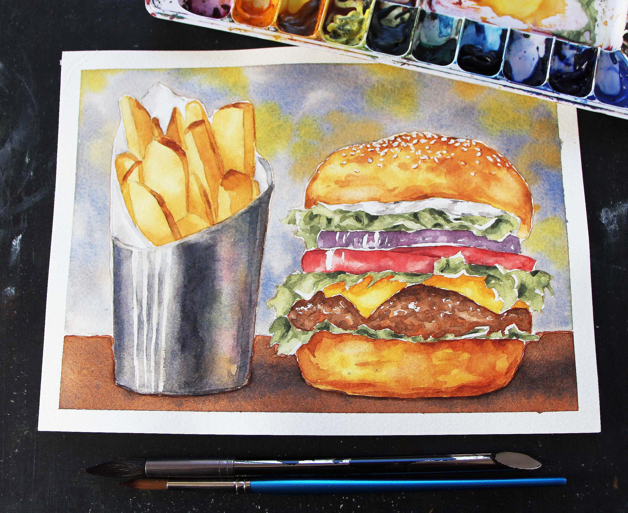
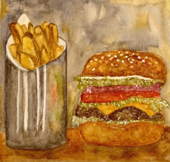
take you through my entire painting process step by for a realistic watercolor
food illustration piece, which features a delicious
juicy burger and crispy fries. I share my favorite
techniques and explain how it is exactly that I layer
watercolor in order to arrive at a level
of realism that I enjoy while keeping
things painterly and simultaneously making
sure that I'm arriving at that beautiful
watercolor glow at the end. Throughout this course,
we not only practice foundational watercolor
techniques such as wet-on-wet wet-on-dry
and layering for depth, but we take it a
step further onto more challenging
topics and techniques, such as bringing in
masking fluid to help us protect small shapes
and complex highlights. We paint a metallic
object with reflections, and throughout this course, we're really focusing on developing that wide
range of values or tones needed for
realistic results from lights to mid
tones to darkest darks, which really involves using our observational skills
observing that reference photo so that we can do
our best to recreate those value or tonal
relationships in our painting. If you're new to watercolor, I would highly
recommend checking out my watercolor one oh one
course here on Skillshare, where I share must
know information on this medium that
makes it different from other painting mediums
and also provide essential exercises
that will help you start developing your
water and brush control. Aside from that, I have
other more beginner friendly watercolor courses
available for you here, which will help you
build essential skills so that you can tackle something like this with more confidence and
greater success. I would recommend this
burger and fries course to artists who have been working with watercolor for
some amount of time. Maybe you consider
yourself to be intermediate or more advanced. You have a certain
level of water and brush control developed, and you have practice
with basic washes. Let's go ahead and jump into our next class where
I'm going to be explaining about
the course project that we're going to be
working on together.
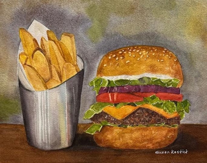
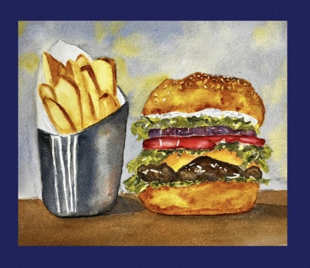
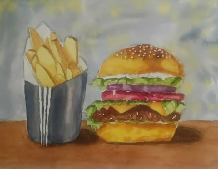
2. Course Project: By the end of this course,
you'll have completed a realistic watercolor
food illustration piece, which features a delicious
juicy burger and crispy fries. As you move through
these classes, you're going to be
gaining so many tools and tips that will help you tackle future food paintings with greater ease and enjoyment. I've broken up my painting
process into phases, each of which has its own class. I want to encourage you to take your time with each phase. Spend as long as you
need to with each video, going back to certain parts
of the video as needed, you may decide to watch the
entire class video to see how I move through that phase and then go back
and follow along, but spend as long as you need to with each video before
moving on to the next and make sure
that you're allowing each layer to dry
before working over. Included a class in
the beginning where I swatch out all of my
paint colors that I'm going to be bringing
in on a scrap piece of watercolor paper so that you can see what they
look like on paper. And I also offer
alternatives or substitutes in case you don't have that specific paint color
so that this way, you can set yourself
up for success. I've prepared a set of
downloadable files, which you're going to
be able to find in the Projects and Resources tab right below any
of the class videos. Simply click on this tab, scroll down a little bit, and you're going to
find a section that is titled Download Resources. Click on any file that
you wish to download and it will be saved onto
your computer or device. You're going to find the outline sketch that I have
prepared for you, which is what I would
recommend tracing over and transferring onto
your watercolor sheet. You'll also find the high
resolution reference photo of this burger and fries, which is what I would recommend observing as you're
moving forward with the painting process so that
you can see changes in color and value or tone also texters as you're moving
forward with your layering. You'll find a photo that I
took after having placed my masking fluid
in case you'd like to use it as reference as
you're placing your own, a photo of my finished painting, which you're free to
use as reference as you're working and
your supply checklist, which includes the list of colors that I'm going
to be bringing in. To post a photo of your
work here on Skillshare, all you have to do is click on the Projects and Resources tab. Once you're in, you'll see this purple button on the right
that says submit project. When you click on this button, you'll be taken to a
new page where you'll easily be able to both upload
a photo of your piece, as well as share any thoughts, experiences, struggles or questions that you
might have for me. Here, you can create a title for your project and click on that larger content
section underneath. And if you want to add in
that photo at the beginning, you can go ahead and click on that image icon on the bottom. Find the photo that
you're wanting to share on your
computer or device, select that file, click open, and it will be immediately added into this content section. Then under your image, share anything that you'd
like, whether it's struggles, questions, wins, aha moments that you might have had throughout this course. Anything that you'd
like to share, I always love hearing from you. At the bottom of this
content section, you'll see different icons. One is for formatting your text. The other is to add Emojis, the Adimage icon, which
we just talked about, and you can also embed link. Free to add in even more
pictures if you'd like. They can be process
pictures, supply pictures. And over here to the right, we have this preview area
where we essentially see a thumbnail or cover
image for your project. You can go ahead
and change it to a title image that you have created in a more
horizontal format. Or you can just go
ahead and leave it as is and have it just be a cropped section of
one of the images that you have uploaded into your
content area. It's up to you. Once you're ready, go
ahead and scroll back up. Click on the green
Publish button, and you'll be all done. If you'd like to share your
work over on Instagram, please do make sure to tag me at Erika Underscore
Lancaster Underscore Art. I love seeing your
work over there and giving students
shoutouts in my stories. And, of course, go ahead and tag the Skillshare account, too. It goes a very long way and inspires other students
to share their work as. Skillshare is a
safe learning space for all of us to continue
growing together. So make sure that you're
using this gallery, and let's all connect
and help each other out. I can't wait to see your work and to help out with
whatever you might need. Let's move on to our next class.
3. Supplies: I'm going to be working on
a sheet of cold pressed, 140 pound or 300 GSM
watercolor sheet, and this is 100% cotton. It is very important
that you use watercolor paper that is suitable for the techniques that we're going
to be bringing in. We're going to be doing
plenty of layering, and we're also going to be
bringing in masking fluid, as well as scrubbing. So make sure that you're using
quality watercolor paper. The size of the watercolor
sheet that you're going to see me
work in is exactly 10.1 " in height
times 7.4 " in width. I'm going to be using
my watercolor set that includes paint from both Windsor Newton's
Professional line, as well as a few
from Daniel Smith. I'm going to be using a total
of nine different colors, and these colors are new
gamboge, raw sienna, lemon yellow nickel titanate, burnt sienna, undersea green, French ultramarine, cadmium red, Alzarin crimson,
and Prussian blue. You do not need to use the exact same colors that
I'm going to be using. I'm going to be sweatching out all of these colors for you on a scrap piece of
watercolor paper and offering some alternatives before we get started with the
painting process so that you can
replace whichever you don't have with
something that is similar. I brought in a total of eight different brushes
throughout this process, a size six mop brush
for larger washes, four rounds in sizes 14, eight, six, and zero. A size eight scrubber brush. Don't worry if you
don't have one. For a very long time, I simply used a stiffer
bristled round brush to do any scrubbing
that I might need to do along the way.
So that's fine. And I also brought
in a couple of extra multimedia
cheaper brushes for my masking fluid
placement and to have on hand for
extra scrubbing. Placed my masking fluid with
a size zero round brush, and it was just a
cheaper old brush that I had in my studio. I would never
recommend using one of your good watercolor brushes or any brush that you really enjoy to place your masking fluid. I will explain what I do to keep my paintbrush
bristles protected. I use a brush with
masking fluid, but no matter what
protective method it is that you use over time, your bristles will become
more and more damaged. And this is why I always place my masking fluid with
alternative tools, such as toothpicks or wooden skewers or
an old toothbrush. But whenever I have
to place it with more precision and I
need to use a brush, it is very handy to have older, cheaper brushes
on hand, as well. Have my container with
clean water on hand. You're, of course,
always free to use two or even three
containers if you don't want to have to change
your water as often. You can use one
container to rinse out your paintbrush
bristles and another to bring out water
into your mixtures. Or for any of those techniques where you need cleaner water, I have a few of my blue
Scot absorbent towels, which is what I use to stay
on top of water control. You can always use any type of towel or even regular
kitchen paper towels, but it is very important
to have them on hand. I really enjoy these because these towels are
thin and untextured, so I can go in and
do blotting and lifting if I need
to along the way, and I won't be left with splotchiness and
texture on my painting. Have a few scrap pieces
of watercolor paper on hand to test out colors and
consistencies along the way. I'm using colorless masking fluid from Windsor and Newton. I have my 1 " masking tape. This is what I use to tape my watercolor paper down
onto my black cutting mat. If you're nervous that removing your masking tape at the end might damage your
watercolor sheet. A little tip that I can
provide is run your pieces of tape over your clothes a couple of times before
you tape it down. Order to weaken that adhesive, and that'll make it a lot less
likely that you'll damage your watercolor paper at
the end when you remove it. I'm taping my watercolor paper
down onto my cutting mat, which is flexible, and
I wouldn't necessarily recommend using a cutting
mat as a backing board. It is way more helpful
to use a sturdier, stiffer backing
board when you're painting with watercolor
so that you can do any tilting or rotating as you go in order to
keep the process more comfortable for you and
maybe even use gravity to your advantage when
you're working on larger washes, especially. Because I am filming on a flat horizontal
surface and I can't really be moving my piece around when I am filming a tutorial, it doesn't really make much
of a difference to me. But when I am working on
personal watercolor pieces, I do use a stiffer board. For this one,
because I knew that the painting process
was going to take a long time
in and of itself, I traced over my
reference photo, and I like using tracing
paper for tracing and transferring and
preparing my outline sketch on my watercolor sheet, but you're free to use whichever transferring method you prefer, whether it's carbon paper or a light box or anything
else that you enjoy. I would recommend tracing over my outline sketch that
I am providing for you as opposed to the
reference photo to make the transferring process easier
and more straightforward. However, I am also attaching the high resolution
reference photo, which is what I would recommend observing as you are actually painting so that you can see color changes and values
and also textures. If you're interested
in learning how to use tracing paper for your
transferring and exactly what I do to prepare my
preliminary sketch before getting started with a watercolor painting process, I would recommend checking out my watercolor one oh one
course here on Skillshare because I've included
a bonus class at the end where I share my
entire process step by step, and I provide lots of tips. Supplies that I am sharing here, which are an HB and
a two B pencil, as well as a soft
graphite eraser and a kneadable eraser were used during the tracing and
transferring process. Go ahead and collect
your supplies, download the files that I'm
making available for you in the projects and resources tab and see you in
the next class.
4. Swatching Colors: I'm going to use a total of nine different colors
for this painting. I'll be swetching all
of these colors out for you right here and we'll
be providing alternatives. In case you don't have these
specific paint colors, you can just use something
that is similar. The first color that
I'm going to be swetching out for
you is new gamboge. New gamboge is a warm
yellow, looks like this. If you don't have new gamboge, you can use Indian yellow, nickel azo yellow,
cadmium yellow deep, Hansa yellow deep,
or any warm yellow. The next color that
I'm going to be swatching out for
you is raw sienna, which is a very light, neutral, beige golden brown neutral
which looks like this. If you don't have raw sienna, you can use yellow ochre, Mars yellow, yellow oxide, or anything similar to that. The next color that I'm going
to be swatching out for you is lemon yellow nickel titanate. It's a cool yellow,
which looks like this. And I do want to mention
that I didn't really like this lemon yellow
nickel titanate because it's pretty opaque, and it really mutes down the greens that I'm going to
be creating in my lettuce. We're going to be adding
this cool yellow into our greens to create lighter greens for the lighter
values in the lettuce. And any traditional
lemon yellow is likely going to help you
arrive at more vibrant, colorful looking greens than the ones that
I'm going to be creating because of this
yellow that I am using. If you don't have lemon yellow, you can use any
cool yellow such as Henza yellow light or
cadmium yellow light. The next color that
I'm going to be swetching out for
you is burnt sienna, which is a warm reddish
brown. It looks like this. If you don't have Burnt Sienna, you can use red ochre,
quinacrodon, burnt orange. The next color that I'm going
to be swetching out for you is undersea green
from Daniel Smith. Undersea green is a
pretty dark rich, deep, mossy natural
looking green. It's also considered
a warm green. If you don't have
undersea green, you can use olive green, sap green, or anything
similar to that. The next color that
I'm going to be swetching out here
is a zarine crimson, which is a cool red,
and it looks like this. If you don't have
a zarine crimson, you can use permanent Alizarin, Pyl crimson, permanent
parmine or any cool red. Moving on from there,
this next color that I'm going to be swetching
out is cadmium red, which is a warm red. It looks like this
and I'm going to be using it for the tomato slices. If you don't have this red, you can use Pyl scarlet, scarlet lake, vermilion,
or any warm red. And finally, we're also
bringing in two blues, a warm blue and a cool blue. This blue right here is French ultramarine
from Windsor Newton. French ultramarine
is a warmer blue and it's very similar to
traditional ultramarine blue. The only reason why I have French ultramarine
is because that's what they had at the
art supply store when I went to buy my colors. But usually I just have
traditional ultramarine blue in my palette as my warm blue. Ultramarine blue is
super versatile. I love it for creating grays and also for
darkening browns, which is what we're
going to be doing with this one in this painting. If you don't have
French ultramarine, traditional ultramarine, ultramarine deep,
ultramarine finest, ultramarine permanent, anything like that will do just fine. And if you absolutely don't
have ultramarine blue, you could also use cobalt blue. And finally, here
is Prussian blue, which is a cool blue. We're going to be mixing
together Prussian blue and a zarine crimson to create
our purple for our onion. If you don't have Prussian blue, any cool blue will do just fine, whether it'sTo blue, green
shade or anything like that. All right? And that is
it for our paint colors.
5. Applying Masking Fluid: Let's get started with
the first step in this process in which
we're going to be placing a little bit of
masking fluid here and there for some
textures for keeping some important highlight
shapes protected throughout the process and
little things here and there. I know that in the
reference photo, we don't really have any
sesame seeds on the bread. I want to bring in
some sesame seeds because I just think that it'll add a little bit of extra texture and
intrast to the piece. Another thing that I'm
going to be masking out are some important highlights
here in the metal. It is very important to create
those bright highlights in metallic surfaces because
of their smooth nature. I'm also going to be masking out some little edges and
highlights here and there, especially throughout
the lettuce and in the onion and the tomato. So what I have with
me right here is a very small size
zero round brush. And this is a cheap
multimedia brush that I use for masking
fluid placement. I would never recommend using your favorite watercolor
brushes to place your masking fluid
because masking fluid is liquid latex and it will damage
those bristles over time, even if you do what I did here, which is coat your bristles with some sort of washing soap, liquid hand soap,
something like that. Coat your bristles
with that soap, and it will protect them
to a certain extent. But even with that
extra protection, the bristles will become
damaged over time. I'm going to pour
a little bit of this masking fluid
into this lid. This is colorless masking
fluid from Windsor and Newton. I would not recommend
using the lid of your masking fluid
bottle to pour your masking fluid
into because it will dry along the edges and make
your bottle more difficult. Open. So if you have any
other small container to pour your masking fluid into, I would recommend
using something else. I'm going to start
with the sesame seeds and I'm just going to
take a little bit of this masking fluid at
a time and I'm going to create little shapes
just here and there. Especially in the top
part of the bread. I have variety in mind when I am masking out these
little teeny tiny shapes. Variety in terms of how these shapes are rotating
or placed on the bread. Also in terms of how they
are clustering together, you definitely don't want
to have any patterns or place them in a
very organized way because it's not going to
end up looking natural. I have added the
sesame seed shapes and also the major highlights in the metallic cup on the left
in your outline drawing. So all you have to
do is fill those in. And I know that it's hard to see where I'm placing
my masking fluid in this video because I am
using colorless masking fluid. But in the resources that I am making
available for you as downloads that you're
going to be able to find in the projects
and resources tab, you'll find this photo that I took after having placed
my masking fluid, where I have enhanced
that yellow look. This way, you can
more easily see exactly where I have
placed my masking fluid, and you can use that photo as reference as you're placing
your own if you wish to. Angle your paintbrush
in different ways, sometimes press down
a little bit more, sometimes a little bit less. It will help you
create a nice variety in those little shapes. I want to play some along the upper edge of
the bread as well, right over my pencil line. Just a few more sparse ones, sparse sesame seeds coming
down the bread shape. Take a little bit
of masking fluid at a time. That's enough. Now I'm going to go
ahead and just mask out some little shapes
in the mayonnaise. These will be the
brightest highlights. I'm just making little
shapes here and there, abstract,
irregular shape, similar to what I
see in the photo, but I'm not trying to create a carbon copy of the reference
photo. This is a painting. It's an interpretation. As long as I am masking out a few highlight shapes
in the mayonnaise, because when we paint
that off white color, we want to make sure that
we are bringing in a lot of that paper as part of the piece
and leaving it uncovered. I also see a highlight shape in the tomato. I'm
going to mask that out. A larger one and then
a smaller one over here just a few little
highlight shapes in the onion as well, thinner shapes in the onion. Not all of the light
values that you see are actual
bright highlights. Most of the light values
that you see are actually a very light version of the color and not a
bright highlight. Do you have that in mind? You don't have to mask out every single light value shape. Here I see a teeny, tiny highlight along the
upper edge of the onion. I do want to make sure to stay away from the look of outlines. If you just go in and trace around a shape
with your masking fluid, when you remove it, you're
going to end up with a white outline all
around that shape, and that's not going
to look very natural. So avoid outlines when you're looking for
realistic results. Mask that out. I'm going to do just a few little markings with my masking fluid randomly here and there
throughout the meat. These little highlights in the meat are going to help me
create that texture there. Less is more, there
is no need to go overboard and make sure that the highlight shapes that you're creating in
the meat are very, very small, almost like teeny tiny specs
of masking fluid. Sometimes it even
helps to splay out your bristles and just go in with a bit of
a scribbling motion. The last thing that
I'm going to do for the burger here in terms of my masking fluid placement is, I'm just going to go over some edges of my
lettuce shapes here. Because there is so much overlapping with
the lettuce leaves, the shapes created by
the lettuce are so complex by just masking out
a few edges here and there, I can simplify the
process for myself and I can better understand
what I am painting. Just a few little edges here
and there, don't overdo it. We're not trying to leave a white outline around the
lettuce or anything like that. I'm just masking out
some little edges to help simplify the
painting process for myself. We want to keep our
highlight shapes small. And when it comes to the metal, we have these bright
highlight shapes that we have to make sure to add in so that we can create
that metallic look. I've added these shapes
to your outline drawing, but I have to sketch them in. Make sure that you're
applying your masking fluid in thin layers so
that it dries faster. And I'm just going to
mask these shapes out. My shapes are a little bit different from
those in the photo. Throughout this
painting process, you're going to hear me
mention the words abstract, irregular shapes
again and again as I am continuing to develop
my layering and my realism. And with this, what I'm referring to are
simply shapes that are loosely painted that have
irregularity throughout them, that have wider areas
and more narrow areas. When we're developing realism, noticing those different
value shapes which are abstract and irregular
is very important, so that we can make those
happen in our painting. It's by recreating
those abstract, irregular value
shapes, light shapes, midtone shapes, and darkest
shapes that we see in our reference photos that we're able to achieve higher
levels of realism. But stay away from blocky, solid geometric shapes,
stay away from outlines, stay away from patterns
or very perfect drawn out shapes and keep coming back to this idea that what you're
painting are abstract shapes. And as long as those shapes, their location and their size is similar to that in the photo, you're going to achieve
realistic results, especially if you
have in mind that what you're painting
is three dimensional, and it is being affected by
light in the environment, which creates lighter areas
and darker areas and shadows. Going to do a little
bit of an edge here right above the highlights. With that, we're all done
with the masking fluid. I'm going to pour the rest of this masking fluid
back into the bottle. I'm going to go rinse
out these bristles and we'll allow
everything to dry for at least ten
to 15 minutes and then we can get started
with the painting process.
6. Bread + Fries First Layer: The first thing that we're
going to be painting is the first layer in the bread. I'm going to be
using new gamboge for my lightest brightest color. You make a little puddle of plain new gamboge right
there on my palate. Raw sienna is going to be my next color getting
into the neutrals here. Then for this first layer, I'm also going to be bringing
in some burnt sienna. Burnt sienna is a
medium, reddish brown. In this layer, what
I'm trying to do is create my lightest values
in the bread. There you go. I have my little puddles of color that I'm going to be
using for this first layer, new gamboge, raw
sienna, burnt sienna. I'm going to start
with the lightest color and then I'm going to add a little bit of this into this, that I'm
going to use this, that I'm going to add a
little bit of this into this to create a nice range of values from lightest values and starting to get into the mid
tones in this first layer. Now, if you observe
the reference photo, the light is hitting the hamburger and the
fries from the left. Notice how the highlights in
the metal are on the left. Most of the lighter values, even in the French fries and in the buns and even the highlights in the onions and the tomato, they are to the left
of these structures. I want you to have
that light position or location in mind as you're
developing your values throughout all of these
different elements in the still life
arrangement because keeping the lighting consistent is essential for any
level of realism. I'm going to be using my size
14 round brush for this. I think it's appropriate
for this size. I'm going to go in
with a T consistency of my first lightest color, which for me is
the new gamboche, T consistency, very water down. With this first color, I'm going to start
right here and I'm just trying to develop a flat pale layer of color
all throughout this bun here. Painting over all of this shape. And adding my paintbrush pitles
over everything more than once because I know that if I just go
over everything once, make my way from left to right or whatever
the case may be, by the time I make my way
across to the opposite edge, that first section is
already going to be try. You want to keep coming back to that area
where you started to re wet that and
then pull that paint, take a little bit more water, take a little bit more
paint if you need to, and fill in that entire shape. I'm going to make
my way down over here because this is B as well. Right? Work on that
until you have that nice pale color and you see a nice even sheen all
throughout the bun shape. Because what you want to do next is you want to
start developing that value range in this area by bringing
in your other colors. I'm going in with
the raw sienna now, more of a coffee consistency this time and you
can even create a bridge color by adding a little bit of your first
color for me the new gamboge, add it into your first neutral, which is the raw sienna. In this way, there's not a big jump from one
color to the next. I'm starting to drop in this midtone where I see mid tones in that
reference photo. We were already observing how the light is hitting the
objects from the left. This means that overall, when I see this at the end, I want lighter
values on the left, darker values on the right, add a little bit more raw
sienna into my puddle here. I'm getting a little bit darker and a little
bit darker at a time. I do want some irregularity
even in this light area, so I do want to drop in some of my light is neutral there to create some
irregularity in the bun. I know that by the end after
I've developed my layers, I'm going to have
more dark values on the right and lighter
values overall on the left. So now I'm going to go ahead and start using my third color. Again, you can add
a little bit of your middle color into the
dark discolor that you're using in this layer
if you're afraid to just develop too much
contrast right off the bat. This is not about creating a carbon copy of the
reference photo. Yes, we are considering the three dimensionality of what it is that we're painting, but we're not trying to create a carbon copy of
the reference photo. Great. See how I've managed
to develop a nice range of values and values ultimately are what makes something
look realistic. So it is essential
that you plan for the colors that are going
to allow you to develop that range of values
before jumping in. Otherwise, you're going to be scrambling and trying
to decide on how you're going to be developing
your values as you go and
things are going to start trying on you and I really want soft effects in
this first layer. Things are still wet
and workable for me because I took my time with
that first palss layer. So if I wanted to, I
could continue developing my range of values and continue developing those
darker mid tones. By this point, I can go in with almost plain burnt sienna and drop it into little sections where I'm looking to
push the contrast, create a little bit more of
a toasted look in the bread. Sometimes I'm just touching the tip of my brush to my paper, creating little
teeny tiny blooms. If you want to go back to
a previous color, you can, but you do have
to make sure that your paper is still
wet and workable. You don't want to
continue dropping in color if your paper is already starting to dry in certain sections because
you can create back runs. If you do go into dark too fast, go in to do some lifting with the clean and only slightly damp bristles of
your paintbrush, or you could even go in
with your absorbent towel, do a little bit of
blotting in that area. I'm going to do the exact same
thing in the bottom bread, starting with the new
gamboge and making my way gradually toward
the burnt Siena. Go to start with my T
consistency new gamboge, I'm going to fill the entire
shape in, take your time. Go back to where you started, re wet that area and
just make sure that the color is nice and pale. T consistency yellow. Going back to where I
started, re wetting gently. Making sure that I have
some irregularity right here along the upper edge where the lettuce
is going to be. I see that nice even sheen
and that pale yellow. Now I'm going in with a sienna
plus just a little bit of that new gamboge and dropping in this color
and shadow areas that I see in the photo, taking clues from the
photo but not trying to create an exact replica
of what I'm seeing, allowing the paint to do its thing and not
overly blending or trying to manipulate
the paint too much. Maybe add a little bit more of your raw sienna before going
in with the burnt sienna. It's all about getting
those transitions. You can see how I have nice soft effects because I've
been working wet into wet, dropping in my colors while
the paint is still wet. Going in with my raw
sienna plus burnt sienna. Now I really want to focus
on those shadow areas. Here I'm thinking
of how the lettuce is creating a shadow on the bun. Darker values on the right. Maybe just a little bit
of a mid tone here. Notice how I have some
little sections where just the plain u gamboge is
shining through uncovered. That's exactly what I want. Improve the shape
of the bun here. Now I'm adding more burnt
sienna into the mixer, going in with a thicker
version of the burnt sienna and darkening some areas even more while the
paint is still wet. Adding some shadows making some sections look a
little bit toasty. Maybe adding a little sense of irregularity
throughout the bread. By making little blooms. To create a bloom,
all you have to do is touch the tip of your
paintbrush to your paper, allow a little bit of
that paint to flow down the bristles onto wet paint and that's going to
create a little bloom. So that is it for the
first layer in the bread. We need to allow that to dry. In the meantime, let's switch to working
on something else. For the fries, we're
going to be using almost the same colors
as we use in the bread. But the fries, I'm going to tackle a little bit differently. We're going to be painting the first layer in
all of them at once, and then it's not until the second and the
third layer that we actually tackle those fries individually and
separate them visually. I'm going to add a
little bit more of my plain ugamboge
onto my palette here. And I want to go in once
again with a t consistency. I'm going to take a little
bit of this new gamboge, pretty water down right here
from the edge of my puddle, and I'm just going to paint
all of these fries at once. All of them together. Make sure that you don't paint the paper accidentally
because we want those paper shapes that we're able to see to look whitish, if you start painting yellow in those shapes so we want
to make look white, they won't look white anymore. Running my paintbrush crystals
over everything again so that the entire shape stays
wet for a little bit longer. When you see that even
sheen with that pale color, I remove that color from my
paintbrush bristles and I go in with raw sienna plus a
little bit of new gamboge. My aim here is really to just start developing a
bit of a range of values in the fries
I'm bringing to mind the three dimensional structure of fries even at this point. Because I am painting all
of the fries together, I am not trying to develop those darker mid tones and
darkest darks just yet. I'm going to leave the values in my fries pretty
light at this point, lighter than what
I used over here. I want some areas with just the plain gamboge
shining through. Other areas where it looks
more like a raw sienna, a bit of a lighter mid tone, remove that color from
my paintbrush crystals, remove that excess water, and then I'm just
going in finally with a mixture of burnt
sienna and raw sienna. Don't want to go too dark. Dropping in this color where
shadow areas would be, maybe where the
most toasted areas are as well in the fries. I'm just trying to develop a bit of a range of values here. Don't want to go too dark. We'll separate these out
later for the second layer. That's more than enough. I'm going to just clean
up some edges here.
7. Meat + Metal Cup First Layer: For the meat, we're going to be repeating the burnt sienna and we're going to be adding ultramarine blue into
the burnt sienna. Here's some plain burnt sienna and then over here
right beside this, I'm going to create a second
puddle of burnt sienna. The second puddle is going to be darkened with some
ultramarine blue. I'm adding a little bit of
my ultramarine blue into the burnt sienna until I get a darker brown, a
chocolatey brown. Shift and change the ratios of these colors in your mixture until you get a
chocolatey brown. You can even test out your color on a scrap piece of
watercolor paper. I'm going to use my size
eight round brush and the process is going to be very similar to what
we've been doing so far. We're going to go in with the first color in a
pretty water down state, like a T consistency. If you need to add more
water into your puddle, I would advise adding water
into one of the edges of your puddle and then
taking your paint from there. Process is the same. I'm going to go in
with this first color, which is the plain Bird sienna, paint in the entire
shape of that meat, making sure that I'm not
painting lettuce or cheese. I don't want browns
in the cheese. Then once we have that
palest first layer in, we're going to develop those
darker values incrementally by first going in with a more thick version of
my plain Bird sienna, and then I'm going
to start going in with my darker brown, which is the burnt sienna
with the ultramarine. Let's go right in. Remember to make your way down a little bit
toward the right. If you're right handed
or toward the left, if you're left handed, come back to where you
started and re wet. Make your way down
a little bit more. Come back to rewet. Make your way down a little
bit more and come back. Try to keep a irregular edge along the bottom there
where the lettuce is you'll likely notice that I changed the lettuce
shapes a little bit. If you go into dark, you can stop what you're doing, do a couple of dips in your container of water to
remove some of that paint from your paintbrush bristles and
just go in to smooth things out and soften things out with
more water in your brush. Just make sure that
you're not going in with too much water because you can certainly start
disturbing that paint, and that is how you arrive at these shapes that look like
they have an outline to them, a darker outline because
you're dropping in too much water and
it's pushing the paint out toward the edges. It's all about water control, and the only way to get good at that
is by painting a lot. All right. I'm just going in over everything one last time, making sure that I have
a nice even sheen. A nice irregular edge
along the bottom. Can see how pale
the color looks. That's what I want
for that first layer, a pale flat looking color, a nice even glistening, adding a little bit more of my burnt sienna into the puddle, thicken it up a little bit, observing that reference photo, bringing to mind the three dimensionality of
what it is that I'm painting, curves,
nooks, crannies. Where is their
overlapping taking place? Where is the lettuce
creating a shadow? And that is where
you start to darken. So we do see pretty dark
values in the meat, but that does not mean that we can skip over creating
the lighter values. Lighter values and darker
values in that range is absolutely necessary
everywhere throughout your piece if you're going
for realistic results. See how I'm just touching the tip of my brush to
my paper sometimes, creating little blooms that helps convey that meat texture. Going in with my darker
version of my brown now, which has the
ultramarine blue in it. Always thinking of taking
steps toward my darkest values incrementally and
touching the tip of my paintbrush to my paper, especially in the
dark shadow areas. What are the areas that
I want to make lighter? What are the areas that
I want to make darker? Trying not to cover
up my first layer completely and keeping my
lighter values in some areas. Gonna go a little
bit darker now. I like my meat well done. I don't want my meat to look super red and bloody
or anything like that, but I do want to create
a nice range of values. Okay, I'm gonna go a
little bit darker now. Burnt sienna, adding even
more ultramarine blue. Much darker this time. Things are still wet and
workable in that meat shape, so I can go in and
continue pushing values. But all I am doing here is
continuing to place more of my darkest brown over my lighter brown layer
while it's still wet. I'm making sure not
to overly cover up that first layer
because I do want to keep some lighter
values in some areas, and I don't want the meat
to look burnt either. Here I'm doing a
little bit of lifting before allowing
everything to dry by using the clean and only
slightly damp bristles of my paintbrush as a
little absorbent sponge, lifting up some excess color, especially in those meat
areas nearest the light, continuing to bring to mind the three dimensional
structure and the curves of this meat patty
and continuing to give it structure
by developing lights, mid tones, and darks. Until I've arrived at
a nice range of values that I think is good
for this layer. Alright, that's great. I'm going to leave that alone,
allow that to dry. In the meantime, let's work on the first layer in a metal. I made sure to change my water before working on the metal. For our gray
throughout the metal, we're going to be using
the same combination that we were just
using in the meat, which is burnt sienna
and ultramarine blue. However, we want
to add even more ultramarine into the brown
until we get a gray. Aside from that gray, we also need to prepare some other colors that are
reflected on the metal. You notice in the
reference photo, we see a little bit of red
created by the tomato slices, also a little bit
of green created by the lettuce and a little
bit of beiges and browns, which are the bread
reflected on the metal. We need to prepare
those colors as well, have those ready to go because
we're going to be dropping those other colors into the
gray while it is still wet. It is very important that when you drop in those other colors, the reflections on the metal, that the gray is still
wet because we don't want those other color shapes
to be sharp and defined. We want those edges to be soft. Let's go ahead and prepare
the colors that we need first, starting
with my gray, starting with the Bergsiena plus ultramarine blue mixture, a good amount of each color
until I arrive at a gray. Right now, I am going for a pretty water down
color mixer, tea, the coffee consistency, still looks a little
bit brown to me, so I'm going to add
a little bit more ultramarine blue,
test that again. That looks more gray to me. I'll leave it at that, remove that gray from my
paintbrush crystals, remove that excess water. Go to add a little bit of
my cadmium red right here, which is the color that
I'm going to be using for the tomato slices, warm red. And creating a little bit of my green that I'm going to
be using for the lettuce, which is undersea green. Maybe I add in a
little bit of my lemon yellow just because
my undersea green is pretty dark as is. Depends on the green
that you're using. You might be able to go
in with just your plain green or you can go in with
a bit of a lighter green, which we're also going to
be using in the lettuce, which is your base green plus a little bit of
your lemon yellow. And then aside from that, I'm going to prepare
a little bit of my raw sienna here with a
little bit of burnt sienna. Get a color that is similar to what I was using
in the bread before. So I have those three
colors that I'm going to be using
for the reflections. Now we can go right in
the water down version of our gray because we're using ultramarine, which
is granulating, it's likely that
you're going to see some separation happen
in your puddle and also some separation happening when the gray is drying
on your paper that is normal and it's a beautiful effect that is going to add interest
to the piece, going in with water down gray
and my size 14 round brush. I'm going to start painting in that first lightest layer
all throughout the metal. And because I have protected those highlights
with masking fluid, I don't have to
worry about those. Dipping my brush
in my container, softening the gray a little
bit of water in my brush, running my paintbrush bristles over everything a few times. As with everything else that
we've been painting so far, my aim with this first
layer is to create a flat light gray that I'm
going to be building on. I want this to be pale, so I'm using water down color. Once I have that
nice pale color, I'm going to start building
up some gray values. Make sure that you
have a nice even sheen and once you do, add a little bit
more ultramarine blue and a little bit more
burnt sienna into the mix, that it close to the gray
that you were just using. You can test out your color
mixture on a scrap piece of watercolor paper.
Looks pretty close. I'm now going in with a
bit of a thicker mixture. This is, I would say more of a coffee consistency
and I'm going to drop in this darker gray in darker areas that I see
there in the reference. And right along the edge. I see a bit of a darker gray
and along the side here. I want to work quickly
because I still have to drop in my other colors
for my reflections. If you want to do any lifting before dropping in
your other colors, if you feel you've
gone a little bit too dark, can do some lifting. Remove that gray from
my painbush bristles, remove that excess water. I'm now going in with a bit
of my red coffee consistency, dropping in some red. Remove that red from my
pain brush bristles, remove that excess water, taking some of my undersea
green plus a tiny bit of the lemon yellow,
dropping it in there. Getting a little bit
more undersea green, dropping it in,
intensifying the green. Finally, I'm going
in with some of my raw sienna plus burnt sienna. Trying to create a bit of a sense of that
reflection there. I'm going to change to a bit of a smaller brush here while
things are still wet. This is a size six round brush. I'm just going to clean
up my edges a little bit here before allowing
everything to dry. When you drop in
your other colors for your reflections here, you don't want to
overblend because you can end up with muddy results
if you start overblending. Cleaning up my
edges a little bit here. Little bit of lifting. Little bit of lifting
and softening here. A little bit of lifting. I'm going to allow that to dry. I do have a little
section of metal right here behind the paper. I'm going to use my size six round brush and my same
color mixture over here, starting with a relatively watered down version of my gray. I'm just going to paint that in. So very small shape. I am helping myself with my absorbent towel taking a
little bit more of my gray, dropping it in, just
trying to create a bit of a range of values even
in that very small area. Right now, this inner plane here is connecting visually with the outer planes of
this tapered cylinder. I will be separating them out.
8. Tomato, Onion + Cheese First Layer: Let's move on to
painting the first layer in the onion and
the tomato slices. I am going to clean out
a bit of a section here. You don't have to do this, but I do have to keep things as organized as possible for these tutorials
that I'm filming. But if you have an extra palette area that you can create
these colors in, which is clean, go ahead
and use that clean section. Here's more of my cadmium red. Then for the onion, I'm going to mix together a azarin crimson and a
bit of Prussian blue. The nice bright purple. Can test out your purple
on a scrap piece of paper. And add more water into it so that you can see
what it looks like in its most diluted state so that you can have a better
understanding of that color. I will be adding a little bit of my ultramarine blue into
the cadmium red for those slightly darker
red values in the tomato and to develop slightly
darker values in the onion, I simply add a little
bit more Prussian blue into the purple mixture. I'm going to continue using my size six round
brush going in with a very diluted cadmium red
initially, T consistency. And I'm just going to paint
the tomatoes separately, starting with a very
pale cadmium red. Notice how sometimes I'm
dipping my paintbrush in my container to re wet those bristles and
soften the color, especially in this first layer. Once you have that
first palless layer in, take more of that warm red
now from the center of your puddle and we're just going to darken certain
sections in that tomato. So now I'm going to
add a little bit of my ultramarine
blue into the red, darken it a little
bit, not too much. And I'm just going to pop in
a bit of a darker red value, especially in shadow areas where there would be a
little bit of a shadow. If you go too dark, just add a little bit more of
your red into the mixture, make it a little bit lighter and just soften the
look of that red. As long as the
paint is still wet, you can go in and soften. I'm going to wait just a
little bit longer to paint this tomato slice because if I go in and paint
that right now, this paint, which is still a
little bit wet is going to bleed into that new shape or this paint is going to
bleed into this shape. For this one, I don't
want any bleeding. I'm going to leave that
alone for just a bit. Things are dry enough. I'm going to do the same
thing for the other tomato, starting with my very
water down cadmium red. If there's any extra little highlight that
you want to leave, you can go ahead and leave a little section unpainted as you're painting
that first layer. You always have the choice to incorporate extra highlights
when you're painting, even when you've already
added your masking fluid. There's that first
palless layer. Now I'm going to go in
with thicker cadmium red. Observing that reference photo, getting clues and ideas in terms of where darker
values should be. Trying to leave
little sections with just the first lightest
layer shining through. This is me just going in to
soften some transitions. Now I'm going in with a bit
of a darker red that has a little bit of ultramarine blue in it to want to
make it too dark, observing where
shadow shapes would be If I go too dark, I add in more of my
red into the mixer, drop in a bit more of my color. I'm done. If you
want to go in to do some quick lifting before allowing things to dry,
you certainly can. There we go. Clean
up my edges here, just a little.
Cleaning up my edge. Oh I'm going to
allow that to dry. The tomato is dry enough that
I won't get any bleeding. I'm going to go ahead and
get started with the onion, still using my size
six round brush, going in with a water down
version of my purple, which I created by
mixing together a azarin crimson
and Prussian blue, painting in the onion. I think I will be leaving extra little highlights
in this shape to convey a little bit more of that texture in
the onion skin. To little lighter shapes, similar little
lighter shapes there. Making my way toward the right, come back and re wet. Now going in with a thicker
version of my purple, dropping it in shadow areas. If you go too dark, you can always go in and lift. Once I have a nice
range of purple values, I go ahead and add more of my zarin crimson
into the mixture to turn it into more of a reddish purple instead
of a secondary purple. I drop some of this in
here and there so that I can have a variety in hue, aside from a variety in
value and the onion. I'm going to do some lifting before allowing this
first layer to dry. Dabbing the tip of my brush
onto my absorbent towel. Cleaning up some matches. Press and lift. Press and lift. Now we're going to
go ahead and paint in the first layer
in the cheese. For my cheese, I'm going to be repeating the new gamboge
as my base color, and then I'm going to add
just a teeny tiny bit of my cadmium red for a bit
of a darker version. Go to use my size
six round brush, starting with the new gamboge
relatively water down, observing that
reference photo and noticing what the cheese
shapes look like. And making my way
around the lettuce. These are small
complex shapes here, constantly dabbing the tip of my brush onto my
absorbent towel. I'm going to do
this cheese section here on the left first and then switch on to working on
the other one in just a bit. Going to go in with a mix of new gamboge and just a
tiny bit of cadmium red. Trop it into little
shadow areas. Remove that color from
my paintbrush bristles, remove that excess water, observing what these cheese sections look like in the photo. Yes, I did change some
of these shapes a bit when I was creating
my preliminary sketch. Going in with my
slightly darker version. Just dropping it in here and
there for a slight range of yellow to orange
values, yellow orange. Going in to just do a tiny
bit of lifting before the strides in the sections
nearest the light, clean up edges while
the paint is still wet. It's easier this way.
9. Paper, Mayonnaise + Lettuce First Layer: So while that dries, let's
go ahead and develop some very light gray values in the paper here around the fries. So we want the paper to
look white at the end. And when we're painting white
objects with watercolor, it's all about
incorporating the paper as part of the piece
and leaving a lot of the paper unpainted and
making sure that we're going in with very water down
gray in this case. Right here, I still have plenty of that gray
color mixture. By this point, the
ultramarine blue has separated because of its
granulating properties. All I have to do is
go reactivate remix, a little bit of water in my brush because I want to go
in with a very light gray, I am going to make sure to add some water
into this mixer. I want a T consistency, and I have my size eight round brush and my
size six round brush on hand because I
just want to go in and develop some very light
gray values here and there. Notice how light that looks. Remove that paint from
my paintbrush bristles, remove that excess water, soften the lower edge, soften the color maybe. I'm just going to be creating a few very light gray shadow
shapes in this paper, painting in that shadow shape, removing that paint from
my paintbrush bristles, then going in and
softening the edge. I should switch on
over to my size six round brush because
this is a very small shape. I went in with a little
bit too much water, going to re darken
that. There we go. I see another light
gray shape right here. Paper is folding a bit there. Then I also see a very, very light shape
here along the edge where paper is
folding over itself. I just created a
long shape there. I'm going in to just soften with a clean and slightly damp brush
and just a tiny bit more. See some shadows
there. There it is. I'm just reinforcing
shadow shapes here in this area a little bit more. And the paper, we're only
going to be painting with one single layer. Don't
want to overdo it. Overly darken that paper. Just a bit of an edge here. There it is, that's all I'm going to be doing for the paper. Let's paint the mayonnaise. Because mayonnaise is white, we're also going to be using the same gray for
the mayonnaise. If you would like
to warm up the gray and use a bit of a warmer
looking gray in the mayonnaise, just add a little bit more
burnt sienna into the mixture. We already have
some masking fluid placed on the mayonnaise, protecting those lightest areas, but we are still painting
something that's white. We want to go in super water down and make sure
that we don't go too dark and make sure
that we're leaving plenty of white paper
shining through. I'm observing the reference
photo I'm noticing where I have a bit of a darker
area right under the bun. I'm not overthinking it. I'm just going to be
creating irregular, very light gray shapes by pressing down the belly
of my brush sometimes, lifting and creating
irregular shadow shapes throughout that
white mayonnaise. All right. Great. Doing a
little bit of lifting here, and that's all I'm
going to do for that. Now let's move on to working on the first layer in a lettuce. The lettuce is quite complex
because we have all of these irregular shapes that are overlapping over each other. What we're going to be
doing in this first layer is something similar to
what we did with the fries. We're going to be painting
all of the lettuce up here at once and
develop a slight range of lichrene values and
then we're going to tackle this section here and then finally
this section here. Once that first layer dries, we'll go in and
develop shadow shapes which are going to help separate out the
different leaves. Don't overcomplicate
this and try to recreate every single leaf
exactly as it appears in the reference photo because you're going to make
the process way harder and it's not really necessary in order to arrive
at realistic results. I'm going to go ahead and change my water because it's pretty murky and I don't want this brownish color to
affect my bright greens. I'm going to be using undersea
green as my base green for the lettuce and this lemon
yellow that I have here. First, we want to create
those lighter green values. Make sure that you're
adding plenty of your lemon yellow
into your base green. I'm going to create a slightly
darker version of this, which has a little bit
more undersea green in it. Then as I go, I might be adding more yellow or more green into these mixers to develop somewhat of a range of light green values in
this first layer. I'm going to use my
size six round brush going in with a T
consistency light green. Really observing my
shapes and trying to avoid getting any green
in the mayonnaise. Once again, my aim here is just to go in and
create a light, pale green layer all throughout this first
lettuce section, and then I'm going to be
building darker values on that. Especially if you're using
a darker green like I am, be careful not to go
too dark too fast, and these are relatively small
complex shapes to paint, do your best to stay on
top of water control. Don't go in with too much
water or too much paint and continue supporting yourself with your absorbent towel. As I am painting, I'm
constantly dabbing the tip of my brush onto
my absorbent towel. Once I have that initial
pale green layer all throughout this
first lettuce area, I go ahead and start developing some darker green areas,
some shadow shapes. And for this, I make
sure to bring to mind the overlapping taking place
between the lettuce leaves, the little caves, the
nooks, the crannies. Wherever there is
a darker value, I go ahead and drop in
some of my undersea green or undersea green with just a little bit of the
lemon yellow once again, make sure that you don't
drop in too much of the second darker green that you created
because if you do, that darker green can
completely expand and cover up all of your lighter green areas.
We don't want to do that. You can do a little bit of
lifting if you need to. Starting with the
second lettuce section. With the lightest green again. Make sure to keep this
first section wet. Doing a little bit
of lifting here. Now going a little bit darker. Going a little bit
darker in shadow areas. Doing a little bit of
softening and lifting here. And last lettuce section. I think I need a little bit
more lemon yellow in the mix. A Go in and do lifting whenever you need
to whenever you go too dark, too fast, dip your water in your container and go over sections with just a clean
and slightly damp brush. There's always a lot
that you can do to remove excess color
to soften color, especially when the
paint is still wet. Going in with a bit
of a darker green. That is it for the first
layer in the lettuce.
10. Table First Layer: Let's paint the table surface. We're going to paint that
brown and I will say that I brought up the edge
of the table just a bit. I think it looks better
there in this composition. To paint the table,
we're going to be using burnt sienna
as the base color, and then we're
going to be adding ultramarine blue to darken it. First, I want to go in with a pretty watered down version of this bird sienna and
you do want to make sure that you're going in with a relatively large brush
when you're painting larger areas like this because otherwise you will
make the process way harder for yourself. Load up a good amount of that
water down burnt sienna. And we're going to go right in. Practice everything that
we've been talking about, going back to where you
started over and over. If you're more
comfortable switching to a smaller brush for this
middle section here, where the shape is a
little bit more complex there with the lettuce
and the more narrow area, go ahead and switch
to a smaller brush. But I would recommend switching on back to a larger brush as quickly as possible so that
you can paint this area fast. Notice how I'm
wiggling the brush. It helps me paint areas faster. Wiggling. Going back
to where I started, re wetting, making
my way down again. I'm looking for soft effects, so I want things to stay wet
for a little bit longer. Before going in with
ultramarine blue, I'm adding more of my burnt
sienna into the mixture, starting to develop
somewhat of a range of brown values to make
things less flat. Now, adding ultramarine blue
into the mix or a bit of a darker brown and notice shadow areas in the
reference photo. Remember how the light in this case is coming
from the left, so shadows are on the right. Shadows on surfaces are very important when
we're going for higher levels of
realism because it helps convey that sense of mass, blocking that light from
hitting that surface. Adding a bit of a shadow
under both objects and then emphasizing the
shadow on the right. Continuing to thicken
up my dark brown and intensifying that dark brown in the shadow areas
more and more. Doing a little bit
of lifting here, have too much water
pooling in that area. Switching on over
to a smaller brush to clean things up here. I cleaning up edges. Putting a little bit more
burnt sienna into the mixer. I just want a little
bit of a greater range of values throughout
the table in general. I think it looks a
little bit too flat. Reinforcing the shadows. My paper is still
wet and workable. So I continue working on
this range of values on the table until I arrive
at something that I like. And here I'm going
to finish up by doing a little bit of
lifting with a clean and only slightly damp
brush to develop some lighter values
in the surface of the table before allowing
everything to dry. And I'm all done with
that layer in the table. I'm going to allow all of
this to dry completely. Everything is completely dry and before doing anything else, I'm going to just soften
this edge right here. If you notice I have
an obvious line here and I want to soften that. That happened
because I continued working when my paper was
already starting to dry. Oftentimes, it is important to allow things to dry
completely and then go in after everything has dried and after the paper has regained its strength and
do a little bit of gentle scrubbing to
make those edges, those lines less noticeable. I'm going in with the
size six round brush, and the bristles in this brush
are a little bit stiffer. It helps with the
scrubbing technique. I made sure to change my water. This is clean water, and I just dip my brush
in my container, remove that excess
water just very gently. I'm going in to do some soft scrubbing motions
right along that edge. And you can see how I'm
able to soften the look of that line, that edge. And I just want to make it
less noticeable. That's all. All right, perfect.
11. Bread + Fries Second Layer: So let's start with layer
number two and the bread. The objective with the
second layer is to just push the darker mid
tone and darkest dark areas. It is not to cover up the first layer that
we work so hard on. It is to expand that
range of values, develop darker values, and allow the first layer to shine
through in lighter areas. In the second layer, we're
painting wet-on-dry. So we're painting
in those darker, irregular abstract shadow
shapes on dry paper. If we need to soften edges, we remove that paint from our paintbrush bristle
and we go in with a clean and only slightly
down brush to run those bristles over the edge that we're looking to soften. Because we're looking to develop darker mid tones
and darkest darks, we're going right in with the medium color and the darkest color that we
were using in layer one. So when it comes to the bread, because I have developed a
nice range of values already, I can go right in with the
burnt sienna at this point, and then to develop even
darker values than that, I am going to add
ultramarine blue into the burnt sienna to create
a bit of a darker brown, and then I use that darker
brown in darkest dark areas. So it's all about
observing the values that you've already
developed in these areas. If you haven't developed the same range of
values that I have, and you're still
missing some mid tones, I would recommend developing those mid tones before
developing the darkest darks. This is burnt sienna, coffee consistency
at this point, and I'm using my size
eight round brush. I'm observing the
reference photo, noticing where darker shadow
areas are in the bun. I'm going in to paint those shadow shapes and I'm being very loose
with this process. Notice how these little shapes and marks
that I'm creating, they're not very stark
looking because I'm thinking of using
a paint color that is a nice next gradual step from the values and hues that I've already
developed underneath. Removing the paint from
my paintbrush bristles, removing that excess water, if there's anything
that I want to soften, I go ahead and
soften it loosely, gently and not overdoing it. Continuing on with this process, creating slightly darker
shapes here and there. There's a little edge
here to the bun. Bersena continuing to paint in these darker shapes
here and there. These are still mid tones and you still want
to make sure that you're not going in and creating very stark looking
lines and shapes. Continue coming back
to your paint mixture on your palette and checking
to see if the water, the paint ratio is helpful for the tone or value that
you're trying to create. Meaning, do you need it to have more water so that the
color goes down lighter? Just creating little textures. Throughout the bun.
Notice how these shapes and marks that I am painting in don't look stark
and distracting. That is because I'm always taking into account
the value that I have underneath before painting
in my shape on top. I want my transitions
to be gradual. Now I can go in with a
bit of a darker brown as brown has a bit of
ultramarine in it. Because I'm painting wet-on-dry, things are drying pretty fast. I can just paint little shapes right over my previous
ones with no issue. I don't want to go too dark because I don't want my
bread to look burnt. That's it for my second
layer in the top bun. Going to move on to doing the same thing in
the bottom one, starting with the water down plain burnt sienna and
developing little shadow shapes, little texture shapes
until I arrive at a look that I like and a level
of realism that I enjoy. Adding more bird sienna here. I'm going to darken this shadow
shape under the lettuce. That's more of a
defined shadow shape in the reference photo and I want to make sure
to get that in. As you can see, I first
developed the more structural, larger shadow shapes
that help me convey the general form three
dimensional form of what it is that I'm painting. Then I move on to
adding smaller shapes, more so for texture. The smaller shapes are
very subtle, very subtle. And to create more
subtle shapes, it's just a matter
of watering down your paint so that
they're not as visible. Softening some edges here. It's not necessary to soften
out all of your shapes. I want to add in some
subtle textures. Going back to my burnt sienna, pretty water down and just creating subtle shapes
here and there, pressing my paintbrush to my paper in different ways,
creating some irregularity. At this point, I've
developed a nice range of golden and brown values in
the bottom and top buns. But I want to darken the right half of both the bottom and the
top buns a little bit more so that I can
enhance that sensation of the light source hitting
these objects from the left. So what I'm doing here
is I am going in with a very light burnt
sienna glaze over certain sections in
the right halves of the top and bottom buns and just loosely painting
in abstract, irregular mid tone shapes in these areas so that I can slightly darken these
halves a little bit more. I don't want to go in
with a darker brown and overly darken these areas
or add too much contrast. This is more of a mid
tone that I'm creating. I'm making sure to leave little sections where the
previous layers are shining through unpainted
so that I can have those lighter value shapes hopping through here and there. I'm just looking
at the burger as a whole and trying
to slightly darken the right halves of these buns a little bit more with
that mid tone color, which would be the
burnt sienna in a relatively water down state. So this is more of
a T consistency that I'm using for this glaze, and that is the
difference between normal layering and a glaze. When you're using a glaze, you're strategically
going in with water down paint so that the previous layers
can shine through. The values and the hues
that you've developed underneath are going to still
show through that glaze. Just going in with a tiny
bit more dark brown with the ultramarine in it and two dark shadow areas
that I see in the photo. A bit more here
under the lettuce. And right here under the burger, the bottom planes of the bun facing away from
the light. That's it. That's all I want to do. I don't want to overly darken and make things look
burnt and I don't want to completely cover up that first layer because that will flatten things out as well. For the fries, we're using similar colors to what we
were using in the bun. I do want to go in with a raw sienna and
bird sienna mixer first in the fries before using the bird
sienna on its own, though, especially
because we have work to do in this case in terms of
separating out the fries. This is a mix of bird
sienna and yellow ochre. Nice next step, and I'm going to use the size
six round brush. I'm going to work on
these individually, starting with my
bird sienna plus raw sienna color combo
a coffee consistency, and I'm going to work
on each fry at a time. Starting with the outer planes in the ones that were able
to see the outer plane, dropping in a bit of the rsiena here and there throughout
this outer plane so that it looks a
little bit crispier. You see the upper outer
plane in this one as well. Crispier outer edge. Starting with the raw sienna
and bird sienna color combo, and then I can go in and drop in more burnt sienna wherever
I want to darken. Observing the reference
photo for the fries. Burnt sienna while this
first color is still wet. Just painting the outer more toasted part in the ones where I am
able to see that. You can't see it in all of them. I left a little fry
out right here. When I was drawing my sketch, I left a little fry out
in this area right here. Something I decided
to do. What else? Where else do I see that
little outer crusty skin? This one here, and a
little bit in this one. Going in with a little
bit of burnt sienna. Is that it? I see a bit of an outer crust
here in this one. Just observing the reference, noticing to see if I'm
missing anything else. I think that's it in terms
of the outer crust or skin, the toasted skin that
I'm able to see in the fries that I've
included here. What I'm missing now
is a bit of a mid tone to separate the different
planes of these fries. I'm going to use the raw sienna and bird
sienna color combo, make sure that I'm not
going too dark with it. I'm trying to understand the actual structure
of each fry. Each fry has different planes
making up that structure. Observe the reference
photo and notice how some of those planes are
facing toward the light. They are more illuminated
and you see a lighter, more golden yellow value, and there are other planes
that are facing away from the light where we see
a bit of a darker value. The planes that are
facing away from the light are the ones
that I want to darken. I'm not really looking to darken the ones that are facing
toward the light. This plane right here is the one that is facing
away from the light. This one is facing
toward the light. I'm only looking to darken the plane
opposite to the light. If I want a bit of a
value development there, a bit of a range of values, just add a little bit
more burnt sienna into the mix, and drop that in. Going to do the exact same
thing in all of these fries. In this one here, I don't
want to go too dark. Whenever I paint in a
color that is too dark, I immediately remove
that color from my paintbrush bristles and I
go in and soften that color. There it is. This is the
plane that is facing away from the light in
this particular fry. Then if I want to
darken anything, I add more burnt
sienna into the mix. And I darken. If your
edges are way too clean, you can just do a little bit of lifting along the edge to
lose that edge a little bit, but you can also do a little
bit of gentle scrubbing at the end of the process
once everything has dried. All right. So this plane here is the one facing
away from the light. A little bit of Bert sienna in my mixer, dropping that in. And adding more raw
sienna into this mixture. Which of these planes
are in shadow? This already darkened and this fry back here is
definitely being overlapped. Now I'm looking at what sections are in shadow due
to overlapping. Where is overlapping creating shadows in some of these fries? You paint in that shadow shape, you remove that paint from your paintbrush pistles and you go in to soften the upper edge. This plane is also facing
away from the light, so I want to darken it here. Going back to the
shadows created by overlapping and maybe
because that part of that fry is in the metal cup There's overlapping between
these two fries. This is mostly raw
sienna, by the way. I'm trying to create
a shadow shape here, for example, in the
bottom of this fry, going in with the raw sienna
painting in a shadow shape, removing that paint from
my paintbrush pretles, removing that excess water, and softening that upper edge. H I'm going to do this one over here, plain raw sienna because I don't want these shapes
to be super dark. Painting in that shadow shape
created by the overlapping, removing that paint from
my paintbrush cristles, removing that excess water, and softening the upper edge. That's all I am doing
for all of these. This is a little bit too sharp. I'm going to soften it,
push the paint down. I'm going to finish up my fries by going in with
my darkest darks, going back to my burnt sienna and ultramarine
blue color combo, still using my size
six round brush. All I'm looking to
do at this point is paint in some small
darkest shapes. And make sure that
you see these shapes as abstract, irregular
shadow shapes. You don't want to go
in and paint lines or very solid blocky
looking shapes. Then remove that paint from
my paintbrush bristles, remove that excess water, and soften any little edges
that I might want to soften. Not everything, not going
overboard with the scrubbing, less is more when working
with this medium. A bit of a dark shape
in this top one. Notice how I'm
mostly painting in these darkest shapes over the darkest areas that I already had previously started to
create with my last layer. Almost done with the fries here. That's it. That's all I'm
going to do for the fries. I'm going to allow that to dry.
12. Meat + Metal Cup Second Layer: Let's do the second
layer in the meat. If you remember for the meat, we were mostly using burnt
sienna and ultramarine blue, pretty heavy on the
ultramarine blue because it's a very dark brown. At this point,
because we're only looking to dark
and darkest areas, we're going in with
a pretty dark brown. Make sure that you have enough ultramarine
blue in your mixer. Otherwise, you won't see the darker values that
you're creating. I still want it to look like
a brown and not a gray. Make sure that you do have more brown than blue in your mixer. I have both my size six and my size eight round
brushes with me. First I'm going in
with my larger brush and then I'm going to switch to my smaller brush for textures
and smaller shadow shapes. Let's just start here. This is a pretty dark area. Size eight round brush. I'm painting in an abstract, irregular shadow shape
right under the cheese. Removing that paint from
my paintbrush pritles removing that excess water, softening the lower edge, perhaps pulling a little
bit of that paint down. If it's too dark, add more burnt
sienna into the mix, lighten it, and that's exactly what I'm going to be
doing throughout the meat. Just going in and darkening shadow shapes and
simultaneously to that. Using brush strokes
that are helping me describe the texture
a little bit more. At this point in the process, I'm both trying to darken
smaller shadow areas, but I'm also looking to enhance the texture in this
part of the painting. And when it comes to
painting textures, it really comes down to changing the type of brush
stroke that you're using. So for this specific type
of texture in the meat, I'm using a combination of the scribbling technique with my brush and also the
bouncing technique. When it comes to the scribbling, I am creating very
small, irregular shapes, sometimes using just the tip of my brush and sometimes
bringing down the belly of my
brush a little bit more and doing very small, irregular loops and scribbles as I'm painting in
that darker brown. And the bouncing technique
is simply when you press down the bristles of your brush to different degrees, using the bristles
of your brush in a stamping motion
almost and shifting and changing the way that you're
using your brush when it comes to the angle how
much you're pressing down, whether it's just the tip
or more of the bristles, Loosening up your
wrist and staying away from the look of
outlines or patterns, keep everything very organic, very irregular and with a lot of variety with
something like this. Simultaneously, make
sure that you are not completely covering up those initial layers
because if you do, you'll get rid of those
lighter values which are important if you're wanting to create believable textures. We're going in on dry paper. If at any point you
want to soften edges or make a shape lighter that maybe is a little
bit too contrasting, you can always go in with a clean and only slightly
damp brush and run your bristles over that spot that you're looking to soften. Let's develop some darker
values in the metal. I'm going to change my water
and I'll be right back. The second layer in the metal is going to be painted
wet-on-wet again. Why? Because I'm looking for
soft effects in the metal. First, I'm going to prepare
that gray on my palette, which is a mixture of ultramarine
blue and burnt sienna. You can test it out on
your scrap piece of watercolor paper to make sure that it is similar to the gray that you were using before. Once you have your gray, remove that paint from
your paintbrush cystles and I'm going to go in with my size 14 round brush to re
wet this entire area again. Do your rewetting gently. You don't want to start
scrubbing and reactivating that paint that has already
dried in this area. I'm observing that
reference photo and noticing which areas I
need to darken more. Everything has been rewetted. I see that nice even sheen. I'm going to take
some of my gray, observe the reference photo, and I'm applying
more of this gray in areas that have a darker
value in that reference. You can see how I am arriving at soft diffused edges because
I am painting on wet paper. I want to make sure
not to cover up this beautiful little
section where I have those different
colors because if I do, I cover up those reflections. Cleaning up edges, doing
a little bit of lifting. I want to cover up these
beautiful colors that I've placed on my gray
in my first layer. Adding more brown and more
blue into my color mixture. I want to go in pretty
thick this time, more like a milk consistency. And now I am focusing on those darker mid tones and darkest dark areas throughout
this metallic cup, and that is where I'm going
in with this thicker gray. My paper is still
wet and workable. Final lifting here. Awesome. And I'm gonna continue working on the second layer and these other elements
here in the burger. I'm going to change my
water before doing that.
13. Tomato, Onion, Lettuce + Cheese Second Layer: Okay. I'm going to develop some shadow shapes in
the tomato slices. I'm going back to my cadmium red plus a little bit of
ultramarine blue, just a teeny tiny bit, still wanted to look
like a dark red. But now I'm going
in with more of a coffee consistency and I'm just looking to create little shadow shapes here and there. I'm going to use
my size six brush, observe the reference photo, I'm going to work on both of these tomato slices simultaneously
because at this point, I'm just painting little
shapes in both slices. I'm going to soften
soften little edges. Putting a little bit more
cadmium red into my mixture. Okay. If at any point you feel that you've
lost the vibrancy, for example, tomatoes,
they're very bright, very vibrant in
terms of that red. So if you feel you've gone too dark and you've
lost that vibrancy, you can always go in
with a T consistency, base red, which is in my case cadmium red and just
create a bit of a glaze to bring
back that vibrancy. And a glaze is just a very translucent water
down layer of your color. When you have very
brightly colored areas, it's a technique
that I sometimes use near the end of the process where I go in with a light glaze to liven up certain areas. Because it's a glaze, it doesn't mess up
the values that you've already created
because you're going in with very water down color that allows the previous
layers to shine through. Back to my onion. For the onion, I was using a combination of a azarin crimson
and Prussian blue. Going back to those two colors, create a mixture that looks similar to the purple that
you were using before. Going to continue using my size six round brush and I'm just painting in
those shadow shapes, maybe create those little lines creating more of the illusion of those little lines by just
using little brush strokes. Painting in some shadows
under the lettuce. That's more than enough. It's just doing some
quick softening here. Great. I'm going to
allow that to dry. Let's work on the lettuce now. So going back to my undersea green plus
lemon yellow color combo, and at this point because my lighter values have
already been created, I can go in with a bit
of a darker green, so heavier on the
undersea green. I'm going to continue using
my size six round brush, which does come to
a nice fine tip, and I'm going to zoom into this upper lettuce section in that reference
photo, which again, I'm not looking to make this exactly the same as
in the reference, but I would say that
most of my shapes, maybe 80% of my shapes are quite similar to
those in the photo. What's most important at
the end of the day is to understand the shapes
that you have sketched in. Understand what is overlapping, what the structure is
that you're painting. You're painting shadow shapes. So these shapes are going to be created where lettuce leaves are over other leaves and
blocking that light from hitting certain sections of the leaf underneath
or next to it. I'm also visualizing
what is upper plane of the lettuce leaf and what is bottom plane of
the lettuce leaf, because the bottom
planes would be darker as they are facing
away from the light. And what's cool about
something like this is that you can do a lot of
designing on your own. You don't have to
copy exactly what is present in the
reference photo in order to arrive at
realistic results. You do need to have this
object's main characteristics in mind and allow that reference photo
to remind you of this. But the shapes themselves, the irregularity
present throughout, you can design on your own. So that's what I have in mind. What loops and nooks and
crannies do these leaves create? I try not to spend too
long in any single area or fuss too much about it because I know that at
the end of the day, what matters most is having that nice range of green
values to convey depth. I also know that
within this context, this is going to end up
looking like lettuce. We don't have to overly
fuss about this. The lettuce is just part
of the entire composition. Always remember
that the viewer is going to see the
painting as a whole. All of these elements they are going to see in combination. So within this context, it's going to be obvious that they are
looking at lettuce. Just continue bringing in a large variety of
irregular shapes and focusing on developing a
nice range of green values from very light areas to
mid tones to darker areas. Pressing down my brush to
help me create regularity. That's more than enough. I don't want to overly darken things. Moving on to this
middle section here. What is overlapping? What? Removing that paint from my paint fresh bristles, removing that excess water. Softening just a bit. Two. Moving down to the last lettuce section, adding more undersea green, a little bit of my lemon
yellow into the mix, maybe more undersea green, scrolling down to the section in the reference and creating
some shadow shapes. Remember to stay away from
lines solid looking shapes. Awesome. Okay. I'm going
to do a tiny bit of scrubbing with the same brush
just to soften some edges. Y this might already be a good enough range of
values for the lettuce. I do want to see what this looks like once it has dried because watercolor does tend to dry lighter than how it
looks when it's wet. Tiny bit of a definition there. I'm going to allow that to dry. Now I'm going in with almost plain undersea green and I'm just developing my darkest shadow
shapes which are teeny, tiny, keep them abstract. Okay. Observing that reference photo, noticing where darker
shadow shapes make sense. Removing paint from my
paint brush bristles, removing that excess water, softening any little edges
that I might need to soften. Back to my undersea green, a milk consistency at this
point. It's pretty thick. Okay. So let's move on to developing the second
layer in the cheese. For the cheese, I was
using Mu gamboge and a tiny bit of cadmium
red Mugamboge. Cadmium red tiny bit. You can test it out using
my size six round brush. You want to make sure that this darker color isn't too red. It's still within that reddish orange range that makes sense. You're always again, thinking
of that next gradual color, next gradual tone when you're
developing those shadows. I'm painting in that
abstract shadow shape, especially under the lettuce. And then I remove
that paint from my paintbrush bristles
and I go in to soften, especially the lower edge. And that is enough
for the cheese. I'm going to quickly reactivate my gray that
I have on my palette, my burnt sienna
plus ultra green, blue color combo and I'm
just going to develop a tiny bit of a
darker gray value in the mayonnaise here and there. Little teeny tiny shadow shapes. That's enough. Ms soften. There's one more thing
that I want to do before removing the masking fluid and painting the
background wall, and it is to reinforce the shadows on the
surface of the table.
14. Table Cast Shadows : Okay. So depending on how light or how dark
your table is right now, and how much you're able to see those important cast
shadows created by this metal cup
and the fries and the burger on the
surface of the table. This next step might or might not be something
that you have to do. It all depends on how your process is going and how
your painting is looking. For me, as the table and
the shadows have dried, all of this has
lightened quite a bit. And so I am still
going to be working on a couple more layers
in my table area. So the first thing that
I did was I sketched in those main shadow shapes on my table once again
using my pencil. And then using my size six
round brush and my Burt Siena plus ultramarine
blue color combo to create a pretty dark brown, I go in and paint these
shadow shapes wet-on-dry. I'm going to make these
pretty dark because later on, I'm going to be applying another wash over the
entire table shape, which is going to help me
create a bit of a mid tone. So even though these
shapes are going to look pretty dark right now, as I am painting them over a relatively light
brown background, they are not going to look
this contrasting at the end. My objective here is
to make sure that these main items are creating visible cast
shadow shapes on the surface of the table so that I can arrive at the level
of realism that I'm after because shadows play such a huge role in
communicating that mass, blocking the light from hitting the surface under these items. I continue working
on the shapes of these cast shadows until
they look right to me. And even though I am going in with a darker brown initially, I'm trying to keep it more
water down and lighter, and I'm gradually making my way toward a darker, deeper brown. So, in other words, first I went in with more of a
coffee consistency, and once I like my shapes, I then go in with a
thicker version of this burnt sienna and
ultramarine blue mixture, more of a milk consistency
or even cream. I create a very, very thin or narrow shadow shape right under these
items in front of the items and connect this very narrow
shadow shape with the larger shadow shape on the right opposite
to the light source. And I do this using just
the tip of my brush. Alright, I'm almost done here, just doing some final darkening and refining of
these shadow shapes. And then I'm going
to allow this to dry and see how
these look later. Later on, depending on
how things are looking, I might decide to do some gentle scrubbing along
the edges of these shapes to soften them before working on that final brown wash all
throughout the table.
15. Removing Masking Fluid + Painting Background: Let's go ahead and remove
the masking fluid now. I like using my hands. I make sure that my hands
are clean before doing it. But if you want to use a rubber cement pickup or
even a soft graphite eraser, just make sure that
the eraser is clean. If you're going
to be using it on your painting, you can
go ahead and do that. I wouldn't recommend using your hands if you
have sensitive skin because you can get blisters on your hands if you're not
careful from the rubbing. Those are the sesame
seeds uncovered and I have a little bit of masking
fluid in the mayonnaise. There it is. There
are my highlights the mayonnaise and little shapes here and there in the lettuce. I want to make
sure to uncover in the onion in the tomato,
making my way down. There it is a little bit
more here. I can feel it. I think all my masking fluid has been removed
from the hamburger. Remove the masking
fluid from the metal. This next part of the process
is completely optional. You don't have to do it
if you don't want to. If you want to leave
your background completely white,
it's up to you. I want to add a little bit
of color to my background, a little bit of an
expressive touch. My same gray that I've
been using all along, which is my ultramarine blue
and Bird sienna color combo is going to be my base main
color for the background, but I have also
prepared a bit of new gamboge and raw
sienna right here, which I'm going to be
creating blooms with. You can also decide to
paint your background with a light gray and not bring
in any extra pops of color. I'm using a large size
six mop brush and clean water and bringing out a little bit of water at
a time from my container, I am gently smoothing this water onto the entire
background wall section. Take your time
with this process. I cannot stress this enough. If you rush through it or just go across once or downward once, whatever direction it is
that you're working toward, that initial area that
you started in is going to be dry by the time
you make your way across. If you are right handed, like I am and you're
starting on the left, make your way toward
the right a little bit, then come back to where
you started and re wet, then make your way
across a little bit more and come
back to where you started and on and on and on until you reach
the opposite edge, and then I would
recommend going over everything gently again
a couple of times. Do not exert too much pressure. You don't want to start damaging your paper or the
sizing of your paper. Be very gentle, but insist everywhere until you
see a nice even sheen. Don't start painting in your
color until you see that nice even sheen all throughout
your background wool. And if you would like to
switch to a smaller brush in that middle section where you
have a more complex area, you can certainly change
to a smaller brush, make sure that you
have your larger brush on hand so that you can
switch between them. Quickly and continue rewetting that entire general
portion of the background. You don't want to
spend too long trying to perfectly wet those
little teeny tiny areas. It's preferable to focus on
the macro general area of your background here and wetting that entire general
area effectively. Then after you have done some work painting
your background, you can switch to
a smaller brush again and clean up
edges if you have to. Do you have in mind that the environment that
you're working in, whether you live in
a humid environment, a dry environment, a cold
a super warm environment. If you have a fan, a
heating system on, anything like that can
definitely affect how quickly or how slowly your paper and your paint start drying on
you throughout the process. When I am painting
large areas like this, I always make sure to
turn off any fans, any air conditioning,
anything like that because it makes the
process way more frustrating. Just as an FYI, I
live in a very warm, oftentimes very dry
environment and I find this pre wedding process
absolutely instrumental. In allowing me to develop beautiful wet-on-wet
effects in large areas. This is a technique that I often bring into
the painting process, especially for large areas, and it is very, very important to learn to pre wet effectively. It takes time and practice. Once I arrived at that nice even chin all throughout
my background, I made sure to have
my larger size six mop brush on hand again. I loaded up a good
amount of this gray, and it was time to start
painting in my color. I wanted to start with
a light gray and then build on that light gray
layer by thickening up my gray color mixture and
then dropping in more gray in certain areas so that
I could arrive at a nice range of values
in my background. I'm not really going for a
flat light gray background, though there is nothing
wrong with that. If you're looking for a flat gray value, that's fine, too. But I am looking for certain sections to look
a little bit darker, other sections to look
a little bit lighter. You're going to see me just continue developing
that range of light and darker gray
values throughout my background until I arrive
at something that I like, and I don't start dropping in my other colors until
I finish with my gray. Switching to my size 14 brown brush and
pushing the paint into the edges just a
little bit closer with more control using
the smaller brush. If you have any puddles, remove that excess
water and paint with the clean and only
slightly damp bristles of your brush and use those as
a little absorbent sponge. I want to make sure that I have some irregularity
along the top edge of the top bun because the sesame seeds are
right over that edge. So I have that in
mind when I'm doing my cleaning up of edges
with the smaller brush. If you want to darken your
background wall more, you can drop in
more of your gray. As long as everything is
still wet and workable, you can intensify the
gray if you'd like, or create more of a
range of values in the background as opposed to
a flat gray all throughout. Create some lighter
areas, some darker areas. I'm going to go quiet as I continue working
on my background. Sometimes you're going to
see me remove some paint to reveal more of that bright paper to create lighter value areas, and other times you're
going to see me intensify and darken areas
by dropping in more color. So sometimes I add,
sometimes I subtract. Alright, think I
like how that looks. I'm going to leave that alone. And I'm going to
go in with some of this new gamboge plus
raw sienna mixture that I have on my palette, dropping it in in a very
loose, irregular way, making sure that
I'm not creating any patterns or
anything like that. This step is
completely optional. If you would rather keep
your background just gray, that's totally fine, as well. I like adding in
sometimes an extra pop of color and also
repeating colors throughout the piece leads to greater color harmony and a more cohesive look at the end. So this is just an artistic
choice that I made. And finally, popping in some plain raw sienna just for a bit of a darker
look here and there, just to expand that variety
and hues in my background. All right. Doing a little
bit of lifting here. Call my background done, and that is it for
my background.
16. Softening Highlight Shapes + Painting Sesame Seeds: I'm going to go back to this slightly stiffer
bristle brush that I was using for my
scrubbing before. And I'm just going to gently soften the edges of my masking fluid shapes
here just a little bit. Another thing that I do
to soften the look of these bright highlight
shapes is I use my size eight round brush and a
very water down gray to just fill in certain sections of these bright white shapes. I'm not going in and
filling the entirety of these shapes with
gray because I want to keep those bright
highlights in certain areas. I'm just looking to
make them a little bit smaller, a
little bit softer. So those right there are those two techniques
that I use to soften highlights left by
masking fluid in action. The first one is softening edges with a clean and
slightly damp brush, maybe activating a little
bit of that dry paint and pulling a little bit
into those highlight shapes. And the other technique
is simply to go in with a very water down
color and just fill in certain sections and
make those sections a very light value as
opposed to a bright white. Using my size zero round brush, I'm going to take a T consistency
gray from my palette, and I'm going to develop a
little bit more realism in these sesame seeds by just
painting in a narrow kind of crescent moon shape
along the bottom edge of some of these shapes that right now are just plain white. Sesame seeds have a
roundness to them. And by creating this
crescent moon shadow shape along the lower edge, you're going to create more of a rounded three dimensional
look in these seeds. Not to mention, some
of these seeds are clustering together or
overlapping over each other, creating shadows on the
sesame seeds underneath. And so I want to
create that sense of overlapping of
depth of three diness. And all you have to do is create a few light gray
shapes here and there, thinking of that three diness and that overlapping
taking place. Avoid going in and just
filling in these white shapes with gray because
you're going to end up with gray looking shapes. Make sure that you're
keeping a teeny, tiny bit of white paper
alone shining through completely unpainted so that these seeds can look
white at the end. And the other thing
that I do to add more realism to this part of
the burger is I add a teeny, tiny cast shadow shape
outside of the sesame seed. So we created shadows inside
of the sesame seed to provide them their sense of roundness and those
curves to that structure. But those teeny, tiny structures are creating a shadow
on the bun itself. So what I'm doing
here is I'm using my size zero round
brush and now painting a very narrow
crescent moon shape outside of these sesame seeds, at least some of them. I'm using a lighter brown, which I created by mixing
together burnt sienna and raw sienna so that
these shadow shapes are not super contrasting
on the bun, because these are very,
very small structures. The smaller the structure, the smaller the shadow
shape it creates. But you'll notice that by adding this cast shadow shape
in alongside that edge, that really makes
those seeds pop. And if you're asking
yourself, well, where should I add the
cast shadow shape? Always come back to
asking yourself, where is the light source in
relation to these objects? It's on the upper left. So try adding the case shadow along the right edge
of these seeds. You don't have to add
a cache shadow under every single sesame
seed. Less is more. Once I'm done with the seeds, the last thing that I
do before moving on to the next part of this
process is I soften the edges of those very
dark shapes that I created for my cast shadows
on the surface of the table. Now that these shapes
are completely dry, I can go in with a little
bit more control and do some gentle scrubbing along the edges to just
soften certain parts. I'm using my size
eight round brush, and it is clean and
only slightly damp. And I definitely
don't want to go overboard with the
scrubbing because it is a rougher technique that can damage your paper if
you're not careful. I also don't want to overly lighten or soften this
dark shape because I need it visible through the brown
wash that I'm going to be painting over this
entire area later.
17. Metal Cup Third Layer + Table Second Layer: It is time to push those darkest
darks in that metal cup. So I'm using my size
14 round brush and my gray color mixture created with burnt sienna and
ultramarine blue. And I'm going in with a relatively thick mixture
right off the bat. This would be more of
a milk consistency. And I'm observing that
reference photo and noticing which areas I need
to push and darken more. Trying to paint in this
abstract shadow shape in a location and in a shape that is similar
to that in the photo. And because I'm painting
this wet-on-dry, I'm being left with
sharp defined edges around these shapes
that I am painting in. So once I paint in that shape, I remove that paint from my
paintbrush bristles and I go in with a clean and
only slightly damp brush, run my paintbrush bristles along the edges that I'm
looking to soften, and continue working
in this way until I arrive at that range of values
that I need for realism. If you find that
you're losing control, one tip that I can provide
is work on a section at a time and allow that to dry completely before
working on the next. Because once a large section
of your paper becomes damp, that paint can expand too much and cover up
your lighter values. And that is going to lead
to flat heavy results. Have in mind that when
working with watercolor, oftentimes you don't
have to go as dark as you might think to arrive at
higher levels of realism, continuing to soften
edges whenever I feel I need to and making sure that I'm leaving plenty of those layers underneath
uncovered, because, again, we need those lighter values, and we also don't want to cover up that section on the right, where we have those
other colors that are being reflected
on this material. You only want to
layer and darken over sections that you need
to push the contrast in. As you continue making your way towards the very darkest darks, you can add in more
of your two colors into your mixture to
thicken it up even more. Continue comparing your painting with the reference
photo and noticing if those value
relationships that you see throughout the
metallic cup are similar. Here I'm separating the
outer planes of the cup from the inner planes of
the cup that we can see in that upper right section, and all I did there was darken the outer planes a
little bit more. That difference
in values between outer planes in that
section and inner planes, which I kept lighter visually separates these sections so that we can better understand
what we're looking. Also create some abstract
gray mid tone shapes in between these bright
highlight shapes, really trying to stay
away from the look of outlines or very
solid blocky shapes, keeping everything
very irregular and softening as necessary with a clean and slightly damp brush. And I make that bright
highlight along the upper edge a little bit smaller by painting in some
gray in there as well. And finally, it is
time to paint in that last brown wash
in the table area. This is going to help
darken the table, make that brown richer, and also act as a
mid tone so that our shadow shapes can be less contrasting
and distracting. So what I'm doing
here is I'm using my size six mop brush, and I'm very gently pre wetting over this
entire table area. I tried my best not to reactivate the shadow shapes
that I had painted before, but I do, especially
that shadow shape in the middle really
lightened quite a bit. So all that means is
that I'm going to have to darken that
shadow shape again, but I'm going to be doing
it wet-on-wet this time right over my initial brown
color that I lay down. Once I see that nice even sheen all throughout
the table area, I switch on over to my
size 14 round brush again and create more of
my brown color mixture. This is a nice, I would say, medium brown that
I have created by mixing together burnt sienna
and ultramarine blue. I was looking for a
nice chocolatey brown, darker than what I
already have there, but not as dark as the
cast shadow colors so that I could still paint
those in and make them darker than the
rest of the table. Make sure that
you're going in at least with a coffee
consistency or even a milk consistency because you have
done pre wedding. So there's already
water on that paper, which is going to dilute
that color even more. With that chocolatey brown painted in all
throughout the table, I add in more ultramarine blue into my brown color
mixture to darken it even more so that
I can use more of a brownish gray color
for those cast shadows. And I paint in those
cast shadow shapes one last time
wet-on-wet this time, which helped me arrive at that nice soft look in
those shadow shapes. And finally, for some
very last refinements, I'm going in with my size
eight scrubber brush and doing some very gentle scrubbing
in some sections that I want to lighten a little bit
more just here and there. At this point, I'm seeing the piece as a whole
and noticing if there are any shapes
or marks that look a little bit
too stark to me. If there are, I just go in with some very gentle scrubbing. I'm not really trying to erase or correct any mistakes fully. I'm just trying to
soften things a little bit more wherever
I feel I need to. Less is more with the scrubbing. Remember that this
is an abrasive, kind of rough technique, and you don't want
to go overboard because you can start
damaging your paper. I make sure to rinse out my paintbrush bristles when
I switch from working on one area to the next
so that I don't muddy up or contaminate
my next area. It's important to acknowledge that how much you're able to reactivate your paint colors
after they have dried, how much you're able to lift off paint from your paper
after you've applied it is going to depend on the
staining qualities of the specific paint
colors that you have used, and also simply the
paper that you've used. If you're using
paint colors that have high staining qualities, you're not going to be able to reactivate and lift much at all. But if you're using paint colors with low staining qualities, you will be able to reactivate quite a bit and
remove some of it. But you're never
going to be able to go back to the whiteness and the brightness that
the paper once had after you've
applied paint on it, which is why it's so important
to protect our highlights, to account for
lighter value areas that we want to create and to always work from lights to darks when we're working
with watercolor. And with that,
we're all done with this watercolor food
illustration piece.
18. Thank You! : You made it to this
point, congratulations. I really hope that you enjoyed this course and that you learned many new things that
you can take with you to future
watercolor paintings. Don't forget to
share your work in the Projects and Resources tab. It always makes me so happy
to see what you've created. I'm also always happy to help
if you have any questions, struggles or need my
input on anything. Feel free to reach out and I'll get back to you
as soon as I can. And finally, make sure
to follow me here on Skillshare because I have many new courses coming
down the pipeline for and make sure that you check out all of the free
resources that I'm making available over on my YouTube channel,
my Instagram, and also my website
because every single week, I share new videos
and posts to help you continue learning
and growing as artists, and that will also help you stay inspired as you move forward. Thank you so very much for
joining me in this course. I wish you a wonderful
rest of your day. Enjoy your art practice and
see you very very soon.
 Erika Lancaster, Watercolor + Sketching + Artist Mindset