Transcripts
1. Mexican Otomi Intro: I have a treat for you. You know how we look for inspiration in all kinds of ways to paint florals and sometimes we
just need a new source, a fresh source of inspiration. Well, if you've never seen Mexican embroidered
otomy fabric, you are in for a treat, It's like a party on fabric. And the first time I found it flipping through somewhere,
probably Pinterest. I stopped and said, oh my gosh. Because I grew up
in Latin American, this is just speaks to me, the colors, the motifs, the playfulness of it. I started using
it as inspiration and I thought I would dedicate a class to using otomy
fabric as inspiration. So we're going to
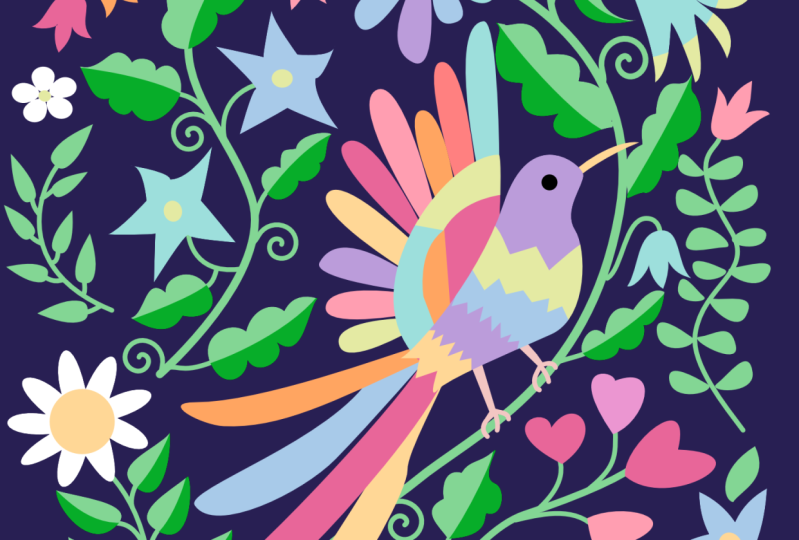
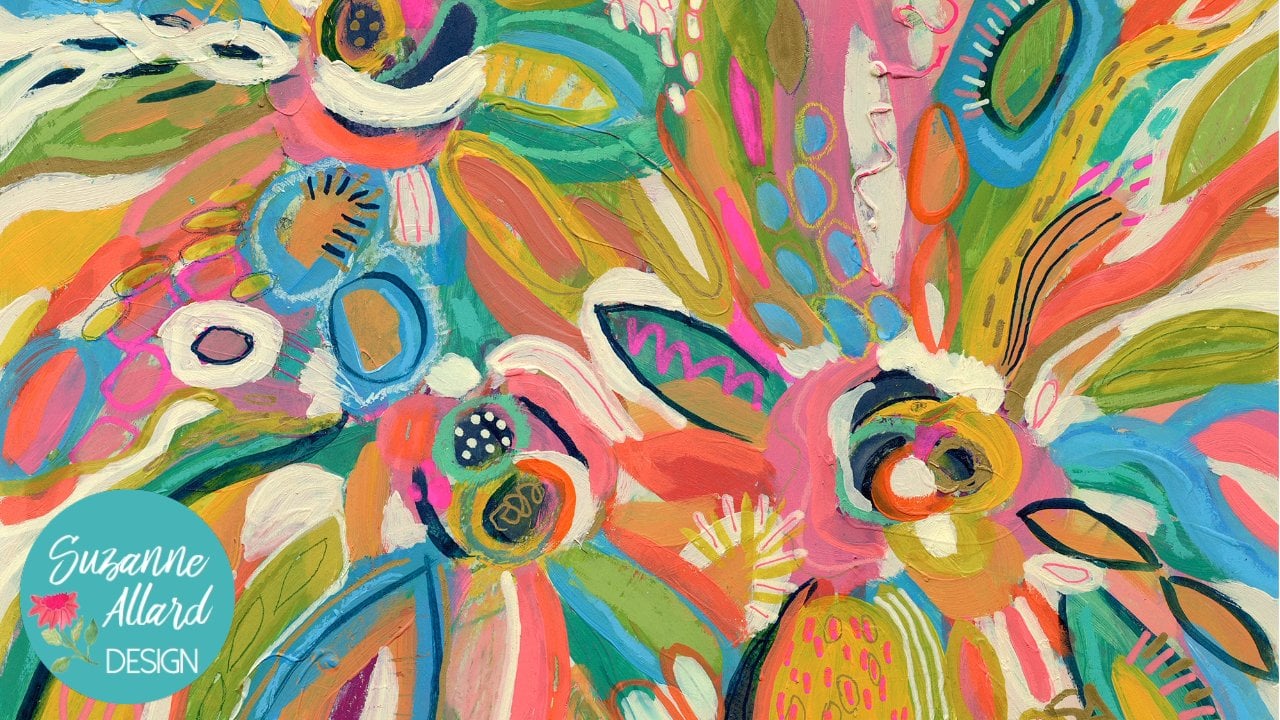
have some fun here. I've got images. This is our inspiration
spread that I created based on atomy
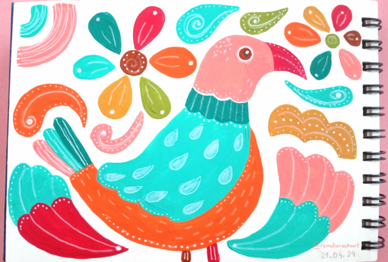
fabric in my sketchbook. And then we're going to
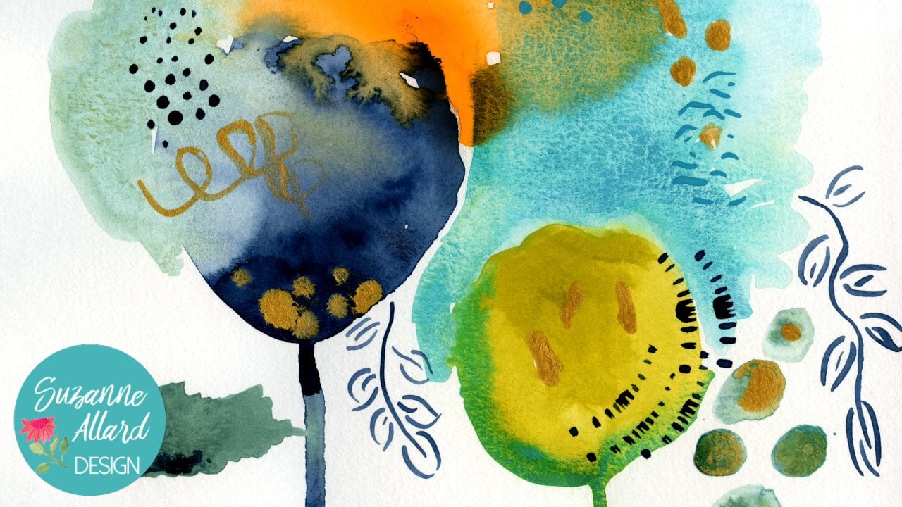
create not the floral on the one side because I had to make that to match this one. But this pretty little
painting of atomy inspired. You can really have so much fun with this
inspiration source. I'll show you how we
find the sources. I'll include some in the class. You can paint this in
any number of styles. You can put little
animals in it or no animals and strictly
botanical elements. You can use different
types of paint. You can like in this one
a white background or in this colored backgrounds,
the sky is the limit. Each one is different and what I love about them is we
do sketch them out. But then as you're painting,
you might, you know, you add more elements or you add more details and it's
just so much fun. Hi, I'm Suzanne
Allard and if you haven't taken my
online classes before, welcome and if you
have, welcome back. So I didn't start painting
till I was about 52 years old. I'd always done creative things, but I was just too
scared of painting. I thought, you know,
that's for real artists. I hadn't gone to art school, and I just got tired of
feeling that sense of regret and I got tired
of making excuses. Here I am now, I have an art business and I'm well acquainted
with dealing with the fears and the doubts and the impostor syndrome
and all those things that we artists learn to
have a relationship with. Now I sell prints and originals on my website.
I sell products. I license my work on various
products around the world, and I teach classes. I love teaching as much
as I love painting, I think it's because I want everyone to
realize that they have this creative source inside them and that to not
let the fear win, basically like I did
for so many years. I think of myself
as an encourager. My style is, I hope very much
what I needed at the time, which is a very encouraging, gentle style of teaching. We learn a lot, we have fun. And most importantly, I
want to keep you going. Because if you keep going, you will get better if too many people
are shut down too early in the process or
shut themselves down. That being said, welcome to the class and
let's get started.
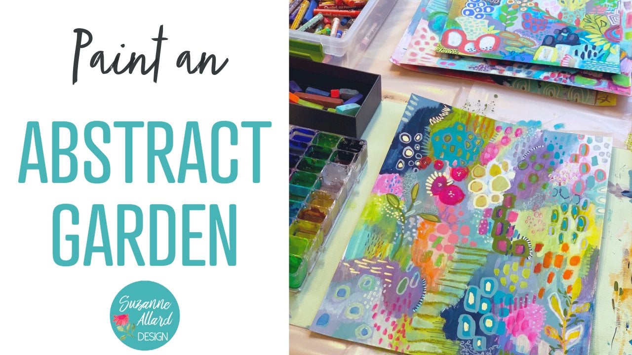
2. Mexican Otomi Project and Supply: Okay, for this Mexican
Atomy Project, we are going to look at
images of atomy embroidery, which is a traditional Mexican
art form that is gorgeous. I've painted before,
things like this. And we're going to use this images of fabric
itself is inspiration. We're going to sketch it out, we're going to put one
little animal in it. And of course you can leave
the animal out if you like, but you're going to see how
much freedom there is in this whole atomy fabric. And how you have wavering lines and
branches and you can make so many decisions
about how you want it to come together and your
composition and your colors. There's so much freedom. I remember the first time I
found this, I was so excited. Like the fact that see, they'll do a flower and all the petals are
different colors. Why not leaves? You can have completely
different colors. If nothing else, it shows you how much freedom you can
exercise when you're creating. Let's get painting. But first, let's
talk about supplies. We are going to use this
fabric, Mexican fabric. It's an embroidered,
gorgeous embroidered fabric. And let's see, which
sketchbook is it in I painted and that's one. But the inspiration for it is this Mexican atomy
that I painted. Actually, I also painted. This one was inspired
by Mexican atomy. I really like that one.
Then I did this one. This sketchbook is the Handbook. It's a strange name
handbook journal, but it's by speedball. You may have heard a speedball. Anyway, what I like
about this little one is unique in the
sketchbook world. It's watercolor paper, but you
can order it in 90 pounds, which means a little
bit lighter weight, or 140 pounds in a book. I really like the
lighter weight. It's still plenty heavy enough
to handle, as you can see, anything I do to it, but
it's just less bulky. And it folds open better than the watercolor books
that are 140 pounds. Now, if you're painting this
class on regular paper, then I would definitely go
stick with 140 pound paper. But if you're using a sketchbook and you're looking to buy one, that's what I would say
I like about this one. Well, there's three things
I would like. I like that. I like the nice linen
color color cover. I like this is particularly elasticy that
hasn't seemed to stretch out. This comes in handy when
your paintings dry and your books maybe getting a
little thick. After it's dry. You put that on there and it just helps keep
it from getting too fat with paint and
buckling and so forth. The third thing I really
like is the price. I think at this moment
these are 17 on Amazon which for the number of pages and the
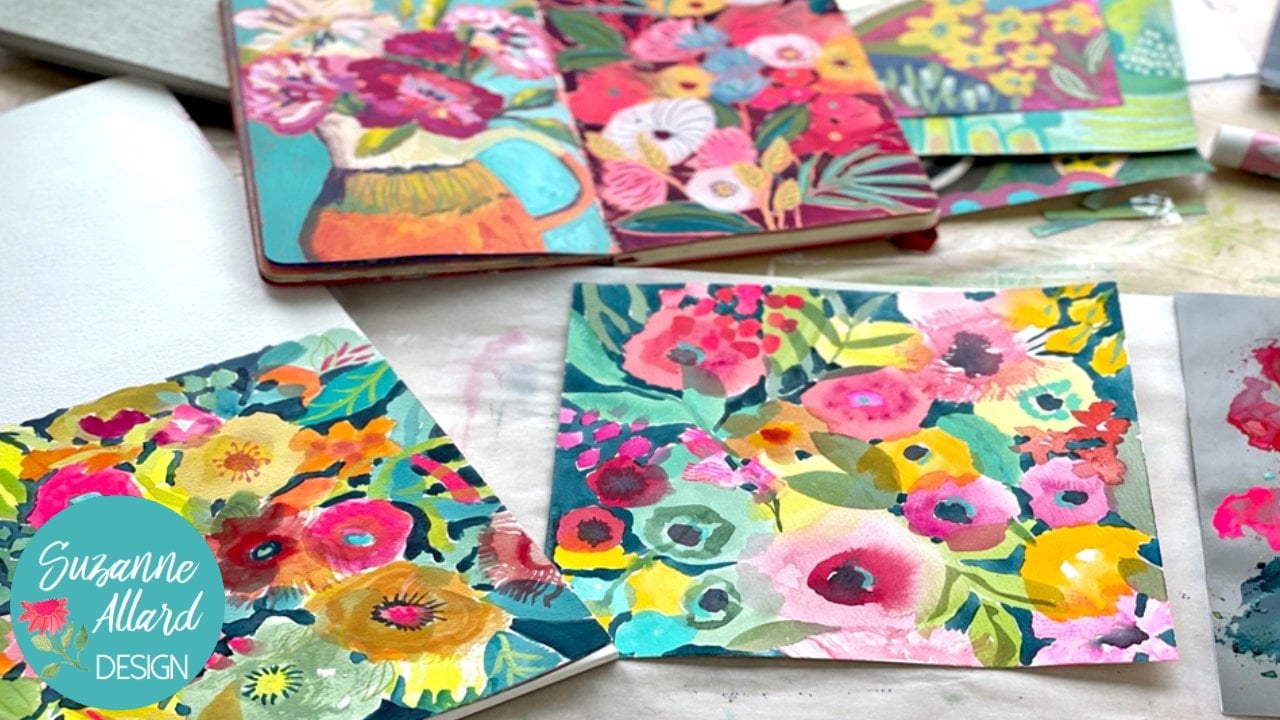
quality is really good. Love this sketch book for the Mexican Atomy which again this is the
inspiration for. I'm also going to show you
some images in the fabric and how to look for
these images and which ones are the
more authentic ones. And how we can pick and choose what we want
out of the inspiration to create really anything we want that is like
a Tommy fabric. I do like these gold
clips. I use these a lot. They are in my Amazon supply list if
you're looking for them. The other thing we
use is palette paper for mixing our paints and
getting our paints out on. For brushes on this painting, I'm using a couple of
brushes around number four, then as a larger one, and then this is a
little tiny number four and it just gives me
the point for details. You can even go smaller, but you will need something to do the smaller
details paint wise. On this one, I used
Acro, Gh, and Gai. It's no problem mixing them. In fact, I just go by the colors and what's on my table and put it
together that way. You could use acrylic on this. You could do this
in water color. Just to give a
little quick lesson on the difference between
Acro G and acrylic, let's put those over here then. I don't think I have any
regular Gh out here right now. Oh yeah, here's one. The water color regular Gah would look like this
and water color, and they'd be over here. Acro gash and acrylic over here. The best way to think
about that is that these can be reconstituted
with water regular, which Turner calls design. There's Windsor
Newton, and there's watercolor paints are able to be reconstituted with water. That means that if I had it out here on the
palette and it dried, I could come back a day, a week later, put some water on that and
get it going again, and paint with it again.
The same thing here. If I had done this regular, even though this has been weeks, I could come get some water, go like this and end
up with moving that around If I wanted
to remove some of it and I could reconstitute
it with water, It's not permanent now, once I've sprayed
it with a fixative. By the way, I love
using this fixative. I'll just pass that along. It's the only one
that's odor free, nontoxic and which I really appreciate because
otherwise I have to go outside and spray the others
and the weather might be bad or whatever anyway. Yeah, this is a G, that means it cannot be
disturbed with water. That's over here, that's these two. Just think of it this way. This is acrylic, this is Acro, it's got the word acyl in it, means it has acrylic in it. This is a relatively new
invention, I don't know. Maybe about ten years ago. What I like about it is
the best of both worlds. I love that Matt chalk finish
that I get on my artwork. I don't know if you can see, let see if you try to
show you right there, can you see how these
two leaves are shiny and glossy but nothing
else is that tells me, and there's a little
bit there that I picked up some
acrylic on those. It's a dramatic difference. I just love the chalky
intense pigment of gas. They took that a
couple companies did. Turner and holding, this is their Agro added acrylic
properties to it. You're getting that
matt chalky finish, but it's permanent when
I paint with these, whether on my palette
or on my painting. They are permanent. They're not going
to be able to be reconstituted with water. It's not that one is
better than the other, it's just understanding
what they do and how you want to use them. Okay. All that being said,
on this painting, you can do any of
the paint you want. This is not the
painting we're going to do that is in the other book, but this is the
inspiration for it. You can use any paint you want. Just know what the
properties are of the paint. For sketching, we can
use a regular pencil. Just understand what paint
choice you're making and make sure it's going to sketch
really lightly like this. You're probably fine whether
you use water color or not. But if you sketch like this and then you
try to do water color, you're probably not
going to be happy with that dark line. Sometimes I'll use a water
color pencil like this. If we then wet it
and we add color, it's going to somewhat disappear as we're
painting over it. Or sometimes we just use a regular colored pencil because I'm going to
be painting over it. Anyway, it's like, let's
grab a little paint. Here's some acho it's going to be mostly
covered anyway because I I don't mind if a
little bit shows, but see it even
covers the pencil. It really just depends on
what paint you're using, how much water you're
using, etcetera. But you just want to
think a little bit about your sketching instrument. You don't even actually, um, this painting is a
little more detailed, so it might be a little trickier to sketch
with a paint brush, but sometimes I'll do
that and sketch out this way instead of using a pencil. But for this thing, that's a little bit
more meticulous. I do like to use a pencil
of some kind of sketch. Those are your
sketching options. Paint options, we talked about. Sketchbook, we talked about. I think we are ready to get
started, get painting a.
3. Mexican Otomi 1: For this module, we are
going to be inspired by the beautiful otomy
Mexican embroidery that was the inspiration
for this bread. We're going to do
one similar to this on the right side
of the sketchbook. I just want to show you jumped
up with ads and things. I think it works
best if you put in authentic Mexican atomy
embroidery, something like that. But you're still going
to get stuff that's not. Then look through and
you'll see people have done these designs and selling products
and so forth. Someone doing custom, Someone doing them in just one color, but also you can just look
not on Pintraus but on Google and get some
beautiful images. In fact, let's do that. I
think you get less ads. When you just search
Google images, tell me embroidery
will select images. Here's how to stitch it. If any of you were
into embroidery, I might have to add that to
my to do cultural cloth. That sounds like it
might be authentic. Yeah, it's basically,
you can see that the colors are
what attracted me also, I grew up in Latin America. I didn't live in Mexico.
But these colors, these images, the brightness, the boldness was very I
remember in Guatemala, especially the fabrics, the woven fabrics have these
beautiful bold colors. That was the inspiration.
And if you look at, let's find a lot of
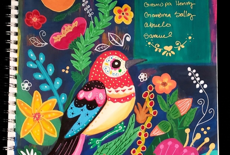
them are animals. I only put one bird in
mine here. We can do that. Do a little bird.
You can obviously incorporate as many
animals as you want. But what I like about how, let me find an image
that's got more, maybe florals in it. See how I love branches
and meandering things. I'll do that a lot in my work, Sometimes taking them
all over the place. But you can see how these
branches go off and then that goes into that flower
and that goes into that. It reminds me of
another big inspiration or influence of my work is. Well, at least he inspires me. I don't know how much
I've been able to be influenced by it because
he was so talented. But Joseph Frank, who was, who was a fabric designer, I want to make sure there's
not a glare in that. You're able to see that.
Okay, good Austrian. But escaped the
Nazis and went to, I think he's German and
then went to Sweden. Joseph Frank has incredible
patterns but we won't go. I'm to keep myself from going off on too
much of a tangent. This is a good one
because look at all of the little botanical things
like here's one big stem. And then off of that
comes this and this. And that might be a good one
to use for our inspiration. Like this bird with
this big open beak too. All right, I will make sure that this picture is in
the class resources. You don't have to
hunt around for it, but I do encourage you to to, you know, do some
research, but yeah. See how much better Google is then Pinterest for
something like this. This is, they are wall hangings and they
were hand embroidered. And he took these women and take these women weeks,
months anyway. All right, so there
we have our image. I have this for inspiration two, I think what I'm going
to do, unlike this one, is leave the white background
just more in keeping with the way they're done. They're all white background, they're just filled
with designs. So we'll just do one side white background and
we'll fill it up. The first thing
that I do is get, I like to work with a
pencil that is well, either light in color like
this is not water soluble, it's a light blue prisma color. It'll be easily covered up. Or you can work with a pencil
that is water soluble. There's so many kinds.
There's supercolor, which is made by Card, the wind, water color pencils. Let's see here a few
different brands. I usually, they'll say
either like this is the Faber Castle
and it says Aqua. Refer to aqua water and that means that
they're water soluble. This is a new one,
I haven't tried. It's not water soluble. I love the Posca pens, This is a Posca pencil. I haven't done much
with that, but I think we'll just go with this regular light
colored prisma color. It's so light, although I want to make sure
you can see it, you might not be
able to see it on the camera. So let
me switch that. I'll use one. I'm sure
you can see this is under wind, water color. Okay. And I have a
good point on it. I don't I don't need it to
be too sharp, but let's see. We'll start with a put
this, you can see it. We'll just look at
one section here. See, do you see that
or is there a glare? You can also print it out and
just have it next to you. It's just going to get me
started really because I like to just go with what
feels like it might work, but I'd like to start a stem. We'll keep this one relatively simple because I'm just trying
to show you the technique. Let's see here. Make this
my main trunk or stem. Then I'll put in the bird because he's going to
be a major focal point. I don't want him
right in the center. I'm going to put him down here and then I can fill in
with some other stuff. We're not trying
to draw a perfect. You can see these are not perfect because
they're embroidered technically perfect animals
or even botanicals. That's what I love about it, is you're doing it in shapes, which is a great way to
think about drawing. Anyway, our bird is going to
look funny and that's okay. I'm just coming
down here with him and he's going to
have his eye there. I always like to
make these bigger, Here's that open beak. Funny. Looks like he's, he
could be singing. I was going to say
yelling at somebody. Let's say he's singing. You can go anywhere you want. Imagination wise, I'm bringing
his tail feathers down. You can put as many as you want. Remember this is a
complete imagination bird. I'll show you how I erase with my water pencil,
for that matter. You could use just a regular
graphite pencil, just light. But what I do when I
want to race is I just, and I pushed a little, I made it a little bit too
hard when I was drawing. But I just like the water color pencil because it'll blend
in with the paint, but certainly not necessary. Okay, So I got
those two sections. This is behind him,
Let's put his feet, we're going to make them and fat. Okay? And I might end up painting him a little
fatter because I like the birds with
the fat bellies. But I can always just do that
when I come through with paint. He's sitting there. Now I'm going to do, sometimes I have
to remind myself, see how that got
too straight there. I am going to raise that, let it dry a little bit, but I'm going to
curve that more. In the meantime,
I'm going to work down here and do something. Branchy comes out here. I will also include this design and the student downloads. If you want to trace this, you can put it on a window, on top of your watercolor paper, or on top of your sketchbook where you can use carbon paper. Probably easier in a sketchbook,
just put the design, print out the design, put it on your sketchbook and put some
carbon paper underneath it. Carbon paper is
such an old thing, but it's so
inexpensive and easily available on Amazon here. Here's the branch.
You'll just put a couple of big
meandering leaves. The fun thing about
these anda being like a puzzle because
you can take it to an extreme where you fill
up every little space in it like you'll see
in the Atami fabric. You'll see little
things like this. A lot that you can
use as filler. I like this big
double head flower goes with the bird's tail. So I'm going to bring this over and up to make
room for that. And then we'll do that. And then if you've
done any needlework, you understand that the
structure of this and why, or quilting or
anything like that, why the bits need to be simple. And I really like how that
forces you to simplify. All right, now let's
look at what I had here. Because I departed,
I used the otomy as a start off point
and then I kind of went and added, you
know, some of my own. This is where I encourage
you to do the same thing. If there's a particular
design that you like or floral element, leaf pattern you can put. This is really anything goes. Sometimes I'll just draw these. Got a few of them drawn and then they're there for
when I feel like painting, I am thinking about a mix of
larger and smaller elements. We have these big leaves here,
we have little ones here. And thinking about what
I want to put here, maybe, let's see. I'm looking at the
seeing if there's anything that I want
to add from here. I do like how they do these
daisies that are then all. I didn't see them in
this particular example, but it's similar to this, like look at this
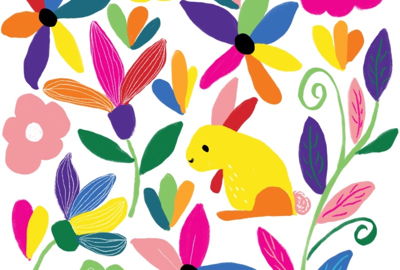
is maybe a rabbit. I'm not sure see what I mean by you do not have
to worry about the animals looking like you can't even really
tell what that is. The only reason I'm
thinking that's a rabbit. I was going to say
squirrel, but it's eating looks like a carrot. It could be a South
American rodent. Who knows? I don't see
that they did that here. Like here, all of the leaves
are different colors. We could do one of these daisy type flowers that we can make all
different colors. And we can have that come
out of really anywhere. But I think I'll just bring
it right out of here. And I'm going to put
the center in first, so I know I have room
for all the petals.
4. Mexican Otomi 2: Okay. And I think it might
be fun to have some little things coming out of here fills up
that area a little bit. Once we get the
paint out, we can throw in some smaller
leaves like here. And like I said, you can
get really fill it up. All right. I'm going to put this here just to hold these
pages down a bit, and let's send some colors
out and start painting. I'm going to use a
piece of power paper. I'm going to get the brighter
colors, which of course, I always like to mix a little
bit to make it my own. But I start with
some bright colors and these are a wash.
You could use acrylic, you could use water color. You could actually see how this is really
an opaque painting, but you could make
it soft and watery, like a watercolor
painting as well. And made will mix it up. Maybe we'll do a little of both. That'd be a fun thing to try. I've got smaller brushes. This is the number four
round for the larger bits. This is the liner for stems. These are both the
brushes that I had made and are available
a couple times a year. You can go on my website and
get on the waiting list. And then this is a little
bitty one for details. This is the Princeton Aqua
Elite number three, Okay. Now you may want to do a
lot of color planning. I'm not against that, but
I'm just going to stick with some of these colors
that I've got in here. Really, almost every color is in here. There's a bright color. But I go intuitively
with color and make up, say, an orange that I like, and then put that in
different places like that if you want to have a predetermined color
palette. I've tried that. Sometimes I stick to it, but usually I don't. We'll just see where it goes. I'm just going to get this
to a nice warm orange, just adding some white
tone it down a bit, and I add it a little
bit of pink just because I'm definitely going to put this color in the bird. In the bird
somewhere, maybe I'll just go ahead and do
a part of his body. I'm going to make him a little
f he was just too skinny. The great thing about quash, well, really acrylic can
be used this way too, is you can go thick and opaque, more watery, and
more translucent, and everywhere in between. Okay. Oh, you know what? No, that's okay. Actually I want to take a picture of
this design I just realized, since I just created it, I want to take a picture
of it to be able to put in the class documents for you before I paint
too much over it. That way it'll be easier
for you to hughes. Now you're seeing a
technique I use a lot. If you've got an
ipad, it's really fun to take a design
like this and practice creating it on your ipad with different color schemes
and moving things around. Okay, we've got drawing, we've got our inspiration photo, I see a lot of orange in there. Look, you could just
choose that bird and say, I'm just going to do
some of the colors. They do use a lot
of browns in here. That's just not a
thing that I do. I don't know. Just not
the color I use a lot. But feel free, I'm going to put some of this
orange down in his tail, maybe in this spot too. If you look at the
otomy fabrics, they'll have just the color randomly, but
repeated throughout. Because remember, we're
talking about embroidery, so you've got a
certain thread color. You're going to use it
in a variety of places. You can do this
any way you want. You don't have to let all of the elements of the way
it's done guide you. I'm adding a little bit of white and maybe you'll do this
stem in this pale orange. I'm going to do a smaller brush. We want to be inspired
by otomy but also make it our own al. Right now I'm grabbing
and doing this is the hole being role being Akh. I think I want that
brighter though. Okay. Going outside of my
line to make this belly a little bit
full. More full. I just added a bit of
weight but it was too much. You're just sprinkling
these colors throughout. All right, let's
see. I want to go in to get, I love this. I've got a couple brands of
it. Put this brick here. The Pastel Marine
by Turner Acro, then light blue, this
is just regular Gh, but I'll show you
how you can make it really easily with
ultramarine blue. Basically, it's a
periwinkle blue, just ultra marine and white. Usually we'll get you there depending on your ultra marine. I think I'll go with a
little bit larger brush for do these leaves. I like to leave a little bit of, it's not too much of the
previous color in the brush. Just because it helps harmonize
the colors a little bit. Just have to be careful if
it's across the color wheel. Meaning complimentary. It
can make your colors muddy. So just make sure you
don't have too much. Okay, Just a little
bit of orange. Because orange is
across the color wheel. If I had too much, it
would make this muddy. Going for a nice blue. Okay, that'll do getting
some water in there. I'm going to see this stem
for a different color. Just I don't want this
too much of this blue. It's already going to be a lot. In fact, I don't need to do
that other leaf in blue. Let's not because I think it'll be too much blue in at one side. Let's just add that up and put something else
there when that tries, or else we definitely
want him over here. If you're finding
that it's hard to control for this
kind of painting, you probably have too
large of a brush. It's funny, because when
you want to paint loose, you want a larger than
comfortable brush. But when you're trying to
do something like this, you want the right
size brush that's about as big a shape as I want to do with this number four. I'm going to switch it
down to the number three. All right, let's do. I'm thinking while I
have the blue out, I might as well make her green. Grab some yellow. See what
green shows up? That's pretty. I always love a lime green for the consistency
on the guage you want. If you're going for this sort of semi opaque look
like a heavy cream. This will be pretty in this, there's so many ways
you could do this. The colors in the design,
I mean, it's endless. You could say, I want to do one in really calm neutral colors. Or you could say, I want
to do one monochromatic. All pinks are all blues. Just a little bit of white up here with some pink and get like a sage kind of green. This is a pretty color. I think it would have been a good
one to do the main stem in. I could still do that. Yeah, I think I'm going to I'll need
to make more of it though.
5. Mexican Otomi 3: I'm gonna tone this green down a little bit for the stone, which means I'll add
a bit of orange. But before I do that, I want to see if I want to use
it anywhere else. I think it'd be pretty
here in the center. Well, when I've been
forgetting to do his plumes, I guess I'm turning
this color into my main sort of unifying color. That's how I work. I end up picking something I really like and saying, okay, that's going to be the
color that shows up and, you know, and dominates a little more and ties
everything together. All right, Let me just
tone this a bit of this down for the stem just because I don't want it to I don't want everything
being a star of the show. I want it darker though. Yeah, that's more of
what I had in mind. Otherwise, I think it
would have competed with the lighter green paint
around these little feet. You could do the feet
first. Either way works. I need a little
bit more of that. A tip. When you're
doing this work, don't drink a lot of coffee. It will make your hand shake,
at least it does mine. If you're doing a
really straight line, you can hold your
breath for a minute, which is why I'm not talking
when I'm doing careful work. As you see, I planted my pinky here to help steady
and practice. Just lots of practice. I like that that shade there. And, you know, that
might be good for his eye because it's
a darker color. He's very cute and you know, he can make a darker
color here for his beak. This is where, like I said, you could take a color like this and just put in some leaves or
other little squiggly things. I'm going to darken
it into his feet. I'll just added a
bit of pink to it. I like that better for his eye. Okay. Now we just have a
few more colors to fill in. I think I'd like a really
warm orange, yellowy orange. I've already got some of this
out, so we'll just mix it. Take this with some
of this yellow. That orange is so intense
that I grab too much. See how when you add white
to a color cools it off. If you don't want to lose
the warmth of a color, you have to add a bit
of yellow to bring that back in cash. Forget how intense
that orange is? I should have grabbed
the yellow first, And just a bit of orange. Okay. I wanted it to be
different enough from the orange we already have. It's still too much
like that, more white. I have a whole train of
oranges here. That's okay. What I do with paint
like that is paint. Just put it on another
sheet because it'll end up being either
paint an element that I can cut out
for collage or paint a background for painting. That's so funny, I can't get
it away from that color. It's because I put the orange in it instead of just going with the yellow. Here we go. Good lesson and mix a bit
of your dark to your light. I'm not the other way round. In some cases with
a lighter color, you may need to do or
want to do the second coat paint clump there of some kind Depending on, like I said, if you
want it really opaque. I like sometimes the way the watercolor pencils show underneath in a in a
really subtle way. Oh my gosh, can't hear. She doesn't come in
here very often. I don't know how that got here.
6. Mexican Otomi 4: That's probably enough of it. All right. Let's do a turquoise. This turquoise, are you are you trying to
tell me you're dry? I think you're just clogged. Yeah. Interesting. Well, does get it acting like it's dry. I'm pretty sure the top's
been on. All right. I'm going to turn this down with the tiniest bit of orange, maybe a tiny bit more. Doing it right this time. Put the dark to the
light. There we go. That's pretty, I can also see how I'm resting my one hand on the
other hand here. That can be helpful, especially because
I don't want to put my elbow in my cat. Okay. So I'm not putting
the same color next to the same
color, you know? So I can't put turquoise
there or there. I can put it up here though, and I could put it there. The other thing I'm going
to do is put it down here because I want these
to look different. This was that one
that was to orange. That great thing about guash. Wonderful. You can do
it with acrylic too, but you can just
cover something up. I think I will put
this one turquoise. Now I've got just a couple
blank spots and I can either add a new color or
see if one of the colors I've had works since we're doing tell me and they have
about 20 colors, I think I'm just going to make a color variation
of one of these. Can just do that by
mixing two of them. Let's see what color would be. We don't have many
darker colors. We could make a purple color by blue is drying, but
taking some of that, maybe even grabbing some
of that dark that we made a less intense purple. Let's see how we like that. Yeah, I like it just giving a little bit of a value contrast a little bit darker. Trying to get more
on my brush here. It just goes on so smoothly when you have enough
paint on your brush. Now I'm wanting to
do this would be like there's no decorative
detail on top of these. You'll see each piece
is a flat color. The most detail you'll see
is maybe a flower center. But of course, I wanted to take it further when I
did my version. We'll do just a few
little details. It's feeling like this purple wants to come hunt down
here and make a line on this leaf and maybe
some squigglies. This is where the whole thing, you can depart and do
anything you want. But starting to add
details is kind of makes it your style because you have the details that you like before. My other colors dry, I'm going to grab my yellow, I'll make some dots on that big blue leaf and
maybe do a second coat here For dots, you want your
brush to be really full. Do you see that? Then you're able to just touch it
down and get nice dots. Pick up a lot of paint,
Not so much that it drips off, that's a thickness. Just make sure you know
it's not so watery, but I like a lot
of size variation. And this gets you
that pretty easily. Just make sure you give
him plenty of time to dry. All right. Where else? I wonder what a tiny to his
eye would look like? Looks fine. I like it. Could do some little feathers. Any other colors I want
to grab before they dry? Let's see, maybe some
of this bright pink. If I were using just
regular gas or water color, I wouldn't need to
worry about them drying because I could
reconstitute them with water. But since I'm using a
or if you're using a, you can sprit them with water. I always have
something like this. That's a make up sprayer. A make up from Amazon. Like a Mr. Let's see. I think it'd be fun to
have a line down here on those dots. Got big. Maybe another coat here on him. You have to really be
careful on those dots. I almost put my finger in them. Here is where we can do
some more like we anywhere. Watercolory elements
like that is a little more translucent, really, anything do you feel like doing can be done any time? Maybe I'll do a really watery
pink just to be a surprise. I like to do things
that are a surprise. So these are just
random watery leaves that are not connected
to anything. They can also unify, that's pretty, you see that a lot in folk are the
little three leaf thing. Okay. I think we are done
thanks to joining me. That was so fun.
7. Wrap up: Thank you so much for
joining me in this class. I hope it gave you some ideas on using fresh
inspiration sources. And how if we just view an image or something we photograph or something that's a
completely different genre like drugs or fabric or the
texture on a wall. Really, if we start
to think like artists really see like artists, everything becomes an
inspiration source. It can be a little overwhelming. Just ask my family
because anywhere I go I'm taking pictures of
just about everything. But I love having that filter
and looking at the world. And it didn't just happen, it developed over time
and it takes practice. I hope this gave you some
ideas on how to do that and how to think about everything you look at as
potential inspiration. Remember that I have a
Facebook student only group, and you can either sign up through that through
the e mail you got when you register
for this course. Or if you're a
skillshare student, then you just use
your e mail that you just say that you're a skillshare student when you
try to get into the group. I have lots of resources
on my website, Suzanne.com I have a blog where I really speak to
a lot of the fear and just how to continue creating and deal with the
different obstacles that come up emotionally. I also have an e mail newsletter where pretty much right
to the same thing. I have a Youtube channel
trying to make sure, of course, my Instagram
and Facebook, I do a lot of time lapses and
just things to continue to hopefully inspire and give
you ideas and encourage you. Thanks again for
joining and I'll see in the next class keep creating. It's good for you, it's
good for your soul, and that means it's
good for the world.
 Suzanne Allard, Landscape, Floral, Abstract Painting Teacher