Transcripts
1. Foundations of Oil Painting: Master the Basics: Are you ready to
immerse yourself in the vibrant world
of oil painting? Whether you're completely new to oil painting or looking
to refine your skills, this course will guide
you step by step through the essential techniques
and tools that professional artists use
to create captivating, expressive works of art. This course is perfect
for beginners who are excited to explore the
fundamentals of oil painting. Will start with the
very basics from color viewy and how to
create a wide range of colors using just a
few primary colors to learning about essentials,
tools and materials. Gradually, you will
progress towards creating captivating still life paintings filled with vivid colors, smooth transitions,
and dynamic textures. Through hands on exercises, we will explore how to learn
about essential materials, including papers,
canvases, palette knives, brushes, and different palettes. Get hands on experience with popular oil painting
mediums like linseed oil and linquin learning how they
affect drying time, glossing, and the overall
finish of your work. Learn how to set up your
palette efficiently, organizing colors, innovator simplifies mixing and keeps your creative
process flowing smoothly. Create bold textured strokes and add dimensions to your
work with a palette knife. Learn how to achieve dramatic reflections
and highlights with this versatile tool. Explore the different
uses of soft haired, hard bristles and
angled brushes. Learn how to control
textured precision and application to elevate your paintings realism
and expressiveness. Put theory into
practice by painting real life subjects like
apples and bottles. You will use a
variety of techniques from glazing to impasto to bring your still life
compositions to life with realistic depth and
texture. That's not all. You will also learn how
to care for your tools, ensuring that your brushes, palette knives, and
other materials remain in top condition, ready for your next artwork. By the end of this course, you have mastered both traditional and modern
oil painting techniques from creating
smooth gradients to adding bold textured strokes. With a focus on
still life subjects and practical exercises, you will gain a deep
understanding of color theory and
artistic expressions, giving you the
confidence to create oil painting that
truly stands out. What are you waiting for? Take your painting skills
to the next level, express your
creativity and start creating artwork that
makes lasting impact.
2. Understanding Oil Paint Colors: Hello, everyone, and
welcome to this new course. In this lesson, we are going to become familiar with colors, getting to know
the oil paints and the characteristics of colors and how we need to see them. These are the oil colors that I'm showing you on the screen. We are going to use
them in this lesson. And what we intend to achieve
at the end of this course is learning how we can
properly see the colors. Have a look at all the range
of colors that I'm using, what we are going to
train our eyes and our mind to get rid of
the distraction and accurately see what is there that needs to be worked on
the sense of the colors. When we try to buy oil paintings either for ourselves
or as a gift, there are many samples out
there that may seem confusing. You can buy them in
packs of six, 12, 24, or even single, one by one. These are the colors we are
going to use, and later on, we will become familiar
with their names and when we try to mix them with another color, how
they will look like. What is interesting to know is that these names are mostly the same in different brands and it makes them easily
recognizable. For instance, this
is cadmium yellow, pale hue 119, so they
all have numbers. It is good to know that we
have two types of yellow here. One is light, which is
called lemon yellow hue. The color is 346, and you can see it here. So even though the same brand, we have two colors, but
they're all a bit different. And then we have cadmium yellow, as you can see, two brands here, the same name for the colors. Now we have moved to
cadmium orange hue, 090 and cadmium red hue, 095. This is another sample of the color red from
different brands. This one's light cadmium red. Also we call it Aesarin
Chrisman hue, 003. The red tone has a
bit of blue in it. It's like cherry red. It doesn't matter what
brand we are using. The Aesarin Chrisman
has the same tone. Just like we had
different tones of red, we have different tones of blue. However, the most important
one when it comes to blue color that we will be
using is ultramarine color, which is called 660. Then we have tons of blue
such as cobalt blue hue, 179 that you can see here. In different brands, we have the same names that
makes them recognizable. So even you go to
different brands, they have the same names. I might just the numbers
to be different. So the next blue color tone
is as you can see here, cerulean blue hue, 139. This one is lighter
than the previous two and it's very close
to the sky blue tone. The next one that I'm
going to show you to here. The next tone of
blue that we will use a lot is Prussian blue. 538, as you can see here, is a very beautiful color, which is dark blue tone, close to navy blue, and we will use
it a lot as well. The next commonly used
color is titanium white. So it's better if we
have larger tube of it. I always buy a very
large tube because we are going to use it a lot
more than any of the colors. Now, look at this
one. Viridiant hue that you can see here
is a green color tone. It is the main green color tone that we will be using
in this course, but it might not be the main
color green that you use it in another subject matter
that you try to practice. The important point
you need to consider is the combining,
mixing these colors. And how we can
create a new color. It will be infinite numbers of colors that we
can create here. So in this course, especially, we only need
eight of these colors. Alizarin Chrisman
Hue, which is 003, cadmium red hue, 09 fine. As you can see, I have it from
two different brands here, but the color tone is the same. We will need cadmium
orange hue as well, 090, along with the
cadmium yellow pale hue, which the number is 119. They're the same. And also
viridian hue, 696 here. And the last one that I'm
going to show it to you, not the last one when
it comes to blue, ultramarine color. This one, 660. Now, the next one, as I
mentioned, is titanium white. Very useful and cobalsblue. This one, 179. This sums up the
colors we need for this color palette we are
going to use in this course. We can use these colors
and create the rest of the colors we
might need ourselves. Keep in mind that
in this lesson, we won't be used colors
such as black and brown because we can create
them easily. Why is that? Because we intend to analyze and understand the colors in
this course, later on, I will tell you more
in details that the color black
actually does not have that color pigment or that
the color brown is actually a combination of many of some of the main colors that
we can create easily, so you don't need
to buy it actually. So these are the colors we are going to use in this course. But in general, it is important
to know all the colors, to know their names, their
tones, try to practice. And when you go, like the brand colors, this is insuraNeton color that are used by professionals are known really for
their artist label. You do not necessarily need
to use artists colors, and you can go with any
oil color you have. And if you wanted to make sure how to use them and
which ones to use, you can send me messages. I will help you to get
this brand that is within your budget and within your
area or your local art shop. Now let's go through
next lesson, and we are going to
talk about solvents and different oil
paints. But by now,
3. Working with Essential Painting Liquids: Hello, everyone. Welcome
to another tutorial. In this lesson, we are
going to get familiar with different mediums and solvents typically used in oil painting. These are a few samples of the mediums liquids and
solvents we'll be using, and I'm going to introduce
them to you one by one. Oil paint is solid and
thick in the tube, so we need to use these mediums to make the
colors ready for painting. Mediums help us alter the
effects of the paint. They can speed up or slow
down the drawing process, and they also allow us to adjust the consistency
of the paint. For instance, when
we want to leave visible brush strokes on the canvas and build
texture with the paint, this is when different mediums come in handy to
achieve that effect. Let's talk about some history behind the mediums and solvents. This originated from China when oil painting masters discovered Chinese oil paintings
and their glossy finish. They began developing
mediums that would help them modify the quality and appearance of the paint
in their own work. If we categorize the mediums, we start with those
that increase the glossiness and
transparency of the paint. The main ones are linseed oil, liquid, and light gel. They can also add
volume to the paint. Linseed oil gives the
paint a nice gloss and slows down drying so you
have more time to blend. It also makes the paint feel
smoother and adds volume. Liquid is faster drying, but it still adds gloss
and helps the paint flow. It's perfect if you
want the layers quickly without waiting
for each layer to dry. And light shell
thickens the paint, adds body, and keeps the
colors vibrant and glossy. It's great for building textures while keeping that
smooth, glossy finish. All three mediums help you control the paints
look and feel, giving more
flexibility depending on the effect that
you're going for. However, guys, it doesn't mean that you need to buy
them at the beginning. Oil paint doesn't need all
the liquids and solvents. You can start practicing
without them. So don't try to spend so much money at
the very beginning. You can get only one of
them, maybe linseed oil. If your oil paint is quite old and you
need some liquid to make sure that it's not
dry and liquidity enough. Also, I did show you
turpentine to fin the paint, sand cedar, and white spirit. Also solvents that give
us similar results. These museums are
widely available from different
brands and use them to alter the paint and create various effects,
as I mentioned. In this course, we
don't need many mediums, so don't worry. We will mainly use
turpentine or white spirit as their purpose is to thin the paint and reduce
its stiffness. Also, linseed oil is one
of my favorite ones. We may also need brush cleaners. My recommendation is either
turpentine or sansdr. It really depends on your personal taste because
well, not personal taste. You might need to buy one that it has smell and one doesn't. So now, as you can see, there are different types
of linseed oil that comes in various thickness
and consistency, but they all work similarly, helping to delay the drying
time and increase the gloss. We will explore this
as we use them. When you use linseed oil, you might need more time when
it comes to oil painting. So you don't want
it to dry fast. You just want to
delay the process, the drying time process. Another use of linseed oil is to smooth out brush strokes, making them less visible
in the final piece, which is great for
portrait drawings, any kind of hyperrealistic
drying, oil painting drying. It can also be used when working on fine ditails
as I mentioned, making them shinier
and more noticeable. Also, I would like
to give you a tip. If we mix linseed
oil with Turpantin, we can create a medium that
speeds up drawing process. So I hope you enjoyed that tip. That's it for this lesson
and thank you for watching. I'll see you in the next
tutorial. Bye bye now.
4. Choosing the Right Papers for Your Work: Hi, everyone. Welcome
to another Tutorial. Well we will explore the
different types of canvases, paper suitable for oil painting. Yes, you did hear me
write papers as well. There are various types of papers and canvas
that can be used. Some have textures similar to cardboard and are thicker
than regular papers. We have also canvases with
a fabric like texture, which are obviously thinner
than the cardboard like ones. As you can see on the screen, this is what we will be
using in this lesson. And it's great for practice. So you don't have
to spend a lot of money and it feels like canvas texture is
form of a notebook and we can tear out a sheet
to start working on it. Great for beginners or great when it comes to professional
you want to practice. These are the ones similar to the cardboard texture
I mentioned earlier. The size is also suitable, providing enough space to
work and the number of sheets allows us to plenty
of papers to practice on. It's better to practice
on paper canvas like this one rather
than those fabric like textures at
the very beginning. These are easier to handle. We can take one sheet and position it where
we want to work. This is not a simple
with fabric canvases. We require preparation before. So as you can see, this is what we're
going to use this time. When it comes to canvases
for oil painting, there are a few more few types you should know about as well. Stretch canvas is
the most common. It's fabric, usually
cotton or linen, stretched over a wooden frame. You can find it in different textures
depending on the eve. Of the fabric. Canvas
boards are another option. These are pieces of canvas
glued to a rigid board, making them more
affordable and portable. But in this course, we're going to use canvas paper, which is great for practice. It mimics the texture of canvas, but it sheets form, often sold in pads. Each type serves a
different purpose with the stretched
canvas being ideal for finish works
and canvas paper or boards being better for
studies and practice. Let's move to the next
Tio, and I see you soon. Bye bye.
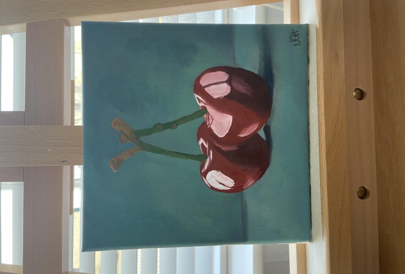
5. Exploring Palette Knife Techniques: Hi, Brivon. Welcome back to another tutorial in this lesson. We are going to get
familiar with this tool, which is a painting
knife and very useful. We will be using the knife as
the main tool for painting, actually using it
instead of brush. The knife we will be
using, as you can see, as an angle tip, and it's small in size. We do have smaller
sizes as well, smaller than this, but
we have bigger sizes. Make it easy for us to
control and handle. It can be used to mix colors, to apply different colors
onto the canvas or paper. The shape of this painting
knife makes it the best choice as the main tool that
we will be using later on. In this course, we
won't be using brushes. We'll be using knife
to emphasize how colors are mixed and
applied to the canvas. Also, we will focus entirely
on the color application and textures created with a knife across different parts
of the painting. A painting knife is great for adding
texture to your work. It's ideal for applying thick paint and blending
colors right on the canvas. You can use it to
drag and mix colors without fully blending
them or for sharp, crisp lines with the
knife's pointed tip. It's also useful for scrapping back layers to
reveal textures beneath, adding depth to your painting. By adjusting the
angles and pressure, you can achieve a
variety of effects, making it versatile for
bold texture strokes. And we're going to use it in the next few tutorials and you will learn how
to do all these things. Thanks for watching and see you in the next lesson. Bye bye.
6. Using a Paper Palette for Mixing: Hi, everyone, and welcome to
a new tutorial where we will get familiar with another tool in our course, the palette. The traditional painting palette is commonly made of wood. However, with frequent
use, it darkens. We also have alternative, such as paper palettes like
the ones you can see here. These usually come
in packs and we can tear off a sheet to use. They are designed to
resist absorption, meaning the colors and mediums won't soak into them, so
don't worry about that. However, for this course, we are going to use a
different type of palette. Why? Because wooden
or paper palettes can slightly alter the colors and affect how we perceive them. This is the palette we will
be using in this lesson. It's made from gray cardboard, which we have placed
inside an ascolt sheet. You might be wondering
why we are doing this. The gray color helps
us distinguish the colors on the palette from the surrounding
environment, making them easier to see. This is because gray is neutral color which allows us to see and understand the
colors more accurately. The gray tone we are
using is called grey, a blend of gray and beige. This is the color of the
cardboard we are using. Again, as I mentioned, I
place an Aslet sheet on top to prevent the cardboard
from absorbing the paint and to make it
easier to clean the palette. Keeping the palette clean
is very important for properly mixing colors
during a painting process. This sheet should
be the same size as the palette to fully cover it and provide
a workable surface. When the paint accumulates
on this sheet, we can easily remove it
using the painting knife. So for now, thank
you for watching, and I hope you found it helpful. I'll see you in the next
sterial and for now, bye bye.
7. How to Arrange Colors on Your Palette: Hi, everyone, and welcome
to another tutorial. In this lesson, which is
quite an easy lesson, we're going to learn
how we need to add colors on the palette and
the what way to do it. The only reason we are doing this lesson is for beginners. And if you feel like
how I should put the colors on my palette to be organized, that's
the only reason. So if you are not
beginner level, I suggest you move on
to the next tutorial, and this is going to be quite a beginner
lesson for you guys. So as you can see,
this is our palette. As you can see again,
we talked about this palette in the
previous lesson. I made of gray cardboard
and acetate sheets. However, if you're not sure
what use and how to use it, you can send me
messages directly and ask me about what
you have in hand at home to better
use our palette and add the colors to it is the best way to
follow my hand wn. We need to have an order as we add the colors
on the palette. In the next lesson, I'm going to create
the color wheel that you have seen in
the previous lesson. And show you how we're going to combine all the colors that
I'm going to use here today. We have already added the first color,
Alizarin Chrisman Hue. The next one would
be cadmium red hue. Look at my hand movements, I'm adding them
from left to right. Have the colors I introduced in the previous lesson
ready beside you, so you can add them in order. The next one, as you can
see, cadmium orange hue. You can stop the video and read all the information that I have put on the screen for you guys. So you have a bit more
information on each color. So we have done cadmium
yellow, the lighter version, and then Viridian hue, any kind of green that is
closer to that brand is fine. And then cobalt blue. After that, we're going to add the last color which
is ultramarine. The darkest blue that we have. So so far we have
added all the colors, and then the last one
would be our white. You can see a bit more. Always, you will need white
color more than others. So as you can see, this
is the right way to arrange your colors and
put them on your palette. We have added other
colors almost vertically like this
on the palette that we can easily take the
amount that we need from the lower parts of it
without damaging the rest. There are other tools apart from colors and
the knife that we need to start working on this lesson and we can make
these tools ourselves. One of them can be made
with a piece of paper, the same gray
cardboard like this, and all we need to do is
adding a small hole on it. This piece that I
have made already is five to 10 centimeters
and I have added the circular hole in 25 millimeters from the
top part on the top part. And as we start working
on this lesson, we use this tool and the small hole on it
to specifically look at the color our subject
that we're going to work on. This will help us sit and differentiate
the different tones, the colors that we have in
different parts of our work, and we will talk about
it more as we go on. We have the subject
to work on the Apple. Going to use this tool, see
the colors specifically on this part that I'm just
mentioning right now. Using this tool like I'm demonstrating right now,
you will do it later, can separate the colors
from one another, and I will do even more later on different subjects
in future lessons. So follow along Anything surrounding the world and
the lights and shadows, they all can affect the
way we see the colors. But when we use a
simple tool like this, we can train our eyes to
see the colors correctly. Try to do this and send me your thoughts. How do you feel? Did you find it useful? This is a tool we
will be using to see better and understand
the colors even better. So we can make them on separate
parrots in a correct way. Another tool we need,
and we can easily create ourselves is what
we can call a color box. A simple box made out
of a few cardboards in different colors where we can put the objects we
are going to work on. The one we are going to make
and use for this lesson has a surface and two walls,
each different colors. As you can see, I have used these two cardboards in this
way to create two walls, and we are going to put
it in front of us where our model is kind of
standing position. We can put it like
this in front of us, even though you cannot see
it, I just put it like this. And underneath it, we can add another cupboard as a surface
in a different color. As you can see, I'm using primary colors
using yellow, red, green to create a
simple box inside, which will create the subject later and I will show
you how to do this. For now, bird is in mind, and in the next few tutorials, we're going to go
through this example. For now, let's move on to the next materials you
need to know about. So as I mentioned, among the materials
we need to start work is a suitable desk, and any kind of desk is fine. You dining table,
your computer table that you're comfortable
enough wear suitable clothes. Go for the ones that
are comfortable and also a piece of fabric
that you just saw using to remove the colors
from knife or just use a kitchen towel or tissue
would be fine as well. Now I'm going to show
you how you need to use the painting knife and how
you can mix the colors. You can use both sides. Look at the way I'm holding knife to take some
colors from the palette. I'm using the sharp
tip of the knife, and then that's how I clean it. Just if you don't want
to use lots of tissues, a piece of fabric that you
don't use at all is perfect. And when we are sure that we have made the knife
completely clean, we can use it to take the next color and
then mix it like this. Any kind of blue and red
you have is fine for now. You don't have to do
ultramarine or zarine red, or you can use cobalt blue or cadmium red and mix them
to get some results. In the next uterial,
I'm going to go through all color wheel and how
to create them correctly. This is just for you
to understand how to use the knife and
how to mix colors. Just handling the knife
and moving it across the palette is very important to mix it correctly because the most important
part is for you to understand the beginner levels, how to mix colors, how to hold brush or the knife palette, and then use those on
your main subject. We need to make sure
that two colors that we have added
are mixed perfectly. This is how we
make colors ready, and we will have it on tip
of our knife like this, and then we can apply the side, the sides of the knife
with the color on it to add the needed color layer
on our canvas like this. Just pick it up. So when I say, usually in the next few theaters pick the color up,
this is how I mean. I just clean it with the fabric. Look, we still have some more this is how we
remove the mix's colors, and then we can clear the knife
with our piece of fabric. These remaining colours and
palette which also soft in, they will immediately dry. So it's better if you act
quickly and remove them with a piece of tissue
or fabric that you have. The remaining layers will
be easily remove like this, and what remains
will dry sooner. Why am I saying
these things because the same thing apply
on your canvas. So bear that in mind, please, and it can affect your work. As you can see colors will
remain on the fabric. We need to be careful
about them as well. But if you use tissue, we can easily throw it away. It's just a matter of your
preference. All right. Now we are ready to move
on onto our next Deterial. You learn how to use the tools, how to put colors on your
palette, and how to mix them. Now we're going to create
different color all the colors on color vial that we have
seen and move forward. See you in the
next TterielPoeye.
8. Brush Techniques: Hi, everyone, and welcome back. Let's continue with the
topic of color observation. This time, I want to use
different tools and materials. After we have created
a variety of colors on our palette with a palette knife and brought them to the canvas, essentially, strengthening
our vision and practicing our color
observation more and better. Now we intend to explain a few simple topics about the materials used
in the oil painting. Now let's talk
about flat brushes. They're suitable
for oil painting. Generally, they come into two models rough
and soft versions. For example, these
are quite soft head. We do have rough heads as well. Each of these brushes has their own specific
applications as well. Let me show it to you
while I'm touching them. When you go to the store
and you ask for brushes, try to touch the Bristols part. See if they're suitable, you like them,
especially the model. For instance, these
ones, the angle heads, the angle brushes also
have a specific place and application and are only used for some specific
area of drawing. Mainly, we use the
non angled one. These brushes, also, they
come in various sizes. You can see from small to large. They vary, which are used for work for larger
scales when they are larger, they have larger bristles. As I mentioned earlier, we use different mediums
in oil painting, mediums such as linseed oil, which is actually an
oil that helps to make the paint thin and make
it more transparent. We also use other mediums
such as original liquid, you can see here,
which when added to the paint increases the
volume of the paint. There are we have many other different
mediums as well, guys, to help your paint dry slower, help dry faster
with more control. Here I intend to first
teach you how to work with an oil painting
brush that you just saw, and a model I choose is a
very simple one like a glass. A cop that I showed
you right now. Here we are no longer going
into topic of color theory, so don't worry about
that and we intend to teach how to create strokes, how to move the brush easily
on the desired surface, how to move your hand. In fact, our topic is a topic of working with
just this material, you'll see and learn about
them in this lesson. You can work with brush
in different ways. For example, you can
work with the brush very thickly and
apply the colors quickly with your brush
or in a thin way, I'll show to you all of them. Here I want to use the
fin painting method, which is actually to put some linseed oil on
my palette here. And then I choose a
color like orange or kind of orangy red and
mix it with linseed oil. See how I'm doing it.
Gradually, I'm mixing it. So if it's too much, you have to add more
color paint onto it. If it's less, you can add
more linseed oil on it. Now here you can see that
I'm using the color. This is the fin state. For example, if I want to paint an object using
only one color, I can work with this
color for a long time. When combining this medium and fin paint with this movement, you can see it gives
me a color tonality. In fact, the volume
of paint decreases. I can create a color tonality, different tones from
dark to light version with this color concentration without having to add
white to this tonality. So bear that in mind, please. In fact, working with
thin paint is like not having a thick and dense
paint for your work, and it's like working
with watercolor, while as even though it's
oil painting medium. With the difference that
the paint you're working dry either the first part
does not dry quickly, but the end part
dries quite quickly. Now we want to apply
thicker paint here. Look, I add less linseed
oil to the paint. And as you can see, the
paint is completely opaque. It's quite dry, isn't it? Sometimes we use a brush with much stiffer bristle or a brush
with much softer bristle. For example, now I want to use a brush with softer bristle. So let's see how I'm
using the brush on here. This is a brush good
for different textures, not for skin texture. So each brush, depending
on its bristles, can be suitable for
a certain area. Now just added
linseed oil on it. Follow my hand movements
and try to practice at the same time using figure
paint with the same brush, creating fin lines
when you go further. Try to practice this
brush paint here, please. Now continue the line as you go. But in case our brush has a stiffer or kind of really
not good or bristles, I have to say, like the
brush that you can see here. Fin lines can be
drawn with the edges, the angle part of the brush. But overall, the bristles
of this brush are such in such a way that create
a rough texture for us. We may not be able to draw fin lines as well with
this one as I did. Below version. Look, I'm trying. But the brush with
soft bristles draws fin lines much better like here. I can do fine artworks with it. Easier way. Doing such a thing with a brush with a
stiff and bristles is more difficult because
they mainly draw textures and rough lines with less
fineness and delicacy. So please bear that in mind. Each of these brushes is chosen depending on what style
I actually want to work, what kind of desire style, and kind of you get
your personal style as well after you practice
these courses with me. Like what kind of
brush you want to use. You wanted to have
angled bristles or I have to say rough or non
rough ones, soft versions. Now, let's use this one. Here we have an angled brush has multiple applications for drawing and generally fin lines can be drawn with
an angled brush. For example, if you
want to work in space to create expressionism
or romantic space, every details impact your work, what kind of brush you use. With this angle brush, I can easily teach you how to draw certain textures here
now, please follow along. Very useful for facial
features and portrait works, and I can easily
change the angle. With an angled brush,
I have to say, and change it to draw
the desired form of different forms
in a very easy way. You can see the way I change my hand direction is
quite important as well. It's an important practice. As you can see, I keep changing
my hand direction here. Let me show you to different
versions. These two. Now I'm going to show you
the way we should apply. Look at how steep
it's a steeper angle. Each of these brushes
they have different use. For example, when the
head of the angled brush has a steeper angle, it will also have a
wider width you can see, and also the line is
going to be thinner. The way you can move your
hands is much easier, but the control of it
might be a bit harder, so you need a bit more practice. Look here, very beautiful way. You can create
different versions. Hm creating, moving, I
have to say, my hand here. It all depends on the
shape you want to draw. Using oil more like watercolor, adding linseed oil to the
paint, making it thinner. Just bear in mind, I'm not using thick and dense paint here. We may be able to apply easier with angle brush
for our base model, for the base of the
model, I have to say. Now, let's use our
palette knife, how we can use and work with it easily take the paint
and apply it here. I just want you to
observe and compare it. It's much thicker, isn't it? See how I'm using the edge of the palette knife knife to
create that line as well. Please try to move your hand along, use
different versions, right to left, left to right, try different direction,
practice, guys, do experience. Not just what I'm
showing it to you. Try to practice a lot more. You will get comfortable. It's like driving a car. The more you practice,
the better you get, the more confident and
confident you will be. Working with a palette knife has its own difficulties as well. The control is a bit more
difficult than brush. It's less controllable, I have to say,
comparing to brush. As you can see here, now
let's compare it with this angle brush that we're
going to create the forms. Previously, my goal
was to only teach color theory and
color recognition. But here, our goal is to
create forms correctly. Just bear in mind, if
you want to create lots of details in your drawings and creating desired form, again, using a brush
like an angle brush is much more efficient and more suitable than
a palette knife. The difference is the ease of
the execution of the forms. For example, when
working with fk paints, palette knife, we can draw
a series of surfaces, but we will face difficulties. Although the use of palette
knife has its own beauty, certain textures
while working with fin paint or using brushes such as angle
brush, more delicate. And easier. Now change the
brush here for you to see, create their own texture here, beautiful hard texture for us. It helps us to control
the amount of color and the concentration
because the size is different and has
a different bristle. We call this short flat bristle, which is easier to control. It's quite dry the way we
are painting over it again. Just follow my hand here. We create certain textures
using different strokes. I can create textures in my painting with
stiff brush as well. This is quite a
stiff. Look at it. The Bristol is not really good. So please do not use this for a portrait drawing
for soft surfaces. Now I'm going to create the
textures that I told you, whereas with soft bristles
soft bristles brush, the textures you won't
create textures with it. You still can, but
it's much harder. As you can see, the
tip of your brush is split in few sections, but here they are not. Sometimes artists use these
textures to their advantage. In fact, some artists they use certain textures for
different personal styles. You can choose your styles. For instance, we're
going to go through different examples
in this course, and you will see and practice different brush strokes that are visible on our form and
actually used consciously. Sometimes we see the textures
are not very clear and are actually used very
softly and carefully. Each of these textures
has been used different has been created
with different brushes. Each of them has their own
characteristics and artists, you are the artist
here, you decide which of these brushes and
textures to use. We'll go through many examples. So you will figure out your personal preference
as well in this course. However, during our training, we should perform
and practice with all kind of tools that you have and the techniques
that you have learned, practice, practice, and send
me your assignments, please. And you will decide later
which brush, soft or, like, non soft Bristol's brushes are useful
for you or not. For now, I hope you
enjoyed this tutorial. Please, again, send me
all your practices, and I see you in the
next tutorial. Bye bye.
9. Introduction to the Colour Wheel: Hello, everyone, and
welcome to another lesson. Today we are going
to become familiar with this color wheel,
which you can see here. This is the best
reference for discussing primary and secondary
colors as well as wide range of colors
will be eventually used. Here we have three main colors in the center of
the color wheel, yellow, blue and red. They form a triangle
in the middle. The combination of yellow and red creates
the color orange, which you can see again here
and it is secondary color. So in the middle triangle
shows the three primary colors and surrounding triangles
represent the secondary colors. Secondary colors are created
by mixing primary colors. For example, mixing red and
yellow gives us orange tone, as you can see here,
the combination of yellow and blue
gives us green, which you can see here as well. Finally, the combination of
red and blue gives us purple. So we have three primary colors and three secondary colors, all visible in the center
of the color wheel. Next, in the outer rings, we have a range of colors. For instance, between
yellow and green, there is a lighter
green in the middle. Between yellow and orange, we have darker yellow
tone, as you can see here. Between red and orange, we have darker orange tone, also known as red orange, it continues like this with the two neighboring colors mixing to create the
next shade in between. Keep in mind that the
percentage of each color in this mixing is not necessarily
equal and may vary. Later we will experiment with these colors combination
on our palette and canvas, and you will get to practice
at the same time with me. But the key point
about this color wheel is how complimentary
colors are shown. For example, blue has orange
directly opposite it, which is complimentary color.
And what does it mean? It means that when we mix
blue and orange together, we get brown tone. So we need to understand
these things, but it will come to you
with practicing as well, so you don't have
to memorize them. Complimentary colors are those which when mixed with their
opposite primary colors, gives us a brown
tone, as you can see. Just look at my hand
where I'm showing it. In fact, when all
three primary colors are mixed together
in equal amounts, we get a brown tone, which is here you can see. You can easily find the
complimentary colors for each primary colors
on this color wheel. For example, blues, complimentary color is a
mix of other two primaries, yellow and red, which
combine to form orange. Similarly, the color for red is a mixture of blue and
yellow, create green. The same goes for yellow. Color is mix of red and
blue forming purple. So once again, the
complimentary color for blue is orange, for red is green, and for yellow is purple. Look at my hand and I'm showing
it to you where they are. If you want to reduce
a color's intensity, we simply add more of its complimentary color
to it. That's the rule. For example, if you add
enough orange to blue, the blue becomes less vibrant and moves toward
a more neutral tone. But remember, this is
a gradual process. As we add the complimentary
colors little by little, not all at once,
the color's clarity decreases, becomes more neutral. So it all depends, especially for now, don't try to add any white
colors as well. This creates a gradient
that shows how a color's intensity decreases and it becomes more neutral. We will see this
range of tones in colors combination
of yellow and green, which you can observe here depending on the amount
of yellow or green. We can create a variety of green tones between
these two colors. This is why we see so many
variations of color in nature. For instance, when you
imagine a red tone, there are millions
of shades of red. I'm not even exaggerating, each slightly different
from the other. These variations are the results of red being mixed with yellow, orange or purple, creating
a wide range of tones. The color circle can expand to include even more
variations and shades. Have a look at here. This is why so different to
accurately identify a color as there are many subtle variations
of the same tone. And that's it for this lesson.
Thank you for watching. I'll see you in the next serial, and we will explore the word of colors even more on our
color palette for now. Bye bye and take care.
10. Creating Your Own Colour Wheel: Hi, everyone, and welcome
back to another tutorial. Now we want to recreate
the colors we saw on the color ville tutorial
using our palette. We'll be focusing on
six primary colors, red, orange, yellow,
green, blue, and violet, along with the intermediate colors
in between them, such as red orange, yellow orange, yellow
green, and blue green. First, we will create the
primary red on the palette. I'm starting by placing
some cadmium red, as you can see again
on the palette. Next, I'll clean
my palette knife thoroughly and add a bit of sarin Chrisman
to the palette, then mix them together. Make sure you have
a kitchen towel or tissues next to you, that's very important to keep cleaning your either
brush or knife palette. See how I'm combining it here. Please try to repeat after me and practice
at the same time. Combining cadmium red
and Alzaan Chrisman, I've created my main red color. The amount of color that
I use and take, like, if it's a bit or a bit more, is quite important as well. And it all depends on
practice and experience. And also, you guys
experiment as well. Please have a look
how I'm creating it. How use the knife palette.
I'm cleaning it now. Cleaning my palette knife, I will mix to create red orange, which is very close
to cadmium red light. Let's try to follow my hand
movements here and have your colours ready
on the It's either on the paper or any kind
of palette that you have or add a small amount of orange to the
cadmium red light. Moving my hand. The way I move my hand and use the knife pal is
very important as well. See that I'm not just
using the back of it, sometimes the front
part as well. By increasing the amount of red, the color starts shifting
towards red orange. In fact, cadmium red light already has a
slight orange tone. So bear that in mind. Don't worry about
the names if they feel like scary and you
have never heard of them. You guys might be professional and you have used
this color before. But if you have never heard
of them, they're not scary. It's a matter of knowing them and practicing
and keep hearing them, which you will hear them a
lot from in this course. Cadmium orange is actually
the pure orange seen on the color wheel
and does not need any mixing to
achieve right shade. The one that you can see now. Yellow orange is created by
combining orange and yellow. Here I'm using cadmium
yellow as the base yellow. In this mix, we should
increase the amount of yellow to bring out
the yellow orange tone. See, I just added a bit more. Keep circling the color. Use booths and back
and front side of the knife knife palette knife
painting that we have here. Let's add a bit
more yellow to it. It's helpful to keep the color wheel in front of you while working to better identify
and differentiate the colors. If you don't have
to memorize either. I don't even memorize.
I just from habit. Cadmium yellow represent the
yellow on the color wheel. And So let's add a bit more. Just take your time as I'm taking my time,
play with color, fill the texture, apply
it more and a bit less. So you could
experiment like if you apply a bit more or if
you apply a bit less, what's going to be the
result what's the result? Now, I'm adding a combining yellow and green
with green here, using more yellow in the mix to achieve
yellow green shade. Yellow is a commonly used color, and you will find that it runs out quickly
in your palette. I'm going to take my
time mixing them. I'm combining the colors. Please try not to rush it. This part is very important
when it comes to practice. It's a very important Tutterial because you're experimenting the mixing the colors together
and achieving new colors. Now we want to achieve
another shade of green. It's actually
called VidianGreen. It's the green seen
on the color wheel and can be used without
further mixing. Now we're going to
use a bit more green. Vidiant green with lighter blue that we have on the screen. Let's see if we combine them.
What's going to happen? We just created the
color blue green tone. We will mix viridian green
with our lighter blue color. It doesn't need to be a
light blue, cobalt blue, or just whatever
you have is fine. Let's add a bit of white and see how it's going to turn out. I lost its shininess a bit, but now we have a quite new
tone here, a lighter one. You will need these for
different part of a painting. Also, I suggest to
try and experiment mixing white color with different colors
that you can see, for instance, with red, orange and yellow
and see the results. You can experiment with
white a bit as well. Now I'm going to use ultramarine blue to get closer to
the main blue color. We need to add some
white onto it. I'm going to add a bit of too much white color and
try to adjust it later. So if this happened to you
guys, so you won't panic. Now here, let's imagine we have added a bit too much and
we need to adjust it. Now we're going
to go through how the adjustment color
adjustments should be like. Clean your knife palette, clean your knife, and
then add a bit more. So try to add little by little, not all at once. A bit more. Now you can see this blue right now closely resembles the primary
blue on the color wheel. Keep mixing it. Use both
sides of the knife. The more you mix, the better
pigments will look like. Now, clean it with
your kitchen towel or tissue that you have on hand. Always make sure you
clean your knife, especially after
you're done painting, try to clean it so it doesn't
stay on it and dries, it will be harder to get it off. Now, you can see we are creating a blue purple by mixing
ultramarine blue, which already has
slight purple tint with some sarin rismonGives us a beautiful dark navy
blue, more towards black. So this is a really great color if you wanted to use
it instead of black. After cleaning the
palette knife, again, I will add some
white onto the mix. Make sure your white
color stays clean. Now look at that
beautiful purplish color, or we have to violet. Colors that lean towards
blue are usually quite dark, so they often need white
to lighten them up. Try to mix it as much as
possible. Take your time. As you can see, I'm not
really rushing my work, mixing the colors,
taking my time. I'm going to add a
bit more blue to this mix because we are aiming
for a blue purple tone. Onto this, let's see. After cleaning our knife, we will add the blue onto it. Just a bit, not too much. I'm going to go a bit
faster here so you can see how long it takes to
mix a color perfectly. The purple color is made by
combining ultramarine blue, a darker blue that you have, a laser in Crispin, which is quite a dark red
that you have a bit of white. Try to add yellow
onto it as well. I'm not going to do this, but
for you and experience it, try to do that as well. When we compare our color
mixers to the color wheel, we'll notice the proportions needed to achieve these shades. These proportions
are rarely equal and they're based on
the colors involved. With practice and experiences, we can create
colors that closely resemble those on
the color wheel. As you can see, we have added a bit more
ultramarine blue to our palette to the current
mix to deepen the colors. Now we can add onto this one more time to create
the main purple color. We need to use more blue
than red in the mix. See, you need to change direction of your hand movement
and your wrist sometimes. The purple is a primary
purple color and the last color we will
create is red purple. Now for red purple, I'm using a laserin Chrisman, a little ultramarine blue, not a lot, just a
bit and some white. Look at the
proportion each time, like the previous time,
how much red we use, and this time, let's
compare them together. I begin by mixing these colors now with the tip of
the palette knife. Clean the your knife
before using it on white. Now let's mix them
perfectly together. Then by pressing the palette
knife onto the palette, I blend the colors
from both sides. Continue mixing using the
edges of the palette knife, blending from
different directions. At this one, I have
more white than I need, so I will add more red onto
it to balance the colors. Look at my hand. We just added the red
that I mentioned earlier. It's a beautiful color. This is what I meant
by experimenting. Even though I'm
going to use a bit more blue, a bit more white, sometimes you would need this
beautiful pink color and sometimes you need to actually achieve what's on
the color wheel. So it's really depends on your subject matter and
what you want to achieve. I will be great, you guys could submit all your assignments. Or message me. You can take
a picture of your practices and send me ask me questions like this color we
mix it like this, and this is how it looks like. You can message me about the
brands that you are using. Also, I mentioned this earlier
only through experience. We can accurately recreate the
colors on the color wheel. Look at all the beautiful
colors we have created so far. By following this process, we have successfully created 12 colors from the color wheel, red, red orange and
onto red purple. So I really hope you enjoy this tuerial and I'll
see you in the next one. For now, Bye bye and take care.
11. Exploring Colour Charts: First Steps: Hy ribon will come back
to another tutorial. In this lesson, I want
to create colors and apply them to my canvas
that you can see here. This is a paper canvas that I introduced to you in
the previous tutorials. Also, you have learned how
to create color wheels, but this time we're
going to create colors onto these squares. The best way is to follow
my hand movements. These are the colors
seen on the color wheel. I'll start with the
primary colors. We can start with
primary blue color by mixing ultramarin blue with
a small amount of white. Also in the previous lesson, I did go through all the colors, their history, more
details about them. I hope you did go through
those information. Now we have our primary
blue and also white. Here, have a look. I'm going to go through this. The proportions of the colors
are not always equal, guys. Bear that in mind, please. You need to practice
to be able to distinguish and mix
these colors correctly. I'm certain that you
have learned how to use palette knife
and mix colors. In the next course,
you will learn about more portrait drawings and
how to use colors with brush. So the best way is to completely
understand the colors, how to mix them,
how to use these. And then in the next course, you will take one step
forward and learn how to do more advanced
subject matters. Just hand movement
from right to left. I dip the palette
knife into the paint, and here I'll show you the primary blue colors that I have mixed
with a bit of white. Remove the excess paint
from the palette knife, place it back on the palette and clean
the tip of the knife. Now I'm going to the
next one is red color. I'm not going to name
the colors in this one as it is okay any
colors that you have. I create this by
combining darker red. If you want to know
which one cadmium red with Alizarin Chrisman. But as I mentioned, it's okay. Any kind of red color
that you have so far, you don't have to have exactly this brand and
also this color name. Now I'm going to
from right to left, again, try to practice this. You might think, like,
maybe this is not like this is very beginner, but it is a very
important practice, especially when you combine the colors and you
meet in the middle. The next one would
be a combination from mixing blue and red, which results in the
secondary color purple. I'm going to place it here.
As we know from color we, we start with the
primary colors. After that, we have the secondary or
complimentary colors, and then we move on to
the colors of spectrum. Now, make sure you clean
your palette knife, and I'm going to
combine these two. Look how I pick the color. Gonna place it here. Now we're going to combine them
after you cleaned it. You can see every
time I clean it, even though I'm using
the same colors when it comes to mixing them. The result of this
combination is a dark purple. Beautifully done. Now, in order to lighten it up
to lighten it a bit, we need to add a little
white paint onto it. Try to mix it perfectly. I'm using tissue here, but you can use fabric as well as you have seen in the
previous tuterials. Clean it again, and
then mix it perfectly. If you don't mix it perfectly, you will see some part of
the color is brighter, some part of it is darker. Here is the purple color that comes from mixing blue and red, making it a secondary color. And that's it for the Part one. Let's move on
quickly to part two. And I hope to see you
in the next tutorial.
12. Exploring Colour Charts: Moving Forward: Well come back right away. Let's dive onto part number two. Our next color is red again. This time we want to combine
red with primary yellow, cadmium yellow light is actually very close
to primary yellow. Combining color yellow and red is going to give
us color orange, as you know, because we have been through these
colors and combining them. This is a great practice when it comes to color combination. I promise you, after you have gone through all these squares, you will learn how to look
at the colors differently, how to analyze
them and mix them. Picking the right colors
is very important when it comes to your subject matter. It's not about
just analyzing it. It's analyzing and
applying it correctly. So please go through these practices with me
at the same time. You will memorize them this way. That's why I'm trying
to make sure that you practice these
color combinations. I did go through this
lesson quite quickly, but take your time when
you're doing this. Now, let's dive into the next
part, part number three.
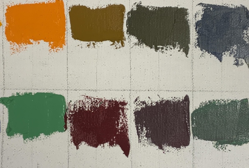
13. Exploring Colours: Developing Your Range: Now we start part number
three of this tutorial. The next combination
involves the two color yellow and blue. Quickly, let's put them
on the first square. The color yellow.
Make sure every time, especially when you're
using a lighter color, you clean your pale
and knife or brush. That's quite essential, guys. This is a practice because
it's about muscle memory. Now we're going to
place blue color and then we're going
to combine them. I'm sure you can guess the combination of
them would be green. You can see I'm using a
bit of blue, not a lot. Try to make your hands get used to amount of color
that you need to use, not a lot of blue and yellow, it should be a bit more of yellow and just a hint of blue. You can see the
green color here. Blue and green are a great color combination
to experiment with, especially in landscape
and nature scenes. Since both are cool colors, they work really
great together, guys. They create calm
harmonious effects. When you mix them, you
can get a variety of shades from soft blues
and greens to rich tones. These colors are ideal
for capturing water skies and greenery because they sit next to each other,
as you can see here, that's why I'm putting
them next to each other so you can see
on the color wheel, they naturally blend
well without clashing, making them perfect for creating balance and harmony
in your paintings. Experimenting with
different ratios will help you explore both soft
and vibrant mixes. Also, you can see I'm creating a separate green with white, and I'm going to
place it next to it. This is how it looks like. Don't forget to send me your
practices and assignments. Looking forward to
receiving them. Also, don't forget to look at my hand waves and
how I'm holding the knife and playing
with the paint. The amount you bring over, that's quite important as well. So we are done with
part number three. I'll see you in the next part, part number four. Let's go.
14. Exploring Colours: Going Deeper: Welcome back to
part number four. We have warmed up our hand and colors put all the
necessary colors here. Our next step is to add complimentary colors to
the secondary colors. This means that where
we have purple, we add a little yellow to it, and then we shade it,
blend it together. Here we take the
purple and put it on the palette and mix
it with cadmium yellow. This is for the first row. In this way, the purity, transparency of the
colors has taken away. What is important here
that these colors or combination of these
addition compliment them. They have become impure, I have to say, gives
us a neutral color. Sometimes this color is quite important because if
you have noticed, some of the artists they prefer to put some neutral
colors on the canvas, the surface on the canvas before they start
the actual painting. We will go through those
elements one by one. For now, let's learn how
to mix these colors. So again, we combine
purple with yellow, but I use a larger
amount of yellow here, which impacts the
balance of the mixture. When we combine
purple with yellow, the ratio of each color plays a big role in
the final results. In this case, I use a
larger amount of yellow. Or I can use less color yellow, which affects the
balance of the mixture. Since yellow is a
dominant color, it lightens and
softens the purple, making the mixture
lean more towards a warm muted tone rather
than an even blend. The more yellow you add, the more it shifts away from
the intensity of the purple, giving you a softer,
warmer color. Adjusting the
balance between the two allows you to create different variations
from soft pastels to richer deeper shades. Ideally mixture, our main
mixture should have a bit less yellow as the goal is a fine middle ground
between purple and yellow. Now it's more towards brown. It is quite important the amount of purple and yellow you use. Now for the next step, let's add another color
onto it, which is blue. We're going to create
a new variation now, and then a bit of red, and then let's combine it and the previous tone that we
had the shade that we had. Maybe try to have the
equal amounts when it comes to blue and red
when you add here. But Now that we have mixed it perfectly, I'll take small amount
of this purple, place it on the palette, mix it with blue to
create a new variation. What we are doing so far, what we have done so far here, combining secondary
colors purple with its complimentary colors
yellow in equal amounts. Hopefully, the mixture plays
in the center section. So let's follow my hand movements
and complete this part. Mixing purple with blue creates a very rich cooler
shade of purple, often leaning towards a
violet or deep indigo, depends the amount of
colors that you use. This color is more
subdued than pure purple. So what we have
done in this room, combination of secondary colors, purple with its
complimentary colors yellow in equal amount. Then we mix it with
neutral color with additional yellow and blue
to create range of purple, yellow tones, as
you can see here. Now we can experiment by
mixing these colors in pairs. For example, we can combine a yellow blue mixture with
purple mixtures and so on. Is the amount of
different colors we can create with just a few simple
colors is just amazing. Or we could combine
yellow with a blue, yellow mixture or with
a yellow blue mix. I'm getting confused
myself as well. So that's why we need this kind of color palette for
ourselves as well. I would suggest you write
down all the names. For instance, here's
a red, write down, you just put pure red or this
one was a combination of, like, was it purple? Was it blue? Was it yellow? And what is this combination? So you can memorize
the combination. That's quite important
that you write about them. For the mix, for instance, if I add that yellow, I will we down and write it down or equal mix of purple,
write down everything. I'm starting with a
little more orange here. Just let's have a bit more. Remember the color
shoul mix carefully. One thing I wanted to talk while I'm mixing this about
the previous color, it's the previous color was
great for painting shadows and night skies or creating depth in floral
arrangements and landscape. You can also use it for adding richness to darker
areas for painting or for creating dramatic contrast when paired with
lighter, warmer tones. The previous cool purple is
versatile and can be used to bring sense of calm or
intrigue to your artwork. Now we're going to
combine this orange and blue that we are
doing hint of white. Let's see the next result now as we are going through
this combination. So again, combine it orange with a specific amount of blue
to achieve a right balance. Added a touch of white to add blue to lighten it up a bit. Now I'm going to mix a
small amount of blue with some orange. Look at the colors. Let's compare it with the
previous one underneath it. Look at the tone, try to experiment the tone at the
same time I'm doing this. While I'm mixing this, let's
talk about blue and orange. We have created a neutral tone. Complementary colors when mixed together cancel each other out, resulting in a muted
grayish brown tone. This kind of mix is useful
for creating subtle shadows, earthy tones or for balancing out more vibrant
colors in a painting. It's great for adding depth
and realism to your work. These are really
important colors guys that I'm teaching you here, especially when it comes
to the backgrounds, muted landscapes
or neutral areas. When you know these colors, the combination, your painting is going to look so different. The focus, the elements, you will achieve a
much better results, I promise you when you mix
these colors together. Now the previous color
that we created, let's add more orange to it. This will create a more
neutral mix, guys. The tone will warm up
shifting towards muted, irvy, orange or brown.
Let's look at it. It's more brown than
the one next to it, on the right side. The added orange
brings warmth and vibrancy back into the
mix and quite lighter. But because it's still
blended with blue, it remains somewhat neutral. This warmer tone is
perfect for creating natural air free
elements like soil, rocks or often leaves, or for adding subtle worms to shadowed area without
making them too vibrant. The more orange you add, the more noticeable
the warmth will be, giving your painting a richer,
more balanced contrast. Now let's look at the next one. The same color
that we just used, the previous one and the lighter blue that we created way before. Let's combine them together. Almost the same color,
but different tone. Now for next color, we create a new combination using the light green
that we created, which was green and
white with red. When you combine light green, which is a mix of green
and white with red, you're mixing
complimentary colors. Again, that looks like
the previous one, the neutral tones that we
have done, previous rows. You're mixing colors generally results in neutral
or muted tone, since the green is
lightened with white. Adding red will create a warm
color often leaning toward a soft brown or peachy tone depending on how much
red you use on it. I added a lot more red, so it leans towards a reddish
brown or trachota color. The red becomes dominant, but the light green soften by the white neutralize slightly
creating more muted shade. This makes it perfect for creating realistic natural tones like rust brick for landscapes. Now, let's add a
lighter green on it. I look at the tone, please. I'll place the result
color at the end of here. It's more brownish. Make sure that you clean your knife every time so you
don't mix them. This is very important when it comes to portrait
drawing as well. Imagine if it's hair
drawing or eyes, eyelashes, all those things. We will use for
all those things, we will use these color
tones, these shades. Now, in between, that's why
I left this part empty. I wanted to show it
to you when you have just the reddish color,
how it's going to be. Let's compare it from green to the brownish tone
that we have in between. Again, please write down all these things that you have done so you don't
forget, for instance, I combine green that was a combination of green and
white. I combine these. All these scenes
are very important. You can see we have
primary colors, secondary colors, and kind impure version
of them lined up. We have now created the
primary secondary altogether. The purpose of creating
this color combination is to see the transition from the purest colors to the most neutral
or impure colors. We can also create gradient
between these colors with the most neutral colors being those mixed in
equal proportions. For example, the purple
and yellow mix in equal amounts or orange and blue or green and red
in equal amounts. All these color combination, you can even create more combination just
combining these ones. Afterward, we adjust the ratio by increasing the
amount of each color. For instance, here, we increase the amount of blue
and mix making resulting color slightly more vibrant than its
neighboring colors. In this row, we have created the most neutral versions of the secondary colors
from the color wheel. And with that, we have completed the study of color
chart part four, and I see you in the next part
number five. Bye bye now.
15. Exploring Colours: Neutral Colours.: We'll come back to
part number five. Let's dive in in the
same way we can combine complimentary colors
such as blue and orange to create
more neutral colors. Similarly, combining red
and green or yellow and purple will result in
other neutral colors. When we mix primary colors, which you have seen in
the previous two serials, with their complimentary
counterparts, we reduce the purity and
vibrancy of the colors, moving them towards
more muted shades, often creating gray
or gray brown tones. Another important factor to consider is how
much white is mixed into these color combinations and how much you
want to mix it with. Now I will demonstrate
how to mix purple with white to create a
range of lighter shades. I will begin by
creating a fresh batch of purple using the same method as before by combining blue, zain, Crispin, and white. The previous layer, they have dried out, so don't
worry about it. Just mix it perfectly. Now that I've created the
original purple color, I will replicate the process. Once I have the purple color, as you can see on the screen, I will take a portion
of it and mix it with specific amount of
white to lighten it up. Look how much we have to take. Just do it a bit
little by little. By doing this, I
have significantly increased the lightness
of the color. I use almost equal amount of purple and white to achieve
this lighter shade. The combination of
purple and white results in a lighter pastelly version. So vibrancy is gone, but we have a beautiful
pastel purple color here. Follow my hand movements. You have learned so much so far, really proud of everything
you have learned. Now I will blend
this lighter shade, original purple to create
gradual transition. The pastel version of purple created by
mixing purple with white is ideal for adding softness and lightness
to your artwork. You can use this lighter Shade in areas where you want a calm, gentle feel, such as skies
during sunrise or sunset, soft flora petals or subtle
shading in portraits. Now, this one is a
bit darker shade. Paso purple is also great
for creating highlights or adding depth to shadows
in a more delicate way. It's perfect for painting soft dreamy scenes or
for adding a touch of elegance or serenity
to your work without the intensity
of darker purple. It's a very beautiful color, one of my favorites. Now, let's mix it
with more white. This I'm combining it
with previous purple. I'm adding even more
white to lighten it. Fade if you add more white
to the pastel purple, the color will become
even lighter and softer, resulting in a very pale, almost lavender like hue. This extremely light version
of purple has a delicate, airy quality, making
it ideal for painting, subtle highlights, soft
atmospheric effects like mist or clouds
or light reflections. It's often used for creating
gentle areas in painting, as I mentioned in
the previous one, but even more even gentler. Great for floor
guys or backgrounds that are any scenes
where you want to evoke peaceful calming mood. The more white you add, the more muted and
pastel the color becomes offering a refined,
understated effect. Also, for those highlights, for instance, let's
imagine sky, the clouds. You want to add that
highlight effect instead of just pure white, you will add this depending
on the scene, of course. Adding larger amounts
of white to this mix. We created original
purple color, then we mix it with
nearly equal parts white. However, the ratio of white to purple wasn't exactly equal, there was a slightly
less white because white tends to overpower other colors in mixture, so be careful. Even a small amount can
have a strong impact. Now we have created
this color combination. Let me talk about
three key aspects of color mixing
that we will focus. Or we have already
focused in this lesson, Hue, purity and brightness. Hue the specific color or shade, purity is the intensity
or saturation of a color, which decreases as we mix more white or
complimentary colors. For instance, let's see
the differentiate between these ones that I'm showing on the screen and the brightness. The brightness is the
lightness or darkness of color determined by how much
white or black is added. Take some orange and place a small amount of
it on the palette. I'm going to show you a
different mixture here. Let's add a bit
of white onto it. To lighten this orange slightly, be careful how much white you
use, as I mentioned before. I'm adjusting the brightness for this mixture to create a
medium shade of orange. Place the resulting mixture
in the middle square on the palette. Look
at the difference. We're going to do
different variations now. I will mix this
medium shade with some original orange to
create another variation. Let's mix a bit more. Make sure that is
perfectly done, and then let's place it here. Why we see a different color on the palette and different on our canvas is
the light as well. So be careful when you're
painting something. The light around you
is going to affect your painting and
your eyes as well. So maybe sometimes try to
paint with the same light. However, look at your painting with different lights as well. Next, I'll take the medium
orange white mixture and blend it with more white. This means I'm mixing the medium orange white
shade with additional white to complete the lightest
color in this spectrum. In this way, we have completed the study of this color range, focusing on how
complimentary colors interact with one another. Hope you enjoy this part. Right away, let's dive
to part number six, and that is the last
part of these tutorials. See you soon.
16. Exploring Colours: Final Touches: Welcome back to the last
part of these two terios. Now we are working with
green color combination. First, I will clean any
remaining impurities from the palette to ensure
clean color mixing. Make sure your knife is clean. Next, I will create
the main green colour, which was green and yellow. Let's mix them together. And then clean the knife again. I'm just going to take these dark remaining colors away from it to make it as pure as possible or as
clean as possible. Let's play some green color from our main color
wheel onto this. And then I'm going to
begin working with it. Let's add a bit
of white onto it. When you mix green,
yellow and white, the result is a soft light
greenish yellow hue, often referred to as a
pastel or pale lime color. The white helps tone
down the intensity. So try to add some
yellow to it as well. This is just green and white. But as I mentioned,
the white helps tone down the intensity of
the green and yellow, creating a fresh light
and soft version of the original mix. This color is ideal for painting
spring or summer scenes, especially when it comes to new leaves or grass
in the sunlight, not just the grass normal, because they are quite dark. So when you want to
add that highlight onto them, this is perfect. Let's add a bit more white. It can use for adding
highlights to plant soft lighting effects or creating fresh
vibrant backgrounds. The added white
makes the color feel like airy perfect for cheerful, natural and bright
areas in your painting. But here we added a bit more
white, a lot more white. But when you add more white to the mixture of
green and yellow, the color becomes even paler. Let's have a look. Now this
is a mid tone combination. Therefore, you have
a softer version, essentially a very
light pasta greenish, very delicate, almost
creamy or mint like shade. These kind of colors can
be used in areas where you want to evoke a sense
of freshness or softness, such as in the sunlight, grass, the first hint of spring leaves or subtle highlights on plants. After this mix, we're going to move on to the next color range. We're almost done. Please send me all your assignments and
practices in the meantime. I need more blue here
to create purple again. I will mix ultramarine blue with sarin Chrisman and a small
amount of cadmium red. The resulting
mixture is too dark. But we can play with it a bit. And let's see how we're
going to mix it now. You have already done this mixture in the
previous lessons, tutorials, the
beginning lessons. Quite a dark blue. So now it's time to add
a bit of white onto these kind of dark purple
color on the palette a bit. Then clean the knife, and then let's mix it
thoroughly. Keep mixing it. Take your time when
you're doing this. Even if you feel like you
need to clean your knife, do it, please. Now
you have seen it. Let's add some
white on the side, and then gradually
add onto this. When you mix these colors, you get a soft mutel
purple or violet color. The small amount of white
lightens the mix slightly. You can use this color for
creating shadows in florals, sky during twilight or for areas that need a touch
of cool, moody shading. The hint of white gives it a more delicate and
approachable feeling. Now we have created that color, let's go through a bit
of blue and white. Now, from the previous color, I'm going to add
that one onto this. Make sure that you mix
it perfectly here. Now, let's add a bit of
previous color onto here. Now that we have created a
muted purple by mixing blue, red and a little white, we can create a second color by separately mixing blue and white to make a light
soft blue as well. Once we mix these
two colors together, they muted purple
and light blue, we will end up with
cooler more version of purple leaning towards a
blue violet or lavender hue. This new color is perfect for creating subtle transition in skies atmospheric
effects or cool shadows, especially useful
when you want to evoke a calm tranquil mood. This mix is great for blending
smooth gradients or adding depth to areas that require
a cooler, subdued touch. Now we have this purple created
from previous versions. I know it's getting
a bit confusing. That's why we had to
do it one by one. Now, let's add a
bit of orange to the mixture of this muted
purple and light blue. We are blending complimentary
colors purple and orange. This results is more
neutral muted tone, often leaning towards a
grayish brown or airy hue, depending on the amount
of orange added. The orange will warm up the cool mixture of
blue and purple, softening the coolness while still creating balanced color. This tone can be excellent for painting natural
elements such as rocks, shadows for different
backgrounds or make kind of
bana painting guys. It's a very good color. Really idea for subtle warmth to areas that need less intensity
and add more balance. Now with darker
purple, let's see. When you add dark
purple to existing mix, the result is a deeper, more complex neutral tone. The dark purple will
darken the overall color, giving a richer, more
intense quality. The combination of the
darker purple with the previously created
muted tones will result in a slightly warmer brownish shade thanks to the interaction
with the orange. Look at this beautiful mix. It's a new mix perfect for adding depth or shadows
to your painting. It can be used for darker,
more subtle areas. For landscape is perfect. Even for evening skies guys, for the darker areas of natural objects or even
architectural elements. The richness of the
dark purple will provide a sense of
weight and contrast, making it excellent color for adding kind of dimension
and mood to your artwork. Let's see, when you
add even more orange, how it feels like,
how it looks like, I have to say, all
painting or pigments, they have feelings. That's why. Now, you're slowly
adding it to our canvas. Look at this brownish color and how many color we mix
to reach to this color. The result is visible here. In this process,
we have combined blue purple with
complimentary colors, orange, yellow, then
mix it further. Now, if you want
to make it darker, follow my hand movements. I look forward to all your
assignments and practices. Don't forget to send me. It's very important you
create them and write down underneath or above them or next to it into it before
sending it to me. What colors did you use? What brand you're using? If you're happy with your
brand, how's your mixing going? You don't need to
have this knife. You can even do it with brush, but make sure that if
you're using brush, you clean it afterwards. Look at this
beautiful orange now. It's kind of brownish orange, the lighter version
of the bonds below. Look at in between. Now you can see the color combinations, which one we use,
which one we combine and mix in order to
achieve these results. All these combinations
are important. That's why I wanted
to do it one by one, some of the dozens, even though they were one or 2 minutes. It was good for you
guys to do it step by step and not rush it in order
to achieve this column. This last bit of
colors we created throughout this process
represents a range of muted, desaturated tones, both
warm and cool undertones. So I really hope you
enjoyed this process, and I see you in
the next tutorial. Take care and Be bye now.
17. Painting the Apple: Laying the Foundation: Hi, everyone, and welcome
to another tutorial. This is a five part tutorials and we are going to start
with part number one. Here we have our model,
which is an apple. We don't call it an apple. It's an object with
colors for now. And then I'm going to show
you how we could draw it on cupboards filling in
different colours of yellow, green, red. We have a set here,
and as you can see, as a picture, you can find this picture on your
downloadable resources as well. As always have your colors, pencil and your
canvas paper canvas filling in front of you. Please follow my hand movements, just dividing the surface, and then drawing the apple
right now in the center. The reason I chose these three colors is because
you get more familiar with the primary colors and how to use them next to each other. As you can see, I'm using
pencil here, HB pencil. Make sure that your pencil
traces are not really hard. You can see that I'm barely putting any pressure on
my hand and on my pencil. When the outlines and the grids are done
and ready for you, then we're going to start
drawing and painting it. So make sure you have
practiced your drawing. You don't rush going onto your painting and use
all your colors until you're ready until you made sure that all your colors
they are good enough. Your outlines are
meant, my apology. The best way to practice is
to follow my hand movements. You can stop the
video at any moment, watch it a few times
and practice it. In this video, in this tutorial, we are not going to use brush. We are going to practice
our palette knife. I'm just making sure
all the outlines are correct around this area. We are going to complete
this work in three steps. Not for three steps, so it's going to be quite easy. We can do the observing
the model carefully. Again, the first is drawing
the outlines correctly. The next step, we make
it smaller inf step. The colors are dry
when we work on the details to show the
difference in color tones, darkness and brights,
brightness in each part. I will explain more in each step so you can understand
the process better. Now, what we have here is a
basic drawing of the model. After drawing the
sample picture, we apply with a card. Do you remember this guys
that I told you about? So whatever sample
that you have, you can use this device as you can see here
in front of it. And then the way I'm
showing it to you, if you're right handed, hold it with your right or left hand. Hold your hand totally
straight forward to where the model is and
then look at the model, through the hole that you
have done on your paper here. It doesn't matter if your model is a fruit or any other object. First, focus on
the object through this small circular hole
that you have done. Try to guess the colors you see and understand how
pure the color is, the hue and the
brightness of the color. Then use this to combine and mix colors
on the color palette. After we have done, we put the same colors on the palette, hold it like this to see if
you have done it correctly, don't forget to hold your
hand totally straight. Then we put this knife, look at here behind the tool. We made it in a way
that we can see both model and colors
on the knife palette. After that, we look
through the circular hole here again to see if they
have similar colors, if you have made correct
chose the color as properly. We want to see if we
understood the saturation, the brightness, all of
those terms correctly. We didn't use green or red yet. We need to check how
bright they are. We need to check the
purity of the color. Whatever I'm saying, it means
the color that you see, try to mix it and bring it onto your palette knife and then just have it
next to your fruit. If it's red, the mixing colors, all those stuff that
I'm mentioning, they need to be the same color. And this one, this piece of paper is going to help
you to achieve that. Okay, now let's start. Let's see how it goes. First, we add the
colors on the palette, follow my hand movements, and try to use the colors
as close as possible. You can see. Now I'm going to do exactly
what I taught you, but I'm going to actually
do it on this model. So let's try to get the correct color because I've already saw it through the
device that I just made. Now we are just going through
the color combination here that we have
already figured out. The color obviously
needs to be darker. So let's see how we're
going to do this. Look at my handbooks. I'm taking my time guys. I'm rushing it. I have seen many of
my students sometimes you rush going through all
the color combinations. I just added a bit
of linseed oil, not a lot a bit and
do it gradually. Maybe you will need more. Even if you know you
will need a bit more. The best way is
to add gradually, either from color point of
view or oil point of view. Is it dns in oil or dry oil? All of them, you need
to do it gradually. Now, I know you cannot
sit underneath the here, but I'm just keep having them next to each other to make sure if the colors are
similar or not. Do I need to add darker colors? Do I need to change
the color here? This is what I'm just analyzing, taking my time to do this. I hope you do the same thing
as well. Very easy to do. Try to recognize, try to
analyze. Don't worry. It's a very interesting process. So it needs to be a bit lighter. That's why I added a bit of white here to make it brighter. The hue of the
color is brighter, which means that the color is
closer to orange or yellow. So follow along
at the same time. Do we need to add more? You need to analyze
all those steps. So if you have, for instance, a lighter orange or red, try to combine it onto colors. And even if you feel like
it's not a correct one, don't use it on your model. Try to do a bit a little
at the beginning, and then create more later. See how many minutes I took
my time taking it easy, making sure my
colors are correct before applying it on the model. We need to modify the purity
of the color as well. It means that you need to
figure out if you need to add a little complimentary
colors onto it. Pay attention to how much green I add to the color combination. I change both purity and also the brightness
of the color now. Sometimes you feel like, Oh, adding green to red,
that's not a good idea. I'm not adding a lot.
It's just a bit of it. That's why I'm adding
you ask you if we could add all the
colors gradually. Now, let's compare it one more
time, see if it's closer. First, I thought is a red
color in orange tone, but then I saw more colors on those areas
considering the light. Now, there's a start. Look at my hand movements. I'm taking the color
and spread it around. Don't worry that how it
goes at the beginning. Just try to follow my hand movements and feel free to ask your
questions anytime. I will guide you
through your learning, especially if you're
beginning level. Try to ask me as many
questions as you want. Also, in your
downloadable resources, I put all the information
you need for more practice. So make sure that
you check them out. Look at the direction
of my hand movements, how I change the
direction on my hands. The way I'm applying the colors
one by one on the canvas, this is behind the apple. Observe my hands movement so you better understand how
to control yours. I'm sure the video is not fast right now because
I'm taking my time. But if at any point you fill the videos,
they're fast for you, try to stop the video, catch up, and then resume so you
won't be overwhelmed. Trying to add a bit
more on the left side. It's very important also, guys, to have clean tools. You know that as I mentioned
this on your when it comes to the first tuterials
in this course, I mentioned to you
have a kitchen towel or tissue next to your hand. And every time you
change the color, make sure that you clean it. Now we are done, complete with
this part. Let's clean up. Now it's time to clean up because we're going
to add another color. We have analyzed it already. Make sure you use the tool
that I taught you before. Look through the
whole and make sure how red or darker
red you need to use. See how I take my time here. Excellent. Now it's
completely clean. I'm going to take the device
that I have invented, I have to say, now
I'm just joking. A lot of famous
artists they do this. I'm not saying, like, this is a famous course, but I'm hoping that
you guys can try and use this method as well. So now if we want to add
a bit of darker red, I added the red,
a bit of orange. Taking my time
completely mixing them. Guys, you need to be patient also when you're trying
to mix everything up. Step by step, get used to seeing things and observing
them in the right way. Continue working on
the darker part. The process is exactly the same. Now, look at the
way I'm going to go through from this
angle from here. Create the shadow. That's
why it needs to be darker. So we need to add create a
bit brownness, darker red. So how we do this,
how we analyze it, we are not going to
use black guys at all. I taught you how to
create darker tones. Let's say it's forbidden to
use black here right now. I'm not saying that at all, don't we will use black
maybe in future courses, but now in this course, I don't want you to use black. I want you to create
the correct colors. Now, a bit of green. Depending on the color that you have analyzed and realized, you can add a bit of
blue as well, depending. But green is good enough here. See how much I'm
actually taking my time to making sure I'm making sure that the color
we have here, we mix it thoroughly. Again, try to see if
they're quite close. Now the colors are match, let's apply them on
our canvas paper, follow my hand movements. Don't worry. I ever
you made mistakes, you can easily correct them when it comes
to oil painting. All you need is practice to
learn the process faster, and you will become
professional in no time. You can also add some turpentine to your color and then
apply it onto the surface. Follow my hand
movements, please, so you can practice at the same time and also how
to control your hands. Always remember that your
work is in progress. So this means at the beginning, you might not like your work. You feel like, Oh,
you're not doing something right, then
you will give up. I have seen so many times
that at the beginning of any journey
that this happens, please don't think like that. Try to make sure that
at the beginning, you're just doing layers,
the first layers. So take your time,
try to finish up, and then you'll see that
at the end of the process, you have achieved something
very beautiful and great. Go. How many times
I have analyzed it? Let's realize if we need
to make it darker or not. Do we need to add darker red? I'm not just calling it Alzaran
Chrisman Hue number 003. I just I'm going to call
it darker red or red. And then again, the process is to add a bit
of green onto it. All right, guys, we're almost
done with part number one. I just wanted you to do a lots of practice
for the background, the color mixing, and you won't get overwhelmed
by this kind of practice. So since you have started
it, if you are ready, let's move to the part
number two straight away, and we can complete
the background before moving on
to the Apple area. Just doing the last part of the mixing and then we're
going to continue after this. Also, don't forget
to do the last, analyze, and then we are done. Alright, have some rest, and I'll see you
in the next part.
18. Painting the Apple: Adding Details: Hi, everyone. Welcome
back to part number two. You remember we have
done our background. After doing some rest, I decided instead of the
yellow part of the background, we should start doing the apple. Right away, let's start using the purple and
work on this part. We're creating a
darker color here, a bit of purple,
mixing it together, mix the colors completely. Kind of reddish and purplish tone next
to each other here. Don't completely mix it. Just make sure the mix
are next to each other. We're changing the
hue of the color. Sometimes we think
a color is darker, but the point is that the hue
of the color they change. Analyze to make sure
they are correct. Look at my hand movements, how I start going through it. If you need to
decrease the purity of the color, this is
how you should do. So we add a bit of this color, the combination of
the id and hue, 696 and cadmium
yellow, pale hue 119. Kind of turned brown, guys. It's not purplish anymore. I'm quite satisfied
with the color, quite similar to the one
we have in front of us. Let's check each step,
make sure they are right. Use both sides of
the night palette when you're trying to mix it. Again, check one more
time. Are they correct? Similar? A bit of darker red. It can be Asarian Chrisman, number 003, follow
my hand movements. Well, it's not just following. It's mixing mainly now. You can see how many times I apply modification
on the colors. I take my time. This practice
is not just mixing color, it's patients as well. I'm trying to make
you understand that you really need
to take your time. This is a great practice when it comes to portrait drawing. Because when you are
doing the skin portraits and skin color combinations, you really need to take
your time to apply this. This is a great method
for hyperrealism as well. Since we are doing abstract, it's still okay if
it's not totally okay, they are not totally
matched, but still. Sometimes maybe with
brush, it might be easier. You might ask me,
do we need to start with lighter colors
or darker colors? So here you have the answer. I started with a darker tone, and then I'm going to apply the lighter colors
where this means here, the brownish color that we
created with a bit of red, darker red, green and purple. This color we created. So it's a darker tone. And then we're going to
apply the lighter color, which means that kind of pure red that we have
on the left side. Just make sure you have a look and follow along
changing my hands, making sure that I understand
the hand pressure, the knife palette pressure that I'm bringing onto
the canvas here. Especially if you're doing on a real canvas that is in front of you is much
easier than on a table. And it's usually how
you get used to it, so you don't need
to have an easel. Since we are going
through this area, I'm going to explain and analyze what we have done so
far and what we are doing. We're continuing this still
life demonstration here, focusing on how to block in colors and establish
a composition. Now I'm going to go
through the breakdown of what you have learned so far. So we have done setting the palette on the left
side with arrange colors, including a wide variety of
primary and secondary colors. Whatever you have is fine, like red, yellow, green,
blues, and white. I'm showing it to you how
to organize the colors. It's really great
to be organized. And the first thing I did
was to block the background. The right side shows what I've done so far
that on a paper canvas, I've already blocked in a
vibrant red background. This is a very important
first step guys to establish the overall color scheme and contrast between the
background and the object, which can be a fruit
object similar to an apple or pearl or whatever
you want to paint here. So so far, this is the
angle that I have done. Now we're going to go
through this part, introducing you the form. Since we have worked on the lower portion
of the composition, let's work on the upper portion. We use darker, rich, reddish brown paint and a palette knife to create the
basic shape of the object. Now we are working
on the lighter tone, how to create the form here
instead of using pencils. Mine asked me why I'm using palette knife
here rather than brush. This technique
emphasizes textures, clean edges, and control
over the paints thickness. I'm teaching you how to blend smoothly and create
deliberate texture by pressing or lifting the knife at different angles and how
to mix it like this. It's very important taking your time when you're
doing underpainting, we call it underpainting
or blocking in shadows by using dark color to mark the lower
part of the shape. And now we are doing
the upper part. It just to establish how to establish a tonal balance
early in the painting, guys. Please avoid over detailing
too early at the process. You need to take your
time to establish the foundational composition and color contrast, everyone. The knife technique that you are learning is a great lesson
how to control pressure when it comes to
mixing right now here to either smooth pans
or create textures. Now I'm doing one more time, the analyze to see the upper part color is correct or not. We're still doing
the underlayer. Just bear that in mind, please. I'm going to give you an idea of what colors I'm going
to use a bit further. When I move towards
the upper part, I'm going to use cadmium
yellow, pale hue, cadmium yellow,
which is called 119 and Viridian hue and maybe
a titanium white as well. But for now, we are
not using them. We're just going to
mix these colors until we reach that point. So on this step, we are
refining the form guys. Still, we are just on the
actual form and the coloring. We're just going through
the shape of the object. As we apply darker tone, now I'm just introducing
the highlight to guys here. So it means we have to define the light source and the light
and shadows on the object. But now we are going through the blending
and transitions here, the contrast between the lower
part and the upper part, which means the darker red and the lighter interacts
with the object. And how they blend together, which we call it, of course, blending techniques
to transition to show the transition between the
light and shadow areas. You need to smooth the edges where the light
meets the shadows. I just give you a bit of more information when you
want to add depth is by darkening the area and also adding white to the
highlights if you need to. Or you can add yellow. This way, you're
adding more depth and dimension to the object, making it appear more
three dimensional. Very important step when
you're doing the model, the form and create a sense
of volume using light and shadow while maintaining
the background. So the red background guys
should remain untouched. A Make sure if you want to make any further
adjustment, let me know. Also, let's understand
the highlights, the strong contrast between the background and the object. We have already established the light source where the
light and shadows are. Gradually, we are building the form without
rushing into details. Make sure that you don't rush. So now, this is the time I mentioned to you that we're
going to use the yellow. Does follow my
hand moments here? This practice needs
lots of patience. Put time and effort pleased into learning the steps
and the process. So in the future, you
will be able to create beautiful and artistic words and use various colors
on your palette. I'm sure you have
realized this is a great practice for you
to recognize the colors correctly and how this practice will change your
drawings and artworks. Use a bit of titanium white, follow the way I'm
mixing the colors. Doing the analyze one more time, making sure the colors
are done correctly. I would like to emphasize one more time the
darker tones on the lower right side of the object have
become more prominent. We're establishing a
solid shadow underneath. These kind of shadows, which is the first layer, makes the object feel
grounded and gives it, as I mentioned, a free dimensional presence
on the canvas. So you can see we have
three layers so far, the darker one,
the midterm ones, now the highlights one that we are going through right now. We're establishing
the light area. The larger unpainted
white area for now is where we
have our highlight, the lighter value color. We have left it blank so
far it's intentional, guys to avoid modeling the colors while focusing on going through each
layer one by one, the darker one, the mid term
ones, and the highlights. Okay. Mm. Contrast
with background. You can see him adding a
bit of more lighter color, either yellow and white mixing it to create
that Highlights. It's a new word, Highlightish. ColorTo enhance the
form of the subject. Let's analyze one more time. You can see the general
shape of the color, the object, the
apple is now clear. Okay. With kind of smooth, well, not that smooth,
but almost curve that suggests the rounded
nature of the apple. So please make sure that
you go through this one, the darker tones
is on the bottom. Crease that roundness. That's how you create the
form of illusion of depth. See how brighter the
color is now after mixing all those colors
together, please follow along. For now, place fall on my hand movens as I'm going to place the lighter
colors on this area. Look at how I mix the colors. After this, we're going to
start mixing soft colors, as we call them soft yellow lighter yellow
or even if you have yellow oche This suggests we are preparing to add highlights or mid
tones to the object, which is our apple
here on the canvas. How to create the
right tone by blending colors directly on the palette is very important, everyone. And how to achieve a
lighter value we need here. It's very important we
pay attention how I apply the colors with
the knife palette. When the color is less
pure, as you can see here, it gets darker and you
get the point when you think you need to make the color brighter
and change the hue. It shows that you
have done it maybe incorrectly or maybe we didn't
mix it in the right way. So when we don't have options
to bring back the pit, you can make the colors
from the beginning. So don't keep using the same color if
that happened to you. Or you can add a bit of white. On this color now, let's see the highlight that
we are creating here. So we are not creating
a direct highlight, which means our white. And Follow my hand movements again as I'm checking the
colors and mixing it, making sure again one more time, if the brightness is similar to the color we have on
the apple in front of us, adding more yellow here or as the actual color is called cadmium yellow pale
hue, number 119. Then we check the colors again. Look how mix the
color thoroughly. You also need to add a bit of cadmium orange hue, number 090. Let's mix the color
perfectly this area. Feel free to ask your questions
at any time, everyone. I look forward to receiving your comments and
also assignments. So whenever it comes to creating highlights
and mid tones, you need to make sure
that you understand the lightening areas
of the object itself. We keep using palette
knife for mixing. Keep the process
clean and efficient. And also, let's bear in mind that when our palette
is organized, figuring out the colors
around it and how to blend them would
be much easier. We are achieving the right tone here gradually
blending the colors. And build up to the
right highlight in certain stages,
starting with mid tone, as I mentioned to you, gradually
moving to lighter areas, which give our apple
more dimension. I keep cleaning the
knife palette here, palette knife, I have to say. So the knife control is quite important as
we keep mixing it. How to control the
palette knives pressure for both mixing and
applying the paint here. Please have a look like, Oh, please notice how many times I analyze and
change the color and mix it to achieve the
correct color tone here. One more time. Let's continue. So even we have a
very small painting and we want to achieve
a good result, we really need to take our time. Let's be patient,
practice more and more, and don't try to finish
as soon as possible. Let's clean the knife
palate one more time, and then I'm going to apply it. As it is very important to see how I hold it here
and control it. In this area that you
see the top part. The color when they
change around, we need to make sure that
we apply it correctly. Wherever I'm applying it, please try to follow exactly what you see and
how I'm doing it right now. H take the color from
the palette and then how I apply it here
and then place it. The color around these areas, they are not completely dried. So sometimes you really
have to let it dry the first layer and
then work on it later. Also, as you know, the cover, the background on the
right side is yellow. So we're going to
use cadmium yellow, pale hue, number 119. So I added more colors
on the palette. We have a bit more
cadmium yellow, pale hue, 119, and
vary thean hue 696. So we could mix them. This way, and I'm
having guest somewhere that we don't have other colors, so we could mix it here
and apply it in this area. As the surface below
the apple is green, so we can see the reflection of this color on the
yellow surface. The only way to recognize the
color is using this tool. This piece of paper, as I
call it tool that we made aeriala here without
this piece of paper. We might just feel like, Okay, the surface is yellow. But after you use it, you're like, Okay,
there's a shadow here. There is this color here. So you realize and you could see the
colors like separately. It's a great muscle training
for your eyes, guys. Also applying a bit of titanium
white and mix it here. Please observe my hand
movements so you could have a better understanding how to uncontrol your hand
and also the pressure. Mix the colors carefully
and patiently, guys. You can change the speed of
playing the video later. If you felt like it's
too slow is fine, but I advise you to really
take your time and even sometimes stop the video and try to finish the part that you
have seen and then resume. Now we get closer to the edge. We could have a bit
of green as well. We need to check the
color one more time. Et's add a bit more
titanium white. Mix them. Now, I'm going to apply
it on the canvas. See how first of all, mixing it now it's
ready to apply. As we move forward, this first phase that you
are watching right now and practicing after that, we got to move towards in
the next few tutorials. Step by step, we got to move to the second and third phase. First, we're refining the form either as background
or the apple. We need to talk about the
Apple has been largely blocked with a range of tones that define the
shape and the curviness. We call it curvature. Darker shades are used on the lower right side to
represent the shadow, while lighter tones likely
mixed from the yellow, white visa a are applied
to the left side. Mainly top part, but you did see how many colors I applied to create
that highlight. Also, we need to talk about highlights and shadow balance. The central part of the apple is transitioning smoothly
from dark to light, giving the appearance of a
round three dimensional form. So the reason I keep
applying and repeating this is for you to understand that you need to create
these different tools, these three different versions. While I'm applying
the green onto this area and a bit more yellow, let's talk about the
balance of light and shadow that will help the
apple look realistic. The brighter, whiter area near the top indicates where the strongest light is
hitting the surface. Since we are working
with palette knife, it's very important to
mention the texture. So we're using the palette
knife effectively to blend and apply paints in a way that
creates subtle texture. So it's very different
from brushes using brush. It kind of mimics the uneven surfaces of
the apple's skin as well. The blending of
colors is smooth, but with enough texture to suggest the natural
look of this fruit. Now considering the background, this area, make sure that you are careful when you
go around the apple. It's very important. You
don't go onto the apple, especially with this color, but if it happens,
it really is fine. We're just completing
the initial blocking of both red background and
the yellow background. It's going to create harmony. Since we continue blending
the yellow background, Once the apple's form
is mostly finalized, we will work on it a bit more. So it's not just one layer. This is just the beginning. We need to let it
just the pains to breathe and stay dry a bit, so we could adjust and
apply more colors onto it. Later on, we will adjust even minor details or I have
not just say adjusting, if we will add more
subtle highlights, and we will refine the shadows
and polish it a bit more. So these are step by steps. So far, we learned a lot. So I'm gonna move a bit faster. Going around the apple. Please have a look how I'm
holding the knife here, the palette knife,
knife palette. Keep mixing the name. So now it's time to create
another yellow color here is because the top
part of the background, the apple due to the light that I have in
the studio is different. So sometimes you have
to make a decision. Are you going to paint according to what you see
exactly like still life? This is what painters old times they used to do
according to what they saw, they would paint or
just according to the actual piece without certain light
reflects around it. Keep mixing these colors now, creating the right tone. So far, I have just mixed cadmium yellow, pale,
titanium white, and a piece a bit of orange
mixing these areas together. Let's add a bit more titanium
white here. Mix again. It really doesn't matter
how many times you do this until you're satisfied with the color that you
have mixed and made. So I'm just combining
these two a bit together. Not just applying
it on the top area, the top part of the surface
for the background. You just have to make
sure that you don't have any in line between them. So it means you have to mix them perfectly when it comes to
this area that you are seeing. Be very patient at this
stage of the work. Please follow my hand movement. We're almost done
with this tutorial. In the next one, we're going
to go through the next step. Making sure I get
rid of that red. Even this happens, it's fine,
make sure you clean it. One more time,
clean your palette, take some yellow, and
that's how you can mix it. It's very important to
have clean palette. Great job so far, and I see you in the next tutorial.
For now, bye bye.
19. Painting the Apple: Building Layers: For this part, we have moved on working
on the background and establishing more context for the apple within
its environment. We're going to work on the
color blocking and also, I'm going to teach you when you create a color that
is not suitable, how to create another one, use the tool that I
mentioned to you. To analyze the color first, we have already decided
that we're going to go three different
colors for background. We have divided the background into three distinct color areas, a red section on the top left, a yellow section on the right, and a green section
on the bottom. Which acts as a surface
on which the apple rests. This technique of color
blocking simplifies the composition and creates a strong vibrant
contrast that allows the apple to pop out
against these bold colors. That's why we chose
these primary colors for this tutorial. For now, you have seen that I added green and then
titanium white, comparing it to the other
colors we have around here. I'm going to add a bit of more navy darker blue and white, and we're going to have
it a bit on the side of the edge between the yellow
part and the green area. And then we have to create another one that
is more vibrant. The green is more
green, I have to say, which I will show it to you in a minute after I have
completed this part. Please have a look how I'm
just mixing the colors. Let's add a bit more
titanium white here. After this, I'm
going to take you through perspective and shadow. We will talk about it
more when I've started applying it and
creating those areas. But the shadow beneath
the apple has begun to blend into green area and it should blend
into the green area. I will teach you how to do that. For now we are almost done with the first color green tone. Please mix as much as you can. Try to have fun when it
comes to mixing colors, try to experience different
mixing different colors, add a bit more blue, add a bit more white, not just what you see here. However, please do follow my hand movements and
the color mixing. But it's great that if you could apply from
your side as well, Great job so far. Please don't forget to go to your downloadable resources and your assignments and download them so you could
practice from those. I have added more
examples for you guys. So that I added a bit
red here as well. Now we can apply it
a bit on the side, and then I'm going to
create another green. So make sure your knife palette or palette knife is clean. Now, the green we had,
which was untouched, we added lighter one, but a bit of white,
not too much. And we will see the difference. Let's add a bit more from
our tube, green tube. It's still okay if
you are not using the same oil paint
brands that I'm using. Whatever brand that you have is sufficient is good enough. You can send me the names, or if you want to buy a new set, please send me names so
I can guide you better. Let's do the analyze
one more time, see if you're happy
to start applying it. Making sure that the green the few colors that I just mix, they're perfectly
harmonized, Mxthoroughly. Just added a bit more
titanium white on it. You can see that I keep
mixing a bit, like, at a bit and white little
by little, not all at once. This is a great
practice for you guys. First of all, for your patients. And second, you have to realize
the color just gradually. Look how I'm taking more green and then how holding
it to go around the apple. Especially if your apple
is not dry enough, you really have to be careful. Left to right. You can
see I'm doing right and left and up and
down at this area. The green is a bit watery. That's why you will see
some whiteness beneath, but we're going to
add more layers, especially in the next uterial h. See, here, because it's not dry. So we are taking it from the red part and bringing
it onto the green. So we have to be careful
or amend that area. Even though when something
like this happened, you can always
utilize it because we do have a certain perspective
and shadow, right? So the shadow beneath the apple, we need to do correct
blending into the green area. Shadows help our apple. An objects that you have
appear more realistic. So we should make sure that we always consider where they are and add them
correctly to our drawing. This is for the shadow one, shadow area that I'm doing. So we're just adding more layers and building that dimension. You can feel like the
background layers. This is the second layer, the shadow part, starting to add more complexity
to the composition. These kind of
background colors play an integral role in
highlighting the apple. So we have a lighter
version here as well. Then I'm going to add
it to this color. You can see it's darker, quite similar to the first
color that we just created. Going to clean the
color from it, and then now I'll
add a bit yellow and red onto this area. Taking my time to make sure that the first of
all the knife is clean, and then I'm going to
analyze the next color, added a bit of yellow to blue to create another
version of green. You will get the hang
of it really soon. Just try to mix the colors, and I use the tool that I
introduced to you, this one. So it's okay if you're really not creating the same
at the same time, the same colors that I'm doing. Try to be as close
as possible, please. Now the shadow area,
very important. And this is only the first
layer of the shadow. We're going to go a
few more times on it in the next few tutorials
and complete this area. The way I'm handling the palette
knife is very important. And the way I'm holding
it. One more time. Let's analyze. Now adding more details on the apple. Did you see holding
it and creating this part? Adding the details. It's like a very narrow line. In the introduction
section of this course, you learn how to do
this kind of details. Now we are just applying
it on an object. In the next part, we're
going to go through more areas and we're
going to add more layers. Alright, for now, let's move to the next part and see you
in the next tutorial.
20. Painting the Apple: Refining the Form: Hybribon vol come back
to another tutorial. This is Tutorial
part number four. Hybribon vol come back
to another tutorial. This is Tutorial
part number four. Continuing, we will
work on the apple. Again, in this step, we're going to use
all these colors that I'm going to show it to you and then I'm going to mix them. Once again, we're
going to use this tool to identify the actual
color on this part. I'm just making sure if the highlights are
all done correctly. And we have to al better
highlights now. Second layer. The best way is to follow my hand movements,
have everything ready. I'm sure you have been through the previous tu orios mixing cadmium yellow
pale hue, number 119. And maybe you could
add some Viridian hue, number 696 on the palette
and mix them together. Make sure you clean your
knife palette as well. A bit of titanium white. We don't need a lot of
white for this part. So don't forget add a bit. So you can control the colors. Nabita cadmium orange hue, number 090. As you can see, we are adding warm highlights using
the palette knife to apply lighter and warmer tones like if you have
any kind of yellow, orange and a bit of
white to the apple, particularly in the area
where the light source hit. So please do use
that tool that we have and understand where
the highlights are. For instance, here, I'm looking where the
highlights should be, and I like zing
it, taking my time and making sure the colors,
the highlights here. They're correct. It's
quite crucial guys to bring out the highlight and to find the volume of the apple. Evil makes such a difference. You will see at the
end of this tutorial, the difference from now and then after we have
applied the highlights, how to create a light reflecting
surface on the apple, taking this away with my fingers because we still need it, but we didn't need it that way. Emphasizing the textures
in these areas by using our palette knife
instead of brush, of course, adding more texture layers more towards like dots
and little textures, which makes the apples
surface feel more lifelike. This is a great way, guys, practicing how to use a
palette knife to build up paint and create dynamic texture that can represent an
object's natural look, such as the uneven
skin of an apple. Let's try to create another
version of the highlight. Again, with the yellow
and titanium white, we are refining the shadows the highlights and also
after this the shadows here. For now, we are just building
volume with highlights. This time, I added a
bit of cadmium orange, highlighting the parts
of the apple that catch the most light using
brighter and warmer colors. So don't forget that.
At the same time, we are creating textures
we using palette knife. Bit of this as well,
just a little. Not too much, please. Taking it with the tip of the The knife here palette knife to make sure
you had good control on it. After we check the color, then we're going to
apply it on the work. Make sure every time
if you need to, and if the color is not correct, you clean your palette knife. Just adding a bit
of blue as well. We're just modifying
this color with adding. It's not just blue. It's called cobalt blue hue 179 to
modify the saturation. You can see how I take my time when it
comes to mixing colors. It is very important. Just imagine you're doing the skin tones or when
it comes to portraits, painting, these are really
important practices that you have acquired
in this part. Because we have
already added a bit of green and cobalt blue, then we add the green
to the mixture. Not just mixing colors, but you're improving
your vision, how to see the colors correctly. Now titanium white a bit. Again, after you have
done, you're done with it. Just clear the palette knife. Look at my hand as we want to check the
color with the model, hold your hand
straight and look at the colors through the hole
on the piece of paper. The color first I made
was not the right one. So now let's look
at the difference between the colors that
we made second batch. Quite different. You're using the tip of the palette knife to work on this
part of the apple. How, look how slowly I applied
the colors on the surface. Again, take a bit more.
Keep applying it. The technique we
are looking using a palette knife is for
building textures and forms a highly expressive
and versatile approach in both abstract painting, or we call it representational
paintings as well. I can say, the most
prominent feature of palette knife painting is the texture that
you can see here. Using cadmium red hue, 095 to the mixture, follow my hand movement. Unlike brushes, which tend to create smooth transitions
and fine details, a palette knife
allows for fickre, more textured layers
as you can see here, the raised surfaces
created through heavy impasto application
at a tangible, I can say kind of sculptural
quality to the painting. Also, I have to say, you can see the way we are
adding the light, this technique allows light to interact with the
surface differently, giving our object
here, for instance, Apple, depth and interest. Let's ale one more time. Follow my hand movements, not just when it
comes to the mixing, but when I clean
the palette knife, when I add this titanium white, a bit of small small amount. Again, let's check the colors while you are following
my hand movements. Let's talk about the expressive
strokes that we have. Kind of expressive style. So any kind of
strokes you have with your palette knife can vary
in thickness and width. You can also create fine lines, but you can also non
fine lines with it. As you can see
here. For instance, background, we had
some fine areas, but on the Apple, we are having different effect, kind of dynamic, I have to say. A creating intric details
around this part. One of the key
advantages of using a palette knife is the
ability to layer paint without muddying
the color because knife scrapes or places the paint on top of
the existing layers. There is less blending
compared to brush work. This allows you guys
to work with vibrant, clean color contrast, especially when
creating highlights or shadows as we are doing now. Add radian hue 696 and
also ultramarine blue 660. Make sure you add a
really small amount. Clean it before you
apply that color. Make sure even you
bring a bit of small amount, it feels a lot. So make sure you have control
and you keep analyzing it. Keep your hand straight. It requires a great
deal of control. I really looking forward receiving all your
practice assignments. Don't forget to go to your downloadable resources
and get more info. Also, when you have this course, whenever you feel like you want more examples, you
can reach out to me. And if we vote, I can create more
lessons and tterios for you guys on specific
objects or examples. We are managing
the pressure here. The angle of the blade
and the movement plays a role in shaping the texture and
the result of this apple. It kind of a balance between looseness and precision
around this part, especially, making
decisions about which areas requires heavier, more texture touch, and which should remain smooth or blended. Also, we should talk about
the range of the colors used for working on this
apple have similar hues, but we see them in different
lights and angles. When we have color
and it's correct one, which is used
mainly in the work, we can apply it in different
parts of the work. Then we can modify this
saturation based on what we see. We can also change
the brightness and modify it when it's needed. When I get to a color which
is used more in work, I keep it for other
parts as well, and again, modify
the saturation and brightness of the colors and apply it on
other parts as well. By using this technique, I speed up the process of
completing the artwork. Add a bit of titanium white to the mixture, then
mix the colors. Try to mix it as
perfectly as possible. Feels like we are controlled. We have to learn how to
control a chaos here. As I mentioned, it requires
a great deal of control, which you're
learning to do that. I'm confident after this, you will be very experienced when it comes to mixing colors, creating new colors,
control your hand pressure. And also when it comes to apply correct color,
correct places. But you really have to
promise me to practice and don't rush when you
apply any of these parts, especially the way you handle the palette knife
and how you hold it. Also, let's bear in mind, it doesn't matter if you don't
apply the colors right now accurately on the canvas as we are using
this palette knife, it's normal to happen. We're not focusing
on the exact form, but we are creating the form. You're just working
on the colors, the lights on the apple. Work closely as I'm
mixing the colors. Let's check the
color one more time. Look how I plow
on the left part, the edge, especially
the edge area. All these second, third layers, additional layers,
I have to say, because some of them
is maybe fifth layer. It's very important
how you apply it, and I really want to ask you guys to follow my hand movements exactly how you see right now because it's the
correct placement for now. And when it comes
to the last part, which is part
number five next to Terre and when we complete it, you'll see everything we have
done so far, it had risen. Keep following my
hand movements here. But when we're working
with different colors, we can understand
better which color has more effect on the artwork. We need to be very
careful when we want to add white as it's very
influential color. So we need to add it bit by bit. Even though maybe you know that you need to
apply a certain amount. It's much more than
little by little. But still, I advise you to
follow and don't rush it. Very important, guys. I promise it pays off
your patient I mean. Basically, you have to note that lighter colors are way more influential because you can
correct the darker color. But when you apply lighter
color, it will be a bit. It's more hassle. I have
to say when you want to correct them and apply
more colors on them. Follow this another
mixing colors again. We kind of control
learning how to control as well and create that balance that I talked about
it a few minutes ago. And also, we have to
make decisions about which areas requires
heavier, more texture touch, and which areas need to be smooth remain smooth or
blended, as I mentioned. This is a great example
of what I meant. I Since the knife doesn't require fine
delicate strokes like brush compared to brush, it frees you guys. It kind of gives you
that free movement from being too focused
on minor details, but it requires
attention and precision. Well, less precision, I
have to say in some areas, but mostly encourage more
creative expression. I love this practice for
you guys because you're going to practice
color relationships, form, and movement rather than getting bogged
down by tiny details. You will have way more
fun when it comes to practicing with
palette knife. Comparing when it comes
to practicing brush, I mean, we just made that
brown color tone earlier. Mix red and green to use it for the tip of the
stem on the apple. Please focus how I'm holding the palette
knife for this part. Clean your palette knife again. Try to mix darker red with
lighter one together. Make sure it's perfectly mixed. At a bit of green. Other subject that benefit from texture would be landscapes or still life. A lot of old masters use this technique when it
comes to still life. When you go to museums, try to pay attention
to the lights. For instance, if
you're looking at some not just nature landscape, when it comes to ocean, seas, waves, waves,
as I mentioned, and also the light when it's coming from the sunset
or the sunrise, all those effects,
you can see a lot of it's coming from this technique. Quite important techniques
that you are learning. As you have demonstrated, palette knives are excellent for defining areas of light and shadows with sharp,
decisive strokes. So for instance,
for the apple part, just compare it with
a few minutes ago. When thick or light paint is laid on top
of the darker layers, it catches the light
more effectively and gives the illusion
of natural highlights. If I want to express it
a bit more artistic, the bold strokes
created by this knife around this area can evoke a
sense of motion and energy, making it ideal for expressive or
impressionistic work where emotional impact is
as important as realism. I know it's a bit too artistic to talk about it like
this, but it's true. Also, it is a quick and
spontaneous effecto. For instance, if an artist
needs to cover a large area quickly or create spontaneous
different effects, the palette knife is an
excellent tool, everyone. It's perfect for creating dynamic background broad strokes and clean edges or kind
of messy edges dg. It really depends on your style. Right now, please make
sure that you follow my hand movements
exactly these areas. For instance, if I'm adding a certain color
just in one area, please try to imitate it. And create that texture, color, and bold expression
on that area. We're creating the relationship between layers of
paint and how the light interact with
those certain areas. It's interesting how
palette knives has freedom, but also is very controlled. In here, apply the color spots in
smaller parts, smaller area. We can continue working on the saturation and the
brightness of the colors. Going to add a bit of
titanium white onto here after we analyze if we
needed more or not. It's been quite a while. We have been working
on this part. We will have a
break. After this, we also give it
some time to dry. So when we apply another
layer is much easier, and it sits on the previous
layer much better. So you don't want to
create a muddiness. So you need to give
your canvas to breathe. Almost done. Let's add a bit of more
titanium white on it. Follow my hand
movement at this part. The reason you see
sometimes my head is just because you need to
have more control on it. So you need to make sure
that you look at it and precisely add that
color to that part. Make sure you're mixing
it forughly here, analyze it one more time. Just a bit in the middle part. Look, I just created
more highlight. It's quite a bold highlight, both in the middle
and on the edge area. And also darker one
to repair that area. So for now, let's have a rest, and let's move on
to the next part very soon. For now, bye bye.
21. Painting the Apple: Final Touches: Hi, Vyvon. Welcome back
to another tutorial. In this part, which
is our last part, we're going to focus
on creating shadows, cast shadows, and also we're
going to do the last layer, last bit of details
on the apple. So we're going to start as
always to analyze the colors, and we're going to
move step by step. First, we have to emphasize the importance to observe
colors accurately, which you have learned in the previous tutorials how
to do this rather than just relying on our minds
idea of what color should be. This is a perfect practice for color observation
and color mixing. This is crucial because
mastering color is fundamental to
achieving realism, death, and atmosphere
in a painting. So now we're just focusing on color observation
and matching. How are we going to mix it, please follow my
hand movements and follow as you see
and repeat after me. If you had any questions, please send me your questions. I always online to answer them. This self made tool
that I have created, which has a hole cut into
the paper helps you to isolate specific colors on the object on the
subject that you have, allowing you to compare them directly with the
paint on your palette. This technique you
have learned so far prevents you from being
misled, I have to say, by the surrounding
colors and make sure the hues that
you mix are accurate. Now we're going to start by
casting the shadow here. Please follow my hand
movements and repeat after me. Have a look how I'm holding the palette knife and also the direction of
my hand, how I move it. All these details
are very important. You can use complimentary
colors like red gleans to darken
areas in the painting, especially for this area, you add a bit of, like, green, yellow and white and mix them to create
kind of neutral tones. As I mixing this and then
analyze one more time, the core shadow on
the apple located on the right side is where the apple transitions
form light into shadow. We have to darken the side of the apple using
complimentary colors. You can use what I have created. Also, you can use maybe experience with red
and green and try it, which deepen the
shadows without taking away the vibrancy of the
apple's natural color. This shadow is not a
solid block of darkness. That one we have to understand
and how to apply it. So instead, it has subtle
variations in tone. With these colors that we
have mixed already together, and we have to be really careful when it comes to cooler tones toward the edges of the apple. These shifts in tone make
the shadows feel more realistic and give the apple a rounded three
dimensional form. I need to emphasize
how the use of complimentary colors adds
richness to the shadow as well. So try to create different
complimentary colors. Maybe you have different
apple, a different color. So all those factors going
to affect your painting. Shadows are not just dark
versions of the objects color. They are affected by light,
the surrounding environment, and even the surface the
object is sitting on. For now, I'm just demonstrating how to
build shadows gradually, not just all at once, mixing colors in layers to
get the depth just right. Follow my hand movements,
I'm mixing this. We kind of have
green tones here. Now we're going to go ahead and start to work on this part. I have to say almost we're getting close to cast
shadow on the surface. The cast shadow under the apple is one of the most
important elements that anchor the apple
to the surface, making sure it doesn't
appear to be floating. We have to use
darken mix of green. You can add a bit of red
as well to make it darker, feels more muddier,
more natural tone. It will create natural
shadows. That's what I mean. The cast shadow gradually fades as it moves
away from the apple, which helps create the
illusion of light diffusion. The area closest to
the apple is darkest. And this darkness softens as
the shadow moves outward, mimicking how light interacts
with objects in real life. So please bear that in mind. It's very important
to understand the transition from the
darkest part of the shadow, which is near the apple to the
softer lighter area areas, which it's quite essential for grounding the apple on the
surface, as I mentioned. The blending of shadow into the green floor creates
a seamless look. Look how taking the
color for this area. Sometimes trying to avoid hard edges makes the
shadow feel realistic. I have to say I really love that color against
the yellow wall. One of the one of the significant
details in this piece, I have to say, is cast the shadow cast by the apple onto the
yellow background. It feels like a key
aspect because it adds that dimension I was talking about to the space
around the apple. Without this cast shadow, the apple would feel disconnected
from its environment. Now, while we are
mixing these colors, since this is the last tutorial, I would like to go through
some of the conclusions. I have to say, some
of the talking points that we went through. Number one would be
building color gradually. The fine result shows
how important it is to layer colors slowly,
guys and carefully. Like, for instance, here, when I go around the
cast shadow, first, I did the first layer, and then now this color,
the green color on it. Each step involved checking
and refining the colors until they were perfect and matched what we
wanted, what we saw. This careful observation
that we had in this tutorial and we learned
how to do an adjustment, many times, I have to say, many analysis, many adjustments are key to
achieving a realistic look. The power of texture is a second point I would
like to talk to you guys. But before that, I have to say, don't forget to clean
your palette knife. That's maybe one of the
very important points. But again, the power of texture. The palette knife technique, everyone, adds texture
to the painting. So you have to be very
careful how to control the pressure when it comes to rough textures
on the apple surface. So you could mimic
a natural skin. While emphasizing the
Apple's form as well. Another point that we learned, and I would like
to talk about it again using complimentary
colors for depth. The shadows beneath the
apple that we just did kind of demonstrated how complimentary
colors like red, green, a bit of titanium white,
mixture of, like, blue and green can be used to create
rich dynamic shadows. The depth and complexity of shadow make the apple feel
more grounded and realistic. I'm just brightening
the the green color. So it's a good match when it comes to all the colors
that we had here. And also, when you have so many different colors
on your palette, you have to be extremely careful when you're
mixing certain colors. So pay attention
to that, as well. Um taking more green
from this area. Look how I'm holding
the palette knife. Let's mix the colors
a bit faster. Again, use the tool. Going to apply it all around
the green background. Now you can see it's easier because the background is dry, it was easier for us to
apply a second layer, a lighter layer
without muddying it. It feels like an
independent color without interference from
surrounding tones. Throughout all these
tutorials, guys, we mix many colors, gradually adjusting
them to match what we have seen on the
sample on the apple. Also we learn how every color is a combination of
influences from light, surrounding objects
and reflections. Also, we learn how every
color is very important, how we should mix them. Every mix is different
and they have their uniqueness. They
are not the same. It's very hard to
create the same color. So you have to take your
time step by step creating. Use that tool that
I taught you how to hold your hand straight
and realize the colors. So step by step, learn
all those details. The apple isn't just red and the background isn't just
yellow and red green. So each area is influenced
by subtle certain colors. The process of mixing
these colors in palettes is kind of special. Each one is special. Adjusting them until we get
it right is very important. It's the critical
skill that we learned. So don't rush it
when you're applying the first color and
the second colors. And also, please follow my
hand movement step by step. Make sure when you're applying the certain highlights,
to apply them. For instance here, I
applied a bit too much, so you learn when
you're applying it, especially when the
background has dried, it's much easier
to get to take off that color and correct
it right away, whereas if it was kind of wet, the first layer, and second
layer, first of all, it would have created
a muddy feeling, and it would have
been harder to take to get rid of the extra
color we had on it. It's all about
gradual adjustment instead of expecting the
first layer of colors to be perfect or the first
color mixing to be perfect. Layering colors and revisiting
them is essential for achieving this technique to achieving this skill and depth. In real life, colors
are rarely flat. They are built up from layers of light bouncing of
different surfaces, and this layering technique
mirrors that complexity. Sometimes you need to go
over an area multiple times. You have seen how many times,
for instance, for this one. I created the color
different colors, mixed them thoroughly
mixed more, created more, and then applied
it many times bit by bit. So not just all at once. When you're beginner level, you might feel the temptation to get things right
on the first try. But this tutorial shows that
even experienced artists go back and forth until everything comes
together harmoniously. Also, we learned this
color checking tool is simple but highly effective. Let me know in the
comment section or message me directly
if you could create one and how you feel about
it and if you could use it. We're almost done.
These are last steps. We have completed
the work by adding proper many details,
I have to say, apply the colors step by step, analyze it many times. Check the colors, making sure we are doing mixing
them correctly. So as we are almost done,
congratulations for, like, going through all five
tutorials, all the parts. We learned how to
observe carefully, mix colors correctly, use
texture purposefully. This is just not about an apple. Creating painting an
apple is about training your eye to see
colors in new ways, learning how to balance
complimentary colors and understanding the value of layering and
adjusting as you go. The end result is not
just a realistic apple, but a vibrant textural
piece of art that demonstrates control over
color, light, and composition. I can say this practice is
a testament to the value of patients and careful
observation guys. I expect to see lots of
beautiful, amazing artworks, please send me your assignments
and it's okay if it's not exactly your
practices practice doesn't exactly look like this, send them to me so we
could analyze your works. For now, we're done. Let's have a rest and
we will start with another example soon I see you in the next
tutorial Bye bye.
22. Exploring Mug Textures and Shading Techniques: Hi Evon, and welcome back
to another tutorials. In this lesson, we are going
to work with brush that is kind of slightly used
brush that has rough teeth. You can see, let me show
it to you by touching the this part of the brush, you will understand if
it's soft or rough. This is called bristle
part of the brush. Of course, working with
these brushes that have uneven and kind of quite
difficult bristles, the results not
going to be clean, but they will give us some
very interesting results. You will see at the end of this tutorial what
results we have. We're going to work
on different colors, very neutral, different tones
than previous tutorials. I hope you really
enjoy this one. Look at this color
that I have here. First, I use white paint. Our brush was slightly dipped in white paint causing our
orange paint to turn pitchy. I'm going to use this color. I need to show you how to clean the brush properly so that
it's completely clean. So we could use it again. We have a bit of white
color here and also green. Well, I have to say pinky color. We got to mix them together. You have learned how to
mix with palette knife. Now, this time it's time
to work with brush. Please have a look
I'm mixing them, creating very
bright green color. My aim here is to create a form, not a specific color. So what I mean by this, I want to use this brush to
draw the shape of the glass. I don't mean to actually
color it for now. This is only for the
base, the base layer. So sometimes some of the
artists, you can see, they do some base layer on their canvas, some neutral tone. They use OCa colors. Now we are using this
color for the background, but we are not going to
do the whole background, just a part for the cup. I'm not going to use pencil to sketch it right
the way we dip in. This way, you will
develop your skills in still live drawing and
also color theory. We're going to combine
many skills here. So I hope you enjoy
your follow along. Pause the video at anytime
if you have any questions. Make sure you get the forms
right simultaneously. I'm going to teach
you how to work with light and shadows
at the same time. Using my paint that is dry here, the tip is quite rough,
as I mentioned before. Completing this part of the cup. Notice the texture
around this area. Now we're going to go
through the body part of the rest of the cup. Please follow along this
sketch and take your time. I'm a bit working on it
faster than I should, but it's good experience
for you guys. See how artists they work on the when it
comes to their sketches. When I work on this part,
the paint dries faster. I can apply colors quicker. For some light areas, we work lightly
with light colors, meaning I use underlying colors
to draw the desired form. Here you can see
using diluted color. In fact, despite the thinness of the paint and the
roughness of the brush, our work is coming out properly. Look at the Form, it's really, really important that you
understand the light, the highlights that I'm
working on, for instance, around the top part of the cup where we use more colors and where we left the
parts we left out. The whiteness of the canvas
is extremely important. Those areas going to show
the main form of our Of the whole area, this part that I'm just
showing it to you. I'm still working on the form. Please follow along. If if you
feel as fast for you guys, just stop at this moment,
complete these areas. Make sure which part
you are leaving out, the whiteness of the
canvas is very important. We leave it out for now, so the form is correctly done. The way I cover the
edges is very important. We're going to work
different colors. So it's not just practice in different colors
because we're going to work similar three
different cops all similar in different colors. First of all, is
a great practice for you guys when it comes to form and the sketching part, holding the brush part
and also color fury. All of these in one lesson is a great
practice for you guys. So please follow along. You can see that where
the lighter parts, which I use less
pressure on the brush. Try to utilize the
whiteness of your canvas. Now, this one, the bristol
is different, is softer. We have done the
primarily the sketch. Now I'm using paper
towel, clean everything. We have everything ready. Your brush should be
very clean as well, so there is no paint on it. Now the green paint. Let's add a bit of
red paint on it. Combining these colors,
you have learned in our color theory,
previous tutorials. It will give us some neutral, dark complimentary color for us. Kind of drawing hatched
lines on this area. I don't want it to be smooth and we are doing this deliberately. On purpose, we are going
through this part. Please hold the brush
the way I'm doing, create the texture of the work. It's really up to
your taste and choice how you want to draw
and paint this area. You can do it in a
soft way as well. But for now, I prefer you follow along and decide this style and work on it with these techniques that you
are learning right now. So for instance,
on the left side, I added the colors a bit in the middle part
and left to right. Again, really important that we practice together
at the same time. We just finished the second
layer on the side of the cup. Now we're going
around these areas, please notice where
I'm applying it. It's not all over
it. Very important. Try to make sure that you place the paint exactly
where you see right now. So paying close attention to
how I apply the paint and move the brush and follow
along is extremely important. First, I use you can
use darker colors, and then you bring
lighter colors. We have so many different
techniques that we're going to learn
step by step here. So far, we have learned how
to create first of all, how to mix colors
for the base layer, to create the base layer, to make sure the form is
correct, and we didn't rush it. We were patient. And then we added the second layer
with different brush. Now with this brush,
which is softer brush, we're going to add
a bit of white. You can use titanium white, adding a bit of
brightness to our color. Actually, now I'm going to cover the whiteness of
the canvas here. The way I move my hand, the way I go on it in this
area is very important, and I'm not applying
it everywhere. Please make sure that you just
applying it in this part. You don't go too
much to the ref, you don't go too
much to the right. Make sure you bring
enough color from your palette to the canvas. And also the way you use the tip of the brush is very
important, guys. When working with
a palette knife, we learn how to do this. Now we are using brush, especially when the
brush hairs are splitted or softer,
they're all different. But right now, how you blend in between
is very important. Now I'm blending in between
first left and right, and then up and down, then you mix the
colors together. You create the form, you give dimension to this part. So you have seen already
our materials and steps. It's already greens,
earthly browns, and we are creating off whites. It's really not white,
it's off whites. The subtle variations in these
colors will help bring out the natural texture and
reflectivity of these. I have to say ceramic
material here. The cup that it has so
look at the basic palette, how many colors I'm using? Bits of white, green
and red, and that's it. You don't need more to
create beautiful artworks. You're just working
on still life. Also, let's use the
white around this area. Create more square filling,
but round version. Also, I have to
mention to you that our brush bristle is flat. This is linseed oil. Look at the difference
that is creating here. Either you're using linseed
oil or you're not using it, make sure you clean your
brush regularly using paper towel because the
colors have blended together. Especially when using
lighter colors, clean your brush every
time you use it, prevent the colors
from becoming muddy. Now again dip the
brush in linseed oil, apply more layers
in these areas. Makes your work more uniform and also create
more highlights. Because when you're adding it, you create that shadow filling. Also you can create
highlights with it as well depending how you utilize the linseed oil and mix
it with your brush, and the hand movements of
the brush is very important. I'm asking you guys to
repeat exactly what you see, Blend the edges. So we could have
our desired form. We're going to bring
the previous brush, dip it into the darker color. Blend these areas. You're also creating
textures lines as well at the same time. Look at these areas that
I just with one stroke, you created that shadow feeling. These details are
extremely important, guys. With every details, if
you don't apply it, you are not going to
get these results. So having brushes, these colors, well, it's kind of
not even brushes. Some of these
brushes, they're not even good quality,
as you can see, but they are perfect for
blocking y tones and creating smooth or sometimes very
dry filling ligers. So we have already
established the basic form, adding more neutral colors. All of these are same colors. But the way we add darker tone, lighter ones, just add a bit of white on it is
how important they are. We're defining the
cops volume without committing too much
paint at any stage. That's the results
we are getting here. So I just added a bit to make the form better,
correct the form. At any point, if you feel that you need to correct
it, please do so. Our aim here is not to
worry about details, but rather to focus on the overall form
and the structure. It's really essential to
capture the perspective and proportions of the cop before refining the textures
and highlights, everyone. We have learned so far, build a painting
from the ground up, starting with
light, transparent, neutral tones, first layer, And I would like
to mention to keep the brush strokes
loose and not get too caught up in
perfection at this moment. Just make sure that you are precise in what you're seeing. The initial layers,
or, for instance, the highlight right now
I'm adding on this area, not bring it too much light, it just a bit of
paint on the brush. So you don't even have to you don't even need
to have free brushes. You can have maybe one of
them, that's sufficient. But this means just
having free brushes, you can complete any work. A brush, I apply darker colors, a brush with another brush, I apply lighter colors,
and another one, I apply medium colors so that I don't have to clean
the brush constantly. But for instance, if you
have one only brush, that's enough as well. While we are moving on,
I would like to mention something if you use
figure paint with the same brushes that
have this kind of bristles to paint this
form and you will notice that your work is
no longer blurred and it's actually very like smooth fair, I have to say, prominent. Now I would like to paint another model with more
concentrated color scheme. We started from the beginning, increasing the
concentration of my paint. For example, I put a
lot more paint here, white color, just combine
it with green and red. As you can see, there are a
lot more paint on the brush. Look here and just go back
20 minutes and compare it with the previous example
that we have on the canvas. Of course, the colors
must be well blended mix, and our color scheme should not have too much like
in between colors. So what I mean, you should mix it forughly
in a perfect way. Now start drawing the same
model here next to it. Look at my hand movements. I'm holding the brush. A lot more color, isn't it? So at this moment, again, I know I've mentioned
it a few times, but please pay close
attention to the movement of my hand and the movement of the brush and try
to follow along. Now, up and down, I'm going to try and create the same cup that
we have on the left side, even when it comes to sizes. So you can practice this at home and practice the structure, the forms, the underpainting,
the first layers. Key techniques here that we are focusing on when
we are learning, we're establishing a
clear light source, which is essential in
any still live painting. You have begun to learn how the light affects
both the interior and exterior of the cup with soft shadows inside and darker
ones beneath the handle. So for now, let's focus on the first layer and
we will learn again, go through all of these. I'm going to go a bit to Digi. Previous cup because
we want to have very three different
cubs next to each other. Still, we are working on
the structure and the form, building a painting
from the ground up, as I mentioned, using
lighter white here. The previous one we
created like kind of grayish color with
white, green and red. Now we have added the same titanium white on
the previous color, but we are not going to mix it, so we still have
lighter version. Look at the brushes strokes. They are so loose.
They are not perfect. The initial layer serves
as the foundation, so we can refine it later. So don't worry
about it. Just make sure the form is perfect. And then we have to define shadows on the lower
right side of the cub. These are the light
sources that you can see. Look how just change
my hand movements and then from left to right,
and then up and down. And please try to make sure
that you're using it in the same exact place
area that I'm using it. This area is catching lights and highlighted with lighter, more neutral, whiter tones. Between the comparison between
highlights and shadows, amtons, shadows are what create the illusion of
free dimensional feeling. I would like to mention
the key shadows areas, the inside of the cup, under the handle, and
on the cups base. We also have highlights on these areas that currently
I'm applying them, conveying the
objects volume here. We're working with
soft transitions between light and shadows. The gradual blending of
tones that we are doing here creates the soft
reflective nature of ceramic, which doesn't have harsh lines, but rather gentle gradations
of light and dark. The smooth texture
of the cup here, comparing to the left one. What we can learn from it
has more subtle blending. You can see I'm more careful
with my brush strokes, taking more time, comparing
to the cup on the left side. So it's kind of your
personal taste. If you want to be
more realistic, using more paint, try to do more blending,
you use this technique. But if you want to use more like I don't want to
say harsher technique, but more rapid I have to use
it with harsher bristles. You used the previous technique
that you have learned. As I mentioned, we
are maintaining a soft focus on the overall
cup with no harsh lines, which we had a lot of harsh
lines in the previous cup. Kind of helps emphasize the material quality
of the ceramic. So we have two different
materials here. Try to put more the placement of the shadows
around these areas, delicate controlled strokes to mimic the smoothness and
glossiness of the materials. Ceramics have a polished
reflective surface. That's why we are going
through these parts right now. My hand movements here, again, is very important. I have to highlight the
importance of layering. Look, for instance, I'm going around this
part one more time. This is called light layering. So it helps us to build
depth and realism gradually. And then also it allows us the correction and refinement
that we are doing here, especially the
colors not dry yet. So that's why we can
refine the form, refine the layers
around this part. In both examples, you saw
how we did the handles. We ensured it follows the perspective and
curvature of the cob. The handle is very
important feature here, everyone because it breaks the simple cylindrical form of the cop and adds complexity. So we have already placed
the initial shadows under around the handle indicating how it cast a shadow onto
the body of the cob Creates a perspective and
structure which are crucial when painting objects with more complex forms like handles. These features can often distort the overall form if
not handled correctly. So we have to understand
the importance of observing how light hits these areas differently
and how shadows connect the handle to
the rest of the object. All of these elements,
please bear in mind. If we go through them again, my first cup had thin
and hazy feeling. But the second form that
we are painting here in such a way the brush strokes
are clearly visible. Look how visible they are. Very different techniques,
painting techniques. I intentionally create
these strokes here. In fact, if you refer to the history of art and
works of the masters, you will notice that especially
in contemporary art, these brushes strokes and
the way of folding harshly, having them harshly here, for example, in the
works of Van Gogh, we have unique characteristics
that he has used, these characteristics that
you are learning here, and this unique points
that you just learn, all these characteristics are evident in the works
of the artist, and it's kind of unique
techniques that they use. You must learn and train ourselves with all
the working models, different paint and brushes. Then later stages. When you have learned practice, you will choose your own, working style from
among those exercises, and then you can even implement
maybe a new technique. You can see some of the areas I place random brush strokes. They might feel like random, but we are doing them
purpose on purpose. While we are working
in this area, I suggest you study the works of famous artists in art history, search them, search
their technique. And I have mentioned in
some of the tutorials, when you go to
museums or galleries, try to look at the
brushes strokes, the techniques that
they have used, different artists
they have used. Now, we are working on
the cast shadow here, painted the handle and the
shadow this form for you to add kind visible and high concentration brushes
strokes to this form. Even sometimes painters put all the paints in the paint
tube directly on the work, which of course,
depends on the method and unique working
style of each painter. And we do not discuss the right
or wrong this issue here, but it just really depends on the after you have learned
all the techniques, depends on your style. So far, we have built
really good layers, painted them gradually, starting with lighter
washes and moving towards more opaque layers
for the darker areas. This approach prevents
overworking the paint too soon and allows to
correction and adjustment, and also adding more layers, for instance, on these areas. Correct blending is key, but placing right colors in right spots is more important. Look at different
brush types that I'm using and how I use them, how I use each one differently. The contrasts and details
here are very important. Before we move to the
third example, right now, we have progress significantly
in refining these areas, the form and adding more
structured details, especially focusing
on the lights and reflective quality of
the ceramic surface. Let's summarize
what we have done. You go back and practice all of these steps again one by one. What we have noticed
is a feature in this stage is a sharpness
of the highlights. I would like you guys
to practice on that. For instance, right
now, where I added it in this direction
is very important. I add a bit in the
middle but not too much. You have really to
understand the placement, which layers have
brighter tones, particularly white
and light grays onto the surface of the cup, emphasizing its
reflective nature. And also the inside of the
cup is now more developed with darkened shadows that give depth to the hollow space. So the subtle gradation of grays inside contrasts nicely with brighter highlights on the rim, helping to emphasize the
cops three dimensional form. While we are going
through this summary, I'm just cleaning
all the brushes, which this is something
you have to do. And also look at this brush. We have learned about
this brush before. So if you remember, recall, this brush is
called angled brush. I put my white paint
on the corner of the palette and add
some linseed oil on it. So with this new brush
and this white paint, I'm going to introduce to you an additional object next to
this cup a fired ceramic. We're going to go just for decomposition, the form for now, because in the next tutorial, we're going to complete this one as we need some
time for it to dry. Our focus for now is to be
blocking the overall form on this new cup and working out the light and shadow structure
before adding details. But so first, go to
create the mix the color, create the color again. You have learned in
the previous with the two previous examples how to do it with
white titanium, a bit of green, and
a bit of white, much more white,
you can see here, and then more green. Let's mix them thoroughly. As we are going through
color combination here, we have to start sketching out the general shape of
this dude object. Using this color again? So just make sure that we are
happy with the base color. This initial step is
all about capturing the volume and the
correct proportions before moving on to the details. So look how we're using
the same colors guys. And please notice how
different each tone is. They're all neutral. First one more towards greenish, grayish, the second one, it's
gray red tones in it, and this one is more
towards red tone. We are adding more linseid
oil to make it more smooth. Now again, we're going to
start sketching it out with the tip of this angle
brush, very different form. This time, the way I'm creating the sketch
is very different. It feels like I'm
holding a pencil. Using this angle brush, we're using it for
drawing sharp edges now, achieving control, we're having more
control over the lines. And then keep adding linseed oil to make sure that your paint is
easier to move. Then especially
for delicate forms like the edges of the
cub and the handles, you can compare this form
to the previous one. Look at how smooth it is that when I'm moving
it left or right, and comparing it to the
first and second one. Sometimes it's so enjoyable, guys to move the
brush like this. You have to experience
it, and I'm hoping you're experiencing at
the same time while you're watching this
theaterial.Epect you guys to practice
at the same time. Also, if you have any questions regarding the
paints, the brushes, or any materials that you have, please send them to me or
even about your assignments. Now again, we are
having the same color. We're adding it here. It's a very bold one
piece block of color. Keep rotating the brush, easily adjusting the
thickness of the lines. I have to mention again, angle brush is great for
control or precision. I would like to
encourage you guys to experiment with different
angles of brushes to see how it affects your
strokes or brush strokes. So you gain confidence when defining edges
or adding lines to more structured
objects like Cops handle now compare these
three cops together. This technique is demonstrated on the initial layer
of the form where the undercoat is applied
to block the shape, and then we add
figure paint with the same brush can result in more visible brush
strokes, guys. I'm still using the same colors, even though I'm having
darker colors here, pay attention to the difference between the forms and the color combination
that I have done. As you can see, I added darker color
combination to my form, and I added it to
this part of the cup, and then we could add
it to the handle, easily design the handle of the cup at the same time
with the same brush. Then after this,
we're going to use lighter colors for the
edges of the cup and some parts of the body and then I will mix more colors
and then it's very important that you focus on
the movement on my hand and how I apply
the paints when we move forward in this tutorial and the way I use the brush. Especially in this area, some of the lines
need to be straight. With this movement, I draw straight lines in different
directions with the brush. Different brushes,
using different brushes helps you guys to draw
desired form very easily. We have already we
got acquainted with three different models
of different brushes. So they had different
brush bristles, some of them were soft, some of them very tough. So for now, let's talk about
what we are doing here. We are refining the object, work more on layers, sharpening the edges, adding more contrast between the
light and shadow areas, making the object more
solid and defined. You also want to pay attention to how this object
interacts with the cub with the
cups next to it, I mean, elements in composition
and also the layers, different layers that
we have applied so far. And then after this, we have
to start adding details. For instance, now more
green and more red, way more than before. And we had darker red
for the details around. As I mentioned, in
the next detail, we will go on this and we will alo more details on all of it. But mainly we'll
work on this cup. So this is the shadow
that we have here. The background and shadow, something we really need to
consider and analyze before we start any painting
where they are, how we should apply them. If we want to apply them, how to use our brush and create those we might need to work on the cast shadow
a bit more later on. They are aligned with light sources that we have already established
for the cup. You can see I use move
my hands much slower. Look at the way, left to right, and in a more curvy way, in a more subtle way. Very important guys. Now again, for this part, let's
compare it how we applied lighter colors
for these areas. In the previous example. Now we are applying darker
colors, very different. Even though some of
the hand movements, they are similar, but the way we go left or right
is very different. Now I'm just making sure
the form is correct. I'm just going to create these lines for you so
you understand the form. I don't want to
have them on here, but it's good for
you guys to visually understand why I'm
drawing it like this. Look where the main points. Or I meant the main lines here. So we understand
the perspective. For now we are done
with this part. I would like you guys to
have a rest and then we go back to the next part
and how to continue. Let's let this part dry. And if you're not
tired right away, we can move on to
the next tutorial and complete these areas. I'm going to work
more on the form and also the the colors and how to add more colors
onto all these areas. We will definitely work on the highlights and
shadows a bit more. So I really hope you
enjoyed this tutorial. If you had any
questions, let me know. I look forward to your
assignments to see your progress. Again, if you had any questions, let me know for now Bee, and I see you in
the next tutorial.
23. Creating Depth with Palette Knife and Brush Strokes: Hi, again, everyone,
and we'll come back to the second tutorial
of this lesson. We're going to continue
go ahead and paint. On this area, the third cup, as you can see, the
paint has dried a bit. Now I'm going to
add lighter parts. On these areas, please pay attention to
my hand movements, the way I hold the brush, and also brush pressure. Adding a bit of linseed oil, the edges of this brush, you have to see how
handling it on the canvas, easily drawn, we can easily draw the edges of the cup
with an angled brush. Let's add a bit here. And also, you can see
with just a bit of touch. I add the highlights on this part and then move it
towards the right side. This oil painting requires
a lot of patience. We need to be able to proceed
with great concentration. And then after each stage, after the paint has dried, we go back to the work and continue adding
more paint on it. We need to be able to
add more color on it, and that is achievable when
the first layer has dried. This way, we can kind of
achieve the richness of the color and create the form. Otherwise, we will have
just muddiness all around, and you need to redo it so many times without any correction. So please follow each step
as you have seen so far. For instance, difference between oil paint and medial such as watercolor is that oil
paint can be corrected. Watercolor can be
corrected as well, but it has a different method, but oil paint has a
complete different story. It's much easier
to be corrected. We're moving our hands quite
softly, taking our time. We don't have any harsh
brushes strokes anywhere. And you can keep adding on here. Let's experience a variety
of different techniques with our brush, combining the colors. In these final
stages of the cup, we have progressed a lot, adding more light and structure. We can see that the cup has more clear defined, more
reflective qualities. I would like to mention
about light and shadow. The shadows inside and
around the cup have been deepened with the amount
of paint we have added, and the cops structure
is now clearer. The darker shadows on the
inside near the bottom and along the side give the cup a more solid
three dimensional form. This step highlights kind of highlights the
importance of using shadows to define
volume and space. The light source is evident
from the top left with the lighter areas carefully blended into the darker sides. We are kind of
emphasizing gradually building shadows to give
the form more depth. This is illusion of
three dimensionality, especially in hollow
forms like the inside of the carp and around the handle. So we have to understand
where we need strong contrast, where
we need highlights. For instance, in this area, I keep adding more
highlights to create that strong contrast comparing
to the inside the cob. So we're just refining
the edges and the angles. So they feel a bit sharper. Kind of, it's like
soft transition between light and shadow areas. So we're sure we ensure the cop retains
its ceramic quality. The handle of Cup has been
connected more clearly to the body with shadows
underneath it, adding depth. Kind I have to mention the handle's placement
and connection to the body of the cop
make the object feel more realistic
and integrated. Please pay attention
to the highlights, edges and angles are crucial for defining the
form of this object. We should focus on sharpening
the edges where the object needs clarity and softening transitions where
light naturally fades. Also, this muted
purple and brown tone have been further
refined in this stage. So again, combination
of red, green, white, all those colors that we had at the beginning
of previous lesson. Now it's blended
seamlessly to create a more natural look.
We are almost done. I would like to teach you a few more tips and points here. So we have focused on the form and structure in the
past two lessons, layering for depth and
handling reflections. We also learn how to
blend with purpose. And our cops, they
all have achieved its final form with
soft realistic, especially third one, shadows and reflection and
a strong sense of volume. In this step, the
final step completes the tutorial by showing you
guys how to refine your work, adding final touches,
and you should know when to stop when
it comes to the ending. Now, I would like
to take you through the next step and teach
you something else. What we are going to
go through right now, let me go here with
different objects in the same way with the
same colors that we have. I'm going to ask you to
practice your forms, form drawing, free hand
movements with your brush. Please just follow my hands. I know some of you might
think this is fast for us or we need more we kind
of need slower tutorials, but I promise you that
this is a good way for you guys to dive in and
not just learn oil painting, but learn how to draw
free hand style. And right away to color, this is old Masters
techniques of structure, form drying and color painting. After you have practiced this form, for
instance, right now, the way I have done
it with one color, you will get much better. So so far, we have layered down the basic structure of
the object using thin, transparent washes of paint. The lines are loose
and general defining the basic form and proportions without us worrying too
much about the details. The brush strokes, you can see, are primarily focused on
outlining the silhouette, capturing the overall
shape of the object. There are some indications of shadow with slightly
darker washes, especially near the bottom
of the object and inside, but these are still very rough. So let's focus on the
proportions here. Our goal is to capture the correct shape and
proportions, guys. Let's remember the
accuracy here is key, and we should
concentrate on getting the object size and shape correct before moving
on to details. That's what I'm
expecting you guys here. Try to understand
loose brush strokes and how fluid it should be. Allow yourself to
adjust the form easily. It's very important
not to get caught up in perfection at this stage. Everything is still
open to change. Look at my hand movements, how moving how I
moved it already, and went through all the
process for the first one, we're going to go through
a few more examples. Again, I didn't use a
lot of colors here. We just wanted to go
through the brush strokes. The principles of color theory
is very important here. Being able to create
colors and be familiar with the basic principles. So we could implement forms
using color and brush. Now I'm going to
draw with rougher, a different brush that
has rougher bristols. You can see that it
has different texture. You need to get acquainted
with different brushes guys. Understand also maybe historical periods,
different artists, what kind of brush they use, what kind of brushes
strokes they have and you could
practice those as well to understand
different methods. So as I have introduced
you to a rougher brush, more texture, compared to
the Smifer initial sketch, these brush strokes
right now helps to define the shadow
areas more strongly, giving the object
sense of volume while also adding an interesting
texture to the surface, as you can see,
let's compare it to the one next door,
on the left side. Very important techniques, guys, very different, and you need to learn all of them and
practice a few times. Please send me your
assignment so I can see how you're progressing. Now we're going to move
to the third one with different with a
different technique. This technique that I'm showing it to you here and teaching you, we have shadows that have deepened and the light
areas are more defined. I'm going to add very
different highlights on it in a bit, especially around the top
rim and base of the object. The object looks more solid with a clear distinction
between light and shadows. That's why what we
are learning here. And also, you will
understand there's definite difference
between mid tones, the shadows and the highlights. Continue adding these parts, forming the whole structure. Make sure all the edges of the objects are
being sharpened. Please follow my
hand movements here. I know sometimes in some
of my lessons, I say, it's okay that you don't
exactly paint the way you see. But here I'm really trying to
ask you if you could follow the brush strokes and
the way I move my hands. Now we have started adding the highlights that I mentioned to you
with lighter color. Focusing on areas
where the light is hitting the object
more directly. These highlights help define our objects material and give it more presence
on the canvas. Refining the edges. Kind of the lines should
become more deliberate, helping to clearly define the
boundaries between light, shadow, and the
objects background. And look precisely, I
added the highlights in in the exact place
that I wanted to. So we're going to leave the
linseed oil on the side, and I'm going to use
my palette knife here, which creates a completely
different textures and finish. We have learned a lot about palette knife in the
previous tu terial, so I'm sure that you're
familiar with it, how to use it, hold it, and bring the paints
onto your canvas. But please pay attention I'm doing all these
factors again. The use of palette knife, is for us to create
thicker paints, resulting in kind of strong bold strokes and a
much more textured surface. Let's compare it to
the ones next door. Well, on the left side, the edges of the objects
are sharper and the strokes are more angular and
kind of more deliberate. They have very strong
characteristics guys. Let's see how spreading the
colors, the paint around. The paint is laid on some areas, especially along the edges and where the light
catches the object, giving it a more sculpture. It's kind of feel like it's like a sculpture, three
dimensional look. The contrast between the
lighter and darker areas kind of enhance the
object's volume. Now, the way we added
the highlight is very different comparing to
the number example, the first example, kind
of more pronounced paint, we're creating a raised
textured surface. As you can see,
with palette knife, it might be easier to some of us to layer a paint without
mudding the color beneath. This is particularly useful
for highlights and shadows by applying a lighter color over a lighter base easily with
just our palette knife. Make sure that you clean
it with your towel, adding more light source, emphasizing the light source and reflective qualities
to the object. And you can also scrape away
areas of paint to reveal the layers underneath
or to create harder edges where
shadows meet light. Why this matters, guys, is because when it comes
to textural contrast, it's really important
to be able to use this knife correctly, which provides
different textures than the previous objects. K showcase how the same form can be painted in multiple ways. Also it's much more expressive. Gives us freedom to be expressive and bold
with our strokes. For instance, right now
at a bit of darker color, but please have a
look I'm adding it. It feels like a gesture. Adding a bit here.
Practicing our textures, kind of bold strokes
and gentle scraping. They kind of meet in the middle. We're creating very interesting
textures right now. This should give us a sense
of how different tools can dramatically alter the
final look of a painting. That's why we learned so many
different techniques here. It was a very important
lesson, guys. I suggest you watch
this a few times, practice your brush strokes, and the paint techniques
that you have learned. Each object is very important to be
practiced a few times. Couldn't emphasize anymore. Again, in this exercise, we learn to move from soft
blended brush strokes in the friggi objects to bold textures strokes with our palette knife in the fourth. For instance,
again, I'm going to add the same thing
we did for the first one and add it with the technique that we
use on the third object. We're refining the form,
adding more shadows. Try to experiment
with your brushes. Now adding a bit more
here, you can see, I'm not just holding
the brush all over, trying to add a bit here on the left side and
on the right side, some dots, some
lines in the middle, still using the same color. So in these models, we can
see from left to right, the first model is
completely made with oil. The second model is executed
in a drier and thinner way. And the first model has more coverage and the
colors are thicker, but it's still smooth. And also, we talked a
lot about palette knife, and we know how we
did it and how we handle the palette knife
when it comes to textures. See how soft it is and
how much we're using. Oil. Also in this lesson, we experience the issue
of seeing colors and also the textures of the different types of
brushes that we use. Different small
and larger brush, the rough and soft brushes, please touch the
bristle so you could understand the form
of each brush. Make sure every time you use
this and clean your brush. Let me know if your brushes
are rough or soft bristles. So I could guide you better,
for instance, look at here. When I touch it, you can feel
the softness or it's rough. And also don't forget
using correct oil, either linseed oil
for making it smooth or another oil to
make it dry faster. In fact, oil paint is heavy
and has high density. You have to make sure you understand the bristles
of your brush, how to work with them, and
also how to wash them. Make sure that you
wash it with water and soap after washing the paint
with thinner or turpentine. For instance, look at my hand. I'm going to explain to you just imagine this is your
sink or you have it. This is the way
you have to brush your so you don't destroy the bristles because
brushes are very expensive. So you have to make
sure you don't just tap it straight this way. Very important that you
practice this a few times, pour some liquid soap and foam
into the palm of the hand, and then we completely combine
the brush with luces soup and and in circular motion,
this is what I wanted to say. Completely bend the bristles
of the brush so that the colors that you have
used completely comes out of the end of the
bristle, the handles. So again, I repeat
we dip the brush in liquid soap and use it like
this in order to clean it, actually remove the colors
completely from it. That was it for this tuorial. I know we had a lot to talk about how to go through
each technique. Please go ahead and watch
this tutorial a few times, practice it and come back to me with any questions
that you have. Even if you have questions about how to wash the brushes again, if it's angle rushes or how to dip them into
different liquid, come back to me and ask me
any questions that you have. I'm more than happy to go
through all those elements, all those questions
that you have, and we could answer
them together. Again, thank you for watching,
hope you enjoyed it, and I see you in the
next Corals which we have a lot to
learn. Bye bye now.
24. Creating Still Life: First Stage: Hi, everyone. Welcome
back to another tuorial. This is the first
part of this lesson, and we are going to dive
in and start right away. In this tuorial, we would
like to paint a clay vase. With some main colors, as you're familiar with this
object that we have here, we are going to
analyze the color. It means we have a
cardboard that we have made a circular hole on it, and we could look at the colors, distinguish
what's there, and realize analyze
what kind color we need to create to mix
here on our palette. Right away, we're going to
start self made the color, look through it carefully. This color going to help us. This piece of cardboard that I just used going to help us to distinguish any color that you have in front of you,
recognize it correctly. Now we have started using
green and red orange, diluting the color,
make it less pure, add a bit more green. After this, we're
going to add a bit of titanium white, just a bit. Have a look at my
hand movements, how much paint
color I brought in. The amount of color that you
bring in is very important. Did you notice even a bit of white color mixed with the previous,
how much it changed? We are creating a kind
of neutral color, neutral tone, a lighter version. Mix it forghy, see
how many times I'm mixing it and how I'm doing it with
our palette knife. So now let's compare
this one more time. See if you're satisfied
with the mixed color. If not, for instance, let's
add a bit more green. It might take several
minutes until you're ready with the color. Do it a few times. While we are mixing the colors, let's go through the
materials that we have a palette knife for applying
paints, oil paints, we have green, red,
white, rsi tone, I have to say, as always, a palette to mix colors, and you also could
have fin paints or linseed liquids if you need that you have learned in the previous tutorials
how to use it. Step by step, I'm
going to break down the all the process first
is blocking in shapes, which after I have mixed
the colors forughly, I will show you how to do that. Then after that,
we're going to add shadows and basic highlights. That's step number two that
we're going to go through. While I'm mixing, I would
like to emphasize that please pay attention how
you use the palette knife, broad strokes for blocking. The first step is
all about creating overall shape and silhouette
with broad strokes. The palette knife excels at covering large areas
with single motion. We can call it scraping
for definition. For instance, in your
second stage of your work, you can start using the edge
of the palette knife to add sharper details or scrape back some paints to
reveal layers beneath, giving your object
phase as we have a vase object here,
more structure. And also so far, we have mixed some colors here, which is kind of neutron green as the base color
for the bottle, for the vase, on the palette mixing green with white
and a bit of red. Helps us create different values needed to define the
light and shadows. So right now we
are going through different tones with the same
color palette that we have. Please have a look how I
analyze and when I need to take more colors in
the second stage, you can start using the edge of the palette knife, like
for instance, here. I'm using the edge turn around. We can see that the palette
knife excels at covering large areas with a single move. Still the color is not correct. That's why we will
add more green. When it comes to mixing
colors on palette, again, we have used neutral green as
a base color for the vase. Try to add a bit of red as well, mixing it with green and
red for the shadows helps create different values needed to define light and shadows. Now that we are
applying it, try, I would like to encourage you guys to experiment
with pressure. Different pressure and also different hand
movements applied with a palette knife can make
a significant difference. More pressure will result
in finner layers of paint, while a lighter touch will
leave thicker textures. You can see this fax the
results here right now. Forming this structure. So far, you're doing that. We also have to embrace
the imperfections. Using a palette knife
means that the painting will have more expressive
and textured look, and that's the results we want. Otherwise, we would
have used brush. We have to remember that
the goal is not perfection, but rather capturing
the sense of the object in a
bold, painterly way. Now, lighter color
for the highlight, begin blocking more areas. Be careful with your strokes
if they are broad or not. Adding shadows and highlights as a form become more defined. We need to think about
the light source as well. Look, I'm adding
more green here. Just having fun with the paint, experiment with textures
by layering paint. Now, this is the last
time I'm going to check. I think we're happy to go, and then we can apply it here. Please follow my hand movements. And also, every
time you feel like it's too fast for you guys, please stop the video. Make sure that you have applied all the colors and
create the form, the structure exactly as
you see, and then continue. We added a bit of yellow. Kind of shiny surfaces are
easier to distinguish and create colors for those rather
than a non shining area. Because the object
reflect the light. You can see their color separately as if they
are separated by lines, adding more yellow to it. Have a look at mixing the colors at a bit of a little red. Mix the colors forgly. Now we're going to add it
to the If we are happy, we're going to add
it to the structure, the form to complete it. So most we began with
the basic shape. You're using the flat side
of the palette knife to cover the top areas. We have to bear in mind
which one is larger area, which one is more detailed and you follow
my hand movements. This you've realized erg and how you have to use
the palette knife. Move it in broader
strokes for this area. Look at my hand movements,
I'm going to go on it. But we need more paint as well. We have to start by identifying the overall proportions of the object and block
in basic form. With certain lines
and bold strokes. Let's for now, focus on getting the sila head of the
aye, this bottle, right? Added a bit more
ultramarine blue and green. Let's mix them together now. We need a bit of darker
color for the next area. Let's load the palette
knife with more paints by spreading it across here. Add a bit of white. Let's have consistent pressure. Keep the knife as
flat as possible to cover more space
and mix it better, turn it around when needed. Okay, if you're happy with it, we can start using
it. On the bottle. Look at the difference. When
I added a bit of yellow, you really need to
try your best to mix as much as possible to try
to get the right color. Don't rush it, take your time. We want to make it a bit darker, so that's why we add a red. So we could create that
brownish neutral tone. It's a very beautiful
color green, red, a bit of blue, and
a little yellow. Now, right away with
consistent pressure, as I mentioned, let's focus on the direction that
I'm moving my palette knife. If you're using
vertical strokes for tall objects and curved or angled strokes where
the object curves. After this, in the
next tutorial, after we establish basic shape, we begin to layer figure
paint to build the form. The beauty of working
with palette knife is that you can create
layered textures. You can do that with brush, but it's going to be a
very different feeling. That gives the object more depth when you're doing
with palette knife, and we do have very
different strokes. Why mention that? Because you use different
parts of the palette knife. We can create a variety
of different effects. For example, you can
use as you can see the edge of the
knife for sharper, more defined lines such as
the edge of the bottle, near the lines, or the flat part for smooth
broad applications. Look here, I'm adding it. Take your time when you're
near the line the edge. Use lighter strokes in the areas that recede into shadows. You can see that I keep changing my hand direction vertical or horizontal to fill in the gaps. The spaces really have to be careful when
you're near the edges. Apply lighter pressure here. It's okay you even have some areas that
they are soft or blurry. It goes out of the line. That's a beauty
of palette knife. Now, this darker one
that we are having here you're establishing where
is the light and shadow. That's why we are using red. Because we're adding
depth with darker tones. Darker shades where
shadows fall, the sides and the
bottom of the bottle. To keep the shadow
soft and natural, blend the edge slightly by skimming the knife
lightly over the paint. We are creating a
transition between light and dark, especially here, as you can see
that I'm pointing, and these areas, use the edge of the palette
knife, as I mentioned. Turn the palette knife
because sometimes you have more paint on
the front side. Now, here we are
doing more form. The top part of the bottle. Now, again, one
more time analyze. If you have any questions about the actual
color of the vase, the bottle that we
have in front of me, please message me so we
can discuss the colors. Maybe you have a different
bottle that you would like to analyze the
colors and apply it so I can help
you with creating the color palette and tell you what colors you need to add. However, in this course, you learn how to mix colors, how to create different
neutral tones. As well, we went through
it quite extensively. Add more white here. We're almost done
with part number one. We could have a rest and be back for part number two
and dive in right away. See where I'm adding
the highlights now, adding a bit here, and the way I'm holding the palette knife
is very important. All these details are
very important, guys. I'm just fixing my
hand direction, adding more to the structure. And there we go. Just
add a bit more here. Sometimes I hold my
hand more angled wise. Great job, everyone. We are done with
part number one, and I see you in the next part. For now, take care
and have a rest, and let's go back
to part number two. Bye bye now.
25. Creating Still Life: Adding Complexity: Okay, on. Welcome back. Let's continue with this part. Please follow my hand
movements as always. Let's start mixing the colors. Gonna pay attention what kind of colors we are
mixing right now. Use more lazarin red. Red is more dominant here because I want this
dark color to be brownish. That's why we add
more green onto it. Let's every now and then check
your colors correctly and analyze it with that
cardboard that you had. Add a bit more green
on your palette. Whenever you have, just
add a bit so you don't waste your colors a
lot, your paint tubes. You're mixing the colors
here, take your time. Now we're going to dive in right away at the darkest here. Exactly the places
that I'm adding, please follow along and you
add them those areas as well. We want the color to be dull and dark and impure and
dark, I have to say. That's why we added the green, even though it has a
bit of red reflections. Every now and then check the vase that you
have in front of you. If you wanted some interesting
more highlight areas, you can add white as well. Now, we are going to go
through these areas for cast to cast shadows here
underneath the ways. This work to create such a work requires lots of
precision and patience. Sometimes it's better you
leave it when you're tired, lets it dry, and then
you go back onto it. That's why I sometimes split one lesson into
different parts, so you don't get really
tired or lose focus. When it comes to round and
symmetrical form of a vase, you need to understand how to hold the palette knife where you add the color on the top or exactly on the bottom
part that I'm adding. Sometimes while
you're working on it, you may realize that the
hue needs more or less red, yellow or green greenish here, so you will refine it. It's okay. You go back to your color palette and correct
the colors that you have. We shouldn't expect
to get the colors with just one move,
with one try. Asking you, I have
asked you many times in the previous lessons
that keep trying, at it, analyze it
as much as I do. And then when you're happy with the color with the
end results, then add it. Take your time. Sometimes mixing the colors takes more time than actually creating the
form and the structure. But the form is as
important as the colors. So I want you to practice, and when you're
happy with the form, then apply the colors. But the most important
thing is for you to recognize and distinguish
the colors correctly. Excellent work so far. So as you can see so far, let's summarize
what we have done. We have refined the neck and
the top part of the vast. We have added darker values around the neck and
top of the bottle. Or vase, I have to say, to create contrast, which helps separate these features from the body of the bottle. I keep saying bottle
or vase is okay. Let's stick to one of them. The top rim is
clearly defined now. With shadows giving it more three dimensional
form, I'm happy with it. That's why I'm adding
white highlights, light reflection on
the top part of it, which is very important, such as a circular shape and shows where light
hits the bottle. I would like to
encourage each one of you to focus on small, well placed highlights.
It is very important. Don't take it for granted
that the exact place you leave it on very important for the neck and top
of the bottle, especially. A light touch with the
edge of the palette, as you can see, is key. Adding those reflective
surfaces while the shadows should be applied with
thicker more texture strokes We're enhancing the body. This body with more
highlights and shadow. Look at here. Look at the highlights that
we can see here. You will have different
highlights when it comes to different
areas, for instance, look when I'm
moving. Look at it. The colors, do they change? Please analyze them,
see what you have, and where are the dark tones, where are the highlights,
especially when you place it behind in front of primary
colors such as red and yellow. That's very important for
you guys to understand. As you can see, this is a reflective vase
that has picked up some colors from our environment due to the reflection
phenomenon. In this painting that the colors are applied to the paper using a palette knife without much concern for
maintaining the vase, real form, shape, or
symmetry for now. The reason a palette knife
was chosen is that it allows for quick application
and blending of colors, as well as easy cleaning of both the
tool and the palette. A results, I can always achieve the exact colors I
want, I have to say, because even a small
amount of paint in the brush bristles can
alter the new colors. The goal of this tutorial
is to practice seeing and recognizing colors on
this was that you just saw. The as this object I'm using
as my subject is this vase. We did observe
various reflection of different lights which I have above my head and colors on it. So when you have a vase or
any kind of reflective shape, when you hold your subject
close to different colors, it picks up a hint of those colors guys
and reflects them. You need to bear that in mind. You need carefully to
observe and recognize the colors on it
and also around it. That is why I place some
colored papers behind my reflective object
to kind of enhance the visibility of
the reflections and various colors on it. As we know, the color of the vase is neutral
as we are creating. It's not kind of a pure color. It has many impurities. We need to kind of some of the areas lighten it with white. Look how I'm mixing it, I take my time to mix it. Try to mix it more here. We kind of start to create
the mid tones on the body, analyze it, making sure
we're happy with it. Especially if we have to start adding colors around the
center and left side. Added a bit of titanium white. Keep mixing it. See how many times I'm
doing this mixing. Now I'm going to
start applying it on our subject.
We're happy with it. Please pay attention.
I'm holding it. Try to repeat after
me right away. Great job so far, guys. If you have any questions,
please let me know. Don't forget to go to your
downloadable resources. And also assignments, we have
assignments for each one, and I have explained more how to hold a palette knife there. Even in more examples, don't forget to go to your
downloadable resources, okay? Adding more details
around the right side. I really love these
textures that we can create with palette knife
very different front brush. Sometimes it might feel
random, but they are not. They all have a reason
where we apply it. That's why I would like
you to repeat after me. Don't forget to clean your
palette knives every time. Now let's start creating
the next color, darker red, a bit darker
green and a bit of red. Let's put them next to each other and then
combine mixing it. We have darker brownish tone. The base of the bottle
has more dark tones. And also shadows here
are kind of deeper, particularly around the bottom. Part clean it, add more green to make sure you're happy
with the dark tone. Right now, we're
going to work on the middle part,
apply darker tones, and then we're going to work on our highlights since they have
to become more pronounced, especially on the upper
left side and center. I kind of have to create strong sense of light hitting the surface
and how we can do it. First, we have to create the
right dark highlights and then apply the dark tones and then apply the
highlights on it. So we could create our object, which is slightly more
glossy, reflective quality. You're going to layer all
these parts carefully. Make sure that you're happy with the color that
you're mixing. We're going to add a bit
of kind of purplish. If you don't have purple, it's so fine, don't
worry about it. Just add a bit of
red and blue on it. So you don't have to
have a lot of colors. For this course, you
can have a handful of colors like only primary would
be enough, I promise you. So don't try to buy really
expensive paint brushes, or even one palette
knife is enough. For this course, we
use two palette knife, two different sizes, but you can even have one medium size, but make sure that the tip part is kind of sharp because we have different palette knife
that they have kind of think round the
tips, the tip part. I prefer not to use those
especially for beginners. We're happy with
this glossy color. We're going to apply
it on the body part. Look at this beautiful
green that we have here. Blend it carefully, create
a smooth transition. We would like to create
a smooth transition from highlight to tons. Gentle scraping and smudging motions to create
soft reflection without losing the sharpness
of the highlight here. Look, I'm holding
the palette knife. Excellent work, everyone. Don't forget to send me
your assignments again. Precisely, I'm adding
it in these areas. Right now, the best way
to learn is to follow my hand movements while I'm deepening the shadows
with darker tone, please have a look where I added it in the middle and
some of the edges areas. We need sometimes to make
sure we avoid overblending, with the knife
palette, it's tempting to overblend shadows and highlights. We have
to be careful. For instance, now, I'm
adding the highlights, but if we add too much and
work on it too many times, you go to smudge it all over. Please don't be tempted, so take your time, relax, try to avoid the points that I mentioned and
maintain a clear distinction Between the light
and shadow sight. So we could preserve the form. Every time analyze the color to make sure that
the highlights, everything you see
in front of you, you're happy with it
while you're applying. Look at the way I'm holding
the palette knife here. In these areas we
had darker tone. So maybe let's see if we
want to work on it more. Again, the same
process. Tiny bit. I don't use a lot of paint guys. You can see that take tiny tiny bit of colors to mix them to
get the colors right. Again, from the beginning, we start mixing it perfectly, left or right, up and down much lighter because
we had more white in it. The bottles, the overall
shape become more solid now. The curvature of the
object is more evident. Mainly along the sides where the highlights
transition into shadows. We can feel that the form now appears more
three dimensional. So that more titanium white. We could have that lovely
greenish highlight. Now, after you added
it on the edge, a bit good towards the right. Don't overdo it, please again. Avoid overblending. Let's have the clear distinction
that I mentioned to you. Your time while you're
adding the line, you need to make sure you
have enough paint on it. If you don't have, for instance, on this area, let's compare
it to the left side. Here, you have more color, whereas the right side, you have the texture of it. Anywhere that I added, please add a darker color. We haven't added it
in the top part, the middle area yet. Let's clean one more time, as we want to avoid
over blending. Almost done with the mixing. Bring it over, analyze,
make sure you're happy. I just didn't want to clean it. That's why I use
another palette knife. Take your time again. The reason I'm trying to take my time and mix it as much as
possible is for you guys to practice this
version as well, because it's a very important
factor in your progress. We're almost done with
this part as well. I would like you
guys to have a rest after this and right away. Let's leave it some fresh time so it dries so we can
apply another layer on it. In the next two parts, we can finish this case. And we can add more details
such as the background. For the background,
I'm just going to add, I'm not going to add the yellow, I'm going to add the red
and green background, so we have a different
feeling than the previous example which
we had yellow background. You will see how backgrounds
affect the colors. That's why we are not adding
yellow background here. See that I added a bit of
red tone on the left side. Look at the difference
between right and left. Added a bit of yellow on it. Because we have
different reflection. Let's work on the edge
control, apply sharp lines. Since we need to
emphasize the form, please try to observe
the form carefully. Really take your time
when you're going around the roundness
of the bottle. The form should always be respected when applying
highlights and shadows. This creates more realism, I have to say, in
the final piece. Okay, guys, we are done right now and I see you in
the next tutorial.
26. Creating Still Life: Bringing It to Life: Hi, Ebone. Welcome back to
another part of this lesson. Let's continue with
mixing the colors. And in this part, I plan to continue adding
more layers on the waste, and also we're going to apply the first layers
for the background, which is going to
be red and green, and we're going to
apply more shadows cast shadows around the waste
in the right place. So the top part, we're going to add the red and the bottom part, we're going to add green. Please follow my hand movements. The first thing to do, as I'm sure you know, is to mix colors, and we're going to
take our time to go through mixing the
colors. Let's continue. Keep trying to mix them. You can take your time
as much as you want. When it comes to mixing, don't forget to clean
your palette knife. Now, let's start the background, follow my hand movements. We're going to make significant progress on both bottle and
the background here. We're going to achieve
more definition, depth, and clear sense of light and
shadows in this tutorial. So please follow along. Really careful when you go around the way you
hold your hand. Look how I go around the edges. The painting is becoming
more dynamic and you should care about
the balance between the object and your wrist hand, how you place the colors. If you feel like you
cannot do it right away, please practice on
a separate paper or canvas and then bring it onto your main cavas
next to your main motto. We're building the layers now. So I have mentioned
we're going to go with a two tone background, which helps to frame the bottle
and create more contrast. Choice of red and green Chris is striking contrast,
guys again. I chose them because it
makes the bottle stand out and adds vibrancy
to the composition. For now, we're going to
focus on the red background. The top portion
of the background is painted in vivid red, and we're going to continue. They I'm putting down the
paint in this area is going to dry much faster
because we are not adding a lot of layers, but the strokes, some of them, they are quite vivid
and that's on purpose, so we will keep the texture. As you know, red and green
are complimentary colors. So this contrast naturally
makes the bottle pop out. We got the difference between now or even this part
and the lower part. We're going to keep
mixing the colors here, add a bit of green. So we're going to have
that textural balance. Look at my hand movements.
I'm adding it there. It's a bit darker
on the right side here because of the
light that I have. So we have to create
the shadows here and please pay attention the
way I'm moving the palette. Just went onto the bottle a bit here to make the
line more straight. Even though I did go
onto the bottle a bit, but make sure that you're
careful so you don't distract the bottle
with going onto it. So we have some bread on
the bottle. It's okay. I'm going to teach you
how to correct it when the same thing happens to you don't panic when this happened. This is the line that
we divide between this color and the next color we're going to have
lighter green. Does Fornas continue this one. This way, I just
added more onto it, and we have fixed
it very easily. Just clean the pale knife, and I'm going to
create the color to go through the lower area, the green surface, the lower
portion of the painting, where our bottle rests. We're going to create
kind of rich green, very different green from
the one that we have. So we could establish a sense
of depth and perspective, grounding the bottle and giving the illusion of
sitting on a surface. That's what we are
trying to achieve here. Try to mix the color, as
you can see on the screen. If you felt it's
quite fast for you, again, please pause the video. Clean it again. If you're creating more adding more color, make sure even though it's the same color that
you want to add, just clean your palette. That's kind of teaching
one oh one to everyone. Either it's brush
or palette knife or when it comes to watercolor, you are painting, make sure
that you have clean tools. Since you keep using
them and you don't want to buy more, so that way, you have a really good
result and you have kept your tools quite clean, and you don't need to
get more of it later. As we were talking about the
adding color in this area, I would like to say adding
a surface for the bottle to rest on the painting
feels more realistic. So that's why it's always
good to have background, even in simple practices
that you're doing. Always think about
how the object interacts with the
environment, guys. Look around yourself,
look at the color tones. When, for instance,
you're sitting on a chair, look at the background, like the wall color, and how they all interact
with each other. Those are quite important like muscle practice for
your eyes practice. And then after this,
we're going to add the shadows on the surface, which helps to ground
the object in the scene. You can see that I left it
for now, left it alone. We have the whiteness
of the canvas, and you will see in a
bit why we are doing it. First of all, if you want to
completely color that area, you need to wait to dry. Otherwise, it's going to
become muddy and you're not going to have the color
that you preferred. But now that I have left that area empty and we still
have a unusual white color, it's quite easier
for me to create that shadow to cast
shadow those areas. So we are creating
the suitable color to cast on the background, shadow cast on the background. Let's add a bit more yellow because we need it
for this color. Now, let's compare it if it's okay because you can
see the shadow there. Now look at my hand movements. Very subtle shadow cast behind the bottle onto the
green background. This shadow helps separate the bottle from the background, emphasizing its three
dimensional form. The direction of the shadow also confirms the position
of the light source. Always bear in mind,
shadows can help define the space and gives our
object a sense of presence. You should pay attention
to how shadows are cast based on the position
of the light source. Now, we're adding
on the left side. Also, you can feel
the texture that I'm creating both on the
background and the shadows, kind of broad and smooth
at the same time. You're having a textured
highlight at some areas. Although if you compare the
background and the bottle, you can see the bottle has more sense of textual presence. Please do experiment
different side of shadows. Make sure you don't just
stick to what you're seeing. You go one step forward and experiment more,
adding more colors. I'm going to add a bit more red to make sure
they're all aligned. We need to have clear
balanced line on the sides. There we go. After this, I'm going to add a
bit of highlights, and then we let our drawing
to rest a bit to dry a bit, and I will see you
after this next part, which is going to
be our final part. So you have to let all
of this to dry a bit, and then we could add
our final details. But after we completed
the red background, I would like to add a
bit of white highlights. Look with the tip
of the palette, how you could create
very nice line and also separate the
two from each other. So really practice
your line drawings with palette knife and practice. Just hint of white is enough. Don't overdo it, please, guys. Don't go on it so many times. Just maybe two or
three times is enough. And on the left side, add a bit more, look at my hand, how many times I change direction to make sure
that I'm happy and comfortable with the
direction of my hand before applying the white highlights. Just a hint of verythin line at the end of the
first highlight, which we have
already applied it. So why I'm doing this, we want to have less
bright highlights so we can apply it here. We didn't want to have
really bright white. All right, everyone, hope you
enjoyed this part as well. Let's have a rest and then
let your painting to dry for a few minutes and we're
going to dive into the last part of this
tutorial for now bye bye, and I'll see you
in the last part.
27. Creating Still Life: Enhancing the Details: Hi, Vyvon. Welcome back to the last part of this tutorial. We're going to continue adding more shadows and going to
work on the bottle a bit, and then we're
going to do a recap of what we have done so far. We are going through
additional layers and also highlights. Please pay attention to my hand. I placing the darker color. We have to be careful where we understand where
the light hits, especially upper
part of the bottle. The goal is to create
a stronger sense of reflection and gloss. Let's apply with the edge, the tip part of the palette
knife using light touch. This will keep the
reflections clean and sharp. Also the additional
layers that we are adding without blending too much
into the surrounding areas. When it comes to final layers,
really take your time, make sure you move your hands quite slowly so you don't
add too much on it. You have analyze where you
add that hint of color. So we lightly blend to create
more natural flow of light across the surface of the bottle while
maintaining the texture, especially around this area, making sure that transitions
between light and dark are smooth where necessary. This will make the reflection on the bottle appear
more realistic. Let's see the last. For this last area, what color are we gonna add? Really careful when
you're adding. We don't want to overdo, add a bit more
paint, just a bit. You're just focusing
on deepening the shadows where the bottle meets the surface to
look more anchored. And some of the
areas maybe soften the edges of the shadow
on the background and on the bottle to make
it appear more natural. But please follow where
I'm adding those. Right now, is all
about repetition. These are just a bit
of more texture on it. So it feels very advanced
when it comes to your skill. So whenever someone sees you, you have created many textures, and it looks great. Et's go through the
final adjustment. Still, we are
adding more layers. Look at the way I just
change my hand direction here. Applied on the edge. Very careful when you're doing
this, when you go around. Creating dark hair color
for the shadows now. Just follow along, please. So these are kind of final
adjustment to the shadow. Kind of softening
the cast shadow. You really have to focus and
your hand needs to be more straight to have more
control on your canvas. Sometimes that's why
my hip sometimes shows. So apology for that. The shadow beneath and behind the bottle is very
important on the ground, but also the additional details on the top of the bottle is
very important, as well. Adding darker green a bit to it. And the previous color
that we just created. Make sure you're happy with the transition and clean your palette before going
on it one more time. Have a bit of titanium white. Very careful to bring
just a bit onto the mix. Focus on deepening the
color, mixing it thoroughly. Add a bit of yellow. So now it's much brighter than previous a few seconds
ago, previous version. Creating right color takes time. So please be patient when
you're mixing colors. Darker red tone. Just a bit. Clean it before go onto it
so you don't bring too much. Great job so far, guys. I really look
forward to receiving all the assignments
that you have done. Don't forget you have
assignments, outlines, eBook, all the information
that you need to have and go through and
learn from them. So now I'm going to add
the color we created here on this part. Look at my hand movements. I'm creating it. Lightly
apply it, please. This shadow, the same color
that we had for the shadow. We're going to have
it a bit here. It's a reflection. You need to have a bit of that
reflection on it. Otherwise it's not
going to look right. We're almost done
with the coloring and the whole painting. Really hope you have enjoyed it. Again, I know I've
repeated this a few times, but please send me
your assignments, all your practices, even when it comes to
your color palette. Just send me so I can
see how you're mixing your colors if you could
do anything better. Now I would like to wrap up
the course and go through the materials that
we have used so far that they were essential. Of course, we had oil paints, palette knife, two
palette knives for applying paint
in this lesson. Which was our main tool for applying paint in this course. We also use a few
brushes as well. It was particularly useful for creating
reflective qualities. We use this titanium
white as well. Very important one
for the highlights that we have used so
far for the textures. So this oil painting
that we have used so far, this titanium white, we mix it with green and
other colors for highlights or with yellow a bit
for reflective areas. We use lots of cadmium red, and viridian green and also red. Make sure that this is
what I wanted to tell you. When you have your paints open, get the oil out of it. This is the way you
have to maintain it and also make sure that
you put the caps back on. Otherwise, your color
is going to dry. These are just last
points that I would like to mention for maintaining
your materials. You really have to take care of these paints because they are quite expensive.
They might get dry. So that's why I wanted
you to clean it. So when they get dry, the paint around the top part, the lid part, it would be
hard for you to clean it. And also, when it
comes to linseed oil, make sure they're it's
completely closed, especially the lead area. You have to clean it because you use colors on it
and go around it, clean all of those, maintaining your materials in the correct very,
very important guys. And I have already taught you
how to clean your brushes. If you still have questions about brushes or
your color palette, please send me your messages. I'm always online to answer you. Palette for mixing was used to mix colors before applying
them with a palette knife. Really this was very helpful
to put them all in order, so you know where is where and
which one you have to use. Now, the next point
that I talked a lot about it was
about the tissues. You always have a kitchen towel, a kind of tissues next to you, so you could clean your brushes, your palette knife, everything, either a piece of fabric, if you don't want
to use tissues, get sustainable
materials, so you can always make sure
that you reuse them. And make sure that everything's clean so you can
keep using them. So this is what we have created. You can see with a
few materials and a few colors how we created
a beautiful painting. Hope you have enjoyed it, guys. Let me know if you
had questions, and I see you in the next course that we go through many
different examples, as well as portrait drawings. So again, take care and bye bye.
 Ava Moradi, Art and Design Instructor