Transcripts
1. Let's Do This!: Hi there. My name
is Care Cantwell, and today I'm going to
teach you how to draw a retro floral illustration on your ipad using
the drawing app. Procreate flowers are timeless, They're always in
style and they're always popular. Why retro? Because retro art is
super trendy right now, and retro art is
always in demand. I sell my art through licensing clients like Alice
and Ames and Silk, Dolly Valentine, and Jacob
Heath, just to name a few. My floral art also does
exceptionally well on print on demand websites like
Red Bubble Society, Six Spoon Flower. My art has even been featured in peppermint and
uppercase magazines. You just can't go wrong with
retro flower illustrations. Plus flowers are super fun to draw if you're an
illustration beginner. Flowers are the perfect
subjects because they have so much variety in their
shapes, forms, and colors. You'll never have to worry
about them not being recognizable as much as you would if you were drawing
animals or people. This class is all about drawing a cool retro floral illustration while learning how
to use procreate. This class is super
beginner friendly, so even if you've never
used procreate before, you'll be able to follow
along just fine and you'll create a beautiful illustration
you can be proud of. If you're already
experienced in procreate, you'll be able to create a professional
level illustration you can confidently
add to your portfolio. As always, I'm
giving you a ton of freebies that will help you
level up your illustration. You'll get my brush box, which includes four
free procreate brushes I custom created
just for this class. You'll also get a set of six super trendy
retro color palettes I put together just
for this class. I'm also giving you some free flower photos
I took myself. And with these you'll be able to follow along
with me in class. These reference photos
will really help you even if you're not super confident
in your drawing skills. In this class, you'll
learn my process from start to finish and
it is simple and fun. By the end of this class, you'll have a gorgeous
final illustration that you can upload to print on demand websites so you can start selling your
artwork immediately. I'll even walk you through
how to export your files correctly for different types of products like T
shirts and wall art. If you want more freebies
and you want to be the first to know when
I publish a new class, please give me a
follow on skill share. I give away a lot of goodies
to my skill share followers, including free memberships
several times a year. Just click the
follow button just below this video and
you won't miss a thing. You can also follow
me on Instagram. I'm Carrie Cantwell Art. You'll get up to the minute
updates and you'll just get to keep up with what
I'm doing at the moment. Are you ready to do
this? Let's get started.
2. Flower Power Class Supplies: Let me tell you all about the supplies that you
will need for this class. For this class, you will need an iPad and an Apple pencil, and you will also need
the Procreate app. You can get this
from the app store. I'm giving you six free
retro style color palettes that you can use directly in Procreate with this class
and follow along with me. I'm also giving you a JPEG so you can sample
the colors yourself. These are really popular colors, and I've found that when I
use these colors in my art, clients and licensing partners respond really well to them. Plus, my print on demand designs with these colors,
sell really well. I'm giving you a free procreate brush box
with this class, which includes four
custom brushes I created as a gift to you. One of them is a
solid brush that's excellent for inking and
filling in solid colors. One of them is a stipple brush, which is a great tool for adding some really interesting
retro style shading. One of them is a stamp brush, which is super fun for adding some awesome
background texture. I'm also giving you a free
bonus messy fun brush, which is just cool to play with. You can get all kinds of interesting layers and
outlines with this brush. We won't be using
it in this class, but I just had to include it because I thought
it was a lot of fun. Just play around
with it, and you will see how much
fun it is to use. I'm also giving you
three free photos I took myself of some really
cool looking cone flowers. They're really fun to draw. If you want to follow
along with me, the vase that I'm
using as a reference, I actually grabbed from
the website Unsplash. If you hold your phone's
camera up to this QR code, you should be able
to get directly to the link to download that
same photo for free, or you can type in this URL. And also, if you're
curious about those artist gloves that I am wearing throughout
all of these videos, you can actually find the
same pair that I use. If you navigate to my
website, carrcantwll.com. Then click on Artist resources, and then you will jump
to tech supplies, click on that, and then you will see the drawing
gloves there. If you click on that link, it'll take you directly to the exact same gloves that I use every day when I
draw in Procreate. There are tons of websites
out there where you can get really cool free
reference images. I like to use Unsplash. The one thing that you want
to make sure that you do is every time you're on
the Unsplash website, when you type in a search term, Make sure you click on
the section where it says license and drop down
to where it says free. Then you know you'll get
a royalty free image. And they have a really
great selection of all kinds of free photos
you can use as reference. I also like the website Pexels, and you can even narrow
your search down with all kinds of things like
hex codes, orientations. And they also have a
great huge free library of image resources
for reference. The Good Old Library
of Congress is also an excellent place to get all kinds of free and
historical images. The thing that you want to
make sure you do, though, is when you search on loc.gov,
that's their website. Drop down to where it says
photos, prints, and drawings. That way, you'll be sure
to get image results. And when you do that,
you'll get all kinds of old vintage images of
everything you can imagine. Now, I'm not a lawyer, so don't take this
as legal advice, but you're typically
safe when you see things that say no known
restrictions on publication. I also love the
public domain review. I subscribe to their
email newsletter. And if you search
on their website, you can get incredible access
to full vintage books with high resolution scans of incredible antique images all that are in the public domain. These are such great
free resources for all kinds of
reference photos, everything from flowers
to sea creatures. Just make sure that anytime you're using a reference image
and you're creating art, do something to make
it really your own. Don't just blindly copy exactly what you see
in front of you. Okay, so here's how to
access the class freebies. Go to carcantwll.com slash FlowerPoWE and make sure that flower power is
all in lowercase. Once you're there,
you can type in your email address to
unlock the freebies. This will add you
to my email list, which means you'll get
my email newsletters, and you can unsubscribe
at any time. Once you hit the Unlock button, it will take you to a
Google Drive zip file that contains all
of the freebies. You will want to click the Download button
at the top right and download the zip file onto your computer and
just click Save. Then navigate to your
Downloads folder or wherever you save
your downloads, and then just double click on
the zip file to unpack it. I created custom
Procreate brushes in a brush set called
Carrie's Brush box. The brush set won't
preview on your computer. It's made to only
open in Procreate. Here, you will also see a folder with all of
the color palettes. The Procreate swatch files
will only open in Procreate. They won't preview
on your computer, but I created a
JPEG which has all of the color palettes on one page just for
your reference. Now we're going to
airdrop these files from our Mac directly
onto our iPad. Here is how you want to do that. If you control click
on Kari's Bush box, which is the brush set, you will get a little
pop up window. You want to go down to where it says Share and then
click on that, and then you want
to select AirDrop. When you click on AirDrop, it's going to pop up a box that asks where
you want to drop them. You want to make sure that your iPad Bluetooth is
on and select your iPad. Once it says that it was sent, you then want to
go to your iPad, and you're going to get a
little pop up box that asks, if you want to open
this in Procreate, tap the word Procreate
with your finger. And these files are smart. So now it's just going
to automatically load directly into
Procreate on your iPad. All you have to do
is open any file in Procreate and click
on your brush icon. Those brushes should
automatically be loaded as Kerri's brush box. They should be
located at the top, but they could possibly be in your imported brushes
section. That's okay. Just scroll down to
the very bottom, and you might find them there. Now let's grab those
color swatches and put those on our iPad. If you go back to your computer and you navigate to the folder
called color palettes, if you click on the
first color palette and then click on the last one while you're holding
down your Shift key, you're going to
select all of them. Then hold down the Command
key on your keyboard and click on that JPEG file because we don't need to import
that into Procreate. And now we're going
to do the same thing. If you control click
while those are selected, just drop down to share. Click on that and then
click on AirDrop. And the same thing
is going to happen. Now you're going to
see your iPad there. So just select your iPad and wait for these color
palettes to say sent. Now just go to your iPad and you're going to see
a familiar message. You want to tap the
word Procreate when AirDrop asks you how you
want to open these files. Now you can just go into Procreate and open
any document and then click on the
little color swatch on the very top right.
That's that little dot. You may need to select palettes, which is
on the bottom right. But now you should see your palettes loaded
directly into Procreate. They may show up on
the very bottom, so make sure you scroll
so you don't miss them. Now let's grab those
reference photos. If you go back to
your computer and navigate to the folder
called reference photos, you can select all three
of those photos at once. Control click, and then drop
down to the word share. Click on that, and now
you'll see AirDrop. Click on the word AirDrop and
you can select your iPad. So once those say
that they were sent, they'll be imported
directly into your photo library on your iPad. You can also grab these
files directly on your iPad. If you open a browser on your iPad and you
go to the URL carry cantwell.com slash
FlowerPOWE you can enter your email address. Once you tap the unlock button, now you'll see all
the class freebies. Just tap the Download
button at the top right. It has a little
arrow pointing down. Tap open in and
open in downloads. Now you'll see a zip file called flowerpower
freebies dot zip. Just tap on that
and your iPad will automatically create a folder
for you with the same name. Just tap on that folder. And in there, you will
see three folders, Cary's brush box, color
palettes and reference photos. Tap on Kari's brush box, and then tap on Kerri's
Bush box brush set. When you tap on that, it's going to automatically
import into Procreate. Now let's go back and
we're going to do the same thing with
the color palettes. If you click on the folder
called color palettes, now you'll see each of the color palettes I
created for this class. Just tap on each one
individually and each one will be imported
directly into Procreate. Finally, if you tap the back button and then tap the folder
called reference photos, if you tap on one of the photos, all you have to do is tap that little arrow
on the top right. It's like a little square
with an arrow pointing up. And now you can choose to
save the image to your iPad. This will save the image
in your photo library. And you can do that
with all three of them.
3. Start Sketching: All right, let's get started
with our sketch. All right. I'm in procreate and the first thing that I
want to do to create my sketch is I want to create
a new procreate document. And I'm going to import my images that
I have for reference. These are the same images
that I've shared with you, so you can follow along with me. The first thing I'm going
to do in procreate is click on the plus sign
on the top right, and I'm going to create a new
canvas. This is a sketch. I'm not really worried
about image quality, I'm not really worried
about the size. I'm just going to stick
with 10 " by 10 ". I'm going to be
importing an image. I'm going to import
the cone flowers, one of the cone
flowers illustrations. In order to do that,
I'm going to click on the wrench icon here
on the top left. If I go to the left option
right here where it says Add, I'm going to where it
says Insert a photo. That's the second one down. I'm actually going to
swipe left on that. Then when you do
that, you'll see it says insert a private photo. I'm going to insert
an image privately. And the reason that I'm doing
it like this is because when I do my time
lapse replay video, which I like to
do those, they're really fun to share
on social media. I will still be able to view this image and use
it as a reference, but it won't show up in
my time lapse video. I often use this option. I'm just going to click on
Insert A Private Photo. Now you may recognize
some of these images. These are the ones that I
shared with you for the class. I'm going to pick this one here. This is a photo that I took. I'm just going to
click on it now. It's been imported
into procreate. I actually love this photo. I'm going to make it
bigger really quickly. I have it selected by default
because I imported it. You can tell because this
little arrow here is lit up. It's blue. And
also the image has all these little dots around it. These are little handlebars. And then it has this
like wavy dash line. So it's saying that
it's selected. I'm going to make it
bigger by just grabbing the corner and you can
grab either corner. And I'm just going to pull
it out so I can see it. One of the reasons
I love this photo, I think this is a really
great photo to draw from, is because I love cone flowers. I think they're really
interesting looking. But also this photo has a few different shapes
that cone flowers can take at various stages
of them being open. I think that really makes for
an interesting composition. As far as a reference, I gave you more images as well that you're welcome to use. These are all photos I took, but I'm actually probably just going to be
working from this one. The first thing that I want
to do here is I want to lower the opacity of
this photo because I'm going to be literally
tracing on top of it. The first thing I want to
do is lower the opacity. I'm going to do that by going to my layers panel up
here on the top right. I'm going to click
on that. Now you can see that's the layer where
this image was added. I'm just going to click on
that letter N right there. And now it's going to pull
down this whole menu. If you see where
it says opacity, you can just adjust that
slider right there. I'm going to put it at about
50% ish. That looks fine. That I know. When I
draw on top of this, I can see what I'm
doing perfect. I'm going to select that. Then one thing I'm going to
do, and I do this a lot, I don't accidentally
draw on this layer, is I'm going to lock
it that way I don't draw on top of the photo because
I don't want to do that. I want my illustration and my sketch on a different
layer to lock it. I'm just going to swipe left and I'm going to click on Lock. Now I need a layer to
sketch on, obviously. Now I have, by default, a layer created already that happens when you create a
new canvas and procreatee. But I want to move
this layer up above the photo so that I can
see what I'm doing. And it's not hidden behind
the photo, my sketch. In order to do that, I'm just going to hold this
layer down and I'm just going to bring it
up above the photo perfect. That's the layer that I'm
going to be sketching on. I can click on my
layers palette. Now I'm about to start sketching
some of these flowers. If you look at your
top right here, there's a little circle
right there, minus black. Yours may be another color, red or blue or whatever,
but mine was black. But let me show you how
to get it to pure black. Because I want to
have a sketch that is black so that I can see it red. It might get lost in the
pink or something like that. Just find it easier to
sketch with pure black. The way that I'm going
to select a black color, pure black, is I'm
going to click on this. Then you'll see all
these options here. I'm going to go to Disc. Then when you're
looking at the disc, let me show you a
trick if you want to select or get a
pure black color if you tap your apple pencil somewhere in the bottom of
this little sphere here. Twice, you double tap,
look what happens. It just drop down to
the center right there. That is black. It just drops it down
to black for you. If I want to verify that's
actually pure black. If you go to value, you can actually see the hex
code right there. And that is the hex
code for black. We've got our color,
or lack of color. I guess now I want
to choose my brush. The brush that I prefer to sketch with is the six B pencil. And it comes default
with procreate. It will be under the
sketching brushes. I'm going to click
back on my brush tool, now I'm going to
do the fun part. And this is just the loose
drawing of these flowers. I'm going to zoom
in a little bit. Everybody draws differently. I, I like to keep things simple. I'm just loosely
capturing the shapes of these petals and
all this stuff. Now I'm going to show you a couple tools that I use a lot. Here's the one that I
use all the time undo. See how that juts out like that? It's weird, it's not
very natural actually, and I don't really like
it. I want to undo that. The quick, easy way to undo is take two fingers and tap
once on your screen. That will undo your last action. Actually, if you keep doing it, it'll do the ones before that. But if you go, oh wait,
I want to redo that. Just tap with three fingers
and then it'll redo. I want to go back one step. That's a really
quick way to undo. I'm just sketching here. There we go. There is
an adjustment you can make in every single
brush and procreate. And I do this all the time. I rarely use a brush without making a I don't know how many, a lot of adjustments. Let
me show you something. If you go into your
option right here, your brush library,
and you click on that and then you
go into any brush. And you can do that just
by clicking on the brush. You will then get into your brush studio when
you click on any brush, if you go into your brush studio and the second option
down is stabilization, you can adjust your
streamline and your stabilization
with this slider here. Let me show you what
happens when you put the slider all the
way near the bottom. If you draw, you can
get some really loose, imperfect lines,
which is really cool. You want to do that sometimes. But then if you adjust the stream line and the
stabilization in any brush, and you use those sliders
and you pull them up higher, look what happens now. You have a lot of lag, but you also have a lot
smoother drawing experience, although it doesn't
feel very natural. Remember the brush studio with streamline
and stabilization, you can do a lot of adjusting
if you're new to drawing, just feeling unstable, I'm
sure yourself or your jittery, this is a really
great little helper. And you can just adjust it as you go based on how it feels. So if you click on Done, I'm going to exit out of that. I'm going to go back to drawing these basic flower shapes. I have some rough, loose shapes right now
for these flowers. I'm going to go ahead and hide my original photo and see
what I think these are loose. I might go back and adjust
these a little bit. In fact, let me show you
how to use the eraser tool. Here's the brush tool, two
over is your eraser tool. I don't like that right there. It's like, I don't know
what I was thinking. I guess that's what was
there in front of me. Going to erase this. I just clicked on
the eraser tool and I'm just erasing it. Now, let me point something out. If you go into your eraser, I like to use a nice bold, thick eraser when I'm erasing a sketch because I don't want
to leave any stray marks. Now if I'm erasing the edge of something that's textured and I want to match that texture. Let me show you a trick
on my six pencil. If I hold down on
the eraser tool, it actually will switch my eraser to match whatever
drawing tool I'm using. That's a cool trick, but I want to actually use
this nice line or mono, this is a nice bold. Brush. You can use any
eraser that you want, but that way I know I'm
going to get a really solid, it's not going to be. And I'm just going to
draw, there we go, another paddle like that. Perfect. I want to draw some stems on these because they're right now,
they're just floating. I'm going to show my original
reference photo again. Now I'm just going to
lose very loosely, draw some rough stems. Actually, I'm going
to do, there we go. Let's say there's
a stem here and then this guy has a stem here. I'm going to do
this. There we go. I did it again. Perfect. All right, that one has a stem
coming from behind there. This flower has a stem
that's like here. I guess it would
be. Maybe coming from back there somewhere. I don't really know where
it is in the photo, but I'm going to play around with that
in a minute anyway. But these are our flowers. Now I want to move on
to drawing some leaves, and I'm going to draw them
on a different layer. First thing I want to do is
I'm going to lock this layer, because I don't want to draw on this layer that has
the flowers on it. And I'm also going
to hide that layer. I'm going to show my
layer with the photo. And then I'm going to create
a new layer above that. It can be at the top or just
above, it doesn't matter. This is where I'm going
to sketch some leaves. And I'm just going to
speed this up so you can watch me draw these
leaves really quickly. Now, I've got my leaves on a separate layer and
I've got my flowers. I'm going to hide
the reference photo and I'm going to
show my flowers. The next thing I want
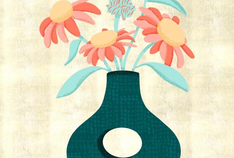
to do is my vase. I found a really cool mid
century modern style vase that I want to emulate. I'm not going to maybe
replicate it identically, but I'm going to add
that as a reference to. First thing I want to do is I'm done drawing these
flowers for now. I'm going to hide and lock them. I'm going to lock the layer
with the leaves and hide it. The layer with the flowers
is already locked. I'm going to hide that one. Now, I want to add
another private photo that is going to be
the vase reference. I'm going to go to my wrench and I'm going to swipe left on inserted photo and I'm going to go to insert private photo. This is the photo that I
chose to use for my vase. It is really cool. Like a mid century modern vase. I like the shape.
It's organic and fun. I think it'll make for a
really great illustration. I'm going to generally get the shape of this one side here, but I'm going to do it
with the symmetry tool, because this is symmetrical. Now, it may be organic
and abstract looking, but it is symmetrical. There's a few rules that objects in the real world
have to follow. They don't have to
be symmetrical, but vases tend to be also. One of the other things is
they do need to at least be somewhat flat on the bottom
so they don't roll away. And then they have to have
an opening at the top for whatever is being
put in the vase. What I want to do is
create a new layer. And I'm going to use
the symmetry tool to draw a symmetrical shape
similar to this for my vase. First thing I want to
do is I'm going to lower the opacity, this image. Then I want to create a new
layer to draw the vase on. I'm going to go to my layers
and click on the plus line. I want to set up some
assisted drawing symmetry so I can draw this quickly and it's going to be easier on me. If you go to the wrench icon, you'll see you're probably
on the ad panel right now. If you click on Canvas, you'll see down here,
a little ways down, it says Drawing Guide. You want to toggle that on? And now we see this
grid is showing up. We're getting into
our drawing guide, but I want to create
vertical symmetry. If you click on
Edit Drawing Guide, now we can adjust the symmetry. And the assisted drawing, what I want to do is
everything that I draw on one side of this canvas is going to mirror over
here on this side. If I go down here to
the bottom right, and there are so
many settings here, I'm not going to get into
all of them obviously. But if you click on Symmetry, you're going to
be able to create some symmetry and some
assisted drawing. If you click on Options, do you see where
it says vertical? This is a vertical line. This is a vertical
guide for symmetry. You want to make
sure that assisted drawing is toggled on. That is what's going to actually draw with you as you
draw half of it. It's going to draw the
other half mirrored on the other side. We
should be good. Perfect. I'm going
to click on Done. Now what I want to do is move this vase to the general area, if I really want
to trace this so that I can draw a
symmetrical shape over it, that's going to mirror it. Now, it's not going
to be identical, but the center of the vase is, let's say, somewhere
around there, perfect. I just want to get half of it. I'm going to lock the
layer that the vase is on, so I don't accidentally
draw on that layer. And then I'm going to go back to my drawing layer with
assisted drawing. Do you see where it says
assisted? Right there. That means that it's turned on. That's good. We're good to go. Now, I'm just going to
zoom in and I'm going to loosely draw the
shape of this vase. Do you see where it
jumps right there. I actually really want to be true to the
shape of this vase. And I do this as I'm
drawing something. I adjust the stabilization
on a pretty frequent basis because sometimes
I want to be like looser and sometimes
I want more control. I'm going to go down here and then go to the
bottom where it's flat, perfect, then see how it's
mirroring as I'm drawing. I want to go up to the top here and then
connect it perfect. Now if I wanted to
draw a perfect circle, half circle here, let me show you a really
cool way to do that. I'm going to do it right
outside of it if I wanted a perfect circle or
somewhere close to one. If you just like draw like a half circle and then
you don't let go, procreate will assist you also. Now you see it's being mirrored. But you can move this around and change
the size and shape. If I wanted to draw this vase
as like a perfect circle, go around the edge right here. Even if I'm not being perfect, I can stop about there. I can get this to what
would be considered, I guess, a perfect circle. Then if I said that
the bottom of this has to be flat so that
it doesn't roll away. Well, if I do like
this and I'm like, oops, that's not flat. Once I get to a point
where I want to stop, just hold it down, then procreate is
actually going to start giving me even more help and
giving me a straight line. Here's another trick. If
I want this line to be really at zero degrees or
90 degrees, or 45 degrees. If I take a finger and hold down on the screen,
it'll start snapping. You can adjust the link. You can also snap it to
different angles. I'm going to snap this to
a flat bottom angle there, because that way it is going to mimic the real world
where it wouldn't roll away. I'm going to go back
here and I'm going to loosely draw this, then the top doesn't
have to be straight. I'm going to help myself a little though and
create it straight. And I just added my
own little extra neck to the vase there. I just want to draw
an inner circle here because I love this
like hollow style of ate. Let's see. There we go. It's helping me. There we go. Perfect. Okay, I have the
general idea of this vase now, the sketch of it, and I
have the hollow part, I can hide this image. I'm just going to go here. Now I have a really cool
looking mid century modern vase sketch. Now what I want to do is turn off the assisted
drawing on this layer. I'm done, I don't
need it anymore, and I want to turn off
the drawing guide. First thing I want to do,
Turn off Assisted Drawing. I'm going to go
to my Layers tab. If you click on the layer, you'll see where it says Drawing Assist
with a check mark. Just check that and it undo or stop the drawing
assist for that layer. Then I want to turn off this
distracting vertical line. I'm going to go to my wrench
icon and I'm just going to toggle off of drawing guide. There we have it
Now I have my vase. Now I can move it
around and resize it. Now if I resize it, you see where it says
Uniform Right here. If you grab the corner, it's
proportionally rescaling it. But if you click on free form, you can really start messing with a lot of the proportions. And actually, you know what is interesting when
I do this reform, that's a happy accident. I like it wider. Anyway, so I think that's cool. But I do want to shrink
it, so I'm going to go back to uniform
and then I'm going to make it smaller and perfect. I'll see you in the next lesson, where we are going to finish our sketch and lay
out our final motif.
4. Finish Your Sketch + Lay Out Your Motif: Now it's time to finish our
sketch and lay out our motif. Now I'm going to start placing these flowers in this vase. Or coming out of this
vase, I guess so to speak. I'm going to move the vase
down a tiny bit more. I'm going to zoom
out so I can see the bottom and it's okay
If it's not centered, perfect, then I want to lock my vase layer because I'm
done messing with that vase. And now I'm going to unlock these flowers and I'm going
to hide the vase layer, because the first
thing that I want to do is I want to separate these three flowers
from that flower there that I can move
them around on their own. I'm on the flowers layer
and it's not locked. I'm going to go up here
to the top where it has this little S thing like the freehand tool or
the drawing tool, I guess that's what it's called, it looks like a ribbon. I'm just going to loosely
draw a little shape around this flower if I want to cut it out of here and put it on its own layer, here's
how I'm going to do it. I'm going to take three
fingers altogether and I'm going to swipe down
really quickly on the screen. And then I'm going to get
my Copy and Paste menu. I want to click
on Cut and Paste. Of course, you can cut, copy, paste, et cetera, duplicate. I'm going to cut and paste. Now if I go to my layers, that flower is on its
own layer, that's good. I'm going to hide these three. I'm going to show the vase. The first thing I
want to do is place this large flower somewhere
in this illustration. I'm going to put that maybe right about here.
A little off center. Perfect. Then I'm
going to go back to these flowers and I'm going to figure out where
I want to put these. Let's see, I think it
would be cool if I had, let's say these
flowers about there. But I think I want this
flower somewhere else. I'm going to cut this out too. It's getting a little jumbled. No problem. I'm going to hide that vase, and I'm
going to hide this. Now I can zoom in, and I'm going to go to my
drawing tool here. It's a sketch, Don't worry
about being perfect. I'm just going to really
roughly draw around this. And I'm going to
cut and paste this. And put this on
its own layer too. Now if I go and zoom out, I have my little one flower that I just cut out
on its own layer. I want to flip this and
rotate it horizontally. Flip it horizontally. Let
me show you how to do that. If I go to the
selection tool here, the arrow, If you
go to the bottom, you'll see where it
says flip horizontal. Now you can flip vertical two, but I want to use
flip horizontal. And that just really quickly will allow me to mirror
that and flip it. I'm going to resize it and
I'm going to rotate it. I'm just playing around with maybe where I
want this to be. I like things being sometimes
a little asymmetrical. It just gives more
interest to stuff. What I want to say is
if this is over here, I want these to move. If I want to move
that tall flower and then this grouping
of two flowers together, I can drag this layer up. But I don't even have to, if I have one of those
layers selected. If I swipe right on the other
layer that I want to move, I want to move these altogether. You can group them,
but you don't have to keep them on the
separate layers. I can click on the
selection tool and then I can move these
as a group together. I'm going to do something
closer to this. There we go. Those are
both selected still. I'm going to go back
to that other flower and I'm going to see where
I want to put this guy. Actually, I like it being there, but yeah, I'm going to do something
like this. Okay, perfect. I have these flowers in the
main part of the flower, in the general area
where I want them. Now I want to make some
logical sense with where the vine or these stems would be
coming out of the vase. Even though this is an abstract interpretive drawing,
it's a sketch. You still want things to behave the way they would
in the real world. Stems attached to a,
attached to flowers, and stems that are attached
to flowers come out of vases. And you want to be able to
maybe follow it with your eye. I'm going to start
with what would be where and what
makes the most sense, this tall flower here. I want to have that stem
be behind that flower. I also know that this is not
going to be a clear vase. I want to erase all
that down there. I'm just going to
really quickly go to my tallest flower layer, get my eraser tool. I'm just going to start, I'm going to adjust the
size of this eraser. I'm doing that on the
left hand side here, just to make it a little smaller if I really want to
get into detail. But that's how I can
adjust the size. If I wanted to adjust
the opacity of my brush. Your eraser is a brush. I can do the opacity down here, but I'm not worried about, actually, I rarely
mess with the opacity. Okay. The other
thing I want to do is erase this part of the stem, because it's going to be
hidden behind this flower. I'm just going to
erase where that would intersect
with that flower. Perfect this flower here. That makes sense. Where
the stem is coming out. I think it works actually. You know what, I might want
to move it over a tiny bit. I think what I'm going to do is go to my layer that has
those two flowers on it. I'm going to re draw that stem because it should maybe be a
little bit off to the side. This flower right now, we're drawing the stem to this flower. I'm just going to do something like actually I'm going
to do this, There we go. That can be coming out
of the side there. It doesn't really
matter, actually. No. I'm just having a hard time deciding,
okay, there we go. Then this flower here. If this stem is coming down here and it gets
hidden back there, where would it end up? Right? I want to try to think
about things like that. What would it be doing in the real world even though
this is super abstract? I'm still trying to follow
the logic of reality. I guess I'm going to go
back to my brush tool. Where would this be exactly? If the stem goes down there, maybe it would curve around
like this a little bit. I'm just going to loosely
guess that it would. In fact, I'm going to keep going with that
shape. There we go. Now it's doing like this, even though it's behind there. Then we just have to
worry about them. For this flower here, I'm going to go
back to that layer. I want to try one more thing. Sometimes I just move things around and play around
and see what I think. I want it to be a little
off kilter. Off center. Let's see actually, like
where that is right now. Yeah. Okay. Now all I have
to do is draw a stem that makes sense for this
flower where it would be coming out of this vase. I'm on that layer.
I'm going to go to my eraser tool and I'm just going to draw a new stem
for this flower here. It's on its own layer, I believe, right? Yep. I can check and see a
little image of it there. I don't have to really worry about going over anything else
that's on the same layer. Let's see, how should I do this? I think I'm just going
to do like that. There we go, Perfect. Now this stem, I want to
be behind this flower. All I have to do is go
into my eraser tool and I'm just going
to erase where it would intersect
with this flower. Perfect. I'm going to erase here where it would be
not seen in the vase. Great, that is our
flowers in our vase. We're just building out the rough structure of what this illustration
is going to look like. Now I want to add
some of these leaves. The first thing I
want to do is I like where these
flowers are right now, I'm going to go ahead and
merge these three layers. I clicked on my layers panel. If I can see here, these are the three
flower layers right here. If I just take my two fingers and I quickly pinch
everything together, now all the flowers are
on one layer together. I'm going to lock that
layer and then I'm going to unlock and unhide
these leaves. I'm on my leaf layer. Now I can start
adding some interest with some of these
cool shaped leaves. One of the things I
want to do though, is I'm not going to add
all these as one image. Let's make this simple. I'm going to hide, I'm
going to hide the flowers, and I'm going to separate these leaves and put them
onto some different layers. Now I'm just going to
go around each leaf, draw a little shape with the free hand tool
and I'm going to swipe down with three
fingers cut and paste, and put each leaf
on its own layer. Now all the leaves are
on their own layers. Now I can start placing these. I'm going to show my flowers. I'm going to show my vase. What? Now that I'm done with
these reference images, because I'm getting into
a lot of layers here. I don't need these anymore, I don't want to
use them anymore. Anyway, I'm going to unlock
this by swiping left. And then I'm just going to swipe left one more time
and delete it. Same thing with the
cone flower image. I'm going to lock it and
then I'm going to delete it. Perfect. I'm going to move these flowers all the
way up to the top. And then I'm going
to lock that layer. Perfect. Now I'm just
going to click on each individual leaf layer
and I'm going to move them around and put them in different places
where I think they look really good and I can
rotate them and resize them, flip them, et cetera. One thing here though is this flower maybe is going
to be behind that leaf. I'm going to go ahead and erase
that part of that flower. And I'm going to unlock
my flowers layer. And then all I need to do, because this leaf here is actually going to be in
front of this flower. I'm going to erase the
part of the flower that's intersecting with the leaf so
that the leaf is in front. We have now roughed out a good structure for
this final illustration. I really like the
way the flowers are balanced and everything has some interest and some
interesting shapes. And it's got this
kind of mid century modern feel to it
with this vase. Now we're going to get into the fun part of adding
color and texture.
5. Start Inking: Are you ready?
Let's start inking. If I go to the top right here
where this plus sign is, I'm just going to click on that. Now I want to create
a new canvas. If I go to this
little plus sign on the top right of the pop up box, I'm going to click on that. Now we can set our
dimensions and our DPI. One thing that's really helpful is procreate will tell
you ahead of time how many maximum
layers you can have in your file as you are
creating your canvas. Because procreate limits the
amount of layers that you have in your canvases depending on your DPI
and your image size. Now I'm going to go by inches. Let's switch to our inches
down here on the bottom. Now you'll see by default
it's got like 500 by 500 ". And of course it's saying
that's too large, that's fine. Let's go ahead and create a
canvas that is 20 by 20 ". If you just go down
here to the bottom of your screen where it
says inches here, you've got width already
ready to be selected. Just hit 20 there. Then drop down to
where it says height, and then we're going
to type 20 again. You'll see here where
it says PI 300. We want to leave it at that. That is a nice high
resolution DPI. We will have a really
good quality image. We're also going to
have a nice big 20 inch by 20 inch canvas. Now we know we have a maximum of 14 layers that we can
work with, which is fine. We're not going to need
more than 14 layers. All right, let's
click on Create. Now we have our canvas
that we're going to be using for our final
piece of artwork. Now we created that sketch. I want to import
that sketch or paste that sketch into this canvas. And we're going to lay it out and put it right
where we want it. And then we're
going to basically just do color by numbers. Let me go back to the gallery and I'm going to go back and find my sketch that I was
working on previously. You'll see here I
have a few other ones that I was doing, some studies. You may want to sketch
and draw some of these flowers and create your illustration a
few different times. Try some different
shapes of vases. Try some different
flower placements until you find something
that you really like. I want you to have
your sketch where it's really close to what the final is going to look like. The sketch that I really
want to work from is this most recent
sketch that I did. I'm going to be
pasting this into that other canvas so I can just use this as
a drawing guide. Before I do that, if I go to my layers, you'll see remember everything
is on a separate layer. We've got our flowers
on one layer, we've got our vase,
and then we have all these leaves on
a separate layer. I want to combine all of these. Then I just have something I
can select, copy and paste. The first thing I want
to do is go through and make sure that all my
layers are unlocked. Just swipe left and
click on unlocked. I'm just going to really quickly pinch
everything together. Now I have, if you look
everything together on one layer, perfect, that's
exactly what I want. Now we're going to be
copying and pasting this. If you go to the
arrow tool, here, the selection tool,
see how it's selected. Now all we want to do is take three fingers and swipe down really quickly
on the screen, and we're going
to click on copy. All right, this has been copied to the
procreate clipboard. You're going to go
back to your gallery, and now we're going to drop
back over to our canvas, which is the large 20 by 20
inch canvas we just created. Let me click on that. I'm going to zoom
out a tiny bit. Now, we're just
going to paste it. We're going to do the same
thing we did last time. I'm going to use three
fingers swipe down, and I'm just going
to click on Paste. Perfect. Now that it's okay, we can enlarge this, because
again, it's a sketch. It's okay. We're not worried
about losing image quality. It's already selected. I just want to make
this pretty big. It's always better to go
bigger rather than smaller. And then we can always
shrink this later. But once you've drawn
your final art, you can't really
make it any bigger. Now I want to center
this on the page. What I want to do is make
sure snapping is turned on, which is that little button down here on the bottom left
where it says snapping. I want to make sure that this
is toggled on which it is. I'm just going to drag
this around until I see the center point for
horizontal and vertical. All right, that's
where I want it to be. The first thing I want to do is go to the layer where
this sketch is. I'm going to click on the end. I'm just going to move this opacity slide,
this opacity down. Let's do about 40, 39, that's fine. Perfect. Now I'm just going
to lock this layer. I'm going to swipe left, and I'm going to
click on Lock I. With this class am giving you some really fun brushes and also some cool
color palettes. Let me show you the
color palettes first. Let's pick that first. What colors do we want to use? If I go up here
to the top right, where this little color dot is, I gave you guys a
few different fun, retro color palettes. I want to go ahead and
set this bloom, boom. Color palette as my
default color palette. That's going to be the
color palette that I am sticking with
for this project. If you go to the right here
where these three dots are, if you click on those,
the very top option that comes up is set as default. Now let's talk about
brushes with this class. I am giving you several
free procreate brushes that I custom created
just for this class. If you go to your
brush palette here, it's called Carry's brush box. Carry's ink brush is a
free brush that I created. That is literally what it says, it's for inking drawing, we're going to be using that for the majority of the project. For our drawing, then I
created a stipple brush. This stipple brush is
going to be what we use for our shading and
our stippling stippling. Especially this retro
style of stippling, it really does give
a really retro feel. I also gave you a
stamp brush to add some texture to your
background if you want to. Then there is also one I created called Cary's Messy Fun Brush. This is just a bonus. I'm not going to be
using it in this class, but I'll show you
some fun stuff you can do with this brush
that I actually love. I have a similar one that
I use on a regular basis. I just included it as a bonus. But what we want to start with here is Carrie's ink brush.
I'm going to click on that. I'll start with
the flower petals. We have our sketch layer locked and it is
semi transparent. I'm going to create
a new layer here. If I click on the layers panel and click on the plus sign. Now I want to start inking in some of these flower petals. If you go to your color
palette, bloom, boom. You'll see I have
two pinks here. I am going to alternate these two pinks
between the petals. It's every other petal
you'll see in a minute. I'm going to start
with the darker pink. Right now, I'm going
to click on that. I'm going to make sure I'm in
Carry's ink brush perfect. What I'm going to be doing
is I'm going to draw the outlines of these back
petals, or every other petal. It may not necessarily
be the back. Then we're going to alternate. Let me zoom in and I'm going
to adjust my brush size. Let's see if I can
find a good size here. I'm just going to start drawing. Let's see, I'm going to
make it a tiny bit bigger. I'm just going to
outline the petals. And you know what, I, I've
had some coffee today. I have the stabilization
set at 40. I'm actually going to set
it at 50 just for now. I also like things to
be smooth, all right? I'm doing every
other petal here. What I want you to do
when you're drawing this is don't worry about drawing or going into other areas of the drawing because
we're going to be putting stuff on top of this. I'm actually going to go a
little bit extra in here. Let me show you
guys a cool trick in procreate that you can do. You see how we drew
an outline here? If you go up to your
color tool here, if you hold it down and
you pull it and drag it into a solid shape or into a shape like
this with an outline. I'm going to do it again
and show you again. I'll probably fill this in too, but now it actually fills in the color. Let
me show you something. If I zoom in, do you see how this is all
one solid color right here? There are a lot of
brushes in procreate that have texture or some
opacity to them. And when you pull the
color in and fill it, sometimes you'll get like
a weird halo effect that I specifically created
this ink brush to avoid you having to
even deal with that. So I'm just going to speed this up and what I'm doing is I'm just drawing around the outline
of each of these petals, every other petal, and then I'm just filling them
in with the color. Okay, so I think you get
the idea what we're doing right now is doing one color and we're doing
every other petal. The reason I'm doing
every other petal is because these petals
are so close together. And I really want to be able to separate and
differentiate each petal. And not just have kind of a
block that's the same color. Or worry about putting
a lot of lines to show where each
petal begins and ends. A really quick, easy way to trick that is to use
different colors. I love alternating two
shades of the same color to give a sense of
uniformity and harmony. Now that we have those done, I'm going to go ahead and do the same thing with the
lighter color pink. I want to do that on a
different layer though. Every time you do a different
color in procreate, you want to actually have a
new layer for each color. That's really important. I'm going to zoom out and
I'm going to go ahead and lock the layer that
I just was drawing on, so I don't accidentally draw on that one
again for the moment. I'm going to swipe left and then I'm just going to
click the plus sign. And now we have a new layer. I'm going to go to
my color tool and I'm going to select
the lighter pink. And now I'm just going
to do the same thing with the light pink petals. I'm going to go a draw
an outline around each one and then fill in each one with that
light pink color. The next thing I want to
do is I'm going to create these little center
parts of these flowers. I want to, this is going
to be a different color, I'm going to use that orange, but I'm going to want
to start a new layer. I'm going to go to
my layers panel. And the layer that I
was just drawing on, I'm going to swipe left
and I'm going to lock it. And then I'm going to
click on the plus sign. And now we have a new layer. Actually what I want to do is hide those other two
layers with the petals. For now, I don't want
any distractions. And I'm just going to be drawing these simple center
piece shapes. So I'm going to click
on my Layers panel. I'm going to click
on my color tool. And then I'm going to click on this Orange from Bloom. Boom. And I'm just going to
do the same thing. We have those. I'm going to go ahead and show those
other flower layers. Layers. Okay, we're
looking good. Let me go ahead and
I'm going to swipe left on the layer with those center parts and I'm
going to lock this layer. Now what I want to do is hide the three layers
that I have so far. I'm going to click on the
plus sign in my layers panel. Now I want to start
drawing these stems. Let's do those first, and
then we'll do the leaves. If I click on my
color tool here, I have a nice bright green. This is super fun. I love this screen. I'm
just going to select that. I might want to raise my brush size a little bit because I want
these stems to be bold. I don't want them to be so
thin that they get lost. I'm going to continue the stem logically as it would
go into the vase. Now I know that this, that's the stem for
that flower and it would disappear
into the vase here. Same thing with
this one. I'm not going to worry about going over what I already have because we're going to
be covering that anyway. But now we know that these stems actually are obeying
reality, I guess. Because even though
this is abstract, I do want to make sure
that there's some reality here with this F,
there's a stem here. I'm just going to do that. And then, there we go. Now we know that each one
of these four flowers has a logical connected stem that
disappears into the vase. Perfect. That's
it for the stems. I'm going to go ahead and lock that layer and
add a new layer, and actually let
me hide the stems. And now what we're going to
do is draw these leaves. I'm going to lower my
brush size a little bit. All right, let me zoom out
and let's look at everything. Let me show all my layers
that I've drawn so far. And let me hide my sketch. Now, here we are. We're getting really close. I'm liking where this is going, but that we have a few things we need to pay
attention to here. First of all, these stems
are above everything else. They need to be
behind all of it. Okay. The first thing we want to do is drag that stem
layer to the back. Easily done. If you go to your stem layer and
remember it's locked, I want to unlock it and
I'm going to drag it down below my other elements. Now the stems are hidden
behind these flowers. I'll see you in the next lesson where we are going to
finish up our drawing.
6. Finish Your Illustration: And now it's time to finish our drawing. This
makes sense, right? This leaf here is right in front of this, this centerpiece. And it's in front
of this flower. We've got some
really great depth and layering and
stuff going on here, But there are some issues
I'm seeing That's okay. We were just blocking
this out for the moment. What we want to do right now is clean up some of these
issues before we move on, before we even do the vase. Let's, I'm going to look around and yours is
probably going to be different. But what you want to do right now is you want to
start zooming in. Looking at things that
maybe don't make sense. See where this leaf here, I moved it over a little too far and it's jumping out
of the side of the stem. We don't want that, that's why these leaves are on a different
layer from the stems. What I want to do is make sure
that I'm on my leaf layer. Let's do the leaves first. I'm going to lock these stems. I'm going to go to
the leaf layer. Then I'm just going to
get my eraser tool. And you can use any
brush as an eraser, but if you want to use one that matches the one that I gave you that we're
using to draw with, Remember if you're
in your ink brush or carries ink
brush for instance, that's your selected brush. If you just go to
your eraser tool and just push down on the eraser until you get
a little pop up there now, and it didn't work.
Let's try it again. We're on Cary's ink brush. I'm going to hold
down the eraser tool. There's a little
pop up that said erase with current brush. Now we're on the same brush. It's not as important with this one because
it's pretty solid. You don't really have to
worry about texture as much, but I'm just doing this
to make things easier. I'm going to lower
my brush size. I want to make sure that I erase this leaf
here on the left, but I don't erase, see how I was going over into that, this
leaf on the right. So you might need to zoom in and you get a little fine
tune here. That's okay. All right, let's go through
these leaves really quickly. See what we think
I like the shapes. I feel like this one
mostly makes sense, but see there's a little bump
there that I don't love. Also see where this leaf has
a little bump right there. I want to fix that too, because I want this to disappear and flow more into the stem. So I'm just going to
go to my brush tool and I'm just going to
do something like that. This is a good time to go around and just zoom in on
all those leaves and make sure that there aren't any weird shapes that you
don't like and clean them up. Now I'm just going to go
to the other layers with my drawings and I'm just going to clean
everything else up. That is left to be cleaned
up where I see any issues. I'm liking where we
are with all of this. These petals look good. The center parts look good. Leaves look good, and
the stems look good. Next thing I want to do is
I'm going to do the vase. First thing I'm
going to do is now lock my dark pink petals layer. Now we're going
to draw the vase. The vase is going
to need to be in front of and above everything
else in this illustration. Let me show my sketch again. Is going to be above, the layer is going to
need to be above these. What I'm going to
do is I'm going to keep these layers
with the flowers on. I'm going to create above
all these other layers, a new layer for the vase. Now, I'm going to use
red for this vase. I just think it's
going to be fun. It'll be a big
bright pop of color. I just free handed
this and honestly I think it turned out a little
lopsided, But that's okay. I'm going to go back and use the symmetry tool to help me. I'm going to turn on
assisted drawing. I'm going to go to my wrench, I'm going to click
on Drawing Guide, and I'm going to go to
Edit Drawing Guide. And let's see here, I have assisted drawing. I can turn that on. I'm going to go to
Symmetry Options and make sure it's at vertical. Now let me click on Done. Now if you notice, see where
the center of this is. Do you see where that
vertical guide that is? By default, that's the
center of the page. We want that to be in
the center of the vase. What I want to do
is if you go to the drawing guide and
at the bottom right, once you click on
it, go to Options. While you have it
selected vertical, you can move this guide over
to where you want it to be. I'm going to put that in. What would be the
C is of the vase? That's probably about
the center, right? Yeah. Okay, good. Now I'm going to
click on Done Now. Let me check and make sure. Yep, this layer has
assisted drawing. Let's go ahead and see
what happens when we try to use the symmetry tool here and make this easier
on ourselves. So now we have a lovely mid
century modern style vase and we have some flowers, but this is a very
flat illustration. In the next lesson, we're going to go through and
add some shading.
7. Embellish With Shading: Now we're going to
embellish with shading. All right, so now we
have this illustration. Now we're going to
add some shading with some fun retro
style stippling. The first thing that
I want to stipple, I'm going to add some
fun shading to the vase. Let's start with
the biggest element above the vase layer. Click on the plus sign. Actually, I'm just going to go ahead and lock the
vase layer too. I'm going to swipe left. Now select the layer that
is just above the vase. This is going to be our
clipping mask layer. What a clipping mask does
is it will only create art onto whatever you're
clipping it to, just below it. If you click on the layer that you just created above the vase, this is a blank layer. Click on the layer, then
you'll see a little pop up. And three quarters
of the way down, see where it says Clipping Mask. Go ahead and click on that. Now you'll see this little
arrow pop up on the left. That little arrow there
that's pointing down to the layer below it is telling
you that layer eight, the layer that we're on, is clipping to the layer below
it, which is our vase. I want to shade this
vase with a red that is slightly darker than
the red of the vase. What I want to do is
I'm going to go out of my layers and I'm going
to go to my color tool, Here I am in bloom, boom, with this red. But I want to get a slightly
darker red for shading. What I'm going to do is
go to the very bottom, go to the left,
and click on disk. Now you can see your color disc. I'm literally in the middle
of this sphere here. I'm going to just pull down the color slider here to
a little bit darker red. I'm going to click
on the color tool again to deselect it. Now we want to create, or we want to activate
our stipple brush. This is the brush, one of the brushes that I
included with the class. If you go to your brush library and you're in carry's brush box, it is carry's stipple brush. If you just select that, then we can start
doing some shading. Now, I'm not exactly sure yet what size I want my brush to be, but one thing that
you want to take note of is when you're doing
shading and stippling, especially with stippling,
you want to have consistent stipling sizes
throughout your illustration. Because if you have
one thing that has really large stipple dots and another thing that has really
tiny ones, that's okay. But it can get a little bit wonky looking if there
are too many of them. I'm going to just do
a little test here. I'm on that layer with
the clipping mask and I have my stipple
rush selected. I'm going to zoom
in to the vase. Actually, let me zoom out. I'm going to look
at where I would want this shading
to be on the vase. What I think would
be cool would be to have a little
shading just under the vase opening and a little shading just
below the opening, this little hollow
hole in the middle. And then a little bit along
the bottom of this vase. Now I might change my mind, but I think that's going
to be pretty cool. That would be, if the light was coming from above this image, then it would be
casting a shadow on the lower parts
of certain elements. Now a lot of people,
and I do too, sometimes we'll
just stipple around the edges of things all
around just to make them pop. I might end up doing that, but for now I'm
going to start with just some basic shading
with some stippling. I'm going to zoom in
and I'm going to go to the opening here, just outside of
it, just above it. I'm just going to draw some
stipple dots and look, you can barely see them. Do you see how small they are? They're like barely noticeable. I want them way
bigger than that. I'm going to undo tapping two fingers on the screen and I'm going to raise
my brush size. Now I'm going to try it again. That is better actually. You know what, That
might be a little big. I'm going to go somewhere
a little bit lower. I'm going to go to about 15. There we go, Perfect. Do one little light stroke of stipples and then you want to make it darker towards the edge. You can just draw
along the edge there. Now we have shading here just
at the opening of the vase. I'm going to do some shading
here along the inside, the bottom of this
little hollow area here. I'm going to outside of, just on the outside
of this hole, I'm, I'm going to hold my mouse down and look
what happens now. I can get like a really
close to perfect. Circle shape with stipple. The stipple brush
can also help you brush can if I want to, I can just go now on the inside and fill
in that area there. Let me zoom out and see
what I think about that. That's actually cool. I like that like shading effect. I might taper it a
little on the sides. Oops, I'm just going to. Yeah, I'm going to try doing a little bit of tapering
with the stipple here, just so it's not
such an abrupt jump. The cool thing about stippling
and shading and stuff, it's going to be natural, It's based on light,
it can be loose. I'm just free handing
it. There we go. Now we have a little bit
of shade in this vase. It gives a lot of depth. It's not a whole lot, but it's giving a nice amount
of depth to this vase. Now that we have a good size, I've done a couple of stipples. I like this size. I want to create, I want to create
a little lock on this brush With this size, I don't forget what size it was. If you go to your brush size and where the little slider is, if you just hold your apple pencil down on it for a second, you'll see where
it says the side. See that little
plus sign up there? If you just click on the sign. Now we've saved that brush size. If I'm like, uh, oh, what stipple size
was I using now? You don't have to remember. It's just going to
be saved for you. If you slide around near it, your brush will just
snap back to that size. It's a good little
time saving trick. Now, I'm just going
to go down here to the bottom of the vase
and I'm just going to loosely start drawing
some shading. Just a little bit cool. Awesome. Actually, I might curve
it around because this is a curvilinear shape
here. There we go. Awesome. Now we've got some really nice
depth to our vase. Let's move on, and
let's go ahead and do some shading on our leaves. I'm not going to
shade the stems. I do want to do some
shading on these leaves. And I'm going to do shading
on more elements too. First thing I want to do,
I'm going to lock the layer that has the stippling
on the vase. Now I'm going to go
to the leaf layer. I'm going to click
on that layer. And then if I click
on the plus sign, after I click on a layer, it'll create a new layer
just above that one, I'm going to click
on the plus sign. Now this is going to be my clipping mask layer for
my stipling on the leaves. With this layer selected, I'm going to go ahead
and click on the layer. And then I'm going to
click on Clipping Mask. And now you can see that we have a clipping mask that is clipping to the
leaves just below. Let me select my layers
and get out of that. Now we want to get a darker
green that is slightly darker than this green that we're using for the
leaves, it shows up. Let me go back to my color tool. I'm going to go to my palette. And I'm going to
go back to Bloom. Boom. And click on that
green to select it. Now that I've selected it, I want to get a darker green. What I'm going to do
is go to the bottom left and I'm going
to click on disk. Then I'm just going to drag this little center dot here in the middle down a little bit so that I get a darker green. I'm going to click off of that. Here's a quick little
trick for you guys. Now you'll notice, remember when we were
stippling this vase, Do you see how this
is like a darker red? Remember that this darker red is not part of the
bloom boom palette. But that's okay If you
go, oh my goodness, I want to use that exact
same red again and I don't remember what
that exact color was. Here's a little trick for you. If you want to sample any
color exactly from what is in your illustration and you want to just use
that exact same color. Again, if you go to your brush slider here
on the left hand side, there's a little rounded
square at the bottom of it. If you click on that, that will pop up your
color sample tool. Then with this little pop up
circle, drag that around, and what it's doing is sampling whatever color is on the
screen or is on your document. Now I've got that red again, even though that's not in our
color palette. That's okay. We can still access it if
we want to use it again. Now I want to go back and I
want to get a darker green. I'm going to go bloom,
boom, select green. Go to disc, and drag
my mouse down, I. Little dot down there
to get a darker green. I might even get one
that's darker than that. There we go. Now I'm going to draw along
the bottom of each leaf, and I'm just going to draw
a couple stipples just a little bit just to give it some interest and some shading. And I'm just going to go
through each leaf and I'm going just outside
of each leaf here. It's really a matter of taste. You can do this
however you want. If you're stipling something really close to another
object and you go, oops, I didn't mean to do
that, I don't want that there. All you have to do is go
in with your eraser tool and you can erase any unwanted
stray stipple points. I'm going to continue shading the bottoms of these leaves. I'm just free handing
it. Right now. I'm just loosely adding a
little bit of interest, some pops of darker green, just to give this
a little bit of depth and make it
slightly less flat, even though I do
love flat graphics. Okay, there we go. Cool. I'm going to add a little bit of stippling to the bottom of this leaf here. There we go. Cool. All
right, what do we think? That looks awesome.
Actually there's a little lump, weird thing here. There we go. Okay, yeah, I've got some really cool
depths going on here. It's really subtle,
but it really does make these leaves pop more
now against the background. And it really just gives
a lot more interest. Now I'm just going
to do the same thing with the center parts
of the flowers. I'm going to grab that
orange from bloom. Boom. I'm going to get a slightly darker orange
using the disc tool. And then I'm just going
to stipple around the bottom of each
one of those two. Let's move on and do the pedals. I'm gonna lock the
clipping mask layer for the orange center pieces. I'm going to click on, let's do the top flowers first,
the light pink. I'm going to click
on that layer. Click on the plus sign, click on the Layer name, and then click on Clipping Mask. Cool. All right,
now I want to get a color that is slightly
darker than this pink. But I do want to make
sure that it is not the same color as the existing pink of
those alternating petals. I'm going to go to
my color tool here. I'm going to go to palettes. I'm going to select
that light pink, then I'm going to go to Disc. I'm just very slightly going to make a teeny tiny
bit darker pink, but not one that's quite as dark as those
alternating petals. That looks good. It's
kind of like a clay pink. I'm going to click on the
color tool to de select it. And now I'm just going to do the same thing with
these light pink petals. I'm going to go around and stipple around the bottom edges. The last thing we want to do is create some shading
on our dark petals. I'm going to lock the layer by swiping left and clicking on Lock with the stippling click, clipping mask for
the light petals. I'm going to click
on the dark petal. Click the plus sign. Click on the layer and
click on Clipping Mask. Go to my color tool,
go to Palettes. Get that dark pink
that we're using as the primary color
for the dark petals. Go down to disc on the left. And now I'm going
to this down to a quite a bit darker kind of
dark, peachy, peach color. And let's start shading some of these petals that
are the darker pink I am really liking this. Isn't this so much better
than I like flat graphics, don't get me wrong, but this just has so much
more depth to it. It has a lot of shade and it's more
interesting to look at. The next thing we
want to do is just do some finishing
touches and sign it.
8. Add Finishing Touches + Sign Your Art: Let's put the finishing
touches on our project. All right, so now we have
a really close to finished beautiful retro
illustration with some really cool flowers and a really cool mid
century modern vase. Let's go ahead and select
a background color. If I go to my layers
panel here and I go all the way to
the very bottom, see where it says background
color and it's white. If you just click on that
white rectangle there, it'll pull up your colors. Now you can actually
choose a background color. You can take any color from your color palettes or anywhere. As soon as you click on it, it's going to change
your background color. I created this off white as part of the Bloom boom palette. I'm going to click on
that, check it out. Now we've got this
nice cool white. It's got that almost
antique paper feel to it. It's really nice. I
really like this. We added all this
great texture to the illustration and did
all this fun stipling, but our background
is really flat. Sometimes people will put paper texture on there,
that's always fun. But I also created
a stamp brush for you as part of the brush box that I'm
giving you for this class. Let's go ahead and create a background stamp that'll just give this a
little bit more pop. If I go to my layers panel, I want to create a layer that is underneath all
the other layers. I'm going to go to
my sketch layer, which is on the very bottom. Right now I want to create
a new layer above that, and that's where I'm
going to put my stamp. I'm just going to click
on the plus sign. Now I have a new layer. I want to give some texture to this background to just
give it some interest. If you go to your brush tools that I gave you for this class, one of the brushes I gave you is Care's stamp brush custom
created this for you. It's some rough
hand done texture. I think that'll be
a cool way to do a textured background if
you select that brush. Now we want to pick
a color that is going to work for our
background stamp. I want to, if I go
back to my palette, if you look at the colors that I give you in the
bloom, boom palette, light pink color, I think would actually make a subtle stamp, but I don't know for sure. Let me find out,
Let's test that. I'm going to select
that light pink. Now, I want to raise my brush size all the way to the top to 100% I
might need to adjust it, but I'm just going to
tap on the screen. Cool. Now we have a light pink, light pink texture back here. Now I'm going to zoom in. You can tell it's a little similar to the colors
that are in the petals. I'm going to try something here. I'm going to do a
couple more taps. I'm just going to stamp
this a couple of times. Now as you can see, it's creating this really
pale pink background. But now a lot of
these flower petals are getting lost in there. I want to show you
guys something cool called blending mode. If you go to the layer where we just created our stamps
and you click on the layer and you click on the
letter N. Remember before, we were messing around
with the opacity. Now of course, you can
adjust the opacity. But what I want to play around with these different things
that are your blending modes, you have all kinds of options that you can
go through here. I would want to just play around with these
blending modes and see what I think and see if
any of these stand out to me. That one interesting
actually color dodge is cool because it's
actually lightning, or dodging that background
color that I gave you. It's making this illustration
pop a little bit more. I like that, I'm going
to remember that now. I'm just going down
the list and looking at my options are here. I also like vivid light like when it's like
lightning this a lot. Some of these are
going to be different. The saturation one is cool. I like the saturation one that's got a real yellow
hue to it though. Let me go back to color dodge. I like that, If you'll notice, that's actually
keeping these light pink petals from really getting lost in that light
pink background. But I do now have this awkward light white
square in the middle. Let's try this again. I'm
going to create a new layer. Above the sketch. Now that I have that blending
mode that I know I want, I'm going to go to and I want
to click on Color Dodge. Now that I know I
want to use that, I'm going to just
stamp very lightly. A few places, there we go, where I want to use
this texture like this. It's almost giving
this illustration like a fabricy texture I guess. But you can zoom in and you
see it, it's really subtle. Now all we have
to do is sign it. I'm going to go ahead and just
because I like to do this, I'm going to swipe left on my stamp layer and lock
it my texture layer. Then I'm going to go all the way to the very top
of all my layers. Click on the top layer and
click on the plus sign. Now I have a brand new layer
above everything else. I'm going to show you how
I like to sign things. You do want to sign your art. It's just always a good idea to sign it somewhere if you can, if you want to,
you don't have to. There's a few ways
you can sign things. I usually like to sign things
using a color that is in the art already because that
way it's not as distracting. Especially if I were to
use a black right now. That's going to be
so distracting. It's going to be the
darkest thing that you see. Even if it's little,
I have an idea, I think I'm going
to use this red. Or maybe the dark red. Actually, I might use the P.
Let's see how that looks. I'm going to go back
to my color tool. I'm going to go to palettes, and I'm going to
go to Bloom, Boom. And I'm going to click
on that dark pink. Now I'm going to go
back to my ink brush, Carry's ink brush that I
gave you with a class. Part of Carry's brush box. That's going to be
my brush I sign with because it'll just match what I was using,
what I was doing. I want to have my signature
somewhere down here, around the bottom of near
where the edge of the vase is. I'm going to zoom in. I am
just going that is too thin. Let me raise my brush
size, that's too thick. Sometimes you have
to just play around. There we go, a little
too thick still. Now you see how it helped me. And it was smooth and there
was a little bit of lag. If you want to have a
different kind of signature, remember you can always
go to your brush and you can adjust the
stabilization and streamline. I'm actually fine with that. I think that looks fine. That is way too
big. That's okay. This signature is fine. I like that it blends
in with the self. My name is really long, my signature is really long. I always end up shrinking
it a little bit. I'm just going to go
to the selection tool. I'm going to turn off
snapping that way I can shrink it down and put it somewhere
where it makes sense, but it's not too big and it's, it's just there and
shows up nicely. Sometimes I will
embed my signature, sometimes I will embed my
signature in the itself. I don't know if I want to
do that here, actually. I don't know. I think
that looks cool. I like the way that looks. But see how bright that
pink is against the red. Now I want to change my
blending mode on my signature. I want my signature to be here. I want it to actually
be a little subtle. If I go to the layer with my signature and I
click on the letter N, now I can change the blending
mode of my signature. I can actually change the signature and the way
it appears. Let me zoom in. When I clicked on multiply, it disappeared, or actually
that's darkened. There we go. Now if I click on multiply, do you see how it's just
blending a little bit better? It's not that bright
pink color dodge. I'm just going
through and looking at all of these different, aha, all of these
different options. I like that one. Soft
light looks cool. Now, if you look, this is signed, I signed this. I might shrink it a tiny bit, but it's my signature in there. But it's really not even
taking anything away from the actual art
itself because we've got this nice negative space. My signature is there, but it's embedded in the art.
I'm going to zoom. I'm going to shrink it a teeny tiny bit just
because, like I said, I've got a really
long name, I guess. I'm also going to rotate
it slightly because it is a little bit, there we go. Awesome. Now my
signature is there, but it's really subtle. It's not interfering
with anything. But I still have my
name on this, is it? That is our illustration. And now I'm going to show
you how to get this file, this piece of artwork, to a format where you can put it on print on
demand websites.
9. Saving For Print On Demand: I'm going to share with you now the right way
to save your files. So you can export them for
print on demand websites. Let's export our
beautiful art so that we can now put it on
print on demand websites. So the first thing that
we want to do is name our file when you're in your main procreate
window and you can see all your icons
for your projects. If you just tap on the
words untitled artwork, now we can give it a name. I am literally just
naming mine flower power. Just click on Done, and now we're going to
select and share this. If you look at the top
right of your ipad, you'll see the word select. This is when you're in your
icon view in procreate, tap the word select. Now you'll see all these little
dots next to your files. Go ahead and tap the dot next
to the one we just named. This is our art that
we created in class. Then at the top right, tap the word share. Now we can choose what
file format we want. If you export this as a Jpeg, it'll be a flat image, which is totally fine for uploading for things
like wall art. If you just tap the word Jpeg, Now you can actually
choose where you want to send this or if you just want
to save it onto your ipad. What I typically do
is I tap air drop, and then I will airdrop
it to my computer. And then from there I
can upload this file directly onto print
on demand websites. There's also another way to export this image with a
transparent background. Typically, if you want
to put art on a T shirt, for instance, you want your customers to be able to
choose the T shirt color. You may not want a background
color behind your art. If you go into the art that
we created for the class, tap on your layers panel. If you go all the
way to the bottom, what we want to do is
hide the layer with our stamp brush that is right
down here at the bottom. All I did was I tapped on the little check box
there and unchecked it. Then at the very bottom where
it says background color, and you see a little
check box next to that. Just tap on the checkbox and tap back on your
layers panel to exit. Now we actually have an illustration with
absolutely no background, so it's kind of like
a floating graphic. This is for uploading to websites where you want
to put your art on something and you want
them to be able to choose their own background
color and check it out if your signature
is embedded in the art. You don't even have to worry about your
signature getting lost, it's still going to be included.
10. Final Thoughts: Congratulations,
You just created a fun retro floral illustration on your ipad using Procreate. I cannot wait to see what
you created for this class. Please make sure you share your gorgeous artwork in the student gallery
for the class. If you look just
below this video, you'll see a tab called
Projects and Resources. All you have to do is click on the Submit a Project button. If you used different
reference photos or photos you took yourself, if you used your own
favorite color palette or your own favorite
procreate brushes, please share that with us. Often my students teach me
just as much as I teach them. Project bonus. Please share your art on Instagram
and tag me. I'm Carrie Cantwell Art. I cannot wait to see what
you created and follow you. Sharing your art
on social media is an excellent way for potential clients and licensing
partners to find you. I hope you found this
class fun and valuable. Please leave a review
so you can help your fellow students decide
if this class is for them. You can do this by
going to reviews below. And then just click on the
box that says leave review. Do not underestimate the
value of your review. I personally read all of them. Please check out my other
skill share classes on creating patterns, signature style mock ups, and my class on Spoodflower
patterns for print on demand. I have an exciting, welcoming community full of
other artists just like you. We would love for
you to join us. It's called Graphics Gang. There you'll discover
expert chats, tutorials, freebies and more. Come and join us at Patron.com
slash Graphics Gang. You can also hold your
phones camera up to this QR code and it'll take you right
to the graphics gang. Thank you so much for
joining me in class. I hope you found this
fun and super valuable. I'll see you next time by.
 Carrie Cantwell, Illustrator | Surface Designer | Teacher