Transcripts
1. Color Crazy! Design Spoonflower Pattern Palettes in Adobe + Procreate: Hi there. My name
is are Cantwell, and I'm an illustrator, surface designer, and educator. I'm also a very successful
spoonflower artist. Are you an artist who sells or wants to sell their
patterns on spoonflower? Did you know that print on demand companies
like Spoonflower, where you can sell your
own art on fabric, wallpaper and home decor items promote products
based on color. That's because thousands of spoonflower customers
shop based on color. It's great to call out
specific colors like pink, yellow or blue in your
spoonflower products? But if you want to
really stand out, did you know you
can design using exact color matches to
specific paint colors? Even the color of the year. With this class, I'm giving you all the paint color
digital swatch files from the big three
paint manufacturers, Benjamin Moore, Sherwin
Williams, and Bear. Including the color of the year and accompanying
color palettes. Imagine you're
redecorating your house, and you want to match
your Benjamin Moore October missed paint
trim to your wallpaper. Or maybe you want to
buy throw pillows that perfectly match your
October missed walls. And this extends beyond
personal projects. There are thousands of
interior designers, home decor companies,
small manufacturers, and DI wires shopping spoonflower
every day for fabric, wallpaper and home accent products that match
specific paint colors. One of the best ways to attract these potential customers to your spoon flower shop
is to confidently promise that your patterns use exact color matches to paint colors from
major manufacturers. You can also ensure your
spoonflower products are up to date because these
paint companies release colors of the year, which are on trend
and in demand. In this class, I'm going to
teach you how to install and use color swatches from major paint manufacturers
in your art. I'll show you how to use these colors to
create new art or recolor your existing art in Adobe Illustrator and Photoshop, Illustrator for the
iPad and in Procreate. And all of the tips and
tricks I'll show you in class can also be applied to illustrations or digital
paintings as well. They're not just for patterns. This is an excellent class
to take as a companion to my popular spoonflower
success secrets class. You'll learn how to level up your spoon flower shop
by using colors that are guaranteed to match paints your potential customers
are already buying. You don't have to be an Adobe or a procreate power user
to take this class. All you need is a basic working knowledge
of the software. So are you ready to get
started? Let's do this.
2. Install Swatch Libraries in Adobe Illustrator: With this class, I'm giving
you a free zip file that contains all the latest as of
the filming of this class, paint software
swatches available from what I consider
the big three. Benjamin Moore, Sherwin
Williams, and Bar. Benjamin Moore even has physical fan decks that you can purchase on their
website or in store. In this class, I'm
going to demonstrate how to use the color swatches
from Benjamin Moore. I'm not in any way affiliated
with that company. It's just my favorite paint. It's actually what I
use in my own home. I also love Benjamin Moore's wide variety of color choices. I have several of their
physical fan Dex, and I love using these to
choose colors in person and then being able to apply those exact same swatches
to my digital art. Okay, so here's how to
access the class freebies. Go to are cantwell.com
slash Color Crazy. That's all one word. This
will take you to my website. Then you will see a form
where you will enter your first name and
your e mail address. This will add you
to my e mail list, which means you will get
my email newsletters and you can unsubscribe
at any time. Once you hit the unlock button, it will take you
automatically to a Google Drive zip file that contains all of these
color swatch files. Then you can download
the zip file directly from here onto
your computer. All right. So let's get started
with installing the swatches that I gave you
for free with this class. It's really easy, and now I'm going to show
you how to do that. Let's start with
Adobe Illustrator. I am actually in Adobe
Illustrator right now. You can just open
Illustrator and just create any new
document. It doesn't matter. We're not going to
be really doing anything with the document yet. What we're going
to be messing with here is the swatches panel. With this class, I
gave you a zip file, which you have probably downloaded onto your
computer by now. Make sure you put it somewhere. You can easily find it. In this zip file, we're going to find all of
the swatches for the class. So I have mine saved
on my desktop, and I'm just going
to double click on it to unpack it.
It's really easy. So once you do that, then you will have a folder. It's going to be called
color crazy swatches. And inside this folder, I've actually put three
folders, three subfolders. So these are there, I guess, the big three paint manufacturers
that are out there. So Benjamin Moore and Sherwin Williams are kind of
standalone paint companies. Benjamin Moore is really
my preferred company, but Sherwin Williams
is really good too. But Bar, I believe is
the house brand of, I think I want to say Home
Depot, but maybe not. But they are a
really major player. Actually, I just saw
an advertisement for them on YouTube
the other day. So in my opinion, these
are the big three. But if you have
another paint company that you really
like working with, chances are they may also offer some swatches that you can
use for your software. And if they don't, you
can always ask them. You know, These paint companies, they really want us to
use these swatches. Because if we design our
art using their colors, and then we help promote
their, you know, colors in our art, like on spoon flower,
for instance. We're also encouraging
customers to buy their paint. So it's really a mutually
beneficial relationship. And it's also really cool because you have a
built in audience. If you have somebody who really wants to paint their house
with Benjamin Moore, you know, October
Mist, or whatever, how cool is it going to be
that you can promise that you can offer a pattern
that match with, you know, colors in it, that exactly match that
specific Benjamin More color. So anyway, I could go on and on about the benefits
of this, but I won't. So anyway, we've got
our folders open here, and I'm going to go ahead
and install Benjamin Moore. I'm going to install one of
these color palette files. Bar has a set of blues, cool, neutrals, greens,
oranges, purples, et cetera. These are the same
paint colors that Bar sells in Home Depot stores. You can visit Home Depot
stores in person and get free paint sample
swatches and then match them to the color libraries in these files I'm giving you. I found this cool color
swatch at Home Depot, and it is called Solar Energy, and the number is P 300105. All I had to do was open the
Bare yellows color library. There it is. There's the
number and the name. And then I can just apply that directly to my
digital file here. And it's that easy.
Perfect match. So let's install the classic
colors from Benjamin Moore. And this is what I'm about
to show you is going to behave the exact same way
for all of these files, all of the Benjamin Moore, all of the Sherwin Williams,
and all of the Bar. The reason is because they
are all the same file type. If you look at the extension
here, it says ASE. That is the universal file type for color swatches for
the Adobe software. I think it stands for
Adobe swatch Exchange. Let's install the
classic colors, and you can repeat this
process for each of these. Now, you do have to do this process that I'm about
to do for the classics. You have to do that for
each of these sets. I know it might get
a little tedious, but you know, it's
definitely worth doing. Especially if you go
and get a fan deck, there is a fan deck
called classic Colors, you can physically
get that deck. It's hundreds of colors. And then, you know, if that's the one you're looking
at in front of you and you want to just
proof these colors in person, then you don't have to install all these if you don't
want to because everything you need from the classic Colors fan deck is going
to be right there. But let's install this. So now that I have my
zip file unpacked, let me show you how to import just this one
into Illustrator, and then you can do
that repeatedly. So if you are in
Adobe Illustrator, you should have your swatches
panel open, by default. But if you don't, you can
just go up to Window, and then you go
down to swatches. So it's not under color,
that's different. But if you go to window and you drop down to where
it says swatches, if you just click on that, if there is not a
check mark next to it, the reason mine has a checkmark is because mine's
open right here. But if it doesn't, just click
on that and it'll show it. See how I did that
and it went away. It's okay. I'm going to
bring it right back. I'm going to go to Window
swatches and there it is. Okay. So this is how
you actually would load any color palette into
your illustrator document. You can create your own
color palettes as well, obviously, but we're going to
use the Benjamin More one. So once you're in your
swatches palette over here on the right hand side to the right of
the word swatches, you will see a little
three line menu. I think that's called
a hamburger menu. It's like three dashes. It's kind of small,
but it's at the top, just on the same
row as swatches. Click on that. And then when you click on that, you're going to get a
little flyout menu. And if you go all the way
down almost to the bottom, you will see where it
says, Open Swatch Library. Now, I have a ton of swatches that are
already in my library, and then you will
probably also have a ton that come default
with Illustrator. There's a whole section
of art history, corporate, earth
tone, et cetera. I'm not really
concerned about those. What I want to
show you how to do is load this new library. So if you go to the very bottom here where
it says other library, all you have to do
is click on that, and now it's going to
pull up a little pop up. And now, it's actually asking, where do you want to pull this library from
on your computer? So here's where we're going
to go back to that folder, which was the Benjamin
Moore folder from our zip file once
we unpacked it. I remember now it was on my
desktop, and there it is. It's under color crazy swatches and it's under Benjamin Moore. And I'm just going to drag
this folder out a little so I can read everything
this little border here. And we want to load
the classic colors. So all you have to do is
just click once on that, and it's actually telling you, you know, it's enabling
the swatch files. Leave that alone. You
don't need to change that. And then just click on open. So as you can see, our Benjamin Moore library did not actually get
added by default, like, automatically to
our swatches panel here. But it did pull it up in this little convenient
pop up window. I'm going to expand
this little window and just show you the
incredible selection here. And this is just one of the color libraries that is
offered by Benjamin Moore. If you have the fan deck
that's called classic colors, and these are the
ones you want to use, then this is the
one that you want to kind of play around with, especially because with a lot of these fan decks and these files, each of these individual color
libraries, for instance, one of them is it's I'd have
to scroll to see all of it. It's huge. It's
like six scrolls. The classic color one is not as big as some
of the other ones, and this can be really
helpful to use. The reason is, for instance, using a smaller
library like this, if you really are trying to
match to a specific fan, You're going to have
less of a hard time finding what you're trying to match because there's
just less to choose from. But there is a lot
to choose from. If you don't want this
little pop out menu in your way while
you're designing, you can really easily
just grab it and then drag it over to the right just
below your swatches panel. And then it will just embed it into your tool bar on
the right hand side. And then you can just scroll. I'm just using my
scroller wheel, but there's a little arrow
and slider bar over here. So, you don't have to have it in the way of
everything you're doing. I'll see you in the next lesson. But remember, if you
want to install any of these other libraries that
were included in the ZIP file, you can just repeat this process again for each of
these ASC files.
3. Create Palettes in Adobe Illustrator: One thing I like to do
when I'm working in Adobe Illustrator is
I don't want to get confused with all
these other colors here and accidentally
use the wrong one. Especially if I'm recoloring
stuff, it makes it simpler. If I just get rid of everything I don't want
to use in this document. So the quickest and
easiest way to do that is if you just single
click on the first one, you don't want to click
on the very first one, which is it looks
like a little target. It says registration,
but you want to go to the one right after
that, the very first one, and then hold down the Shift
key and click on the very, very last one at the same time, and then you're
selecting everything in your swatch library
for this document. Do that. And then just click on the trash can and
just click Yes. So now we've got a blank slate. So we're not going to
accidentally use the wrong color. We want to keep everything
very consistent. Yeah. So let me show you now, if you wanted to pick out, let's say three colors
that you wanted to use in, let's say, a pattern,
and you wanted them in the Benjamin Moore
classic colors library. All you have to do is you can go through and pick out a color. You want to pick one at a time. And you know what? I like this bright red.
It's called pinata. If you just click on that, do you see what
happened over here? Just by clicking on that, it actually
automatically populated in my swatches folder here, so you don't have to do
anything else. I like that. Now, if you're like, Oh,
my gosh, you know what? I don't want to use
that. I changed my mind. All you have to do is click
on it and hit the trash can, but see it didn't
delete it from up here. So it's not really
deleted out of your library for
Adobe Illustrator. It's just deleted out
of this document. And that's really
helpful because I like working in
limited color palettes, and I just don't want to confuse things. I'm
going to put it back. I'm just going to click on that, and then there I have my pinata. So if I wanted to do, let's
do a red, blue and yellow. Let's do a primary color
palette based on this you know, this Benjamin Moore
swatch library. I'm going to find let's
find a yellow first. I really love bright
colors lately. So I'm going to find a
nice, bright yellow. And let's see I like this one. Oh, look, it's
called Bold yellow. And at any time, you know, if you're like, wait,
what color is that? You can actually hover your
mouse over top of the swatch, and you can either do that
in the Benjamin Moore flyout library or You can hover over it here in
your swatches panel. So see how it's
saying 007 pinata. It's the same as
it is over here. So you can remember. Now, it does not say Benjamin
Moore, though. So keep that in mind. If you're worried about losing track of where this came from, you know, just
keep that in mind. So let's go with
that bold yellow. Where did that go? I'm hovering. There it is. 3306 bold yellow. I'm going to click on that,
and there it is right here. On the right. Nice. I've
got two out of three. Let's pick a blue. Yeah,
this Crystal Springs is really pretty 764. I'm
going to click on that. Cool. And now we've got a simple three color library saved in our swatches
panel for this document. I close this Benjamin Moore swatch library,
everything stays there. And every time you open this illustrator
file from now on, you're going to have
those three colors populated in your
swatch library. Here is one thing
that I like to do. Every time I am
working on a file, especially if I'm going
to be doing something like creating a
pattern collection. I like to create a palette for each collection
that I create, and I like to save and
name those palettes, and then you can
load them anytime. So let me show you
quickly how to do this. And this works with
any color swatches. So you can do this with
any color you pick. It does not have to
be Benjamin Moore, but I'm going to
show you with these because I'm going to show you how I keep track of these
and why I like using them. So first thing I want to do, is I want to take these three
colors that I just chose, and I want to put them in a new folder, a new color group. So what I'm going to do is if I click single click on
the one on the far left, hold down the Shift key and single click on the
one on the far right. Now I've selected all three. If you go down to where
the folder icon is, which is at the bottom of
your little swatches panel, click on new color group, and then you're going
to get a little pop up. And this is asking us what we want to
name this color group, we're going to be making a
color group out of these three Benjamin Moore color swatches from the classic Colors library. And I'm going to name this. Benjamin Moore, bright
primaries Classic. I'm not just saying three colors or cool colors or even
bright primaries. This is a definition that
only I am going to see, but it's going to be really
helpful in the future. If I go and open this file
again several years from now, and I'm like, where did
these colors come from? Are these colors that
I created myself, probably not because they have these numbers and names
if I hover over them. So then you're going to
remember they're from the Benjamin Moore library, and you can even give yourself a little note that says Classic. So now I know they're from
the classic collection. So I'm going to click. And now you see how the
little folder kind of jumped down here and it has
our three colors in it. So now we've got our own
little custom folder that's called Benjamin Moore
Bright Primaries Classic. So now we know, what
kinds of colors they are. They're bright primaries,
where they came from, Benjamin Moore, and where specifically they came from
within Benjamin Moore. They came from the
classic color library. This is so helpful. Trust me. The more
art you create, the more easily it
is to get confused. And, you know, you
want to be able to make your work really efficient, you know, so it's just
going to save you a lot of confusion
in the future. I want to show you one
more thing that I do with all of my color swatches. This is something that I do, no matter if they're Benjamin
Moore or they're just, you know, color libraries. I created myself, and I have
tons and tons of palettes. Let me show you. So remember,
when we loaded these, see here where where it says swatches at the
top of this little panel. If you click on the
three line menu and you go down
almost to the bottom? Do you see where it says
Open Swatch Library? We're back there again. Now,
there's a ton of stuff here. There is the Benjamin Moore. These are all the ones that I actually have loaded
on my computer. And also, I believe Panton
used to offer them in Adobe. I don't think they do
anymore, but that's okay. I like using Benjamin
Moore anyway. But if you go to the very
bottom of this library here, do you see where it
says user defined? These are the actual color
palettes that I created. So when you first
open illustrator, if you've never created
your own, you know, color library, this is
probably going to be blank. But look at this. Look at all these
color libraries I've created over the years. So I created a palette
for East Fork. When Spoon flower did a design
challenge for East Fork, they gave us specific colors. I created a palette for it, so I didn't have to
remember what they were. And I actually have done
that with other like, I have a Panton mega
Matters, Ultra steady. Here's Peach fuzz for 2024. Anyway, So this is a really
useful tool to have. In fact, these are
my default swatches, here's my brand colors. But I want to show you right now how to save
this little library that we created for
yourself so you can apply it to other illustrator
documents in the future. If you click on this folder here and you select it and you
can see there's our name. If you go to the menu here, which is to the
right of swatches, the three line menu,
click on that. And then go down to Save
Swatch Library as AI. Now, there are two file formats that you can save your
swatch libraries as. And the reason that you
saw some of those swatch those swatch libraries that I created that had two of them. That's because I create
both an AI and an ASC file. You don't have to do that. If you're going to do only one, I recommend doing ASE, but I like to use AI because Adobe Illustrator is the
primary software that I use, and I just like to be redundant
because I'd rather have more backups than risk losing
anything in the future. So I'm going to do that first. So I'm going to click on
Save Swatch Library as AI. And now, actually
when you do this, you don't have to
choose a folder. In fact, don't switch folders. It's actually
automatically opening up your Adobe Illustrator
folder for the version of Illustrator
that you're using right now, and it's actually showing you where it's going to be
putting this AI file, the Adobe Illustrator file. It's going into the
version I'm using is 28. It's going into the
English version. It's going into swatches, and then here are all my color
swatches, as you can see. So if you look, see how
I have Sweet pastel and I have sweet Pastel
AI, Sweet Pastel ASE. Let me show you guys
really quickly why you might actually want to save both an AI and an ASE file
of your color libraries. So you are not probably going to be able to see
this on your machine, if you're on a Mac, if you're on a PC, you
can probably see it. But if you are on a Mac, the MAC tends to hide certain folders from people
from users only because they don't want you to
accidentally delete something that might be a really important support file
for your software. So my swatches, as I'm
saving these as AI and ASE Whenever I do
that and it just goes into that folder by default into the software folder,
this is where it is. So it's going into
my Mcintosh users, my name, library,
application support, Adobe, Adobe Illustrator 28, because there's multiple
English swatches, and then there they all are. I actually had to do command shift period
to see this folder. Now, I am not telling
you to do that. In fact, I do not
recommend that you do that because if you do view folders that are
normally hidden on your mac, you could actually
delete something that's really important even if
you don't think it is. But if you do want to
see those folders, you can hold down
the command and the shift button at the same time on your keyboard
and then type the period. But this is where these are. This is where all of
them are located. So as you were seeing
that huge list when I was in Illustrator,
that's where these are. But the reason that you might actually want to save these, there's an AI, and
there's an ASC. The reason you might actually
want to save these as an AI and an AOC file
is because an ASC file, if you open that in
Adobe Illustrator, you will not see the swatches, they will not even show
up in your swatch panel. But here's an example, if you here's Sweetsmmer, let me show you
where did that go. Sweetsmmer That was one
of my collection names. And it's way down here. Okay, see how I
have sweetsmmer AI, and then I have sweetsmmer ASE. So I duplicated my efforts. But here's why I like doing that and why you might
want to do that too. Although it can get
a little cluttered. So if you actually were to open that AI file in
Adobe Illustrator, you're not going to actually see anything in the document, but if you go to
your swatches panel, those swatches are right there. As you can see up here, where it's asking you what
you want to save this as, it's actually giving you the
default name untitled one. We don't want to keep that,
but then it's automatically adding the file extension.ai. So you don't have to
do anything other than type the name of it
here. And that's it. So I'm going to
do Benjamin Moore right primaries classic. This way, now I've actually
saved that same name, and I'm going to go ahead
and just click on Save. You don't need to change
your file format. Don't change the location because this is where
it needs to go. So I'm just going
to click on save. Now if you want to
see it in action, now let's say we open a new
Adobe Illustrator document. Doesn't matter what
it looks like. Now we're back to
our defaults here. Now if you go to your
little three line menu and you go down to
Open Swatch Library, and you go down to user defined, let's
see if it's in there. And it's a very long name, but look, there it is. We I just save this color
library, there it is. So I'm just going to click
on that and check it out. It pulled it up in its
own little window. And then all I have to do is grab this folder and
drag it over here, and now it's in my permanent
library for this document. Now, remember, if you don't grab that folder
and drag it over here, when you open this
document again, it's not going to
be there because this little pop up is
not going to show up. I like to keep my library
for the document I'm working on in my little swatch library with the document.
I'm going to go back. To our original
document where we were creating little where we
were saving these libraries, and I'm going to show
you one more thing. So I'm going to close
this little pop up. Now, I want to be a little
redundant, but again, I'm just I always like to
err on the side of caution, and I'm definitely going to
save this as an ASE file. And the main reason is because that is the default file type, and that is what Benjamin Moore and everybody else uses anyway. If you double click
on this folder, As you can see, it's actually giving you the option
to edit these colors, you can absolutely do that, but I wouldn't do
that in this case because these are exact
matches to that Benjamin More. So if you start playing around with this slider, that's cool. But you might regret
it because then this color isn't going
to match anymore. I would not mess with
that in this case. But what I do want
to show you is where in this little
edit colors pop out box. See where our file
name is right there. If you click in that box, now it's actually giving us a little cursor because
we could edit this. I don't want to edit it,
but what I do want to do is copy and paste this
extremely long name, so we don't have to
type it out again. And this is what I usually do. So if I hold down the command key and
then hit the letter A, that is going to select all. I'm on a Mac. It should be
the control key on a PC. And then I'm going to hold
down command and C for copy. Same thing on and on
a Mac and on a PC, it should be Control C.
I've now copied that text. I've copied that name. That's all I wanted
to open this for. I'm going to click Okay, and I do not want to
save changes, no. All I wanted was to put that
a text into my clipboard. Now we're going to
save this as an ASC. It's the same process with the folder selected,
click on it. You can see that it's selected. Go to your little
three line menu here. Go down to save Swatch Library
as ASE and click on that. And now here we have the
same menu we saw earlier. But now our file
extension is ASE, and it's saving it in
the same location, Illustrator 28 N for
English and Swatches. And now, see how
this is highlighted. It says titled one,
and it's highlighted. Don't click on anything. Just hold down the
command key and click the letter V or tap
the letter V for victory on your computer
and check it out. It just typed all that for, just filled out all that for us. It's so much easier. And then just click on save. And now I want to see if I
can load those Benjamin Moore swatches as an ASE file
that I just saved. So I'm going to go to
the three line menu, go down to Open Swatch Library, go down to user defined, and there it is. So one of these is our ASE file, and one of these is our AI file. It really doesn't matter, but that's why you're
seeing two of them. Now, if you really don't want to deal with that and
you don't want to deal with confusion or you
don't want to list like this, which is a little
out of control. I'm just used I name everything, so I'm just used to scrolling, and it's, you know,
alphabetical. You can just do the ASC, you don't have to do AI. But anyway, I'm going
to click on that, and there it is again, and then I can just grab the folder and
drag it over here. This is what I do. I delete everything but the
colors I'm using. So I clicked on the
first one here, holding down shift,
clicked on the last one, and I'm going to click
on the trash can. So now, every time I open
this file from now on, I'm just going to see
these three colors. If you notice here, do you see where it says, copy? So that is because
we copied this over. So you know, you may want to. Remember when we
copied that text, no pun intended and pasted it. You just want to check
your folder name, and I'm just going to hit Command V again and I'm
going to rename this. So I'm going to click, and I'm going to hit yes to save it. So now we do have two. You can delete one of
them, but you don't want it to just say copy because yes, it does tell you
the color names, but I don't know
where they came from. So I'm going to delete the
redundant one and now I know that these colors are from the Benjamin Moore
classic color library. So make sure before you
close any of your documents, if you want to remember exactly
what these swatches are, just make sure that you have
your folder named correctly. I always do what I'm
about to show you every single time I create any
type of swatch library, whether it's this
Benjamin Moore one, not the ones that came,
that I downloaded, but I'm talking about
ones that I create. There is a chance in the future, you may update
Adobe Illustrator, and you could possibly
lose this library, the one that is
your user defined. So it has not
happened to me yet, but I have met people
it's happened to. And let me tell you
if you spend years creating and curating these incredible palettes
and you lose them all, you are not going to
be a happy camper. Okay. So I like having them in that folder where
they got put by default, when we were looking, it was in our Adobe
Illustrator folder. And Adobe Illustrator is pretty good about when
there's a new update, a new software update, they
do transfer that over. And they may ask you. You always want to say yes
if they say you want to transfer your preferences
and settings. But I don't want to risk that because that's
kind of depending on adobe to do the right
thing or not have a glitch. And I don't want my
entire, you know, livelihood and all
the color palettes I spent all that time creating to be ruined or deleted because Adobe
had a little glitch. I'm going to save
it one more time. I'm going to save it
just as an ASE file. But if I click on
the folder here, and then I go back to the three line menu
and I go down to Save Swatch Library as
ASE, I'm going to do that. And remember, when we did that, see how it gives us
this default location. It's going into my
Adobe software, Illustrator, English swatches. But this is inside the software. See where I've updated
Adobe Illustrator. There's an older version, right? So I may have older versions. I may have swatch
libraries in those two, but I'm going to
save this somewhere completely outside
of this software in a completely separate folder of mine that I will
never lose track of, and especially won't lose if
there's a software update. So remember how we copied
and pasted that text. I'm going to hit Command
V for victory again. And I'm going to name this. And then what I'm going
to do instead is I have my own little separate
folder, on my computer. So if I go to documents
and I go to stock, I actually have a stock
like images folder, stock files folder,
and in there, I have a section for brushes,
actions, and templates. What I have separately as its own unique folder is
one called color swatches. So you can create a folder anywhere you want and name
it anything you want. But what I highly recommend you do to keep yourself
organized and also to save yourself potential future
headaches is to save it to a folder that's not inside your application
inside your folder. So if I'm just going to click on color swatches and now you can see all these see all these color
swatch ASE libraries, and I only save them as ASE here because I just didn't
want to have duplicates, but at least that way, I have access to it, and then I'm just going
to click on Save. And now, if we want to open that separate folder that we
created just for ourselves, not inside the software,
we can do that, too. So if you ever
lose your swatches that are inside your
Adobe software, never fear, you can get them now that
you've saved them in your own personal folder
outside of the software folder. So if we go to the little
three line menu here, Go down to open Swatch Library. Then if you go all the way
to the bottom where it says, O library here, click on that. Now we can just pick a folder from anywhere on our machine. By default, it's
asking you if you want a library that's already
in your Adobe software. But remember, mine
is in documents, stock and it's in brushes, actions, templates,
and color swatches. And now I can actually pull up a color swatch palette that I created that's not inside my
software, and there it is. And I'm going to drag this
out so you can see it. Benjamin More Bright
Primaries classic, and then I'm going
to click Open. And that's it. It's
that easy to create and load not to mention save color palettes
in Adobe Illustrator.
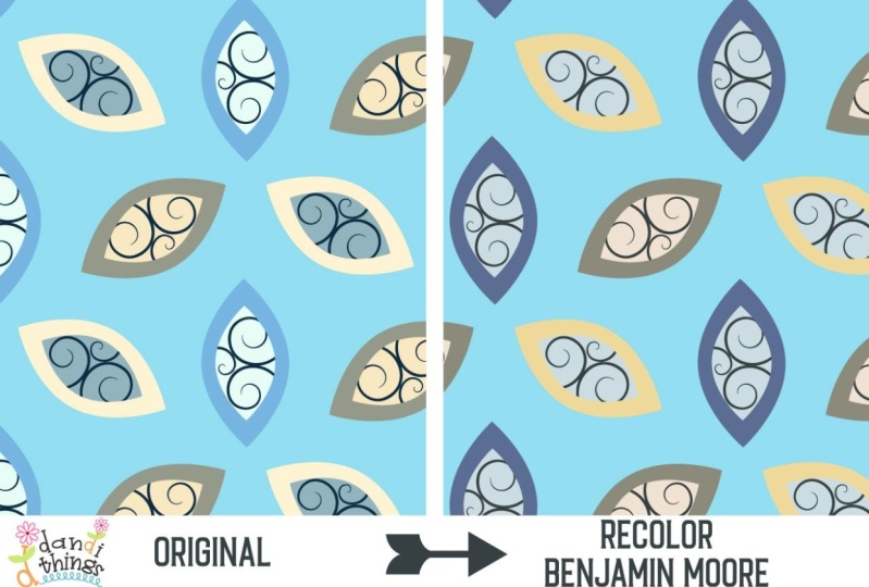
4. Recolor in Adobe Illustrator: If I have a pattern that I
designed in Adobe Illustrator, I can really easily recolor it and I can use
these paint swatches. So I can tell my spoonflower
customers, Hey, guess what? These colors are going to
match the paint on your walls. Here's an example of one
of my pattern blocks. You may recognize my format. Does this look familiar? That's from my first
class that I ever taught on Skillshare
on half drop patterns. I'm going to use this one as an example because
it's a simple one, and I have a really
simple three color Benjamin More palette
that I created. So let's say I already have
my swatches palette open, and again, you can do that by going to Window and Swatches. And I have four colors here, but I want to load those
Benjamin Moore bright primaries. So all I have to do is go to that little three line menu to the top right of
the Swatches panel. And I'm going to drop
down to where it says Open Swatch Library, and then I'm going
to drop down to where it says user defined. And here are all my
palettes and check it out. There is my Benjamin
Moore bright primaries from the classic collection, I'm just going to click on
that, and there they are. And now I'm just going to grab the folder from the
flyout menu and drag it into my swatches panel in my document, and
I can close this. So I'm going to leave my
background color the same, but I have these
three color rainbows, and I'm just going to go
to my selection tool, which is the black arrow
here at the top left, and I'm going to
select everything. And then if I go to edit, and then I go down
to edit colors, I'm going to go to
recolor artwork. So if you just click on that, now you're going to
get this probably advanced color theme
picker color menu that is giving you these
sliders and stuff. That's okay. I'm going to
click on advanced options. When you first hit recolor, you may get this,
but if you don't, just click on advanced options. So here are my three
colors of my rainbows, and there are the three colors that I created
with this palette. And now you're
probably saying, Aha, I know why she had
us create a palette. Be watch this. I just clicked on that palette, and it changed
everything all together. So I could have gone through
and double clicked on these and then manually
made some adjustments, or I could have chosen from my other swatches in
my local library. But I didn't have to do that. That's one of the joys of using pre made color
palettes and why I recommend if you're going to be doing anything with color, including using these
incredible paint color swatches from all these big
three paint manufacturers. I recommend creating palettes, and then you can actually call those out in, for instance, spoonflower listings,
and your customers will love you for it because
they'll know that your patterns are going
to match their paint. If you want to individually
recolor one by one, instead of using palettes, you can also do that. Way I typically do
it in illustrator is if I want to change
maybe one thing, I will select an object or you can select
multiple objects, and I will go to edit, and then I will go to edit
colors and recolor artwork. Now, I'm going to get
this dialogue box first. You can change those
in your settings, but all I have to do is click
at the bottom here where it says advanced options on
advanced recolor options. This is where you can
actually manually change a color one by one, one at a time, instead of
using an entire palette. So let's say I just want
to recolor this blue here. All you have to do
is double click on this little box on
the right hand side under where it says new. And now I'm going to
get my color picker. Now, I can go in here, and I can adjust the hex code, the RGB, and the CMYK values. But if I already have a saved
swatch in my color palette, all I have to do is click on the box that says
color swatches. And now I can manually choose from whichever colors
I already have saved. So I'm going to
choose bold yellow, and I'm going to click on. And now it just changed the
ones that I had selected, and it just changed one color. Again, if you double
click here as well, if you click on color swatches and you realize, you know what? I want to change the hex code. You can get back to
that previous screen. All you have to do is
click on color models. And now you're back to
where we were before, and you can also even
use a manual slider, and it will show you a
little preview here. The top is what your
new color will be, and the bottom is what
your old color was. So you can kind of
see the comparison between what you're
changing it from and two. What if you wanted that red to be maybe
where the blue is, and let's say you wanted it
red, yellow, blue, right? So it's really easy to fix. So right now where the blue is, I want the red to
be there instead. I'm just going to grab this here and I'm going to drag
it on top of the blue, and then it switched the colors. So now it's red
is on the inside. But I actually want the yellow
and blue switched still. So I'm going to do
the same thing. I'm just going to grab one
of these right here and then pull down and drag it on top
of that, and there we go. And I'm just going to click on. And I'm going to say no here because the
reason it's asking me this is because I did make some I didn't actually make
changes to the colors, but I rearranged the order
that these swatches were in. If you ever get this message, especially after you're moving
things around like this, you can just ignore it because you have your palette set up. You know it works, and you don't want to
make any changes. So I would just click
No, and that's it. Now you've got your
pattern block, which you can upload to spoon flour or wherever else
you want to put it, and you've now applied these
new colors in the palette. Stay tuned because
in a future lesson, I'm going to show you how to
leverage these color names and the fact that
you actually used colors that will match
existing paint colors. I'll show you how
to leverage that in your spoon flower listings, so you can make more
sales and stand out.
5. Color Swatches in Adobe Illustrator for iPad: As of the filming of this class, there really isn't an easy
way to be able to open these color libraries
that we created and these palettes in Adobe
Illustrator for the iPad, the way that we're doing
it on the computer here. But I do have a
workaround for you. So here's a really easy
way to basically be able to set up your little
color palettes in Adobe Illustrator
for the iPad. So here I have my three Benjamin More Bright
primaries, classic colors. Let's say I want
to have these in a document on Illustrator
for the iPad. All I'm going to do is create a new Adobe Illustrator
file on my computer, And I'm just going to draw. I have three colors here. So I'm just going to
draw three squares. It really doesn't matter where they go or whatever or
what they look like, you know, as long as you can use these to
sample the colors. And then I'm just going to
turn one of these squares. I'm for one of these squares, I'm going to apply
that pinata color. Let me make sure that
it is not on my stroke. And then for one
of these colors, I'm going to apply
the bold yellow. And then for one of
these little swatches, I am going to apply
crystal springs. So here are these are
the three colors that we set up earlier in our
little mini palette. So if you are subscribe
to Creative Cloud, you can really easily save this, and then you can just pull it up immediately on your iPad. So if you just go to file, and then you go to save. And then when you get
your little pop up here, all you have to do is
save Cloud document. So you're going to
be saving this to the Cloud so you can
open it on your iPad. So let's just name it
color Let's just say, let's just do color swatches. That's fine. And actually, I'll just call it new because I might actually
have one with that name. Okay. So what it's doing
now is it's just saving this file to Creative Cloud so you can access it
on another machine. Just click on Save. And now I'm on my iPad and I'm
going to open Illustrator, and there's the color swatches new file that I just
saved from my computer. I saved it to the Cloud. So I'm just going to open that. And the quickest and easiest
way to get these colors into another Adobe Illustrator file is to copy and
paste these boxes. You can do this with a new
illustrator for iPad document, or you can also paste these boxes into an
existing one two, if you have art that
you want to recolor. I'm just going to select these three boxes with
the selection tool. That's the arrow
at the top right. And then I'm just
going to go over to the left hand side where the little scissors icon
is and click on that. And then the middle icon
is the one for copy. So I'm just going to
copy these boxes. This means that I'm copying everything to the clipboard
that I have selected. Now I can close this document and create a new one or I
can open an existing one. And now, when I paste these
boxes into that document, the swatches automatically
get populated to the local swatch library in this Illustrator
for iPad document. I'm just going to go
over to the left again where those scissors
are, that scissors icon. And the third option
is for paste. So I'm just going
to click on Paste. And now you can access
those swatches, and they just got automatically populated to your
swatch library. If you go to the right hand
side here on the bottom, see where that little dot is. There's actually two dots. One is your fill and
one is your stroke. Click on either one of those, and that will actually pull up the swatch library
for this document. And look, there they are. Those are the colors
that we selected. Those are the colors from the
boxes that we just pasted. You can also go through and manually delete the
colors you don't want in your document by just holding your Apple Pencil tool over the swatch and hitting remove. And that's it. Once
you're done deleting all of the color
swatches that you don't need for the
document that you're in, you can go ahead and delete
those boxes that you pasted, and those swatches
will still stay in your color library
for this iPad document.
6. Install Swatches & Recolor in Adobe Photoshop: O. All right, so I want
to show you guys how to install these swatches
in photoshop and also how to recolor any of your
art in Adobe Photoshop. The first thing we want to do is install the Benjamin
Moore color library. We're going to install
the same one that we did in Adobe Illustrator. So I'm in photoshop, and I have my swatches
panel open. It's over here. If you don't see
your swatches panel, you can just go to Window, and then you can drop
down to swatches. And mine has a check mark next to it because
mine is showing. So I'm actually going to pull this swatch library
out so you can see it. So this is my swatch library
right now for this document, and these are all
preloaded swatch libraries that came with photoshop. So I want to load that
Benjamin Moore one, and we're going to do
something similar. So in the Swatch
library where it says swatches on the same row
all the way to the right, there's another one of those
little three line menus. I'm just going to click on that, and then I'm going to go
down to import swatches. And I'm going to click
on import swatches, and now it's actually
allowing me to choose any file on
my computer, well, not any file, but an ASC file that I can load into Photoshop. And the thing is,
these ASE files, these are Adobe swatch
Exchange files, which means you can open
them in any Adobe software. So I'm going to open the Benjamin Moore
Classic Colors library just like we did in Illustrator. I'm just going to click on that and I'm going to click on Open. And now it's showing at the very bottom of
my swatch library. You may not see it
because yours may be kind of contracted like this. Just expand your swatch library, and then you'll be
able to see it. And it may be helpful
for you to kind of pull it out like I did so you
can see what you're doing. And now, if I click
on the little arrow here next to the folder, now I can see this is
all the color swatches in that Benjamin Moore
classic color library. Cool. And here's one
that you may recognize. This is the 007 pinata. That was one of the
ones we were using in our bright primaries palette. So what I want to do,
I have an image here. This is an image that
I drew in procreate, and it has a lot of layers. I'm in my layers panel, and you can kind of see all
the layers I have here. And one thing that
is really important, When you're designing
raster art not vector art, it's very important to be able to keep all of your colors, if possible, on their own layer. And I also have all my
effects on one layer. So like, for instance, I have this stipple effect on the bow, and I have that, you know, kind of, you can
show and hide it. But I have that
on its own layer, and then I have the white for
the bow on its own layer. And you can see show and
hide what's on each layer. If you're in your layers panel, if you just click on the eyeball to the
left of a layer name, that'll show and hide the layer. So you can see where you are. If you're not seeing
your layers panel, all you have to do is go
to window and layers. And mine has a checkmark
because it's showing. But what I want to
change right now is I want to see
what happens when I change this poodles face to
be that 007 red pinata color. It may be a little crazy, but I just want to try it out. So one of the reasons you want to keep your colors each on its own separate
layer is because it's going to be a
lot easier to change, and you're not having
to worry about, you know, having
multiple colors on one layer that you're trying
to adjust at one time, especially if you're trying
to make exact changes like change your colors to an
exact Benjamin more color. So what I want to
do is I want to select the layer that
this poodles face is on. So I'm going to figure
out where that layer is. So, this one is
the poodles face, and I know that because I am showing and hiding the layer. And if you hover over the layer, it actually will tell you
what the blend mode is, the opacity and the fill. So this is actually
a normal blend mode, meaning it doesn't have any
effects applied to it, like, you know, you're not multiplying
or doing anything fancy, and it is opacity 100%, and it's fill 100%. And that's important
because if you're going to be changing from one
color to another, And you want to be
really exact about having this is the exact
color and it's a solid color, and it's matching this
Benjamin more color. You don't want to
have any serious shading or multiply
blending modes, any kind of crazy things going on that are going
to change the hue or the tint of the color because you're not going to end
up with an exact match. So really, the main thing
that you want to do is focus on when you're making color
changes with raster images. You want to have images that have solid colors that have
100% opacity and fill. So what I want to do is change this pink poodles face to
be that red pinata color. When you want to make a
change to a raster image, not a vector image, the best way to do that, without destroying
your original work is to use non destructive
editing techniques. The best way to do that
is to create things like new adjustment
layers in Photoshop. You can create a new layer, which is called an
adjustment layer, and then you can make changes, but you actually
still get to keep your original color,
your original layer. So you're not actually
destroying the original art. And that's the way
I like to work. So with this layer selected at the bottom of
your layers panel, If you go down to the little
icons here on the bottom. There's one that is
kind of like a circle and it has half of it
filled and half of it not. It looks like a little
almost like a Ying, and it has a little
hover over it. We're going to create a
new adjustment layer, new filler adjustment layer. I'm just going to click on that. And then when I do that, I have all these options. And actually, what I want to
choose is the first option, which is solid color. So I'm just going to change one solid color to be
another solid color, so I'm just going
to click on that. And now I have a new
adjustment layer. It's a color fill, and I can select any color that I want to change this poodle face color here to be and I'm going to change it
to a different color. So by default, your eyedropper tool is
automatically pulled up. So anything that you click on, Any color is going
to be sampled. If for some reason,
you don't get that pop up little
color dialog box. It's really easy to open it. If you go to your
adjustment layer that we just created
above our original layer. There's a little box here on the left hand side that is our adjustment layer
and our color fill. All you have to do
is double click right there inside that
box where the color is. And then it will pull up
your color dialogue box. So, if I click on
this blue background, it's now changing the
poodles face to be blue, which is the same color
as the background, which is why it
just disappeared. We don't want to do that. What I want to do is go over here to my Benjamin
Moore classic library, and I'm just going to click
on that 007 pinata color, and there we go. That is an exact change. That is an exact
match because it's 100% opacity solid fill color, and we just change from
one color to another. So that's it, and I'm
going to click on. Now, obviously, this
looks a little weird, but I just did it for
effect to show you guys how easy it is and quick. To make exact color changes
even with raster images. It doesn't just have
to be with vectors. Now, the other thing
is too, remember we did an adjustment layer. I'm going to hide that. Look,
so there's our original. So we did not destroy
the original art. That's what's called a non
destructive editing technique. So we can hide and show this. We can also double click here in the little
color fill box, and you can change
it to anything. But remember, if you want
to do an exact match to, for instance, a
Benjamin Moore color, you really want to use your
Benjamin Moore palette, which is why we installed
that color library. If you have any images that have a blending
mode applied to them, a blending mode is when
you change the brightness, the way it is kind of blending on top of the
layer underneath it, you're not going to
get an exact result. So you really want to stick
to things like, you know, solid colors if
you're worrying about matching something like the
Benjamin More color library. You want to stick with things
that are 100% opacity, 100% fill with a
normal blend mode. That's just because we're
working in raster images, and you have a lot more options with things like
shading and texture, but you also have a lot less
options in terms of getting exact colors and unless you're working with true solid colors.
7. Color Swatches in Procreate: The color swatch files
that we are working with in this class all have
the same file extension. It is ASE, which is
Adobe swatch Exchange. The A for Adobe means that these are easy to open and use
in any Adobe software, but they are actually not
meant for use in procreate, but there is a really easy work around that I like to use. If I want to put these same paint swatches
into my procreate documents, so I can create art
and recolor art with these exact colors. I'm in Adobe
Illustrator right now. I'm actually just
going to create a new illustrator document. I'm on my computer, a good size, I would say, would
be 10 " by 10 ". And I'm just going
to click on Create. I'm just going to load my Benjamin Moore
Bright Primaries color library that I created. What I'm going to do is go to my swatches panel and
I'm going to go to my little three
line menu and I'm going to go to Open
Swatch Library, and then I'm going
to drop all the way down to user defined. And there is my Benjamin Moore Bright
Primaries classic palette. Now, of course, I can also open any of these Benjamin Moore palettes that I have installed or any of the other ones that
you have for this class. You can install the
Sherwin Williams or the Bar ones as well. But these have a lot
of colors in them, and I was very careful to
curate my own custom palette. And that's why I
love doing this. So I only have
these three colors, and I'm just going to draw three really quick boxes
here with these colors. So I'm going to select
my rectangle tool, and then I'm going to go down to my color fill and stroke. I'm going to turn
off the stroke. And by doing that, the way you can do that is clicking
on the stroke, which is the second option. And then I'm just
going to click on the little button here. And then that turns off the stroke for the box
that I'm about to draw, and then I'm going to go back to the main the fill part of it. And then I'm going to
click on the box again, and I'm just going
to draw a box. I'm holding down shift
while I do this. And now, if I click
on my selection tool, and then I just go over to my Benjamin Moore palette here, I'm just going to
hit the first one, which is pinata, and now it
has changed it to that color. I'm just going to
duplicate this box. I'm going to hold
down the option key, and then I'm going
to drag this over, and I'm going to
do the same thing With my objects selected, my foreground color
is right there. I'm just going to choose
that bold yellow, and then I'm going to hold down the option key and
drag this down here, and then I'm going
to do the same thing with the crystal springs. Perfect. Each one of these is the exact match to these
three Benjamin more colors. I'm now going to
export this as a JPEG, and then I can open that in procreate and sample
these colors. So I'm just going to go
to an illustrator file, and then I'm going to
drop down to port. And then I'm going
to go to export as. I'm just going to name this
bright primary colors. So I'm going to go to the bottom of my little dialogue box here. I'm going to make sure to
click on US artboards. That's going to use
this white artboard and make sure that
that's what it exports. I'm also going to
export it as a JPEG. You can export it
as anything almost, but I just find JPEGs are easier to work with.
And that's it. I'm just going to
click on Export, and then I'm going to
leave my JPEG as RGB, quality ten, and I'm going to
make sure it's at 300 PPI. Now, if that is not
what yours is at, if it's at screen or
something like that, under resolution, just
change it to 300. So you have the highest image
quality and make sure that your quality is ten and
color model RGB for me, I just like to work in RGB. That's what
spoonflower prints in, and that's what a
lot of printers use. So That's it. I'm just going to
click on, and now it has saved that JPEG
to my computer, so I can put it on my iPad
and open it in Procreate. And now I have on my desktop on my computer that JPEG that I just exported from
Adobe Illustrator, so I'm just going to
airdrop it to my iPad, which is really easy
because I'm using a MAC and I'm going to be airdroping it to another Apple device,
which is my iPad. So if I just click on that, if I just select the JPEG, I'm going to control click, and I'm going to
go down to share. And then if I select
the option airdrop, I can actually choose where
I'm going to airdrop it. And I don't know if you
heard that little ding, but that was it
getting transferred to my iPad. It even says sent. So I can just click on Done, and now that image is
going to be on my iPad. So now, I'm in
procreate on my iPad. I'm just going to
create a new document. It does not really
matter what size it is. And now I have this new
procreate document. I want to import that
image into Procreate. So all I have to do
is go up here on the top left next to gallery, and I'm going to click
on that wrench icon. And all I have to do is under ad and if you don't see this, you'll probably want to go to the very left where it says ad. I'm going to click on
the second option, which is Insert a photo. And now it's pulling
up my photo library. So I'm just going to select
that image, that JPEG, because I imported it into
my iPad from airdrop, and it just automatically was loaded into my photo library. So I'm going to click on that, and there it is. These are the colors that I sampled from Benjamin Moore
in Adobe Illustrator. I want to create a
new color palette for just these three colors. At the very top right of the screen, there's
a little dot. That is a color. It may be blue or red
or black or white. It doesn't matter. It depends on what your current color is, but that is the
color picker tool. I'm going to click on that. And if you don't see it, you may be in this mode
or classic or something. But at the very bottom right, if you click on palettes, that is where your
color palette tool is. I want to create a
new color palette. So at the very top right of the palettes panel,
there's a plus sign. I'm going to go ahead and
click on that and I'm going to click on
Create New Palette. Now, you may not
see it immediately, but it's going to be created at the very top of your list, and there it is. It's
called untitled. Obviously, I want to name it. I'm just going to click on it. I'm just going to
name it Benjamin Moore Bright Primaries Classic. Now I have my color
palette named. All I have to do is
color drop these colors. The way you want
to do that is if you go to the left hand side, You'll see this little
slider tool over here, and at the very bottom of that
is this little rectangle. I'm going to click on that.
And by clicking on that, now I have my color
sampler tool. I can just drag this around with my Apple pencil and any
color I drag it on top of, it is going to change in the
little color library here. And all I have to do is open my palette and then click
in there, and that's it. And I'm going to do
the same thing again. I'm going to select this, and I'm just going to go
over this bold yellow, and I'm going to do
the same thing again. I'm going to click on the
yellow now on the top right, and I'm going to click right here with my Apple
pencil right next to the red and add
it to my palette. Same thing again,
I'm going to go back and then I'm going to
select crystal springs, go back in here,
and there it is. Now, These don't have names. This does not say, you know, pinata or bold
yellow or crystal springs, like those other ones did in our Adobe software because we're not loading them
from Benjamin Moore. But these are still going to be matches because
we're directly sampling them from that
JPEG that we created. So now, if you're in Procreate, you can create new art, so you can draw, you
know, anything, really. And now I'm going to be
drawing with crystal springs. And if I want to draw with
bold yellow, same thing. So that is a really great
way to be able to say, I am creating art patterns
or illustrations in procreate using
these exact colors that match Benjamin Moore. Now, if you have a
piece of artwork and you want to recolor, let's say one of the colors
or multiple colors in there to match these That's actually really
easy to do too. So I have a piece of
art here that I drew. And if I open my layers
panel here on the top right, you can see, I'm
pretty good about keeping my color layers
separate from each other. So that blue in her clothes
is on its own layer. The blue rain streaks on the window behind her are
also on their own layer. If I want to change these to crystal springs or maybe I
just want to change one. All I have to do,
I'm going to unlock this layer is make sure
I'm on that layer. And then I'm going to zoom
out so you can see it. I'm going to go back to
my color picker tool. And there is my crystal
springs right there. It's on the right hand side.
I'm going to select that. I'm just going to hold
down the color with my apple pencil and drag it and pull it on top of this blue right here
for the rain streaks. Now, you notice it's only
coloring one of them. If you drag to the right, your slider will move up. That is going to color
everything on that layer. So you can do that to color
all the blue on that layer, that color, or, you know, you can also, if you
want to drag it on top, you can just color
individual elements. So see how with the
slider, you know, you can kind of
adjust And the way I'm doing that is
with my Apple pencil. I'm just dragging it
to the left and right. The left is a lower threshold, and the right is a
higher threshold. But if I want to color all that, I'm going to go all the way to the right. And it's that easy. So now I could easily go through and change all of these colors. So let's say I want to change her clothes to crystal springs. I'm going to do the same thing. And I'm just going to
pull the slider down, and now her clothes are
that crystal springs color. What if I wanted to
change this yellow that the book is to
be that bold yellow? So I'm just going to do
the same thing here. Go up to my color picker, click on the yellow, and then drag it directly on
top of the book. And that is the bold yellow. And then, of course, I
have this pink here. If I want that to be
that pinata color, I'm going to select that, and then I'm going to drag
it on top of the pink and use my slider to make sure
that it covers everything. So it's that easy. Now, it works a
lot better if you have solid images, solid shape, solid colors in procreate, because if you start playing around with shading
and stuff like that, you know, you're not going
to get an exact match. But I tend to design
in a very simple way. So my colors are usually
pretty solid, and that's it. That's how you can create
color palettes using these exact paint
colors in procreate, and you can even recolor
and create new art.
8. Spoonflower Tips & Staying on Trend With The Color of the Year: I want to show you my
spoonflower stats really quick. So if you look at my sale, some of my top sales, one of my top
selling products is this Portuguese floral
tile pattern that I designed specifically using
Benjamin Moore Blue Nova. So this is the product. This is a Portuguese floral
tile pattern that I designed. I used Benjamin Moore
Blue Nova, which is 8205. There are tons of
potential customers on Spoonflower specifically
searching for Benjamin Moore Blue Nova. Because it is the color
of the year for 2024. So, you know, I am going
to take advantage of that and recolor my art with
that specific color. One of the color palettes that I am giving you
with this class is the Benjamin Moore color
trends 2024 AS file. And if I open that in Adobe Illustrator into
my swatch library, This is actually
the Benjamin Moore color trend library for 2024. Look at what the first color is. It's blue Nova. So now I know that Blue Nova
is the color of the year. I can go in and either create new art or recolor existing art using Benjamin Moore Blue Nova. Benjamin Moore even has a suggested color
palette of colors that are going to
coordinate really well with the color
of the year for 2024. How cool is that? In my product title, I made sure to call
out Benjamin Moore and the color name
and the color number. I also did it in my tags. Here is a tag for Blue Nova and here's one for
Benjamin Moore. So now that there are going
to be interior designers and DI wires who are going to be painting their walls with
Benjamin Moore Blue Nova. How awesome is it that I can promise that this pattern
that I created that they can purchase on
wallpaper on spoonflower is going to match exactly with Benjamin Moore
Blue Nova paint. So if someone wants to paint the trim in their house with
Benjamin Moore Blue Nova, and then they purchase
this wallpaper from me, they are going to know
that my pattern is going to exactly match
their paint color. How cool is that? So take advantage of it, leverage the company
name recognition and help yourself stand
out on spoonflower by being one of the very
few artists who takes advantage of using specific paint colors
in their patterns. One reason it's a win
win for Benjamin Moore and you is because if you
design your patterns, keeping in mind specific
paint colors from, for instance, Benjamin Moore
or Bar or Sherwin Williams, and you call those out in
your spoonflower listings, you're also encouraging
spoonflower customers to go out and buy that
specific paint color. This is another of my top selling patterns
on spoon flower. I designed this Magnolia
flowers pattern, and when I designed it, Benjamin Moore, October Mist
was the color of the year. And one thing that's great about using the
color of the year, whether it's Panton or Benjamin Moore is that you
have a built in audience. You have people that are
going to be purchasing Benjamin Moore October Mist because it's the
color of the year. Those people may be
interior designers. They may be small manufacturers
who want to make purses. There are going to be people
looking for October mist. So I recolored this vector art using Benjamin
Moore October Mist. That's that green kind of
sage green color there. So you better believe
I took advantage of the name recognition of Benjamin Moore and the
color of the year. So I made sure to include the words October
Mist in my title. I also made sure in my tags to use not only the
words October Mist, I also used Benjamin Moore. That is what I think made this one of my top selling
products on Spoonflower. The moment I found out that October Mist was the Benjamin
Moore color of the year. I jumped on recoloring this pattern and because
I thought about people who are going to be shopping
for it and my end user and what they were
going to be searching for October Mist
and Benjamin Moore, that really helped me boost my sales and stand
out on spoonflower. I want the same for you. So make sure you take advantage of this, leverage that name recognition
and leverage those colors. Benjamin Moore is certainly not the only paint company that releases a color of
the year, either. Bear also has one. So for 2024, the color of the year that Bar released
is called cracked pepper. It is really a cool,
dark charcoal, and this is going to be what a lot of people are
purchasing in 2024, not only to paint their walls, but it's going to inform home interior design
and decor trends. I went to Home Depot
recently and they have a huge section just
for bear paint swatches. And so I went there and
I actually picked up a few fun cool colors in different paint swatches
directly from Bar. These paint swatches are free, and they have not only
samples of the actual color, but they have the color
names and the color numbers. I had a lot of fun
just looking at all the colors and creating
a little custom palette. I also happen to find a little swatch for
the color of the year, which is cracked pepper. They even had this cool
little cheat sheet with different sheens showing mat and flat and satin,
gloss, et cetera. It was really cool and honestly, really helpful to be able to look at all this
stuff in person. And I also happened to find in the cool neutrals
color library, which, by the way, is included in
the freebies for this class, the Bar color of the
year, cracked pepper. And now I can digitally recolor my art directly from Bar
using the color of the year, and I can be sure it is
going to match their paint.
9. Class Project & Final Thoughts: Now that you have either created new art or recolored
existing art, using paint colors from
major manufacturers, it's time to put it to use. Please share in the
class project gallery, your art that you either
created or recolored using some of the paint swatches that I
shared in this class. Or if you have another set of swatches that
you prefer to use, whether they're from pantone or even another paint manufacturer, please feel free to
share that as well, and let us know what you used. I am always learning so
much from my students, and I would love for us all
to cheer each other on. Project bonus. Please share your art on
Instagram and tag me. I'm Carrie Cantwell Art. I cannot wait to see which colors you used and
where they came from. And sharing your art on social media is an
excellent way for potential spoon
flower customers and art directors to discover
you as an artist. I hope you had fun and
found this class valuable. Please make sure to
leave a review so other students can know if
this class is for them. Never underestimate the
value of your review. I personally enjoy
reading all of them. Please check out my other
skill share classes, which are excellent
companions to this one. You can learn how to draw and
procreate, create patterns, find your signature style, design mock ups and learn everything you need to
know about spoon flower. I have an exciting, welcoming community full of other artists just like
you called Graphics Gang, and we would love
for you to join us. There, you will
discover expert chats, tutorials, freebies, and more. Plus, I meet with the Graphics Gang live
via Zoom once a month. You can find it by visiting patrion.com forward
slash Graphics Gang. Please follow me on Skillshare. You can just click
the Follow button on my profile page or
just below this video. And make sure to say
hi on Instagram. I'm Carrie Cantwell Art. Thank you again for
taking this class, and I will see you
next time. Bye.
 Carrie Cantwell, Illustrator | Surface Designer | Teacher