Transcripts
1. Introduction: Some time ago, I decided that I wanted to
improve my handwriting. In our digital age, it
might seem like a lost art, but there's real
value in this skill. It's not just about
writting beautifully. It's a form of
personal expression, a way to reflect and a
moment to be truly present. When you write, your thoughts flow differently and freely. My journey started with
practicing cursive, studying sensoria,
business partnership, and developing my technique. Now, I'm excited to share with
you the next step, Foshan. Hello, I'm Robert, and I'm passionate about
human expression, creativity, and personal growth. Improving my
handwriting has become a wonderful way to
develop skills, focus my mind and
see my own progress. That is why I want to share with you what I
know about Forsa. Think of it as a step
up from basic cursive, but not quite diving
into full calligraphy. It's that sweet spot in between. Learning to add
elegant embellishments to your everyday writing. Don't worry. You don't need fancy materials or
perfect technique. The only requirement is
knowing some basic cursive. We will build on
that foundation, and I'll show you
ways to add flare and style to your
existing handwriting. In this class, we'll
cover useful techniques, starting with
foundational principles and warm up exercises. We will discuss
guidelines for balance, grid, position, and the elements
of different flourishes. We will see exit strokes, entry strokes,
descenders, ascenders. I will also share my go to uppercase alphabet and ideas for flourishing longer phrases. Be honest, I do not consider
myself an expert on this. As com ma mistakes. I'm still learning. But
also because of that, I think that my approach
and perspective will be great for you if you are just getting started
with flourishing. Even if you already
got some experience, I am sure that you can find
some inspiration here. Through the class,
I will provide practical tips and
clear explanations. I will include
resources for practice, but you might want
to pause as we go along because we will
really cover a lot. By the end, you'll
have a toolbox of flourishing techniques to
develop your own unique style. Remember, flourishing is about muscle memory and
personal expression. I'll show you many options, and I'm sure with this, you will discover what works
best for you. Whether you want to add
elegance to a grocery list, make journal pages
look amazing or create beautiful letters
or handwritten cards, you'll have the skills to do it. Are you ready to transform
the way you write? Let's dive in and
start flourishing.
2. Getting Started & Project: Welcome to this class
on flourishing. I'm excited to share with
you some simple ways to add some flare to your
cursive and everyday writing. Let's start by
talking a bit more in depth about the
idea with this class. We will see some
few requirements and things that will be helpful. Also some things for when
we begin practicing. Many people think that flourishing is only
for fancy calligraphy, requiring special tools
and lots of skill. You can definitely develop
it into an incredible skill. I believe that knowing some
degree of flourishing is enough to give a personal touch to our everyday handwriting. My goal here is to help
you understand the basics, so you can apply them in
a way that fits you best. For me, learning
cursive calligraphy and flourishing has been mostly about improving my day to day. Process has been
incredibly rewarding, even becoming a form of
mindfulness practice. I invite you to approach this
class as a time to relax, focus and develop a
skill at the same time that you practice being
present, being in the moment. Honestly, I think that
trying to grite mindfully, paying attention and focus on what you have
in front of you is the best way that you will have a much more enjoyable
experience. Ideally, this class
will not only be enjoyable and lead
to visible progress, but also help you cultivate
better hand griting habits, while getting rid of
any not so good ones that may be blocking
your development. This class, I have
to tell you that you should know some cursive. If you need a refresher, check out my beautiful, easy to read cursive class. There's many different
kinds of cursive, but specifically for what
I will be teaching you, grinding on a slant is
also very, very helpful. If you have trouble with that, try rotating your page and grinding in a straight
line towards you. This will result
in a natural slant once you straighten your
page at the very end. Obviously, you will
need a pen and paper. You don't have to go
all the way and get a point of pin and
calligraphy holder. You can if you want,
but I won't be focusing too much on shading
techniques in this class, so it's not necessary. What I do think is necessary is a tool that allows you
to grid comfortably. I love using fountain
pens because their mechanism let you
grid with minimal pressure, which is very helpful
because after all, flourishing is all about this
natural flow that we can only achieve if we're grinding lightly and without
restriction of movement. So, I highly recommend
fountain pens, but any pen or mechanical pencil that doesn't require too
much pressure will be okay. I will be using a
personal favorite, a pilot falcon with
soft extra fine nib. If you plan on using
a fountain pen, I suggest that you go for a fine or extra fine nib
to keep your lines clean. This is something
that helps a lot when trying to make our
griding legible. As for paper, if you go for a fountain pen or
a calligraphy pen, you will need something
that can handle ink well. I will be using R a notebook. If you are using a normal pen, then any paper will do. In the resources of this class, I will be sharing some guides that you can also
print if you want. This is something
that I use when I'm learning a new
flourish or when I want to get really picky about my angle and consistency. It's not a requirement, but is there as an option if you
think it will help you. Okay, since we're here
at the very beginning, let me tell you about your
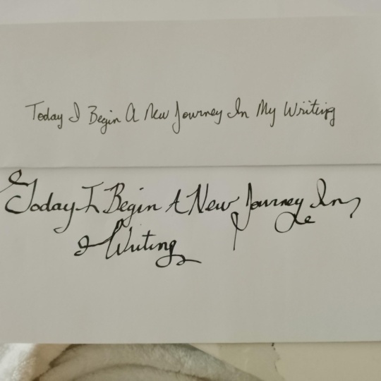
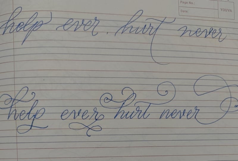
project for this class. Write a phrase in cursive. Just do it with the style
that you have right now. If you already know
some flourishing, you can use it. No
problem with that. Remember that we want more
than just a single word here. A short phrase or even
a sentence will work. Our emphasis on this class will be on trying to find a way to add balance and elegance on text that
we can use every day. It's not just flourishing
for the sake of flourishing, which could be done
in a single word or even a single letter. Grite this right
now, and when you complete this class and you have practiced what you learned, I encourage you to write the exact same phrase and
share it here in skills. You have any
questions by the way, feel free to ask anytime in the discussion section or
when you post your project. I'll be happy to assist you
to the best of my ability. All right, this would be
enough to help us get started. In our next section, we will start warming up
at the same time that I share with you some important
flourishing principles. I hope that you are ready
to learn how to make your grading look more
elegant and personal. Get your pin ready
and as see you soon.
3. The Basics, Position, & Movement: Let's dive into the
basics of flourishing. Before we start creating
beautiful flowing lines, we need to set ourselves
up for success. In this section, we
will already be doing some exercises so you can
grab a paper and your pen. First, let's talk about posture, sit up straight,
but stay relaxed. Your feet should be
flat on the floor and your grinding arm should rest
comfortably on the table. This position helps prevent fatigue and allows for
smoother movements. To make sure that
when your forearm is resting on your table, it forms this 90 degree angle. It will just make writing much
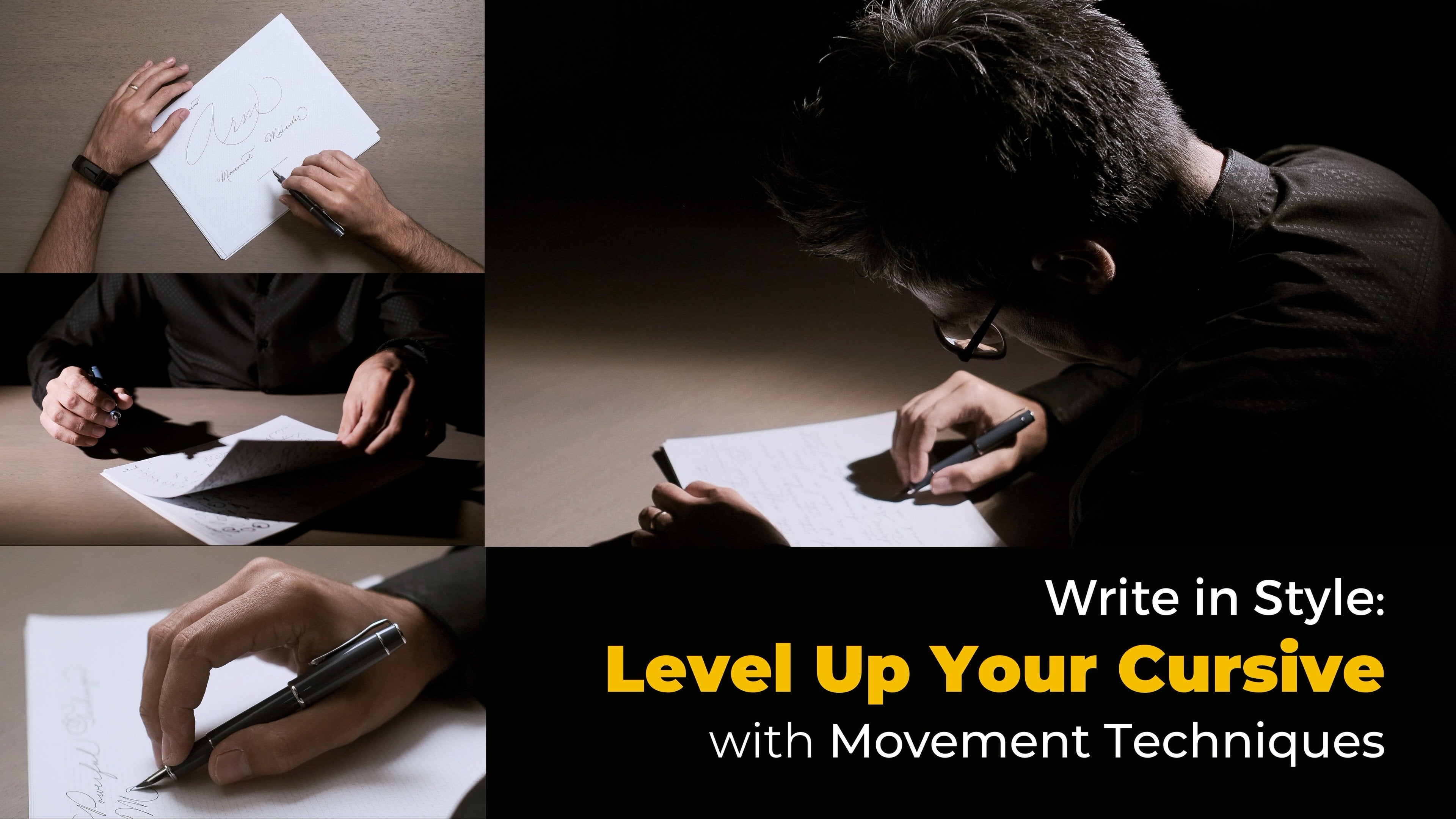
more comfortable for you. Now, grab your pain
and grip it lightly. A death grip will only lead to cramped hands
and stiff lines. Hold it as if you were
holding a small bird. Firm enough that
it won't fly away, but gentle enough that
it would not hurt it. Let's farm up with
some exercises. Let's start with some ovals. Make large slanted ovals
using your whole arm. Here we're not traveling, just doing ovals, one on
top of the other one. Now, on the other direction, it's very important that you
use your whole arm for this. As you can see, I'm not
even resting on the desk. Now, let's go for
something smaller. You don't have to move
all your arm for this. You can just rest your
forearm on the table. Same opposite direction. Finally, let's do
some tiny ones. For this, you can just
be moving your fingers. Do you feel a difference? When flourishing, I find
it extremely useful to be switching between these
three type of movements. The whole arm,
only the fore arm, which is also called
muscular movement, and the most common one
is finger movement. There's a lot more that
can be said about this, and I actually have a whole
other class where I go very much into detail and exercises
for movement technique. But for now, I just want you to be aware of the
general differences. Sometimes you will
feel too restricted if you're anchored to the
disk with your greased, like you may be used to. So take some of this
warm up time to experiment with something that will give you more
freedom of movement. After you practice
some slanted ovals, you can move on to horizontal
ovals and do the same. I personally hold
my pen like this. And only slightly touch the paper with my
last two fingers. That way, I can glide around. Even though this is a
more traditional grip for Spencerian and
this kind of rushing, I personally do not
think that it's super important that you force yourself to follow
this tradition, because more important are the results and that
you feel comfortable. Over time, and with practice, you will be able to
adapt to your grip and overall position to what
works specifically for you. After practicing those
vals in the same place, we can start introducing
some traveling and movement. Again, first slanted
and then horizontal. You can stay in the
same size or going from big to small and
the other way around. Now, a few things.
In flourishing, ovals are a big part
of our foundation. This helps maintain a
consistent flowing look. Generally speaking, aside
from the oval shape, balance is also crucial
in flourishing. I'm just giving you
an introduction here. We will cover balance,
and I will share with you more in depth information
in the following lessons. But if you have a word
or phrase that you want to flourish and it
already starts with a big, very attractive,
elegant parches, we will be learning
ways to balance it with something
similar on the right. The same goes for the
top and the bottom. Now, here at the very
beginning of our class, I want to tell you
something important. Balance doesn't mean symmetry. It's about visual weight. We already practice some ovals, so less practice
with some fear aids. This help with fluid transitions between upstrokes
and downstrokes. Start large again in one place and gradually decrease in size. This is an exercise
that many times actually can work as
a flourish itself, because as I was telling you, this can help us have
some visual weight. We can connect it to the
senders, for example. While the concept of balance is not very hard to understand, it can get a bit confusing at
the very beginning because you may feel like there's
some balance missing, but you do not know what
you need to put in there. Since I have told you that
it's all about visual weight, then this means that it's
not only about fligens. The text itself, how we position our letters
and words are also important elements to consider when it comes
to this balance. You already have an upper ese
alphabet that you like with some flourishes
and several words that individually add weight, you can focus on
the end flourishes. This is why pieces with multiple words are generally
easier to work with. The text itself contributes to the balance and
visual weight, making the overall
composition more cohesive. For example, if I want to
fish the word weight alone, I do have to figure out
more decorations for it so that it doesn't feel
too heavy only on one side. If I write visual weight, it just turns out a
little bit easier. The less the text, the forishes become more important
because they stand out more. Remember, here I
am trying to show you some general tips when
dealing with flourishes. I am trying to use some very simple extensions
or figures here, but we will see this and
many more flourishes in the following lessons. Don't worry too
much about getting this right right at this time. I just want to
illustrate my points, which can be considered some
guidelines for flourishing. Here's another tip that
many beginners overlook. Avoid sharp angles and straight
lines in your flourishes. They interrupt the flow and can make your work look rigid. Instead, aim for smooth
curved transitions. Every line basically should have some degree
of curving them. Another very important thing to know when you are doing forages, is that when lines cross, you should aim to do it at
about a 90 degree angle. Of course, this rarely happens. But the closer that
you get to that, it will make your forages
look cleaner and intentional. One thing to mention is
that if you start to do shading with calligraphy pens or fountain pens that allow it, you can always cross
hair lines with hairlines or thick
strokes with hairlines, but you should avoid
crossing two thick strokes. Finally, when you plan to
do flourishes, leave space. We want our flourishes to have room to breathe
and grow naturally. Beginner, don't
stress about cramming your work into a tiny
corner of the paper. Instead, give yourself more space that you
think you will need. This approach not
only reduces anxiety, but also gives you
the freedom to experiment and led
your creativity flow. As a quick review,
let me tell you some of the things that we talked
about in this lesson. Slanted and horizontal
ovals are the foundation for flourishes and will give everything a consistent
flowing look. Try to practice switching
between finger, muscular, and whole
arm movement. The finger can only go so far, especially if you
are anchored down. When you cross lines
in your flourishes, try to do it as close as
possible to 90 degrees. Balance doesn't mean
symmetry but visual weight. The less the text,
the flourishes become more important
because they stand out more. Avoid sharp angles and straight
lines in your flourishes. When you're flourishing, don't start too close to the
border of the page. Always leave space for your
flourishes to grow naturally. All of the exercises that we did here should help you
loose an phabit. Some of the flourishes
that we will learn are also based on these
simple movements. But still, I highly suggest
that you look for example, alphabet of your favorite
flourished letters. I'm talking here
mostly about per case because there's so
many options out there. Remember that these
principles that I've given you are guidelines,
not strict rules. As you practice, you'll develop your own style and as we go
through the next few lessons, we will continue to
review some of them. The key is to stay relaxed, keep practicing, and most
important, have fun with it.
4. Freeform Flourishing: In this section, I want
to start going into some basic flourishes
that I use all the time. I want to tell you
how to look for spots where you can
introduce flourishes and show you some ideas to start creating these extensions and strokes that add some balance
in an elegant and easy way. First, I want you to forget
about perfection here. Let's cover this more in the
spirit of free form fliion, which is all about letting
your creativity flow. Don't worry if your
lines are perfectly smooth or if your loops
aren't perfectly symmetrical. The beauty of what I
want to show you here lies in its natural
organic feel. Let's start by writing
a single word here. Let's do symphony. This upper case is something that would be
considered more modern. It doesn't really belong to any traditional calligraphy
method as far as I know. But I want to use
this here to tell you that when it
comes to flourishing, and especially if you
are someone who likes to improvise and try to come up with
something new each time, it's a good idea that you
look for letters that give you an opportunity to
easily extend them. What do I mean with
this? When flourishing, usually the uppercase letters carry more visual
weight in themselves. There's many different alphabets that you can get
inspiration from. But if I wanted, I could choose a different kind of S that
could be more flourished. This may look nice,
but at the same time, I am a bit more restricted because I do not have a lot of different directions
to go from here. I really like simple
forms like this S to give me lots of room to experiment
where I take those endings. Now, I got my word without
any extra additions yet. I immediately start to look at the left to evaluate how
heavy it is already there. I look at the right, to see
how much balance I need to a. I look at the top, to see if it feels too empty
and at the bottom. For the ending, when you
are just getting started, the easiest thing
that you can do is just follow the flow
of the stroke itself. Here we end this word with a y, which makes it easy to
just extend it like this, super simple, but it is
still considered a flourish. We could also make it turn up. It works as another
simple option. O S here is simple
enough and has enough weight to balance this
simple flourish at the end. But if I wanted more, I would first work
more on the S, and then I'll figure out how to do something
similar with the ending. These kind of flourishes,
as you can see, are just an extension of those warm up exercises that we saw in the
previous section. They still work great. My go to exit strokes
and EC flashes are this. Let me do them with letter A. In these very simple exit
fishes that I will show you, the val shape is very important. So you can always warm up
with your letters like this. First, the most basic of all flashes may be a simple
extension to our letter. If we want another variation, we take it a bit further. And if we want something
a tiny bit heavier, we can even have
another loop in there. Notice that I'm trying to keep that loop centered
in the bigger val. Now let's do
something different. Let's go towards the bottom. For another variation, we can
extend a little bit more. We can also do another one
adding an extra loop in there. This one breaks a little bit
of the balance and symmetry, what still works as a
more modern option. Now, for something different, we can try to go to
the bottom like this. For another variation,
we can go all the way and do something
similar to a novel. And if we want more, we
can start incorporating some of those loops that we
used for practice before. You can easily adapt these
flourishes to other letters. Here I am doing it on letter K. And now let me
do it on letter r. As long as we are at the
end of our word or line, this will work without issues. These are simple enough
to quickly memorize and allow you to achieve a bit
of balance in your words. Let's go back to
the word symphony. Something similar to
what we already have. After finding some
balance between the beginning and ending
of my word or phrase, I start to look
at my descenders. In this case, we have three, and this p is pretty much in the center, so
I'll go with that one. Let me do something
super simple. Just an extension
with sort of a wave. To give you my go to
fishes for descenders. But let me take a
moment here and look at our word as it is. Can you see the ovals on the flourishes?
There's two on our S. O it flourish is
also a slanted oval. Even in this
descender extension, we can see that two ovals
are our foundation. We can even loop back on that same flourish and we
can see it more clearly. Now, this also works on
any other descender. Let me do it on energy. Another variation would be to add a small loop
on your way out. We can add the loop
inside the center itself. This one is far from perfect. But remember that we're
just seeing options here. It's always a good idea trying
to mentally see the center of our vals when we do
center loops around that. This one is definitely better. I am adding that loop back, that I did a few 4 " back. We can also take
that exit stroke in a different direction. This one is more simple, but it's still something
that I use often. If you want to use some of
those warm up exercises, you can also do something
like the horizontal eight. Here, let's just do
two of those figures. Now let me do 18 and then
close with a bigger loom. Sometimes I may even connect this with some extra spirals. Remember that all of these
that I'm showing you here is more free for floss. It's all about trying
to come up with simple extensions and different
ways to find balance. You can do some practice in
this way to loosen up and also your muscle memory
learn to flow by itself. Now, there's also
frogs for ascenders. But when you are just
getting started, I highly suggest not
to look into this yet. I will be giving you some options in the
following lessons, but these are a little bit more complex and it's very
easy to mess up. Instead, when I feel like there's balance
missing from the top, I try to extend my
first per is letter or I try to come back
here with my last letter. The idea here is to add
some weight at the top, while at the same
time, we're adding some balance towards
the right or the exit. I'm giving you some
options here that I always have at
the top of my head. When you look at this
in a word alone, it is as if we were
trying to enclose our word inside
these decorations. Later, we will learn some
extensions for ascenders. But these are a great
and easier form of substitution for those. In my opinion, the
top weight is not as necessary as the
ending or the bottom, especially if you already have visual weight everywhere else. When you already
got something of visual interest
in the beginning, then the rest is
all about finding a layout that works
to create balance. It's all about balance. A quick tip is that when you
have more than one line, you do not have to try to make everything
perfectly centered. Forages can still
make everything look like it fits
together nicely. You're adding flourishes, always try to make them flow
naturally from the letters. But what if you feel
like you want to add balance or weight
in the bottom area, and you don't have any
descenders to work with. For example, in the word dance. Then adding an
flourish that feels natural is not an issue since we already
have that E here. But we see that
there's no descenders. If I want to add some
weight to this bottom, I can extend the
stroke in letters like the letter n or the like this. If this was actually let's
dance without descenders, the perks can also take care of the weight in the
bottom of the first. I am just improvising
here. Nothing formal. Just playful,
improvised forages. Like I told you, I'm just going for more free form style here. It's fine to take a moment to look back and figure
out what's missing. It's okay to do it
again and again. You can even do the
basic word with pen and experiment different
forages with pencil. Which you can erase and redo. I have seen people
practice these with onion skin paper or
semi transparent paper. But I personally, I'm okay with redoing phrases or words
as much as necessary. Practicing time is
never wasted time. Let's practice together. Write out your name
and then let's add some free foreign
fishes to it. Start with the first letter. Can you extend one of the
stroke into a flourish? Now look at the last letter. Can you add an exit flourish that complements the first one? In my case, since I like to cross my ts above
the actual letter, I also can use this to create
a loop back down like this, and I can somewhat use a similar stroke for my upper
case here, ending they are. They don't have to be the same, but sometimes it helps to make the whole piece
feel more cohesive. Some takeaways from what
we saw in this lesson. Start with letters that
are easy to extend. Begin with simple letters and as more fishes as
you get better. After the first
upper case letter, focus on the ending flourishes. The easiest way
is just to extend the natural stroke
of the last letter. Look at the top and the
bottom of your word. You can add balance
using simple shapes from your warm up exercises as flourishes or use some
ideas that I gave you here. For longer phrases, don't
worry about perfect centering. Start each new line
a bit to the right, then use flourishes to bring
balance to your piece. Don't get discouraged
if your first attempts, don't look exactly
how you want them to. Flourishing is a skill that
improves with practice. The more that you do it, the more natural and
intuitive it will become. The goal here isn't to
copy someone else's style, but to develop your
own unique flare. So let's keep practicing
and learning.
5. Uppercase Flourishes: Welcome back, everyone.
In this section, we're going to dive
into uppercase letters. As I've mentioned before, these are often the
first place that you may need to start adding
flourishes to your griding. For a good reason, they
are eye catching and can really elevate not only
flourished pieces, but your hand
griding in general. Now, remember what we talked about earlier, balance is key. We do not want to overwhelm our griding with
too many fishes, especially in longer texts. For shorter pieces or when you want to
add a bit of flare, uppercase and more complex
forages can be perfect. We have covered some
simple flourishing ideas in the previous section. But from now on, we will
explore more formal options, including some common
spensaran extensions, a few ideas that have gathered from ornamental caligraphy, modern caligraphy, and
some copper plate. Once again, I want
to encourage you to look for samples and
alphabets on your own. But here, let me give you my go to when it comes to per cases. These options are
easy to remember and great to have as backups. I will not focus on
entire words here, per case letters isolated. Let's see if we can cover the entire alphabet
in one lesson. You can see here I'm grinding these very basic letter shapes. These are just some simple forms I use for uppercase letters. And they're just in my mind
whenever I write something. If I'm doing a more
serious or bigger piece, I may stop for a
moment and think more. Maybe I will look at some
samplers or inspiration online. But even though
these are simple, they are extremely useful. They're not really
impressive yet, I know. But that's because they are the building blocks that we'll be using when we add flourishes
a little bit later. Doing this in one take, so you are seeing my
real process here. Usually, I'm moving my
page a lot as I write. But here I'm trying
not to move a lot to make this as clear
as possible for you. Some letters might
look a bit wonky. That's not the main focus here. What matters is how we connect the fishes to these
basic shapes. The way you find these letters
in the class resources, you could print them out
and practice along with me. You can also try
making a whole page of just one letter playing
with different extensions. It's a great way to get
comfortable with the shapes. Once you've got this down, let's move on to the phone part. For this, I'll grab
a mechanical pencil. First, let's look at the
entry strokes of our letters. Specifically, those that
start at the baseline. For example, the entry
stroke of letter A, I can do something like this. Another letter with a similar
entry stroke is letter B. Here's a different option. We see this on letters
F and I as well. Well I could use something like what I did on letter A and B, here I'll show you
something different. Let's go around
like this. C. It's totally not an issue if we repeat what we did on letter A, but I like that letter I allows for a full loop
like the one I did on F. Letters and n have
similar entry strokes. Let me give you
another option here. For my n, in this case, I'll just repeat
what I did before. If you wanted to keep it simple, you can also just do
something like this. Here on letter R, I'll show you
another simple loop which doesn't
overcomplicate things. We covered S in a
previous lesson. Remember that you can use
any of the other options. For T, we do the same. But since I have a
bit more space here. I wanted to show you
this ornamental flourish that also works okay for
this baseline extension. Here's another one,
also ornamental. I do not use this very often, but I have in my
mind as options. Keep in mind that while you could repeat what
we did on letter F, it's easy to get both
letters confused. The context of the
letter or the word in which it is used will
make it more legible. But here, let's just
keep it simple. Now, let's look at
strokes that seem to start in the air
above the baseline. For B will add a simple
loop at the top. D could be similar. It looks fine, but
I often prefer going inside the existing
loop for a refined. You can even extend
it under the letter to add a little bit
more of visual weight. Now, I will add a similar
look to several more letters. F P R. Now I want to
show you a special case. With, you can do exactly
the same, simple. But flourish that I like to use sometimes is this small ribbon. This works for several upper
case letters like Q V, y, W, For letter Q, here, I'll just do the loop we did before and let me show
you another option. Look at what I do here on V.
I will finish this line of uppercase letters with
the same entry loop because I want to show you
something interesting. The same cur V extension
that I did here on letter V can also work for
letter H and letter K, even though they
just look different. Here's a letter H. For
Letter K, in this case, I will teach you
an option that is simple but super useful. Remember that I was
telling you that the ovals are the foundation
of our flourishes. There are some
letters that offer the chance to directly
do this shape. If you wanted something
a bit extra fancy, you can even add an
extra loop like I'm doing here Letter E. Let's
look at other letters where we can use this l here's Letter O and the same
works for Letter L. Oh, Hold on 1 second. Here on letter L,
let me show you one entry stroke that
is a bit different, but I also like to use. This is just like a slight
curve here. Back to the val. You can also do that on letter
g. You don't have to add loops and flourishes to every single exit
or entry stroke. I just want to show you part of my thinking process here when I'm looking
at these letters. Let's look at some strokes
that end below the baseline. Just following the
natural curve. Same here on Letter. Here, let me look back.
Remember, similar strokes offer the same flourishing
opportunities. All of these are
interchangeable. I sometimes leave letter
E open like this. But if you want
something more fancy, you can add an extra loop. Letter, let me repeat the same. You don't even have to
cross that extension like I showed you before on Letter
E. You can leave it open. And I forgot to add that
baseline loop here. Letter Q, just the same
that I did in Letters. Letter U, and here on letter
x, I can do the same. But letter x gives me an opportunity that I do
not have in other letters. So I like to cross it
like this sometimes. On L, I can turn around leaving
it open like this again, or we can have this small lop. Actually, it's similar to one of those three foreign flourishes
that we saw earlier. Let me extend letter R and M in the same way
that we saw before. Now, B has this exit stroke, which is a bit different. I can extend it
into an oval shape, and this extension actually behaves more like if
it was a descender, like what we have on
Letter G, for example. I could do the same as Letter B, but when we start
looking at descenders that follow this
same kind of stroke, there's a few more
possibilities. I can simply look back
like this, for example. If this was part of the word, it adds some nice balance
in the bottom left. I can treat like this, doing
a lo towards the bottom, like one of those free for
flourishes that we saw before. Here on the J, I
can keep it simple. Just look this back. I'll do something similar
here on letter, y. For letter Z, let me show
you something special. You can of course use this
with any other descender. I'm just trying to give
you another option here. This starts to look better. There's still some
strokes that we can extend like here on the M. And we saw something
like this before. Even a simple extension can be enough to bring
balance to our letter. Like I'm doing here on later and we can look towards the top. I'm doing that on letter T, or simply towards the bottom. With all of this, you can
always mix and match. Maybe you can even come up with some original extensions
for yourself. Here on letter, let me give you two different options.
One is like this. Leave a stroke that you can even extend even
more if you want. Like this, just closing it back. O and Letter D also allows for this same kind of extension
as I was showing. In Letter A, I can use
a similar exit stroke, but A offers a unique
opportunity in the opposite direction.
Check this out. Sometimes I do this.
This also works for letter M and N. Finally, let's cross letter A. This way to do it has
this loop in the middle and feels very flowy. I like it. But if I wanted to
keep it simple, I also can do it like this. I'm not satisfied with J, so here's another try. This works better. To be
honest, for letter J, a lot of times, I just go for
its expensaran variation. But it's one of those
cases that leave you with very few extension options. As we start practicing, you'll notice that at first, many shapes will seem
new. Don't worry. This is normal. Keep going and as we progress
through the alphabet, these shapes will start to
become more and more familiar. We're not just learning
individual letters, but gathering
inspiration that we can use across the
whole alphabet. Keep going and soon
you'll be adding beautiful forages
to your griting without even thinking about it. Just to grab up this section, let me give you a
couple of takeaways. Number one, when dealing
with percase letters, look for entry strokes, exit strokes, and loops for
potential forage points. Start with one or two
forages per letter. It's a good idea to find similar strokes that you can apply to more than one letter. It's totally okay to lift
your pen and reposition. In our next section, we will look at some exit fluents that are also more formal than the ones that we
have already covered. Keep practicing those
uppercase fishes and I'll see you in
the next lesson.
6. Entry & Exit Flourishes: Hello, everyone. Welcome
back to our forging class. Today, we're learning
some more exit fishes. As you might remember from
our previous sessions, we have already explored some
free form exit flourishes. Now, like we did with per cases, we're going to focus on more
formal structured fishes that you can rely
on when you need a bit more consistency
in your griting. Ending fishes are my favorite because they a weight to words, phrases, and even
full pages of text. They make your griting
look more polished and can fix balance issues in
the rest of the text. Let's start this with a
simple form we saw in a previous lesson when talking about free form flourishes. This basic shape can serve as a foundation for a more
traditional flourish. Instead of only leaving
the loop at the center, we extend it to create
a horizontal oval. This small change makes the
flourish feel more complete. Another variation that follows
the same form is this one. Instead of going
towards the right, we can go towards the top. Now let's look at another flourish that we're
familiar with. This is the one similar
to our warm up exercises. In this exit flourish, we have one loop
that can be placed in different locations to
create a different loop. We can place it in the
center of a bigger loop and extend it with an
exit stroke at the top, for example, or we can bring it down to resemble a descender. When placing the
loop at the bottom, we can also change the
exit strokes direction, bringing it back to
the top and around. Next, I'll show you a flourish that's great for extending
towards the right. I mean, all exit flourishes bring some weight
towards the right, but this one is just
a bit more versatile. The reason for this
is that it can be used to add balance to
the top of our leer, or it can also serve to enclose
our word if we need this. Another option for
bringing balance to the right looks like
the number two. This is the basic
form. But I'll show you a slightly more
complex variation. We'll create a loop and bring
another loop to the center. Now if you want something
more impressive, you can add an extra
look like this. While there are many
other flourishes, I believe these examples will give you plenty
of possibilities. By the way, I have
presented them in this specific order because
I think it's easier to remember if you start
with a simple form and gradually a more complexity. Let's look at some entry fishes. I have to admit I don't use
many entry flourishes myself. I'm usually happy with
the most flourish part of my words or phrases being in
the first per se letters. In normal writing,
I'm totally fine with a simple extension like this one that I'm
showing you now. Sometimes I might add a
small curve at the bottom. These are the tool
that I use most often. I can also do something
that looks more like an val. It works well too. If I want to add a
bit more complexity, I can do this ribbon at
the beginning of my words. It's still a good
and simple option. The phrases that I
will show you next, I know them and practice them. But honestly, I do not
use them very often. Still, they are good to have in case I need some extra balance. Let's look at this rounded oval. It's like one we saw before, but this time it goes to the
left instead of the right. We can also do
something like that, number two exit flourish
that we saw earlier, but as an entry flourish. Another entry floorish
that can help us practice those warm up
exercises is this one. We go towards the left and make some loops going to the
bottom of our page. We can also treat this as
if it was at descender, make a small loop at the center and bring that exit stroke down. If you want something
that looks more impressive or complicated,
you can also do this. Start towards the left, make a big loop, and
we do as before. It's kind of like mixing the
two previous flourishes. Let me do this flourish again because I'm not very
happy with how it looks. We want that center loop to
be more in the middle of our bigger loop like this.
Yeah, that's a bit better. Let me try one more
time. Much better. It's just a small detail that
maybe nobody will notice. But it's good to keep in
mind when we're practicing. As we wrap up this section, let's review while
we have covered. We have explored more formal
structured exit forages as a complement to the free foreign flashes
we learned earlier. I showed you some
entry forages as well, and with both entry
and exit flourishes. We can bring balance
towards the right, towards the left, to
the top, or the bottom. It all depends on what we
use and how we use it. It's always a good idea to
start with a basic flourish and then learn variations
with added complexity. This will help your
muscle memory. While no one may notice
small imperfections, it's always a good
idea to practice keeping balance and
centered loops in mind. Spend the next few minutes practicing some of
these flourishes. Try to relax and let the
fishes flow naturally. Remember that the more you
practice, the more intuitive, these movements will become, I'll see you in the next sesion.
7. Ascender & Descender Flourishes: Back everyone. In this section, we're going to explore
ascender and descender floss. These are a fantastic way to add balance and visual
interest to the middle of words rather than just
at the beginning or end, as we have seen
mostly until now. Remember, as we
practice this frogs, try to stay present
in what we are doing. Not forgetting to pay attention to the consistency in space, slant, and size, not
only of our fishes, but all of our letters. Let's start with some
ascender froges. These are perfect for
letters like B, H, K, and L. When adding
fishes to ascenders, we want to enhance
the natural flow of the letter without
compromising legibility. Will show you some of
my go to for this. I told you before that this can be tricky when
you're starting out. Unlike other flourishes,
where you can simply extend and exit stroke
with its natural curve. Here, the way I mostly do it is leaving the stroke open
when grabbing the word. Then I come back to
add the flourish. The vertical top to
bottom movement is not easy and it's something that I still need
to practice more. Still, I want to show
you some common forms. We'll begin with a basic loop. Next, we can extend that loop and add
another one at the end. We can also go in a different
direction downwards, or we can extend it upwards. We might even add
another loop at the end. Now, let's add a
loop in the center. H use this one lot. Let's step back and make
another simple option. We also have room in there
to add a small loop. This is similar
to what we did in other flourishes that
we already saw before. We can also cross it to add
even more weight to the top. While most of these add
weight towards the right, you can also do it
towards the left. Here's a simple extension with a small loop. Do you need more? You can also add a ribbon like flourish that
we saw earlier. There's also this traditional flourish that is a good option, even though because of its form, it's a little bit more
complicated to get right. Now, the letters, D and
T are a bit different. D has its shape on the opposite side
from other ascenders. Can treat it the same
as all the others. No problem with that.
But here we have the opportunity to do something different and extend
it like this. Since we have a different loop, we can also play with it
to add a small decoration like this or bring it
more towards the top. If you ever need
something with lots of whistle weight, you
can also try this. With T, we have a crossbar. I personally like to cross
it in the air like this, but you can also do it
on the actual stroke. You can add weight
to the right towards the bottom, towards the top. You can add a loop
at the beginning, or you can add a
loop at the end. You can also do something a
bit heavier here in the left. D and T also work great
for exit flourishes. For D, you can go towards
the right like this and you can even
do some more stuff with that exit stroke. With T, you can turn the
crossbar into a flourish. There's a special
case when you have two ascenders together and
you need to connect them. This way is to extend
them like this. For something else, you can
have a loop at the end. I want to show you
this other option. Simply extending
the second ascender and using the first one to
grab it around like this. Let me write belly. Sometimes, especially with T, you don't need to
do the crossbar if there's an
ascender next to it. For example, in T, the H can have a small flourish that
covers the T function. Doing this adds visual
interest to your flashes. It's always good idea
to look for ways to make your flashes do
more than one job. Now that we have seen ascenders, let's move on to the
sender flourishes. Let's start by extending the exit stroke
towards the bottom. We can also curve it up. We can add a small loop in there too. Or instead of turning up, we can turn down if we want. For a bolder look, we can
make the loop bigger. There are so many options here. I already showed
you this before, but I wanted to show you how we can transform it
into something else. We can bring that
exit stroke back up or extended like this. If we don't want to go so
far towards the right, we can do a lob like this too. We can also bring it
to the left like this. This is another type of
closing that's good to know, and we can use it as a simple
curve towards the top. And of course. I showed you this earlier when we looked
at upper kiss letters. It works here too, just
as another option. There's two things that
I need to measure. First, the letter is. It's one of those letters we can extend into a
descender flourish. If you want, you can even do more elaborate stuff like this. I don't do this often, but
it's an option if you want something bold at the end
of your word or phrase. The other thing is how to
deal with double descenders. The simplest way,
in my opinion is to make the first
descender very basic, then use the second one to grab around the
first one like this. You can extend the
first descender to make it more complex, but it's harder to keep
everything balanced. You can also have an extra loop at the end like I'm
showing you here. Honestly, I prefer
the simple version. Let me write nugget to show
you how it looks in action. I'm excited to tell
you that I'm done with all the flourishes that I
have planned for this class. As we start wrapping up, I know that I've
given you a lot of info and a lot of flourishes. Now it's up to you to
practice, practice, practice. In the next session,
I'll share with you some useful tips that will help you in this practice time. I want to give you some
ideas to keep in mind, and I also want to give you some closing tips that will be helpful so you can continue
improving as you go forward. So stay with me. We're
almost there. See you soon.
8. Closing Thoughts, Ideas, & Tips: A Wow. I'm so happy that you
have made it this far. In this video, I want to give
you some closing thoughts, ideas, and tips that will be helpful as you continue
your flourishing journey. First of all, I have to
say that I have focused on showing you many
forms and possibilities, but not so much on how to achieve perfect
technique. Do not worry. I promise you. Once a lot of these fishes are
part of your memory, you'll figure out how to adapt the technique in a way
that works for you. At this point that we are
at the end of this class, I suggest that you go back
to earlier lessons and pose wherever you
need to practice individual fishes over and over. It's tempting to add
as many fluorites as possible to one word. You can definitely
do that if you want. You can look for
words that offer flourishing possibilities
towards the right, the left, up and down. Honestly, though, just because I have given you
lots of options, doesn't mean that you
have to use them all the time or on
every single word. The best way to practice
is to look for ways to incorporate flourishes in
your everyday writing. By practicing with more
than a single word is that you will learn how
to balance all your layout. Your flourishes should make your text stand out
and look beautiful, not overpower or distract
from your words. One thing that I want to mention is that the size of
my flourishes in this class might seem larger than what you use in
everyday writing. That's because I was focused
on the flourishes alone. But smaller text can also be flourished with
bigger strokes. When you write a node, think about which uppercase letter you can use at the start or where you can fit an exit flourish. If you need to take your
mind off something, you can just grab a piece of paper and start
practicing flourishes, even as a form of relaxing. Let me emphasize
this one more time. Highly suggest a lot of
individual practice on flourishes before
stepping up to add words. You do not have to
know all the ones that I have showed
you by memory. If you is okay, you can always come back and
practice some more. But understanding balance and
maybe the overall shape of the fishes is something that should be present from
the very beginning. Remember, practice
makes perfect. If you want to improve
your foundation, don't forget to check
my other cursive class. Also, don't miss the class that I have on
movement technique. These two will be
very helpful to you in your cursive or
Caligraphy journey. See this class as a
foundation of flourishing. There's still so much
more to explore. There are specific aspects
like connections, shading. I know that here I did not
focus so much on practice and how to incorporate these
flourishes in actual text. But that's because I think
that's kind of the next step. After you have practiced and memorized some of the
options that we saw here. I'm thinking about maybe doing a short class on flourishing only one phrase and analyze many different
possibilities on it. I don't know if this would
be a good idea or not. Your feedback really helps me create more targeted classes. So if you found
this one helpful, I'd appreciate that you give me some feedback for
which direction you'd like to see me go. Now, for your own
personal development, I suggest that you look
at other alphabets, samples online,
Instagram accounts, there's inspiration everywhere. When you're browsing,
analyze how different artists incorporate
flourishes into their work. It's always a good idea, trying to spot the val synder. This can really help you
develop your own unique style. Continue your
flourishing journey, consider creating your
own custom made sampler. While it's great to copy
and learn from others, having your own personal
reference guide can be incredibly helpful. It allows you to keep track of your favorite fishes and see
your progress over time. Since we're talking
about progress, it's time for you to revisit the project that I mentioned
at the start of this class. Now that you have practiced all of these flourishes, strokes, and possibilities, it's time to return to that initial
phrase that you wrote down. Your new skills, try
to read it again. This time, be strategic
about your flourishing. Think about word placement, balance and how to create
a unified complete piece. I am sure that you will be surprised by your own progress. I really hope that you will share your work
here in sculpture. Your creation could
inspire other students, and it helps me see how the
class has been useful to you. It always brings me joy
to see student projects. You can request feedback. But even if you just want to show off your work,
that's great. I'm excited to see
what you create. I'm always here to help, so feel free to
ask any questions. And please do not forget to leave a review if
you enjoy the class. It really helps with visibility and encourages other students. Keep practicing, stay inspired,
and happy flourishing. Remember, every stroke
that you make is a step towards mastering
this beautiful art form. Enjoy the process and don't
be too hard on yourself. Thank you so much for watching. I'll see you in the next one.
 Robert J. P. Oberg, Creative - Filmmaker - Photographer