Transcripts
1. Introduction: How you go. H go. Illustrator. I have been
painting for 15 years. So I have a bit of
experience in this field. I'm obsessed with procreate, watercolor, magical
things, and cute stuff. And during my classes, I constantly share the knowledge that I have about the procret, about the watercolor,
also how to paint lovely and cute art in
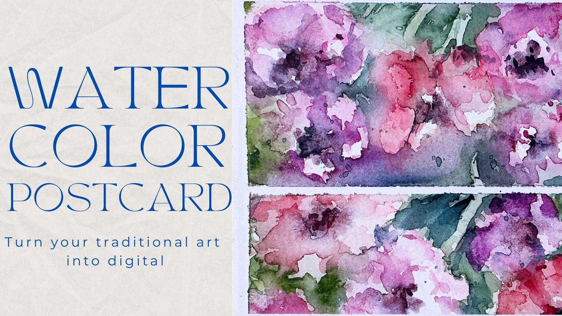
fun and simple way. Today's class will be special. We're going to
learn how to paint lovely watercolor
illustration traditionally with real watercolor do. Our next step will be, I will show you how to turn your traditional
art into digital. We'll learn a few
useful tricks that you can use if you want
to enhance your art, and also we will explore affinity photo app and
procreate, of course. So welcome back to my class, and let's dive into
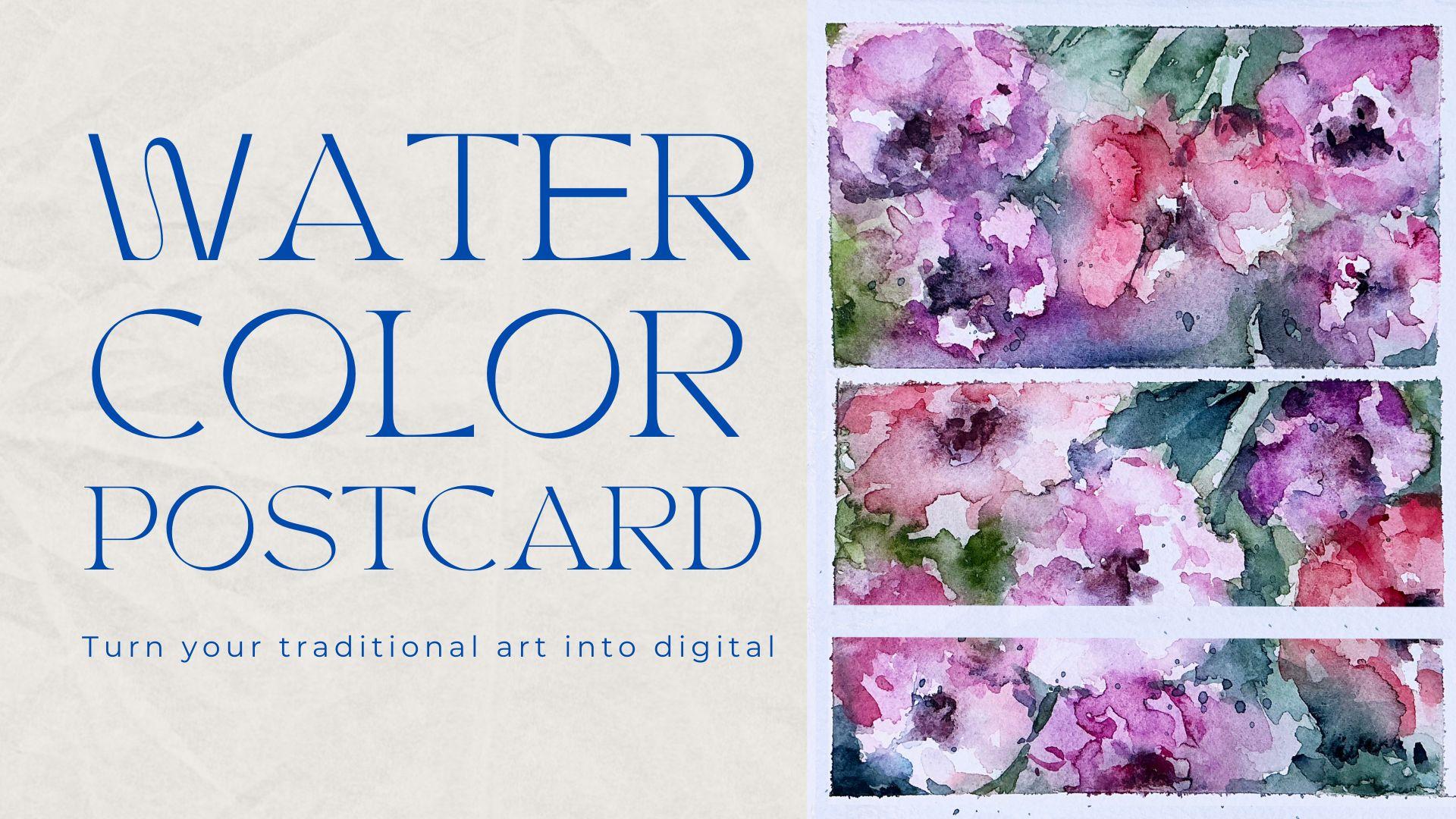
watercolor floral art, and let's create altogether lovely watercolor
postcard vise flowers. So in the end of my class, you will learn how to transfer your art from traditional
way into digital and how to make
your art even more beautiful affinity
photo and procreate. Guys, you can skip some
of the steps during my painting process and jump into the moment
that you actually like. Feel free to do
whatever you want, and whatever will help you to
feel comfortable and happy. I will show you where
to find freebies and how to import them
into the procreate. Our next step will be
creating sketches. After that, we will paint beautiful flowers
in traditional way. And finally, we will start adding colors, shades,
and highlights. I will show you how to
create floral art from the simple shapes and how to
add more and more details. So we will make our
painting process a little bit advanced. Our next step will
be transferring your traditional art
into digital sphere. Here, we will use affinity
photo app and as a bonus. I will share with you
my own custom brushes, my own picture that I created. This class is great for
intermediate level. Also can be useful
for beginners. If you have some
familiar knowledge about the Procreate and
affinity photo app, and actually for anyone
who is interested in traditional and
digital watercolor art and floral illustrations. And one more thing that
I want to mention, your opinion and your feedback
are very important to me. So don't hesitate,
and if you have some questions or you want to share your opinion
about my class, feel free to go to
discussion or review section and leave your thoughts
about my class there. I can't wait to see what you
aplo to Project section. So let's not wait, grab paper. Regular watercolor
paints and pencil. Oh, if you want to
draw digitally, just grab iPad and Apple pencil
and go to procreate app, and let's not wait and start
painting process together.
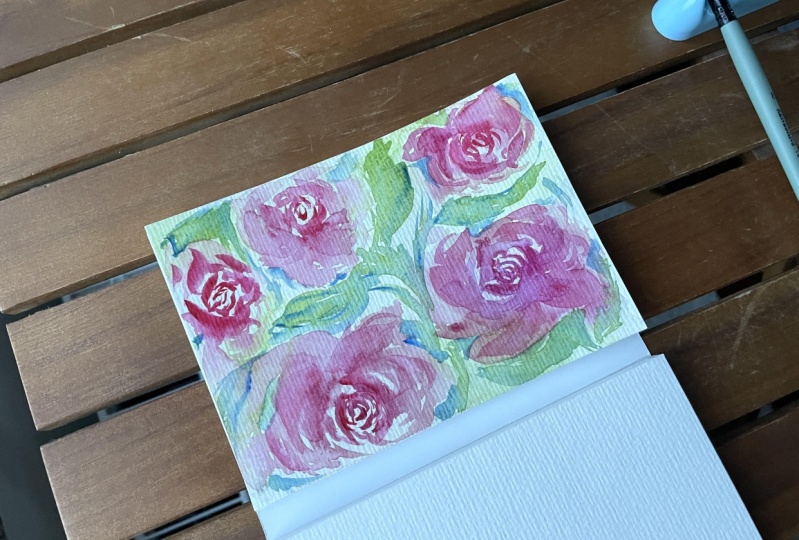
2. About Class Project: And in today's class, I will paint floral postcard. We will paint beautiful
flowers in traditional way. And after that, like I told you, we will add colors, shades and highlights, a
lot of color variations. And I will show you how
to create floral art from the simple shades to a little
bit in a more advanced way. And we will add more
and more details. But what we need
to keep in mind, I'm going to apply
loose watercolor style to our traditional painting. So our next step
will be transferring your floral art
into a digital way. And here we're going
to use two apps. First is affinity pota app, and second one is procreate. Once again, you can
choose your own topic, and you can just
follow your own steps. Just get the knowledge
that I share with you in class and be free to
do whatever you want. Try, experiment and enjoy
painting process together. We don't have a lot of
digital resources today. Just one brush that I prepared, and all of the materials
that you need for our today's class are actual watercolor paints
that you have at home. You don't need to
buy the new one, find the old paints
that you have, grab some thick
watercolor paper, and I think you're ready to go. Again, you might download
affinity photo app. It's for free for half a
year if I'm not mistaken. So you don't need to
pay for this app. Or if you already have it, I know many artists
use this app. So just open the app and
let's start using it. And the second app that I'm going to use
today is P create. And like I said, if you don't
like some of the steps, you can just keep them
and jump right into the part of the class that
you are interested in. So let's start our
painting process now.
3. How to Create Sketch: We finally move to
very important step. This is a class about sketching. I will show you where
I got my inspiration. I will show you the way how I sketch in a fun and simple way. Again, today's
sketching technique will be pretty simple and lose because we're going to use loose watercolor
painting style. We don't need to have
so many details. Our aim is to show you
the mood of the art. That's the most important
and diffusion of the colors. So let's think how to
create unique art, and if you're ready, let's start talking
about that right now. So you can follow my steps
carefully one by one, or just use the freedoms
that you have and create the art that you would I think we are ready
to get started. Once again, what we're
going to do today is, we're going to draw
lovely floral postcard, and we're going to do
it in a few steps. First of all, we will start with painting postcard in traditional way with
traditional watercolor. Also in my class, I'm
going to show you how we can export our traditional
painting into digital one, and what to do with our
illustration, how to scan it, how to adjust the settings, and how to enhance
our lovely art. I took the paper, and as
you see from the paper, it's not too grain. It's medium grain paper. And if I'm not mistaken,
this is arches. Now let's grab tape and just
spin it to the wooden block. Again, you can follow my steps and also paint the
same illustration, or you can paint your own art, your own oral postcard. The most important
what I want you to do during my class
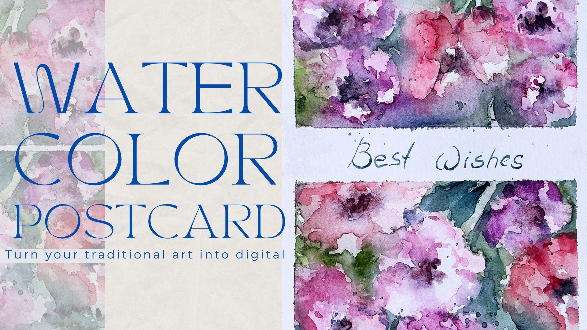
is to have fun. I also want to leave some
space for the handwriting where I will write something like happy birthday or
to my lovely friend, to my lovely family,
whatever you want to add. I think it will be
somewhere in the center. I'm going to leave
it here. Next, you might look at the
reference pictures that I'm going to use
here on the screen. You can use just tiny brush. Again, what I'm
going to use during my class is I have Schminke
brush set this one. I will tell you all the colors that I'm going to
use during my class. Second one is Winter Newton. Small color palette. Here. Also my suggestion
about the brushes. Use any brushes you have. You don't need to have the
exact brushes that I have, and I'm going to use a lot of the brushes. You
might see them here. The set I used for Chinese
calligraphy because I like the brush strokes
that they create. But again, use any
brushes you want. I also have some
watercolor brushes, which is Pol Rubens, number one and four, and Turner number four
for tiny brush strokes. So let's just grab
some blue shade. And like I said, maybe some
brown color schematically show where you got
a place of flawls. Here we have to pig rose. Some of the roses
will be not in focus. So we won't spend too much time on details, which is good. And mostly, I'm
going to paint in loose watercolor style. Okay. So this is the sketch
that I created.
4. Painting Process: Now we are ready to jump
into painting process. Use the brushes that you
have and watercolor paints. Or if you paint digitally, you can use brushes, watercolor brushes from
my previous classes, or you can use native procreate brushes,
whatever you want. So let's not wait,
and I will show you everything in details right now. And I'm going to
use green Earth, which is 51, six, this one. Those two colors. So again, we can use some alternatives,
have the same brush. And from this side,
I'm going to switch the color to Pareln
green, which is 784. Because in this part, the
color is slightly darker. Same I'm going to
have here. Okay. So now, let's talk about
reddish and pinkish shades. And for today's class, I'm going to use magenta color, which is 352, and
Parel and maroon 366, and permanent carmine,
which is 353. Let's start with
permanent carmine I. Maybe that's a
little bit too much. The first part of
layering color is literally just some blooms. Try to leave also
some white spots because some part of
roses is just white. Ooh. Let's go to Magenta color. You can use a little
bit of magnesia violet, which is four, seven, four, and mixed together. Why I like white on white
techniques because I like the blooms that you might get
after this way of painting, and now I'm going to
grab some white clothes. I just tissue, and
I'm going to dip some of the parts because I
want to keep the white color. The parts, re white
flower in this area. Because you always can
layer and add more colors, more shades, but
it would be hard to return back the
white pigment. Mx it. Now let's wait until
the color dries. Our next stage is we're going to layer again,
the second layer. I dry in some parts
is still semi wet. I like the bloom that
we have right now, and I think we are
ready to layer. So I'm going to
change the brush. Just a mother one.
Now I'm going to use Chinese brush for clropy, because I'm going to
just show some wins. Olive color and parle and green. I'm going to use
them together. T. And I also want to
add indigo color, which is 485 and mixed together. So now I want to show
the stem of the floral. Es again schematically, but I want to see
where I'm painting. Like I show still very hard to show where it
comes to. But it's fine. So this is the best
when you just paint on a top of wet pigment on the paper because I like the colors that it
creates together. I'm going to use Man ginse
violet and Magena together. 'cause I've got to
keep the pink shade. Also, when we create a flower, when we create the shade, keep in mind that from one side, we're going to have
a darker shade and from another
side, it's lighter. And I'm going to grab a
little bit pickers brush. Same P bins, number four, and I'm going to create a shape
just thanks to the water. Like that. Again, this is
loose watercolor style, so I'm not going to paint like every petal,
everything in detail. I just want to show schematically the shape
of a floral of petals, but without emphasizing
every detail. Now I'm going to
grab per in Maron. Slightly reader shape. Now I will go with green color, and I want to add more shades. By adding darker shades and
mixing them with light spots, you actually create
the composition, and you create the
volume in your. Little by layering, you
will add and pigment, and you will add the volume. Here we have the past
flower in this area. Green. Respond. Don't forget to separate the floral. I'm going to grab Tundra Rosa
this color, which is 982. That will be the heart
of. Almost each one. Dark pink color. This also will help us to recognize
where each floral is. Because we have so many
flowers on a picture, I decided to merge some of them into like one
bigger floral. Okay, now, let's
wait until it dries. Okay. So you see it's super
loose watercolor style. That's what I like a lot. But still we need to emphasize
some of the florals. That, we're going to
grab another brush. I think thinner one, and I'm going to use a turner
brush to show the stem. Again, we're going
to mix parle and green and olive green
yellowish together. And now let's just
show the stems. How we can do it, we're going to just show the darkest part, separate one part of the
stem one from each other. Axis. And you can show some of that leaves. Ma it. K. Okay that's our stem. Here. So by playing with light and
like highlights and shades, we can emphasize where
we have the stem. Here, we're going to have
a few stems together. Axis. Also grab
some indigo color and mix together
to show the shade. At the background, we're also
going to have more stems. So show them with
light and dark color. So now we are trying to separate florals one
from each other. Here, we're going to
have some dark color. But still remember, we're going to keep painting and
lose the color style. Don't be too detailed. From the right side, we have more parallel green
shades and from the left, the more olive shades. Now, I just want to slightly separate se forms
from each other. Use more water to
keep it in a blue. Now let's just add some
color to flowers as well. Magenta and Manganese
violet, mixed together. Little bit of indica color. I just want to separate
some florals to add more shades. Maroon. I know in picture, we actually
have a lot of white roses. But I think if we leave
a lot of white spots, the postcard will look
a little bit empty. I decided to turn those roses into reddish and pinkish roses. Not entirely, but still
leave less white spots. And some of my roses
look like poppy. I tried to emphasize some of the petals. My water. I want to keep leaving it
in what colors or color. I decided to add a little
bit of contrast to our art. So I indi a color and
perl and green together. I think it might look
very good. P out. I like it. Swearing lose water style. I go
to keep it that. And we've done with this
part of our bot car. So now, our aim is to keep the balance
between two dark shades. Do not add too much. Some water. That can help me to diffuse
the colors slightly. Parle green. Oh, Par
like Taylor Swift son. Now, actually the darkest
part will be from this side. It turned out that our
Postcard is super artistic. It's always hard, that
is for me to keep the balance between lose watercolor and more
realistic one. And usually I tend to jump
into lose watercolor style. Because if it's traditional, I tend to paint more
and more details, and I can just spend hours on
painting all those petals. So for our class, because not everyone
has a lot of time for paint in every petal, I think lose watercolor
style might suit perfectly. I think the best thing is to mix colors and play this
light and shade part. Add more water,
and then you will receive very beautiful blooms. Just like this. So what I really like
to do is to receive some unexpected results
from my painting. Some dark shade in this part. We won't draw too petals. Okay, now let's use
our hair dryer. And let's see what we have
in the end of our paint,
5. Adding Final Details: So it's almost the
end of our class. In this part of the class, I will show you how to
add some texture, shades, and highlights, and
more color variation, and how to add tiny details. So let's wait a little bit, and that will be the end of our traditional
part of the class. So, let's jump into
this part of the class. So now I think it's
time to remove the tape and write
something beautiful. So let's do it. First of all, I'm going to remove
this part of the tape. Wow. Okay. Perfect. Now, let's go to this one. I. Super beautiful. And if you
still have some part here, it's not a big problem,
we can remove it. W is in nz color. White. Wow. Great. So our next step is
to remove this tiny spot. So for that, we're going
to grab white color. I use Sk. Again, if you don't have white coach color,
it's not a big deal. Use white watercolor color, or maybe you have white pen. I can be really crazy about
buying some art supplies. So when I bought my Schmke, watercolor said, I wanted
to buy more and more. So it's just like one by one. I keep buying some colors that I like that I think
might be suitable. So I also I was thinking
maybe maybe for sure, G. It's very useful. Color. Okay. Here. So now it's
perfectly white, and let's wait until it dry, and you're going to
add some quote later. Okay, great. So now we are
ready for our final step. And I'm going to
use indica color. And I will just write
something in this part. You can write whatever
you want depending on who you're going to
present this postcard. I will just write best wishes. I'm going to use turner
brush number four. But I think even
thinner would be great. S. And if you want, you can
add a little bit splatters. So first part of our class is. So guys, if you would
like to keep painting, and now you want to learn how to digitalize your
traditional art. So wait a little bit.
6. From Traditional to Digital: Guys, for the next
part of the class, we're going to use affinity
photo and procreate. Okay. Once we've done with
painting our lovely postcard. Now we need to
think how to import this illustration into our iPad, or for example, procreate. So in this case, first of all, if you have
scanner, you can just scan it. But if you don't have this
tool, it's not a big deal. You just need your phone
or iPad for doing that. If you're going to use iPad, you have some special
tools that can help you to do it pretty easily. So let me show you.
So we grab our iPad, and then we need to go to notes. Our next step is we need to go and tap this camera button, and then you have the options scan documents. So
you need to press it. Then let's just
check what we have. And we're going to have
this slave option. And I think it looks amazing. So the next thing
that we need to do is let's just save it. Here, we need to press done. Share and save to our files app. Monkey, great. Now it's saved. Another option, let's just use our camera and just take a
picture of the postcard. Okay done. Next thing that
you're going to do is, we will share this image
to affinity photo app. And guys about this app, you don't need to
buy the subscription for half of a year,
it's for free. So if you have this app,
go ahead and use it. If you don't have
it, you can download and use half a year for free. Or if you don't want to do
any enhancement in your app, you definitely can
do it in procreate. I just like this app because
it's a little bit more professional and it's
pretty comfortable to use. So let's jump into next part
of our class where I will show you how to make some adjustments to
our illustration.
7. Working with Affinity Photo: This part of the
class, we're going to explore affinity photo and procreate and see what does
app can do with our art. L you guys and we
have two options, what we're going to do
with our paintings. The first option, we have our PDF file where we have
lovely scanned illustration. The other option is we have
our picture in photos. Let me show you what we need to do with the scanned option because when we scan
it through nodes, it's saved in PDF. But for making some adjustments, we need to have GPAC
format illustration. Or in this case, you need to
go to Google and then tie PDF to GPAC online
free convenor. And then find the app
that you might like more. I will go to smallpdF comm.com, and then I will choose the file and then I will convert that. Then we need to wait until
it blots, and download. Okay, cool. Now, the other
thing, what we need to do is, let's go to our affinity photo, and we need to press
open import document. Then we can find
our illustration. Before we start
making any changes, I want you to see another
option, what you can do. So let's come back
and then we need to move the picture
from our photos, also into ainity photo app. Open input from photos. And this is a photo
that we've got. Now let's make some changes. First of all, we need to go and and move it to the sides. I don't want to have too
much space from this side. If you want to
rotate on estration, you need to press this
straighten button. Then we can rotate it. Let's the size, and I
think I like it that way, and then we need to apply. Next thing is, let's just
change the size a bit. In this case, we need to go
and press those three lines, and then we have re size option. Next, we have document
Pixels and DPI resolution. Let's write 150. Then again, apply. Now,
the quality became better. That's why I like this app because it gives you
endless possibilities. Okay, the next thing is, I just want to make
some enhancements. In this case, I will go to
this adjustments button. Tap. Here we have
brightness and contrast. Also play with just with some options and see
what you like more. I have some amount of tools
that I use frequently. Let me show you
them. For example, you can also go with color
bands and play with colors, make it warmer, colder. I'm going to make it slightly warmer and curves my favorite. The same tool I like to use
in procreate app a lot. Like said. So now
it's super bright. The other thing is, here you can make some
color grading as well. The w to make slightly brighter. Flexes. Okay? I think in this case,
illustration looks great. The other thing,
what we're going to do with our art is save it. Also three lines, and
then we have expert. Make sure that it's a
E, I also can be PNG. Here we have the size,
it's almost 20 megabytes, and you can name it like
postcard or floral postcard. One because we're going
to have a second one. And press k. Then save it. Okay, guys, and this is the
first version of our art, again, originally, which just took picture of our postcard. Now let's go to scanned
document and do same. Okay, and if you need
to crop our ustration, let's press this crop version. I will make it slightly
bigger because I'm going to make some adjustments
and press apply. Then I still want to rotate it, and then rotate right. Lexis. Then let's go to
crop version again, and let's straighten out Ly here. Okay, I like the way how
it looks now. Looks good. Then if you want to rotate, just press somewhere here and rotate it the
way how you like. Again, you can't rotate inside because you will touch the grid, but you can rotate if you press the screen
from this side. And grid can help you to see clearly where we actually
need the rotation. I like it, so I apply
all the changes. Then you might think,
we need to resize this. In this case, we need to go to resize option, but
as you may see, the DPI that we have
is already 300, so that's pretty much a lot. That's why we don't do
any changes in this part. Let's just go to
adjustments, brightness. If you want to do
the adjustments, you just need to tap the area. For example, if it's contrast, you need to press up
control the adjustments. And you can go to brightness
and also do the same. Touch the wheel, and then you can press
like left or right, or up, down, whatever
works for you. I made the contrast
maybe 28 is too much. 25. And brightness minus seven. You might not see it here. Okay. Let me just like
over it slightly. Guys, if you want to undo
something, two fingers down. I'll redo, again, three fingers. Same features that you
have in procreate. If you want to do something, you just need to tap the
area that you want to use and press up and down
or left or right. Just make sure that
you hold the area, for example, if it's
contrast, I touch the wheel, and then I control up and down how much contrast
I wanted my art. Okay. Let's go to curve. Touch the area that
you need to use, and then you have big
option of the curve line. So also you can tap the color
that you want to apply, and you can add brightness, some specific color to our art. That's what we have
after we applied some of the filters,
and that's before. And I really like after effects. I'm going to keep
this lens filter too. And then shadows and highlights, I want to add more shadows. So I press the shadow and then up and down
or left and right, and I just add the shades. Same the highlights,
more or less highlights. O options that we got
from the scant document. Same three lines, press Expert, and save the illustrations
the way you like. Postcard two. Let's close this window. We have two options. Now what we need to do
is let's go to Files app and select the postcard
that we like more. Great. Now we have the option. This is the last postcard
that we had from the scanned document.
This is the first one. And guys, as you see from
the scant illustration, I think the art is a
little bit too sharp. But again, if you like to have those very bold and
very obvious lines, obviously, you can
keep the scant option. But if you like more soft
lines, more natural look, my suggestion is to
take the picture and then make some adjustments
in affinity photo app. So I'm going to keep the first option and I
will use it in Procreate. So let's move to the next class, where we're going to make some
changes in Procreate app.
8. Working with Procreate: In this part of the class, we're going to explore
affinity photo and procreate and see what this
app can do with our art. My we move to our next class, if you want to move this
illustration into the procreate, First of all, you might
select it by long tap, and then you have share option, or you can just open it, and then you also have share option which
you need to press, and then choose the option
share with Procreate. You see here, share
with Procreate. Let's just expert. So we have our
illustration right here. Now we keep it on
one of the layers. And guys, if you don't want
to use the init photo, you have another option how
to make some adjustments with your illustration of
your traditional art. So in this case, let's
just create one layer, and then we need to
import the picture of our arts that we took
into the procreate. Let's do it. Let's turn of the illustration that
we just imported. We are on new layer, and
then we need to press ad and insert a photo from
the photo library. Then we need to oom
our illustration. Because we just
made some changes, the dimension is the same. Next, what we're
going to do here you see the corner is a
little bit not straight. In this case, we need to go
and grab selection button, and then we need to press d store and move the
sides a little bit. Now, everything looks very nice. Neck thing, what we're going
to do because we change the size of our art with Zoom. That means that the quality is a little bit worse
than it was before. In this case, in
order to change it, we can go to sharpen and
move sharp til 20%. It. So in this case,
the crispness of our paper, will be visible. Next them is, let's
go to adjustments, and we can go to Curse options. This is my favorite one where we can play with
intensity of color, with brightness, and
with saturation. You see that also
looks pretty nice. Then you go to hue
saturation and brightness. Again, you can adjust
the brightness, and you can play the saturation, make it more or less saturated. I increase the
saturation a little bit. And here also, we have the hue. You can add more or
less filters to make your art warmer or colder. I'm going to make a little
bit warmer look like that. And that's what we have. To changes are a
little bit simpler. But again, if you don't
need or don't want to go through all
those changes that we made in affinity photo, about changing the pixel size, about some more advanced options of changing our illustration, it's totally normal to do those changes in
procreate app two. This is the first
option of here also, you see, the corner is a
little bit not straight. We're going to make
sure that we stay on a layer of our
first illustration. Let's write affinity photo. In here, we're going
to have procreate. Rename it. Now it's easier to
understand what is what. This version is less saturated, but also very nice. Let's make sure that we are
on affinity photo layer, and then we need to go to
selection to distort and also move the corner a
little bit to sides. From side. List. Okay. Now, everything is perfectly straight
except this part. Cool. So definity photo, procreate. Okay, now what are you going to do with our art?
Let me tell you. Let's just rotate my iPad. It's just easier for me, and you will be able to see everything what I'm
doing on the screen. L. That's a finity photo. That's procreate. We're going to work with the finity photo because I like the brightness of the colors that we have,
it's most sturated. So what you're going to
do with our art next. I'm going to tell you how to keep this illustration
separately from the paper. In this case, you will be able
to change the background, you will be able to
add any text you want, like I said, in the same case, you will have the
traditional painting, and you can add whatever
you want digitally. So that's pretty simple. In this case, we need to be
on affinity photo layer, create one layer, rename it, and here we can
write paint here. Something like
that. First of all, what I want to do is to
remove this best wishes code. Let's go to rectangle.
Let's turn it off. Perfect. But now as you
still can see that we have some differences
in color between the paper and
actual white color. In this case, what we can do
is go grab selection tool, automatic and press this area, and select the frame. But make sure that you don't
select our illustration. That's crucial that our art
should be stayed untouched. Select the area and
move stylus right. I think it looks
good. Okay this part. No, no, no. Here and
here. This area. Don't grab too much. After that, like
what we did before, three fingers down
and press cut. Let's turn off our background. And then almost perfectly done. Neck thing is we still can
go with selection tool, press automatic, select
some of the areas. Then three fingers down. Cut. Three fingers down, cut. Same here. Selection too. And cut. Then you can go and grab rani
inker as eraser and just erase the area that you just don't need some
simple white dots. They might not look
beautiful when you actually move it to some
colorful background. Same here. As you see, you got how lovely water
color illustration separately from white paper. Now you can do whatever
you want with them. For example, let me show you you can change the color of our art. Let's go with screen color. And then you can go to our paintings and change
the position of them. Grab rectangle tool, and you
can make them, for example, closer to each other,
or for example, even far away, or if you want, you can even separate them. Let's go with the
rectangle tool, select one of the
parts like this, and then three fingers
down and right cut. Now let's move this part, somewhere here. Like that. And then you can write
some code underneath. Let's go and grab green
color or blue color, and then we need to tap
add ad and add text. Here we might write something like to my lovely friend and change the font. By the way, guys, what I want to tell you is
that as a freebies, I added the font that I created, which is called
strict imperfection. You might use my
font or you can use the font that you
have in procreate. Here to my lovely friend. If you want, you also
can add some frame. Example, as a paint and brush, I'm still usable Runny inker. I still have the same
blue color that I used for my lovely
friend illustration, and I'm going to draw rectangle. P rectangl then I just want to do Free. And copy paste again. Duplicate the layer. Let, to my lovely friend. Also if you want to can change
the color of the frame. Let's select all three layers and then merge them together. L. And then select the color that we need,
probably white color. And then we need to
press feel layer. Now the frame is white. It might be suitable if your
background color is darker. That's what we can do here. Let's grab dark blue
color black head, and change the
color of the phone. Select it, and then
go to white color. Like this. Now it
looks very, very nice. Anywhere you go.
Anywhere you go. You go. And guys, before we finish our illustration and save
it in a way we like. I want to tell you
briefly how to import all the freebies into the
procreate that we have today. Among the previs, you'll find
the illustration that we drew today digitally,
and traditionally, also, I shared with you the brush that we used for creating frames, and the last freebie that I will share with you is
strict imperfection. Now the question how to
import it into the procreate. In this case, you need to tap it and then just tap procreate. Okay, we return to Procreate, and our next step will be how to actually save
our illustration. In this case, we need to go
to action button, press, share, and here we have the options, how
you can share it. My suggestion share
it as a GPA file, and just save it. And you found how to paint loose watercolor flower
illustration traditionally. During our necklace, I'll
show you how to paint lovely watercolor
flowers in procreate. And that's super simple. I already prepared
for you set of lovely new brushes that
I hope you will like. Let's see each other
next class. Bye bye. This is the end of
our today's class, and I hope you enjoyed
our painting process, and now you know more about traditional watercolor media and how to use procreate
and affinity photo, especially how to
sketch in a fast way, and how to add some
loose watercolor wives to your traditional painting. Also, you learn how to enhance your art by
using layers and some adjustment
tools and how to add volume and color
variations to your art. The most important, you
learn how to create authentic watercolor
floral postcard from real watercolor media, and you learn how to make your traditional art
even more beautiful, Thanks to procreate
and affinity photo. And guys, I'll be happy to see your feedback in reviews
or disc section. And if you have any
questions or suggestions, feel free to leave your thoughts in discussion section. To. I will be glad to listen to
you and to reply to you. So let's see each other
in next class. Bye bye.
 Inga Yoon, Digital illustrator and teacher