Transcripts
1. Introduction: I'm going to let you
in on a little secret. Most of the lettering
designs you'll see on my Instagram feed and in my online stores are all
created using basic fonts. In procreate in a previous
pre pandemic life, I used to work as a wedding calligrapher and
lettering artist. And even then, the way I got comfortable with hand
lettering and the flow of calligraphy was to trace over type fonts for my
lettering practice. And the muscle memory I built up then still lives in
my hands to this day. Hello, I'm Rebecca Flatty, and I'm an artist and
digital content creator from the United Kingdom. These days, I mostly spend my creative time designing floral surface pattern designs, but I still like to
keep up with adding a fresh supply of typographic
designs to my portfolio. Two, I've licensed
my patterns and illustrations to all sorts of companies all over the world. And also my lettering designs,
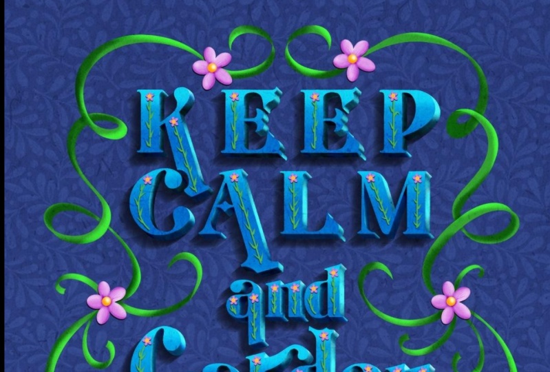
just like this one here, the text was created using a computer font as a
basis for the layout, which I then digitally painted in water color in procreate, and now it's licensed
on this planner. If your portfolio only contains patterns
and illustrations, then you're missing out on
a massive opportunity to step into licensing designs
for things like planners, greeting cards or T shirts. But I get it. When you don't have any experience
in hand lettering, it can feel really
daunting to get started. I totally understand the
feeling of starting to learn a new skill and then
instantly hating it. And yourself and life in general because it's a new
thing and you're not as good at it as you are at all your other illustration
practices, blah, blah, blah. We all go through that thought
process from time to time, especially when we look
for inspiration on Instagram and see all the
amazing designs on there. Well, that's where tracing
over type faces comes in. If you want to dive into the
world of hand lettering, creating your designs with fonts and then
tracing over them to add hand drawn details is a
really beginner, friendly, and easy win way to get started, you'll be learning all about letter proportions and
placement without having to go through blank canvas syndrome or hating your attempts at
drawing letters from scratch. You'll build up muscle memory and you'll soon find that you're able to ditch the fonts and come up with your own
lettering layouts. Spoiler alert. Using fonts for your lettering designs
isn't cheating. Graphic designers and artists use fonts every
day in their work. There's no rule that
says you can't add your own texture to a typeface
or change the angles. In this class, you'll
learn how to create these three lettering designs
from beginning to end. We'll look at where you can
find free fonts online. And how to check the
licenses on them to make sure they can be
used for commercial work. And also how to import
them into procreate. We'll go through the
text interface in procreate and how to
adjust and manipulate the text to give it
a unique spin and make it look more hand
drawn and uniquely yours. I've got a really cool way
for putting text on a curve and mimicking illustrators
type on a path function. And we'll be getting
lots of practice on tracing letter forms
and using layer masks, clipping masks, and blend modes. There's a whole lot of tips and tricks in this class
that will broaden your knowledge and
skill set when it comes to illustrating
in general. In procreate. To take this, you should have at least
some basic knowledge of procreate and the
simple gestures. We'll go over everything as
we work through the projects. But if you've never ever
used procreate before, then I recommend fighting a basic beginner class first and then coming
back to this one. If you're ready to
get started with some floral learing fund and
procreate, then let's go.
2. Class Project: In this class, we'll be working our way through three
different projects. The first project will
teach you all about creating designs with
circular or wavy lettering. In project number two,
we'll look at manipulating the proportions of
the text to get it to fill a space and
nestle together. And then we'll add a three
D extruded effect to it and use blend modes to mimic different
lighting effects. In the last project, we'll
take a piece of lettering and interweave it with a floral
design using layer masks, clipping masks, and shading. You can follow along each
project with me exactly how I do it or you can choose
your own fonts and words. When we're learning a new
things often easier to make an exact copy of
what's going on on screen. That's the thing I
do myself when I'm learning something new and
I definitely recommend it. It's a lot less overwhelming. You just need to remember
that any artwork you've ever copied can't be used for
commercial purposes. Later in the class, I'll
show you how to export a low resolution copy from procreate and upload it
to the project gallery. Whether you tackle one
project or all three, or if you copy these
designs or come up with your own, I
can't wait to see them.
3. Finding and Installing Fonts: Procreate actually
comes pre loaded with quite a big range of different
fonts that you can use. But if you want something a bit more fancy for your
lettering projects, it's actually really easy to import your own
fonts into the app. There's a ton of
places you can find paid and free fonts
on the Internet. The one I like to use
for my free fonts is Dafhont.com On our ipads, we're going to go ahead and
navigate to that website. Here we are on Dafont.com I always feel like a bit of
a kid in a sweet shop here. I've literally got
over 800 fonts installed on my main computer, and I can never
resist grabbing more. But before you get carried away and start downloading
everything, I want to draw your
attention to this part here where it says
free for personal use. This is the licensing info. Free for personal use
means you can't use this font to create anything
you intend on selling. And it also means you can't
use it on your social media. If you're a commercial artist, you can use it to
make a piece of art for yourself to hang on
your own wall at home. Or if you want to make some
cute jar labels for yourself, for example. But that's it. If you see a font that you
absolutely have to have, most of these will have a link somewhere where you can go to purchase the font with
a commercial license if you really, really
love it that much. All the principles
with this class apply to fonts you've
purchased elsewhere. And I certainly love
purchasing fonts from places like Creative Market
to use in my artwork. But for this class, I
wanted to stick with using free ones so that
everyone can join in. And also because it's
an opportunity to learn about licenses and what
is and isn't, okay? So if you have fonts that you've purchased elsewhere that
have a commercial license, you can also use
those in this class. So to make sure we're
not getting tempted by fonts we don't have
commercial license for. We can come up here
to the filters, let's just tap on
decorative for now. So we can come up here
to the search filter and we can tap on more options. Then we're going to
check public domain and 100% free if you want to. You can also change the
preview text something here, we'll just type in flowers and
then we can tap on Submit. And then this is going to
repopulate the page with fonts which are public
domain and 100% free. So you can see down here
in the licensing info. Now these are all 100% free. This will be a smaller
list and you'll notice a lot of the prettier
fonts might now be gone. But that's just how it goes. And we all have
the right to put, choose whether we want to give something away for free or not. And the terms of that, and
that's absolutely fair enough to find your way
around this website up here. You can tap on themes and this will give you a bigger list of all of the different
themes that they have. You could honestly
spend all day here. There's so many to choose from. My favorite sections to
search in are Retro. This has lots of really
cool fonts in it. Over here I'll explain what a seraph is later and what a sound seraph
is if you don't know. These are all sera
fonts in script. I also really like these old
school ones here as well. They're good places to look
for some really cool fonts. The three fonts
that I'm going to be using for the
projects we'll be making are super magic
LT, glockenspiel. And if you want to
follow along with me, then we can start by
downloading those fonts. Let's start with Sane. Let's go up here, we'll type it in lie L, I, S IN search for that,
It's this one here. Before we download it, I'm going to double check
the licensing info. So we'll tap on the text here. Then down here in the note
by the author it said, it says, this front is free for both personal and
commercial usage. Here we can see that
the creator has clarified that it's definitely
free for commercial work. It says it's free
for both personal and commercial commercial usage. We can download on that Tap download on
this little pop up. The next front I'm going to
use is called Supermgic. We'll tap that in up here. It's this lovely
groovy '70s one here. Again, I want to double check, even though it says 100% free, I want to double
check that there aren't any special terms like having to credit the
author or things like that. So let's tap on this one
note from the author. It says free for personal
use and commercial use. We're good to go with this
one. We'll tap download. Then the last font
that I want to use is called LT glockenspiel. This one says 100% free. We'll tap it and search
down here to see if there's any extra clarification
on the licensing terms. There's nothing in here that clarifies the licensing
terms because it says in the FAQ on website,
Where does it say it? Are all the fonts
free of charge? The license mentioned
above, the download button, is just an indication if no author or license
is indicated. That's because we don't
have information, That doesn't mean it's free. And it also says if indict contact the
author of the form, I always like to double double check that I
can definitely use it commercially because
I don't ever want to run into any
trouble down the line. And I also don't want
to use something for my commercial game that I shouldn't be without
the correct license. How did we get around this? Let's go back to the font. Just press back here. What we can do, we can tap on
the author's name up here. And this is all the fonts
that this author has made, so there's a link to
their website there. I'm going to go on
about here and there about section it says we
can use it commercially. All of them in the
Lions Type Library are available for any
purpose you intend, whether it's personal
use or commercial use. It also says down here, fonts are licensed under
the SIL Open Font license, which if you want some
light bed time reading, you could open that and read all the input about what
that license means there. But basically it just means
you can use the font for commercial purposes and
modify it if you want to. While we're here on,
on the author's font, we'll tap on fonts and we'll just grab the
download from their website, lock and spiel, tap that one and we can
download that one. What do you do if you can't find clarification on the license? Ultimately, it's up to
you how to handle that. But for me, I don't
use a font unless I'm 100% sure it comes with
a commercial license. That's to keep myself
out of trouble and also because,
just ethically, I don't want to be using
somebody's hard work for my own commercial gain without having
licensed it properly. So now we have our
fonts downloaded. Let's have a look at how
to get them in procreate. Up here in your menu bar, you'll see this
little circle with a downward pointing
arrow in it on that one. And you'll see the things
that we've just downloaded. So we can tap on any of these
and it will find it for us. That will take you
into the downloads folder in your files up. Sometimes a font
will download as a zip file or it might
just be one single file. But to unzip a file, you just tap on the file
there and that will unzip it. We'll do that for
all three of these. Then when you unzip it, it might zip to a folder
with files in it, or it might zip to just
one single font file. Once all of these are
unzipped in here, we'll just check that this
one has the font files in it. There we go. Now we'll head
back over to procreate. You can either open up an existing file or
create a new one. Just going to tap on this
empty one that I have here. We're going to come up
here to our actions. We're going to add, and we're going
to add some text. We don't need to type anything in there for now
because we're not actually going to be creating
any text at the moment, but we're going to tap
on these two as there. Then down here on the left, you'll see we've got a list of all the different fonts
that you could use up here. We're going to tap
on import font. Then we're going to navigate
to our downloads folder. I'll tap over here and we can start to
download these fonts. There's several different
extensions for font files. Extension is the letters
that come after a file name. This one is doff,
there's zip files. You've probably also
heard of dotDFfiles. That bit at the end is the
extension procreate can open dotcfortFfontfiles, any of these files
you can tap on, and it's going to bring
it into procreate. These ones are TTF, so I'm just going to tap
on this one then we should see that one on our
list would be better if I looked at which one it was. I think it was Glockenspiel
one. There we go. Super magic. That's
now in our list, and we have that font to
use within procreate. Now we can bring
the other ones in. We'll go to import font. And we'll bring in
the LT glockenspiel. No, that should be
there on our list. There we go, that one's there. And then lastly, we've
got the lysine one. You could bring in
either of these. I'm going to go for the lysineF. We've got that one there too. That's how to import
fonts into procreate. If you ever want to delete
a font from procreate, the way to do that is to go to your Settings and
come down to General. This is your main ipad settings. This up here, come down to General and go
to ipad storage. Then find Procreate. Down here you'll have a list of all the fonts that
you've installed. If you want to get
rid of one of these, you just swipe to the left and you can delete
the font that way. As you can see, though, these
fonts are all really tiny, they're only a few kilobytes, unless it's just
a clutter issue. You don't really need
to worry about having a lot of fonts
installed on procreate. It's not going to be taking up massive amounts of
space on your ipad. Now that we know how to
get fonts into procreate, we can get started on creating some lettering
designs with them.
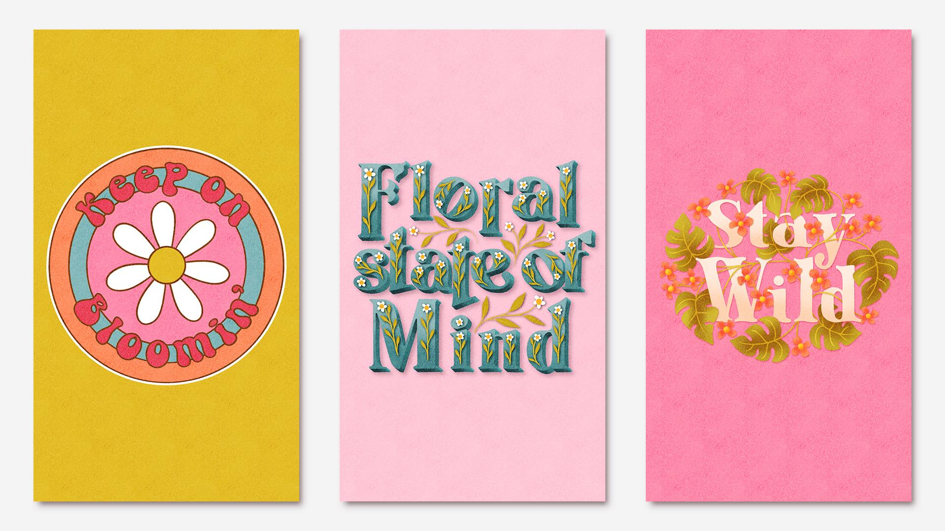
4. Project 1 Adding Text: Hello. In this first project, we're going to
learn how to create curved wavy lettering
In procreate, we're going to be creating
something just like this. And for the finished project, we'll be curving it
around a circle so we get to look at making it
curve in both directions. And I'm also going to show you how to put it on a wavy line to, to get started, let's
create a document. I'm going to be working in an eight inch square canvas at 300 DPI for all of
these projects. If I was working on
a piece for print, then I would use at
least 12 " square. But I want to make sure
these projects are as accessible for as many
ipad sizes as possible. And the lower layer
limits that some of them have on a sixth gen
base model ipad, for example, this
eight inch square size should give you around
30 layers, I think. So that will be plenty for this project to set up
a canvas at that size. Come up here to the plus icon, Start a new document, and then we're going to tap
this little icon here. We'll change this to
inches and we'll type in 8 " for the width and
8 " for the height. The DPI will leave
at 300 and that should give you a good
amount of layers to use. We'll be using this size for other projects to make
it easy to find later, let's give it a name up in here. We'll call it eight inch canvas. I'd like to put an MOG on mind so that they're
easy to find. Now we can go ahead
and tap Create. If you go back into the gallery and then you could
start a new document. You'll see that
preset down there and we'll be able to
use that again later. Let's go back into
our document here. We're going to be using
a regular typed font, which when you use in procreate, you only have the
option of typing in straight lines in software
like Adobe Illustrator. When you're working
with type faces, you have the option
of doing all sorts of cool things using the
type on a path function. And what we're going to do is
recreate that effect here. In procreate for this project, you'll need to
pick a phrase with around two to four medium
sized words in it. This is so we can keep it
clear and easy to read. If you use too many characters, it's going to become too
small and too hard to read. If you use too few, there won't be enough word length
to curve around. I'm going to use the
phrase, keep on blooming. I was licking on Pinterest
for some short quotes, and I saw one that
said, keep on trucking. And I was like, yep, I can make that floral.
So here we are. Let's start by adding that
text into our document. We'll go up here
to the spanner and we'll go on add and add text. Then we can just
type our phrase in. I'm going to go with keep
on blooming at the moment. It's just in this
plan default font. But if we tap on it
quickly three times, that's going to
select everything. And then we've got
these simple options up here for doing some editing, but we're going to tap on
this double A down here. And then that's
going to bring up all of these different options. We can change the font over
here to something different. You'll have all of the
precepts pre loaded here. But you can also find
the ones that we imported into procreate earlier. I am going to use the super
magic font for this one because I think
it's going to fit the groovy aesthetic that
I'm going for really well. For this and possibly all
of the other projects, I recommend using a
plan typed font rather than a script or joined up handwriting because
we're curving the text. That would make it
really complicated sorting out all those
swoops and ligatures. When we do that, to
keep things simple, steer clear of joined up or script handwriting
for this class. So now that we've
got our font picked, let's start by dragging
out these blue nodes out to the side so we have a
bit more space to work in. And then we can use this slider here to
increase the size. If we hadn't adjusted
these blue nodes and we just left it like that, you can still make it bigger, but it's going to cut it off at the edges of the bounding box. Let's just drag those
back out again. Let's have a look at all
these settings here. First of all, we've got size
and that's pretty obvious. What that does is it
changes the size of it. Then we've got
kerning and tracking, which if we just
slide these around, it might look like these do exactly the same thing they do. But what kerning refers
to in typography, that's the space between
any two letters. So you could have different
kerning pairs in one word, whereas tracking refers to the spacing between all of
the letters in the word. Then down here we've got
leading and baseline. Again, these look like they
might be similar things, they just move the
words up and down. Baseline is the line
that the letters sit on. Then the leading is the
distance between the baselines. Then last of all, down
here you've got opacity, which does exactly what
you would think it do. It reduces or
increases the opacity. These settings over here
you're probably familiar with if you've ever used
a word processor before. These ones change how
the text is aligned, we'll keep it centered. For this project, that's going
to be most useful for us. You can do things like
add an underline, you can change the
text to an outline, you can make it
type up and down, or you can change
it to all capitals. One thing to be aware of, if you toggle that on and
off, like I just did, if you had capital
letters in that, it's going to turn them all off when you toggle
that back off again. So I'm just going
to tap on, undo, and go back to where I
was here. There we go. I've got these two
words capitalized. We don't need to change any of these settings
for this piece, but it's still nice to know
what everything in here does. I don't know about you, but when I'm working I know the settings, I know, and I tend to not
even look at the others. For example, I've
used the Select all 1 million times and I'm familiar with the options
that I'm familiar with. And yet only just
the other day I spotted this colorful
option here. And I was like, well, I've never actually even
noticed that before. So it's good to know what all of these things do
because it might give you some ideas for other
lettering projects that you might want
to do in the future. The only other setting you
might want to change in here for now is the
curling or the tracking. Just to give you a bit more
space between the letters, we'll be cutting them
out in a second. So if you want to give yourself a bit more space in between
them for cutting out, you could go ahead and increase the tracking or
curtining on those. So we're going to be rotating this writing around a circle, some at the top and then
some at the bottom. What you want to do is split your quote roughly
into two equal lines, or wherever it makes sense, grammatically, to
split the text, we'll have a half
curving around the top and the other half curving
around the bottom. Size wise, you want
it to be a little bit less than your
overall document width. That's probably the ratio
you want to go for. It's going to have more
room to curve around there, if you imagine like a circle. And then we unpin that circle
and straighten it out, it's going to be
slightly longer, so we want it a bit less than the full width
of the document. That's our text
all added in now. And in the next
lesson, we'll start to add some guidelines
in our sketch layer.
5. Project 1 Layouts and Guidelines: So I'm going to start these
guidelines off by making several concentric circles to
help me lay everything out. First of all, I'm going
to draw a big circle to mark the edge of the design. I'll do this on a
layer underneath. You can use any brush for this. I'm just going to draw a rough circle around
the edge here. Then I'm going to hold, I'm going to tap the screen
with my other finger. Lift up my pen and now
we've got a perfect circle. I'm now center that on
the document down here. I'm going to turn snapping
and magnetics on. Then drag that into the middle until we get those
orange lines there. There we go. That's
nice centered. Now we need to add
some other lines to help us line our text up. Let's have a look at what
those lines are called. As we looked at
earlier, the line that the letter sits on is
called the baseline. Then we have this line
here called the X height. Then at the top here, you've got the ascender and cap height. And then down on the bottom here you've got the descender. Luckily, to lay our text out, we only need to mark the
baseline and the X height. Let's draw a circle now
to mark out the baseline. Remember that's the one that the letters are going to sit on. We can actually duplicate this circle here
and use this one and make it a bit
smaller so we don't have to keep drawing
circles for all of these. Let's tap up here to
select the circle. I might just turn snapping off for a second
while I'm doing this. And then put it back on again to help me center
it in a minute. So what you want to go for
is something that comes out, maybe I guess I've got
this just over halfway between the center of this big circle and
the outside of it. You want something that
looks like it's got enough room for your
writing to curve around. If you just imagine this, keep on curving around there. I think there's enough
room for that to curve around this and
also the blooming, I'm going to stick
with that size. It's the thing we can change later if it doesn't look right. So don't feel like you have to stick with this and
get it perfect. We always have the undo
or the change option. So this one here is going
to be our baseline. And then we need to
add in our x height. You might not always need
to add in this second line. And the reason I know I'm going to need it here,
if you look at this, it doesn't actually sit
on the baseline there, like normally we would
draw a there and the belly of the P would
sit on the baseline. But this one
doesn't, it actually lines up with the X
height on the top. When I come to put
this one in place, I'll be lining it up with the
X height and the baseline. And that's why I need both. The other reason I know I definitely need to put
the X height in for this project is
because we're making a circle and doing some at the top and some at the bottom. This x height up here
is actually going to become the baseline for
the text at the bottom. If I'm drawing a circular design with text at the top bottom, I know I'll definitely need to put in both the baseline and the X height to work out exactly where
that X height needs to be. I'm going to move
this text around and use my to figure that out. We'll just go down here and turn snapping
off for this bit, I would suggest grabbing
something like an or an from your text to line up
on the baseline like that. Then you can duplicate
this smaller circle, drag it out here, and just keep making it
slightly bigger. And centering it as you go until it's just touching the
top of that there. You can turn snapping
and magnetics on and off as you need to to do
centering or fine tuning. So just keep moving
that around until it's nicely sat on top of that
or whatever you've chosen. And that is there marking out
the x height. There we go. I think that will
do. There we are. We've got our baseline here
and our X height up there. There's all three
circles in place. Now, you can merge these onto
one layer if you want to, especially if you
think you might end up being short on layers later. I'm also going to go ahead and turn the opacity
down on this layer a little bit so that we can see the difference between
the text and the lines. When we come to zoom
in on them like this. Now we can start to
transform our text. At the moment, this
is still active text. It's still got that A there. We could carry on typing this. We could change the
size of it or the ing. We could use all of those
text controls with it. In order to move
it and rotate it. We're going to need
to convert them into pixels or rasterize it. Once you rasterize text, it's not really text anymore, it's just drawing and pixels the same as these lines
we've drawn here. We won't be able to go
back and edit it anymore. Make sure you have it exactly as you want it at this stage. Before doing this, if you think you might want to
go back and edit it, you can always
duplicate this layer, hide it, and then
rasterize the copy. So we're going to
do that by tapping on the layer and
tapping rasterize, You'll see this red
message up here, which will hopefully stop you ever doing this by accident. At this point I'm also going to turn on some guidelines
for the canvas. I'm going to go to Actions, and I'm going to canvas
and turn on drawing guide. I'm going to edit the
drawing guide and let's turn on symmetry options wise. I'm going to go
for radial because it's got these extra
markers in there. And I'm going to turn
off assisted draw because we don't actually need to draw anything symmetrically. We just want to see these
guides as a visual. Then we can Tap done. That's all our
guidelines laid out now. And in the next lesson we can start moving these
letters around.
6. Project 1 Arranging the Letterforms: There's two ways of curving your letters around the canvas, depending on what type of curved line you're going
to be placing them on. If you've got a wavy
or non circular arc, then you can just cut
and select each letter. Rotate it individually to fit around your lines
that you've done. And we'll cover that
method shortly. But I found a much
easier way to do it when you're dealing with a perfect centered circle like this one. We're going to cut each
letter onto a separate layer, line them all up in
the middle here. And then rotate them round in a circle by just grabbing
the whole canvas. And then they will
just nicely scoop around this line to allow
us to spread them out. Let's start by cutting
each one of these out and putting it onto
a separate layer. I'm going to grab
my selector and I want free hand
selected down here. And then I'm literally
just going to go through, draw around each letter, swipe down with three fingers, and then tap cut and paste. And that will put
it on a new layer. We'll go back to the
bottom layer again. And then we draw
around the next layer. Swipe down with three
fingers, tap cut and paste. Then we're just going to
keep doing that for each of the letters on
this line of text. And keep going until we've got them all on separate layers. That's the top line of text, all cut on to separate layers. We'll hide the bottom
layer for now, and we'll just work on these
top ones to start with. Now what we're
going to do is drag each one of these letters across as if its final position was up here in the middle. Obviously, this K is
going to be done here. But if you imagine rotating
the whole circle end, we could rotate it so
the K was up here. What I'm going to do is put them all in this position here, then we can rotate
them back around. This might be easier if you hide the other layers that you're
not currently working on. Which one do you
want? First of all, we'll do the E. I'm not
sure if I want snapping and magnetics on for this because
it might possibly make it difficult to keep it on
the baseline down here. What I'm going to do is zoom in, probably just use these
blue nodes as a visual. I'll come down here
and turn snapping off. Then we can just use those as a visual and drag it
into its position. And line it up with
the guidelines, Lining those blue nodes up
with this central line there. That one's done, we'll
hide that one now. Then if you've got
two letters that are the same, you've got two s here, we can actually just duplicate this one and get
rid of that one. I'll do the next, but I'm going to hide
these two E's first. Remember we're lining
this one up with the X height because it
doesn't sit on the baseline. We'll just drag that
until we've got that little blue node
there in the middle. And lining up with the X
height, hide that one. And now we can do
the N. This one we are going to line up with the baseline there.
That's the done. We can hide that one. Now we'll do the O. It doesn't matter if you don't do these in the exact order that
they're spelled in. We can sort that out later. It doesn't have to be
in the right order. Now, last of all, we'll do the K and just centering
that on the baseline. Now that we've got all of
these, they're centered, what we want to be able to do is rotate them and scoot them around this line so that they also rotate perfectly
as they curve around. You might think that we're not going to be able to do that, but it's actually quite
easy to do in procreate. If we select this
K and rotate it, it's going to rotate it around the middle of the selection. What we want to do is rotate the K around this
point down here. We want this to be the
middle of our selection. That means we need to select
the whole of this document. To select the whole document, we're going to come down
to below these letters, and we're going to add a new
layer on this new layer. We're going to fill it with
a color. It doesn't matter. You can choose any
color for this because we're going to
hide it straight away. Tap on the layer,
choose fill layer, and then we're going to turn
this layer off and hide it. Now here's the semi magic part. Tap to select your letter. Then swipe right on this filled layer down
here that we've hidden. Then you can tap to transform. And now you can rotate this perfectly all around a
baseline. How cool is that? Now I'm going to
just undo that and get that back to where
it was in the middle. Sometimes when we want to
grab the whole canvas, we put these little
marks in the corner. Let's just add some in here so I can show
you what I mean. Then once you have those
in, that does work. You can then rotate the canvas and that is a
useful way of doing it. But as soon as you rotate that
these marks are then gone. If you want to
rotate it some more, you're going to have to keep
drawing those marks on. Plus, we'd also have to do
it on every single layer. We want to rotate all of these letters by using
this filled layer. You're not going to
have to keep redrawing those every time you
want to rotate it. You can even make a group
with all of these in. Then later when we've got the word spread out
and we've grouped it, you can then adjust the
whole group like that. It's very easy to select the whole group and
rotate it when you've got that invisible
layer inside there, which fills the whole canvas. You'll notice that
as I rotate this, each time I show it here, bits are going to get
cut off on the edges. But it's only ever going to cut off the full canvas width. As you rotate it more and more, each time it's slowly
going to start to become more and more
circular in shape. But that circle is always
going to be centered and it's always going to cut it
off at the full canvas width. So you're not going to
have to keep redrawing it. And it will still
center your selection. The more times you rotate it, the more you'll end
up with a circle. But the circle will always be the full width and
centered on your document. So you can keep reusing this for each one of these
transformations. I'm just going to go ahead
and under all of this now, and then we'll get
back to where we were with all our
letters in the middle. Now I'm going to turn off all of the layers apart from
the most central one, which was A. I think that was
roughly the middle letter. Now you want to
choose the letter that comes just before that one, which was an E. We'll grab the E plus this hidden
layer down here. And then we can rotate
that around that, that sits nicely next to
the P. Then we'll grab the other E. Turn that one on. Grab the layer underneath
by swiping, right? And then we can also rotate that one around on
that baseline as well. Now we'll do the K.
Let's turn that one on. Actually, I do want
these on because I need to sit it next to those. We'll grab the K and swipe right on our
pink hidden layer. And then we can scoop this K down there and
bring that one around. Next one we want is the O
plus this layer underneath. Select that and rotate that one, leaving a space
between the words. Then last of all
is our N. Again, we'll grab both those layers
and rotate those around. Then when you get to this point, step back and have a look at the curling between each
of the pairs of letters, and check that you've got
everything spaced out nicely. I feel like I might have
a bit too big of a gap here between the
O and the N. I'm going to go and
tighten that up again. We'll just grab the N plus the pink layer and then
bring those around. Then once you're sure you've got everything in the right place, we can grab all
of these letters. I'm going to group all of these
by swiping right on them. We can bring that pink layer
up into the group as well. Now we can tap and rotate this whole group
around like that. What we're looking to do
is to center it here, so you can use the distance from this middle guideline and the
beginning of your letters, and also these two extra
45 degree guidelines as a clue To help
you line that up, think that looks about right. That's our top
line of text done. The next job is to repeat
that for the bottom one. We'll turn our blooming on. I'm going to duplicate
this layer up here as well so we can use it in the group we make
down here with. We zoom in here for a second. I'm not sure how well
you're going to be able to see this on the camera. But can you see the difference
between the softness of this line here versus how
crisp these ones are, which I haven't rotated yet. These letters here have all been rotated around and
moved a lot more. Whereas these ones are still on the straight
line where we left them. Can you see these ones have a much crisper edge
than these ones here? Unfortunately, this is just what happens when
you rotate things. You'll see a bit of
image quality loss and the different parts of the image don't quite match each other. If this was a final
illustration, then this would be a bit of a problem because the edges on the different parts of the
image quite look the same. But because we're using this in our sketch layer and we'll be tracing over these
letters later, this is absolutely fine. This is why we're using it as a sketch and then tracing
over it because we can do all the
transforming we need without worrying about
losing image quality. Then when it comes to trace over it, in our final drawing, all of the line
work quality will match up. Do you remember that? I said when we get to
the bottom part of text, the x height and the
baseline are going to swap. Well, this is what I meant. This line here is the baseline. Up at the top, down
at the bottom. If I just line this one up here, you'll see the baseline is neither X height and the X height is now the
baseline down here. All we're going to do
is go through all of these letters and line
them up in the middle, cut into separate layers
like we did before. Because I've got these two S, I can skip cutting
round this one and moving that one
into the middle and we can just duplicate the first. When we get to that part, let's grab our selectal
and we will just go ahead and cut all of these to different layers
like we did before. Now I'm going to
go and line all of these up on the
baseline in the middle, the same as we did before. I can just drag that in and line the blue dot or blue node
up there with the baseline. Just do that visually
rather than snapping. And then I can go ahead and repeat that with all the
other letters as well. For the apostrophe here, I'm going to hide all of the
other letters apart from the N. I'm just going to drag this one and put it where I feel like it should
go in relation to the N. Now we can re show all
these layers one by one. And we need to
remember to duplicate the grabbing that one plus the hidden circle
at the same time. We can then rotate these around the circle
in the same way. Which other one do I have
showing at the moment n? Let's just hide that one. We'll put the back in and
drag that round into place. Then we can bring
the back in and just rotate all of these letters
round into their places. I'm going to turn my top group on so that I can look at that as I'm working and try and match the spacing that
I've used up there. The next one we'll do is the N. When you have them all in place, have a look and see if what
you've got done here feels like it matches up tracking wise with what
you've got up there. I think I need to spread mine out a bit more
at the bottom. This one feels more tightly
packed than the top line. I'm going to carry on fine
tuning and adjusting these. What you can do is to grab
several at the same time. Like this swipe right on them all and then
you can bring them all and then let go
of one layer each time and then space
them out that way. I'm just going to give
all of these bits a little shuffle
and fiddle round, and do a bit more fine tuning. There's certainly no rush to finish this stage
of the process. This is where you want
to spend your time in the sketch layer
and in any drawing, really getting these things
just as you want them. When you're zoomed in like
this working on the spacing, it's really hard to
see the whole picture. Do this spacing when you're all zoomed out and can
see the whole thing. With digital drawing,
it's really easy to drill right down into
these little details, which is definitely an
advantage over pen and paper, and that you can really zoom in. And working on these
details does become easier. But one big area
where we miss out in digital drawing is that when we draw on real paper
and real canvas, we've always got the
full sheet of paper. The full drawing
right in front of us. We can always see the
whole thing right there. When you're drawing digitally, don't forget to
regularly zoom out and look at the big picture
every now and then. Now that I've got
the tracking feeling around about the same
for top and bottom, what I need to do is rotate and center this part
of the text here. We'll select all of those. Group them, and
then we can select our whole group and
rotate this around. This one is going to be tricky because it's got the
apostrophe on the end there. Although I could line the
very edge of this up with the edge of that one in relation to the center line and
make them balanced. The distance between that and the line is the
same as the apostrophe. It's still going to feel like it's too much this way because we've only got this one tiny
part of it extending there. But if we ignore the apostrophe
and we go with lining up the N and the like, that it still might feel
like it's a bit too far this way because our eyes are still aware of that little
extra apostrophe there. I think what we're
going to have to do is not literally center this, but just go with
what looks centered, which is going to be somewhere in between those two points. I'm going to go for that, which is somewhere in between
that center and that part. It's not perfectly centered, but hopefully our eyes are going to perceive
it as centered. Now I feel like I'm
second guessing my self, so I'm going to go ahead
and leave it like that. There we go. That
is now the bones of our lettering layout
all laid down there. If you're short on
layers at this point, you could now merge all of this down onto one layer
if you want to. Or you could put it
all into a group and collapse it just to keep it
tidy and out of the way. But it is absolutely fine to flatten all of these
layers at this point. In the next lesson, we'll
hit pause on this project, and we'll take a quick
look at another method of arranging letter
forms over a wavy, non circular, arc or curve.
7. Project 1 Lettering on a Curve: We've just looked at
a really easy way to rotate letters around a
perfectly circular arc. Now let's hie to these layers and take a look at if
we were doing something over an ellipse
where we had maybe not a perfectly circular curve or even a wavy line,
something like this. I'll just start this
on a new layer and draw in a nice curve like that. Then I'm going to add
some text to this. So we go to our
actions, add, add text. I think this
lettering style lends itself really well
to the word groovy. And I want this to be
a bit of a longer, so I'm just going to add
some extra O's in there. For the sake of making
this big enough, let's make this lettering
a little bigger. We'll bring the size up. Tap on it three times to select it. Add. It looks like it's going to be just
about long enough there to fit this curve nicely
with this type of writing, because it's not being flipped and then going at the bottom, like with our circle,
we don't need to worry about drawing in the x height
as well as the baseline. I think we can
probably just get away with drawing the
baseline for this one. And then we'll eyeball lining this up with the V when
we get to that part. Now I'm going to go ahead
and rasterize this layer. I'm not going to bother
making a copy of this one. Rather than cutting these
all onto separate layers, we can just leave these
all on the same layer as long as we move this
up and out of the way. First, I'm going to go ahead and just cut
this out first of all. Then we'll bring that down
and set it onto the baseline. Decide where you want to start, rotate it and we're
just going to eyeball it and line it up there. Then we're just going to grab
the next letter along that are we can bring this one down, rotate that one and align that one up to
the baseline as well. Then we're just going
to work our way through all of the
letters like this. As you get closer to the point where this curve
starts to flatten out, you'll find that
you need to rotate the letters a little
bit less each time actually. Because
with these O's, we've got lots of
the same letter. It's going to be quite a
good visual for seeing the slightly different
rotation on each one of these. So that one's kind of
pointing off that way. This one's a bit further up, and this one is going
to be almost straight. And then with the
Y, we just need to remember to line this
up with the x height, even though we didn't
draw in there. Now if we hide our
guideline that we drew, you can see we've got our
nice curved lettering there. If you want to make this a bit bigger so that we go
further down this way, and further up that way we can just grab our lettering there and make it a
little bit bigger. Then we can go back in and fine tune those and edit
them a little bit more, Spreading the text
further down the line. Again, as you start
to zoom in here, you can see we're losing
more and more image quality because we're changing
and adjusting and transforming
these multiple times. But again, it's okay because
this is our sketch layer. This is again a case for tracing and in the favor of tracing and it not
being cheating, tracing is actually
the smart thing to do here because if
we weren't tracing, we'd be having fuzzy
lettering and this just wouldn't be a viable option for manipulating the text. There we go. We can now hide our guideline then with this one here because we're
just eyeballing this one. I think having hidden the line, that does need to
come up a little bit more this way and
be rotated round. That is how you would
line up the lettering on a curve that's not circular. You can type your
text, draw your curve, and then adjust each piece to fill and then trace
over it later. You can use that with lots of different lettering options. With these two tricks
up your sleeve, you'll be able to create lots of wavy and or circular
lettering layouts. And it will be almost as
good as having the type on a path option at your
disposal In procreate. The next lesson we'll go back to our circular lettering and start tracing over it and
adding some color.
8. Project 1 Tracing: Before we start
tracing over this, there's just a
couple more bits to turn this into a
full illustration. Firstly, what is a floral illustration without
some flowers? I'm going to add a big hippie daisy to the
middle of this, and I'm going to use this
stamp brush to do it. If you've taken my class on making stamp
brushes like this, then you may already have
your own one of these. If not, you can grab this
whole brush set for free from my website and there's a link on the PDF in the class
resources section. I'll also put a link for the stamp brush
class in there too. I'm just going to grab this and let's do it on a new
layer down there. And I'm just going to
stump this in the middle, make it a bit smaller,
then we'll center that. This is an interesting
one because you can see using the blue dots, the circle in the middle
isn't actually centered, and that's because
all these petals are going out at different
diagonal angles, which is making some
bits stick out further. I'm going to do my
best to try and center this central circle
around the middle there, even though these blue dots are showing that the whole
thing isn't centered. There we go. Now that we've
got this sketched finalized, I'm going to merge
all of that down into one layer and fill it with
this same brown color. Then I'm going to
reduce the opacity on that slightly while we're here. I'm going to change
the background to this nice green yellow color. Then I'm going to add a layer
above for illustrating on. I'm going to do
some work on this. I'm going to choose this
nice dark brown for that. Again, for the outlining here, I'm using this drawing brush
from the brush set here. What I'm going to do
is just literally go and trace around
all of these letters. This brush has got
some smoothing on it, so it makes it easy to draw
around these nice and smooth. Okay, some tips for drawing nice, smooth
shapes like this. Whatever brush you use, make sure that on your
stabilization settings here, you might want stream lining
up as far as it goes. You can also bring this stabilization
up if you want it to go like even more
smooth and stabilized. I personally find
that's a bit too much for my liking and
the speed that I draw, I found that I have to go
to slow with this one. But if you're finding it really hard, getting smooth lines, you could bring that second
stabilization slider up. It really slows things down. You can go nice and slow, but as I say, I find that one a little too slow for my
natural drawing speed. I'm going to bring that
one down just for a laugh. I'm going to turn off
streamlining as well. I take that all the way down. You can have a
giggle at how wobbly my drawing skills are without the benefit of
any streamlining at all. Not so great. Let's undo that. Go back into our brush
and I'm going to turn just the streamlining
up to the Maxia. When you're tracing, go nice and slow and smooth. Not
too slow though. If you go to slow and
hesitate too much, your curve is going to snap
to a straight line like that, so don't go too slow. But yeah, do this
tracing nice and steady. I actually love
tracing over things. This is almost my favorite
part of the drawing process. I got my sketch layer all done, and all I've got to do
now is just sit and relax and draw these nice
smooth meditative lines. When you get close to closing up a line like this one here, you kind of carry on going past the end of the line a
little bit to close that gap. Another tip, you'll see here. I'm not really moving
my wrist at all. I like my whole arm
make this movement. I'm moving from up
here on my elbow. If I'm just drawing
a small circle here, you can see that I
use my fingers and my thumb and my hand to do that. But for drawing big,
smooth things like this, I keep this almost like
locked in position, really stock still
as I move and glide. That's why I like these
drawing gloves by the way, they allow you to glide around the surface of
the ipad like that. So again, my hand is pretty much locked into position here. And actually this movement, I can feel it is coming up
from as far as my shoulder. I can feel my shoulder really working at
and pivoting here. I didn't quite close
that one up properly, so I'm just going to
do this one again. It's because I'm thinking
too much about what my shoulder is doing and not concentrating on
the line properly. Another tip is to
relax and don't think too much about
what your body is doing. There we go. So yeah, make sure you've got
enough of room around you to the side to be able to
really use your whole arm. And even your shoulder
for drawing here. If you want to
draw smooth lines, it doesn't come
from your fingers, it comes from all
the way up your arm. I guess another thing to say is you don't be afraid
of undoing it. If you're not happy with
how it's joined up, just undo it and draw it again. I would say that's almost one of the best things
about digital drawing. If you were to ask me what my one favorite thing
about digital drawing is, I would say it's a
close call between not having to get out and then tidy up 1 million art
supplies all the time. You can just do it anywhere
or the magic undo button. So yeah, if you find
you've done something and you're not quite happy
with it, just undo it. Also, like I've done here, don't be afraid to
lift your pen up. You don't have to carry
on all the way around. If it helps you to draw
a smooth line, carry on. But if you feel like
you need to stop, then stop, And then you can just pick it
up again from here. And that's especially
true when you've got a corner to go
into like that. So I'm just going to whizz through doing all of
these letters down here. Now, there we go. These letters are all
night traced around. Actually, I'm going
to eat my own words. I should have
totally listened to my own advice and
zoomed out sooner. Because now that I'm zoomed out, I'm not actually a big fan of the thickness of the brush
that I've used here. I think for the scale
of this drawing, I personally feel
like this brush is too thin here for the outlining,
it's a bit too narrow. I wish I'd zoomed out sooner so I could have switched
to a thicker brush. What I'm going to do is
I'm going to undo all this and then draw over it again
in a slightly thicker brush. I'm going to go for
this size instead. So I'm just going to snap my fingers and that is
all No magically fixed. Yeah. I'm much more happy with the thickness
of this lettering. I think that suits
the scale better. The next thing that
I think we should do is to trace around the
flower and draw that in. We'll add another
layer and we'll just start tracing
around this flower here. I'm going to make this
one a perfect circle. So we'll tap the screen. Let go with our pen, then I'm
just going to trace around these petals where I've not quite matched
up with the edge. I'm okay with that. I want
this to look hand drawn and I want it to be a little bit wiggily and wobbly
and that's okay. There we go. Then I think
I'm going to draw some of these circular lines in and make them
part of the design. Let's draw that on a layer
underneath the lettering. I think the first one I'm going to trace over this circle, but what I think I might do is take it up a little bit so it goes behind the lettering
rather than resting on it, I'm going to draw
a rough one and then I'll draw a proper
one over the top. Let's just draw this roughly using this
one as a guideline. First to hold tap left up pen. Then I'm going to
resize this with magnetics off to make it
just a little bit bigger. With snapping and magnetics off, I'm just going to take this
out just a little bit more. It cuts into and just sits behind a bit more
of that lettering there. Now we can put snapping and magnetics back on
and then center it. I think that's going to look
better having the writing just cutting through that line rather than just
balancing on it. The reason that I didn't
just want you to draw that line and then resize it is can you see the
difference in quality between like this one here
which was drawn fresh, and then this one which has been resized even just a little bit. That one's fuzzy round the edges because I transformed it. And I don't want to do
that in final artwork. That's why I'm going to re,
draw the line over this one. I'll turn the opacity
down on that one, add a layer above, Then I'm just going to draw another
circle on top of this one. We can go nice and slowly, just following this line round. We can draw, hold, touch
the screen and then lift up our pen and then
we've got our perfect circle. We'll reuse this rough one
because I'm going to draw some other circles as
well on this same layer. I'm going to draw the
outside of the design here. Following this
outside circle round, just go nice and slowly leading from my shoulder
and my elbow here. Draw, hold, touch the screen,
then lift up your pen. Then what I want to
do is add one more, about halfway between these. I'm going to hide
my sketch layer. Now that's not confusing me. I'm going to grab this one that we already transformed
for the sketch, and I'm going to make
this one a bit bigger. Let's bring it to about halfway
between those two lines. Then we can turn snapping and magnetics on to center that. Here we go. Then on this layer with the
two circles already, I'm just going to trace
over this one again, letting your whole hand
glide smoothly around. You see my fingers
aren't moving at all. My wrist isn't moving, and this movement is all coming from my shoulder and my elbow. And then you can touch
the screen and release. Now we're ready to color this in so I can delete that one. That's the rough on
from our sketch. Our sketch layer is hidden. This is going to be really easy. We're not going to do
any shading on this. One is going to be a
nice flat drawing. I'm going to use reference
fill for doing this. To do that, let's do
the flower first. I'm going to tap on
the flower layer. I think I want to
keep the inside of the flower this
yellowy green color. I'm going to use this
as a reference for adding a fill on a
different layer. I'm going to tap this layer. Then down here, I'm
going to tap reference. If I add a layer underneath, actually it will do
the petals first. So that you can see,
if I strike that into there and I hide
this layer above, you'll see it's using
the guidelines, the pixels on the layer
above that we marked as reference for what to fill
on a different layer. If I just clear this a second, what you want to do
and make sure is that, especially when you're using
a texture brush like this, is that you have your
threshold up high enough. I'm just going to bring the
threshold right down here. Just undo that, and then I
can bring it down even lower. I'm taking this threshold
down here to 4% Can you see the little bits of yellowy color in between
the two edges there? If I undo that, we bring this in and we
bring the threshold up almost to 100% but not all the way so it fills the whole screen, then let go. When you zoom in here, we've got no gaps and you
can't see there. If we hide this, you can
see if I put this on top, you can see it's filled past those edges,
which is perfect. Check your threshold levels when you're doing
these fills like this, especially if you're
using a texture brush, we can drag that
into there, Tap, continue filling, and
do all of our petals. Now I'm going to add
a layer above that. I want to fill this middle with the same color that we're
using for the background. This part here, we're going to fill with a different color. We still need to fill
in that circle there. We'll grab this yellow color and just drag that into there. Which obviously you
can't see at the moment because the background
is still the same color, but you can see it's there. That's the daisy part field. Now we can turn this off
as our reference layer. And now we'll go and do
all of the lettering. We'll tap this one. Tap on reference to make this
our reference layer. Now add a layer underneath and I'm going to
use a pink color for this. I'm just going to drag this and fill all of the
lettering there. I'm keeping all of the colors on separate layers so that I can
really easily recolor this. If I want to change the
color of the lettering. For example, we can Alpha lock this by swiping to the
right with two fingers. You can tap on the layer and select
Alpha. Lock on and off. That way all you have to do then is just grab
a different color. Go for this orangey color, then we can tap on the
layer again and fill it. And it's that easy to
change the color on that because we've kept it
all on separate layers. Just going to undo that. I'm going to fill in these
two parts down here. That mist underneath this one, we'll make the circles
our reference layer now. And we'll add a
layer underneath. And we'll choose some
colors for the background. I might go for this pink here. For the middle part, I'm
going to add another layer. Then I'm going to go for a
blue color for the next ring, add another layer,
and finally do like a peachy orange color
for the outside ring. One thing I want to do
is to make this writing a little bit darker so
it pops a bit more. I'm going to fill it with this
darker pink color instead. Then that's all of our coloring
done for this project. In the next lesson, we'll just add a few final
finishing touches.
9. Project 1 Finishing Touches: That's all the coloring done. Now, we could call
this finished, but there's a couple little
effects that I want to add. I want to put a white
outline on this, so it looks like a sticker. We could just try and draw a circle and line it up on top, which would work well enough if we were just drawing a circle. But I want you to be able
to use this method for creating sticker type outlines
for all kinds of shapes. Like if you've got a flower
or a heart shaped sticker. I want to show you a way
that you can select that and then expand the selection by enough pixels to add
a white border to it. What we need to do is grab
the whole illustration, everything we want to outline. I've got all of these
things in one group here. If you have enough spare layers, you can duplicate this group
and flatten it like this. Duplicate and tap flatten. If you don't have enough
spare layers to do that, you can just hide
your background and everything else
apart from this group. Swipe down with three fingers, tap copy all, then come up
to the top and tap paste. Either of those
methods will get you a flattened version of everything that we've
illustrated so far. Let's just get rid of
this spare one now. I'm going to f lock this layer. I'm going to fill it with white. I'm going to bring it down
to underneath my group. I'll turn the
background back on. We've got our sticker on top and then this pure
white copy underneath. Then what we're going
to do is use this layer underneath to select and
expand the selection. And then make a fill slightly bigger than this shape
on the layer above. This will work for any
shape, not just circles. We're going to expand it
by adding a blur on it. The blur will take it out past the edges and
then we can grab that blood shape and make a crisp fill on a
new layer with it. I'm going to start by
unlocking this layer. You need to have alpha lock off and come up to
our adjustments. And we're going to
tap on Gaussian. What you want to do is to slide your pen across the screen. You can see if I bring
it all the way over, I'm going to put a
massive blur on there. What you want is a blur of
about 10% I zoom in here, you can see it just come
out past the edges. If you've got a larger or
a smaller size canvas, you might end up
needing to go with more or less than
10% You just want to see it peeping out
from the edges. A little bit like that. Once that's done, you can
tap on that to set it. Then you need to go
into your layers here. If you still have reference
selected on any other layers, if we still had this
one as a reference, you need to go in and
you need to turn that off and have no reference
layers selected. Because when we come to
use the select and fill, it would still be using that reference layer to fill from. Make sure you've
turned reference off on any other layers. Select this white layer here and we're going to
tap on select up there. And I want you to
tap on automatic tap this area outside
the circle here, you'll see that's selected
all of the area outside. Normally, when we
select things we've got a nice hard edge on
something we've drawn. It obviously selects
one thing or the other. But because we've got
a blurred edge here, we can adjust the threshold and choose how much of it we
want to be able to select. If we wanted to have a
bigger sticker edge, we bring the threshold down. If we want to have a
smaller sticker outline, we bring the threshold up. You can even take it right up and pass there to the point where it's
not blurred anymore. I'm going to leave
mine about there. Which is most of that blur
selected at the moment, we've not the circle part
selected at the moment. I'm going to tap on invert. Now. We've got the inside selected. I can go to my layers. I can add a new layer,
I'll hide this one. I've got white selected, I can tap on this
and tap fill layer. If we zoom in Now given me a nice crisp sticker
edge around there, I want to show you
how you can use that on other shapes,
not just circles. We use this flower
as an example. I'm going to come down into
my group and I'm going to duplicate all the different parts that make up this flower. Then I'll select all of those and just drag those
up to the top there. We'll hide all these
other bits and pieces. Now I'm going to pinch to merge
those all into one layer. I'm going to alpha lock them. I'm going to tap and duplicate it and I'm going to fill the bottom one with white. I'll take alpha lock off and come up to
here to my adjustment. Tap on Gacian blur again, we're going to put a
10% blur on this one. You can actually do this
with the layer hidden. We can turn this layer off
here. If I hide this one. I'm going to go up to select, I'm going to tap outside here. I want automatic selection. I can bring my threshold
up and down to see how much of an edge
I want to put on there. That's quite a lot like this. If I want it a bit smaller, tighter, I can bring
the threshold up. Now we're going to
invert the selection. We'll add a layer and tap
to fill that with weight. That is how you can add that
offset sticker type outline to anything within procreate. All I want to do now is to get rid of these examples up here. Get rid of that and
we can get rid of the blurred one down here because we don't need
that one anymore. Now I'm going to move
this white outline into my layer group with all
of the other parts of that. I'll just drag that one back on and we can turn
this back on now. Now you know me, I love to use a bit of texture
in my drawings. This flat illustration, it's
not my usual aesthetic. I've got a bit of
a treat for you. I've got some texture brushes
in this brush set here. They're called color
burn and Overlay. This one I recommend using
with color burn blend mode. You can use this one here with the overlay blend mode and then this hex code that's
in the brush name, that's what shade of gray I recommend using to start with. Then after that
experiment with your own, I'm going to grab this one here. Color burn 777. I'm going to go into my palette. Click on Value down here, and then just type in 777. Then we've got that gray there, which is a 50% gray on this layer above my group
above the whole illustration. I'm going to add
a layer and then draw over this all in one pass. It's going to make it
look absolutely awful. And you're going to wonder
what on Earth is going on, Just scribble over
that all in one go. What you don't want to do is
draw some lift up and then start drawing again
because you'll end up with uneven
patches like that. Just draw this all in one go. Then we can tap on
this layer and we can change the blend
mode to color burn. And you'll see we get this magic textured effect on there. Ice. It doesn't have
any effect on white because color burn onto black or white
doesn't do anything. It doesn't do anything to either a pure white or a pure black. But I think that's okay. It still looks pretty cool. We'll change the
capacity on this. I'm going to change it to, let's try 40 or 50% I think that was maybe a little
bit too strong at 100% Then I'm going to
add another layer on top. I'll grab this second
overlay brush. We'll use the color that
I recommend up here, which is a bit of a
lighter gray B33b3. We'll go to our
palettes, Delete that, and then type that hex
code in there, 33b3. Then again, I'm just going
to draw on this layer, taking it all over in one pass, making sure there's no gaps. Now on this one, we'll change
the blend mode to overlay. You'll see that one has brought some lighter tones into it
and added some highlights. That is our first
project completed. We've learned how to put this
lettering on curve shapes. We've learned how to rotate
it around the center. Picked up some tips for tracing over the
lettering as well. And then in the next lesson, we'll learn some ways
to manipulate and change the proportion of
the letter forms even more. We'll add some extruded
shadow effects and then learn all
about shading, as well as adding
some floral details to the letters themselves.
10. Project 2 Layout : So in this next project, we're going to
tackle a lettering piece like this one here. Where we're going to look at some extruded lettering
adding things like shadows and highlights and floral details to the
letters themselves. And we're also going to be
doing things like manipulating the shape and the position of the letters to make them fit
our design a bit better. You can create this
on any size canvas. I'm going to use an
eight inch square one, so we'll tap on the
precept we made last time. Let's choose a nice
background color for this. I'm going to go for
pink and I'm going to lighten it so that the
lettering really stands out. First of all, we'll
add our text in. I'm choosing another really
short quote for this. I'm going to go with
floral state of mind. You want to go with something short and sweet that roughly fits into a square shape if you want to follow along
with this project, although you can, of course,
choose anything you like, you don't have to stick to a
square if you don't want to. If your lettering
shape fits landscape or portrait format
better, then choose that. Don't feel like you have to stick to a square
just because I am. So I'm going to go
and add my text in. I would, as before, try and keep it quite short and sweet. If you go for something
that's too many words, especially with this
lettering style, it's going to look quite hard to read and possibly
a bit overdone. This style of lettering
better suits small, short, and sweet quotes. Let's type a quote in floral state of mind
and talking of mind. Be mindful of which letters you do or don't
want to capitalize. You don't have to
worry about grammar and punctuation
being correct here. You can use the
capital letters to go with whatever fits
your design better. For example, I know
this middle line is a bit longer than
the top and bottom one. I don't want to put a
capital S on there and make it even longer and
make the difference bigger. I want these two
to stand out more. And this line to
Nestle in the middle. Have a think about where you are or aren't using
capital letters, because in art you don't
necessarily have to follow the correct rules of
grammar and punctuation. I'm going to make this
a bit bigger now, so I'll drag out my blue nodes. Then I'm going to tap to
select the lettering. A double tap will
select just one word. If you triple tap quickly, that will select
all of the text. Then I'm going to
tap on those two As. Then down here, we're going to choose a
font for this one. If you've never done extruded
lettering like this before, or particularly if you're not feeling confident in doing it, I would choose a Sandip font. Seraph means these little caps there on the ends
of the letters. And sand seraph sands, meaning without that means it doesn't have these
little end caps. This is a sand seraphont here, and this one is a seraph. If you're feeling
less confident, I would go for a sand
seraph on this design. Because the less faces you have, the fewer different
shadows you'll have to put in with this D. For example, if I change this to
a sand seraphont, you'd only have this
face underneath to extend and this face on
the right to extend. Whereas if we change
it to a seraphont, you can see we'd have one at the bottom, coming down here, we'd have one at the side, and then a top one here, and then the side one. If you want to work
out and a challenge, then go for a Seraphont. But if you want
something a bit easier, then I would choose a Sand
Sera font for this project. You can use any of the fonts that come with
Procreate For this, if you don't want to use those, you could go ahead and
choose your own fonts. I'm going to use this one
called LT glockenspiel, and this one is from Dafont. I've chosen this one because
it has a quirky feel to it. I like the fact that these O's are leaning over to the side, and I'm thinking I'm
probably going to flip one of those and make it
go the other way later. I also like this detailing
on here as well. I'm going to go ahead
and use this one, plus it will give me lots of opportunities
to show you how to handle all these
different shapes and angles that you'll get
with your lettering. Just zoom out again and
we'll bring the size of this up because I want this to be
more or less a square shape. What I'm going to do is to make the bottom and top line
match up a little bit more. I'm going to adjust the
tracking on these two lines. I'm going to select the
bottom line and I'm going to bring the
tracking out a little bit. I've got the tracking
set to 12.2% Let's do this one at the top and see what we want
to change that to. I don't need to bring that
up as high for this one, because it's a
little bit longer. Then I'm also going
to adjust the leading here as well to make this
nestle together a bit more. I'm going to bring that
down. There we go. Then I'm going to center this on my canvas by using snapping. I'm going to turn
magnetics and snapping on. And just center that
in the canvas there. It doesn't matter if it's
not completely centered, because we are going
to move things around in a bit in a second. It also doesn't matter if you didn't get around to
changing the leading, because we are going
to cut these onto three separate groups and
adjust the spacing a bit. Anyway, the next job is
to rasterize this text. If you think you might want
to go back and edit it, then swipe duplicate
and make a copy of it. But I think I'm definitely
done with mine, so I'm going to go
ahead and rasterize That tap on the layer
Tap, rasterize. And those are now pixels
and not active text. I'm going to make this black
so we can see a bit better. I've all fallot
the layer and then I'm just going to tap
to fill it with black. What I want to go for is making
this fill a square shape. Whether you're working
on like a wide rectangle or a tall rectangle, have a think about
how you're going to make these letters
fill that shape. I want it to be one nice thick filled
chunky block of text. What I'm going to start
by doing is to cut each one of these onto
a separate layer. I've grabbed that
with the select tool, then I'm swiping down with three fingers and
tapping, Cut and paste. I'm going back down to the
other two lines of text. Or select that swipe down with three fingers
cut and paste. Now those are on three
separate layers. What I can now do is to center this middle
line of text here. If you're having trouble
centering it like I am, try turning off all the
other layers and then you won't get it trying to center
itself on anything else, it will just center on
the canvas. There we go. Now we'll bring
these other two in. I think I'm going to put
guidelines in at this point. So we'll go up to Actions. We will go to Canvas,
turn drawing guide on, and Edit drawing Guide. And then I'm going to turn the grid size up as
high as it will go, just so we've got these
central lines crossing there. Oops. As I always managed to do every time
when I tap done up here, I tap on the line underneath and change
the color to white. And then when I try and
grab it and move it, it doesn't want to move along. Let's take this
over to the end and make it black. There we go. Now we can see the guidelines. I'm going to move these
round a little bit more. Just get them sitting
where I want them. I'm just eyeballing
the centering rather than snapping it
to the exact center for. I think the first
thing I'm going to do is change the size of this. Can use the rectangle select, then I don't want to make
this uniformly bigger. So I'm going to change
it to free form. And that will allow me to
adjust the height and width independently so I can make this taller without
making it wider. What I want to look for
is having the width of these thick parts here match up roughly with the
up there as well. We'll extend the up there. The next thing I want to do is bring this down to
close that gap. To do that, I'm going to have it on freehand select down here, so I can just draw
wiggly lines with it. I'm just going to select
that bottom part of the instead of resizing
the whole letter, all I want to do is just extend this descender down a bit and make it a little bit taller. I've still got the
free form option selected down the bottom there. Then you'll see we've
got this little cut in there where we've stretched
the lettering downwards. But that's okay, because we're going to be tracing
over this later. Have a look and see which of your letters
you can pull up, pull down or make bigger, or move around to Nestle
and fill these spaces here. I think the next thing
I'm going to do is bring this R down and make the
bottom of that a bit longer. I'm going to select
the bottom of that, pull that down using
the free form option, then I think we'll have a
bit of fun with these S, Remember I said I wanted
to flip those around. We'll just draw around this with the select tool tap
to transform it, make sure I'm on the right layer and then we can flip
that horizontally. That's just an extra
little bit of fun we can have with manipulating
this lettering. I think what I might also do is to bring this L
down a little bit, so we'll grab our select tool. I'm not too worried about
filling every single gap in this piece because I am going to fill some of the gaps
with a flower later. For example, this gap here, I don't think I
can do too much to fill that one by
moving things around. I'm going to draw some flowers in there to fill
that space later. Bring the top of the, with the select tool,
we can bring the top of the D up a little bit
there to fill that space. Then just so that we've got
some variation on this line, what I might do is take
this up and this down. I'm just going to trace around the bottom part of this one. Tap to select and
then make sure I'm on the right layer to select and we can extend that
down a little bit. Then draw around the
top part of this one. Drag this one up a little bit, then we're going to zoom out and have a look at the big picture. Yeah, the idea at
this stage is to have a look at what letters
you can play with and pull to vary the flow of the text and also to fill
the spaces and the gaps. I think that now
I've moved things around and made
this a bit bigger. This needs to be
shifted over that way a bit so we can grab
this whole line. I'm not necessarily going
to center it on the line, because if you remember before, when we had that lettering that said blooming, we
had it centered. But it didn't look centered. I think we're going to have the same thing
going on with this. Although that's centered, I feel like it needs to be a bit
further over that way. I think the reason
is this middle line is centered based on
that small bit of the F, which is a lot further along. That's making it feel
like this needs to be further that way, maybe. Let's try zooming right out and looking at this from
a lot further away. Yeah, I do think that needs to be further over to the left. Let's nudge that over
ever so slightly. Another thing to
think ahead on here is when we're adding
the extruded parts, you don't want to nestle
things up too closely. You want to leave
enough room to add your extruded text at
the bottom of these. You don't want to make the
letters go too close to each other now with the floral, I think we just need to maybe
move that up a little bit. We're not running
into problems there. I think I'm going to move
that to where it feels centered rather than
literally centered. And then what I'm going
to do is grab all of them together and just move them
up a little bit like that. So I think I'm happy with
that now as a layout. So just to go over the
things we've done here. As a quick recap, you can go over for adjusting your letters. So capital letters, use them
wherever you feel like. Don't feel like you have to only use them at the
beginning of a sentence. You can use those to add to
and to elevate your design. You can increase the size of these capital letters to make
them more like drop caps. You can bring the ascenders up. You can bring descenders down. You can create descenders
where there weren't any. You can also flip the angle or rotation of certain letters. So have a look at
those points on your design and see how
you can get them to fill either your square or your
rectangle space a bit better and add some interest other than just the plain
straight type lines. Then once you've
done that, we're ready to move on to
the next lesson.
11. Project 2 Tracing: At this point, I'm going
to merge all of these into one layer now and get rid of
that empty layer underneath. I'm going to bring
down the opacity on this layer and also turn
off the drawing guide, because we won't be
needing that now. Now, at this point
we're ready to start tracing over our letters. I'm going to use the textured drawing brush with
this brush set. And I'm just going to have a little experiment and choose my brush thickness
to start off with, make sure I'm on
the right layer. This canvas is 8 ", I think on this
eight inch canvas, the smallest brush setting there is going to be
just about right. We've got some differences with the tracing here compared
to the last one. We've got lots of straight
lines in this project. You can just freehand
those if you want. You can start up here and again, working from the elbow
on the shoulder, you can just try and
freehand the line like that. If you want this to
feel more hand drawn, that's often a good
option to go with. You've got those little
variations in there. If you want really
straight lines, you can get a straight line
by just drawing down there, starting ahead of the
curve, drawing downwards, drag it all the way
down and then just hold and then it will
snap to a straight line. It's up to you which of those
looks you want to go for. If you want a bit
more hand drawn, rough and ready feel, you
can go with that one. Or if you want the
straight lines, you could go with
snap lines like this. Then when it comes to blending these straight lines
in with the curves, I'll just do this one here. You just start on your
straight line and then slowly diverge and go off
into your curve like that. That's how you'd merge
the straight lines with the curve if you weren't doing
it all in one long swoop. Another way of getting
straight lines, if you turn drawing
assist on tap the layer and tap
drawing assist. If you hadn't already used
guidelines on this canvas, you'd need to turn
on drawing guide. And then you'll
be able to toggle Drawing Assist even if you've
turned it off afterwards. Once you've got drawing Assist, if you've got it set to a grid, which is what we had,
you'll only be able to draw vertically
and horizontally. If I just draw this line here, you'll see we can get these nice perfectly straight lines. We can only draw vertically
and horizontally. I think actually this is probably going to
be quicker than drawing and then snapping all of those lines
and holding them. If you do decide you
want straight lines, I would go with this option and use drawing assist
with your grid. I'm just going to
clear this layer. I'm going to tap
and then clear it. Then I'm just going to go ahead and trace all over
these letters. One final tip before I do that, before you start
tracing over a letter, make sure you've got the
whole of the letter in view. I was just about to
go down here and then I realized I wouldn't have
been able to keep going. Make sure you've got
it zoomed in just enough so that it's easy
for you to work on. I don't want to
turn my ipad round at the moment because it's
going to mess up my shot. But if I was tracing
this, I would have this like that on the screen
so I can zoom in more. And then I would flip my
ipad around the other way. So that's another two tips for when you're
tracing over things. Make sure you've got the
whole of the shape on screen so that you can
complete your lines. And if you need to flip it
around and turn your ipad the other way to get more of it on the screen when
you're zoomed in, then absolutely do that. Now I really am going to whizz ahead and trace
over all of these. Once you've got all
of your tracing done, we can then go ahead and
use color fill on these. I'm just going to drag that
color down into there. I guess I need to
reduce the threshold on that, drag that into there, and then if that
happens, just move to the left and reduce
your threshold a bit. Something around 80% should do. Then you want to make
sure you've got all of these different parts there, even those little
bits on the T there, and just fill all of those gaps. Now I'm going to turn the
sketch layer off underneath. And you could delete that at this point if you
wanted to as well. You're probably
aware that when you use a texture brush
in procreate, it's often difficult to get it to fill all the
way to the edges. Threshold here seems to
be working quite well. But sometimes it's difficult to get it to fill much
more than that without then spilling over all the edges onto the
rest of the canvas. You could probably see in
several places here we've got these bits which
we would have to fill by drawing
those in by hand. I've talked previously
about a way of filling them in later with one
click in Photoshop, but I was determined to
find a way of quickly filling them in all in one
go from within procreate. The way we're going
to do it is this. We are going to duplicate this
layer that we just filled. Then we're going to go up
to our adjustments and we're going to put a
Gaussian blur on it of just 5% tap and then
pull across until you're up to 5% Then we can turn this layer
off and hide it. Once we've hidden
this blurred layer, we're going to
grab our selector. We're going to use
automatic select. And we want to grab all
of the negative space, all of the outside around here, then don't forget the insides
of the letters as well. Depending on what threshold you had the last
time you used it, you'll see that you
can slide it in and out like this to
the left and right, and you can grab more or less of this selection similar to
with our sticker edge. What we want to do is to take it in out of the way of that nice, crunchy textured edge
we've got there. So we can take it
in past that edge, but not so far in it
that we're going to miss these bits that
we're trying to fill. What we want is to not
see any of those crunchy, textured edges, and
you will have to tap again on the centers
of the letters there. Once you've got it taken
in pasture textured edges, you don't want to see any of
those edges on there and you want to make sure
that you can still see all of those gaps
that we want to fill. We're then going to
invert the selection, and then you'll see
here and white all of the bits that we have
selected currently. Now when we add a layer, we can tap this layer. We can tap fill. Let's zoom in. We can see what's going
on here a bit better. I think actually
I'm going to fill this newly created layer in a different color so that you
can see the two separately. What we've done is
we've used the blur to be able to adjust
our selection, and then we've adjusted
the threshold. When we did the sticker fill, we brought the threshold down so that we could grab
outside the shape. This time we've
done the opposite. We've taken the threshold so that we can grab
inside the shape, and we've taken it away
from those edges there. We've still got a nice,
crispy textured edge there, and we've filled the spaces inside that we've missed
with the color drop. If I turn this back
to black again, just to those steps, if I show it and hide it, you can see where we've got
those little gaps now filled. If we go onto the as well, there was some and you can
see that's filled them there, there will be some places on tight corners where it
comes out a little bit, but I think in that
instance there, we're going to get away with it. But because this color fill
is on a separate layer, you can always erase
any parts that you don't want before
you merge it down. There is a way to
easily fill all of your gaps in one,
go in, procreate. Once that is done, you can merge all of those
layers together. That one in the
middle was hidden, so you can either
delete it or merge it down and it all get deleted. When you merge those together, that was quite a lot to take in. I'm going to go over
that one more time, possibly a bit more succinctly. This time we'll start
by drawing our shape. We'll make this one with
a hole in the middle. We've got that part covered too. There we go. There's our shape. Now I'm going to feel the shape, and I'm going to take the
threshold right down, so that we've got nice
big gap showing there. Then we're going to
duplicate that shape. And on the bottom one,
we're going to go to Gaussian blur and put a
blur of 5% on that one. Then we can hide that layer. Then on the hidden layer,
with our select all, we're going to go to automatic. And we're going to select
all the negative space, including the spot
in the middle. Then we can adjust our
threshold to bring it in just enough to take it almost up to the edge that
we haven't filled. It's just coming up
to the edge there. Then you'll need to
tap in the middle to update the selection
on that part as well. Then we can invert
the selection. You'll see the area that
we're going to fill. We add a layer tap to fill, and that's our color
gaps filled in. That's all of our lettering
filled in and completely flat if you find you're having trouble with that
method of filling the gaps, sometimes it can
be a bit finicky depending on what part of
the screen you zoomed, on, what you have on view,
and the threshold settings. If you find you
just can't get it to work, then that's okay. You can just still
always trace around the edges of the lettering and that's really not a big deal. Once you're at this
stage, we're ready to move on to the
next lesson and we'll look at putting that extruded
drop shadow effect in.
12. Project 2 Extruded Lettering Setup: I think first of
all, I'm going to choose a better color
for this lettering. I'm going to alpha
lock that layer. Let's go and make it
this nice duck egg blue color extruded lettering. Step one is to duplicate this top layer of
lettering that we've done. Let's duplicate that. Let's make this one underneath a
different contrasting color. I'm going to make it
really bright pink. I'm not going to stick with this for the final illustration, but I'm going to make
it this bright red color so that it's
really easy to see. We've got a bottom layer
that's a contrasting color, and then our top layer is the color that we
actually want to use. We're going to tap up
here to transform, making sure that
we've got snapping and magnetics turned off. What we're going to do is
just pull this layer down by however much you want
to offset your lettering. Things that you want
to be looking for and paying attention
to here is that you're not taking it too far into the space of
another letter. You want to move
it enough so that you can see a good
amount of extrusion, but not so much
that it's going to be encroaching onto the
space of another letter. I'm aware, I've got that
going on there a little bit, but I think that's
going to be okay. I'm not too worried. If
it's just a tiny bit overlapping there, we
can live with that. I think we'll stick with that
offset about that amount. Once you've got that
positioned in a place where it's not going too far into
the letters around it, you can then tap up here to
set that transformation. Now normally the next
job that you do with extrud lettering is you
grab a brush and you go round on a non alpha
locked layer or a new layer even you join up all of these little parts
here like that. But the problem is that it's
really difficult to get the exact right precise
angle on all of those. Again, I've come up with a way that we can easily do that. What we want to do is zoom right in on a corner part of
your lettering way, you've got just a few
pixels like that. Actually, this part
here where we've got those three pixels, that's going to be an
ideal spot to work with. What you want is just a little unique sticking out
pixel that you can find. That's going to help
us on this next part. Zoom right in on your drawing until you can see
these big pixels. Then we're going to
turn on Drawing guide. We're going to go to
Edit Drawing Guide, and we want it back
on a two D grid. I'm going to bring the
grid size down a bit, then up here you'll see
there's a little green node. You can drag this round and
change the angle of the grid. What I'm going to
do is drag it up here near to the part
that we were working on. I'm going to drag that up there and I'm also going to
drag the blue one. Maybe I should have
dragged that first. You want the two nodes in the part that you
were working on. Then you can zoom right
in here and try and spot those two unique pixels
that you're looking for. Then zoom right in. What I want to do is
line up this line so it touches the exact same part
here as on the other one. Keep adjusting it until
you get it right. So I want it just to touch
this corner of that pixel. Just keep adjusting
one and the other. There we go. Do not tap reset, otherwise that
will take it right back to the center again
where it came from. Okay. You can see here,
I've got this line, it just kisses left corner
of that pixel there. Then on the duplicated layer, it also that bottom left
corner there as well. That grid is now marking the exact angle that we
offset the red layer. By now I can tap done. You remember earlier
when we were using drawing assist to
draw those straight lines, you could only draw
along the grid lines. Well, if we turn drawing
assist on on this layer, we'll add a new layer,
Put drawing assist On. Now anywhere we
draw on this layer, we're only going to
be able to draw at the exact angle of these lines. I'm only going to
be able to draw at that angle or the opposite. Going that way, no
matter how much you try and draw a wavy
or wiggly line or make it go at a
different angle, you're only going
to be able to draw at the angle we set the grider. That means we can
easily connect all of these gaps up by that exact
precise specific angle. This is a really cool trick for always being able to
get those lines on the extruded design at the exact same angle and having it not look wobbly or wavy. The only thing to
be aware of is that when you want to fill
in gaps like this, you can't scribble them in, you'd have to do it
in separate strokes or going in the same direction. But what I normally do is to draw all these lines
first and then come back and fill them in afterwards with
drawings turnoff. Now that we've got this grid
and our guidelines in place, our job is to go
around and connect up all the parts on
these lettering that we'd be able to see
the edge there. We'll start on this.
We've done that. One on the left there, one that you might not notice or think about
is this face here. If you think we can see
the bottom side of this, we can also see this
right facing face here. We need to remember
to draw all those in. Then on this edge here, we can obviously
fill in that part. And this one, this one here, again, this is one of
the less obvious ones. But there should be a nice
straight line going down from that part
connecting up there. If you go over it
a bit too much, you can just grab your erasor and get rid of it like that. Now we can go and do this one. Sometimes it might
take a few goes to get it exactly how you want it, but that's what the
end tool is for. Then we can work on
this one up here. I think I'll skip filling
in those gaps until later. We'll do that with drawing
a cyst off one bit, which you also might not think about doing
is these bits on the top right hand side because there's no red bit
there that you can see. But anytime we can
see the underside, we would see the underside
of this face as well. So we can put those top right
hand corner ser as well. This is why I said if
you wanted a more of a low effort project with this one or you're not
feeling so confident, choose a sand
Seripont because you won't have to go and do
quite as much work on it, putting these extra faces on. Then on this one we're going to add that extra part in as well. Just connect these
two up. There we go. We'll just put that
one in as well. This again, there's these bits. Depending on the angle
that you've offset it by, you may or may not need
to straighten these out. It depends on how much
of an offset you used. We'll just straighten
this up up there as well. You might find that you need to put more or less on these, depending on how far
away you've moved it. Don't forget to zoom out every now and then
and make sure you've not forgotten any
bits on this one. We'll just straighten
out the curve on this to carefully
take that up there. And then with these bits,
I'll fill those in later. So this one here, where
it's kind of hidden, it would be easy to
forget this one. But don't forget, you can see the edge of that right
facing curve there. So we need to extend
that one down as well. And here on the M, I'm not sure how much we're
going to need of that. I'll just try drawing that in. I think we'll probably
just leave that one off there because there's
barely any of that showing. Once all of that is done, you've got all your
connector lines drawn in, you can turn the
drawing guide off. We'll still be able to use
drawing assess later if we need to for
doing some shading, but for now we'll turn
that off and we can go around and fill in all
of those little gaps. Find this easier on the drawing
brush if you go in and on stabilization streamline off for this part because
it will be quicker and easier to do scribbling, just don't forget
to turn it back on. If you're going to
use it for doing tracing further down the line, we're going to just go in and fill in all of these
little extra bits here. There's a little
extra bit there. I might erase this with
the current brush. I'm going to long
press on the eraser to erase with the current brush, we'll have that
soft edge actually, that's not part of that layer, which means it's part
of the offset layer, we'll just erase it off there. And that means it's
also going to be on this blue duplicated layer. So we'll just clean it
up on that one as well. Now back to this
extra layer that we created and back on my brush, I'm just going to
carry on filling all of these little gaps in. This is where it starts
to come together. Once you've got all of these
little bits filled in, it really does start to
look like you've got some proper extruded lettering here that is now all filled in. At this point, you can
go ahead and merge the connected pieces and your
offset layer in together. In the next lesson, we'll look
at adding some shading to this piece to start to make the three D elements really pop.
13. Project 2 3D Shading: Now we're done connecting
these two pieces up. I'm going to go ahead and
change this bottom layer to something a bit more in
keeping with the top layer. Let's make it this darker blue. It's a bit more appropriate
for a shadowy color. This is looking pretty good already just by having
these two colors on there. What we'll want to do
to make it look even better is to render
it a little bit, add a bit of lighting
effect to it, a bit of shadow, and
a bit of highlight. For this illustration, I'm
going to imagine we've got all our light coming down
from this direction. We draw a light bulb
up there and light would be hitting these
top parts of the letters. These bottom parts
underneath these would be in shadow and then getting science here because light kind
of curves around corners. Anything that's near
the top edge here, curving around these corners, there's going to be ever so slightly lighter on these parts. And then anything that's underneath is going
to be darker. To translate that into how
are we going to render this, anything that's near the top here on this right hand side, I'm going to add some high
light coming down from there. Anything that's
really at the bottom, I'm going to add darker
shading coming in from there. And then where the
two meat, we'll get that contrast and it will be really obvious what
is what I like to do, my shading using blend modes, rather than choosing
different colors. The reason I like to do that
is because it allows me to really easily change the colors without having to
redo all the shading. The other thing is
that blend modes mimic the lighting effects. It really helps you to get the exact perfect colors
to mimic lighting. I'll show you how I do the shading on this and
that will give you, hopefully, a method
for being able to replicate this
on your design two, I'm going to add a layer above this darker color of the two, the extruded part, and we're going to clip it down
onto the layer below. Then when we draw on that layer, it's only going to
show the pixels that are covering pixels on the layer below that
it's clipped to. It won't draw outside
any of those. If we unclip that, you can see all of
those are still there. But when we clip it,
it just clips it down to those pixels.
We'll clear that. Now we'll tap on this
little n on the layer. We're going to change the
blend mode to color Dodge. Color Dodge is good
for adding highlights. I've got a 50% gray here, which you can get by double
tapping in this area, and that will snap to 50% gray. If we look at the value down
here, we tap on that one, you'll see that brightness
is at 50% brush wise. I've got the procreate airbrushing from
the air brush set. I've got the soft
brush up there. We'll need the size pretty
small for this one. And I'm just going to
do a few tests to see how bright this is and
check out the brush size. As you can see, it
doesn't come out gray because we're using the
color Dodge Blend mode. We get this nice lighter color in there that is a bit
bright at the moment. So I'm going to take the opacity down on this one to probably around 50% I think that's probably sufficient
for the brightness here. My brush size was,
I've just changed it. Let's try 3% Still a bit big. I think that's a bit too big.
Let's try 2% for this one. I think 2% should be
a good size for this. That's based off an
eight inch canvas. By the way, if you've
got a bigger canvas, you might need a
bigger brush size. Let's just clear
that layer for now. This is our highlights layer. We've clipped it to
the extruded part. We've got Collar Dodge for the blend mode and opacity is at 50% Then we've got the
procreate soft airbrush. It was, I'm just going
to put a marker in here, 2% What we want to do is
add a little touch of this highlight to anything
where the light would be pouring from the top
edge around a corner. We've got this bit
coming in here, you'll notice that it is
also spelling up there. We're going to come back in and remove those extra parts later. Don't worry about those for
I just get you highlighting in it would be curving
down around there. Possibly a little
bit on here because it's almost a top edge there. Even if it's not obeying
the laws of science. Exactly. It's going to help with contrast and the effect
that we're going for. I think we'll just do
this and this L first, and then we'll add
the rest afterwards. We just add these two
little bits there. Now we've got all of these highlights in on
these two letters. What we want to do is
to tidy up the parts where we've spread it onto
bits where it shouldn't be. To do that, you could just
erase stuff like this. I just grab the eras
and use that brush. You could just erase
stuff like that. But if you erase too much or you decide you want to go back
and change something, those pixels are gone forever. I suggest that we use
a layer mask instead. Tap the layer, and then we tap, man what a layer mask does. Basically, anything you
draw on here in black, it's going to effectively
be like using an eraser, but then you can draw
back over it in white. And add it back in. Again, make sure you are on your layer mask. The layer mask should be dark blue, not the
other way round. So you want your layer mask
to be the dark blue layer. And then we'll
grab a black black to conceal white to reveal. That may help you remember it then with our drawing brush, we're just going to draw up
here One more thing to do. Actually, we want to
go on this layer, tap it, and we'll turn
drawing Assist back on. And then we can also erase at these perfect angles as well, the nice straight lines. And we can't do wobbly stuff
in there. Just undo that. We're just going
to carefully go up here and erase those parts. Now we've got that
nice highlight cut off as a contrast against
the shadow going up. Then where we've got
this ridge here, I'm going to draw a nice
clean line in the middle. Maybe make that a
bit further up. There we go. Having
that contrast there is what really makes
this feel like it pops. I think that's all we
need to do on this one. We can repeat that on the
bottom of this L here. Just erase up there. I think that's all
of the highlights done on these two letters. What I want to do is put
in some extra dark bits. We'll go to our extruded layer, add another layer above it, and this one will be
automatically clipped as well. We want to do darker
shading on this. We're going to use the color burn blend mode for this one. We're still going to use
that same gray color. We'll grab the soft brush again. We're going to use
this for anything that's on the bottom, like the opposite to the direction that the
lights coming from. We'll make anything that's facing this way going
to be a highlight. Then anything that's facing downwards is going to be
an extra shady shadow. Then all of the rest
of it can just be this regular darker
color that we've chosen. We want to add some shadow
coming in from here. In reality, there probably would be light spilling around
this corner as well. But we'll keep it simple and
just add the shading here. Let's bring the color down to 30% Somewhere 30-40 I
think is going to be good. The opacity on this layer, it will just spread
that along in there. In reality, there would be some light pouring
around that corner. But the thing to
remember is that the lighting doesn't literally have to obey the
laws of physics. Because like I said,
technically there would be a little bit of light creeping around that
corner as well. But as long as you
use the same rule all the way through your drawing,
when people look at it, their eyes and your eyes
will perceive it as correct because it obeys the same rules all
the way through, rather than necessarily
obeying the laws of physics. If you chop and change and apply different shading
to different faces, then it's going to
start to look weird. But yeah, if it's not obeying the exact laws of
physics, that's okay. As long as you use
the same method all the way through
your drawing, this part here that's
facing downwards, that's going to be a bit darker. I think for this one
I might actually make my brush a bit bigger so
that it's a softer shadow. Just undo that and
then we'll just gently stroke some soft shading
coming out from there. I'll put some on
that corner there. Then there'll also be some
shadow coming in from here. There will be some on
the bottom of this. There would be
some just slightly on the bottom of
this one as well. Now we'll go in and erase
some bits of that as well. We'll add a mask to
this layer as well. And we'll grab our
drawing brush. We've need black selected
for this layer mask. What we want to do, we'll turn drawing a cyst on for
this layer as well. Then we'll just put
a line in there. Actually, I'm not sure
I'm on the right layer. I'm just going to check
on the layer mask. Just draw that line in there. We're just going to erase that diagonal there and then take off all of the shading that's come down onto this edge. We've got that nice hard edge
there marking at the angle. We're also going
to do that here. I'm going to try and line it up with where the high
light started on there. We'll just erase
that part there. Taking it up to the
edge of the other mark. Then gently erase that part. I think I might put a
bit of extra on there. We'll go back into
this layer here. Grab the soft airbrush. I'm just going to
put a little touch of the darker color
down there too. Okay. I think that's the done. Now, we can carry
on working our way through the L. We're
doing dark now. This bit would be dark
up in that corner. And you can see it's
spilling onto up there. I'm going to be
careful, I don't go up there and I can just
erase that if I need to. Then we would have a bit of dark coming around this corner there. That's the basic overview
of these two letters. Done. I'm going to go ahead
and do the rest. I'm going to carry
on recording at normal speed and talk you
through what I'm doing here. Because this can be quite a complicated
concept just to pick up everything
of only two letters. I don't want to
just have that be the only explanation
that I give you. And then just straight on
through the rest of it. I'll do these and carry on talking as I go
through these parts. I'm going to go back to
working on the highlights. So we need to make sure on the right layer
for doing that. And there will be
some light creeping around the top of that one, some on this top part
and some down there. I think I might have missed
a little bit on this either. So I'm going to go down
onto my darker layer. I'm going to take Alpha
lock off, turn drawing, assist on, and then
grab the color that we've used for the
extruded part. And I'm just going to fill
that part back in there and smooth out that line there
and straight up a little bit, then we can go back up onto our shading layer and carry on working on that one
with our gray color. At the soft brush, I'm just going through
each letter one at a time and just looking
at it and thinking, okay, what edges are connected
to the top face there? And then adding a little bit of high light to
the tops of those. I'm just going to add this
to the top of the M. I think I probably should have
extended that one as well. So we'll go back in
and fix this one. And just straighten
out that line there. There we go. So we'll go back up onto
our highlights with the gray and the soft
brush and just put that highlight coming in the
top there on this one here. I'm going to have quite a bit of raising to do on that
one, but that's okay if you've gone for the slightly easier sands sera lettering. You're only going to have to do this light coming round the
very tops of the letters. You won't have these
caps to go round. Let's, I've missed some parts on the T. Let's just
go and do those. I think that's everything.
Now, we can go onto our layer mask
for the highlights, and we'll select black for our color and get
our drawing brush. And then we can just go in
and clean up all these bits. I know that choosing sera
flettering instead of sands, sera flettering, it
does make it more work. But when you've got all
these little extra edges to add to the effect and you
get more of that contrast, it does really like emphasize
the lighting effect. So I think that's all of
the highlights done now. So we can go up to our layers, tap onto the color burn layer, grabbing a gray again, with our soft brush, we can
go and add in some more of those shadows where it's on the underneath
of the letters. We can add like we've got
some coming in from there. We can also put some coming in from the
underneath of this. We had some under there, it would be a little
bit under this as well also coming in. This corner and that edge
there, that's a curve. We're not going to need to
draw a harsh line in here, but here we might need to have more of a precise line in there. But we'll get all of the shading in first and then come in,
erase them afterwards. Let's just get these
in. That's a place where we might want a bit more
of a hard edge on this a, so we'll just extend that. And then we might want to erase
a little bit more of that at the end, just in there. So here's a spot where
we're gonna have the dark blending straight into the light because
this is just a short edge. So then we'll take a
little step back and make sure what we've done matches
up all the way through. I actually think
I've been a bit more heavy handed with
this towards the end. So I'm just going to go and make sure those bits match up. What I'm going to do now
is go into the layer mask and tidy up some of those
splurged shading bits, tap onto the layer mask. And I think I want my drawing
brush to start off with. I'll do all the
hard edges first. Hard edge wise, we've
got this one here, so we can just draw that diagonal line down there because we've
got drawing assist, then just erase out
that line down there. I think I'm going to go in with my soft brush on the layer mask, make that really small and just blend this harsh
line out like that, maybe make it a bit bigger. I'm just going to blend
out that harsh line there and then clean
up those parts. I'm just going to go
and fix some things. I think this needs blending
out a little bit more. I'm sure that there
was somewhere else. There was something I knew
I needed to clean up. I can't think what it
was. I think it was this. Here we go, Take the
shading off that one. I think with this it's part way between a curve
and a harsh straight line. I don't want to draw a harsh
line with the drawing brush. I'm going to use the
soft airbrush on this and really small and
on the layer mask. We'll just blend
it out that way. I think if we use
the drawing brush, we get too much of
a harsh line there. We'll just use the
soft airbrush. We're going to do the
same on the R up here. Zooming out and stepping back
and taking a look at this. I think the next thing
to do is probably to crop back on that high
light on the bottom there. I think I've gone a bit too
heavy handed with that. So we'll go onto the layer
mask and we'll just knock out where this has spilled
down onto the underneath edge. There we go. I think that's looking a bit more
realistic lighting wise. I'm going to go through
and make sure it's just mostly on that side edge there
and not on the underneath. That's all our extruded
parts shaded in. Now I want to add a
little bit of light and a little bit of shade to this top layer of lettering here. Again, I'm going to use
a clipping mask up here. I'm going to tap on the N and change the blend
mode to color burn. For this one we're going
to be making stuff darker. I'm going to grab
this soft airbrush and make it a little bit bigger. Now I'm going to use
my select because I only want to draw on the
bottom parts of these letters, and I don't want to
draw on the tops. If I mask this off, it's not going to spill
onto the letters below. I've got my soft airbrush
and we've got color burn. Let's take the blend opacity
down to about 40% And I'm just going to gently
paint upwards and just add a bit of D to the
bottom of these letters. I think maybe I'll bring
the opacity on that down. Let's try like 25. I think that was a bit too dark. Then still on this
color burn layer, I'm going to draw round the
next line of lettering. Only draw within this selection. Then we'll add that darker touch just to the bottom of
this lettering as well. Then on this layer below, we
don't need to worry about masking it off because there's
nothing else down there. So we can just draw
free hand down there. Then I'm going to go back to
the lettering layer again, add another layer in between. It's automatically going to get clipped and we'll make this one color dodge that's
going to allow us to add some
lighter highlights, maybe 30% for this one. On the opacity, we might
change that in a minute. We're just going to
gently paint downwards and add a lighter touch to
the tops of the letters. It's a bit heavy handed there. There we go. Then we'll just
mask off the next section. This lettering is
really starting to pop. Now I like the
difference between those two at the top and the
one at the bottom. Then last of all, we'll
do the bottom layer of text that is all our
shading completed. Now in the next lesson, we'll look at adding
some floral details to this and finishing
the piece of.
14. Project 2 Floral Details: Welcome back. We're going to add some floral details
to this lettering. I'm going to put all of this in a group so it stays nice and tidy at this point. I'm also going to add in
some texture to the drawing, just like we did last time. I'm going to go into
the floral lettering set and I think I'm just going to use the color
burn on this one. I've already got
50% gray selected. I'm just going to draw all over this layer in one complete pass. With that, we'll set the
blend mode to color burn. I'm going to bring
the opacity down to around about 40% You'll see when we zoom in
on this texture, depending on what size
canvas you've used, this texture might be a
larger or smaller scale. Because I've got an
eight inch canvas, this texture seems quite
big for this piece. If you want to change the scale of the texture on the brush, tap that a little squiggle
on the top right, then go to grain. And you can change
the scale there by sliding that it was at 20.
I'm going to change it. Let's try 12% We'll scribble
over this layer again. If you've used a smaller
canvas like this one, 8 ", you may want to
change the grain scale. And we'll just change that to color burn 40
and we can zoom in. Yeah, I think I prefer that smaller texture compared
to this bigger one here. That's the only texture I'm
going to put in for this one. I'm not going to do
the overlay one. The other reason I
like this texture, it blends out where
we've done the shading. It just softens out and
diffuses that shading there. All of my illustrating
from now on is going to be done underneath
this texture layer. I'm going to add some floral
details onto these letters. First of all, I'm going to
grab my drawing brush again. I'm going to grab this
yellowy green color. And I'm just going
to draw in some flower stalks down here. I need to go back in and bring the stream
lining up again, like I told you guys
not to forget to do so. We're just going to draw
in some flower stalks on all of these letters. If you look on Pinterest, you'll see lots of
different ideas for embellishing
lettering like this. You can do all sorts of
things like you could have with multiple lines at the bottom or like
little curvy diamonds. There's like loads of different
things you could choose. I'm choosing to do
floral ones on here, but choosing a typed
font like this and then adding illustrated details
on top of it is really fun. One thing though is if you are
using Pinterest for ideas, just try and pick
one small detail from several different pieces of lettering and then
use that to come up with something that's
uniquely yours. Don't just copy someone
else's whole style. So now I have all of
my flower stalks in. I'm going to add in some smaller
branches for the leaves. I think with these, oh, I'm going to have some
curving this way, and then I'm going to have
some curving the other way. I'll change that. I'm just
going to erase this here. And I'll draw that
back in again. And we'll have these branches
curving the other way. And then I think to fill in this gap here, and
these two up here, I'm also going to do some floral details in there as well. So that's all of our
stalks drawn in new color, new layer. So we'll
add a layer above. And I'm going to draw
the flower centers this time in this
nice yellow color. I'm just going to draw a flower at the top of each one of these. On the lettering, I think I'll probably do a flower on those blobs on
that A as well. So we'll put one in
there on that as well. Then underneath that layer,
we can add a new one in, and we'll draw some petals in, in either a white
or a creamy color. Let's just free hand these. I think I'm going to try and get five petals in there because I think five looks
better than four. I'll try and fit five in there, and then I'll just
color those in as I go. That's all of those petals in. Whilst I like the softer shade, creamy shade on the letters, it doesn't really stand
out on this background. I could either change the background color or we could try changing them to pure white and see if they pop a
little bit better. Let's just alpholock and
fill this layer with white. Yeah, definitely. I think I am going to leave those white. I like them popping a bit more. The only disadvantage is that the color burn layer doesn't
do anything to that, but that will be okay. The last of all, on a
layer below the stalks, we just need to add some leaves. I'll just add some
cute little leaves to each one of these letters, and not forgetting the bigger
motifs in the middle there. Okay, so that's all those
drawn and filled in. And what I'm going to do now, because we've got these gaps, I'm going to give you
a quick refresher on filling those gaps from
those shapes in procreate. So we're going to duplicate
our leaves layer. Come up to adjustments. Go to Gaussian blur
and add a blur of 5% then we can hide this layer. Come up to select Choose
Automatic Selection. And we're going to tap to select this layer outside the shapes. Then we can drag our threshold
so that we are coming in past and away from our
textured edge like that, but nice and close
to those gaps. Then down here we can tap,
invert the selection. And you can see we've got
those parts selected there. We can add a layer
and then fill it. Tap to fill it with the same color that we
want it to be filled with. That's all of our gaps
nicely filled for us. We can now get rid of that
middle hidden blurred one and merge those
two down together. I think all I want
to do is just add some extra daisies to that S there I feel
like they're missing, so we'll just pop
those in there. Now we can group all of these
flower layers together. The very last thing I'm going to do for
this illustration, because we've got all these lighting effects on the letters. It looks very three D, but it just looks like
it's floating in midair. It doesn't really feel like it's connected and grounded
on the background. If you've got enough
spare layers, you can duplicate and
flatten this group. Otherwise, turn everything off. Swipe down with three
fingers to copy all, then go and tap on your group. Swipe down again with three
fingers and tap paste. And then you've got a flattened
copy of that lettering. Drag that underneath
your lettering, Alpha, lock it and we can turn
our background back on. At this point,
we're going to fill this alpha lock layer
with a 50% gray color. And we're going to put
a drop shadow on this just to merge it and ground
it with the background. We can take the alpha
lock off there. Now let's set the blend mode to either multiply
all linear burn, I would say they both make the shadow a darker version
of the color underneath. But I find multiply gives like a muddier
version of the color. Whereas linear burn
is often a bit darker and a bit more
clear and saturated. I'm going to go with linear burn and then we'll come
up to Gaussian blur. Again, tap on Gaucian blur, I'll put a blur on
this of maybe 89, 10% Let's go up and
see how far we get. Let's go with 8% We'll try
that and see how it goes. The difference between
linear burn and multiply, multiply, doesn't give you
quite such a strong effect. We put this on and multiply, and compare it with linear burn. I find linear burn
works a bit stronger. And I don't know. It gives
cleaner colors as well. I've tacked up here
to select everything. And then down here
I'm just going to tap on this corner and just nudge this downwards a little bit down and a
little bit to the right. I feel like now that looks
like it properly belongs in this illustration and it's
grounded with the background. Now we can bring the
opacity down on this one. I think it's a
little bit too dark. Let's try around 40%
again on this one. And then let me turn
the flowers back on. I don't really
want these flowers to look like they're
floating either, so what I'm going to do is put
a shadow on those as well. But I don't think I want
this shadow to be as big as the letters because they're not as big and tall
as the letters. You can hide everything else
and then copy and paste. Or if you've got enough layers, you can just duplicate that
group and then flatten it. I'm going to duplicate this in case I need
to go back to it. I'm going to alpha lock
it and I'm going to fill this bottom on with
that gray color again. Let's go to gas and blur maybe. Let's try, I think I'm going to stick with
just 5% this time. Then we can nudge it down so that it looks like it matches
the rest of the drawing. Just tapping up here to
nudge it back upwards. What I don't want is like I think I'll just turn stapping off
and move this free hand. What I don't want to
see is like daylight, I guess between the stem
and the shadow there. I'm just going to bring it up
so that it's a drop shadow, but there's not a gap there. Then we turn the blend mode
on that to linear burn. Now, when I did a practice run through
this practice project, I'd only put the drop shadow on these flowers there because they were on a separate layer. I didn't have the shadow
over these letters. They were on a separate layer as soon as I just
turned the shadow on. Now I was thinking, oops,
I didn't mean to do that. That looks different.
But actually looking at it, I don't know. I think they reminded me of little ice cakes with little
pipe decorations on them. What I'm going to do, I'm
going to hide this one. Then on this layer here, I'm going to draw around these flower motifs here
with the free hand tool. In situations like
this where something happens and it might be a happy accident
or it might not be, it's always a good idea, I just go with it, have a check and compare
both options and then you can have a look and
see which one you prefer. Like it would have been
easy for me to think, oh no, that's a mistake, that's not what I was intending, stop filming and then
correct it and go back. But actually, I think
it's a good idea to compare the two options
and see which one you prefer. I've selected these and
I'm duplicating that part. So I've got just these extra
motifs on a separate layer. Now I've alpha locked them
and I've filled them with gray and I'm going to put
that same Gaussian blur on this layer again. Then we'll just move
that down slightly, bring it underneath
the lettering, and also change the blend
mode to match the other one. And then we'll bring
that down underneath. Now basically I
just need to have a look and see which
one of these I prefer. That's with just the
shadow on the flowers. Then we've got this one with the shadow on
everything else. I like both of them. I don't think either one
looks right or wrong, but I am really enjoying here. These look like little cakes with piped icing
flowers on them. If I wanted something more subtle, I could
go with that one. Just realized I've
forgotten the leaves on. I do want to go with this one. I'd have to go back and
fix those leaves on that. I think I am going to
stick with this one. I think it suits the overall
feel of the piece better. I just need to go back and
fix these flowers down there. As I said, I know when
I was filming this, I could have the whole
thing and been like, no mistake, don't
want to do that. I'll just keep with what
I originally planned, but I find the class is
where I've learned the most. It's where teachers have
done something like this, and something unexpected
has happened, or gone wrong, or
plans have changed. And I actually think it's really useful to see how somebody else processes something and how that can change the
direction of a piece. It always made me feel like that was okay for that
to happen to me as well. Yeah, I'm leaving this
in and giving you a real life example of how
artwork can change direction, like halfway through a piece or nearly at the end of a piece. Here's a quick recap of the skills we've picked
up in this lesson. We've learned how to
do extruded lettering. How to use the grid to make sure your angles line up
properly with drawing. Assist how to extend the shapes of the letters to
fill all of those gaps here. How to use color burn and color dodge for rendering
the lighting effects. And how to add floral
details and embellishments. And also how to add a
drop shadow to your work. This piece is now finished
and in the next lesson, we'll look at how to use
clipping masks and layer masks to take text and make your flowers flow in and
out and behind the letters.
15. Project 3 Lettering Layout: In this last lesson,
we're going to be looking at clipping masks
and layer masks. And we're going to create
something similar to this, where we've got floral elements interwoven and poking in and out from between
the lettering. I'm going to create this one
on an eight inch canvas. Again, this project will use slightly more layers
than the last one. An eight inch canvas would
be the best one to use if you've got quite a small
layer limit on your ipad. I'm going to go ahead
and create this on the eight inch one so I can use the same as you don't forget, if you're using
this for print and you do have a
larger layer limit, then use something much bigger. So let's jump right in and add our lettering for this one, I'm going to go
up to my actions. I'm going to tap on
Add and then add text. And I'm going to start
typing something in here. Again, I would suggest
something fairly condensed. Maybe two or three words
I'm going to go with. Stay wild for this project. Again, as before, the
more words you have, the more overcomplicated
this could look. Because we're going to be
obscuring some of the text. It's already going to be
slightly more difficult to read. So you want to keep this
one nice and simple, so I'm going to
go for stay wild. I think I want both of these
letters to be capitalized, so we'll leave it like that. And then I'm going to triple tap on this to select it all. And I'm going to go
and choose a font, either a seraph or a san sera font would look
good for this project. I think I like the
classic serif style, so I'm going to choose
a serif font for this. I'm going to have
a look through. Either choose one
you like the look of or the one that we downloaded earlier is called Listen
for this project, we don't want to drag all the way out to the
edges for this one, or at least what I
mean is we don't want the lettering to take
up the whole width of our document because we
want to leave some room for some floral elements
around the outside of it. We'll probably take to something
around about that size, which is it's roughly a
quarter of the document size. You may take it a little
bit bigger than that. Let's just turn off snapping. And you can use the
transform tool to change the text size as well
without rasterizing it. Maybe make that a
little bit bigger. It's a bit bigger than a
quarter of the document size, but any size you choose is fine. You just need to bear
in mind that you need to leave space for some
flowers around the outside. So I'm going to triple tap
on this to edit it again. And we'll have a look
through these options here because my letters
are roughly the same size, my words are roughly
the same size. Sorry, I don't really
feel like I need to adjust the tracking or
curling on this one. There are enough the
same size that I don't especially need to stretch
either of the words out. But if you've got one
word that is a lot bigger than the other and they aren't more
or less the same with, you could adjust the tracking to adjust the size of those, to make them match
up a bit more. I think rather than adjust
anying of these things, what I'm going to do is manually adjust and move the
letters around. Similar to how we did
in the last project. I'm going to tap down on that, but feel free to change
these things if you want to adjust these
parts on your text. I'm going to center
this on the document now with snapping and
magnetics turned on. I think I'm going to
rasterize this at this point so we can
center it properly. The first thing I want to
do here is bring the height of this W up and make
that a little bit taller. I'm going to draw around
this with my select all. I'm going to increase
the size of this one. And I'm going to do it
with the free form option because I don't want
to make it wider. I want to make it taller.
Can drag that there. I'm going to turn snapping and magnetics off so I can do
that bit more freehand. And we'll bring the height
of that one up a bit higher. Then I'm going to bring the L up to the same height as well. I'm going to go up to
my actions and I'm going to go to canvas and
turn on the drawing guide. I'm just going to line this
mark up here with the top of the W so that I can use that as a visual guide to bring the L up to that height as well. I'm going to draw
around this with my select all, just
the top part of that. I'm going to stretch it so those two are now
the same height. So you want to have a look at your other letters in here and see which ones you could move up or down if there's
gaps you want to fill. I think I'm actually
going to pull the Y down a little bit and
then just move the D up, just a small part, rather than have it
the same height as the W and the L. I'm
going to draw around the yos, let's draw around that. I'm going to stretch
that a little bit, then I'm just going to draw
around the top of the D. And we'll bring that
up to about there. It has some variation. It's not all the same height as
the other letters there. I think looking at that, that makes for quite a
visually pleasing layout. And it's all nicely nuzzling into one another,
which is the thing I like. Stage one is manipulate
letters around, pull things up,
stretch things down. And then when you've done
that, we're ready to move on and add some extra
guidelines in here. I'm going to turn the
drawing guide off. Now. I'll come up here to my actions and turn
the drawing guide off. Once you pull things around, you might find that you
need to recenter your text. I think because mostly I've been changing things
in the middle. This probably isn't going
to need recentering, But if you've made
parts on the top or bottom of your
lettering, higher or lower, then you'll need to recenter it at this point, add
a layer underneath. I'm now going to draw a circle or rough boundary sketch line. That's going to be
the outline of where I'm going to put
my floral elements around the outside of this to make sure that that's lined
up properly in the middle. I'm now going to turn
the drawing guide back on again and I'm going to bring the good size
up, as big as it will go. So I've just got the
center guides marked in. I'm going to draw this on an
empty layer below the text. And I'm just going to draw a rough oval shape around
the outside of that. Hold it and let it
snap into place. Then I'm going to
tap up here and I'm going to tap on ellipse. What I'm going to do is
grab these blue nodes and line them up with
those central lines there. On each one of these
is on the guidelines. That's a mostly
sylurgical ellipse or close enough for a sketch. Anyway, you can bring those in a bit closer if
you wanted to make it more of a flat shape and drag those out a
little bit further. You can adjust the
size of your ellipse. Once you get a shape
that you're happy with, then you can tap up here or just somewhat on the
outside to finish that off and then double check that your ellipse is centered
on the document. With these center guides, I've just realized
they're slightly off because we moved
it to line up with the W and the top of the L. That's why this wasn't
quite centered there. I'm going to go into
my drawing guide and edit drawing guide. If you ever need to reset that, just tap in the middle and
you can reset it there. I'll assume that
you can see that. Tap that and Tap, reset that. We'll put it back in the middle. Now our ellipse is
centered in the middle, but I don't know if
you can see to me, this stay wild somehow, it doesn't quite look
centered inside that ellipse. I'm going to turn the drawing guide back
off for a second. Stay wild. It feels like it's further down towards the bottom. That's just the
thing with lettering sometimes because it's centering it based on the highest
point up here, the capsite. All of the lettering came up here that would feel centered. But because we've got these
lower down parts here, it actually feels
like the whole piece of lettering is lower down. We've got the ellip centered. What I'm going to
do is just eyeballs centering this the
same as we did with our blooming piece of text where we just had to go somewhere
between the two extremes. That's what I'm going
to do with this one. I'm going to turn snapping
and magnetics off and just move this around free hand
until it feels centered. That's probably going
to be moving it up slightly and maybe over
to the left a little bit, maybe down a little bit more. So that feels a little
bit more centered to me. We can turn the guidelines
back on and see if I actually made any difference at all on the drawing after I
finish moving it around. Let's turn that on. And if we tap up
here, you see yeah, a little bit above center is what it feels
right to go for. That's my tip for centering these lettering designs
inside a circle or an ellipse is to center the ellipse or circle and then center the
text visually freehand, especially if you've got text which doesn't all line up with the cap height or ascender
height there at the top. Now we can turn off the
drawing guide on this, and in the next
lesson, we'll look at adding our floral sketch
details in there.
16. Project 3 Adding Floral Elements: For my design, I'm going to
use some Monstera leaves, which are the jungle Swiss
cheese plant leaves, which is basically
like a heart shape. And then they have these bits
cut out of them like that. If you want to go for
something a bit more simpler, you could just use plain
leaf shapes like this, or you could do tear
drop shapes like that. Or you could draw more angled like pointy
shapes like that. Any leaf shapes you feel comfortable drawing with
is going to work for this. It doesn't have to be
these monstera leaf shapes that I'm going to
draw if you feel like they're too complicated. When I'm drawing these shapes, I normally start behind one of the letters and I'll branch
everything out from there. I'm going to start behind this L and have the ends of my
leaves tucked in there. I'm going to start on top
of the lettering, I think. And then once we
come to trace them, they will actually be hidden underneath, but we
can see everything. I'm going to draw these
on top of the letters. For now, what we
want to do is just draw some nice sweeping
shapes coming out here. Which we can then put
leaves on the end of sweeping branch shapes
coming out of here. You want to think about passing over different parts
of the lettering, having some stems,
crossing them, twisting around, twisting
around. This would be nice. I think I'm going to take a
root right through there. And then up here we'll have one coming in there and then
going over the top there. I'm not going to draw the full outline of the
leaves at this point. Just going to draw these
rough heart shapes where we want the leaves to go. If I just don't do that, it
could just as easily have been some more
simple leaf shapes like that and coming
off the edge. I'm just going to do that and draw my heart shaped
monstera leaf back in. What you want to do
is take it out to the edge of the guidelines
that we've drawn. So the edge of the ellipse. Then I think I'm going to
bring another one up here. Going through the just
curve that round. Then I'm going to turn
this round so I can draw the heart shape in there. Again, going up to the
edges of the ellipse, I'm going to bring
this one down so that we can have
just a little bit of the edge of that leaf
tuck over the letter A. That way when you're
drawing your leaves, be mindful of where things are going across letters and where they're going
to cross over here. I think we could have
another one coming in here with some parts could be
poking in and out of this. I'm going to just join
that up to there. I am also going to be putting some flowers in this design, so I want to make sure I
leave space for those. I don't want to fill up all
of the spaces with leaves. I think we'll work on curving
a leaf down round here. Maybe bring it round
more this way. Whoops. There we go. And then this nice
big space here, we can fill that with
some leaves as well. Bring one coming
down around here. What you want to try and
avoid doing is drawing too much of the leaves where
the actual letters are. You want the leaves and the big elements mostly to be filling the spaces around and just overlapping here
in certain parts. I think we've got room
for one going up here. We'll put a stalk going up there and taking the edges up
to the edge of the ellipse. We can just bring that down there and just
overlap with the A. Then I think we've got room for one or two more down
here at the bottom. I think we'll have one
coming out from under the L, going over this way. Thinking about this one, I'm going to move it
up a bit further, so there's a bit less
overlapping here with the W. And I'm also going to
make it a bit smaller. I think it feels a bit too
big compared to the rest, so I'm going to go
in with the eraser. I might draw in the leaf
first for this one, and then draw in the stalk
to match up with that. Just draw a smaller
version of that there and then curve
that run there. Now I think that I can move
this one over a bit more, so I'll just redraw that, turn it back the other
way because that feels more comfortable
drawing this way. We can bring this one over a bit more and then that's going to leave space for
just one more down here. Let's just step back and
take a look at that now. So I think these leaves feel fairly evenly spaced
all the way around. We've got some more
gaps in here which I think we can put
some flowers in now. So I'm just going
to draw those in as rough circles for now. I'll just put one down
here in this spot, one out here on the edge
for another one there. And again, it's
important to be careful not to put these too
much over the letters. We just want a tiny
little bit of overlap, not like complete
coverage of the letters. I might just add an extra
curving stem in for this one, coming at the bottom
behind the D. And then maybe putting
another one down there to see how
this is looking. Without the text, I think that's pretty well filled both with
this being in the middle, but then also when we hide this, it still looks like
quite a balanced design overall without the
lettering in there as well. Once you think you've
got everything in place, hiding the lettering layer
and having a look and seeing if this still looks like a balanced design in itself, that's a good sign,
things are going to work. The next thing we're
going to do is put a bit more detail into our sketch and just refine
it a little bit further. You can either do this on a separate layer if
you don't want it getting too messy
on this one and you don't mind
redrawing a few bits. Or you can just
carry on working on the layer that's already got
your sketch And on there, which is what I'm going to do to turn these into monstera leaves. We started with our
basic heart shape. And I'm just going to
come down here and I'm going to draw these lines
in going into the middle, and then curving it
back down again. You start here, just undo that. Start here, curve
upwards and in, and then curve it down and out into the edge
of the leaf there. It's going up into the middle and then
down and curving out. He's going to do a few
of those on each side, just like that,
following the curves. You could also draw some of those little holes that you get on Monstera
leaves like that. But I think I'm going
to skip those holes for this one and leave those
out for this design. I'm just going to pop all of those little lines
there on this one. Then you can see how
easy it is to turn this basic heart shape into that classic
jungle leaf shape. A Monstera leaf. I'm
just going to always threw out and put those lines
onto all of these leaves. If you're drawing slightly
different leaves, if you're not doing the
monstera ones and you're drawing these leaves
more like this, it's classic leaf shape. And you want it to go off and add a few more leaves
on the edges like that. Have a think about where
you're putting the leaves and them so that they're just overlapping all of
the different parts of the letters there and going up to the edge and overlapping some of
the letters like that. That's another option for filling this design with leaves. Make sure they go all
the way up to the edge. Because having your motif lining up with the
edge of the ellipse, that's going to really maintain this nice circle shape that
we've got around the edge. And then think about where
your leaves are going to come down and just overlap
with the lettering. There's all my leaves in now and now it's time
to do the flowers. I'm just going to do some little wavy outline petals for these. I'm going to go for four petals. I think I'll first start
by drawing the middle in. And then just drawing these simple little wavy petal shapes on the
outside like that. As I draw these, I'm thinking
how I can extend these just over the edges of the lettering just to add
some interest in there. If you find that you
always draw flowers in the same direction when
I'm drawing these, I tend to draw them in a like 45 degree X shape when I'm doing four
petals like this. And that's the muscle memory
that I have for that. If you find you're
the same and all of your petals end up
in the same place, just rotate the canvas
and as you draw them. And then they will end up in a slightly different
position each time. Then when you turn it
around the other way, they'll be slightly rotated. I find it's the same
with five petal flowers. I quite often tend to
draw them like this. The petals are always pretty
much at the same angle. Yeah, if I'm really quickly, in just drawing five
petals like that, they can all look the same. Give it a little
bit of a rotation. Each time you draw a new petal, then you'll end up with a bit of a subtle rotation
built in there. Again, here I'm taking my motifs all the way up to the edge, which is going to
help us give us that nice hard
outline that we're building out with all
of our floral motifs. These don't have to be too
precise in your sketch layer, it just helps us to get a big picture idea of how things are going
to look In the end, there's all of our flowers in. We can now hide the text. Yeah, again, I think that's
looking pretty balanced. We haven't got, for example, any big concentrations of flowers up here and
then non down there. It's just looking like a
nice overall balance design, which is a good sign at
this stage That might change later as we
put more elements in. But now we can drag
this on top and see how that's mostly going
to the lettering on top, but I'm going to drag that
back underneath for now. Our next job is actually to
trace over the lettering. The way we're going
to build up this illustration is
we're going to have floral elements are going
to be all underneath. And then we'll have
our lettering on top. And we're going to use a mask to erase away parts
of the lettering, to show the floral elements
that are underneath it. It looks like they're
curving over the top. And then we'll go in
with some shading to really reinforce that twisting over and under effect that we've
got with the letters. Once you've got your
sketch all finalized, we're ready to move on
and start the tracing.
17. Project 3 Tracing: First of all, let's choose a nice background color
for our lettering. So I'm going to go for
this nice pink color here, I think not too
dark, not too light. And then for the lettering,
I'm going to use a plain, creamy white color because
it's going to really pop against that
midtone pink there. So I'm going to hide the
sketch layer at the moment. If you want to keep your layer numbers down for this project, you could either just delete the circle that we drew
around the outside. What I'm going to do,
I'll just drag it down and merge it with
my sketch layer for now. Then I'm going to
add a layer above the lettering and grab the drawing brush
from the set here. I'm just going to use a plain, creamy, warm white color. And I'm going to go ahead and trace over all of
this lettering. All of the tips and strategies I'm going
to be using for this are the same as tracing over the other lettering
that we looked at. I'm just going to go ahead and whizz through this part and I'll catch you up at the end when all the lettering
is traced over. Except I am going to say because we stretched this y down here, I know that the tops
of these seraphs are going to be
slightly thicker, for example, than
these ones down here. Because stretch
it and skewed it. As I draw these, I'm
going to try and reduce the height of this also. This was more of
a circular shape, but because we pulled it
down, it's nine more oval. As I trace over this,
I'm going to try and bring that circular
shape back in there. If you know there's any
letters where you've really obviously stretched
the proportions out, you can correct this
in the tracing stage. Now I really am going to whizz ahead and be quiet while
I finish the rest. Now we need to fill in all of these letters with
the color drop. And then to make
sure we don't have any of those gaps
on the edges there, which I can see maybe it is
not picking up on camera. If I just add a layer in here
with a darker fill color, then we zoom in there, you can see we've got that
halo around the edge. We'll just have a
quick revision guide off that trick for
filling all those gaps. In one go, we'll
duplicate the layer. Then the layer underneath, we're going to add a bit of
Gaussian blur to that layer. We'll just take it up to 3%
here because we're just using a small canvas on this one
and also a thinner brush. Then we tap on the select up here and I'm going
to choose automatic. Then I'm going to select all of these outside areas like that, and also the bits
inside the lettering. Then I'm going to
zoom in on this, so I can see that, and set the threshold to
where I want it to be. Then we invert the selection. And then you can see
that's taking it in past the edges of the drawing there. But not so far in that
it's going to have gone past that gap that
we want to fill. Now we can hide this layer
with the blur on it. I'm going to add a layer above it and go back to the color
I want to fill it with. Tap the layer and
then fill that in. That's now filled all those
little gaps on the edge there we can merge our original layer and the
one we just filled together. And delete the blurred layer, all those gaps filled
in and we didn't have to go round tracing
over them super quick. Now the lettering
is all illustrated. What we need to do
is illustrate all of the parts that are
going to go underneath. And we're going to do all of
these on separate layers. That's quite important
because we're going to be adding different shadows for
different parts of them. Each different color and element needs to be on a separate layer. I'm going to have one
layer for the stems, one layer for the leaves, one for the petals, and one for the middles
of the flowers. Each one of these
is going to go on a new layer underneath
the lettering. I'm turning the lettering
off for this part. I might just actually
leave it on and then reduce the
opacity of it so that I'm going to be aware of where things are crossing over
the lettering lines. Okay, let's grab a nice
light green color for the stems then I'm just going to start tracing
the leaf stems in, starting from the tops
of the leaves like this and bringing it down
behind the lettering. And I'm going to have
it ending behind this, L. I don't need to worry about the stems matching up with
each other behind this, because it can all be
hidden behind there. And this is going to be like the central part
of our lettering. Just turn this round
so it's easy to draw. Just connect it up
with that one there. And then work my way
through just tracing over all of these stems
for each one of these. I'm starting at the
end of the leaf, so I get a nice
tapered point there. And then bringing it in and joining in with the main stem. There we go. So that's all
of our stems in there. Now I'm going to add
a layer underneath that and I'm going to draw
the leaves in with that. And again, just tracing
over these shapes there. And all the principles we talked about for like tracing, steady, smooth lines, they apply to these shapes as
well as the lettering. All of the movement
here is mostly coming from my elbow
and my shoulder. As I trace, run these, then when we've traced
round all of them, we can have another
practice with the Gaussian blur fill
technique Because honestly, when I figured out the
method for doing that, it still took me quite
a few goes before I was at the point where I could do it without thinking about it. And I kept having to go back
to my notes to check what to do each time we
duplicate the layer. And then the layer underneath, we go up to our adjustments, add a Gaussian blur, and we were doing
3% on this canvas. Then we can hide that layer. Now come up to our selection, and we can still have the settings
preserved from last time. They should work for every
subsequent time you use it, you can just tap invert. Now we can add a layer. Let's zoom in so we can
see it fill the gaps. And we'll fill that layer, merge those two, and then
delete the hidden blurred one. Then I think I'm going to add some leaf veins on
top of these leaves. Now I've got them drawn in, so I'm going to go back
up to my stems layer, grab the lighter color again, and we'll add some
leaf veins in here. Just merge those in and blend them in with
the main stem there. The next layer that
will add in above this is for the yellow
flower centers. Then it's easier to
draw the pestles in coming out from underneath them if they're
already in there. Add a layer above and we'll draw the yellow
flower centers in. You can either draw these as perfect circles if you want to draw hold and tap like that. Or you could just keep it
wavy with the rest of it. Which is what I think
I'm going to do. I'm going to freehand these now. We'll fill all of those
in and we'll repeat that method where we
duplicate the layer and add a blur on this of 3% or however much feels appropriate for the
canvas size you're using. Then you can tap up here
to select the layer. With Automatic, your settings will be preserved
from last time. We can invert that selection, add a layer, and then tap
to fill it with that color. Then you can merge
those two together and delete the blurred one. Then we can add a
layer underneath that. And we'll draw in
our flower petals. I'm going to draw
these in, in blue, but this color is subject to change as you will see later. I'm being careful to close
off all these shapes underneath here so that when I come to use the color fill, the color doesn't spill out of all the gaps behind the leaves. Yeah, being careful to join up all the middle
parts here like that. Then we can go ahead
and fill these and see how successful I was in
closing off all of these gaps. Then I'm going to repeat
all of those same steps for filling the gaps with
the Gaussian blur technique, because some of these petals
were quite close together. With the threshold settings, it's splurged in between them on the layer
that we just filled. I'm going to go in
on this one with the eraser, the
size of that down. I'm just going to take
those parts out and put that definition back in
there between the petals. This is a thing
that you might need to do and check for
if you're using this Gaussian blur
fill method and you've got elements or shapes that are quite
close together like that. But because it's on
a separate layer, it's easy to just erase
those joined bits. There we go. Now those
two can be merged. That is, all of
our colorful parts done for this illustration. I'm going to bring the
opacity back on this and now we can hide
our sketch layer. Then the next lesson,
we'll get started with our layer masks and
clipping masks.
18. Project 3 Layer Masks and Colour choices : These colors are indeed
very wild at the moment. But we'll do some editing and adjusting of these
colors as we go along. I'm going to drag this
sketch lettering down to the bottom and group these to keep them out of the way
and to turn them off. The first thing we want to do is have a look at which parts we want to overlap and which
parts we want to have. Going underneath this lettering, we're going to be using
a layer mask to do this. I'm going to tap on my
lettering layer here. And I'm going to tap on
mask on this layer here. This layer mask, anything
that we color in pure black, it's going to hide anything
that we color in white. It's going to show
at the moment, this whole layer is
filled with white, it's going to show everything. But if we invert the layer
here to make it black, it's going to hide everything. If we grab a brush and
draw with pure black, we can effectively erase
parts of that layer. But what we don't
want to have is big ugly gaps around
our elements like this. Here's how we're going
to get around that. We're going to go down to our stems lettering
layer and select go onto our layer mask with our black brush on
this layer mask. Then we can only draw over
the parts that match up with what is on that stems layer that we have
selected at the moment. But as you can see, we've got
this little halo around it, which if I just deselect that, we've got this little
halo where you can see the background
is showing through where we've got the
threshold set so that it creates erasing
too much of that. To get rid of that halo, what we're going to do is
duplicate this lettering layer, delete the layer mask off that one lettering layer up
here with the mask. Then we've got the
copied layer down here underneath which
doesn't have the layer mask, The layer without the
mask we're just going to drag right down to the very
bottom of our document. Then with that in there,
this layer is going to show through the
threshold gaps in there. If I show and hide this
one at the bottom, you can see we get around
having those gaps in there. We're going to
have a copy of our lettering right at the top, which we're going to use
a mask to erase parts of. Then we're going to have
the copy at the bottom, which will just act as like a base layer down there
to hide those gaps. Let's clear this layer mask at the moment and decide which
bits we want to erase first. It's easy to want to go mad
and just erase loads of it and have loads of our lettering covered
by the floral motifs. But if I just hide this
top layer at the moment, we've just got the bottom layer
showing, I hide that one. You'll see we're going to
end up with something like that where the lettering
is just too obscured. If we go erasing everything, what we want to do is be
really intentional and selective about which parts
we do and don't erase. Let's put our top layer back in. A good place to start
is with the stems because they're not going
to obscure too much. Mostly any place where I've got a stem completely cutting
across some lettering. I'm going to go in
and erase that bit. We'll start with these and make sure you're on a layer mask. This one should be the darker
blue, not this way around. Then you know you're definitely drawing
on the layer mask. Because if you do
it on this one, you're just going to be drawing black lines on the lettering. But then when we draw
it on the layer mask, it works like an erasor. I'm going to start by just
working on the stems. I think it's nice
to have it where you're going over one
part of a letter. Then the next nearest part of the letter is quite nice
to go underneath that one. We'll leave that one
as they are for now. Can raise this one here. Although here we might then want the leaf to come
over this part instead. Maybe we'll have those
leaves going onto this and then we'll
swap around these two. Actually, maybe you will cover this one up and have
this one showing over the top. To change something
where you've drawn a layer mask in and you decide you actually want
to show those parts, what you need to do is change
your brush color to white. Then still on our layer mask, you can just draw over
this with white like that. It's going to make whatever
you're masking visible. Again, we were masking off the, erased it with black and now we've put it
back in with white. That's why a layer
mask is always going to be better
than erasing it. When you erase stuff, those pixels are gone and
you can't put them back in, but using a layer mask,
it's non destructive. Let's go back down to
our stems layer and select those so that we can only draw on the parts
where the stems are. Probably should have
done that before. Then up here on our layer mask, we'll have this part here showing and this
part here hidden. We'll just draw over
the top with this one. We'll have that part hidden, this one coming over the top. And then we can draw
this one in here, because we've already got quite a lot coming in
over the top here. I probably would leave
this one going under, so we could have that
coming over here. And then under there, then I think we've got these
two flowers here. We need to decide whether we want both or just one of these, above or below, because we've got quite a lot
going on up here. Maybe we don't want to
have this one on top. Perhaps we would just
have this one on top and bring in that part
of the stem in there. And we'll also do
that with the petals. In a second, we're going to leave everything
hidden behind the L, because if you remember, it's a bit of a hot mess
going on under there. We'll just keep everything
hidden behind that one over here with our D. I think we'll have this
bit of the flower on top. We'll have it on
top, down there. Therefore, I think this
would look nicer underneath. So we'll have this one on top. It's going over, and then under. Then up here on our Y, that would be nice to
have going over the top, Maybe we'll have this one
going over the top as well. You don't always have to
obey the 101 under rule. You can have it going over
two bits if you want it to, or you could have it
going under both. As I'm looking at this, I'm now like zooming out to look
at the whole piece. I'm actually having second
thoughts about this one. I'm not sure if I
want all of that to be showing on top
of the letter there. I think I'm going to
trace back over that with the white just to make
sure I've got all of that. I'm going to turn the select off and put all of
that back in properly. Also up here, that's the thing to pay attention to when you want to put
something back in. Turn off your
selection to do that, because with the
threshold balance, you might end up not
putting all of it back in and getting
a little halo lines. The next thing we'll do is work our way round
and do the leaves. We're going to select
the layer with the leaves and then go
onto our layer mask again, grab our black color and
we'll decide which parts of these leaves we want to
show and hide where it is. Just a very small part up here. That's an easy decision to make. Then we'll have
that going under. Maybe we might have
both of these in. I think sometimes less
is more and you don't want it to be going over
literally all of the letters. Let's have a look at this one. Yeah, I think we'll
leave that one without the leaf
showing over the T, and we'll skip that one. And we'll just have both
of these going over there. Then instead, we'll have this one here
coming over onto the, that's nicely fitted
in between those. I'll have it pop in over there, then there's two bits over here. I think it would be nice to
just choose one of those. I think I'll go
for this one here. We could have all of that, but there is quite a
lot of it there. And I wonder if
it's going to look too hidden and obscure
the D too much. I think it's hiding too
much of that and making it too unreadable. I'm
going to undo that. We'll have all of that D
showing on our I here. We can have the bottom
of that hidden. That's still going
to be very obvious that that's an here. This is these two
separate fronts of the leaves which we could have. I think we'll just
have the bottom one of those coming over. It's nice where
you've got two parts and you can have one over and one under here we've got
the option of having that. But I think we'll just have
it go over the S there. I think that's it
for the leaves. We've got some nice bits covering over there,
but not too much. I think it's still nice and
clear what the text says. Now we can select the petals. Select this layer, go back
up to our layer mask. Then we can put some of those petals in poking
over the lettering. Let's make sure we get this one to match it up with the stem. You don't always have
to have every single one of the four petals
peeping over things. I think this detail
here on the eye, I think we will probably lose quite a lot if we
covered that up. I like the little
seraph details. I like the shape
of that. I think that's something that adds something to the
design which would be lost if we covered that up. I'm going to leave
that uncovered then I think I want to leave
that one uncovered as well. These two we can put in because we've not got many parts peeking over the L. Again, this one's another
interesting one. I really like the shape of
serifs on these letters. I think I'm going to
leave that showing there. Thing to remember though
is that these are all my personal choices. If you think that looks
better covered up there, then you should cover
that up on yours. It's totally okay to do that. Let's have a look at this one. We'll have that
going over there. Those because they're
not cutting over any important parts
of the letters. But with this, I think because we've got this part
of it hidden down here, I'm going to keep
this top part on. Show up there. We'll just have it peeping
over the top there. Then we could draw
that one in. Up. Again. I'm zooming out,
looking at the big picture. Again, I'm feeling like now we've put the
flowers on top of this. That, this part in the
middle here with this leaf, it's looking a bit lost. I feel like this
tea is too covered up and looking a bit
hidden too much. I think I'm going to put the
bottom of that tea back in and just have this leaf going over the top
of the W there. I'm going to deselect my layer. I'm going to stay
on the layer mask. I'm going to grab
the white color and just draw the bottom
of that tea back in there. Then if we zoom
out, I think that immediately just makes that
text a bit more legible. Another thing I'm noticing
as I've zoomed out is I feel like this part up here
is looking a bit sparse. Although we did the zoom in and check how this looked when we were working in
our sketch layer. I think that now
we've got the color in there for the flowers. I feel like this part up here is missing it
around the edges a bit. You could go back into your sketch layer if you want and add them in there first. Or you could just
free hand it if they're fairly simple
shapes like these flowers, onto your top layer, which is what I think I'm going to do. I'll keep the sketch
layer showing there. I've got the edge of my
ellipse there as a guide. And I'll just go and grab
the dry pencil again. I'm just going to
put one up here. I'll just fill in
these shapes as I go rather than doing
the color drop thing, because they're nice and small. Oops, on the layer underneath with the
rest of the petals. We'll just put these
petal shapes back in. This is why it's
really important to regularly step back and out, even when you think
you're done with the sketch layer as
you work through. Because as soon as you
start to add color, it really does start to change the dynamic of how your
drawing is working. Remember to step back
every now and then and reassess as you're working
your way through with these. Quickly trace around them to fill in those little guts there. As we've only got a few. I'm just going to erase
that part in there where I don't like
it's to join together. We can hide our
sketch layer again. Now looking at that again, I think that looks much
better and more balanced. I'm just going to choose
where I will connect these flowers to the leaf stems. This one up here is easy. This can just go in there. Actually, I might even
not bother to put the stem in there because most of it's
going to be hidden. But with this one, I
might just leave it as it is because it looks okay. But then because all
the others have stalks, I'm not sure if that's
going to look a bit weird to have only one
not having a stork. I'm going to try this on a
separate layer to start with. We could have that coming out from behind the
letter down there, and then just going
up and around the A. Then we can make it pop in and out of those parts of the A, which I think actually that
might look quite cute. We've got it going
onto this one, we'll have it over
this one here. Which again, will work nicely because we've got these
two over the top. And then something
go going underneath. We need to select this layer, go onto our layer mask, grab the black and just
paint this one out. There we go. Before we go and start the shading and we really bring
this to life. I think what I'm going to do is adjust the colors slightly. At this point, what we
want the main focus of this whole illustration
to be is on the text. We want that to be really
punchy and legible, even though we've got
parts of it hidden. We've done a good job
of that at the moment. If I just take the petals out of the equation,
if I hide these, there's a good amount
of contrast between the lettering colors and then all of the other
colors in the illustration. In terms of like the
value of those colors, there's a good contrast between
that and the lettering. But if I put the
petals back in now, it adds a lot of
contrast in there. And it makes it feel
a bit too busy. If I hide this, the writing
really comes to the front. When I put this back
in, the writing becomes a lot more camouflaged. I think I'm going to do is change the color
of these flowers. They're a similar family of colors to the background
and the other elements, something in the reds,
pinks and oranges. Enough to contrast
with the background, but not too much that it's
competing with the lettering. You'll see if I've changed
these to the orange color. For example, if I
just tap on Phil, you'll see they still
stand out as flowers. And it's still adding something to this as a floral design, but it's not competing with
the lettering anymore. This background feels separate
enough from the lettering. If we were to make these
something really contrasting, like black, for example. If I fill those with black, suddenly these parts
are the main focus of the drawing and they're what
really stands out to you. And the lettering gets
even more lost in that. Pay attention to the
colors that you use and switch them
around and use color to bring your lettering to the front even though a certain color palette
can look really good. Like I actually really love these colors. I've
got going in here. It's not actually serving
the purpose of this design, which is to have the
lettering stand out. I'm going to go back and fill these again with
an orange color. Then as we start to add
more shading in there, these will also pop
a little bit more. We'll put a drop shadow
behind the thing, so these will contrast even
more against the background, but they still won't be
competing with the lettering. Once you've got your color
palette figured out, in the next lesson,
we will start to add some shading and
shadows in there.
19. Project 3 Drop Shadows: There's two different sets of shading we're going to be
doing to this illustration. We're going to use the
shading like the shadows to show what's going under
and what's going over. To do that, we're going
to be using drop shadows. Then there's the shading on the leaves itself
and the flowers, and the texture,
which we're going to draw in freehand with a brush. Let's start with the
drop shadows first. All of these are going
to be applied to this top lettering
layer up here. We're going to do that by
duplicating all these layers, blurring them, and
then clipping them down onto that lettering.
We'll start with the leaves. I'm going to
duplicate this layer, drag it up to the top here, and then I'm going to put
a blur on this layer. Just make sure we don't
have alpha lock on first. Yes, we do an alpha
lock of that layer, then we'll put a
blur on this layer. Let's go with 3% just so it
peeps out a little bit there. Maybe bring it up
a little bit more. Let's go with 4% I'm using an eight inch
canvas for this one, and a blur of 4% works
for these motifs. But if you have a bigger
or smaller canvas, you may want to go with
more or less than 4% or if you want a more
dramatic effect. We're going to now clip this
to the layer underneath. Tap on the layer and
tap clipping mask. Then we want to select this layer and I'm going
to nudge it down this way, slightly just down here
in the corner outside the selection just I'm going
to tap it three times. And that's going to nudge it just a few pixels down this way. That's what's going to give
us this drop shadow effect. Then we're going to add
a mask to this layer in places like this where all
we see is a blurry outline. We're going to go in and remove those with our black
on our layer mask. Here again, all we can see
is the blurry outline. We can just remove all of that because those aren't parts of the leaf that
we want to have showing. Whereas down here you can see the hard edge as well
as the blurry outline. That's where the drop shadow is doing its job and we
want that to be there. Again, up here we've got just
the blurry outline there. So we can remove
that. Here. We can see the hard edge plus
the blurry outline. We'll leave that one in. Then up here we've only got blurry
edges. So we can erase those. These ones, we've
got the hard edge, that's what we wanted there. We leave those in down here. Just a blurry edge here. We'll erase that one. We'll
erase these blurry bits here. That one we'll also
leave in this one here. We've got a mixture of the two. We've got a hard
edge on this part, and then we have a blurry
edge on this part. Up here we can remove this one, but as we get closer
to the bottom, we need to be careful
that we're not going and erasing too much
of that other one. For this one, you'll probably want to use a softer
brush for this. Come down to the airbrushing set and choose the soft
brush on that one. Take it down as
small as you need to go. Take that out there. Get because we are
using a layer mask. If you go wrong, you can just draw stuff back in with white. Now we've got this
slight drop shadow where all of our leaves
are peaking over the top. In terms of what color
you make that shadow, you've got a few choices. You could leave it
the same color. You can bring the
opacity down on that If you want to
make it less intense, you could alpha lock this layer and make it a gray
color if you wanted to. Let's just go to our color disc. Tap here and fill it with gray. You'll probably find
if you use like a pure gray or a pure black, it's going to look a bit
harsh and stand out too much. You could change the blend
mode of that to color burn so that it blends with better
with the color underneath. Or if you've got quite a warm
tone drawing like I have, you could try using a
brain color for that. Let's fill that with
the brain color and change the blend mode
back to normal on there. You could go for just a
brain shadow like that. If you've got quite
a warm tone drawing, there's several
different options there depending on what sort of
color you want to use. You could even change the
blend mode of this to linear burn and take the
capacity down on that. Or you could multiply is another good option for drop
shadows I think are probably leave linear burn on for that
one and maybe just bring the opacity to something maybe 70% or
something like that. I'm going to go for linear burn, 70% and a brown color for these because my whole
drawing is quite a warm tone. Once we've got the
leaves shadow put in the next layer to
do is the stalks. I need to start by merging down that extra little stalk that I drew with the rest of them. I'm going to keep that.
So we'll merge that down and then we can
duplicate that layer. Drag that up on the top there so that it's
above the lettering. And we're going to put
a Gaussian blur of 4% on this one, just
like the other one. Make sure it's clipped
down to the layer below. I'm going to put a mask on this one as well. Same
as on the other one. Then the idea is the same
as this layer below. We'll grab our black color. We can stick with this soft
air brush that we use before then basically where we've only got this soft line showing,
we can erase that. But before we do that,
I just need to select this layer and nudge it down here like we did
with the other one. To make it more
of a drop shadow, I'm going to tap three times, the same as before we
go into our layer mask. And we're just going to anywhere where we've just got that
blurred line showing. We've got this
blurred line here, We can get rid of that one here. We've got the hard
lines, We keep that one. This one is all blurred, so we can get rid of that one. And this one up here
too are hard lines. We keep those, but these are all soft lines down here so
we can take those out. Then all of these ones on the L, we want all those to be
hidden. We just go over those. These are all hard lines. We keep those and then erase the blurry
lines from on here. I think that's everything
done for this layer. Now. We can alpha lock this layer, change it to the color that
you're going to use for your drop shadows, fill it. Now I've done that,
I can see that there are some bits I did miss. I'm going to remove those
as well, black again. And then go onto
your layer mask. We can just take those out now. We can bring the opacity on this layer down to 70% so
it matches the other one. Then we're just
going to go through and repeat this whole process with any of the other layers of floral elements
that you have. The next one we'll
do is flower petals. Duplicate that. Bring
it up to the top. That's got automatically clipped down to the lettering below. I'm going to unalphalog
this layer and put a Gaussian blur of 4% on this one, the
same as the others. Then we want to add a mask to this layer as we
did with the others. Then we're going to
go in with our black and just erase any bits
that are just blurred on this layer here. We've just got a blurry outline. So we're going to go
and erase that one. Again, I've forgotten. Before we do that,
I'll just need to move this layer down so
that it's a drop shadow. Then we can go back
into our mask layer. This one is just blurry. So we can take that one
and that one there. That one is just blurred. We can take that
one out, but we've got the hard edge there,
so we can leave that. Then you can see here, there's a little bit I've missed
on the green stalks layer. Let's go and remove
that as well. Just remove that one. Back up to our flowers. This bit here is just blur. We can take that out.
That's all of those. Now do centers we're not
going to need to do because those don't actually overlap the lettering and they're
taken care of by the flowers. Now we can alpha
lock this layer, fill it with our brown color, and change the blend
mode to linear burn and the opacity to 70% so it
matches with the other shadows. And that's all of the
drop shadows set up now. And in the next
lesson, we'll look at shading the flowers by hand.
20. Project 3 Shading and Rendering: Now that we've got all
of the drop shadows from the motifs that are going over the top of the
lettering in place. We can add some
shading and details to the motifs and put some free
hand shading onto those. I think I'm going to work
from the top down on these. We'll do the lettering itself. First of all, on the
lettering layer itself, I'm going to add a
layer directly above that and I'm going
to grab a 50% gray. This one using
this soft airbrush down here from the default
procreate airbrushing set. I'm just going to make this
layer blend mode color burn. I'm going to set the opacity to 40% then the same as we did
with our extruded lettering. I'm going to select off the
top part of this lettering, just the top line of text here. I'm going to add some shading to the bottoms of the
letters like this. The same as we did on
our extruded lettering, with that gray color color burned down onto the
cream color underneath. That's just slightly increasing the saturation and
intensity of what's underneath it while we've
got this part selected. If we long press up here on the select all that's going
to invert the selection. Now we've got just the bottom
bit down here, selected. If we tap up here
with our brush, we can add that same shading down here to the bottoms
of these letters. Now I'm going to add another
layer above this one. This one will also
automatically get clipped down using
this same gray color. I'm going to change
the blend mode on this one to color dodge and the opacity to 40% What's going to do is brighten the color
of the layer below, which is this
peachy cream color. As I draw from the
top down on this one, it's going to brighten
it and make it lighter. Now we can take this mask off, deselect that, and
just draw that down onto the top of
these letters as well. There we go. That's instantly
looking a bit more vibrant. It's got a bit more
movement going on and do the top of the eye, that is all the shading
done on the lettering. Now, now I'm going to add
some shading onto the leaves. I'm going to add a
layer above them. Clip it down as
we've been doing. And this one is also
going to be color burn. And 40% I'm going to stick
with the soft airbrush. I'm just going to add
some darker tones just popping out from where is underneath
the letter there. I make the brush a
bit smaller as well. Anywhere I've got a leaf hiding behind some
lettering like this. I'm just going to make
that a little bit darker there behind the lettering just to
add a little bit of shadow to it and
also some up here. I'm also going to put some down the central vein of
the leaves as well. Just to add a bit
of depth to those, let's put some coming out
from behind this lettering. Careful just to
get it on the one that's going behind that. We can put some
down here as well. I'm pressing really
lightly with this brush. I'm just putting barely any pressure on this at
all as I draw these. And then we're going to tap back down onto our leaf layer, add a layer above it, and we'll make the blend mode
for this one color Dodge. And the Opacity 40% which is going to add
some lighter tones to anywhere where
we've got it on top of the lettering there where we've got
this going on top. We're going to put some
lighter tones on there. I'm going to mask this one off. Where we've got
several of these bits all here together that
are quite close together. This one's going under and
these are going on top in order to stop me bleeding the lighter color
onto that as well. I'm going to use the select tool and just mask off
these two top leaves. We just draw on these ones and then I'm just
going to put some on the outside of the
leaves as well. So this is really starting
to come to life now with these lighter and darker
tones we've got that are just helping to reinforce each motifs position
in the layer system. Now on top of those leaves, the stems, we're going to do
the same thing with those. We're going to darken the parts that are peeping out from behind the letters and lighten the parts that are
coming over the top. We're going to find our leaf
layer, the stem layer here. Add a layer above. I'm going
to make it a clipping mask. And we're going to change the
blend mode to color burn. It's going to be a darker layer, color burn 40% and we're still using
this same gray color. Any bit that's peeking out from behind some lettering
like down here, I'm going to make that
a little bit darker. I've made the brush a little
bit smaller for these, all of these parts where it's
dipping behind the letters. We'll just add a little bit of shadow coming out
from under those. Not forgetting these parts
on the leaf veins as well. Over here I can see
a bit where I didn't quite erase the
shadow on this one. Let's go back up to our leaves on the layer mask above
it. Up here, the shadow. And with black, we'll just take out that bit of
shadow that we missed there. Then we can go back down
to our stems layer and carry on putting this
shadow in on it. The other place on
the stems layer I'm going to want
to put shadow is anywhere where it's
coming out from behind a flower or underneath a
flower petal like this. Over here I can see where I've erased too much of
the shadow here. I'm going to go onto the
mask for this layer, change my brush to white, and I'm just going to
draw that shadow back in. Probably going to need to use a really small brush here to just get that part again. This is why we use layer masks, not erasing stuff, because we can go back and fix
it when we need to. Once we have all of the
shadows put in on those stems, if you want to, you could add
some high lights as well. This is quite a light color
already on this stems. I'm not sure if putting a high lighter on this might
come up as over kill. We can give it a try and
then we can hide it. I've added a layer here. Color Dodge 40% These parts where it's coming on top
of the lettering here. I'm just going to
lighten those with the color Dodge Blend Mode just to show that
they're further up. I think that's all
of those done. You could also add a touch to the outside of the
Leaf fans here where we've lightened it on
the edges of the leaves. It's nice to lighten the leaf veins to
match those as well. Then we're almost
done. Now we just need to do the same thing
with the petals. I'm going to add a
layer above them, make it a clipping mask color, burn 40% Then let's break
my brush a bit bigger. Then I'm just going to
darken the center of all these flowers where it's coming out from behind the
yellow middle like that. Then also anywhere it's underneath the
lettering like that, I'm just like gently swiping
out from behind the flower middle there to put some
shading onto these flowers. Then we're going to add some highlights
onto these as well. Color dodge 40% I'd like to make the brush a bit bigger
for the high lights on these. We'll just add a little blob of that to the outsides
of the petals as well. I think I'm going to reduce
the opacity on these layers. Let's bring this down. Let's try something around 20% going to bring those ones
down because I think that was changing the color too much
and it was too dramatic. Then the last job is
just the yellow layer. Add a layer, clip it down, and we'll do the shading
with a color burn. We'll try 40% to start with. And then if we need to reduce the capacity, we can do that. Let's just add a darker
tone to the bottom right of all of these because we made our drop shadow come
down at this angle. We want all of the shadows
to match up in this one. Our drop shadow
came down this way. We're going to add
the shading to the bottom right
of those as well. We're going to make
this side darker. And then the other
one will make. Always try and keep
track of where your or imagined lighting
sources in your illustration. Now we'll add that
layer above this one, make this one color dodge. So remember that's
going to brighten it. We'll have the
opacity at 40% and we're just going to
put a little touch of the lighter color onto the top left of all of
these flower medals. Then once we've got all
of the shading in place, we'll have one final
look at the colors. Once we've got our texture
overlay over the top, that's all of our shading and rendering done on
the top of this. I'm now going to go up to
our floral lettering brush set and I'm going to grab this color burn
brush color wise. I've got 777 and I'm going to draw all over the top of
this one, all in one pass. Then this is where it will
really start to come to life. We'll make the blend mode
for this color burn, and let's try 50% for
the opacity on this one. Then we'll add another
new layer and we'll use this overlay brush
here color wise, we're going to use B333
Blend Mode overlay. For this one, we'll
just draw all over the top in one complete
pass there again. Then change the blend mode
to overlay for this one. Oops. Then we can have a reassess of our
colors because when you add these textures,
it does change things. I'm just going to put
these two in a group, then we can toggle
those on and off. I love how just using these
take something that is, well, we have some
shading on it, but it's pretty flat, smooth and we put this in immediately, It just throws down that
lovely texture onto it. Do we want to change the colors? I'm quite happy with the
color on the leaves. I just wonder if maybe the color I've chosen
for the stems is a little bit too light
and too much contrast to go down to my stem color, alpha, lock it and try
a deeper, darker color. For that one that might
be a little bit too dark. I think the reason that there's too much contrast in this is where we darkened
the stem color, the leaf color in the
middle of the leaves. We didn't also darken the stem color there to
match what we can do, we can just literally copy this color burn layer we
made over the leaves. This one that we used to
make the leaves darker, we can duplicate that one. We can drag this one
up above the leaf stems that's automatically
clipped in there. I think that makes the middle
parts of those leaf stems, leaf veins blending
a lot better there. So I'm going to leave
those colors as they are. It was just missing
out on the shading, so I think I'm pretty happy with the colors as
they are for now. I think there's just one more
thing left to do to this. And that's like before, to add a drop shadow to the whole document to give it some contrast
from the background. Because in places like this, there's not a whole lot of contrast between the
flowers and the background. So what we're going to
do is hide our texture. Overlay layers all the way at
the top of it, hide those. Then all the way down
at the bottom we're going to hide the
background as well. And then we're going
to swipe down with three fingers and tap copy all. Then we can put those layers that we've just hidden back in. Then I'm going to come right
down to the bottom here, below my base lettering. And I'm just going to swipe down with three fingers
and tap paste. Now I'm going to alpha
lock this layer. I'm going to fill it
with the same bro color that we used to do the
shadow on the lettering. This brain color here,
we can tap fill. I'm going to take the alpha lock off that layer and then
we're going to go to Gaussian blur and put a blur
of 4% on this layer as well. Already you can see that
that's really starting to pop and it brings it away
from the background. We'll select this
layer and we're going to bring it just
enough down this way. Actually I've got snapping off, I might just free hand it
and drag it down a little bit more than the
rest here rather than tapping it to nudge. This is going to be
our base shadow. We've brought it down
to the bottom right. And then we can set
the blend mode on this one to linear burn like
we did with the others. And choose an opacity, we might not want this dark. I think 30% should be
quite a good one for this. One can see if we hide this and show the flowers now popping against the
background a bit more. That is our interwoven floral lettering
piece, all finished. Now we've looked at using clipping masks and layer
masks to create drop shadows, which really enhance
the layered look. And using blend modes at different opacities
to get those effects. In the next lesson,
we'll look at how to export your illustrations as low resolution copies which are perfect for sharing in
the project gallery.
21. Exporting a Low Res Image from Procreate: I'm going to show
you how to explore low resolution versions of your artwork for uploading
them to the project gallery. Uploading smaller
images will be quicker, your projects will load faster. And uploading low res images
is always a good idea. When you're sharing
previews of your artwork online from the gallery, we're going to duplicate any piece of work that
we want to share. Swipe left and duplicate. Then we're going to open the
document and we're going to come up here to
our canvas actions. And we're going to go to canvas and we're going to tap, crop, and resize the up here on settings tap or toggle
on resample canvas. These up here will
then lock in and your dimensions will
be constrained. The settings I choose
for sharing this online are 72 for the DPI. For the dimensions up here, I would choose something around
about 1,000 pixels wide. If you're sharing it on
Instagram, 1080 is perfect. That's the recommended side, 1080 pixels in there, because we've got
this constrained, that's also changed the height. And then we can tap
done, it will crunch. And then if we zoom in,
you'll see we've got a slightly more pixelated
version of that there. But if you have a think
when it's going to look around this size
on a phone screen, that's absolutely perfect and you can't really
notice the difference. Now we can save this
to our camera role, so we'll tap on Share and
save it as a Jpeg save image. And that's going to save
it to our camera roll. Now now we can navigate over to Skillshare
and a web browser. Down here, you can click on in the Projects and Resources tab, Submit Project, And you
can upload an image here. Go to your photo library, tap that one, choose Done. Then tap on Submit for the
cover. And then do here. You can give it a
in the description. Tap on image again. Tap on photo library. Add that one in, wait a
moment for it to load, then you can write something down here in the description. We press Enter, you can then
type something down there, give it a title, and then we can all see your
lovely projects. In the final lesson, we'll
wrap things up and look at some more ways you could use these new lettering skills.
22. Thank You: Thank you for taking
this class with me. I really hope you've
had fun flexing your creative muscles and learned a few tricks
along the way. There's so many
different directions you can take these skills in. And the list of products you
can design for is endless. You can design greeting cards, Instagram posts, wallpapers,
T shirts, journals planners. And even take your lettering
into procreate dreams and animate it like I did for
the slides in this class. Apart from all the techniques you've learned in this class, I think the key takeaways
are that using fonts as a basis for your
designs isn't cheating. Always check the license
and find a way to make each design your own and bring your own
unique spin to it. Remember to share your creations
in the project gallery. I always love to see them. If you post them on Instagram, don't forget to tag me at Becky Flatt so I can
share them in my stories. If you have any
questions at all, then get in touch via
the discussion tab. If you're stuck with
something, please include a screenshot of where things are going
wrong as that really helps me to figure
out what's going on. If you want to see more from me, I'll have a Youtube channel with weekly tips
and tutorials for procreate surface pattern design and all things related to that. If drawing challenges and
community are you thing, then you can keep up with those by my monthly newsletter and over on Instagram sign
up for my newsletter. You get access to
my Freebie library which has things like
procreate brushes, mock ups and other
templates in it. You can find the links
for all of those either in the result
sheet or by going to my Instagram at Becky Flatty and following the links
in my buyer there. Most importantly though, don't forget to follow me
here on Skillshare. Thank you if you already are, because then you'll be the first to know whenever I publish a new class or if I have
some exciting news, like a skillshare membership to give away to share with you. If you've enjoyed
the class, then please leave me a quick review. They help other students
know which classes are the good ones and they're always nice for us
teachers to read to. Thank you again, stay creative and I will
see you next time.
 Rebecca Flaherty, Surface Pattern Artist & Content Creator