Transcripts
1. Introduction: [MUSIC] I love the atmospheric,
dreamy landscapes. I've done several different
projects where I've visited the landscape subject
but in this project, I want to do some type of
field of flowers landscape. I want it to be a
little more abstract, I want the colors to
maybe not be traditional, and I just want to see what interesting abstract field of flowers that we
can come up with. I'm Denise Love
and I'm an artist and photographer out
of Atlanta, Georgia. Today, I have been
experimenting with watercolor and pastels, and pastel pencils,
and some oil pastels, and just seeing what it is that we can create
for a little bit of an atmospheric landscape with some dreamy flower
fields in the bottom. I want you to to in today's
class with your watercolors, you don't have to have the
same ones that I'm using, I want you to experiment
with your mark-making tools, and that can include a variety of different
things such as pastels, oil pastels, or soft
pastels, pastel pencils, your Neocolor II crayons,
colored pencils, really the options are quite
open once you see what it is that we're doing on top of
the landscape that we create. I hope you get excited
with today's project. It's not hard, it's
another one of those. I wanted you to be able
to sit at your table, create something and be proud when you were
finished and be like, "Oh, I can't wait to frame this," because there's one or two in this collection that I
got really excited about. I like doing more than one, so I'm going to paint
several with you. The same technique,
maybe we'll add a different spin to each one. Maybe on one, it'll
be all color, maybe on one, it'll be
all shades of gray, maybe on one we'll get some mountains in
there throw in a path, maybe on one we'll
have two colors. I want you to just
come watch each one, see what really appeals to you, pull out your watercolors and pastels and see what
you can create. I'm really excited to
have you in class today. I can't wait to see what landscapes and fields
of flowers you come up with, so come back and
share those with me. I'll see you in class. [MUSIC]
2. Class Project: [MUSIC] Your class project
is to create one of these really
beautiful landscapes and come back and
show us what you did. I'd love to see if
it's a one-color or a two-color watercolor and
what colors you chose for your random flower fields
coming off the bottom of that and just see what it
is that you came up with. I'm looking forward to seeing those and I'll see
you in class. [MUSIC]
3. Supplies: Let's just take a look at
the supplies that I'll possibly be pulling
from during this class. This class was inspired by those beautiful
atmospheric landscapes that I created for
the pinprick class, and I thought, man, I love
those landscapes so much. What if we had a
field of flowers down there at the bottom
in the landscape you part, and man, I love these so much and I will show
you how I make these. I'm going to be using watercolors for the
landscape itself and I'm going to be personally
using my graphite watercolors, some of the original set
that I've shown you in some of these classes that
I'm absolutely obsessed with. These are the [inaudible]
graphite pans. It is a newer product out there. I so loved those that I then
decided I can make some. Those are the
original ones I made, and then I'm like, I
can make some more, so I made myself a whole
pan of yummy colors. If you want to use graphite colors and you
want to make your own, check out the make your
own graphite watercolors. That's what I'm
going to be using. Any watercolor would
work for this class. Don't feel you have
to use that one type. I'm also going to be
using some pastels. I'm going to be pulling from my yummy favorite pastel drawer. These are all half sticks of
this anneleate soft pastels. I like using these. Then I also recently got some pastels and I want to just try them so
I might pull those out. These are extra soft
art spectrum pastels, and I'm just obsessed with
the yummy set of greens. I might pull that out and use that because I
haven't played with those and I want to
see what they'll do and I just know they'll
make something amazing. I also have some other
yummy pastels here, which are die Townsend and
they didn't come broken. I've managed to drop them on
the floor and broke them, but doesn't even matter
if their whole or broken. The colors are super cool. I'm obsessed with
this pink color and I'm feeling like that could be really pretty
in a landscape. I'm almost feeling
like if we did one similar to this one that I did, that reminds me of being
out west and maybe worth the Grand Canyon and maybe there's water flowing
through the Grand Canyon. It reminds me of this color way. I feel like I want to
maybe try those too. You may or may not see those, but I just thought I'd show you some other soft pastel options. I also like playing
with pastel pencils, and I have this is the
faber-castell pastel pencil set. This is really fun to add
details and marks and maybe a little flowers and
this is a fun set to play in. We'll be pulling
from that possibly. You don't have to have
all those things. Really the bare basics would be some watercolors
and some pastels. I also [LAUGHTER]
thought some of these oil pastels are
also very fun to work in. Keep in mind when you're using soft pastels and oil pastels, that you might want to fix them. I fix these with the
saniliate fixative. Saniliae has a fixative for soft pastels and a fixative
for the oil pastels. I'm not as concerned about the oil pastels smearing as I am the soft pastels because the soft pastels
just go everywhere. The oil pastels are very creamy, so they do tend
to stay in place, but they don't seem
to ever really dry. If you use that fixative, you'll usually just get a nice hard coating on top so they're less
likely to smear. I do maybe use some of these things sparingly,
or maybe not, but I do intend them to be framed fairly quickly if
it's a piece that I love. But I did do a
sample just to show you for myself and
then show you, I did a sample of
how much does this fixative darken my piece? This side has the fixative on
it and this side does not. Even though the pastels are
maybe just a hair darker, it's not enough that I would
think my piece is ruined. I am pretty okay with spraying the saniliae
on top of my piece. If you're not sure
on your fixatives, if it's going to darken
your piece or not, just do a sample
piece, mark it off, and cover one side and
spray the other side. Then when it's dry, compare and see if it bothers
you or if you like it. I did that for myself. Then I also have some artist's tape because I
like to tape my pieces off. I have my sketchbook
so I can play in the sketchbook and see what
different colors might be. Then today I'm going to be using this acquarello watercolor,
Fabriano paper. It's 100 percent cotton paper and I've liked working
on this stuff, so I thought I would finish
off the pad that I had since it was such a good size and then I got a piece of scrap
paper down there. The supplies can
be very minimal, watercolor and then some
mark-making for the flowers on the top and you could experiment with different items there. We could experiment with
the neon color to crayons. I'm going to be
experimenting with pastels and see what I get there. Definitely look around
at what you already have and see what
you can do because we're going to make a really
pretty atmospheric landscape with the watercolor and
then we'll fill in with some dots and lines and color to get our flower fields and
just see what we end up with. Also, I've got some water over here and also we'll be using my Raphael soft Aqua brushes
and this is a size 0. That's the size I'm going to be using to paint my landscapes. This is more of a mop brush. It's got that mop shape to it, and I like that shape
doing stuff like this because I'm just trying to get a really beautiful
blend of the color, maybe pull up some color, and so that's the brush I'm
going to be using in class. I just forgot to mention that. I also like to have one of these artists needing
erasers handy because if you happen to get pastel in any part of your
piece that you didn't intend, like maybe you got a
piece off to the side, this stuff is great for erasing a little bit of pastel dust and then your piece
is not ruined. You know how many
times I've done that and had a little
spot out somewhere, and maybe I wanted the
whole thing clean. I could just pull
this and just get that pastel dust
right off of there and then still
have a clean edge. I do like to always
have one of these over here on my desk that I can grab. I'll see you back in class.
4. Sketchbook Play: Let's do a couple of things
in our sketch book to get used to what
we're working with. I've taped off just a couple of squares and I want to try to focus on one color landscape
and two-color landscape. What I want to do is I want to start at the bottom and
make almost mountains, or hills, or a pathway, so on the first one
we'll do like mountains and on the second one
let's try like a pathway. Also wanted to try one color, one color from the
top to the bottom and two color from landscape
being one color, sky being another color
and that doesn't mean that the sky has to be blue and the
landscape has to be green. I'm not doing a specific color. This is more like an
abstract landscape, maybe we're looking at fields
of flowers and the fog, or maybe we're looking
at it at sunset, or maybe we're in a part
of the country we've never been to and blue and green are just the only colors
that are there. [LAUGHTER] Maybe just in
our mind and imagination we have amazing colors that
we can make these landscapes. I'm going to be using my graph white watercolors and I've got a little
scrap piece of paper up here where
I can just test out these colors and say
okay what is this? I could also spray these down and just activate
them a little bit so that when I'm coming over
here with my brush they're already wet and active
and ready for me. I'm just trying to see like
what colors do we have? What I've already done? What would I want
to experiment with? Check that out, that
one super cool. That's like a dark
grayish graffiti color. Let's just do that for
giggles since I haven't done a landscape in that and this
could be like all gray. I'm basically wanting to start off just pushing that color to the top super thin and
then I'm going to come back and fill in with the
mountains a little better. Because I want the top,
I just wanted to fade into their being
sky up there but not necessarily blue sky with lots of clouds that you
can see what it's doing. I just want to imply
up there personally, you might have some
different thoughts there. Then I'm just very gently coming back here and throwing
in what can be mountains, maybe trees up there
and then I'm going to let that dry and do its thing. Then we will come back
in there with flowers, or fields, or whatever it
is that we're feeling. We'll just let
that do its thing. If you think, oh I didn't
put enough up top you could make it a little darker but it needs
to be before now. You need to go ahead and
do it and then do it darker and then if you're
thinking, oh it darker, do it darker but don't come back after you've
waited this long because now it's past the time that you can
change that it's already started to dry so let's just say at this point
we've missed that chance. Let's just let it do its
thing and then we'll know for the next time or let's just
do another one right here. We'll just know
for the next time that maybe we want it darker. Let's just run that sky up and come back and put
the landscape in. Maybe we want it darker. At this point we could let
that dry a little bit, I could go ahead and come back in with some
darker mountains, if it's getting too
smeary I can wait a second because
that's a lot wetter, I just wet that
down pretty good. This is such a yummy color though and I do
like the darkness up there that could almost
be like dark stormy sky, it's really late
at night and let's just let that do
its thing and dry. We can hurry it up
with a heat gun but I really do encourage you
to resist doing that. Then I also have these
microfiber cloths that I keep handy and that's what
I use to dab stuff on, I love those in my room. I'm going to let
these dry a second and then I'll be right back. Those are dry. At this point I would
look at that and I think, what is it that I
want to add to that? What look I'm I going for? I could get out of
the pastel pencils, I could get out my soft pastels which I'm not sure that the
green family is what I'm looking for for this or that red family so I could
just go ahead and get out this my little ciliate like
half pieces and just see, what do I want to
make out of this? Do I want it to be
blues and grays? Do I want it to be
greens and pinks? What are we initially going for? Is it going to be
dark and maybe we need to do some dark colors? The sketchbook is
the place to play. At this point I'm trying
to now put in maybe some details like how
is this field doing? Is it covering mountain
side so things are going up and curvy
and doing something fun? Or are the flowers all
laid out in the field? What is it that we're
trying to add detail to? I'll tell you, I'll be
the first to say on something like this
I always overdo it. [LAUGHTER] It is a case of less can be more
but I don't know, I just end up doing more is more [LAUGHTER] so do it the best, just see what you end up with. This is I think like a black not quite black it's got a
greenish color to it because I actually
have black right here and it's black so
you can tell there's a little bit of green
in there but I do not know what color any of these are because after you
take them out of their little pan
they're just gone, like that color is just gone. Now that I'm looking
at that though I think this color right here is out of this I think it's this brown so let's just try those since it's a little piece like this. If you have broken pieces
that's fine that does not hurt it or bother it
or change it at all. The sketchbook is the place to experiment with
color before we lock into colors that maybe
we were not sure about. Like I'm not sure about this
all gray color way so we're experimenting and
maybe we want to pull blues look at that
so that's fun. I'm just implying there's
fields of flowers there, we're working so small, you could do like
little dots of color, we could do like I did and like little runs of color implying
hills or whatever it is that we're trying to
imply there and then start mixing in maybe a
little color palette that you think you like. I'm just going by feel here. You could go by color palette, you could go by
specific color ways. If you've got something specific in your mind that you know you love give it a try there's
no wrong way here. But I do use the
sketchbook to figure out color palettes and
colorways before I move into my bigger
piece of art. Before I completely go let's
add way too much to it. Let's just peel the tape and see what these
little minis look like. I want you to resist going too far which I just have
a hard time with that. I just want to add then I think that was
too much. [LAUGHTER] Right now they are still powdery so I could have gone ahead and fixed them,
but that's okay. See, when you peel all the tape, that's what make
these look so pretty. That is really pretty
for a yummy, neutrally. I do like the darker sky, so interesting experiment
to figure out there. Now if you're working
in your sketchbook with lots of pastels, you'll notice that then the pastels get on the
page on the other side. If you're trying to protect
the pages from that, you might put a piece of glass scene or butcher
paper in there. I have to get some out. I'm going to put a tissue
there so that I'm not ruining those pages
as I flip over. Now we could do something else. I'm thinking that was one color. Just trying the mountains, did we like heavier
sky or lighter sky? Here I want to try something
that's not just like a black and maybe like terracotta, like we're going
into the mountains. They're off this
color right here. Now this color is a color that's the Chinese orange by
Sennelier the watercolors. It's got the graphite
powder mixed in it so you can take
premixed colors and mix them with
graphite powder and get these yummy graphite colors. That's what that is. This
was the Chinese orange. It's a very beautiful
terracotta color. I think I want to do another
one of these where it's like we're in the canyons and a
little heavier on the sky. Go ahead and run that color
up and then come back in. Let's put some little mountains. You can play until it
starts to dry a little bit and then you're locked
out like you're done. Super fun there. Then what if I wanted there to be a passageway
in those mountains? What if we did same thing? Let me get the color
running up a little better. There we go. Let's
get some mountains. But what if in the mountains, I want a little canyon way. Let's get some mountains in their little canyon
away, pathway. [LAUGHTER] Let's get some of these and then
clean your brush off. Now we can actually
come back in, then pull some of
this color off, make a little path, and then come back in
and finish that off. We can pull some of that color off to give us that yummy path. If we've got some water
pooling anywhere, we can pull that back off. Just some fun little techniques to experiment with on
something like this. You don't have to go too fast, but slow down enough to
get some details in there. Then think about things
like, do I want a path? Do I want no path? Do I want one color? What one color do I want? Let these dry. Let's go ahead and take off one more page and try not to mess that
up while it's drying. What if now we did two colors
instead of just one color? I want you to fill your
sketchbook up with ideas, different colors, different things that you're using for your
flower mark-making. Then see what ended up
being your favorite? What gave you the
look you wanted? Then what big pieces did you create off of that inspiration? Because this is your play
time here in your sketchbook. Then you worked out
all the problems before you get to your
bigger, nicer piece. I want to color, I feel like I want maybe a
real pretty color up top. Let's see, that one's more red. Let's see what we got here. I like that color, but I want it to be
real fine and slight. It's hard on some of these to get that. I do like that one. Let's use this one. This one is venetian red with
the graphite in it. It's another civilly
a color that I like. Trying to run that color up. Light. If you get it too heavy, don't think that you can dab it back off
because you certainly can. Then we can also pull
color back if we think, oh, I got too much on there, we could pull color back. Then I want the bottom
to be more of a blue. Like this. This one's
real blue-gray. It's real pretty. I even want a path. In that thought, let's just lay the color down
like we had a path go and already like let's
just leave a path in there and just see what we get. We can just plan for
that right up front. I'm just playing there
with the watercolor, making it do things I didn't
actually intend to do there. [LAUGHTER] Just experimenting. Let's do another
color over here. I don't know, let's try
this crazy greenish color. Look at that. Let's do a blue-green. Let's just run the
greenish color up. I don't know what
color blue this is, but let's just go for it. That's not the color I wanted. Let's put some of
this green in here. We'll call this two
or three color. [LAUGHTER] Maybe we
want some pathway. There's not really
enough there in the sky. Maybe we could come
back more in the sky. I want you to get
brave with some of this and experiment on these. We can come back, add some other details in here. Then we want to let that dry and we're already
letting this one dry. Let's let those dry. I'll be right back. [MUSIC]
5. Sketchbook Flop: [MUSIC] This one dry. I can't say that I
like the way that this turned out on the
sketchbook paper. I really like the way
it turned out better on my 100 percent cotton paper. That is one of the drawbacks to doing stuff and
working out problems and ideas in your sketchbook
versus working it out and doing it on the nicer paper
that you plan on using. This would be the
perfect argument for going ahead and working
on your nicer paper. Because actually,
I don't mind this. I actually do not [NOISE]
like this one at all. You're not going to know that until you do it and you think, "Gosh, why didn't
that work out?" It probably did work out, and I could color
the flowers on it. But in the end I
just don't like it, and I wanted you to
see that I could have just cut this out
and re-filmed at all and not let you know
that we all have some of these issues working
things out and not everything comes out
the way we intended. I like to work on [NOISE]
the paper that I'm going to be doing my final pieces
on a lot of times, because this exact reason. [NOISE] Different papers react differently to your paints. Once you get a feel for, say, your sketchbook, and you're coasting along, and you're loving
everything you're getting, and then you move on
to say the nice paper, because now you want to create
pieces that you're like, "Okay, I'm in love with this." Then you start painting on that nice paper and you're like, "Why is this not
working the same? I'm not getting
the same results I figured out from my sketchbook." Most of the time the sketchbooks
are not cotton paper. For instance, if I'm working on a 100 percent cotton paper here and my sketchbook
is not cotton, it's wood pulp, the paint reacts differently and you
get different results. Perfect argument for practice on the paper that your good
pieces are going to be on, and I know it gets more expensive to buy
the better paper. But it's going to react differently to
everything that you do. Even though I started
in my sketchbook, I'm glad that I had this
example to show you, [NOISE] that it just
does not work the same. This does not look the same
as my cotton paper piece. It's almost better, which
is what I always do, work on different
types of paper, for instance, when I was making different landscapes
I was working on. This is a handmade paper. I thought that was really cool. [NOISE] This is a piece of
cotton paper that I thought, do I want deckled edges? Do I want the
deckled edge to have a white gap before the piece? Do I want to spray it
with the fixative? This was my play
piece where I deckled the edge right up
on the watercolor. I deckled the edge with
the seam around it. I cut the paper in half, and I put fixative on half of
it and left half of it raw. Just to see, what do I
want to do with this, and how do I want to accomplish
those finished pieces? I've decided I don't
mind the fixative, because it didn't darken the piece and change
it drastically. If I do a deckled edge, I like the white seam on it, or I like it with
the straight edges. Very interesting to
experiment and play on the actual paper I had planned on doing my
finished pieces in. I encourage you to
do the same thing. Now that we have played
in the sketchbook and I got a stellar
result and thought, "Oh, I do love that,
I might try that." And got a 50-50 result, not quite what I was thinking, and then got something
that I'm like, "Oh, that's just a blob." That's very interesting and
I want to move on to working on the paper that we
actually intend to work on. But if sketchbook is your thing, definitely do as
many of these and as many different colors as you can and see what you can get. Then I'm going to do
these techniques on the nicer paper with
the results that I expected rather
than the results I got from the lesser
paper I had used. [LAUGHTER] But I wanted
you to see the results, [NOISE] that not all
of them work out, and that maybe you
should be playing on the paper you plan on doing
your finished pieces on. For this reason, I wanted to let you see that
in my process. Let's move on to doing some of our better pieces on
the better paper, and we could still call
these practice pieces, but we're going to use our
better paper to experiment on. I'll see you in the
next lesson. [MUSIC]
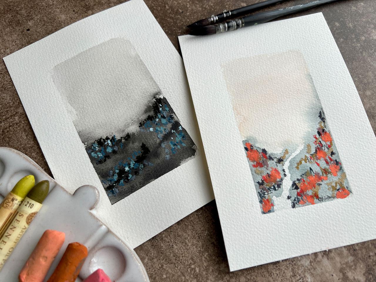
6. Gray Landscape: [MUSIC] We've got our 100
percent cotton Fabriano paper that I'm going to be
using personally, because that's what I was
playing in and having fun with. I'm going to go ahead and tape out my shape on my landscapes. Like I was talking about in
our sketchbook explorations, sometimes sketchbook work
just does not work for me, because it's a different paper. Then even if I master what I'm trying
to do on that paper, when I get to my nicer
paper or whatever paper it is I plan to use for
the nicer projects, it just does not work the same. The paper texture is different, the water absorption
rate is different, and I just get frustrated that I did all that work
in practice in say, one piece of paper
or one medium, and then my final piece just
does not look the same. Let's go ahead and do our
practices on our nicer paper, and when we're done, hopefully we'll have
some gorgeous pieces we want to try out. Here's my piece of junk paper. It's a piece of
Canson XL, I think. Let's just decide,
let's do the one color. Let's go ahead and do one color. I think in my one color, I really liked this charcoal
graphite gray tone, so why don't we go ahead
and get one of those going. I want to start off making some mountains and then
going up into some sky, and we'll do just the one color. Same project that we
just basically did. Let's go ahead and just
run this up for the sky, and then you'll see how
a nicer cottony paper. The absorption rate
is just so much different than what we were getting with the
sketchbook paper, which was a wood pulp paper. It was a moist skin
and it's nice, but it was not 100
percent cotton. Let's just go ahead and get in some of our
mountain range here, and then just clean
your brush off. Then we could actually
just come back in here and pull some
of this back off, and just create some
visual difference here with our mountain ranges and just see what we can get. That'll maybe give
us some direction to go with the flower. Fields are options that
we decide to do there. Then if I take too much off, I can just come
back in and I can re-emphasize a hill or maybe
a mountain flower over here. We could even be like, there's some little
dark trees in there, you can put some dark trees. I like some of the
differences that I just created with the lines
and the movement there. Look, they're already
feeling much more successful [LAUGHTER]
than I was there. Got a little white spot
there that's distracting me. There we go. Now, we do need to let that dry. But look how much better
that already feels than it did on the paper
that I didn't intend to use for my final project. I really do advocate
and I didn't use too. I didn't even in my mind realize how different it was
working on one type of paper and working your ideas out in your sketchbook versus doing your actual final piece on a nicer paper and
seeing the differences. Then I'm just working
it and I'm like, why do we do practice work on cheaper paper and then struggle when we get
to the nicer paper? Because they're
different papers. They absorb the water
different, they look different, the color is different on it, you just don't get
the same results. I know that paper is expensive, so I buy paper when
it's on good sales. Michaels sometimes does that, buy one, get one free. [LAUGHTER] Let me tell
you on those weeks, I'll buy some and I'll come home and think
I got some paper. Then I'll go tomorrow, and then I'll think I need a
couple more pieces of pads, I can't let that go. Then I'll wait two days
and then I'll be like, crap, I need to go
buy some more paper. When they're buy
one, get one free, I just can't help myself, [LAUGHTER] I go buy them out. If you ever come
across some deal on your favorite paper buy
as much as you can, put it in your paper stash, and then be ready when you
want to do a project like this to practice on a
little bit better paper. That doesn't mean that you
have to use the whole page. You could take one
piece of paper, cut it up into a whole
bunch of smaller pieces, and then practice on all
the small pieces and then you'd be ready to
move to the larger piece. I was talking the whole time, letting my watercolor dry. You want to resist
taking a heat gun to it, but once it's almost dry, you could take a heat gun
to a little bit of it. But if you heat gun
the whole thing, it peels your tape and then it lets things seep under it, so you want to resist
the heat gun if you can. But I wanted to go ahead and
finish drawing that for us, so that we can now [LAUGHTER] come back
in with our pastels. We're going to pull our
pastel piece back out, and I'm going to play with the same similar colors that
I did in the sketchbook. Because, again, sketchbook is good for working stuff out, but sometimes it's just not as good for really getting nice pieces finished and
thinking, I love that. I've got this same,
not quite black. Was that the right one? I think it was. Well, we're going to go with it. I'm going to do some
movement there. With some of that movement
I already created, and then try not
to do the overdo. I'm so good at overdoing it. It should be like a Blue
Bell field or something. I'll do some little dots and maybe we got a little brown in there, and then I might refer
back to the sketchbook, just to see what colors that I use in there
that I liked so much. Even though in the end our sketchbook is not
what I liked doing, what did we like in this? Look at the difference in the two pieces,
isn't that amazing? I also liked the light blue. This one just looks so much
nicer and so much like a finished piece of art almost
from the very beginning. I just feel so much better
about it on the bigger piece. Even though you're thinking, I want to use my nice paper, nice paper so expensive. When you're doing the art, you feel so much better about the result when you're
done that it's almost worth it just to bite
the bullet and have some better papers handy, even for your practice work. Can't tell you how much of
a difference this makes. To be honest, I'm doing that in a sketchbook
and I'm thinking, why am I even making these? This is terrible,
this didn't turn out. Then I wanted to show you that we all have those thoughts, [LAUGHTER] it happens to us all. Then come over here and
immediately see the success on the nicer paper that
I was seeing on the other pieces I was creating. I'm going to stop there. It's going to be a case
of don't overdo it, because I can overdo it. I'm going to move my pastels, and I'm going to look at this. Do I have anything else
in my oil pastels? Because look at this color over here before I call it
done, look at this color. It's probably same with
one of these other colors, but I actually love how
creamy and slightly darker. I said I was going to stop,
but look and I'm not. [LAUGHTER] I love how
creamy and a little bit darker these oily pastels are. Look, just a tiny bit, it didn't even take that much. Look, how gorgeous this is, oh my goodness, about to have a little freak out
moment here on with you. [LAUGHTER] Let's
just peel this tape. Wow, look at this, oh my goodness, I could do a million of these
when I get this excited. Oh my goodness, this
is so beautiful. Look at that, it's
a dark stormy night out in the flower field
of say, Blue Bells. [LAUGHTER] So pretty. This is a really beautiful, foggy at night flower field. In the next video, let's do something a
little bit brighter. But I just want to sign this, and go ahead and be like
okay, foramen, it's perfect. [LAUGHTER] You see,
I was really getting discouraged there
with the sketchbook, I was getting mad
at the sketchbook. Perfect reason to go ahead with the paper that you really
feel you're wanting to use, because the results are
a million times better. I'll see you in the
next video. [MUSIC]
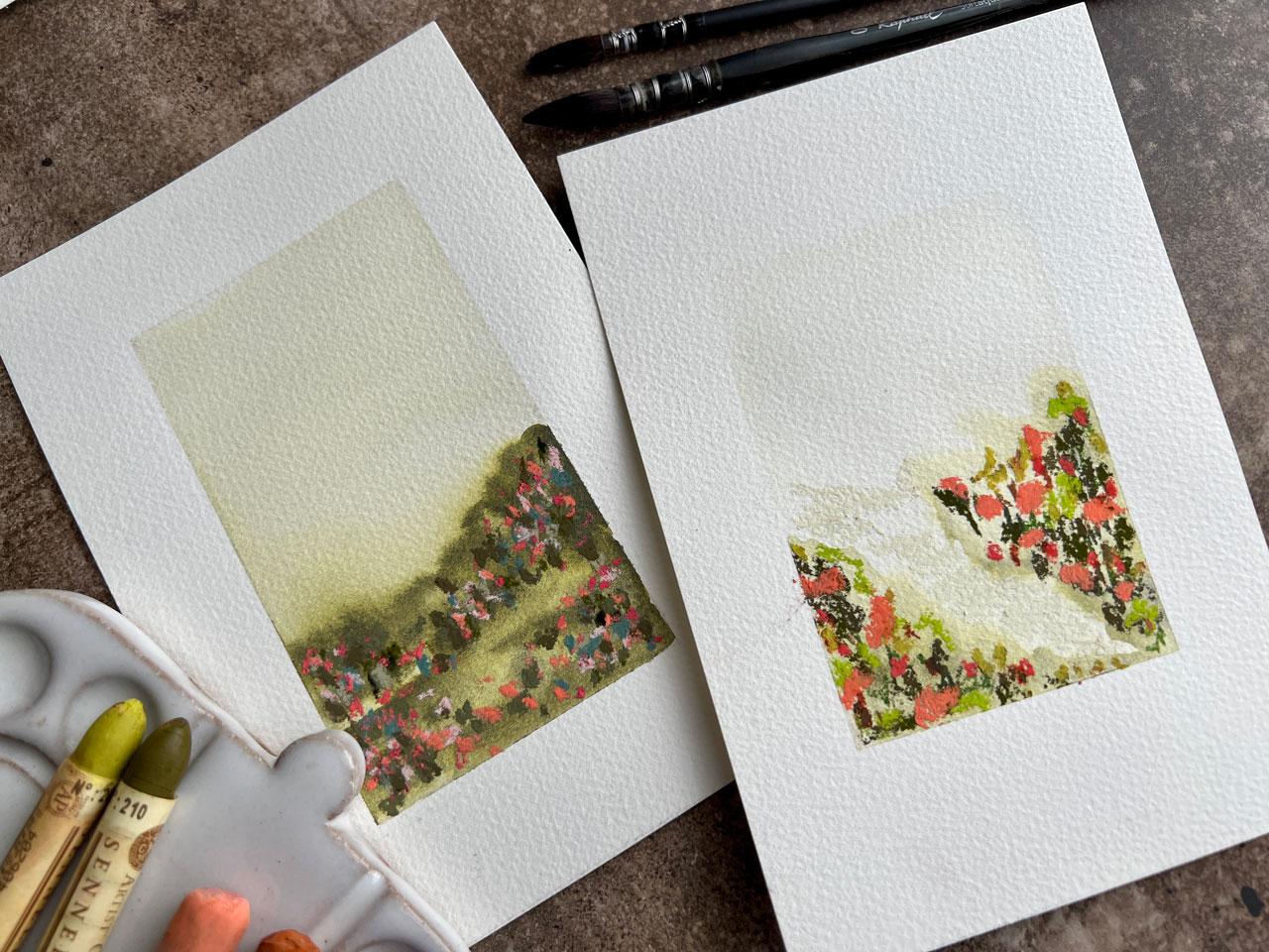
7. Green Landscape: [MUSIC] I want to do a brighter, maybe one color just
to have a little play. I'm going to use this
graphite watercolor that's made up of Sennelier
brown pink. This one. Yeah, brown pink. I mix the Sennelier
brown pink with the graphite powder to make
this graphite water color. I'm obsessed with
the brown pink. It's a little bit like a green gold, but
slightly different. With this graphite in it, it's got that beautiful
smoky quality that I'm obsessed with. Let's just go with
the brown pink. I'm going to go ahead
and start that. I'm going to run this color up. I want that to be the
sky because remember these are more abstract
flower fields, they don't have to be a
perfect representation of a real scene. I want these to be more of
something in your mind, a dream, something
fun, beautiful. Look at that color. [LAUGHTER] I'm just
insane with this color. It's gorgeous and it's a little
deeper than a green gold. Sometimes I want to
love green gold. Sometimes I just don't love it. I'll use it and I'm, oh,
just not what I wanted. Let's just pull some color
out of here and make some movement and
then we'll come back in with some more color. Get more movement in here
and just really given my front landscape
here, my foreground, just some power, some strength, some movement, some excitement, something that says, oh, look at the rolling fields. Whatever you got going there. We can do that right
there and let that dry. Then we'll come back in with some color feeling
like greens and pinks. I want to even like this pink. I'm obsessed with that color. [LAUGHTER] It's not a 100
percent dry, but it's close. What if I tried out some of
these art spectrum greens? I want to have
implications like there's some grassy stuff there and then there's
flower stuff there. Then just adding to what
we've already got going. I want to not overdo it, so I'm trying to
keep in my mind it doesn't have to be
completely covered. I want to have just
some interest. I'm just doing some little marks implying that we've got
stuff going on out there. There's several different
shades of green in this set, so it's interesting
just to try them out. These are very interesting. This is a lighter shade. I like that. This one's olive
green A. What was this? This was sap green C and
this was olive green B. I'm trying to be real careful
not to touch the white edges of my paper with anything that's got pastel like my fingers. [LAUGHTER] I really like these blues over
here too. Let's see. This is colored green C, but it looks the most
delicious color. Let's go ahead and
let's throw some of that in there.
That's different. Maybe not quite what
I was thinking, but it's still pretty. We've got a little
darker color here. This is sap green
D and then Dog, a little darker
color. Super fun. Let's throw some of
this pink in here. That is Diane Townsend, and it's this light pinky
color here that's all broken. I don't know if it's
got a color on it. It's part of the Terrages set. But it's like this just light. Whoa, look at that. [NOISE] This one breaks up pretty good. [LAUGHTER] [NOISE] Very soft, but look at those yummy,
crazy beautiful colors. I actually want to pull out
my little half-pans again. Let's pull this back over here because this is my favorite
set that if you get one of those big half pan
sets that Sennelier has, you'll get all these
yummy colors in there and it's perfect for doing little things like this and you've
got enough choices. Fun. Let's do a little
bit of this here. Now I'm just trying to dot in [NOISE] little
colors of flowers, maybe a little bunches
of colors in there. Maybe I should have
spread that out more so I can come back and
just start working it now as I need to get the colors exactly
where I want them. Because now I've did
like dot, dot of color, and I want to get that spread out of that
level a little better. Like it's not really
a disjointed scene. Maybe the flowers
and collections go together a little better than I have managed
to do them here. [NOISE] That's super fun. [NOISE] A little
different there. I think my first one that I did, I actually spread the
flowers out a little better. Just something to look at and
think about and next time, consider different
ways to do it. But I still do love the way the color did with the
watercolor on this one. Let's peel the tape. Try not to make a mess and just see [NOISE] what
we've ended up with. [LAUGHTER] Peeling the
tape is my favorite. Somebody asked me in
one of the classes that might not have needed tape, why did I do that because
I didn't really need it. Sometimes I do it just for a
visual barrier for myself. Just so mentally, I have a place to stop what
it is I'm doing. Well, some like this, peeling the tape really does
reveal the finished piece. Look how pretty that
is. Oh my goodness. Now that is prettier with the tape peeled than I
thought it was going to be. [LAUGHTER] Super fun. Again, if you have a
piece of pastel that ends up anywhere on your paper
that you didn't intend, your little eraser
is perfect for cleaning off any stray
pieces that you got, that you didn't intend. Look how pretty that is. Let's call that one good. Our two solid colors, one color pieces that
with fields of flowers. How beautiful is that? [LAUGHTER] In the next one, let's try two colors. I'll see you back
in class. [MUSIC]
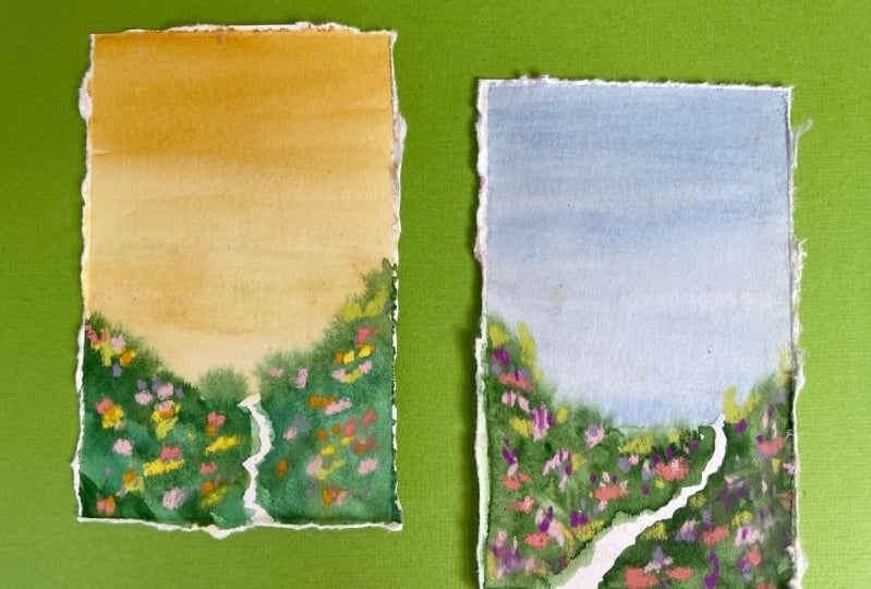
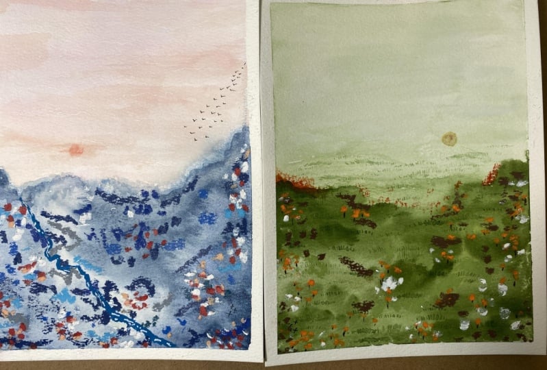
8. Blue Landscape: [MUSIC] This landscape,
let's hop into two color. And I want to do a pinky sky. I'm just looking at these
little code, that's pretty. Let's do a pinky sky and
that yummy bluish base. Let's see which one
of these are like. I like that first one I think, so let's do a pinky
sky and a bluish base and I just mixed up two
colors, but that's okay. [LAUGHTER] I'm going to go
ahead and run this color up. That's not real thick. I actually want
that to be pretty soft and I don't want
that to run back on, I want a soft pink sky. We run this down a little bit and come back
in with this blue. Look at that color. You know what, for giggles, let's throw in a pathway. I fill a path on this one. Let's just leave a
space and just see. Well, we can do there is a path. I could have made
it a better path, but I thought as [LAUGHTER]
I didn't think fast enough and we can come back in here
and pull color if we want. If you want to try
to pull any color to make some extra movement, we could try that. Come back with some
more color on top of that just because I
love the extra movement and energy that we get when
we can see layers in there. Super fun. We got
to let that dry. We're going to give
that a moment. We're about 80% dry and I think on this one
I'm going to pull back out my pastel box here because it seems to be
my favorite working on these. [LAUGHTER] Let's
just jump in there. I want this to be
bright springy, maybe even try one
of these on here. That's about the same
color I just painted with, but still very
interesting on there. Got that in there. What if we put in some of these, this blue my fill on that. Maybe a deeper blue. I like this feeling of the flowers taking
up this rounded, not all across the bottom
like I did on this one. I've got it across. I want this to do a little
U-shaped swoop there. That's what in my
mind I'm thinking. Also keeping in mind that I have a pathway here and
maybe we could make that pathway a
little more of a path with a white or an ivory. We can just make that path a little more
defined and out there, maybe that's a
waterfall or something. I'm just thinking these
things up in my mind. It's not from any
specific picture that we may have already
seen anywhere. What about tiny
bit of this blue, getting a lot of
blues in here and I know we're going to come back with some really pretty bright
color here in a minute. Just soft little details. You can take your
time with this part. You don't have to be in a hurry. Let's start filling this with
some yummy, yummy color. I'm trying to keep
in mind size of the landscape versus the size of whatever I'm putting on it. But in this original one
that I'd played with, look at those big
splotches of color. It's still pretty like that too. It's okay if we have
some bigger areas which I might make a few in
there and it's just that, that could be gigantic spots of color out there
on the landscape. A little cluster of
whatever is growing. I'm just spreading
that color out really. There's no wrong way to do this. We're not trying to create a specific flower or
a specific something. It's more like just intuition, if I squinting my eyes
at a field of flowers, you know what might
I see out there. You could look on Pinterest
or Google field of flowers, or if it's spring and
you've got some sunflowers, fields and things
like that growing, go out and take a look and
squint your eyes and say, "What is it that I see?" Take a few photos for
your own inspiration. I do that a lot. Look how pretty that is. This is where it's very obvious that I'm like,
"More and more and more." [LAUGHTER] You might look
at it and think, "Oh, I don't know But
let me tell you, resist judgment till
you pull your tape. [LAUGHTER] That's
what I'm going to do. I'm going to resist the
judgment and think about it. Anything else I want to add. Every single one of
these are different no matter how many times you try to paint the same exact scene, every single time, you'll
get something completely different and I really love
that about making these. Let's peel the tape. We can keep adding details. Once you peel the tape,
if you think, "Oh, not done," you can go back
and add some more details. I'm like, "Look at that. Just hoping that I'm
done when I peel it." My goodness. Look
how pretty that is. I doubted it, but look
how pretty that is. [LAUGHTER] Look at that. I'm pretty happy with the
way two color with a path. I love that. These are super
fun to color with a path. Let's see if there's
anything else. Let's try canyons. I really like the canyon one, like we're at the canyon, but look how pretty that is. Want to go to the canyon
for the next project. I'll see you in the
next video. [MUSIC]
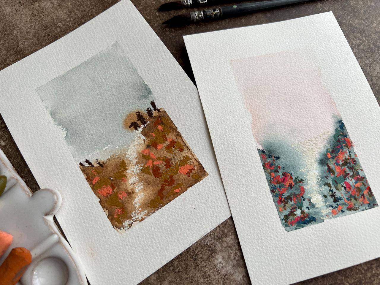
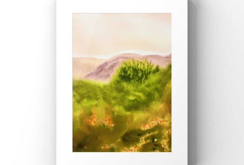
9. Canyon Landscapes: So let's go to the Canyon. What I like about maybe
doing a Canyon 1 is totally out of like a normal
color zone that we might be thinking of in
our local color area and maybe there's a
lot of red rock and red dirt and not so many flowers so it's going to be like
an imaginary Canyon scene. I'm just going to
come in here with my yummy kind of red dirt color. I live in the South and we're basically everything
was built on red dirt. [LAUGHTER] When you dig
up the plants out front, they're all in red dirt. I don't even know how
anything grows here. Let's go ahead and get
our Canyon sky there our red sky and I want to get some Canyon mountains and here and maybe some Canyon pathways. So let's go ahead and paint some color on there
and then pull color off. So I'm just going back with a clean brush and maybe
putting some movement in here. Maybe multiple pathways
is what we end up with. Then once I do that, we'll come back in here and put some of my Canyon
mountains back in here. Just see, just play
around for a minute and see what can we create here. What pathway can we get? Maybe we overdo
it and we need to pull some more back off. Totally possible. [LAUGHTER] It's more of a push and pull that
we're doing here. Now that I'm seeing this, maybe we have like a little
too path thing forming. This is another thing too. We talked about paper, cotton paper really is way more forgiving of
pushing and pulling and working a little bit longer than you are when you're doing things on
like a sketchbook. Look at there, maybe we can
go in a direction instead. But you do get a
lot more give and take with a nicer paper. Going back to what we were talking about in
an earlier video, I really like practicing your pieces on the final paper that you really intend to
use for your good stuff. For this reason, we have
more opportunities. We have quite a bit more leeway with what we can do on here. Now I'm just getting
to the point that I could be just overworking it. But the better
papers do give you more options and more
play time and a few more things than you're
normally going to be able to do with a lesser
student-grade paper. Okay, I like that. Canyon with the curved pathway? Definitely fun to try this. Because now I feel like
look at that we can see the Canyon road coming down. [LAUGHTER] We're going
to have to let that dry because I'm just overdoing it now and see what we get. I think while that's
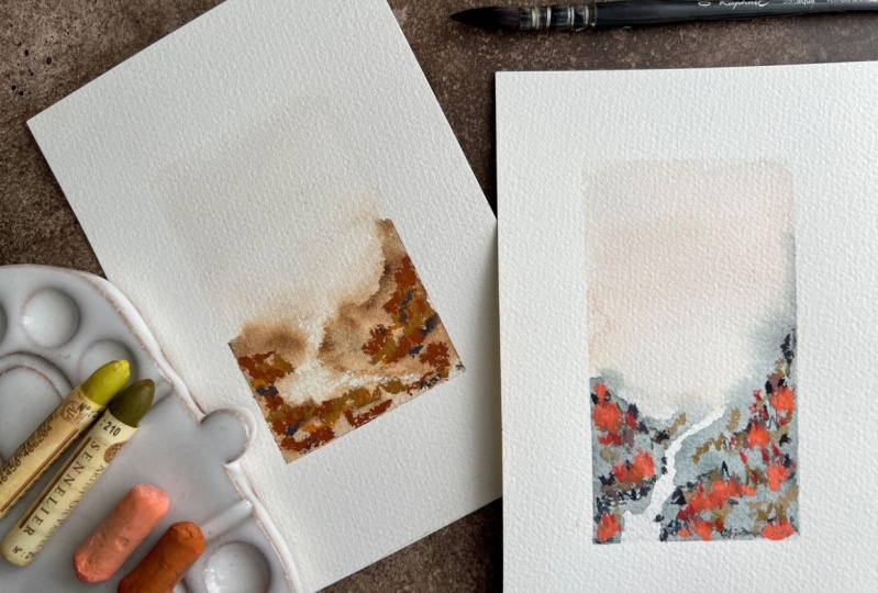
drying, I'm going to do another Canyon 1 also because I think my original Canyon 1
was a different color. Yeah, I think it might
have been this color, which is I don't know,
some yellowy tone in here. More browns and look
how pretty that is. Maybe we can do a two-tone
Canyon let's just do this. Put that in a little different. Maybe just not a solid. Maybe we have blue sky instead and get that working in there like that. Just see, do we like this two-tone Canyon
with maybe a pathway? And now we'll just work
that a little more. Well, maybe I want to work that. Let's pull some of this
up and then work it some more because we're going to get some layers
in here this way. Let's lace on. I can already see I'm going
to be obsessed with this one. [LAUGHTER] Because look
at that pretty sky. You could maybe even put clouds in there if
you're feeling brave, maybe a little bit
of gouache clouds. I'm not wanting any
clouds, so I just want the implication there. Let that one dry too. This might be the better
Canyon we'll see. [LAUGHTER] So let's
see what we got here. Definitely don't want
the greens in that one. Might want let's take a look at the pastel pencils before I come on here with some
bigger pastels look at these, do love the pastel pencils. I'm feeling like maybe
some darker colors. So let's just come in here
with some dark shades. Get some movement going. Sometimes I'm glad
that I do two. Instead of just one. Because then if one of
these looks terrible, I have the other
one that I know. I feel like I'm
filling the other one. The other one's
going to be amazing. [LAUGHTER] You just
got to experiment and not all of these
are going to work out. Don't ask me what
these little lines are supposed to be they're just helping me throw
some color in here. Let's try this
blue. Look at that. We might say that this one's
going to be a failure. But I want you to
see my failures and my successes because
if you just see that everything I make is a success, what good is that? Now you're thinking
that you failed when yours is not a success. I don't want you thinking
that we don't all have failures because
we do. That's crazy. It takes a process you
have to work through the different things
to get to the wins. So all of us have to do that. We all have to do the work to get to the ones
that were like, here's the one I love. [LAUGHTER] That's different. We're going to stay in
suspense for a moment and go ahead and do this one and just see which one
in the end we love. So I do actually like the colors in this
one a little better. But now that it's dry, maybe it's not as
successful or maybe it is. I got a path in here we
could come back in here with that pretty creamy color and that's really
going to definitely show up my path on this one. Yes, I like that. I'm feeling good about that. Might throw in a couple
of brighter just because see I'm feeling pretty
good about that. I don't know you think
it something else. I need a little
vote button and we randomly have something
that could be a tree there. [LAUGHTER] I could
actually come back, say with like a brown. We can have some
structures up there. That's fun actually. It's like little things the
trees at the top maybe. Oh, yeah, look at that. Now we've got some
trees up there. Now I got pastels
all over myself. Am I going to be able to peel the tape. Let's see. All right. Let's think about that
one for a minute. We can come back with any little tools that we
feel like we needed. But I feel like I'm pretty good. Let's just see if because I stick tape everywhere that just went over
there and stuck. [LAUGHTER] It's a
good spot for it. [LAUGHTER] Now that we're done, I'm actually pleasantly surprised
at how that turned out. I can see a definite like road in there and maybe
it's like the forest and maybe it's the fall
and the Canyon and we see all the leaves and
the things that are turning for the fall. But that's fun, like a nice drive in the
mountains in the fall. I'm not as unhappy with
that as I expected. [LAUGHTER] Let's peel this one's got some trees
that look at that. Make sure there's
nothing on my finger. Oh my goodness. That pretty. If you have any spots
of little pastel, get your little artist eraser and come back and
erase that spot. Then if you've got any that
you just can't get off, you can always trim around this because
that ain't coming off. [LAUGHTER] Oh, yeah,
it is. There we go. Thought maybe we
weren't getting that. But let's say that maybe you
weren't getting that off. We could decal the
edges of that. Look how pretty that is. I feel like I'm in
a little fairy tale where we can see the little waterfall on
the top of the mountains. We've got some hills
there super fun. So let's take a
look at all these, so I'll see you in the
next video. [MUSIC]
10. Landscape Recap: [MUSIC] Let's do
a little recap of these because look how
pretty these turned out. We started out doing one color so I want
you to try that, I want you to try one color like black and white like it's dark, it's out or in the fog, and think about what
colors you could actually see in a dark fog, and then do the same thing, all one color and see what pretty flower
fields that we could do. So I like the one color in the watercolor
and come back with the pastels for the flowers
and then two color. I like doing the two color with the flowers on either side rather than all the
way across, super fun. Then one and two color with a path where we were
practicing pulling up some of that watercolor
creating a yummy path in our landscape and then flowers on either
side of that path. I did a lot of those on some earlier ones that I was
doing for myself when I was playing and I just love how
all of these turned out. They're so beautiful, I also want you to think about whether you want to
possibly deck the edges, which is just tearing
the edges with a ruler, so I'll do that on one of these, and then whether
you want to finish it with the finishing spray. So I want you to try
some finishing spray, I'm using the sennelier to
make those pastels stay down, but there's a couple
of different brands, and do just a little sample one, draw a line and just
spray half of it. I covered it with a piece
of paper on this half and I sprayed half and see
did it change the color? Isn't going to ruin
your piece when you do a piece that is important? I want you to know
right up front how your fixative is
going to react to the materials that
you decide to use and I want you to explore different materials whether
that be some oil pastels, some soft pastels,
some pastel pencils, you might explore neo
color to crayons, that would be a good choice, colored pencils will color
on top of watercolor. That's another good choice, so I want you to experiment with some different mark-making tools on top for your
splotches of color that implies the
fields of flowers. I hope you have fun
doing this project we came up with some really
beautiful landscapes. I hope that you
love yours as much as mine and not all of
them are a success. I also want you to do this little
sketchbook experiment and possibly do one on here and do a big one that matches
and seeing how different the art looks from the
student grade paper to the nicer paper and think about
what we talked about with the practice pieces being
on the better paper. Because several of the
ones in my sketchbook, I just was like this
just is not working and now that I look at it now and truly I judge things too fast, I actually do like
this one quite a bit and with the flowers,
I might like that one. I just don't like those two
at all I feel like they're just duds and if I had
started with that, I might not have
even tried making bigger beautiful
landscapes and I would've gave up so
practice on the good paper. That's my argument for that because it really is
important to learn what the paper is going to do and
how it's going to react to different supplies
and materials and pigments that maybe you're
using on your projects. Then be really careful
when you're using the soft pastels
that you don't have, pastel dust everywhere,
then gets on your finished pieces [LAUGHTER]
I have that happen a lot. Hope you have fun
with these projects, I had a really good time showing you how I created some of these. I can't wait to see yours and I'll see you
next time [MUSIC]
11. Final Thoughts: [MUSIC] I hope you had fun
experimenting with me today. How interesting was it to see the differences of what you
create in your sketchbook versus what you create with
your better papers and side with me a little
bit on the argument of practice on the
better papers. Maybe it's a case where you can buy some
big sheets and cut those into a lot of little
pieces which you then have more pieces
to practice on, and larger sheets are generally cheaper than the smaller pads. Get a bigger pad or a sheet, cut those up and
then we have lots of practice pages to practice on. But nine times out of 10, my practice pieces end up being so good that
I'm like okay, I love it even though
I'm practicing. Because they're
on the good paper and I'm playing with
supplies that I love, and maybe I'm experimenting to see what I can come up with. The pieces that I do
in my sketchbooks, some of them work out
and some of them don't. But the pieces that I
do on the better paper, nine times out of 10, I'm like I love this. [LAUGHTER] I want you to get in the habit practicing
on the good paper. Whatever that good
paper is to you, it may be a different good paper than whatever paper I'm
playing on in class, it may be a different
paper than the one I normally gravitate
towards when I create. It doesn't really matter what
you think is good paper. What matters is, what is
that good paper to you? That's what you need to be practicing on so that
when you go to do your good pieces you already know the
properties of the paper. You know how it's going
to soak the water, how the colors are
going to blend, how things are going to react, how your tools work with the paints that you're
putting on the paper. It's not going to be a
surprise because it is a surprise when you go from
sketchbook to nice paper. I left in my sketchbook
segment in this workshop so you could see how
different that really is, and how in the
middle of creating, I was like, okay, these are just duds. If that had been
where I started, I might not have done any
more of these or done this project or created this class to show you
how fun these are. Because I was disappointed
in the pieces that I painted in the sketch book to the
point where I was like, I'm just going to turn the page, I didn't even go any
further on this one. I wanted you to see that. I want you to know
happens to all of us. I don't want you to get
discouraged at that point. If I had done my practice pieces on that sketchbook
to begin with, because a lot of times I'll
be up here just creating and I'll be on my better paper sometimes
because I'm like, I think I'm going
to like this idea, let's just do it
on the good paper. When it turns out and I'm like, oh, yeah, really great. Then I started
class and I'm like, let's start in our
sketchbook and I'm like, why is this failing? That's why. A sketchbook paper, a
lot of times you can get 100 percent cotton papers
and some sketchbooks, but they're the
expensive sketchbooks and so a lot of times
you're just picking up your watercolor sketchbook
that maybe it was on sale and that paper is usually
like a wood pulp paper. The good paper to me is like a cotton paper and I like
working on cotton papers, and when I go from that
wood pulp sketchbook to that cotton paper, the results are
completely different. I wanted you to see that, I could have just left
that whole segment out and then you could have just tried in your sketchbook and wondered why
this wasn't working, or it didn't look the same, or you weren't getting
the same results as maybe you were getting in the class or another class you're taking or whatever it is. You're wondering why is this
not the same results that you're seeing on
screen or that you thought you'd get
and that's why. I want you to get into
the habit of working in the paper that you're going to be working on for
your better pieces. I want you to know the
paper, how it reacts, how it works with your
paints and your tools and really learn the ins
and outs of that paper. A lot of times what I will do, if it's an expensive paper [LAUGHTER] I will buy
several pads of it, preferably when it's on sale. I'll put it in my paper stash until I forget how much it cost. Then I'll pull it out
[LAUGHTER] and do a class or do
something with it and I'm not even worried about
the cost because the cost is a big inhibitor of
creating a lot of times. If you buy a paper
that you like, this is too nice,
I can't use it, well then what good was it? If price is a barrier, buy it when it's on sale, stock up on extras. A lot of times Michaels has
a buy one get one free week. Let me tell you, on that week
I went and bought like 20 of these Canson XL pads
that I love to use. Now I can feel like I can do anything because I
got plenty of paper. [LAUGHTER] Buy
when it's on sale, consider buying bigger
sheets or bigger pads and cutting those into smaller
pieces because it's cheaper. Then practice on
the better paper, so don't go from the sketchbook
thinking this is what I want and then being
disappointed in the nicer paper because
everything works different. Don't go from the
sketchbook thinking, I don't like this it's failed because you're
working on a lesser paper. Just give the different
options a try. But for the argument of working on paper that you plan to
use for the better stuff, practice on that paper
because that's going to give you the better stuff
even when you're practicing. I've really enjoyed having
you in class today. Can't wait to see
what you're creating and so please come back and
share those in the projects, and I'll see you
next time. [MUSIC]
 DENISE LOVE, Artist & Creative Educator