Transcripts
1. Welcome: [MUSIC] Hey, I'm Denise Love and I want to welcome
you to class. Let me show you what
we'll be doing. In this class, I have tons of fun things
to show you and I'm pretty excited to be getting into some of the fun stuff we're
going to be doing today. We're going to start off with yummy little practice pieces where we're going to
practice with colors and botanicals and different
types of botanicals where we draw on top of some
watercolor that we did, and then we'll progress to little bit larger botanical
watercolor pieces. Then we're going
to do super fun, little bit larger
pieces in squares where we just create a different
little scenario, color wise, flower wise, practicing different
techniques and flowers and botanicals and things
that we might want to use in a larger pieces. Then we're going to
move into great, big yummy pieces like these. They're so much fun. I do these in my art journal and then just come
back and work on them as I think of new ideas and add pieces in that I think
need to be added. Here's another one
that I have done in my sketchbook in a
different color way. I just find these so
relaxing and informative. You learn so many things about the materials that
you're doing and you get different inspiration off of different botanicals
that you draw on here. I truly enjoy making these. We're going to start off small and get some good
things under our belt, and then we'll end up at a little bit larger
piece that you may or may not want to take out of your sketchbook
and then frame. You may love it so much. There's so many things I
do in my sketchbook that I take out and then frame. I do meshing out ideas and practicing and playing
and letting loose a little bit and doing
things that I might not normally do and experiment rather than being so regimented and afraid to break those rules. This is super fun class. We're going to start off
small and get bigger. I hope you enjoy the different projects that
we've got going on in here. I know I certainly enjoyed
painting them while we were going through class and I'm pretty excited about it. So I'm looking forward to
seeing what you create. Definitely come share those
with us in the projects. I want to see what you
made, what colors you used, what illustrations you ended
up putting on your pieces because we'll put some pretty
little illustrative pieces in there that you're
going to love. I want to see what you've done so come share those with us. Welcome to class, so let's
get started. [MUSIC]
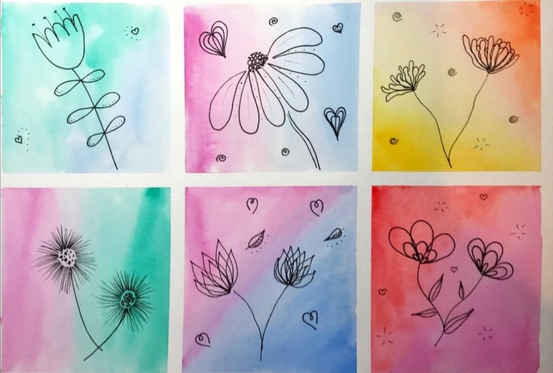
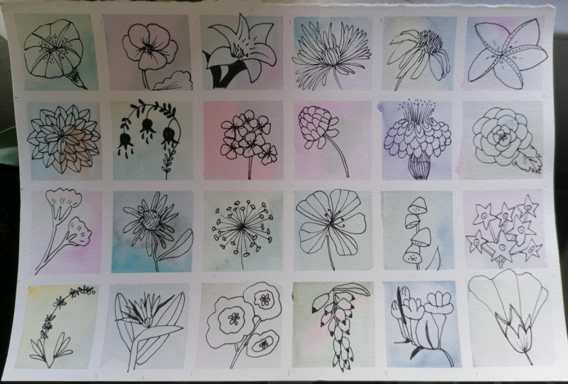
2. Inspiration: In this video, I want to take a look at inspiration for the pieces that we
might create in this class. Creating botanicals on top of watercolor paint is really
very fun and relaxing. You can do this when
you're sitting in front of the TV or when you go up
to your art room to play. This is one of my
sketchbooks and I've got a couple here
that we'll look at, but I just like to
create watercolor in the background and
then draw stuff on top that I think
is really pretty. It's a great way to experiment
with your watercolors, playing with colors and
combinations and seeing how things blend when you're working wet on wet or wet on dry. A lot of times I'll
create big backgrounds of watercolor and little
backgrounds of watercolor, just waiting for me
to come along and then draw on top of
them when they're dry. I have a bunch of different things I've
experimented with here. In addition to big squares and big squares of
color like these, I've also done some botanicals that I've drawn on top
of the watercolor paint, which the paint underneath it, I really thought
that looks so icky, and then when I
draw on top of it, I'm like it's magically better. That's fun to
experiment with a lot. Draw the watercolor on, draw the ink on top of
it. I love doing that. Then these circles
were super fun because it allowed me to experiment with different patterns
and different colors and I was seeing how
they blended and it's a fun little circle of
color rather than a square. Then offers also playing with larger circles of square and drawing pretty things
on top of that. I've had a lot of
fun working with botanicals and they
haven't all been perfect. I started off in this book and
I discovered that I didn't like different markers when
I was drawing on here. This is pencil. Then I like these Pigma pens, which are these
Micron pens that are archival and they draw really nicely under watercolor
and on top of watercolor. You can draw your botanical
and then paint on top of it or you can paint and
then draw on top of it. There's a lot of good
things you can do with these little Micron pens. Then I did bigger layouts for the bigger squares
that I was creating. Really just having an
absolute ball mark making on some of
these coloring some. How beautiful, some of these turned out even
though underneath I thought I'm questionable about whether I'm going to like it, and then when I
draw on top of it, I was like, oh, I love it. This class is going to start
out in our sketchbook. I've got some books. If you don't know how to draw botanicals or you don't
have any good ideas, there are a couple
of books that I own that I have found
very inspiring. This one, 20 Ways
to Draw a Tulip and 44 Other Fabulous Flowers by Lisa Congdon is my favorite
one because in here, she has gone and
brainstormed and drawn 20 different
versions of each flower or botanical, or leaves,
or whatever it is that that page is focused on for you to then look
at and be inspired to use in your drawings
and your sketchbooks. This is the best book. It's really good for
teaching you shapes and different flower
types and what petals to do to make it look
like each type of flower. I like a lot of these, a lot. This book I found
very inspiring. I definitely encourage you. If you only get one book, this would be my choice. Some of these other books
are ones that I've just had for a long time and I pulled
them back off my bookcase. This one is called
Illustration School: Let's Draw Plants
and Small Creatures by Sachiko Umoto,
S-A-C-H-I-K-O U-M-O-T-O. I'm sure I didn't
say that correctly, so I'm sorry about that. This book is more about more
delicate illustrations, but it goes through
some butterflies and different flowers and
their inspiration for how to draw those, which is completely different
than Lisa Congdon book. I do like it too. It's a different style. It gives you some ideas. There's lots of good
stuff in there. The third book I
have as inspiration. I was into the
Zentangles years ago. Zentangles are patterns and
things that you draw on little blocks and you make just intricate, beautiful
illustrations with. This one is in Zenspirations : Letters and Patterning
by Joanne Fink. It's a fun book and it's not as filled with pattern
examples as that book, but it's definitely got
some beautiful things. Like look at those hearts,
aren't those beautiful? The inspiration
behind this entangle is you get more and more detailed and add patterns
within the patterns and really get a lot going on. There are lots of illustrations
in here showing you how to get some of those
really nice patterns. Look how amazing that is. If you get to the point
where you want to do more than just a leaf or a
flower or something simple, you might get into pretty Zentangles on
top of your watercolor. Because there's
lots of ideas and pretty things in
this book to get you into a lot more detail
in your pattern drawing. This is a fun book too. If you only get one, this first book is my very
favorite and most inspiring to me and the one that I will refer to possibly in class
when I'm thinking, what is it that I want to do
to add to my illustration? Hope you love all these fun
examples that we've looked at for inspiration
and I can't wait to see what fun things
you create in class. Let's get started.
3. Supplies: [MUSIC] Let's talk
about the supplies that we're going to
be using in class. I do show you my favorite
inspiration book for drawing botanicals
and different ideas, and that's 20 Ways to Draw
a Tulip by Lisa Congdon. If you only get one
book for inspiration, this is the one that
I liked the most, and it has tons and tons of very inspiring
illustrations that you can practice on and draw on top of your watercolor pieces
that you create. I love this book and I
will be referring to this one when I get stuck and want a new idea on
something to draw, this is what I'm
usually looking at. Also, it's basic in this class. You want paper, you want
watercolor, you want a pin. That is as basic as you can get. Now that being said, I am doing stuff in my sketchbooks, and
these sketchbooks, I've done lots of fun, inspiring little things
to practice and play and just mesh out ideas in my mind. I am using, for this particular book, this is the 8 by
8 Artesia books. It came as a set of two. I like working in
more than one book because when this one's wet, maybe this one is dry and I can be working in
this one instead. You can see here
I've done lots of smaller botanical ideas and then larger two-page
spreads just to flush out ideas and
play and experiment. I do play in my
sketchbooks quite a bit. I'm also partial to 140-pound cold-press
watercolor paper. It's a little heavier
than sketchbook paper. The sketchbook paper is
a 110-pound cold press. This paper should react
similar to the sketchbook, just a little heavier. You could do these in
any size that you want, but I do find it fun to
play in sketchbooks for the different things that
I'm just playing with today. My favorite pens are
the Micron pens and I have these common black and
they come in different sizes. You just get one, I
like the 05 size. It's a nice medium tip. Then these other
numbers get smaller or larger depending on
what that number is. I have a lot of those. I have discovered that working with the
paint pens on here, not my favorite, so I
don't really enjoy those. I do occasionally work
with a larger paint pen. These are Faber-Castell
artist pen and I've got golden silver. I don't like these as
the drawing by itself, but I have found
that I like to draw like maybe an
underdrawing and then do an ink version
right on top of it, so it's almost like an echo. This really is my favorite one. Then I do have some other
pens I've experimented with. This decobrush. I did not like that ones, kind of smudged everywhere
like this over here, it's real fat and smudgy. I think I've tried to sharpie. Just experiment and play, but my favorite pen to draw on these has been these Microns. Then if you have a set of
colored pens or pencils, I do play in some
colors sometimes. Then get those out. Pencils are a little
bit less favorite too, depending on what the pencil is. This one I tried out and I want you to do this
experiment for yourself. But in this book, I tried out
different pens and colors. Like here I did the
white paint pen. You can see how it really just
sinks into the watercolor. This was that bigger brush pen
that I said I didn't love. This one here was a pencil, and you can really see that
the black pen, this one, the Micron 05, makes the prettiest
Christmas drawing, so that's why I
liked that the best. We also need just a
watercolor brush. If you just want one
watercolor brush, something in this size 10, this is the Aqua
Elite from Michaels, which is their artists'
grade brushes, and they're under $20. These are about
$16-18 paintbrush. You don't need to have the best, you can get whatever watercolor brush you want
to play with because we're basically spreading
color and letting that dry. Just your preference,
but I'll be using these and I have an 18 and 12. That's the sizes I like to work in and I like that they
have a tip on here. Because if I do these larger spreads with just botanicals and
mark-making on them, I like to be able
to come back and do dots of color in watercolor and stuff and
I like the tip on these. I'm also working in some colors that I have decided are
the colors that I love. I've pulled them out of a Daniel Smith box of colors
that I got off of eBay and a box of Sennelier that I had gotten
years ago at an art market. The Sennelier box comes with
a bunch of random ones. But what I like about pulling
out the ones you love, now you're working
in a color palette, it works for you, rather than an
overwhelming color palette of all these colors. A lot of times when you
buy a big set like this, you're not going to use
most of these colors. Some of these I used
once and I thought, I don't like that, and I've
never used them again, so it's a waste. If you combine the colors
that you like individually, that's really nice because I have a whole little bucket of colors that I've
purchased individually that I like and I've got
some of these from Michaels, which is their Grumbacher
Academy brand, which is not the
cheapest brand and it's not the professional quality. It's their grade 2
brand and I like those. I also have some Sennelier
colors that I love, love. [LAUGHTER] These two
colors right here, some of my favorite, which is the cobalt green and
the chromium oxide green. That's over here on
this paint palette. I love those two colors. Find the colors that excite you. If you get a couple of
tubes of that color, you can make your own
custom color palettes, like I've done on this
ceramic palette here. I've made my own
custom color palettes. These are those artist Grumbacher
ones from Michaels are over here and then these
Sennelier are over here. I've picked out
some of my favorite made my own little
custom palette. In class, I'm going to be using my little custom
palettes of colors, but use any watercolor
brands you want. If you get a little
cheap sampler set, that's fine and these
are really, really fun. You can see I've used
these quite a bit. I had this one that I'd
used a lot and I'd used up all of this one color
over here that I loved. I bought another set that randomly didn't
have that color in it. [LAUGHTER] But you can
get a whole set of these, like Michaels for a
couple of dollars. These are very cheap and I
like to use them to make textures with when I'm making watercolor textures for
my photography business, that's how I have these. I don't even treat
these very carefully. You can see I have drops of color on top of other color, but they're really fun and
make beautiful colors. If you just want to go with
a cheap set like this, to have a lot of colors
to experiment with, do these, I love these. Then if you get like me and get industrious and think I want all the colors from every brand. This is a little custom
box of Daniel Smith colors that I got off of eBay
for not very much at all. But you can see even with
all of these colors, I've picked out the ones that I like out of this big
bunch of colors. I didn't really need
all these colors. And I feel like earlier
on in my painting, I felt like I needed
everything and then I got confused because I was like, well now I have
too many choices. Whereas later on in my
career of doing things, I have now decided I should
pull out my favorites, and then I have a
little collection of ones that I know work for me that I want to
work with, that I love, and so this has really
narrowed down and pushed me forward in my own watercolor playing
and experimenting in work. Don't feel like you
need every color. I've already done that. I've got every color
from every brand, [LAUGHTER] it seems like, and this is what I want to use. Figure out what colors
you love and start there. Just buy a few at a time. Or if you see a color
that I'm using, I'll try to tell you
what the colors are. They're between Daniel
Smith's Sennelier and this little art academy, Grumbacher ones from Michaels, or this little set over here. If you see me use from
here, it's Daniel Smith. Those are those Grumbacher. Most of these are Daniel
Smith and there's one or two Sennelier that I have pulled out of
that Sennelier box. That's all we need. Paper, brush,
watercolor, and a pen. I know that was a lot of
explanation to get down to this, but I want you to know why I picked things in addition
to what I'm picking. Hope you have fun in this class, I'm looking forward to
seeing what you create. I personally like working in sketchbooks to
do some of these, so I encourage you to maybe
play in a little art book. These are teases 8 by 8, I think is the size on these. Have been a really nice set and I like it and at the back, there's an envelope to put
stuff in if you've got some stuff you want to carry
around and keep ideas. I do all kinds of
stuff in this book. I did these little
abstracts in these, I flush out ideas for different classes or
different techniques or different color things
that I want to do. I really loved working in
these because I don't have loose paper that I
then have to deal with or big canvases that I
don't know where to store. [LAUGHTER] Really fun. I think in class, I will mostly be working
in my sketchbook. You are welcome to use
loose watercolor sheets and I recommend 140 pound
if you decide to do that. I'm looking forward to seeing
what you create today. Definitely come back and share some of this
stuff with us. Let's get started. [MUSIC]
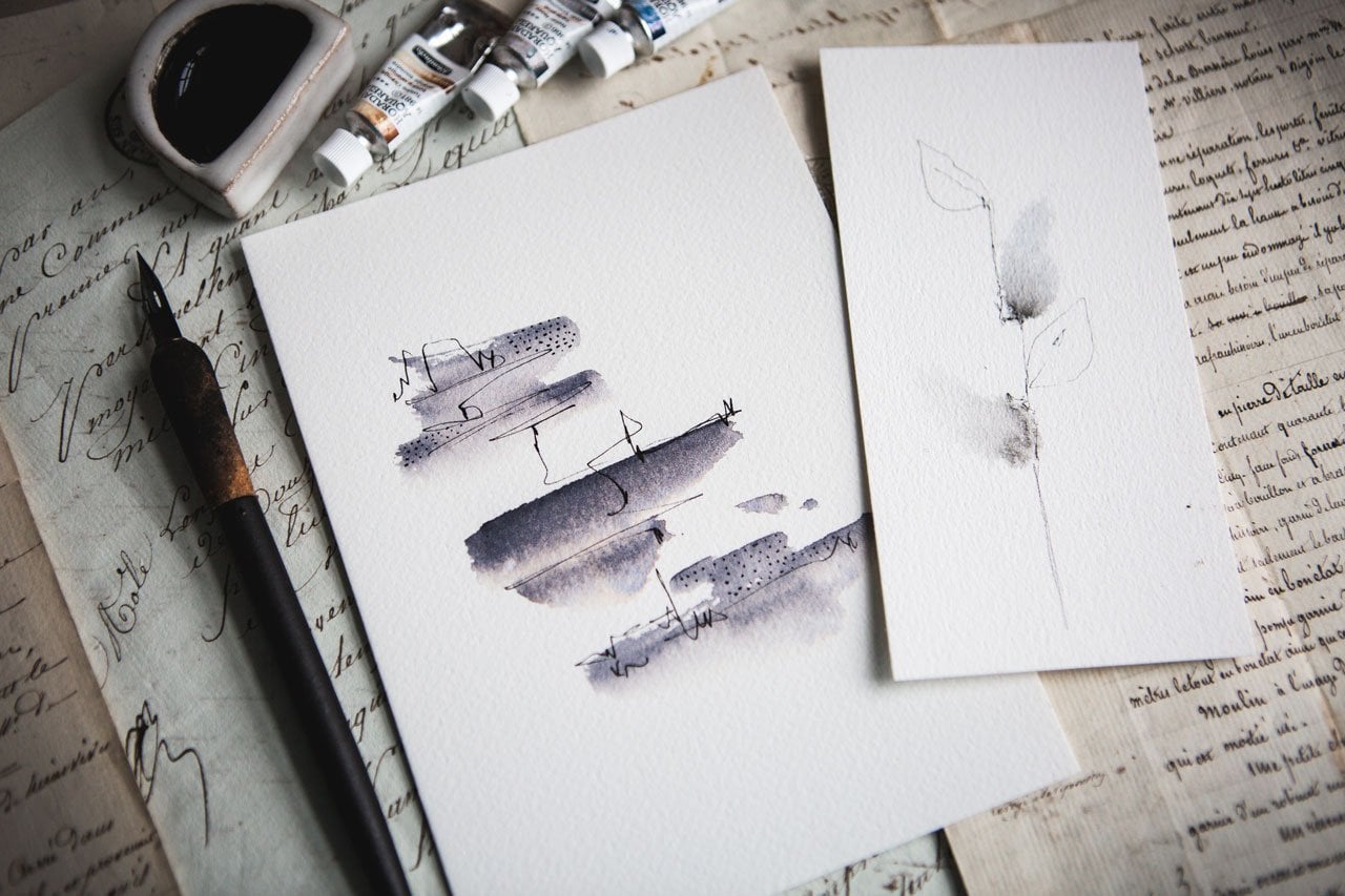
4. Small color studies: [MUSIC] In this first lesson, I thought it would
be really fun if we recreated something like this
simple layout that I did, where we do some
watercolor circles or ovals or whatever shape you
happen to be interested in, and then draw some
botanicals in there. Then I do like
experimenting with this watercolor underlayer with leaves or flowers, or
whatever on top of it. I thought it would be really
fun if we used that as our inspiration for
this first project. I'm just working
in my sketchbook. Those Arteza 8 by 8, 110 pound cold press. Get any watercolor art book
that you want to work in. I think I got this
off of Amazon, but you can get them
at the art store. What I want to do is
experiment with some colors. I like how there's
not one color here, they graduate into other colors, and so I'm going to
show you how I did that because they
really are very pretty. Then you might be
thinking, well, what can I do with this once
I learned how to do that? Well, you could do
a round piece of art or you could also do like custom card that you want to send to somebody
that'd be really pretty as the front as a custom
piece that you're doing. What I'm going to do
first is I've got my tub of water here
and my watercolors, my two palettes that I love. [NOISE] Then I think
I'm going to draw a leafy pattern similar
to this one here on this side and then circles
of watercolor on this side. Then we'll need to set
this to the side to dry, so that's what we're
going to be doing. I'm going to set that
up a little bit so I can put this right here
where we can see it. I am working with a
medium sized brush to do this leaf side, and I've got some
watercolor paper that I use as a scrap just to test color and to see how much color got coming
out versus how much I want. I'm just going to be drawing some very simple leaf
shapes and you might think, it doesn't look good as
you're painting it on, but I guarantee you when
you add the ink to it, you're going to love
it. Because I would not say that I'm a
perfect illustrator. I've drawn for a very long
time from high school on up, but I wouldn't say that
illustration is my strong point. Let's just draw a wavy
line there for a stem but I still think it's fun to experiment and play
in my watercolors. I still try it even though wouldn't say I'm perfect at it. It's just fun and it's easy, and once you do the ink
drawing on top of it, I guarantee you'll see how much
nicer these start to look. I'm just drawing a little stem and then coloring the leaf in. Just use these like
occurring on basically. The color is going
to end up going wherever it is that you
put the water down, so you can basically draw with the watercolor brush and
it'll stay where you put it. I do move my book around
as I'm going because I find it hard to draw
this leaf shape if I don't move the book
around with me. [LAUGHTER] I move it around so I can get
pretty leaf shapes. I'm not worried if some are
darker and some are lighter. If you're more advanced
and you want to do really detailed leaves, go for it, we're just going to draw on top of that with ink. I'm just trying to lay down pretty color
to draw on top of. Because in my inspiration piece, you can see I was real heavy with paint and then
real light and I was experimenting with
how the drawing looked on top of the real
heavy to the real light. [LAUGHTER] You could do
something like that too. Start off with lots of
pigment and go down just a little pigment
and then see how does that look on top of each
gradiation of that color. Then you can get to the
point where you're like, now I know what I like to
do with this technique. The more you practice and draw things like
this with a brush, the better you get
at it, so just play. First one might not
be your favorite, but after you draw on
top of them with ink, some of them I have rarely enough turned in
to be my favorite. When I thought my hand does not so steady and I
don't love it, or I used the wrong pen and if I drew on top of it
with the micron pen, it became my favorite. Like this one, my hand
wasn't so steady, but in the end is
one of my favorite. It's just funny how
that works out. Don't get discouraged with the
initial lay-down of color. I just want you to use this as your first go experiment and then we'll see what
we get from there. I'm going to stop
probably right there. Well, let me put one
more out here, it's odd. Then we're going to let
that side dry for a minute. There we go. Let's
leave that at that. Then on this side, I'm just using these
big bulldog looking clips to hold my pages down, if you're wondering what
those big clips are. On the next one,
I think I'm going to use the bigger brush, so this is the Number 12. I'm going to start doing
some circles of color and then I'm going to tap in a different color and we'll just see what we end up liking. I'm going to start off probably with this one
which is yellow ocher. You can see it's one
of my favorite color, I've used it a ton. Little bit of water in there. You can use your
scrap piece of paper to see how much
pigment you've got. I'm just going to draw a
circle and then I might come back and dot in some extra
color if it's real light. Then I'm going to
pick a second color and that's a Daniel Smith color. Second color is
this venetian red, which is another one
of my favorite colors. I'm going to dot
that in here too while this is wet and let it do its little spread thing and spread out and see
what we end up with. Then I think I'll do a venetian
red whole circle there. Let's just go ahead and
draw another circle. You can work those around if you don't like where it sits. Then let's see what color that we want to
mix in with that. I've got this color here, which is quinacridone
burnt orange. Let's just see what that does if we tap in some of that color. Because I want these
to be two tone, the two toned ones on our
samples there are my favorite. If you want to do three tones, you don't have to stop at two, you could say, well, I
think I want a third color. Let's see this is a
sennelier color 623. I'm not sure what that
is, I'd have to get out the sennelier box, but it's sennelier 623. Let's just tap that on there. These different taps of
color are how I ended up with the pretty
colored gradients that we have going
in these circles, so I want you to
experiment with those. You can see what is it that you think
you're going to like. Let's do the third one. This is green gold, which is a color
that I want to love and sometimes I'll put it down and I don't love it at all, [LAUGHTER] but that's not to say that we can't put
other things on top. This is burnt sienna. I shouldn't have
picked that color. [LAUGHTER] It's all about
playing and experimenting. This is terre verte. Again, these are
Daniel Smith colors. I'm not saying you're going to love every
color that you create. What's nice with the wet on wet is we're mixing colors on top. I could turn this into
a different color by putting these on top and then it turn out
being a different color. Let's just go ahead
and get rid of all that yellowy underneath, but then I might come
back and put some more on top and let it blend in with that pretty blue
that we just added. Well it's a blue-green
that terre verte, which verte is green. Then let's see, what do we
want to add to the green? I do think that looks pretty. I might like the
ocher in the green, so let's just go ahead
and see if we like that. Might want more water in there to really let those
start to blend. Then let's look at
these over here. I already told you what
these two here were, but let me just grab
my little tub here. I love this chromium oxide
green and this cobalt green. I'm going to go ahead
and play in that color. See, it's a real
pretty aqua color, which is my favorite color. All over my house, I love mixing blue and green. Let's mix blue and green there. Then this other
color that I really love is this pretty
grayish color here. I'll tell you what that is. It's this light gray. All three of these
are sennelier shades. Let me just grab that paintbrush and we'll
start off with the light gray. I might put in, because I
thought that color was really pretty mixed in over
on our samples, so I might mix that in with this Daniel Smith venetian red. That's a lot. Let
that spread around. Once your watercolors
get wetter and wetter, you pick up more pigment. Let's go ahead and let
those do their thing. I'm going to have to
let it completely dry before I put ink on it. We can almost come
back to this one. We might as well put our little watercolors out of the way so that we can draw. I will be right back
when these are dry. This side's completely dry. We're going to let this side
do its thing for a bit. You could use a heat
gun to dry these, but I really like it when
some of this real thick, wet part does its own thing
and takes a bit to dry. Sometimes I'll move
the page around and make those
pigments move again. What I'm going to do is work on this side while it is dry. I'm using on this one, the micron O5, that's my
favorite size to work on. I'm moving my watercolors out
of the way so I don't paint on top of things I
didn't intend to by sticking my hand in them. [LAUGHTER] All I'm going to do, and this is how I've
done all these others, is I'm just going to
draw right on top and follow the shape that
I've already made. Then I'm going to put in some little leaf veins just by drawing some straight
lines in there. I can do one side, I can do both sides. Another thing that
I think is real fun is if you have a
drawing and maybe the ink part is slightly to
the side of your drawing. Let's take a look at one
of those real quick. Here's another leaf
that I have done almost identically to the first one
just to give us an idea. What I like about the
second technique, we need to draw it right on the leaves just
like we have here, or we could draw everything
slightly to the side of the leaf and let that color
part look like a shadow. Like that. Two different
options there. I'm going to go ahead
and draw on the one. Then I will come back and
finish that second one just to give you two different ideas of what you might be doing here. I'm going to zoom in a bit. I think I'm going to go
ahead and draw my stem. I want the stem just to have
several layers in there. Your preference when
you're drawing, but I do like it when it's
got the more than one layer on this because I
made a real fat stem. Then you can be as neat or
messy, or fast or slow. However it is that your drawing style is
this is the time to play, experiment with
different leaves, and different marks, and different lines,
and just practice. The more you do, and the more things that you experiment with, the better these get. You might even get
some leaves out of your yard to create a real
leaf shape and look at the veining in it and try
to create a real leaf rather than just one
that we thought up. Different ideas for you there. This other side's still
a little bit damp. I'm trying to make sure
I don't put my arm in it but didn't get on me
so I think we're good. [LAUGHTER] Really, the
lesson I get off of this personally
is I can see that my underwater color shape
doesn't have to be perfect. It doesn't have to
all be the same color to work when I draw
something on top of it because then it turns
what just really looks like an
unattractive blob of paint into a beautiful
colored illustration for me. I like that. It looks like you didn't paint in the lines look. It's what that is. It's almost as if you had
the leaf drawing there and then you didn't
paint inside the lines. I like that look. That's why I like doing
pretty stuff like this. I like the color variances
and the gradient differences. If you don't get much control over your
watercolor as you would like, this is a great way to practice and get more control over your color
because I guarantee, the more times you try
to draw a leaf in green, you'll get and figure out how you got one that was so
dark versus so light. You'll get a lot easier time there controlling
your watercolor. Look how pretty that is. Let's take the second one and draw everything
to the side of this. I'm not going to be
really exact here. I'm trying to get
my stems going. I'm going to draw everything
slightly to the right. Let that color just
seem like it's an echo or a shadow
coming off of that. Doesn't have to be perfect. That's why I like starting
in sketchbooks so I can experiment and figure
out what works for me. What colors do I like? What pins do I
like to draw with? That experiment
where I did it on different boxes with different
pins of color earlier in my sketchbook really narrowed
down why I like using this versus why I don't like using some of the other options. Again, even on this side, I'm staying slightly
to the right of whatever color I put down. I'm being consistent
on both sides. You can see my drawings
aren't perfect. I don't do a lot of drawing as compared to painting and
things in Photoshop. I don't have the best
handwriting and I don't have the steadiest hand when
it comes to drawing because I don't play
and practice enough. The more you do this, the better they get. Just to show you, you don't have to be perfect and you don't have to be like some perfect
illustrator or drawer, have lots of art skills to be
playing and practicing with this technique. Because then when you get the
whole thing done, you're looking at
the whole picture, not one specific element. That's really fun. Everything is slightly to
the side and more like an echo versus
everything right on top. I want you to experiment on
this technique with both of those and just see how it changes your drawing because
it looks a little different. Practice with your
watercolor skills. Less pigment, more pigment, get consistent with how
much pigment you can lay down within a whole
watercolor piece. I think you'll get a lot
out of this exercise. We're going to go from this
to our little circles. Let me see if
they're dry. [MUSIC]
5. Adding ink botanicals to studies: [MUSIC] This side is
dry now we're ready to draw on that and I'm going to basically recreate some
of the leaf things that I created on here
to show you how I created those and they're
fun to start with. But after you do that, then I want you to come
up with a whole thing of circles of different things
that you came up with. This 20 Ways to
Draw Tulip book is a great book to look at for
different illustration ideas. You could also look at Pinterest and I like
Instagram a lot. I follow a lot of art
accounts on Instagram. You can definitely follow some things to come up
with some other ideas. You could look out in nature and see what's growing outside. If you've got some IV outside, maybe you want an
IV line in here. Just experiment with that. This first one, I
started with a gold pin, and this is how I
knew that maybe the gold pin wasn't
going to be my favorite because
the tip is so big, but I really love it as an underneath layer
or an accent layer. I'm just going to draw a stem similar to what we just did and I'm going to draw
some leaves out here. I'm going to go ahead
and draw my lines and my leaves just like that and I'm going to go ahead and do that
for the whole thing. Let me zoom in so that
you can see what we're drawing and move the book around if you need to so that you can get a really nice shape. You see how big and
heavy this pin is compared to the
little micron pin, which is what I'm
going to be using to draw on top of this. I want this to be the
underpainting or the underlayer, like we did on our
leaf over here. I like this because it's an easy technique and you
could do a lot with these. You could make these
little greetings. You could, on the front of a card that you're
sending somebody, this would make really
cool custom card. Illustration, just a circle, pretty leaf, Happy Birthday. [LAUGHTER] However
you want to do that. Congratulations, thank you. Whatever you want to say under that would be really beautiful. There we go. I'm going
to start with that. I also like dots. I think on the
underside of the leaf, I'm going to have
some gold dots. I just think dots are pretty. I like doing dots
in my mixed media, in my painting, all that stuff
because they're whimsical. I think they're pretty, just an element that
I particularly like. When you start figuring
out what your style is, that's basically figuring out elements that you
love and don't love. I love dots. I'm going to put those in. Then on top of this, I'm going to do the very
same thing we just did with that and I'm going to draw
right on top of this. Then you'll see there are
little gold elements now become our background
shadow element. I'm just going to follow exactly what I created
underneath or close. It's just the gold will be
shiny up underneath it. Look how pretty that
is turning out. Let's go ahead and
do this one here. Don't be afraid to
turn your drawing to the whichever
direction you need to go to get a steady hand. Wow, look how pretty
that is, so pretty. I'm in love with
that one. Let's go ahead and move on
to the next one. The next one, I'm
just going to do a leaf pattern without
the undercoat on it. Let's just go ahead and draw our inspiration leaf here. Again, I'm just redrawing the ones that
I had already thought of when I was playing with this technique for just myself. A lot of times when I think of things I want to do for a class, it's usually something I've been playing in and then I'm like, oh, I love this so much. Let's record that. [LAUGHTER] When I did
art classes years ago, most of those have been retired, but I would start the class
off not really knowing even where I was going and I pick
out supplies and I'd say, okay, here's our supplies
and here's what I'm hoping to create and hopefully when we're
done, I've created that. Whereas now most
people should be, if you're doing
something like this, creating your samples
and deciding what techniques that are going
to work for you and saying, okay, I've got something I love. [LAUGHTER] I guess, experience and wisdom
comes with age. [LAUGHTER] Because now
I'm getting old so I can see the errors
of my youthful ways. [LAUGHTER] This one, I
want a different leaf. Then I'm just drawing a long
leaf and align up the leaf, but I'm not doing the veining like I did in this other one. We might color one end to
be a little darker if we wanted and you could shade the undersides of
these if you want to pretend that they
are leaves that you're seeing the underside of. We'll draw a little stem, maybe some little
ones over here, with a darker leaf. Over here, maybe some little elongated pieces
with a darker leaf. Didn't have to be
perfectly colored in. I just want to imply
what I'm creating. Let's do another one out here. Not pretty. Pretty,
I like that one. Let's come down here and let's just make some really
long pointy leaves. If you asked me why these
plants are then I'm imagining, I don't know. [LAUGHTER] Who knows that
this is even a real leaf? But that's what I'm saying, if you go outside, and maybe collect
some leaves you could actually draw from real leaves, I'm drawing from whatever my imagination wants
to create here. [LAUGHTER] On this next one, I played with the silver and so I'm still taking
my inspiration and I had great big round
leaves which I then came in and made some
other little marks there. We're going to do that here. I just did the leaf
and I just came back around just to get extra
little detail in there. That really reminds me of some flowers I've seen on
the Japanese lantern plants, I'm going to say
that's my inspiration. [LAUGHTER] Then we're
going to come back on top of that and give
it a lot more definition. That way that silver is
just the underlining. If your lines have a
little bit of shake to it, I think that adds to our look
on this particular plant, then I'm imagining that
little bit of shake is pretty and adds
to our design. There we go. I love that one. On this last one, I want to do a little
tiny leaves, vine, so let's just get a fun shape going and just a nice
little leaf there, maybe we have another
little leaf coming off of that and I'm just going to do a little vine of
pretty little leaves. See, works better if I
moved the book around, I end up with some weird
directions if I'm not moving all around but I'm trying not to move it
off-camera for you. [LAUGHTER] This is a technique you could definitely
play with this and how many leaves
and what direction you want to go and how you
want that to turn out, you can play with this
little technique. That's really pretty. Then, I thought that it
would be real fun to have some little
white detail in here, so I did use my white posca pen and did a little
paint pen action. I'm basically just drawing five lines to imply
some type of flower. We could also do some little dots out there
to add to the whimsy. I just think it's fun
to imply that this was some type of vine with
a little bitty flower. You can either
maybe put a center dot in that if you wanted to, do something like that, which to me looks a
little bit better even, so maybe a dot and five
lines coming out of it and then maybe a
few dots out there. Then look how pretty
that is, super pretty. Now, let me pull this back. Now you've seen my ideas for different leaf botanicals
and on this other one, the larger leaf that we did with the watercolor
and beside the watercolor. I hope that this inspires
you to create some of these to just get a feel for the drawing of them,
different leaf shapes, different ideas, the mixing of different colors because some of these on this
first example page that I had done are so pretty, I love this gray and
this little bit of that the orangey one. That's so pretty, I moved
paints out of the way so I don't get paint everywhere. But this averting red and that might be the yellow
ocher or the Naples yellow. Because I have a
Naples yellow out here from Sennelier that's
really pretty. I think that's the Naples
yellow and the Venetian red. That's one of my
favorite. This is that gray, and Venetian red, that gray that I had over
there on my custom palette. It's just the snowy,
a light gray. That was really pretty. This was that same two colors
that were up here, but a little differently
and more red. Those are really pretty. Then on the ones
that we did today, I really love that ocher and Venetian red
again, that's my favorite, I seem to be drawn
towards those colors, but I like this a little
bit with the gray outside, I like the blue-green
combinations. It's really fun to experiment and see how your colors mix. I did a wet-on-wet, so I want you to try that, make a big splash of color and then dot
some other color in there and then let them
dry and then just see. What you come up
with and how you like them that's
how you figure out what you like to create and you then start getting into what your style is because
then you start picking out the things that
you particularly love. I hope you enjoyed this
project. This is really fun. I like doing these, and I
will see you back in class. [MUSIC]
6. Larger leaves project: [MUSIC] In this project, we're going to do
another little leaf design or you could do whatever botanical in this technique that
you wanted to do. But I like it because
we're doing a spread of watercolor and
drawing on top of it. Let's go ahead and get
out our watercolors. I've just got this page
held open with a clip. I believe I want
to work in this. Let's see. That's lapis lazuli. Why don't we use that?
It's like an ocher color. What I'm going to do is
just put a spread of color. It doesn't have to be in a line. It doesn't have to
be all circles. But I'm thinking that I want
to do these two colors. My terre verte, the Venetian red
here that I like. For some reason I have
terre verte on the brain. [LAUGHTER] I'm
just going to draw a great big circle right
here in the middle. These can have as much color, as little color as you want. You can come back in
and add some color. You can get as fancy
with this as you'd like. Then I want this to dry, so I'm going to dry
this very quickly. [NOISE] I right something really dumb while I was drawing, and I swiped my hand across
it to see if it was dry. I created these little streaks. But then I decided I
like the little streaks. I'm going to leave them
instead of redoing it. [LAUGHTER] Then after we get
our watercolor in there, now we can go ahead and draw. I'm going to draw using
the micron pen again. I might do an accent in gold because I thought
it looked pretty on my original sample there. Then I'm going to do a
little bit different. It's going to be a leaf,
but maybe we can go up this way and then have a piece
that comes up that way. Just experimenting
and thinking outside. I might actually get this
leaf to go off page. Let me zoom in a bit better. Maybe I'll move a watercolor paints out of the way so that we don't spread watercolor
on everything. [NOISE] Then I'm just going to go through and make
some nice big fat leaves. I think for this one
I'll go ahead and do each side right here
at the beginning. There we go, that's
pretty. Now I have my initial drawing and I can go back in and decide
what I want to do here. My initial drawing
I actually just did lines on one side of the leaf, which I messed up
a little bit here on the top one because I've put lines on two sides of the leaf. Pushes go ahead.
There's no real reason why I just thought,
let's experiment. Then, I'm going to come back and add some decoration
here with my gold pen. I'm just going to
follow the one side, maybe do some dots. You don't have to do
that. I just think it's pretty so I'm going to
go ahead and do it. I think it'd be fun if you
just experiment with some of your techniques and
maybe some of your pins, and see what can you do
to add some interest. What's the next
layer I can add to this rather than just
stop at the ink? What else can I do? If we're just doing
drawings like this where we want to emphasize
everything with pins, we could come back with
different colored pins. I'm choosing gold because
that's what I like. There we go. That's pretty. We could come down one side
of the stem if we wanted, but I really think that's
pretty like it is, so I'm going to go for that.
I'm going to try that. I want you to try a couple of different areas of
color. Wet on wet. Let them merge a little bit, let that dry and then draw a botanical,
a flower, a leaf, anything that inspires
you on top of that, and you can be as decorative
or as plain as you want. These are just real fun. I like the way the colors
behind it react to things. Flowers would be real
pretty in there. Just play and see what
you can come up with. I'll see you back
in class. [MUSIC]
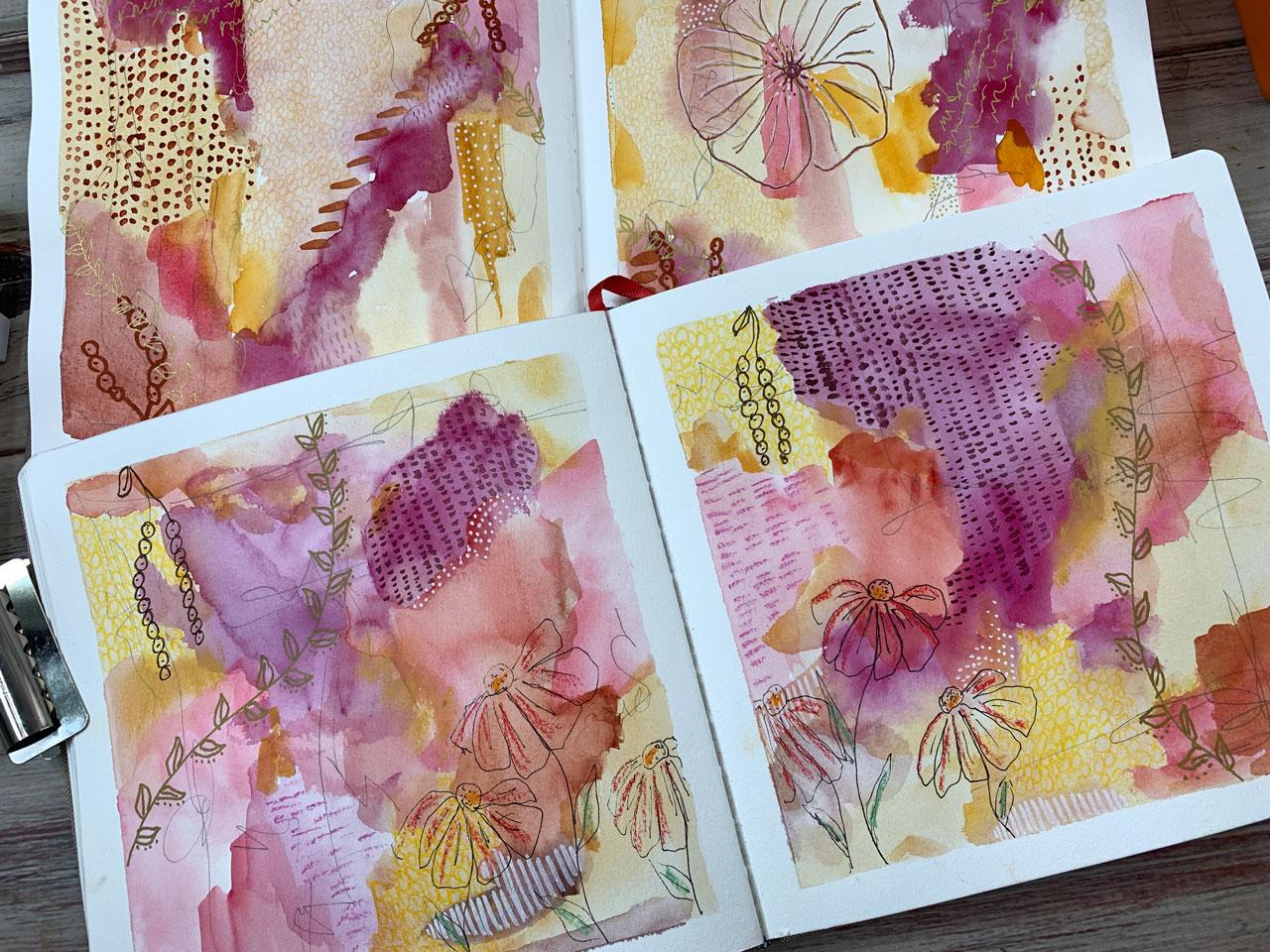
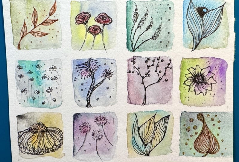
7. Watercolor blocks: [MUSIC] For this next project, I really want to experiment
with you with some squares. On this one, I did squares
of different botanicals on different background color plays that I was doing with
different colors. I did those and then I did these where I was doing different
botanicals on the background, then coloring them
in and this was drawing the botanical on top
of a colored background. These two are colored in. I want to play with some squares and some
ideas here with you. This is where
you're really going to get some good use
out of a book like this because this is where I
did kind of come up with some different ideas
for cone flowers, which I did cone flowers and
all four of these squares. I want you to try that one
page of the same flower, but how many different ways
can you draw that flower? So each of these is a different cone flower
illustration idea that I got out of that book and if you don't want to
get the book and you want to look on Pinterest to look up flower illustrations, cone flower
illustrations, and just see like how many
ideas are out there. On this side, I
just did ideas for different flowers to see what I can fill up
my squares with. Then when I got back here to
these other illustrations, this again was a cone
flower and I'm like, what can I do with
maybe some stripes in different cone flowers, and then the other three are some little variation of rows. Those are real fun.
That's what I want to do today in the squares
with this project is I want to take my inspiration from these experimental
squares that I was doing and do some
botanical squares. Let me get that out of the
way that I'm going to sit it up there for my ideas. Because I do like to look at
ideas and I'm going to work in my other book here and I
have some white artists tape. You can use artist's
tape or you can use painter's tape and I'm going to tape off both sides of this to have different
things to play in. Just like tape. Because when you peel
the tape that makes all your little boxes look like finished pieces of
art and I love that. Peeling tape is my favorite part of the art piece, I believe. [LAUGHTER] Takes the
piece from blah to wow, it elevates it immediately. I mean, it's amazing really. How much difference it is with the tape on it with a tape off versus if you did it
with no tape at all. Amazing the difference you get. This is half-inch
painter's tape. You can use I'm sorry,
half-inch artist's tape. You can use painter's tape. I've got plenty of the
blue painters tape that I like to use, but it's thicker. I wanted this half-inch. This is more like
an inch and I liked the inch for when I'm doing
least loose pieces of paper usually and I liked this
half-inch in my art book because pages are
usually smaller. Now not being real
exact here if you want to be more exact and
measure these off, so all your squares
is the same size. You can certainly do that and I might do a
cone flower spread. I love cone flowers. I love to photograph them. I love to see them out
in the garden and so mine might be cone flowers
and roses perhaps. I'll just show you
how I did some of those in here and basically, we're going to start off
with our watercolors. Let me just get those out
from where I've stashed them and the goal here is to fill
the square with watercolor. I think I'm going to
fill a couple with, like in my book where
I was inspired by those stripes on that
last setback here. I might fill one with something like this
because I loved it. I might leave one or two cleared to do flowers in
it, dark in color. We'll just experiment there and then we'll have
to let them dry. Then we can paint them. I think I'm going to
start off over here. I've got these. This is Daniel Smith's
rare earth green. I'm using the number 10 brush
just to some a little bit larger to really lay
some of this color down. Keep them light, not too dark and maybe I'll
come back in here with chromium green oxide
because I like blue and green and you can just experiment and play
here with your colors. I like the blue a lot. I'm going to do blue down here. Experiment and play. Right now you're laying colors. This is how I
actually came up with colors that I love
and separated out my color pallets into
things that I really, really like was by
doing stuff like this, I'm going to use
this terror Verde. Most of these are
Daniel Smith colors. Look at that a little
bit different. This is how you figure out
what colors that you like. You do stuff like this, where you're playing with
the colors and you're just trying to figure out
what are these colors do. This is the Sennelier, a 659. I'm not sure off the
top of my head what the name of it is, but it's 659. This one might be the rows opera because it's one of my favorite. Look how bright it is. Let's put that in with Daniel
Smith, Ultramarine red. This is exactly where I
experiment with colors and figure out which ones
go together in the end, which ones did I like, which
ones I don't like and why? I think those were
pretty though. Let's come over here to this
smelly light gray I believe. See I like that gray. It's a light bluish-gray almost. Get that in there. I might do this. That's a lot of colorless test out
how much color that is. There we go. Loosen that up on our little spare sheet
of paper over here to just see because these
were very pigmented. That's Sennelier a color
that I love so much. This cobalt green. It's a teal color, I love it. Let's just do another
one over here. See if we can pick up
some of this color off of our watercolor sample. These Sennelier colors though, especially when you're
pulling them out of the tube and they're
still pretty fresh with the colorway we'll
use this green over here. I'll tell you what
that is in a minute. It's that Michael's Grumbacher. It's one of these
Grumbacher Academy colors that I got at Michael's. It's like here we go. Sap green. Look how pretty that is though it's real pretty
color right there. Let's go ahead. What
else do we like? I really like shades of red. This is one of those
academy colors over here. No, it slows me down
to tell you colors, but I hate to be
using colors and not tell you what I'm using
and then you like something. You don't know what I
did. This over here, that one is the rose matter. Sorry, it's the thalo crimson, is this one, and that's
the rose madder. I think I'm going to use those. We'll see how we like
them. Look at that. Get some more water.
I'm going to spread that color around pretty good. I like these when they're
very watercolory looking, less paint looking so
that what we draw on top of it it just adds to
that very watercolory feel. As they dry, you'll like some of the lines and things
you get in there. Let's leave one open for one of our little rose pictures
and let's do one stripe. I think I'm going to use, let's do this green, which is the chromium
green oxide. Way too much color. Let's go ahead and
water that down. I'm just going to do some
little stripes here. Maybe we'll do this blue, which is the rare
earth green color. Those are Daniel Smith shades. Then this one is
that Sennelier 659, which I think is Rose Opera. I just want that very
vivid color over here. I like that. Now we're going to have to let these dry and we
can start drawing on them. These are almost completely dry and these are getting there. Let me get my heat gun
and I'll dry them for us. These are dry, so we are ready. I'm actually going
to do a couple of cone flowers just
to get started. I'm taking my inspiration from our 20 Ways to
Draw a Tulip book. There's a cone
flower page in here. I liked it because there were so many different ways
to draw a cone flower. I picked out this
one and I liked this one and I liked this one. Actually, when I drew it out
though, I didn't love it. A good way to start
was that one. There's the two that I
was pointing out there, but that one I ended
up not liking, so then I made it look like
it's double exposure thing. In the end, it's okay, but I don't know that I love it. But it was a good way
to experiment with all these different
techniques and the different cone flowers
to see what do we like. I did take my inspiration for all these flowers
out of this book. I like to be able to share the book with you, like that, so that you can
test it out and see what you like for yourself
and come up with ideas, or if you don't see anything that you like in
there, you can look around. Basically, what that
was is some lines. You've got some dots up
here on one of those, and then we're
drawing the petals and you can make them as full. This is more like a cone flower
basically on the way out. It's a little more as they're starting to wilt the other way and
they're not full out, which I love flowers
that look like that. Then I came out of
here with a stem, and then I drew another one.
Let's just draw another one. It's basically some lines
coming out here with some just not perfect, not straight, a little
more wilty looking on the petals like
it's the last days. Some few little dots up here for the top and come out
there with our stem. Look how beautiful that is. You can get as decorative
or as plain as you like, but that was that one. I loved it. I'm going to
do another cone flower. We'll just do a cone flower page [LAUGHTER] and I'll show
you the ones that I already did and then I'll
pick one that I haven't done before to fill in
for that last one, but I basically drew a
circle and then come back out here with some
of these petals, some little dots out there, and then draw a little stem. Then we can add some
leaves on here if we want. We've got a leaf there, and then came to the
side and did that again. You can see how really
doing this on top of the watercolor
elevates the drawing. It doesn't have to be perfect, but all of a sudden
it looks like something quite a bit
more amazing because it's on this beautiful
watercolor paper that you've got behind it, and all of a sudden,
instead of just being a plain ink drawing on a white piece of paper,
it's something amazing. It got elevated because of
our yummy little background. A little stem. It's a little leaf. So pretty. Then this would be
perfect if you liked to write things on
there or put a word. You could do a word or
a scripture or a quote. Perfect, right in there. This would be
perfect to practice some of that, which I love. This third one is
basically a bunch of dots in a circly
little mode there, and then some petals
coming off of that. I really like these
non-perfect elongated petals because it seems to be my drawing style,
not perfect petals. I'm sure as I get more into
drawing, I used to draw, we'll do a little
double stem perhaps, because I used to draw
tons and tons and tons. When I was in school, I was in an interior design major
and that was all drawing, but now I've spent 20 years not drawing and look how pretty
that turned out though. My drawing skills are not quite what they were
when I was younger, so I need to practice. [LAUGHTER] Doing stuff like this where I get excited
to then share it with you is my working on my skills that maybe I have
let go a little bit because it gives
me a reason to come up here to my
art room and play. Otherwise, I'd be
thinking, why bother? What am I going to do with this? Doing stuff like
this really gets me excited because I have reasons. Look how pretty that is. I have a reason to come up here. Let's pick one that
I have not done. I'm feeling this one. It's a little more defined
than what I've been doing. Maybe we'll try that with
that little top on it. Let's set that right there. I'm going to start off with
the head top because that seems to be what makes
it easier for me. But I get up here
when have a reason to come up here like doing
classes like this. I just do so much more
work and hang out in my studio so much longer than when I'm trying
to do stuff for fun, which I don't do stuff
for fun very easily. I always have to have some
meaning or purpose behind it and then I feel like I need to be up
there working on it. [LAUGHTER] Other people are better at just getting up there, practicing and doing
things for fun. I do get jealous of
artists that are out there designing for fun, but then I think that
most people end up finding their reason for doing stuff after they
do all this fun stuff. I'll sit up here now and
I will play in the effort to eventually come up with
a class that I want to do. I do allow myself a lot more
play than I ever did before. Now this is a little different. This one actually is
a colored flower. Well, let's do
another one first. We might actually come back and add a little pink color to that because I
picked a blue layer. You could come back and then play with watercolor on top of these if you thought that that
would add to the drawing. I think it's easiest really
if you start off with this middle leaf and then build out from there and do the
leaves that are on top with some little extra detail and then do those
leaves underneath. That really seems to be the
way with this one for me, but just play with that and
see what you end up with. I like those. I like
that first one better. [LAUGHTER] Super fun page of cone flowers. I
want you to do that. Pick a flower and do that one
flower four different ways, whether you find those ways
on Pinterest or some other. Then if you want, let's just take one
of these and maybe we could just splash
some color in here. [MUSIC]
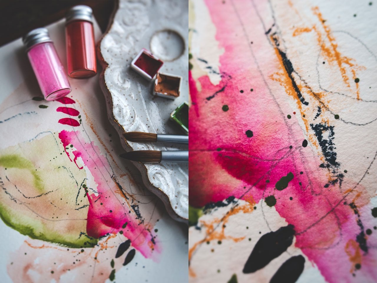
8. Adding botanicals to our blocks: Since we painted that on a, I'm just going to pick
out this pinkish color. It's too wet. But
that'll dry in there. Just know that
your watercolor is going to go wherever
you set it down. It's not going to normally
go outside that line. I'm trying to be real careful. Keep it inside of my leaf here. Drawing with it like a pencil. Then that color shouldn't
be spreading outside the line because the
color on top, I'm sorry, the color that we're
putting this on top of is dry so we shouldn't get
bleeding or anything. I'm using these like
a pencil or a marker. Then we could do this other one, a slightly different color. You'll notice I'm not doing this with a huge amount of water. I think less water helps you get a little more
control here of these. Have to be perfect either
you can just imply color. You could come back in now and dot some
other color in here, like I like orange. We could do a little
bit of orange in here. Do right here, let that blend a little and get
some prettiness in there. That would be pretty oh, yeah, that's real pretty, I like it. I know I'm silly, sorry. Then maybe a little tiny
bit of green on this stem. We could have added some leaves. Oh, I like that. Look at that. Oh my goodness, that's going
to dry and be really pretty. I like it. Let's let
that do its thing. Let's let that dry. We'll put our little cone
flower inspiration over here. On these I want you to be creative and come up
with some new ideas. I really want to do like I did on this
little stripe here. I actually did cone
flowers there. Let me just show
you my inspiration that I had already done. I actually liked
these cone flowers. They're a little
bit the similar. I'm going to go
ahead and maybe do this one again
because I love it. It's fun to after you
do some inspiration, if you need to set that
on your board behind you. Because you know, I
do a lot of things up here on the board
behind me I have a little cheat sheet
of inspiration marks. You can have a cheat sheet of inspiration, illustrations
and flowers. Like you could hang all
these up on the board behind you that you're facing and just use these as future inspiration for
art that you want to do. Let's do this cone flower. It had a little bit bigger
petal and a drop on top. It's almost like a
Black-Eyed Susan rather than a cone flower. Let's call these
blackout Susan's because this is actually what
these look like. Little detail there on
the stem and then we have little stem that comes out. Maybe some little leaf
detail like that. Look how pretty that is. That is reminiscent
of Black-Eyed Susan. We'll call that Black-Eyed
Susan instead of cone flower. Then I think I actually want to
do another one. Let's go ahead and do another
little oval for the head. Come off with some little
petals that are rounded. Come down with the stem and maybe we have a little
bit of leaf action. Yeah, I love that. Then maybe over here I'll do
one that's off to the side, who actually forgot my
little pedal details. I like some little
lines in those petals, little stem, maybe a
little bit leaf out there. Look how pretty that is, and when we peel this tape off, you're going to love
just that little botanical in there and then
how pretty would that be, a little poem or saying
or piece of scripture? Really pretty. I think,
I'm going to go back. I think since I'm over here, let's go ahead and just
do an inspiration piece. I might use this one
and this one for our roses because I
like to these roses. The first one, I actually did like
some little stems. Then I did this
little swirly head, not real even, and made that look a lot like
a rose, rose-ish. Then I just put some little
tiny leaves off to the side, could look like thorns, but I just wanted to be
a little tiny leaves. Then I did several
of these beside it. You don't have to be really
exact and sometimes the more sketchy look in these
look the prettier they are. That's pretty let's just
do another one right here. Look how pretty that is. In this we're going
to paint in a moment. But before I get the paint out, I want to get all of
our little ideas drawn. I really like this idea too, or I had a line, a little bit of rows. Then that could have
had some leaves on it. That's real pretty
and then I just offset those little
flowers on that. Come back with a little
line in there, some leaves. Some of this doesn't
have to be hard at all. It's just getting creative
with what marks and lines and stuff's
working for you. We'll put some little leaves. Look how pretty that
is. Now once we drop some paint on those, they're going to be pretty
so let's stop with that one. In this fourth one, I actually want it
to do something that looked a little
bit like a pansy. We're going to come
back and paint these roses in a minute. Now let's go back to our
first inspiration page and I'll show you what
I'm talking about. These right here look a little
bit like a pansy to me. Oh, I got it open
with the clip there. I actually really liked
this one down here. That was real pretty. But I think I'm going to
do maybe this pansy and maybe some leaves like this, just because that's
what I'm telling today. The paintings, these
are pretty easy. This is actually just a circle and then some lines with
a dot coming out of it, so that's that little
center stamen part. Then we can just come out here with an uneven
leaf like that. Then I had five leaves
go in on all of mine. But you can do four or five and then some petal detail coming out is what I'm
going for on these. Just experiment with
like a pansy look, you don't have to be perfect. You can even pull up some
pictures of pansies and get a good look at what their petals really
do and they overlap. Sometimes there are
different colors and they're doing some different things. I'm being inspired by
real pieces of flower. And then if we're inspired by those funny little
leafy vine things which aren't part
of a pansy, I know. But they're pretty, then we could draw some
of those in there. Just some little
vines with leaves coming out just for
something a little pretty. That's pretty. Let's
leave that there. Now, I like that. We could do one of
the corner if we wanted or some little
leaves in the corner. But I like it, I like
this one over here. I'm going to leave that
one and come back and show you what I did
for these roses. The roses, you just want to pick a variety of
whatever color rose, you're thinking you want to do. If you want to do a red rose, have three or four
colors of red, and then just start
dabbling it in. It's not really exact
and I'm going to use more than one color so that there's some
variation in my flowers. The first time I did these, I was like, I don't know
if follow that or not. This might not be for me. Then the next day I
went back and I'm like, oh, I love these. A lot of times I have to sit with a new idea for a day or two before I decide if
I loved it or not. If you don't love
them on the first go, come back tomorrow and
look at them again. I'm just going to pick a
different color of red. I'm not going to tell you
what all these reds are. Just pick a variety of
reds, is the go-to. They're reds or pinks. I'm doing red- pink. I could tell you what they are. This is rose opera. Oh, yes so that's
659 is Rose opera. That's my favorite.
I love that one. Then this one and that
rose [inaudible]. This is perylene Scarlett,
this Daniel Smith. Then to make it really
fun, I might come back with an orange. This oranges cadmium orange hue, and that's Daniel Smith and I just like all the way
the colors blend. Because I'm doing
wet next to wet, we're not going to end up with just one color on
top of another. They're going to blend in and like another little set
of shades which I love. This is messy kind of painting. This is not the perfect, make a perfect flower kind of painting that I'm doing here. But I liked the messiness and that's why I'm
showing that to you. I like it like that. Then I want the
smallest brush I got. Let's try this one. I've
got the number eight. You can even get a
smaller one if you like. I want to come back
and paint the little leaves a little bit
of a greenish color. I think I'm going
to go with that. This Grumbacher
Academy, which is that level two in the sap
green just on the very tip. I'm going to come back and touch these leaves so that they are slightly green and you can do
that in any color of green, but I'm just doing it
in the sap green today. We can paint the stem
too if we wanted, but I really just want
it to be these leaves. Then there's one more
thing I'm going to do on some of these. Here's a point too where you can then play with
mixed media paint, these draw, these, do
whatever you want. But now I'm going to take my medium brush and then we'll come back in here with
some pretty splatter. You've got to be careful if you don't want everything
splattered, you can hold your hand over it. But I think these are
pretty widths bladder. You could hold paper over it if you don't want
splatter on everything. But I do think these are
pretty with splatter. These might be pretty
with splatter too, but it might not be
this bright pink or orange that I'm splattering, that I would want over there. Oh, look at that.
These are so pretty. Then if you want to come
back on one of these others and do some pretty
splatter we could, like this might be pretty
with some of this green. Then when that dries,
that'll be pretty. Let's dry this and then
we'll pull our tape off. Let's go ahead and
pull our tape and take a look at what we got. This is my favorite part. Even if I'm doing loose pieces
of paper rather than on a sketchbook or an art book
like I'm doing right now. Even if I'm doing loose paper, I always tape it
off because peeling the tape is my favorite part. I love to see how we end up with our finished piece
after we peel this off. See it just elevates
each little squares, so amazing how that works. Look at that, prettiest page of
my sketchbook now. Look how pretty those are. We've got our four
different types of cone flowers and we painted something and then we've got
our four different things. We've painted on some
ended, some splatter. How fun or those, this is the prettiest page. I'm so happy with this. I used to come up and play in my sketchbooks and
everything would be ugly and I'd be mad not leave because I couldn't create
something amazing. These two books,
every time I come up and I come up
with a class idea, then I've got some
things that I'm working on I get excited, and then I end up with
pretty pages like this. I get so excited to work
in my art books again. Super fun. I hope you
enjoyed this practice. I want you to do four
squares and pick a flower to do four different ways to
see what you can get. Then do four squares
where you do something random like roses and paint
them, do some splatter, maybe some multiple
colors and just play with your
different techniques, and try different botanical
up here in this top square. Just see what you
can come up with. Doesn't have to be a cone flower over here if you want
to do four types of roses or four types of marigolds
or four types of tulips. Whatever you happen
to love is what I want you to do your four
different types of, but I want you to
see if you can draw it four different ways, like we've done here
with these cone flowers. Or you can just try the ones that I've done
and I think you'll love playing in this technique. I hope you enjoy this project and I'll see you back in class.
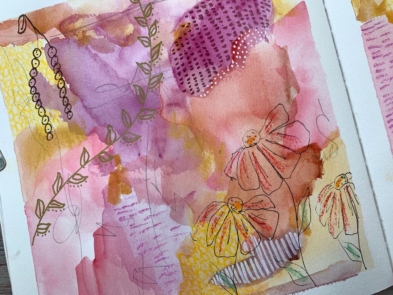
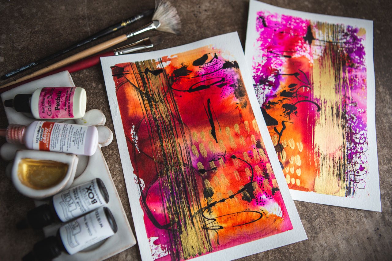
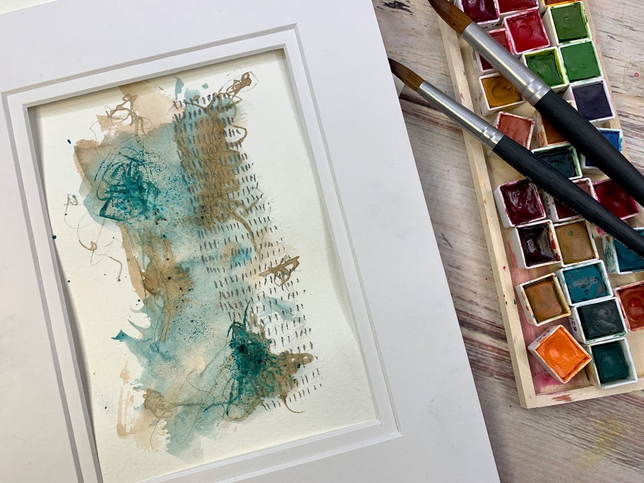
9. Larger watercolor piece: In this project, I want to do something a little
bit larger and play and experiment with
color, mark-making, and some ink and
drawing that we do on top of the watercolor
and the mark-making, and here's where you could
get into other supplies. You could play with pastels, you could play with
colored pencil, you could play with
colored ink pens, you could play with
your micron pen, you could play with
the gold pens. I've got lots of
different things. I also like to play in
my mechanical pencil, so I'll do marks with
a mechanical pencil. This is the time that
we've spent building up to some yummy fun
abstract pieces. Here's one where I did blues and greens and that
green gold color so super fun and I
just experimented and I played with different
materials and mark-making, different pins to
see what I'd like the look of and there's
some color pencil in here. I really like colored
pencil on these, and then I like this
color way here. I'm going to show you how
I've paint some of these and then we'll let it
dry and then we will mark and play on top of it, so lots of fun going on
here in this project. I'm going to set
this to the side. I do like to sometimes
have them sitting up where I can see some other inspiration
that I already did, so if I get stuck,
I have new ideas. I have opened up our pages here. Maybe I'll go ahead and
take a bull frog clip and clip each of these so they
don't move around open on me. Then, I believe that
I'm going to play in some of these
Daniel Smith colors. I really love pink
and orange and ocher. I love those colorways. That seems to be one
that I'm drawn to a lot and I'm going to paint
these just as abstract. I'm not trying to do
anything specific. This is yellow ocher
here and I want to just create different
areas and swaths of color that we can then incorporate later
in different ways with mark-making and
stuff like that. I'm just going to go ahead and randomly paint swaths
of color [LAUGHTER]. I like that word swath. There's no rhyme or reason or exact way to do this so
you just got to play. If you think, I don't love that because there are several
of these I don't love. I've done these before. Let's see, in this book,
if they're in this one. There's lots of colorways in this book that
I did not love. Like, I didn't love
some of these, but I did love this
for little ones, but I loved this one. But I wish the colors
were more defined. So sometimes I did not
like this one at all. I just wish I could tear
this one out of my book. [LAUGHTER] This one I liked
and it's real close to my inspiration piece because
sometimes I will just sit, I think that's all
I did big-wise. Sometimes I will just sit
and paint backgrounds to then come back to later
to draw things on top of. If you're not feeling
like drawing today, but maybe you're
feeling like just putting some color on a page, come and paint a few
backgrounds and then save that top part for another
day when you're feeling it. Because yesterday I came up to my art room and I was
actually going to start filming this class yesterday and I was just not feeling it. I didn't want to sit and draw. I just wanted to
paint some color. Actually, yesterday
just moved paint around and did some
fun abstracts, and then I got up from my table and went and
sat on the porch because it was like 80 degrees and
really pretty [LAUGHTER]. Let's see what that color was. That was Myan red. Let's go ahead and move
this yellow ocher. Move these colors out
as I'm picking them. Then I like this color. This is Sennelier. I don't have the color written
on it, but it's 623. It's an orange color. Anyway, yesterday,
sometimes you just want to come and just move color around. You just don't want
to sit and draw or maybe you're just
not in the mood to put all the effort in and you just want to sit and
not think about it. I don't know that I love
this color in here, but now we've got it. [LAUGHTER] This is why
you experiment with your colors in
something like this. This is Purlin Scarlett. When you get to big
important pieces, you already know if you liked what a color did or didn't do. I want this purply color. Let's see if this
is a purply color. I'll tell you right
now, I don't remember what color this even is. We'll look at that.
That's not purply at all, but it is Breyer. I really want more
of a burgundy. Maybe this is the burgundy. No, that's more purple. I don't know what's more brown. If I don't love the way
these colors turnout, I might go to that other layout
and start drawing on it, but this is how I create those. [LAUGHTER] Always
have myself a little, if I don't like this, I have a different
background I can work on like I'm telling
myself, you know, as I'm even working, if I don't end up loving what I did, you don't have to stick with it. This is that Michael's
color, this one here. Let's just see what that is. I want it to be splotchy
colors because in this one, the spot genus is what
in the end made me love it when I added all
the extra marks on top. Even if you doubt
what you're getting, that color I just used
was this rose matter. If you really love what
you do in the end, you might do a little color
book or color swatch. I always talk about in a
lot of my other classes, my color swatch book. If you end up with some
watercolor things that you like, add this set of colors to a color swatch thing
that you can save. I really want a purply
burgundy which I'm not seeing, so I might pull out of my box Daniel Smith and that could be some color I didn't pull out. This is a random box of
Daniel Smith that I got off of eBay for cheap. Let's try this mayan violet. I want some violety
color out there. Well, that's more purple
than I was thinking. But if I put it on one page, I'm probably going to slap it
in here in the other page. Let's try this garnet. We could test these
colors out on a little watercolor
piece of paper here before we put it
on our painting if we really are concerned. That's the color I want. This is more dough. It's a Daniel Smith color. I think that must
be with that color is on that big layout there. Well, maybe not. That still seems more red, but I do like it so we're going to go ahead and
put that on there. [NOISE] I don't know if I love love it though so let's see what
else we got here. I got this rod-like garnet. Let's see what color that is. Nope, not quite what I wanted. It's handy if you have a spare
piece of paper out here. This one is quinacridone pink. That's a fun color. Let me put that over here. I like that enough
to play with it. It's fun if you have a little spare piece of paper where you can test colors out. I like that one too. That's quinacridone
violet, but it's very close to this
color already used. Still not quite
that burgundy shade I'm seeing over there. Here's quinacridone magenta. That's a fun color. [NOISE] This is ending up way more purple and way less yellow. Then I had in my
mind and vision, so even when I use an
inspiration thing, this is Naples
yellow in Sennelier. Even when I have an inspiration thing that I'm going off, sometimes what I end up doing
looks nothing like what my inspiration was,
and I liked that too. If I'm looking at
something an artist has created and I think I want
to create one of those. Even when I go set
out to purposely try to create something I
think I'm going to love, inspired by that artist, I end up with nothing
that looked like what I was initially inspired by. This is a crazy set of colors. Let me dry this. Even though I try, I might be trying to copy
something because I'm like, I love that and
copy it for myself, I end up with nothing
like what I was trying to create initially. I end up with different
stuff. It's just weird. That's how my creativity works. I would be a terrible forager because where I start and where I want to be and where
I start and where I end up are three
different things. [LAUGHTER] Let's dry this off. This is dry enough that
before I put this away, I'm going to take
my watercolor paint and make a few marks in here. Maybe on top of this purple, I want to try something. Maybe I want to try whatever this color
was. It's a burgundy. Let's see what color that is. See if I did dots like a
burgundy dot on top of that. That might be nice. I think
that's what I want to do. I want to do some type of or some water dot on
top of this purple. I don't really want it to be
on top of the other shades, so I'm going to follow
just the purple. It's not really a dot now, it's more of a line, but it's that line I
like to draw in pencil. I really like lines of lines. [LAUGHTER] This is where I like that nice sharp
point of this paintbrush, because I have a couple
of watercolor brushes, these Rafael ones that I had
gotten at it in art show, and they are more
of a rounded tip. They don't come to a nice sharp tip like
this one does and so I've decided that I really like this
sharp tip sometimes, and sometimes I liked
that rounded tip. Just depends on what I'm
painting and you just have to play with these supplies at some point to even
figure that out. Like how are you going
to know that you like the round tip or the
sharp tip unless you tried it and you played
with it and you figured out, yeah, I really did like that.
10. Adding details to our larger piece: So I went ahead and sped up and made these little dots. I finished these dots rather than making you
watch me all these, and then I added those
little dots right there on the same color on
this other side. Because I like it when
if I'm doing this, it's going to be a pair, I want some repeating
elements in my different pieces and I
should do this right here, but I didn't, so we're
going to go with it. I also like a little bit of
color pencil added into that. I'm going to be using
a colored pencil, and this is a set of colored
pencil that I have legit no lying had for
more than 25 years. I used these in college for coloring in
renderings of rooms. I think I'm going to go with
this Prismacolor orange. This is orange. I don't know if the colors are still the same as what they were when this box
was purchased. But I'm sure that you can
still get Prismacolor pencils. I'm just using a box
that I've had forever, which really goes to show. I'm going to do
circles because I like them on my
inspiration piece. I'm going to go ahead and
do that on this piece. I think I'm going to like that. You can see a little
circle detail. You can do it lighter or darker, but I'm going to do it on this
orange because I like it. But it just goes to show some
art supplies never go bad. I have some mechanical
pencils still from my art school days also that I can still use.
They don't wear out. They're not like
oil paints where they dry up in the tube and then you can't get the top
off and use them again. There are some things that maybe you're going to buy
once in a lifetime and a really nice set of
pencils is one of them, apparently because when I sit at my art studio more than
a couple of years ago, I pulled those back out
of my school supplies, things that I had saved that I just had stored in the closet. I'm like, okay, time for these art
supplies to be added to all the others. They sit on my table and
I still use them and they do brilliant color on things. Let's go up here and
do this. I love that. I do recommend a really
good quality set of colored pencil, not the $2 set that you
might buy at Walmart, but a nice grade
of colored pencil, they are going to have more
pigment in them just like any other art supply
that you purchased and they're going to
last you forever. This pack of 72, I
always found had plenty of choices for anything that
I needed to do with those. I still find that it
has plenty of choices, so I don't feel
the need to go buy any more colored pencil
sets than the one I had which is funny because with oil paints and watercolors and
acrylic paints, I feel the need to
have every color in practically every brand. Even though I only
like a handful of the colors after I get them. Maybe because there's
already 72 colors there, there's enough to
fill my color need. I have not. I know it. Just embrace it. I'm telling you I have
a weird obsession with art supplies. Even before I could do
anything with them, I just wanted all of them. Art runs in my family. My mother did stained glass. My aunt, one of my
mother's sisters is a painter and she does
the most amazing, mostly folk art painting. But if you hand her anything
that you would want painted, she can paint it. She's got some amazing
more serious landscape with horses and it typed gigantic pieces that she's
given to her children. I mean, she's got such talent in the painting
department that I've always been super jealous of all her skills and I
want to be a painter. Painter doesn't seem to be
the thing that was my thing and I'm getting old now and even after all the
trying and practicing, it still isn't my thing compared
to the way she does it. Photography is
definitely my thing and that's the business that I run for my regular day job. The tool allow studio is
photography business, and that really does seem to be my thing because I made a
whole business out of it. I'm 10 years in at
the point that I'm filming this and
I still love it. This doing art things is a nice way to get a break from
the photography stuff and do different creative stuff and fill my creative well
with different things. I like that. Also
like my paint pens, let's get the white paint pen and maybe do something
with some paint pen. I'll fill in the creative in-between the photography
creative things with some projects like this now and while I do love
to paint things I create, I think my aunt
does much better. Maybe we'll do some stripes. My other aunt did amazing
things with yarn and did amazing things with cooking. I don't know, they all seem to have different talents
and the photography, I feel like it runs
in my family way, way, way back because my great, great grandparents
were photographers back in the very early, late 1800s and early 1900s. They were on the
forefront of that and had their own little
studio and dark room. We have a more photos in that time of them
out taking pictures, let's do some dots,
and being silly and just getting things that we wouldn't have
had any other way. I feel like that's where my photography talent
or desire comes from. I feel like I can
trace it back to them. Let's add some dots over here. But I really feel
like I want to try every creative art out
there and master them all. While I don't really
master all of them, I have at least given
them all a chance. I can knit, I can
sew, I can draw. A little out of practice with the drawing, but I can draw. I do the photography. There's years that I was into jewelry making and
blacksmithing, so I can do a lot of that. I have all the
jewelry tools and at some point I wanted
to have a kiln and do the silver clay
and stuff like that. But I can only have one
expensive hobby at a time. For years and years
that was photography, and so now it's photography
and art supplies. But I feel like I really don't want to jump
back into the jewelry. I'll go broke. At this point maybe
we want to add some botanicals and then see what else we
might want to do. I really like the gold or the silver with the botanicals
drawn on top of it. So what I could do is
maybe a line of leaves. I really like our cone flowers. Let's go back to our
cone flower inspiration. Actually, let's not do the gold. Let's just go back to the cone flower inspiration and I'm going to draw some of
our cone flowers. Well, this is actually more of the Black-Eyed
Susan inspiration. Let's go back to the
Black-Eyed Susans. Sorry. Do that in this corner. Now you'll see too, when we were doing stuff at the corner and getting ideas, where that inspiration
was coming from. It was coming from something
like this where we can then add fine details in
different parts. Maybe we'll put some
little leaves in here. Doesn't really matter if
that's the leaf that's on it. We're just going to
get those on there. But this is the time
to now draw from all the fun little square
inspiration pieces that we did and get some
botanicals go in here. Because you've already done
some of those for practice, I feel like it'll be
easier when you get to this piece to pull from that
work you've already put in. Let's pull one of these over
here, going off the side. There's a little bit of
a method there for how we were progressing
with the lessons here. In this art class, I want you to pull from some of those lessons for
your inspiration when we get to this point. That's really
pretty, I like that. I like it so much that we
could do some more over here as a mirror of that. Let's do that. My grandmother, she was a sewer, so she sewed all the
clothes for the family. My mother was in
high school before she had any
store-bought clothes. She liked to tell me that. My mom unfortunately
did not pick up that talent so I had a little 1970s Buster Brown stuff going. I love this. I'm getting really
excited here about this now with our botanicals in here. It does seem to be a lot of creative people in my family and I just love that. My aunt that paints
has had a frame shop, she posted on her
Facebook page recently that she's been in
business 35 years. I thought that was
pretty awesome. I thought, man, at this point, I don't know when you'll
be watching this class, but when I'm filming this class, I'm in my 10th year business, and I definitely hope that I can think up enough
ideas and keep coming up with yummy things
to do so that at 35 years, I too could be like, I've
been in business 35 years. That would be way cool. I'm loving those. This is a project too
that you don't have to do everything all at once. I'm going to draw with my mechanical pencil
while I'm talking. If you do a bunch of
stuff and then you think, I don't know if it's done, but I'm not feeling
working on this right now. I don't know what else to do. I do love extra
marks at the pencil. I like holding the
pencil farther out so these lines are a lot less manufactured or
even more organic. If you get stuck and you think, I don't know where to go or what to do or I don't
want to mess it up, I feel like I'm at a point where I'm just going to have to
wait it out a little bit, that's what working in
your art book is for. You can come back to
these layouts over and over again as you get new ideas and you want
to try new things, come back to it later. You don't have to
do everything now. I'm going to pull
out some pastels. Even though that probably wasn't in our supply list,
at this point, I want you to feel
free to pull out any other supplies that you
have and play with them. But I like these
hard pastels because they draw nice lines and they give me other color options. If you wanted to, you could color in your flowers like we
did when we were painting. We could paint in our flowers. We could just come back
with some more mark-making. We could draw with
some of the pastels. I just like all the colors
that are available in this Charvin set and these
are the harder pastels which I like because they're different than the soft pastels for drawing and getting
color on your piece. I do have soft pastels
too that I love. See now, this is a
point where we could come in and be making lines and marks and just doing some
other stuff in a texture and a color that is different than a color pencil and it's
different than the paint. You can tell there
is a difference in what we add when we get
into like a chalk pastel. I don't want both layouts
to be exactly the same, but I do want them to
have a cohesive feel with the same colors and same
type of marks like that. I like it. We could
take this and we could actually use it to delineate
our drawings a little bit. Maybe we could add a little
color edge to our petals. Even though these are inspired
by black-eyed Susans, which are yellow, we are going to be inspired by whatever
color we pick up. If you pick up a different
color than your flower would actually come in,
don't worry about it. This is a little
more of an abstract, it's up to interpretation, you're just going for some fun. Let's do a little top here
in orange. I like it. Who cares if it's not dead or on what
it might normally be. This is my interpretation. Look how fun that is. Super fun, just
another little layer of whatever inspired
you in the moment. We could do some blocks
of color if I want some more yellow in here because
I didn't have enough. Put the color on that and
spread it around and we get a totally different look
on top of the paint. I've got some pretty
gold leaves that I've drawn on my inspiration
piece and that would be fun. Maybe I'll come right through here and draw different spots, I'm not trying to do the exact
same thing on both pieces, but I do want to have it match
and be a companion piece. A lot of times when
I'm playing and experimenting and trying
out different supplies, some of my very favorite
pieces end up being the piece in my art book. Usually I don't paint on both sides of the page
like I'm doing with this so that if I want
to tear that page out and frame it or sell it or use it
for something else, I can and I'm not afraid
that there's something on the back that's just this fabulous that I
might be giving up. Now we could actually
get really detailed, maybe I add a few dots on
one side, I like dots. I think I was in the
middle of a thought, but now I forgot what it was. I like that. Then we'll just
come do that over here. If you're afraid
that you're going to make pieces that
you're going to love more on your sketchbook
than the pieces that you tried to recreate
outside your sketchbook, if you do stuff on one side, then you know you can tear
them out and use them. Because I like to
get stuff framed. I don't have as many bills now that I'm older
and I've paid stuff off and so now I take stuff to the custom framer and
hang art in my house. Stuff that's my own art and
stuff that's other pieces, especially here in my art room, I have quite a few
things that I've had framed that I love and I'm going to love them
for the next 50 years or however much longer
I get to be here. Some of that stuff's
worth framing up. Look at that. That's pretty. I've got two and I might do that in a different
something, let's see. This is a calligraphy pen, but I do like its little tip and we could do some
drawing with it. We could do, let's see. I've got this, I think
it's a Holly Hawk is what it's supposed to
be and it's too fat. But I'm inspired by that little line with some circles and a dot in
the middle of the circle, so I think I'm going
to do those out here, even though it's upside down
technically, for the flower. I don't even care. I'm
inspired by that Hollyhock. This is a piece that was inspired out of our
20 ways to draw. Where's my book at? The book I've used all through class that I was inspired by. This is 20 Ways to Draw a Tulip. It was one of the patterns
inspired out of that book, I believe, on the
Hollyhock page. See there, I like
that. That's pretty. I could even come over here now and do that somewhere
over here if I wanted. Like right here anyway. You could spin this
whole piece right here, just being inspired off
different illustrations of different flowers and fill your whole piece with different botanical and leaves and dots and things
like I've done here. Look how pretty all that is. I don't know that I'm at a
finishing place for this, but I am at a place where
I'm wondering like, what should I do next? What do I want to be
the next feature? This is a point where I might sit and live with
this for a while and come back to this
page in my art book later when I think of
new ideas and I think, oh, I would love
this on this page. You can continue working on
these for quite a while. Before I wrap it up though, I do want to go ahead and peel the tape so you can get the
feel of the peeled tape. Because I do feel
and at least at a stopping point, I do love it. I like all the things that
we've drawn in there. I might come back later
and add some other stuff. But I think I might
peel our tape off. Let me move my paint out of the way in case it's still wet.
11. Adding botanicals and other marks: Let me see where I
started. Here we go. At least give you an idea of what it looks
like, semi-finished. We'll call it semi-finished because I reserve
the right to later. Maybe come back and add to this. If you'll pull your tape off at an angle away from your drawing, like at an angle this way, I find that it's less likely
to rip or tear my paper, so I do very carefully. I know I'm going a
little faster here. I normally go very slow
and pull it at an angle, and then you're less likely
to do any paper tears. If you're using anything
on here like pastels, like I use those pastels, you're going to want to do
either a finishing spray. Or put a piece of wax paper in-between
here because when you shut this
book up on itself, like you close it, the pastel is going to
bleed on each side. To prevent some of that, I will take these out and
spray fixative spray on it. I'm using the Sennelier
Fixative for soft pastels. I will spray a couple
of coats on these pages outside so that I'm less likely to have them
bleed on each other. Then I have a big box
that I got at Sam's of heavyweight dry wax paper, which is basically a deli paper. Then I will cut
this down and then store this inside my book, but cut to the right size, and then when I
come to that page, each of these hasn't
bled on each other, if I've used pastels. Just a thought there. If you use anything, pen pastel, soft
pastel, hard pastel, anything that charcoal, anything
that would still smear, that's what you can do
to not have that smear. But look how pretty
that page turned out. I'm actually pleased. Now that I'm to this point, I like all the color swatch, the color splotches
that we have. I like the red inspired, Black Eyed Susan botanicals
that we drew on there. I like the marks. I
like the hollyhocks, I like the leaves. I want you to try one
of these bigger ones. They can go page to page. It can be without the tape, it can be with the tape. It's your choice there. But I truly have
so much fun doing these and I'll just show
you my inspiration. Like here's another thing
on this piece that I didn't do that I might
come back and add here. Now that I remember it's on
there is a bit of scribbles. You could do some writing, you can do some
inspiration writing. You could do a scripture. If you'd like
scripture, you can do some scribble that
looks like riding, but it's really not. That's fine. You could
do other botanicals. This page, I love this page. Then the other one that
I did in the blues and greens and I still feel like
it's not finished is one of those where I might go back and revisit it again, but I like this colorway and it was fun to experiment with. Now I've got a third
little colorway with different marks and
different fun things. I hope this inspires you to do a little bit bigger
layout and just see what you can come up with. I definitely want you to come
and share these in class. I want to see what you've done. I want to be inspired
by the colors that you came up with and the marks that you made and the flower illustrations
that you created. I can't wait to see it, so definitely come
back and show it, and I will see you
back in class.
 DENISE LOVE, Artist & Creative Educator